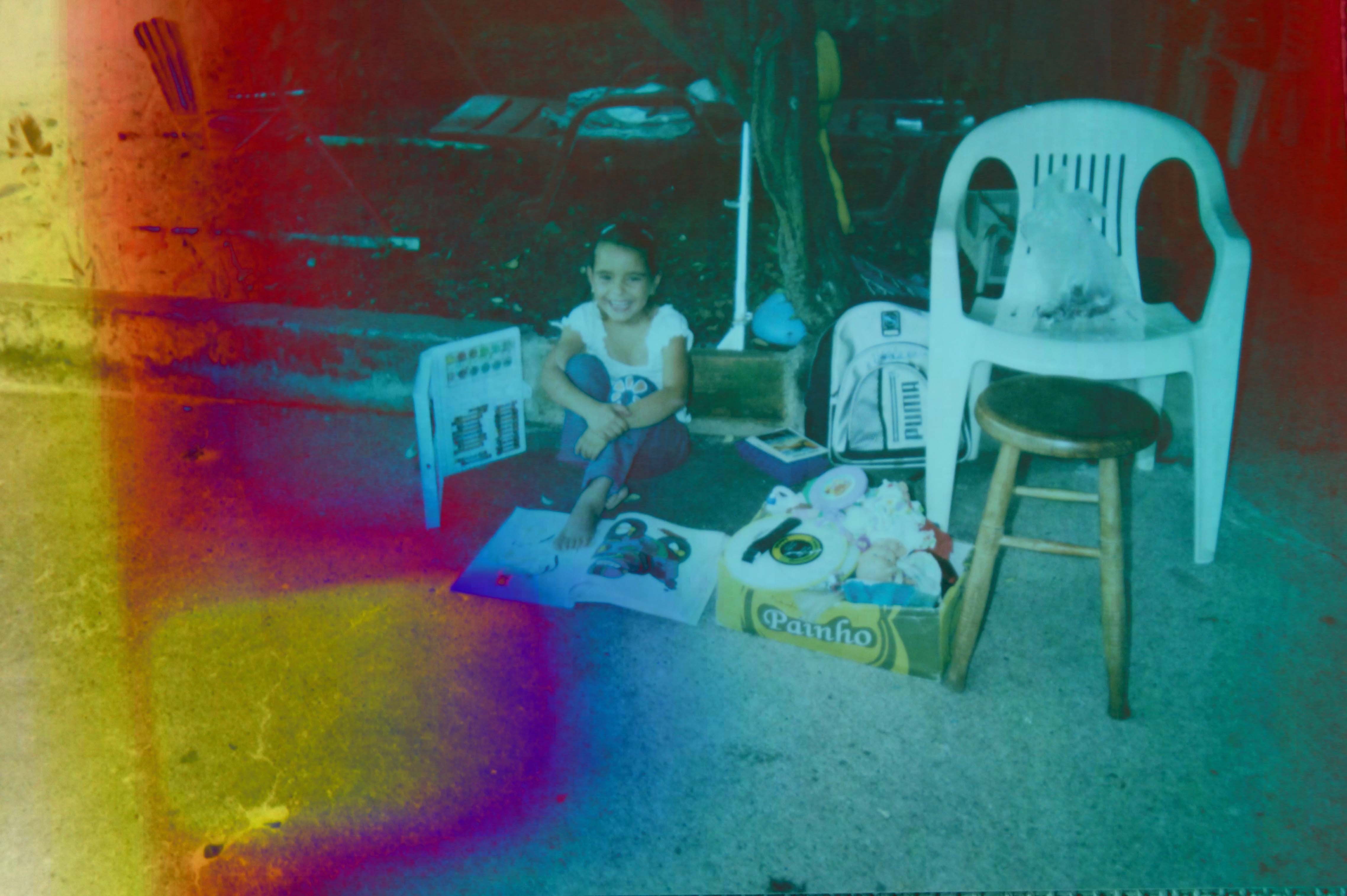
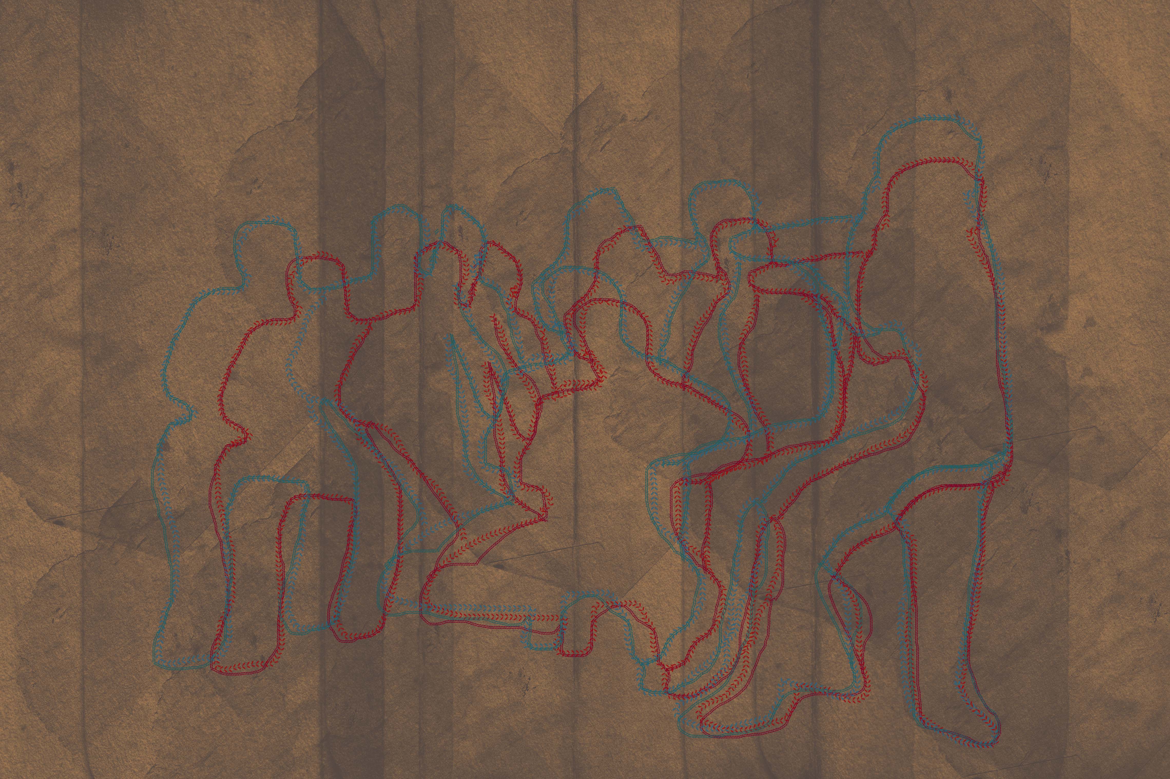
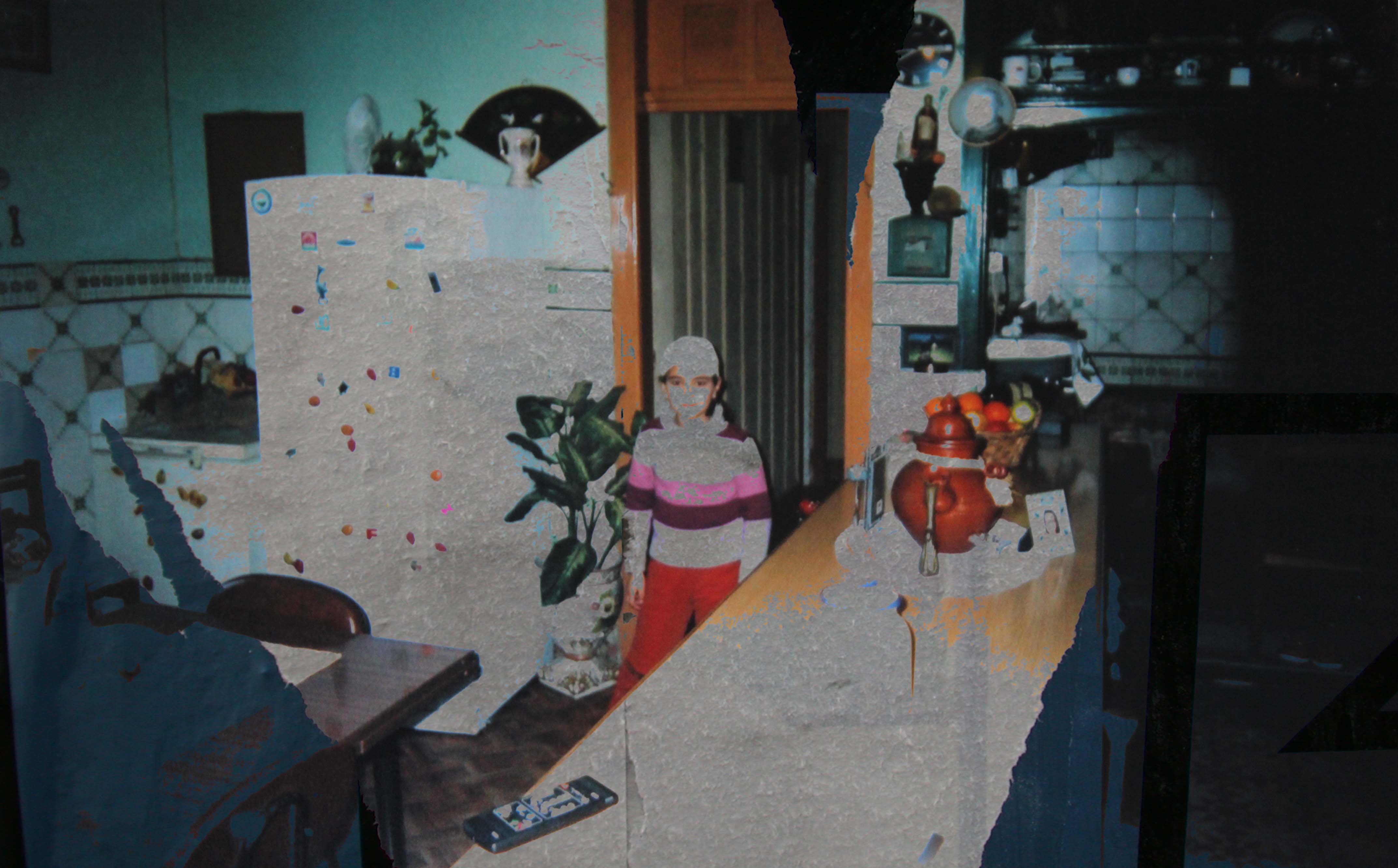
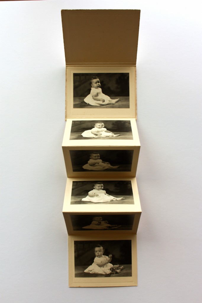
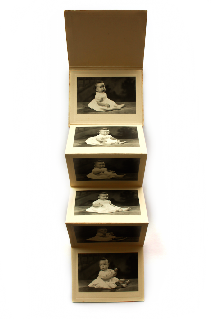
Final Evaluation of my Laporello Design: “LOVES’ ENCOUNTERS”

TITLE PAGE: LOVES’ ENCOUNTERS

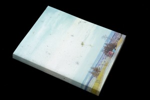
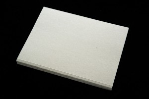
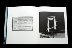
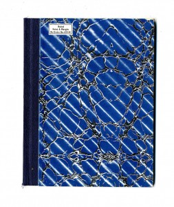
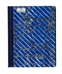
Here is my final piece entitled “LOVES’ ENCOUNTERS”. I chose the title of this for my final piece in order to represent the broad relationship between traditional and non-traditional relationships. To create this front cover, I have used a silver pen on top of assotate in order for the title to stand out more.

IMG_1073[1]

IMG_1074[1]

IMG_1078[1]

TRUTH 4

LAYOUTS FROM MY LEPORELLO

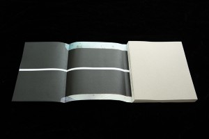
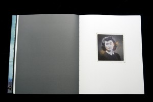
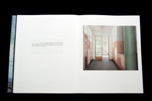
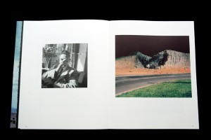
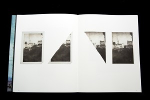
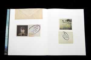
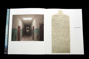
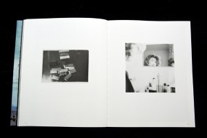
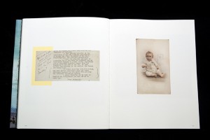
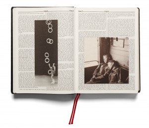
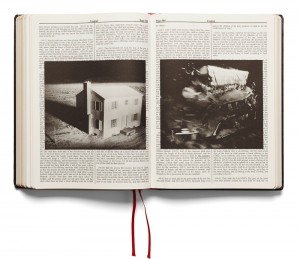
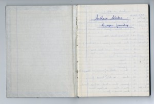
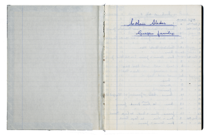
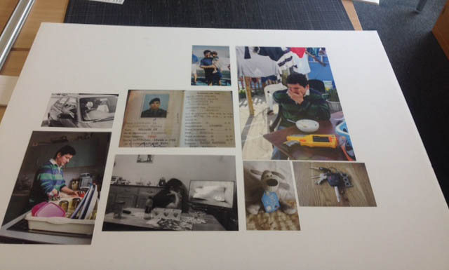
These are some of the examples of my final piece layout and how I have laid out the Traditional Images against the Contemporary ones.

TRUTH
Layout showing contemporary love.
TRUTH2
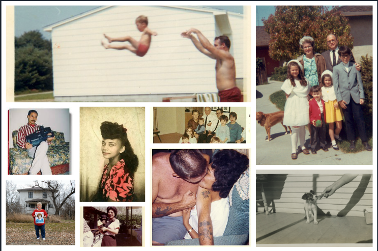
Layout of traditional photographs.

TRUTH 3

My Major Inspiration

Throughout my project, I feel as if my major inspiration has come from the works of Lina Hashian, KasslesKrammer and Ed Templeton, as they have inspired me to use the concertina and leporello form. This is because throughout their individual works they have demonstrated duality’s within story’s, and promote cross contextual references which make the works look, feel and seem more personal, encouraging you as the role of the reader to empathize with what is happening.

Am I pleased with my final outcome? 

I feel like I am most certainly pleased by the way I’ve represented truth and manipulated it in an alternative  way. Before the start of this project and investigation, I was unaware with the effects that would happen when a concertina was unfolded. From becoming an artist with the concertina form, I have learned skills such as being able to narrate a story with the absence of words and telling that story with a steady, flowing pace – visually and physically. Overall I feel the effect my leporello has upon a reader is significant in a way which can allow the reader to interpret love for themselves, within my stories and for themselves, as well as how the reader’s interpretations can differ by the reader’s place in society: (age, race, culture, gender, etc.)  I am very happy with this overall outcome as I feel the overall message and moral of truth shows a framed narrative, promoting how important it is to be realistic in life, and not how always we should appropriate it. The algorithms behind my project, is that love and truth never lie.

Planning for my final photo-book: Laporello in the style of Lina Hashian and Ed Templeton

Project Specification:

I am going to be creating a Leporello in the style of Lina Hashian and Ed Templeton, to show the dual sides of love from a contemporary and not contemporary perspective. This will include other material such as photographs from my family archive, as well as images I have kept of my friends over tine. I feel this aspect can help level out the narratives presented on this leporello and can depict certain  stories that people can relate to or empathise with.

Specification statement and algorithm:

to use Appropriation as a source of manifesting profiles of people usually perceived and associated on Social Media against those considered ‘normal‘ ways of courting love.

Final Images for my Photo-book (Traditional)

These are my final images for the traditional side of my Leporello:

Mum and Dad

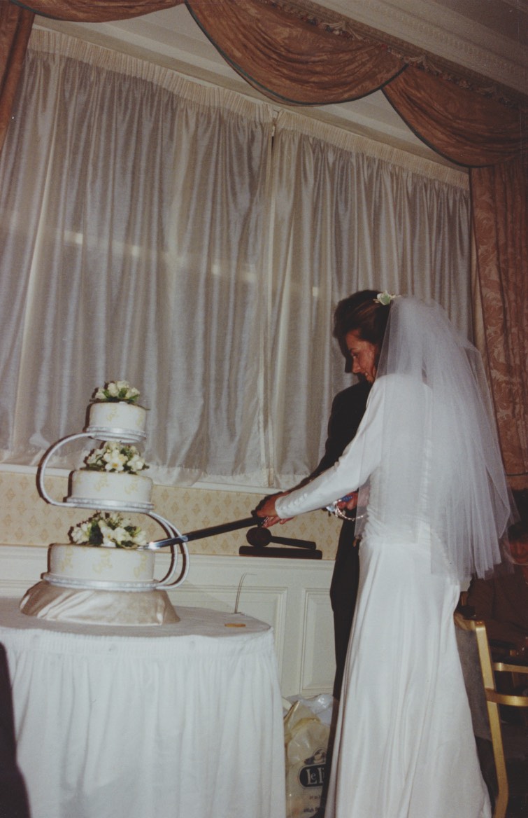
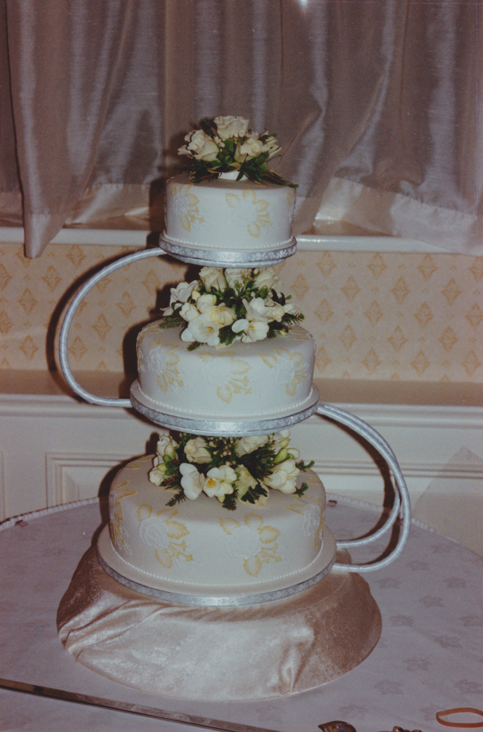
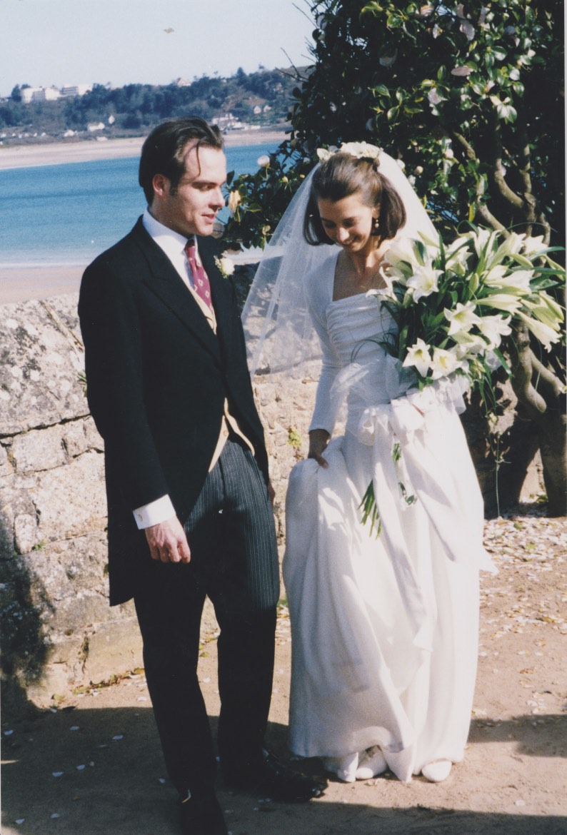
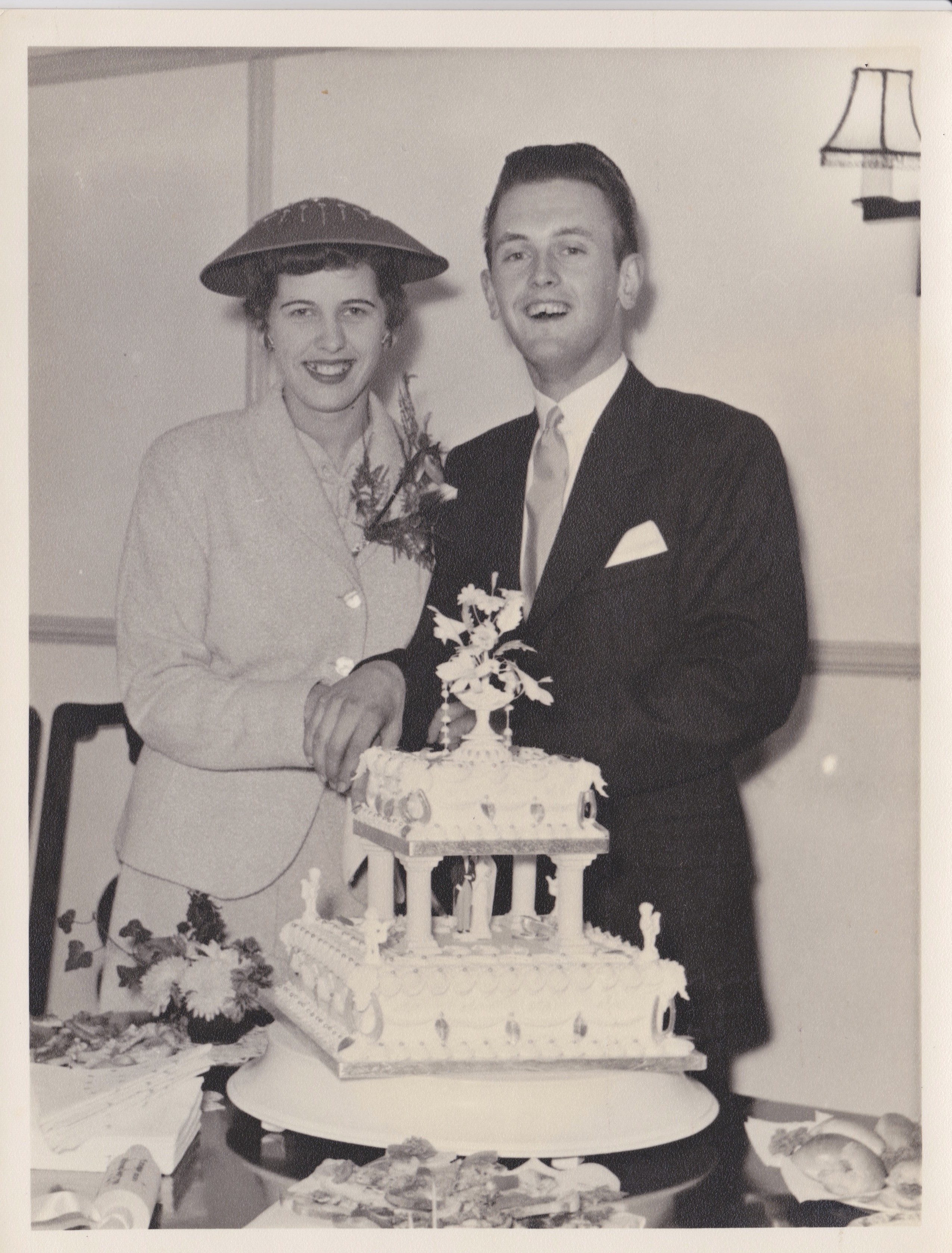
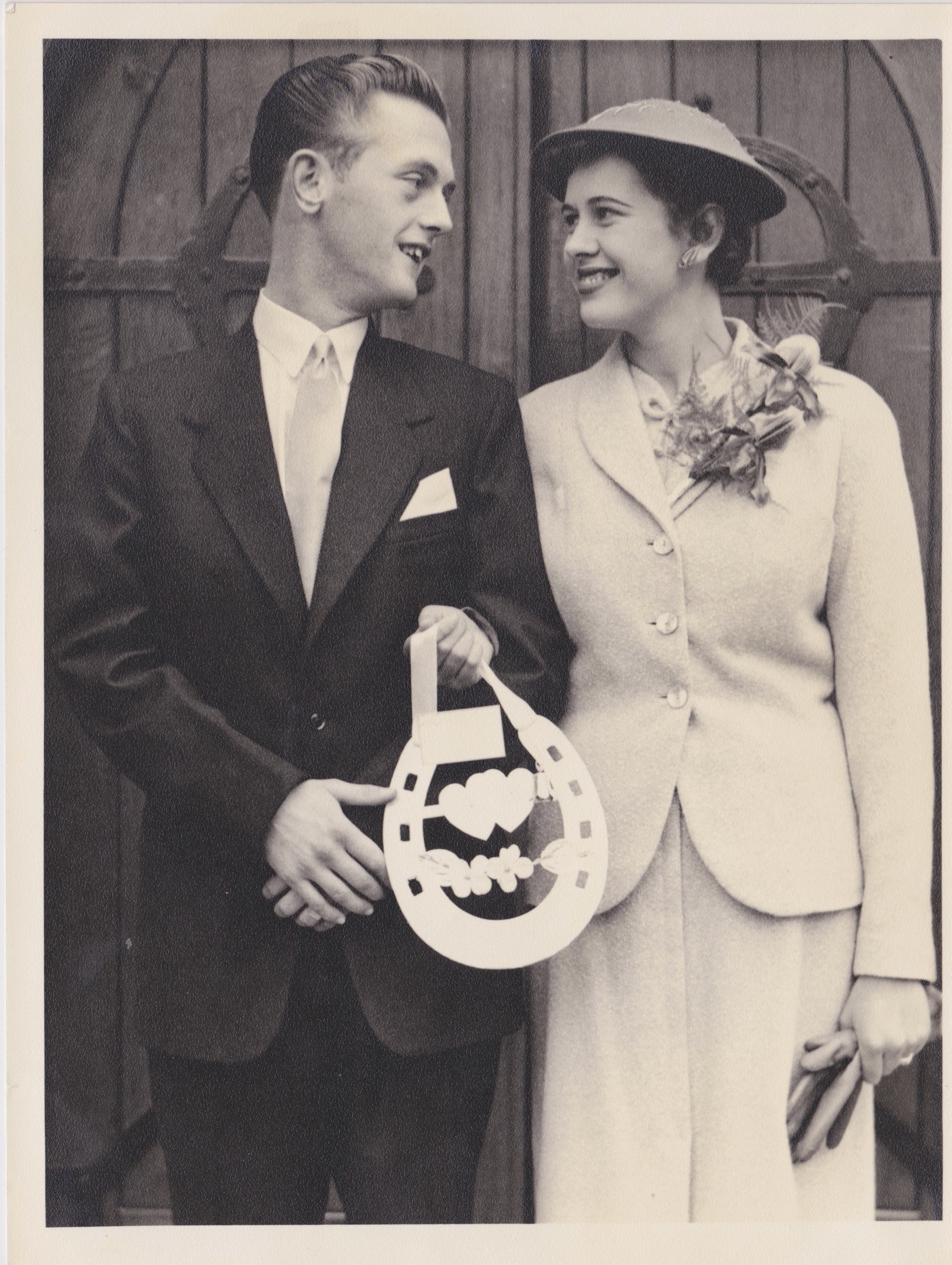
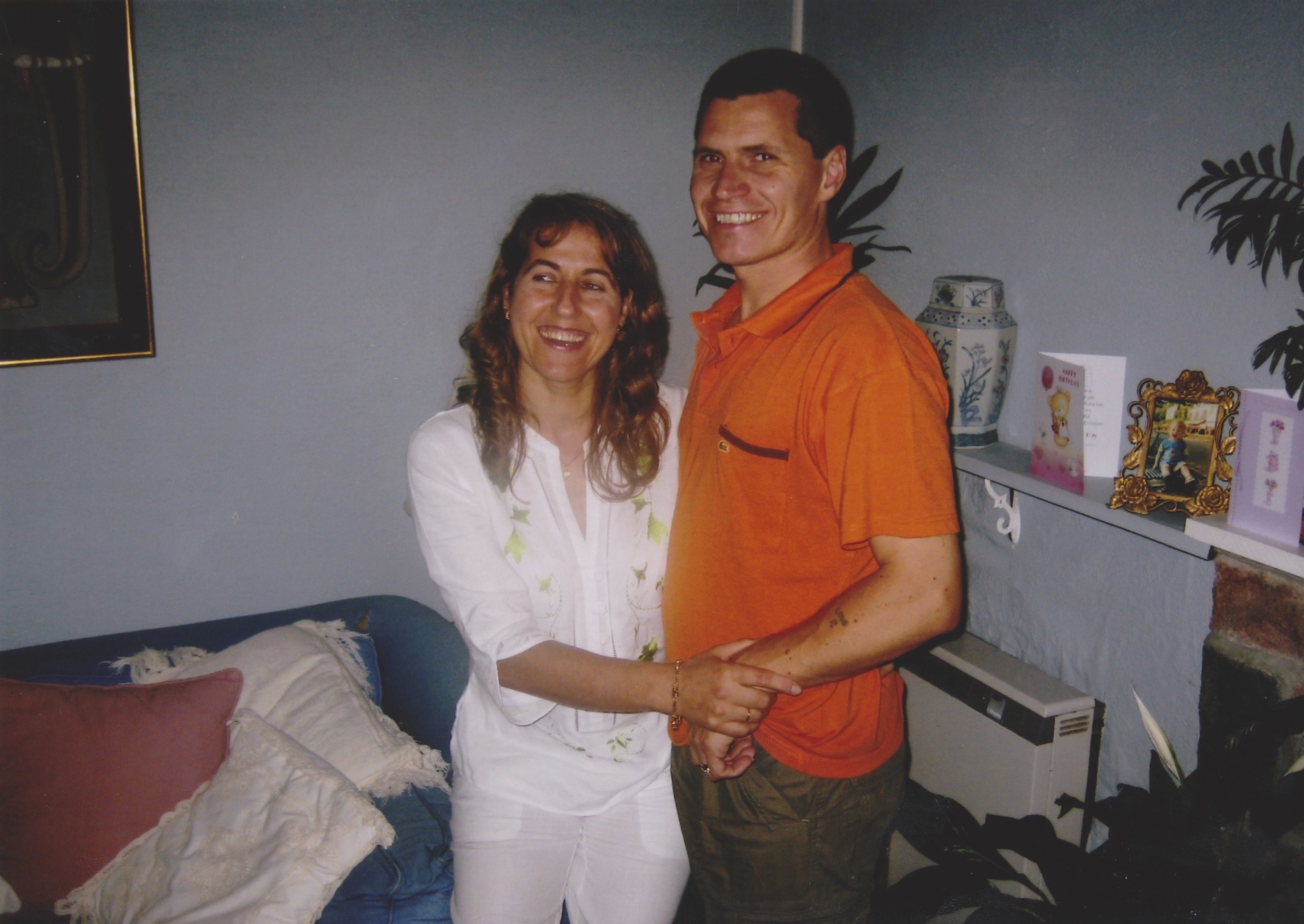
The first series I have selected are my family archival photographs. I felt using these was a really important aspect as my project as a reader can follow the journey of their relationship just by giving them a selection of photographs. The first two images inspired me as I felt this could be a good comparison towards the works of KesslesKrammer’sUSEFUL PHOTOGRAPHY 010“. Krammer’s ongoing use of typology has inspired me as repetition is an ongoing theme. With this in mind this is why I have included two images of the wedding cake of my mum and just by itself as I think during a wedding, the cake is one of the most notorious features in a traditional marriage.

Scan 81

Scan 82

Scan 86

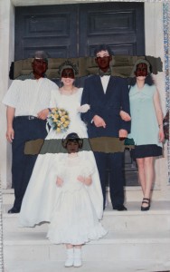
The image of my parents above I thought was important as it makes it clear what the celebration is really about. However, I think this image also poses an important argument that even though finding love is alternative in contemporary society, the celebration of your wedding has pretty much always stayed the same.

Scan 88

Scan 85

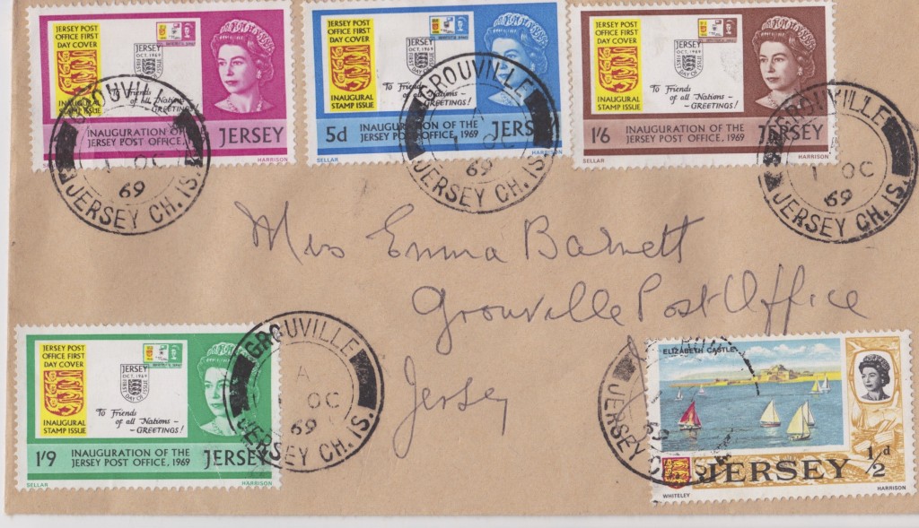
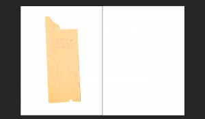
In the style of Ed Templeton, I have included material such as this envelope to make the reader get a more personal response to this project. This letter was written to my mother when she was very young, and indicates the time and the place of production  and destination. I felt this was an important feature in order for the reader to feel a sense of background within my family, therefore empathising with the images more easily.

IMG_0853

IMG_1048

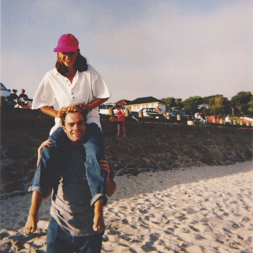
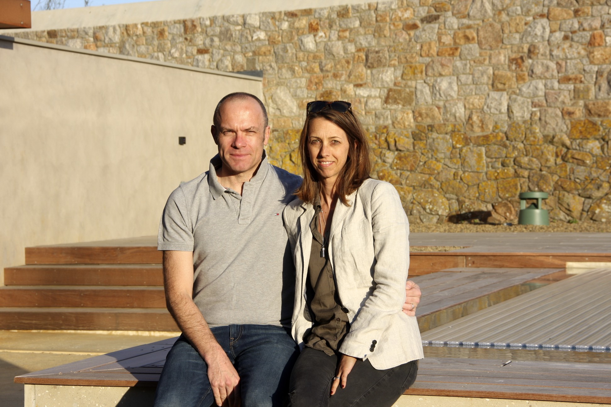
This image which I have captured is a contemporary representation of how my parents are still in a very happy relationship. I want the reader to understand my parents relationship like a story and how it unfolds over time. This is why I have captured an image so recently in order for this narrative to progress.

Nanny and Pops

For my investigation on my grandparents, I have used various recourses in the style of Ed Templeton, in order for the reader to get a better sense of context, and how important it is and has been influenced upon my grandparents.

Scan 89
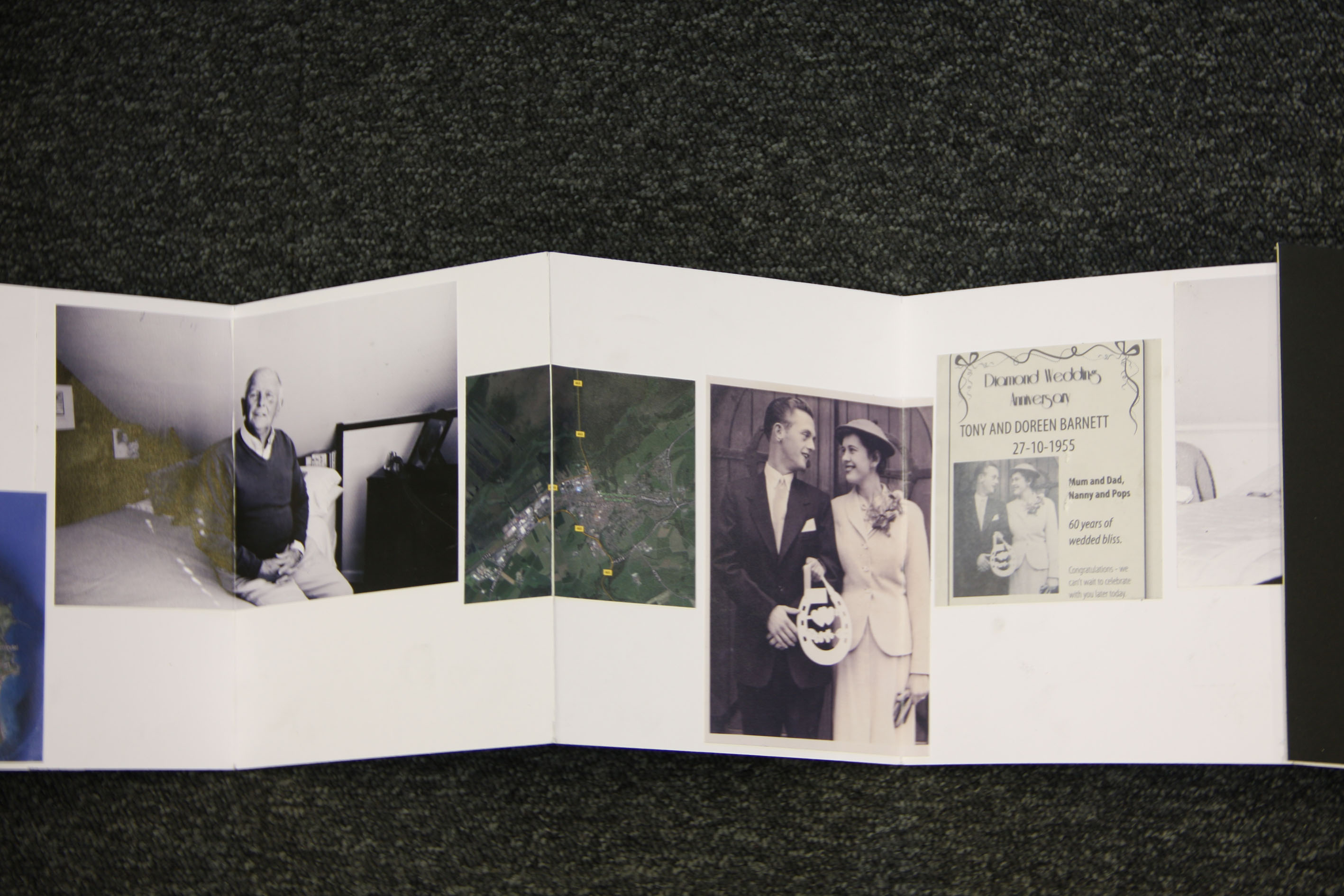
This image shows the poster our family used during the celebrations of my grandparents diamond wedding anniversary. I felt this aspect was extremely important in a way in which it allows people to get a sense of how long they have been together. The reader, this way, can step back and compare this with contemporary relationships, as 60 years ago was a very different era and time surrounding an allot more diverse and social culture; such as, World War ll.


Scan 90

In conjunction with the images I had used before of my mum and dad, I felt using this photograph alongside the others was important as it can be used as a follow on to KesslesKrammer’sUSEFUL PHOTOGRAPHY 010“. This way, the reader can almost see my leporello as a small typology, as I will fit the images in a grid like form in order to replicate the works of Krammer and how significant it can be.

Scan 92

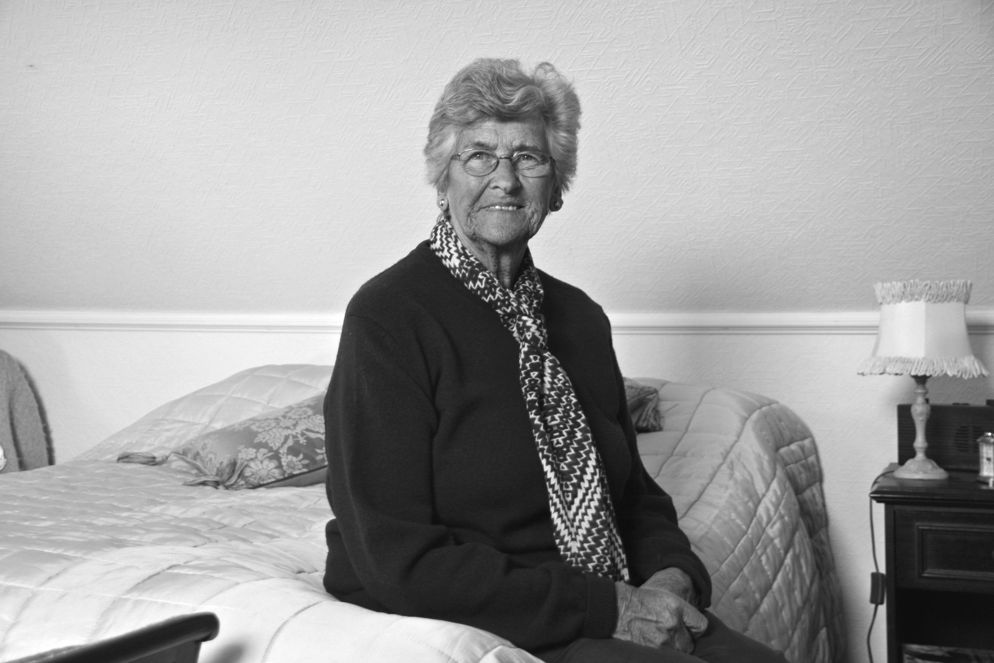
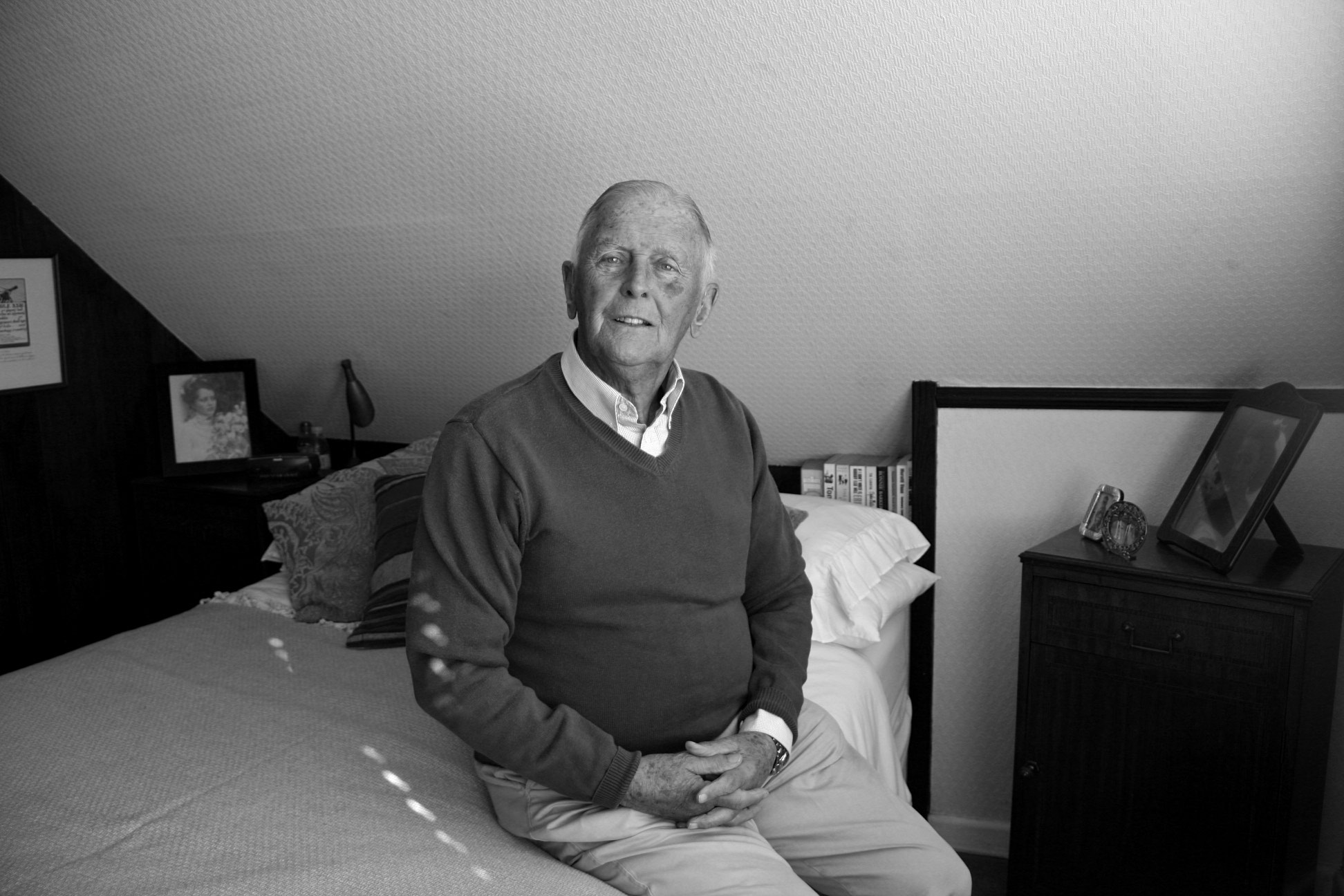
Including images of my grandparent’s wedding day is also a good way of showing parallels between my parents, as this tradition is shown to have been ‘passed‘ on through generations. Below is also an example of a contemporary photograph of my Nanny as well as my Pops, in order to show how they are very much together. Even though I have captured them in two different frames, I feel like the narrative has flowed by incorporating previously the archival material that I’ve extracted.

IMG_0827

IMG_0815

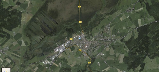
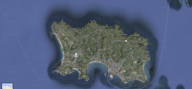
Below shows how I have incorporated images that I have screen-shotted from google maps, in order for the reader to locate and trace back memories just by single images. Alike what I did with my parents, the uses of letters and other sources of material transgress the boundaries of how events over time have seriously effected the relationship of my grandparents, in this case however, for the better. With the deportation of my Grandfather to Bad Wurzach, and my Grandmother remaining in Jersey, this liberation post war shows how their relationship can be too, using these sources of material as a metaphor for how love is ‘united’. This can also be empathised with the works of Templeton, as I’ve used various mediums in order to narrative this passage of time.

Screen Shot 2016-05-05 at 22.28.57

Screen Shot 2016-05-05 at 22.30.52

Paula

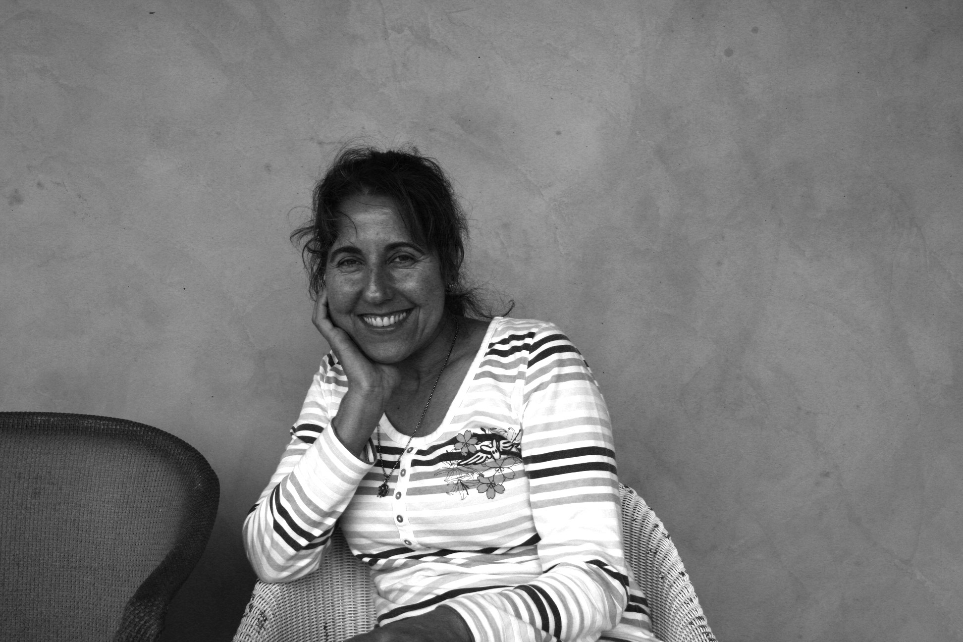
My final reference which I have used for the ‘Traditional‘ side of love is my family friend, Paula.  I though it would be nice to get an alternative outlook on relationships that I am not aware of as much, like my grandparents and my parents. Because of Paula’s Portuguese   heritage, this dis-farmilularality made me interested into how her relationship with her husband, Joseph, may differ to ours. This in itself, can create a dual between the differentiation of languages and culture, as well as comparing contemporary with the non.

IMG_0717

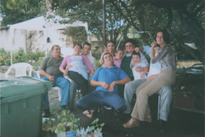
My archival research for Paula was me extracting an image of Paula and Joseph, taken about twenty years ago. This vague and delicate aspect can drive the reader to interpret it for themselves, almost in the style of Lina Hashian.

Scan 94

Final Non-Traditonal Pictures

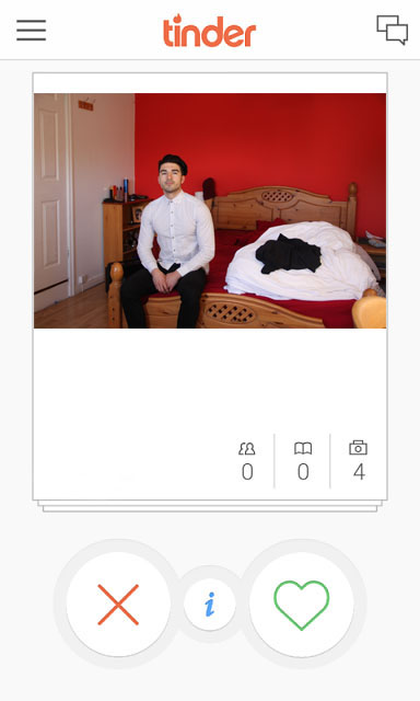
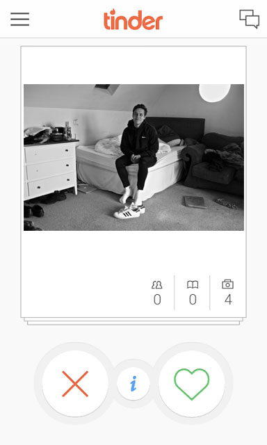
For my final images for the Non-Traditional side of love, for all the images I have included my edit of the ‘Tinder‘ frame. I felt this was  a good way to get a modern perspective on how Love in influenced by social media, and in particularly mobile apps and website like Tinder which promote the act of Online Dating.

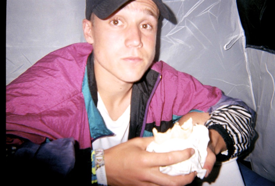
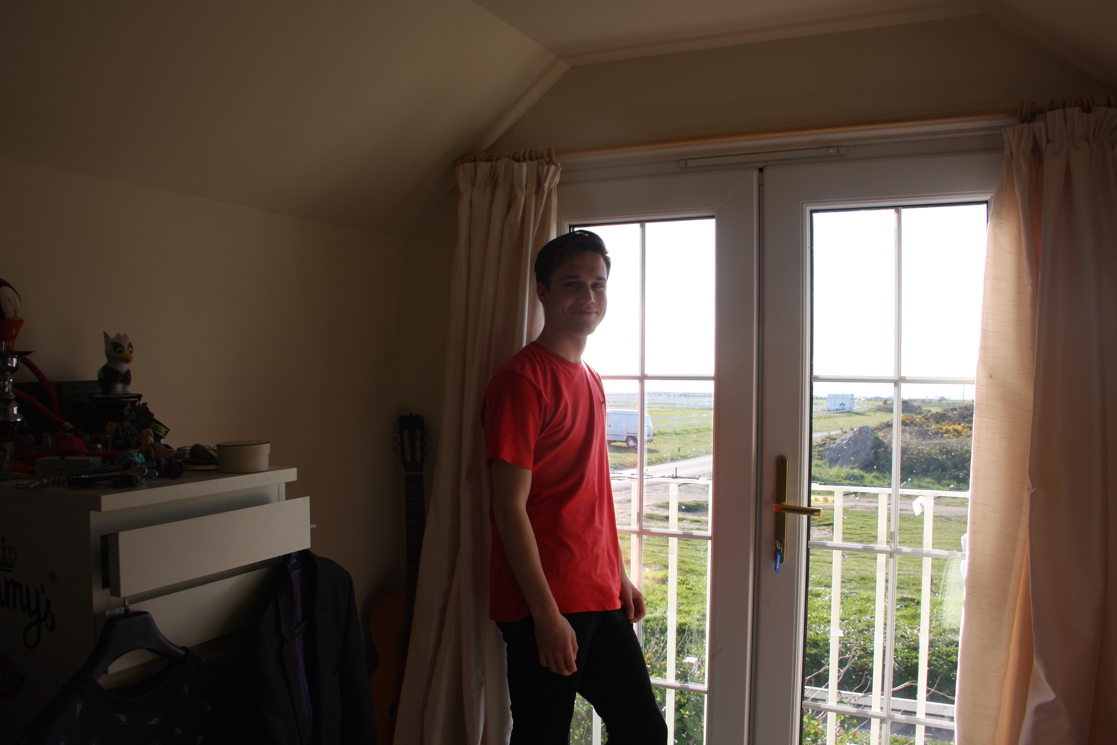
William

william 2
This images shows how I have endorsed the image of William into the Tinder Frame. Using only once image per person, I thought this image was most dominating out of the series I took of will because of the overly vibrant, red colour. This aspect can relate to love in a way which overpowers the readers eyes, allowing them to empathise with how the colour of ‘red’ can relate to love.

IMG_0952

IMG_0984

I have included these portraits of William also, in order for the reader to get a closer, more in-depth insight of his interests and hobbies. These images promote a more realistic side to his character, juxtaposing with the Tinder frame and comparing with the Traditional side of love.

Holly

Holly 2
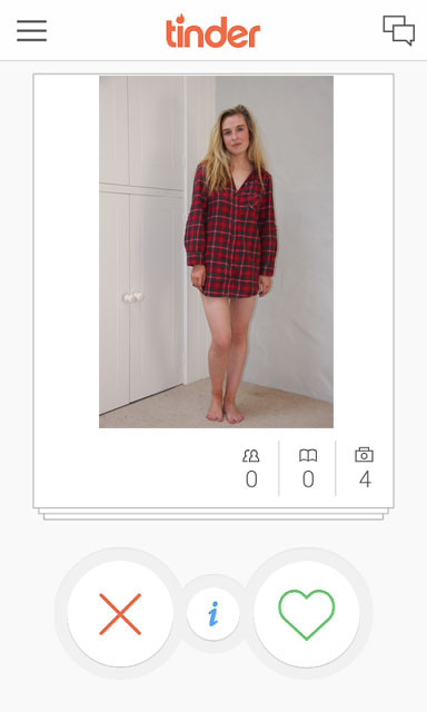
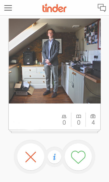
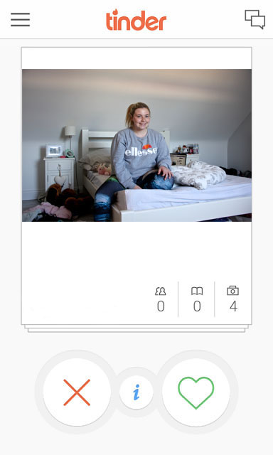
This is the image of Holly in the Tinder frame. I felt this image I have used is the most strong as it is a full body shot. This image can be seen as truthful as every aspect of Holly is included in this image.

IMG_1004

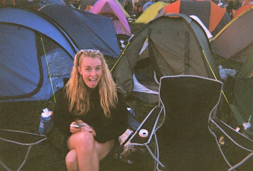
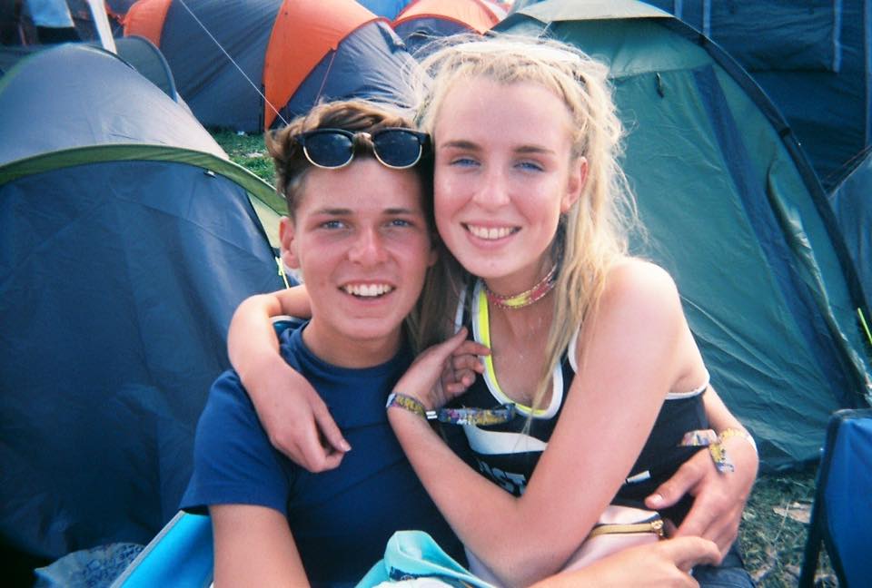
I have also included this image (pictured above) to show Holly’s natural setting. I feel this image contributes importantly to the images flow and journey as the reader gets a closer insight into how Holly is as a person, and how her personality can therefore be interpreted. Below shows a set of images that I have extracted from my own archive. Taken at Reading Festival in 2015, I thought these images juxtapose with the ones previous. This continuously follows the theme of duality, and how this can be metaphorically symbolised throughout my project.

11921662_1046174468727265_9193434088177339570_n

11986367_1046174448727267_509706394773108306_n

Alex

Alex 1
This is the most prominent image of my boyfriend, Alex, whom I captured in order to make my project feel more personal. This image which i have super-imposed into the Tinder frame describes him as himself – in a realistic perspective. The setting around him suggests how he is alike a typical and stereotypical teenager which is something I wish to establish, especially with the comparison with other images in order to maintain a rounded and realistic perspective.

000007

000009

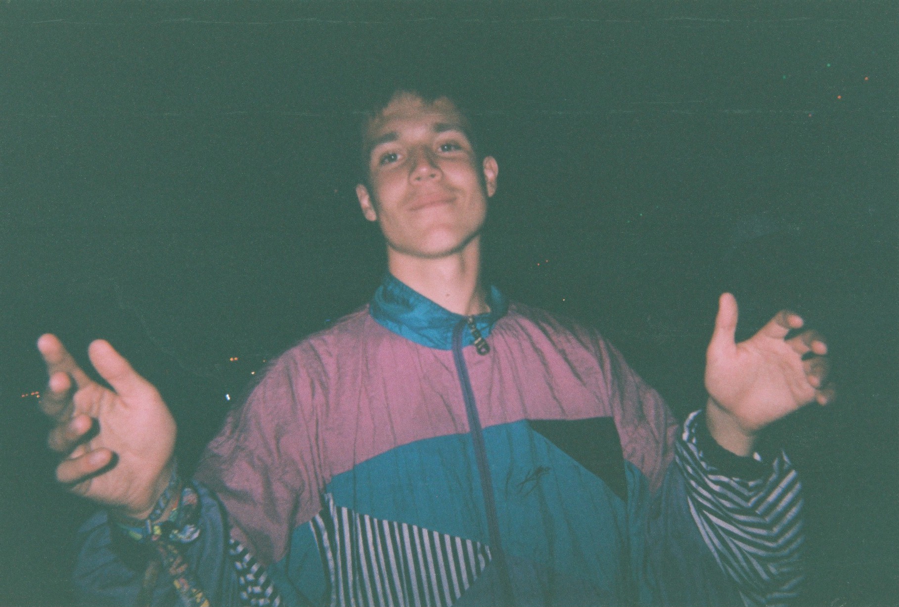
Above are some of the images which I have extracted from my own personal Archive. Taken also at Reading Festival 2015, I wanted to show how Alex’s personality is well rounded. Depicted as someone who is quite timid and shy, to someone who is fun can show that on Tinder profiles, depictions are most usually false.

IMG_1042

Myself

IMG_20140708_160823
Using a blank tinder frame which i will eventually overlap using assotate, and draw on top of it masking its true identity. Because I don’t actually have a Tinder account, I feel like I am manipulating truth by creating my own fake profile, twisting reality as it wouldn’t happen in a real life situation. This is all a response to the MTV TV Show: Catfish
Scan 2
This image shows the overlapping of what my blank Tinder frae will look like on my leporello. I feel this is interesting at the viewer starts to question what the situation is. This could be a response to Lina Hashian as the reader is left to interpret the narrative for themselves.

Will

will 3]
This is my cousin Will’s picture which has been imposed into the Tinder Frame. I feel this image is different to one you’d typically see on an online dating forum which is why i thought it would be significant to use.

IMG_0914

Including aspects of Will like his shoes can give response to Ed Templeton, as he has influenced me to show a different side to a character by objectifying certain things.

Freddie

Freddie 2
This is my final image of Freddie amidst the Tinder Frame. I Like this image of Freddie as I feel this represents his character. By including his setting, his clothing and his stance, I feel this representation is valid and is truthful, if it was to be used on an online dating Forum.

IMG_0759

IMG_0779

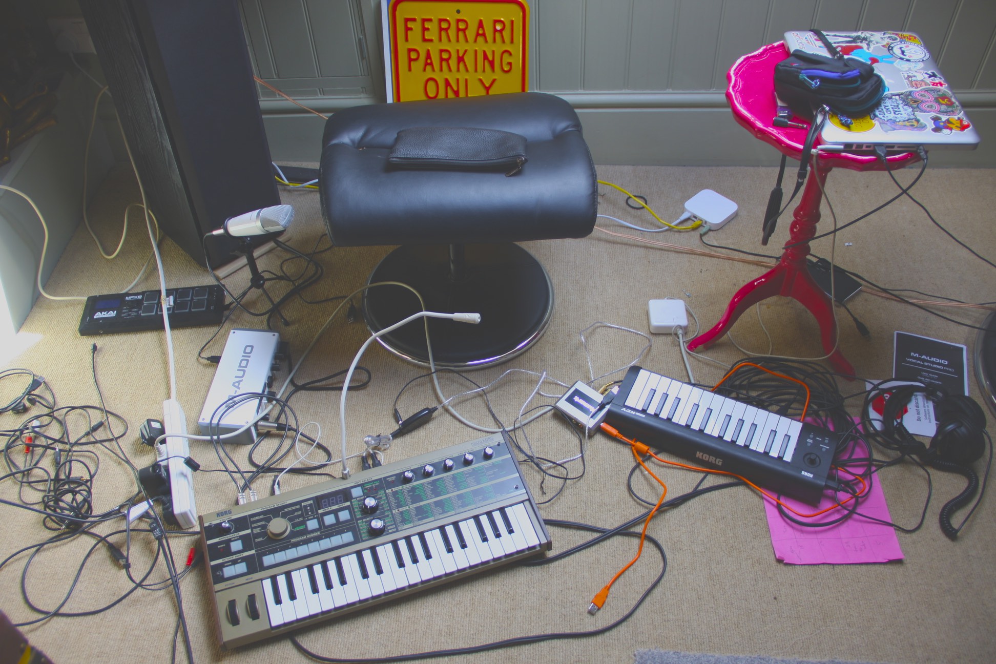
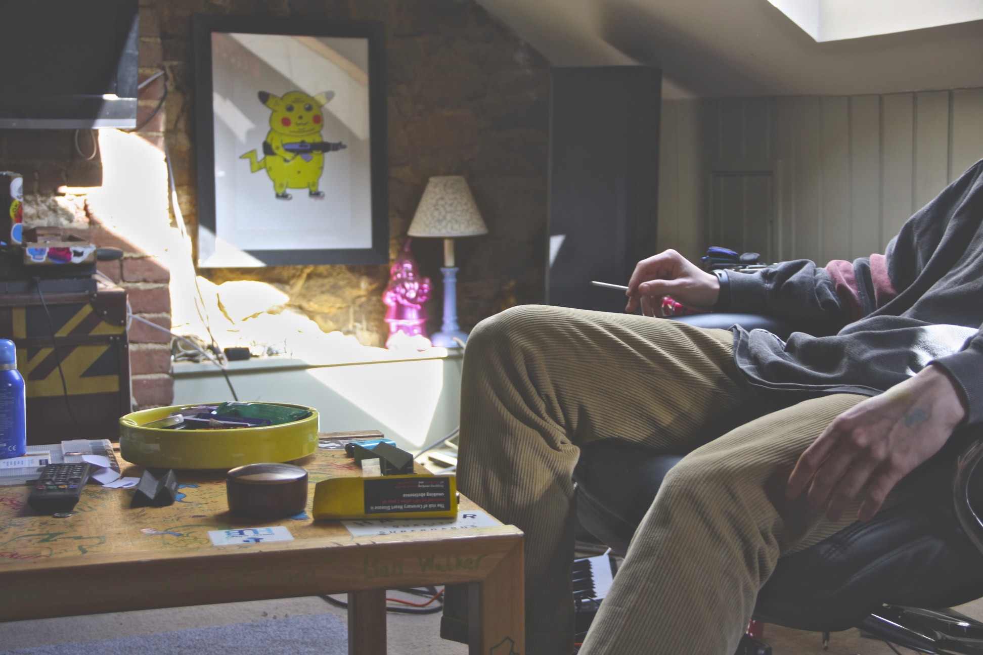
These images above which I have taken recently I feel represents Freddie’s character further, as it shows his interests in a clearer light. The photographs of his music equipment and the images of him smoking, shows to the reader a more realistic approach to just one single image. This is because Freddie’s picture in the Tinder frame presents him as quite a smart and well-ordered person. So I feel like I’m questioning the truth of Freddie by showing him realistically through photographs.

000008

000018

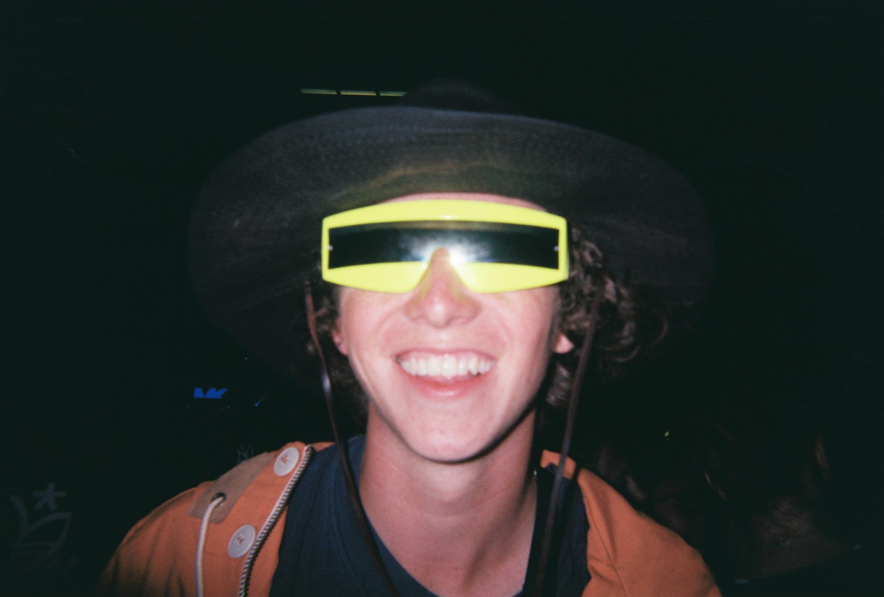
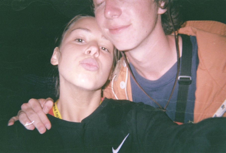
These images above show my use of archival material. I have references images I feel reflect Freddie’s personality, yet as well including images that me and Freddie are featured. This makes my project more personal to me with the hope people will then empathise with it.

Emma

Emma 2
This is my friend Emma’s picture which I have put in a Tinder frame. I felt this image reflected Emma realistically and shows her interests and personality.

Creating my own fake Tinder profile

As I don’t own a Tinder account, I thought it would be an interesting idea to manipulate truth by creating my own profile in order for me to delve into this world of Online Dating. Prior to this creation, I have done some research and have looked at both sides of the online dating world, from adaptations of TV Programmes to Documentaries all centralising the apps attractive and addictive features.

My Interpretations of ‘Creating’ a new and realistic Profile

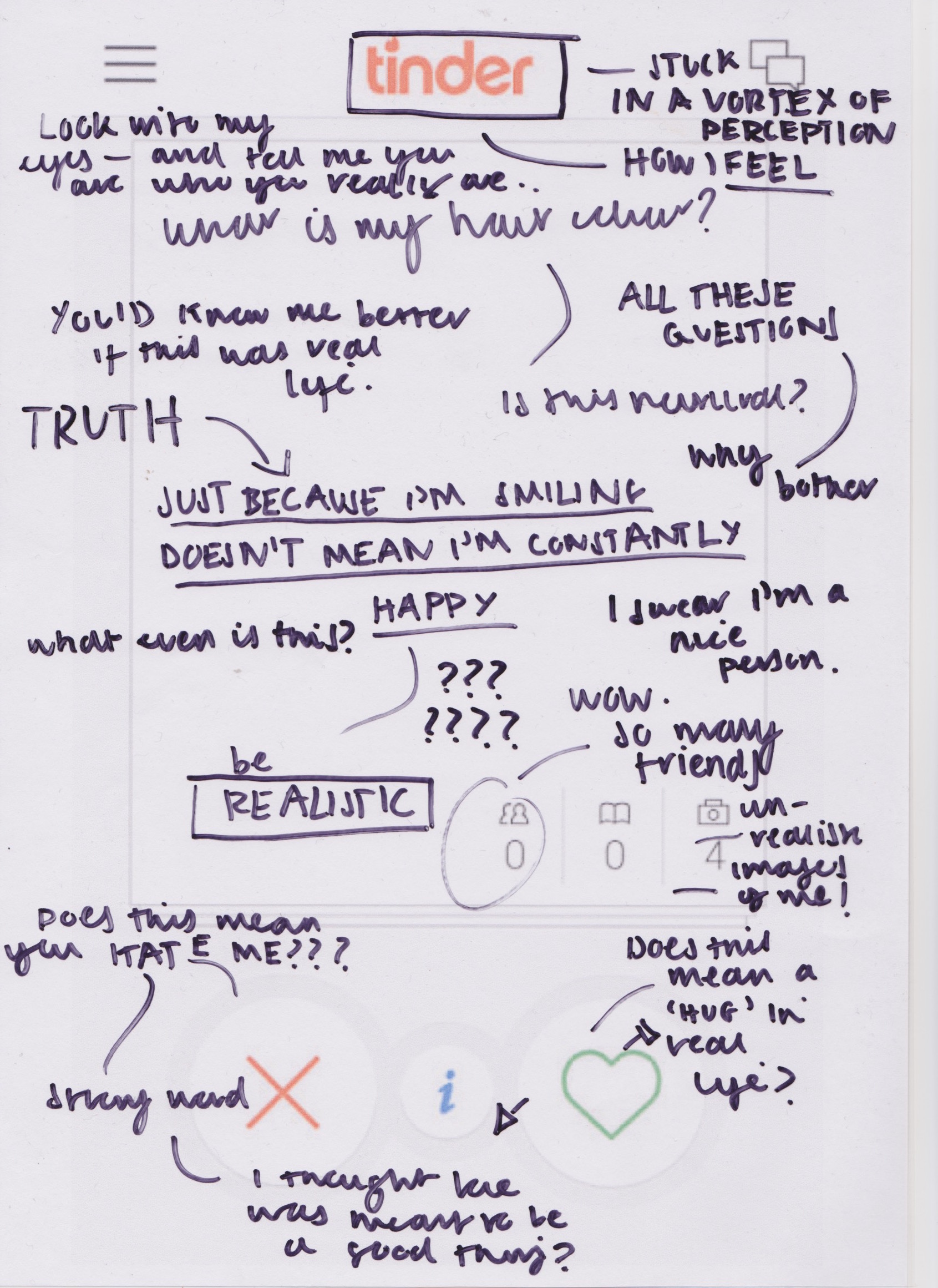
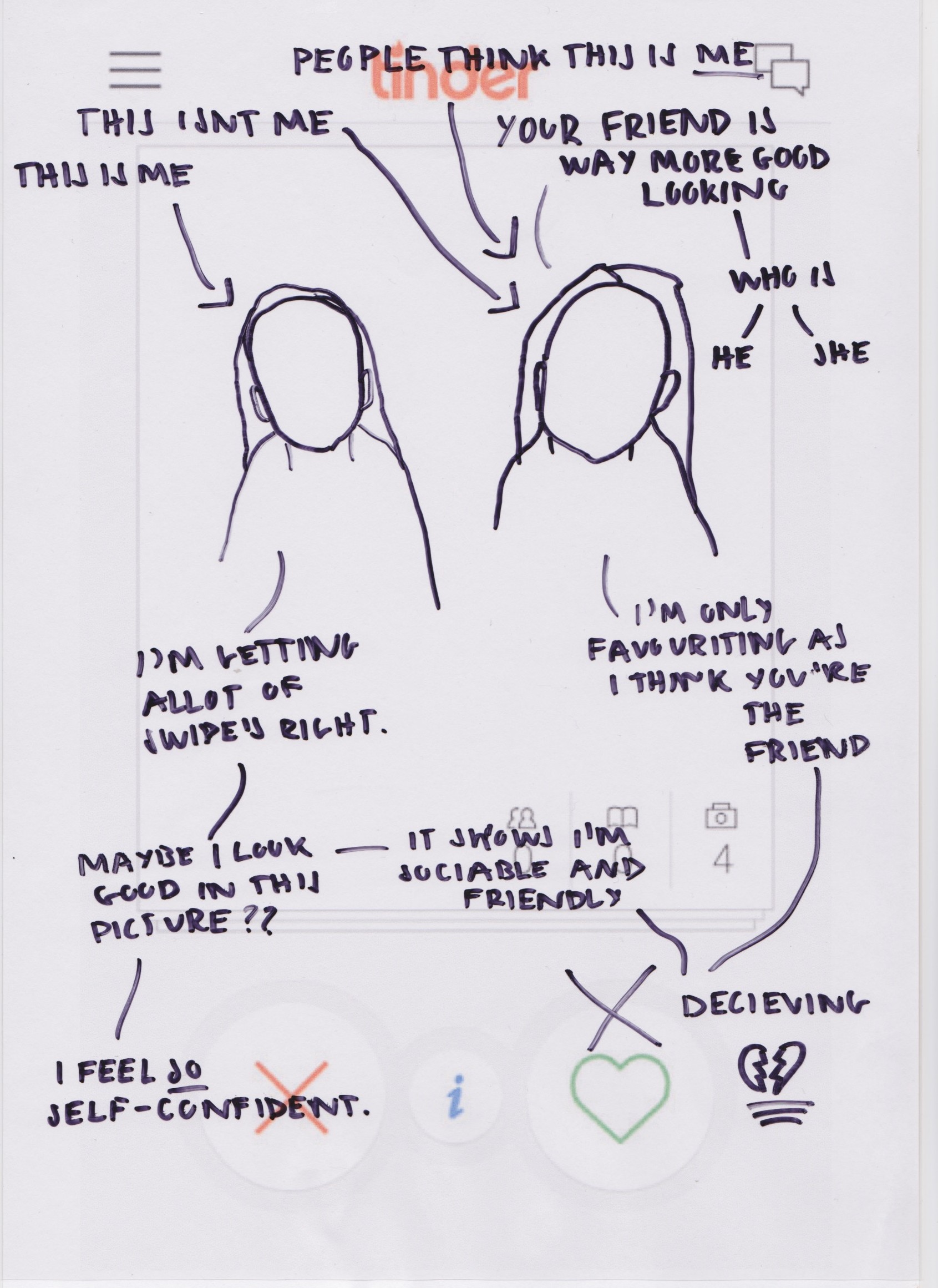
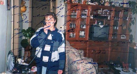
For my own interpretations, I have drawn over a blank tinder frame and profile in order to ‘create‘ my own interpretation. I have written on top of images like the style of Ed Templeton, to allow the reader to understand a narrative in a more clear and flowing way.

IMG_20140708_160823
This is what the Tinder blank background looks like. By drawing over this, I feel I am creating my own truth by making what seems realistic false but at the same time truthful because of what I am stating. This concept acts as a metaphor within itself as the reader is drawn into questioning what ‘real’ love is.
Scan 2
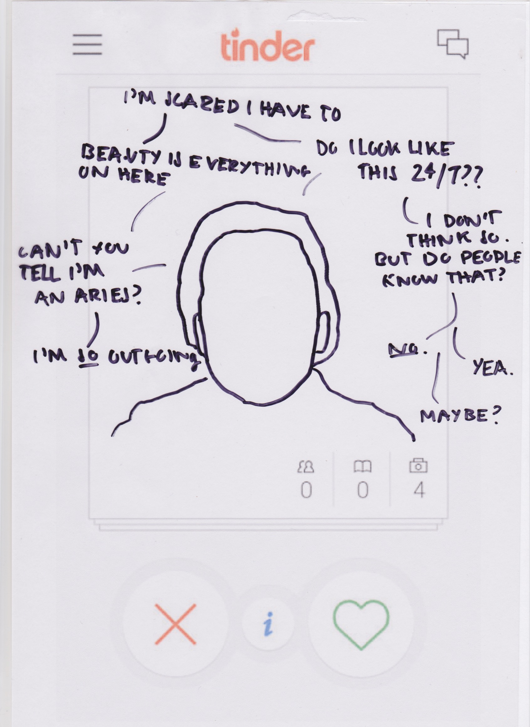
In this frame, I have drawn over a fact in order to represent a photograph of someone. Around the image I have used quotes such as “Beauty is everything on here”. I feel this blank portrait could remise to how a person’s personality is not shown vividly throughout the Tinder algorithms as the first thing a person see’s is their profile image.
Scan
On this frame I have written only text. I have included quotes like “Just because I’m smiling doesn’t mean I’m constantly happy” and “A vortex of perception” as I feel this contradicts the way Tinder users are forced into only including four images of themselves. This narrowing of choice dis-broadens the way in which people see that person, instantly labelling them as a ‘type’ to decide whether they approve of them in a quick and efficient way.
Scan 1
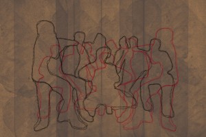
In this frame I have included outlines of two people. Because many Tinder users include images of their friends, I thought it would be a good influence to show how using pictures with their friends present may subvert the viewers eye onto likening the person that isn’t yourself. This can change the way we see the app as truthful as in real life this mistake wouldn’t be made.

Case Study: Catfishing 

Urban Dictionary definition –

“to lure (someone) into a relationship by means of a fictional online persona.”

catfish-meaning

MTV’s Catfish: the TV Show 

Catfish is a 2010 American documentary film directed by Henry Joost and Ariel Schulman, involving a young man, Nev, being filmed by his brother and friend, co-directors Ariel and Henry, as he builds a romantic relationship with a young woman on the social networking website Facebook. The film was a critical and commercial success. It led to an MTV reality TV series, Catfish: The TV Show.

Examples of episodes:

The Mobile Love Industry

This  this episode of Love Industries you look at the ways in which mobile apps have become an essential part of our search for the next hook-up, true love, and everything in between.  Karlie Sciortino manipulates this industry by placing herself into it by creating her own Tinder profile. This allows her to try online dating herself as well as seeing if the truth behind people profiles are really what they say they are.

Ed Templeton: Adventures in the Nearby Far Away

“Adventures in the Nearby Far Away”

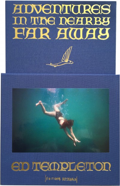
Following on with my research of the concertina and leporello form, I thought it would be a good idea to research Ed Templeton’s notorious work “Adventures in the Nearby Far Away“. The recently contemporary book by Templeton is  presented as an accordion-fold continuous book which spans 27 feet once extended. The books plot surround the journey 26 miles across the Pacific Ocean from the tangled mess of humanity that is Los Angeles and Orange County sits an island paradise called Santa Catalina where time has stood still and visitors can experience what California was like before the Europeans sailed in.

“Adventures in the Nearby Far Away is a photographic diary of my many visits to the island over the years, a place I have been visiting since I was a boy, and been documenting photographically since the late 90s.”

– Templeton

tumblr_mxmx3pfBsf1svbj9ao1_1280-1080x352

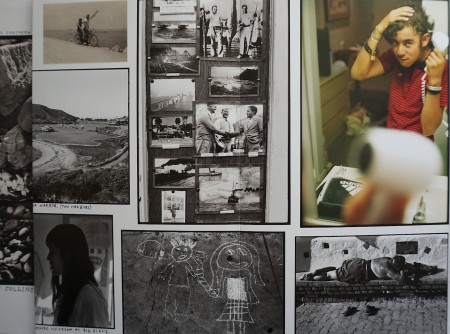
All photos are shot on film and are taken all by the artist. I feel I can relate to Templeton as in some of my shoots I have used the form of short video clips as a recourse to get closer in on the subject. In the style of Templeton, I could use this form of video to include selected frames of some of the people I have videoed, to show the continuous rhythm effect it has similar in “Adventures in the Nearby Far Away“.

1444393597_IMG_50802
The front cover of “Adventures of the Nearby Far Away” is encompassed in a cardboard sleeve. This little feature could represent how the books’ plot shows a story within a story. This Leporello shows symbolism throughout, and Templeton could add this to rise tension and expectation before the reader even opens the concertina.

img51446553513_DSC01616

jpg

In some images, Templeton uses other mediums such as drawing over photographs in order to create a larger perspective of the narrative. Including personal images and quotations can show how the driving force of the photo-book progresses because of its personal connection and realism. I feel this could be a good technique to use during the production of my final Leporello, preferably using a material like associate or tracing paper to really represent significantly the masking and imitation of peoples real thoughts, feelings and emotions.

Here is a video link showing Templeton’s book layout –

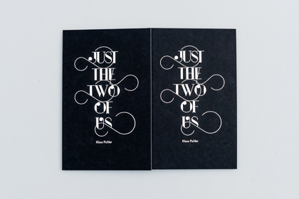
Klaus Pitchler: Just The Two Of Us

JUST THE TWO OF US: Photo book, self-published, 2014

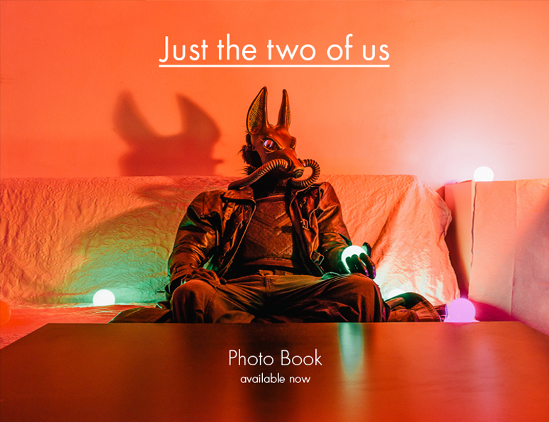
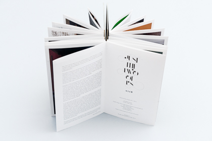
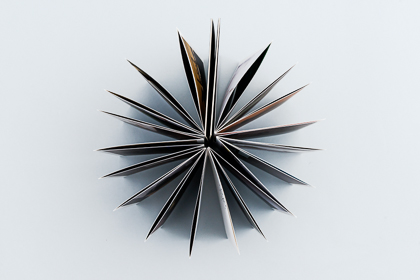
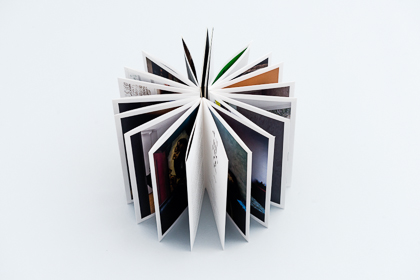
Klaus Pichler was born 1977 and lives in Vienna, Austria. After graduating from university in 2005 he decided to quit his profession as a landscape architect and become a full time photographer- without any education in photography. The topics of his work are the hidden aspects of everyday life in its varying forms, as well as social groups with their own codes and rules. “Just The Two Of Us” was made and published in 2014 and is a handmade Leporello, that is 645cm folded to 38 pages, on hardbound paper. The black cardboard cover has a silver-metallic hot foil stamping. 26×16.6cm (open: 26x645cm), 38 images, printed on Munken uncoated paper. The Photographs and text are written and produced by Klaus Pichler, and are written in english.

just-000
The digital front cover.
just-the-two-of-us-185
The Leporello front and back cover.

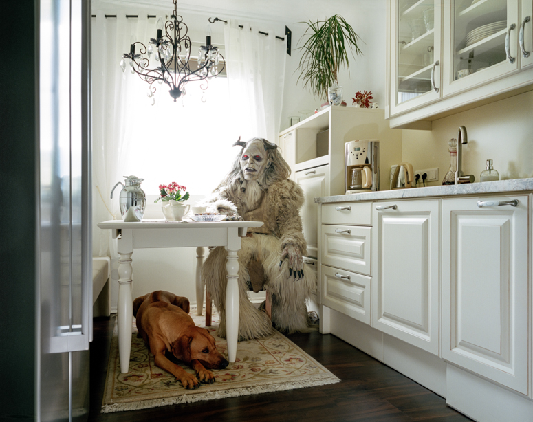
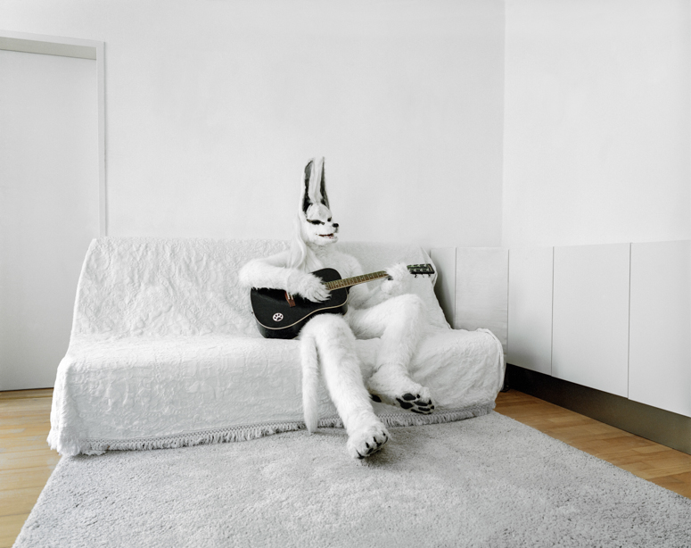
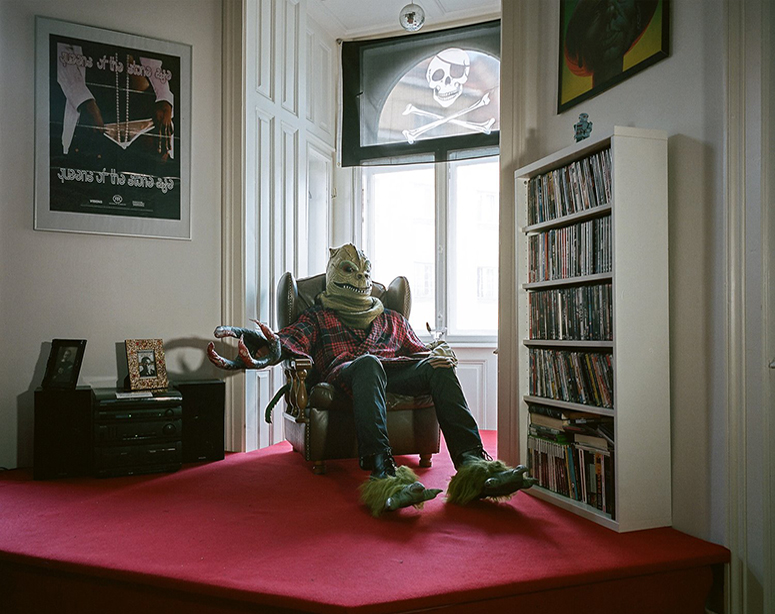
“Dressing up is a way of creating an alter ego, a second skin which one’s behaviour can be adjusted to and causes a person to be perceived differently. ‘Just the two of us’ deals with both costumes and the people behind them.”

just-the-two-of-us-145

just-the-two-of-us-125

just-the-two-of-us-135

Colossal Magazine: Just the Two of Us: Portraits of Cosplay Enthusiasts in their Homes by Klaus Pichler

by Christopher Jobson on November 1, 2013

Jobson opens the article by stating this comparison to ‘Halloween‘:

“We’re less than a day past October 31st and it would be reasonable to assume the people depicted in these portraits are wearing Halloween costumes, but they’re not.”

This statement sets the reader up to expect the most ridiculed of concepts. Halloween is traditionally associated with things which are in opposite to things associated in love. Words like horror, terror and a dissimulation with nature, contradicts the juxtapositions Pichler makes with breaking the norms of traditional love. In Pichler’s ongoing series of portraits titled “Just the Two of Us”, photographer Klaus Pitchler gained access to the homes of Austrian costume play (cosplay) enthusiasts where he photographed the elaborately costumed individuals against the backdrops of their everyday life.

Just the two of us, Klaus Pichler, 2013

Jobs asks the question,

“Who hasn’t had the desire just to be someone else for awhile?”

To which he answers,

“Dressing up is a way of creating an alter ego and a second skin which one’s behaviour can be adjusted to. Regardless of the motivating factors which cause somebody to acquire a costume, the main principle remains the same: the civilian steps behind the mask and turns into somebody else. ’Just the Two of Us’ deals with both: the costumes and the people behind them.”

I feel here that Pichler has really governed the effects of Love’s truth onto Jobson as he understands the concept of ‘masking’ the truth by minipiulationg peoples normal expectations. By dressing up these characters in costumes, the reader is unable to comprehend what the real person his behind them. Yet Pichler isn’t worried about what people he represents through costumes, its what they do normally which makes people question the sanity of the act, its puts people in the position of allowing oneself to except the norms that have been pushed.

just-412

While the costumes are incredible, terrifying, and laughable, it’s the strange juxtaposition of ordinary home life and the unknown identities of each individual that create such great images.

My Interpretations of Pichler’s Algorithms 

I felt from researching Pichler’s work and his intentions have inspired me to be a bit more adventurous within my hypothesis. I feel this is a good opportunity to mask people in a way that puts them in a different frame of appearance against what they are really are like as a person. This could be a good way of confusing a reader and therefore manipulating the truth in a way people wouldn’t know. This could set my project out more personally then most.

The Leporello and Concetina Form

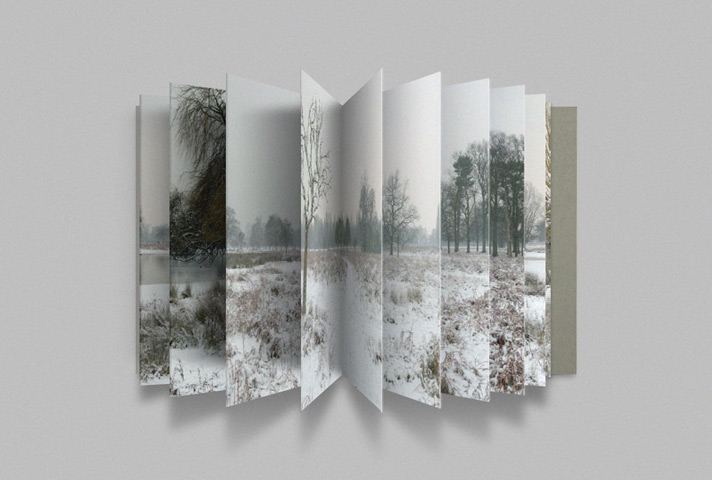
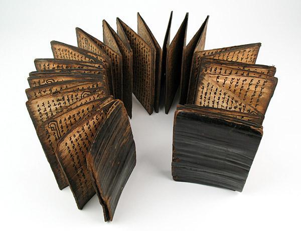
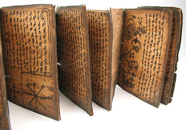
The term ‘leporello‘ refers to printed material folded into an accordion-pleat style. Also sometimes known as a concertina fold, it is a method of parallel folding with the folds alternating between front and back. The name likely comes from the manservant, Leporello, in Mozart’s opera Don Giovanni, who the Famed rogue and lover Don Giovanni (in Italian – also known as Don Juan in Spanish) has seduced so many women that when Leporello displays a tally of his conquests, it unfolds, accordion-style, into a shockingly long list. Many leporellos are used as a way of telling a story, while others are purely visual.

An example of a visual contemporary Leporello and Concertina book.

In the Victorian era, leporellos were quite commonly used as travel souvenirs, depicting beautiful, panoramic scenes of the places travelers had just seen, customs and culture of the region and the like. They are often used in illustrated children’s works, as well. Collectors of books and paper ephemera will love their scarcity and delicate beauty.

790604054_4
Tree-bark manuscript] Batak Divination Book in Toba-Batak language from the end of the 19th Century. Leporello.

790604054_5

Book: The Dailies by Thomas Demand

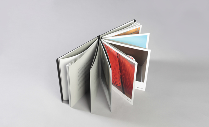
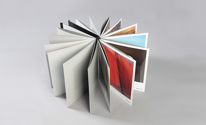
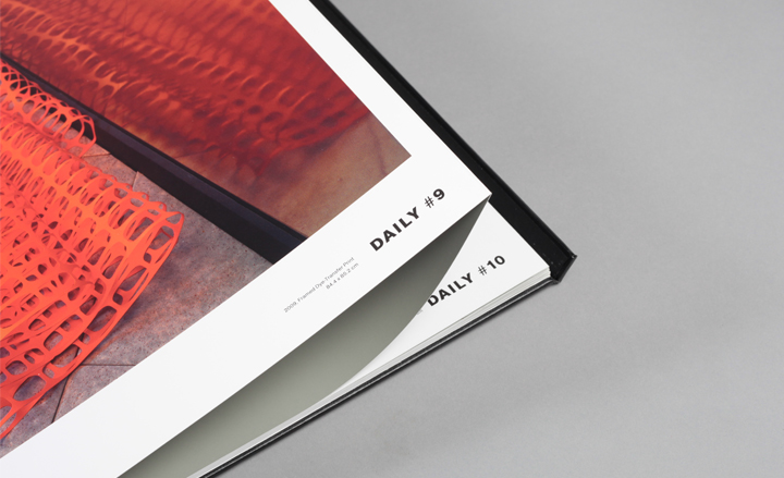
Artist and photographer Thomas Demand partnered with London-based publishers Mack Books to create a limited edition catalogue for his project, entitled ‘The Dailies‘. Demand has created the poetry of the everyday; haikus of glanced objects, dreamlike scenes and liminal locations. ‘The Dailies’, as the photographic installation is called, recalling the daily rushes of a feature film, takes over a whole floor of the building. Accompanying the exhibition (presented by Kaldor Public Art Projects) is a limited-edition catalogue, which Demand produced in collaboration with London-based publishers Mack Books.

04_Thomas-Demand

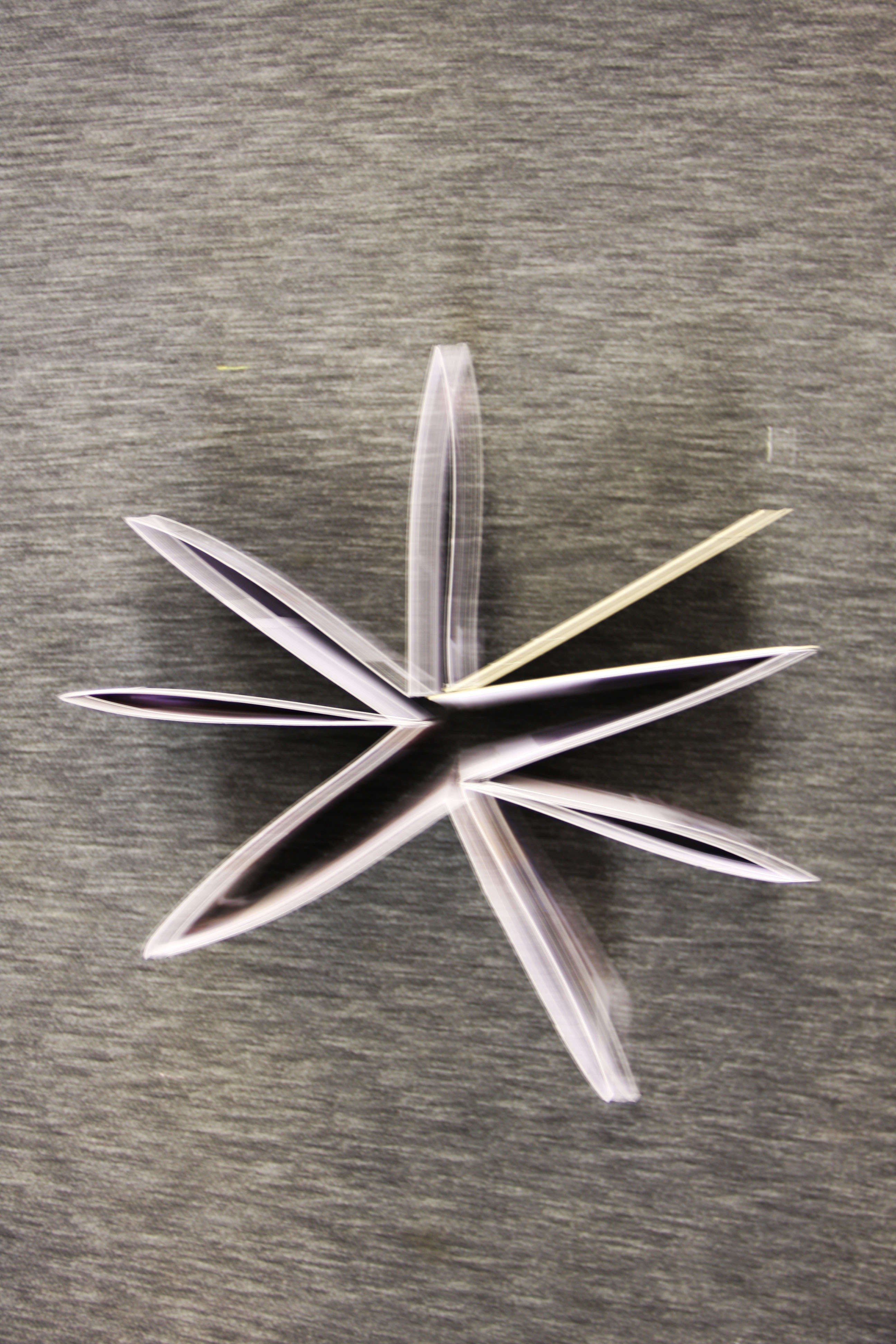
The substantial 32-page volume can be displayed in a circular fashion, appropriated to its leporello binding. Its concertina pages, a nod to the fluted pillars which make up the base of the building, come together to form a 16-pointed star which is encased with a magnetised closing system in faux leather, ‘The Dailies‘ was designed by Naomi Mizusaki of Supermarket, who has worked with Demand on a number of books – such as his most recent publication, “La Carte d’apres Nature“. The photographs that make up The Dailies are of cardboard and paper sculptures. Some 
of them – like the coffee cup caught in a chain link fence or the twist of paper trapped in a grating – speak of transient urban scenes. Other constructions (of windows, doors or changing rooms) are places of passage, not residence; as is the location of the exhibition, a members’ club for travelling salesmen.

05_Thomas-Demand

11_Thomas-Demand

In the CTA building, each of the photographs are framed on the wall of a different room, radiating from a circular corridor. Demand has made subtle adjustments to the contents and fittings so they complement his beautifully melancholic images of life’s lost details. The installation is a collaboration with the writer Louis Begley, author of About Schmidt, who has penned a short story about a commercial traveller’s dream-state visit to the CTA. Fragments of the story, Gregor in Sydney, are printed in each room and on the pages of the book. A unique scent has also been created by Miuccia Prada.

Read more at-  http://www.wallpaper.com/art/book-the-dailies-by-thomas-demand#kXF1HvFXJodlWO3u.99

My Further Interpretations

I feel using the concertina and leporello form would be a great way to narrate a story and a pattern, as well as being able to compare two different narratives exploring my hypothesis of love. By appropriating some of the works like Thomas Demand, I feel this is a good way of using similar skills by comparing ‘non-traditional photos associated with love‘ with those that of ‘traditional‘ love images on the other side, submerging the concept of how they can be cross-contextually similar or even indifferent.

Archival Imagery and Material from the Societe Jersiaise Photographic Archive

During my research process, I thought it would be beneficial to contact the Societe Jerseaise Photographic Archive in Jersey, in order to get a larger perspective towards what ‘love‘ was like historically, and whether it fits my specifications of it being seen by society as ‘truthful‘.

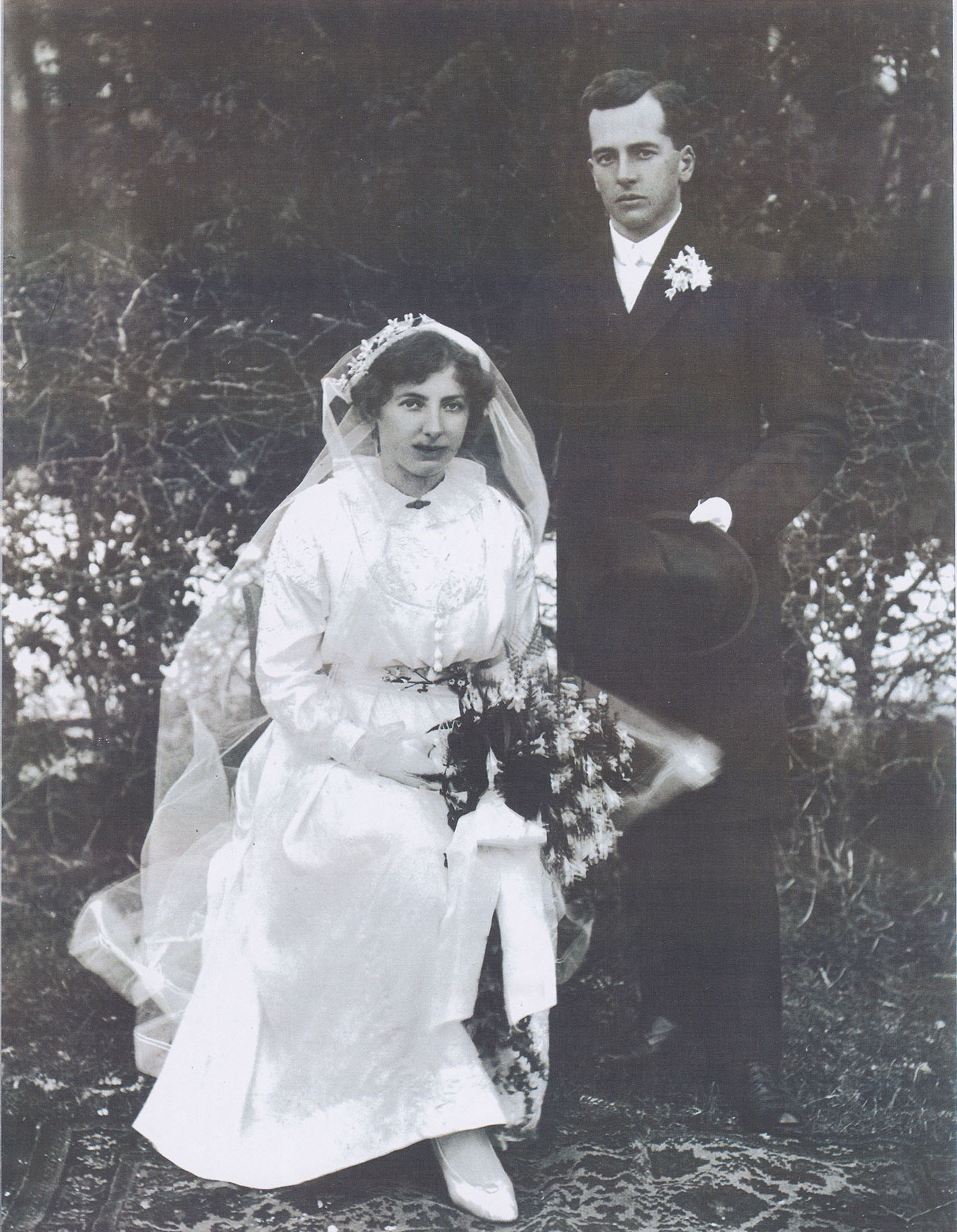
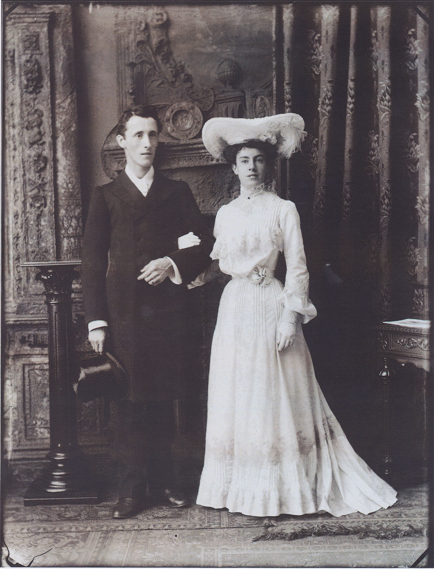
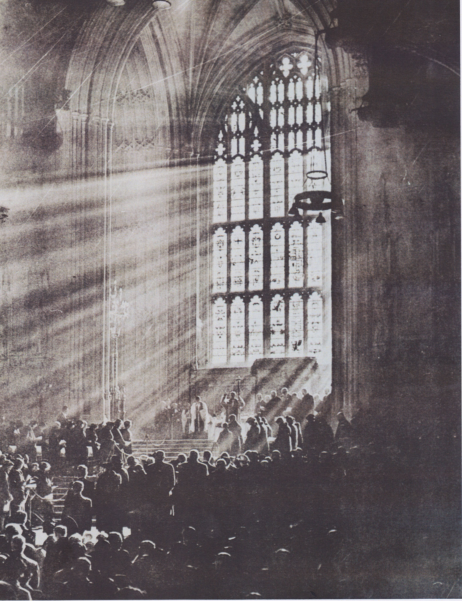
I emailed Karen and Gareth explaining the hypothesis of my project and that I was exploring the perceptions of what love is like in the modern day and our contemporary lifestyle patterns, in conjunction to what was seen as traditional methods of relationships. Gareth suggested I should look into weddings as a good way of approaching love, and I visited the Archival Website and searched up images associated to words like “weddings“, “ceremony” and “Church“. These where the following results:

Scan 100
Image Ref: SJPA/001378, “Wedding portrait of Captain Frank Ahier and Mrs Hilda Ahier, posed in front of hedge in a garden”, dated between 1898 – 1903
Scan 99
Image Ref: SJPA/005699, Studio portrait of young couple, Mr and Mrs Catton of 1 Brighton Villas, St Helier man holding top hat (possibly wedding portrait)”, Dated 1903
Scan 98
Image Ref: SJPA/017688, “Painting or print depicting interior of large church or cathedral, sun streaming through stained glass window, service in progress, with large congregation”. Photographed by Lester Baudains, dated 1955 – 1975. Uncertain copyright.
Scan 101
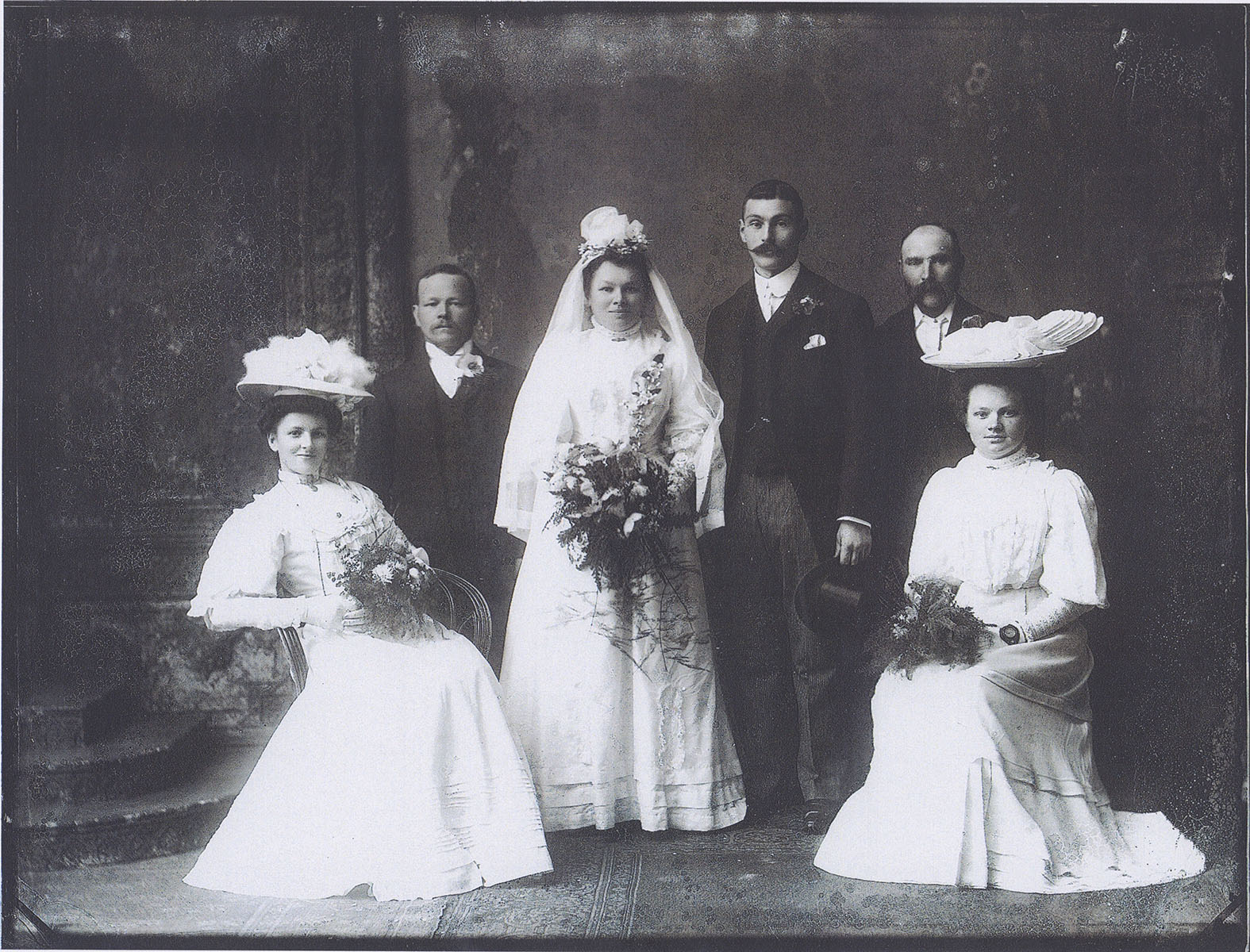
Image Ref: SJPA/005705, “Studio group portrait of Maillard wedding group; bride and groom, two bridesmaids and two men”, Dated 1907
Scan 103
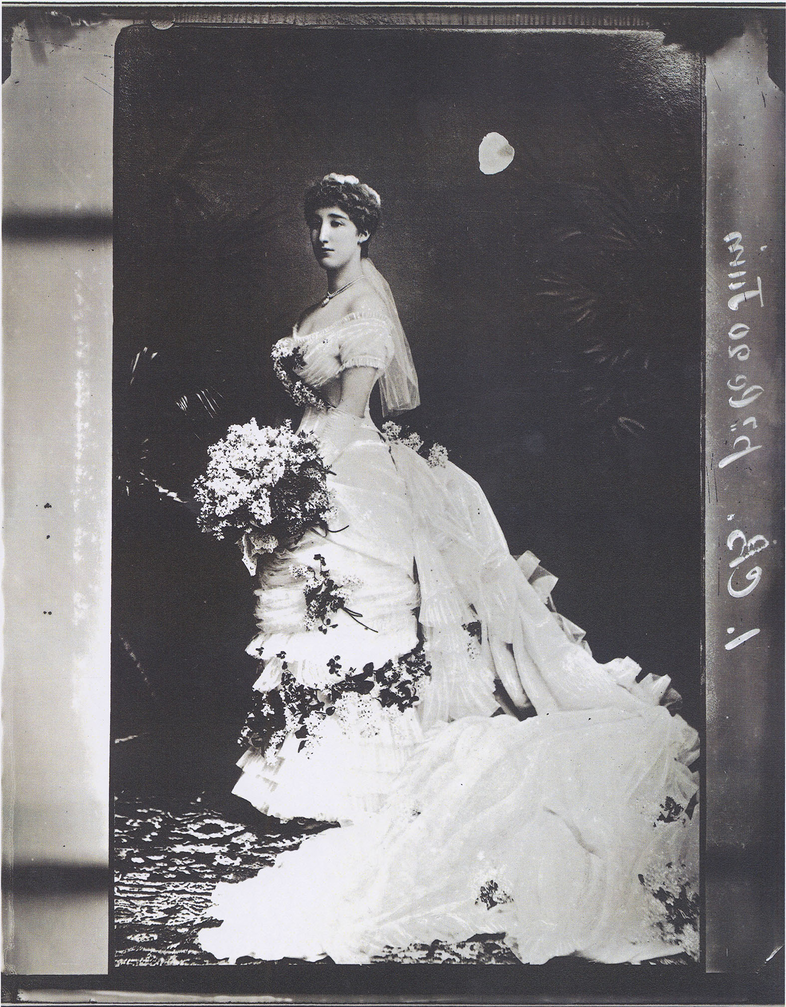
Image Ref: SJPA/001282, “Portrait of an unidentified woman wearing wedding dress with long train, dress decorated with flowers and woman holding bouquet (dated in French 20th June)”. Photographed by Ernest Baudoux.
Scan 102
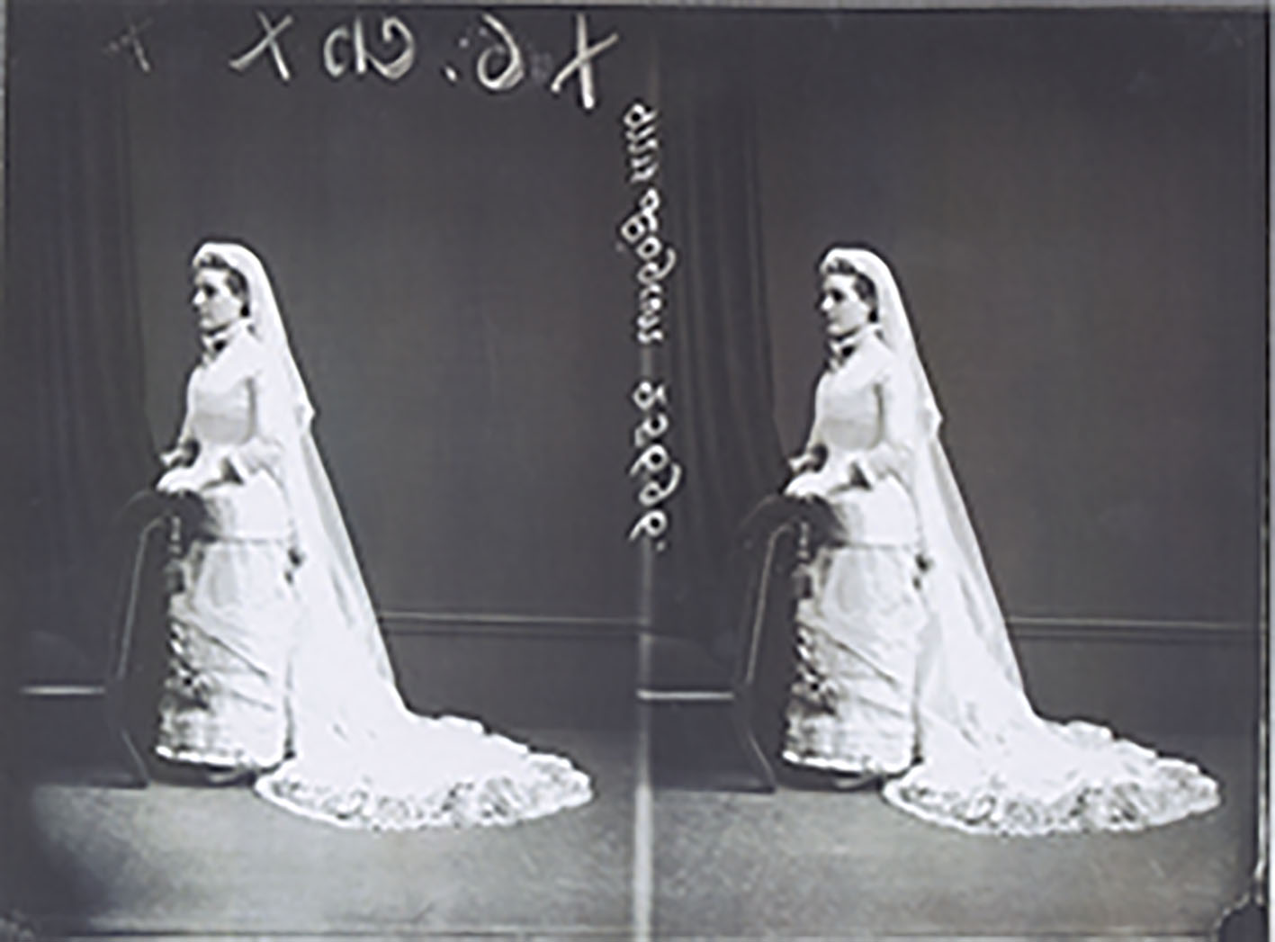
Image Ref: SJPA/000889, “Studio portrait of Mrs Logan wearing high necked wedding dress with veil and long train”. Photographed by Ernest Baudoux.

The Laporello 

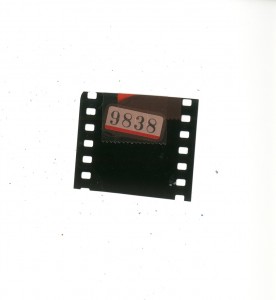
During my time down at the Societe Jerseaise Photographic Archive, Gareth had kept ahold of a archival artefact that had been sitting around for a while within the archive. Gareth kindly allowed me to take the Laporello and to use it at my own will. I think this Laporello is beautiful, and could be something that I use as part of my final piece. The red colouring of the box could be used as a metaphor for Love. Love symbolically can be associated with the colour due to its passionate and vibrant animosity.

Further Research

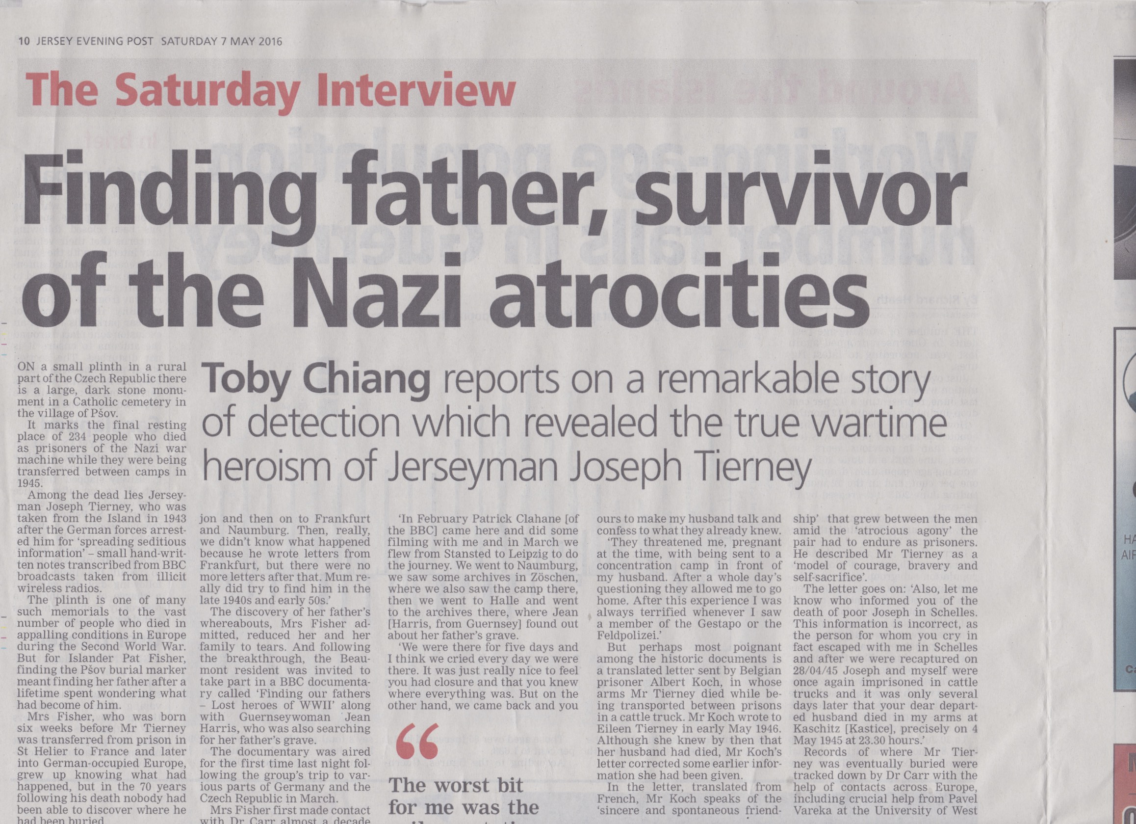
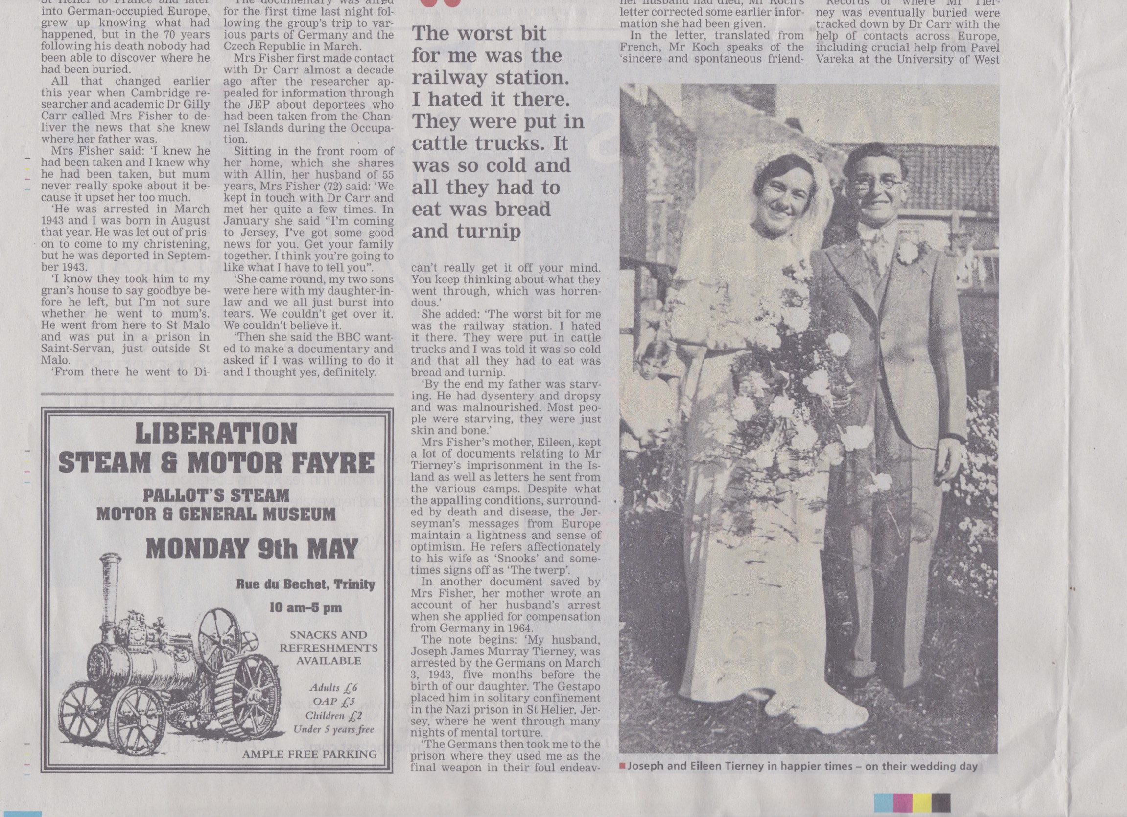
Reading the news paper the other day, I came across an article explaining about how a story of a man names Joseph Tierney. The article reads how Tierney’s death during the Nazi War, is remembered on a “small plinth in a rural part of the Czech republic“, in the village of P´sov. The Jersey Islander was taken in 1943 after the German Forces arrested him for ‘spreading seditious information’ – “small hand written notes transcribed from BBC Broadcasts taken from illicit wireless radios“. The article’s main focus was how Islander Pat Fisher found the plinth in P´sov and discovered the remarkable finding of her father after spending decades wondering what had become of him.

“I knew he had been taken and I knew the reason why he had been taken, but mum never really spoke about it because it upset her so much”.

I felt this article has had quite an influence on my project as this concludes the desperation of communicating with someone when social media is not around. The difference of this is this is not particularly a ‘love story‘ but a story including ‘loved ones‘. This similar concept still speaks the same anthology’s, and that is that the difference between contemporary love and traditional love is obviously comparable. Mrs. Fisher goes on to add how letters where so important in tracing the footsteps of his life:

“Really, we didn’t know what happened because he wrote letters from Frankfurt, but there were no more letters after that.”

Scan 106

The discovery of her fathers whereabouts, Mrs. Fisher added how it “reduced her and her family to tears”, and following the breakthrough, Fisher was then invited to take part in a BBC Documentary entitled “Finding Our Fathers – Lost Heroes of WW11‘ along with Guernsey resident Jean Harris, who was also on the search for her fathers grave.

Here is a link to this documentary:

http://www.bbc.co.uk/iplayer/episode/b079yq31/finding-our-fathers-lost-heroes-of-world-war-ii

Mrs. Fishers mother Eileen kept allot of documents relating to Mr. Tierney’s imprisonment on the Island, as well as letters he had sent round from various camps. Despite the camps awful condition, the Jerseyman’s letters and messages from Europe maintain a lightness and a “sense of optimism“. Mr. Tierney frequently refers to his wife as ‘Snooks‘ and sometimes off as “the twerp“. The note begins:

“My husband Joseph Murray Tierney was arrested by the Germans on March 3, 1943, five months before the birth of our daughter. The Gestapo placed him in solitary confinement in the Nazi Prison in St. Helier, Jersey, where he went through many nights of mental torture. The Germans then took me to the prison where they used me as the final weapon in their foul endeavours to make my husband talk and confess to what they already knew. They threatened me, pregnant at the time with being sent to a concentration camp in front of my husband. After a whole day’s worth of questioning they allowed me to finally go home. After this experience I was I was always terrified whenever I saw a member of the Gestapo or the Feldpolizei”.

I feel this quote really strongly shows how relationships where put under allot more stress during the time of the Second World War. In contrast to our contemporary lifestyles, this shows how these sort of factors seriously compromised the emotional and physical states of what relationships had the envelop.

Scan 107
Pictured: Joseph and Eileen Tierney in happier times – on their wedding day.

“Never in any of his letters does he ever complain. He said all the time, “don’t worry about me, I’m alright” He was so caring. Even in letters some people who had been in prison with him wrote, they said what a caring gentlemen he was”.

Mrs. Fisher is pictured below holding a picture with her father, Joseph Tierney.

Scan 105

Jim Goldberg

Jim Goldberg

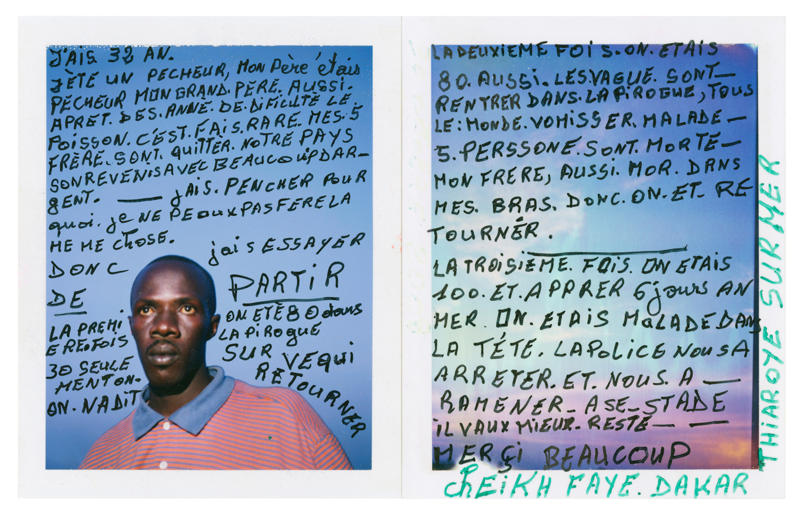
Jim Goldberg was born in 1953 and is an American artist, photographer, and writer whose work reflects a long-term and in-depth collaborations with neglected, ignored, or otherwise outside-the-mainstream populations. Goldberg is part of the social aims movement in photography, using a straightforward, cinéma vérité approach, based on a fundamentally narrative understanding of photography. His empathy and the uniqueness of the subjects emerge in his works as shows by his statement:

“forming a context within which the viewer may integrate the unthinkable into the concept of self. Thus diffused, this terrifying other is restored as a universal.”

Goldberg explores the theme and motif of truth by writing sets of narratives on top of images to dictate a story. This could be an example of false representation as what people can really mean in photographs is not always what the person means in text. This un-reliable narrator shows how this could be a ‘take-over‘ of an image in order to dictate public assumptions from their own interpretation. For instance, the reader is unsure whether or not to judge if the person in the image had written the text or if someone else had partaken on the act. This makes the image in effect un-truthful as especially in Goldberg’s most influential book ‘Raised by Wolves‘ it shows how love had become un-truthful by the way Goldberg writes text on top as another significant medium.

jim

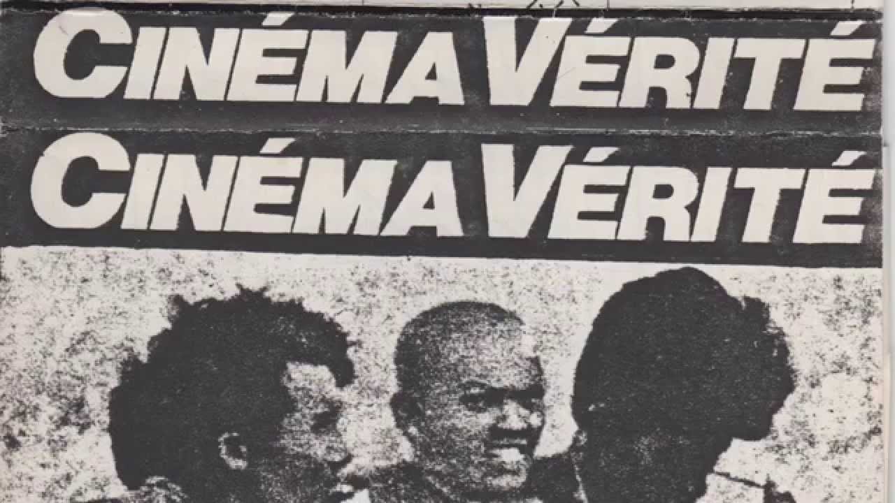
Cinéma Vérité

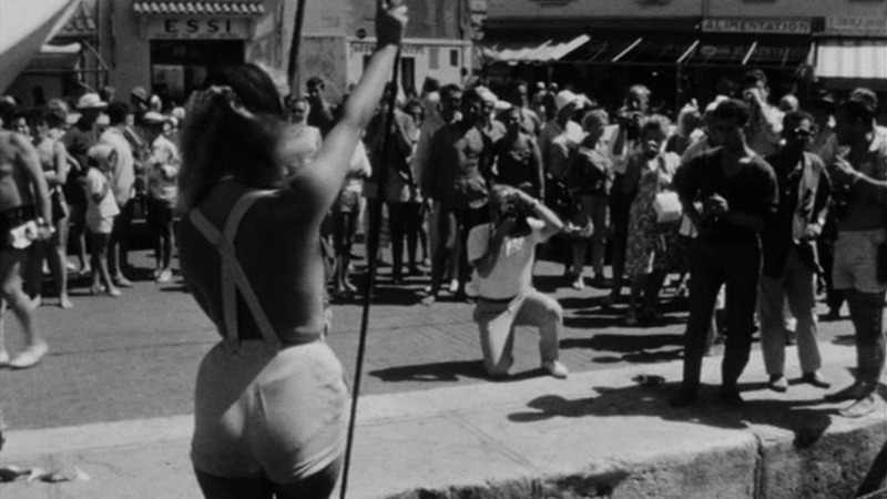
Cinéma Vérité which is translated to ‘truthful cinema‘ is a style of documentary filmmaking, invented by Jean Rouch, inspired by Dziga Vertov’s theory about Kino-Pravda and influenced by Robert Flaherty’s films. It combines improvisation with the use of the camera to unveil truth or highlight subjects hidden behind crude reality.

maxresdefault

A collaboration between sociologist Edgar Morin and documentary filmmaker and anthropologist Jean Rouch, is considered a pioneering work of cinéma-vérité.

Cinéma Vérité in relationship to Direct Cinema and Observational Cinema, It is sometimes known as observational cinema, if understood as pure direct cinema: mainly centred without a narrator’s voice-over. There are subtle, yet important differences among terms expressing similar concepts: Direct Cinema is largely concerned with the recording of events in which the subject and audience become unaware of the camera’s presence: operating within what Bill Nichols, an American historian and theoretician of documentary film, calls the “observational mode“, a fly on the wall. Many therefore see a paradox in drawing attention away from the presence of the camera and simultaneously interfering in the reality it registers when attempting to discover a cinematic truth.

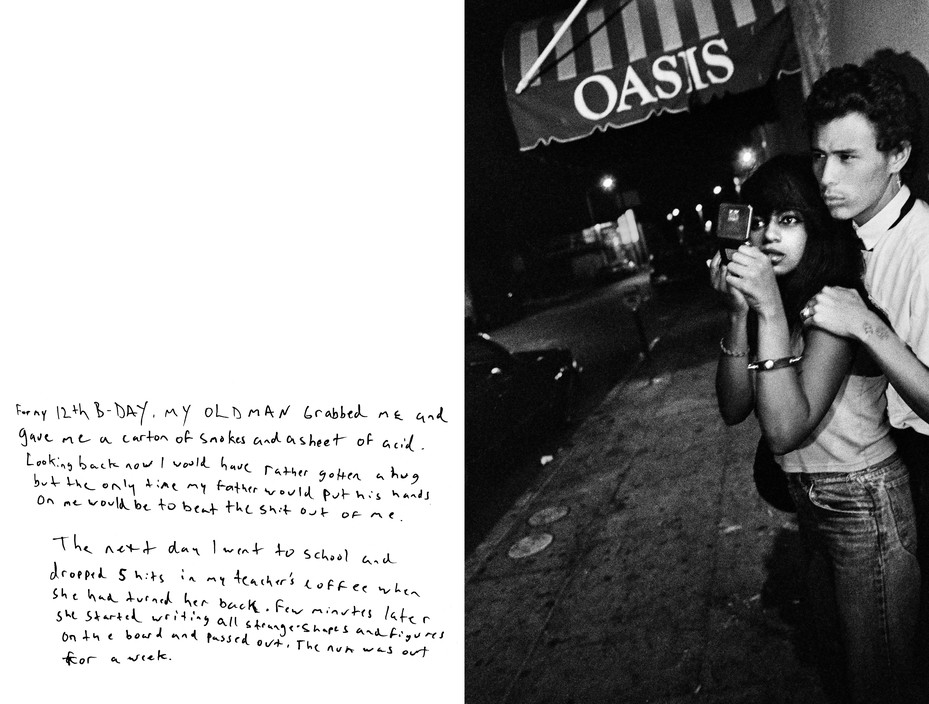
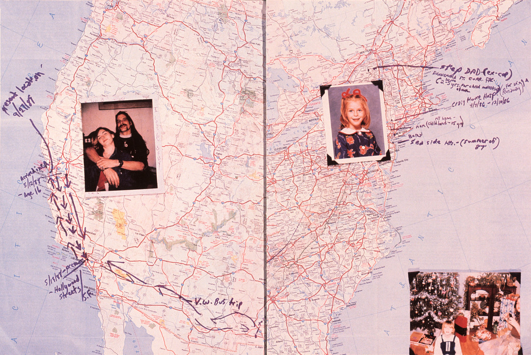
Raised by Wolves 

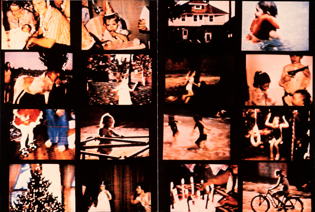
Predominantly considered Goldberg’s most seminally influential project, Raised by Wolves combines ten years of original photographs, text, and other illustrative elements and mediums which include: (home movie stills, snapshots, drawings, diary entries, and images of discarded belongings) to document the lives of runaway teenagers in San Francisco and Los Angeles.

USA. San Francisco, California. 1991. "Dieter."
USA. San Francisco, California. 1991. “Dieter.”

Review: Cororan Gallery of Art

A review of the exhibition at the Corcoran Gallery of Art noted that Goldberg made reference to other artists and photographers; used photographs, videos, objects, and texts to convey meaning; and

“let his viewers feel, in some corner of their psyches, the lure of abject lowliness, the siren call of pain.”

Although the accompanying book received one mixed review shortly after publication, it was described as “a heartbreaking novel with pictures”, and in The Photobook: A History, Martin Parr and Gerry Badger praised it as

“complex and thoughtful.”

USA. Hollywood, California. 1989. "Oasis"

USA. Hollywood, California. 1989. “Oasis”

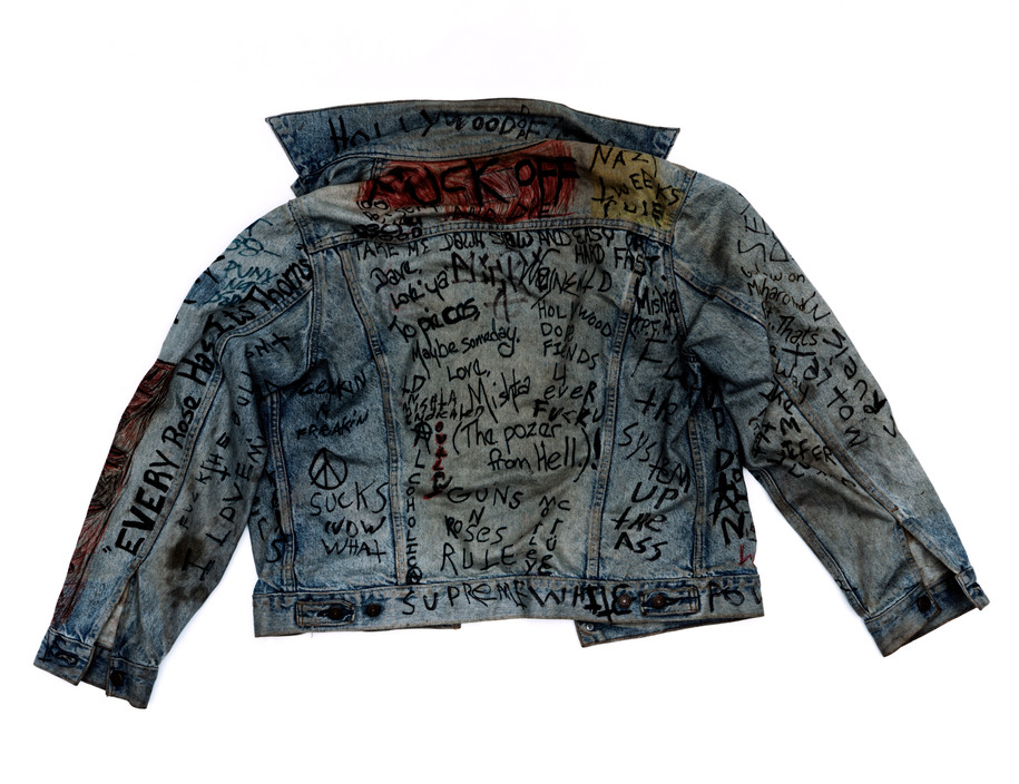
USA. Hollywood, California. 1991. Dave's jacket.
USA. Hollywood, California. 1991. Dave’s jacket.
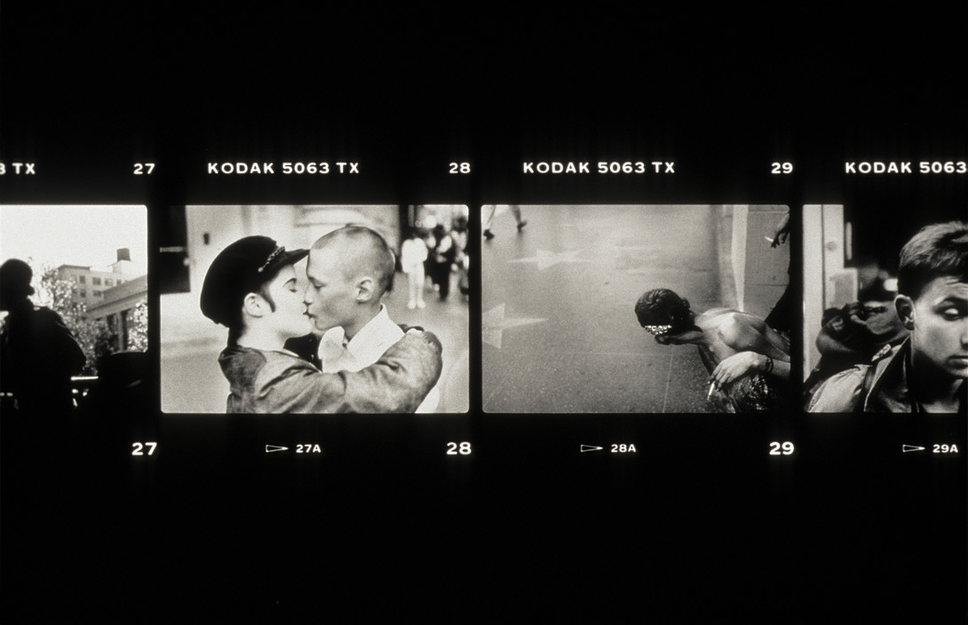
USA. San Francisco, California. 1986-98. "Hollywood and Highland."
USA. San Francisco, California. 1986-98. “Hollywood and Highland.”

In this series, Goldberg has a knack for focussing in on the pleasures of different mediums and material, his attention to the use of mixed media such as polaroids, the use of archive and a variation of portraits and landscape imager allows the reader to get a rounded glance of the havoc presented in a stereotypical teenagers lives.

USA. San Francisco and New York. 1989. "Echo's Map."
USA. San Francisco and New York. 1989. “Echo’s Map.”
USA. New York. 1995. "Echo's Home Movies."
USA. New York. 1995. “Echo’s Home Movies.”

Here is a short story of Goldberg’sRaised by Wolves‘:

San Fransisco Museum of Modern Art

Jim Goldberg discusses the larger stories told through his photography practice:

Shoot 7: Investigating non-traditional Love: Holly

Holly

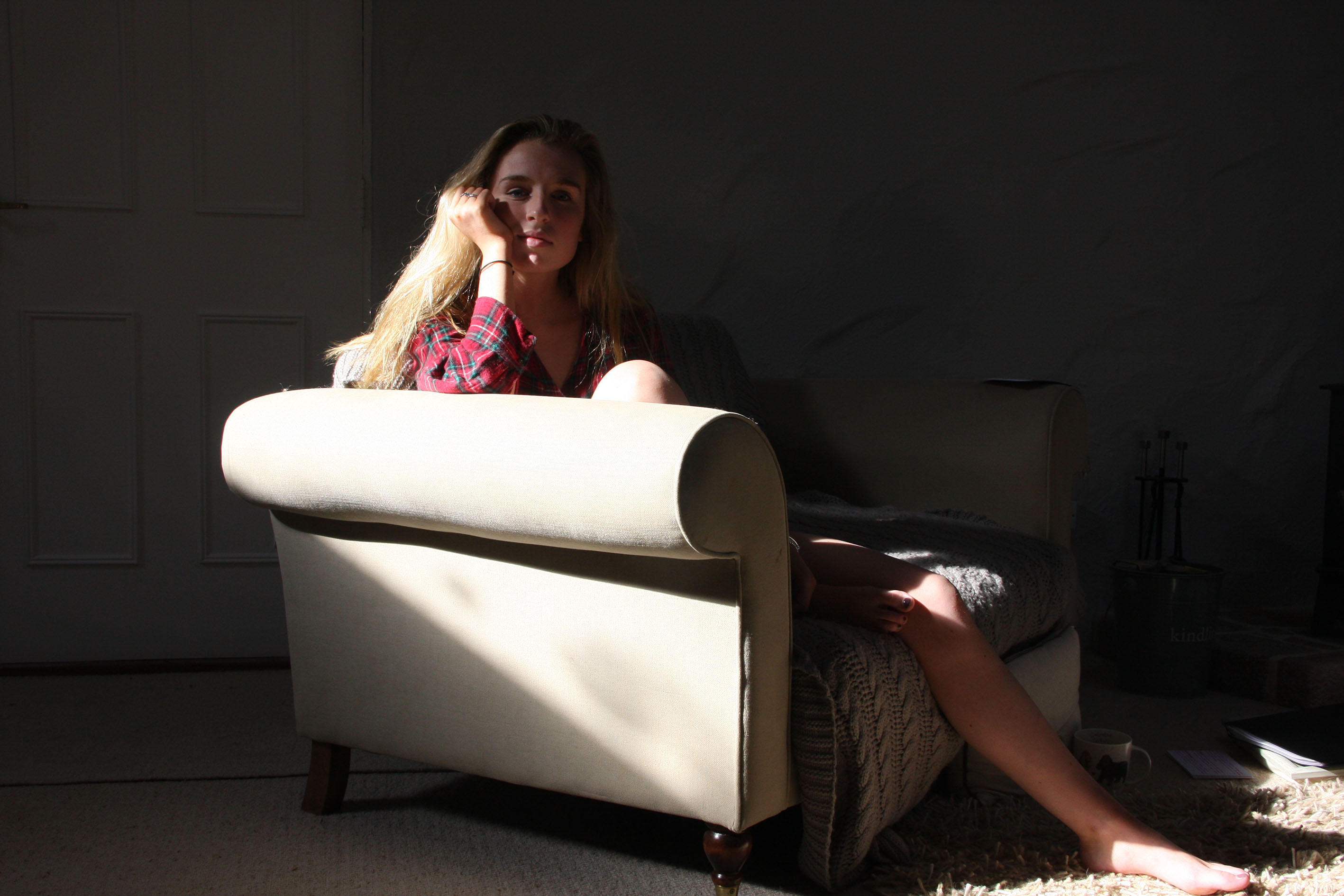
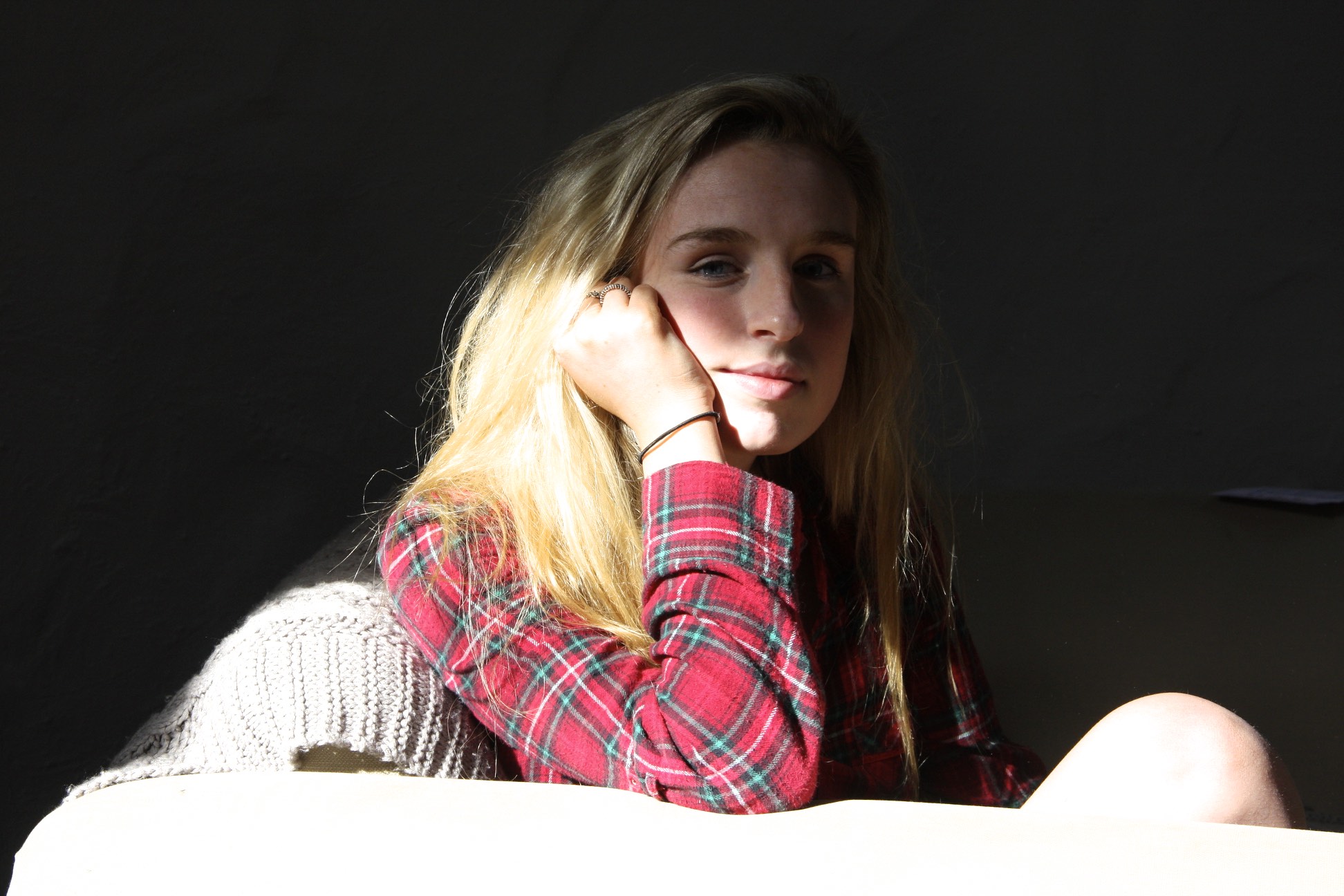
The final shoot commencing my images of Non-Traditional lobe was of my best friend, Holly. I composed these images of Holly alike everyone else, to create repetition and coherence with the realism I wish to create and adapt upon. The first images I composed of her was her wearing her usual, and chilled clothes. Within her house there is a room which is lit purely by natural light, coming through large window which overhang like a skylight. I thought I could play around with this effect as the uses of shadows could be used to symbolise the darker meaning of ‘truth‘ but in a more symbolic and metaphorical way.

IMG_1004

I composed the first image (as seen above) of her sitting in the sofa with a sort of hidden appeal. This is contrasted with the image below, as the harsh over exposed light could reflect Holly as a dual character. Te absence of light in this sense, (the above photograph) can show the darker side of her truth but the bottom a more realistic image. If Holly was to upload these images I’m sure the reader would grasp a sense of ambiguity.

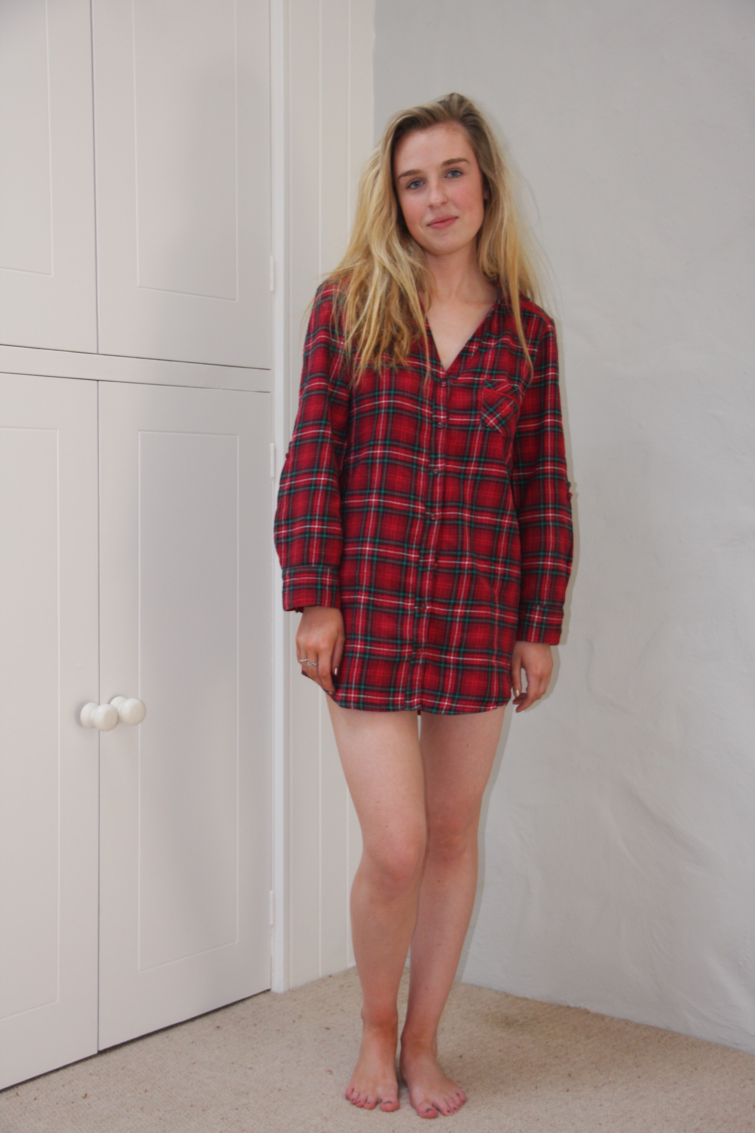
IMG_0998

I wanted to frame this image (above) as a full body shot as I felt the image before was quite restrained by the way I used the sofa. I defiantly wanted to create this contrast in order to represent the truth behind herself as I feel if she was wanting to pursue herself online she is able to do so with the rounded qualities she is demonstrating in all photographs.

The next image (below) shows the first image agin but different in a way that I’ve composed this as more of a close up shot. This differentiation falls under how the reader is unable to comprehend where about this image is taken, and therefore is unable to interpret or relate to it as they are fixed on Holly to give a narrative for the photo to become compelling. I think this is why the use of light and dark with shadows and light is so effective, as the reader can critically acclaim Holly as a character who is mysterious yet significant in a way they don’t know what the purpose of herself is. This is not to say Holly is being perceived as a boring or mundane character, but one who is normal instead of staged in order to reflect her inner self. Yet, at the same time, she is ironically being staged to not being staged, releasing the truth within itself – the reader doesn’t know who or what to trust.

IMG_1003

The next image of Holly was one that I composed in her bedroom. I felt the more light in these images would allow the reader to understand her character more, as well as giving her personality a more realistic approach. I composed Holly to wear different clothing for this one in order for this reaction to be catalysed.

IMG_1018

The final image I took was of Holly outside wearing her normal casual wear. Putting the image in black and white, could re-alliterate what I mentioned earlier about how the truth is manipulated within a photograph by its attention to contrasting colours.  Holly’s warming stance can give the reader the idea of how she is a friendly and kind character and can see the journey thats progressed in order for people to become ‘attracted ‘ to her, as people are attracted to different things.

IMG_1025


Shoot 6: Investigating non-traditional Love: William

My next shoot I did was focussing on my friend, William, and his alternative lifestyle. I wanted to compose these images of William at his home, as he spends most of his time there. My main aim was for the reader to understand how William’s character can be asserted if these images were to be used on an Online Dating profile, such as Tinder. I have composed these images of William wearing his usual wear, smart wear as well as laid back wear, in order for the reader to elaborate upon his well-rounded and significant character.

A Casual Setting

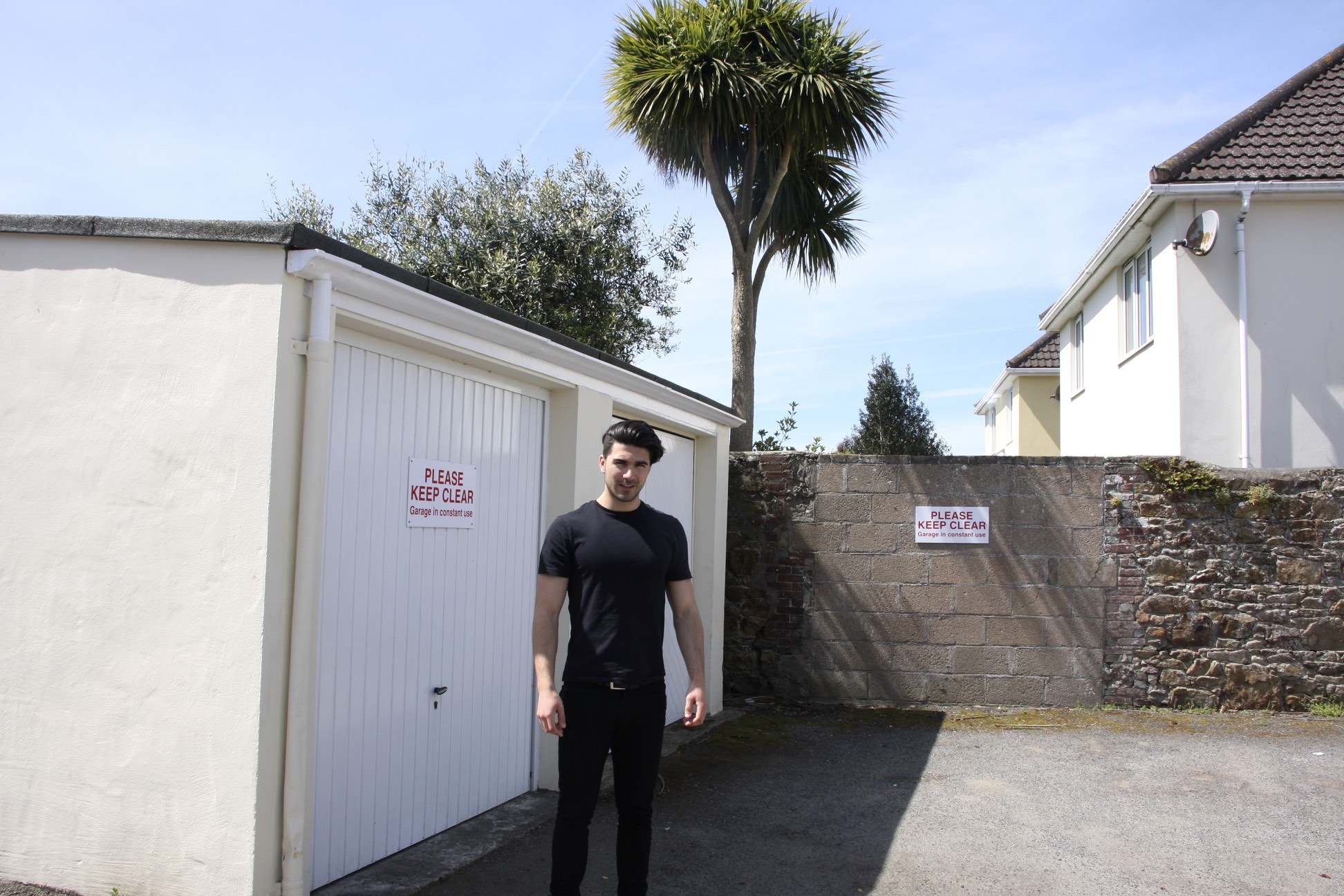
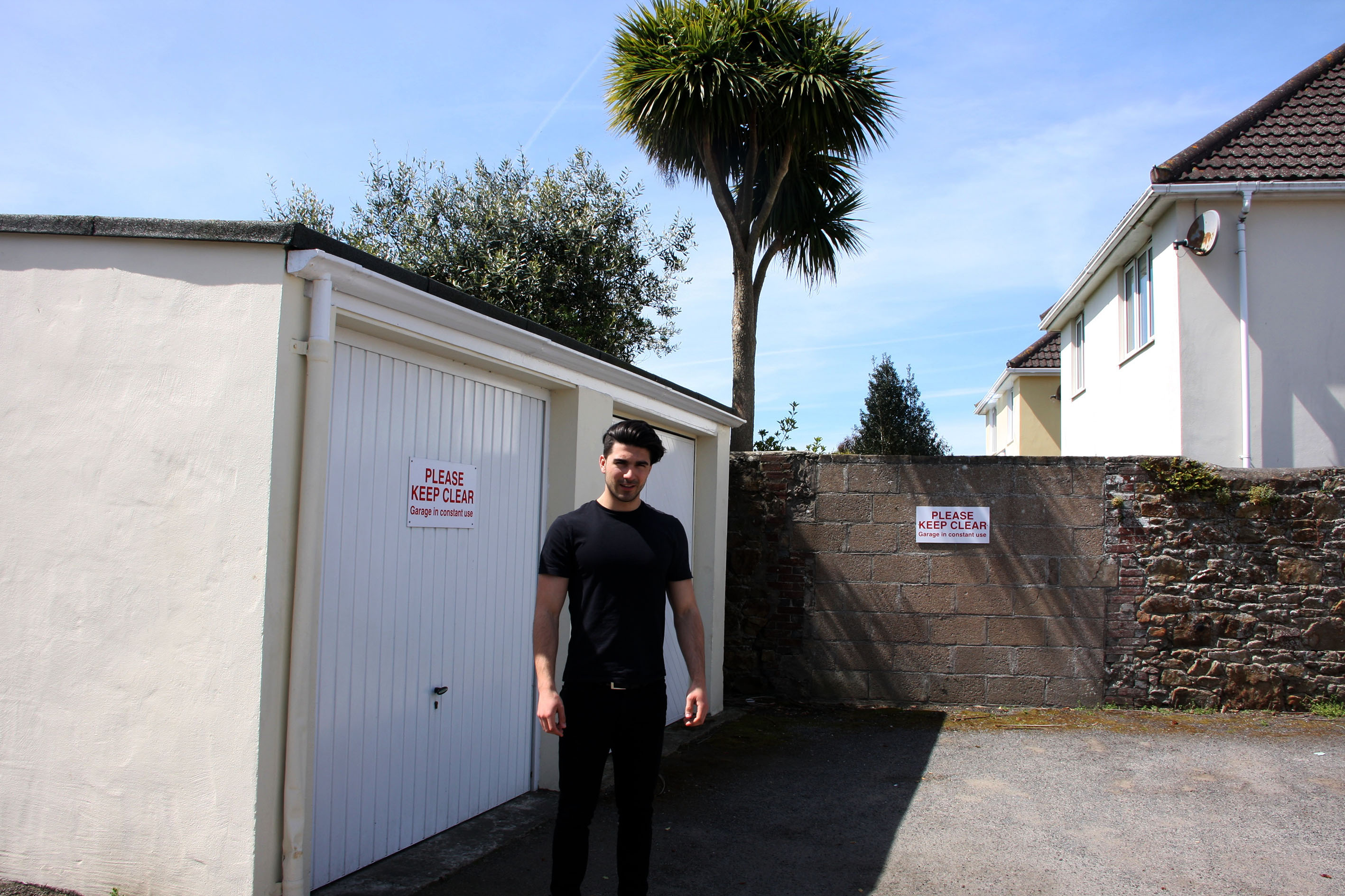
I composed this image of William in his back yard. I felt this was a good location to capture ambiguity as I felt the palm tree really illustrates how William can be seen in a different place to that of reality. For instance, a palm tree is usually accosted with tropical or hotter climates. Being this element the first thing the eye sees, the reader can work their way down to William to show how the ambiguity is shifting, as the reader is unaware of who  this character might be.

IMG_0952

I then began to take a range of closer range shots, yet drew the ambiguity in a different way by covering the way in which setting isn’t very clear, as the sky doesn’t give an indication of where the location could be.  I felt if the image below was used to document William on an online dating site such as Tinder, the reader would feel confused as to what he personality is like. Because the image is set in a mundane mise-en-scene, the connotations a reader can draw from this are simply sparse, dictating this as an ambiguous representation of his person. By capturing other images alike this one, I felt the significance of his personality would simply end up becoming more rounded, as the reader is able to relate to him more.

IMG_0956

Smarter Wear 

I captured this image in William’s bedroom because I really thought the dominating red colour could be used in order to signify how ‘red‘ is usually associated with ‘love‘. Red is the overshadowing element within this image and I thought I could contextualise with theoretical stereotypes in which people are able to characterise him through his appearance and the setting that’s around him.

IMG_0967

I prefer the above shot to the one below as the reader gets more of an insight into what William is really like; his bedroom is quite messy so it could show the ironic juxtaposition between his smart appearance to his messy actions. If William was to upload a realistic image like this one, people might be turned off by the fact he shows his messy lifestyle, which is in fact, his real one. What I tried to pursue the most out of these shoots was definitely the masking of people’s profiles on social media and online dating websites.

IMG_0973

William’s Laid Back Approach

I composed these next images to show more of a background into William’s teenage lifestyle. Using his car as an example shows his independent ways could be shown by his freedom to do whatever he desires. This aspect, however, could come across as misleading; The approachable attitude can show he is mature as well as a teenager. This whole concept I feel has helped to capture William in various lights in order for the reader to critique him as no necessarily a ‘type‘, but a well rounded and a multi-visual character.

IMG_0984

IMG_0990

Evaluation

Throughout this exam theme of truth fantasy or fiction, I decided to predominantly on the aspect of truth (more specifically, the truth behind closed doors). My first research point was getting into contact with the women’s refuge in Jersey and seeing if meeting could occurs in which I would be able to learn more about the help that is available in Jersey. After thinking that it was not longer a possibility by not getting a response, I decided to just focus on the stories that I have been told by friends (with their consent), and found the photographer Donna Ferrato, whom I found highly inspiring. I couldn’t believe the work she produced and it encouraged me to produce staged images. I then came across a photographer called Daria and her visual outcomes were really inspiring for me. I responded to her by creating my own body of work which experimented in the style that she used. There was also another photographer (Valerie) who was also very important and influential throughout my work, as I used statements that she had shared to represent the voices that had been heard.

Very close to the exam the women’s refuge contacted me and although there was no time to create anything visual from this, I found out lots of information thanks to the chairman of the organisation Pat.  It would have been very beneficial to have spent more time on the topic of the Jersey refuge for women and It would have been interesting to get to know more of the volunteers more personally and explore their roles within the organisation but I am glad that I got a change to know more about the organisation personally.

Overall, I am quite happy with the outcome of this project. At first, I was quite nervous as this is such a touchy and intense subject and I was afraid of doing something that would offend someone somehow, however I think I did okay and I am happy with the experiences and experimentation’s within my body of work. If I could go back and improve this project, I would probably create more shoots to have more of a variety of images to choose from to create a final outcome.

OUTCOME 2

IMG_4423

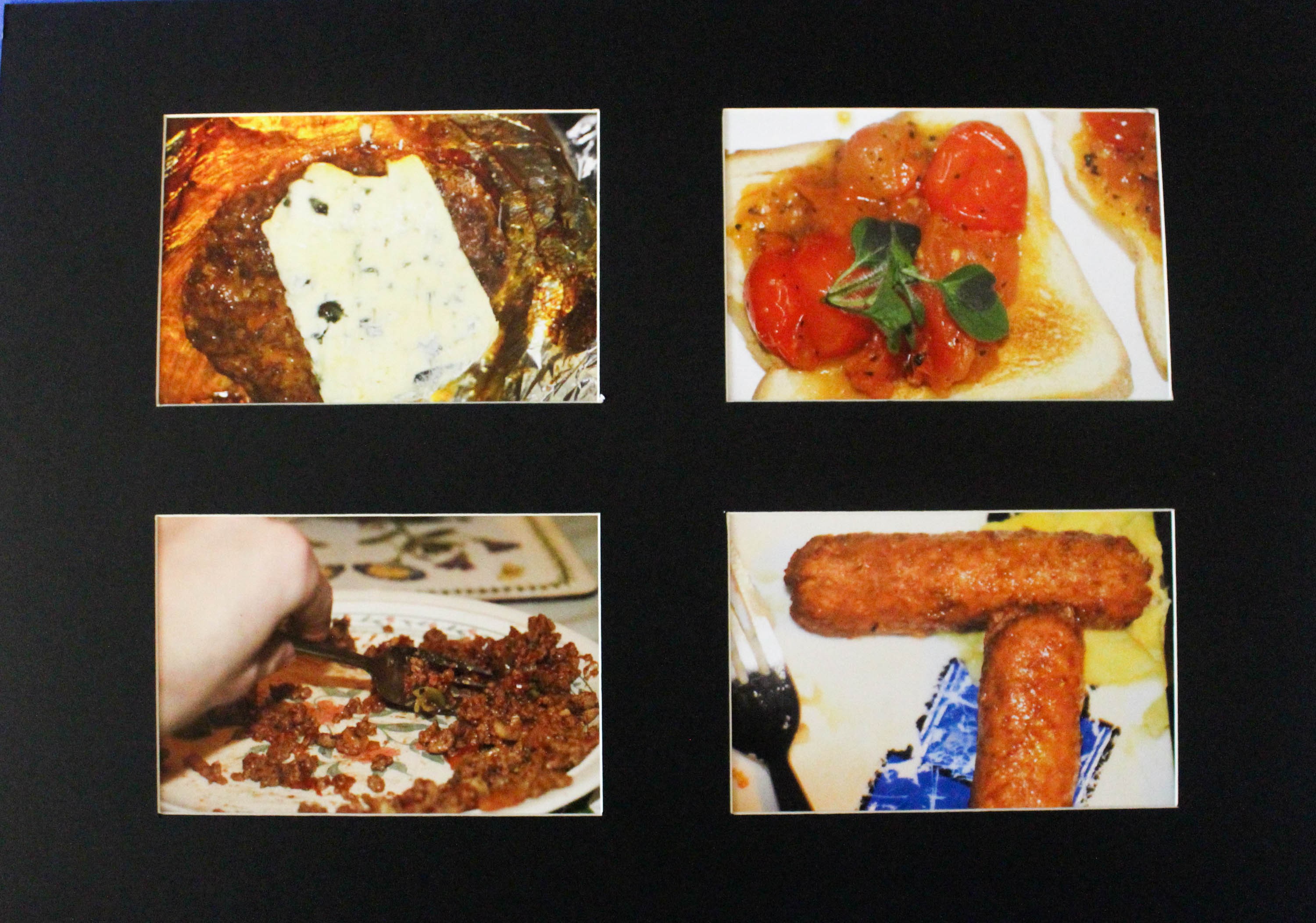
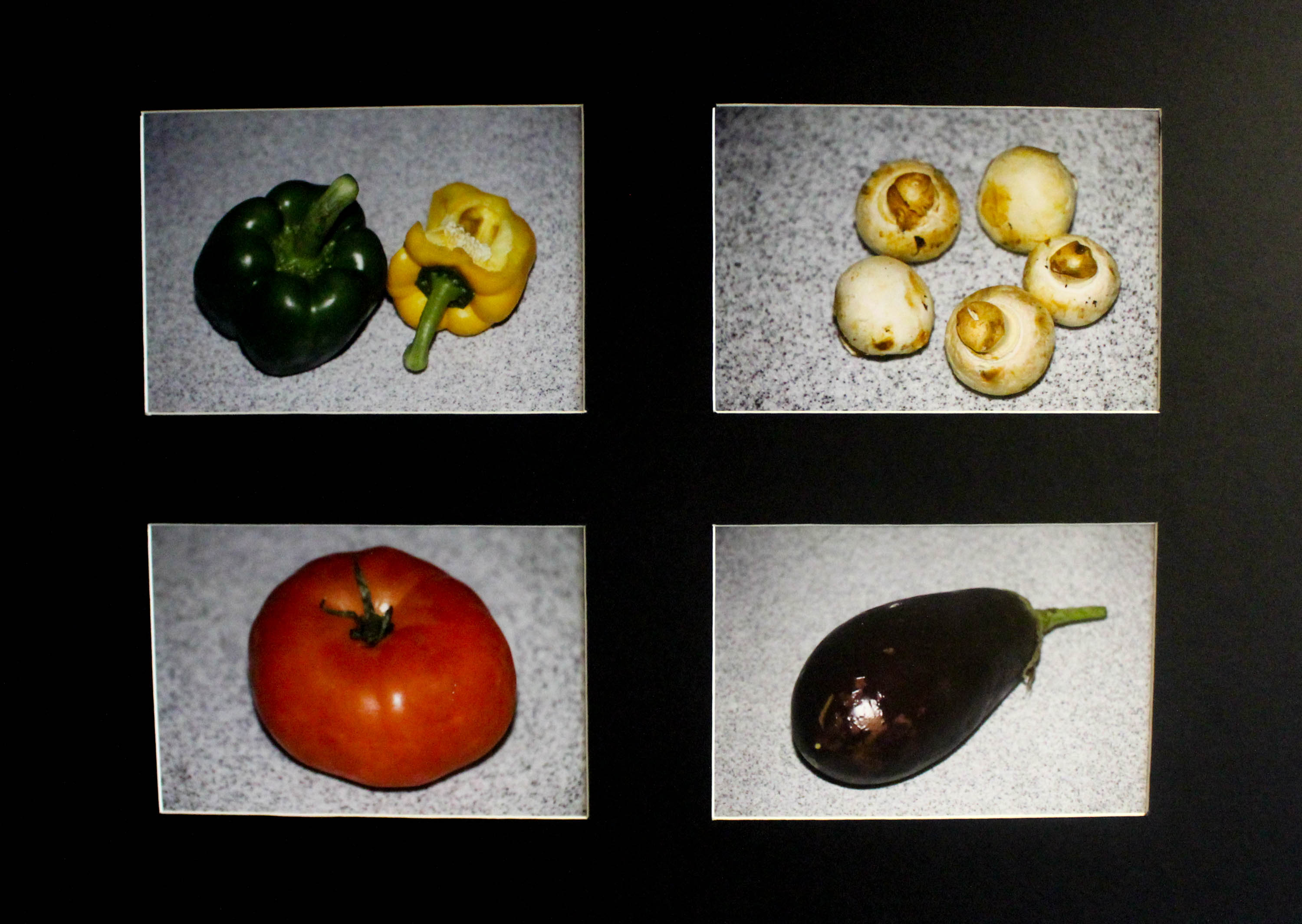
This second outcome is a typology of 4 images which I have taken of food whilst it is being eaten. The intent of this was to show a collection of very daring and vulgar images taken to deliberately look bad, a more extreme version of the vernacular, often associated with the likes of Richard Billingham.

The resulting images subverts the typical view of looking at Jersey produce by showing it in an mostly unpleasant and unappealing light. Whilst this image subsequently gives a alternative viewpoint, it is not necessarily correct that this is in anyway more true, because it has like advertising images would be, manipulated to suit an agenda, in this case the opposite of the intent to appeal to the viewer.

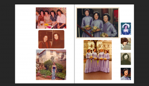
The Life of a Guegan

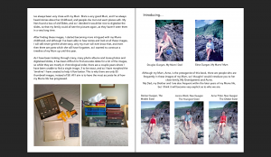
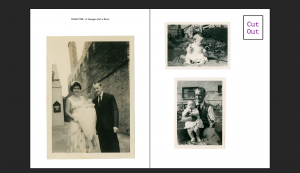
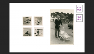
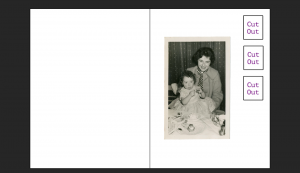
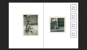
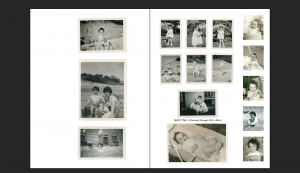
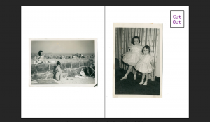
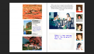
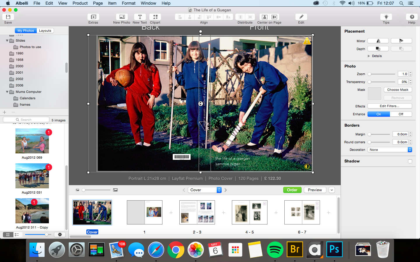
My photo book is titled ‘The Life of A Guegan’, which was my Mums first surname. I decided to use this because even though she is now married to my Dad and has the surname Pitter, she will always be a Guegan, and takes pride in that Surname.

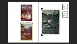
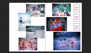
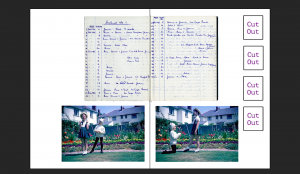
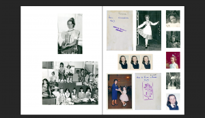
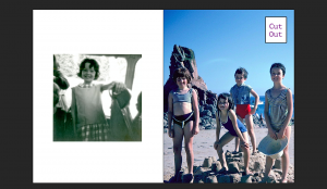
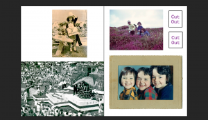
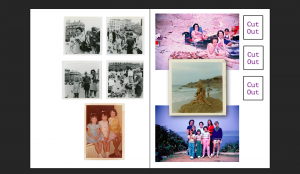
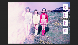
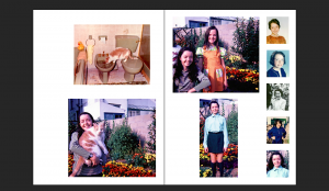
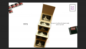
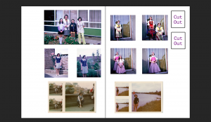
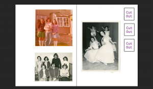
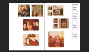
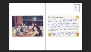
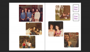
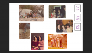
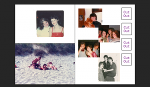
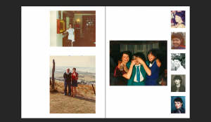
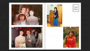
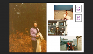
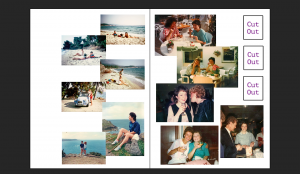
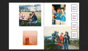
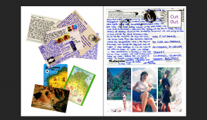
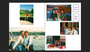
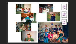
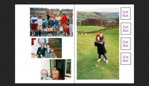
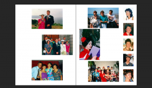
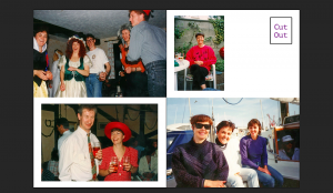
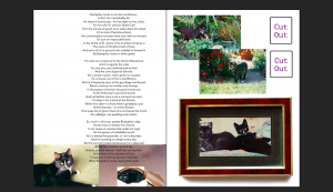
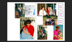
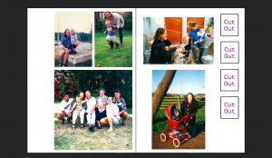
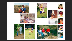
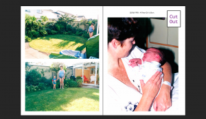
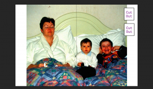
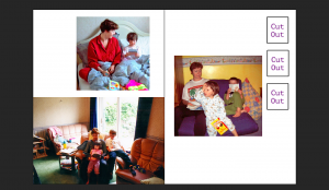
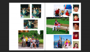
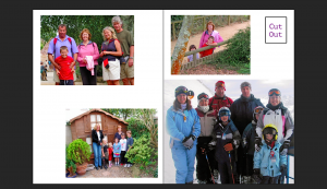
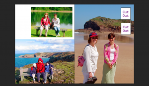
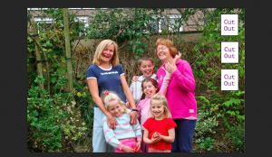
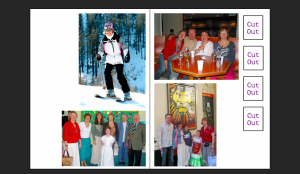
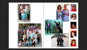
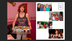
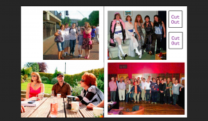
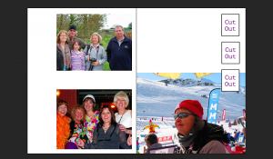
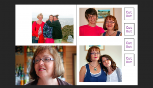
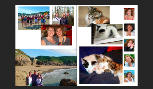
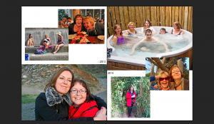
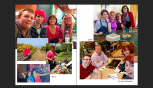
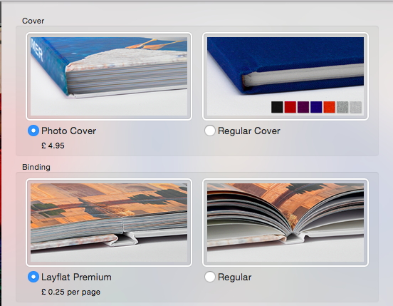
The photo book has 120 pages, and explores all elements and years of my Mums life in a few forms and although the book is ready to print, it will not be completed until I receive the printed book and have cut out all the squares within the book marked ‘Cut Out’ (all 110 of them). Although this process will take a lot of time, I think it will be really worthwhile and I don’t regret my choice to include this feature throughout my whole photo book, which was inspired by Rita Puig Serra-Costa’s book, Where Mimosa Bloom.

This book is something which I’m already very proud of and my Mum and I (and the rest of my Family) are very excited to see the physical version of it, and treasure it forever as the most accurate lie about what my Mums life was like.

It will never be the truth. The book was heavily edited by me. I made so many choices of what images to include, which images should be the thumbnail to represent my Mum from that year, how he images should be layed out, what writing should be displayed. A lot of the images were slightly edited (making them transparent, changing the size slightly to fit the page properly etc) and are no longer the same images they are as their original physical prints or slides. The images aren’t in their proper correct order, in the same way that its sometimes hard to get memories in the right order, as they get more confused the further away they get from the current day. They will never show completely what my Mum was thinking or feeling, even my Mum will never remember all that.

The truest this book will ever be is when I look through this book with my Mum and my Family and my Mum will tell stories behind certain images, and where the images were taken and who the images were taken with, which will give an extra dimension to the book, one that can only be achieved by the presence of my Mum.

Project Review – Evaluation

When i first started my project and seen the theme was ‘Truth, Fantasy or Fiction’ my mind went blank, i was so unsure about what i was going to do and it worried me, but after i researched the words a bit more and looked into it i knew that i could think of my own idea and then try and adapt it into one of the three words. The word i was leaning to the most was fantasy as i knew i could try and create my own fantasy world through the use my camera and Photoshop. After i had thought for a while and done a little more research i knew i wanted to something involving the use of colour as my last project was very dark and black and white oriented. This is when i started to research photographers that revolved around colour and came across some nice photos which i knew i wanted to recreate and experiment with. 

If i could change anything or if i had more time then i without a doubt i would’ve taken more photos/shoots, my lack of shoots meant i wasn’t able to experiment as much with my photos and show the best of my ability. I’m happy with the shoot that I’ve got but i know if i was to do 1 or 2 more shoots, i could have came out with some better finals and i would have had more photos to try and alter in Photoshop to recreate some of the photographers work that i researched.  Another thing i would’ve done if i had more time was reach more into the surrealism side of my project, i attempted a small experiment with the photos i had but it wasn’t really surrealism and it interested me also so i feel i could’ve come out with some good finals for it. 

As a project overall it has been mostly successful and i have enjoyed doing it, there was some problems i ran into however i have attempted my best at working around them and finding the best possible solution. I feel i have grown as a photographer and the project has helped me develop my skills and shown me new skill sets that i didn’t know i would have before i started.

OUTCOME 3

IMG_4426

These four images are put together as part of a mini-series I looked at over the course of this project, attempting to photograph different Jersey produce in a way reflective of Martin Parr, close-up and using flash.

I like this collection of images in combination because they show a variety of different vegetables together, which is interesting because of the level of focus and development to such a basic and simple concept.

The images are striking in the sense that they are highly colourful, with a balance of rich colours such as purple from the aubergine, red from the tomato and green/yellow from the peppers. This brightness draws the viewer immediately into viewing the typology with a degree of interest and intrigue, with such a balance of colours holding the visual aspects of the four images together.

Overall final outcomes

Throughout this whole project, I have decided to select the following as my final outcomes:

IMG_5725 IMG_5700IMG_5734

With regards to presenting these images, I plan on using a triptych approach. I want these images printed out on quite a small scale because I think that that it is what would look best. These images were taken in response to a situation that my friend was in and I think I represented certain aspects within the story successfully.

The other outcome I have decided to present are these:

I plan on presenting them as a little series on foam board, and underneath I plan on having the statements (on their mouth) underneath each individual image. I think this body of work is quite strong and emotive and am happy with the outcome of this series.


OUTCOME 4

IMG_4428

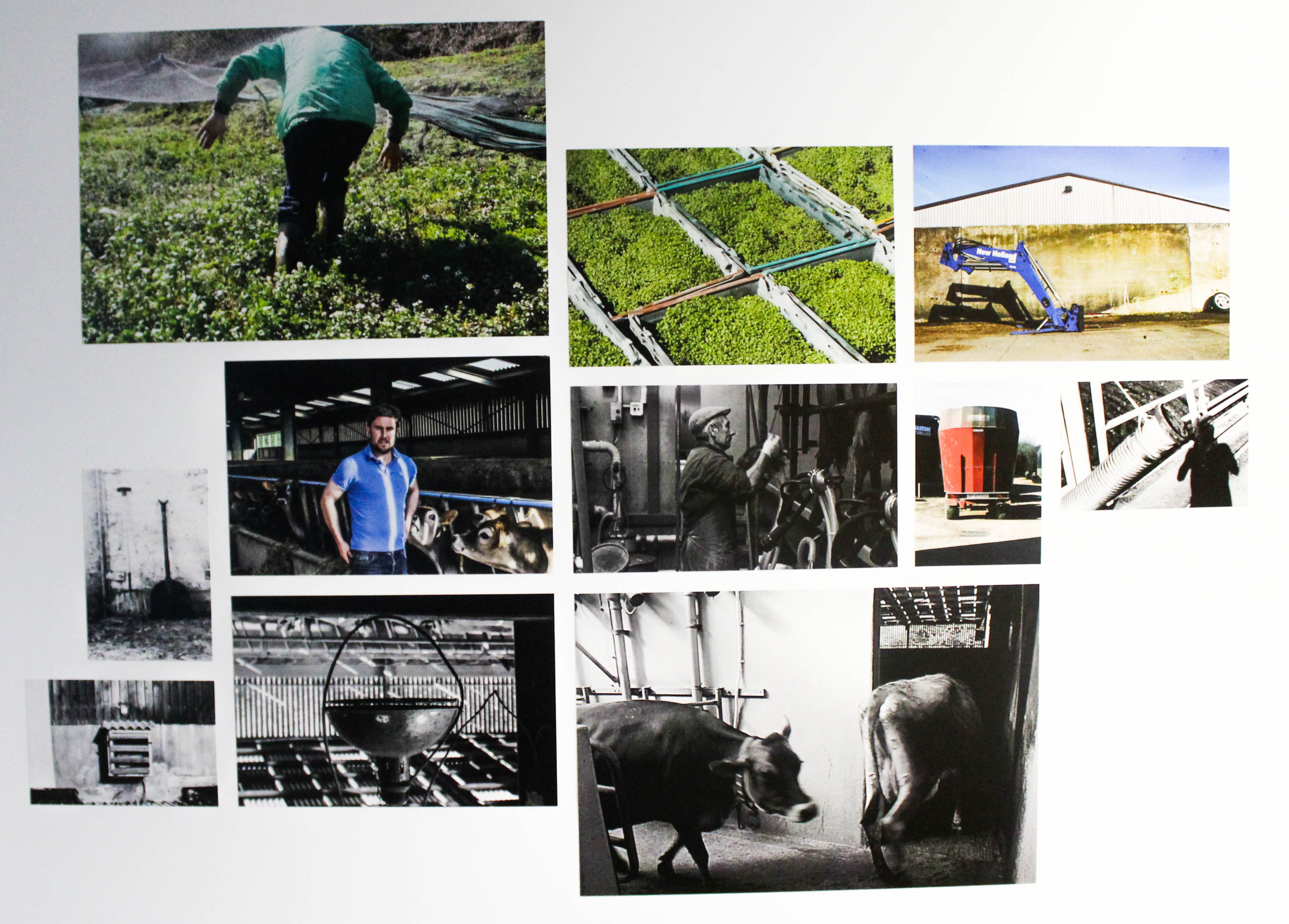
This is a storyboard of images  made using a foam-board mount. The images I have used are the best compilation of images taken from the Henk Wildschut farm style shoots that I have completed.

I find that the way the images have been sequenced help to tell a very colourful and lively observation of my experience on the farm, as the images all seem to display a degree of intensity through two different features, bright colourful images, with more reflective black-and-white images.

In addition, the colour images combine with the grainy and vernacular black and white images to create a story which balances a contemporary and nostalgic feel, thus linking the cultural past of Jersey farming to the present and future. This idea is expressed most strikingly in the contrast between the dominance of colour in the Colin Roche photographs, with the more traditional sense of black-and-white in the majority of the Tom Perchard images. This links the idea that whilst cattle farming may represent the tradition and past of Jersey farming, watercress farming on the other hand represents present innovation with scope for development and progression in the future.

Thereby this storyboard draws this conflict to the viewer, a journey they are then taken on through studying the pictures in greater depth.


Paradise Lost: Documentary

After editing and finalising the project, I have finally finished the documentary I have been producing. I am happy with the final outcome, because after revisiting certain parts of the film, I have got it to a standard that looks very professional.

The cinematography in the film was inspired by the way that Vice film their documentaries such as the ‘Skate World’ series. Using obscure shots such as time lapses and low angle shots meant that the pace of the film was not slowed down by uninteresting shots. I also experimented with using still camera and moving video as I wanted there to be diversity within the edit.  I imitated the way that Vice conducts their interviews by having Eddie look and speak directly into the camera. This meant that you could really feel the passion behind what he was saying, as you are able to read his facial expressions. For some of the skateboarding shots that I personally filmed, I decided to stay stationary when filming as I didn’t want the footage to become too shaky that it is unusable. This worked to my advantage as you are able to see Eddie being filmed while he is skating, and it acts as a kind of behind the scenes look into the way they film.

For the editing I tried to make it as seamless as possible, so that the continuity was prominent while watching the film. I didn’t use any fades or dissolves between shots in a sequence, and only used them when moving to a different sequence. This was because if I was to use fades between every shot, it would slow down the pace of the film dramatically, and would eventually become uninteresting for the audience. With the footage, I didn’t apply any correction to the shots such as colour grading or white balance, as I wanted them to feel as natural as possible, because the documentary is about something true and real. As well as editing my own footage, I also manipulated the clips i got off YouTube. I rescaled some of the shots so that they fit the dimensions of the project but made sure that the quality of the clips was not diminished.

For the audio, I added slight EQ and reverb to my voice over to give it a bit of ambience as the dry audio clip was very dry and didn’t suit the voice over for the film. I didn’t add any additional editing to the music in Final Cut Pro as I had already mixed and edited it in Logic. I adjusted the levels of the footage of Eddie speaking so that you were clearly able to hear what he is saying, but also so that the music is not too quiet.

Overall, I am glad with the outcome of the film because aesthetically I am really pleased with it, and the message of the film is very clear. I hope that with this film I have been able to portray the ‘Truth’ about Jersey, and what the society and culture here is really like .

Blurred analysis

IMG_7491 ooooIMG

These images were edited in Photoshop in order to represent the subject (as a victim) being hit. I think I applied elements of Daria’s style within this particular body of work, specifically the blurred effect. Similarly to Daria, I used natural light to produce this image and although It could have been conducted in the studio, I feel that this way adds authenticity and is more comparable to Daria’s body of work. I used a slow shutter speed to make it look like the subject is moving and away from the hand and I think it worked quite well. I think that out of the two images, i prefer the first one as some facial features are more apparent than in the other image. When I took the individual images, I composed the frame so that the subject was in the middle, however I adjusted this in Photoshop because I personally think it looks a lot better visually within the  rule of third aspect.

IMG_7536

This image here was taken in order to enhance the black mark o the neck. This here represents the victims situation in which she was being strangled, and I created this black hand print in order to reinforce that. Although it is slightly blocked by the hair, I quite like the fact that it’s subtle yet bold. Something I could have done to improve this shot would have been to make sure that there was no shadow surrounding the bottom half of the frame.

IMG_7481

This image stands as representation as the victim realized how bad her injury actually was. Although I quite liked this image in colour (because of the fact that the mark was red and therefore more associated to blood), I think it would look weird being the only piece throughout my body of work that was in colour. Nonetheless, I still think it is quite  noticeable that it’s blood and I plan on leaving it in the black and white effect. Compositionally, this is not the strongest of images that I have produced but I liked the context behind it.

blurred Edits

With the images I took from this Daria inspired shoot, I decided to merge and blend images together in Photoshop on order to explore the idea of the subject being hit. A friend of mine (different from the other situations I’ve talked about) explained to me how she was once in a situation where her boyfriend came home drunk, and he was already angry because he had been kicked out of the pub he normally visits. He began to hit her and eventually grabbed her neck and he was suffocating her.  Just as she was about to pass out, he let go abruptly and she ended up banging the side of her head on the bedside table, and because of the force she hit her head at, it started to bleed. She tells me how she has this ‘safe place’ at the back of her house where she goes and waits for him to cool off, and on this occasion, on her way to it, she leaned on the wall and saw blood left behind. It was after this she decided to go to the hospital. She explained to the nurse how she fell down the stairs and with the nurse believing her cover up story, she had to get four stitches and she had a concussion.  This body of work pretty much represents this in the style of Daria.

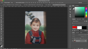
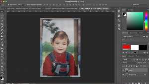
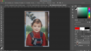
Here is a print screen that shows how I combined two images to create an outcome:

Untitled-1Untitled-2

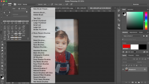
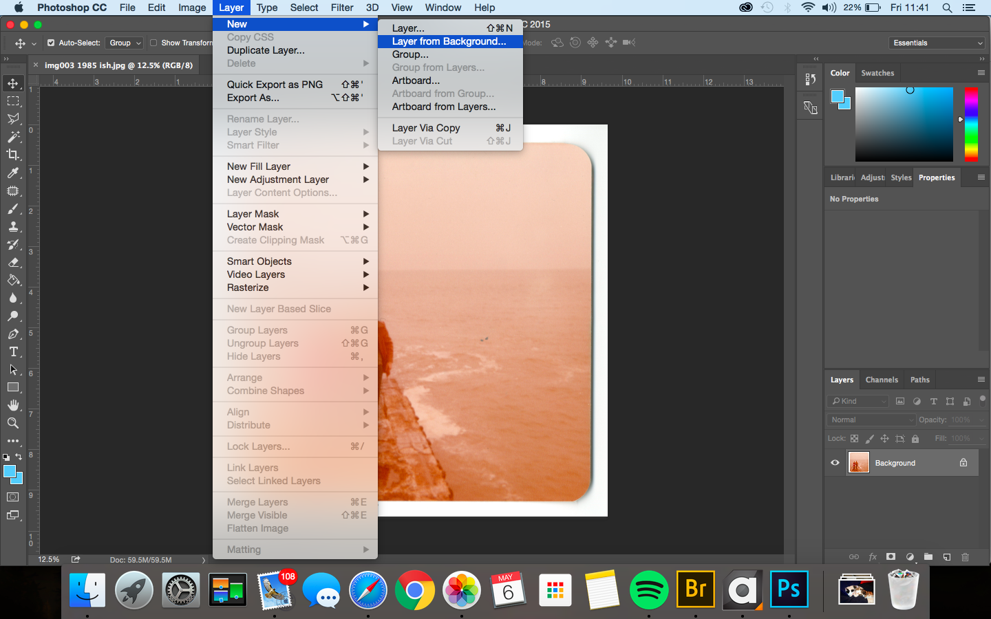
By using the brush tool in Photoshop, I was able to merge the images together. After editing the blurred hand into the back image of the subject,  I adjusted the levels slightly to created a darker tone throughout the image so that it fits well within the context and within the style of Daria. I also experimented with this images by using different blurred movements from the subject to see which looks the best. Here is a gallery of the edited images from the shoot :


Shoot 5: Investigating non-traditional love: Will

The next stage when focussing on more contemporary perceptions of love was experimenting with my Cousin, Will. His relationship with one of my closest friends, Emily shows how being in a relationship can change the way we look at them micro-cosmically  in a social structure. Just like everyone else, I wanted to envisage Will with a dual character with a range of his own individual personas. I captured him wearing smarter clothes, casual and more laid back wear as well as using different landscapes and setting to characterise him in a more symbolic way.

Smart Wear

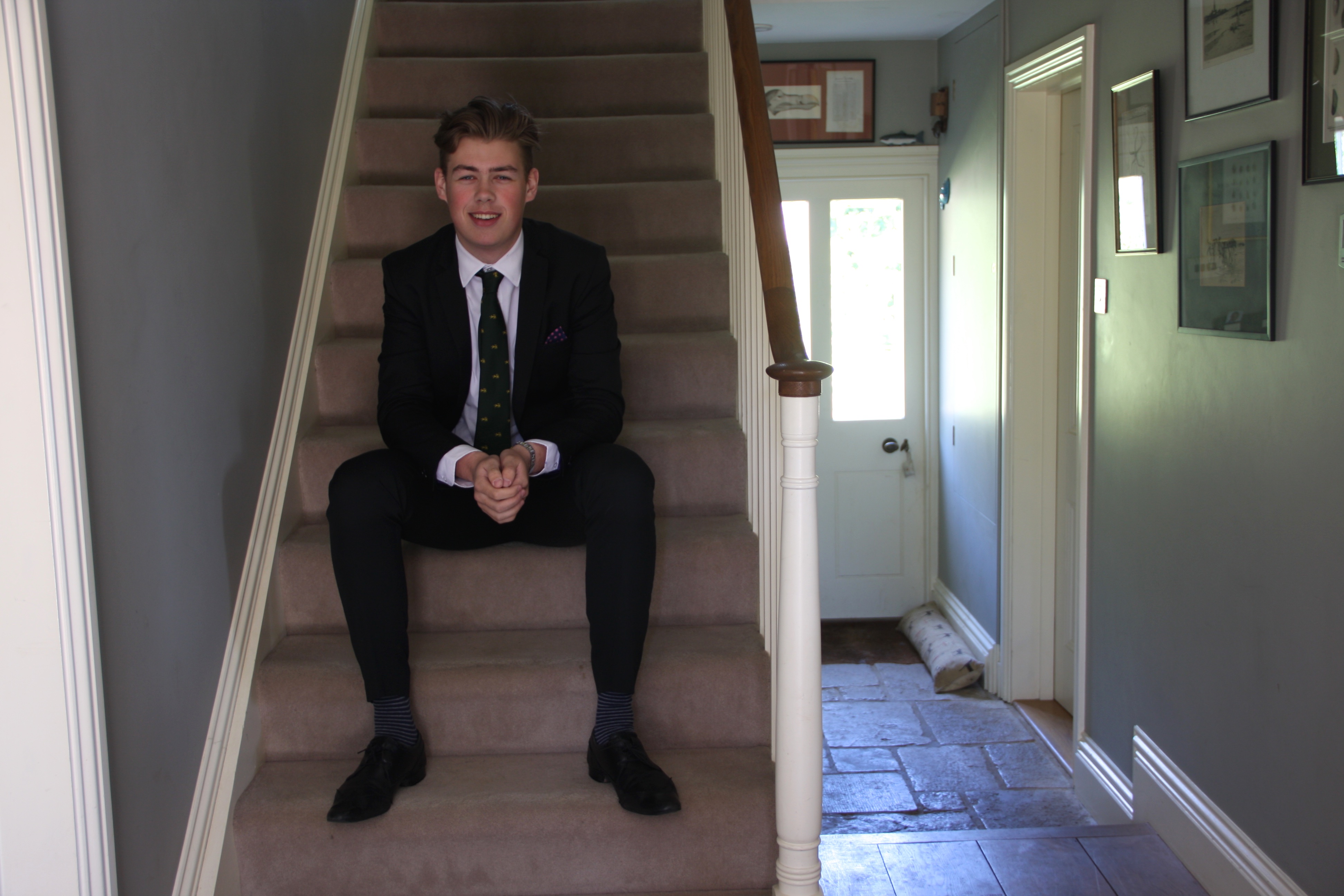
I composed this image of Will on the stairs, however I wanted to frame him with the essence of including his surroundings. By doing this, it makes him the most central subject as well as making the reader question his significance. I wanted to compose Will this way as I felt this abnormal setting reflects his relaxed side, making him be seen in a more casual light.  Asking him to wear smart clothes can also possess some elements of wealth, contextually referring to his place within a modern society.

IMG_0885

A Casual Lifestyle 

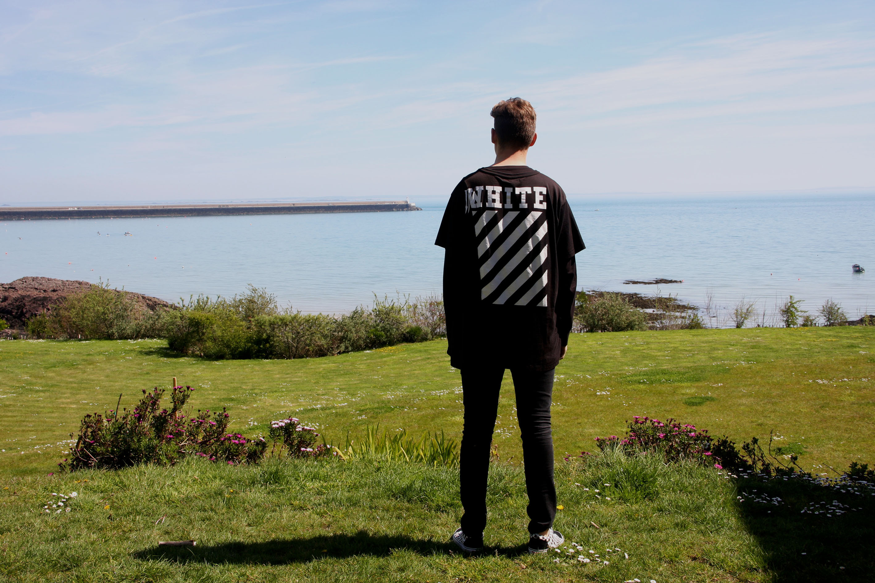
Referring contextually to the elements of wealth once more, it could be said that Will lives in a nicer area than some, as his views from his house are beautiful. I pictured him facing against me as I felt this could re-embark once more as to how the truthfulness in relationships can occur. If Will was to use Tinder, or any other social media websites that consist online dating, and used this photograph, I feel this could symbolically and metaphorically repress how people in this modern day and age perceive themselves on these types of websites. I definitely wanted to make this ambiguous, as truthfully this element sets it aside to be ‘un-truthful’.

IMG_0921

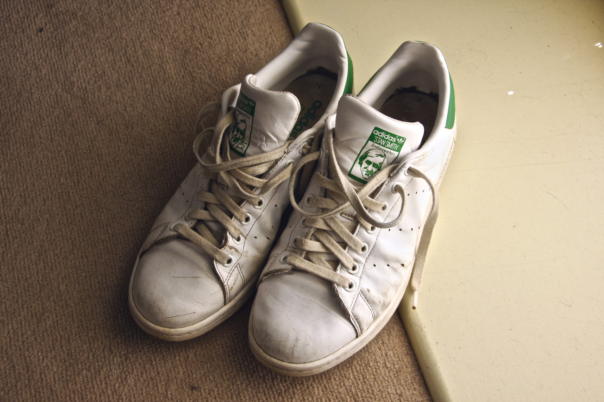
This image below I though was significant in a way which was the objectification of Will’s teenage persona. In consideration, Will wouldn’t necessarily include an image like this on a Tinder app or any other online dating website yet I figured that for the processes towards my final outcomes, It was important for me to include images that could reflect will personality as an objectification rather than a clear statement.

IMG_0914

IMG_0937

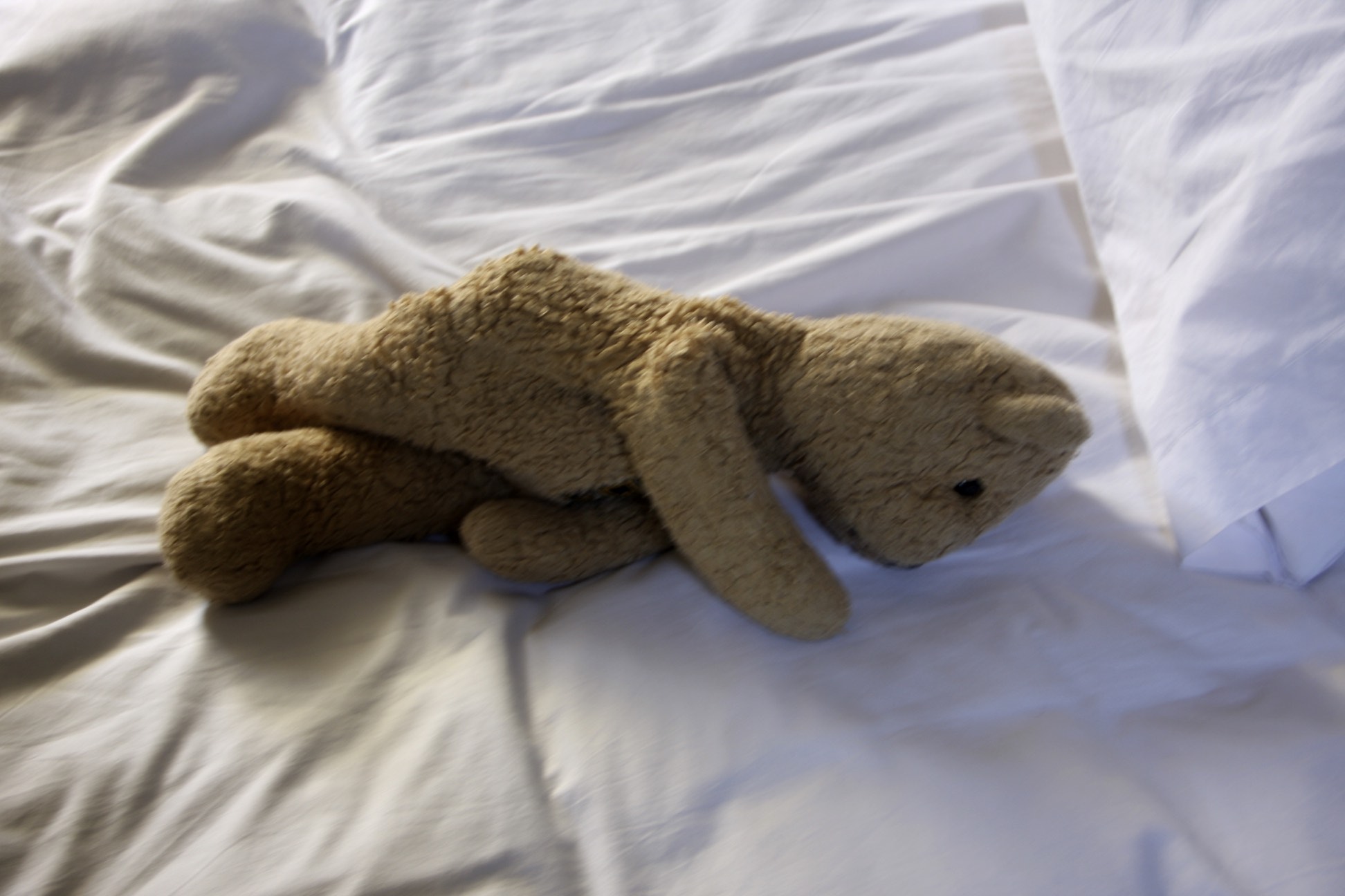
This image above suggests a alternate side to Wills persona, yet can surely be seen as a realistic one. I feel this image below on the other hand shows a different side to Wills character. The idea at his age of owning a teddy bear in reality can be seen as a laughable matter, so I thought capturing it might be a good way of getting across to the reader the boundaries I have crossed in order to put the ‘real will’ onto a ‘real’ online dating website or app.

IMG_0918

Exam – Evaluation – Overall Outcome:

Overall I am very happy with how my photo shoots, experimentations, photo book and final pieces came out. I personally think that they are a good representation of what I wanted my project to be like and what I wanted it to look like as well. I feel like I explored my artists enough to be able to accurately and closely respond to each one. I feel like my research and analysis of some different artists, essays, articles, photographic methods and artist’s photo books really helped me and guided me into what final project turned out to look like. I feel like they gave me a lot of visual and contextual inspiration which I was then able to project onto my own work,which I think was successful. If I had to do anything different within my project, it would have to be to have explored the different truths from my mum’s perspective as well as from my dad’s perspective when looking at the same photograph. I wish I could have included this as it would have allowed me to better explore the theme of truth and therefore have a wider acknowledgement of how different people, no matter how close they are or even whether they are acquaintances or not can have such a different perspective from just a single photograph. I would also be able to interview them and see what they about it in contrast to what I feel like the truth is.

Final Outcomes

The Box

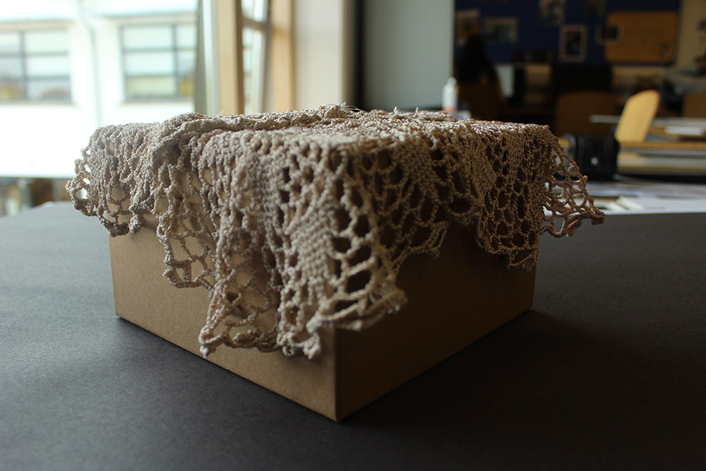
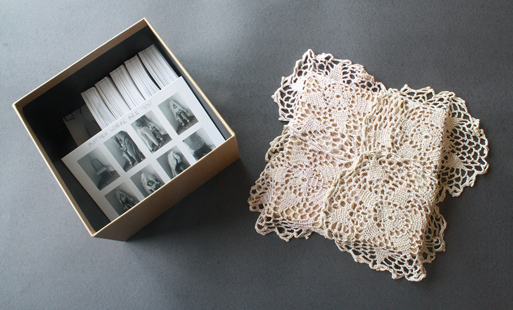
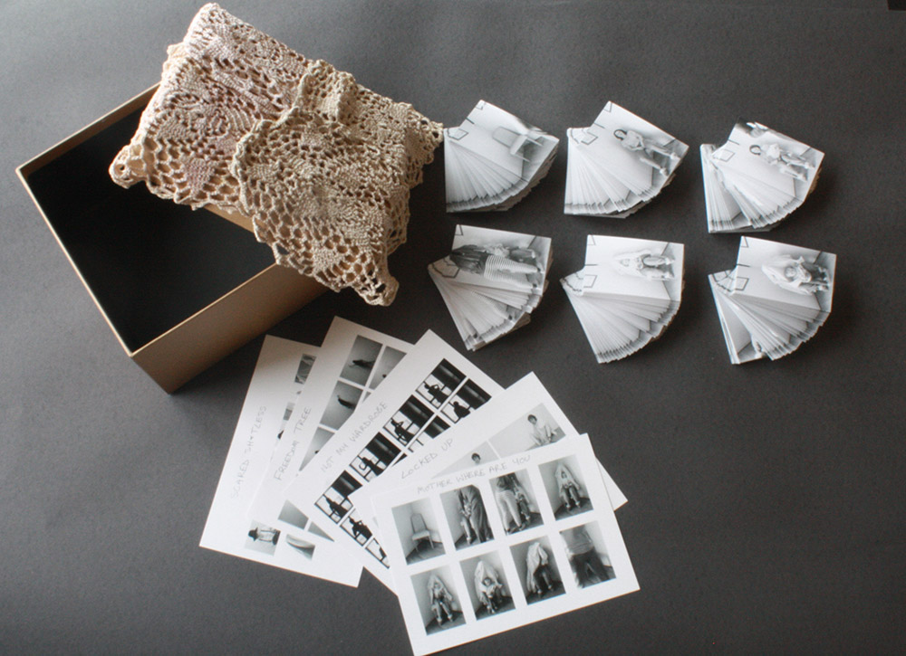
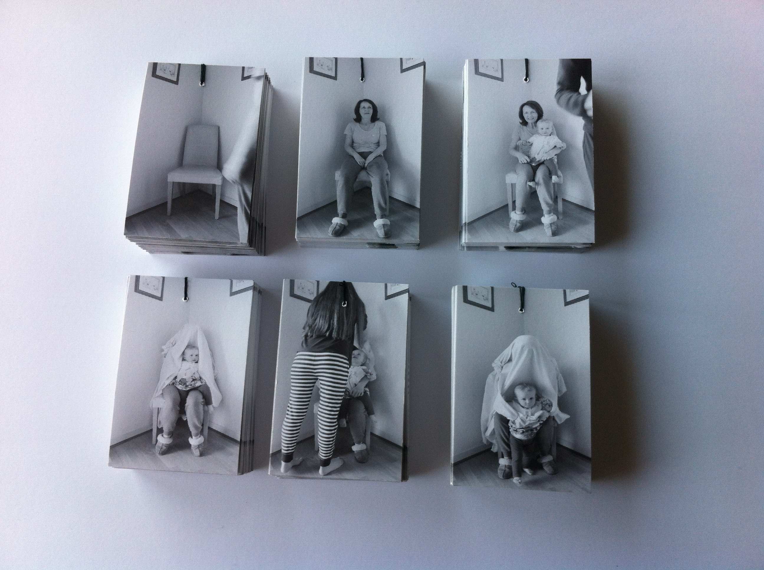
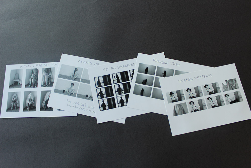
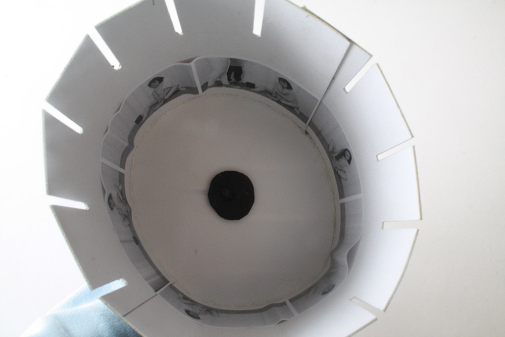
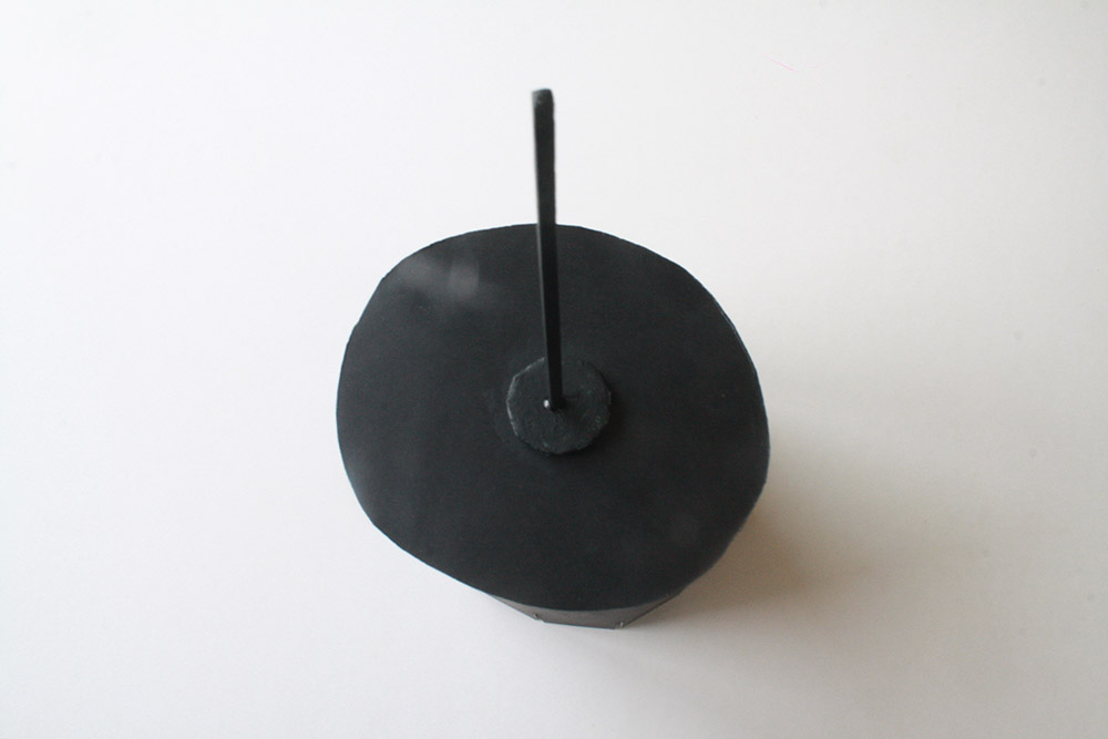
For my final piece I have decided that I want to put everything inside a small box that looks like it is from the Victorian period. I wanted to do this as all of my work and images are based in the same time period of the late 1800s and so I thought it would all fit in quite nicely. For my final piece I have printed out 5 series of images that each have a caption on them with their titles, I wanted to make these images small as I thought it would be a good idea and they would all fit nicely into the box. The idea of the series was also to make them look more like film stills which is something that I have an outside interest in and wanted to incorporate my love of film into my photographic work. Another added element to my final project was that I created six flip books from one of my shoots based around hidden mothers from the Victorian period. These flip books are basically behind the scenes looks on how that kind of image is made and what goes into making them. A last minute final touch that I decided would be a good idea to add was a zoetrope. I made this all by hand and made it quite small so that it would also fit nicely into the box. The idea of the box was to basically make it seem as if it was a found memory style box filled with a load of old stills and showing the first forms of moving image before film and cinema were actually invented. I thought that this would be a good way of bringing everything together as I felt it was all a bit like odds and ends and didn’t really look much but now that I have come up with this idea for the box I think that my work looks more complete and put together nicely. This whole project can link back to the exam title of truth, fantasy or fiction as I show the truth behind how local islanders used to treat outsiders and those that didn’t fit in with the norm. I wanted to focus on lunacy within the island and how those struggling with it were treated before the asylum was built. I also did a series on transgender and looked into islander Colonel Victor Barker and how he managed to live as a man for so many years. The series I made out of this research was much more simple and basically my subject changed from being a female, wearing feminine clothing and long hair, to cutting her hair and slowly covering her female parts and she finally became a man wearing a suit trying to blend in with the rest of society. I feel that this subject is something a lot of people don’t understand and to help me understand it myself I wanted to do research and a project on it which I actually really like. Overall, my project is based very much on truth and what life would have been like in Jersey in the late 1800s. The element of fiction comes into my work with the box not actually being from the time period and the stills and flip books being handmade by me. For the box I went out and bought a plain brown one and found some old Victorian looking material and glued it to the top of the box with a hot glue gun, this took about 5 minutes and I think that it has turned out well and I am happy with how it looks.

IMG_4406blog
the box
IMG_8353blog
Inside the box
IMG_8357blo9g
Inside the box

The Zoetrope

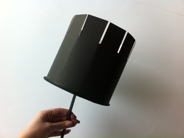
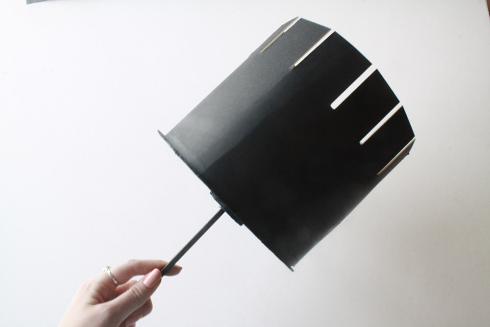
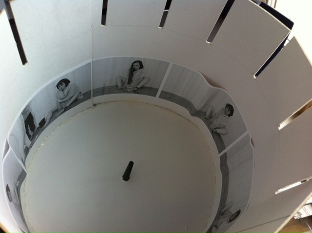
Today I decided to make another little addition for my  Victorian inspired project. Presentation is really important to me and so I wanted to make it look as good as possible and have as many visual elements as possible. I also wanted to add things that relate to film as it is something I love and am passionate about. I made flip books to add moving image into my work that could have been created and used during the late 1800s and I printed out stills and wrote on them for something extra in the book. I then decided to make a zoetrope as these were invented during this time period and I thought it would add something more interesting to my project too. I really like how this has turned out as it was my first time trying this method out and it has worked out well. I chose to use the shoot Locked Up as I felt that this one would work out the best as it was the shortest one and it is also looks good with objects appearing in ever photograph.

IMG_8358
Finished zoetrope
IMG_8359
Finished zoetrope
IMG_8360
Finished zoetrope

Exam – Evaluation – Photo Book:

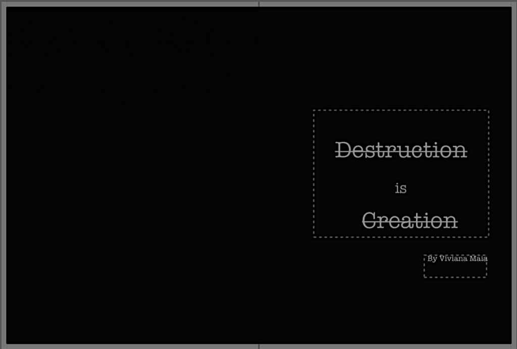
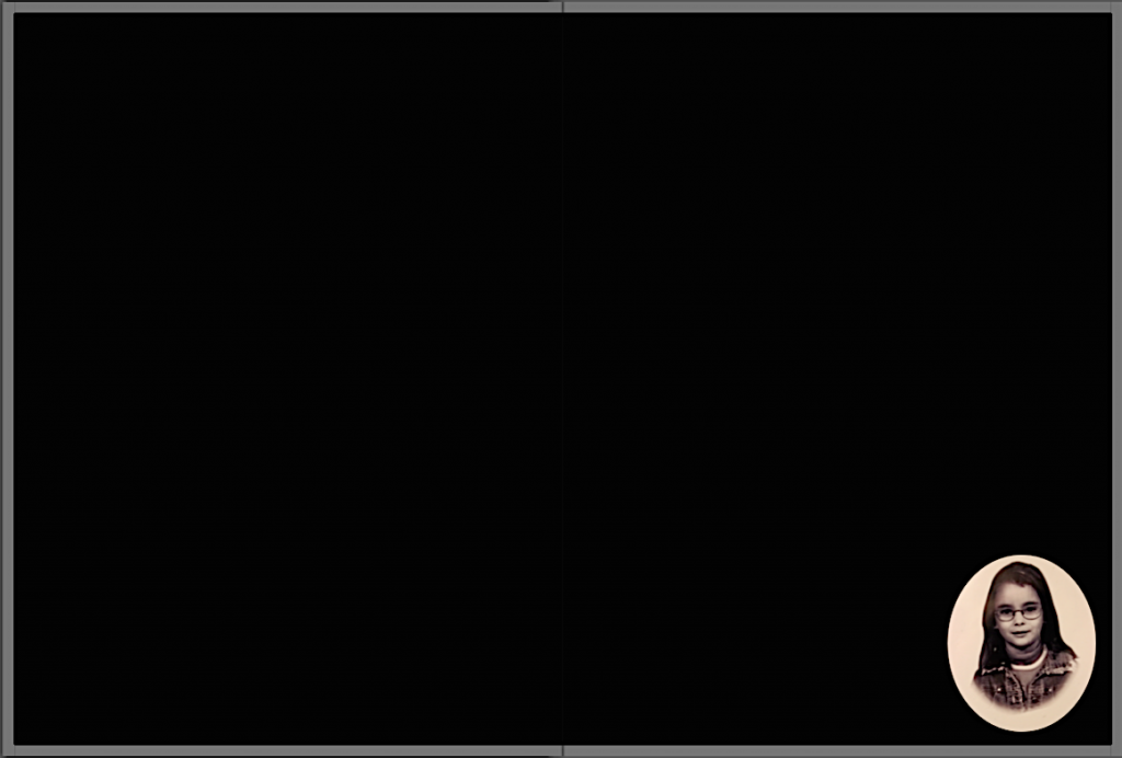
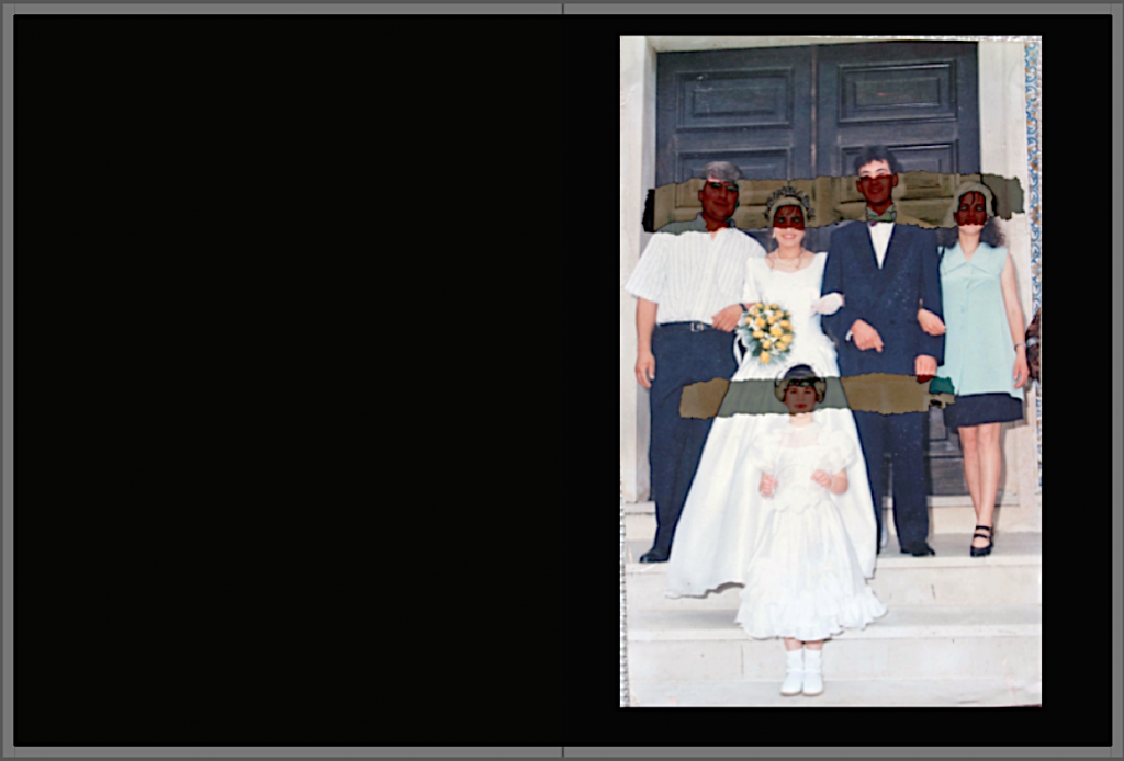
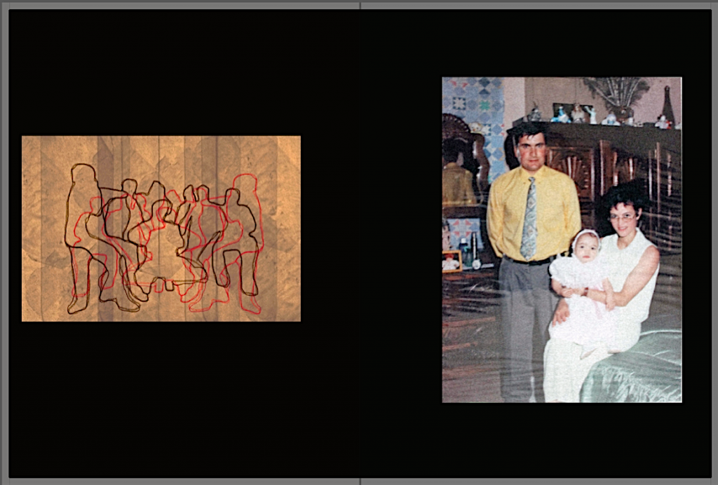
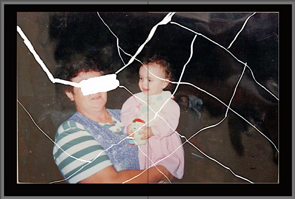
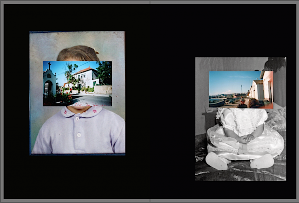
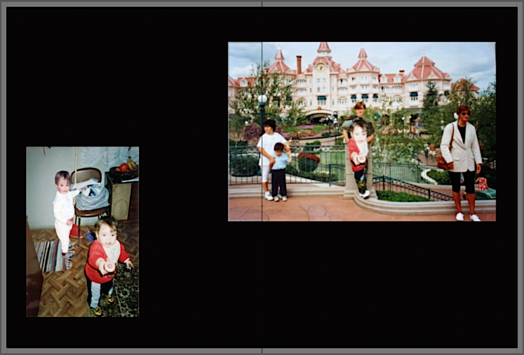
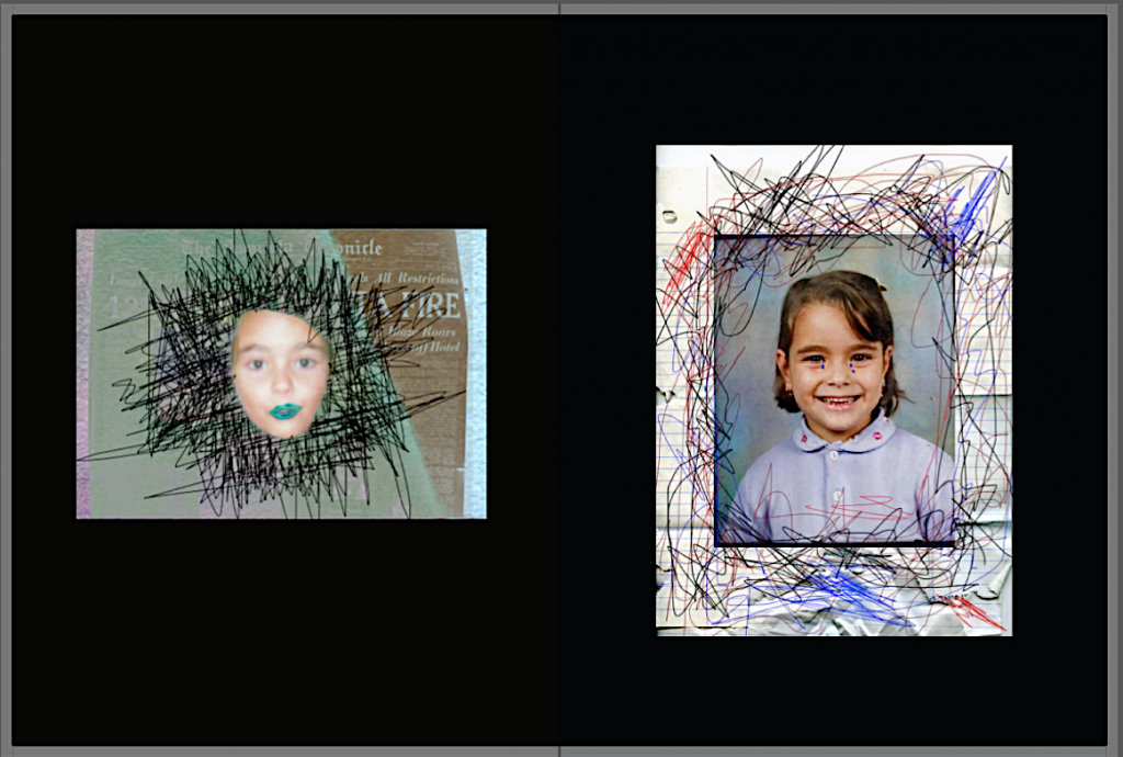
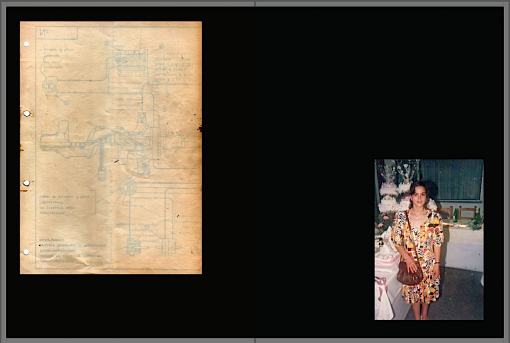
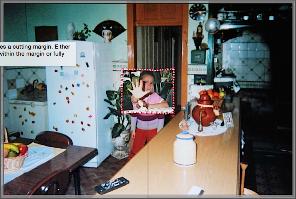
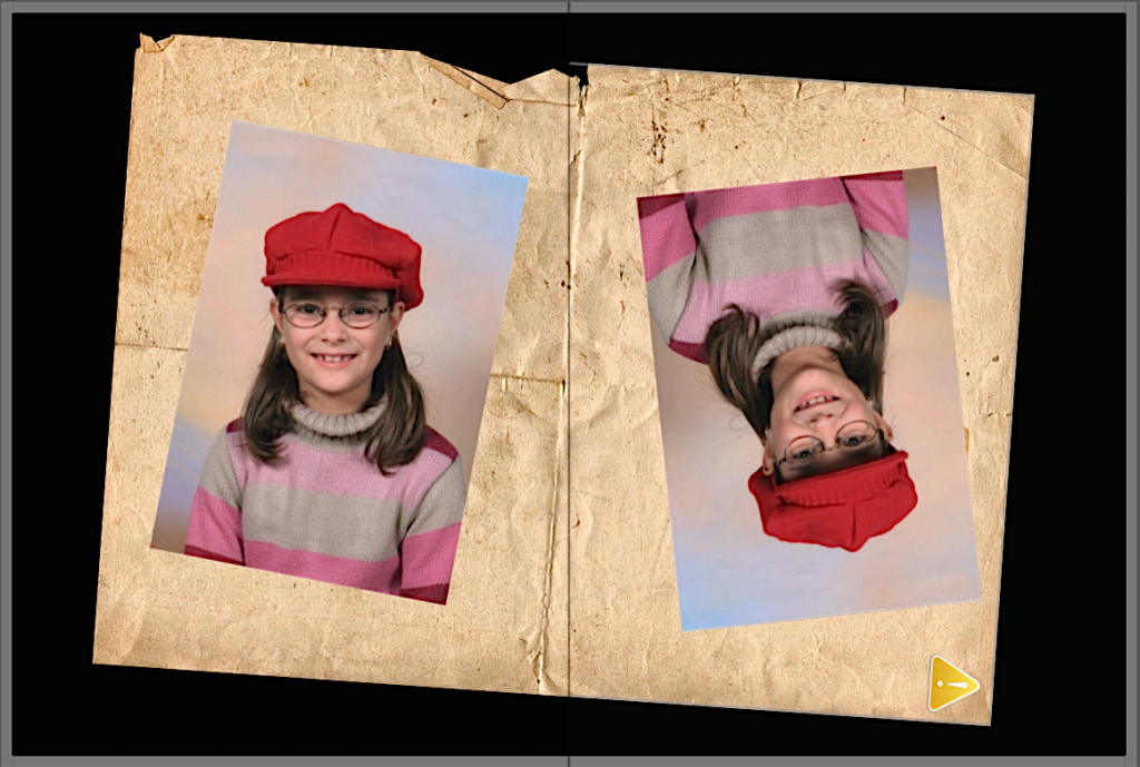
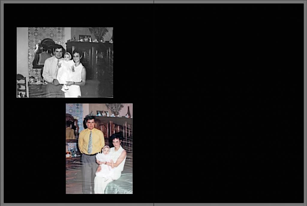
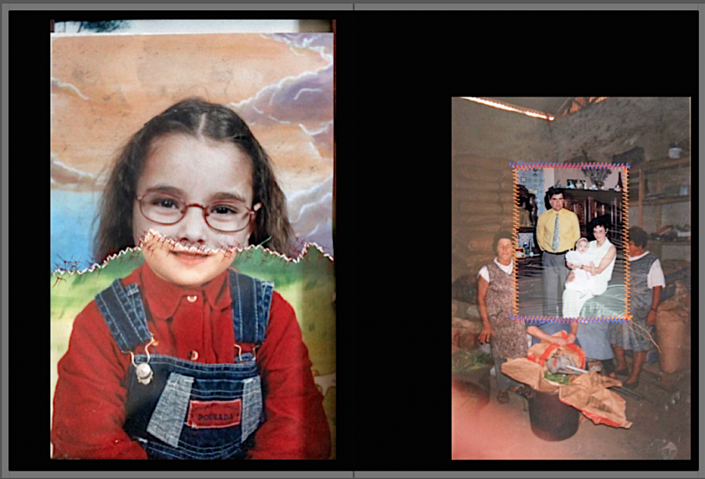
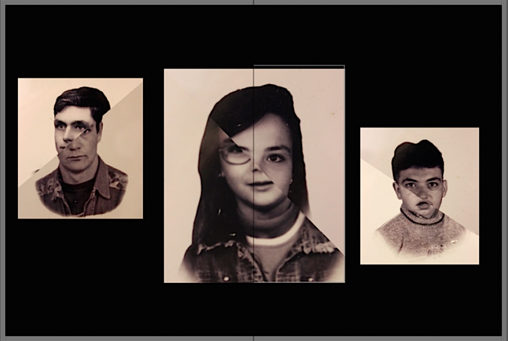
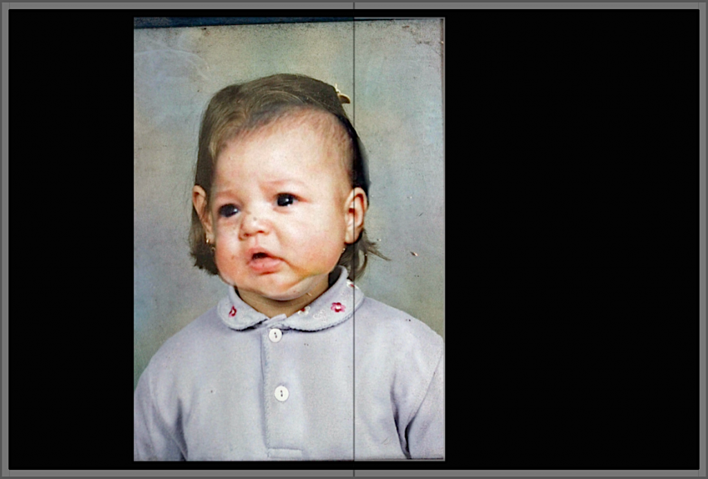
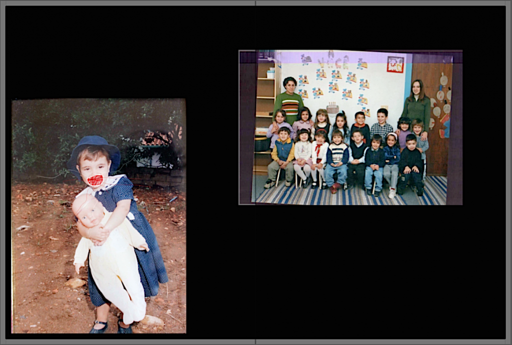
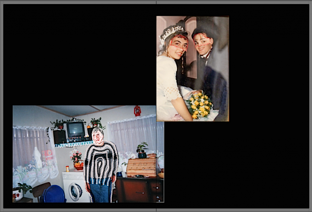
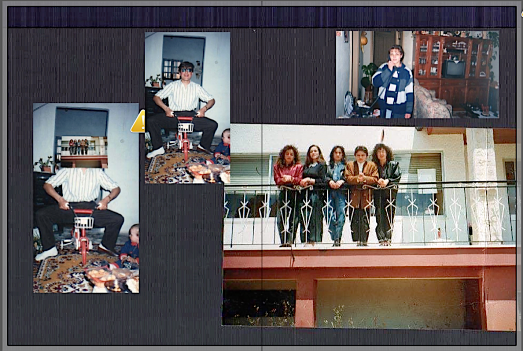
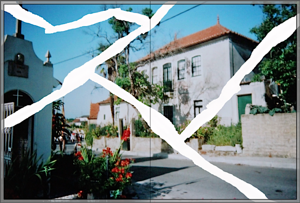
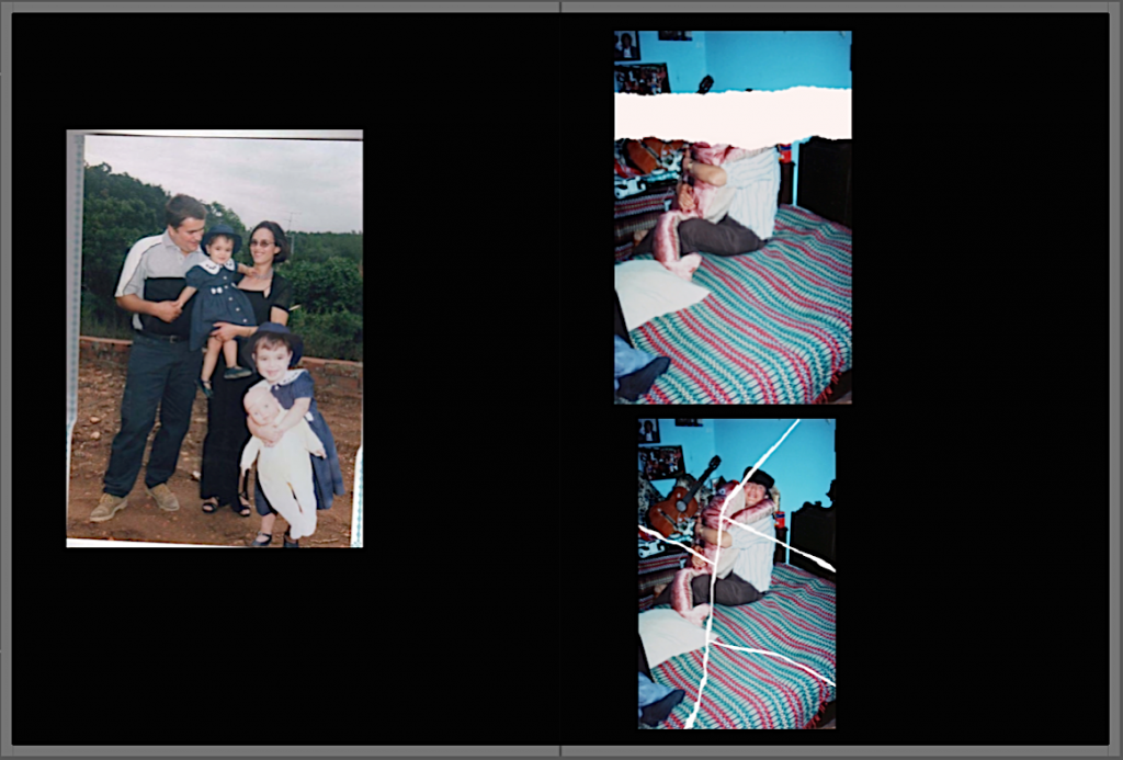
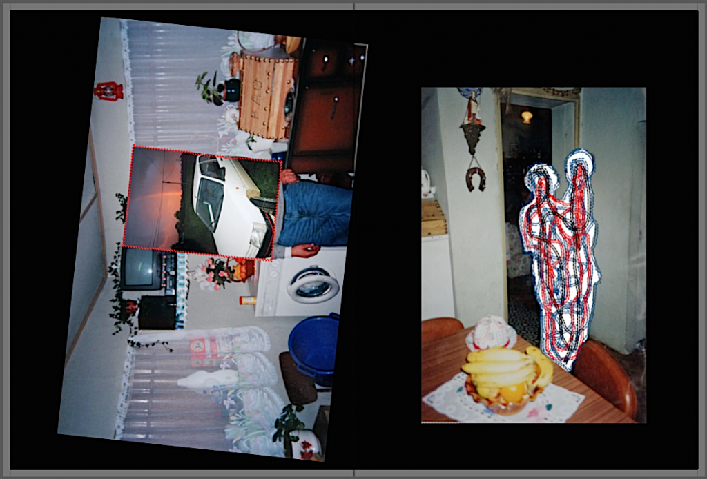
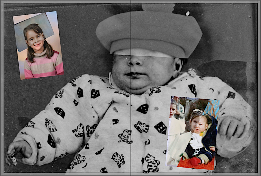
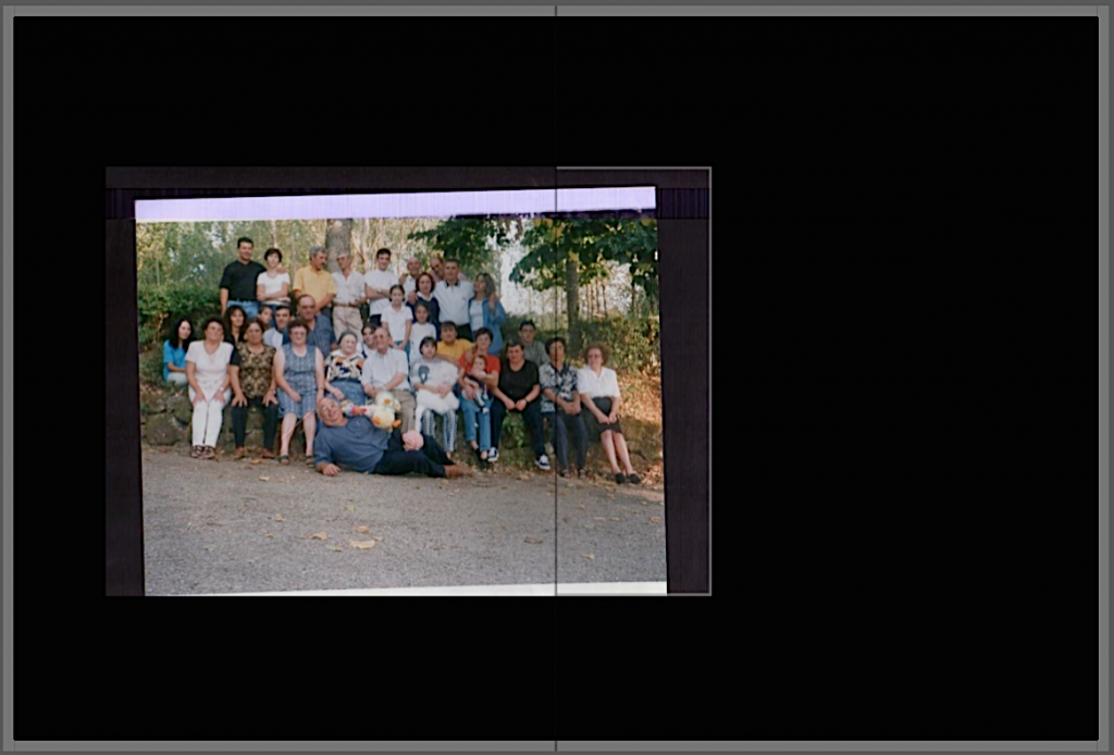
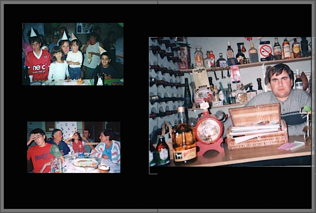
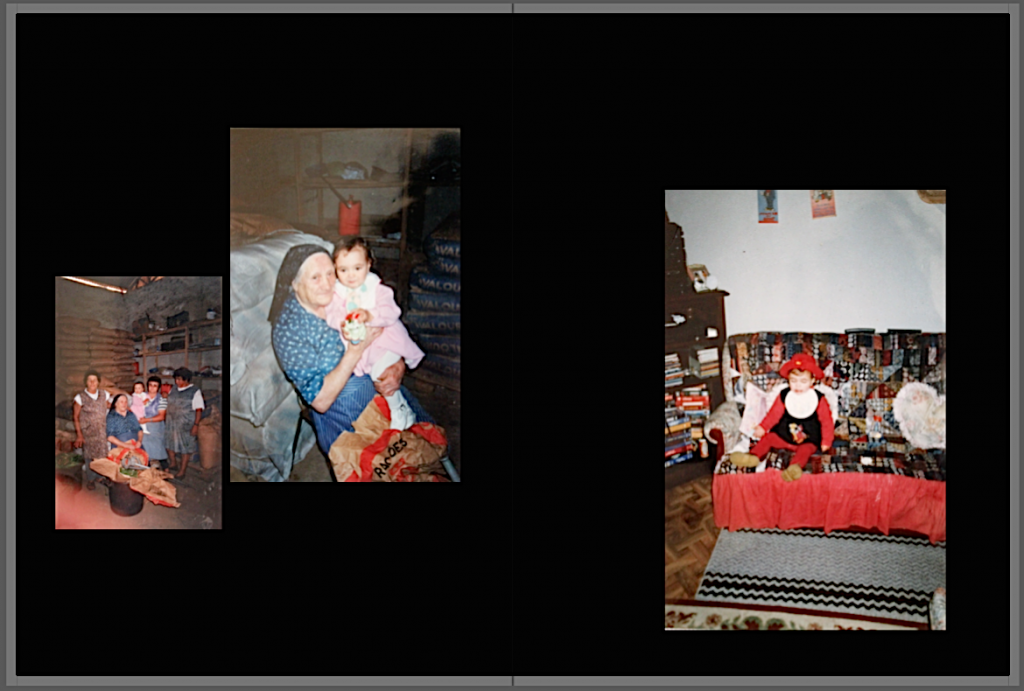
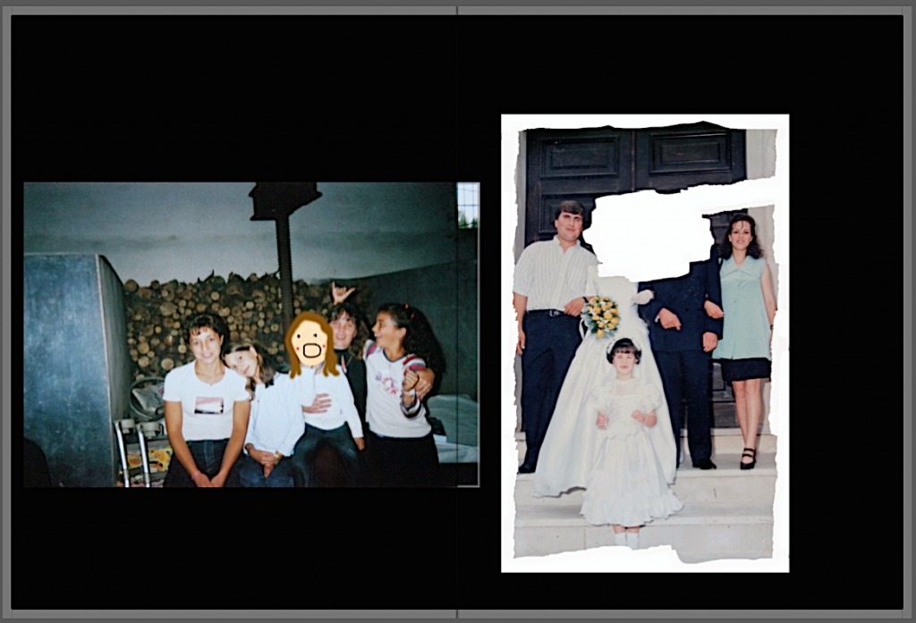
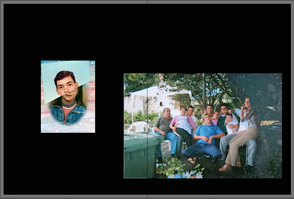
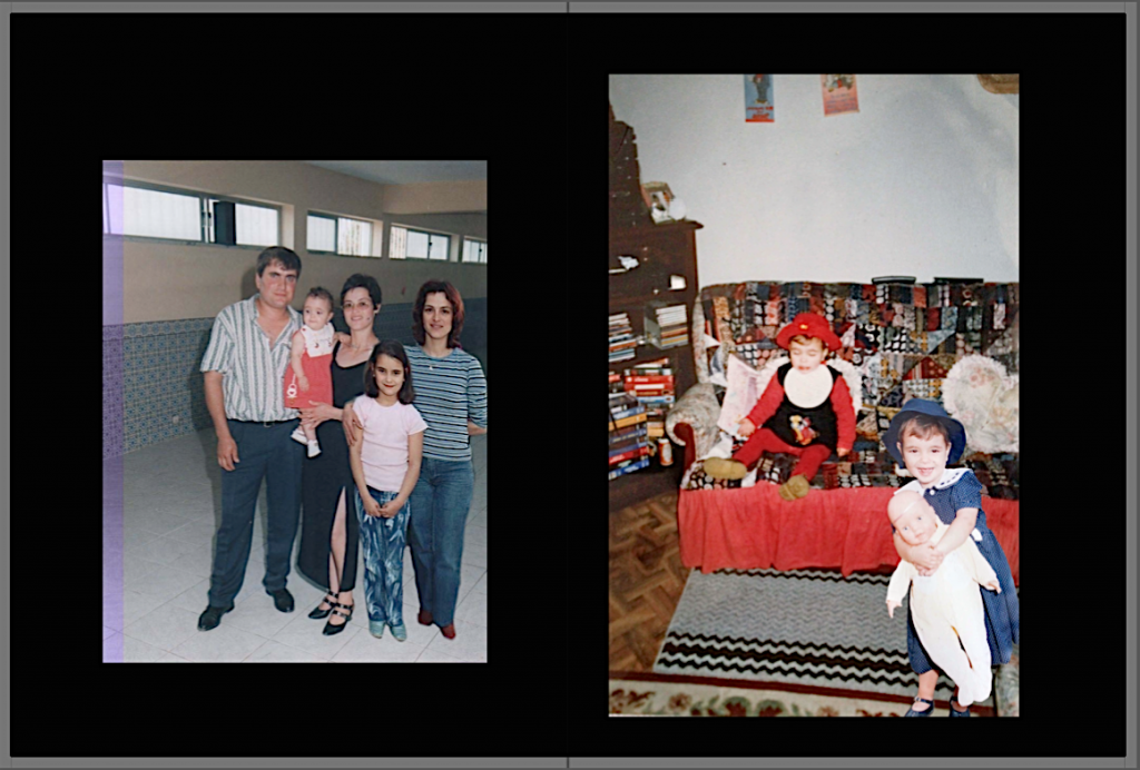
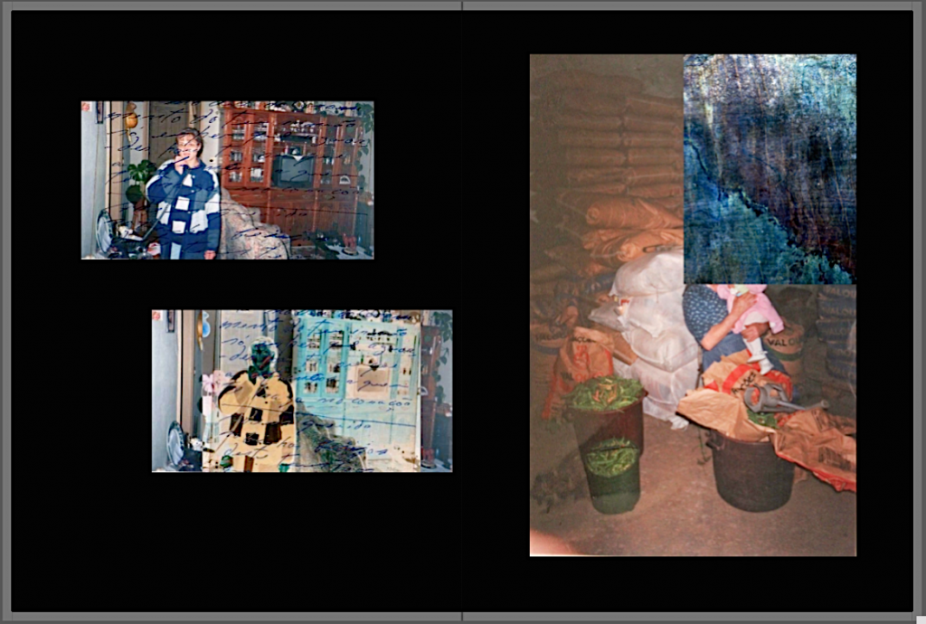
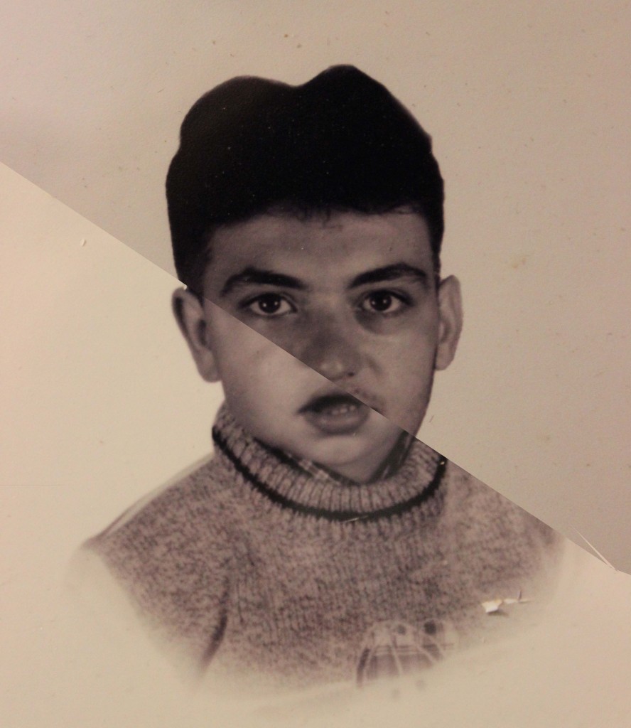
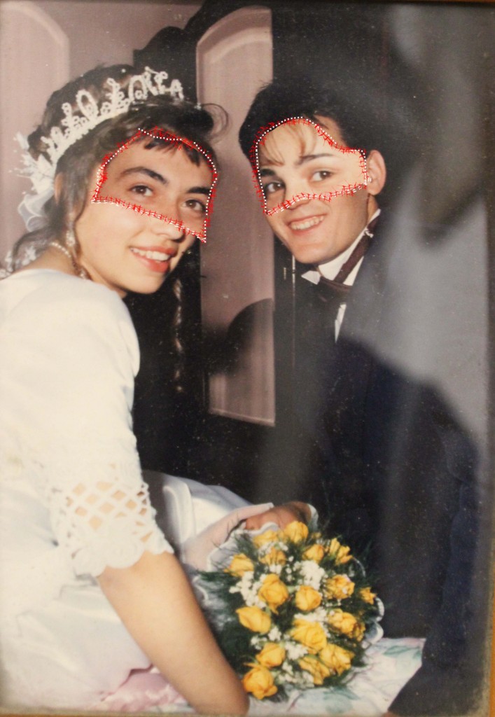
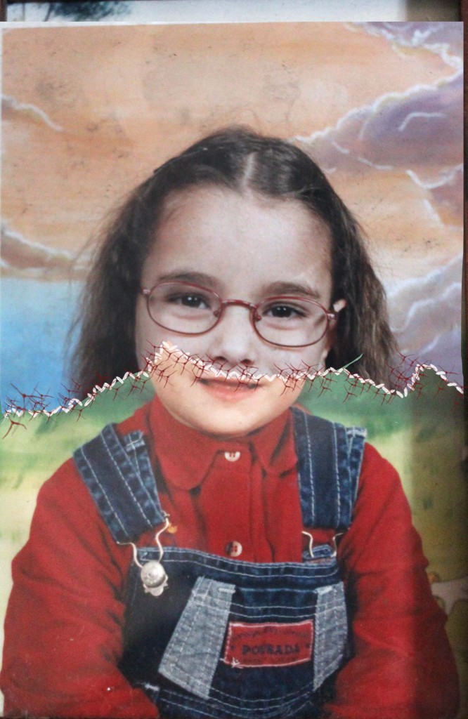
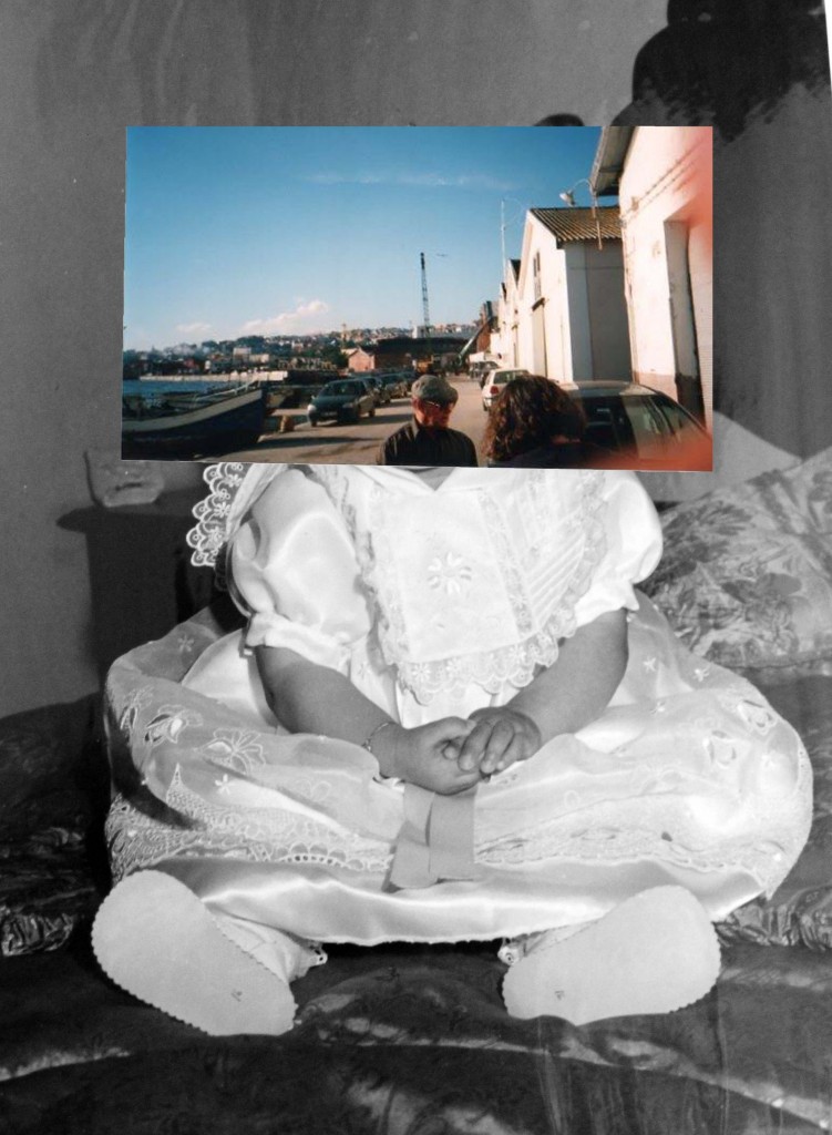
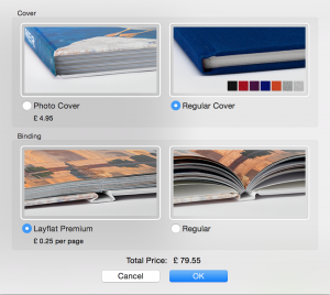
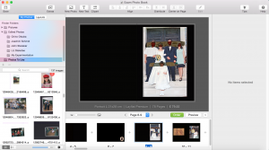
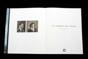
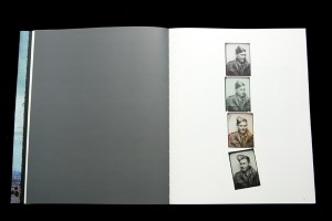
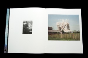
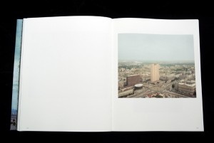
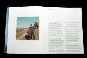
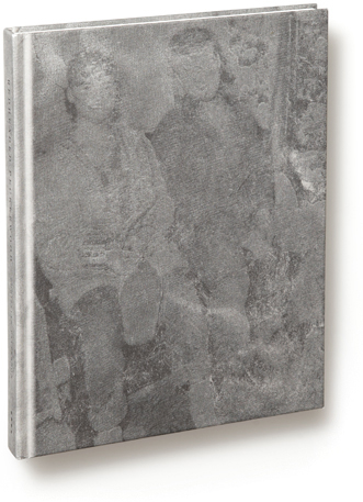
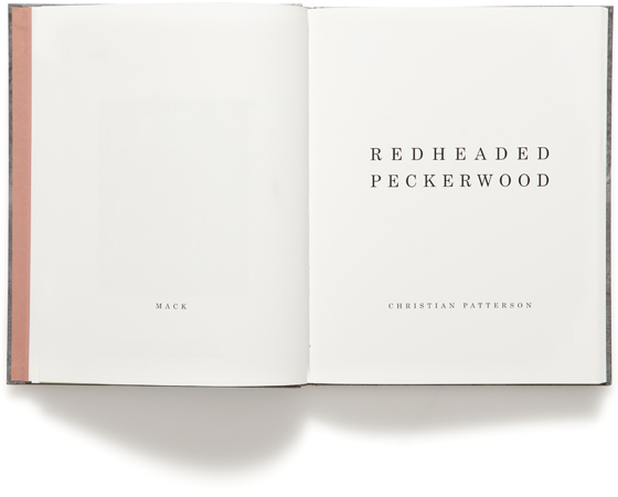
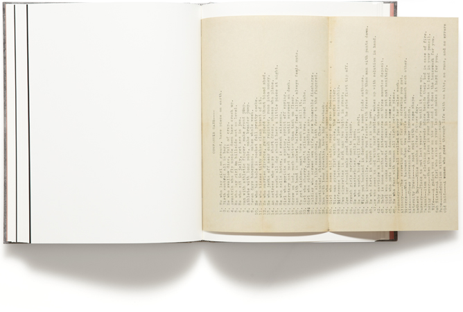
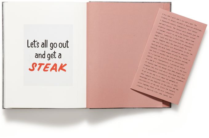
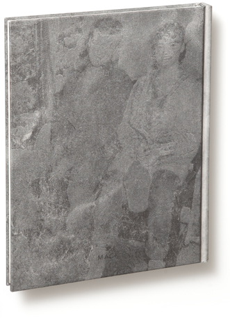
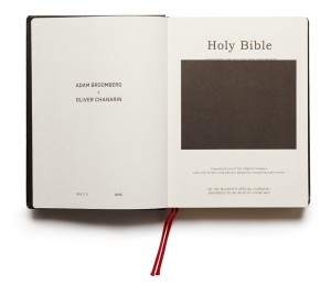
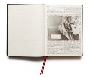
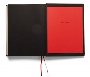
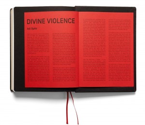
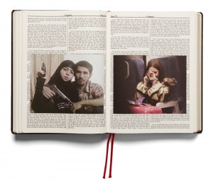
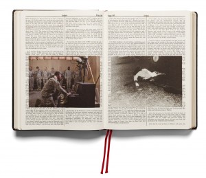
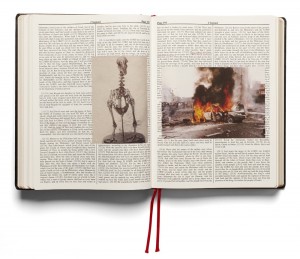
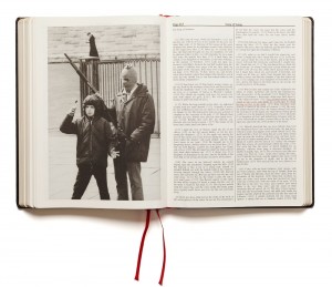
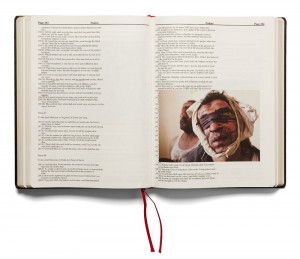
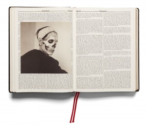
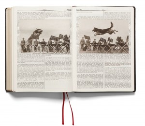
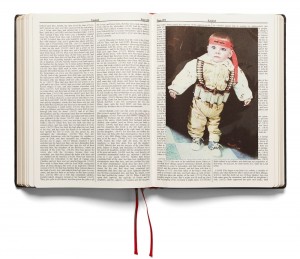
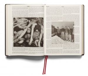
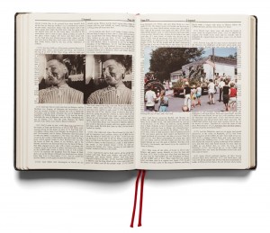
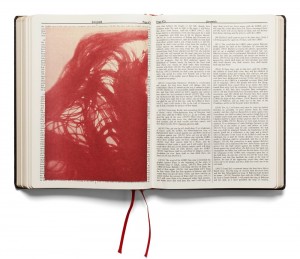
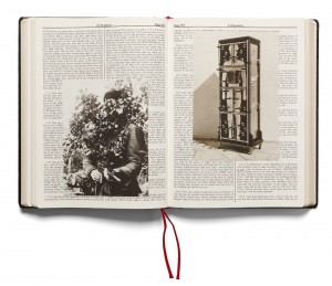
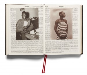
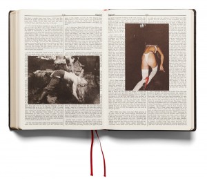
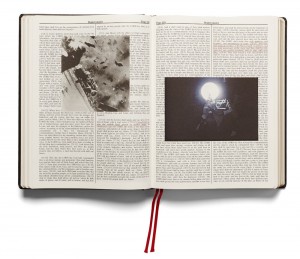
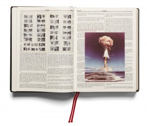
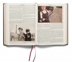
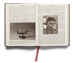
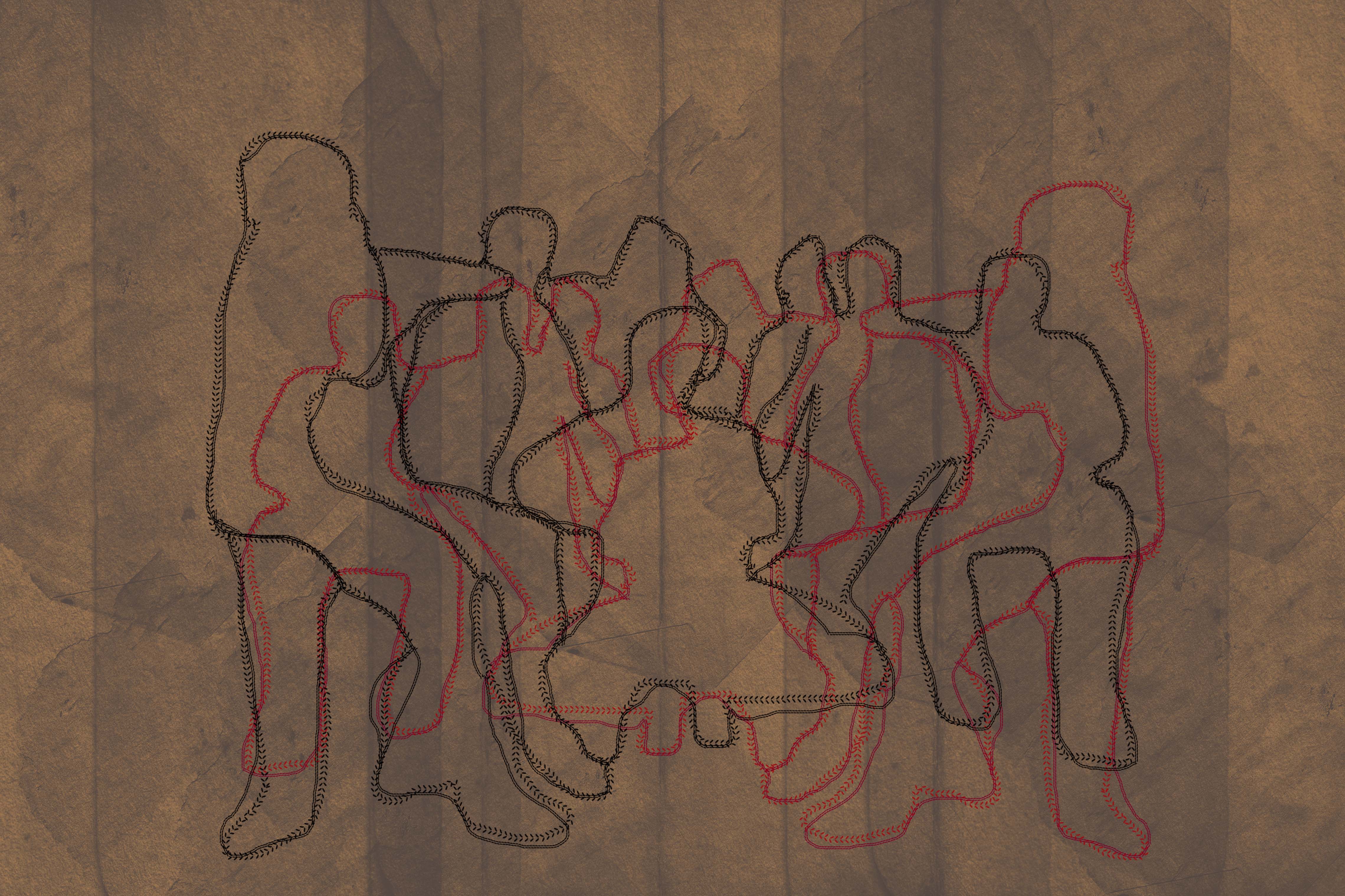
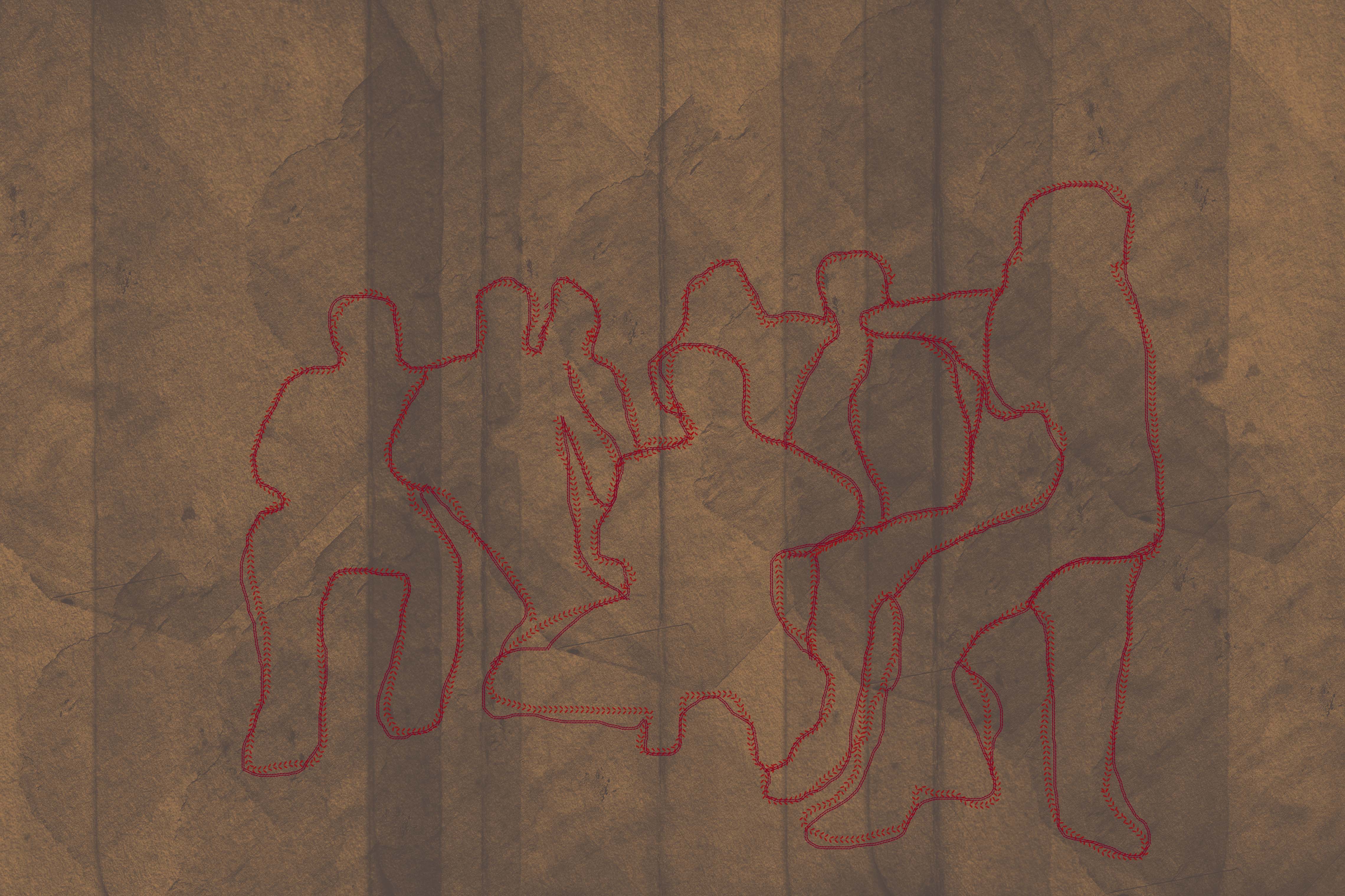
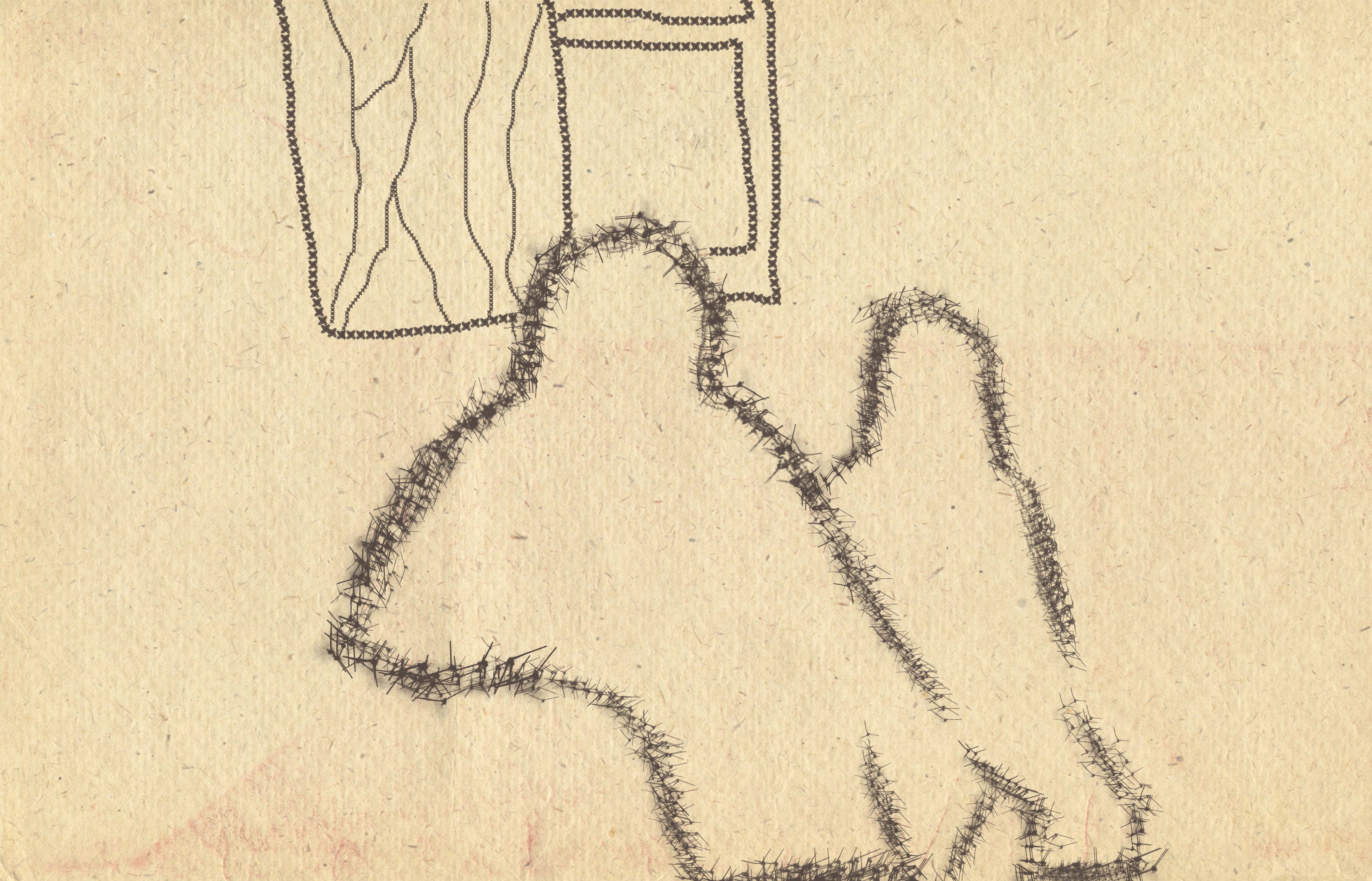
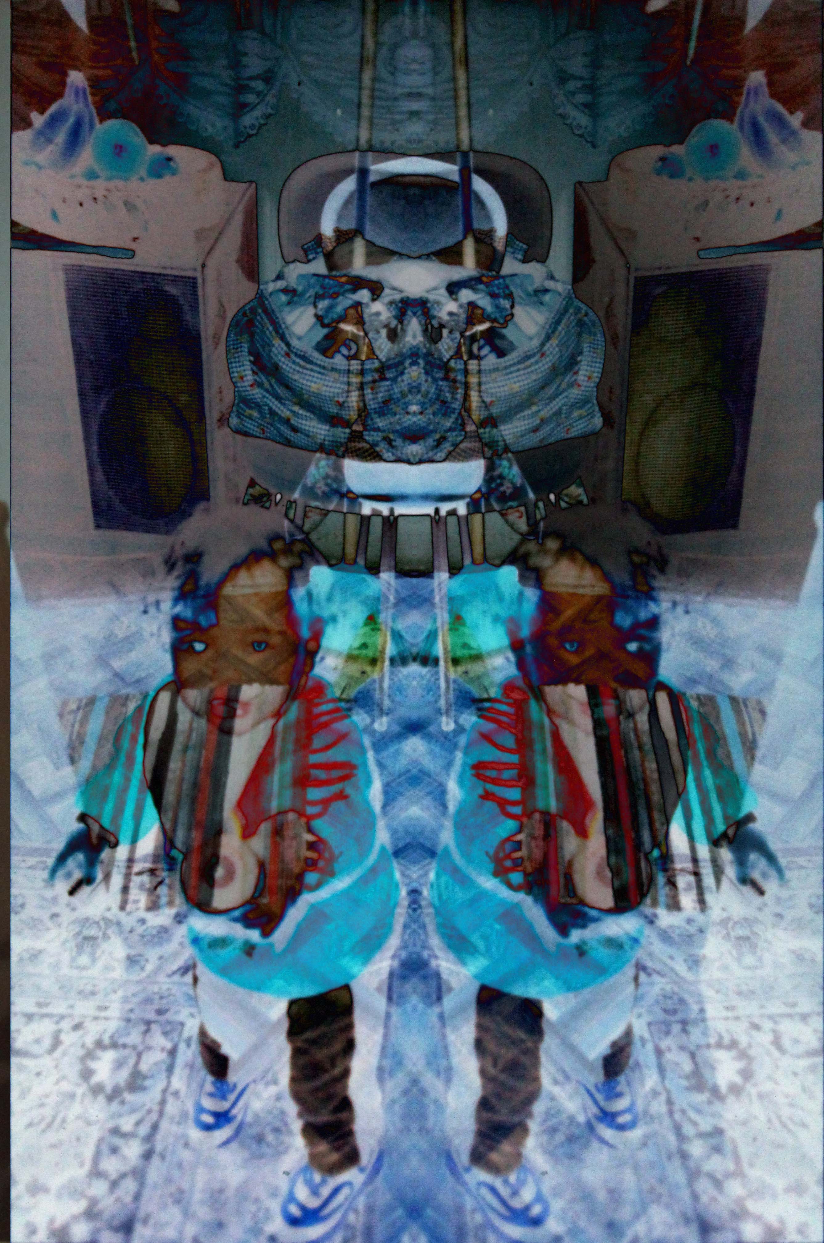
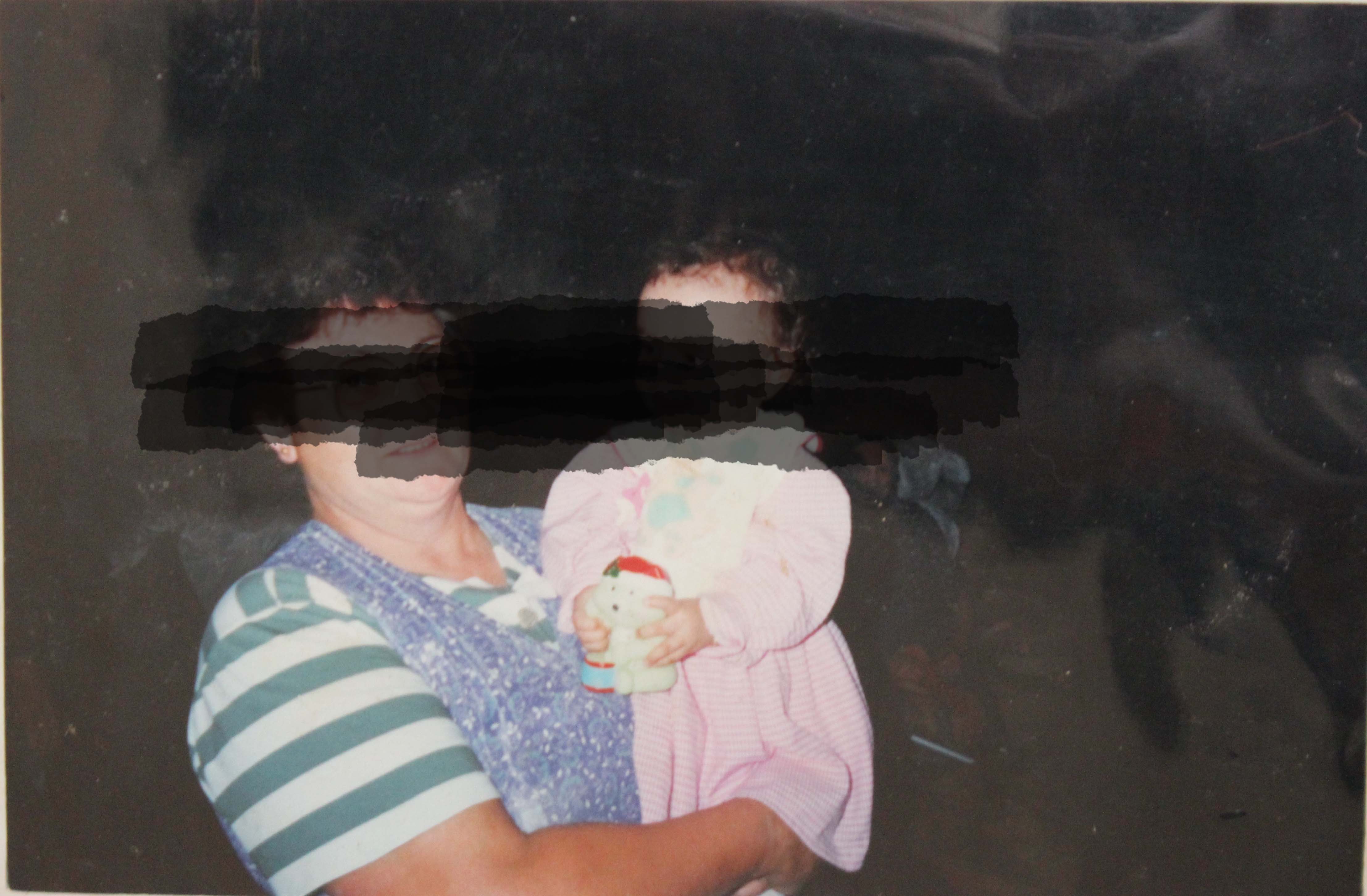
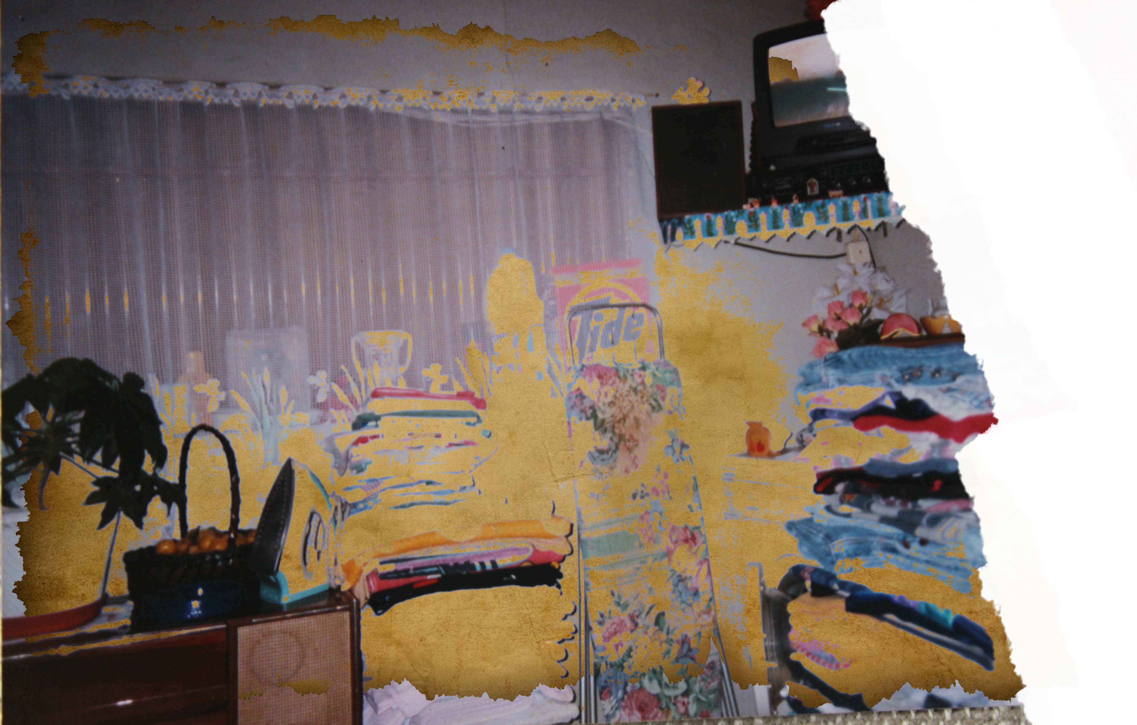
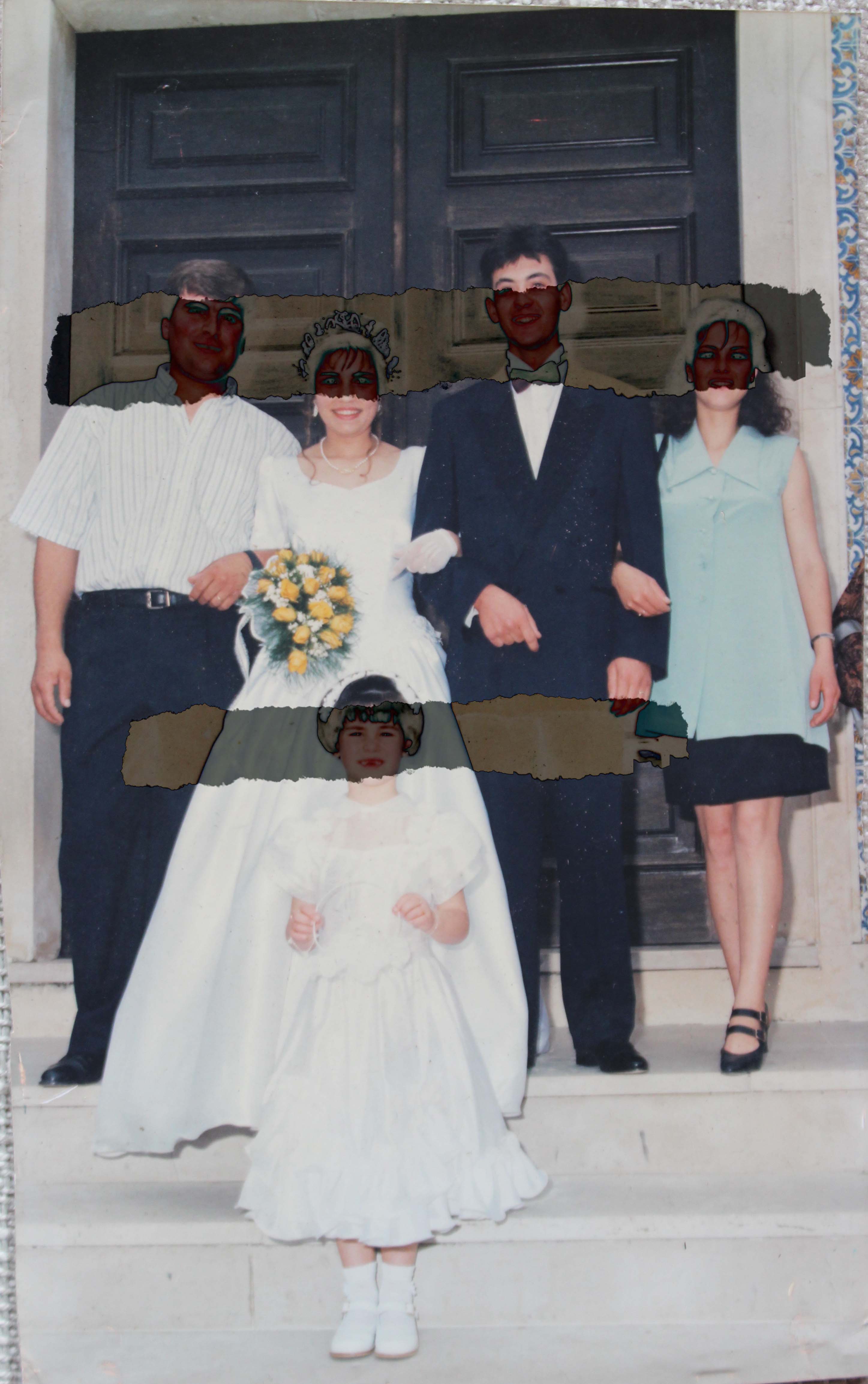
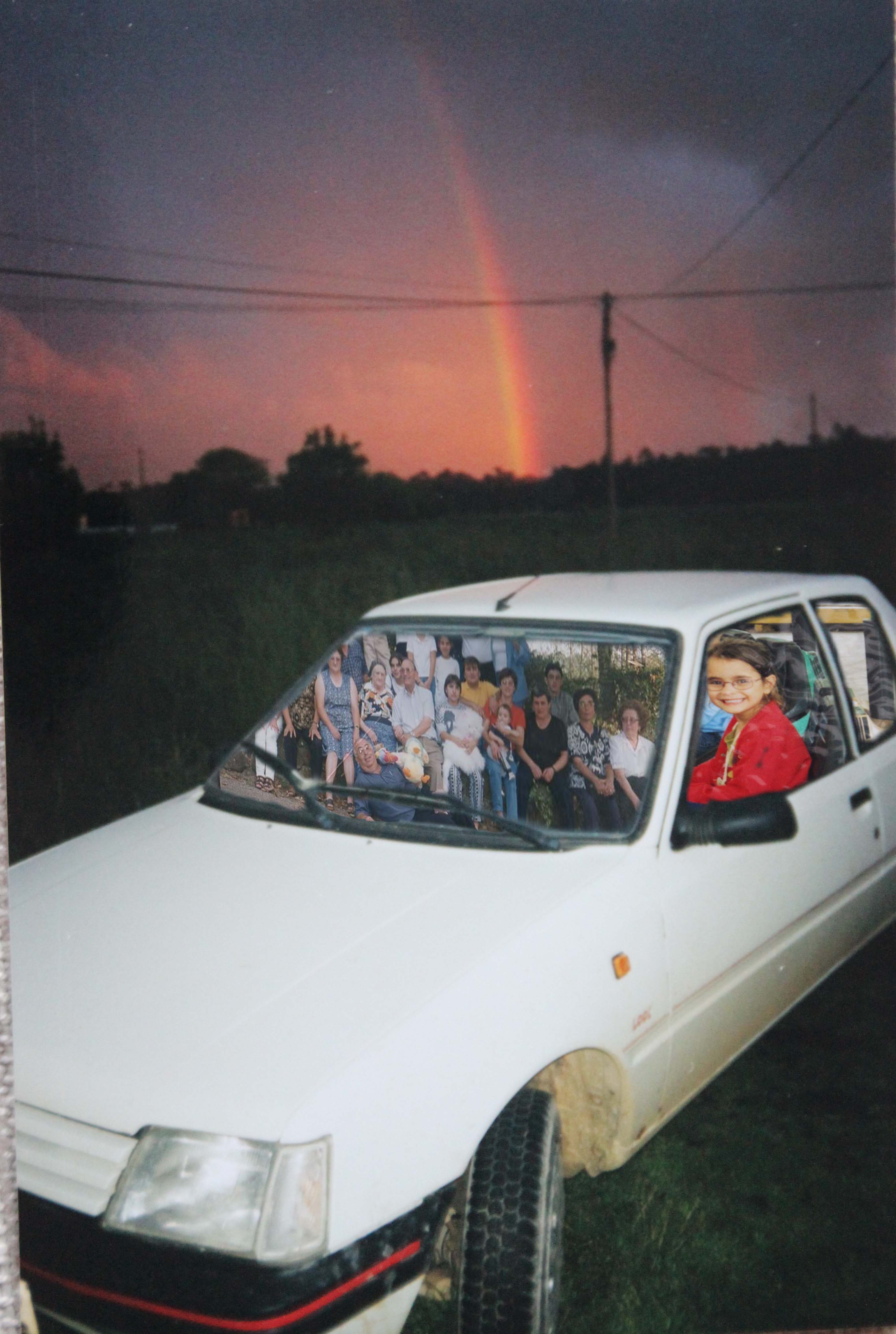
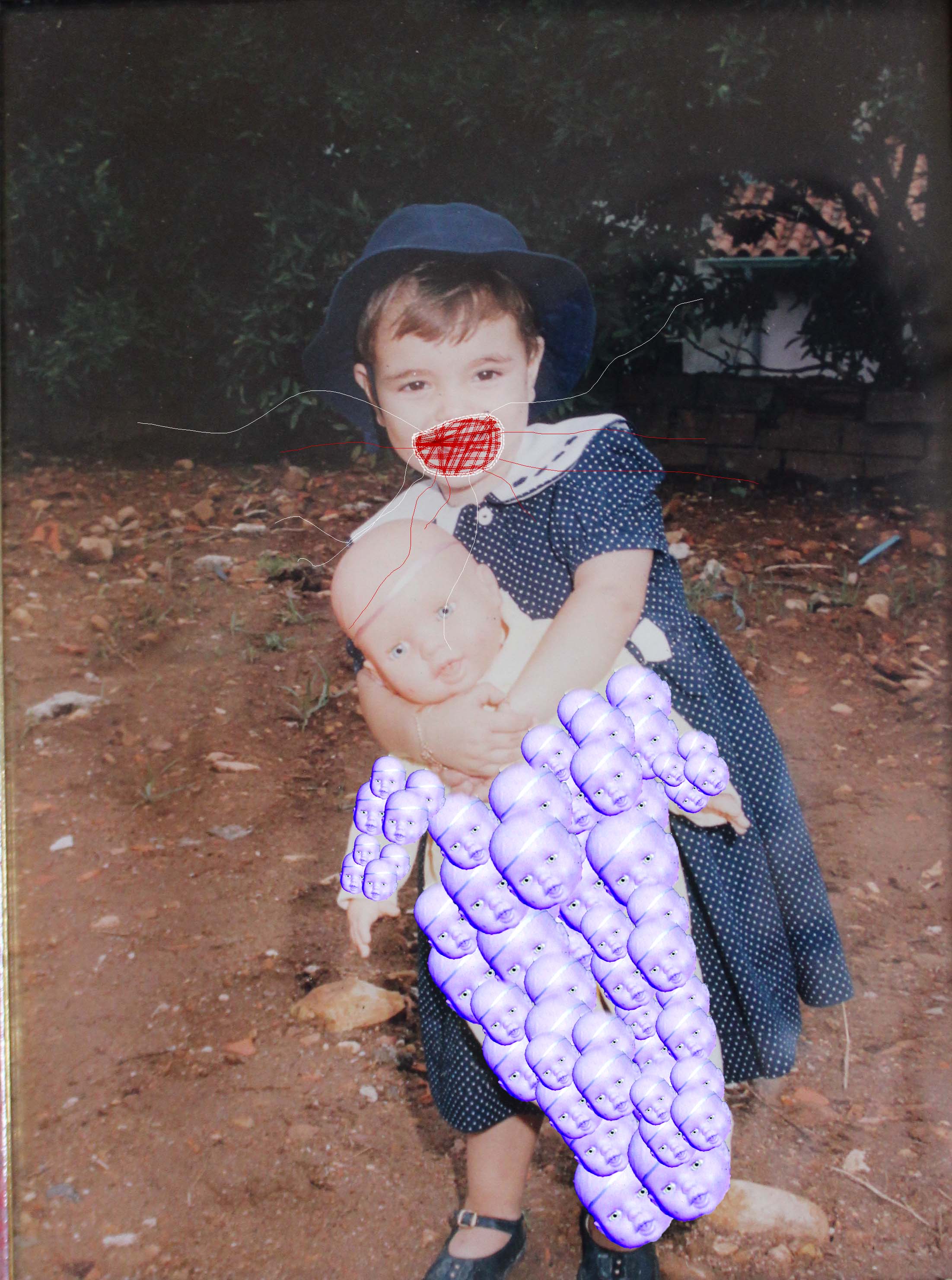
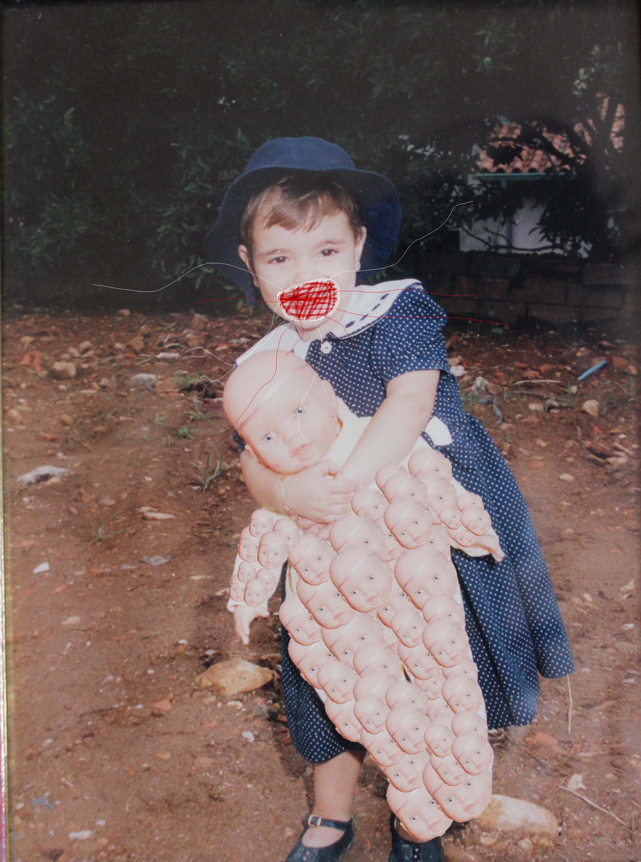
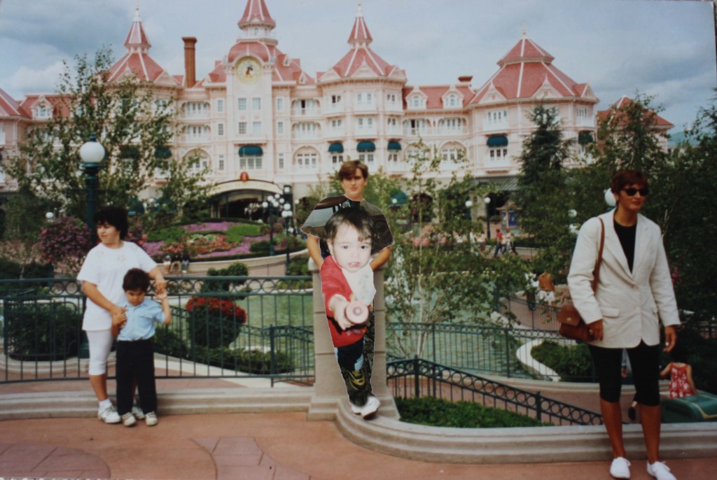
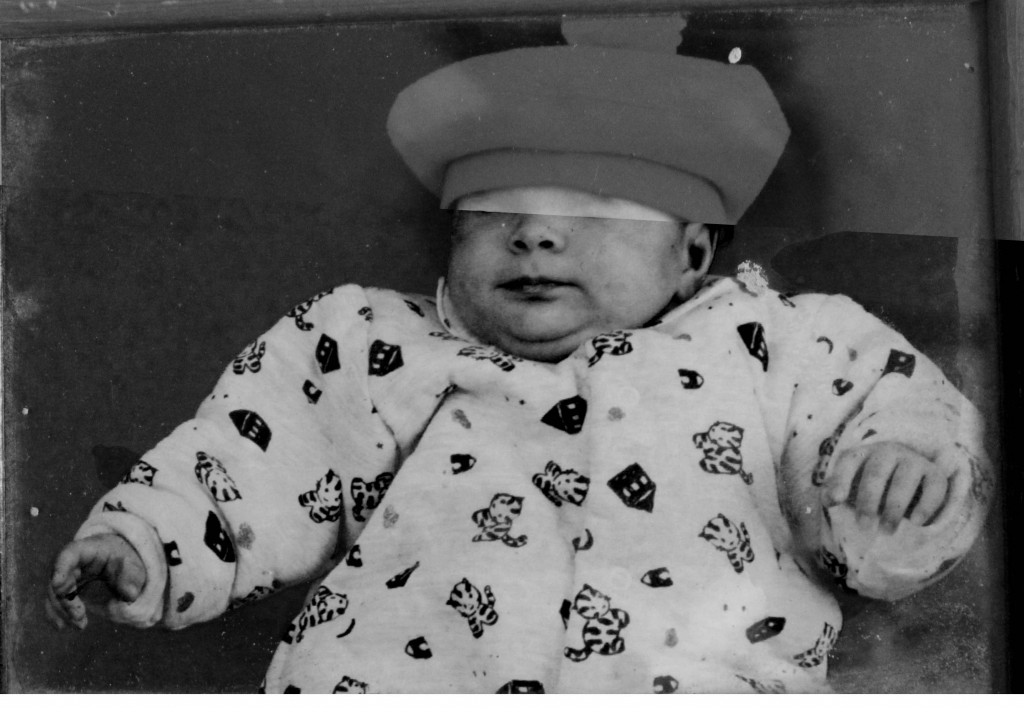
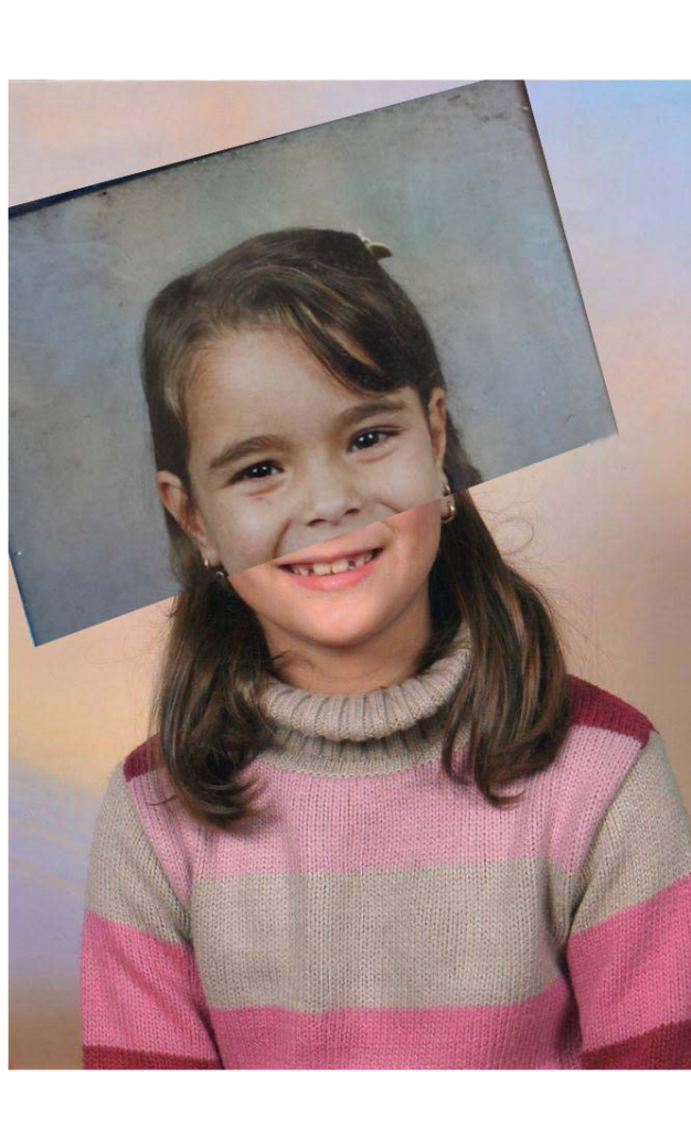
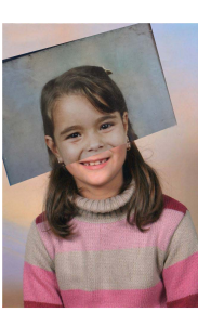
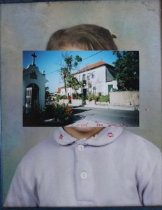
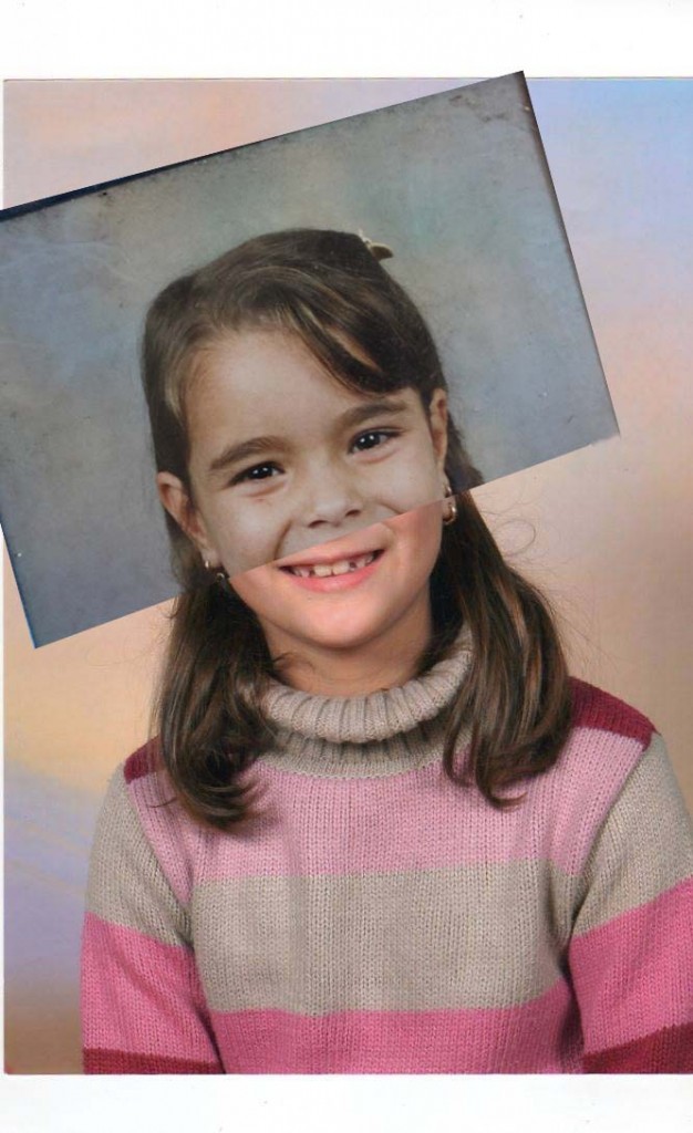
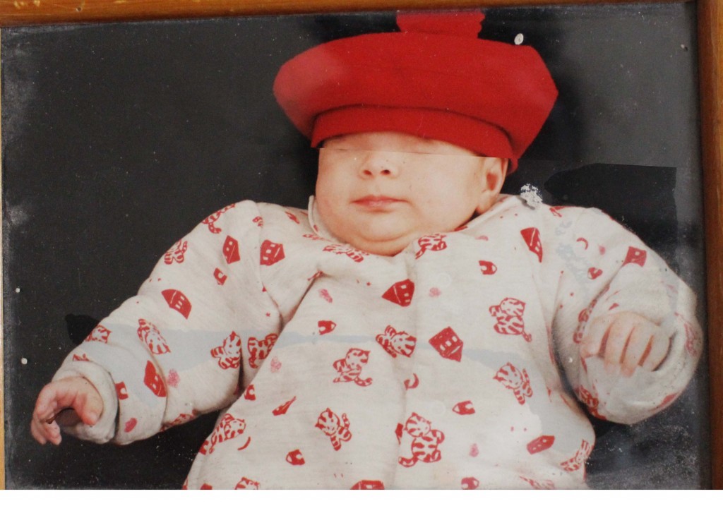
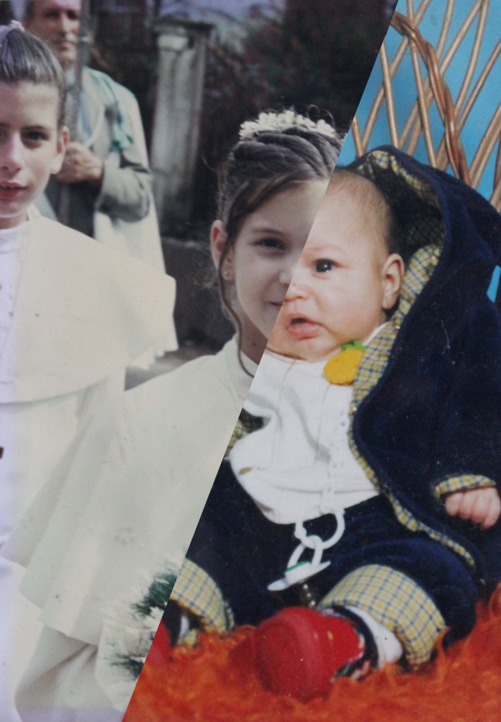
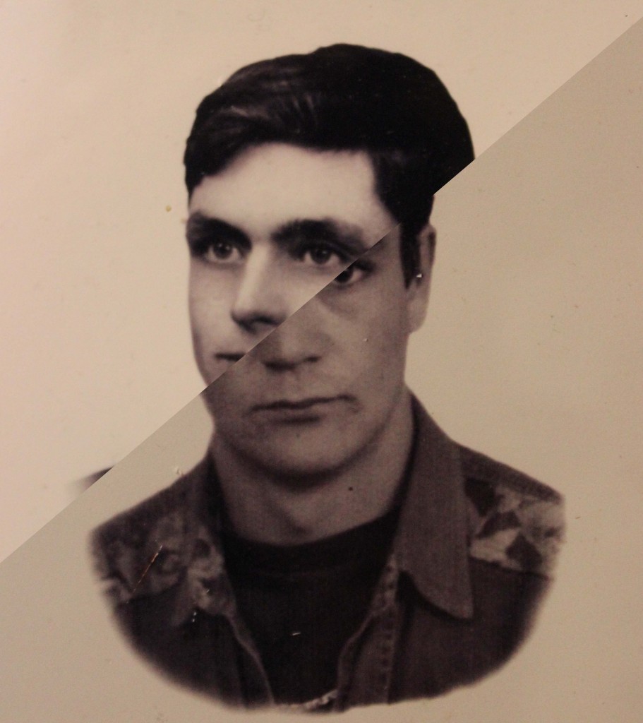
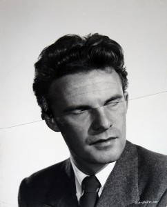
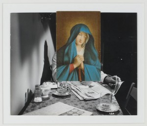
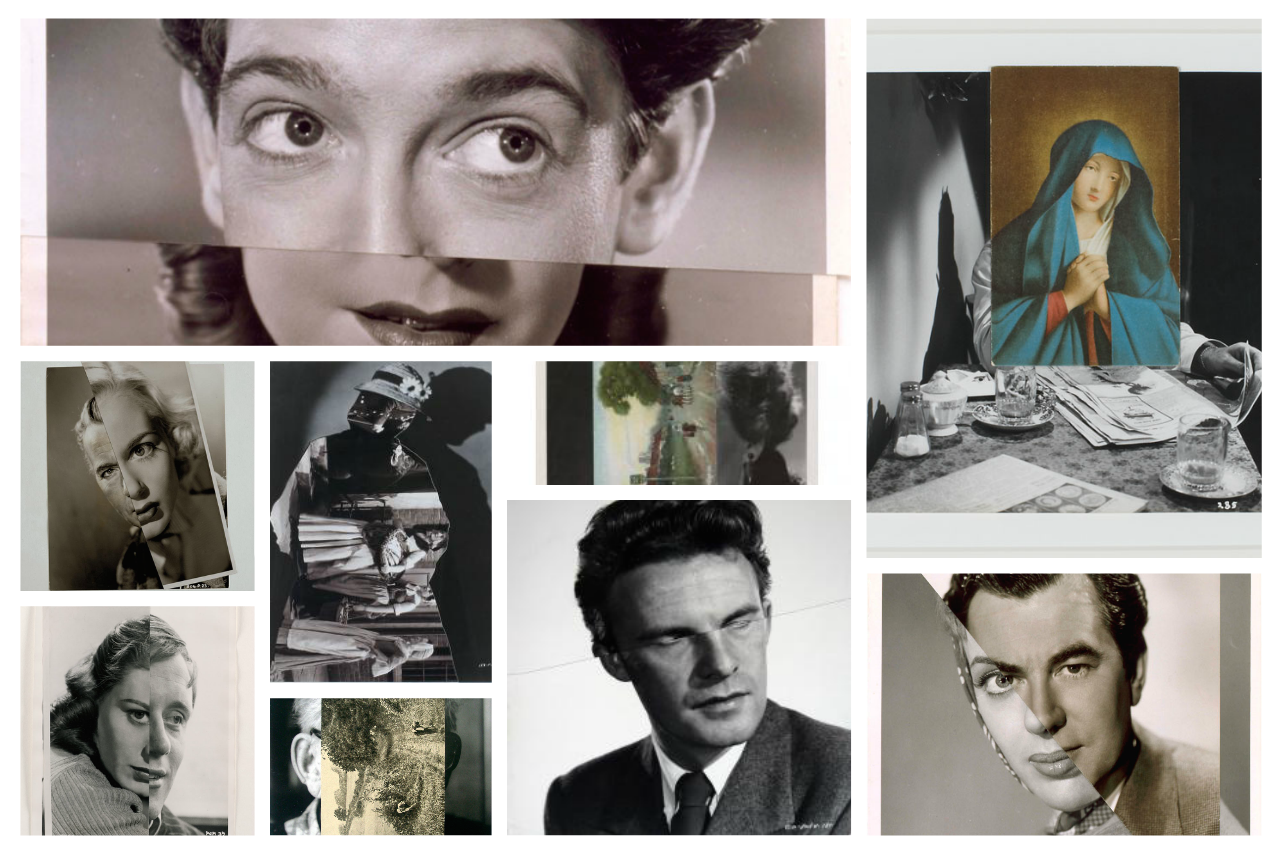
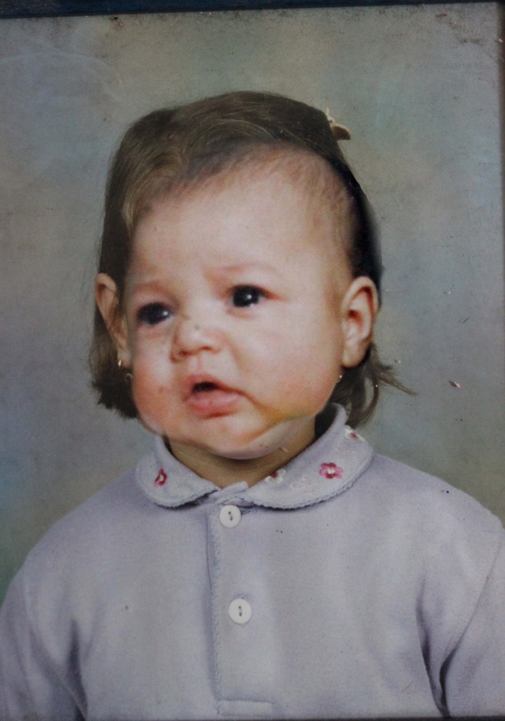
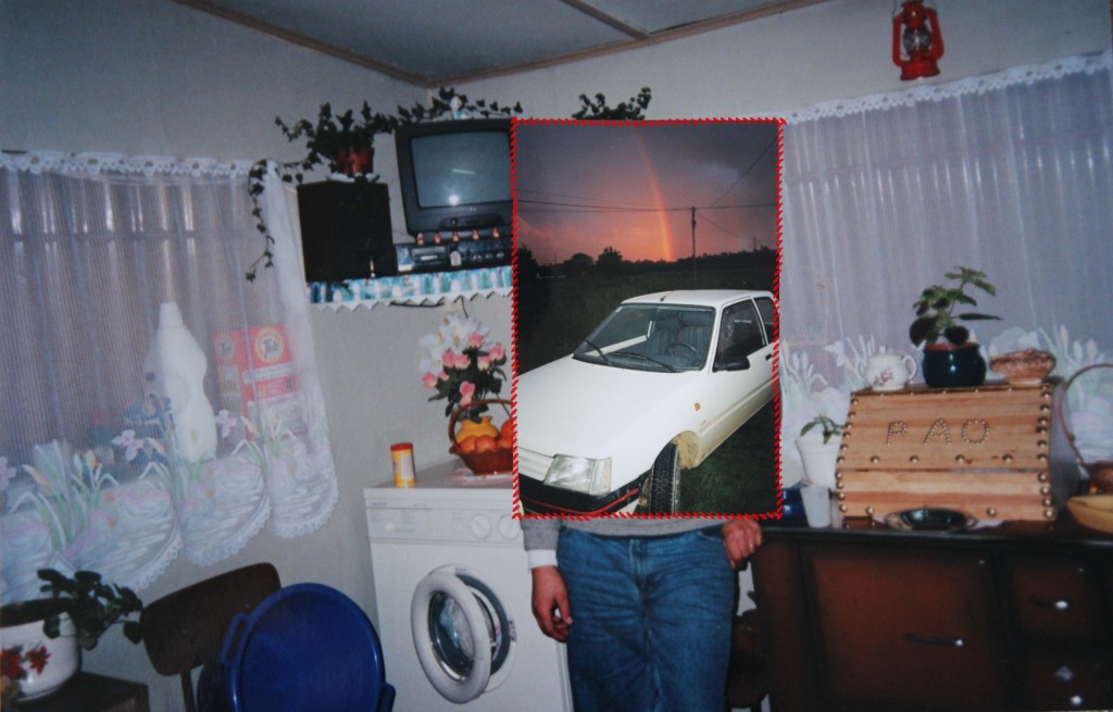
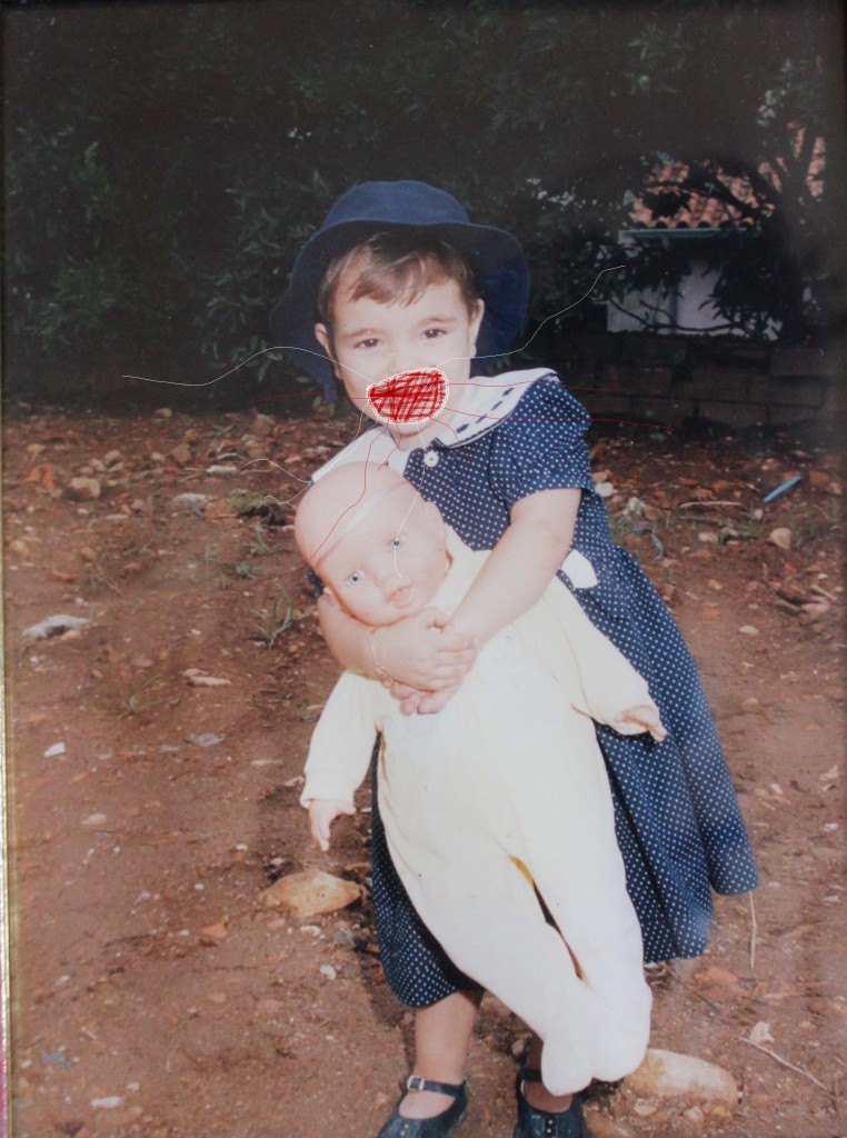
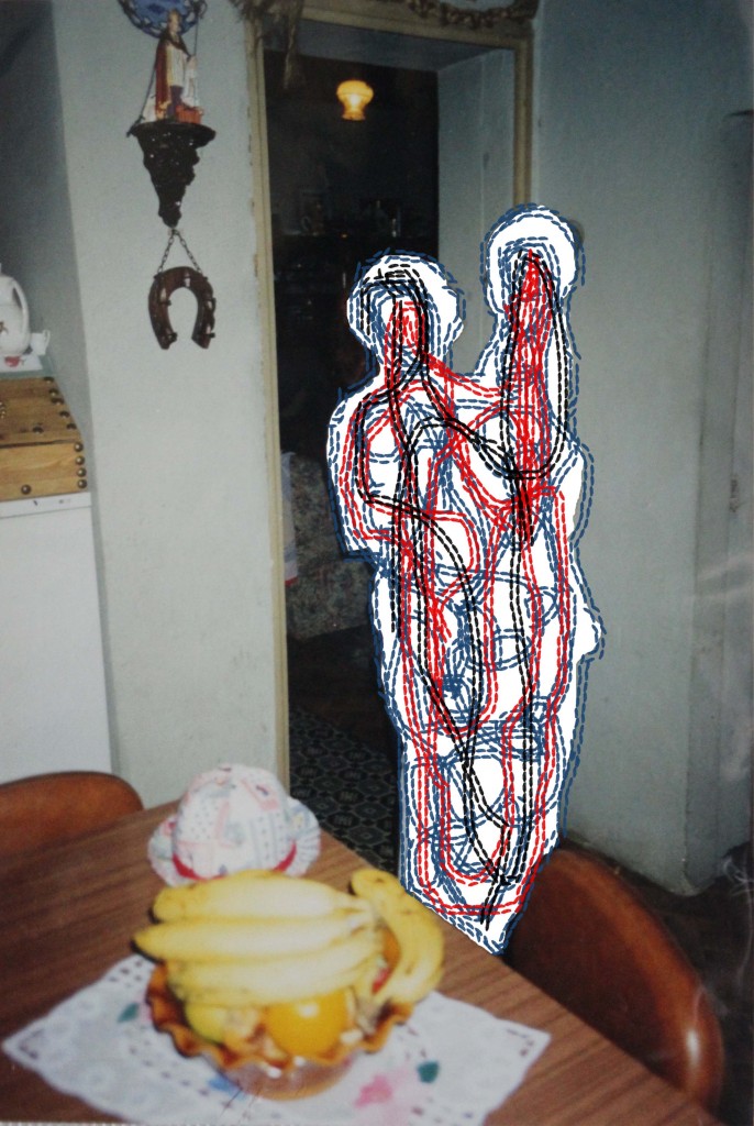
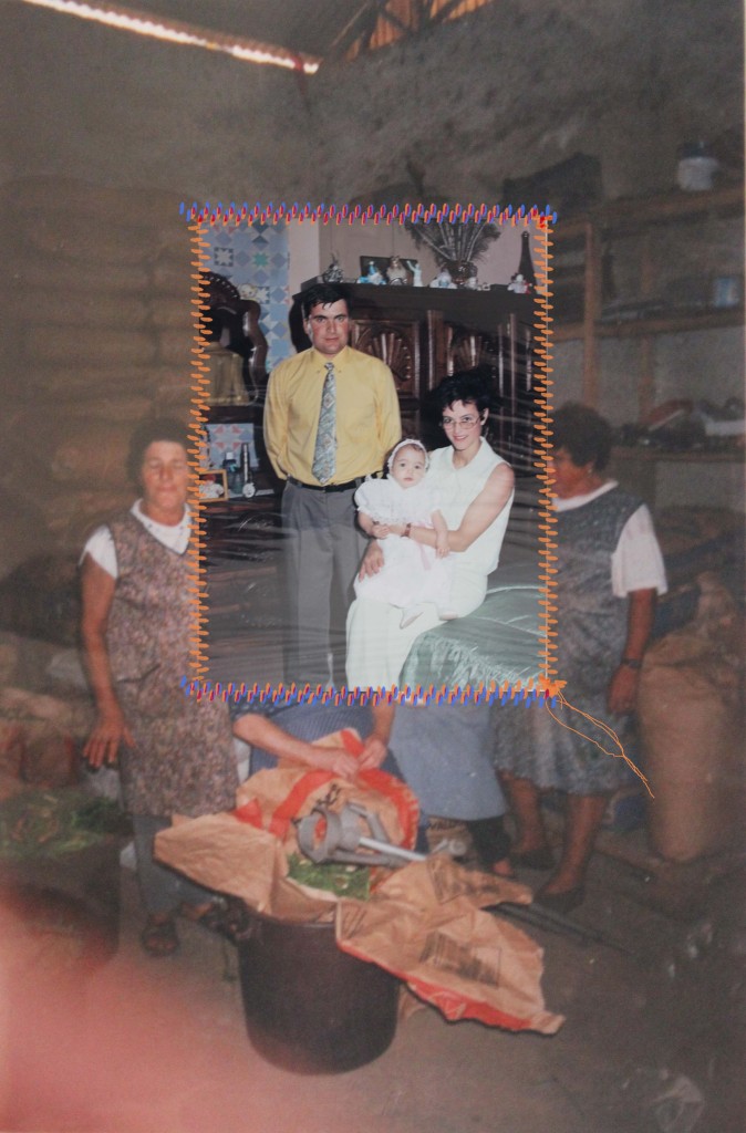
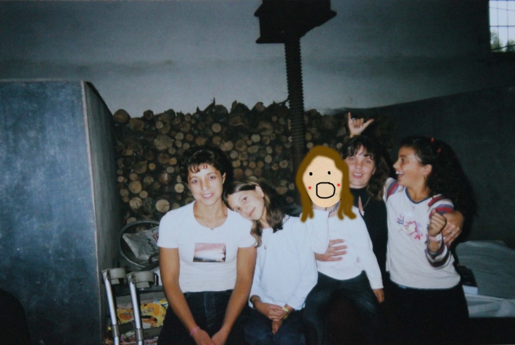
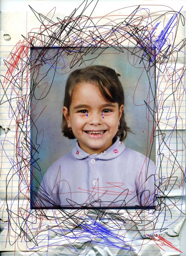
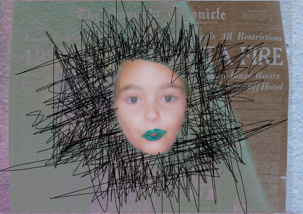
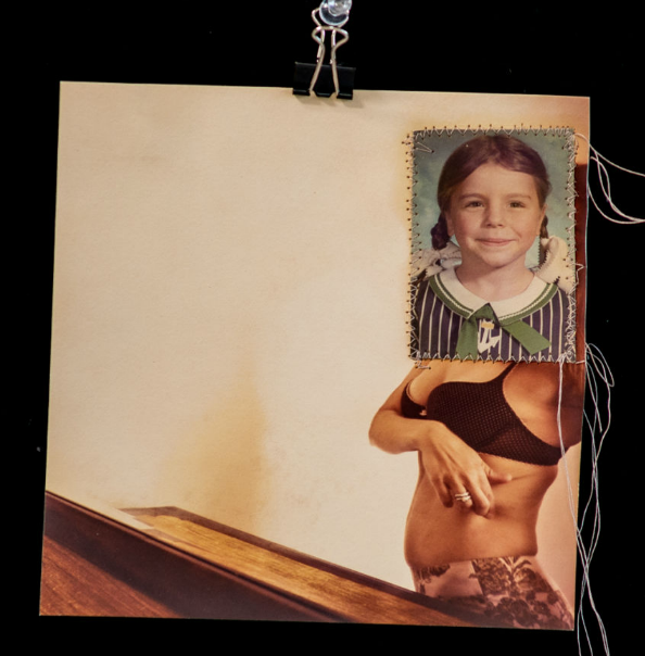
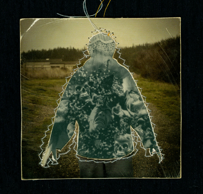
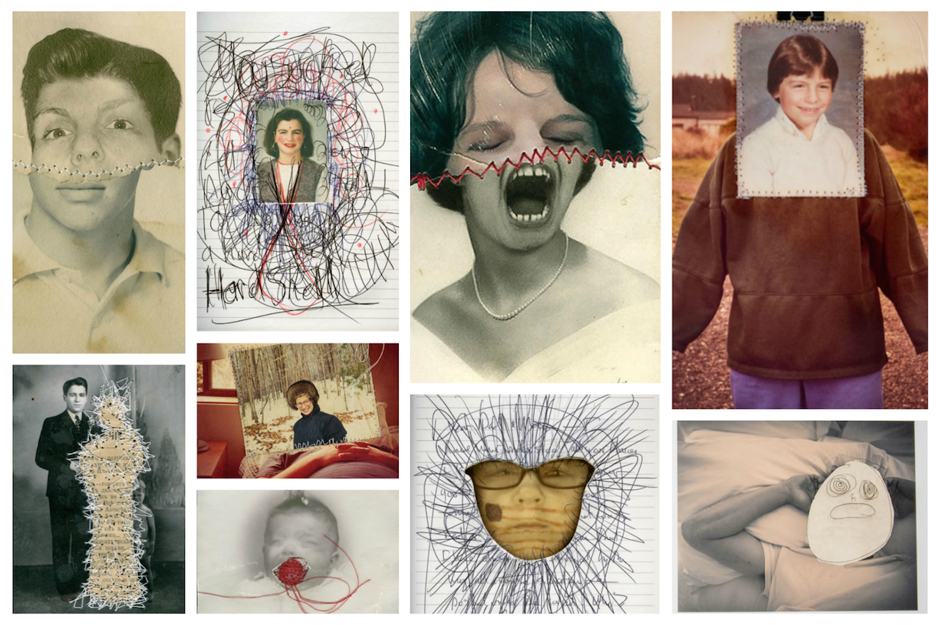
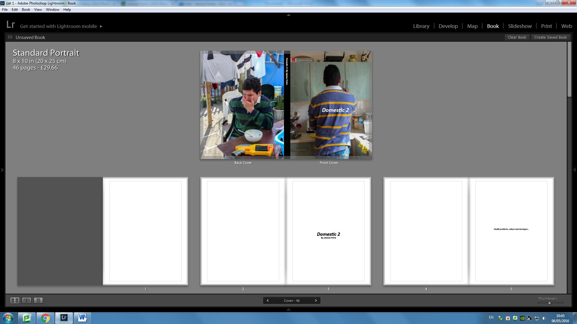
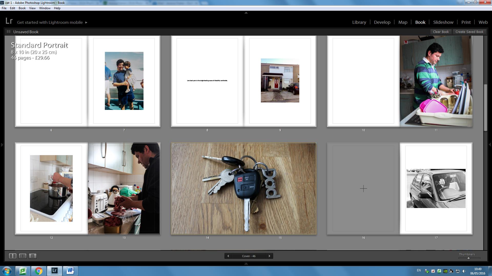
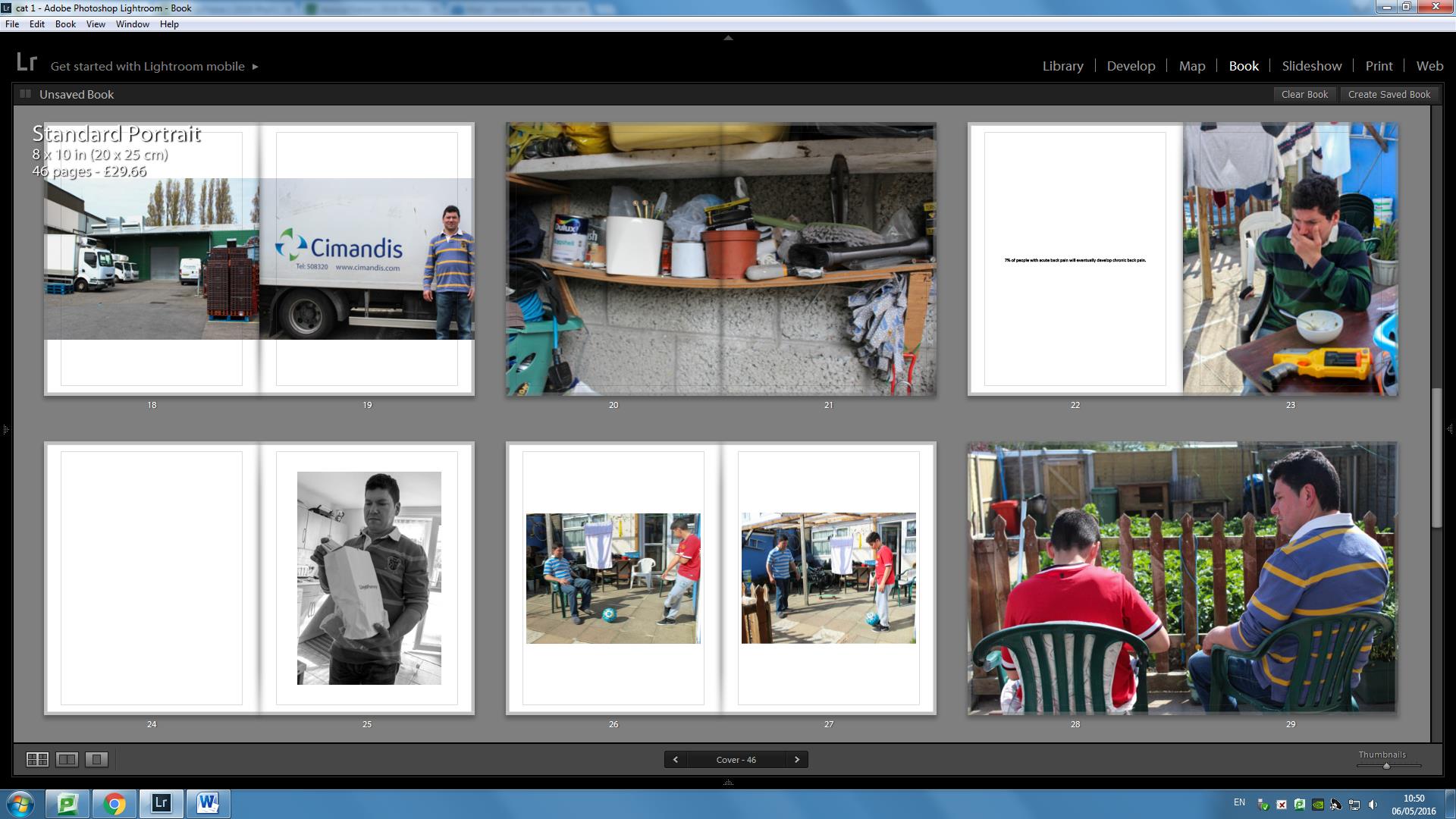
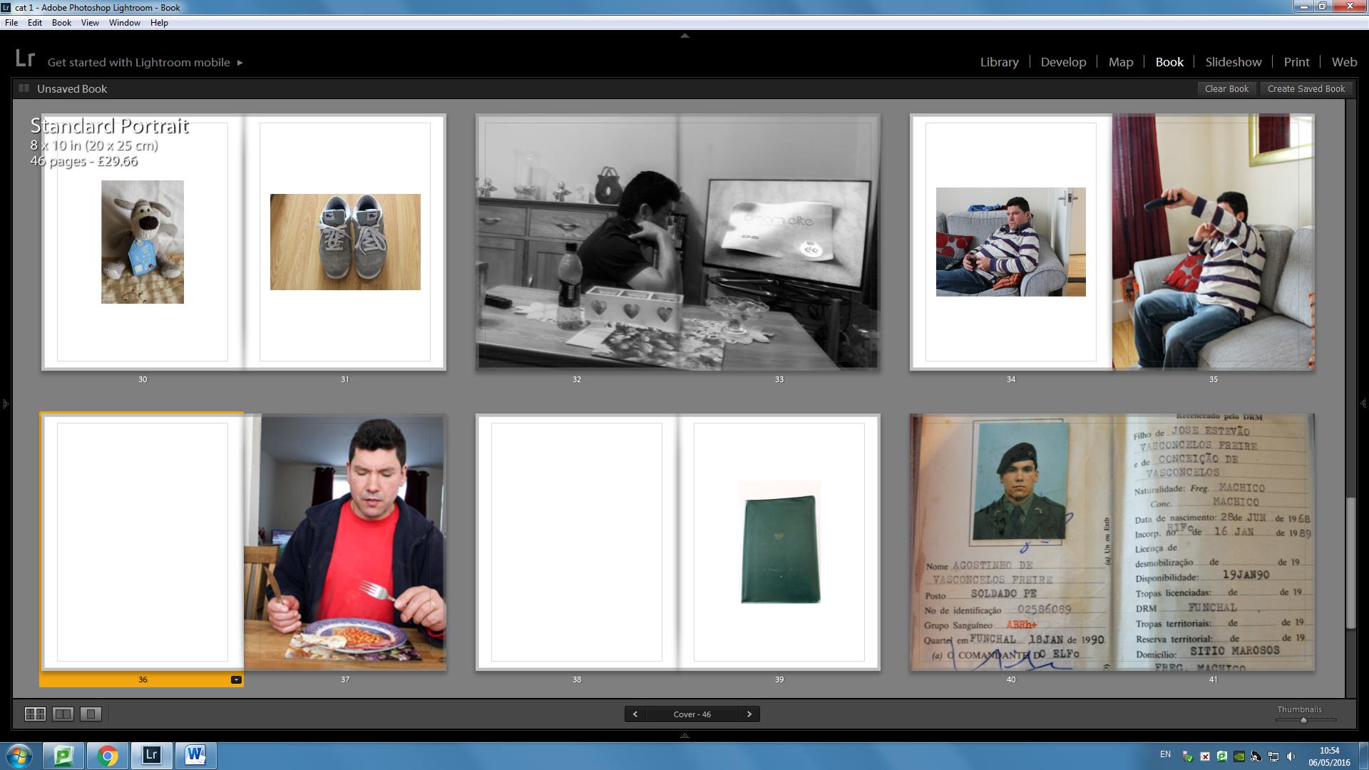
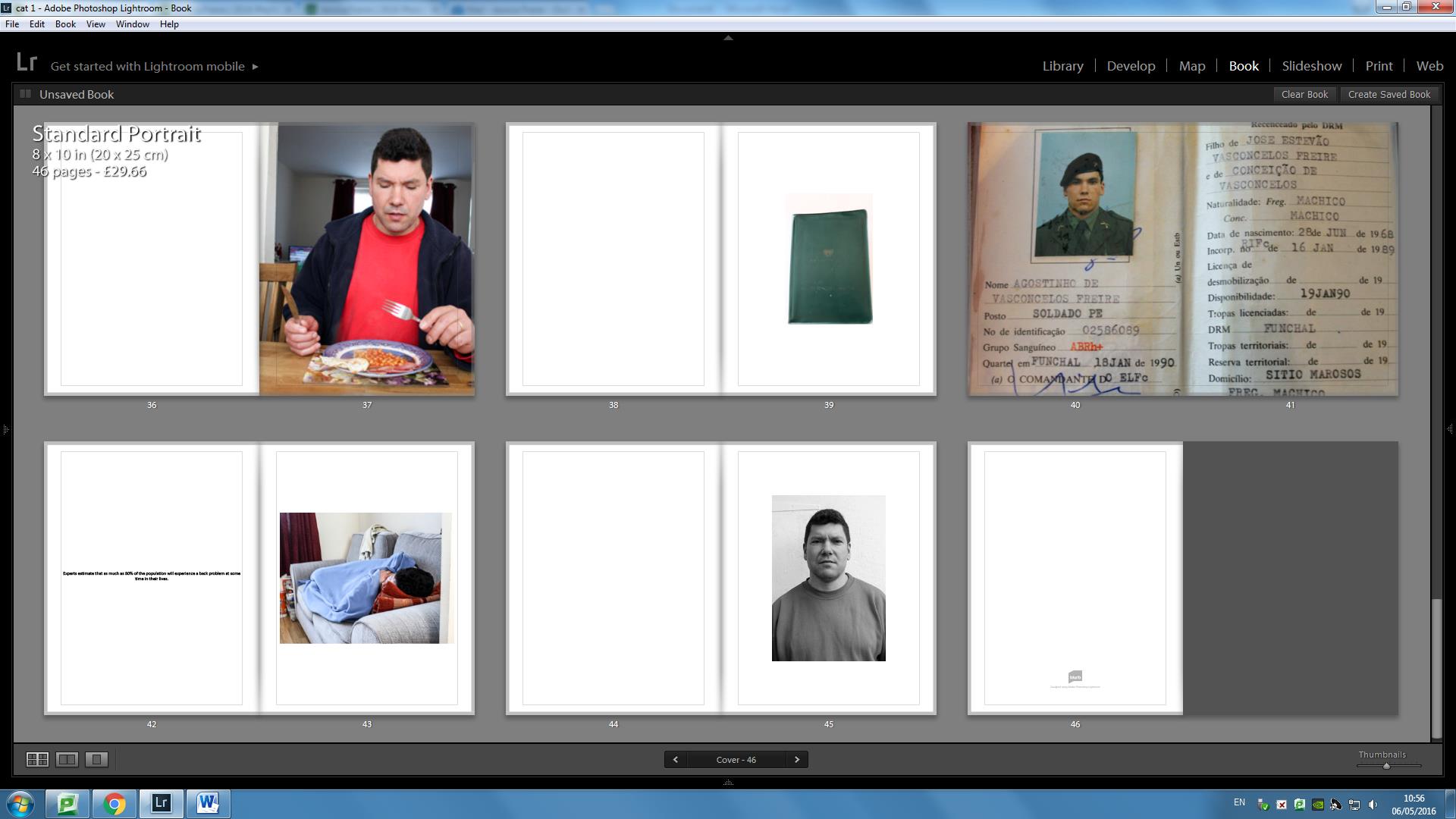
This is the full layout for my photo book. The title I decided to go with was ‘Destruction Is Creation’. I decided to go with this title as throughout the whole exam project, I ended up looking and only focusing on the theme of Truth. Therefore, as I was ‘destroying’ my photographs I was actually creating a whole new meaning to them. I was creating whatever I wanted the photograph to mean and therefore that became my truth. The next thing that I decided to do was to keep all the pages of my book in black. The reason for doing so is because I feel like my photographs would stand out more from the page to the viewer rather than having the color of my pages white or any other color. As you first open up the book you will be able to see a portrait photograph of from when I was little, and this was done to set the theme that is book was going to be based on my interpretation of what I believe to be truth as well as the truth that I created for myself using old photographs of me and my family. As you look through the photo book you will be able to see a range of experimentations  that I had previously created as a response to the four artists that I based my research, analysis and inspiration from – John Stezaker, Liz Steketee, Chino Otsuka and Joachim Schmid. You will be able to see some photographs that have just been inserted into the book without having been manipulated. The reason for this is due to the that I wanted to have somewhat of a balance between my manipulated photographs and some original photographs. You will also see that I don’t really have a standard and neat order to my photographs. I didn’t make the layout of my photo book neat as I wanted it to look like what a family looked like as well as having an authentic vintage feel to it. I got inspirations for some of my page layouts from the various photo books that I have researched and analysed which were –  Adam Broomberg and Oliver Chanarin – Divine Violence / Holy Bible,  Christian Patterson – Redhead Peckerwood ,Chris Dorley Brown – The Longest Way Around and Yoshikatsu Fujii – Red String.  Once my photo book arrives I will also be adding things to it, which I talked about in notes form in my photo book planning blog post. Overall, I am happy with the outcome of the photo book and I think that it will represent what I wanted to project to be based and and what I wanted it to look like very well.

Exam – Evaluation – Experimentation / Responses:

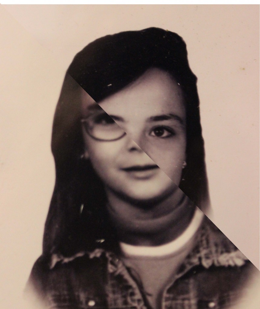
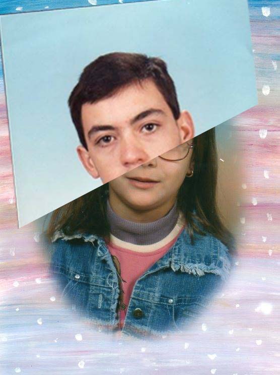
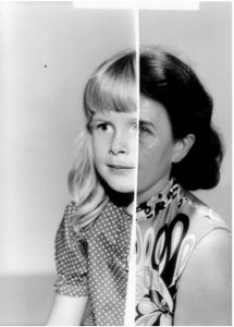
John Stezaker –  I really enjoyed creating my responses for John Stezaker, not only were they easy but they were also very closely represented. I like the way that they turned out and how I was able to create some interesting photographs with interesting meanings behind each one of them to create my version of the truth. I also really liked the visuals of putting two faces together, and I personally think it looks very interesting and it looked almost as if I created a whole new person.

Liz Steketee – My experimentations and responses to Liz Steketee were my favorite responses to create. This is due to the fact that I really connected to her visuals and how she was working with the images in various different, simply yet very creative and effective ways. Therefore, after looking closely at her work , I got really excited to start producing my own responses to her work. I also like the fact that the images that she has worked looked very similar to mine and therefore I feel like that allowed me to connect more to her work and therefore be able to produce similar photo montages.

Chino Otsuka –  This was the responses that I least enjoyed. This is because of the fact that I found it very hard to create almost like an illusion like Chino Otsuka creates with her photo montages. When I was trying to create my own responses, I didn’t really like the outcomes as much I did for other artists, and this is because I felt like I needed to approach this situation the same way as Chino Otsuka approached hers when she was creating these photo montages, however that was just impossible to do therefore I just tried my best. using all the Photoshop skills I knew to create my best responses.

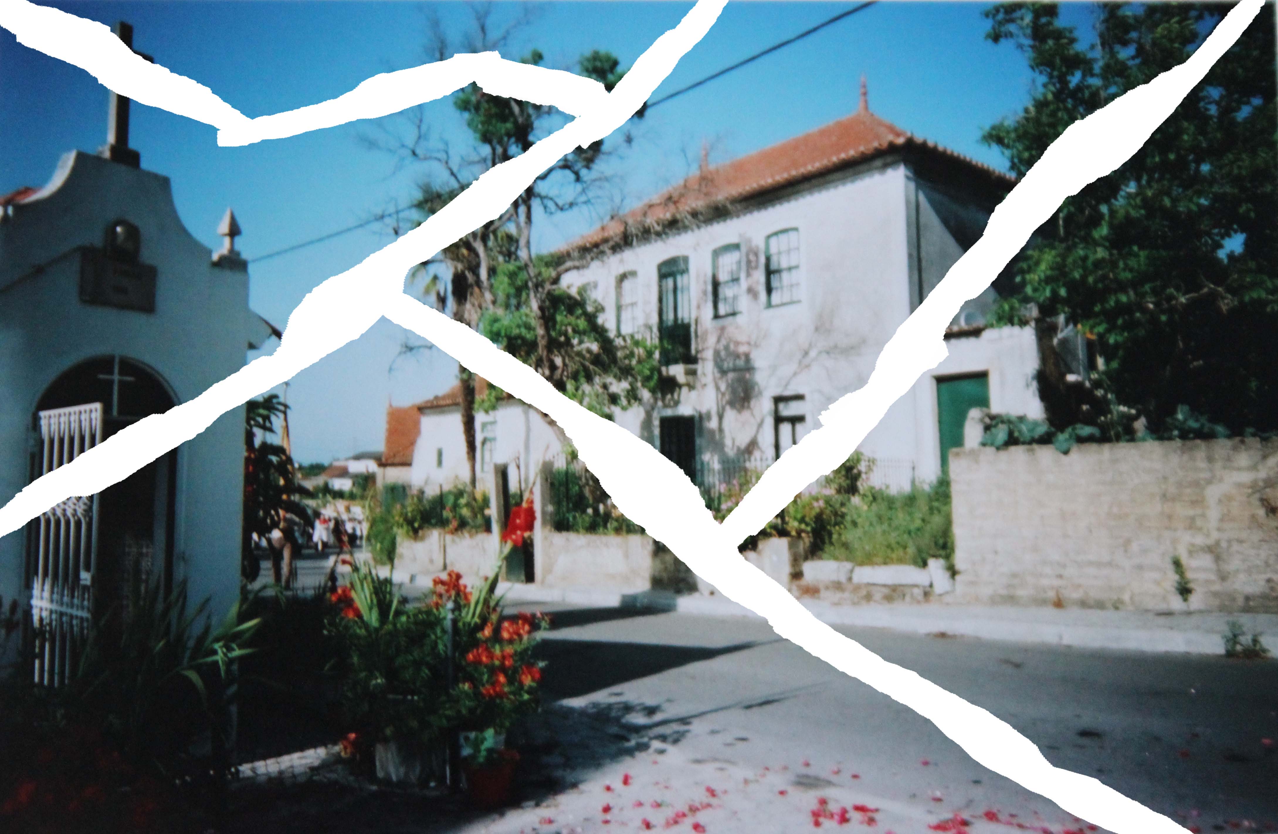
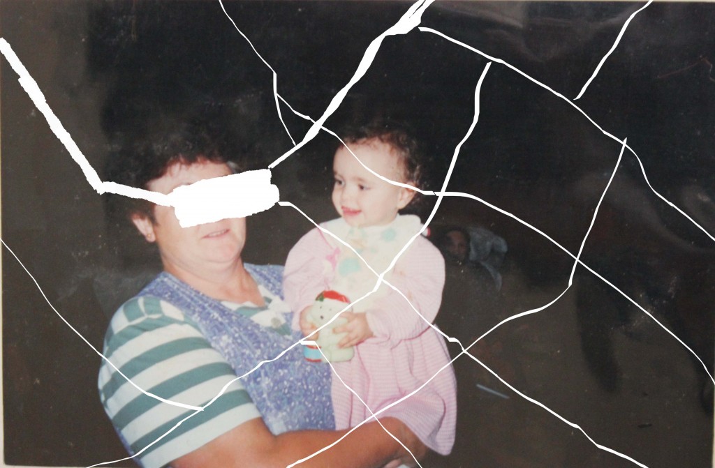
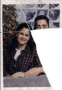
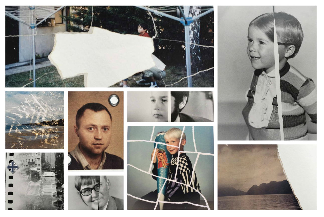
Joachim Schmid – These responses were fun to create digitally and also manually. I decided that, just in case the photographs did not come out the best way when I was trying to do the ripping effect digitally using Photoshop, that I would also print out some photographs onto some printer paper and rip them up just like Joachim Schmid has done. However, with the right brushes that I had found online and had downloaded I was able to create some interesting photographs, which I am happy with the outcome of.

My own – I decided that I would do my own version of some of these photographs as I was in the process of creating my responses for my other artists. I like the way that they cam out, as I feel like I had more creative control over the outcome of the images and therefore I was able to include or exclude whatever I wanted, however always keeping the theme and aesthetic in mind. I feel like some of my own responses are as strong visually and contextually as some of my responses to my researched artists, where I had less creative control however being inspired by them and their own work.

Exam – Evaluation – Photo Shoots:

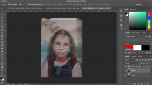
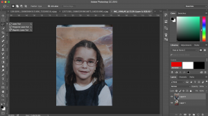
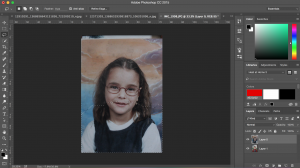
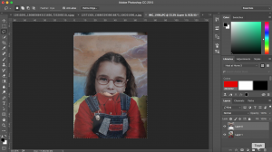
Screen Shot 2016-04-20 at 14.32.05Screen Shot 2016-04-20 at 14.33.03Screen Shot 2016-04-20 at 14.33.25Screen Shot 2016-04-20 at 14.33.59


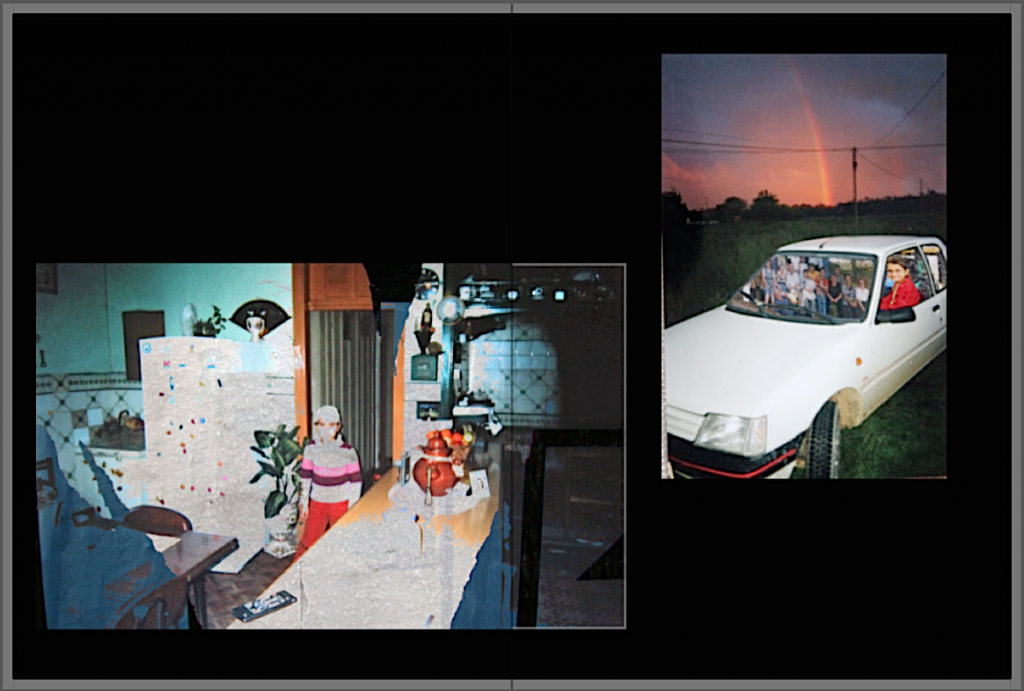
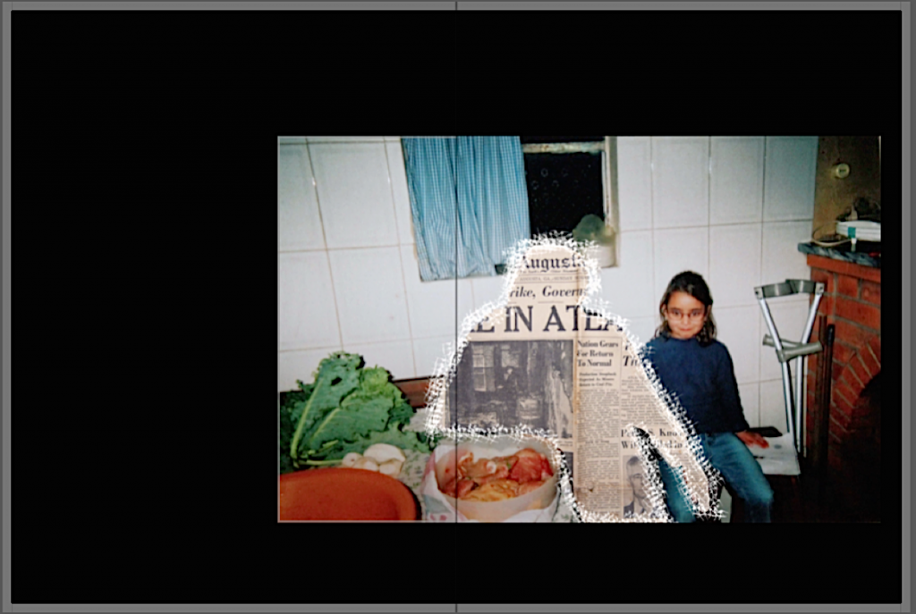
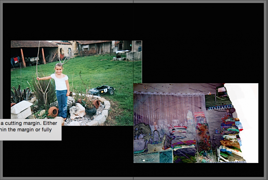
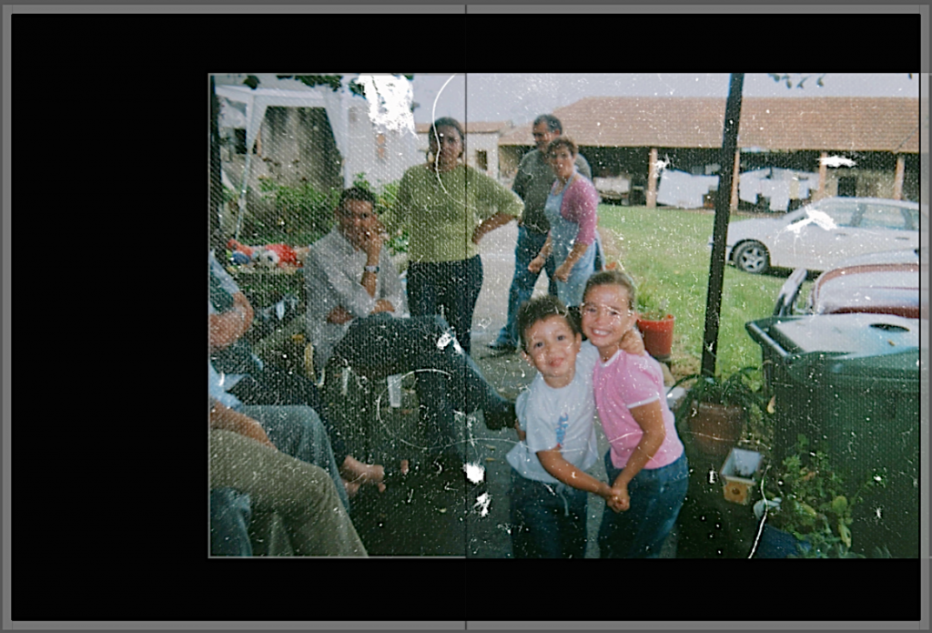
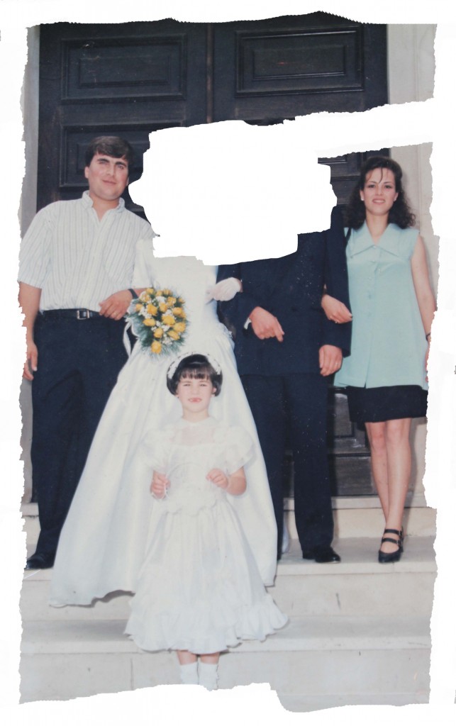
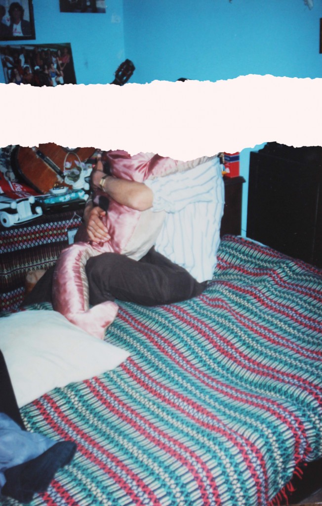
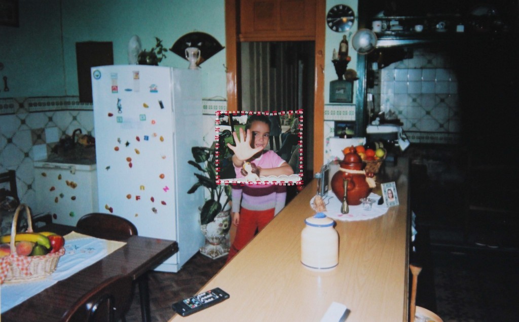
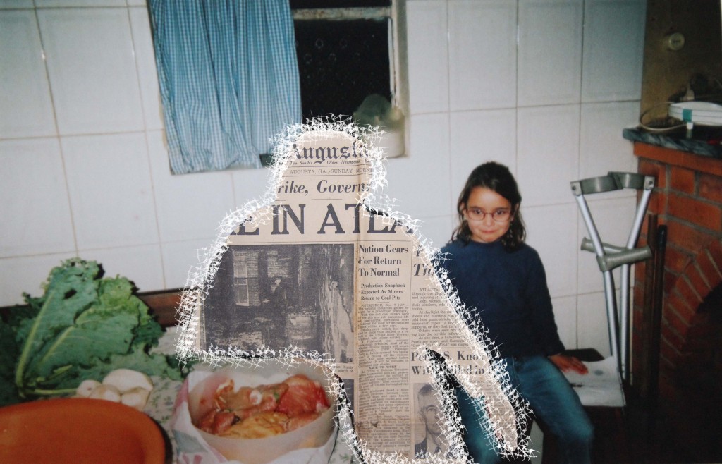
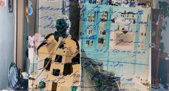
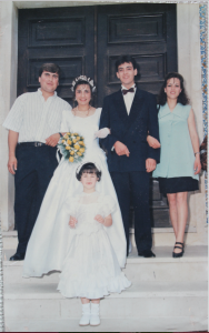
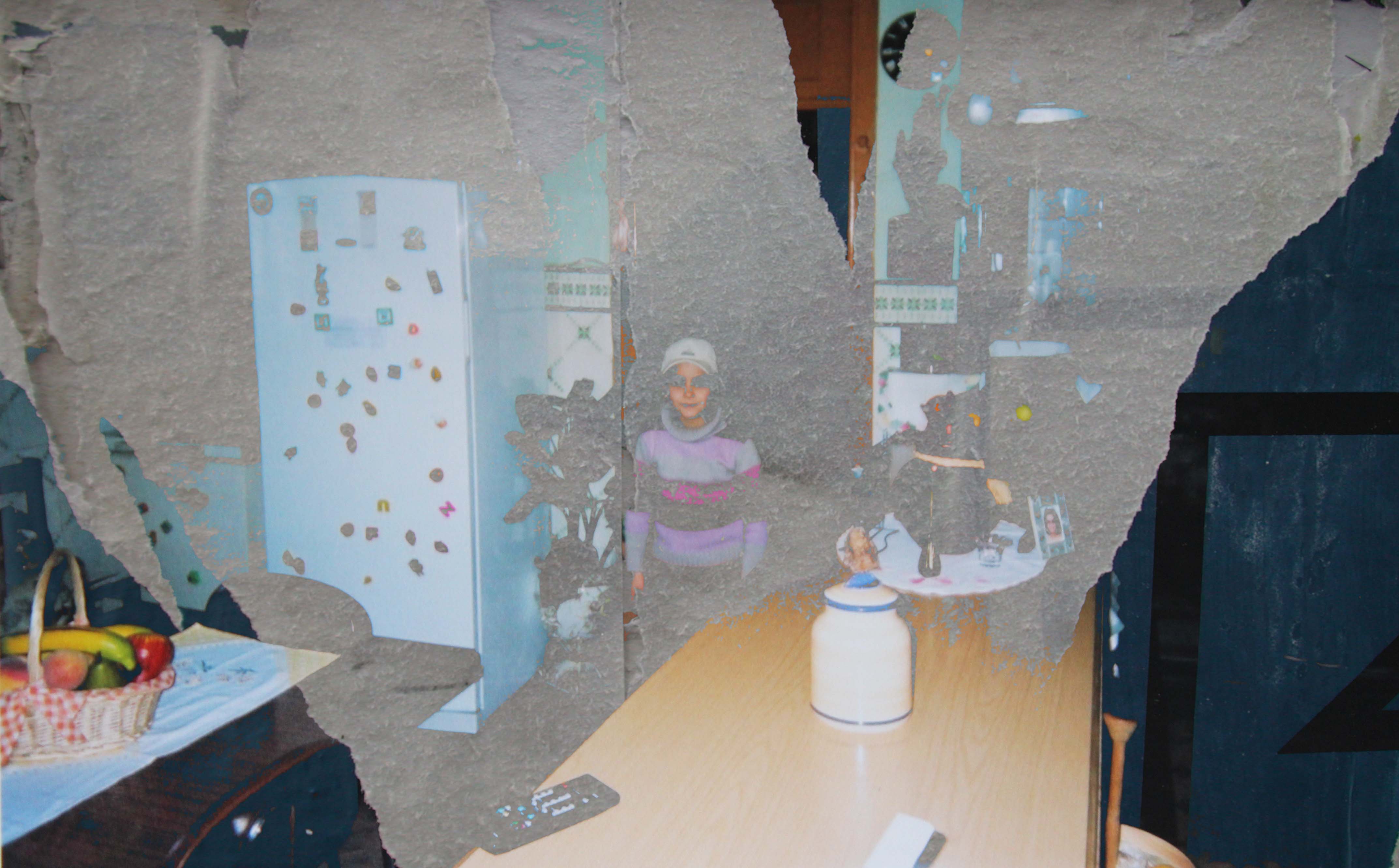
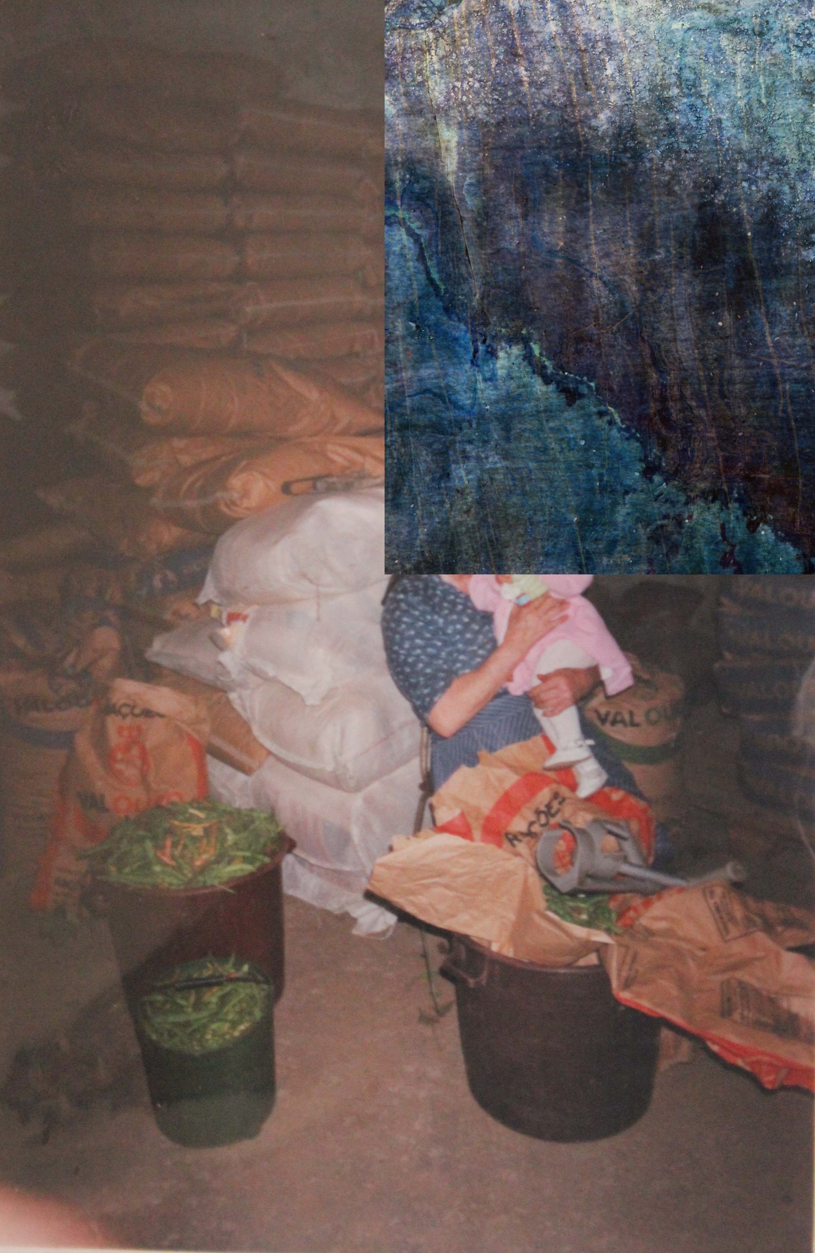
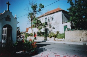
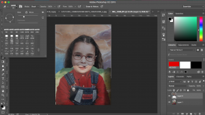
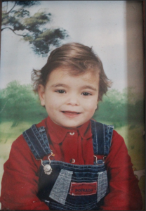
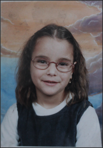
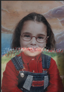
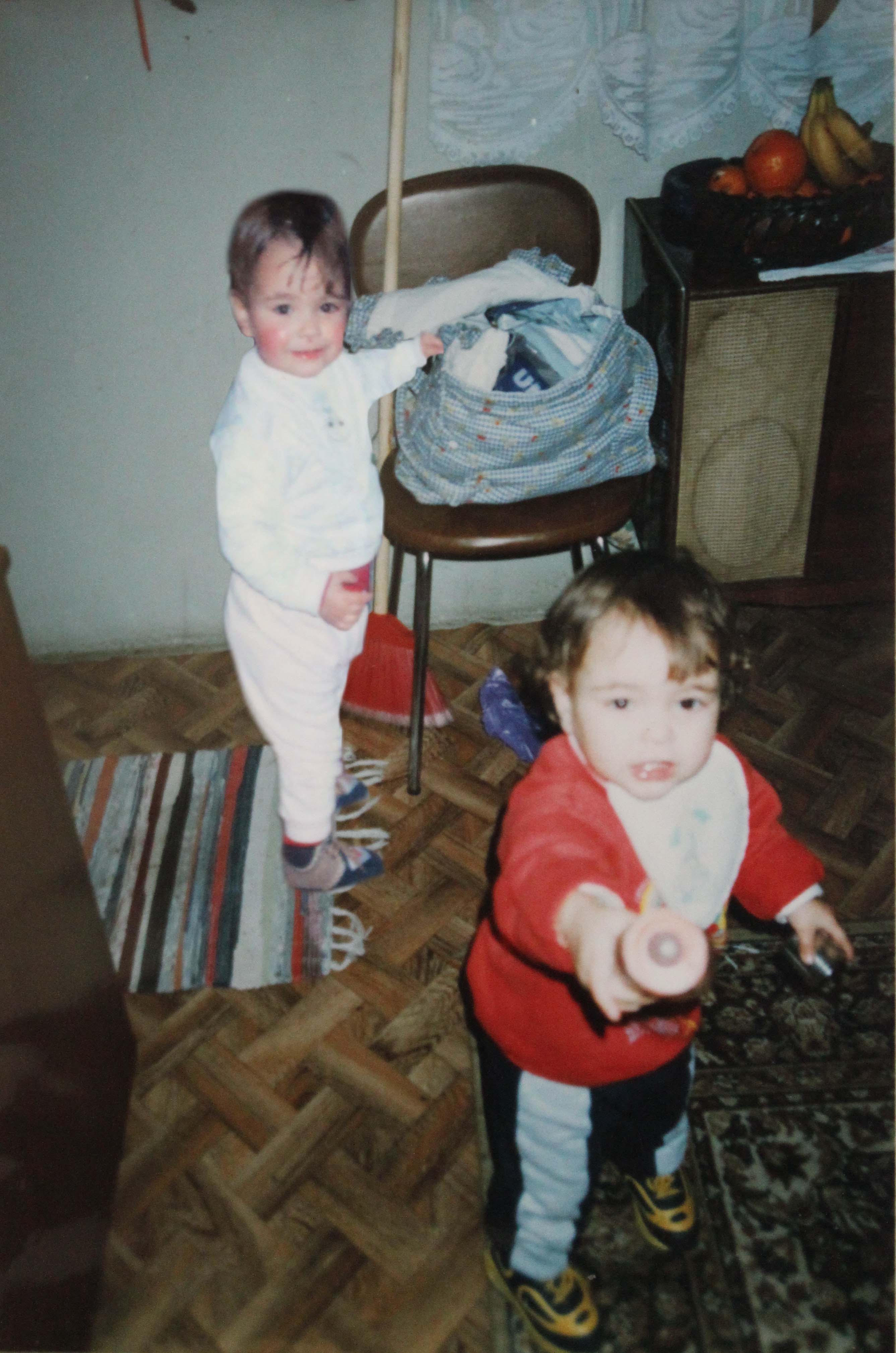
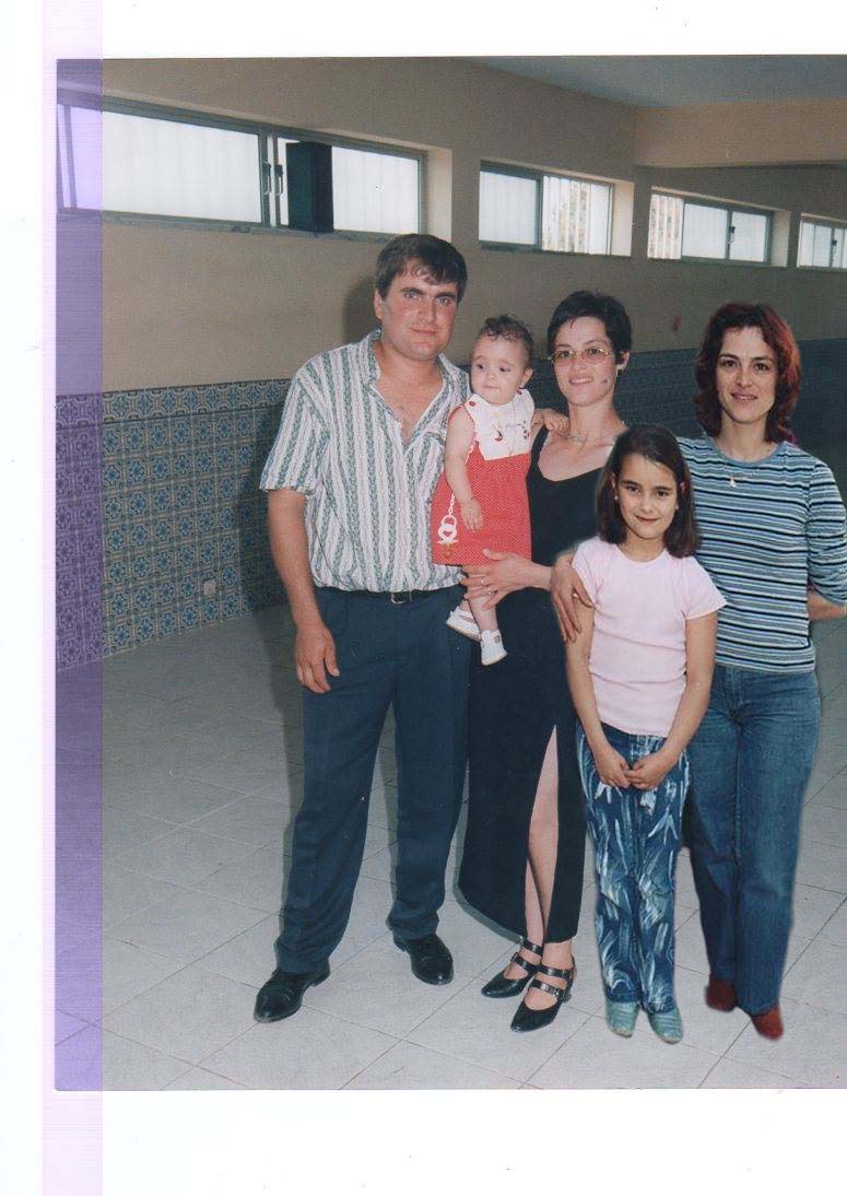
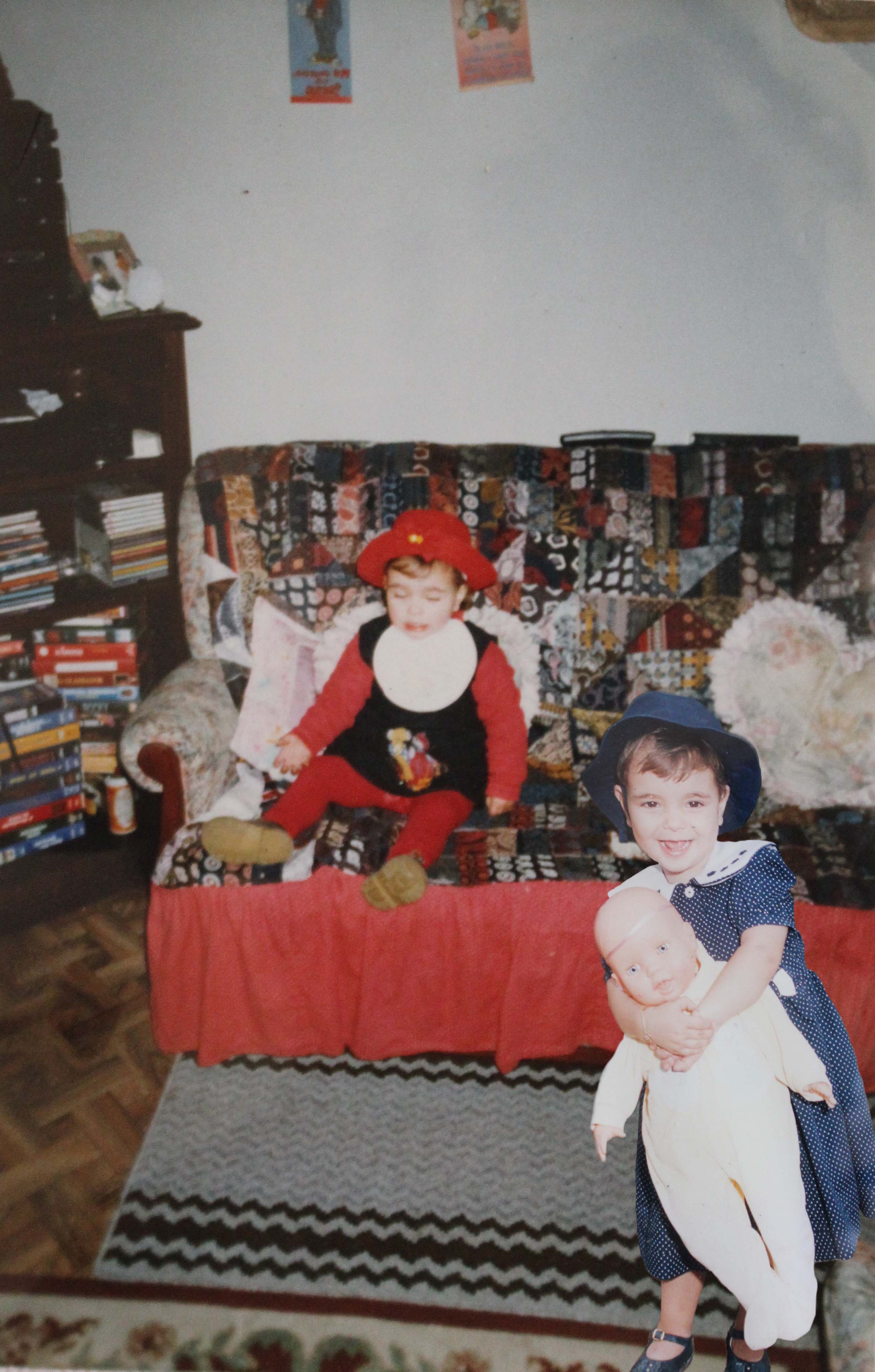
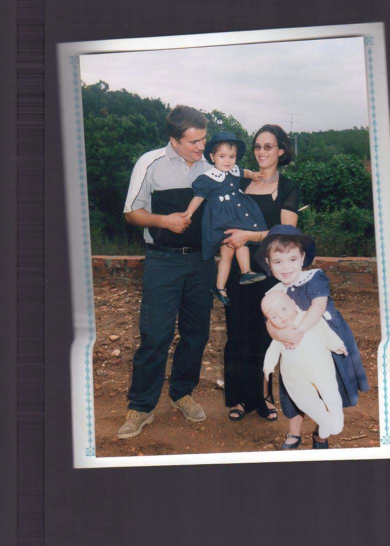
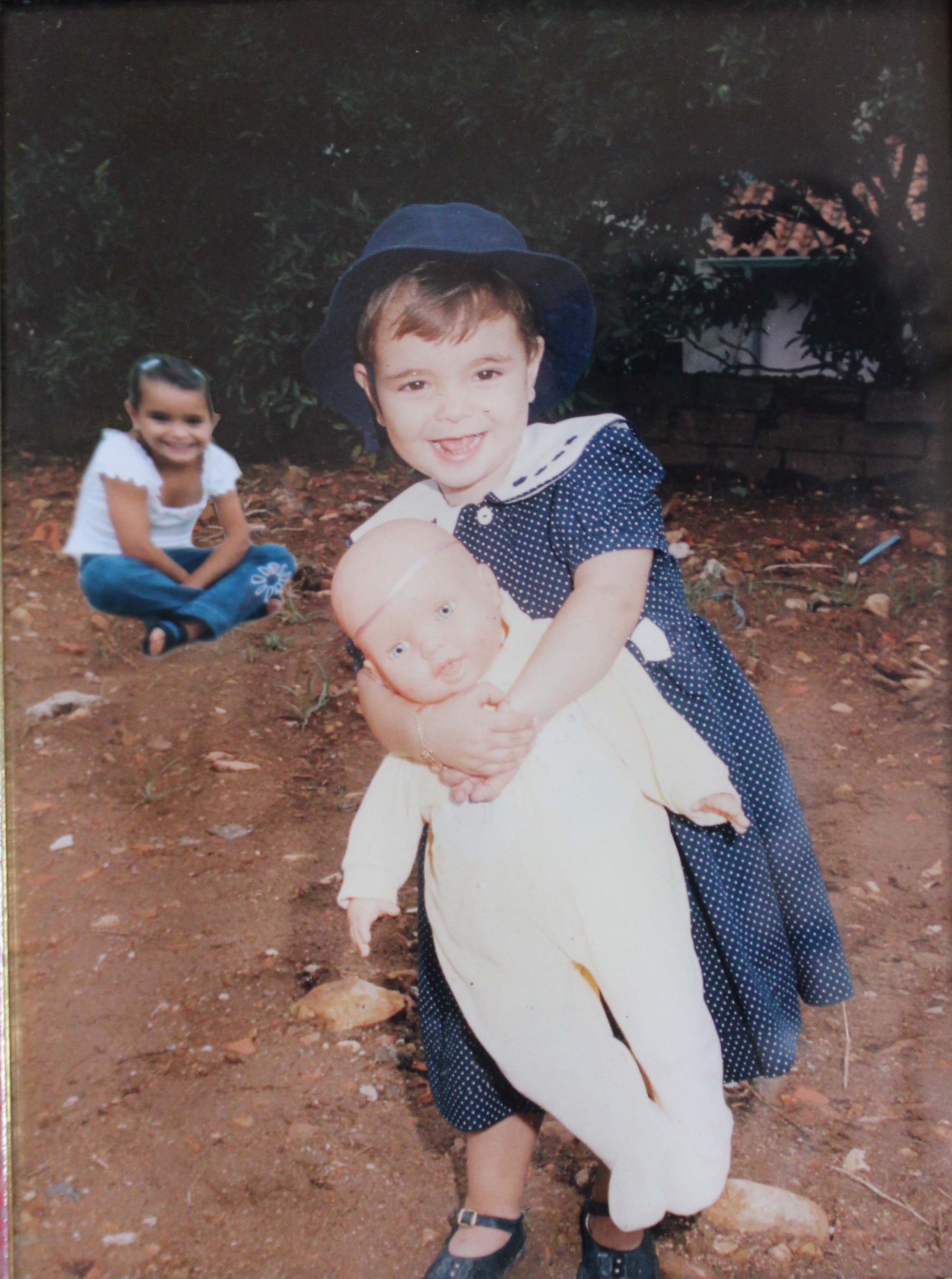
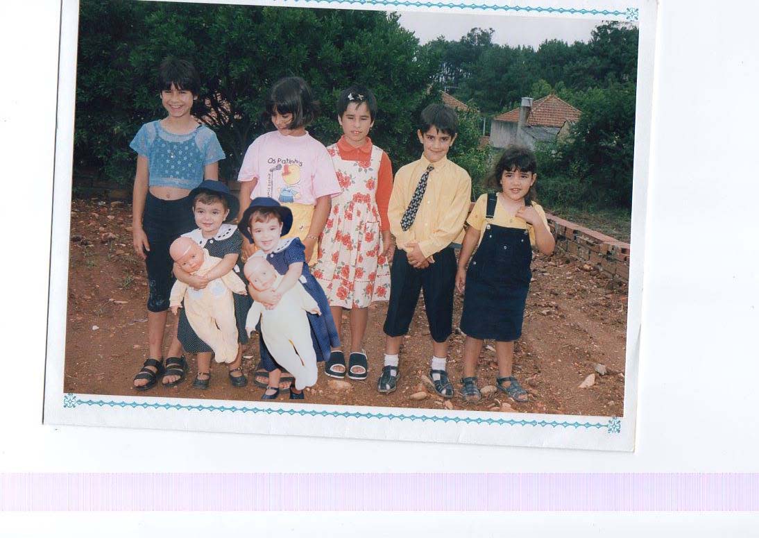
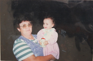
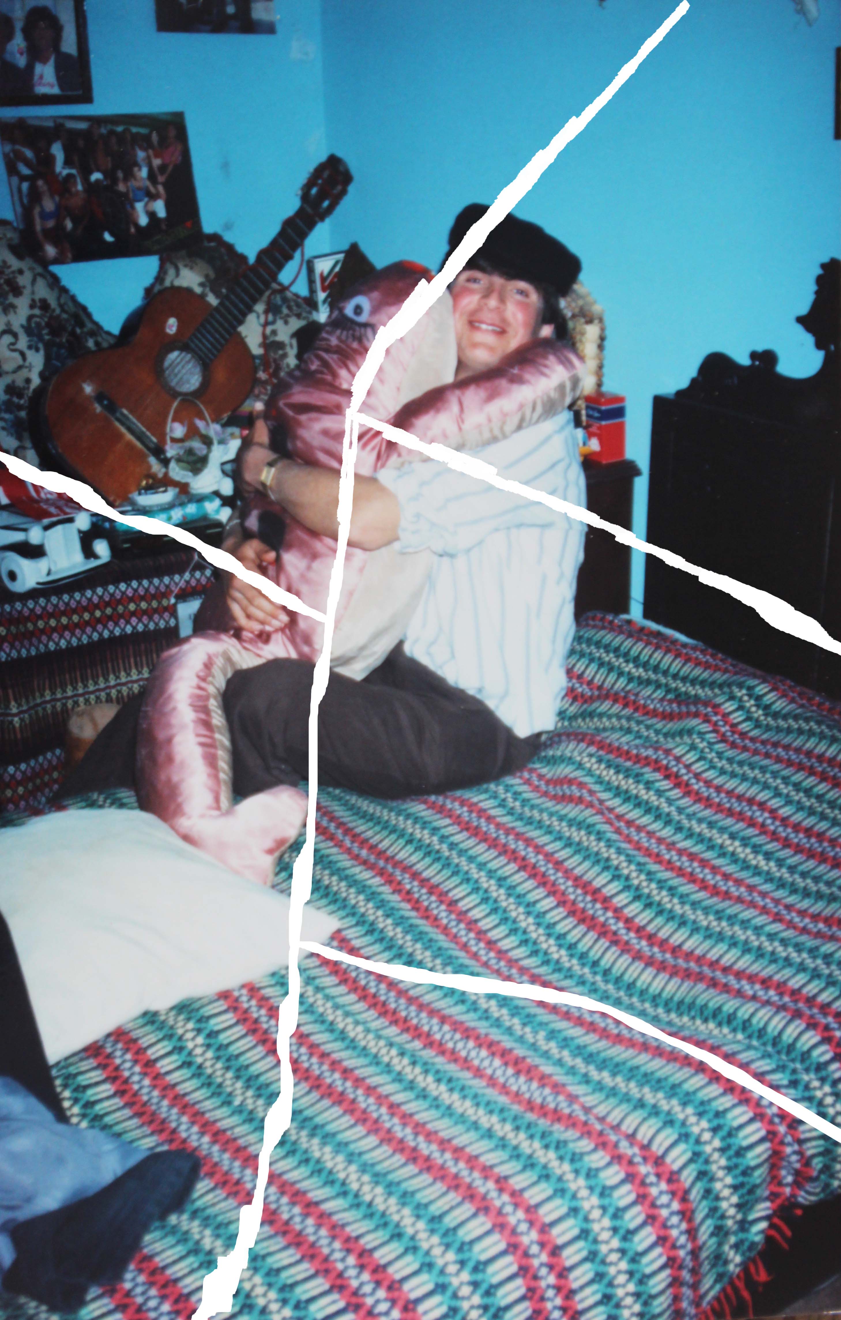
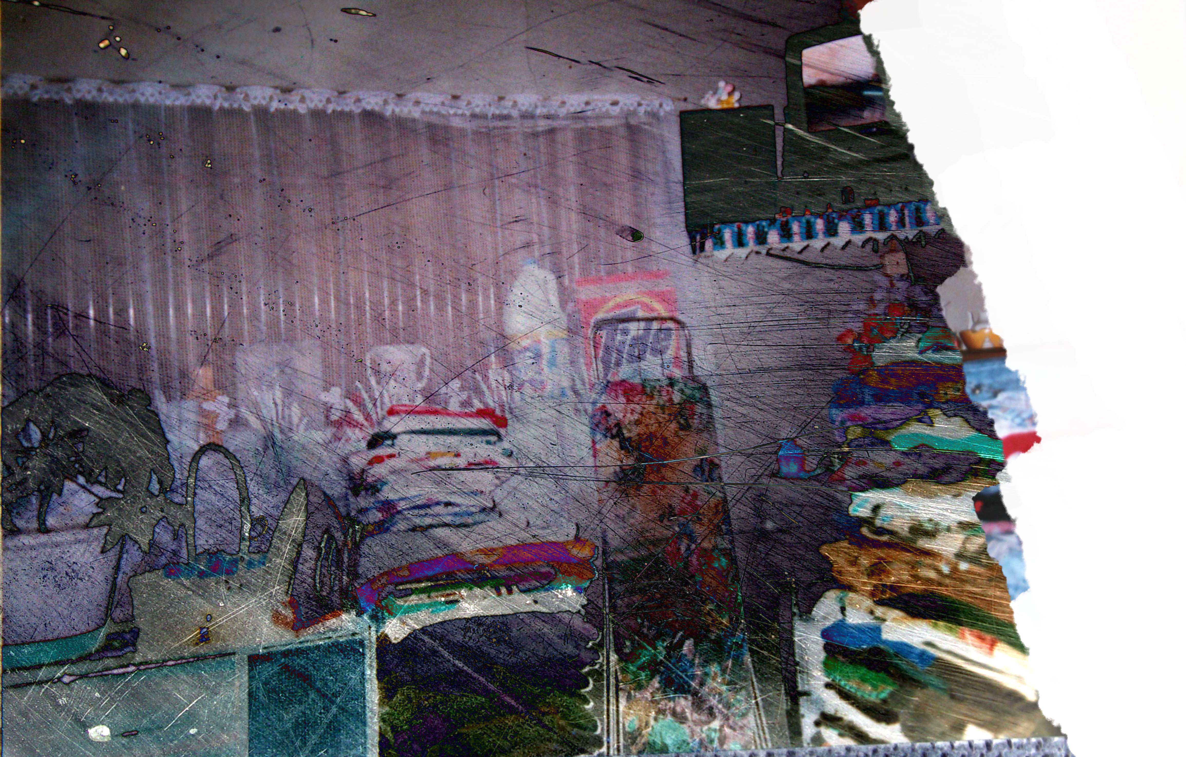
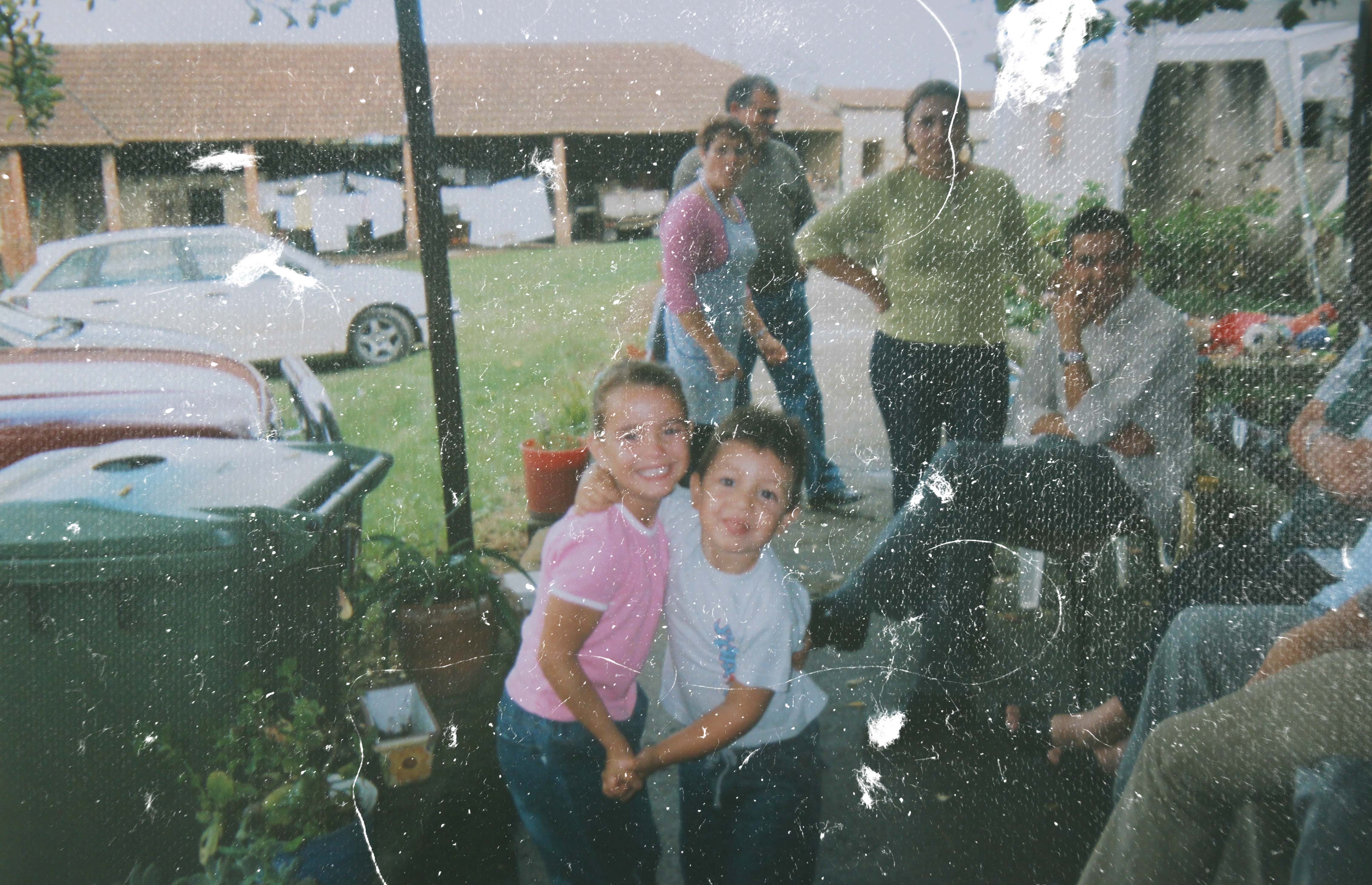
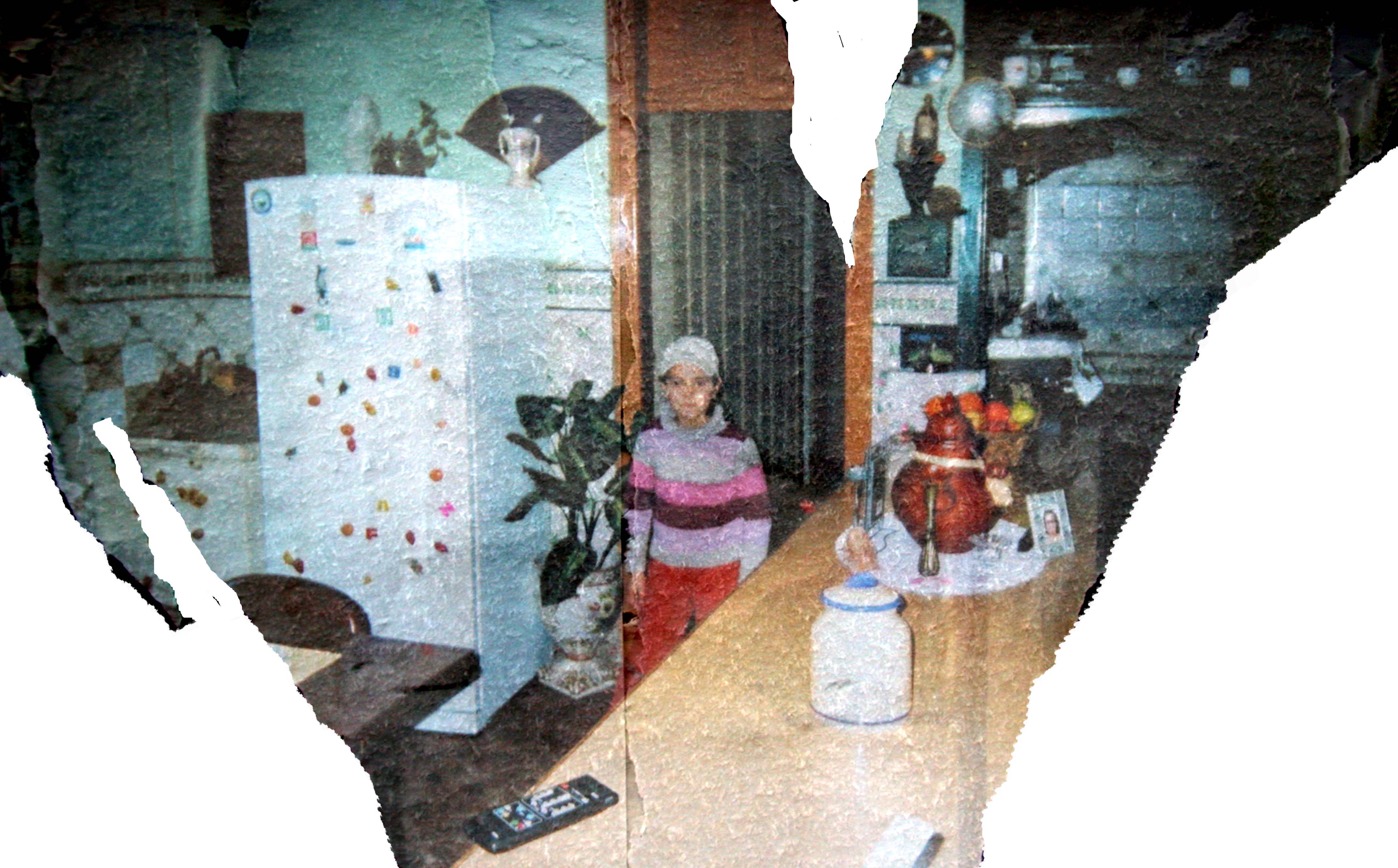
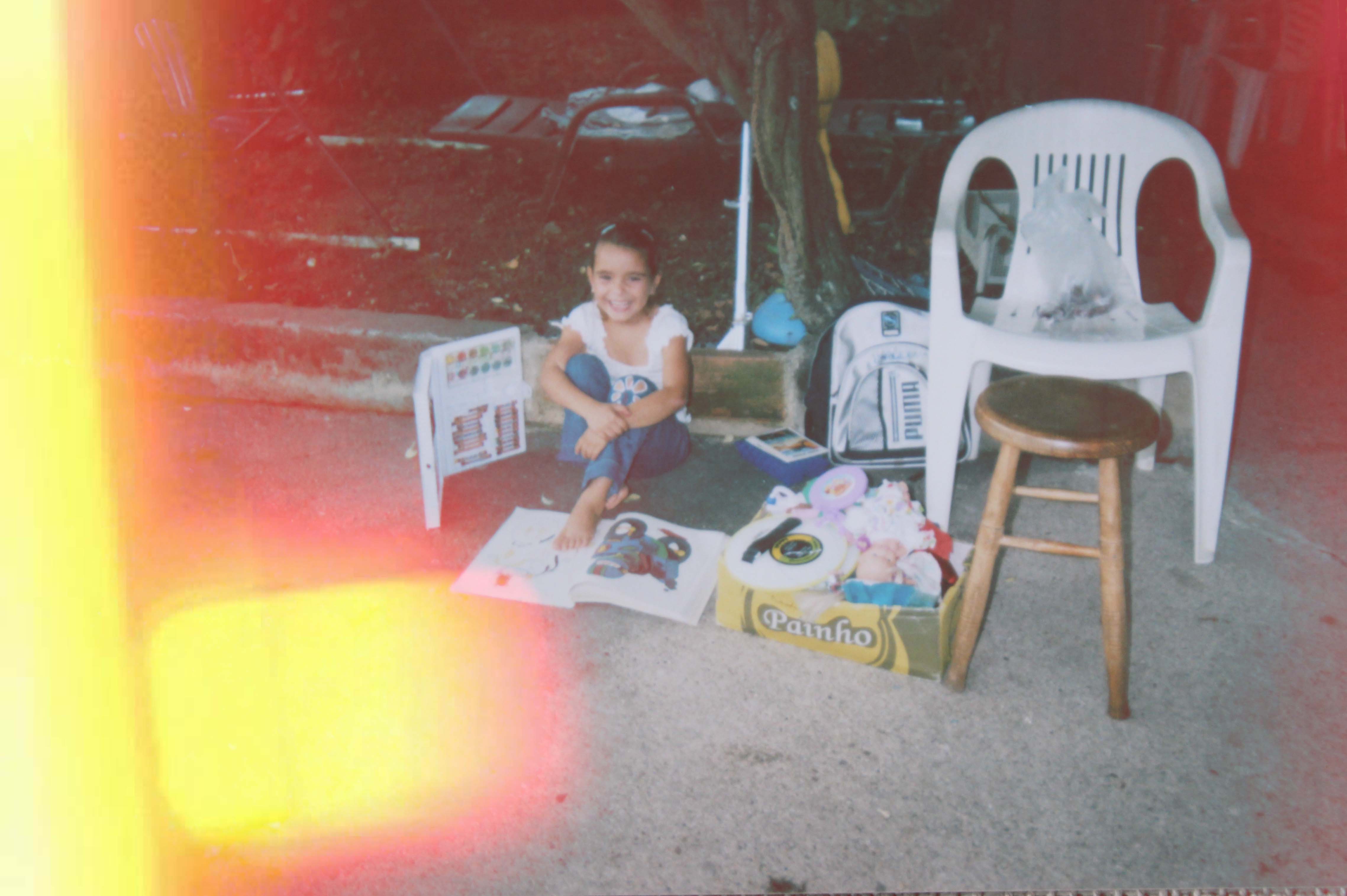
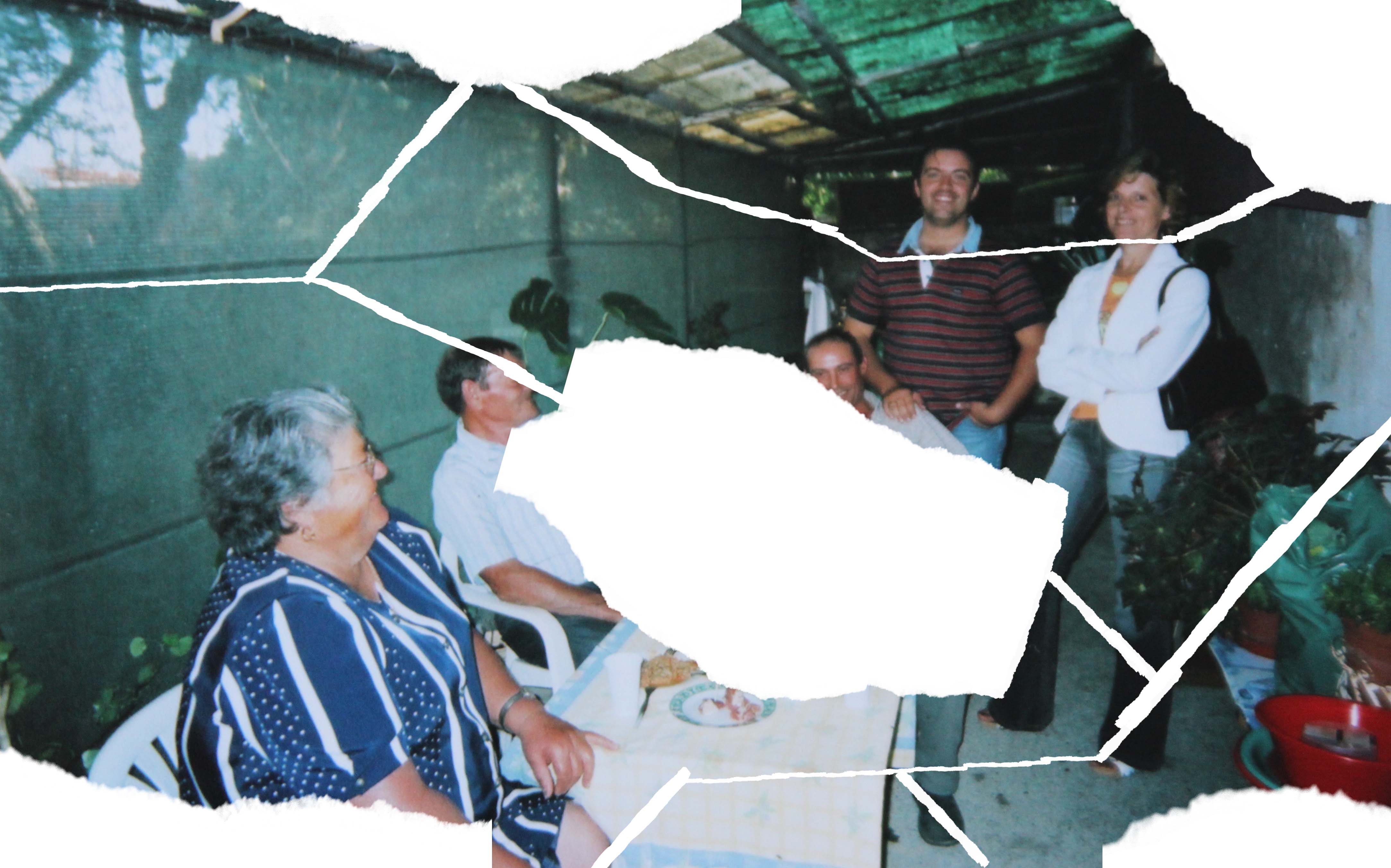
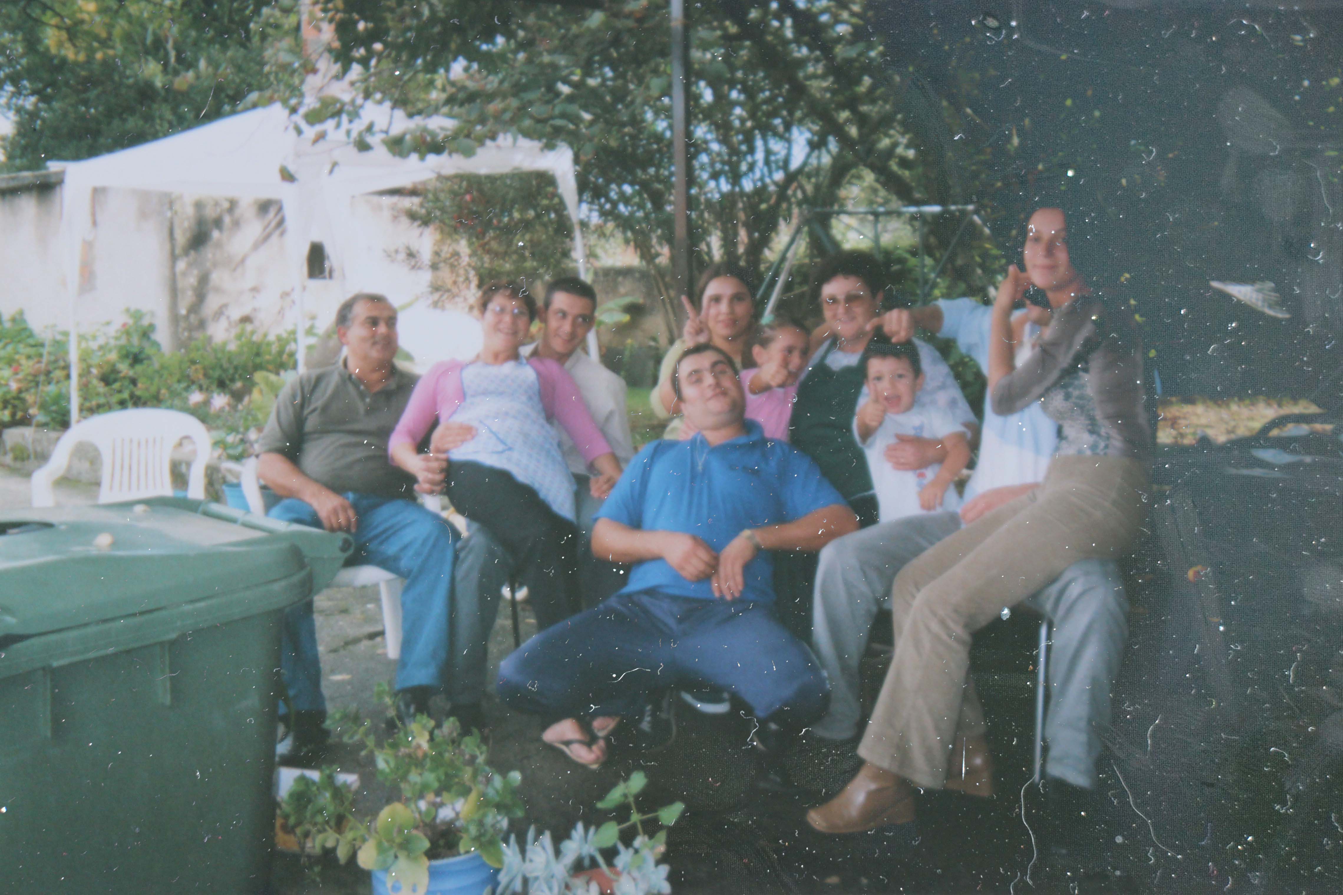
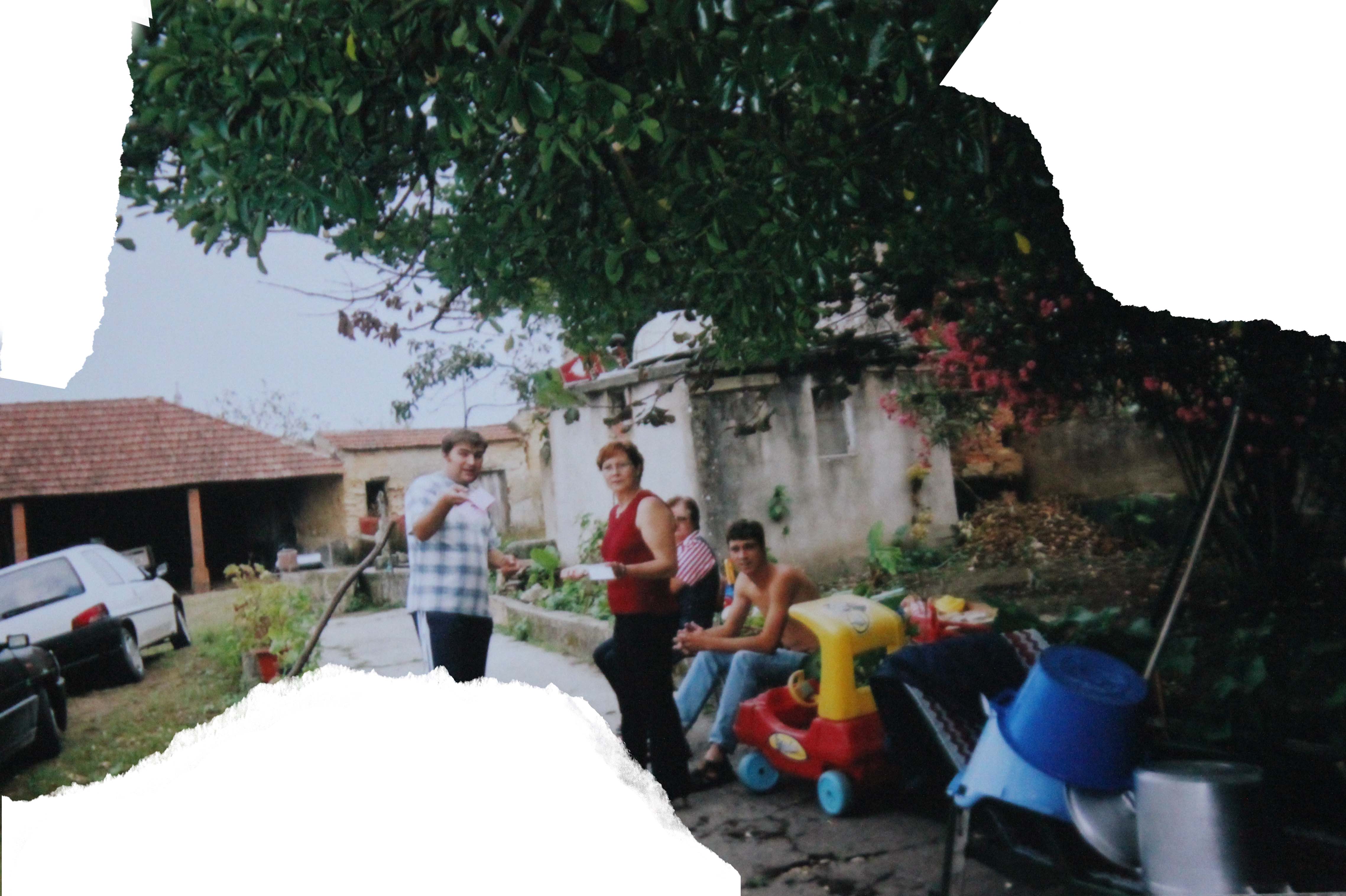
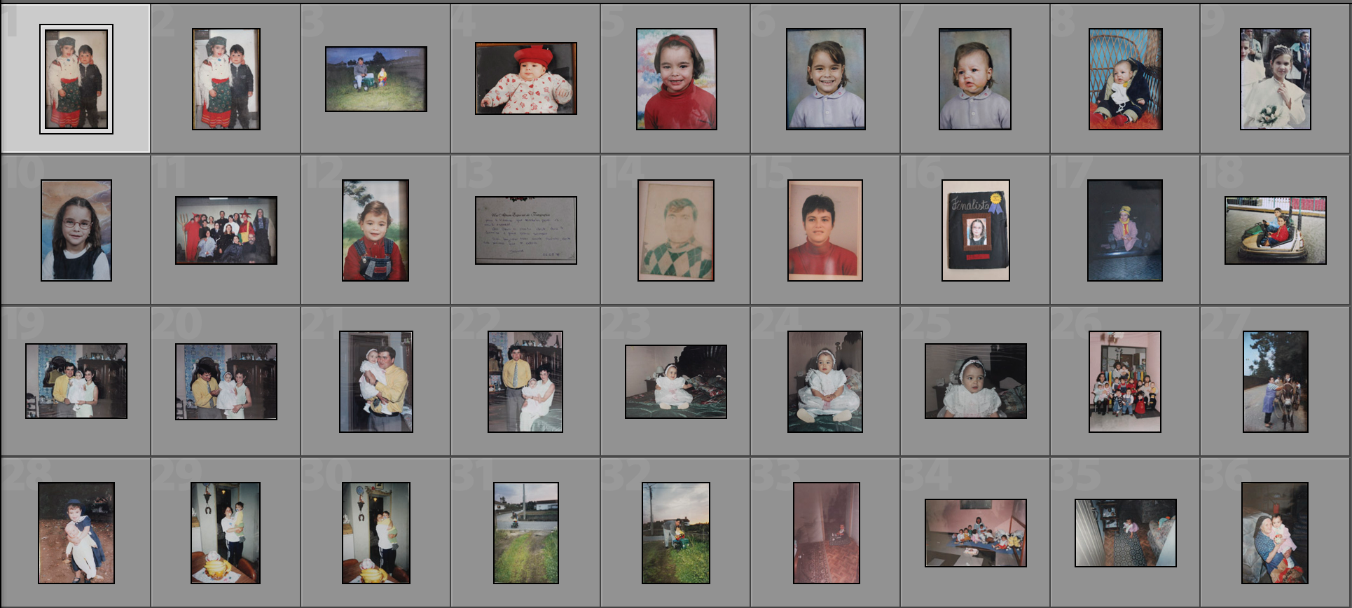
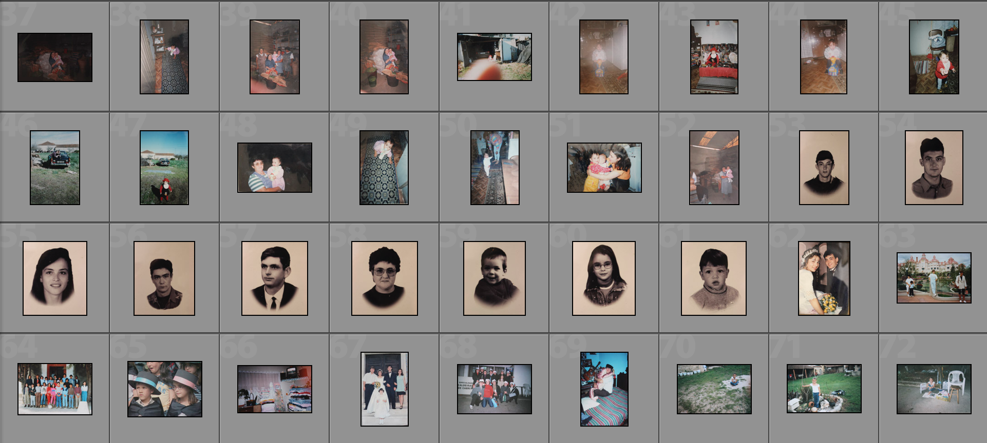
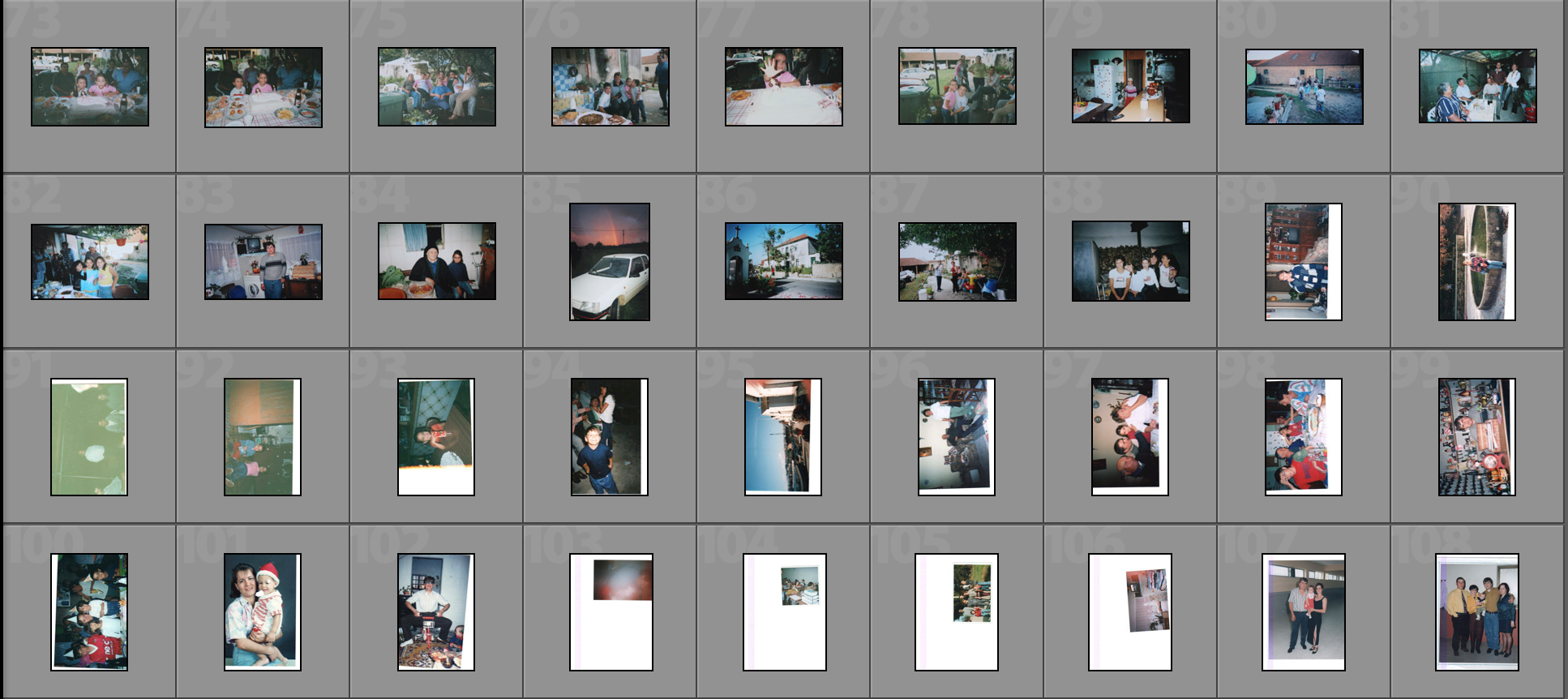
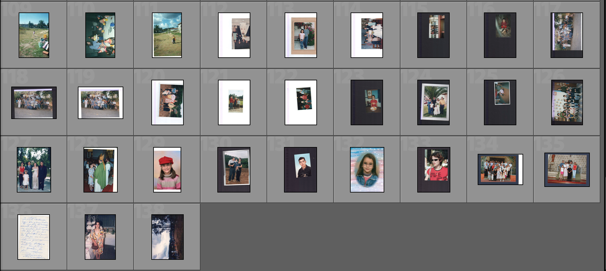
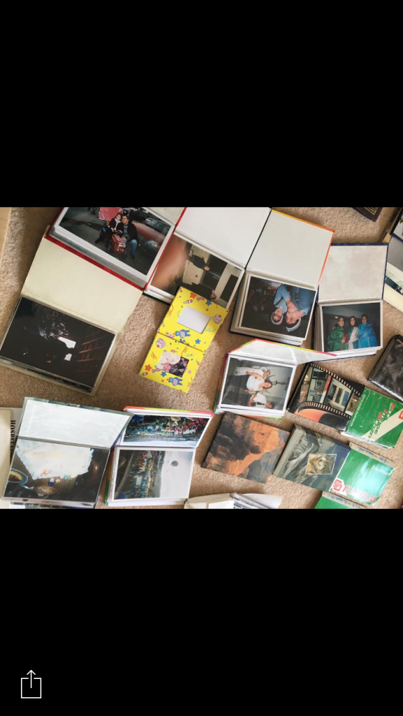
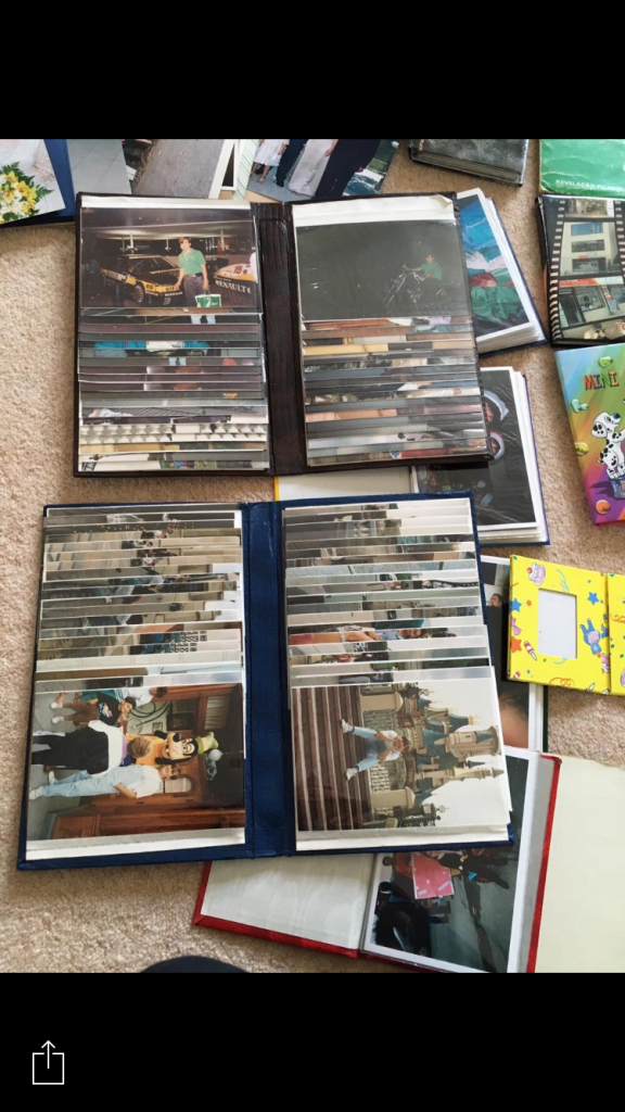
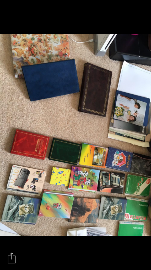
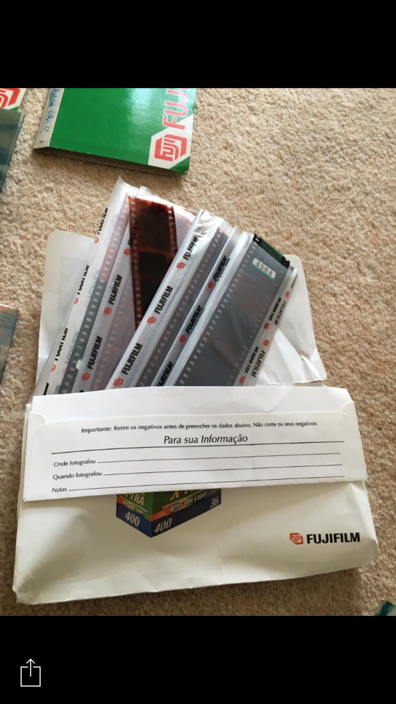
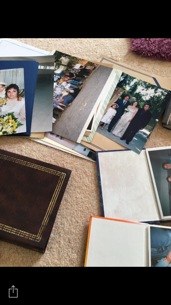
For this exam project, I did not take any new photographs. Instead I scanned, used and manipulated archive photographs from when I was a child. I had previously brought some of my photographs and old photo albums from Portugal over to Jersey. I then just scanned the photographs that I was going to use after I implemented a selection process, which you can see on a previous blog post and started to digitally manipulate them. I decided to use a variety of photographs which go from formal portraits, to landscapes, birthday parties, important ceremonies, to grouped family photographs. I really like the way they look due to the fact that some of them are more than 20 years old and the quality of the photographs back then wasn’t as great as they are now, which is something that I personally prefer. I also included photographs of family members that I have seen in years, that have passed away or even family members that unfortunately I am not close with anymore therefore those photographs are all the memories I have of them as well as with them. I didn’t take any new photographs as I didn’t want to interfere with the aesthetic of the vintage look to the photograph as if I were to put them together in any way, they just wouldn’t look as good as they could do they weren’t included. Overall I am happy with my decision to use old archival photographs as it allowed me to re-tell my version of the truth and some of my feelings towards some of the photographs and to be able to reflect on some of the events that have happened in my life and manipulate them to whatever I wanted.


Locked Up Zoetrope | Experimentation

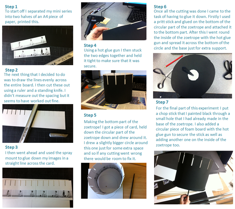
As a final little experiment I have decided that I want to attempt to make a zoetrope and I think that I can do it well. I have chosen from my mini series Locked Up as I feel this one has jus the right amount of images to create a zoetrope with and it will look good. I don’t think that it will particularly be a working one but I feel that when I get the basis of it all it will be fairly straight forward. I feel that this could be a really great idea as this is something that the Victorians used before there was the invention of cinema and moving image. I feel that this could bring my work to the next level and add on to the whole idea of having my work look like it is from the late 1800s as well as the images being based in the same time period. I watched a few YouTube videos on how to actually make a zoetrope and think that I pretty much get how I could go about making my own one. This is just going to an experiment and see whether or not it looks good enough to make it into my little box filled with late 1800s inspired work.

How To | Make A Zoetrope

Here is how I made my mini zoetrope. Firstly, I got my images onto one A4 piece of paper, printed them out and split them in two. I then backed each of them on some black card using the spray mount. After this I made the slits at the top of the card using a standing knife, this took me about half an hour but has actually turned out better than I had expected.  I stuck the images to the card and then curved it round to create a circle, it didn’t turn out too perfect but I don’t really mind that. I have also painted a chop stick black to use as the twirling part of the zoetrope. I have cut another piece of card to use as the bottom of the zoetrope and need to cut it in a circle so that it fits on the inside of the whole thing. So far it has turned out better than expected. Something that I realised is that the images are possibly too low down and the slits aren’t long enough but that’s ok as it is supposed to be from the Victorian times and I don’t mind if it is perfect or not. I added a little bit of foam board and cut it into a small circle underneath the whole thing just so that the stick wouldn’t more around too much and painted it black, I also made another small one and put it onto the inside using a glue stick and a hot glue gun. This just made the stick more secure in the whole thing. Overall I am happy with how it has come out especially as it was a first attempt and I basically just went off of intuition for the whole thing. The end result is a bit rough around the edges but I really don’t mind as it was a last minute idea which turned out better than expected.

how to make a zoetrope

image (31)
Locked Up | Zoetrope
image (28)
Locked Up | Inside the zoetrope

Exam – Designing – Photo Book:

Ever since I started searching up for this exam project, I decided that I was going to want to have a photo book as a final piece. When I have previously designed my photo books, I had always used Adobe Lightroom and Blurb. However, after having a look at some books that had been created with this photo company called Albelli, I decided that that was where I was going to be creating my photo book for this project. One of the main reasons as to why I decided to use Albelli to create and design my photo book is because of the fact that the website and the company offer a software which in fact seemed much better to use than Adobe Lightroom has been to use.

Throughout this blog post, I am going to be designing my photo book using the Albelli software and posting my progress from when I start it to when I finish it. I am also planning on posting anything that I thought could have worked however may have not looked so good on the photo book or any other changes that come to mind as I am in the middle of designing it.

Screen Shot 2016-05-06 at 10.48.56
This is the software, Albelli, that I decided to use for the designing of my photo book for this exam project. The main reason as to why I decided to use this software instead of Lightroom is because I noticed that this company gives us the option to have a photo book that is lay flat. This means that the photographs that are placed in the middle of the photo book will not be distorted as a regular book would be as you would not be able to see then properly because some of the photograph would be lost. Screen Shot 2016-05-06 at 10.49.09This is what comes up when you first start your photo book, once you have chosen what size and type of photo book you want. You can either chose to have an image wrapped around the photo book or have a regular rough fabric cover. I decided to have a regular photo book cover as I wanted my book to have a vintage and family album type of feeling to it. It also need that I can glue stuff on top possibly like Yoshikatsu Fujii on his Red String Photo book. I also decided to go for the lay flat option for the reasons that I mentioned above.Screen Shot 2016-05-06 at 10.49.23

The next thing that you will need to do is to import your folder of photographs which you are wanting to use. One of the features that I really liked is the fact that you could import multiple folders, however they would not all merge together which meant that you would organize your images into different folder for the different purposes.
Screen Shot 2016-05-06 at 10.49.49

For the actual photo book designing, this is what I was working with. It was very simple to use. as well as customizing it. You can have different colored backgrounds as well as having a photograph as a background if you wish. You can also add as many photographs as you would like as well as being able to place the image wherever you would like on the page, which is something you would not be able to do if you were using Lightroom to designing your photo book.
Screen Shot 2016-05-06 at 10.49.39

This toolbar here appears on the left hand side of the software, and it allows you to to different things with / to your photograph like add borders, shadows, different effects, change the placement of the photographs if you want a more standard and neat look to your photographs.


Exam – Planning – Photo Book:

NOTES:

  • have actual pages with sewing done
  • have photos where I add a vintage lined paper background border and draw on the picture as well as outside of the picture
  • hava a normal photo but then stick paper faces on top of it that have been drawn on
  • actually glue photos on top of other photos, possibly make it so it sticks out like 3D
  • have another ‘me’ cut up so only my body is cut and glue it on top of another photo – chino
  • like John Stezaker – have the outline of someone then cut inside of the body of the person in the picture and then have another photograph underneath it
  • have my ‘family tree’ as the opening of the book like where mimosa bloom, but have one for my mum’s side and another for my dad’s but only have me at the end and not my cousins
  • have parts of photos ripped out – for this print out a photo then rip it then put it back together and scan it to digitalise it then add to book then leave one or two pieces out of the ripped photograph out when scanning so then when the book comes i can glue the missing pieces from the photograph onto the book
  • glue random strings on top of photos in straight lines, crossing each other and others covering a whole face or person – liz
  • use paint like liz has to cover parts of photos or add borders
  • print photos onto tissue paper and have then facing down or scan them in.

Exam – Planning – Photo Book Title:

As I wanted to create a book, I needed to think of a title for it. I first of all thought that it could have something to do with family, seeing as my project has been  centered around photographs of me and my family. However, I needed to think of something that would also resemble truth or the creation of a new truth, which is exactly what I did with my photographs and my project. So I started by looking at some quotes of both family and truth. Below are some quotes that I either thought could be good as a photo book title for my project, or gave me some inspiration to come up with something else:

All truths are easy to understand once they are discovered; the point is to discover them.

-It is easier to perceive error than to find truth, for the former lies on the surface and is easily seen, while the latter lies in the depth, where few are willing to search for it.

– From error to error, one discovers the entire truth.

– Time is precious, but truth is more precious than time.

– Destruction is a form of creation.

family albums – memories

destruction is creation

de -construction

– every act of creation is first an act of destruction


Exam – Research – Photo Book Inspiration – Yoshikatsu Fujii – Red String:

“In Japan, legend has it that a red string connects lovers by their fingers from the moment they are born.”

https://vimeo.com/102344549

The ‘Red String’ photo book by Yoshikatsu Fujii  is about the breakdown of his own family as his parents went through a divorce. Therefore Fujii is using archival images and different materials from when he was still a young  kid and when his parents where still married. The photo book it self is call red string as “In Japan, legend has it that a man and a woman who have a predestined encounter have had each other’s little fingers tied together by an invisible red string since the time they were born.”  this will mean that those two people are connected through that string forever.  What is interesting about Fujii’s photo book is that throughout time, that red string begins to weaken. Cleverly and creatively, Yoshikatsu Fujii’s photo book begins to have less and less red string, and the string even begins to split leaving some of its string behind. This was done to represent how overtime, his parents began to loose the love that they had for each other and eventually loosing that red string all together, and that’s when the red string finally breaks.  All of the photographs included are all vernacular snapshots with the primarily intention of them being memories to hold on to and to be able to look back at them in the future. For Yoshikatsu Fugii, it would eventually be to be able to remember a time when him and his family where still all together and happy. He is now able to look at those memory snapshots to try and feel what it felt like when his family were all still together.

The whole book itself is divided down the middle and it looks like there’s two different books in one, which some people may argue that, that there are meant to be two books, one for each of his parents. However, the way I personally see it, the book is divided into two separate parts to symbolize his Yoshikatsu’s parents splitting up however they are meant to be telling one single story instead of two. When we first open the book, we can see straight away that the book is separated into two different sections, and in each different section there is a photograph of Yoshikatsu with his dad on one side and then another photographs of Yoshikatsu with his mum on the other. Therefore, it is already setting up the scene of that, his parents being divorced. The photo book itself has a whole range of different photographs, from new to old, from back and white to some more abstract visuals. Yoshikatsu in an interview has commented that all the photographs by themselves do not make a lot of sense, as they didn’t to him at first when he was starting to think about the concept of this photo book. However he has also mentioned that as soon as the photographs where placed together, they intertwined to create a narrative of his parents divorce, them being together, old photographs of Yoshikatsu as a child, as well as some photographs that where produced to convey feelings and emotions rather than evoke memories.

I have chosen to include this photo book as one of my photo book inspirations as I really like how raw and emotional it is. It also connects well to the theme that I am exploring  for this A2 exam, and that being ‘Truth’. Another reason as to why I decided to include it, is because I really liked the way that the photo book itself was put together and how everything is connected. I found it really creative also, the way that the book included different extracts from different stages in Yoshikatsu’s life, some different written notes that seem that they are not meant to be part of the book. I also really liked the way some of the photographs were laid out, some on top of each other, some juxtaposing each other, however Yoshikatsu somehow managed to make them work well to create an emotional visual story.

“The design of ‘Red String’ is so integral to the narrative, what lead you to make these decisions in the work?The idea actually came quite simply. As the book focuses on my parents divorce it didn’t make sense to have their stories together in the same book, so it was decided to make two parts to the one book – just as there are two lives within the one marriage. That is also why it was so important to make these two sides speak to each other as well, to refer back to the fact that they were once together but now are separated. This was also the reasoning behind the use of the red string. The string acts as a binding within the spine of the book but no longer connects the two lovers together – however the children become the red string, the history of the relationship, the connection that no longer exists apart from the threads.This is also why the book cover is made of white felt, it is soft and comforting to touch yet can be easily dirtied and becomes quite precious. The cover will show ageing over time the more it is read and worn down, it symbolises how the family relationship becomes worn over time too.”

“How did you go about mixing photographs of your childhood and parents past with your own work?When I first decided to create a book I didn’t have that much material as I’d only been photographing for about 2 years. I had been documenting only my father photographically as my mother did not like to be photographed as much. The decision was made to use the family archives as it was integral to have the family history behind the work, to add context to the meaning and also to reference the family’s collective memory.As a photographer of course I thought it would be nice to have a book all of my own photographs but now I am much more flexible with using both family photos and my own, especially when it helps build the photo-story. However, I must be careful in what respect I use the found imagery and where it has come from.”

“Was it hard to find imagery that spoke to you and your concept in the archives of family photographs?In the beginning it wasn’t easy to find photographs but after searching through the archives of the remnants of my parents own childhood and mine it has become easier to find material to use in creating a narrative. Once I widened my search to include more media not only photography it became easier. There is one picture that my mother drew when she was a child that I used in the book, it represents her own childhood so the viewer can see much further in time and history.”

“What lead to the decision to turn the works into a photobook?I had so many single images that I didn’t know to fit them all together or to tell a story. However, once they were in book format it was easier to curate a narrative, there was a place for my images within the book, and the story began to reveal itself within the images.


Exam – Research – Photo Book Inspiration – Chris Dorley Brown – The Longest Way Around:

The photo book named ‘The Longest Way Around’ produced by Chris Dorley-Brown, is a photo book that visually investigates the Dorley-Brown’s family history. It is constructed by historical images that have been interlinked together to create a whole new set of images. It aimed to uncover a treasure trove of archive material not intended for your typical family album. The new images that have been created present a multi-layered alternative narrative for the course of events that shaped the later 20th century. The book looks at two Londoners, Peter and Brenda,  that were born in the 1920’s. These two embark on a series of journeys that were shaped by war, romance and a subsequent settlement in a seaside paradise. The book got started when, these two Londoners were unable and much unwilling to recall some of their most traumatic experiences to their five children. Therefore, a box of photographs, film negatives and letters was handed down to their youngest child, who so happens to be a photographer. From then on wards, Chris Dorley-Brown started to form a new narrative with the archive, integrating his own pictures made in the UK and on travels through Europe that follow in the footsteps of his mother and father. The book is very ‘war’ heavy. This is because of the fact that they were growing up with the times of World War II. Dorley-Brown’s parents were not yet married during the world war two, however they had already known each other as childhood friends. At the of 19, Dorley-Brown’s father Peter volunteered as a heavy artillery sergeant and survived the Battle of Crete, four years as a prisoner of war in German stalag camps, and a death march of more than 500 miles in extreme weather that happened towards the end of the war. Some of Peter’s photographs that he had taken were confiscated as he served his four years as a prisoner of war, however , somehow, they are included in this photo book. The photo book itself addressees subjects of personal identify and memory, and offers potential for a sense of closure for the author. So there is a construction of a narrative here, but it’s quite low-key. This is a very gentle retelling of the story, one where the archive images are put back into places that they very easily fit. There is neither the deconstruction and recontextualization that you find in archival projects where the original meaning is almost lost, nor is there the conscious reworking of key elements in the image through integration with other materials.Instead Dorley-Brown glues it all together with images of his own. The old is mixed with the new to create a scenario where the past is visually connected to the present through images of lakeside restaurants, Warsaw roundabouts and Hackney demolition jobs.

“The question was, what to do with it? It’s the basic question of old pictures, of how you reinvent them and make them into something new. Or do you simply recycle them as something that belongs to the past?”

“I believe in ghosts. The dead and departed remain with us. I would look through this old suitcase full of folders and boxes of faded documents in my studio from time to time – Mum and Dad’s collection of personal pictures, letters, negatives, and more. They held a suspended threat of revelation, but i could not parse them into a legible chronology. They remained just random sparks of another person’s nostalgia. I would put them away but somehow they were burning a hole in my soul. Perhaps I was delaying the inevitable assembling of the jigsaw. I thought maybe I was just the keeper of these treasures, designated to hand them on to a more imaginative descendant. “

“The silent and ongoing inner dialogue with memory and experience seems to become more reliant on hard evidence as time passes, while the brain is steadily upgraded with fresh events. They are accompanied by new artifacts that, being a documentarian, I manufacture at a prolific rate and transfer to unstable forms of media. Archivists call it migration. Unreliable memories are partially deleted as we go on, and what remains is a compilation of edited highlights. At unpredictable moments the remaining detritus announces itself as ready to re-interpret and reorganize. Be prepared; time-travel comes at a price. “

“The innate optimism my young parents exude in these pictures remain as reassuring to me now as it ever was, but i know what happened next. Reading their faces, it’s as though they believe they are immortal. Seeing your mother and father as young people is like seeing the future, not the past. You realize your own existence came about through the most slender and tenuous matrix of events. “

“With photographs you can extent and compress time as you choose, they are interactive and can be assembled into narratives of your own design, without meditation. “

“I start to reconstruct a visual history of these two young and attractive Londoners, both with family rooted in the East End immigrations of the 10th Century. They were just the right age to be up to their necks in the largest-scale conflict in history, but the photographs don’t show fear or pain. “

“We only get the camera out for the good times, right? What the pictures do show is a kind of achievement of escape velocity, a transcendence of terror, a reunion of childhood friend finding themselves beached on an island paradise, so good the can never leave.”

I decided to choose this photo book as a photo book of inspiration as I feel like, with what I wan to do for my own A2 exam, I am wanting to explore the truth about where I was born and where I grew up with the use of old archival photographs of me and my family. Therefore, although completely different situations, I feel like in a way, this photo book is very similar to what I am looking to achieve out of this project. I also really like the way the photo book has been presented and the whole aesthetic of the photographs, as it really creates a sense of memory in the future through the use of manipulation of old photographs with the intention of creating new ones from those.

Exam – Research – Photo Book Inspiration – Christian Patterson – Redhead Peckerwood:

https://vimeo.com/66457078

“A boy and a girl and a car and a gun. The formula is deeply encoded in American mythology, a twentieth – century commonplace, half threat and half desire. The threat part needed just the slightest suggestion from the broader culture to implant itself in the minds  small – town burghers, trembling in their beds; the desire angle could only have been born of desperate times. Imagine what the appeal might be: you and your love object are desperadoes on the run, hauling the back roads, pursued by sheriffs’ deputies, a loaded weapon on your hip, death in one form or another the only possible outcome. It’s a suicide mission with no conceivable effect, only consequences; a political action for and by a constituency of two. It is the sort of fantasy that can emerge only when people are trapped like rats even while they know that there is an unreachable alternative out there somewhere. To go on the run is to chase the dragon of that vaguely envisioned other life, in full knowledge of the futility of the effort and the inevitability of the end. Since the formula stirs together three of the most combustible elements in American life – sex, speed and ballistics – you simply have to accept that you will explode along the way. The formula was already traditional by the time Charles Starkweather and Caril Ann Fugate hit the road in 1958. The principles were laid down ,most famously and enduringly by Bonnie Parker and Clyde Barrow in the few years before they were gunned down in 1934. The romance in their case was as evanescent as the damage was real; they were accomplices rather than a couple, although popular imagination supplied the sentiment. But they were married in blood – Bonnie took 23 bullets and Clyde 25. “

“Redheaded Peckerwood” is a photo book that was produced by Christian Patterson which unerringly walks that very fine line between fiction and nonfiction. It is a disturbingly beautiful narrative about unfathomable violence and it’s place on the land. It is a work with a tragic underlying narrative, as it is telling the story of 19 year old Charles Starkweather an 14 year old Caril Ann Fugate. These two murdered 10 people, including Fugate’s family. During their three day killing spree across Nebraska, they were capture in Douglas, Wyoming. The photographs include the places and things / materials that are thought to be central to the story, depict ideas inspired by it, and capture other moments and discoveries along the way. The photographs themselves include a range of different photographic techniques and approaches, such as photojournalism, forensic photography, image appropriation, reenactment and documentary landscape photography. What Patterson does is that he is able to  deal with a charged landscape and play with a photographic representation and truth as the work deconstructs a pre-existing narrative. The use of fact and fiction plays in well with our exam theme, and therefore being one of the reasons as to why I decided to look at this particular photo book. As well as that, it also presents the past and present, with elements of myth and reality, whilst expanding and re-presenting the various facts, factors and theories that surrounding this story.  Something that is very important in this photo book and something that the viewers will notice straight away, the first time they open the photo book is that, the photographs are complemented and informed by documents and objects that belonged to the killers and their victims. These include things such as a map, a poem, a confession letter, a stuffed animal, a hood ornament and other various items. In several cases, these material are discoveries first made by the artists and presented here for the first time. Something else about the photo book that many will notice is that the work itself is presents as some sort of visual crime folder, with the enhancing aesthetic by including pieces of paper which have been inserted into the book. The many individual pieces included serve as cues and clues within the visual puzzle. In this way, there are connections that are left for the viewer to be made and mysteries that are still left to be solved and told.


Exam – Research – Photo Book Inspiration – Adam Broomberg and Oliver Chanarin – Divine Violence / Holy Bible:

The Photo book  named ‘Holy Bible’  was produced by the photographers / artists Adam Broomberg and Oliver Chanarin. it is an extended visual rant that pull together 512 bizarre and disturbing imagery that they collected from the Archive of Modern Conflict. It also presents those photograph superimposed, which means that they are on top of something else, on the precise structure and the physical form of the King James Version, which includes snippets of Biblical texts underlines in red on essentially most pages. Something people have to keep in mind when looking through this photo book, whoever that may be is that, this photo book is constructed by and meant to be viewed in multifaceted contexts. When looking through the photo book,  you will be able to pretty quickly come to the conclusion that most of the photographs that have been superimposed over text are striking photographs which show many sensitive subjects topics such as violence, catastrophe, global and regional politics, religion. power, corruption, greed, propaganda, consumer advertisement, human conflict, nature, sex, life, as well as death. It is using photography as a powerful visual language that can be used and may also be abused for multiple purposes, therefore, it is something which in a way or another can relate to everyone at some point or level. The themes of violence, calamity and the absurdity of war were recorded extensively, and are held within The Archive of Modern Conflict. This is the largest photographic collection of its kind globally. When Adam Broomberg and Oliver Chanarin were looking through the many photographs included in this type of archive they always kept philosopher Adi Ophir’s central tenet in mind “God reveals himself predominantly through catastrophe and that power structures within the Bible correlate with those within modern systems of governance.”. Something quite unique about this photo book is that, due to its brilliant and unnerving format, the viewer is able to open the photo book at any random page and they will most certainly be confronted with some kind of rather absurd, obsessive phrases that have been extracted from the Bible, which within themselves include a juxtaposition of disturbing images of different cruel realities, or some photographs of magic tricks, hoaxes or visual illusions that we as a connected human race go through. Within the photo book, there is also a brief essay named Divine Violence, which is a small extraction from a Hebrew book written by the Philosopher Walter Benjamin.The format of Broomberg and Chanarin’s illustrated Holy Bible mimics both the precise structure and the physical form of the King James Version. By allowing elements of the original text to guide their image selection, the artists explore themes of authorship, and the unspoken criteria used to determine acceptable evidence of conflict. The format is brilliant and unnerving — open to any page at random and you are confronted with rather absurd, obsessive phrases from the Bible, juxtaposed by disturbing images of various cruel realities (or, one of the repeating motifs, photographs of magic tricks and hoaxes based on hokey visual illusions). Lest there be any doubt, a brief essay glued inside the back cover drives home the intent: its title is “Divine Violence”.Inspired in part by the annotations and images Bertolt Brecht added to his own personal bible, Broomberg and Chanarin’s publication questions the clichés at play within the visual representation of conflict.A few thunderously violent lines from Exodus – “… lie for lie. Eye for eye, tooth for tooth … wound for wound, life for life” – are illustrated by an image of an atomic bomb’s mushroom cloud. A black-and-white photo of a couple kissing, meanwhile, refers to “My lips … My tongue … my delight” from Psalms. Each time the line “And it shall come to pass” appears (which is often), it is accompanied by shots of circus performers or magicians.


Exam – Analysing My Response To – My Own Perspective:

12939331_1368656663151834_1231713831_n copyI decided to analyse this photo montage that I created for my own experimentation part of my exam project because this is a very important photograph to me. The photograph underneath all the writing is a photograph of my mum in January of 1997.  This is a very important photograph to me as this is a photograph of when my mum was on the phone to my dad, and also when she told him that she was pregnant with me. The writing on top, although you cannot read it properly and it is in Portuguese, it is a message that my grandmother had written to my mum on the back of one of the photographs that were taken on the 18th birthday. I decided to add them together as this is kind of juxtapositioning  the meaning of both photographs. The time of when my mum officially became an adult comparing to a few years later when she is calling her husband telling him that she is pregnant with me, who is now telling the story about it 18 years later.  When editing the photographs I decided to blend the two photographs together using the difference blending mode as I feel like that added a sinister look to the photograph and therefore would also speak out as a loss of innocence and how the times changed. I personally really like this image and especially the message that it is conveying as well as the story behind it.
IMG_273132435 copy

This photo montage is composed on tracings done from a photograph that was taken of me and some of my family members during my 5th birthday. I decided to do this photo montage with the some of the work by Liz Steketee in mind with the stitches. However, I decided to go one step further than what she originally did and I decided to duplicate my stitches layer as I was creating this photo montage and reversed it and changed the colour to black, The reason as to why I did so, was because it is actually representing how we all used to be so close and always together as a family, however, that quickly turned to black when me and my parents moved away from where we had lived all our lives. Therefore, the black is almost like representing the absence of the times we used to spend with our family as now it’s been  years since I have seen or talked to some of my family members included in the original photograph. As well, I decided to go with the colour red, for the original layout of the photograph to represent how we, as a family, are all connected by blood, and that’s what keeps us together when we are apart from each other.

Blurred contact sheet

This contact sheet is in response of Daria and I have experimented with using a slow shutter speed in order to capture specific elements Daria portrayed throughout her work. Now I plan on editing these images, firstly into a black and white effect, and then merging images together in order to create the look that imagined.

Untitled-1... Untitled-1....jpgppp Untitled-1 Untitled-2 Untitled-3

Exam – Experimentation – How To Create Like – My Own Perspective:

For this part of the project, as well as wanting to closely respond to the four artists that I have looking at for this project, I also wanted to have a go at thinking outside of the box and create some of my own images where I wasn’t really looking at a particular artist or photograph. Although I used some of my artist research when creating my own and that is apparent. I also wanted to create some other photographs that ended up being created and produced through the process of when creating other photographs that have ended up being close artist responses. I also just decided to randomize my options and ended creating some weird photographs, however they all seem to have a link to one another and therefore creating a new truth.

I am going to be showing how I was able to create two of my own perspective experimentation photographs using Photoshop .


IMG_2714 copyThe photo montage above will be the first one that I will be showing a step by step on how I was able to achieve the look.

  1. For this photo montage, I needed to use some resources that you cannot find on the standard version of Photoshop, which means that they have to be downloaded online and then they have to be imported into Photoshop.  What I needed to download to be able to create this look was that I needed to create this photo montage, was some ripped paper brush presets.
  2. To download the brush presets, I simply used this website http://www.brusheezy.com/brushes/19717-ripped-border-brushes and downloaded the brushes. Then to be able to use them in Photoshop, all you need to do is to go to the brush option and then you will be able to see at the top of the window  a little screw. You will need to select that and then a drop down menu will come up and you will need to select load brushes and then just select the file that you have downloaded and then you will see that your new brushes will be automatically added to your brushes collection.
  3. The next thing that you will need to do is to select what image you want to use. Then you will need to open it in Photoshop by pressing ctrl+o and selecting the photograph.
  4. The next step is to chose what brush you want to use as this will determine what kind of effect ends up on your photograph.
  5. After you have chosen the kind of brush you want to use and have determined the sizing of the brush you are wanting to use you are one step away from achieving the same look.
  6. The last thing that you will need to do before you paint your photograph that you will need to select the brush blending mode. To do so you will need to have the brush option selected and then select ‘mode’ at the top of the window. This is what will allow you to achieve that unique look. I personally selected the ‘difference’ blending mode. Once I did that, I just simply clicked once on my photograph, where I wanted the effect to go on and that was it. That’s how I was able to achieve this unique look.

Screen Shot 2016-05-06 at 09.53.05IMG_2714 copy


IMG_273132435 copyThe photo montage above will be the second one that I will be showing a step by step on how I was able to achieve the look.

  1. For me to be able to create this photo montage I needed to use the same stitches brush presets that I had previously downloaded and used to be able to create my Liz Steketee visual responses. As we can see, this photo montage was very inspired by the work of Liz Steketee, however I decided to include in my own perspective responses and not hers as I did more manipulation to the photograph than what she has done.
  2.  I also created my own background for this photo montage. I was able to do so by pressing ctrl+n and creating a new file. I then painted it a shade of brown. Then with a darker shade of brown I simply used different brushes with different effects from the brush collect that has been included with Photoshop to create the look that I wanted, which was a old, vintage paper effect.
  3. I then needed to open up the photograph that I wanted to use. To open up the photograph that I was wanting to use for this photo montage, simply and already  on the same file / window as the file in which I created my background, I simply just dragged and dropped the photograph into Photoshop.
  4. I then re-sized the photograph, by pressing ctrl+t so that it would fill the space which I thought to be good enough for my idea.
  5. The next thing that I did, was to drag the photograph down in the layers panel so that it would be below the layer of the background.
  6. I then created a new layer in which I was going to be adding my stitches to. To do so, I just went to the bottom of the layers panel and select the button that looks like a folding piece of paper.
  7. I made sure that this new layer was at the top and this would allow me to have more control over the stitches, just in case I needed to do anything different or erase something.
  8. To be able to see both the background that I created as well as the photograph that I was wishing to trace. Therefore, I simply reduced the opacity of my background layer to the point where I was able to see both of my photographs.
  9. The next that I did, with my empty new layer on top and select, I just simply selected the brushes that I wanted to use and its colors and just started tracing around the people included in the photograph.
  10. The last thing that I did was that, after I had traced the people in the photograph, I duplicated the layer by pressing ctrl+j, changed the color by pressing ctrl+u and inverted it so it would create almost a mirror image by pressing ctrl+t. Then you can either delete your photograph or simply turn the opacity of the background back up to 100% and you are done.


Screen Shot 2016-05-06 at 09.54.11IMG_273132435 copy


Exam – Analysing My Response To – John Stezaker:

IMG_2648This photo montage was created as one of some responses that I created when looking at the works of John Stezaker.  The main photograph is of my dad at the age of 18 when him and his older brother ran away from home, and with some money that they had gathered decided to go to Disney Land in Paris. Something already interesting about the photograph itself is that without background context, you would not no that he had ran away and would probably have thought / assumed that this was just a happy photograph that was taken during a whole familys’ holiday where everyone seemed happy. As a response to John Stezaker, I decided to insert a photograph of myself from when I was a toddler inside of the outline of my dad’s body. A reason as to why I did so was because he was a dad at an age that is still considered young, and that’s representing that. Another reason  for this is due to the fact that it has been one of his dreams to take me to Disney Land in Paris, however, due to money and work and the fact that my parents had to take care of me that was never a possibility. Therefore, by inserting a photograph of my in the original photograph where my dad was actually there at Disney Land it makes it seem like I was there too, almost.

IMG_1932588

This is another photo montage that I created as one of some when looking at the works of John Stezaker. This is a photograph of me when I was only a few months old. At this age babies do not have a clue what is going on and will certainly not remember anything from the beginnings of their lives, which is something that I find interesting. I decided to create a phot montage where I ‘removed’ my eyes from the photograph as I do not remember this photograph being taken and therefore it almost feels like this isn’t even me.  I also decided to put it in black and white as when I look back at these photographs of me, even though they were only taken 17 years ago, it feels like they are much much older than that, therefore I felt that by putting it in a black and white filter would enhance that feeling.


Exam – Experimentation – How To Create Like – John Stezaker:

The type of photographs and photo montages that I have analysed and used as influence for my own exam project are all quite simple to create whether you create them by hand which is how Stezaker created his photo montages, by having the photographs all printed out and then just folding them in different ways and putting on top of other photographs, or even more simply by just placing one photograph on top of the other depending on what he was wanting to create with each of the photographs. I personally decided to respond to John Stezaker using a digital format to create the same look.12948461_1368653189818848_2098210348_o copyThe example of my own response that is shown above, is a response that I created when looking closely at John Stezaker’s work.

  1. First of all I had to choose what photographs I wanted to use for this photo montage. To decide what photographs I was going to pair together, I had an overview of all of the photographs that I had, then started looking more at the relationships between the people, rather than just deciding on what I thought would look the best.
  2. The second thing I did after deciding the photographs I wanted to use I just opened them up using Photoshop.
  3. When you first open your photographs they will appear in two different windows, as they are two different files. However, what you need to do is to have both photographs in the same file. To do so all you need to do, is open one of the photographs, doesn’t matter which photograph it is, and press ctrl+a to select the whole photograph. Then to copy it, you will need to press ctrl+c. Once you have done that, you can then close that window as it will no longer be needed. Then the next thing that you will need to do is to paste it on top of the other photograph. To do so, all you need to do is to have the other photograph open, then press ctrl+v to paste it.
  4. The next thing you will need to do is to re-size the photograph to the scale that you want. You want re-size the photograph by pressing ctrl+t whilst holding shift as this will prevent your photograph from distorting and becoming out of proportion. As one photograph is on top of the other, it might be hard for you to see exactly where you want it to  end up, according to the photograph underneath. Therefore, whilst you’re re-sizing the photograph, you can decrease the opacity so you can still see the photograph, but you will also be able to see the other photograph underneath.
  5. Then next and final step is to cut the photograph to create the classic Stezaker look. To do so, you will need to select the polygonal lasso tool. The reason to use this one is because it will allow you to select part of the image that you do not want in a straight line. To use this, you will need to go around the part of the photograph that you do not want and then press enter so that a selection can be made. Then all you need to do is to press the backspace key as that will delete the part of the image that is selected. Once you do so, you are done, and have created a classic Stezaker photo montage.

IMG_199212948461_1368653189818848_2098210348_o

12948461_1368653189818848_2098210348_o copy


Another type of photograph that is also very popular although you might not think so when you are searching him up, and those types of images are the ones where Stezaker places, most likely landscape photographs on top of portraits. There are many reasons that I personally can think of for why John Stezaker could have done so. However, it has seen to prove effective, and I personally really like it and will be showing how I managed to create that look  digitally using Photoshop.IMG_1992 copy

  1. The first thing I did, was that I decided what photographs I was going to be using. For the photographs, I had to think about who I was linking with what photograph to be able to create the truth that I wanted.
  2. After choosing one portrait photograph and one landscape photograph, I simply opened them up in Photoshop. To do so, I pressed ctrl+o and selected the photographs that I want to use.
  3. The next thing that I had to do, was to put both photographs together instead of having each photograph on separate files. To do so and the way to not have to mess around with layers, was to simply have the landscape photograph open and press ctrl+a to select it all and then press ctrl+c to copy the photograph. I then just closed that photograph window and just had my portrait open.
  4. After this all I had left to do was to paste the landscape photograph on top of my portrait. To do so, I just pressed ctrl+v to paste it and then pressed ctrl+t to re-size the photograph to whatever size I needed it to be.
  5. And then you can either leave it like that, to have it exactly how Stezaker had it, however you can actually use the blending mode options that Photoshop comes with to create a unique look. However, that is all you need to do to be able to create that classic John Stezaker look with your own photographs.

IMG_1992IMG_2800
IMG_1992 copy


Blurred specification

After looking at the work that Daria Produced, it has inspired me to produce a set of images in a similar style , because I find that style quite interesting/captivating. I remember looking at a poster with a hand print on it, and therefore came up with the idea to incorporate this idea of a hand print on a body to represent a mark left from an abuser. I plan on creating images that are blurred and plan on creating a specific image where there is a hand that looks like it is hitting the subject. I could perhaps use a slow shutter speed in which it looks like the subject has been hit, but I would have to see if they work well together.

Because of the fact that Daria used herself within her images, I plan on doing the same and will do it using natural window light and dark tones (similarly to her style). As far as creating a physical hand print on my body, I plan on just using black body paint to replicate this and I plan on creating this on my neck (inspired by situation a friend of mine was in).


Image result for domestic abuse handprint posters

Exam – Analysis – John Stezaker:

20110124115219_APSTEZJ00261300

This photo montage was created by john Stezaker. It is clear to see that he has used only one single image to create this illusion like photo montage. The photo montage is made up of a photograph of a man, who looks like he could belong to an upper class, judging by the suit, clean shave, appearance as well as the pose that he was adapted for the photograph. This photo montage is actually very simple. John Stezaker has cut the photograph into two parts at the region of the eyes and has then joined them up again however, when joining these two separate parts again,he has decided to exclude most of the eyes of the man. There are endless possibilities that could be brought up as an explanation to why Stezaker has decided to do so. Something that I can say from closely looking at this photo montage is that it may be that Stezaker views this man in particularly or maybe views that class that this man seems to belong to as powerful. We as normal viewers of this photo montage, do not know what relationship John Stezaker has with this man. It may be the case that it was the man could have been Stezaker’s dad or a role model, or maybe just a random photograph that John Stezaker stumbled upon and thought to use it in his works. As I personally feel like this photograph has some kind of relationship to power, I feel like a reason as to why Stezaker has decided to exclude the man’s eyes in this photo montage is because the gift of sight is something that is very important to all. Someone becomes much less powerful if they are not able to see what is going on around them etc. Therefore, I almost feel like this is a metaphor or a response to how this artist views powerful men in suits or the upper class all together, for the fact that they may seen to be  so powerful, but when something so precious is taken away from them, they become powerless. This is my main thoughts that came up when I was looking at this photo montage, where it is something that is simple but can become very powerful and effective as well as being able to explain a lot of context.

20110704102030_John_Stezaker_visitation_

This is another photo montage that was created by John Stezaker. This photo montage consists of two separate and completely different photographs. It is very easy to explain how the photo montage has been created, but that may not be the case for when trying to explain and analyse it for the reason as to why it was created in the first place. First I am going to talk about each photograph individually and just then, I think will I be able to analyse the photo montage as a whole. The main photograph that we can see and the one that stands out the most, which, if I am not wrong is a picture of the Virgin Mary. In a nutshell, the Virgin Mary is essentially thought to be the purest woman that has ever lived and someone who has not been touched by the devil. She is supposed to represent purity and perfection, hence her being chosen by God. The photograph underneath is what seems to be a man either sitting down at home or at a cafe / restaurant reading the newspaper whilst having his morning coffee. He is reading about what is going on in the world whilst drinking a drug, caffeine. I feel like the one photograph is in colour and the other one in black and white so that is the photo montage not only eye catching but it is also meant to be seen as more serious than if both were in colour or black and white. Subjectively, I feel like the reason as to why these two individual photographs were put together is essentially due to the fact that, as mentioned previously, Mary is seen and meant to represent purity and evil less, whereas the common man is cannot resist into the temptation of everyday ‘evil’ acts such as taking drugs such as caffeine, which alter the mood and actions of a human, when we are not supposed to alter anything about ourselves according to God and actions such as reading the news, which subconsciously heavily influenced by many people that have the jobs of telling the public a certain version of the truth, however, as common people, are not entirely aware of this act, therefore it could cause it to influence our actions, again another thing which we are apparently not meant to do.


Exam – Research – John Stezaker:

Screen Shot 2016-03-30 at 15.23.44

“I love that moment of discovery, when something appears out of the ground of its disappearance : the anonymous space of circulation, where images remain unseen and overlooked” – John Stezaker. 

We can trace the legacies of the Surrealist movement and of International Situationism in the work of British artist John Stezaker. However, his work also defined a synthesis between the appropriated photograph, media culture and the politics of perception that was to percolate through the London and New York art scenes in the late 1970s.


John Stezaker’s work re-examines the various relationships to the photographic image: as documentation of truth, purveyor of memory, and symbol of modern culture. In his collages, Stezaker appropriates images found in books, magazines, and postcards and uses them as ‘readymades’. Through his elegant juxtapositions, Stezaker adopts the content and contexts of the original images to convey his own witty and poignant meanings.

In his Marriage series, Stezaker focuses on the concept of portraiture, both as art historical genre and public identity. Using publicity shots of classic film stars, Stezaker splices and overlaps famous faces, creating hybrid ‘icons’ that dissociate the familiar to create sensations of the uncanny. Coupling male and female identity into unified characters, Stezaker points to a disjointed harmony, where the irreconciliation of difference both complements and detracts from the whole. In his correlated images, personalities (and our idealisations of them) become ancillary and empty, rendered abject through their magnified flaws and struggle for visual dominance.

In using stylistic images from Hollywood’s golden era, Stezaker both temporally and conceptually engages with his interest in Surrealism. Placed in contemporary context, his portraits retain their aura of glamour, whilst simultaneously operating as exotic ‘artefacts’ of an obsolete culture. Similar to the photos of ‘primitivism’ published in George Bataille’s Documents, Stezaker’s portraits celebrate the grotesque, rendering the romance with modernism equally compelling and perverse.

British artist John Stezaker is fascinated by the lure of images. Taking classic movie stills, vintage postcards and book illustrations, Stezaker makes collages to give old images a new meaning. By adjusting, inverting and slicing separate pictures together to create unique new works of art, Stezaker explores the subversive force of found images. Stezaker’s famous Mask series fuses the profiles of glamorous sitters with caves, hamlets, or waterfalls, making for images of eerie beauty.

His ‘Dark Star’ series turns publicity portraits into cut-out silhouettes, creating an ambiguous presence in the place of the absent celebrity. Stezaker’s way of giving old images a new context reaches its height in the found images of his Third Person Archive: the artist has removed delicate, haunting figures from the margins of obsolete travel illustrations. Presented as images on their own, they now take the centre stage of our attention

This first major exhibition of John Stezaker offers a chance to see work by an artist whose subject is the power in the act of looking itself. With over 90 works from the 1970s to today, the artist reveals the subversive force of images, reflecting on how visual language can create new meaning.

Exam – Analysing My Response To – Liz Skeketee:

IMG_2796 copyThis is a photo montage that I created as part of my response to Liz Steketee, which is one of the artists who’s work I have been looking at as part of research for this exam project. This photograph was originally a photograph of me and my great grandma from when I was little. I decided that I would  create a photo montage where I would replace the body of my great grandma with some news paper and stitches for a few reasons. The first one being that I wanted to create a photo montage where I was closely responding to the work of Liz Steketee as much as I could. The other reason being the fact that my great grandma sadly passed away the same year that I moved to Jersey. Therefore I felt like replacing her body with a newspaper would almost make it seem like she was the news and that you would be able to tell the real story just by looking at this photo montage. However, something weird that happened whilst I was creating this photo montage is that, I google searched the term ‘old vintage newspaper background’ and one of the first ones that came up was a news article talking about an accident where a few people died and it was written in the Augusta Chronicles, which I found to be a strange coincidence as both my great grandma passed away and the fact that she was also called Augusta. Therefore when I was creating this photo montage I made sure that the name Augusta was present inside of the outline of her body. IMG_2519 copy

This is another photo montage that I created as a response to the works of Liz Steketee. The original photograph is of my auntie / god mother and my uncle on their wedding day.  To be able to respond to the works is Liz Steketee, I decided that I would cut the eyes of both of them and swap them. I did this almost as a metaphor for the saying that ‘I only have eyes for you’. Therefore, I took that concept and seeing as they are in love and getting married that I would take it literally and swap their eyes around. I really think that the idea worked and I personally really like the way that it came out. They are both looking at the camera at not into each other’s eyes, therefore I feel like it would not the message across as well as I would want it to however, I still think that it has worked well. Also the reason as to why I decided to use this particular photograph and use this particular concept to construct a photo montage is because the truth is that unfortunately they were not married for that long and therefore, the reason for using this image is because I now find it ironic that they look so happy together and now the truth is that actually they are not together anymore. This also works, as they are not looking into each other’s eyes and instead are looking at the camera, it makes it seems like they are already looking at different people are not interested in each other anymore, therefore the love is forced, which in this case is represented by stitches, but it just didn’t work out.


Exam – Experimentation – How To Create Like – Liz Steketee:

Liz Steketee has many different ways in which she manipulates her photographs as we are able to see when looking at her work. However, Liz Steketee doesn’t really, if ever, manipulate her photographs digitally. The photographs that she works with are all printed out and just then, she begins to manipulate them the way she feels appropriate for each of her photographs.

For the purposes of my project and visuals as well as personal preference, I decided to manipulate some of my photographs in the style of Liz Steketee, however digitally. I used Photoshop and some add-ons that I found online to create my responses. Therefore, I will be showing how I created two of my Steketee responses.

IMG_2003 copy

The photograph above is the first one that I will be showing a step by step on how I ended up with the finished look.

  1. First of all, you will need to choose what two or more photographs you are wanting to use.
  2. Another thing that you will need is a few brush presets that will look like stitches. What I had to do to get them was that I searched up online a few packages of brush presets and ended up downloading two different ones. I decided to download a set that was cute and clean and then another one that was meant to look less neat and more of a trial and error type of stitching. These were the websites where I got both of my sets from.  http://www.brusheezy.com/brushes/1637-stitch and http://www.obsidiandawn.com/stitches-sutures-photoshop-gimp-brushes.
  3. Once you have your selected photographs and you brush presents, you will need to open these in Photoshop. To open your images simply press ctrl+O and select the images you want to use.Screen Shot 2016-04-27 at 16.18.03
  4. To add your brush presents, simply select the brush option on the left-hand side toolbar and go to the top on the program, and open up the brush selection. Then you will see a little screw button on the right-hand side of that window, you will need to select that and then select add / load presets. Then all you need to do before you are able to use the downloaded brush presets is that once you click add/ load a window will come up and then you need to select your download. Once you do so, you will see that your new brushes were added to your preexisting brushes panel, which means that you are now able to use them.Screen Shot 2016-04-27 at 16.19.03
  5. The next thing that you will need to do is to have all your images that you selected inside just one window. To do so, you will need to go to each one of the windows that will have your single image on, press ctrl+a, which will select the whole image for you, then press ctrl+c, which will copy the whole image, then you can simply close that image by pressing ctrl+w. Then you will need to place this image on top of the other. So you will need to press ctrl+v and this will paste the image.Screen Shot 2016-04-27 at 16.19.57Screen Shot 2016-04-27 at 16.20.11
  6. The next step is to re-size your top image to the size that you want, whether you want the head and facial features to match closely or you may want them to do not look proportionate to each other. Therefore, to re-size an image all you need to do is to press ctrl+T and then whilst pressing shift just simply re-size the image to your liking. To have more of an idea of what it will look like before you start cutting the image, you can see where your images are being placed more accurately by decreasing the opacity of the top image until you are happy and then increasing it to 100% again.Screen Shot 2016-04-27 at 16.20.37Screen Shot 2016-04-27 at 16.21.59
  7. Once you are happy with the positions, you can then starts cutting your image. For the image above I only needed to do one cut, this is because I only used two photographs, however, you may need to do more cuts if you are going to be using more than two images. To cut my photo I used the lasso tool, which is on the right-hand side toolbar. The reason as to why I decided to go for the lasso tool is because it allows me to freely cut where I want, and that is how you can get your cuttings to look uneven and more realistic. Then press enter and you will be able to see a selection formed. After this, whilst the selection is still available, all you need to do is to press the backspace key and that will delete that part of the photograph that you selected.Screen Shot 2016-04-27 at 16.22.33Screen Shot 2016-04-27 at 16.22.51Screen Shot 2016-04-27 at 16.23.00Screen Shot 2016-04-27 at 16.24.05
  8. The last thing that you will need to do is to add the stitches. So to do this all you need to do is to select the brush tool and the stitches brush preset that you want to use, then select the colour, which in my photo montage above I decided to go with red and white,  and then all you need to do is to click on the area you want to add a stitch. That is all I did to create my Liz Steketee shown above.

Screen Shot 2016-04-27 at 16.26.32Screen Shot 2016-04-27 at 16.26.50Screen Shot 2016-04-27 at 16.25.35


IMG_2796 copy

This is another photograph of mine that I edited digitally using Photoshop to be able to create a clear response to the work of Liz Steketee. I will also be showing how I was able to achieve this final visual.

  1. First of all, like before, you need to make you have selected the photograph that you want to use.
  2. You will also need to use the same stitches brushes presets as well as another photograph to go in place of the inside of the person.
  3. I decided for this photograph to use an old newspaper photograph that I found on Google images.
  4. So what you have to do is open your chosen image in Photoshop, as well as the saved image of your choice that will go inside of the person.
  5. Then what you want to do is to cut of the inside of the person. To do this all you need to do is either erase inside or a quicker way is to use a selection tool of your choice; for this one I used the quick selection tool. If you choose to use a selection tool, what you need to do after your selection is done  all you need to do is to press the backspace key and that selection will be deleted.
  6. The next thing you need to do is to go back to the photograph that you want to replace the inside of the person with. which in my case was a old newspaper that I found online, and press ctrl+a to select the whole image, then press ctrl+c to copy the image. Once you do that, you then need to go back to your original photograph and press ctrl+v to paste it in.
  7. You will notice that your photograph once it has been pasted will be on top of your original photograph, therefore you need to send it to the back of your original photograph. To do so all you need to do is to back the layer of for example your photograph of n old newspaper so that it is below the layer of your original photograph.
  8. Then you will need to just drag the photograph into place and if you need to re-size it all you need to do if press ctrl+t and this will allow you to get the photograph to the size that you want.
  9. The last thing that you need to do is to add the stitches effect. For this all you need to do is to go to your brushes and select the stitches brush of your choice, select a colour; I personally went for white as Liz Steketee used white stitching and I wanted to respond to her work as closely as possibly. Once you are happy with your stitches, you are done.

IMG_2796Screen Shot 2016-05-06 at 10.11.54IMG_2796 copy


Colour Shoot – Evaluation

Conclusion

I am quite pleased with this shoot considering that it was a very cloudy day and even started to rain at one point but i still managed to give the vibrant and colourful look to each photo like i planned. The shoot was taken at around 7pm so the light wasn’t amazing especially because it was overcast but as the sun started to set it gave that orange glow over the island however i only was able to capture one more photo at that point before my camera ran out of battery which was very unfortunate as i could’ve captured some more warm feeling pictures.

Improvements 

If i could improve anything about this shoot i think it would be the time of day that i done it, because of the overcast whether i was limited to the amount of photos that i could’ve edited into coloured photos because Photoshop found it hard to change the hue over a grey background which i had to try and work around. Another thing i would’ve improved if i had more time is maybe explore into the back streets of town instead of down the main high street, this may have lead me into some better photos that i didn’t know i could’ve got.

Exam – Analysis – Liz Steketee:

dghtrhrthrth

This photograph was created by Liz Steketee. I still have not been able to find out if the photographs that Steketee uses her own photographs from her childhood or even from people that she knew / knows. Either way, this is a very powerful image. I believe that, from my perspective, this photo montage is telling us the truth about the young girl that we still in the portrait.  Essentially, what I think this photo montage is telling us, is the true way that this young girl views herself and how comfortable she is in her own body. There’s a few ways in which this photo montage could be interpreted in a few different ways. One way in which I see this photo montage is that maybe this woman has been feeling this way ever since she was a little girl around the age of when this photograph was taken. The fact that the little girl is smiling could be seen has how shes’s been hiding the secret about the way she feels and view her own body and image. She has been smiling to lie to everyone saying that everything is fine and that she is fine and happy with herself, when truly behind closed doors her real self comes out, a part of her that only she knows, and has gotten to know so well over the years, form when she was a little girl. Another way in which I have considered this photo montage, is that maybe the portrait of the little girl has been used, as if to represent a time when she wasn’t caring about what she looked like and was truly happy with herself. However, as she started growing up those views changed and because of that she started to feel bad about herself. I also feel like, still in the same context, that maybe a reason as to why the photograph of the little girl has been used to represent her thoughts that she now has, as a woman, thinking about the times when she was care free and wishing she could go back and learn to love herself from a young age instead of growing up hating her body.  I also think that’s another reason as to why the woman’s face was hidden behind the smiling portrait of the little girl, as I feel like she doesn’t like her face so much that she doesn’t even want to show that as she might think she’s too ugly for people to see, therefore replacing it with a photograph where she thinks she looks nice and pretty.

ftyhuetujhrtjr

This is another photo montage created by Liz Steketee, where she seems to have taken an informal portrait of a man, which I personally do not know if this man had any relationship between Steketee or not, therefore just like with my other analysis, I will only be commenting on what I think I see and how I personally interpret the photograph / photo montage. With that being said, I personally think that this is a photograph of someone that Steketee knew very well and  someone who told her a lot about himself to her. I say this as what I am getting from the photo montage and  the way that she has created it, it seems to me that this man has had a lot of internal struggles that maybe not everyone knew about, however Liz happened to be one of them, therefore being able to illustrate it well.  The photograph that has been placed inside of the body of the man is representing darkness, death, destruction, demons in what is seems to be a field of flowers, maybe daisies. These may have been some of the things that he is / was struggling with and only the people who were very close to him knew about. I think that the main reason as to why this such dark photograph, was covering the whole body of the person instead of maybe just the mind, which represent these inner thoughts and feelings being a creation of only his mind, is because maybe the person felt like these thoughts were the ones to control him and therefore feeling that they were taking over his whole body and that these demons, thoughts and feelings where living for him. Another idea is that, maybe this man was hiding his feelings from everyone and that no one knew what was actually going on in his mind, so he thought. Maybe he just got worse at trying to hide it, there more that these demons, thoughts and feelings were taking over him, that he became an open book about his emotions. Essentially what I am trying to say is that, these things became his new image, therefore when people looked at him they didn’t really look at him as all they would see was his inner struggles, he became transparent. However, there’s no way to know the truth about this photo montage

Daria – image analysis

This particular image of hers I think is really interesting. I like how she uses herself as the subject within her images and this is something I plan on doing when responding to her. There is something almost haunting about this image, I like the blurred effect she created and is something I have experimented with throughout my project, and still plan on within the next shoot. The dark tones within the image are quite dark, but alongside the lighter tones of the background it enhances this darkness and adds to the haunting aspect  of the image. The way the dark tones have created this shadow around the eyes looks really captivating and it almost represents the darkness of her feelings (that she’d been holding in for years) being finally exposed creating this haunting effect. It looks as if she used natural lighting rather than studio lighting and I think that visually, it fits in with the troubling and sad context.


I like this image and it differentiates with all the other images she has chosen to present throughout her body of work. I really like the harsh lights throughout this image and the shadows creating hard lines and forms from the sun. Most of her other images are quite close up, and here you have the home environment which I think is crucial to include as this is the place where everything happened, the home where both her and her parents lived and is now just where her mothers depression has taken over her life. I like how she used natural light from the door, it definitely contributes to making the piece very interesting.


This image here, is really powerful and I think it represents her emotions getting  to her. Her expression looks fed up almost and the different harsh dark tones in the neck compared to the softer darker tones throughout the image works well and is really interesting to view. Her pose of holding her hands to her ears perhaps represent the fact that she is fed up at listening to her mother’s struggles and pain. Yet again, this image looks like it was taken in natural window light and is really interesting in the fact that this image looks quite old due to the darker tones throughout the background of the image.

Exam – Research – Liz Steketee:

Screen Shot 2016-03-30 at 20.19.41

“ I used my life as material for my work. By doing this, I am able to explore the conflicts that exist within the everyday and the richness that is found in the mundane.”

“I feel strongly that life and art belong together, intertwined in everyday experiences. I began doing this in earnest when I got married and started a family.”

“I created composites or “paintings” that define my vision of an experience. Through the use of montage, collage, and purposeful juxtaposition of images, it is my intention to present the “truth” of life. I alter, chop, merge, and recompose photographic elements. This process allows me to represent a moment, a memory or life’s reality as I see it. I disrupt linear structures and confuse elements of time and space to convey my notion of how life truly exists; a combination of independent moments that converge to leave us with a unique experience. This process is intended to jar the viewer and call into question our history through memory and as photographic document. “

“For over a decade, I have altered, chopped, merged, and recomposed my photographs.  By doing this, I create work that deals with the notions of truth in photography and its impact on identity.”

“I use my family images and those from my family’s past albums as material for the work. The resulting imagery tells a “new truth” with re-imagined memories, situations, and experiences. “

” ‘SEWN’ expands this notion by incorporating mixed media elements to expand the work to a new realm, to create object that comes off the wall and has its own experiences.  I cut out, obliterate, and cover up elements of an image to draw attention to what is missing, what may have changed, or what needs to be considered. “

“Pieces are sewn together and dyed to congeal the elements and ideas together.  Thread binds the content. Dye binds the colors. Past and present collide.  Memories are colored by the past, guided by the images burned in our brains.”

“True feelings emerge and break through the expected parameters of vernacular imagery.The pieces in this work are purposefully raw and unrefined, recalling the impulsive and rough nature of childhood.”

These are a few different quotes by Liz Steketee where she explains what materials she has used, the reasons behind using them, as well as talking about some of the processes that she has used in order to alter her images into her final pieces. I personally find it interesting, the fact that she is so aware of the untold truth and the ‘what hasn’t been told or the what has fallen between the cracks’. She talks about some of the processes that I am looking into using with my own photographs to create a similar look to hers. I am also going to be looking through and using photographs  that have already been taken and are of me, from old family albums and old family photographs. I really like what she has decided to do with her photograph. I think that it is very creative and something that not everyone will be able to understand, as it is a complex body of work that you really have to look into in depth to understand or get an idea of why she did what she did with particular photographs. We will never know the actual truth, however her type of work allows us to really come to our own conclusions as reasons for why and what is going on.

Exam – Analysing My Response To – Chino Otsuka:

IMG_2295 copy

This is a photo montage that I created as a response to the works of Chino Otsuka. The original photograph is of me handing my bottle of milk over to my mum or my dad, and the second photograph that has been inserted in, is of me when I was playing with some toys at home. I decided to create this photo montage to respond to the works of Chino Otsuka. However, the way she did her work was completely different to how I decided to do it.  For he to produce her work of illusion, she actually visited the places where she had been photographed as a child and then digitally combined the photographs and therefore they look very realistic, This is something I could not have done due to the fact that I live in a different country to where those photographs were originally taken. Something else that was different to what I did, was that she added herself in photographs with a great age gap between them however I could not do so as seeing that I wasn’t in the same location therefore I couldn’t have taken photographs of myself then. Going back to this specific photo montage, I like the way that it turned out, as I feel like it looks like the most realistic one that I created as a response to the works of Chino Otsuka. I also really like it, as it looks like the sister that I never had or it could also be interpreted as being like two sides to my personally where on one side I am calm and obeying and the other I am crying and screaming. 12921850_1368656366485197_1000796014_o copyThis is another photo montage response that I created when I was looking at the works of Chino Otsuka. The original photograph is of me as a baby, my mum and my dad. The photograph that I inserted is of me and my mum during one mother’s day that was taken at my school. The reason as to why I decided to add these photographs together is because we  are able to see how, even in a small space of a few years, you can already see a big difference and how much people, which in this case is me and my mum, have grown and developed over that small period of time. Personally, the editing of this photo montage isn’t great, and you are definitely able to tell which photograph was inserted and how it looks like it just doesn’t belong there. However, I still really like it as I feel like it’s the future posing the with past, however it is the past posing with the past .


Exam – Experimentation – How To Create Like – Chino Otsuka:

Chino Otsuka’s work is very interesting and looks at what it would look like if you happened to see yourself walking down the street, whether looking at a younger version of yourself or an older version of yourself. The way she creates her creative and astonishing work is that she looks at a photograph from when she was younger, analyses where and when that photograph was taken and then goes back to the same place, when the weather looks similar to when she first took the photograph and takes a photograph of herself in the same setting. She then combines the two images digitally. However, due to me living in a completely different country to where I grew up and where all my photographs of me growing up and that I have used for this project, I could not attempt to try and do the same thing as Chino Otsuka has done. Therefore, instead I just combined two of my photographs, that were taken individually using Photoshop.

IMG_2295 copy

I will be showing how I have been able to create my response to the works of Chino Otsuka which ended up looking like the photo montage shown above.

  1. The first thing that you will need to do is to select what two or more images you are wanting to use and combine together.
  2. Once you have chosen them, you will then need to open them up in Photoshop. You can do so by pressing ctrl+o and selecting your chosen images.
  3. The next step is to make sure that they are all in the same file instead of being in different files which is what will look like when you first open your images up in Photoshop. To do so you will need to select the window of one of your images, then press ctrl+a to select the whole photograph, followed by pressing ctrl+c to copy the image. At this point you can close the photograph you just copied down.
  4. Then you want to place it on top of the other photograph that you have selected. To do so all you need to do is to press ctrl+v to paste the photograph.
  5. Then you will need to re – size the photograph you have pasted. You can do so by simply pressing ctrl+t and holding shift whilst you are dragging the photograph to the size that you want, as this will prevent you from distorting the original look of the photograph.
  6. The next step is to cut out the part of the photograph you are wanting to use, which in my case was me. To do so, simply select the lasso tool on the right hand side tool bar and roughly trace around the body or the object.
  7. The next step is to delete the background, which you are able to do once you have made your rough tracing by pressing  shift+ctrl+i and then press the delete button.
  8. The second to last step is to then carefully erase the rest of the background that you do not want, by selecting the erase tool from the right hand side and by selecting an appropriate sized brush depending on the areas that you are trying to erase.
  9. The last step is then to drag and drop it to wherever you want the second ‘you’ to be. You might notice that the colors may not match too well, however with some leveling and color balance you should be able to get a closer color to the original photograph.
  10. Once you have done all of that you should end up with your own response to Chino Otsuka’s work. 
    IMG_2295IMG_2344IMG_2295 copy


Archives

The thing that makes my project as full as it is, is due to the archive of images my Mum and Nan have kept over the years. A lot of people don’t have many photos of their parents, especially not in the amount that I have of my Mum, my Dad for example has about 3 images from the whole of his childhood, his parents split up and he went to boarding school and his set mum got rid of all of his possessions and photos, and so if i had tried to do this project on my Dad, it would have only shown the last 20 or so years of his life.

“Archives are important because they provide evidence of activities and tell us more about individuals and institutions. They tell stories. They also increase our sense of identity and understanding of cultures.” Source

The fact that my Mum and Nan have kept these archives is very important, because it allows us to remember things better, how their hair was, what the clothes were like, the places they used to see and the people they used to be close to.It has allowed me to gain a closer relationship to my Mum and understand that essentially, she has always been the same person, who is always happy and up for almost anything, she’s never worried about being sensible and doesn’t care if she looks bad in one photo. She’s always had a close family and a busy life.

Daria Klimasheva – research

Daria’s parents unfortunately got divorced when she was only fifteen years old. This project of hers entitled Embrace is a six year project all compressed  into a body of work containing a total of thirteen images. For Daria, photography became a sort of tool in which was a way in which she released the pain that she was holding alongside a way of telling/showing her mother what she was really feeling. The divorce was never something that came up in conversation, and she was brought up in a family where you smile when things get tough; to hide your problems; pretend that everything was okay even if you were so lost, confused and broken on the inside. Daria studied photography at Moscow State University and at the Danish Media School of Journalism. She purposely presents this story in English and stated: “When I imagine the way I would talk about this in Russian, it causes me pain.”  Vulnerability, however, grew into strength as she worked.

” I didn’t believe that I could rely on them any longer so, all of a sudden, I had to grow up in one day. First, I was trying to become a mom for my mom but it felt wrong.” —Daria Klimasheva

Daria stated  the fact that  you cannot go any further when you are full of pain and fear, and that eventually you realize that you can’t ignore it, that it’s time to face the truth and heal yourself. That is what she did, and she did so by putting some of her memories on the shelf. By creating an emotional, expressive visual story about the challenges of growing up in a family where feelings long remained below the surface, her images capture this visual darkness that she perhaps held inside of her mind and heart. Although her subject matter differs from mine, as her project focuses on her mothers struggle with depression after a divorce and mine focuses on domestic violence, I still feel as if there is still this connection that both explore a ‘dark’ side within a home environment. I find both concepts of visual and contextual aspects interesting and I think that her work is very poetic and conceptual.

Her work is very inspirational to me and I really admire the fact that over a six year period, she narrowed down and selected only thirteen images that represent her deepest and darkest feelings. Something else that I find interesting about her work is the fact that all of her outcomes are is black and white. I think this is powerful and was done purposefully because black and white images don’t usually give depth to the image and by doing this, it challenges the way the viewer thinks and makes them think about what is going on within the image and why.

Here are a selection of her images:


Exam – Analysis – Chino Otsuka:


chino-otsuka-inserts-her-adult-self-into-childhood-photos-designboom-23

This is another photograph that was taken of and created by Chino Otsuka. This photo montage is again the manipulation of merging two different photographs into one. The original photograph was taken in 1981 and the second photograph being taken in 2006, therefore meaning that there are 25 years between the two photographs.  These photographs are only a few from Chino Otsuka’s series called ‘Imagine Finding Me’.  The title alone can be viewed and considered in a few different ways. The first way that I have considered this title is that maybe she has always wanted to see herself from an outsider’s perspective and see what see looks like or is like. Another way in which I have considered this title is that maybe the title is a metaphor for her wanting to find herself. Maybe she still, after all those years and after growing up she still doesn’t really know who she is, or who she wants to be. Therefore, maybe she is/was in hope that by finding herself she would know exactly who she or what she wants to become. This could be telling us the truth about Chino Otsuka as a person, however, she found a way to visually present those feelings, thoughts and conflicts between herself. Now going back to the photograph itself, just like all her other photographs, we can see that they are a classic example of what vernacular photography is. However, this particular photo montage is not the same as her other ones that she has included in this series. The original photograph is of her as a little girl posing and looking at the camera in front of what it looks to be a Japanese monument. However, the second photograph that she has included of herself, just makes it look like any ordinary woman walking up the stairs as the original photograph was being taken. The thoughts that come to mind that could be a reason as to why Otsuka has decided to create this particular photo montage is that maybe she has come to a stage in her self discovery, where she can seem to get anywhere, and she just cannot seem to figure out who she is or who is wants to become that she has decided to ignore herself. I feel like this photo montage was created with the intention of representing the fact that she feels like a stranger within herself, that if she, at this stage in her life and self discovery found herself in the street or metaphorically she would have not recognized herself therefore ignoring her. These are just some of my thoughts when looking and analyzing  Otsuka’s work in some depth and detail.

1. 1976+2005, Kamakura, Japan

This is a photograph that was taken of and created by Chino Otsuka. Although, the original photograph was a normal and simple vernacular photograph, it has been altered, therefore I am going to be referring to it as a photo montage. So, this photo montage that we can see above is showing us Otsuka attwo different stages in her life.  We are easily able to tell which photograph is the original photograph, this is because she cannot go back in time therefore the original photograph is of when she was a little girl. The first image was taken in 1976 and the second photograph was taken in 2005, therefore having  a big difference of 29 years. Something fascinating about Chino Otsuka is that she is able to manipulate her images so well that it really looks like they are two separate people having a photograph being taken of them at the same time. I personally think that, for Otsuka to be able to create illusory photo montages such as this one, she is having to analyse the original photograph and going back to where the original photograph was actually taken from. Then, with these two similar but different photographs, she is able to digitally alter them to make them look very real.  Here we can see that, she is at the beach, where she is looking straight at the camera both of the times, making it look like someone staged her, however not looking like the same person to look straight at the camera. This is a classic example of vernacular photography, where a holiday or a fun day is specially recorded so the family can have a memory of that day, place forever.

Recent Photos

As well as all the old photos I have found, I also found old frames and some other bits which I wanted to photograph and include, as these elements can’t be scanned and i wanted them to appear more 3 dimensional within the book. I then took the images and made them transparent, so they would fit cleanly in the book.

These were also some other extra bits I found, which were scannable that I wanted to include within my photo book. The book was in the box of slides I found, in it was written some of the dates and names of people within the slides, so I wanted to include this, the other bits were little details that I wanted to add into the book to add more detail/variation/texture.

Exam – Research – Chino Otsuka:

Screen Shot 2016-03-30 at 19.07.15

Born in Tokyo, Chino Otsuka came to Britain at the age of 10. The core of her photographic work is based on the personal experience arising from this move and her sense of a dual inheritance from both East and West. In many of her projects she uses self-portraiture to explore themes of belonging, identity and memory. For her, memory is a form of storytelling and the narrative element is important throughout her work. She is preoccupied with the idea of home, displacement, memory and loss. What makes a place a home and where does a sense of belonging come from? For Chino, tracing back and recreating the past is a way to deal with such issues. The imagined and the real, reflection and projection, past and present are all recurring themes.Trained at the Royal College of Art, London and at the University of Westminster, Otsuka has exhibited throughout Europe, as well as in the United States, China and Japan, and her work is held in several public and private collections

Her photo book is narrating the past and present simultaneously, Japanese photographer Chino Otsuka documents her cultural identity, ideas about displacement, and international travels through a series of photos that present her adult self, standing beside an image of her as a child. The images that make up ‘imagine finding me’ are seamlessly integrated digital composites of the artist in different stages of life in various places around the world, cataloging the biographical materials into one synthesized shot. ‘the digital process becomes a tool, almost like a time machine, as I’m embarking on the journey to where I once belonged and at the same time becoming a tourist in my own history.’, Otsuka explains of the both the nostalgic and unfamiliar territory probed within the set. the portraits taken of the artist as a youngster — shyly posing in front of her family home, and whimsically enjoying a baguette on a trip to Paris — united with the mature and developed woman she presently is, invite the viewer to imagine what might have been, and provoke a poignant awareness of the brevity of time.

Tom Pope

For the research of my project, I looked at photographer Allan Kaprow, who in the 50s and 60s started the ‘Happenings’ which is the earliest version of performance art, and he pioneered the whole movement. Because of this, I want to also talk about Tom Pope, a photographer I have met through school and made pieces of work with.  Tom Pope is a performance based photographer who was born in Bristol but lives and works in London. Tom is very different to conventional photographers in the way that his work is more about the act of taking a photograph instead of the actual photograph itself. His style of photography is very performance based instead of standard photography and usually creates short films for his work instead of just stills. He performs his work in public and usually involves audience participation, as he tries to break the fourth wall with his work.  homenicksshow_imagesTom_Pope.width-1000

His first project entitled ‘Over The Edge’ was a project he worked on while studying at the Royal College of Art in London. The projects features Tom taking pictures of himself jumping up in the air to make it look as if he is floating, and captured these images by jumping in the air and using a cable release.  His other works include ‘Potentials’ and ‘Blinded By Armor’ where they were more about the art of taking a photograph. Potentials featured him throwing oranges at the camera to try and hit the cable release which would then capture the image. Blinded By Armor is a video where Tom shoots arrows at the camera until he finally hits the lens. Tom is heavily inspired by the work of Allan Kaprow, as the pieces he creates are usually revisions of works that Kaprow had performed and produced. 294255-7

Exam – Analysing My Response To – Joachim Schmid:

IMG_2331 copy

This is a photo montage that I created as part of my response to the works of Joachim Schmid. The original photograph is of me and my grandmother from when I was a baby.  I decided to, instead of ripping my photographs, that I would try and create a ripped up photograph look using Photoshop.  The main part about this photograph that really draws the eye is the fact that I have decided to remove / rip the eyes out of my grandmother’s part of the photograph. The reason as to why I decided to do so is due to the fact that me and my grandmother only see eachother once a year due to living in different countries, therefore she doesn’t see me growing up and changing from a little girl to a young woman. Therefore it is almost like a metaphore the fact that she is holding me but she cannot see what who I have become. IMG_2800 copyThis is another photo montage that I created when I was looking at the works of Joachim Schmid, This is a photograph of the house where I grew up and where most of the photographs that were taken of me from when I was a baby / kid were taken, I decided to use this image and ‘rip’ it up as when I look at it and remember all the time living there I get mixed feelings about it. Although it was were I did most of my growing up in first part of my life, it was also where I was living happy with my family, thinking this is where I was going to be doing the rest of my growing up in. However, when I now look back at it, and at the thoughts that I used to have whilst living there, I know that that wasn’t going to be case and that one day we were going to move away not only from that house but away from everyone we knew and interacted with everyday; moving away from a happy place to what my parents must of thought would be a happier place, but was it ?


Exam – Experimentation – How To Create Like – Joachim Schmid:

Joachim Schmid’s work involves working and presenting the photographs of others, through the vernacular photography visual. Therefore, the images show various different aspects of vernacular photography, showing lives and key moments in other people’s lives. From the types of photographs that I have been looking at the most, it shows some photographs that seem to have been superimposed, whether this is something that Schmid did after we collected some of his images or not I do not know for certain. Also, Schmid presents some photographs that have been ripped up, and even some that have missing pieces. Again, if this is something that was done before the collection of photographs or not I do not know for certain. Furthermore, from the work that I have been closely analyzing, it seems that Schmid has worked with some of his photographs in a very similar style to John Stezaker. This is as they have both presented some photographs where two portraits have been used and folded so that two faces become one. I am not going to be doing that as a response to Joachim Schmid’s work as I have already done it as a response to Stezaker and have also shown how to do so already. Therefore, I will be showing how I digitally recreated and responded to some other work presented by Schmid.

IMG_2331 copy

Here I am going to show how I created the ripped up photograph effect digitally, without having to rip up any actual photographs, although this is something I am also wanting to try out.

  1. So first of all I am going to choose what photographs I am going to be using and ‘ripping up’.
  2. I am then going to be opening them up in Photoshop. To do so, all you need to do is to press ctrl+o and selecting the photographs that you are wanting to use.
  3. The next thing you will need to do is to download some ‘ripped’ brush presets to be able to get the ripped up photo effect. I downloaded these brushes to create my response – http://www.brusheezy.com/brushes/19717-ripped-border-brushes
  4. The next thing that I did was, I loaded my downloaded Photoshop brushes. To do so all you need to do is to select the brush tool on the toolbar on the left hand side and then at the top, where you go to view your brushes, click the little screw button and then select load brushes. This way you will be able to add those downloaded brushes to your collection.
  5. Then all there was left to do is to either use the brush method where you just paint on top of the photograph with white, or you can just use the same brush style that you have downloaded and erase parts of the photograph to create the effect.
  6. You will notice that when you start to brush on or erase the photograph that you may want to rotate the brush to that you get get it at different angles to create a more realistic look. To do so you just simply have to go to Window at the top of the screen and then select brush (f5). This will open a window where you are then able to not only rotate your brush, but where you can also have / add different effects to your brush depending on the look and final image you are going for. Once you have done all these steps you should then have your own response to Joachim Schmid.

IMG_2331IMG_2331 copy

Tape idea analysis

It started when I first got pregnant.
I haven't told anyone
I haven’t told anyone.

These two are my favorite throughout this body of work. Mainly because of the fact that the written statement on the tape is really clear and visible to read. I think the statements as individuals are quite powerful and I think the black and white effect works well. My work prior to this have differentiated greatly in comparison to this shoot because they were taken in a home environment with objects and elements in the background representing that fact. The previous shoot focused more on the situation that was going on and less on the subject, whereas this shoot was intended to focus on the sole aspect of the what the subject has on her face. The tape I used is of a large size and i’m quite glad as I think that anything smaller would have been to small to see anything written on it. The soft lighting and tone within these images replicate aspects of Valarie’s work. Her images are staged and the expression of most of the subjects face are blank (similarly to mine) and I think this was the best approach when this particular context was this intense.

I think that because of the hard lines on the clothes of the subject in the second image, it makes the image as a whole stand out. Because the clothes of the subject in the first image are quite dark and not many lines , shapes or textures are visible, it is softer and she doesn’t stand out as much as the subject in the second image. With regards to final outcomes, I like this body of work and think it is strong in representing  victims’s once unheard voices.


Exam – Analysis – Joachim Schmid:

Slide1

This photograph or photo montage was presented by Joachim Schmid, and the first main thing that we can see is the fact that the photograph is ripped and therefore almost completely removing a person from it. There are many ways in which I could interpret this photograph just at first glance. My main idea about this photograph is that maybe this photograph was originally ripped up the way that it was, because maybe the two people included in the photograph were a couple and the girl in anger, due to a break up ripped up the part of her ex  – boyfriend. Or it could be the other way around in the way that perhaps the photograph belonged to the boy and the girl was the one that ended the relationship, thinking he was the reason for the breakup therefore removing himself from it but leaving her in as he still has feelings towards her and wants to have a good picture of her to remember. Another way in which I have considered this photograph is that maybe, the people included in this photograph are brother and sister, but perhaps the reason as to why the brother is hardly included anymore could because the brother may have passed away and the sister cannot bare to look at his face anymore and it will only make her feel worse. Again, as mentioned, there are many ways in which we could look at a single photograph and interpret it.

Slide2

This is another photo montage that was created / presented by Joachim Schmid. I think that this is a pretty easy photo montage to analyse and talk about as I feel like the main reason as to why this photo montage was created was to contrast and show how the little girl has aged into a woman, however their main features new change even with such a long time in between each photograph. One small detail that I noticed is that with time, the eye comes down slightly more from the face when comparing it to when she was a little girl. This could be seen as a representation of how the little girl turned into a hard working woman and not only that but also the struggles in life can be seen in her face. I think that that is another reason as to why the photo montage was created the way it was, using the images it did. This is because you are able to really contrast and analyse the aging process of someone, almost as if you could see their whole life with just that one photograph. Another way in which I personally view this photo montage is in the way that maybe the young girl is the daughter of the woman, and the reason as to why they have been  put together way they did is because of the fact that they look very similar to one another and you can clearly see a resemblance between one another. However, we will never know for sure what the relationship between these two photographs are, if there is any relationship between them at all. We will never know the truth between them, however, it is interesting to see the many different ways in which a single image can be interpreted by different people with different views.

Exam – Research – Joachim Schmid:

Screen Shot 2016-03-30 at 19.00.21

” I think there are no meaningful images. Meanings are created outside of the image. “ – Joachim Schmid 

The work of Joachim Schmid remained something of an inside secret in photography throughout much of the 1990s. despite over a decade of international exhibitions and numerous publications. But by late 2004, it was clear to those involved in this project tat Schmid’s contribution to the field deserved wider recognition, critical assessment, and documentation.

The images showing some of Joachim Schmid’s work and what I will be using as reference to my own work and how I will be getting inspiration from his work all comes from the photo book called ‘ Joachim Schmid Photo Works 1982 – 2007’. It was conceived as nether a traditional exhibition catalogue nor an illustrated critical monograph, but a blend that takes the best from each format. The results are visually beguiling, often hilarious, and deeply moving on a human level, constituting one of the most sustained and original investigations of vernacular photography yet created. Schmid’s work blurs the boundaries between artistic, critic, historian, archeologist and anthropologist in a radical re – reading of the history of photography. He asks viewers to look seriously at photographic material formerly considered unworthy of either the art museum or archive, including discarded snapshots, Brazilian ID photographs, purloined imaged from internet webcams, and eccentric groupings of vernacular photography. At once expanding and short – circuiting inherited notions of the photographic canon, his work deftly questions the nature of authorship and artistic intention in the post – romantic, post – Duchamp western tradition. At its heat, Schmid’s work expresses a quiet but persistent scepticism about the central role assigned to art photography and what we might call ‘high journalism’ as documents of human photographic culture. Without disputing the value of accepted histories and collections of photography, Schmid chooses to focus on what they leave out, and what those other scorned and neglected images reveal about the world of cameras and people.

Joachim Schmid suspects that few people in the world have looked at more photographs than he has. It is a surprising and unstable assertion, but he is probably right. ‘For several years in the late 1980s to mid 1990s – I was a professional looker. I looked at thousands of photographs a day. Once I checked it: I could look at about 10,000 in a day. But after you finish that you just want to close your eyes. No more visuals information.’ At the time, he was working on archive commissions, both as an artist and as an editor critic, combing through mountains of material in search of unseen patterns, undiscovered themes, exceptional images and new ways to understand photography outside the museum walls. Driven by the conviction that ‘basically everything is worth  looking at,’ his work since 1982 has burrowed deeply into the photographic ‘Bilderberg’ of everyday life, extracting a mother lode of insight into the life and death of photographs in our time.

Albelli

Instead of using Lightroom to make my Photo books, I prefer to use Albelli, as there are more options and more possibilities.

Screen Shot 2016-05-06 at 12.07.53 Screen Shot 2016-05-06 at 12.07.39

I chose to use a wrap around Photo cover and Layflat Premium, as I have used this for all of my previous Photo Books and I want to keep this continuity throughout all of the books I produce, so they all have similar appearances. The Layflat is also a really good feature, as it allows you to make more out of the pages, as you can see properly the whole page, rather than the centre being less visible due to pages curving. I t also makes the pages much stronger, and makes the book feel a lot nice, in my experience, so even though it costs a lot more, it is well worth it.

Screen Shot 2016-05-06 at 12.09.29

Transparent images

Some of the images I scanned in had rounded corners or edges which I wanted to include in the photo book, as they vary the presentation of the images, and keeps the images as true to the originals as possible.

When scanning them in, the background wouldn’t always be completely white, and had lots of little bits of dust and dirt stuck to the back (I used the scanner in DT which probably has something to do with it), and in order to keep the photobook looking as smart and clean as possible not eh inside, I decided to go through and edit all the images with the white background, and make them transparent using photoshop. To then keep them as transparent files I saved them as PNG’s.

Screen Shot 2016-05-06 at 11.41.17 Screen Shot 2016-05-06 at 11.41.24 Screen Shot 2016-05-06 at 11.41.28 Screen Shot 2016-05-06 at 11.41.44 Screen Shot 2016-05-06 at 11.41.52 Screen Shot 2016-05-06 at 11.42.08 Screen Shot 2016-05-06 at 11.42.31

Exam – Planning – The Reason Behind The Photos I Decided To Use / Selection Process:


My visual and photographic focus for this photography A2 exam is to use old photographs of me from when I was younger, as well as using my old photographs of when my parents and other family members were younger. I have produced a different blog post where I briefly talk about why I decided to use the photographs that I am thinking of using. However, I decided to use old photographs with the purpose of telling the truth about my childhood and what it was like growing up in a whole different place to what I live in now. I am also using old photographs so I will be able to manipulate what they are representing and their truth, into something that will be able to tell a completely different story to what they originally did, which is something that I find to be very interesting and unique. Because I had an awful huge amount of photographs, there had to be a selection system for me to be able to decide which photographs I was going to be using for this exam.  Therefore, before starting to select my photographs, I had a look back at my four main artists that I was looking at which are Liz Steketee, Chino Otsuka, Joachim Schmid and John Stezaker. I had another look at their photo montages and what they would be doing to their photographs, then had a look back at my own photographs that were similar in visuals, however still making sure that those visually similar photographs were still telling the kind of story that I wanted. Not only was I looking back at this artist’s styles for inspiration but I was also looking and visualizing what I wanted to do with my photographs myself, as I wanted to respond to each of my artists closely but I also wanted to do what I felt like the photograph needed, being able to manipulate them in my own way and style. Above I have included some photographs of the amount of photographs I had to go through to make sure I had a good selection of photographs to use. Because they are all printed out and / or in albums, which used to be the only way to get your photographs twenty years ago, I had then scan each one individually using my printer. By scanning them, I was able to have a digital copy of each one and this therefore allowing me to digitally manipulate them using Photoshop.

Exam – Planning – Photo Shoots:

Photoshoot One: For this photo shoot I am wanting to respond to the work of Liz Steketee . I am going to be using photographs that I found from when I was younger and manipulate them in the style of Liz Steketee. For this, I will be adapting different techniques like the ones she has used to give a new meaning and truth to my photographs. I will be using sewing techniques to deface some of the subjects included in some of my photographs. I will also be adding faces / parts of different faces to other faces, to create completely new people and / or faces. I will also be scribbling on top of some of my photographs as well as writing words or phrases that represent my feelings towards my situation or my feelings towards a certain event.

These photographs are some from the work of Liz Steketee that I will be looking at when creating my own responses and photographs as inspiration.

Screen Shot 2016-03-30 at 20.19.41


Photoshoot Two: For this photo shoot I will be looking at the work of John Stezaker and going to be responding to his work with my own photographs.  I am going to be looking for any portraits that I can find in my archive of old photographs, and will be doing the same style of manipulation as Stezaker does as his own main body of work. I will mostly be doing this in photoshop, however, I think I will experiment with trying to print out some of my own photographs again and try to fold them to create new faces. I can see from Stezaker’s work that more often than not, he creates his new faces either diagonally or straight across in a landscape way. Although I will be doing that, I also want to try to use more than just two faces and incorporate more angles and different features than what John Stezaker has used in his work. For my next response to his work, I will also be putting photographs on top of other photographs like the one we can see on the top right hand corner on the mood board that I created of his work. I will be using different images that I used as well as found photographs online to represent and visualise what the photograph underneath means to me and what feelings arise when I look at the photograph. By using found photographs online, I am also looking into vernacular photography, which using found photographs is the main concept of this genre of photography. Lastly, I will be using the outline of people and buildings and adding something else inside of that outline. I think this is a creative way of representing inner feelings and a good way of telling the truth about someone or a place.

Screen Shot 2016-03-30 at 15.23.44


Photoshoot Three: For this photo shoot, I will looking at the works of Joachim Schmid and will be responding to some of his most known pieces. The only area that I will be responding to from his work is the use of ripped up images. I really like that concept of ripping up an image and trying to piece it back together, however, it will never look and be the same as of when the photograph was still intact. I also really like the fact that some parts of these photographs are missing, which is something I will also be doing to my photographs. I will be doing so, as I personally think, it adds a sense of mystery to not only to what the photograph would look like if it wasn’t missing any pieces, but also as it will leave the viewers wondering the meaning of the photograph, the concept behind it and the reasons for ripping up certain images and leaving parts out.

Screen Shot 2016-03-30 at 19.00.21


Photoshoot Four: For this last photo shoot, I will be looking at the works of Chino Otsuka and will be responding to her creative and meaning however still simplistic body of work. I will be looking to find photographs of where I was photographed alone, as it will give me space to add myself to the same photograph. Although, Chino has included herself with a wide age gap, that is something that I will not be doing the same thing as her. Instead, I will be including myself almost at the same stages in my life as the original photographs. The reason as to why I will be doing so is so that I can make it look like I am more of a twin like a true reflection of the same person instead of making it look like there are two different people in the same photograph. I think that this way I will be conveying the fact that I was still a kid when my life completely changed, and the fact that I still was in the same frames of mind, which all changed when I moved away.

Screen Shot 2016-03-30 at 19.07.15

A lot of these ideas for photo shoots will seem very similar, however, I am going to be making sure that the visuals will be correspondent to the different visuals of each artist that I am looking at for this project.

Tape idea – Edits

I decided to pick out images that I conducted containing both black and white background . I feel like with the white background The writing on the tape is more visible. However, I prefer the images with the black background because it’s almost like they are emerging from the darkness and I quite like the brightness from the tape in contrast from the dark background.

When looking a the images lined up next to each other, I am definitely preferring the images with the black background and I feel like they are much more powerful than the ones containing a white background. I quite like this body of work and although it varies from the styles of the  photographers I have looked at, I think I have put my own style within this body of work. The emotionless expressions on their face is something I was going for. I think that if I were to capture scared/sad emotions, it would be too much and it would lose the point it’s proving.


Jerry Uelsmann – Editing

Step 1: Place the picture you are mixing in place on top of the other picture. Change the size and shape to your liking using Ctrl T then select enter.

b1

Step 2: Change the opacity to around 50% so you can see both photos evenly and then select the eraser tool, now you can start rubbing out the bits of the top layer you don’t want, in this case i have rubbed off the bits that didn’t fit on the building.b2b3

Step 3: Once the shaping is done that is pretty much finished, but in my case there was still a bit of blank space on the building so i decided to fill it in by placing the same photo over it again but the other way round so it fit perfectly into the blank space 

b4

Step 4: Finally just do the same thing with the opacity and the eraser to the new layer and it should look something along the lines of the finished photo below

Pink sunset Jerry UELSMANN

Scanned In Images

As well as the digitalised slides and digital images from my Mums computer, there were also a lot of physical images from albums, ones both my Nan and Mum had put together, as well as finding lots of loose images from my Aunts box of photos and a box my Mum has of randomly collected images. I scanned in around 250 images, and wrote in the dates they had been written as being in the albums i found them in, or the date written on he back, however there were quite a few of these images with no context and no date, so I had to go through with my Mum and work out which images were from which years, going by haircuts, ages of children, friends etc.

scanned in

Exam – Research – Documentaries Aren’t As Real As We Want Them To Be:


If You Want It To, The Camera Can Lie: 

When photography first became a method to document events, both large and small, more than a century ago, there was a certain understanding that what one was seeing in a picture was more or less what happened.
The ability to use photography to recount life in a visual way and replicate it in the mass media allowed people around the world to see and understand things they may only have imagined before. The “truth” of photography, embodied by the phrase “the camera doesn’t lie,” was something that came to be generally accepted. Yet the camera, like most tools used by people, is more than capable of lying if used in the wrong way.
A picture is simply a moment, and although we might think we can divine what it is we are looking at, there are times when a visual representation of life is simply neither the whole truth, nor nothing but the truth.
Increasingly, with the ubiquitous arrival of smartphones, what matters most is simply that someone, not necessarily a trained professional, was able to take a photograph by the simple fact that he or she was present. According to an old press photography saw, when a long-time pro was asked how he made a picture, he replied “f/8, and be there,” capturing the essence of what news photography is really about. It is the ability to witness, and capture, a moment in time. Does it always tell the “truth?” That is a good question, since what we define as truth can sometimes have many meanings.
David Burnett

If a picture is meant to be the sole, definitive description of what happened, and no one else is around to see, then to a certain degree, we might have to accept its veracity. But the ever-increasing presence of cameras, both traditional and camera phones, has added a new dimension to what we see. And with the invention and perfection of Photoshop and other photo editing software, it has become much easier to add to, take away from, or alter an image to change its very nature. Can the camera lie? Not sure. Can photographers or editors lie? Most assuredly, if they are of a mind to.
The photograph of President Obama taking a “selfie” with the British and Danish prime ministers is a case in point. Many news organizations and social media platforms jumped on the bandwagon to showcase the photographs where Michelle Obama is looking away, with what could be considered an angry expression. Yet those pictures may not necessarily tell the whole story.
The AFP photographer who took the photos wrote a blogdescribing how surprised he was at the reaction to them. And though he released no photos showing the first lady looking more light-hearted, he says, the glum look in the published pictures was simply a moment “captured by chance.”
Obama selfie controversy is not new

Obama selfie controversy is not new 02:32
A photojournalist covering an event will take dozens, sometimes hundreds, of pictures in the process. For large-scale events — the Olympics, political conventions — often the photographer doesn’t even get to edit his own pictures, that job being handed off to an editor. In the digital, WiFi, connected age, this becomes the efficient way of getting work processed and out into the real world. In the end, as viewers, we have to try to sift through not only what we are seeing, but try to understand what we are not seeing.
The growth of social media and the concept of so-called “citizen-journalists,” has created a real quandary for the older forms of media and news delivery. Most professional journalists, both photographers and writers, try to adhere to a code of fairness and objectivity.
In the United States, it’s only in the last generation that politically charged, partisan reporting has started to become the norm.
It may seem old-fashioned to think that the light of truth is the most important force for good. But that is the place where most professional photographers stand. When you decide on your message first, and then try to make the reporting adjust to it, you have created a place where truth becomes the first casualty. And if you ask it to, the camera — like the people who use it — can certainly lie.


Evaluation

Domestic 2 

For my finals I have produced a sequel book to my first book ‘Domestic’ which is about my mum who works as a Domestic taking on the role of a breadwinner within my household which has abdicated from her culture’s traditions. This second book is about my dad who in some ways has taken on the stereotypical role of a female which is staying at home and doing household chores, the reason for this is he has a chronic back pain which has inhibited him from working. Both the books combined show the role reversal in my household.  For this book I have been photographing him daily doing household activities, I think that these photographs have revealed isolation and a lack of emotion from my dad this may be because he is ‘restricted’ in the things he can do.  I have included archive photographs such as the photograph of me and my dad and his army identity card to show his past jobs. I have also included objects which represent my dad and that emphasize him as a dad. With this book I think that I have managed to reach out to my dad because we don’t have a very close relationship, he is closer to my younger brother like I have mentioned previously this may be partly due to cultural preferences. Through out making my book I have observed that there is a strong tendency for females interact with females whilst the males mainly interact with males. Therefore photography has almost given me a ‘passport’ to get to know my dad better. I think this project was much harder for me to do then my first photo book because of gap between me and my dad, l was able to photograph my mum with much more ease and it was more natural to do. However, with this project I think I managed to get personal photographs of my dad although he didn’t agree with it at first. An example of this is I wanted to photograph my dad when he was out with his friends and the Portuguese male culture, however I wasn’t able to go. Overall I think I was able to get a wide variety of photographs and I am happy with my final outcomes. I think my final outcomes turned out to be a lot better then I had expected because I didn’t feel it was easy to take lots of photographs. The book is a good representation of my dad and it shows his true likeness. It links into the exam theme truth, because I think shows ‘ the truth behind closed doors’ by showing that the male isn’t always the breadwinner and take on more female domestic roles.

My starting point for the exam theme ‘ Truth, Fantasy and Fiction’ was looking at each theme individually and brainstorming ideas that I could explore under each heading. I stared off my looking at surrealism and the idea of blurring the lines between reality and fiction because it was something that interested me. However, when I couldn’t think of a good idea to do with surrealism, I began to look at documentary photography under the heading truth. This is when the idea of making a sequel to my first book Domestic came up. I then started exploring this idea by researching documentary photographers.

I think my research on documentary photographers aided my work because I was able to choose what type of documentary photography I wanted to do because I looked at staged vs natural documentary.  My research into documentary ethics led to me to avoid taking staged photographs. I also got a better understanding of what I wanted my photographs to look like. Finally, my research gave me inspiration as to what I wanted to achieve and transmit to the viewer through the story telling.

I have also printed out the key images from my book individually, so that I can mount them up to make a smaller sequence which also tells the same story, but the viewer can see it all together rather than having look through like in the book.  I like the flow of the mount because your eyes move from one picture to another rather than jump from one to the other. I think these key images work well together and you’re able to see the main story line. Again the photographs were printed to the size of their importance. I placed the photograph of me and my dad at the top of the mount because I think its one of the most important images as I’ve reached out to my dad through this project. I then placed the large image to the side rather than in the middle because although it is a key image its large size would have made it over powering. I placed the similar picture of my dad in the kitchen on the opposite side. I also did this with the picture of my dad in the car and the car keys so that they didn’t cash. Finally, I put the photograph of my dad fixing the TV and or his army identity card in the middle because they are both key images.

untitled-1-8

Domestic- http://www.blurb.com/bookstore/invited/6219596/b6a7d66a6cdc71797b46124895fb4ea1b8719ff1

Domestic 2- http://www.blurb.com/bookstore/invited/6330665/3b0f28471c77246776c3471eacbf81b5e170adf1

Exam – Research – Truth In Photography Essay By Leslie Mullen:


After reading this essay, I went back and had a further look into the essay itself and picked out some information, opinions and research that I thought to be more appropriate for this exam topic.

There were eight chapters that I focused on when having a further read of this essay however only was able to really focus on the main five that I thought o be the most important and therefore made some of my own notes and thoughts that came to mind when at the time of reading these main chapters and those eight chapters being:

  • The Introduction
  • Digital imaging
  • Photography and perception
  • Reality, perception and truth
  • Persuasive art – Documentary photography

The notes below include some quotes that stood out to me when reading the essay, therefore I just decided to take a few from each chapter that I thought was appropriate for this project and commented on what my views and knowledge were when reading and thinking about the meaning and perception of each one.

The Introduction – Notes: 

“Photography originally considered to be objectively representative of reality, without being obscured by the perspective of the photographer” –  In my opinion, it is becoming more and more apparent to people that there must be some type of perception within the photographs as well as the photographers themselves for photographs to be able to have a sense of reality as well as being able to stand out for our entertainment purposes. This therefore meaning that the photographer has to choose carefully what they want to shoot, which in the process could be missing out some key elements of the reality they are in.

“Manipulation happens in various ways from choosing what to shoot to altering the final image outcome” – This again has to do with the perception of each individual photographer. The truth is, we could set up 20 photographers to shoot an event, a person, an object etc and no two photographs would ever be the same, as each and everyone of their perceptions and unique visuals to do with the same situation that they would be put in would be very different. This is what happens with photography, even when it was first discovered. However, nowadays we are even more capable of inducing our perception and views into a photograph by being able to very easily alter the photograph into what ever we want it to make it look like, enhancing our views on the particular situation being photographed.

“Manipulation to photographs bring out the questions about the nature of the truth” – This has always been the case ever since photography started to become a popular thing. We know that it is hard to express the truth into a photograph, therefore it seemed like manipulating it to enhance it would be the way to go. However, then there are people who will criticise the photographs as well as the photographers wondering if what they are photographing is actually telling the truth. From my point of view, in a way it has to be true for something to be photographed, however only a small percentage of that I think is depicting the truth, as we never know if that photograph is staged or manipulated in any way unless we see the situation with our own eyes. This, therefore of course defeats the purpose of photographs as one of the big reasons photography is so accepted by society is because it enables us to look at situations and people who we would otherwise never have the chance to look at or even be aware of their existence.

“All art forms manipulate factors of reality so that they become more apparent t the uncritical eye” – To me, what this quote is trying to say is that, for many of us to be able to understand, without words what the photographer’s intentions and what they are trying to put across and convey may have to be enhanced through the use of manipulation to a photograph, for people that don’t understand the situation fully to finally understand. This however, doesn’t mean the whole photograph or any other type of art has to be manipulated as as the quote states on y certain factors of reality are manipulated to be able to standout to an outsider.

“Truths alter and change in culture; a postmodernism view” – To an extent I think this is true , however not only talking about culture but also to each individual person. We all have different experiences, views and perception and as no one person is identical to the next, neither what we believe to be true. Yes, I do agree that culture is a major influence is the way that view the truth and also the society we live in, however, I believe that we as individuals, whatever background or culture we come from can see over this major factor  and really look at what we actually believe to be true for ourselves without having this stigma behind us.

“Understanding of photographic truth, like all other truths, depends on an understanding of culture, belief, history, another universal aspect of human nature” – For us to be able to say to what extent something is true or not true, we have to be able to understand what is going on, what is the photograph as well as the photographer trying to say or conveying to the outsider, public eye.  Again as I have previously mentioned, what we believe to be true or not has a lot of different layers and factors to it , before we can really figure out the honest truth about something that is being shown to us.

Digital Imaging – Notes: 

“In truth, digital imaging has simply forced everyone to acknowledge the inherently manipulative nature of photography and to understand that it never represented the truth in the first place” – “The advent of digital imaging causes us to question and redefine the nature of the photographic visual medium” –  Personally, I believe that this is a statement that came more apparent after the breakthrough of technology, computers as well as the invention of the internet. If you were pretty much raised by the internet and technology, you would know and were taught from a very young age that you can never believe everything you read online, however, also  in that space of time, we have also been informed to not believe everything that we see. And the main cause for this statement is due to the fact that almost 100% of the time before the public can see a photograph, the photographer will edit, or in other words manipulate the photograph. By doing so, they are already not telling the complete truth about that photograph. For example, by changing the colours slightly or even by adding a black and white filter on top of a photograph, we already know that the photograph has been edited and therefore, is not how they truly saw the event happen. This is especially true with the use of social media. For example, there are now apps that you can get on your phone that pack a mini photoshop version of the software onto a small little app. What this app allows you to do is that it allows you to change your appearance into whatever you wish. These can be things such as, being able to change the colour of your hair, or the colour of your eyes, as well as being able to apply makeup despite the fact that you might not have had any makeup on at the time of the photograph being taken. These overdone photographs are then uploaded to social media such as twitter or Instagram and we automatically think that that’s what the person actually looks like however, they have edited themselves to make them look like a completely different person. So what can you actually believe in?

James Enyeart “it may be that digital imagery will liberate photography and reality from being questions of representation by sufficiently distorting the truth of both” – What I feel like James Enyeart is trying to say with this quote is that, eventually manipulated photographs will become part of our truth as that’s all we are going to see,  as the use of technology and more importantly image editing software become more available to a wider public rather than just the professional photographers themselves.

“as computer programs become cheaper and more widespread, manipulation of images will become more common.” – This is something that I completely agree with.  Even though while I was growing up I wasn’t really invested in photography and therefore didn’t take part in editing my landscape photographs, I did use to take photos with my friends and would go home, and use a free online photo editing website to add filters and writing to my photographs. I have only mentioned that to be able to show that even 8 years ago it was already easily available for people without any knowledge of photography and its manipulation to be able to edit photographs. Therefore, as photography is pretty much everywhere we look, and with the use of social media and the internet, there is 100% chance of manipulated photographs to be more popular and known rather than those who are not. This is also due to the fact that nowadays a high percentage of all photographs are taken using a digital device whether that’s a digital camera or simply your smart phone, which only entices people to do even a little editing to their photographs. So to me, this quote is not only relevant but very true and will it only become more true until another way of shaking the truth out of a photograph emerges to the surface.

“There will always be those willing to distort visual images in hopes of distorting the truth” – Sometimes a photograph might say too much than you care to show, therefore from my understanding of this quote, I believe that some might manipulate a photograph to distort not only the actual photograph itself but also the meaning of the photograph. However, afer re-reading the quote above, I also get the sense that it could be the fact that some photographers might manipulate a photograph or in other words ‘distort’ it to lie with the photograph, and have no shame in doing so.

“Just as people can lie with words, they can lie with pictures” – This is a very simple but strong statement, as I think more than ever this is true due to the fact of having ready and easily available photo editing programms which allows anyone how can take a simple photo to simply edit their photographs. However, some my use their power of being able to take photographs and actually lie about the meaning or the actual situation in which the context of the photograph. Some artists like Chompoo Baritone have actually created some photographs to show just how much the framing of a photograph can really hide from the actuality of the situation. She takes a famous example of instagram photographs, which has a popularity for having very cute and clean lifestyle feelings to some of their photographs, and she actually recreates this ‘theme’ and really shows you what goes on outside of the framed and very much staged cute instagram shot. This therefore links to the quote above, as many actually lie with their photographs just as much as they lie with their words, which is something that sadly through the  trends of the internet many ‘internet famous’ people do just for the sake of pretending to be what their ‘fans’ want to be true in their own lives.

Photography and Perception – Notes:

“Differences in the perception of images arise from the cognitive aspect of perception – the interpretation of what those images mean.” – What comes to mind when I read this quote that something which I have already mentioned before and that is the fact that everyone is unique and no person is the same. With this in mind, the way that we view photographs and they might mean to us could possibly be completely different to what someone else might view the photographs to be, and this all having to do with our cognitive psychological processing of each image, combined with our experiences in life. As established, we know that perception and the actual truth can be very different when we don’t know the reasons or meaning behind a set of photographs or even a single photograph. This can then, play a big part in what the images ends up being processed as in our minds, something which photographers have to take and in some cases have taken into consideration when shooting, editing and publishing their work.

– “Although the photograph involves a reduction in proportion, perspective and color, we still understand that the photograph is a representation of reality” – We know that a photograph can only tell us so much, although seen as being able to ‘say a thousand words’. What we see in a photograph is only a very small portion of the actual reality of the situation, and we have to take this very much into consideration when looking at photographs and also this is very important to consider before criticizing the photograph/s as well as the photographer. This means that photographs can tell the truth, however there might be other stuff that we, as the viewers do not get to see which, if we were the ones taking the opportunity to be in a certain situation that the photographer was when taking a specific photograph, your perspective could be completely different therefore your photographs could come out to be completely different to the photographer’s. It all depends on the perspective of the photographer and that has a big impact on what we perceive for situations and parts of the world that most of us to not get to see.

“A photograph allows us to study a scene for more detail than we would be able to see by looking at the scene firsthand. The vision of a lens is fixed, whereas the human eye is constantly changing its focus, from left to right, from near to far, a constant change of perspective.” –  This is a very interesting quote, as I do personally think that this is 100% true. A photograph is forever and it frames time like our eyes and mind simply cannot do. Therefore, you are able to look into depth at every single pixel of a photograph if you really wanted to examine it that much. We are able to figure out more about that specific time frame once we have taken that photograph. However, as I have mentioned previously, what we decide to freeze into a photograph, may not be able to tell us everything we want to convey and communicate about a certain situation, person, event etc.  When talking about the human eye, it is interesting to read about the fact we never stop looking around, and we as human beings, can only focus on something fora limited amount of time. Which something that a camera lens can do however it always comes back to the photographer.

– “The passage of time, as will be shown, is thought by some to alter our notions of truth and reality. A discussion of theories about truth and how it compares to reality relates to perception, because some theorists posit that our perceptions “create” reality.” -What we believe to be true, could end up being someone else’s lie. It all comes down to our cognitive perceptions and processes that enable us to analyse a situation and find out if we believe it to be true or not. Different outlooks on life, different life experiences all have an impact and effect on how we perceive life and what our reality is.  The truth might not be the reality, and the reality might not be the truth, or is reality just another word to describe the truth? These are all ideas and thoughts that become too complex.

Reality, Perception and Truth – Notes: 

– “If our notion of reality depends on this world that we “made up,” through our measurements, culture and history, it would follow that our notion of truth is also a product of such factors. By this view, truth is just another contextual measurement by which we judge reality. From this standpoint, how “true” or “false” something is, depends on our perceptions.” -Although this is a complex thought, to an extent I agree with it. I feel like, as I have mentioned previously, that for example my reality and sense of truth might not be the same as the next person, and I feel like this is all because of the fact that we, as human beings have different experiences in life that shape us to become who we are. Therefore, what I am trying to say is that everyone is unique and their perception of the world and their sense of truth and reality is what I think, unique to them. As mentioned in the quote, culture and history I feel, play a big part in how we perceive the world. Now do we judge reality by what we think is true, or do we judge the truth by what we think reality is ? Finally, I feel like in photography, especially nowadays with all the technology that surrounds us, the line between how true something is or how false something is, is a complete blur.

Persuasive Art – Documentary Photography – Notes:

“Photography enabled people to document significant events with more visual accuracy than any other medium” –  I agree that photography is something that can be used for a whole range of situations, events, people etc. Ever since vernacular photography, which is a genre of photography that many people, especially in families were already a part of without knowing, there have been a lot of versatile uses for this type of photography. When people discovered that a photograph, once it was taken could last forever, people would start documenting what they thought to be a moment in their lives that they did not want to visually forget, therefore by taking a photograph, they would be able to remember that time much more clearly than just a memory. I personally find this fascinating, the fact that there’s actually a big contrast between photographers and ordinary people. One of the main differences between them that I find so interesting is the fact that, while family member are only using a camera to capture what they think is a special moment to capture and a sweet memory or a milestone in their lives that they do not want to forget, many photographers will take 100 photographs that look exactly the same and some of the time, depending on the type of photographer you are, they will be shooting something which they will often forget. Therefore, the thought of ‘significant events’ being photographed just becomes the same mundane activity that they are already used to doing, in comparison to someone who finds it exciting to photograph their daughter’s first birthday.

“Documentarists always knew that some manipulation was necessary in order to make a point, however much they denied it. Most documentarists never admitted to manipulation until after the documentary movement of the thirties and forties was over. But they all understood that documentary truth has to be created, that literal representation in photography can fail to signify the fact or issue at hand” – “Documentarists often try to achieve a level of drama and sensitivity in their photographs on par with art, to combine straight news photographs with artistic methods to tell a compelling, emotional story.”
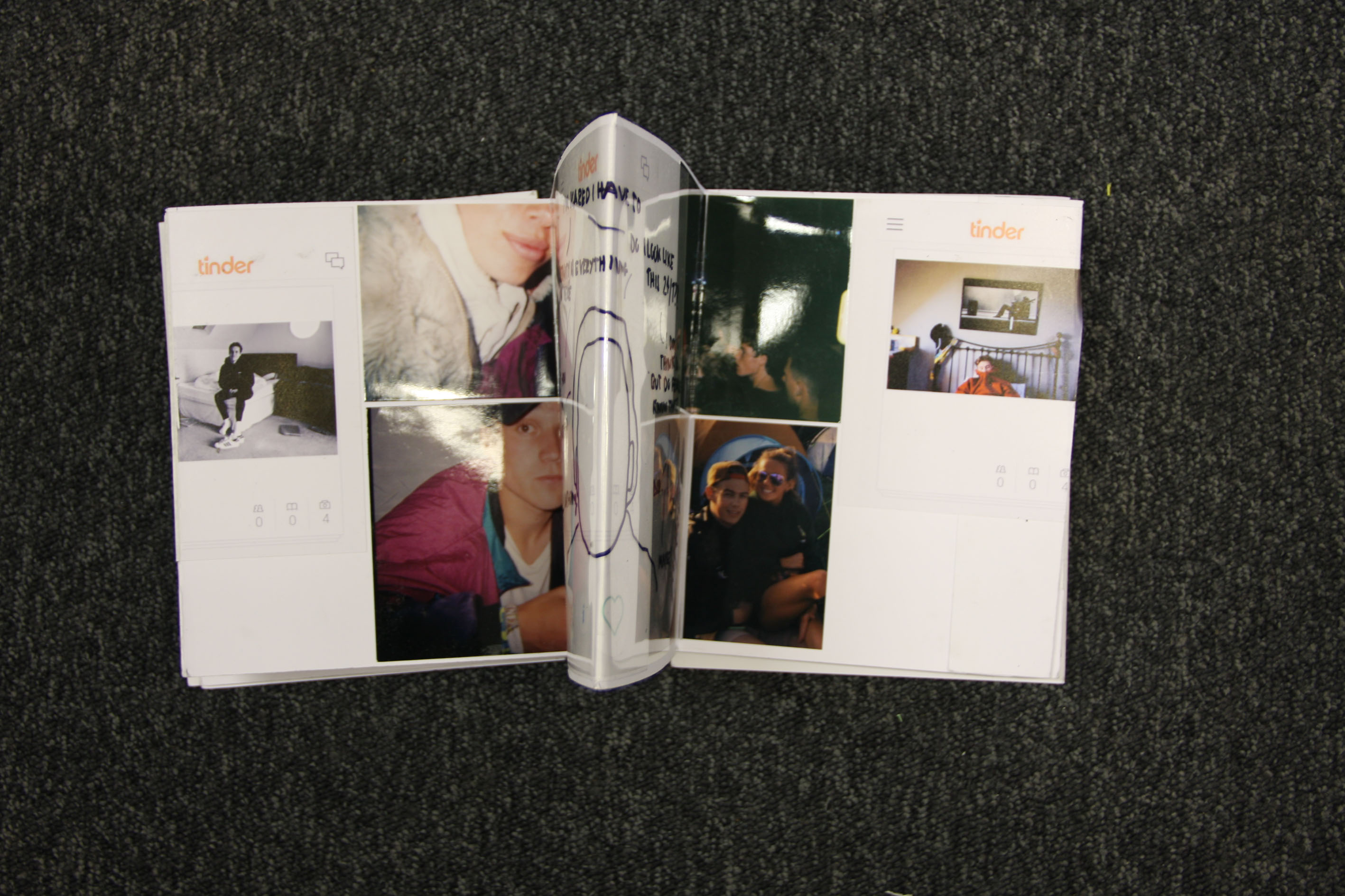


Jerry Uelsmann – Experimenting

Jerry Uelsmann has a very abstract thinking in his photos, he usually tends to mix 2 photos together which is what i’ve tried to do here. I have taken one of my photos of glass windows and mixed it into the building , it makes the photo seem like a landscape but also an abstract at the same time. This photo follows both Matt Crump and Jerry Uelsmann because there is still that fantasy coloured theme but then there is that Jerry Uelsmann feel to it with the abstract building.

Pink sunset Jerry UELSMANN

Exam – Research – Vernacular Photography:

Vernacular Photography:

Untitled

‘is the creation of photographs, usually by amateur or unknown photographers both professional and amateur,who take everyday life and common things as subjects.’

Though the more commonly known definition of the word ‘vernacular’ is a quality of being ‘indigenous’ or ‘native’, the use of the word in relation to art and architecture refers more to the meaning of the following sub – definition form The Oxford English Dictionary ‘ concerned with ordinary domestic and functional buildings rather than the essentially monumental’. Examples of vernacular photographs include travel and holiday photographs as well as family snapshots, photos of friends, class portraits, identification photographs and photo booth images. Vernacular photographs are types of ‘accidental’ art, in that they often are unintentionally artistic.  Closely related to vernacular photography is ‘found photography’, which in one sense refers to the recovery of a ‘lost, unclaimed or discarded’ vernacular photograph or snapshot. Found photographs can be found in various different places such as charity shops, markets, car boot sales, in the bin, between the pages of random books or even on the side of a street. The use of vernacular photography in the arts in almost as old as photography itself, as back to when photography was just becoming a known thing and when it got to the point where a lot of people were taking photographs, almost all photographs were taken by strangers and people who we will never get to know, but somehow their photograph could have been seen by thousands of people. Vernacular photography has become far more commonplace in recent years as an art technique and it now a widely accepted genre of art photography. The idea of vernacular in photography is also an indication of photography as a medium informing the everyday, prevalent, naturalised. Something interesting about this type of photography is that it can be seen and understood as an oppositional photography, as it is outside of all the technical or artistic histories, yet, especially with the snapshot, it could also be entirely conventionalised, a manifestation of visual banalities, This relates to the theme of truth in the way that we might understand the images may or may not be separate from their initial intents.

Selected Slides

From the 480 slides I decided to filter through them and find all the best images containing my Mum, and even though I still was only able to narrow it down to 118, this still made it much easier to find the images that I need or want to use within my book. Although the slides are my favourite images, it has been much more difficult to find each slide and find the year written on the physical slide, and the slides are all mixed up as to when they were taken, so I mainly used the slides for years when I couldn’t find many physical images.

Screen Shot 2016-05-06 at 11.12.41Screen Shot 2016-05-06 at 11.12.51

Exam – Planning – Project:

Although our exam title is a mixture between truth, fantasy and fiction, I am interested in focusing only in exploring the theme of truth in photography further. My plan for this project is to be able to explore the truth within family photographs, through the media and the visuals of vernacular photography. I have been researching the works of such people like Joachim Schmid, who is an artist who works with found photographs to create his own meaning of what someone else’s photograph could mean to him, as of course he is unaware of the true meaning behind that photograph as the photographs as the photographers themselves are unknown. This is something that I will be interested in exploring further, which is the perception of different people from the same photograph. I have also been looking at the works of Chino Otsuka, who is a very visually creative photographer with brilliant ideas as well as manipulation skills. What Otsuka does, is that she takes old photographs where she is included from when she was younger and puts herself as she is, where she is much older in the same photograph to make it look like two different people at the same time. Another artist who’s work I have been looking at is John Stezaker. Stezaker’s work involves creating a new person through the manipulation of two different portraits of different people. I personally find this idea very creative, and something that can have a lot of different meanings and reasons behind them depending on the perspective you are looking at the work from. And lastly I have also been looking at the work of Liz Steketee, who is someone who is very creative in the way that she ‘erases’ people out of photographs. Liz’s work is interesting in the way that she uses photographs, and I feel like she has a reason behind each and every photograph, and the method that she uses to create her final images is always unique. Therefore, for this project, whilst focusing on the visuals of these fur main artists that  I am looking into, in much more detail, I am wanting to create photographs that will be depicting the truth about who I am, where I came from, where I am now, and why everything happened the way it did. I want to create my own meaning from photographs that where taken of me, my friends and family as well as my surroundings. My main focus for the visuals is to use photographs from when I was still young. The reason for this is because, it was a period of time where I had no idea that one day that was all going to be taken away from me, where I thought I would spend a lot of my life, and people who would see me grow up from a baby to an adult. However that would not be the case and the truth would sooner or later become my new reality.

Photobook Specification

I really want this photobook to be as personal as possible, and so I have decided to create a kind of timeline throughout the book, which will contain 120 pages, just over two for every year of my Mums life, as she is turning 58 this year. Every double spread of pages will represent a year of my mums life, and will contain the best pictures of my Mum from that year.

All the photos within this book will have my Mum in, apart from images of cats, as cats are quite a big love within my Mums life, from Bingo to Charlie, to Monty and Bustopher Jones, to our current cats Panda and Willow, and I want to make sure the cats are properly shown as being a strong part of my mums life.


Archive: Belle Vue Skatepark

http://www.itv.com/news/channel/update/2016-04-07/the-channel-archive-belle-vue-skatepark-1977/

In Jersey, when skateboarding first came about in the 70s, there was a big buzz in the community as this new sport was very popular with young people. It got so popular that a high quality skatepark was built, that was used by pro skaters. Although it was becoming very popular, many people in the community looked down on skateboarding and thought that it was a waste of time, as the kids who were focusing more on skateboarding than things some members of the community felt were more important. This led to the skatepark at Belle Vue pleasure park to be shutdown. This has had repercussions on skateboarding in Jersey, as ever since then there has been no more quality skateparks that have these kinds of facilities. Compared to today, things are the same in the sense that some members of the community still despise skateboarding. This is something I believe has to change as all that these young people want to do is practice and perfect their skills for their sport. With my documentary, I have focused on these topics in my film, as the message of the film is to inspire people to look for change in the community.

Contact Sheet (inspired by posters)
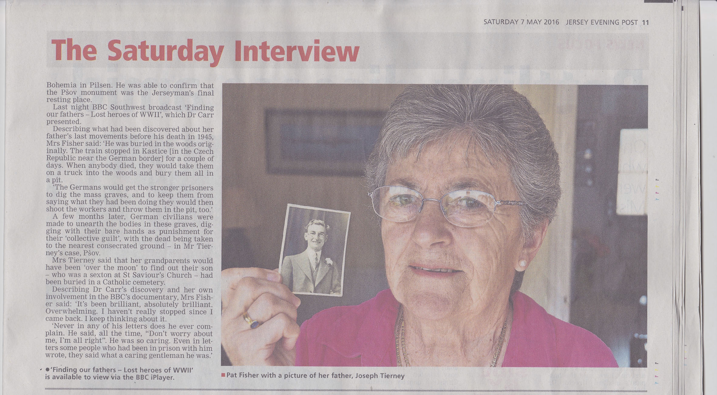
I decided to created these images, purely from an idea that I had, however I wanted to connect it somehow to an artists that I have previously looked at and decided to connect this idea with Valerie. The images that she creates are quite perfect in the sense that everything is set up, it looks like she uses some sort of professional lighting and that is something I wanted to incorporate throughout this shoot. The staged and adjusted lights setting about the whole thing definitely connects with the work that she produced. Alongside the written statement I found from her website that I used to represent those (victims) who spoke out. My main reasons for conducting this photo shoot was because I was so shocked at her research including things that women have said to her and I found that just unbelievable, and it really horrified me at the fact that women felt like this/what people had said to them (e.g. ‘my mother asked me what I had done to cause this’).
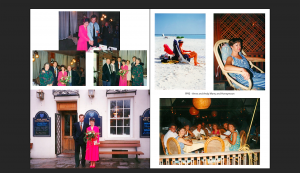
I already adjusted these images into black and white and did this because that is how I want my final outcomes to be look like. An interesting idea that I could experiment with when considering final outcomes could be to mount them up a foam board, with the written statements underneath each image. One reason for this could be because when printed out, they might come out small and thus the writing may be difficult to read. Another reason to conduct this would be for a powerful and emotive effect, I also think that presentation wise, it would look quite interesting to have that standing out (as I want that to be the primary focus).


Untitled-1 Untitled-2

Exam – Fiction:

Fiction:

Screen Shot 2016-03-30 at 14.34.03 2

Fiction is a form of literature in the form of prose, especially in short stories or novels. Fictional stories usually use imaginary / fictional people, places and or events to create a whole new world. Stories that are classified as fictional are often ones that have been created through the imagination, compared to history or facts. Fiction is open to interpretations and is an act of creative inventions. This therefore meaning that fiction is not expected to tell the truth, which allows to create very unrealistic stories for our entertainment, while allowing someone to open their imagination up to us. Fiction is actually very similar to fantasy but it is also an opposite of the truth. Some photographers and artists that I have come across when I first researched this topic were people such as James Casbere, who creates fictional landscapes inside a studio and makes them look realistic. I find his work very interesting as it is blurring the lines between the truth and the fictional.; Ursus Wehrli, who uses small toys such as cars and figurines to create a fictional reality world.; Lucas Simoes ” To burn pictures, a way of physically erasing a memory by burning it, so with time, the image that is burnt will disappear from your memory”. Lucas Simoes uses photographs which he has printed out and burns them to create a whole new fiction memory in his head about that one photograph, therefore distorting the original meaning with a new one.; Didier mansard creates fictional and dream like landscapes in a gloomy way, which are very simplistic, however enabling you to emerge in his vision of the world.;   Kyle Kirkpatrick constructs tiny dioramas using the topographies of carved books. “My practice is primarily concerned with the notion of the imagined landscape. I present man – made objects and natural materials simultaneously to form carefully and meticulously composed installation works. I capitalise on intrigue taking objects out of context reinventing their use, pushing the viewer to see beyond what I present before them, a glass could be interpreted as a lake, a metal bracket as a cliff.”


Calendars

Last night when looking through the images, we realised there were some dates of images which I didn’t know, so my Mum decided to get out her old calendars, which she has always kept. The calendars dated back to 1993 and go up till last year. When looking through we found the calendar from 1995, and in it was marked the time of my brothers birth, which I found quite interesting, and I think I am going to use the photo of that date in my phonebook for 1995.

IMG_1212
IMG_1214 IMG_1215
IMG_1217

Poster Influence

I decided to look more into the ways that awareness is conducted and found some posters that I believe visually strong and emotive. I feel like I would like to respond (not in a poster style) but these images have  given me a few ideas of how to incorporate certain elements within my own body of work.

Image result for domestic abuse postersImage result for domestic abuse handprint posters

I like how the subject in the middle image has tape over her mouth, I feel like I can incorporate the context of the image on the right alongside this. The fact that a hand is over her mouth, not letting her speak standing as representation of the truth and reality behind this and even if there isn’t physically a hand over their moth, it can be just as hard to communicate and talk about negative encounters. Therefore, I plan on using the tape to represent the fact that they can’t speak out, along side the words on the tape which represent what some victims did say when they did have the chance to speak out.

SPECIFICATION 

I plan on responding to this idea of not being able to voice certain things. I had an idea to combine things that a previous photographer Valerie had stated throughout her work (that women had stated to her) and I think it will be quite interesting to perhaps create portraits of various women and write in a sharpie over that tape with some of these statements:

It’s ok. It was my fault.

I have nowhere else to go.

I’ve waited for him to change. It’s been eleven years now.

It started when I first got pregnant.

My mother asked me what I had done to cause this.

I haven’t told anyone.

I’m afraid to go out.

I still love him.

I plan on conducting this shoot in the studio with studio lighting because I want the focus to be on the statements written over their mouths and not on anything in the background. I definitely think that using a variety of people will look better than just one person with all the different statements and as far as rule of third, I plan on placing everyone in the center of the frame because I think it would be odd to have them off centered.


Nans Attik

To get more photos, I went into my Nans attik with my Mum, who hasn’t been up there in years, however I have been in the attic a lot myself as a child whenever I would be looked after by my Nan, so I know where a lot of certain bits and bobs are within the clutter from when I used to nose around.

I filmed my Mum whilst we were up there so I could remember how my Mum reacted to seeing certain things we found.

My Mum laughed quite a lot looking at all the different things written on all the supports in chalk.

From this trip, I found a huge box of my Aunts photos, in which I found many of my Mum, which I have scanned in.

When we were rummaging through everything in my Nans fairly cluttered Attik, I found a tin with lots of small bits in, which meant nothing to me, but my Mum was amazed I had found it, as it was one of her favourite things to play with when she was younger. The plastic bits all go together to build your own garden. My Mums Dad and Grandad both care(d) greatly for they gardens, and so I have a feeling this was where my Mum got this love of gardens from. Watching my Mum look through all the stuff in the time again was great, and she was so happy she’d been able to rummage through again and it seemed to bring back so many memories.

slide - 1IMG_1086

Another item I came across was this old rocking horse type thing, which I played on when I was younger, but remembered seeing this within one of the slides of my mums youngest sister.

slide - 113

In the back bedroom of my Nan and Poppa’s house, she has also still kept all the old games they used to play as children, some which are seen in the slides when they are opening them for christmas.

IMG_1082

The last thing I found which relates to a few of the slides, are these toffee hammers they used to play with, and even used as part of costumes.
IMG_1083

slide - 286

Although I probably won’t be able to use some of this stuff within my original planned photo book, I may be able to incorporate them into a smaller phonebook somehow, comparing old and new photos, as the photo book I have currently planned follows chronological order and so I can’t really compare photos from different times very well.

Exam – Fantasy:

Fantasy: 

Screen Shot 2016-03-30 at 12.26.26

Fantasy’s dictionary definition is ‘the faculty or activity of imagining things, especially thing that are impossible or improbable.’ Fantasy is a trans media genre and its narratives are essentially fictional.  For regardless of how one ultimately understands the nature of fantasy, the notion of true fantasy seems patently incoherent.Fantasy is something that is produced by the imagination on an idea of something that is far from the norms of reality. Fantasy in a psychological sense is broadly used to cover two different senses, conscious and unconscious.Fantasy is a necessary ingredient in living. Fantasy is a category of fiction that uses magic and supernatural elements to create something unique. With fantasy, you are able to venture off into your own little world, enabling you to create very unusual pictures that others might not get, however they might mean a lot to you. It is much easier to identify typical elements of fantasy. than is it to understand the category of fantasy itself. There can be little doubt that, in practice, the genre of fantasy is pretty well defined, concretely manifesting itself in the shelves reserved for it in video shops and bookstores. Fantasy is a trans media genre and its narratives are essentially fictional.  For regardless of how one ultimately understands the nature of fantasy, the notion of true fantasy seems patently incoherent. Some photographers and artists that I firstly came across when researching the topic of fantasy in photography are people like Paula Rego which worked on looking at psychological dramas, which for many, specially people with mental disorders could view some of these as their own fantasy; Moira Sprunt which looked at merging a person’s face with another person’s face through the use of a projector, to make the person standing in front of it look like someone they can  only dream of looking like, aiding them visually with their fantasy of looking like their idol. ; Ana Schuleit, who looked at creating the outside world inside of buildings by paving the floors of different buildings with flowers. ; JerryUlesmann, who looked at surrealism and alternate realities by manipulating landscapes in various different manners for various fantasies of his own.; Erwin Blumenfeld who plays with perception ad our imagination through the use of human faces.; Duane Michals, who looks at different perceptions someone can have of themselves when looking in the mirror, with the use of a distorting mirrors to create unrealistic and distorted images of a human face.; Jon Von Holleben , who was interested in looking into something which pretty much every human on earth has thought about which is flying. He brings this fantasy of ours to life by using the floor as it’s main prop.

Photo Analysis

This is another photo i believe is one of my best, like the other one it has a large depth of field which helps the viewer scan the photo from left to right as it gets further away.  Because of this the photo has the effect that everything is getting smaller as it gets further away, this could portray Jerry Uelsmann’s photos as he uses the same technique in some of his photos, it shows good use of depth of field and allows you to look more into the detailed parts of the photo.

I have created the candy coloured effect again to go with the theme of my project, this time i have decided to make the sky pink as well and i think it goes really well, the dark pink on the gates contrasts well with the bright pink sky.  I chose to keep the cars and the road the same to show the variation between the fantasy world of colour and the normal world with the plain colours such as the greys and whites.

Market pink

I feel like this photo relates to Matt Crump’s because of the candy coloured theme, it makes the photo a lot more vibrant and fantasized, it is also like the work of Jerry Uelsmann because of the use of depth of field and the objects getting smaller, he uses this sometimes in his work but sometimes mixes that with other photos.

If i could change anything about the photo it would be the van in the bottom left, it either needs to be the full van or cut out completely, but the reason i didn’t cut it out is then the photo would be too short and the depth of field effect wouldn’t work as well. Also if i was being picky i would prefer for the grey van to be a smaller car so you could see more of the pink on the main gate, this is out of my control but i feel it would’ve looked better.

Exam – Truth:

Truth:

Screen Shot 2016-03-28 at 22.30.23

What is the truth? is a very simple question, however the answer itself is not simple at all. One of many definitions of truth that ‘it conforms to reality, fact or actuality’. But this basic definition is not complete because its definition is open to interpretation and a wide variety of applications.  For example, just from reading that one definition we can start bringing up other questions which are very similar to what is the truth, however carry along with them a heavy answer such as what is reality? what is fact? what is actuality? One main thing to keep in mind when talking about the idea of defining the truth, is that every human being has a different perception of what the truth is; My perception of the truth could be nothing alike what someone else’s perception of the truth is, and actually they my think that my perception is wrong, weird or could be the complete opposite and I could be thinking exactly the same thing. A great example of this is documentary photography. Now, we are all generally told throughout our lives what is true, what could be true and what isn’t true, and documentary photography is something that we often see in places where a lot of people are very influenced by what they see , and one of these places being the tv and the internet. However, when we are looking at these types of photographs and being expose to them, we are actually only looking at what the photographer wants us to look at, in other words we are only looking at the photographer’s perception of the truth, which could be different to ours if we were to photograph the same event / scenario that they were photographing. Generally things that are true are fact to reality or committed to an original standard. The word turret it self conveys the power of honesty and the opposite of fake / false. The truth is very powerful. By telling someone our  truth or someone else’s truth we are exposing ourselves and others to everyone and anyone.The topic of truth is often debated, particularly is areas of philosophy, religion and art. Now, when looking at how some photographers interpret truth, there was a lot of variation between a lot to different topics in which the truth can be told and exposed truth the media of photography , and it was also fascinating to actually look at visuals of someone’s perception and perspective of what the truth about a certain thing is.  Some names that came up that stood out to me when first researching the topic of truth in the media of photography were photographer’s such as; Richard Avedon with the complex truths beneath the beautiful facade; Jill Greenberg with portraying real emotions; Richard Billingham with the truth about some very close to him and their struggles to keep a family together; Nan Golding with looking at the truth  behind different dark sides of life through the consumption of drugs and alcohol; Martin Parr with the obsessive pursuit of a ‘truthful’ representation of British culture; Xuchen which looks at what is someone’s truth about living in two different cultures and societies at the same time.

Photoshoot

For this final shoot, I took photographs of my dad when he had arrived from the pharmacy which I hadn’t planned to do, however the outcomes were good. I think these photographs were important to include in the book because they are a big part of his life. I also took photographs of my dad and my brother interacting to show the male bond, which I had intended to do. At first they were both resilient, however after they agreed  to let me photograph them. I didn’t take many photographs as I could feel that they were uncomfortable with the situation.  Although I think I was able to capture their bond with the few photographs.

dad and son contact sheet

I choose the best photographs from the photo shoot to include into my photo book. Before this I edited them by decreasing the brightness and increasing the contrast. I also experimented with different tones, I then added some more blue to some of the photographs which were a little bit yellow. I decided to put the photograph of my dad holding the pharmacy bag in black and white, because although it looked good in colour I thought that the black and white in this image could represent the thing that is holding him back (his illness) from working and doing the things that he wants. I tried to make the photographs of my dad playing football with my brother the same colour so that I could use them as a sequence in my book. I am happy with the overall outcome of the photographs below.

untitled-1-6

untitled-1-7

untitled-1-5

untitled-1-3

untitled-1-4

Jersey Skatepark Project

In Jersey, the skateboarding facilities are limited to only two parks and one mini-ramp. There is one in St Helier and one in St Johns, the one is St Helier is the main park which is usable for skateboards, scooters and BMX’s, and the one in St John’s is mainly for skateboards and occasionally scooters. Although to some people this might seem like a good number for an island of this size, in reality it’s not very much as the parks are quite a small size and don’t feature things that proper skateparks feature. For example, there are no bowls that you can skate, and this limits people learning transition tricks as the only vert equipment is the quarter pipe and mini-ramp in St Ouen’s, Because of there being limited facilities, a campaign has been set up on Facebook to gain funding for more facilities in Jersey. Screen Shot 2016-05-06 at 09.09.08

The project has been set up to be a way to gain funding from the public for skateboarding facilities, as it usually costs a large sum of money to build equipment. The first thing that is being funded is a portable 8ft mini ramp, so that they are able to have vert competitions all over the island and raise even more money for more projects. The project has gained a large following by the skateboarding community, as they all want to see a change in Jersey and have more facilities produced. It has even been picked up by the Facebook page of popular international skateboarding magazine Sidewalk.  This shows that the community is really wanting new facilities as the following for the project is growing larger and larger each day.

In my documentary I am going to be showing the project, and the whole theme of the documentary will be about wanting and needing the new facilities.