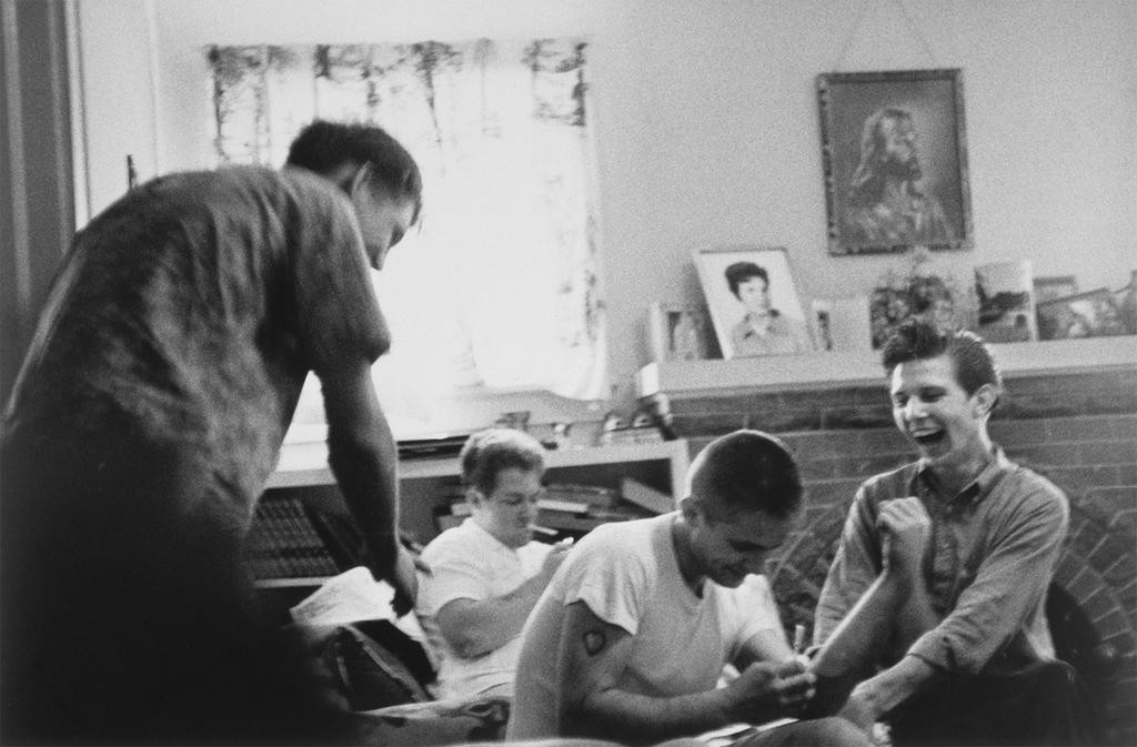
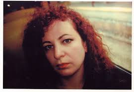
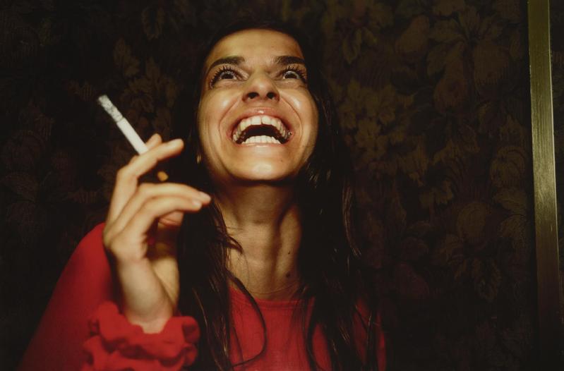
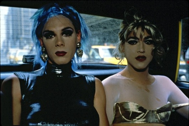
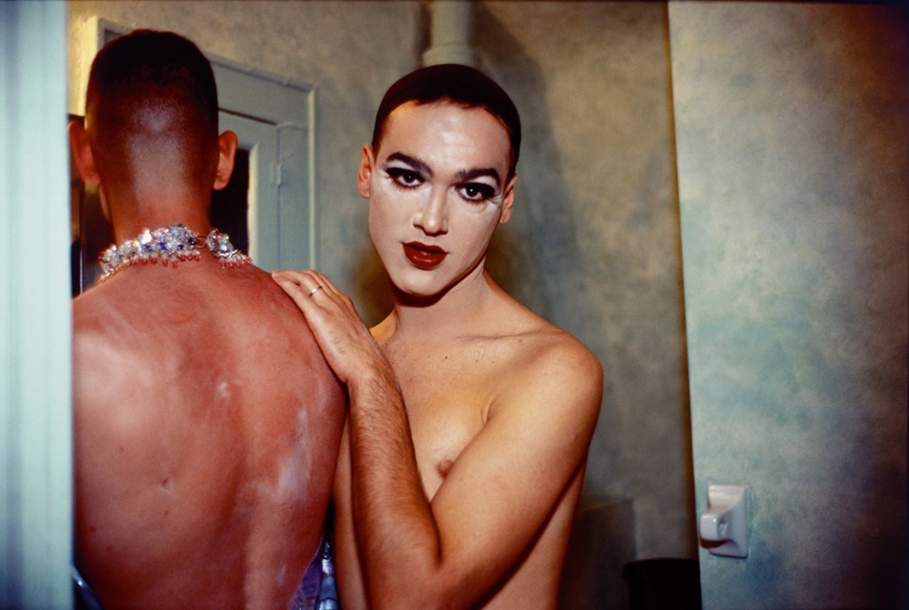
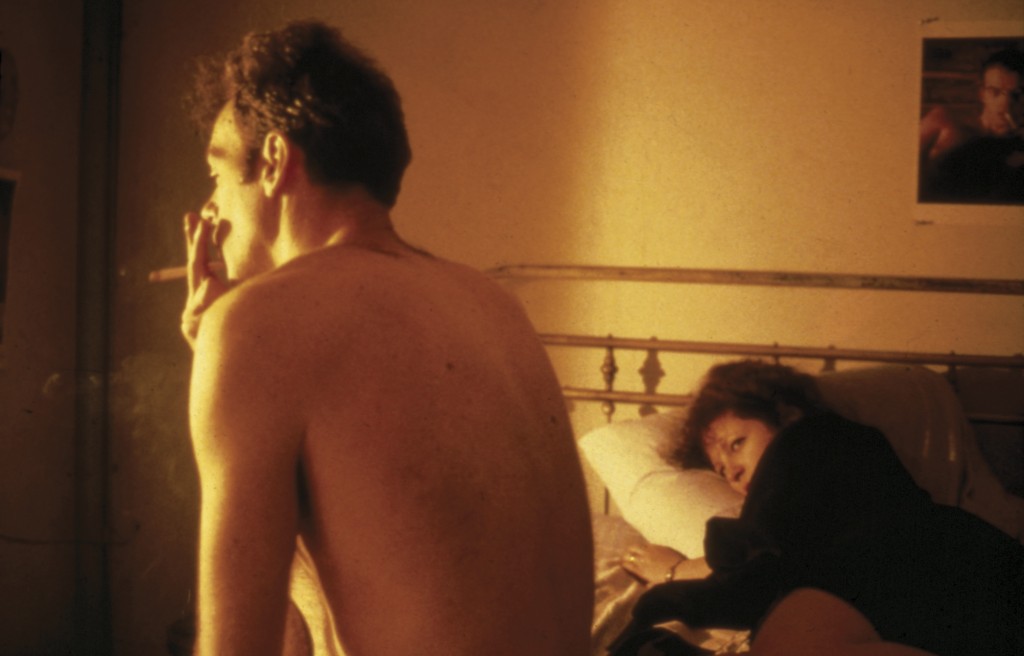
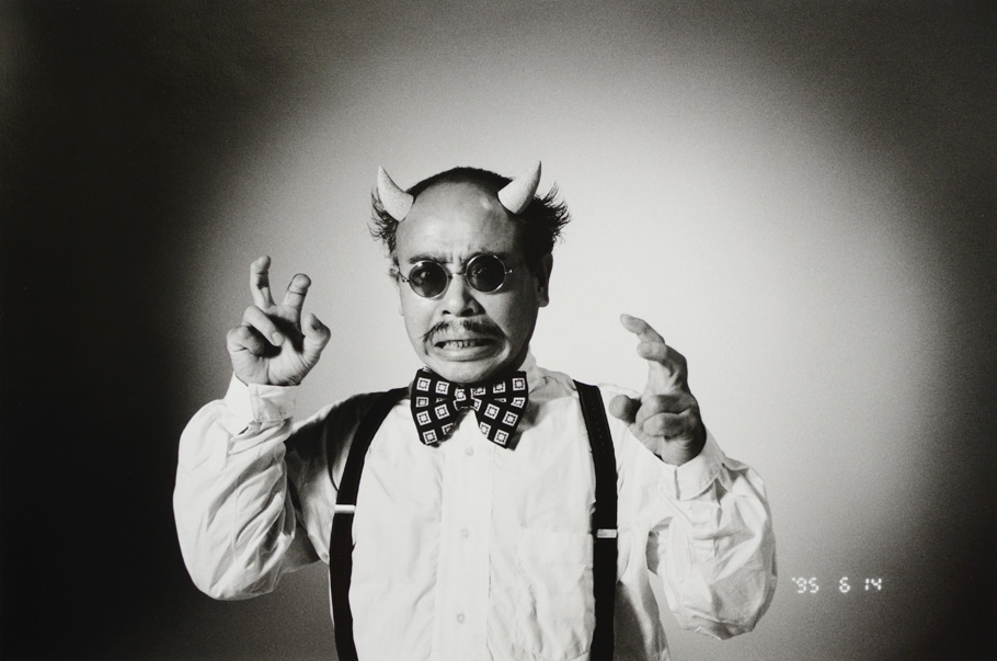
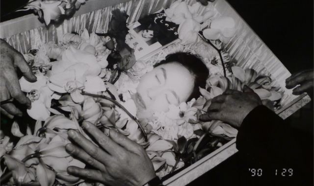
For this I have taken some inspiration from the tableau photographer Cindy Sherman. Here I have taken on board the way in which our community views men and women. For this shoot I decided to challenge the way our community thinks and understands certain circumstances. I want to provoke thought, I want our society to open their minds and learn that there is so much more to life than the magazines we read and the ideal of having the ‘perfect life’, watching celebrities and thinking that these people lead the most glorious lives. Nowadays we have shows like Keeping Up With The Kardashians, award shows, news reports that glamourise celebrities and showing them in the perfect light. We sometimes forget that they too are people and they face the same difficulties that us ‘normal’ people do. There is no such thing as the perfect life, this is what I would like to express through my work. For this shoot I am going to stage everyday life to show how unrealistic this way of life would actually be.
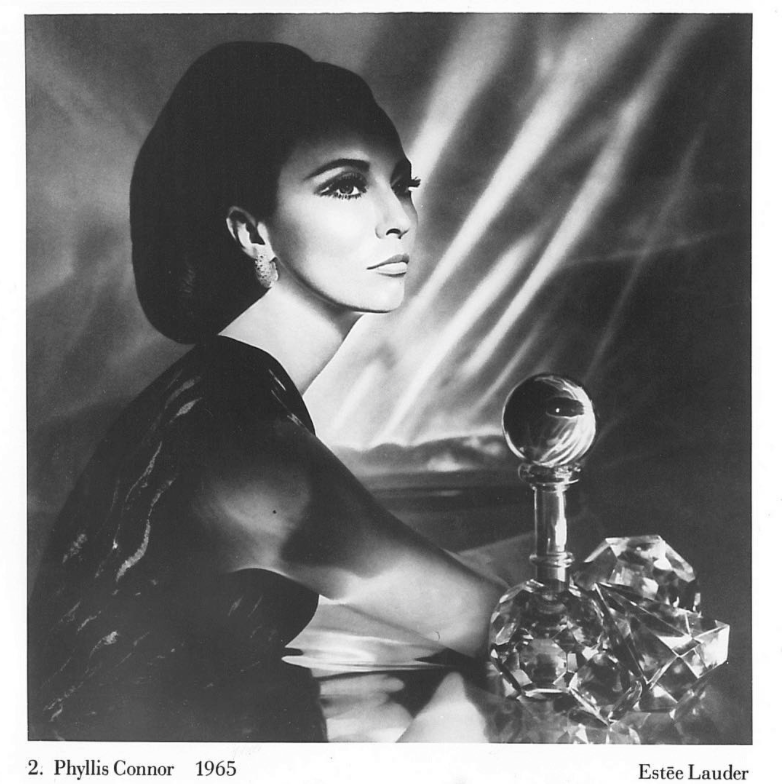
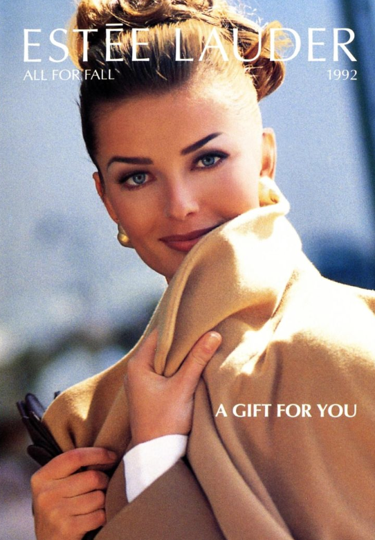
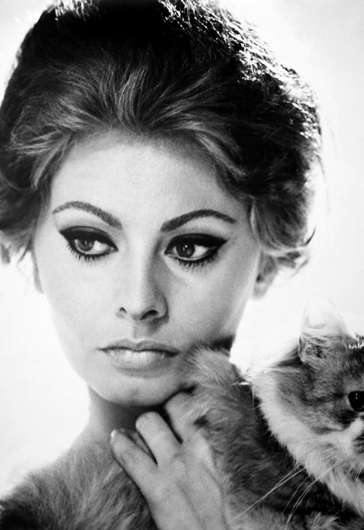
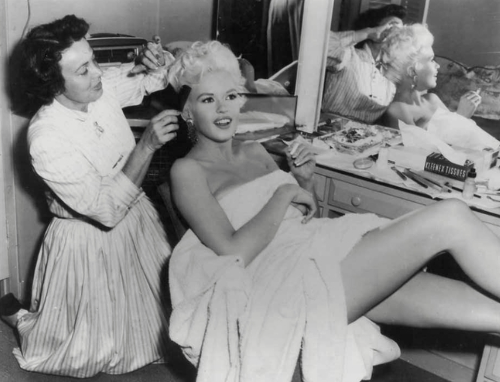
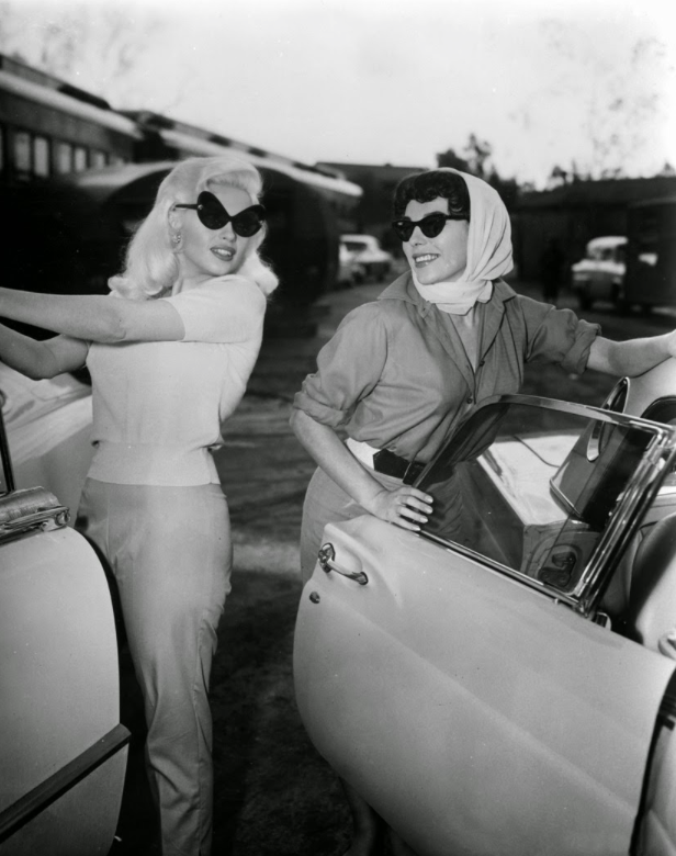
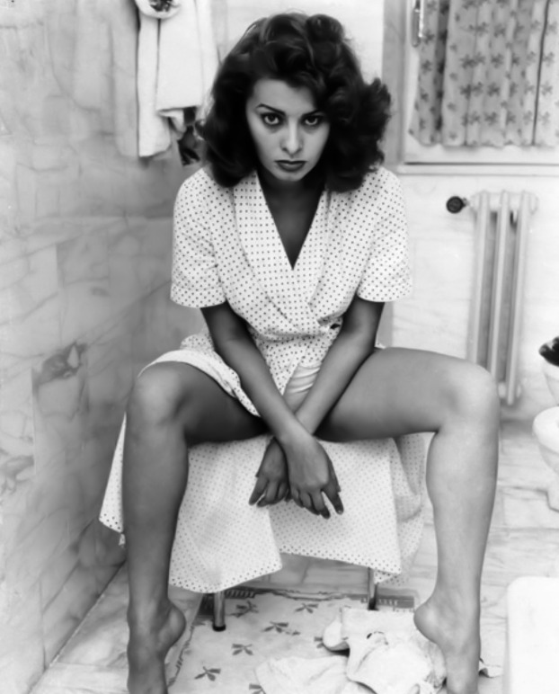
To me community is sharing, whether that be an environment, ways of thinking and experience. As communities grow we are able to learn more and more about one another progressing those relationships. I chose to go with the element of community as this shoot is a message for our first world community to try and enlighten them of how a lot of young people think and the fact that none of it is actually true, it’s all fake. We are constantly bombarded with images of women on the front of magazine covers posing doing everyday things that a lot of young people take literally and think that these models constantly look the way they do in the magazines. This is completely wrong and staged for the cameras. I found my inspiration for this when I came across the 1960’s Estee Lauder Campaigns. I came across these images whilst watching a YouTube video and then decided to explore it further and find out more about these campaigns. This actually inspired me to create my own images.
YouTube video that first inspired me:
https://www.youtube.com/watch?v=U0wm5HiQXuQ
Estee Lauder history:
https://www.esteelauder.co.uk/estee-edit-article-victor-skrebneski-interview
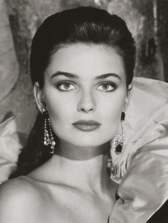
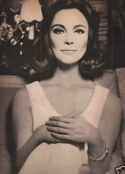
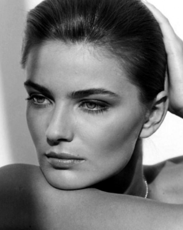
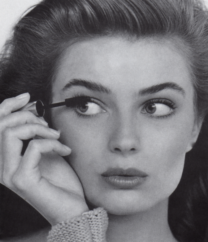
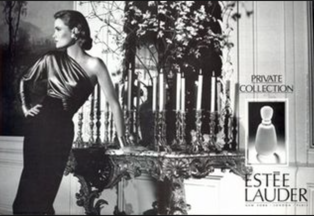
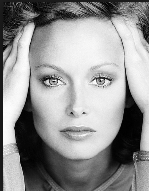
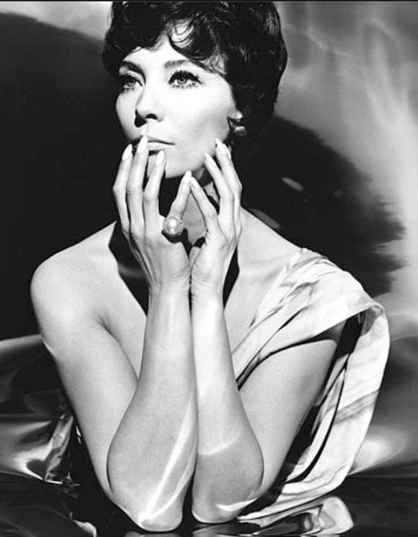
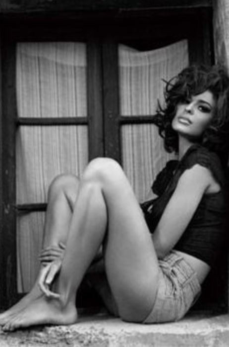
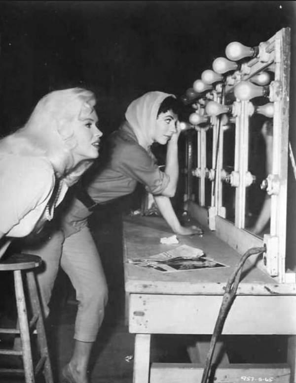
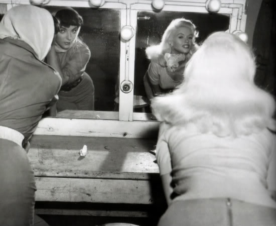
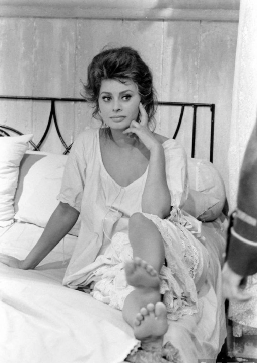
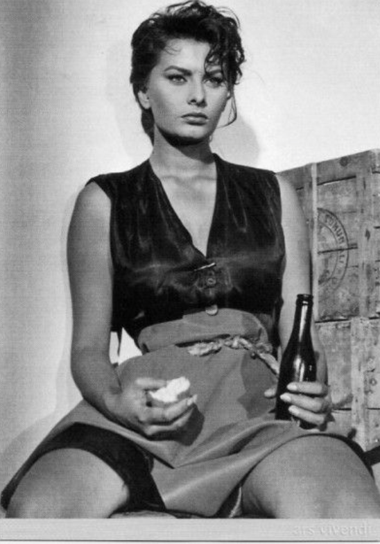
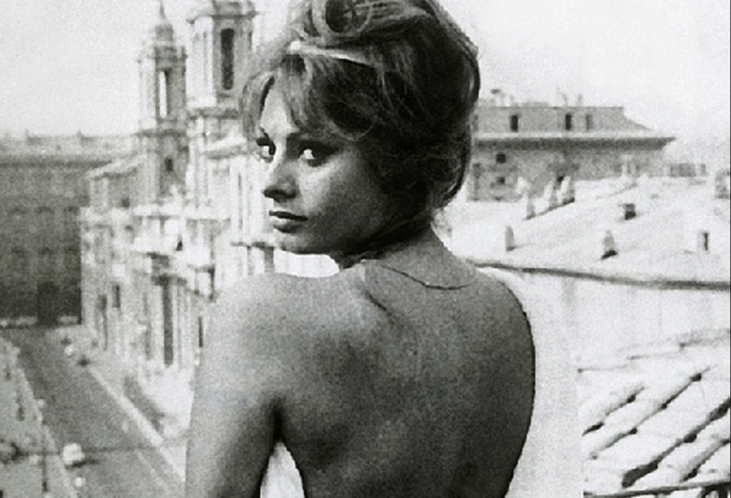
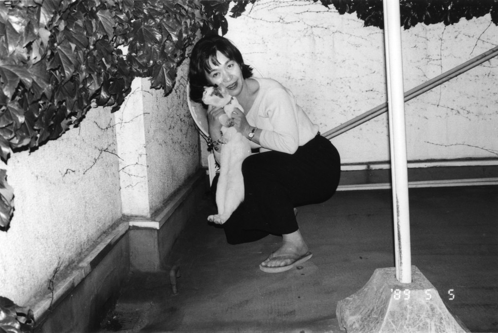
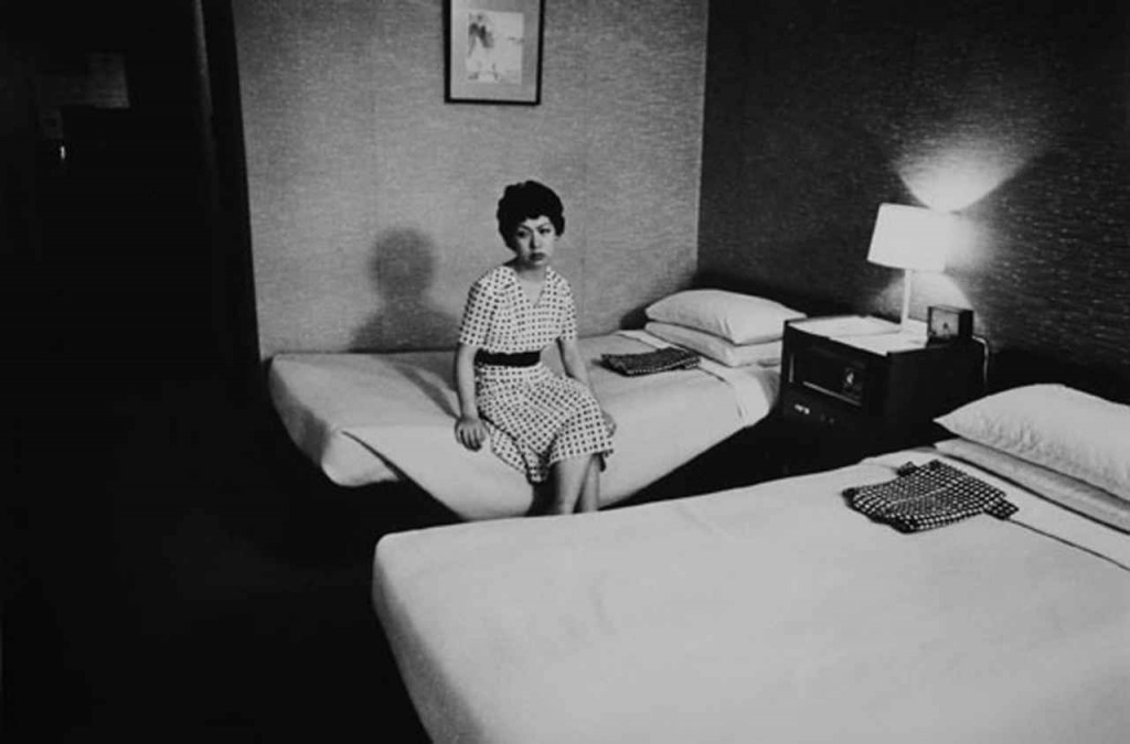
All of these images have helped to inspire me to create my own photographs. These models were photographed for these photos in the 1960s and to me seem very raw. I think this is because the cameras that were used were more like disposable cameras of today, they had film and that is how they operated. Images were developed in dark rooms rather than being edited and perfected on the computer with editing software. For my shoot I have decided to create all of my images in black and white to stay true to my style models as well as to maintain focus on the subject of the images rather than the colourful surroundings. I think that this shoot will challenge the way we as a community think about things and the way we see the celebrity world. I want people to understand that this idea of having the ‘perfect life’ is completely staged and people are just good at pretending. Celebrities are huge influences on our younger generations that I think we need to focus on and bring to light that this is not a realistic way of thinking. I really like a lot of the images above, most of which are from an Estee Lauder campaign in 1965.
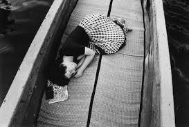
These three images were my main inspirations as they were thought provoking. The two first images of the women looking in the mirror and doing their makeup interested me. I thought ‘why are these women leading over and doing their makeup?!’ that to me just looked ridiculous and kind of glamourised the way that women actually do their makeup, making young girls think that makeup is beautiful and that all women do it. The third image of the woman looking off into the distance all glammed up with a full face of makeup, hair beautifully done and wearing a glamorous gown while seemingly sat at home just makes no sense to me. I understand that these images are for a makeup brand and to advertise their makeup but I don’t like the way the women are glamourised making young girls and women think that this is the way to be and that this is what beauty is. I am excited to recreate some of these images and to try and make the staged aspect of the shoot as exaggerated as possible. I have also decided to do a more realistic everyday life shoot, photographing real people doing through their everyday routines and finding out a bit more about our community and the world that we live in.
A Staged Day in the Life
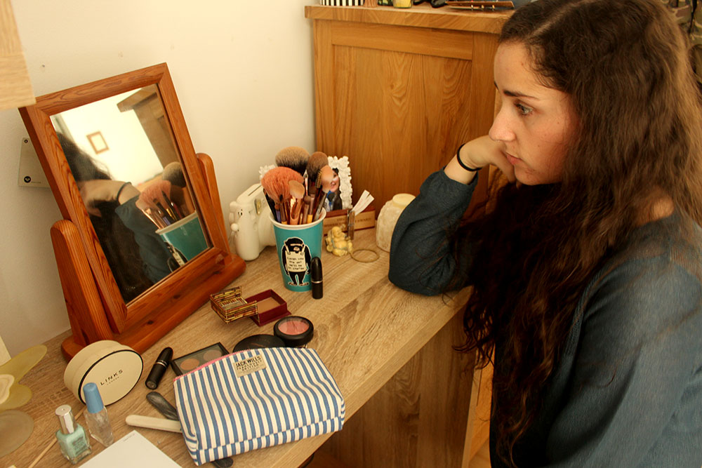
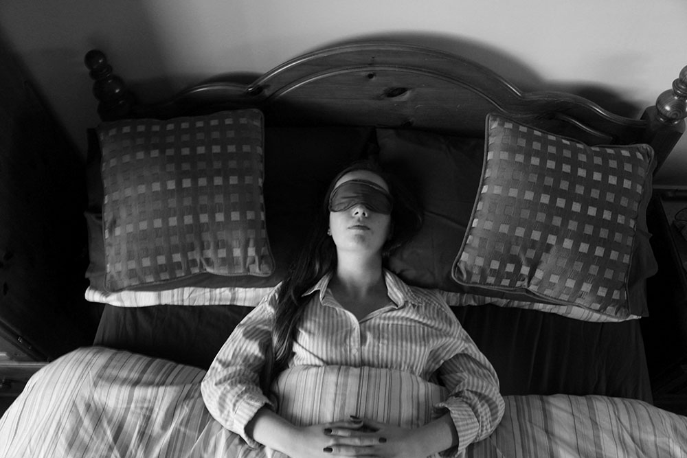
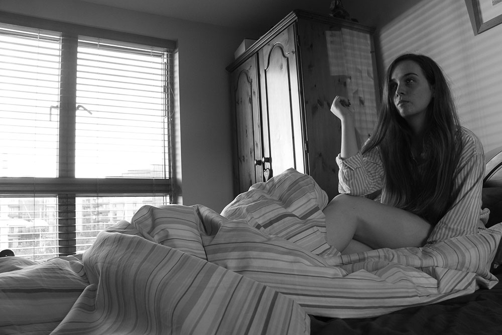
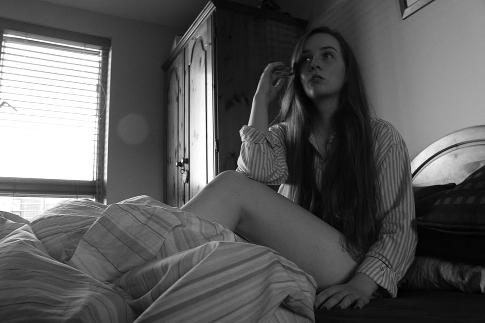
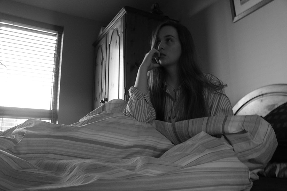
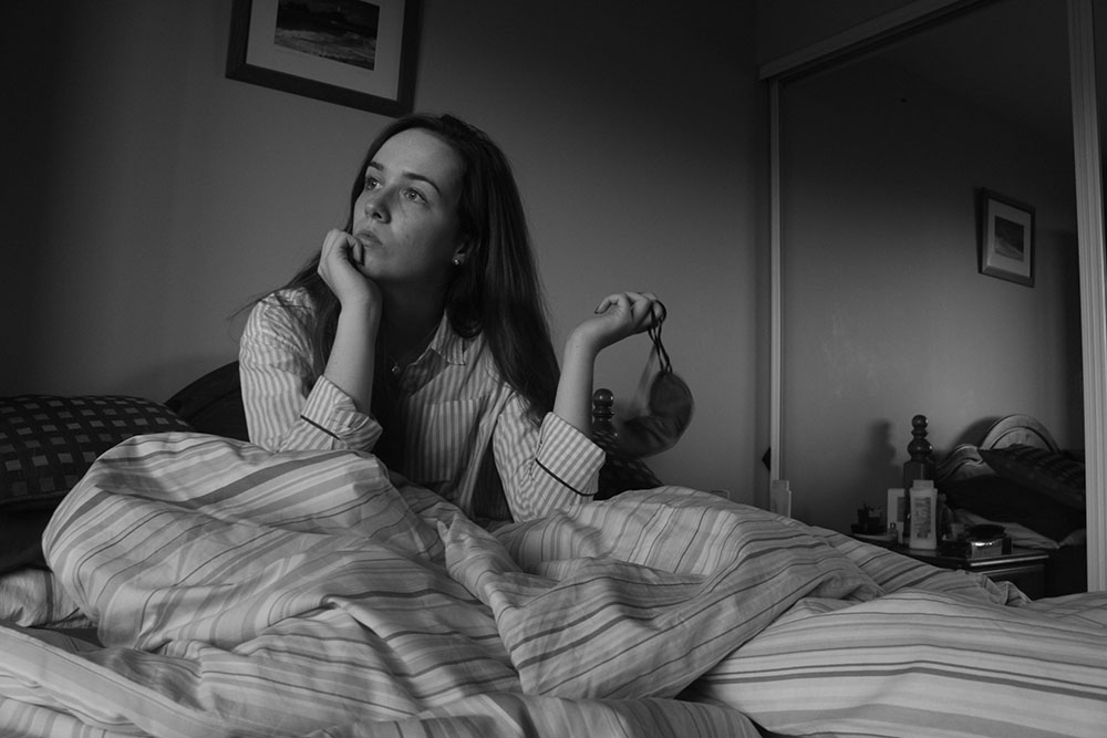
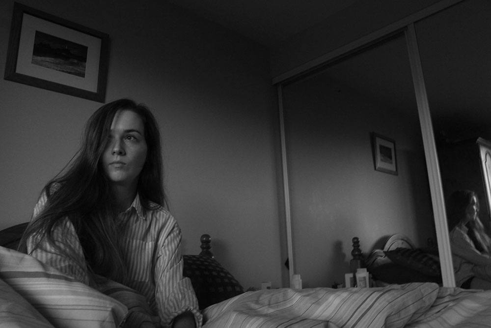
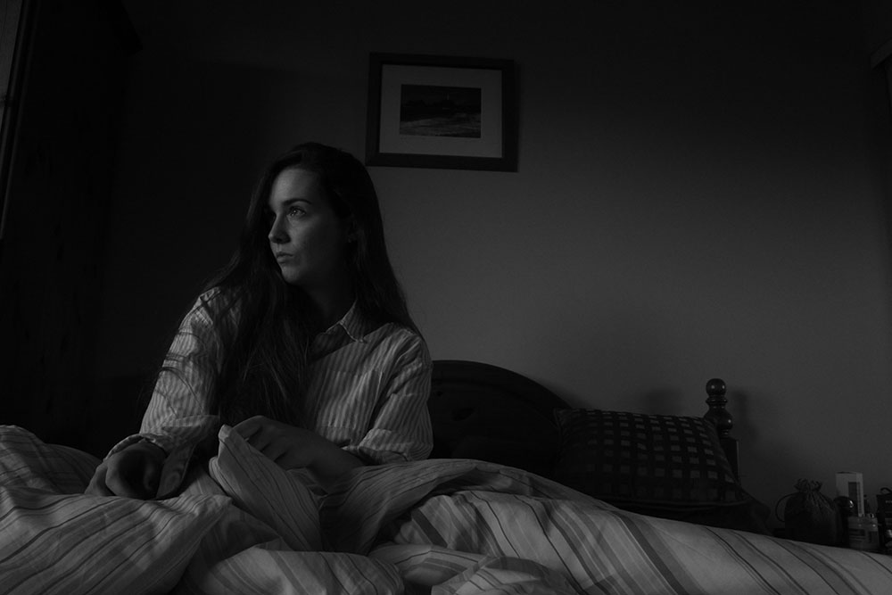
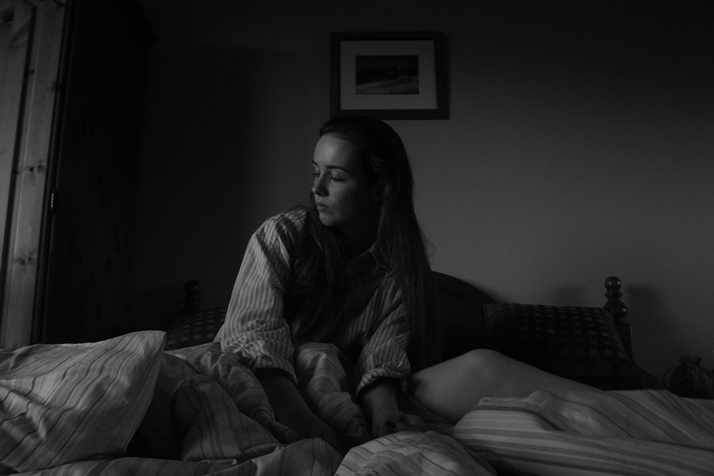
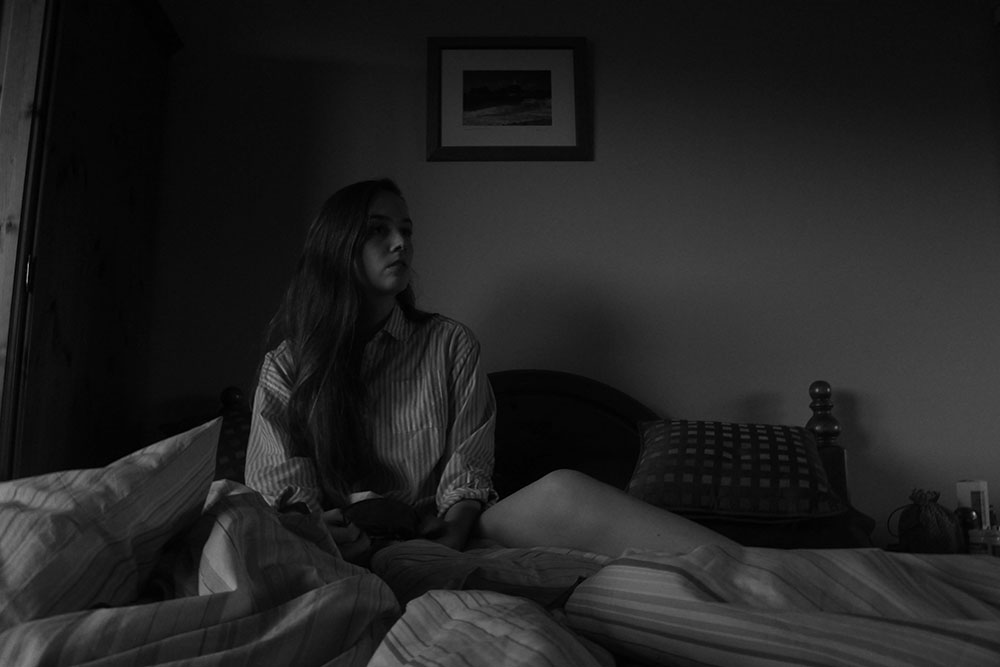
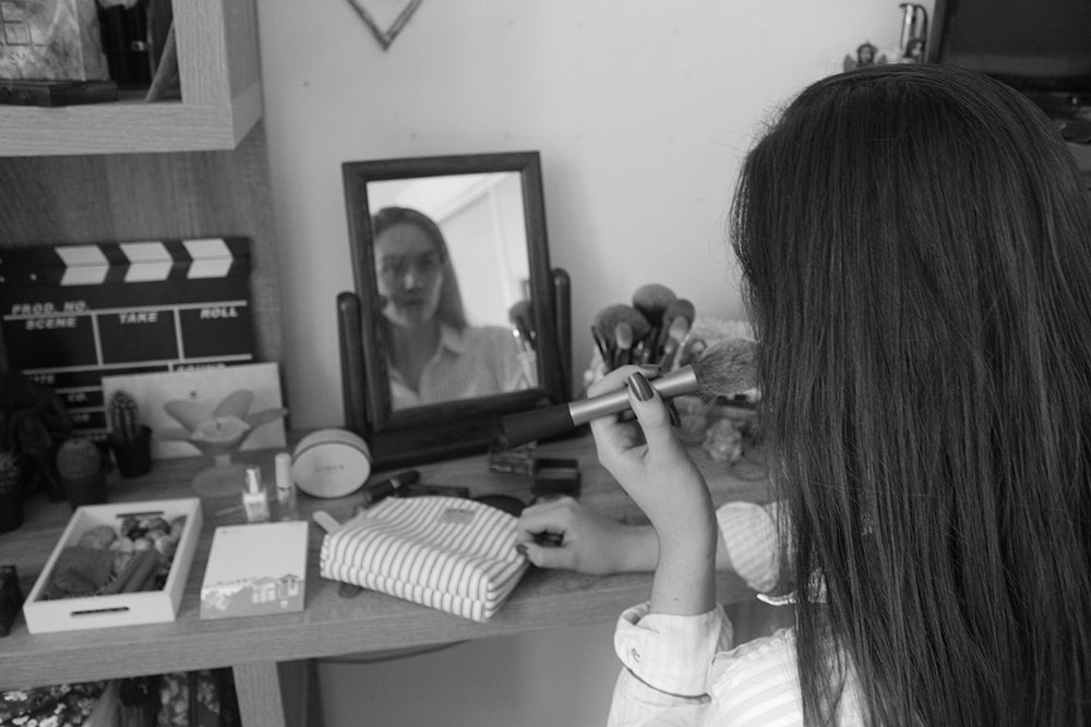
Here I asked my friend to pose in the position that I would be so I could test out the different angles for my ideas as well as lighting. I found that this shoot was more of a learning experience towards my actual main subject of Film Noir as I managed to work with a load of different lighting exposures with harsh light and soft light by only using natural lighting. I think that this did work out of the bed shots as the sun was setting when I made those images which brought in some good light into my images making them more interesting and mysterious. However, the images at the makeup table aren’t the best as I couldn’t seem to get the aperture completely right on the camera and so those particular ones didn’t come out as well as I had hoped as well as me being unable to actually properly pose for the photos as it was difficult to not get anything else in. If anything I would want to re shoot this in a bare room or something were there is very minimal surroundings with just the vanity dresser, the makeup and the model. I think that this would probably be best done in the studio where I can change the lighting and mess around with a few different things but other than that I think I’ve made a good start and am starting to really get the hang of what light looks good and what pose works well with the position of that lighting.
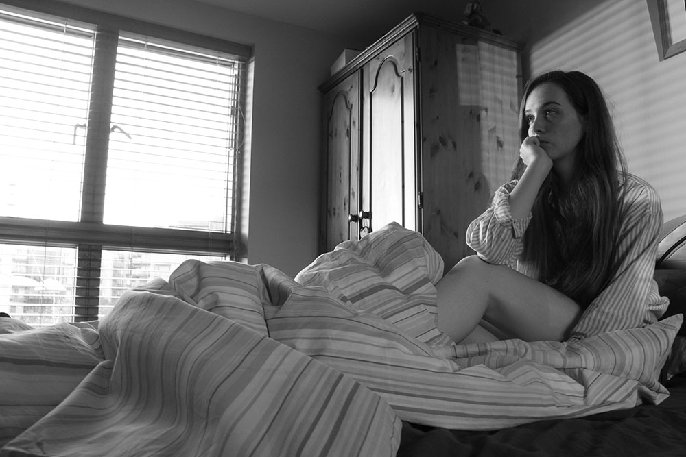
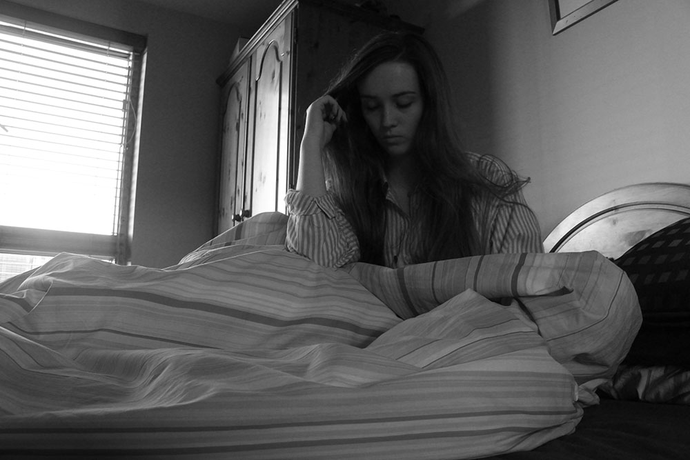
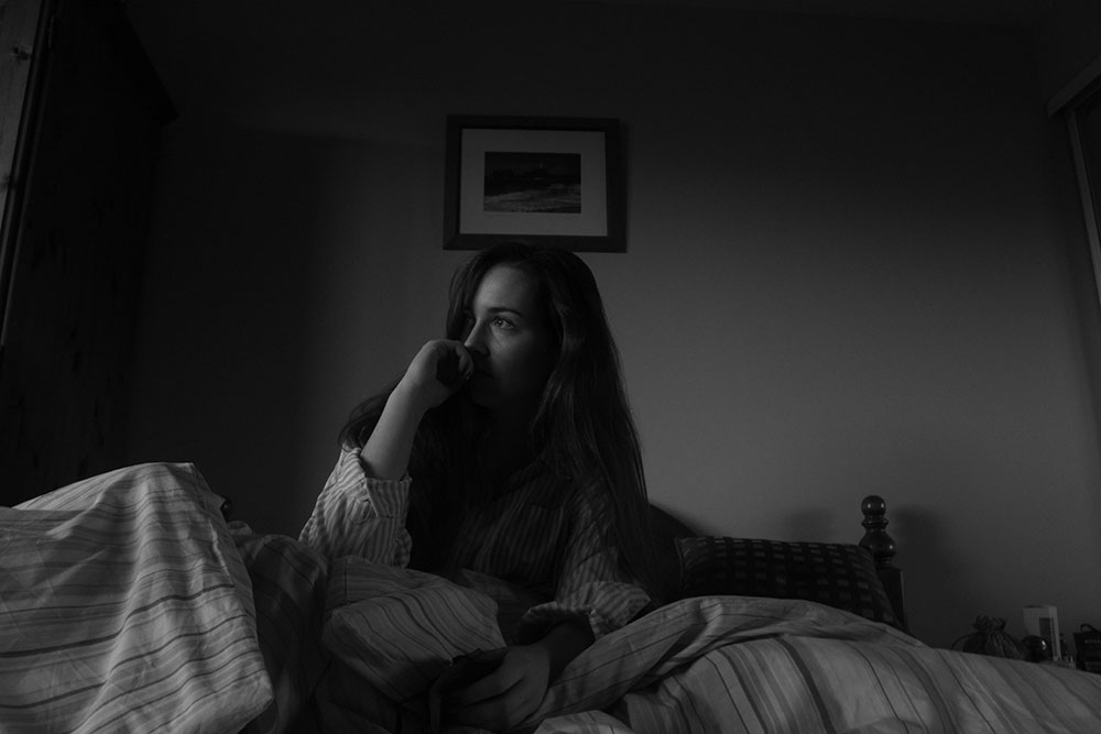
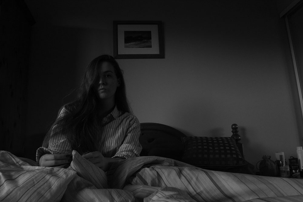
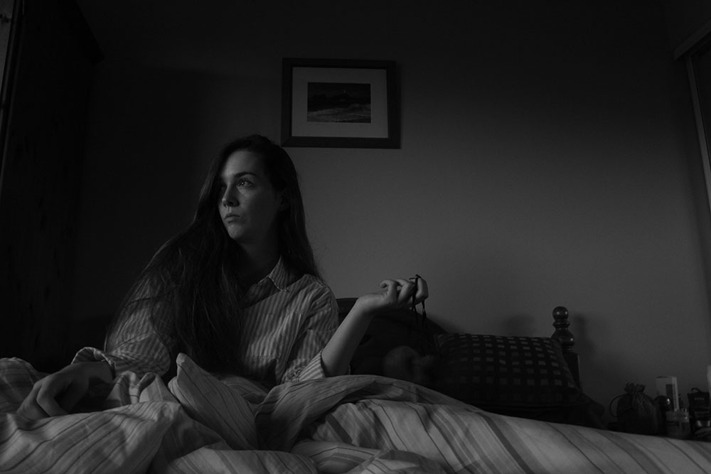
Here are the images that I have made so far and will be adding to as the course goes on. I experimented with a load of different angles and positions of the subject to see what looked best and which one managed to capture the story the best. This is only the beginning of the characters morning and I will be adding to this to create a more in depth story. I like the lighting in a lot of the bedroom shot images as the sun was actually setting when they were being taken and looked really great with there being more harsh lighting on the subjects face as well as in the background of the image.
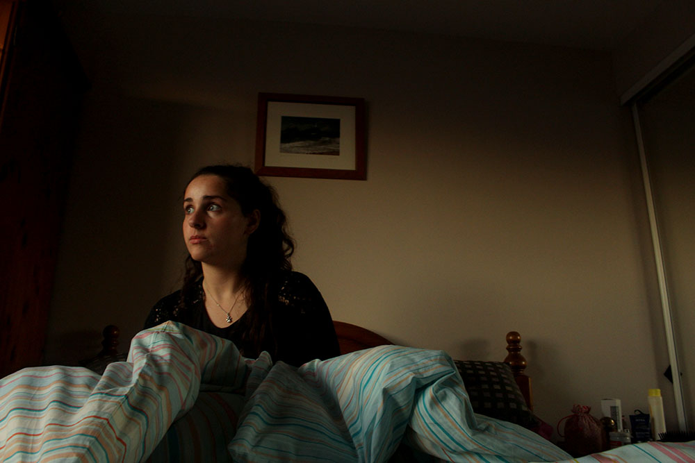
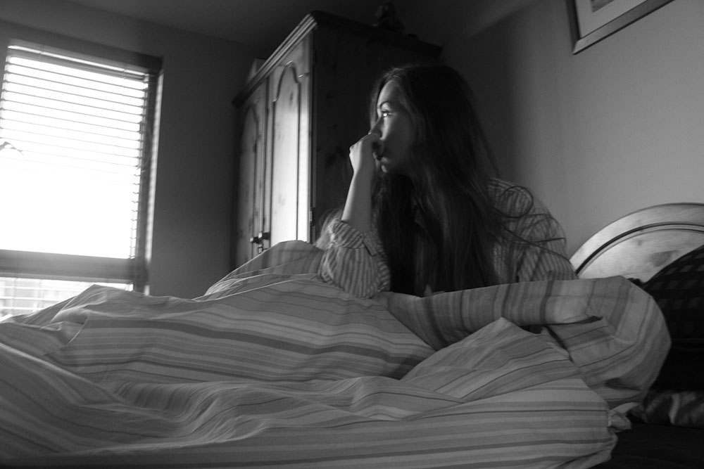 This is one of my favourite images as it portrays exactly what I want to get across. This image represents how women are expected to get up and enjoy the morning and simply gazing out of the window but in this image my character looks almost concerned as if she does not know what to do. I like the position of the camera and the composition of my character. Here I set up my camera on a tripod, positioned it and asked my friend to click the button, this worked well. I do find it so much easier just to be behind the camera making the photographs of someone else but I wanted to give a more personal response to the works of Cindy Sherman and Claude Cahun as they are always the main subjects in their photographs. I also like the way my character is looking and that the hand almost covers some of the face giving more of a mysterious way to her as if the spectator cannot completely see who she is but all they know is that she is in deep thought. I do like this image as the strong lighting makes for a more interesting black and white image. I think that this image is most effective in black and white and wouldn’t work in colour as the spectator would get too distracted by the orange coming through the window of the sunset and the contrasting colours of the stripped night gown and the stripped bed sheets. This also makes my character more of an enigma and will make the spectator want to look at the rest of the story to possibly find out a little more about this woman, who she is and what is troubling her. For these images I wanted to create an almost robotic character that is just doing what is expected of her and how society thinks she is really does drain a person and that other people do have problems and do have troubles that they feel that they can only face alone.
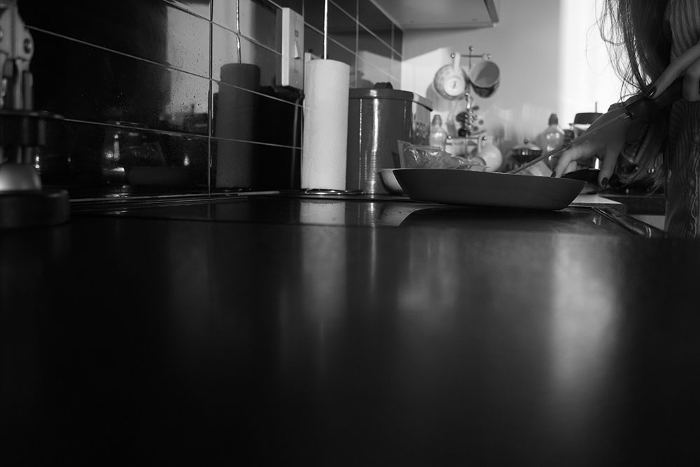
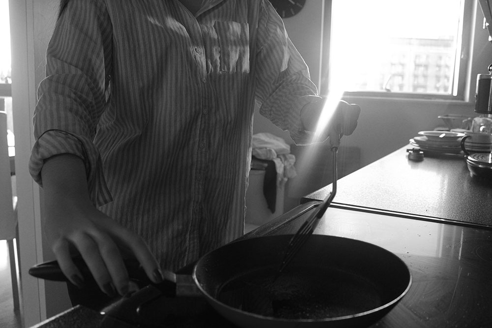 I also really like this image as the spectator is unable to see the identity of the subject bringing more of a sense of mystery to her and again making the spectator want to look at more images to find out more about who she and what she is going. I like the way that the camera has captured the sunlight coming through as a lens flare and I also like that is kind of cuts of the subjects hand a little so that the spectator focuses more on the pan with nothing in it. I like this image as it reminds me of one of Cindy Sherman’s images where a young woman [herself] is cooking something and is just passively staring into nothingness which I have taken inspiration from with my own photographs. I do like the composition of this photograph and how the hand on the far left looks a lot bigger than the hand on the right as well as making the body look a lot smaller as if she is possibly wasting away or can’t be bothered to come closer to the pan and actually make a nice breakfast. I also like the light coming off of the subjects shirt as it just gives more layers to the image and makes it stand out a bit more which is really interesting to me. I think that I will stick to having all of my images in black and white as it makes for more interesting images and allows the spectator to focus on what I as the photographer want them to focus on rather than all of the black and red that surrounds my family kitchen. I really like the way the light hits off the counter top as the spectator is able to see the window in it as it shines, it just makes the image that more interesting as well as it giving more shades for the black and white.
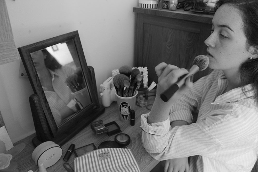
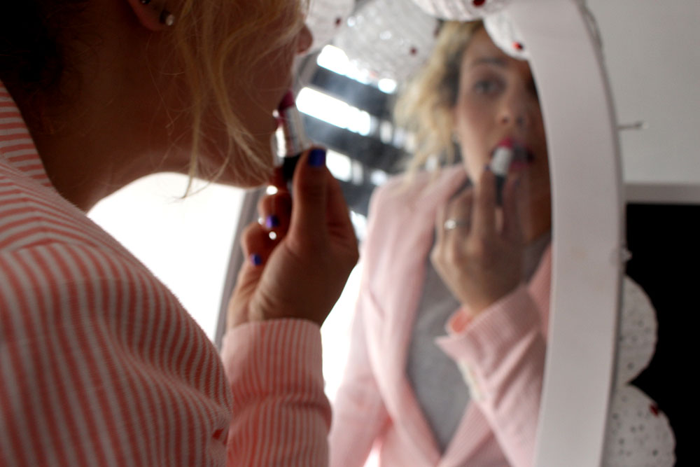
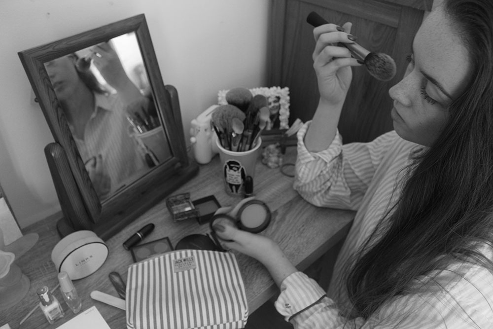 I chose this image because I like the angle and position of the camera making it look as though the spectator is looking down on the subject and that she is less powerful than them. I wanted this image to represent how women feel pressured and expected to dress up and always look pretty when in reality not a lot of women want to be constantly made up and when they do it is for themselves and not to impress anyone else. I also like the entire mise-en-scene of this shot as the spectator is able to see the makeup products she has sprawled across the dressing table as well as being able to see her reflection in the mirror. I like the angle that the camera is at and find that it looks really interesting as well as the position of the subject being exactly where I want it. I really like this image as a whole as it is the perfect position of where I want everything to be and how I want the image to be portrayed. I think that the most interesting part of this image is the reflection of my character in the mirror as it is just an interesting angle and everything within that little frame within the photograph looks very staged and put together, this shows how we often only see a part of someones life, the perfect part, and are often taken in by the aesthetics and how everything in that one frame actually fits and looks pretty when in reality the subject isnt so happy when faced with the pressures of having to constantly be ‘perfect’ for the rest of the world.
A Real Day in the Life
Shoot 1:
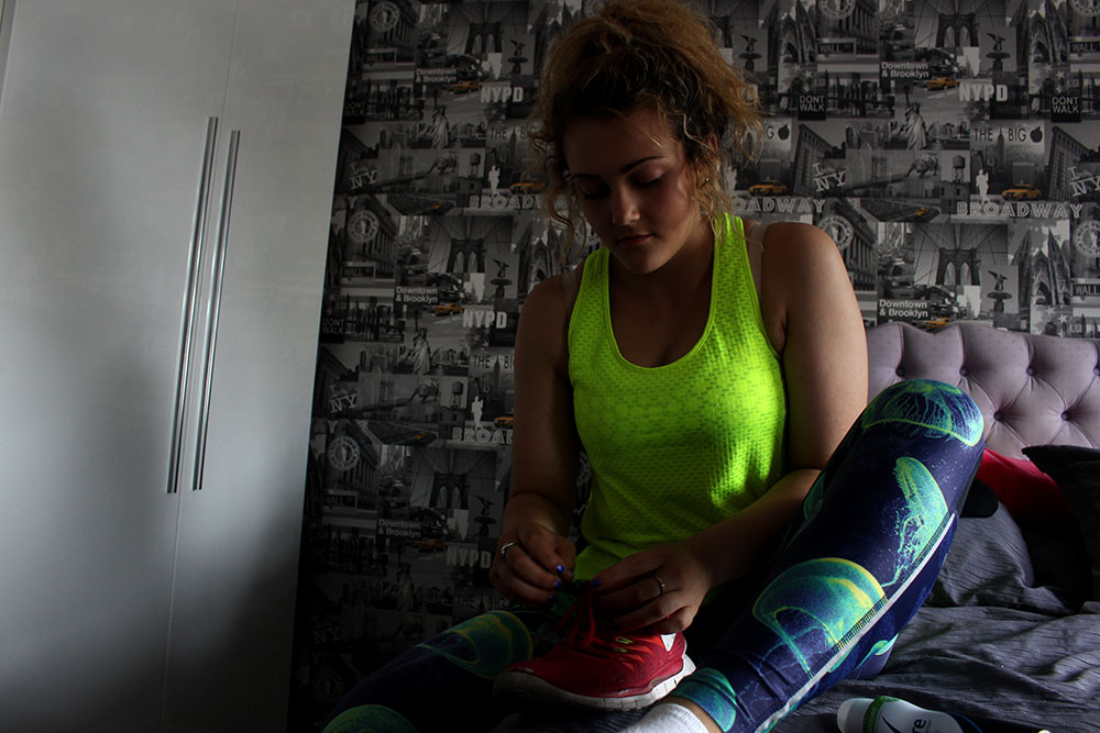
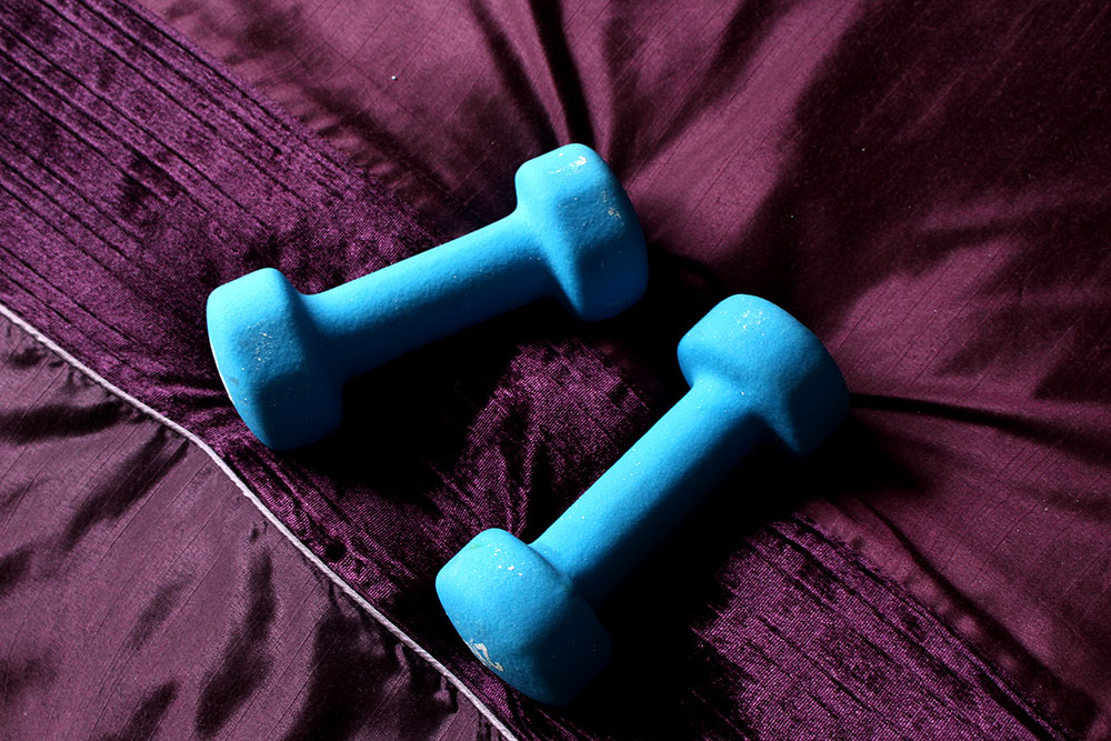
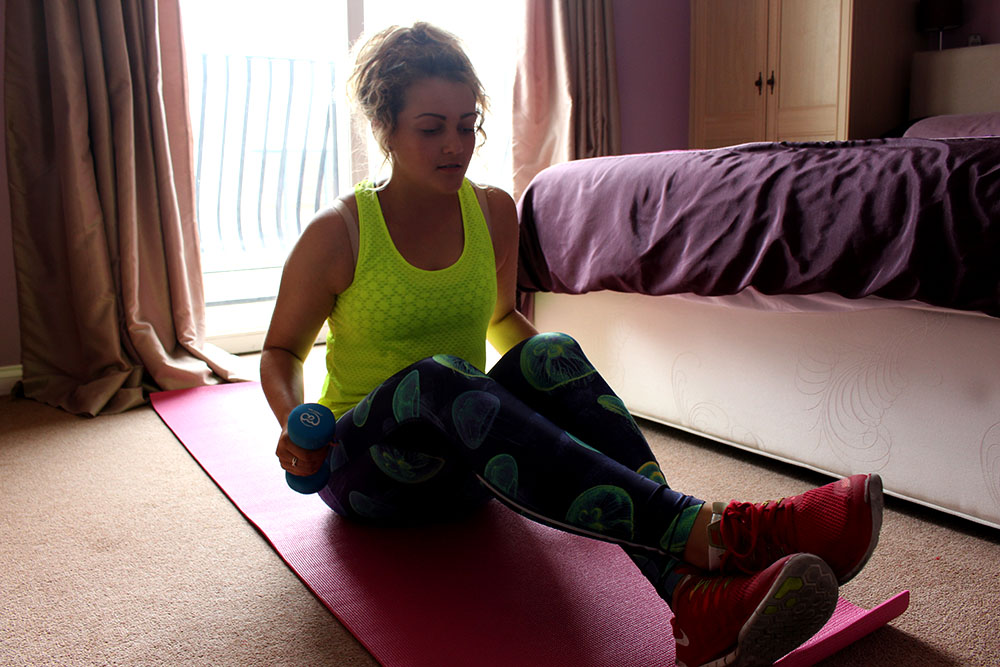
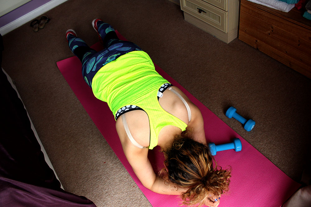
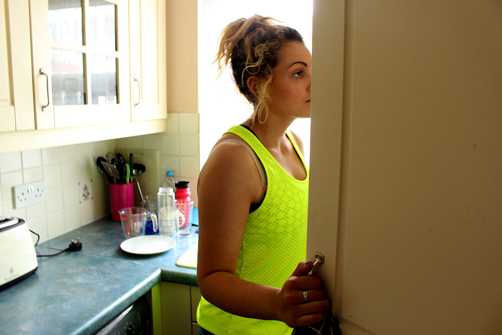
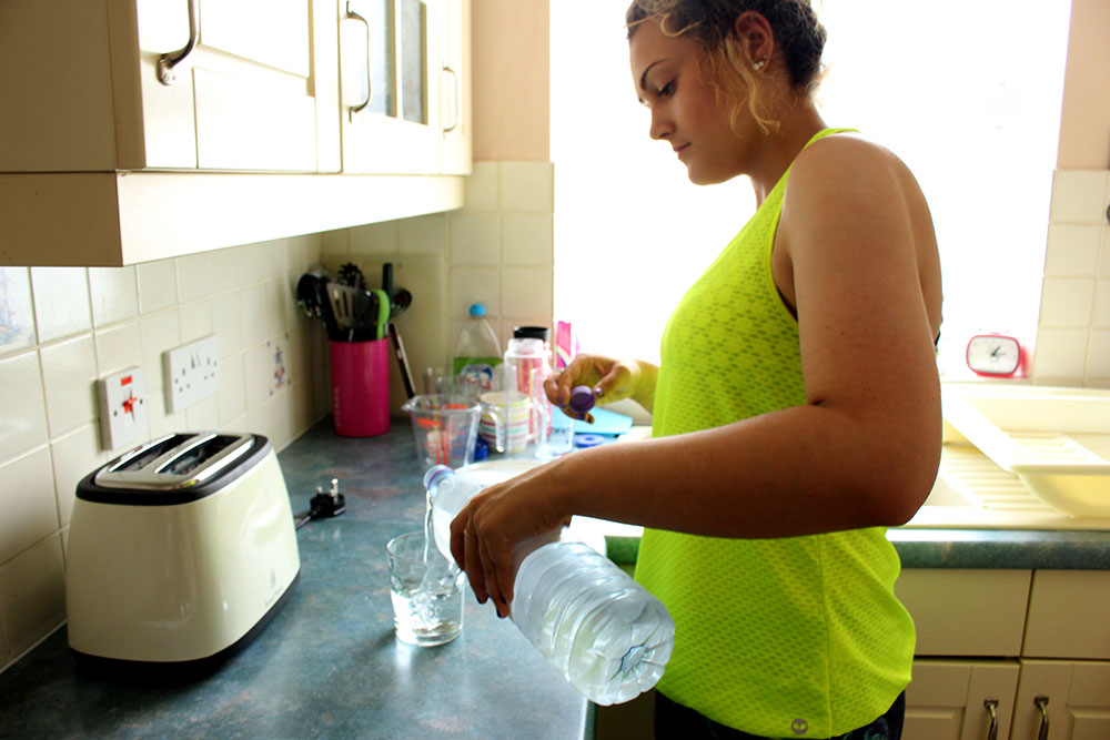
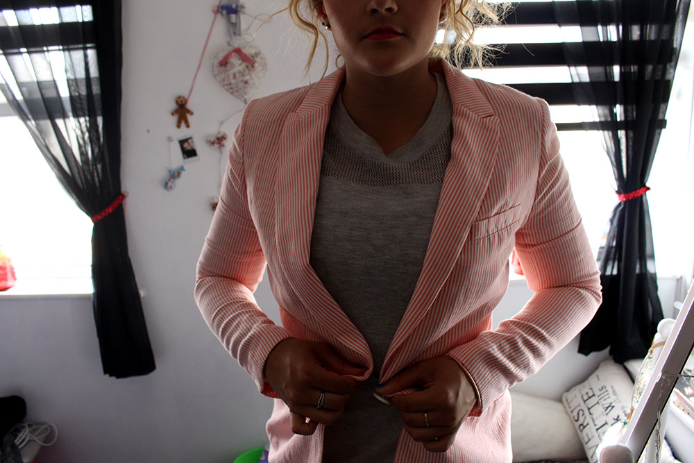
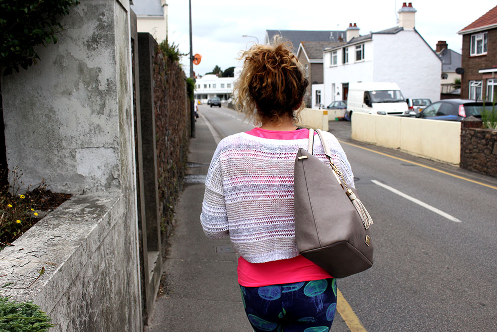
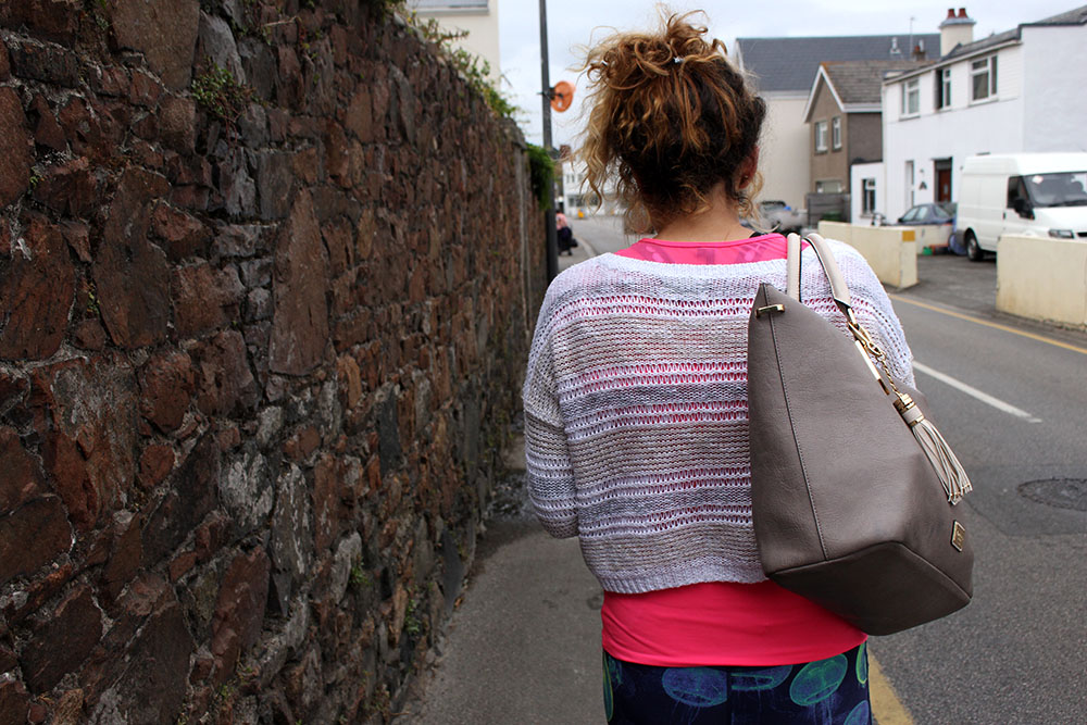
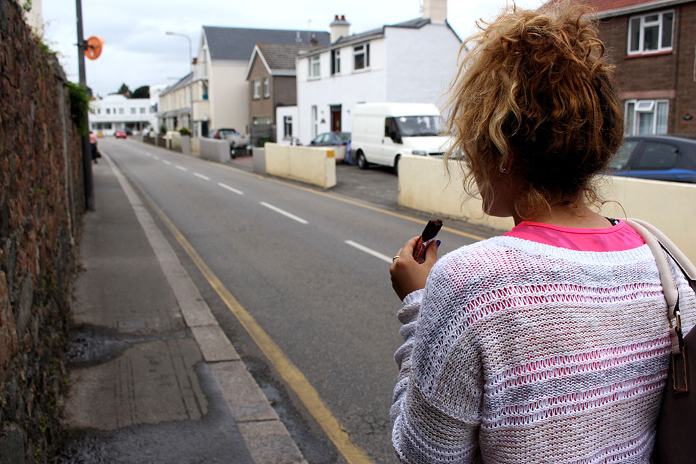
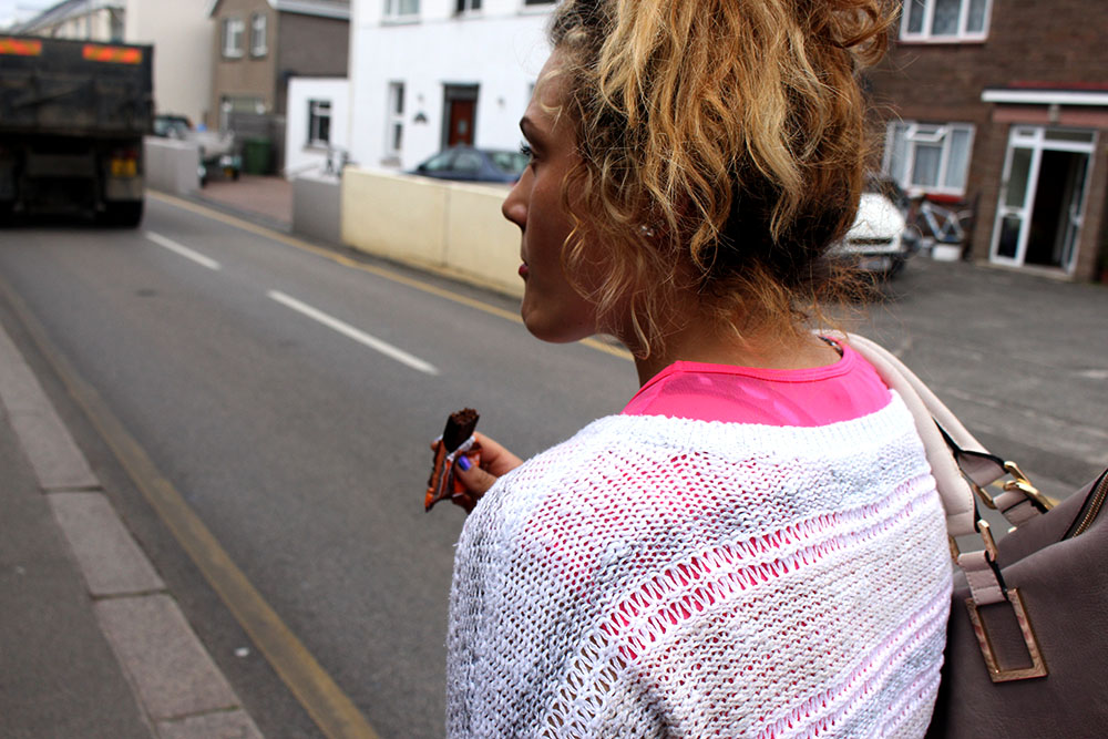
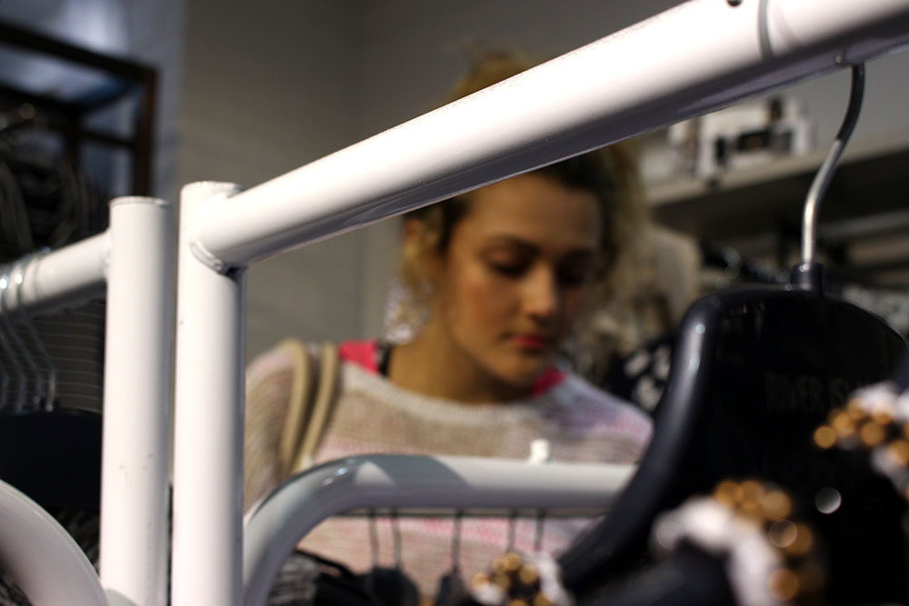
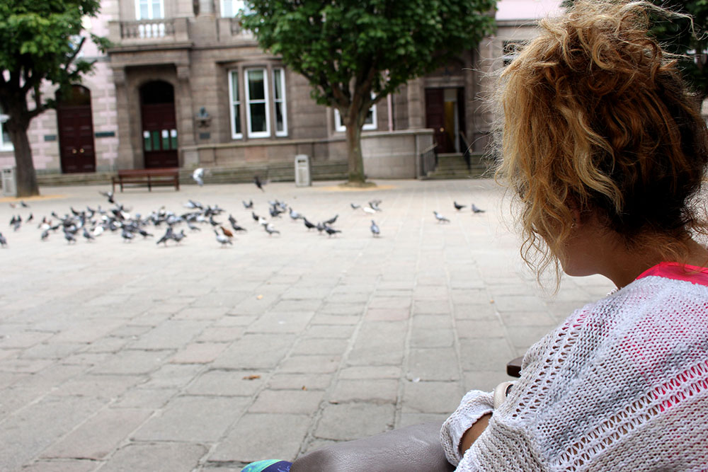
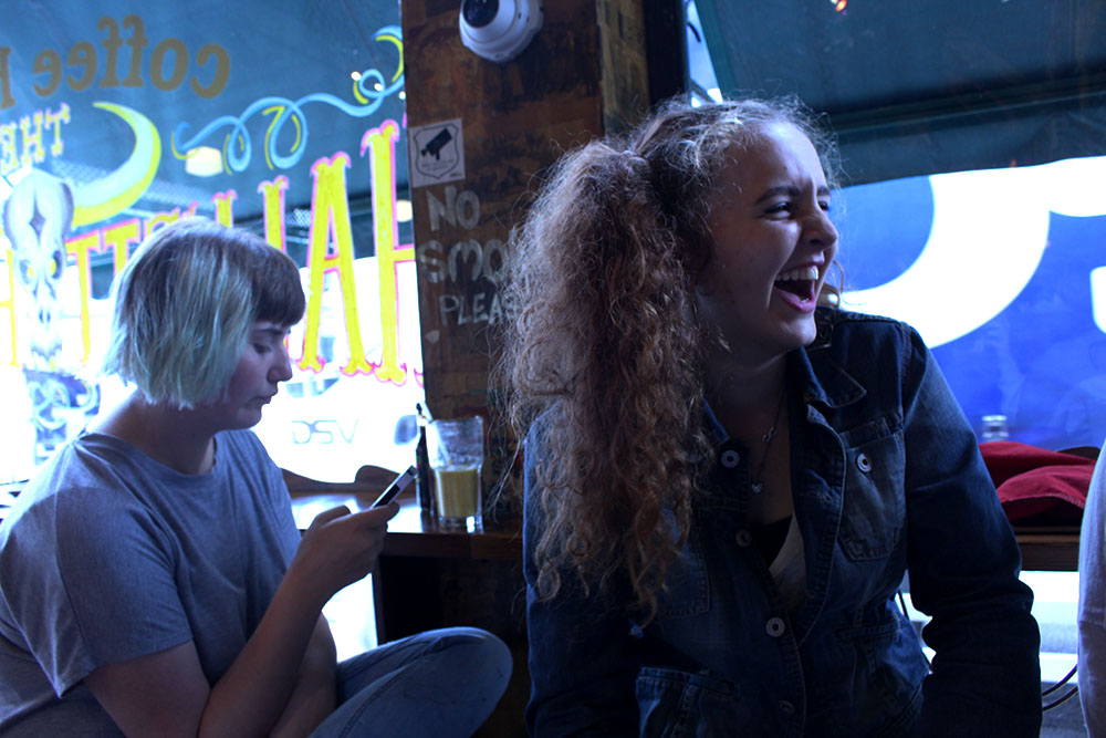
Here are images from a more realistic day in the life. This isn’t its full potential and I think that I will be redoing this with possibly the same subject or a few different ones to show a more realistic day in the life. This was interesting to shoot but I think just as a starting idea as I know that I can make better images.
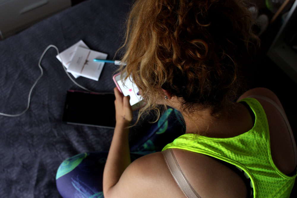
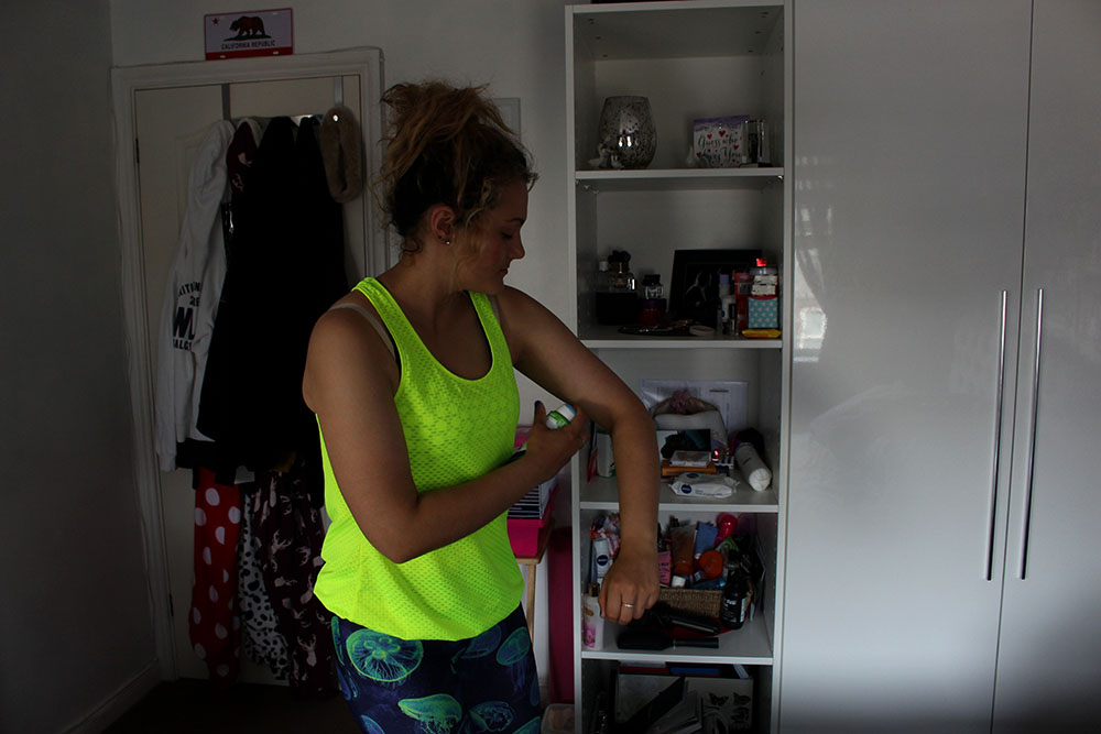
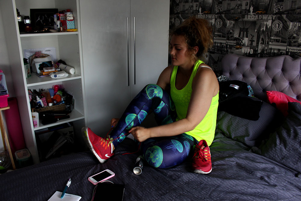
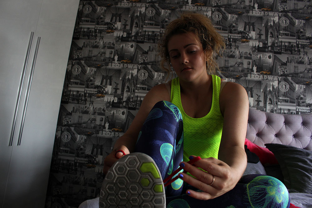
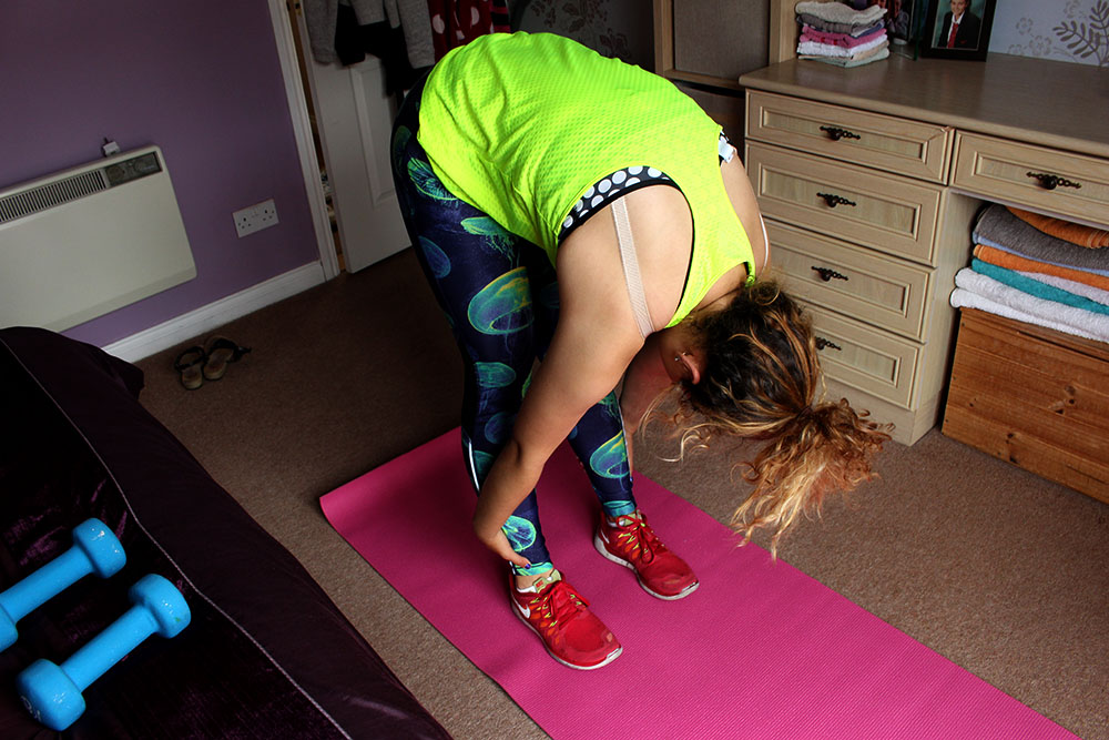
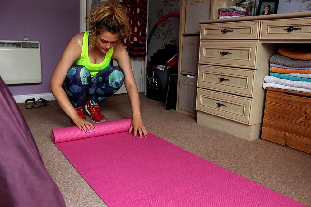
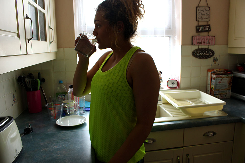
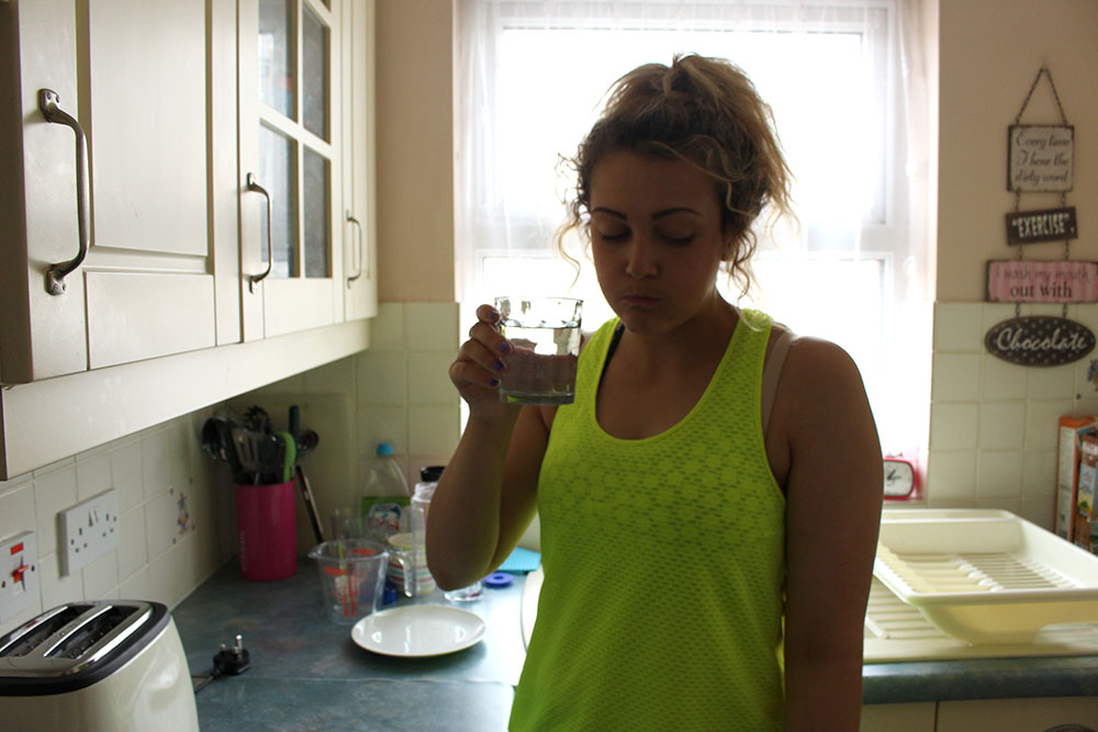
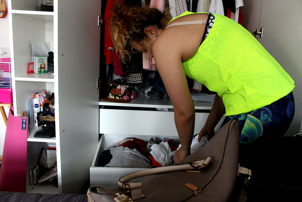
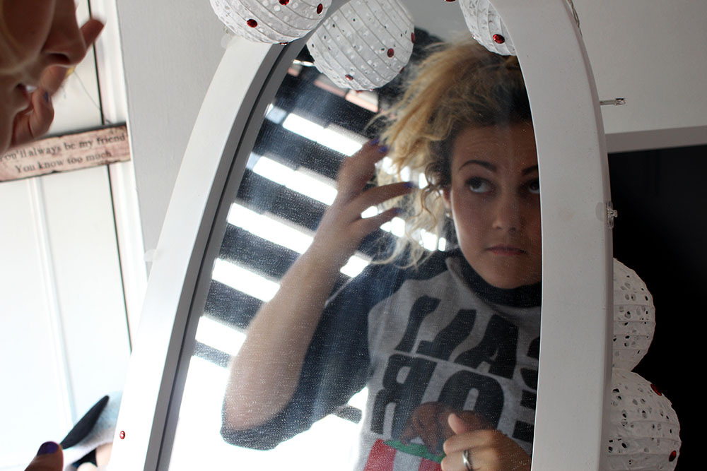
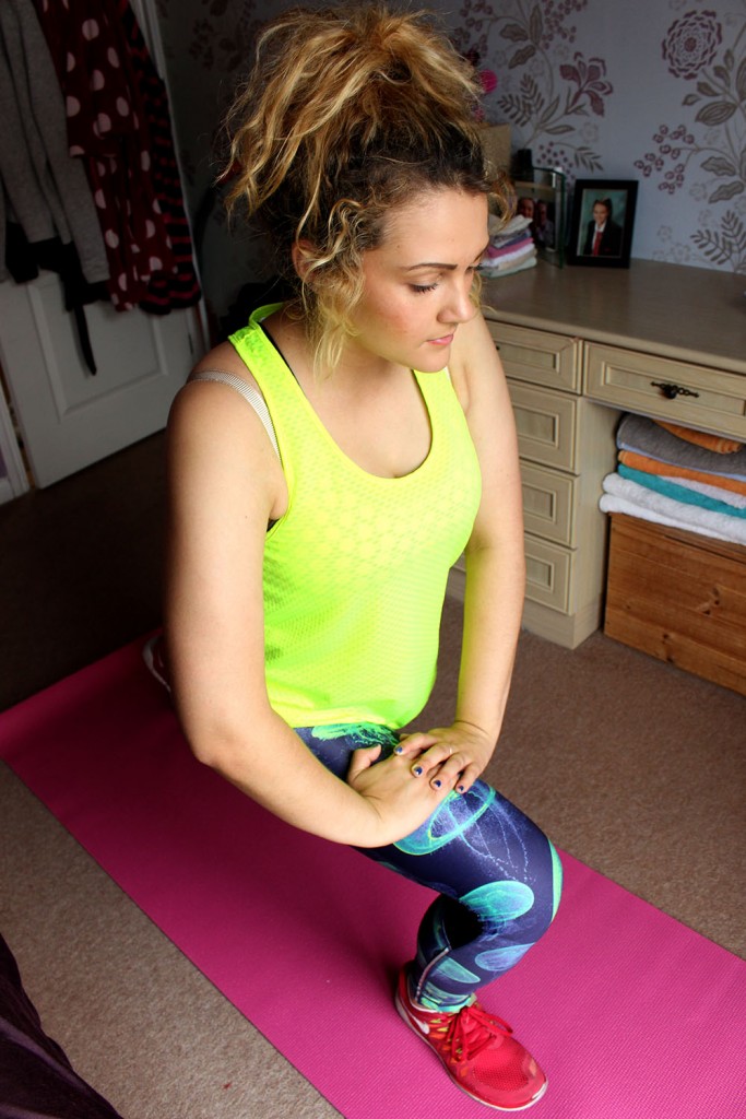
Here the subject is working out and getting ready to go to the gym. This was interesting to do but I don’t really like it as a shoot as it is quite boring and doesn’t really have any meaning or anything behind it. As documentary photos they are average and don’t think that they are anything special or interesting. Something about it just makes me not really care too much.
I think that this work is pretty average as a documentary piece and I know that I can make better and more realistic images than this as I felt that this shoot was quite rushed and isn’t really good enough. I will be furthering this idea though and will be making it a lot better visually and a lot more realistic. I will also work on some more shoots with different subjects performing for the camera and I will stage their daily routine too. This will be an interesting way using female stereotypes as well as somewhat documentary by photographing them within their natural environments.
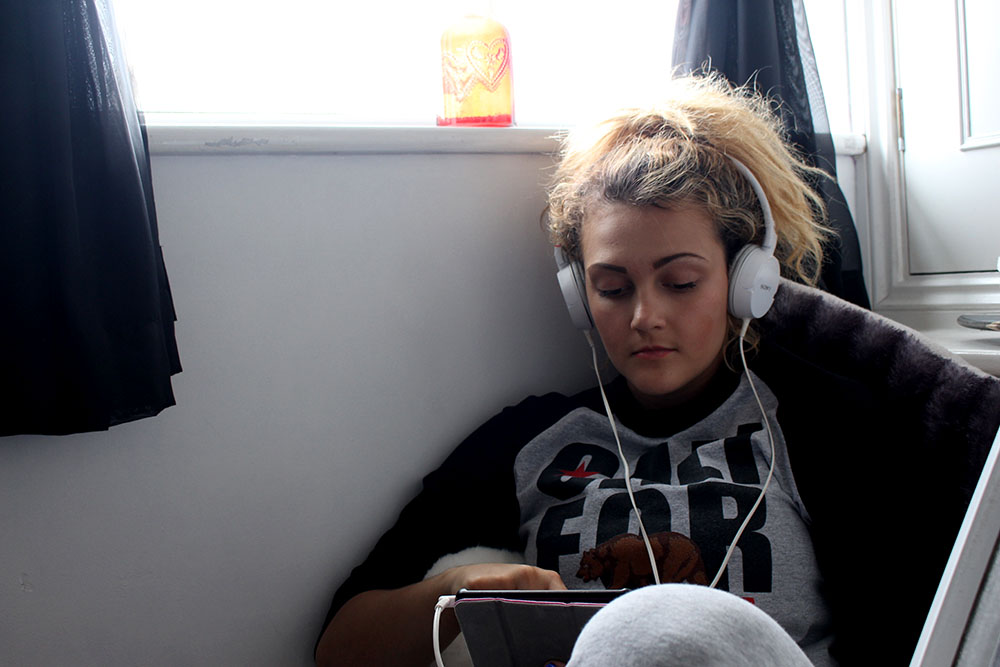
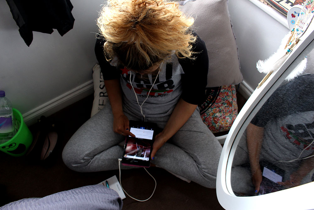
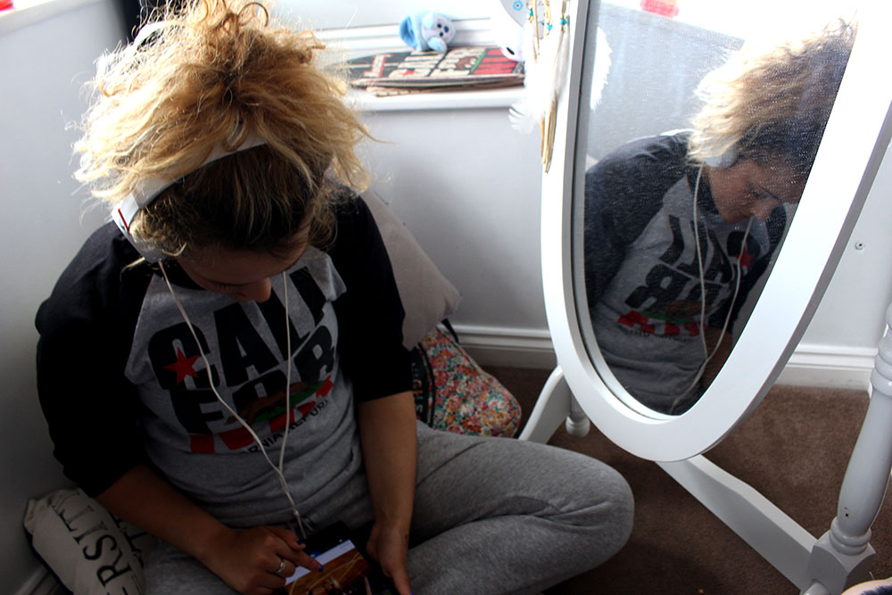
 I actually quite like this image as it just shows a teenager doing exactly what you would expect a teen to do, sit with their headphones in listening to music and playing on their phone. I like the position of the subject as the spectator is able to see her reflection in the mirror and can see how dusty it is reflecting on how teenagers are stereo typically seen as lazy and messy. I also like the way my subject is sitting as she doesn’t allow the spectator to see too much of her face as if she is so engrossed in her phone but the spectator is able to see some of her face through the reflection in the mirror.

