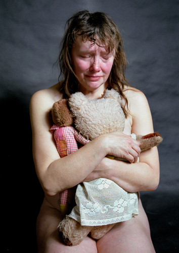
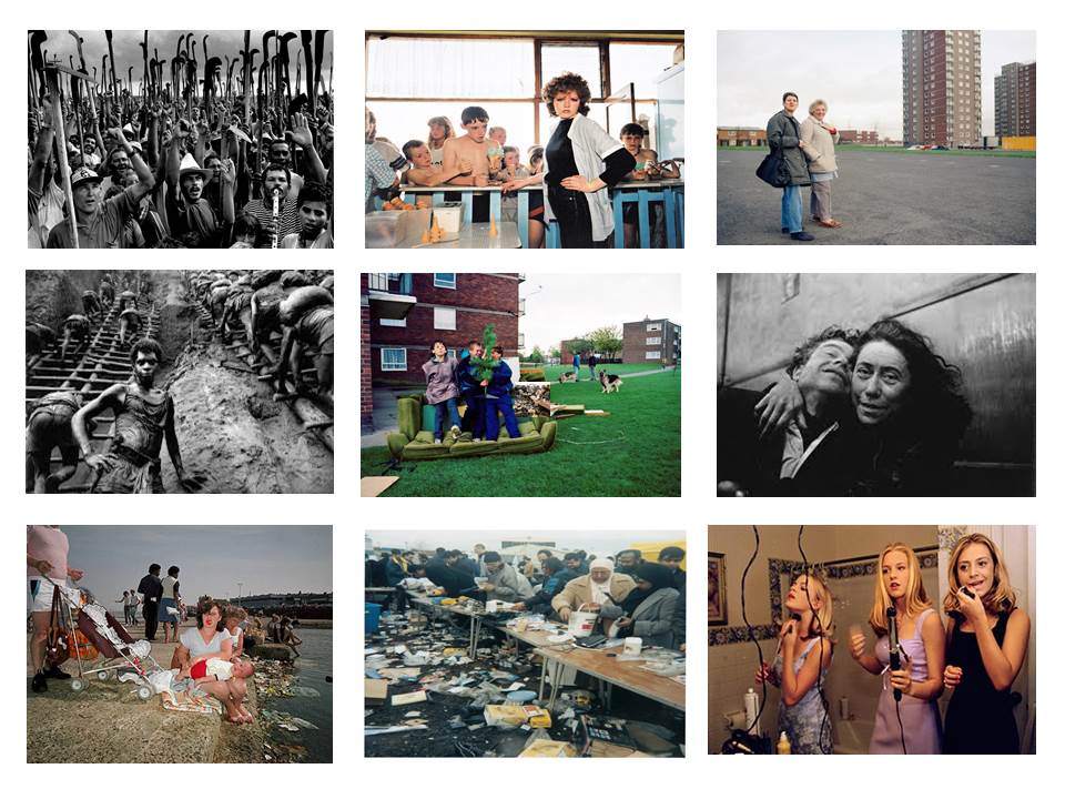
Family Project: Starting Point

Photograph taken in 1972: Central Kenya Show, Nyeri.

What am I doing?

For my project exploring family I have decided to research my Grandfather, Arthur Maitland Le Feuvre – my dad’s dad. I never got the chance to meet him. He died in 1985 at the age of 63, 13 years before I was born. Although I’ve heard a few stories about him from members of my family, mainly my grandmother, I virtually know nothing about him. He remains a mysterious figure, and I can only imagine vaguely what he may have been like. I don’t feel I have any connection with him, only through a few stories about him, a couple of photographs and brief information regarding who he was and the life he lived.

What I hope to achieve?

I want to use this photographic project as an opportunity to learn more about my Grandfather. Had I have had the opportunity to meet him then I have no doubt he would have played an important part of my life. Sadly I will never know this, all I can do is try my best to build a better idea of who he was; what he was like; the life he lived; a the friendships and relationship he had with different people; These are just some of the many questions I ask myself whenever his name is brought to my attention. I hope from doing this project that  maybe I can come a bit closer to searching for these answers. I will never get to know him personally, but I hope that through the research I do over this project that I will be able to gain some sort of connection with his memory. I have no doubt that this will be a tricky project, and possibly emotional for some of my family members. I will therefore try to be as sensitive as possible, and gradually search for the answers I am hoping for.

I believe this idea will work well as a photographic assignment because it will allow me to explore my Grandfather from a historical perspective, which will tie in nicely to the work we have been doing with the Societere Jersey Archives. As it obviously would not be possible to photograph or talk to my grandfather, I have to instead use other means of learning about him, through studying archival data and photographs, talking to his friends and family members, visiting places he was connected to etc. I am interested in History which I take alongside Photography as an A-Level Option, and so this project will give me the opportunity to put my historical skills to the test. I am very excited to begin this project. It is a topic which is very personal to me and which interests me greatly.

Considerations?

Collaboration

Collaboration will be a critical aspect determining the success of this project. Without collaboration the project will not work. For instance a form of collaboration I will have to use heavily is the photographic archives, both through images that my Grandma may have and possibly any relevant photographs that are stored in the Societe Jersey Photographic Archives. All photographs I collect of my Grandfather will be archive photographs. This use of archival photographs will be important in my project because I can use them as visual documents which provide evidence of my research and discoveries. They can also form part of my own photographic response. Other collaborations will include accounting information from people who knew my Grandfather. In particular I will talk to my close family, i.e. my Grandma, my Dad, my Aunts and Uncles, and a couple of my Grandfathers friends who are still alive.

Planning

In terms of planning this project I will not be overly strict on when I work and what I focus on. I go to visit my Grandmother every Wednesday so this will be an ideal time to get a lot of the information, archival images and take photographs that I need. Before I make any responses I will try to do a little bit of research beforehand so that I have a certain understanding to begin with, otherwise I think that I may be a bit lost going into such a big project. The blog posts I make which track my progress will be based on my responses to what I am doing, not actually planning beforehand. I will use the blog as a way of documenting and showing evidence of my research in addition to the outcomes I produce.

My Expectations?

I expect that I will learn a lot about my Grandfather from this project, and that doing so will be very revealing and fascinating. In order to achieve this however I will have to extensively explore the topic and this will require a lot of work and concentration over the source of the next few months. Although my Grandma will be happy to assist me in my Project I know it is important to be sensitive at the same time. Bringing up a dead loved one after such a long time is bound to be a painful process, and so I must be cautious in how I go about the project. I hope however that it will be something that she will enjoy and be comfortable doing, otherwise I will have to look for other means to go about getting the information I need.

The project will be interesting to explore, and hopefully I will gain an extensive body of work I am proud of, as well as learning a lot about my grandfather at the same time. The project test my limits as a photographer, making me incorporate and develop new, challenging skills. I will be hard work but ultimately lead to me maturing as a photographer, and develop my understanding of photography.


Planning and Tracking

I will make one blog post over the course of each week. In each post I will outline my intentions over the week as well as a brief summary of what I got up to. This I hope will be a good way of both planning as well as tracking what I do. I will be flexible to change as I can edit my plan over the course of the week.

I will make 2 posts tomorrow, a completed post from last week (Week 1), and this week (Week 2).

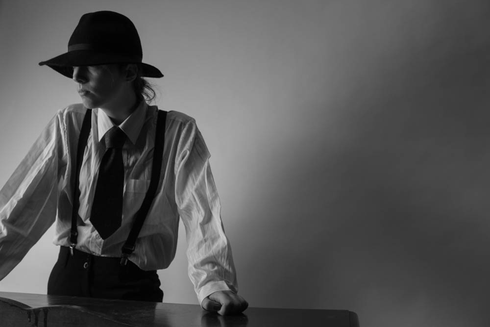
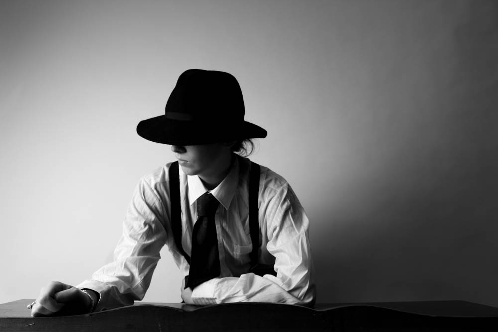
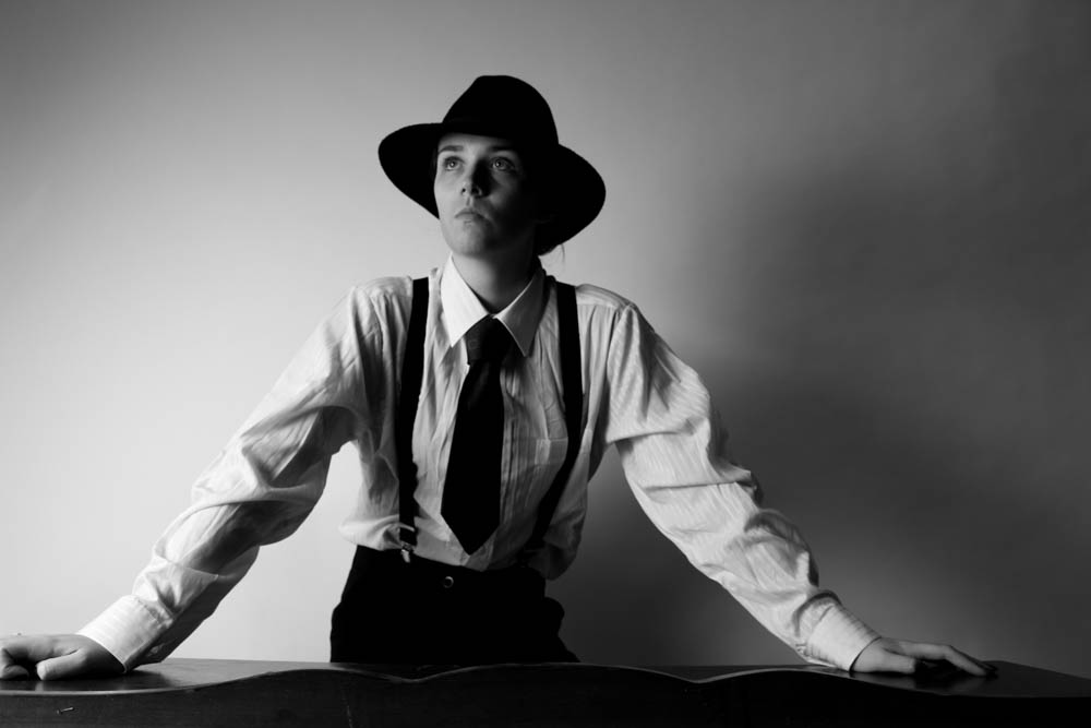
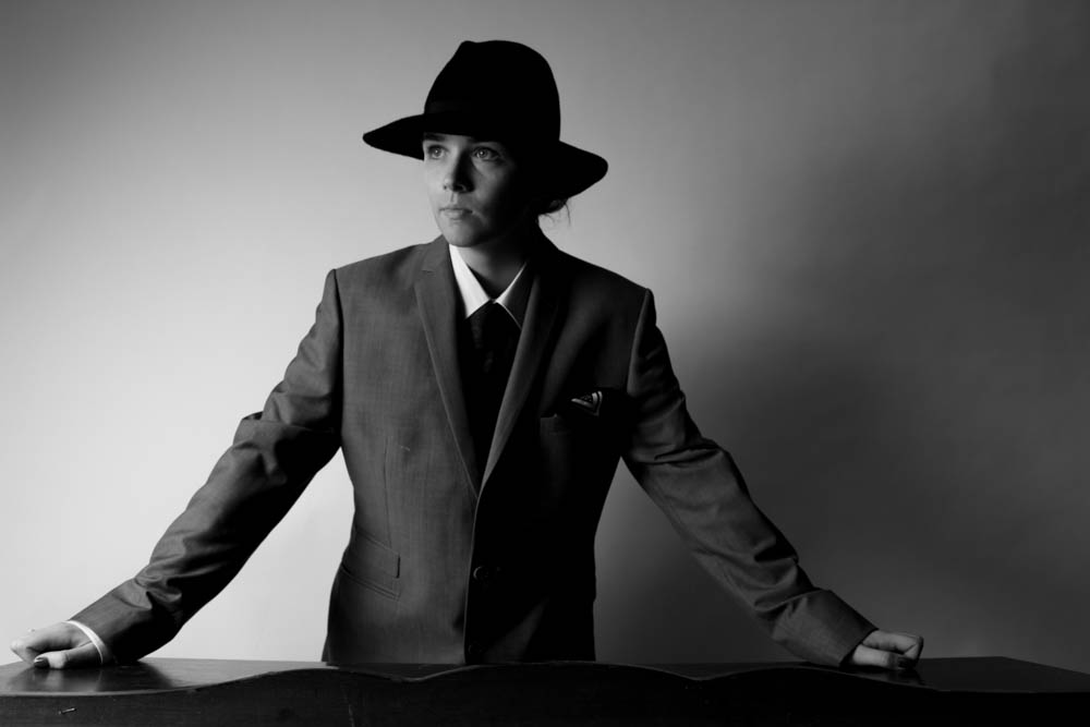
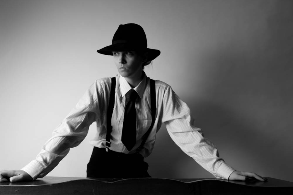
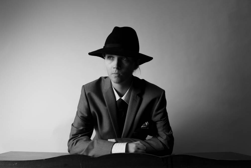
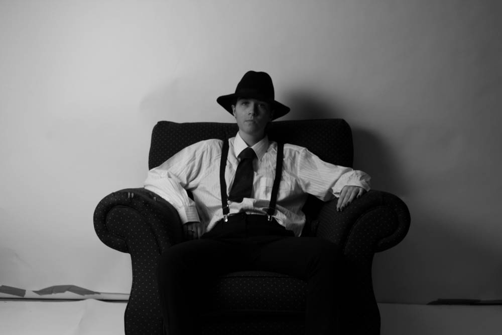
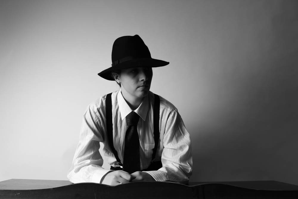
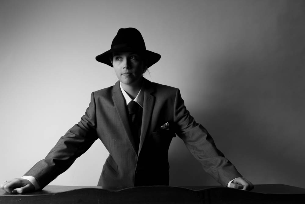
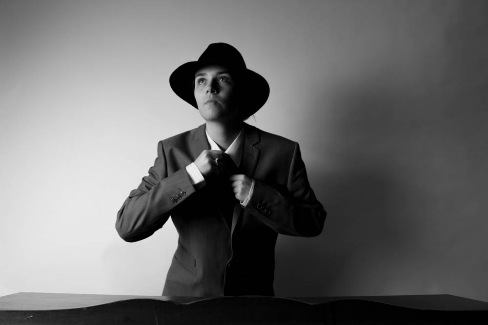
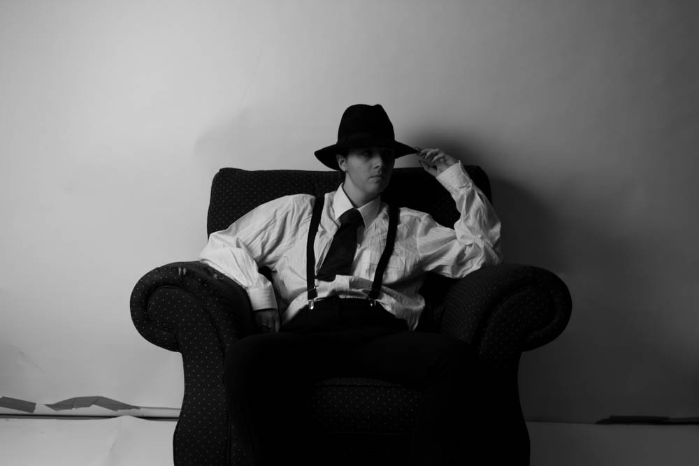
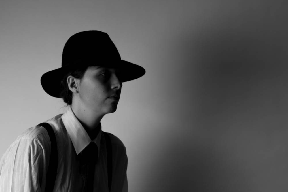
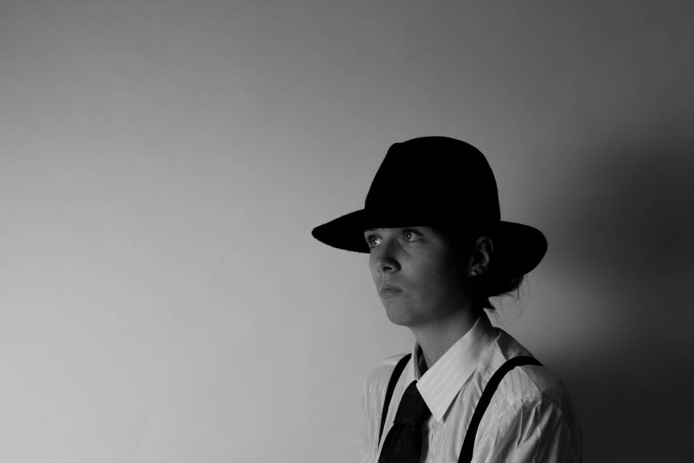
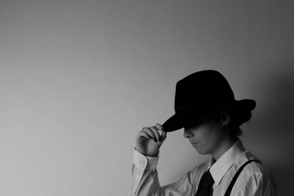
My Shoot: The Detective and His Dame

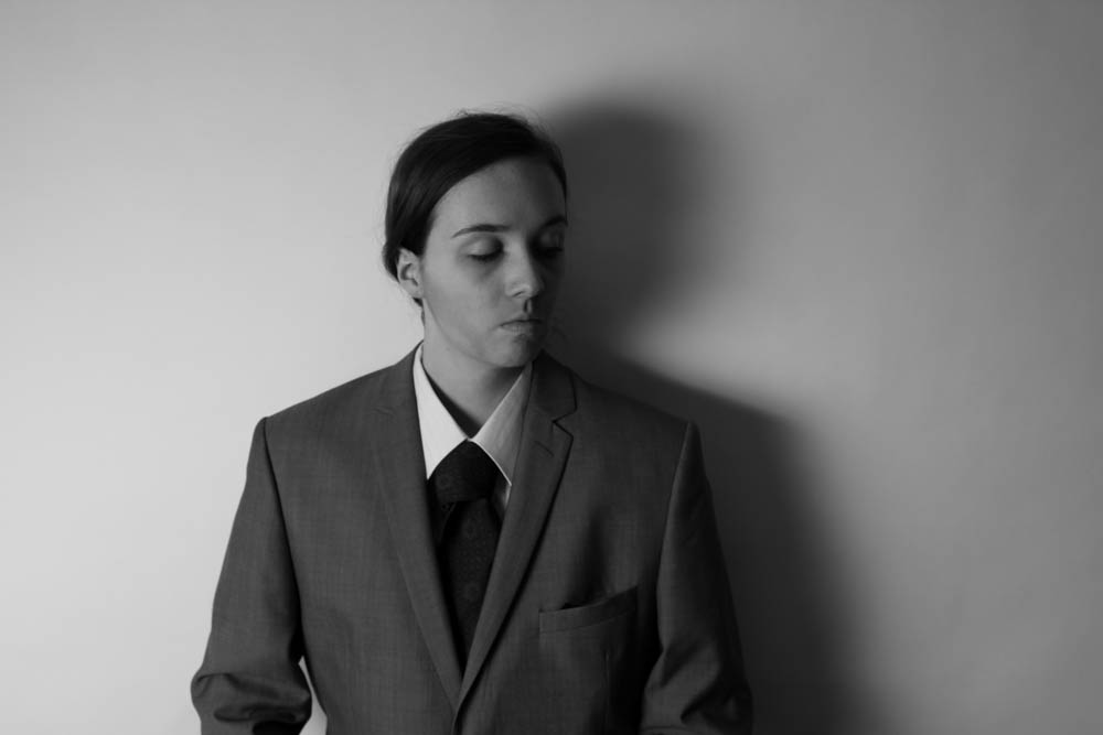
For this shoot I decided to make some images of a Film Noir detective with a dame. I thought that this would be a good opportunity to take inspiration from the work of Claude Cahun and going against the socially accepted gender norms between men and women and I am also inspired by Cindy Sherman who dresses up as characters and becomes someone new in every photograph.

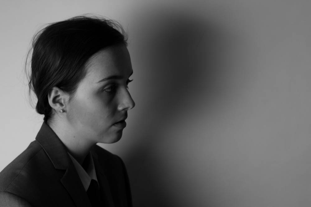
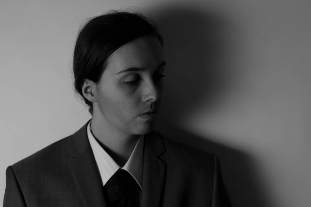
I did a shoot dressed up as a generic Film Noir male detective to look at how men are portrayed with this old style of film which also goes along with my work on femme fatales and making images of famous femme fatales and inspiration from Barbara Kruger and her newspaper style images. This shoot went well and I enjoyed doing it. I wanted to portray a man well and really become the character so I put bronzer all over my jawline and cheeks to create a beard. I also wore my dad’s grey suit jacket, tie, shirt and my own trousers and braces to go underneath the suit jacket. I wore a large black hat that is reminiscent of the hats that a usual detective in film noir movies would wear. I really wanted to become the character and portray them in the way that I had imagined. Later on I went back into the studio for a couple of hours to shoot the images for the female dame character. This went well and was fun to do. I managed to look back at the images made of the male detective and got them into the same position in order to make it a lot easier for me when actually editing the photos together. I do think that the images will look a lot smoother if they are in black and white which works well as my theme is Film Noir.

Here are a few of the images that I made of the film noir detective. I like these images as I think that I managed to capture the lighting well and really made some good film noir inspired images. I think that they will look a lot better when the noir dame is introduced and when I can actually edit them together by layering them. However, I do really like the look of these images alone as they are interesting to look at. I made an attempt to edit the two images together, one with the detective standing along side his dame but this didn’t really work as the lighting was different and the camera was at different focal points and slightly different positions. At least this way I am able to still use the images of the Noir Dame and create some more interesting Femme Fatale images and I will know for next time to actually do the shooting for one image all at one time and not to go on different days. This will just make it easier when editing and allow me to get really into the characters and the exact positions that I want to be in in each of the images.
I like these images and think that they are interesting to look at as they challenge the norms of gender and how people are supposed to look and be as part of that gender. I wanted to create strong images that are unusual and will leave the spectator wondering who I am and what decade I am from. This can be linked to more recent issues on gender stereotypes and having to conform to the expectations placed on us at a young age by society and to fit in with the norm and be another one in the crowd. I did take inspiration from Claude Cahun challenging how we see ourselves and showing that really we aren’t all that different at all. This was really fun and interesting to explore as it shows a new side to photography and allows me to work more deeply and think more deeply about these kind of situations of gender stereotypes and smudging the lines between what is male and what is female.


My shoot: Femme Fatales

I have taken a lot of inspiration from Film Noir films and decided that it would be a fun idea to recreate the image of these women and mimic the way they are and the way they are represented, cliches. I have taken inspiration from Cindy Sherman for this as I am going to be a different persona in each photograph and slightly exaggerating the way Femme Fatales were represented. Although they were seen as strong and independent, to me the women are represented in a negative light as if being independent and not needing a man makes you a work of the devil, a temptress. This shows how these women were there for the male gaze and brought some diversions into the films with the inevitable death of the Femme Fatale at the end of the movie. These women were always meant for the male gaze and made to be unnecessarily seductive and made out to be something like a witch that puts a spell on the man and tries to purposely steer him off the course to possibly further his career or development as a character. Femme Fatales are shown as enchantresses.

Possible titles for entire project [and/or shoot]:

  • enchantress – enchanteresse [translation to french]
  • temptress – tentatrice [translation to french]
  • “He keeps me on a leash so tight I can’t breath” [possible title of series of images]

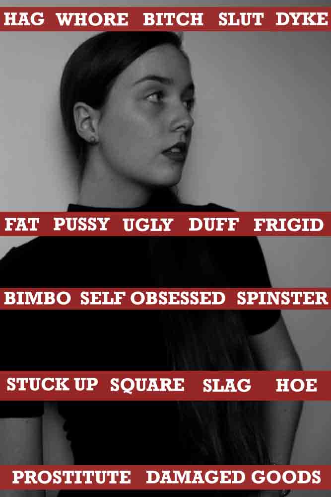
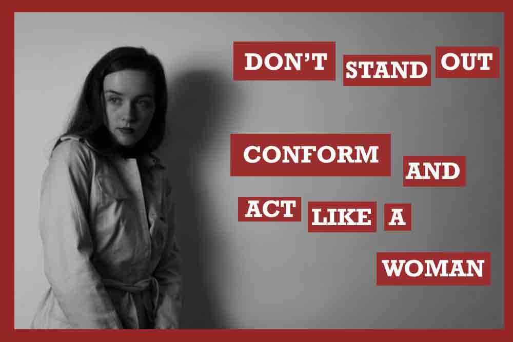
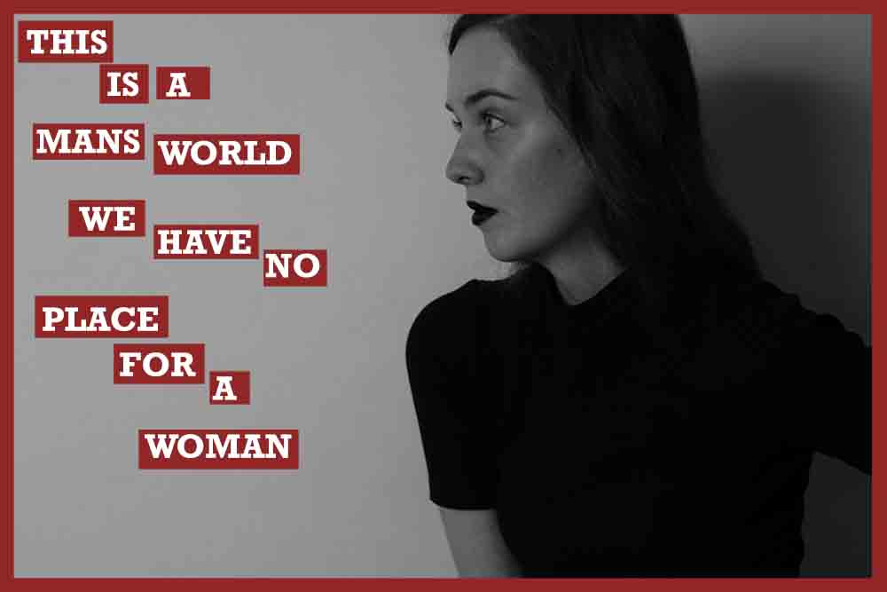
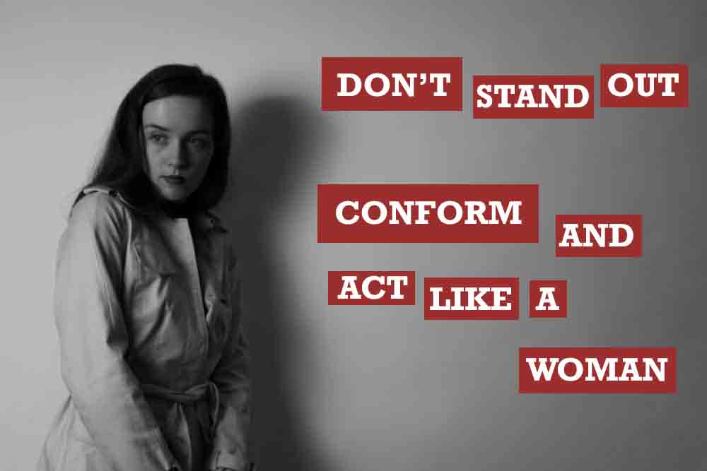
For these images I wanted to incorporate the work of Barbara Kruger with Cindy Sherman and the staging of famous film noir images of femme fatale women. I will also be adding quotes from things that I have heard people say or just with the expectations placed on women. I want these images to look like posters, something that would be up in your wall with a sarcastic feel to it. I really enjoyed editing these together although at first none of them looked anything special but after I got experimenting they started to come out exactly how I wanted them to. I made up all of the phrases myself just like Kruger did when she picked images that other photographers had taken to make her own art. I used my own images and my own text just because that is the way I wanted to do it as well as experimenting with different film noir dame personas.

Experimentation:

conform LABELS PRETTY FOR MENBLOGNO PLACEBLOG

femme fatales message
Femme Fatale experimentation

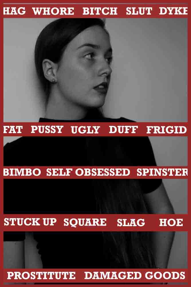
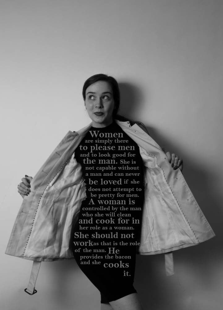
I wanted to create strong images with strong and clear messages on them. These are all my own thoughts, text and images. I want to make this work authentic and not coming from someone else. I like the bluntness of my text as it stands out and really captures the attention of the spectator, which is what this project is all about. I like the images that I have created and don’t want to make too many more as these ones are strong on their own and too many might become slightly repetitive and irritating. I like these images as they do remind me of the work of Barbara Kruger but my images and text is a lot more directed at feminism and being a woman whereas Kruger’s work varies into other movements and categories too. The image at the bottom is an experiment that I have had in mind since I started on my film noir project and wanted to include it in my work. This one is my favourite as it is something that I wrote and performed myself, I wanted to do a parody of what a lot of people think of women and their place in society. I chose to have my subject, in this case myself, wearing all black and holding her trench coat open as if she were a flasher from the streets back in the 1960s when older men would go around wearing nothing and flash passersby for a laugh. I chose to adopt this method but instead of showing naked flesh I decided to replace it with words that would stand out a lot more and I positioned each bit of text in a way that seemed as if it were the models body. I really love how this image has turned out as it is different to the rest and it came out just how I had imagined it to be.

Family Response:

As a repose to my ‘Specification for Family Shoot’ post that I uploaded before I have produced a set of images.

DSC_0006 edit

Above, is a photograph of my cousins daughter. She is simply playing on her game. Her body language is laid-back and relaxes as she sits on the sofa. Her full concentration is placed on the mini screen. The placement of the boots on the stone floor adds balance to the picture. This is because the shot doesn’t feel as empty.

DSC_0043 edit

The picture above was taken spontaneously as my family we in the middle of a conversation. I took this is an un-staged manner. The coffee cup is placed on top of a dark red car, which adds interest to the picture.

DSC_0051 edit

This shows my family members chatting before the man in the helmet leaves. Again this picture was taken in an un-staged manner, as they were casually occupied and oblivious that I took this picture.

DSC_0064 edit

Above, is another shot that I took in an un-staged manner. As you can see it’s very hectic and animated. There is a lot going on here, from the man moving his bike, to my cousin drinking his coffee and my uncle in the green top, walking out. With that comes the confused face on the girls face as she figures out what’s happening. Everybody seems to be in their own little world and they’re all doing something different. Nevertheless, their faces all show confusion as they are mostly squinting their eyes and pursing their lips.

DSC_0065 edit 1

Here, my dad is pictured on his motorbike. I asked him to pose for this image and asked him to look at the camera. This is a medium shot, so it shows his whole body and also some surroundings. In addition, I also captured the following two photographs from this set:

DSC_0066 edit

This is a much closer version of the previous on. Additionally, the motorbike driver is looking away.

DSC_0069 edit 2

Finally, my dad is seen leaving the house as my small cousin looks on. You can tell that she is very intrigued and has even left her game to look up and see him leaving.

DSC_0090 edit

Later, my male cousin and uncle were having a discussion outside the house. The tattoo is a sign of permanence and meaning so it’s significant that he has it on his arm. My cousins sheer look of concentration whilst speaking demonstrates that he’s probably very interested in capturing my uncles attention and the mix of facial expressions and body language points that out.

DSC_0096 edit

Above, my cousin turned around as I was taking this and I caught him mid-talking. My uncle in turn was left to look at hi neck and ponder what he was doing. My cousin seems alert and annoyed. The raised eyebrow may suggest that he is suspicious.

DSC_0100 edit

I captured this shot by using different focuses. I wanted to catch the neighbor just behind the girls head. He was doing some yard work and sweeping excess waste from the floor. I positioned myself at eye-level to my female cousin and then focuses solely on the man.

DSC_0117 edit

Then I got my uncle to let me take a self portrait of him. He usually dislikes taking pictures, therefore he wasn’t very eager to let me take this. I used the grey wall from the backyard as a background. My uncle’s didn’t smile, which I believe is great. This shows a real rawness to his character.

DSC_0123 edit

Next, I decided to explore inside the house. My cousin was talking to me as I took this. She was showing me around the house and the floor captured my attention. Since the house is being  re-furbished and new carpets are yet to be put in the wooden flowing was left looking dull. You’re able to see the discolored pieces and jagged edges of the material. This is just a small detail of the house which on a whole adds to the meaning.

DSC_0140 edit

Meanwhile, this is another close-up shot of the door that leads up to the bedrooms. The door is covered with cream tape and in effect is unfinished. The natural sunlight coming from the far right enters through the small squares on the door, that have been created by the tape. The light shines on the wall on the left and I think that it looks very magical.

DSC_0148 edit

Here, my auntie posed in front of her car. I didn’t even have her to pose as it was an automatic response. In this case the photograph is categorized as staged. This is because she acted differently in accordance to me having a camera with me, whereas in the other ‘un-staged’ images, my family was caught off-guard.

The following images are of my auntie. My auntie hates getting her picture taken therefore she’s always hiding in some way or covering her face:

DSC_0150 edit

In the one above, she hides her face looking down at her feet.

DSC_0153 edit

When she saw me, she immediately turned her face away whilst I took a photograph of her leaning against the blue car. Her pose is quite relaxed but she seems tense in her mood.

Moving on, I captured some more details around the house.

DSC_0177 edit

I believe that this photograph has good very good balancing elements: from the scrupled-up black plastic material that’s being held down, to the grey meter on the left. I like how the meter is small in size and compares to the heavy materials placed on the right. Also the fact that it’s not neat and simply left there adds interest to me.

DSC_0209 edit

I also incorporated more inside shots into this response. Here my uncle, which is standing up is trying to unravel his granddaughters blanket as a playful act. The family dog is seen scratching herself also. All in all there is a lot of different movements going on here: from the dog scratching, to my uncle lifting the blanket and my cousin relaxing on the couch. This was taken in an amateur approach as I didn’t bother with compositional elements or any professional photography basics. I simply captured the moments as I saw it, and in turn I was able to exude the emotions in the picture.

DSC_0212 edit

My auntie and also godmother was piking up some vegetables when I took this. She remained unaware that I was taking this and carried on with her routine.

DSC_0217 edit

Then after a while the little girls mother arrived. She had just come from work and the vibes of tiredness and stress were felt. Here, I took a medium shot, to catch the moment in which she interacted with her daughter as she got home.

DSC_0219 edit

After that, the mother discusses something with her husband. I captured this from afar and let them have their moment. Meanwhile, they were completely candid and in an un-staged manner. You can see their facial expressions and gestures to each other.

DSC_0220 edit

Another moment in the kitchen displays the girl dancing as the mom tidies the groceries. Her expression seems to be agitated, although that’s just my opinion. It’s a bit shaken, for instance on small cousins arm where the movement blurred her hand.

The following two pictures are taken of my two cousins playing with the family dog. It captures excitement, happiness and sometimes anxiety from the animal:

DSC_0222 edit

DSC_0223 edit

Below, are two action or movement shots that I took in the front porch. The dog is playing with his new toy and is very energetic and excited. The dog’s persistence to bite the pink toy is present. She’s filled with pure joy as she runs around biting and exploring the new smells with her mouth:

DSC_0229 edit

DSC_0250 edit

Halfway through a green apple, the mother is looking up at her surroundings. In this particular image, she was aware that I was taking a photograph of her, therefore she looked away. Although her frustration was kept whilst she chewed the fruit.

DSC_0252 edit

Outside again, my dad and my aunties boyfriend were inside the car on the laptop. My dad was teaching the man what to do. The window was already rolled down a bit, so this gave me the perfect opportunity to take this.

DSC_0263 edit

Then, other family members stood outside showing each other the houses and talking about building. I captured this in an un-staged manner and in a amateur way.

DSC_0271 edit

Also, this one was un-staged, the woman was simply laughing at my little cousin outside of the picture frame.

DSC_0274 edit

Below, my dad is in the background whilst my cousin is pictured smiling and looking up at someone. Her smile looks real and joyful. Meanwhile my dad is staring at his phone. I like how this picture has a realness to it and depicts a truthful moment. This is because I didn’t plan this and took it randomly.

DSC_0278 edit

For the next series of images, I photographed my godfather in his room:

DSC_0200 edit

To begin with I took an establishing shot. This is the room in which he shares with his wife, my godmother. I wanted to show the environment and the different details in it.

DSC_0202 edit

Since, he was alone it was harder to capture him in a un-staged way. Therefore, I chose to create portraits of my uncle whilst he sat on his bed. In this photograph the man was looking at the wall in a posed manner. I edited the lighting and saturation to create light tones.

DSC_0205

Finally, this is my favorite picture out of this series. My uncle has a very relaxed pose. I only instructed him to look at the window, but I think that the way he placed his hand on his chest added personality. He appears to be thinking very thoughtfully about a certain think and generally seems to be day-dreaming or mesmerized. This is kind of like an environmental portrait because he’s in his own environment of his room.

My [Extra] Shoot: The ‘Perfect Life’… Is Staged

For this I have taken some inspiration from the tableau photographer Cindy Sherman. Here I have taken on board the way in which our community views men and women. For this shoot I decided to challenge the way our community thinks and understands certain circumstances. I want to provoke thought, I want our society to open their minds and learn that there is so much more to life than the magazines we read and the ideal of having the ‘perfect life’, watching celebrities and thinking that these people lead the most glorious lives. Nowadays we have shows like Keeping Up With The Kardashians, award shows, news reports that glamourise celebrities and showing them in the perfect light. We sometimes forget that they too are people and they face the same difficulties that us ‘normal’ people do. There is no such thing as the perfect life, this is what I would like to express through my work. For this shoot I am going to stage everyday life to show how unrealistic this way of life would actually be.

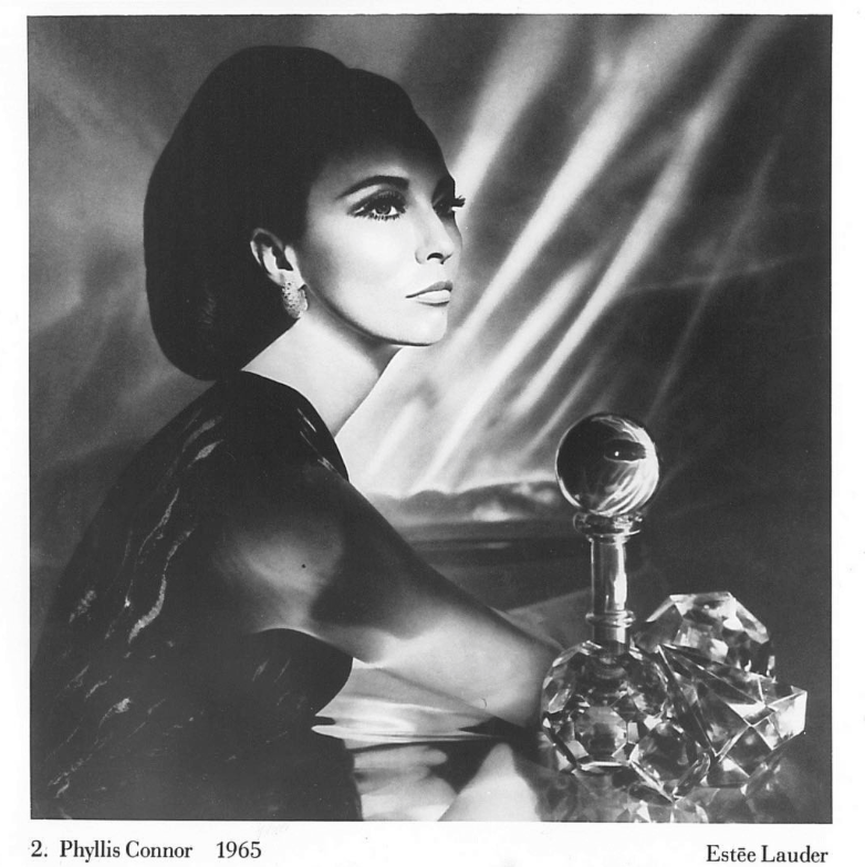
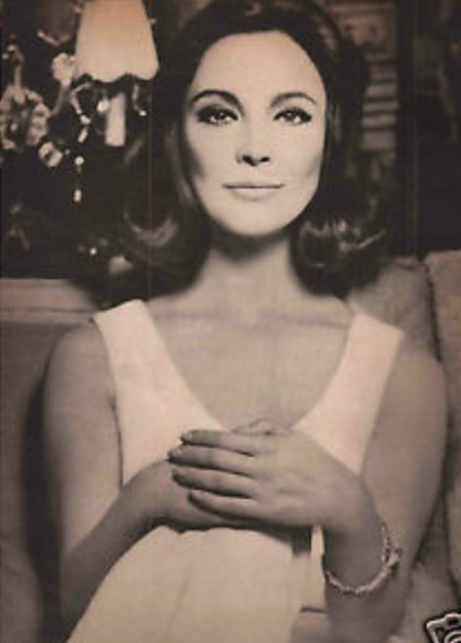
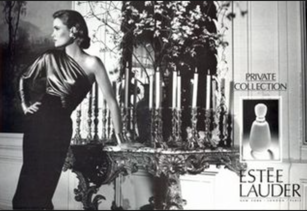
To me community is sharing, whether that be an environment, ways of thinking and experience. As communities grow we are able to learn more and more about one another progressing those relationships. I chose to go with the element of community as this shoot is a message for our first world community to try and enlighten them of how a lot of young people think and the fact that none of it is actually true, it’s all fake. We are constantly bombarded with images of women on the front of magazine covers posing doing everyday things that a lot of young people take literally and think that these models constantly look the way they do in the magazines. This is completely wrong and staged for the cameras. I found my inspiration for this when I came across the 1960’s Estee Lauder Campaigns. I came across these images whilst watching a YouTube video and then decided to explore it further and find out more about these campaigns. This actually inspired me to create my own images.

YouTube video that first inspired me:

https://www.youtube.com/watch?v=U0wm5HiQXuQ

Estee Lauder history:
https://www.esteelauder.co.uk/estee-edit-article-victor-skrebneski-interview

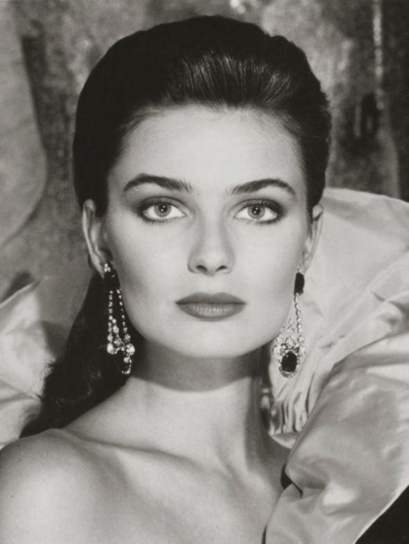
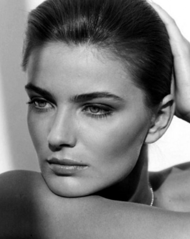
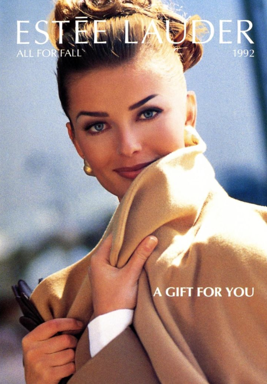
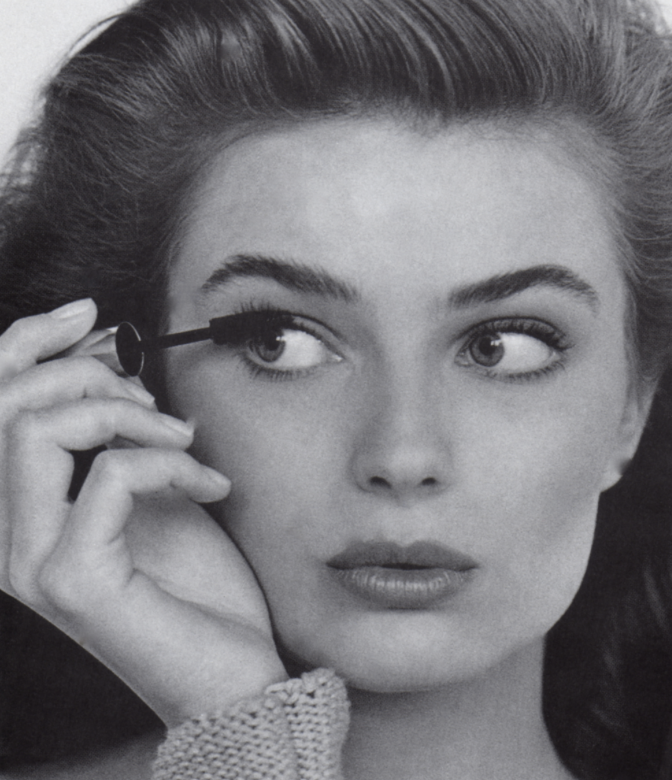
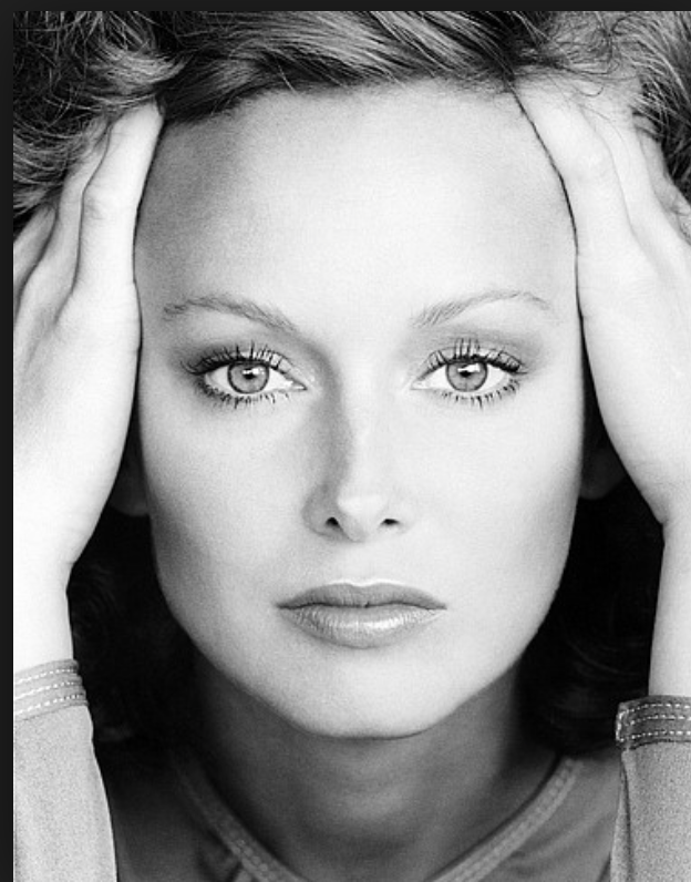
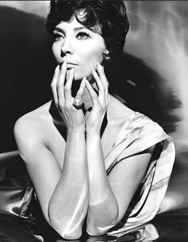
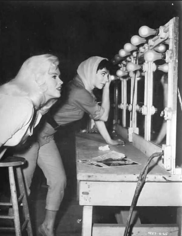
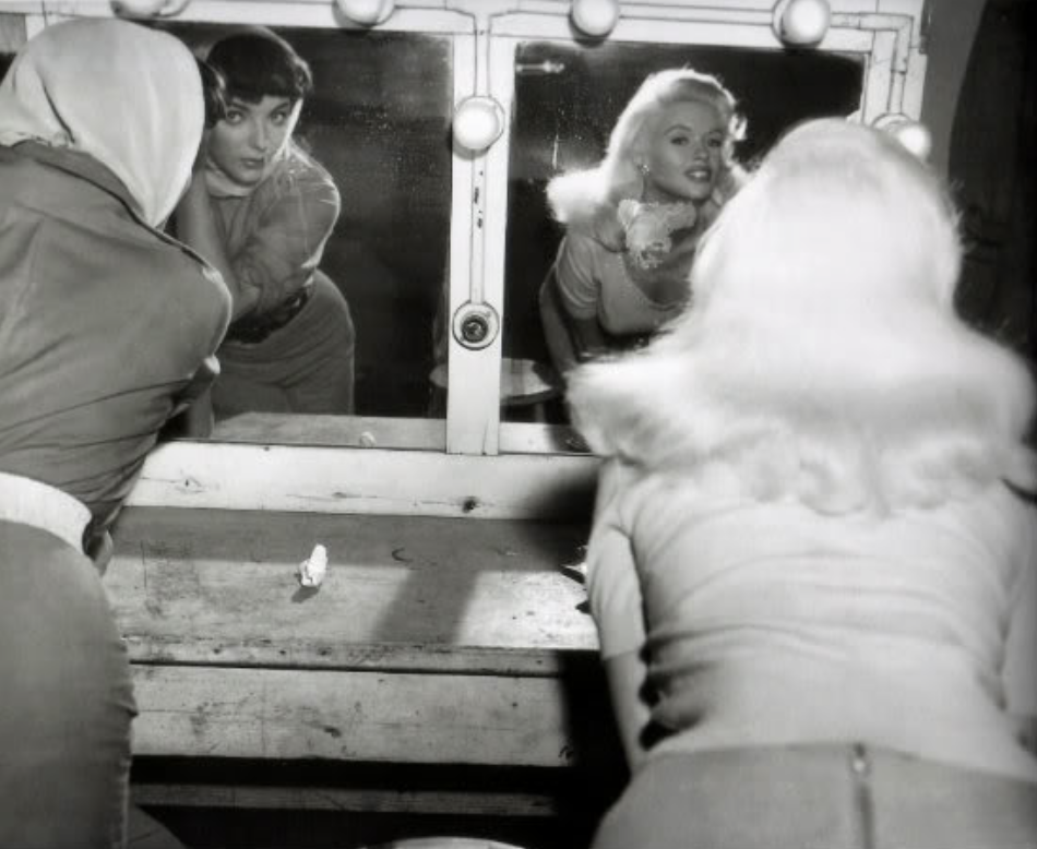
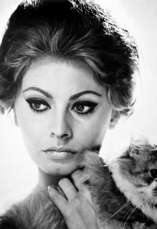
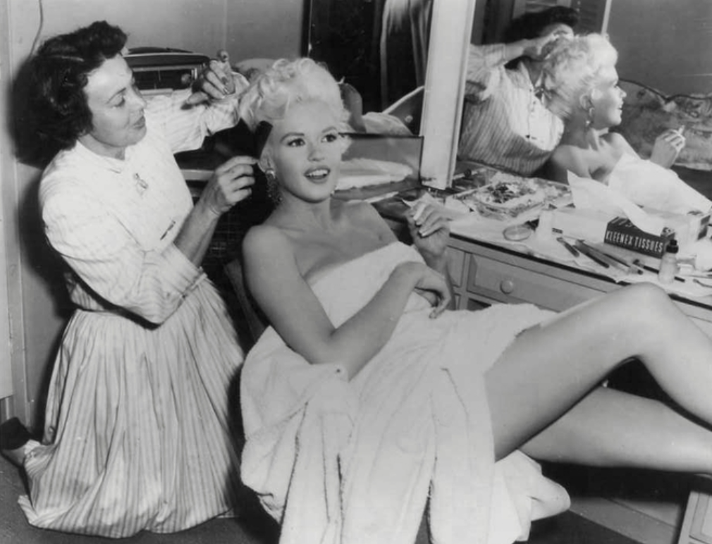
All of these images have helped to inspire me to create my own photographs. These models were photographed for these photos in the 1960s and to me seem very raw. I think this is because the cameras that were used were more like disposable cameras of today, they had film and that is how they operated. Images were developed in dark rooms rather than being edited and perfected on the computer with editing software. For my shoot I have decided to create all of my images in black and white to stay true to my style models as well as to maintain focus on the subject of the images rather than the colourful surroundings. I think that this shoot will challenge the way we as a community think about things and the way we see the celebrity world. I want people to understand that this idea of having the ‘perfect life’ is completely staged and people are just good at pretending. Celebrities are huge influences on our younger generations that I think we need to focus on and bring to light that this is not a realistic way of thinking. I really like a lot of the images above, most of which are from an Estee Lauder campaign in 1965.

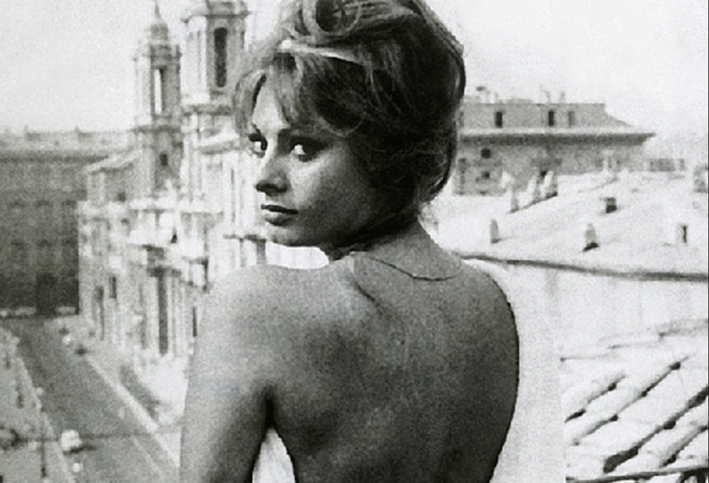
These three images were my main inspirations as they were thought provoking. The two first images of the women looking in the mirror and doing their makeup interested me. I thought ‘why are these women leading over and doing their makeup?!’ that to me just looked ridiculous and kind of glamourised the way that women actually do their makeup, making young girls think that makeup is beautiful and that all women do it. The third image of the woman looking off into the distance all glammed up with a full face of makeup, hair beautifully done and wearing a glamorous gown while seemingly sat at home just makes no sense to me. I understand that these images are for a makeup brand and to advertise their makeup but I don’t like the way the women are glamourised making young girls and women think that this is the way to be and that this is what beauty is. I am excited to recreate some of these images and to try and make the staged aspect of the shoot as exaggerated as possible. I have also decided to do a more realistic everyday life shoot, photographing real people doing through their everyday routines and finding out a bit more about our community and the world that we live in.

A Staged Day in the Life

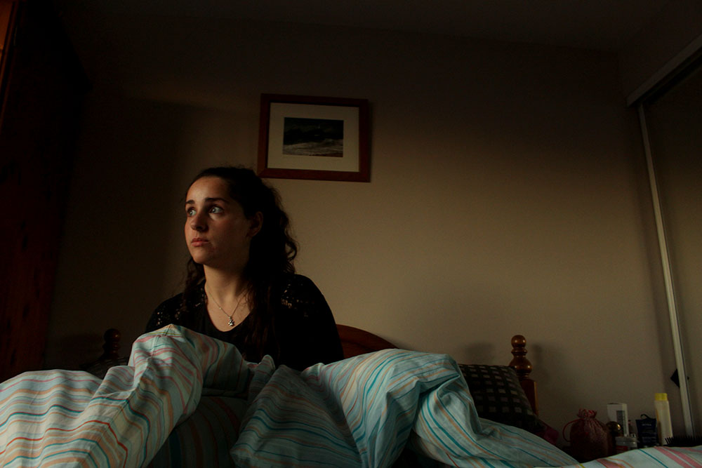
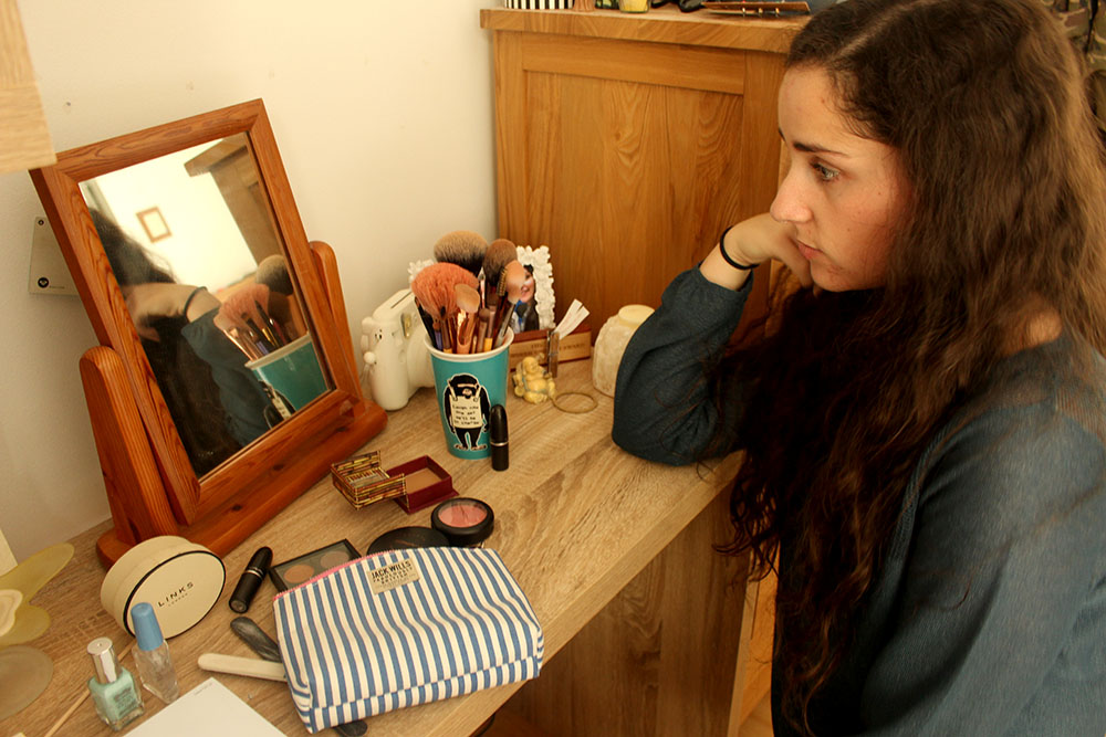
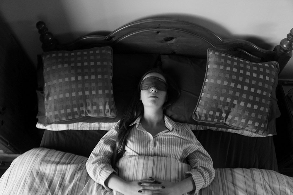
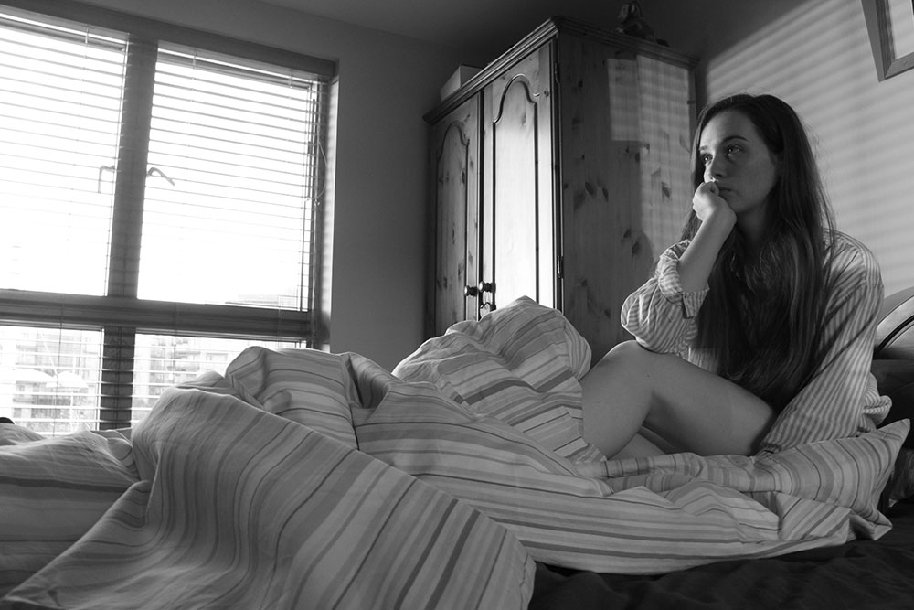
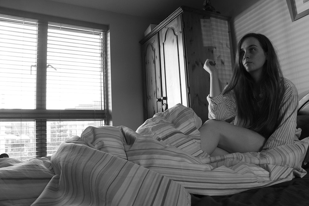
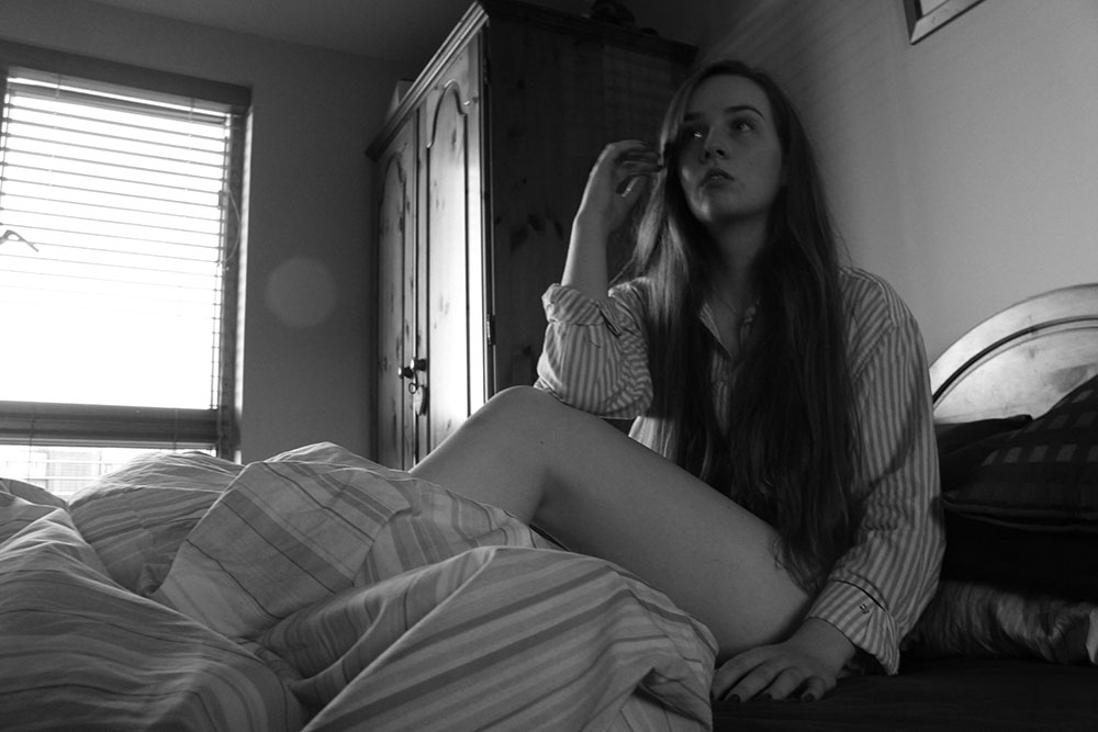
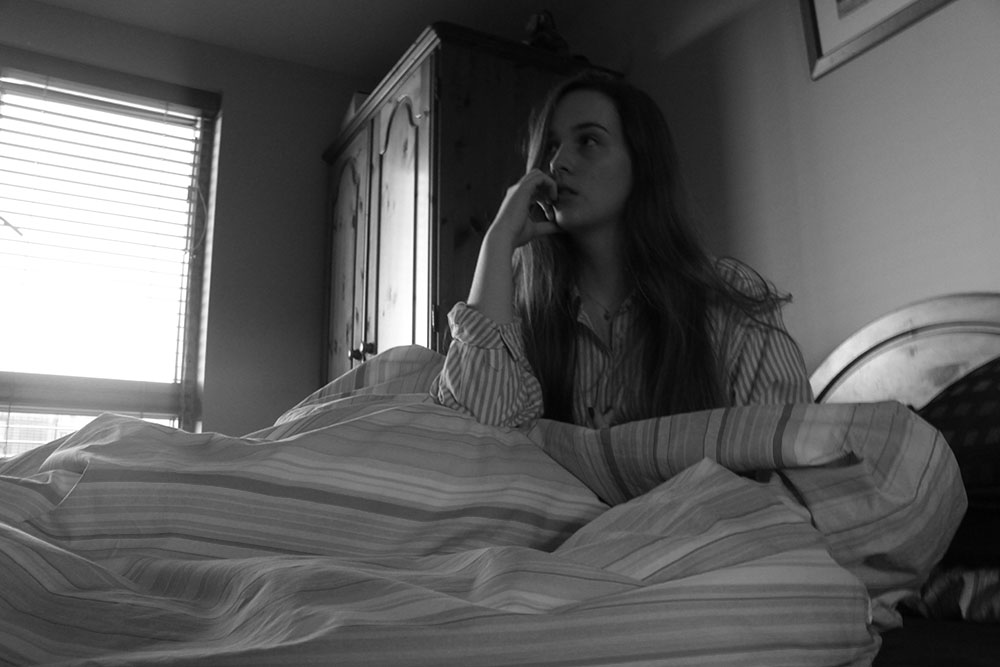
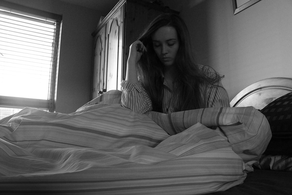
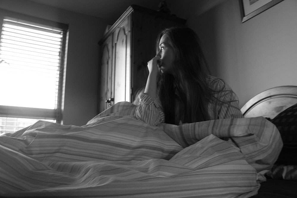
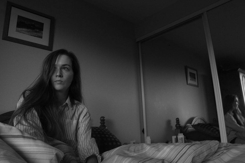
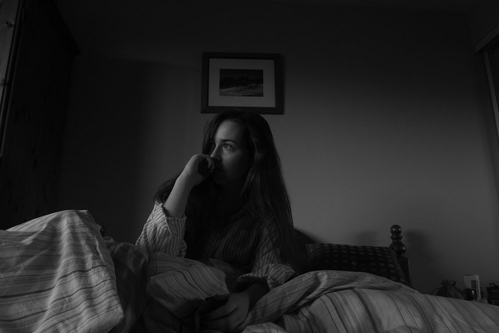
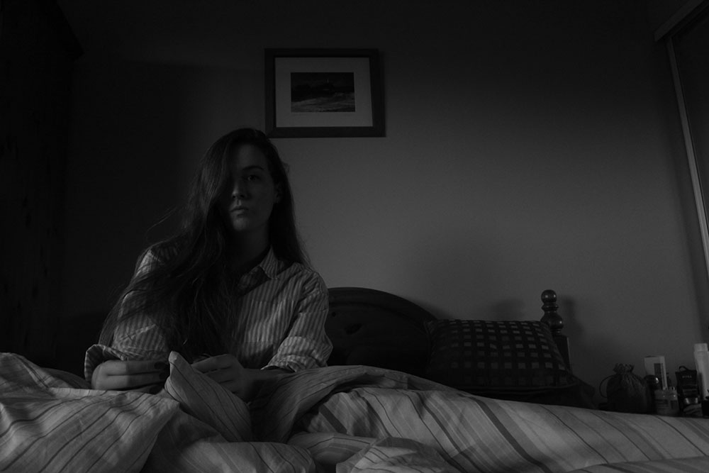
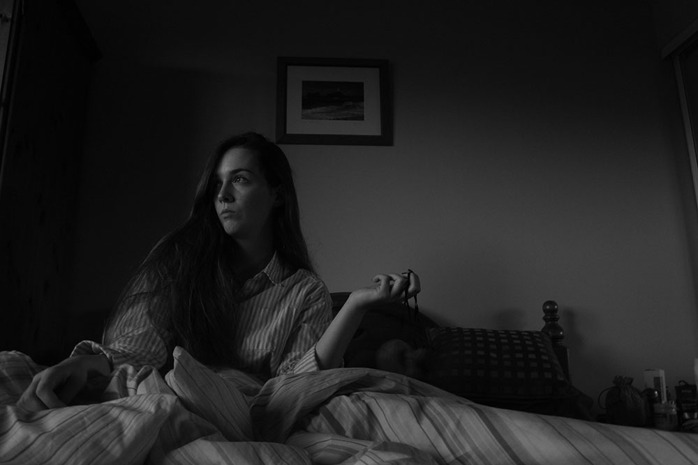
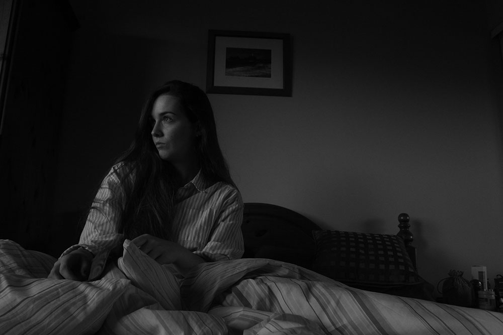
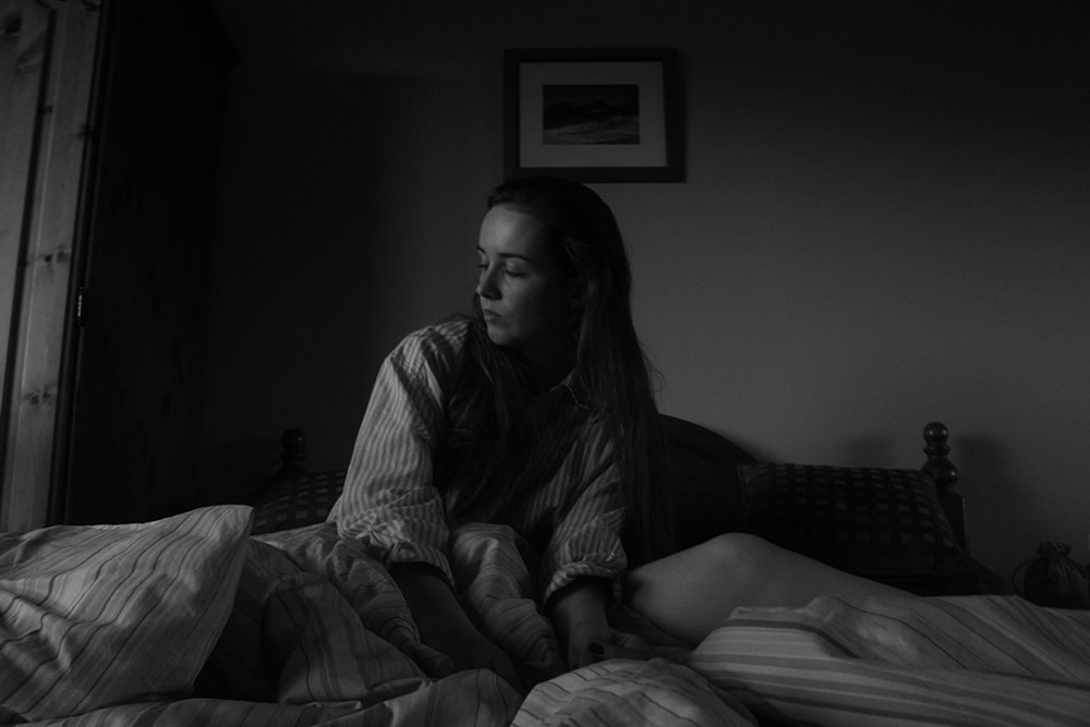
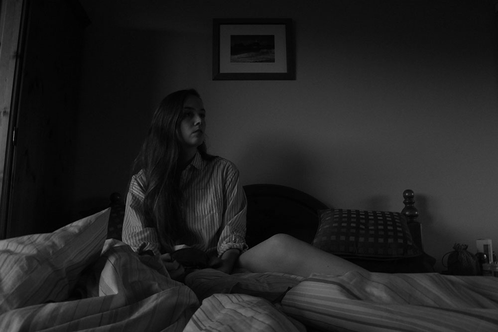
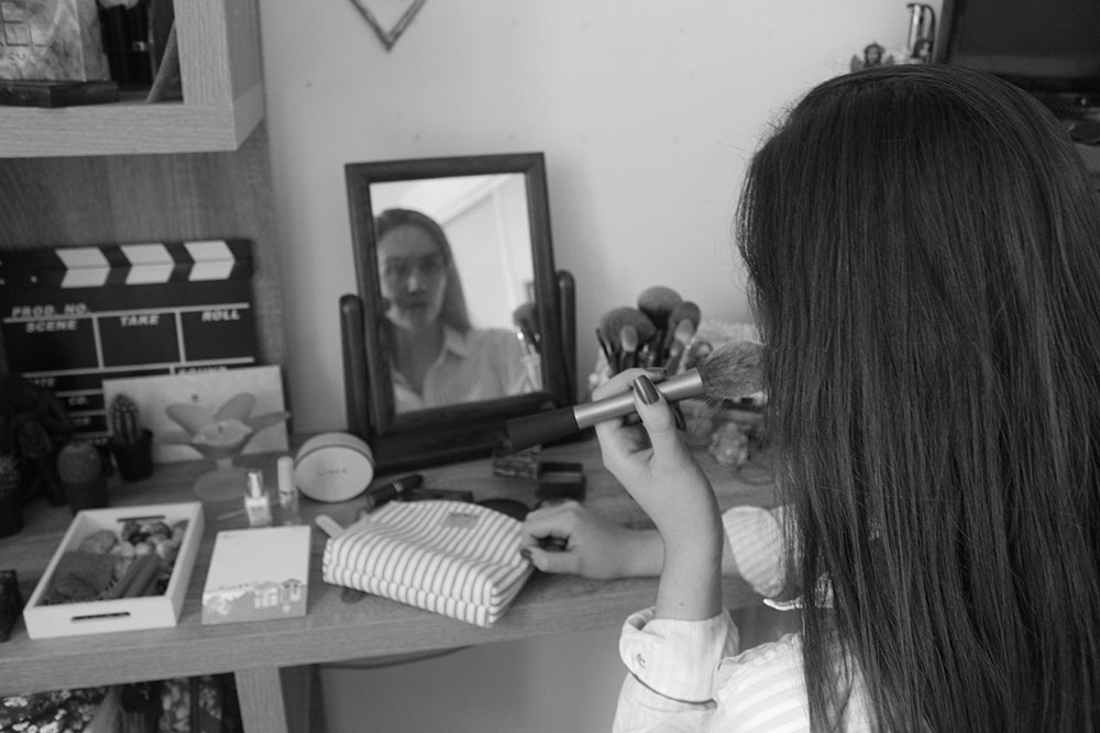
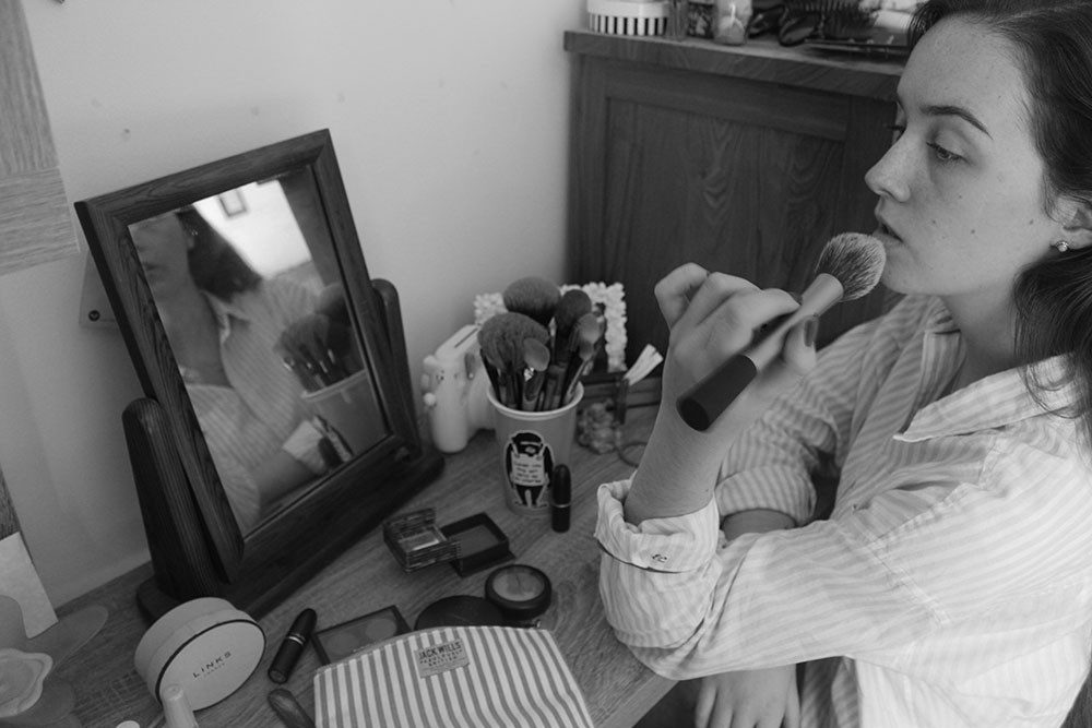
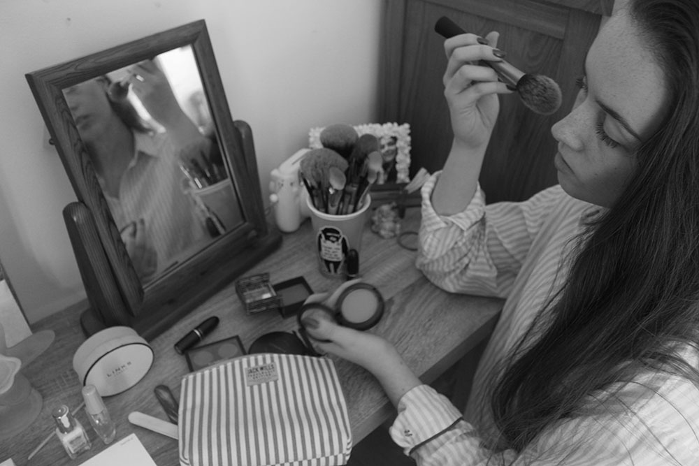
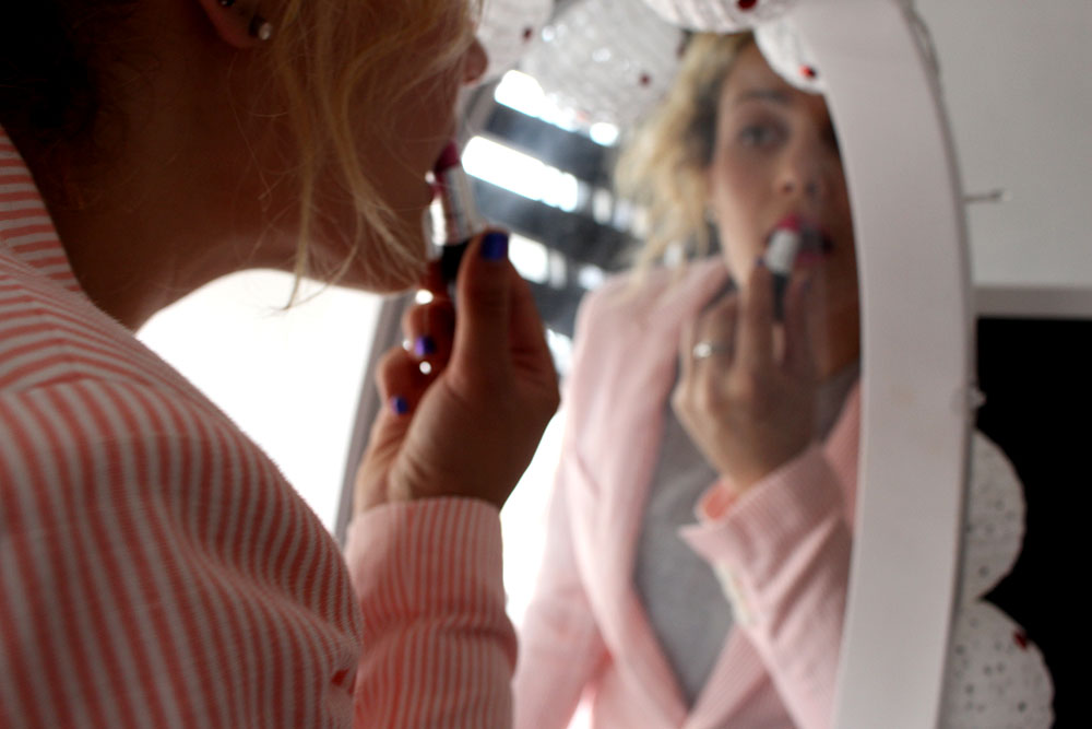
Here I asked my friend to pose in the position that I would be so I could test out the different angles for my ideas as well as lighting. I found that this shoot was more of a learning experience towards my actual main subject of Film Noir as I managed to work with a load of different lighting exposures with harsh light and soft light by only using natural lighting. I think that this did work out of the bed shots as the sun was setting when I made those images which brought in some good light into my images making them more interesting and mysterious. However, the images at the makeup table aren’t the best as I couldn’t seem to get the aperture completely right on the camera and so those particular ones didn’t come out as well as I had hoped as well as me being unable to actually properly pose for the photos as it was difficult to not get anything else in. If anything I would want to re shoot this in a bare room or something were there is very minimal surroundings with just the vanity dresser, the makeup and the model. I think that this would probably be best done in the studio where I can change the lighting and mess around with a few different things but other than that I think I’ve made a good start and am starting to really get the hang of what light looks good and what pose works well with the position of that lighting.

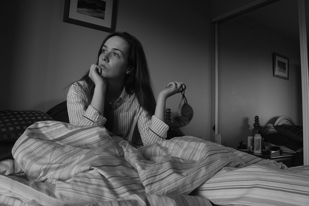
Here are the images that I have made so far and will be adding to as the course goes on. I experimented with a load of different angles and positions of the subject to see what looked best and which one managed to capture the story the best. This is only the beginning of the characters morning and I will be adding to this to create a more in depth story. I like the lighting in a lot of the bedroom shot images as the sun was actually setting when they were being taken and looked really great with there being more harsh lighting on the subjects face as well as in the background of the image.

IMG_8994blogThis is one of my favourite images as it portrays exactly what I want to get across. This image represents how women are expected to get up and enjoy the morning and simply gazing out of the window but in this image my character looks almost concerned as if she does not know what to do. I like the position of the camera and the composition of my character. Here I set up my camera on a tripod, positioned it and asked my friend to click the button, this worked well. I do find it so much easier just to be behind the camera making the photographs of someone else but I wanted to give a more personal response to the works of Cindy Sherman and Claude Cahun as they are always the main subjects in their photographs. I also like the way my character is looking and that the hand almost covers some of the face giving more of a mysterious way to her as if the spectator cannot completely see who she is but all they know is that she is in deep thought. I do like this image as the strong lighting makes for a more interesting black and white image. I think that this image is most effective in black and white and wouldn’t work in colour as the spectator would get too distracted by the orange coming through the window of the sunset and the contrasting colours of the stripped night gown and the stripped bed sheets. This also makes my character more of an enigma and will make the spectator want to look at the rest of the story to possibly find out a little more about this woman, who she is and what is troubling her. For these images I wanted to create an almost robotic character that is just doing what is expected of her and how society thinks she is really does drain a person and that other people do have problems and do have troubles that they feel that they can only face alone.

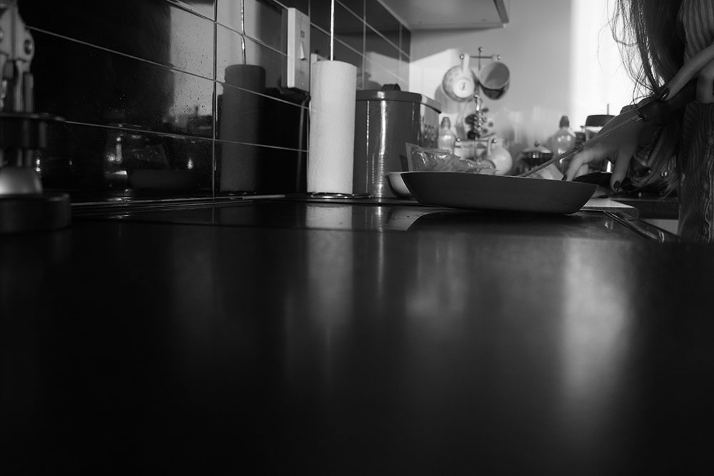
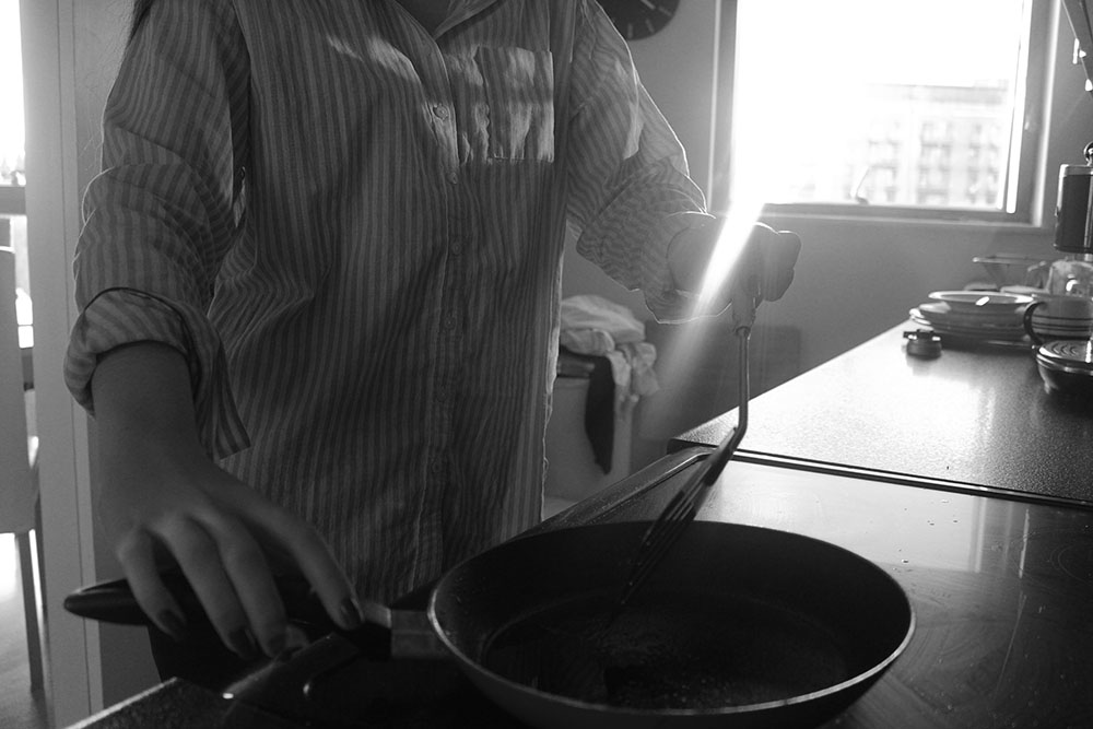
IMG_9236blogI also really like this image as the spectator is unable to see the identity of the subject bringing more of a sense of mystery to her and again making the spectator want to look at more images to find out more about who she and what she is going. I like the way that the camera has captured the sunlight coming through as a lens flare and I also like that is kind of cuts of the subjects hand a little so that the spectator focuses more on the pan with nothing in it. I like this image as it reminds me of one of Cindy Sherman’s images where a young woman [herself] is cooking something and is just passively staring into nothingness which I have taken inspiration from with my own photographs. I do like the composition of this photograph and how the hand on the far left looks a lot bigger than the hand on the right as well as making the body look a lot smaller as if she is possibly wasting away or can’t be bothered to come closer to the pan and actually make a nice breakfast. I also like the light coming off of the subjects shirt as it just gives more layers to the image and makes it stand out a bit more which is really interesting to me. I think that I will stick to having all of my images in black and white as it makes for more interesting images and allows the spectator to focus on what I as the photographer want them to focus on rather than all of the black and red that surrounds my family kitchen. I really like the way the light hits off the counter top as the spectator is able to see the window in it as it shines, it just makes the image that more interesting as well as it giving more shades for the black and white.

IMG_9125blogI chose this image because I like the angle and position of the camera making it look as though the spectator is looking down on the subject and that she is less powerful than them. I wanted this image to represent how women feel pressured and expected to dress up and always look pretty when in reality not a lot of women want to be constantly made up and when they do it is for themselves and not to impress anyone else. I also like the entire mise-en-scene of this shot as the spectator is able to see the makeup products she has sprawled across the dressing table as well as being able to see her reflection in the mirror. I like the angle that the camera is at and find that it looks really interesting as well as the position of the subject being exactly where I want it. I really like this image as a whole as it is the perfect position of where I want everything to be and how I want the image to be portrayed. I think that the most interesting part of this image is the reflection of my character in the mirror as it is just an interesting angle and everything within that little frame within the photograph looks very staged and put together, this shows how we often only see a part of someones life, the perfect part, and are often taken in by the aesthetics and how everything in that one frame actually fits and looks pretty when in reality the subject isnt so happy when faced with the pressures of having to constantly be ‘perfect’ for the rest of the world.

A Real Day in the Life

Shoot 1:
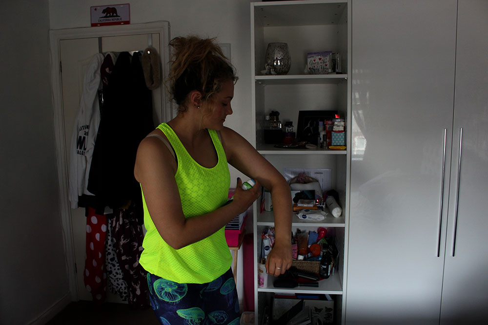
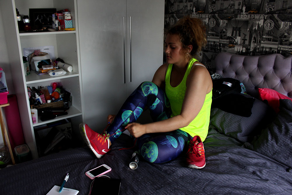
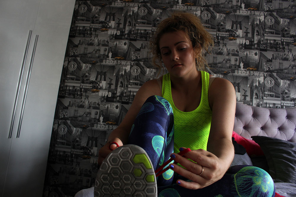
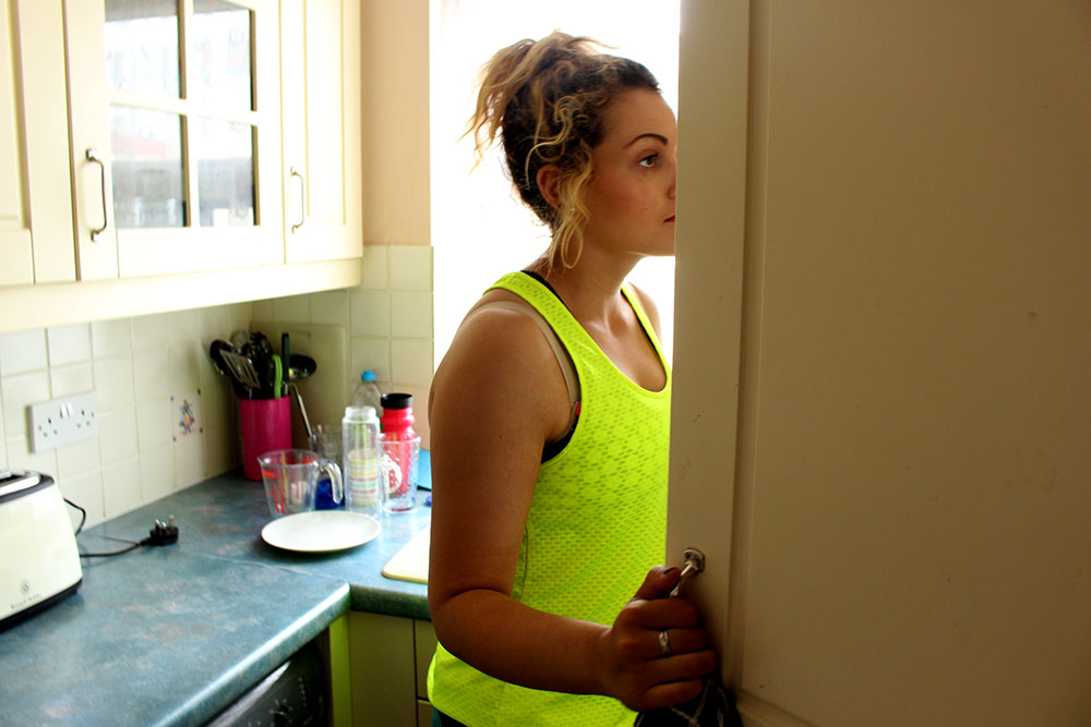
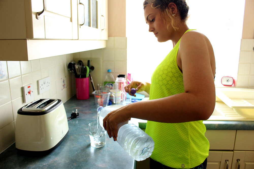
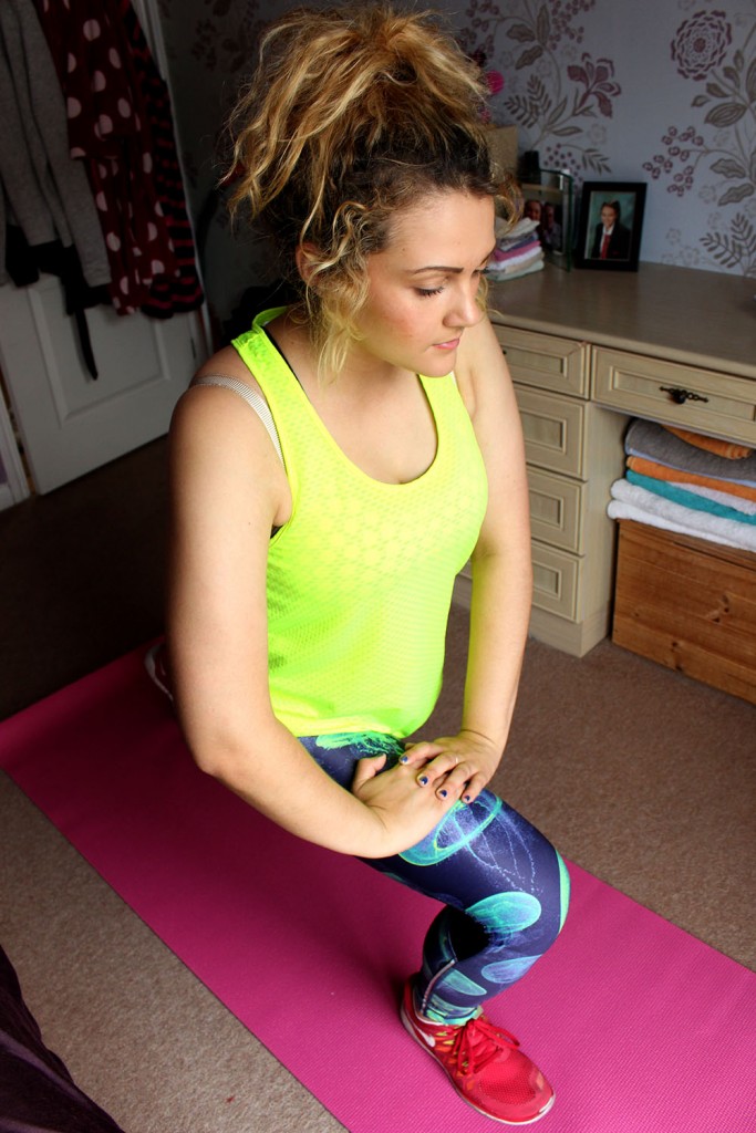
Here are images from a more realistic day in the life. This isn’t its full potential and I think that I will be redoing this with possibly the same subject or a few different ones to show a more realistic day in the life. This was interesting to shoot but I think just as a starting idea as I know that I can make better images.

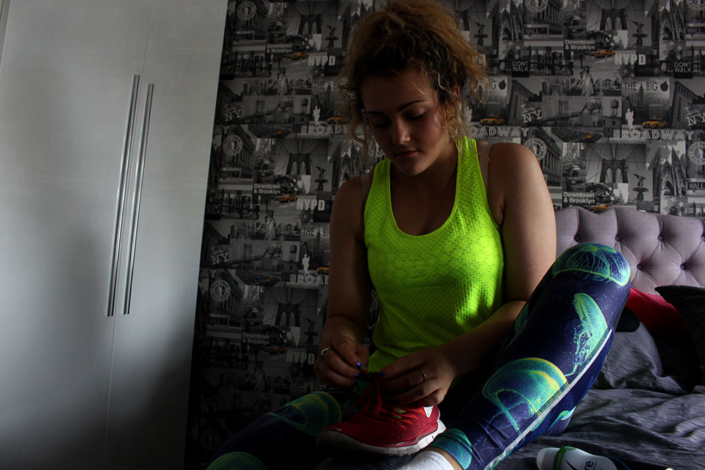
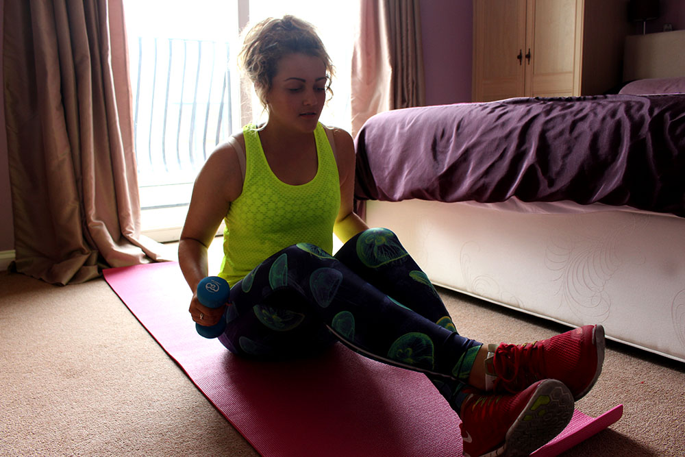
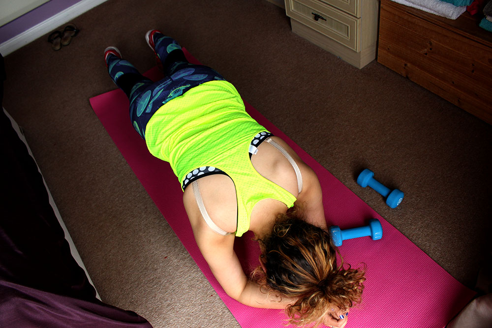
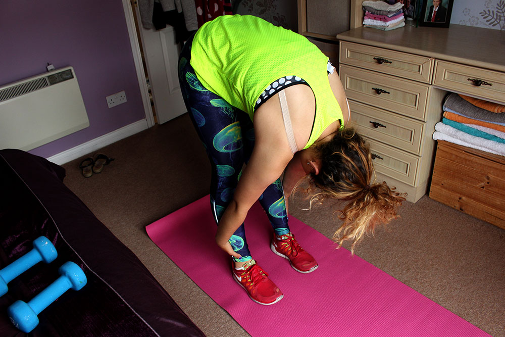
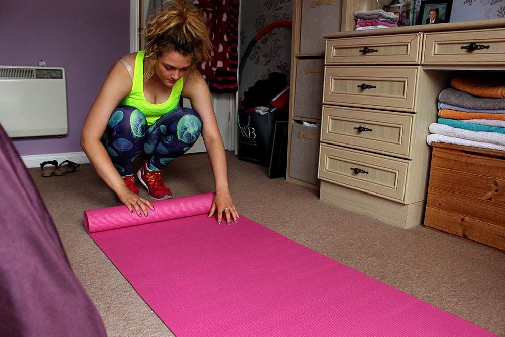
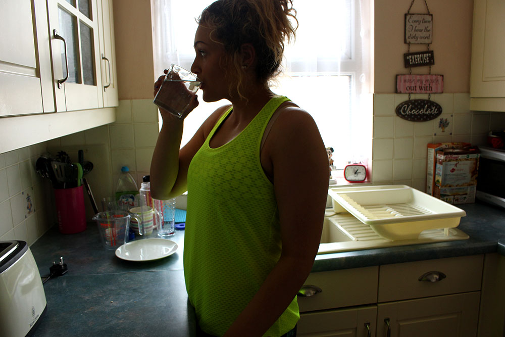
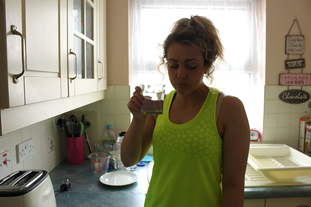
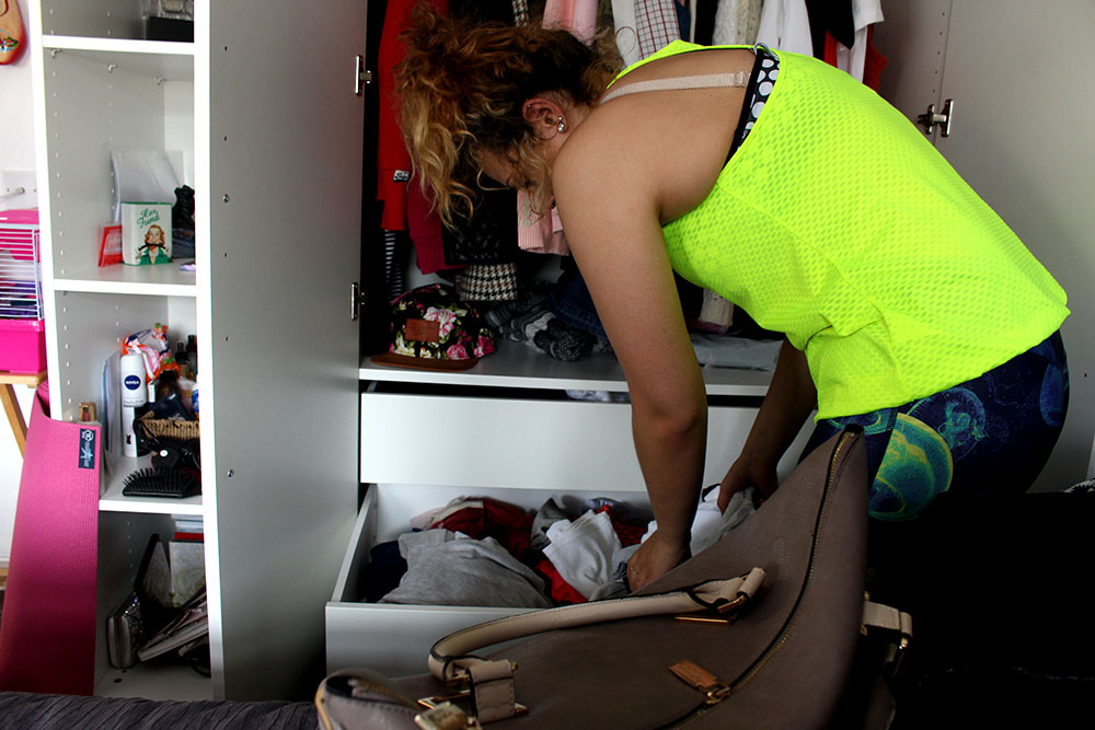
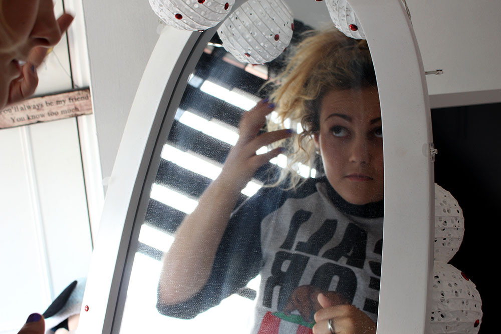
Here the subject is working out and getting ready to go to the gym. This was interesting to do but I don’t really like it as a shoot as it is quite boring and doesn’t really have any meaning or anything behind it. As documentary photos they are average and don’t think that they are anything special or interesting. Something about it just makes me not really care too much.
I think that this work is pretty average as a documentary piece and I know that I can make better and more realistic images than this as I felt that this shoot was quite rushed and isn’t really good enough. I will be furthering this idea though and will be making it a lot better visually and a lot more realistic. I will also work on some more shoots with different subjects performing for the camera and I will stage their daily routine too. This will be an interesting way using female stereotypes as well as somewhat documentary by photographing them within their natural environments.

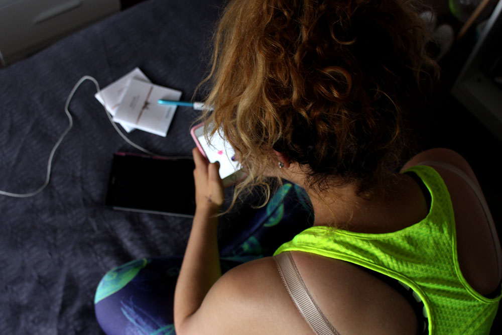
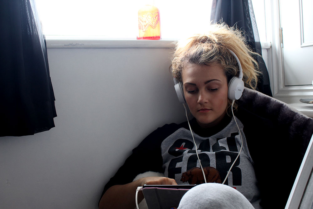
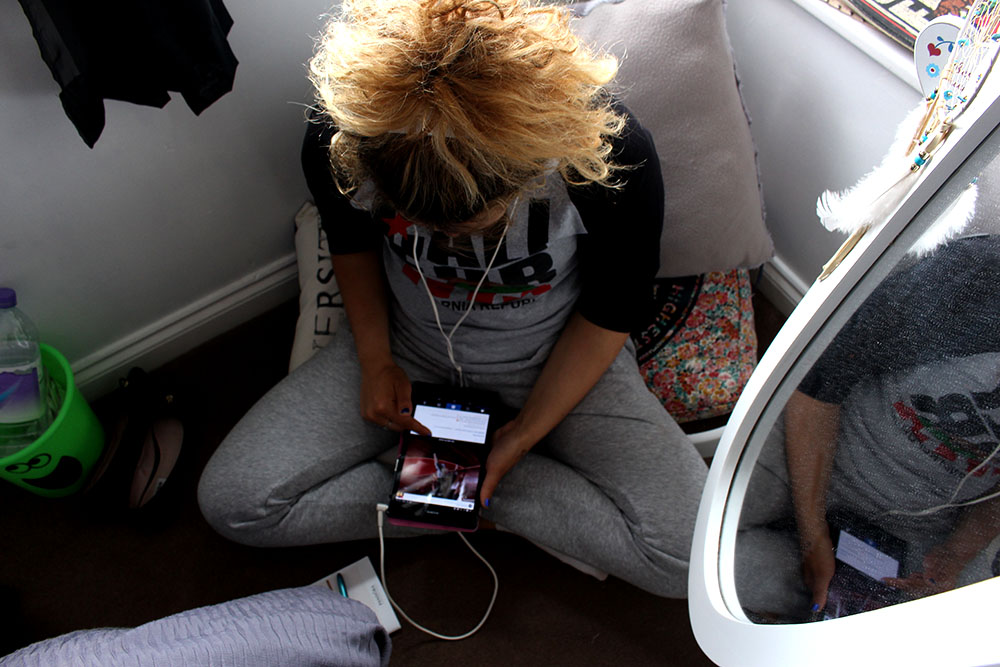
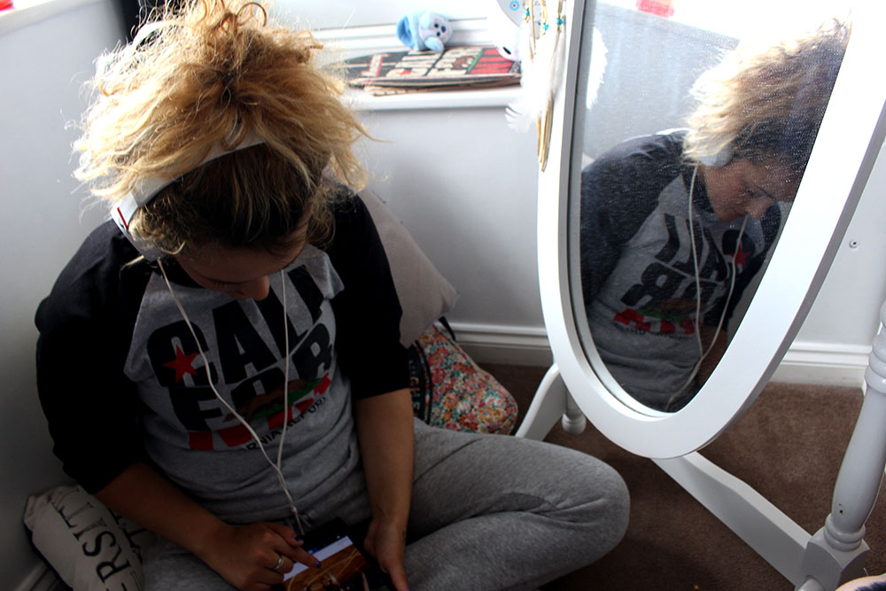
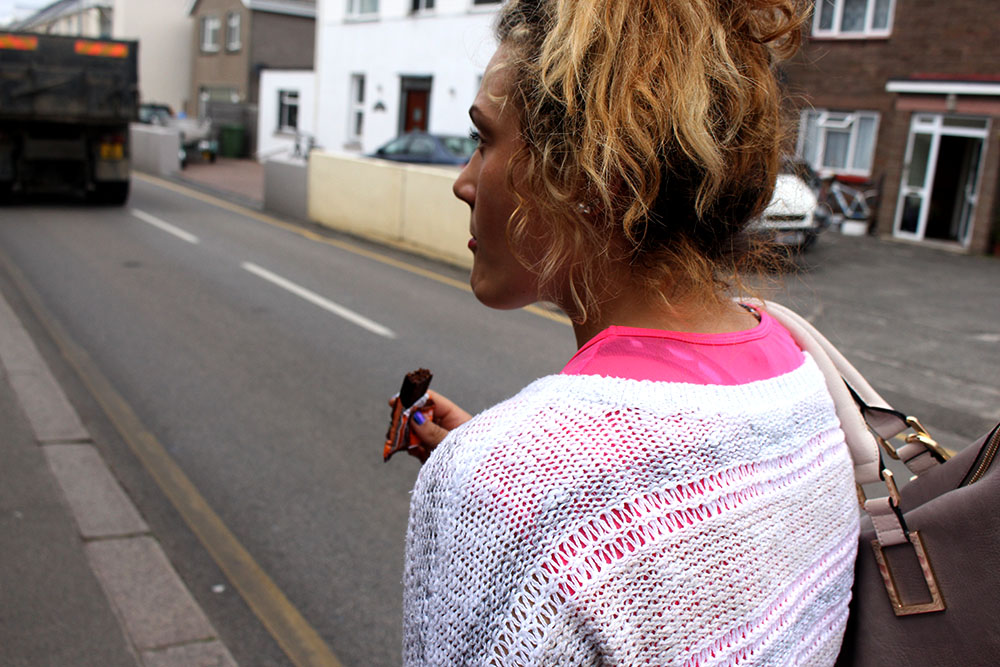
IMG_7593blogI actually quite like this image as it just shows a teenager doing exactly what you would expect a teen to do, sit with their headphones in listening to music and playing on their phone. I like the position of the subject as the spectator is able to see her reflection in the mirror and can see how dusty it is reflecting on how teenagers are stereo typically seen as lazy and messy. I also like the way my subject is sitting as she doesn’t allow the spectator to see too much of her face as if she is so engrossed in her phone but the spectator is able to see some of her face through the reflection in the mirror.

Vernacular Photography

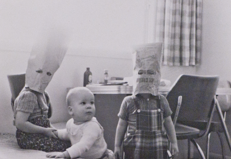
Vernacular photography is the creation of photographs, usually by amateur or unknown photographers both professional and amateur, who take everyday life and common things as subjects. This type of photography links to my project as I am focusing on capturing very natural everyday life images of my friends and different types of people. I like the idea of making my photographs very relate-able and realistic, I don’t like very staged photographs. These types of photographs relate to documentary photography as they document everyday life/what my life is like. I think it is important for the photographer to have that personal connection with their photographs, therefore, doing something that portrays your life with your friends/what type of people are in the society that you live in are like. Vernacular photography allows the photographer to spontaneously take photographs whenever they feel.

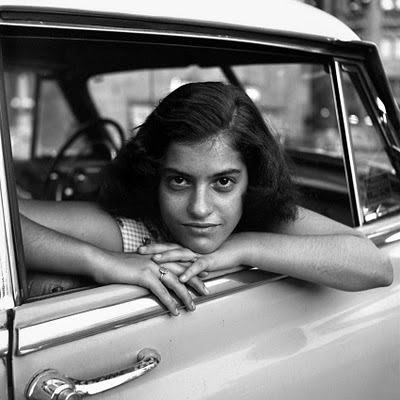
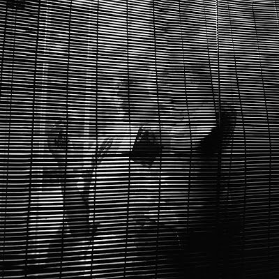
This also relates to the theme of family as family portraits can be categorized as Vernacular photography as they are pictures of people you generally with most of your time and love. They can be everyday images or just annual things. Vivian Maier is a photographer who did a project focusing on Vernacular photography, her images are all in black and white and are simplistic yet still effective. This has inspired me to experiment with black and white vernacular photography. I want to experiment with different types of photography to see which one best fits with my project.
56-623

Untitled, Undated

IMG_1351

125 hours through a teenagers lens

Photography students at Hautlieu have been given the opportunity to be involved in a collaborative project with the Jersey Museum called ‘Our Story, Half Term: 125 hours seen through a teenager’s lens‘ this will allow us to’ take over the museum’ by working behind the scenes to organize a pop up exhibition doing jobs such as PR, design, curator and  documentors. The task is to take between 150 and 250 photographs over the half term for 125 hours, the photographs can be of our daily life’s which fits in with our current documentary style theme.  To aid us with this task and give us some inspiration we are going to visit the Jersey Museum on Friday 23rd October during this visit we will have talks from  museum curator, Lucy Layton and Photo-archivist Gareth Syvret from the Societe Jersiaise.

ARTIST REFERENCE – JO SPENCE

Jo Spence


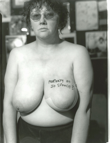
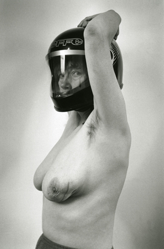
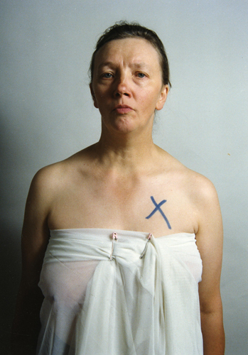
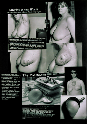
Joe Spence’s photographs are about the idea of using photography as therapy. Whether this is for an illness, like it is in Joe Spence’s book ‘Putting myself in the picture’ where she goes through MRI scans and appointments for her breast cancer, most of the images are very explicit photos of her breasts while she is getting scans done, but also images to document the changed that are happening to her body, to make her come to terms with the fact that she has cancer. An idea which Joe Spence writes about in the book is using family photos as therapy. For this therapy to happen it is not about just talking to family and friends about the images or the past, it is about looking at the image with a Councillor. In this section of the book Joe Spence has included a few photographs from her childhood and also dialogue from the conversations. I think this idea of placing dialogue into documentary work is really interesting as it gives the viewer an insight into the conversations and the lifestyle that someone leads, which sometimes helps to understand what is happening in the images. Jo Spence plays with the idea of a photographer/therapist while she assists people in helping them get better with their mental or physical illness. In most of these images Jo Spence is in them herself, where she is the main ‘character’ in the images.
“We are not trying to show familiar objects in unfamiliar ways, but rather to denaturalize the genres of photography which already consist of fully coded visual signs” – JO SPENCE

2 3

This image is of Jo Spence when she found out that she had breast cancer and she went to go for scans, she photographed this moment to document this part of her life and what was happening at this point in time. This image is a very explicit images and it brings up questions about ethical reasons for posting an image like this, however because it is an image of Jo Spence herself the image is not as shocking.
4

I think that this image is very alarming as Jo Spence has taken this image as a type of therapy for herself, and it shows the deformity in her breast because of what the cancer has done to it. I think that the idea behind Spence wearing the helmet is that she wants to protect herself, and this implies that she is scared, maybe scared of the cancer. As this image is in black and white it makes this image more plain and documentary like in my eyes. 5 (1) 5 8

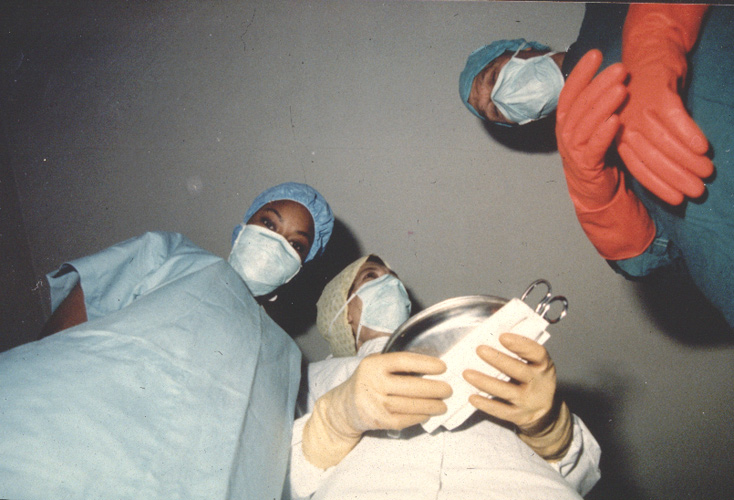
This image is of the perspective that Jo Spence has while she was having some treatment, i think that this is interesting as it shows what she can see from her perspective and you can see how frightening that it must be. c_s_2 nod_6


Community

What is a community?

A social, religious, occupational, or other group sharing common characteristics or interests and perceived or perceiving itself as distinct in some respect from the larger society within which it exists.

A feeling of fellowship with others, as a result of sharing common attitudes, interests, and goals.

I think that community is a broad theme which incorporates a wide variety of people and both family and faith. Although it’s not as personal as family, community gives people a sense of belonging and identity.  As well as community being a large group of people who share common interests it can also refer to shared values and beliefs for example: religion. The people whom you trust and rely on can also be you’re community, in a way you’re community can also be seen as almost like you’re second non blood related family.

Types of communities?

  • Religion
  • Culture
  • School/work
  • Sport
  • Night life
  • Friends
  • Hobbies/ interests
  • Geographical area
  • Island events
  • Politics
  • Parishes
  • A group of people unified by the same interests

community