Weekend plan

This weekend I have decided to conduct an interview with my Grandma and Grandpa, as in my picture book I would like to have some subheadings where I display my grandparents feelings/thoughts on a chosen subject. The subjects I have chosen to interview my grandparents about are; Faith, Wales, Music, Family and Jersey.

I would also like to look into my grandparents own archive and try and find some photographs of my Grandpa during his singing career.

Finally, I plan to take a trip down to their church on Sunday and capture some images go them at their service and their contribution to their church. For example my Grandpa playing the organ. My Grandma preparing tea and coffee, for after the service.

125 HOURS: JERSEY MUSEAUM TAKEOVER

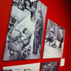
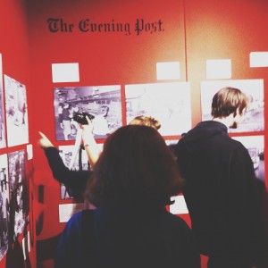
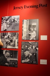
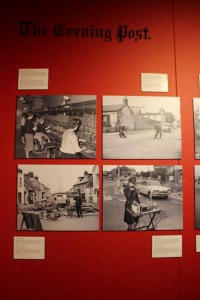
On Friday 23rd October the whole of year 12 and 13 photography students headed down to the Jersey Art Museum where we were delivered an opportunity to get our creative work exhibited within the Jersey Museum. This was created to celebrate 125 years of the Jersey Evening Post [originally named Evening Post]. This would be a really great opportunity to get our work out there within the Jersey community as well as actually being a part of an exhibition.

Archive collaboration with JEP
JEP collaboration with Jersey Photo Archive


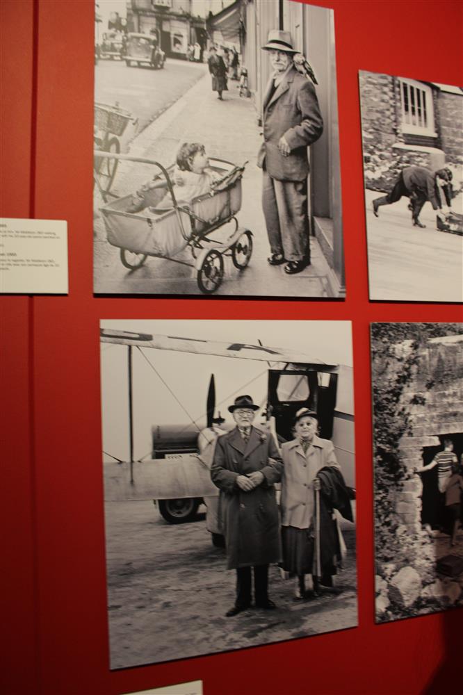
The film cameras were great, as I’am fond of vintage cameras, it really brought the whole exhibition into perspective that people actually used to use these to make photographs for the papers and looking around at the images they were all so amazing without any editing being done at all. I personally was unable to attend the exhibition but from pictures and research i have done i have a clear imagery of what the room and presentation looked like. I do not like the layout of the exhibition and thought it could have been done a lot better. The very bright red background was too intense and set off the view to the images. However the contrast of the black and white images onto the red was very complimentary. The captions of the photographs were too high up the wall and very small so they were unreadable from a low level. The actually quality of the prints at the exhibition were very poor also.

Exhibition

IMG_0952 (Custom)

IMG_0941 (Custom)

The space that the exhibition was in the Jersey Museum and the space was also very small for the images shown. Ceilings were relatively low and makes the space feel cramped and small. The lighting was very harsh and did not compliment the photographs well at all, On a whole i thought the exhibition was very poor and could have been done ALOT better. This is a shame because the conceptual idea is a good and if done well could have been a successful and well perceived.

Finals from October shoot

I went for another visit to my grandparents house this October half term to see them unpacked and settled in. They have unpacked their furniture and started to make the house more homely. However they haven’t hung any paintings or pictures on the wall as they had lots hung up in their old house, therefor they have lots to choose from.  It was also my Grandpa’s Birthday. They are very sociable people and have a large circle of friends who sent cards, called and visited on him on this day. Two of their closest friends, called round for a cup of tea whilst I was photographing.

I have chosen a couple of finals from this shoot which I think portray my grandparents very well. I managed to get a nice portrait of both my Grandma and Grandpa and some nice photographs of around the house. My first photograph is of my Grandpa;

1

I really like this photograph because of the soft lighting and the neutral colours used throughout. My Grandparents house is a new build therefor they have been able to choose the colour of the walls, carpets, interior ext. They have chosen browns and beiges as a general colour through the house. You can see in the photo that there is nothing that stands out due to bold colours therefor it gives the photo a calm and gentle feel.

My Grandpa is sitting on his piano stool, where he spends a lot of time. He is looking through his Eisteddfod paper work, which is an annual Jersey event which he has participates/ helps out in every year. My Grandpa is a big music lover, as he plays piano and the organ for his church every Sunday. However he is mainly a singer. He has been singing in choir’s and performing solo performances ever since he was a child.

The one thing that I would change about this photograph’s composition is; I would move the brown plant from behind his head. As I think the photograph would be more atheistically pleasing if it wasn’t there. To further this photo, I would like to take a portrait of my grandpa in his brown chair, this is his chair that he always sits in, and watches his sport matches in.

2

This portrait of my Grandma has a similar colour scheme of browns and neutral colours. I really like the couch that my grandma is sitting on in this photograph because it adds lots of different textures to the photograph; the brown leather on the arm rests, the studded detail and the cross patch material on the majority of the seated area. As well as detail from the textures, the photograph contains other details such as her glasses are steamed up from her tea. I really love details like this is photographs, because it adds character.

My Grandma is also on the phone in this picture, I think this is a good representation of what type of person she is; very sociable and likes to keep in contact with all her family members and friends.  I do like this portrait because I like the angle, lighting ext. But if I were to reshoot, I would take the photo without the cup in front of her face.

3

This photograph is of their new bedroom, I like the photograph because of the line of symmetry running through the middle. The matching nightstands which both have a book and a bible, a lamp and a mug coaster.

Just before coming upstairs to photograph my Grandma ran up in front of me saying;

“No Emily you can’t go up there yet, I haven’t even made the bed. I can’t have people thinking I don’t make the bed in the morning”

4

This is the last final from this photoshoot. It is of my Grandpa and his good friend, who has come to visit his on his birthday. They are in their front room, and are having a joke about something.

125 HOURS: JERSEY EVENING POST EXHIBITION

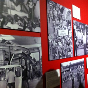
Photography students at Hautlieu were invited the the Jersey Museum to view the Jersey Post exhibition of the past 125 years of the evening post. There was a room which had been allocated with a range of images from the past 125 years of the Evening Post. These images ranged from portrait image of single people to group photographs to some landscape images of Jersey from years ago. I think that these images were really interesting as it gave an insight into the community that there was in Jersey and what people in Jersey use to get up too. Some of the images were also from events like the battle of flowers, i found these images really interesting as the battle of flowers is still on so you can make comparisons between the two events in time.

Write down the first thoughts about the exhibition that enters your head when you walk in?

At the exhibition there was a range of images and unknown information about events that i did not know about. I also thought it was interesting to look back at 125 years of different events and occasions that had happened in Jersey that had been displayed in the newspaper. However the exhibition misses out some information from the 1930’s and also from the present decade either. 

What is it that you like about your favorite image?

My favourite image is the one from the battle of flowers, this is because it shows the community coming together and working together to build a float. In the image all of the people look happy and excited to be taking part. I also think that it is interesting that in still in 2015 we have the battle of flowers which means that this event which is in history is still taking place, and i think it is interesting to see how times have changed through this image. 

One of the image is called Football Fever, i think that this image is interesting as it shows a group of people coming together for something they all enjoy, which shows the community which they take part in. In this image the people are walking towards a ball.3

What is wrong with your least favorite photograph?

Cadet regatta 1948 is my least favourite image, this is because in this image you cannot see the peoples faces it in, so i do not feel that you can connect as well with the image. In comparison to the other photographs i do not think this image is of high standard, however as it is a document of history this could be why as it was taken in 1948 so the quality was not as good as nowadays.

Do any of the photographs in the exhibition show similar events or activities to what you will be doing in half-term?

Most of these image which have been presented in this exhibition show the same kind of events which still happen in the present, which makes it easy for these images to be compared to our lives to see how time has changed. Some events for example football and of people working show activities that people still do nowadays.

When walking around this exhibition i thought it was interesting to notice that the images are not actually from 125 years of the JEP they actually miss our 50 years and there are no images from this present decade. This means that this event does not show the changed through time in the JEP through the images, and i am confused as to why they have called in 125 Hours of the JEP, as crucial moments in history have been lost through these images as they have not been displayed in this exhibition. In addition all of these images were in black and white, i think that it would of been interesting for some of the image to be in colour so we could see what type of colours people wore decades ago, but also to get more emotion from the images. 

These are some images that i took while i was at the exhibition: IMG_0949 (Custom) IMG_0940 (Custom) IMG_0952 (Custom) IMG_0953 (Custom) IMG_0941 (Custom) IMG_0935 (Custom)

Jersey Museum Exhibition

Jersey Museum Exhibition- Analysis of favourite and least favourite photographs 

I have chosen this as one of my favourite photographs because I like portraiture photography, especially this black and white style. It has a very ‘poppy’ ‘rockstarry’ feel to the image, also the policeman’s hat being in the image connotes to the idea of trouble and control. This feeling is highlighted by the possibly fans asking for autographs which has been captured at the bottom of the image. The reflection in the subject’s sunglasses also makes the audience focus on this area of the photograph. Moreover, I like the framing of the image because the main focal point is in the centre of the image and the complimentary subjects are there as an additional. I do not think this image would of worked as well if it hadn’t been in black and white. This photograph doesn’t looked as though it were staged, it’s more a documentary photograph where it has been captured for the news or in this case for the JEP Newspaper. 

This is my second favourite image because I think it has a very natural feeling to it; the simplicity of the photograph is what makes it interesting for me. Also the position they are both in gives the image a sense of unity and support. Through the subjects linking arms they have created a warm and endearing photograph which could connote to their love for one another. Framing is also very important for this image, having the subjects at the right makes it almost formal and as though it were set up. It is also clever how the photographer has included parts of the plane in order to relate to whatever news story was being published. 

My least favourite photographers were of subjects creating the newspapers in the factories. I thought there were too many of this type of image because they didn’t actually have much relevance to the specific project. Furthermore we were not told any of the photographers that took the images, which I found very strange as this could of potentially been a research point for us to begin from. 


Research: Picture Stories

Picture stories are techniques commonly used in newspapers and magazines. Photojournalists report media in a way of interpreting news. Picture stories however, can be seen easily as inconspicuous

The Guardian is a British national daily newspaper. Founded in 1821 as a local paper. The Guardian Newspaper and Magazine has redeveloped the photo-history of picture stories, as it has impacted readers from over 150 years.

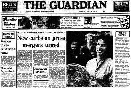
Virginia Wade wins Wimbledon 1977, Guardian front page

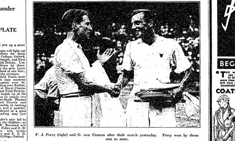
Fred Perry wins Winbledon in 1935, Guardian photograph of Perry and runner up G von Cramm
From the archive: When Fred Perry and Virginia Wade won Wimbledon Compared to the wall-to-wall Andy Murray coverage, the Guardian was more muted when Fred Perry and Virginia Wade won Wimbledon

The Guardian is renown for its technical response to society, and ever changing life events and

1DOUBLE1

3BB
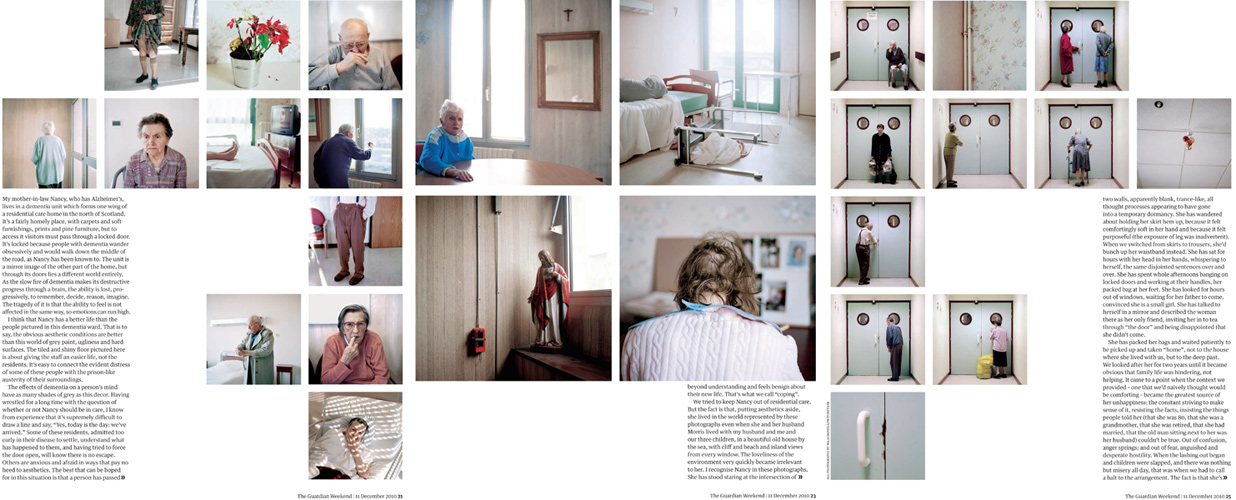
“INTO OBLIVION” PUBLISHED ON THE 11.12.2010. It is a five-page spread layout and the first publication of the series, underlining the lives of elderly people. The words of this article have been written by Andrea Gillies.


35-37_Spread

This technique is very efficient, it draws readers in.

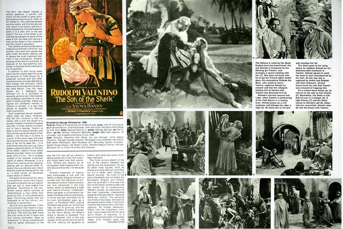
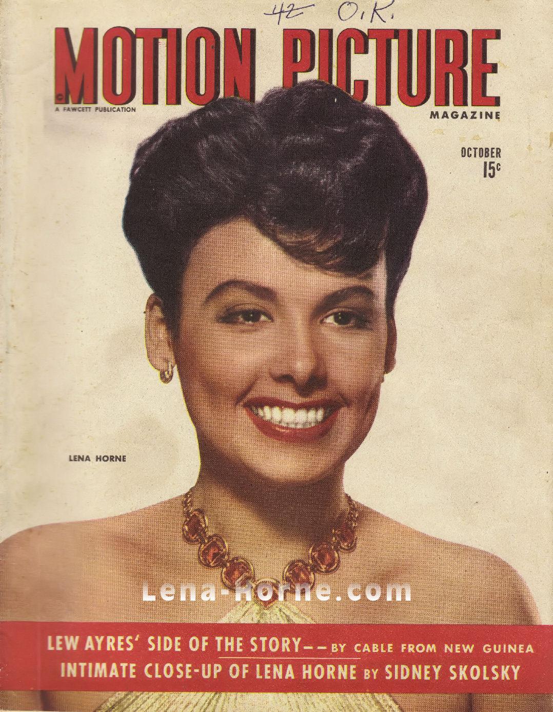
Another example is Motion Picture Magazine. This was an American monthly fan magazine about film, published from 1911 to 1977. It was the first fan magazine.

sotsspread
Vilma Banky Portrait from Idols of the Silent Screen — Ronald Colman & Vilma Banky Magazine Portrait from Motion Picture “Classic,” March 1927


motionpicturecoversmall
Motion Picture Magazine 1944

Untitled-1

The aim is to make sure the reader can interpret the image in a certain way. obstacles like captions can throw away the original perceptions you want the reader to consider.

Street Photography

“Street photography is photography that features the chance encounters and random accidents within public places. Street photography does not necessitate the presence of a street or even the urban environment.”

Nils Jorgensen is a good example of Street photography, although quite humorous street photography. His photos, although appear like they might be staged, are mostly spur of the moment images where he’s seen something happening at the perfect moment to take a photo, exactly like Documentary Photography, except instead of focusing on political issues or ‘newsworthy’ subjects, he has chosen to try and take more humorous photos among the public.

his website: http://nilsjorgensen.com

Some of his images are more ‘artsy’ photos, but the majority seem to show either something unusual, that doesn’t normally happen, or photos taken at just the right moment to be funny.

74457-4715040-NJ2_7853_ps_hgsel_usm100_srgb_cnvs_04C

The way he takes his photos is similar to the way that I have been taking photos for my ‘Gatherings’ project, the majority of the time I don’t go out know exactly what and where i’ll be taking photos, but I take my camera and if I see a moment or place worth photographing, i’ll take a photo. Jorgensen doesn’t do a whole ‘photo shoot’ where everything is planned and he has organised people to be there etc, he just waits for the right moment and captures what is naturally happening around him.

Another photographer who takes this style of images is Todd Gross. Again, he goes into the public and when he see’s something interesting happening, he photographs it.

http://www.in-public.com/ToddGross

I think this style of photography really intrigues me because a lot of the time, street photography and photojournalism/documentary photography is used to show all the bad stuff happening, fights, police, gun violence, political issues, but this style of street photography is used to make people smile about all the little coincidences or funny moments happening everywhere, and it reminds you that not everything that is worth photographing and reporting has to be serious.

This kind of photography also reminded me of Andreas Gursky, he takes very large scale images, but then focuses in on individual things happening within the image, for example with this large image of a swimming pool, he cropped down to point out all the individual things going on in a situation, which you may not ordinarily notice when looking at the photograph as a whole, whilst it may not be humorous as such, it shows all the different things all happening at the same time, like little fights in the pool or an intimate moment between certain people.

cri_000000199291-2

Screen Shot 2015-11-06 at 10.59.42

Screen Shot 2015-11-06 at 11.02.48

Jersey Museum takeover

On Friday 23rd October we had the opportunity to visit the Jersey  Art Museum to see the exhibition which celebrates 125 years of the JEP to give us some inspiration for our task “Your Story, Our History: 125 years seen through a JEP lens”.

First impressions when you walk in?

  • Black, white and red eye catching
  • Red background linked to the JEP
  • Contrast
  • Simple layout
  • Small space

Although exhibition was celebrating 125 years they only had photographs representing about 50 years therefore the title was miss leading. They didn’t include any photographs from 2000, however I think this is were our task ‘125 hours through a teenagers lens’  may fit in. One thing I found that was really interesting, is there were no photographs of jersey and the community during the German Occupation In World War II, we then found out that this was because the Head of the JEP at the time burned all the images to make sure that the Germans didn’t get hold of them, I think this was an interesting way of preserving Jersey’s history/culture from the Germans. It also made me wonder if there were any important photographs or information that they didn’t want the Germans to find out about.

The first photograph I have chosen is ‘Prince Charming’ as one of my favourite photographs from the exhibition, this is because this was the first photograph that caught my eye when I walked into the exhibition, as it was placed in the middle and right in front of the entrance. Another reason why I chose this photograph as one of my favourites is because I think it portray’s a typical ‘ladies man’ although the person is famous. I think it was captured at the right moment and I like the composition. The only critique I have is I don’t know a lot about the context of the photograph or who the photographer is.

The second one I chose was the ‘housewife protest’ photograph because I think it’s a powerful image, due to what it represents rather than it’s composition, the photograph is of a protest during the 70’s which was a crucial time for ‘ the feminist movements’ when women not just in Jersey were fighting to have more rights and for the equality between men and women. I think the banner is the main point of focus and as a viewer it is the first thing your eye is drawn to. I usually don’t like when there is too much going on in a photo however in this case I like that the photograph was filled which gives you a lot to look at, the photograph was also taken from above which I think gives you a better view of what is going on, I think a photograph taken from above works better because of what it’s representing.

My least favorite photograph is the Cadet regatta 1948, because the people in the photograph are all facing the other way, so you can’t see their faces. The displayed photograph in the museum also looked a bit blurry. It doesn’t seem like there is much going on in the photograph which makes it uninteresting and reasonably forgettable among the other photographs. Another aspect of the exhibition that I didn’t really like was the wall of photographs about what happened inside the JEP I think that they focused to much attention on this and there were a couple of photographs illustrating the same thing.

http://jerseyeveningpost.newsprints.co.uk/search/byg/p/u/48/2/jep%20125th%20anniversary%20exhibition%20images

Vivian Maier:

Vivian Maier was a nanny and also a ‘secret’ photographer. She was described by friends as being introvert. She preferred to have a very private life and even asked for a lock to be placed on her room door. Maier had O.C.D. and with that she also took many photographs. Her ever-growing passion for photography lead her to the extreme of creating a darkroom in her bathroom. Spread out throughout the five centuries that she photographed, she managed to take over 100,000 negatives.

Vivian Maier’s website: http://www.vivianmaier.com/

Amazingly her work was only discovered in 2007 at a Chicago auction. She’d actually become very poor and had to sell one of her storage lockers in order to pay for her house. Inside there was a mass of photographs and a man called John Maloof unknowingly bought them. He was the man that got her famous. After all those years of storage and hiding the photograph’s were finally brought to light. He’s played a huge role in helping to archive her  work for future generations to cherish.  Maier’s street photography seems to be very contemporary although it was taken with a rather historical camera. One of her many camera’s was called ‘Rolleiflex’ and can be seen in her self-portrait:

Vivian Maier: Self-Portrait.

I have produced a similar photograph to this one. I actually took this picture spontaneously during the half-term and have edited it into black and white to create a similar effect to Maier’s. My face is not very visible but you can still see the outline of my reflexion on the car window.

Here’s my outcome:

DSC_0093 edit vmaier
my response

Her photography focused on the street life in urban areas. Since Maier was born in New York City during the 1920’s, she had many sources for inspiration. During her life Maier kept changing locations from the her hometown to France. In 1951 she finally decided to settle down in the U.S. where her passion for photography evolved. Her documentary style created meaning and evolved into a great story. Vivian incorporated both still images and video recordings into her work.

Here are some example’s of her street photography:

1953, New York, NY
1953, New York, NY
Undated, New York, NY
Undated, Canada
Undated, Canada
May 5, 1955. New York, NY

“Well I suppose nothing is meant to last forever. We have to make room for other people. It’s a wheel. You get on, you have to go to the end. And then somebody has the same opportunity to go to the end and so on.” – Vivian Maier.

Contact sheet reviews – COMMUNITY

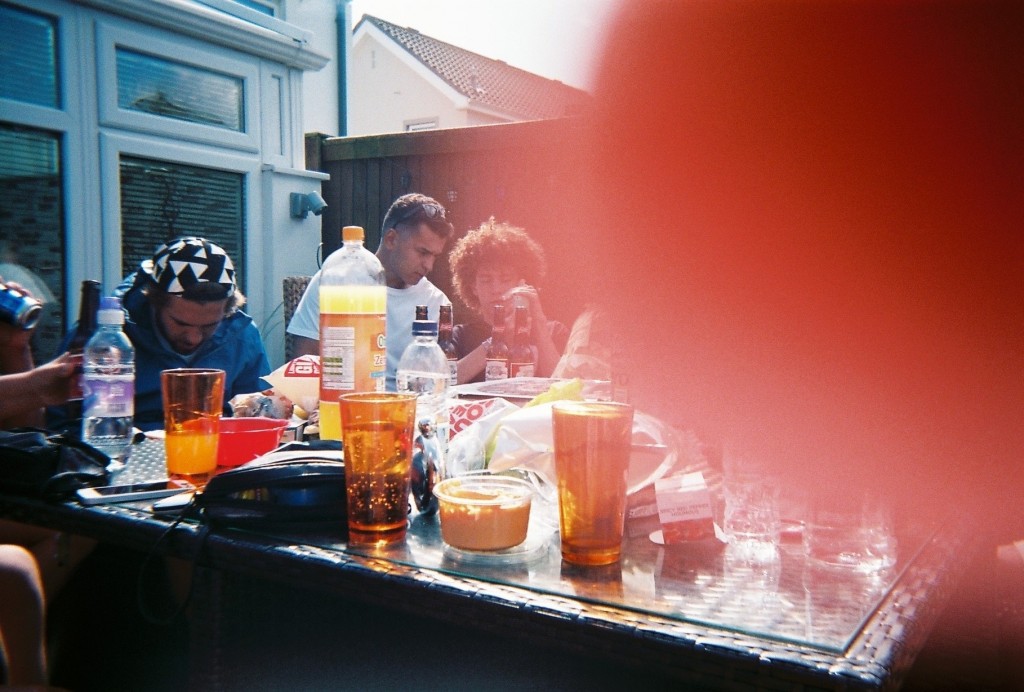
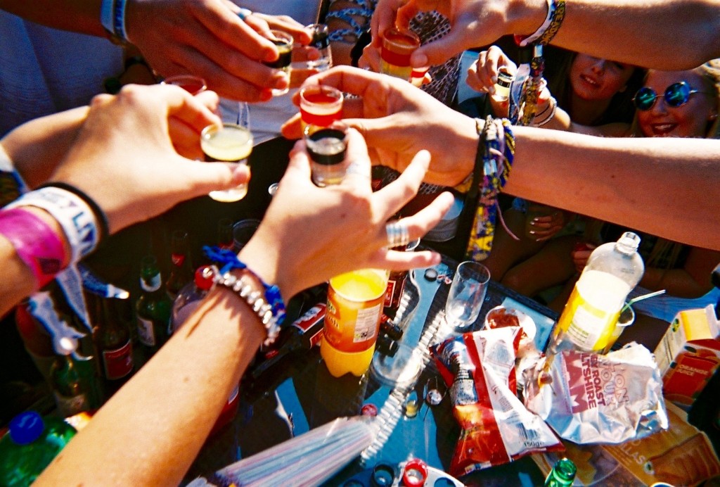
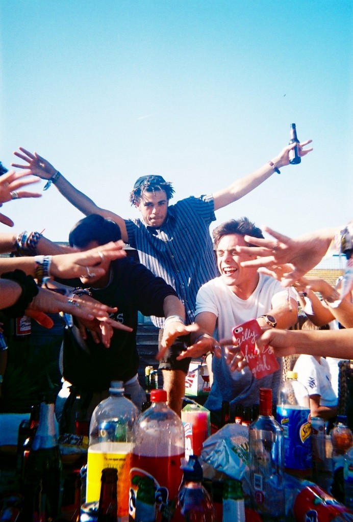
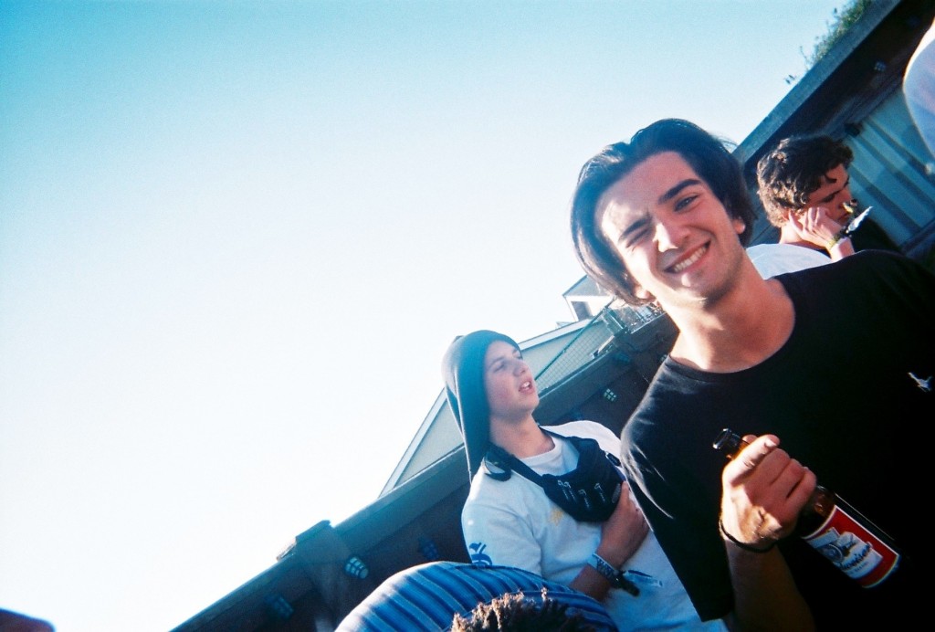
After gathering these images for my community study, I went through all 53 images and selected my favourite ones. Screen_Shot_2015-11-03_at_09.02.44[1] Screen_Shot_2015-11-03_at_09.02.13[1] Screen_Shot_2015-11-03_at_09.02.56[1]

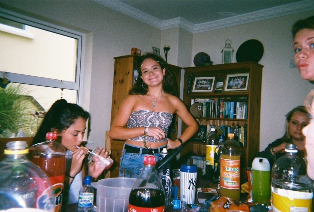
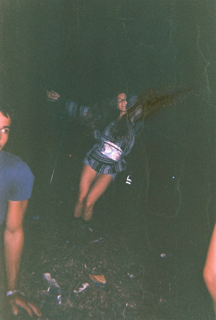
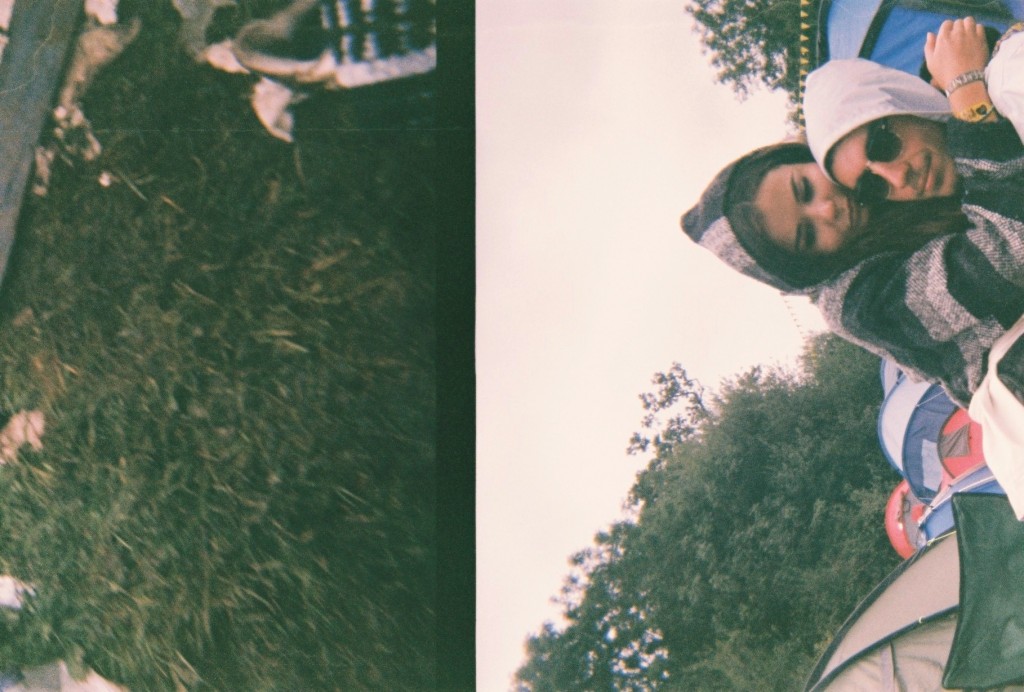
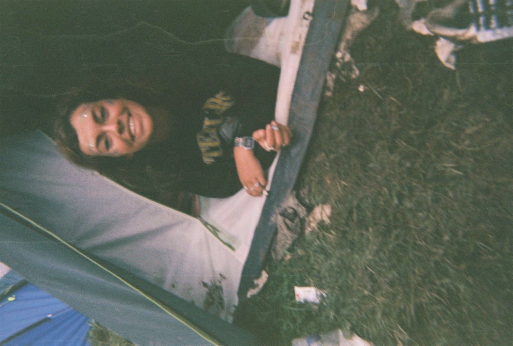
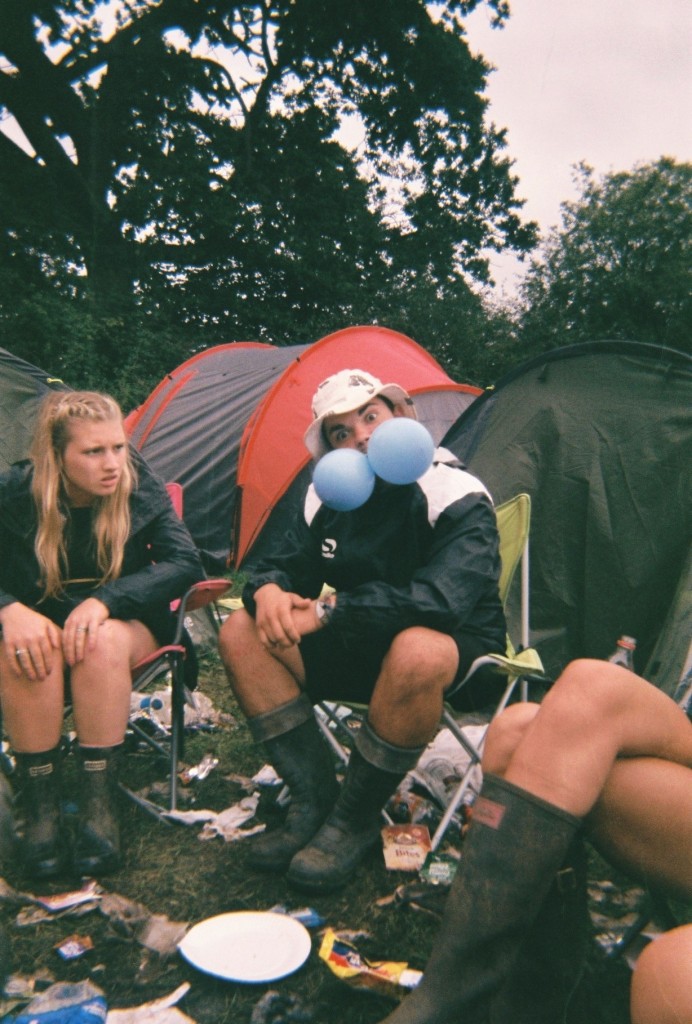
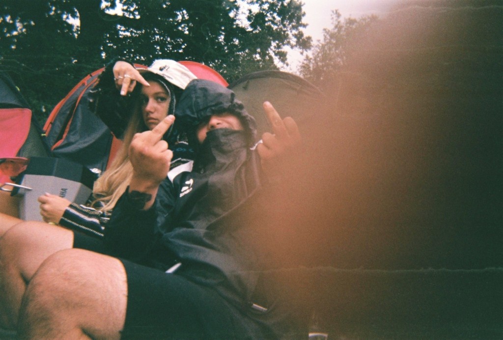
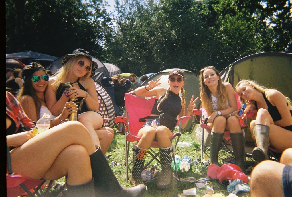
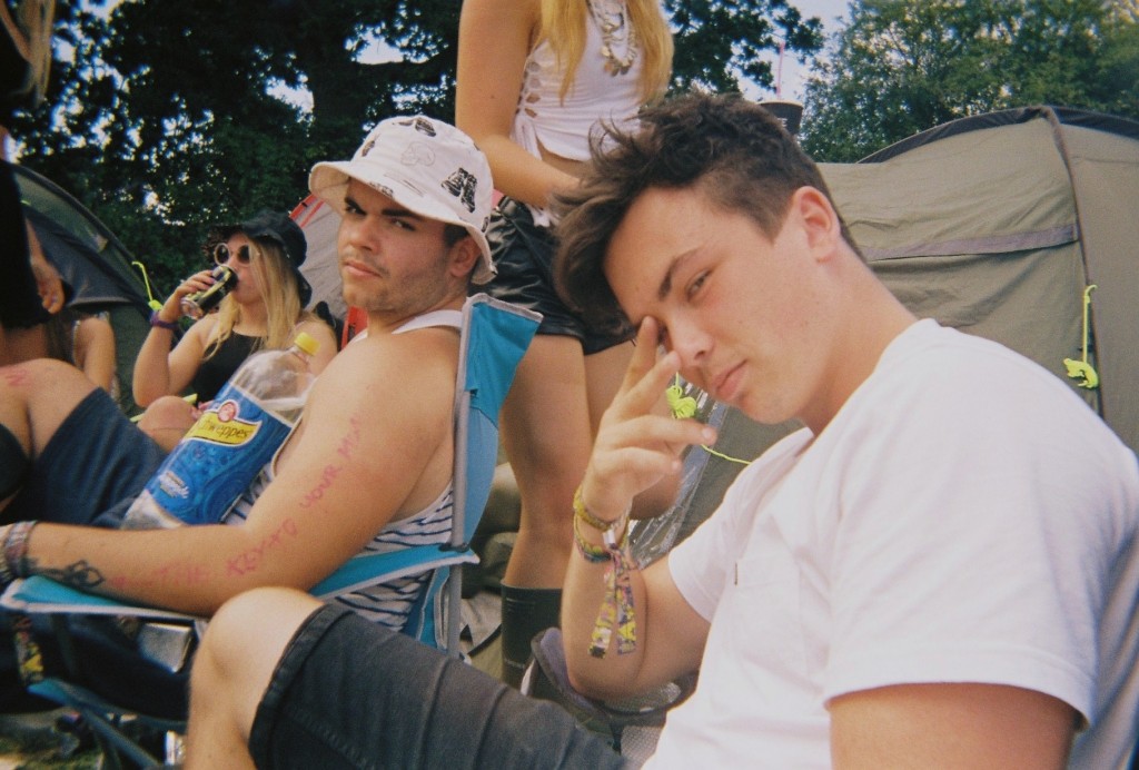
I chose the following images as i felt these were the most interesting and artistic. This is because of the angles, colours, and context of the images. All of the above images were taken on disposables, i took 6 disposable cameras to Reading festival as i love the style the cameras produce. They give a rough old look which i feel matches this topic perfectly. The below images are the images I have chosen as my favourite –

FH000001 FH000005 FH000011 FH000015 FH000025 IMG_9340 IMG_9341 IMG_9342 IMG_9343 IMG_9347 IMG_9352 IMG_9353 IMG_9357

Out of these images there are a select few that I feel are the best – The above and below image I picked as they both were actually intended to be the same image. This did not happen as i dropped and wet the camera multiple times, I believe these mistakes cause the split image and the damage that can be seen in some of the images. The above image uses the rule of thirds as it has something interesting in each section of the photograph, however there is a lot of negative space as the majority of the right side of the image is black, with a few splashes of red, spot lights and some water marks. The right side of the image was taken at the main stage of the festival and the left side in the camp with friends. I think the ‘mistake’ of the damage actually benefitted the image as I feel it made it very arty. The below image is similar as it is split, however i do not know where the left side of the image came from. The right is the other half of the previous image in camp. The below image I like as I feel it looks more laid out, The black block line down the centre of the image splits the two time periods and scenarios in two and joins them together. I also enjoy the image due to the emotional message behind it, the left side shows the mud, litter and dirt that is produced by the festival and the right side show the more intimate and emotional side that is also a big part of festivals. These two messages are on opposite sides of the festival spectrum but due to some freak mistake are shown in the same photograph.

IMG_9341

IMG_9340


The above image was taken in the arena of the festival while waiting for another act to come on a stage. I like the layout of the image as the main subject is in the centre. However surrounding her is a lot of negative space as it is just black. This image also has a lot of water marks which I feel makes it artistic. This image has also been damaged by a sort of split, as the subject is missing her arm. In real life her arms were spread apart like a star fish and in the produced image her arm has been removed and replaced by darkness and moved vertically. This is not very noticeable but I feel adds to the roughness of the image well.

IMG_9342


The above image was taken in camp of a friend who had just woken up after passing out for 8 hours. Water marks again make the image look rough and dirty, and the poor angle and positioning too. However the subject still remains roughly in the centre of the image. This image also looks better on its side or upsidedown. This is because when it is upright and normal, it looks ‘too normal’ and not arty enough.

IMG_9343 IMG_9347

The above two images also have watermarks and were taken in camp aswell. The angling is quite straight on which I feel makes the images quite clear.  The thumb print in the second image is the reason I chose it in a select few. The first image has a range of colours i feel contrast each other well, aswell as the odd act of two gas balloons in ones mouth, the blue contrasts well with the red tent in the background and the rubbish on the floor.