Alain Laboile is a French family photographer born in Bordeaux, France 1968. He is a father of six and uses his family as his subjects when photographing. In 2004 Laboile put together a portfolio of his work as a sculptor, this is where he picked up a camera and developed a taste for photography. A while after this Laboile pointed his camera onto his large family becoming his major subject. This is now what Laboile is known for, creating strong images of his family as well as being able to be at the heart of the family and documenting his children growing up. I like the concept of this because as a father he would be expected to go out and work but instead he is able to make stronger bonds with his children and be there for them whenever they need him as well as Laboile being able to do his photographic work which he is now known for.
“I am totally self-taught. When I began, I had a very limited photographic culture, no technique.” – Alain Laboile
Laboile’s website: http://www.laboile.com/index.html
Lensculture ‘La Famille’ Archive:
https://www.lensculture.com/alain-laboile?modal=true&modal_type=project&modal_project_id=8491
Lensculture Interview: https://www.lensculture.com/articles/alain-laboile-video-interview-alain-laboile
“Through my photographic work I celebrate and document my family life:A life on the edge of the world” – Alain Laboile
Interview with Alain Laboile: http://www.all-about-photo.com/photographer.php?name=alain-laboile&id=528
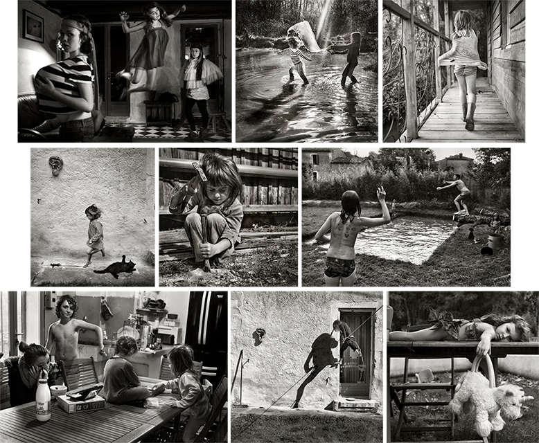
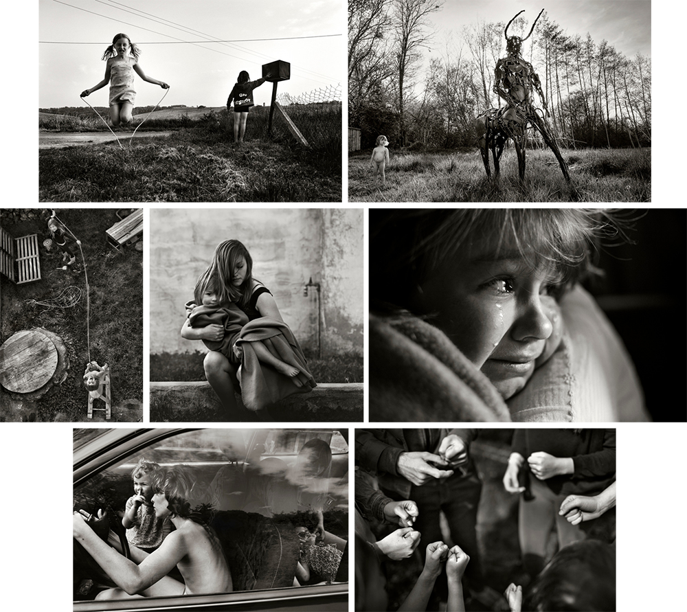
I do like the work of Laboile as he simply makes images of his family when and wherever some good photo opportunities arrive. I think that his images look very professional and really capture some great family moments that can be quite similar to our own experiences and bring a sense of nostalgia to the spectators mind making them think more about the ups and downs of their own childhood as well as looking at Laboile’s photographs. I find these images very visually pleasing as each image is very crisp and clear allowing the spectator to see everything from a professional standard. These photos are really amazing with the composition and the entire mise-en-scene of the images especially from knowing that Laboile is a self-taught photographer and has only been photographing since 2004. He makes very strong and personal images showing not only the good side of being in a large family with lots of children but also the down side of having such a huge family where kids can fight etc. I do really like his work as it is so raw and real and is better than a usual family portrait kind of photo that spectators are used to seeing as he is an insider to the family and is part of the family so is able to use that to his advantage making images at times of the day and places that an outsider photographer wouldn’t be able to make.
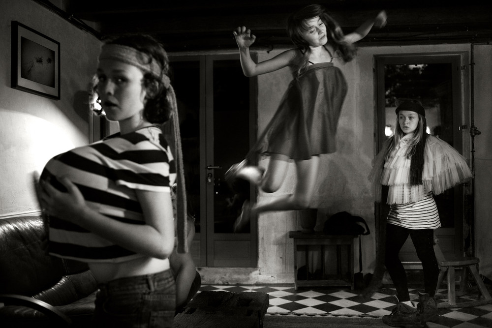 I find this image really funny as the girls are all dressing up and messing around with what could be their mothers clothes. I think that this is a strong portrait as everything from the girl jumping in the air to the others standing and posing is so crisp and clear. I think the entire mise-en-scene of this image is perfect as the spectator is able to see their surrounding area and what kind of house they live in [seems like an old-fashioned house] as well as the facial expressions of the girls being really strong with the girl on the far left looking directly into the camera with a very serious facial expression while the girl in the back far right is posing similarly to her sister and looking off into the distance. I like the way that none of them are actually smiling or laughing as if they are very serious about dressing up in random outfits. It does look as though the girls were having a lot of fun dressing up and running round in their mums clothing. I do think that this image looks great and it being in black and white, for me, makes it a much stronger image as the spectator isn’t distracted by the colours of the light coming through or the colours of the clothes that those girls are wearing. Overall I think that this is a really strong image and is interesting to look at.
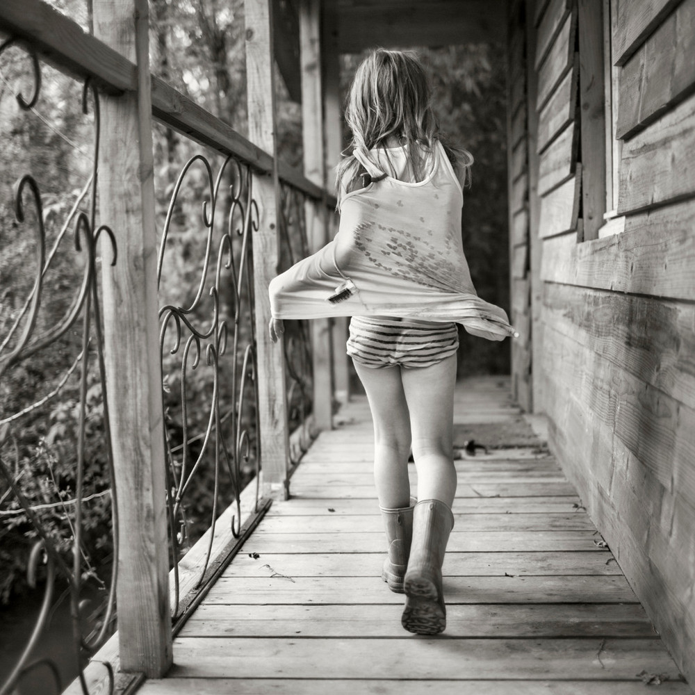 This is one of my favourite images because it is so simple. I like that Laboile caught one of his daughters walking along the patio of their house. I like that this photograph is taken from a more of a low angle as Laboile would most likely have been on his knees or leaning down low to make this image. This makes the patio balcony look a lot larger making the girl look smaller. The composition of this photograph is great as the spectator is directly drawn to the slight right of the image looking at the young girl. I also like what the little girl is wearing as her wellie boots suggest that she has been out in the muddy garden [shown in some of Laboile’s other images] as well as the back of her shirt looking wet as if she had been in a water/mud fight. I like that Laboile makes all of his images in black and white bringing across a theme as well as consistency of editing in the same style. This image is interesting and brings happy memories as it reminds the spectator of their youth and being younger with no cares or worries at all, we never even worried about getting our clothes muddy or dirty.
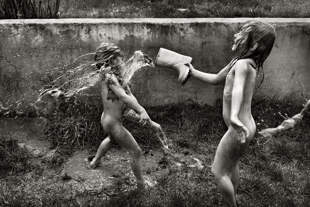 I love that in a lot of Laboile’s images his children look like they are having the time of their lives and seem like such free spirits. I chose this image as I think that it really does show how free and comfortable these children are. It brings some nostalgia to the spectator bringing back memories of when they were younger and never had any cares and would just run around naked. I like the moment that Laboile has captured in this image, he has caught them laughing and having fun while throwing water from their wellies at one another. It seems extremely muddy where they are as the spectator is able to see the bottom left corner where the child’s foot is slipping. I find it hilarious that we only see one of the children laughing and having a good time while the other is too busy trying to defend herself with the water right in her face as he wellie is lowered and the water is just tipping onto the muddy ground. It also looks as though there are more than just two of them having a water fight as in the right hand middle corner there is water about to catch the young girl on the back suggesting that there are more people involved. I think that this is a very strong image as it is very clear and easy to look at. It is more of a fun environmental image showing what ordinary children tend to get up to in their free time.

.jpg)

