My Documentary Spread – Magazine Layout:

The layout of the page is very important when presenting your photography. For our images we can apply them onto an A3 size of paper. Here’s a mood board of a few magazine spreads showcasing photography that i found:

1-Mosaic2mothers_day_photobook_7_webmagazine-layout-tiffany-ann7b-stylish-magazine-design

I have produced a two page spread that includes my favorite documentary outcomes. I’ve placed the pictures in a fairly varied layout. The photograph’s are all different sizes and dimensions. Accordingly, the angles at which I took them vary. I enlarged the image that I wanted as the main focus, because it intertwines the theme of ‘Family, Faith and Community’ in the best way.  All of the photographs are edited in some way or another. I included some very strong contrasts and vibrancy in them.

Here is my main picture:

DSC_0085 edit 2

This particular shot appears to be ‘layered photography’ due to the many subjects in one. In fact, no changes were made to the picture’s composition and nothing was moved.

Me and my family had just strolled to our car, that was parked in the church’s car park. As everyone was getting in the car, I took the opportunity to spontaneously take this.

I find it quite lucky that my friend was holding the booklet that we got given at our ‘Jersey Museum – 125 Hours’ visit:

fdgdh
“Your story, our history” booklet – Guidebook given to us at the Jersey Museum

I like how it shows the task booklet and gives a small detail about the photograph’s meaning. I believe that this manifests the theme of ‘community’, because it shows the assignment that our school was given to complete as a whole. Additionally the church in background adds depth whilst embodying the theme of ‘faith’. The girl in the picture is representative of the subject of ‘family’ in that I consider her to be my family.

I’ve tried out various designs in Photoshop as a form of ‘trial and error’ so that I could find the one design suited to illustrate my story.

Original layout:

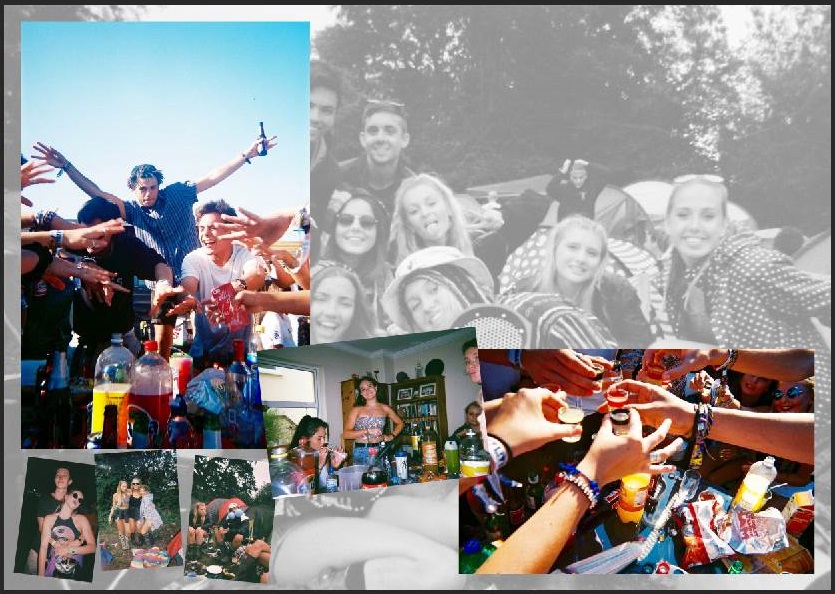
Magazine spread - no text
Magazine spread – Original with no text

This was my initial magazine spread but i decided to alter it. I found that some of the images were out of context and didn’t relate to the overall subject.

Second layout:

magazine spread - 2nd try
Magazine spread – 2nd try with no text

For my second copy, I removed the picture on the bottom right-hand side as it was sort of an anomaly. I then moved some of the picture to create a balance. I aligned the photograph’s so that they would look more proportioned.

Third layout:

Magazine spread - 3rd copy
Magazine spread – 3rd copy

For my third alteration I expanded the titles so that they went across the top border of the A3 page. I wanted the writing to be spread out and aligned with the pictures.

Fourth layout:

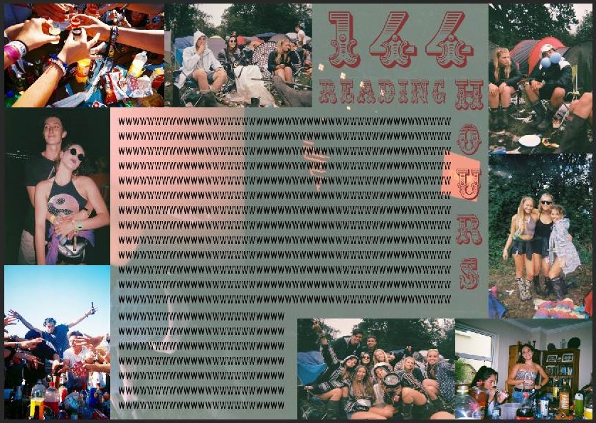
sheet with photos 3rd try for the blog

This is my 4th try at the layout. I have added the text to go along with it and included some inspiring quotes associated with the subject I was doing. I also moved the two detail shots from the middle of the page to the top. This gives the layout more space for the writing and looks more balanced. Additionally, I altered the titles changing the color into purple. Purple is representative of imagination and individuality. ‘Impulsion Du Moment’ means ‘Spur-of-the-moment’ and this explains the whole spread, since I took the picture quite spontaneously as I wasn’t expecting to experience certain scenarios.

Own Archival Research: 1960s

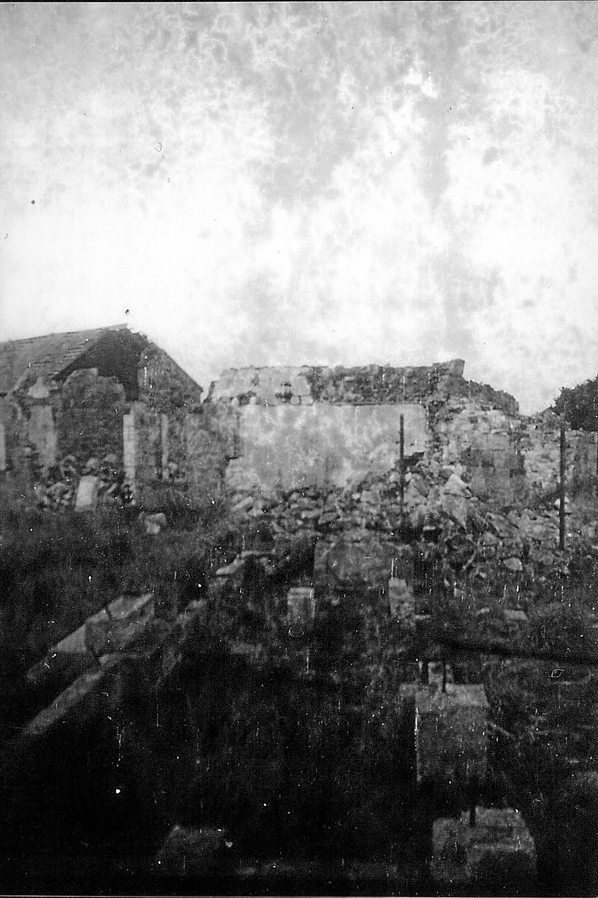
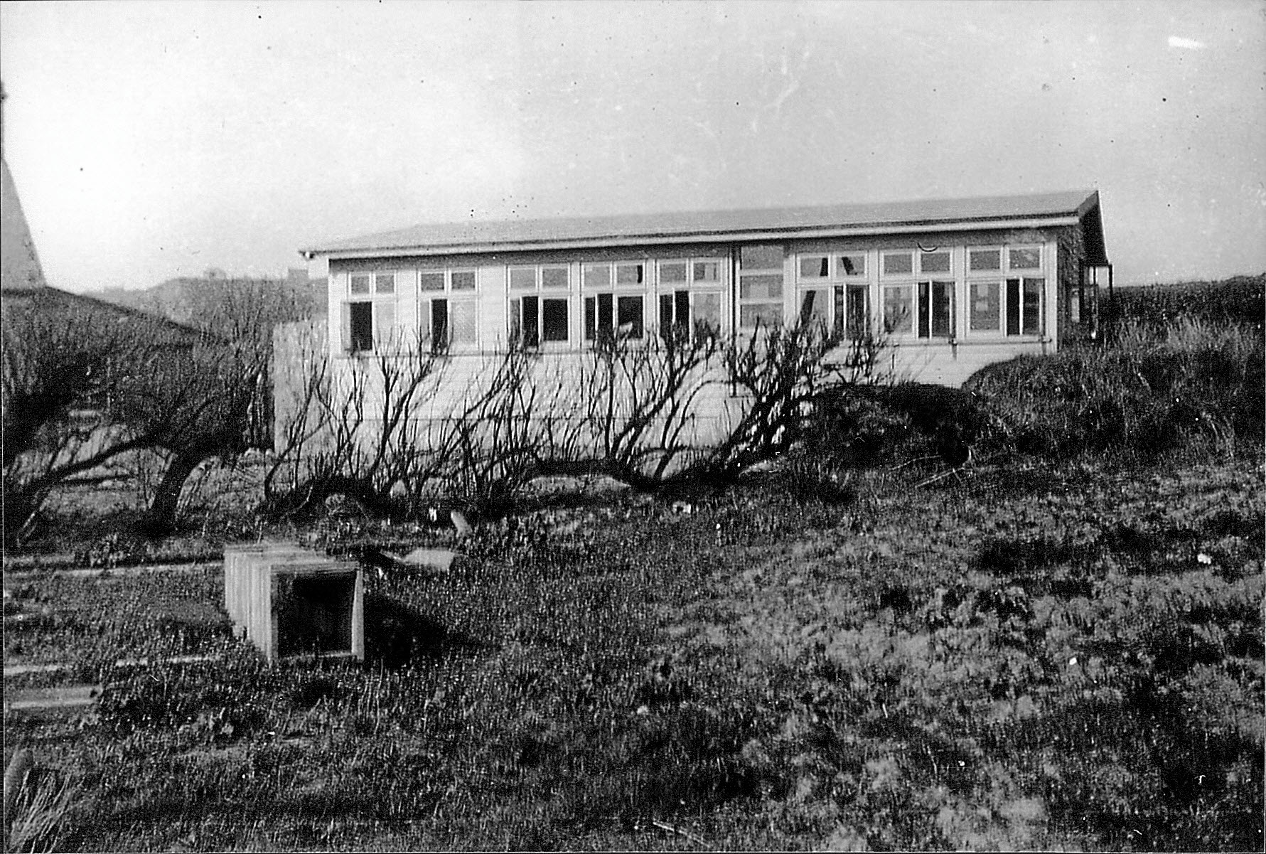
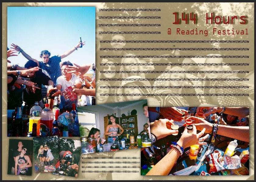
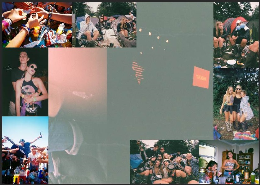
These images which I came across from the previous owner of the house shows clearly the significant and original style of 1960s culture. These images show the counter development after the war, after its re-development in the late 60s and early 70s. As you can see, the development causes various similarities with that of its post-war development in the 1930s and 40s, prolonging its classic characteristics and structure. The images seem as if they’ve been documented using disposable camera’s, this is because, for example, in the image below the raw and vivid colouring is brought out from the decomposing of the walls, the grass, and the sky. This style is notorious, and easily recognisable, which connotes the time period as to when this was documenting, as this constantly relates back to the context and culture of the time this development took place. 2180110901_011_2001
2180110901_012_2001

2180110901_010_2001

2180110901_009


Own Archival Research: Post World War ii Demolition (1930s-40s)

With my new skills of Archive extraction and implementing key skills to recognise the stages in an Archival process, I came across a significant amount of historical images from the early 1900s relating to my project. As a starting point, I have researched past images of the house in order for me to make a comparative link to suggest more relevance within my ideas. This was all done with help from the Societe Jerseiase and Jersey’s Photographic Archive. With help from Gareth Syvret, we researched these past images of the house with the references tagged along with the images. 2180110901_002_2001


20110312152627_00004

2180110901_006_2001
The derelict wall and the posts from the foundations.

This was all stored in a box of photographs given by the Bailiff of Jersey, between the era’s of 1930’s: a post war memorial. I then learnt that my house was an important artifact and gem to the German soldiers which were residence in St Ouen’s Bay during the time of the occupation in World War ll. From this, my ideas then began to develop, I found relevance into my project by being able to contextualize and relate to the history of my new house.

20110312152627_00003
The development of the wall and roof.

2180110901_005_2001

2180110901_001
The house as it was, with little garden space and aesthetic pleasure.


CREATING A STORY BOARD

I have created my own story boards using my own images, similar to typical picture stories this story has the 6 or 7 key image categories – Person at Work, Relationship Shot, Establishing Shot, Detail shot, Environmental Portrait, Formal Portrait, Observed Portrait. Making these story boards proved harder than i thought as you have to make sure everything is aligned properly and sized well.

Here are some of my designs –

ll

Picture1

Picture2

Picture3

JEP Exhibition

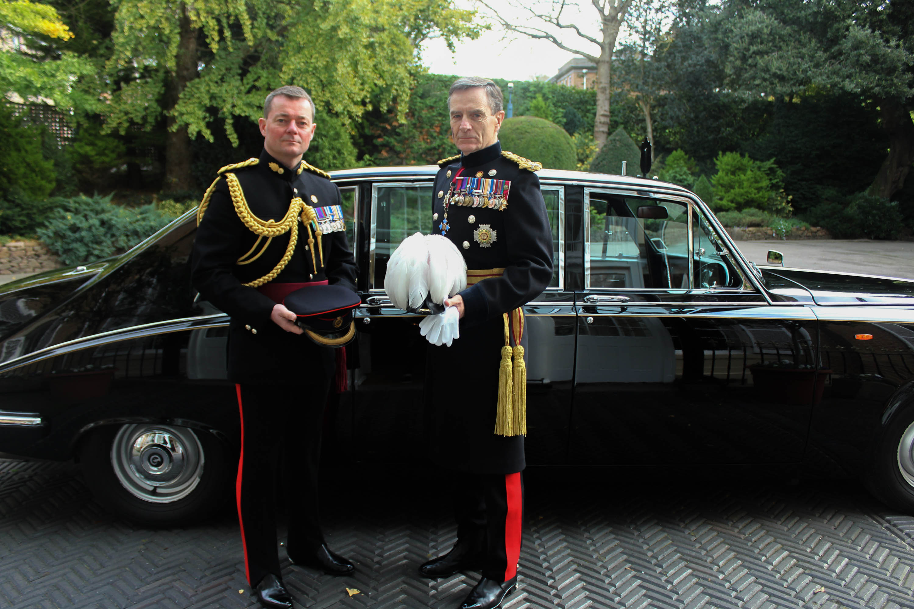
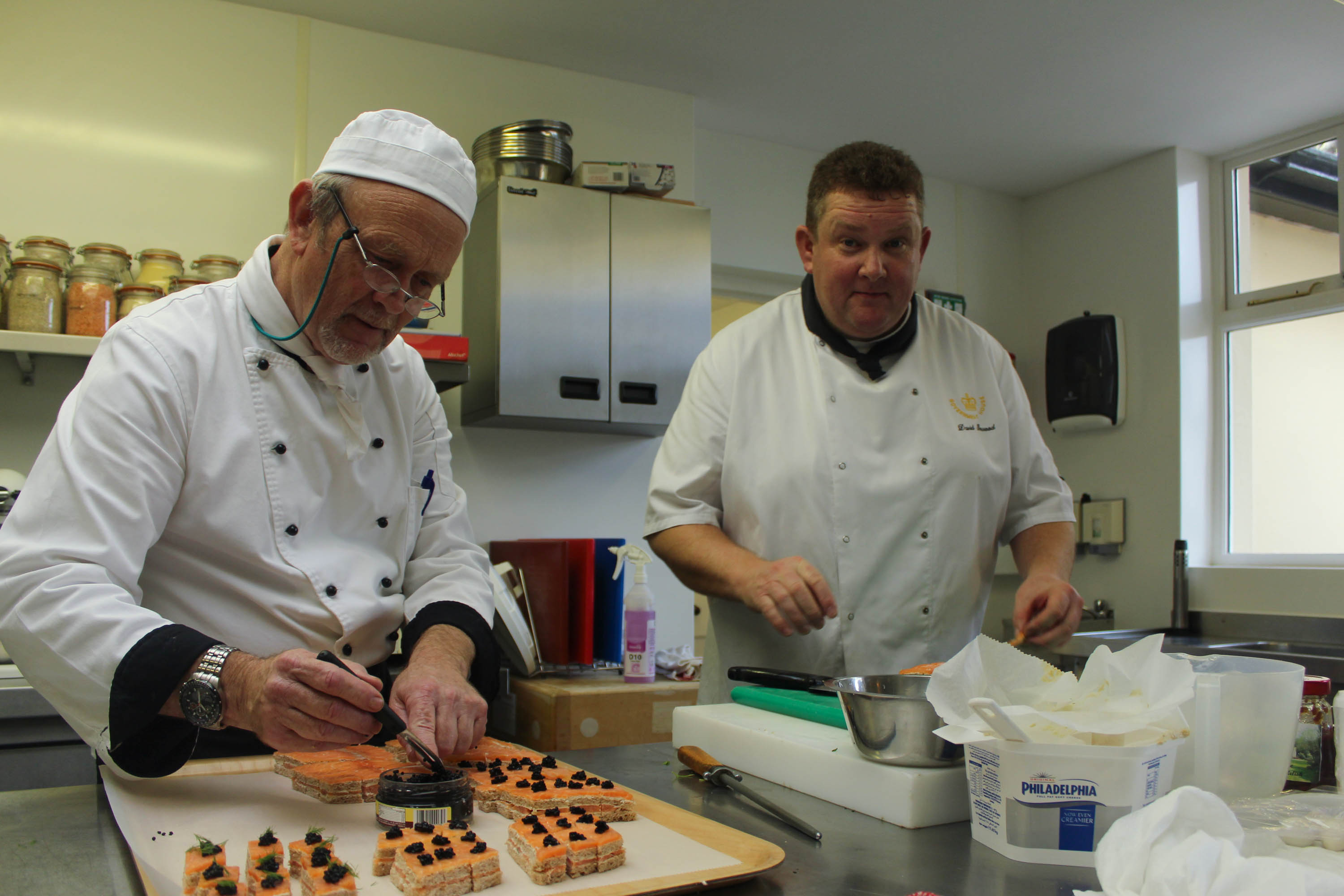
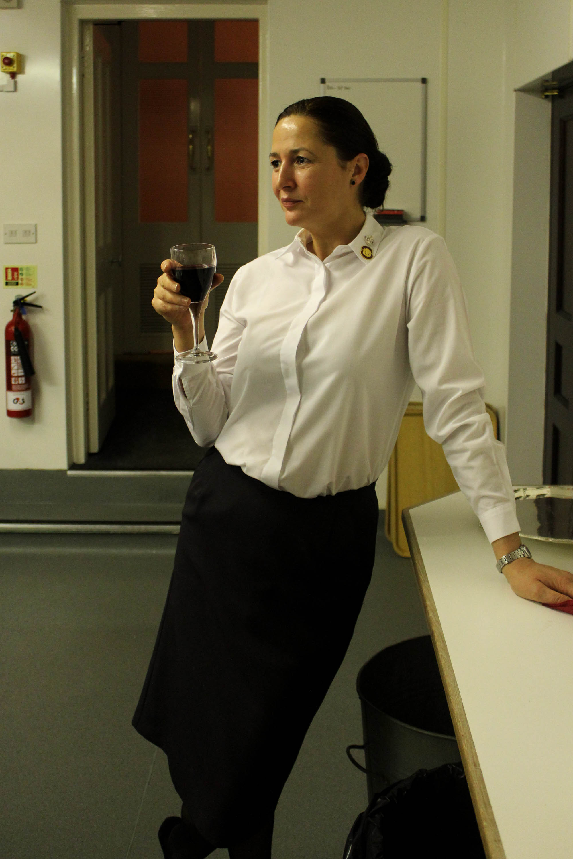
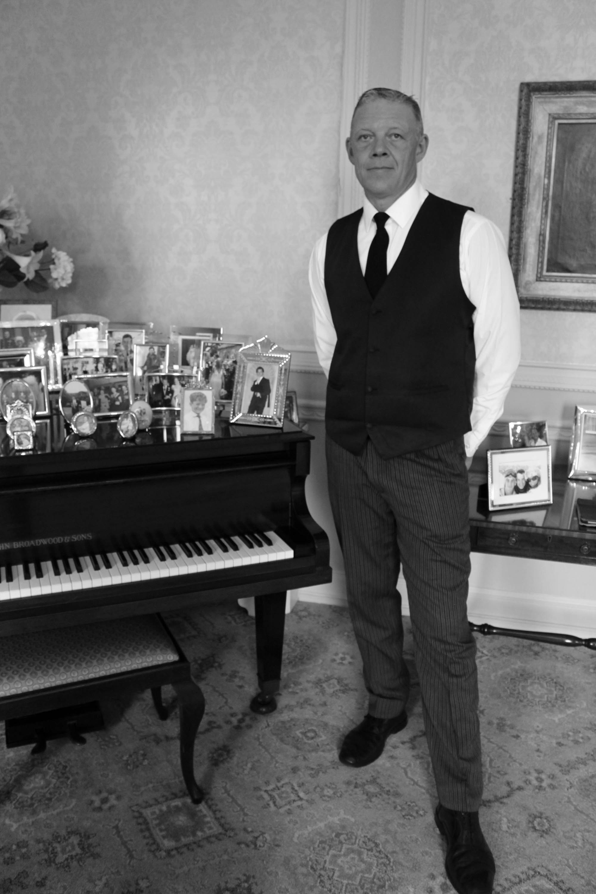
For the JEP Exhibition, I have chosen 5 photographs from my previous photo-shoots that tell the story about Government House. I thought that including a photograph from the archive will help support the story from decades ago about the life at Government House and the importance of the people who work there. I have chosen portraiture shots of the main people in my story, such as my dad and the Governor. I like the image of Monica drinking a glass of wine during work as it shows something that no-one else could capture if they came to government house as it is a a behind the scenes type of picture which shows a story in itself. This has helped me start to think about what my picture story is going to look like. I am going to take more personal pictures of the Governor and then big events like his annual Christmas Party.

JEP

JEP-3  JEP-4

JEP-5

JEP-2

JEP EXHIBITION IMAGES

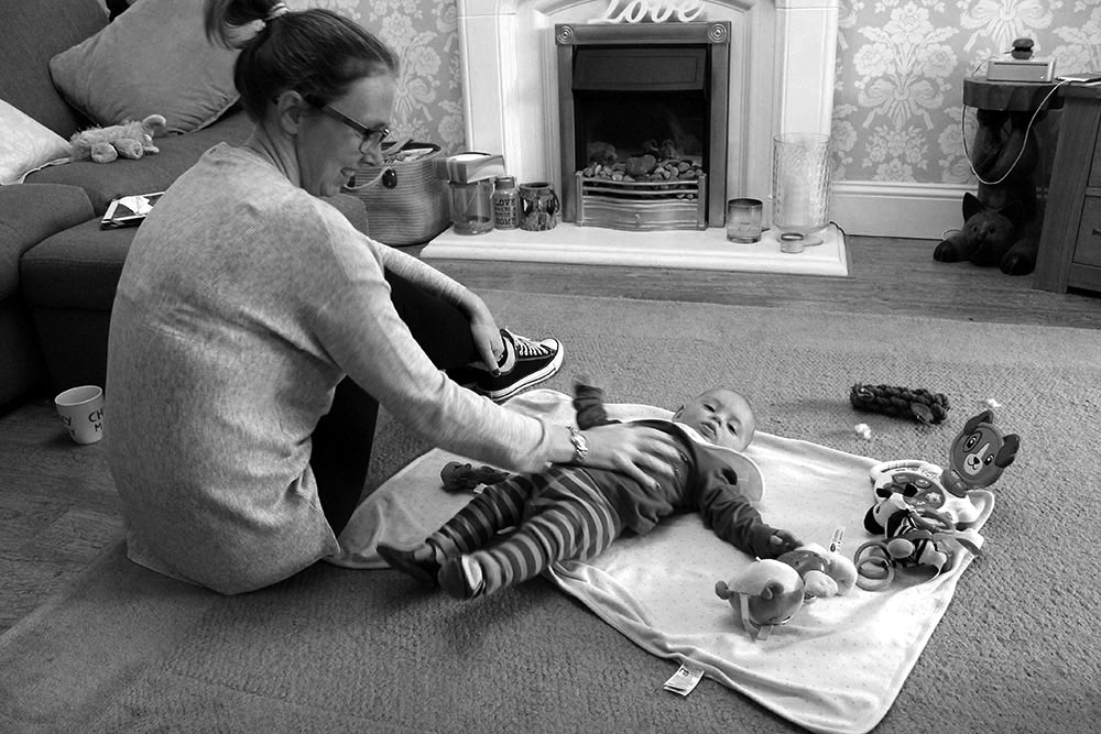
These are the images that i have put forward for the JEP exhibition that will be displayed in the Jersey Museum. At the exhibition Channel 103 and Channel TV will be there viewing these images. As these images are suppose to be of a picture story, everyone had to choose 3-5 images that tell a story. These images tell a story of my mums life and what she does on a weekly basis, some of these images the things get her stressed and others are things that she does and they relax her. 

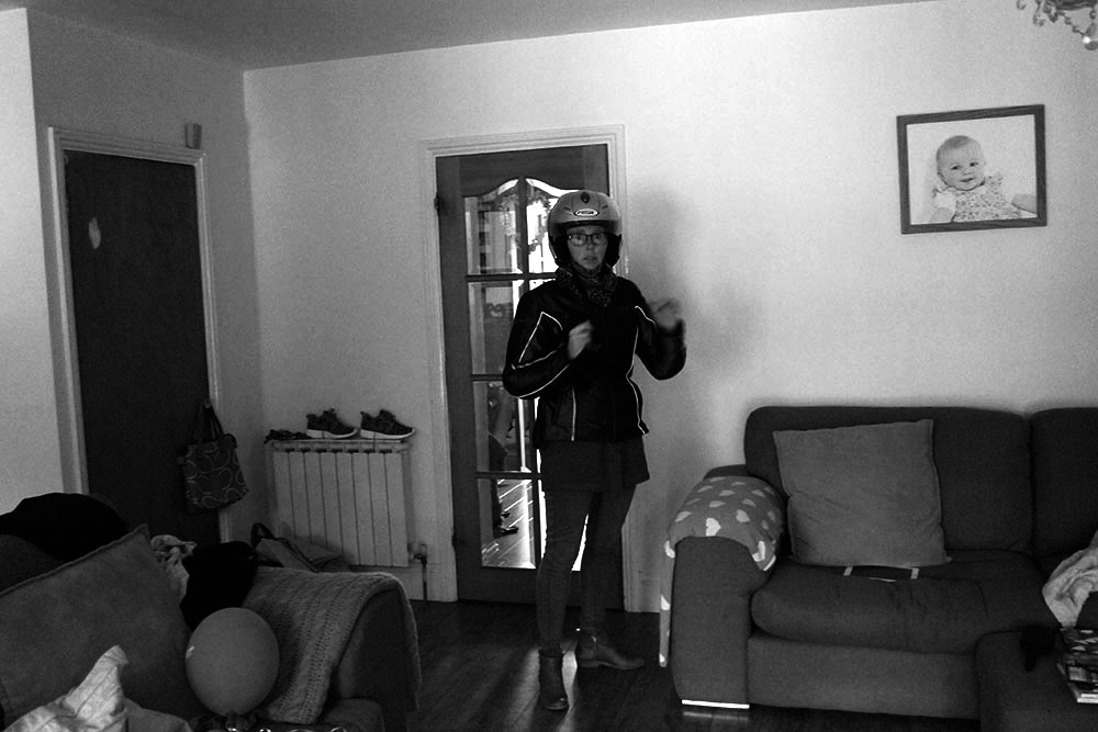
Emily_Vetier_JEP_1This is an image of my mum before she goes to work, in this image she is about to go onto her bike. As my mum has fallen off her bike a couple of times this makes her very anxious. Some days are better than others, but most of the time she gets very stressed about going on her bike. This is why i took this image as my story is about my mums anxiety and this is something that arouses her anxiety. 

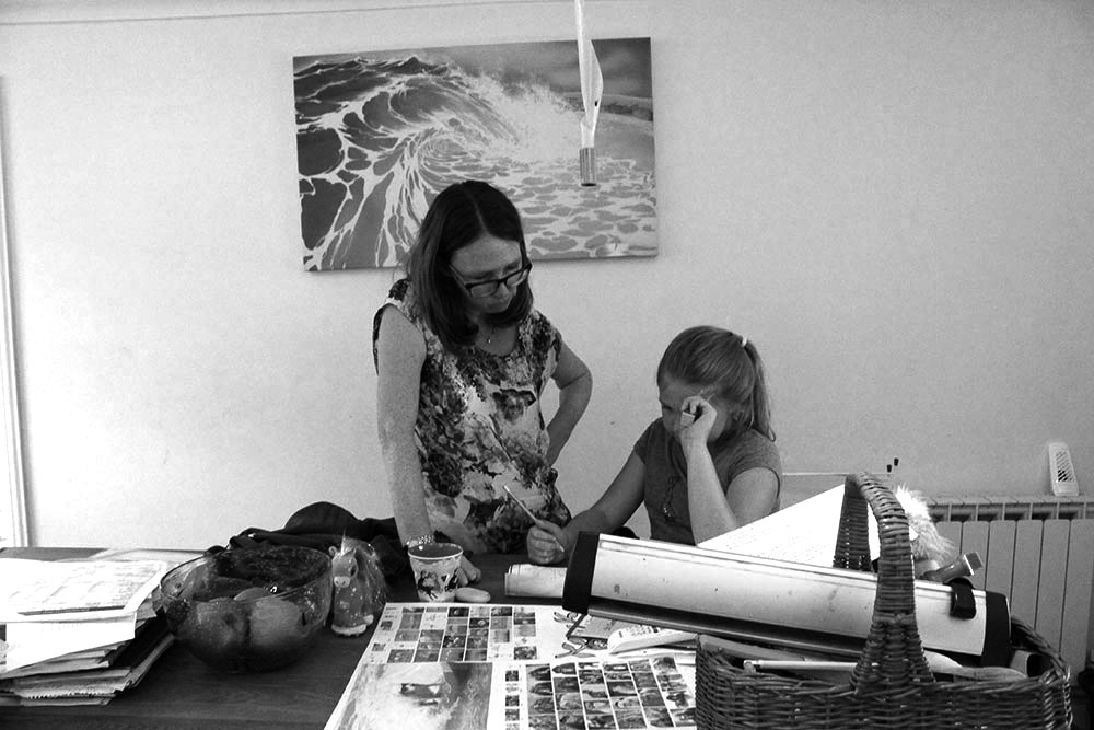
Emily_Vetier_JEP_2This image is of my sister and my mum as my mum is helping her with her homework. I like this image as it shows the relationship between my mum and my sister. This image is a relationship shot and i think that as i have taken this image from far away it shows the environment in which they are working together. There is a lot of junk in this image which i think arguably distracts from the actual thing happening in this image. Emily_Vetier_JEP_3This image is of my mum and my little cousin, twice a week my mum looks after him. I think that this time with my little cousin relaxes her as she is not thinking about herself, but she is looking after him. I think that this is good for my mum as she thinks too much about how she is feeling. I think that it is important that in this image my mum is smiling, as this image shows that she is happy and enjoying time with her nephew. 
Community

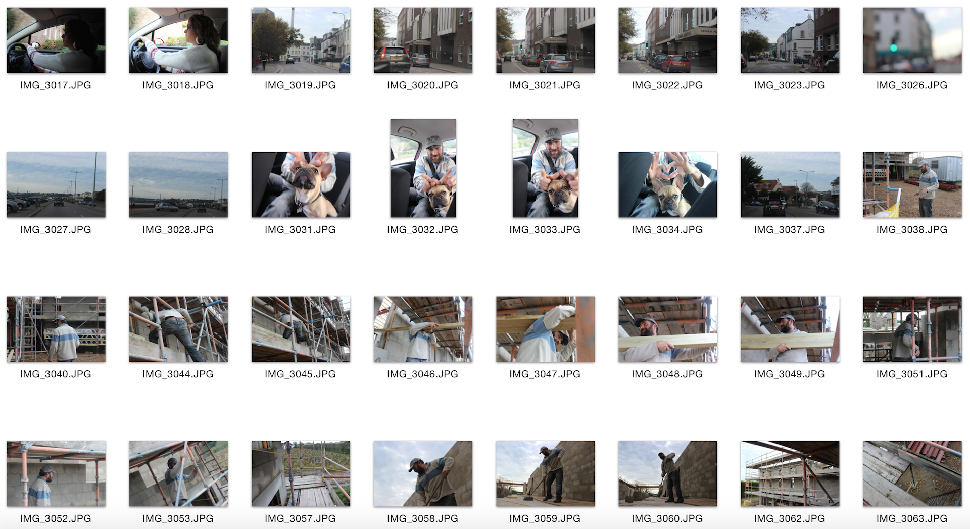
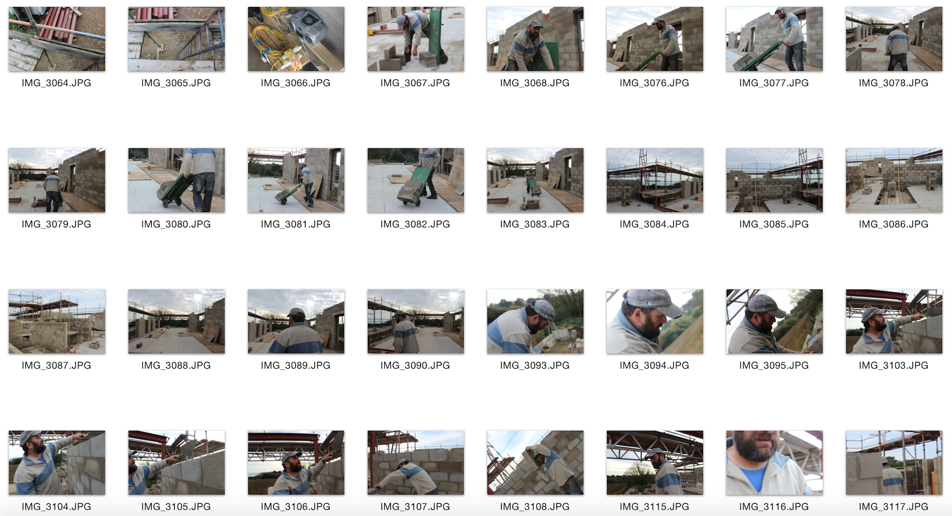
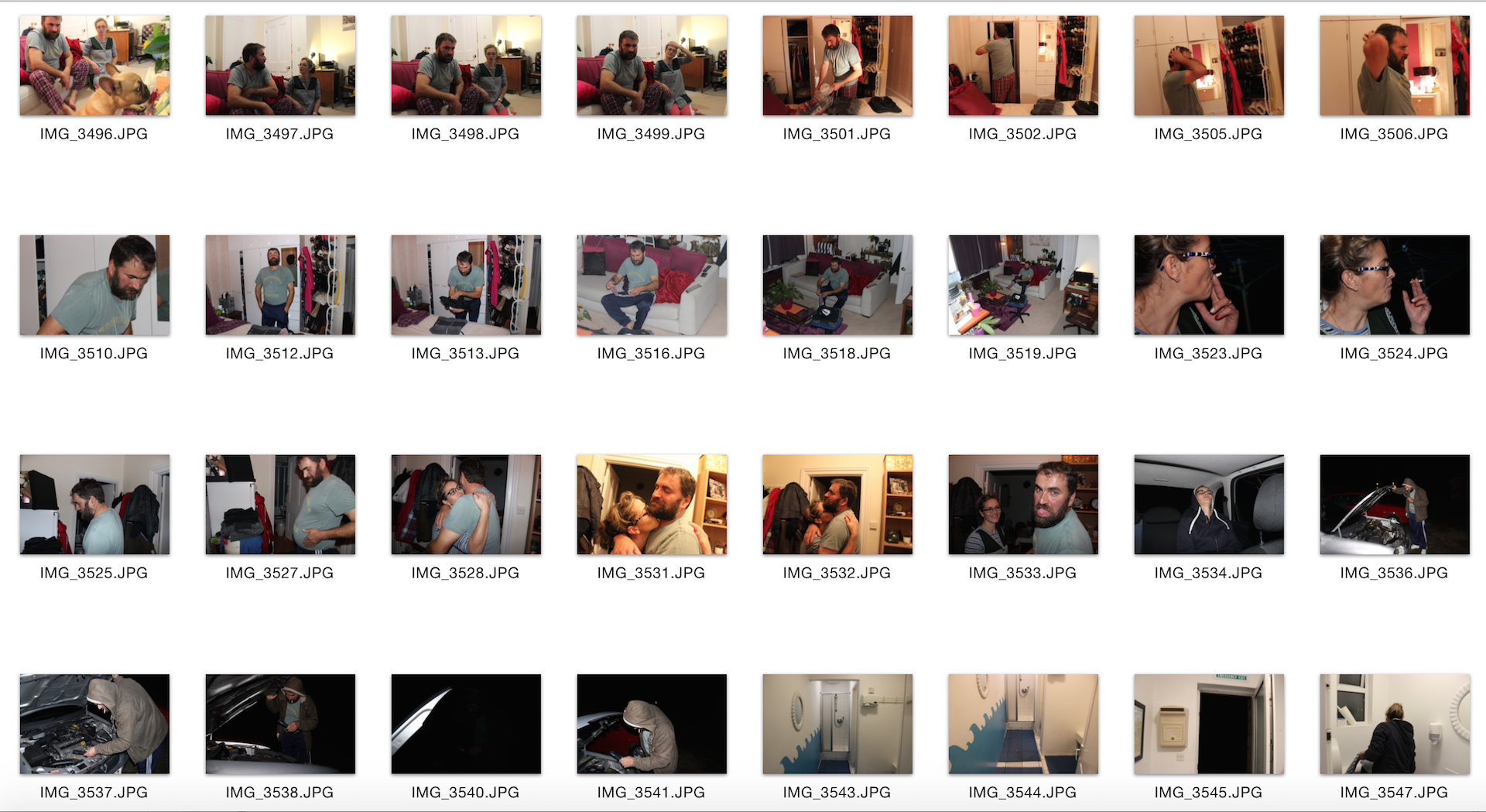
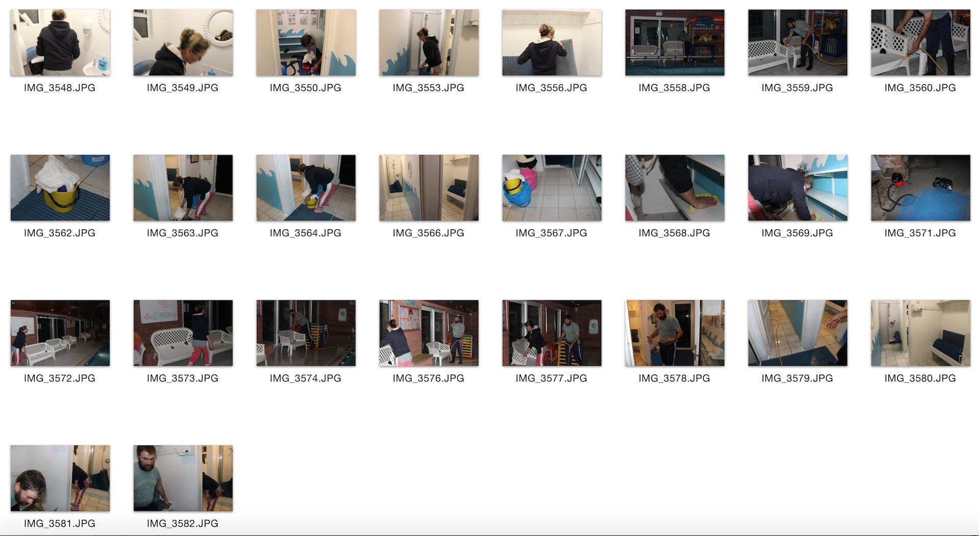
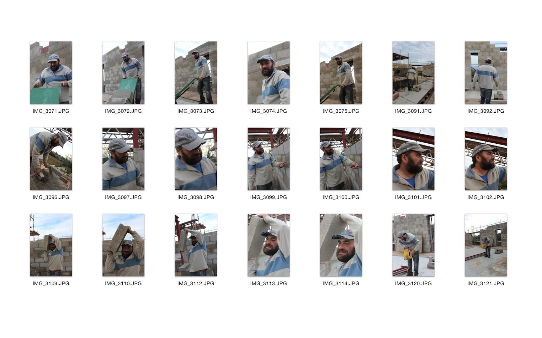
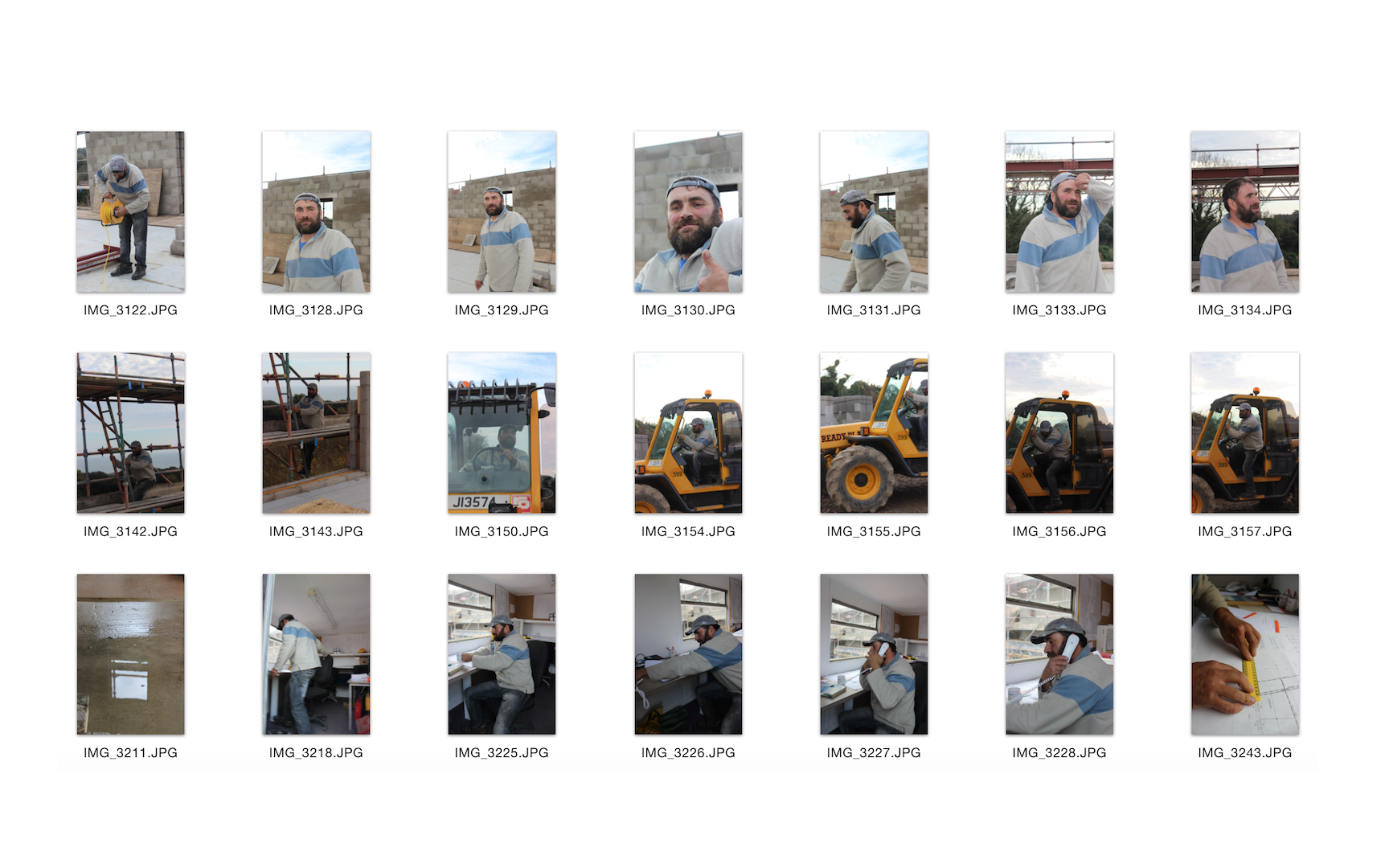
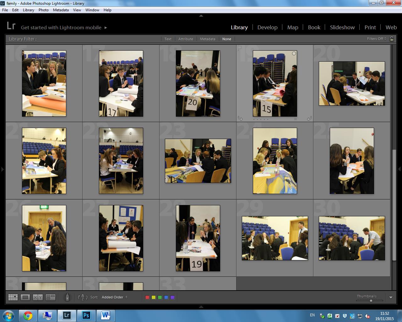
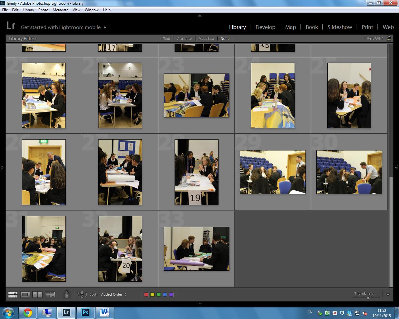
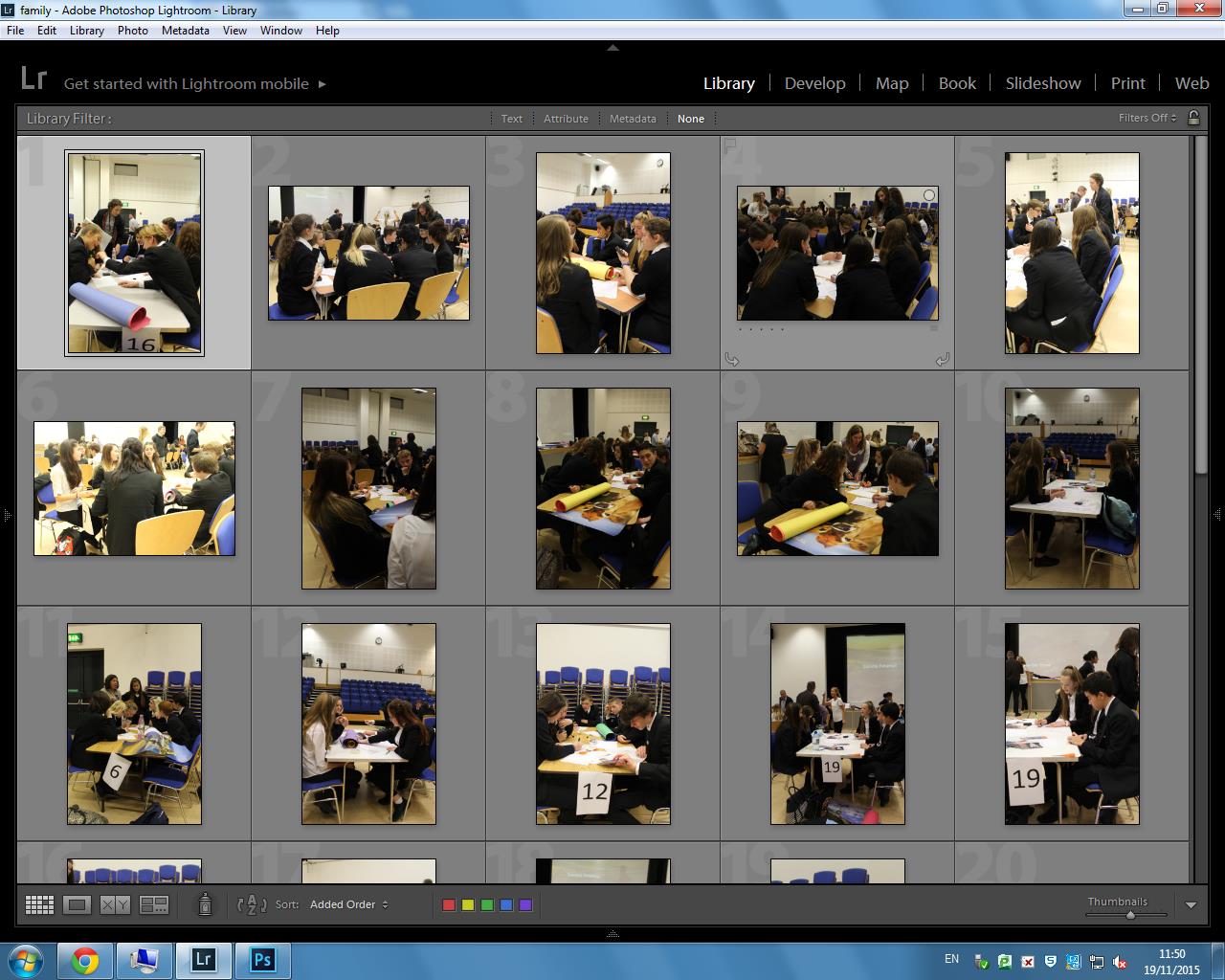
I was asked to take photographs of the year 10 Enterprise day, which I think fits in well with the community theme for this project, because the photographs show not only the school community but the ‘business’ community within school. Most of the photographs I took were environmental and observed portraits. I’ve made a contact sheet with the photographs I took.

Enterprise 1

Enterprise 2

Enterprise 3

Photographs for the JEP Exhibtion

Photographs for the JEP Exhibition

These are the photographs I am entering into the JEP exhibition at the Jersey Museum. There will be Channel 103, Channel T.V and lots of members of the school at the event.

IMG_5961

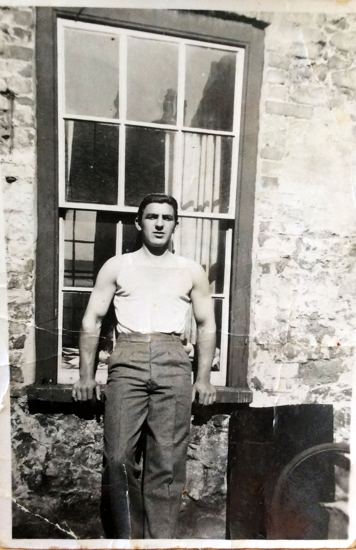
This is one of the main photographs in my picture-story because it is a portraiture shot of my grandfather, there are not many images of him on his own. I think it shows off his personality massively, he was a very strong and brave individual who fought in the war and raised eight children. I like the texture of the image and how it looks old and vintage. There are creases through the middle of the photograph and it is slightly discoloured around the edges but I think this adds to its style. 

IMG_5962

This is one of my favourite images from all the photographs from the albums, I think the the way the man is just sitting reading his paper makes everything look very casual and everyday. The black and white style is also representing the time period the photograph was taken in, as my grandfather did not have the money to afford photographs in colour. 

IMG_5959

Picture Story Plan: Double Page Spread

Here are a few example of double-page-spread picture stories which I would like to base my picture stories on. I feel like using a double-page-spread would be a good technique to use in order to convey a story, and passages of time. This is because, as you can see, the images are complimented by text and subtitles. This allows the story to flow as the major images are places usually on the right side of the page, due to the right side being the first page you seen in a newspaper, magazine or any literary text presented in a book form. This major image, as you can see, in accompanied by various minor images. This allows for stories to flow, for the major images to be understood more clearly by the minor, in awe that they help translate and narrate stories without the affect of reading any text.