Nick Waplington is an artists and family photographer based in New York City and was born in 1965 in Sussex, United Kingdom. He went to study art at the West Sussex College of Art and Design in Worthing as well as studying at the Royal Acadamy of Art in London. His photographic work is usually amateur looking images of family, this interests me and I think that I can learn a lot from his work and the way that he photographs people.
About Waplington: http://www.claxtonprojects.com/books/nick-waplington/
Waplington’s website: http://nickwaplington.co.uk
Waplington’s Diary: http://nickwaplington.co.uk/diary
“I’ve never defined myself as a photographer. I make art” – Nick Waplington
“Photogragher Nick Waplington hit a creative high when he realised drugs were a waste of time” – Michael Fordham
Waplington mainly makes amateur style images to help portray his stories. His documentary style is almost like using a Polaroid camera or a disposable camera which is really interesting to me as they are quite artsy yet still seem to be of good quality. I like this style as it is different and stands out. Although I find his style interesting and unique for the images that I make I think that I want to keep to a higher quality style of images telling my story in a different way and relating more to Alain Laboile. I find that Waplington has a very unique and artsy style with weird unusual angles and amateur looking images. I find his work very interesting to look at as it is so different.
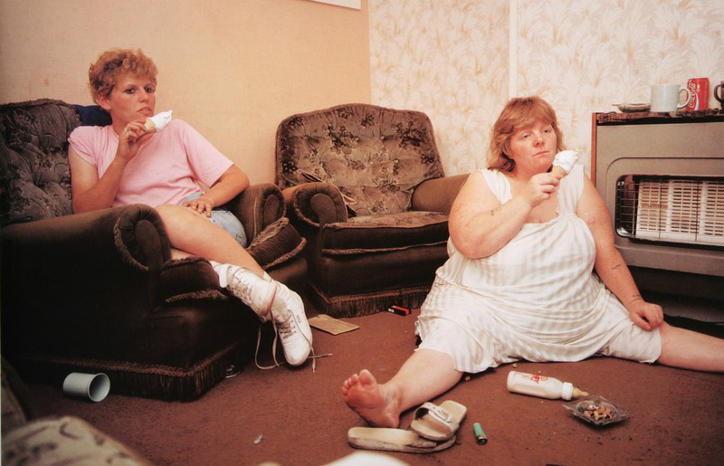 This is my favourite image of Waplinton’s as it is quite comical to look at. I find it really interesting to see the way the woman on the right side of the image is sat with her legs spread out as she slumps on the floor of the living room eating an ice cream with a blank facial expression on her face. I also like the way the woman on the left is sat as she looks very comfortable and they both look as though they are watching the television. This image doesn’t look staged at all to me and looks like a proper documentary image. I really like the entire composition of the image with the women not being totally in centre of the image and both being on either side of the image which allows the spectator to have a look at the whole of their surroundings. I like that this image is in colour as the spectator is able to see where the two women are and what kind of colours surround them. The colours are very yellow in this image which often connotes poverty or dirt as if they don’t have much money which is kind of evident with the entirety of the image showing how dirty the floor is and that one of the women is sat on the floor. Something that I really like about this image is the clothing that the women are wearing as it really interests me to see what fashion was like in the 80s and 90s. I like the colour of pink that the woman on the left is wearing as well as the, what looks like, undergarments or pyjamas that the woman on the right is wearing. I find that this image is very personal and was taken by Waplington as an insider to the family showing more of what an outsider photographer wouldn’t be able to do. This image really shows the behind the scenes of a working class family life and how they relax. I do however think that this family isn’t very clean and the house looks really dirty and as if they are less than working class and possibly living off of benefits or they are just jobless.
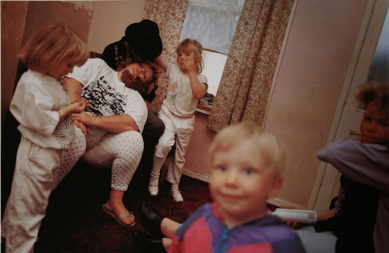 I find this image hilarious as the little boy reminds me of the images that I have made of my niece smiling into the camera and interacting with the person behind the camera. I like that the children are all just stood around waiting for their mum to wake up. I find it hilarious how the woman is sat asleep really showing the struggles of parenthood and constantly being on the move to keep up with the children. Something that took me a bit longer to notice was that what I thought was a male with a beard was actually a female being held up by a man wearing a black hat sat on the arm of the chair. I think that this is down to the exposure of this image which just adds to the amateur of the entire shoot. I do think that the composition of this image is interesting as Waplington was able to capture everyone at a really great angle, with one of the young girls looking at her hands very bored while the girl right in the background of this image looks as if she is trying to capture the attention of the person holding up the woman. I just love the cute little smile on the boys face as he looks happy and as if he is looking off the camera and at Waplington himself.
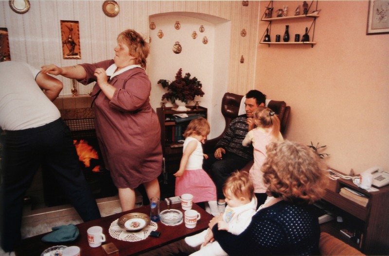 I find this image very interesting to look at. It just looks like a typical family photograph of a regular family dealing with everyday quarrels and laughs. I don’t actually like this image that much as it doesn’t really do much for me as everyone is kind of everywhere and the composition doesn’t particularly appeal to me, I don’t find it very visually pleasing. I do however like the left part of the image where the woman is mid punch/push to the man that is half out of the frame. I find this the most interesting part of the image as it has a story to it but the rest of it is just random to me. I think that this image is definitely capturing a more amateur style photograph as it does just look like an image that a family member made at random on their disposable camera. I do think that Waplington has much better work that this particular image. I think that this image would have looked a lot better in Waplinton was looking up at the family from a low angle as it would have made everyone look a lot bigger and made for a much more interesting photograph.
How to: Design a picture story using PhotoShop –
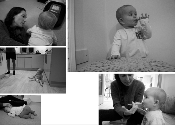
Experimentation with different designs
I have started to collect a few of my images together to create different picture stories, I haven’t found my favourite images yet that really work well and portray the story well but I am experimenting with the different shoots that I have done to make the best format and layout for my final chosen picture stories.
Here are just two different experiments with the some of the images that I have produced. I am still working around with the different images and positions of the images to find my favourite ones. So far I have only experimented with two shoots and I am unsure which images look best and if they actually stand out or whether or not they contrast each other too much and are overpowering one another. I think that I will have a look at all of my shoots again and try to make a design where I have a portrait, establishing and possibly a person at work shot just so it is more spread out and it isn’t just the same type of images being created each time.
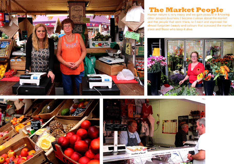
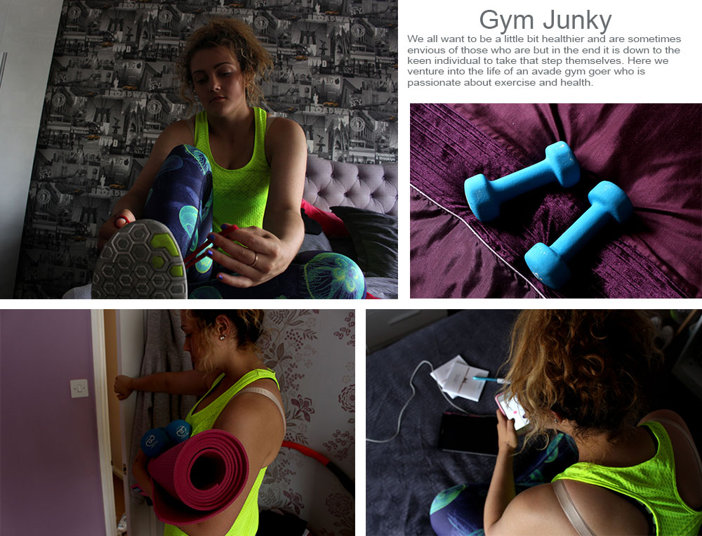
I don’t really like any of the experiments that I have produced as they aren’t complete and quite boring. I want to create a proper picture story that is interesting. I have gained inspiration from all of the newspaper articles that I’ve looked at and think that I want to create something similar to this as it is more interesting and I am able to get more images into the project rather than trying to squeeze in a load of images that don’t look right or are out of place.
For this little article I took inspiration from newspaper articles as I find them a lot more visually pleasing and exciting compared to the picture stories that I have created above. I think that this is a lot more interesting as well as the information giving the reader/spectator more of an insight of what life is like being a new mother with an active baby. I do love these images and think they are interesting to look at with all of the bright colours surrounding the environment. I like the sharpness of these images as it makes them a whole lot more interesting to look at and will make the spectator want to read on as they will be drawn to the bright colours in the front cover image.
When making a picture story the first thing to do is chooose 3-5 strong images that show the different types of traditional picture story images, such as the establishing shot along with a detailed shot and an enviornmental portrait for example. To make the picture story you need to open up photoshop and open up a white A3 document (New, international paper, A3) and then rotate the image so it is sideways (image, image rotation) and then place the images that you want onto the page. Once you have placed the images onto the page then you can choose how much spacing you would like between the images, and how to place them on the A3 spread. It is made into an A3 spread as this is how it would be presented in a newspaper. When placing these images the establishing shot should usually be the biggest image, and then the other images should be placed smaller around them, also leaving space for a title and text which we will need to leave to leave space for our text that explains about our picture story. When making the title you can use different fonts and layer styles to make the title stand out and make it original. For the picture story i will need to choose a title which explains my picture story. Using rulers when making a picture story will ensure that the spacing inbetween the images will be the same and this will make the picture story more neat. When placing the title it can also be placed over the image however you will need to ensure that if the image is a dark image then the title is lighter so then it stands out. In addition when making a picture story you need to think about how people view and read them, for example when reading in a magazine or in a newspaper people read from left to right, so by usually placing the establishing shot in the left top hand corner it makes it the main focal point of the page, even though it should be because esentially it will be the largest image on the page.
Brainstorm on titles
As my story will be on my mum my title needs to be something that explains our family life at home, or something to do with her anxiety.
Living with anxiety
Anxiety
When analyzing picture stories you need to look at the different aspects that are in the images, for example if there is the setting in the image or whether the image is close-up or not. The different aspects that are in a picture build up a story-board and make it tell a story about something which has interest to someone reading it. The text that is in the picture story should explain what the images do not, if the images are ambiguous then the text will explain what the images do not, unless the photographer is leaving the images up to interpretation.
These are the selection of photographs that I think could be used and that I personally like, however feel like I may have better photographs that I feel could portray the story that I am trying to tell with my photographic essay. However I have made this selection as there may be some photographs or perspectives that I may want to include however didn’t make the cut for the photographs I am definitely wanting to use.
These are the selection of photographs that I wasn’t too sure whether I want to get rid of them completely or maybe use them. However most of the photographs in this selection have the potential to possibly be used in the case that I made the wrong decision on one of the other photographs that I choose to keep. 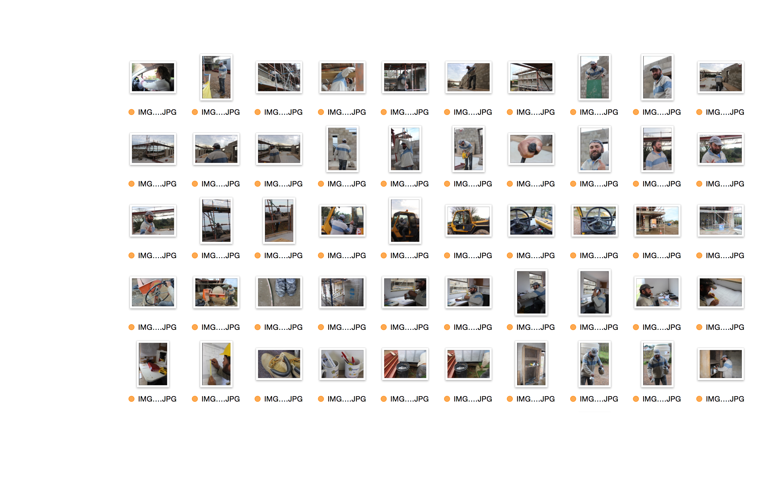
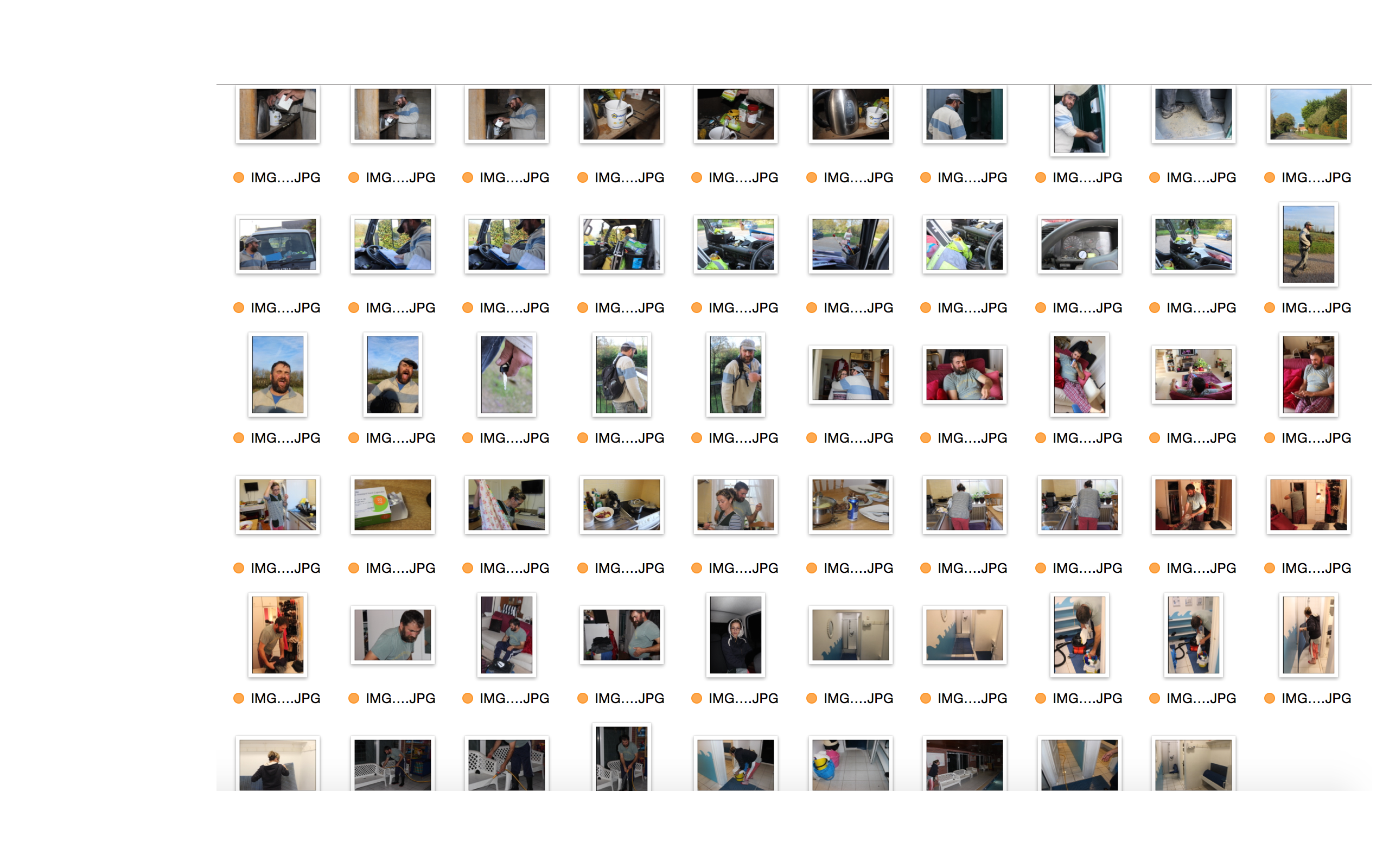
These are the selection of photographs that I do not wish to use in any way for my project. The reason as to why I did not want to use them at all in my project was because they were either poorly composed, or were distracting from the main idea that I have for my picture story, therefore having a poor or no link to my idea, or simply because I took too many photographs and had many that were very similar in composition. 