Evaluation

Evaluation:

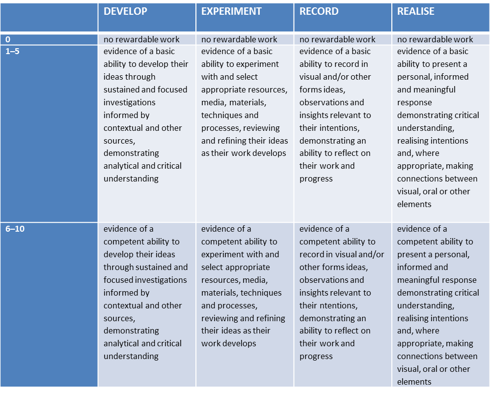
After completing my family, community and faith project, I looked at the assessment criteria and highlighted key areas I can improve on in my next project as well as adding to this project through the year. I defiantly think there is much needed improvement in experimentation and record. I will aspire to be in the 16-20 section for my next project for each aspect of the marking. For my project to be a higher grade and more successful I think it needed photographs I had taken so that I could be more creative. I also think I needed to focus on my picture-story earlier on, so that I could experiment with different designs. Furthermore, I also need to create a newspaper design so that I have another final.

For my personal study I am going to carry on with the project I have done for my picture-story. I think I have only really explored a little of what memories are and how I can photograph them.

asss2

asss

To be awarded a grade A* at GCE A level, a candidate must:

  1. Achieve a grade A overall for the A level. This can also be described as achieving 80% of the total

uniform marks.

AND

  1. Achieve 90% of the combined uniform mark total for the A2 units.

For example:

  • For a four-unit A level, a candidate must achieve at least 320 of the 400 total uniform marks

and 180 of the 200 combined uniform mark total for the A2 units.

  • For a six-unit A level, a candidate must achieve at least 480 of the 600 total uniform marks

and 270 of the 300 combined uniform mark total for the A2 units.

Photographing at Victoria College

For my next shoot I want to photograph areas of Victoria College, the secondary school my Granddad attended from 1932-38. My Granddad was a proud ‘Old Victorian’, and was a member of Dunlop House. During his time at Victoria College he was a member of the XI Football Team, and in the teams for Athletics, Cross Country, Cricket and Hockey. I attended Victoria College myself so this is a significant connection I share with my Grandfather. I hope to go to the college and photograph areas  which are significant to my Granddad, such as; the sports pavilion and football pitch, the great hall, the opening of the building, and the commemorative plaque of his name on the First XI Football Honours Board.

This will be a very good part of my project if it is possible. First of all I need permission from the headmaster, Mr. A. Watkins. I have emailed him to ask for permission.

This is the email I sent Mr. Watkins,

Dear Mr Watkins,
I am emailing you today to ask whether it would be possible to photograph some areas of Victoria College at some point at the end of this term or the beginning of the next.
I am currently doing an A-Level Photography project about my Grandfather, Arthur Maitland Le Feuvre (1921-84) (O.V. 1932-38). With your permission, I was hoping to  photograph some areas of the school with relevance to him which would help me with this project, for example; the sports pavilion and football pitch, the great hall, the opening of the building, and the commemorative plaque of his name on the First XI Football Honours Board.
I do not know if this is legally possible but thought I would check with you, and if it is to ask whether it is okay to do so.
I would be very grateful if you would be able to assist me with this. If you have any questions or require any extra information as to what the project is about, please feel free to email me back.   
Thank you,
Kind Regards, Max Le Feuvre (O.V.).


Final Picture-story

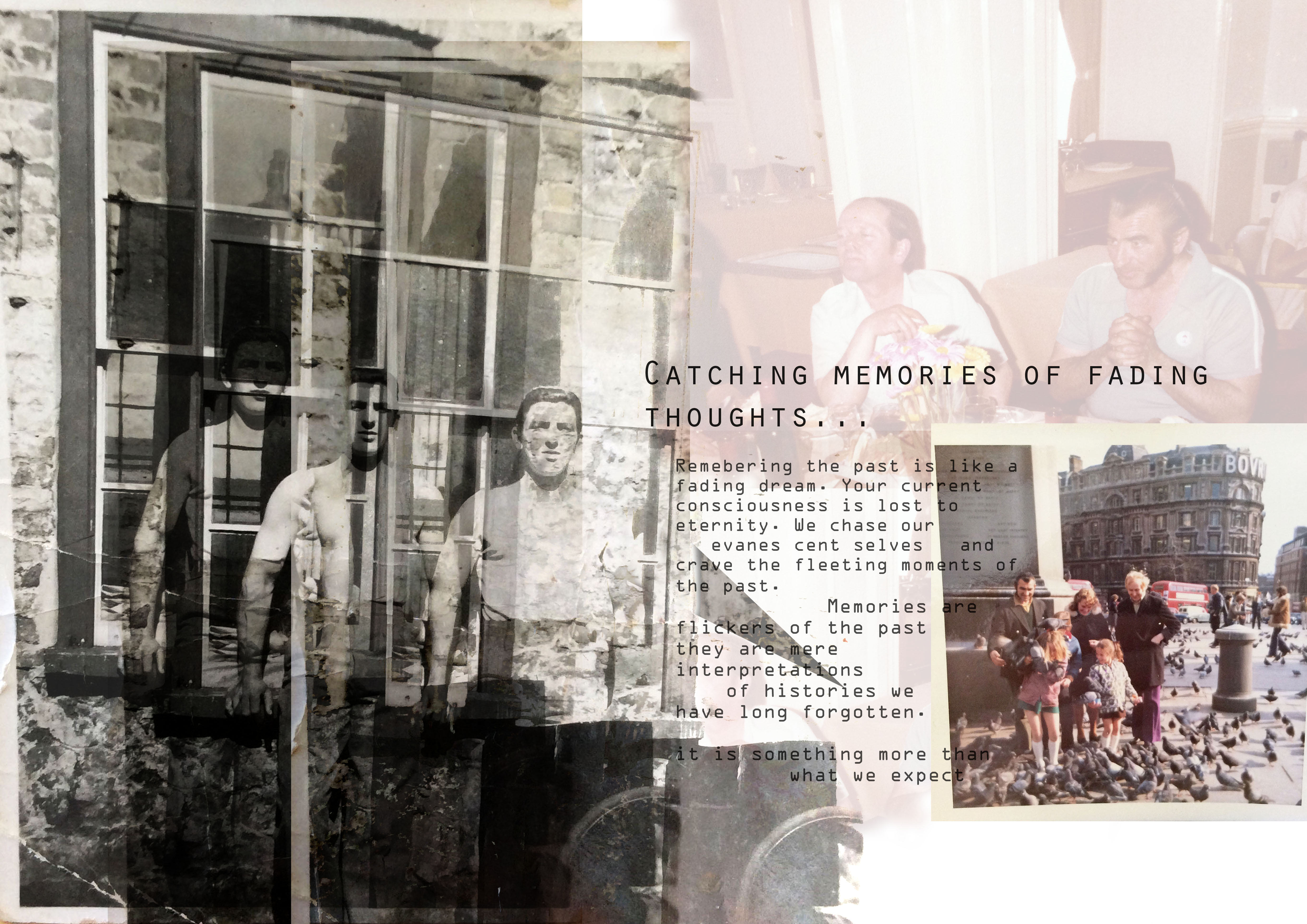
Final outcome- Picture- Story:

final small

This is my final design for my picture-story, I have experimented with different styles. However, I have found this particular idea to work the best for my theme of memories. I wanted the photographs to look as one in a sense, so they appear as a fuzzy thought. I also wanted the writing to tie in with the images as though they are speaking the memories. Furthermore, the style of writing I have chosen is a type writing font which in my opinion works really well with the photographs. I have put photographs on top of each other and copied particular images. I have used different filters so that the images have a more powerful effect. The only image I have kept the same is the photograph in the bottom right hand corner because it represents my grandfather’s focus on his family. He was very much a family man and spent most his life devoted to supporting his children and grandchildren. 

With regards to the text, I chose the particular font because of the olden style it had about it. I liked the idea of it being like a type writer because I wanted the picture-story to feel old and vintage therefore this worked perfectly. For the title I explored with a range of different ideas, I looked at quotes online about memories but found a great deal of them were very sad and focusing on losing someone. This isn’t the idea of my picture-story therefore I decided to go with a title I thought suited the entire piece. I added the ellipsis on at the end in order for the sentence to trail off like a thought, I didn’t want it to have an end. 

When photographing these images I kept the burnt and broken sides of the pictures in because it made it look more authentic. Especially the image which I have not used any effects on, the edges stand out and represent a old and vintage look. 

I think this picture-story is close to what I initially wanted to produce from this project. I think I needed to include more modern photographs, however, I struggled with the concept of photographing someone that was essentially invisible. I think for when I carry this project on into my personal study, I will be more creative and open to exploring ideas which perhaps are more difficult but will capture the concept of memories. 

picture story one

This is my second picture story design, it is extremely different from my first picture story. I wanted the second one to be more professional and clean cut, I also wanted to include important quotes from condolence letters which were personal to my family. Archival images were a major factor in my picture stories, I think this was an important element as I have hundreds of photographs from my grandfather’s life. I used Photo Shop in order to design this picture story, I had previously leveled the images as well as adjusting the brightness and contrast. I then began the design by playing around with a selection of images, adjusting the size and angle to fit with the other images. I also played around with where the photographs were placed and the writings. 

Picture stories – FINAL DESIGNS

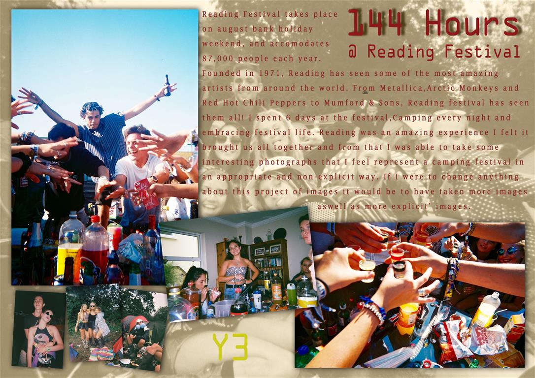
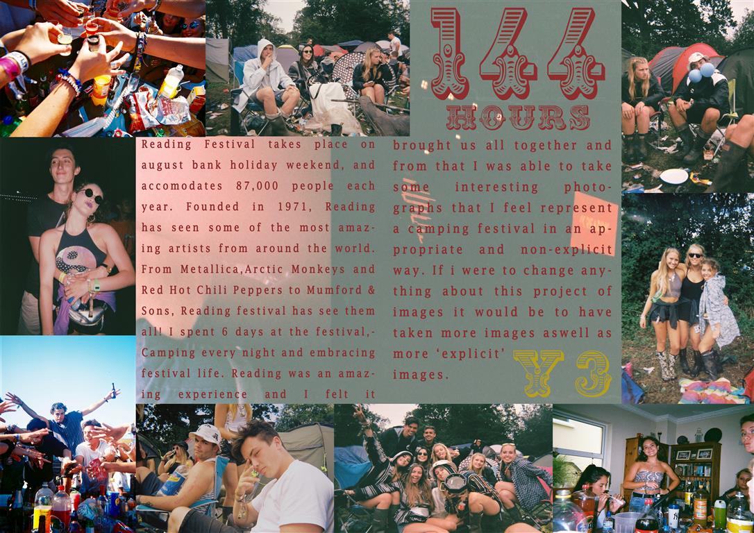
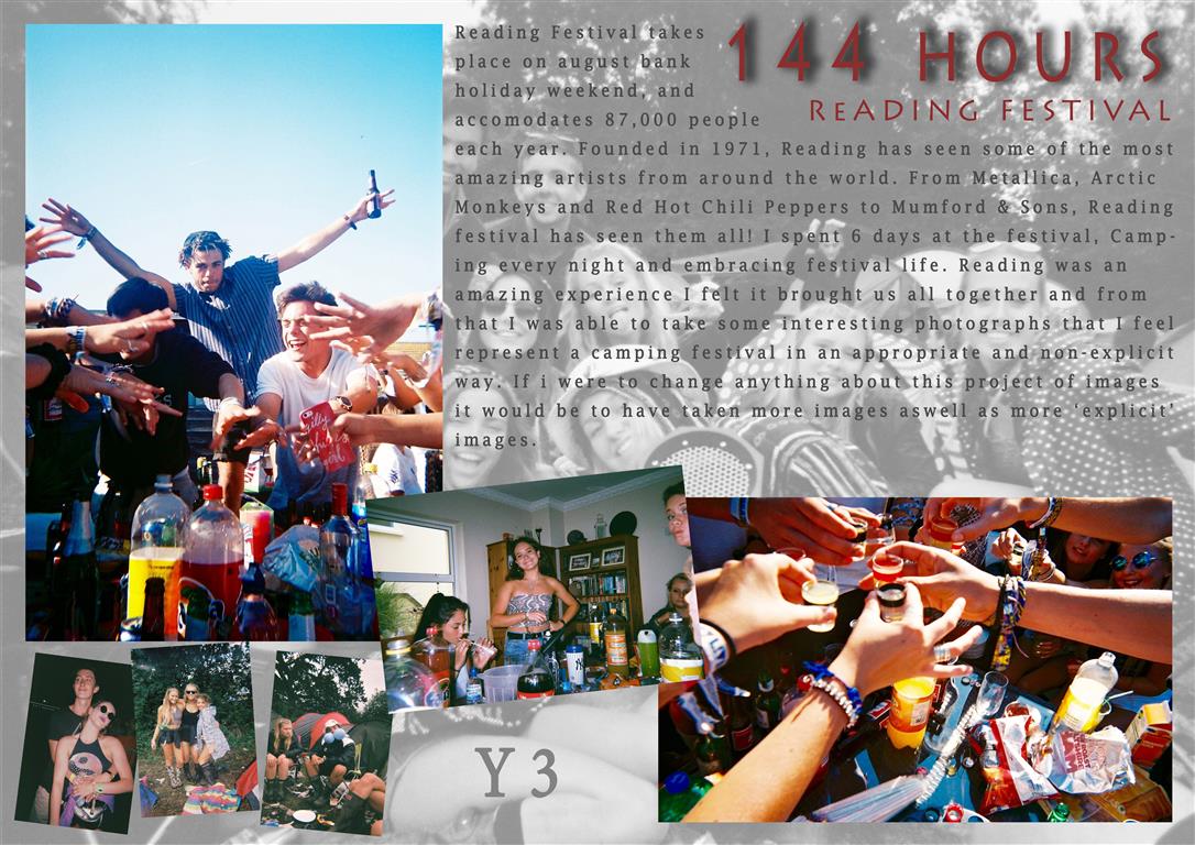
These are my final designs for my picture story, I experimented with many designs but came out with these two templates. I wanted the story to have a rough feel to it as my story was based around a festival I thought the theme should try to match the presentation. I kept the same font throughout the stories and a similar color scheme with red text and a faded picture for a back layer presented in all 3 stories. wacky 3 (Medium)
The above story was the first I created, attempting a graphical layout I had to twist and turn the images as well as add in ones that were different sizes. Adding drop shadows to the images also made them stand out more and created a non flat look. with 2 main establishing shots and a few relationship and observing shots to create a picture story with 7 images all together.
Untitled-1 (Medium)The above picture story was the second I edited and when completed was my favorite also. This story is presented more as a double page spread, with no drop shadows or highly edited images. I increased the vibrancy in all of the images to bring out the colors. I felt this was a cleaner and less artsy layout due to the symmetry and images laid out all in line. My favorite part of this layout was the title text, as it was very bold and very different to usual titles I felt it fit well in this design. This design also had a background image, this image was a corrupted photograph from the broken camera and I felt it fit very well as a background as there is nothing important within the image apart from a few corrupted images and water marks.
wacky 2 (Medium)This design was the third and least favorite design, The same layout as design 1 but with different color schemes and effects. The text should have been changed to another color as i feel it blends too comfortably with the background. I feel this story looks more of a poster than a picture story, The story is far from what i set out to design when i started but was an experiment and directed me towards editing my other stories more as i could then see what they were missing eg: drop shadows.

Text for Picture Story

As i’m doing an article on scouting and the shooting competition we went to in October I thought I’d make up the kind of article we usually hear about when things happen in scouting. All quotes have been made up and whilst it may not be a proper article and is a little bit gibberish, it helps to make my picture stories look professional. I have written it as if it was a reporter writing it, rather than myself as I found that a lot easier to do. I will be making a Newspaper spread and a magazine spread so that I can experiment with both styles.

For the title of my piece, a couple people suggested I call it ‘Shooting the Scouts’ as its a bit funny, and also has two meanings, the first with the fact that its a shooting competition with the scouts, and the second,obviously not actually shooting scouts with a gun, but instead with my camera.

Shooting the Scouts

Scouting is a big part of Jersey life, especially with young people of the island. Trips away to do activities in foreign countries are memories that always stick in those young people minds.

Thats why the Jersey Explorer Scouts try to go on as many trips as they can, having had a group of young people come back from the

back from the World Scout Jamboreee in Japan in August, they took a group of 9 young people to a Scout Shooting competition in England.

“We think it’s very important for the young people within our organisation to get the best experiences they can” says Greg Ruellen, the leader who was in charge of these young people. “These experiences are crucial for young people as it allows them to become more independent and see life outside of Jersey”.The Jersey Scout Assosiation don’t currently have a shooting group, so in comparison to some of the cometitors, scouts who are part of a group who practice shooting on a regular basis, the Explorer scouts representing Jersey, most of whom have only practiced shooting once or twice, were very under-experienced  in comparison. Not that this bothered them in the slightest.

“None of us go with the aim to win anything, we have a Jersey trophy, which we give at the airport when we get back, for whoever did the best out of us, but we mainly just go because it’s a fun, social weekend, and we get to meet other scouts, explorers and leaders from other places, which is a big part of what scouting really is.” says Sammie Pitter (17), one of the Explorer  scouts who went to the shooting competition.

It’s clear to see that these experiences help to give these young people a sense of maturity and responsibility, and they also help to give the parents of these young people a weekend to themselves.

The Explorers also have some other exciting experiences for their young people in the future, with a trip to Italy next summer, and the hope of a trip to hike Kilimanjaro in 2017, these young people have a lot to look forward to, and a lot of great memories they’ll come out with at the end of it all. Not to mention the life long friends they’ll have made in the process. “We couldn’t do it without all the effort our leaders put it, and it so we feel its really important to thank them for everything”.

Picture Stories:

picture story one

This is my second picture story design, I have used both archival images that I have collected from my mother’s albums and created new photographs from personal items such as condolence letters, newspaper prints and albums. Furthermore, I scanned images such as my grandfather’s passport because I thought this was an extremely interesting personal item. It held his identity and was a crucial belonging he carried around with him his whole life, therefore it had historical meaning and heritage. I included the main title ‘Three Chapters’ as well as the subtitle ‘Ten years have passed but it still feels like yesterday.’ Moreover, I included a quote from a close family friend that they wrote in a condolence card. I wanted this picture story to be clean and professional which reflected the main idea of project.

Demolition Video

Here is a video I made using iMovie of the beginning stages of the demolition process of our new house in 2009. This was the first beginning stage of the whole re-development which has been happening since late 2015.

From this video, I hoped to show time through the two angles I captured. This all-in-all was a pledge to alleviate the theme of development which is a re-occuring theme I’d like to run throughout my project.

https://www.youtube.com/watch?v=wDNoudjyufI


Picture Story

A picture story is a group of images, roughly ranging from 6-8 pictures. For a picture story to be powerful, it contains 7 types of shots, including:

  1. Person at Work
  2. Relationship Shot
  3. Establishing Shot
  4. Detail Shot
  5. Environmental Portrait
  6. Formal Portrait
  7. Observed Portrait

Person at Work – These photographs are very realistic and usually quite natural. These photographs makes you think about the types of things they do and why they are doing them. They make you think about the context more, and why the context is important.

maxresdefault

Relationship Shot – A relationship shot doesn’t always have to be the stereotypical loving relationship. It can range from love to hate, abusive to affectionate etc. It can also be an emotional thing, such as the relationship between workers, or the relationship between two objects. It is important to notice the key aspect of the relationship, how it works and why are they apparent.

A beautiful wedding image of a bride and groom embracing while the bride is laughing looking at the photographer.

Establishing Shot – This is one of the most important aspect to the picture story. It portrays the main context of the story, giving out detail of where it is and what is happening. It describes key aspects of the story.

Screen Shot 2013-05-14 at 3.06.42 PM_0_1

Detail Shot – These type of images range from doing close-ups of objects to images of people. Commonly, I did detailed shots for some of my portraiture work last year. I think this images are very effective and enabled the audience to focus on the foreground rather than everything that is going on in the picture.

bat-ball-detail

Environment Portrait –  An environmental portrait is a portrait executed in the subject’s usual environment, such as in their home or workplace, and typically illuminates the subject’s life and surroundings. By photographing a person in their natural surroundings, it is thought that you will be able to better illuminate their character, and therefore portray the essence of their personality, rather than merely a likeness of their physical features. It is also thought that by photographing a person in their natural surroundings, the subject will be more at ease, and so be more conducive to expressing themselves, as opposed to in a studio, which can be a rather intimidating and artificial experience.

portfolioindex1

Formal portrait – A portrait is an image of a person’s face that clearly displays their likeness and may often display some aspect of their personality. A formal portrait is not a snapshot but a carefully arranged pose under effective lighting conditions.

formal-portrait2

Observed portrait – These images have more than one person in. The main focus to the image is the person getting a portrait taken, but there is always another person in the image ‘observing’, it doesn’t have to show their face just their presence.

POS1 IL

Headline, text, caption

Headline, text and caption

For the text in this picture-story I wanted to explore what people thought of memories and their interpretations of these invisible sentiments. However, when I was researching I found it to be very difficult to find what people thought memories actually were. Most of the information I found was very scientific which is not the sort of thing I wanted for this particular project. I wanted the piece to be a poetic picture-story therefore the words I used needed to reflect this. So in order for the concept to work I decided to ask my family’s ideas of what memories are, what we need them for, what they are made from and whether they exist at all. I wanted to take a philosophical approach to this area of work because I think specific philosophers have some insightful ideas for example Sartre. 

The headline for the picture-story is also very poetic. I wanted the title to explain everything about the picture-story as well as not giving anything away. 

What is a memory? What do you think our memories made up of and why do we have it? Does everyone have a memory? Can our memories deceive us? Are they reliable? 

phototoo

Due to my first picture story being very poetic and artistic because I wanted it to reflect the haziness of the memories of my grandfather therefore, it was important the photographs almost merged together. The only image that is slightly separate in comparison to the others is the archival image on the bottom right hand side, because it is a memory of my mother, it made it realistic and truthful listening to her remember it so vividly. Therefore, the second picture story is more simplistic and only focusing on the images singularly rather than looking at them as a merged sort of collection. 

picture story one

Picture Story

I have played around with the arrangement of my picture story on Photoshop and have found an outcome that I am starting to like. I wanted to incorporate the archive photograph into the background of the image as it makes my pictures stand out and look more effective. The title is important as the Governor has to stand out the most as he is the most important individual in the story. The portraits look effective as a three, 2 in colour and my main character in black and white (my dad). I have left space for a couple more images in the bottom right corner, however, I like how there is space otherwise it will be too overwhelming. The colours in this picture story are very bright and I like how their is contrast between the black and white background with the coloured photographs. I am going to experiment with a few more designs to see which is the best outcome.

final1