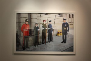
Case Study | Martin Toft and Finn Larsen

For this case study I chose to look at Toft and Larsen first as when looking around all of the images these were the ones that really stood out most to me. I found Larsen’s images so visually pleasing and beautiful but I knew nothing about the images and what they represented and was shocked when I found out what they were really about. I love finding out new things in the photographic world and what underlining messages there are behind these types of images.
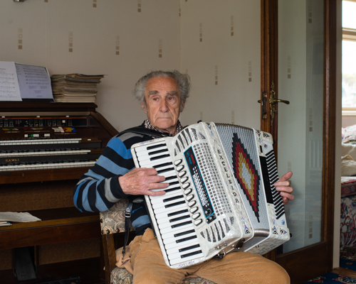
Martin Toft is the local photographer who nominated Finn Larsen. He is a Danish man and is currently living in Sweden. Toft was 25 years old when he figured out that he wanted to be a photographer and if he hadn’t met Larsen, Toft says that he wouldn’t be a photographer. He basically mentored him giving him a load of photographers photo books to read and study for one week, a box filled, the next week he would go back to see Larsen where they would discuss everything Toft had found out and learnt. They did this every week. This really helped Toft become a better photographer and so Larsen has become one of his biggest influences.

Martin Toft’s website: http://www.martintoft.com
Finn Larsen’s website:
 http://thephotographersprint.com/products-page/finn-larsen/

“The photographs and the art that interest me enter into a global and historical dialogue about how the world looks and how it can be understood. It is about seeing the world, society, the landscape as soberly as possible, without God, sentiments, nationalism, symbols and other abominations.” – Finn Larsen

About Martin Toft

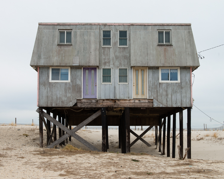
Martin Toft is a local photographer originally from Denmark. He is working as an A Level teacher here at Hautlieu school. Toft has worked on a huge project called Atlantus. This is a project showing the connections and contrasts between Jersey, Channel Islands and New Jersey. Through Toft’s work we are able to see how different and how similar the two are. It is strange that a lot of the world doesn’t even know that Jersey exists and this project in particular is interesting as it explores a place named after Jersey.

About Finn Larsen

Finn Larsen is an international photographer nominated by Martin Toft. He is a Danish photographer now living in Sweden. Larsen graduated as a photographer in 1980. He is a member of the Society of Artists and the Association of Visual Artists in Denmark. He is also a member of the National Organisation of Artists in Sweden. Larsen has published books over the years and has recently worked on a project titled ‘Mansland’ where he made images in Greenland of all of the waste and dump on the island.

Comparison | Toft and Larsen 

Q. What underlining social and cultural messages are held in the work of Martin Toft and Finn Larsen?

In this essay I will compare the similarities and differences between Martin Toft’s photographic work as part of the Quintessence exhibition and his chosen artist Finn Larsen.
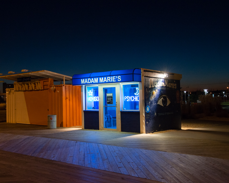
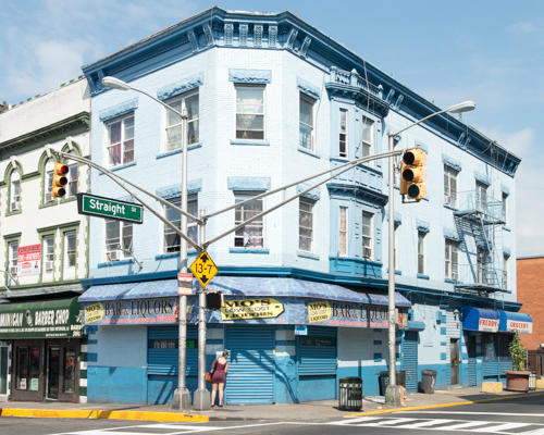
Firstly, I find these two photographers different in their approach and their style. Toft’s project shows people and the environment surrounding those people and how different and similar Jersey and New Jersey are compared to one another. He also looks into the history of these two parts of the world and shows, through his images, how far each place has come and how different it is now compared to in the past, especially in New Jersey. Whereas Larsen’s images are pure landscapes giving little away but with a deep political and environmental meaning behind it. I like both photographers but for very different reasons. I find Toft’s work very interesting in the people he chooses to make his images and their facial expressions, the way they look and feel in front of the camera. Toft’s work shows how a place can be named after another place yet have nothing in common with the original place or it even shows different sides of the spectrum and how they take care of things differently. Contrary, Larsen’s work is more just landscape work with strong political meaning behind them. I find that his work is a lot more subtle in that you wouldn’t guess what is going on in just one image, you would need to see the entire project to understand what is going on. I find his work very interesting as he has some really beautiful images with a deeper meaning that you most likely wouldn’t get if you did not read more into it.
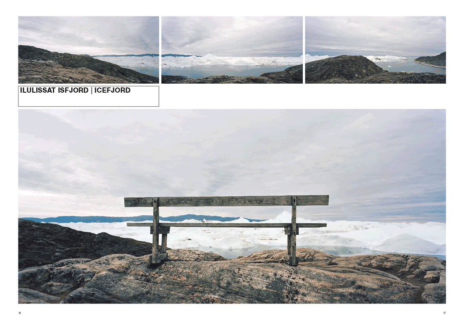
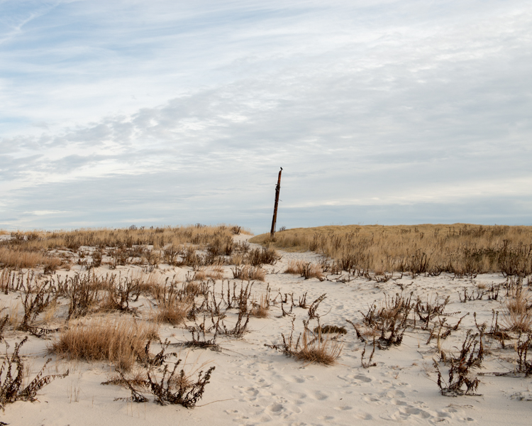
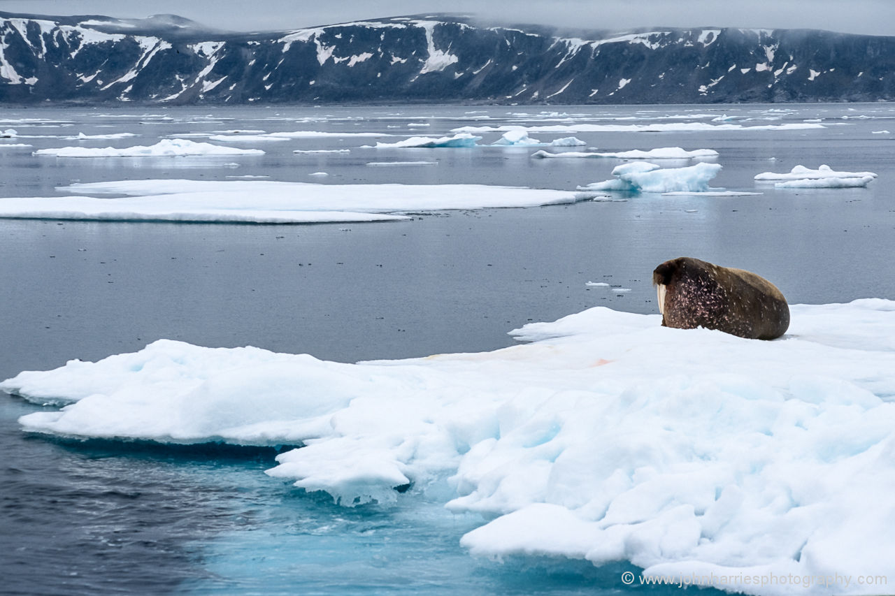
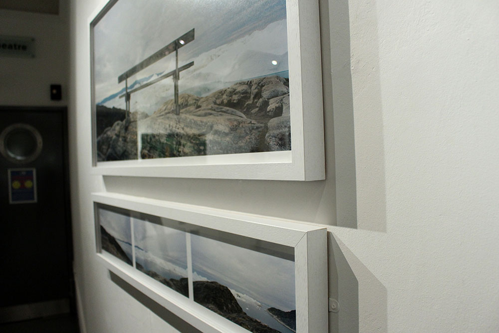
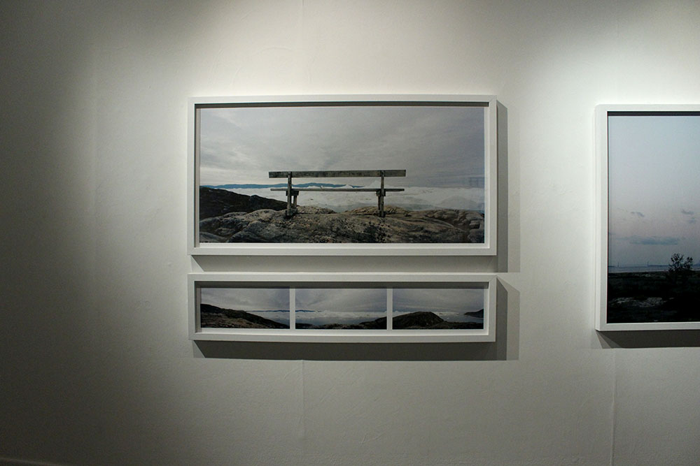
However, I chose to compare the images above as I saw similarities in them visually. In the center of both of these images is an object, Toft’s is a large stick or pole and Larsen’s is a wooden bench. I find that Toft’s image shows the natural beauty of the land, it is simple yet the cloudy skies and the landscape is captivating. On the other hand, Larsen’s image looks,at first glance, like another beautiful landscape image of glaciers in the water with the perfect view from the bench but reading more into this project I found out that just beyond those glaciers is a dump, filled with human waste. It is so sad, to me, to see both of these beautiful landscapes yet our own destructive human nature is slowly destroying that and taking over with these landscapes being ruined by our waste and dumping. I find Larsen’s image very powerful and almost sending out a political message to the rest of the world saying that this beauty is being destroyed and ruined by our wasteful nature.
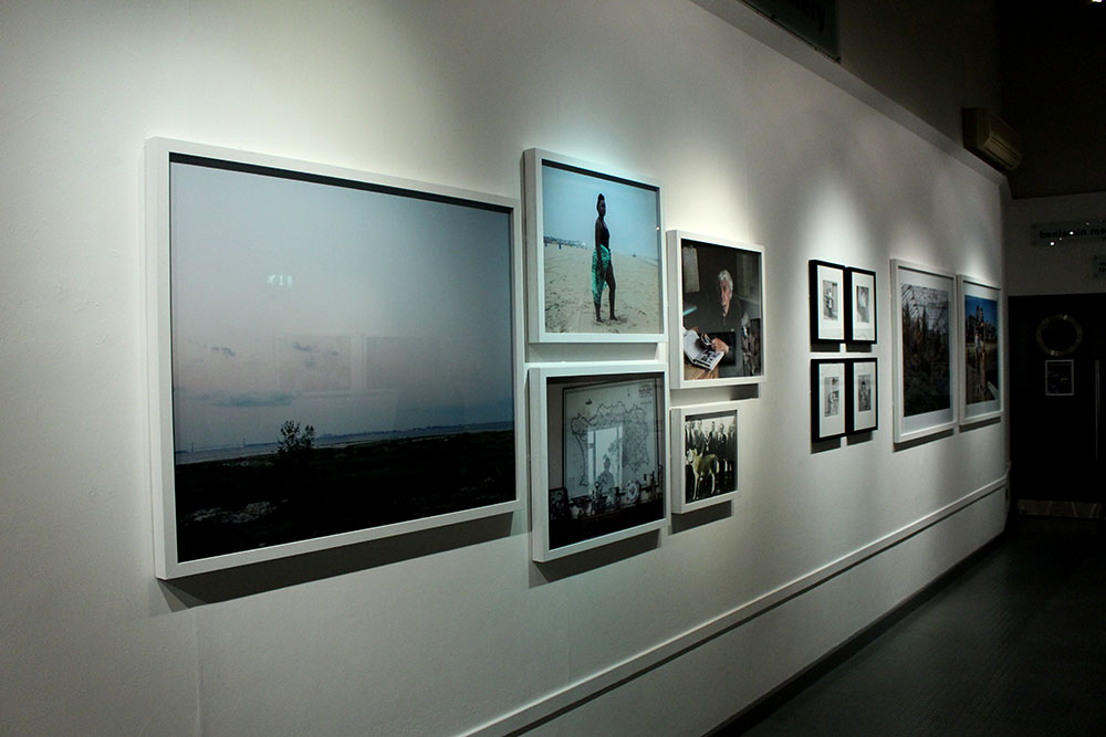
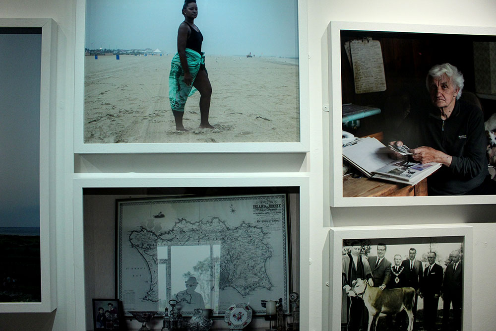
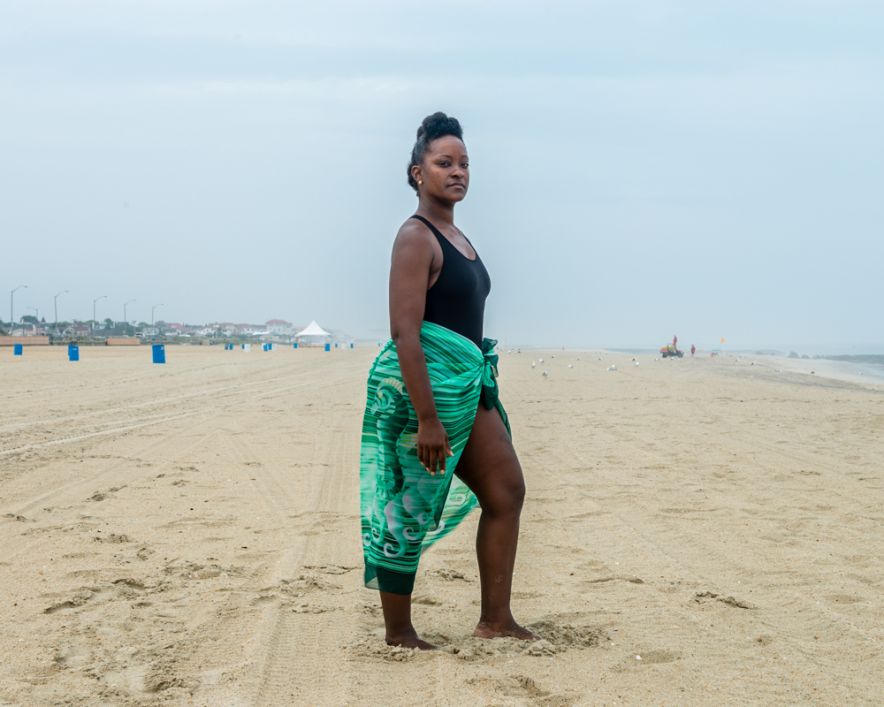
Contrary, better suited for the comparison would be the image Toft made of a black woman at a beach in New Jersey. This image represents a lot. It represents the struggle that black citizens of America went through. This image was made in a place in New Jersey called Asbury Park where black slaves used to stand and serve their white masters over 100 years ago. This is why this image represents a lot and is so significant in how far we have come as humans. In contrast, the image made by Larsen shows how really little we have come in society hiding our waste and dumping our unwanted rubbish behind a beautiful natural glacier. I really like these two images together as they both hold a lot more behind just that one image. It is captivating and interesting and the more you know about the subjects and the behind the scenes of what has gone on in the past or what is going on in the background makes the image even more powerful. I like these two photographers, Toft and Larsen, as their work holds meaning and doesn’t just tell us or show us in that single image, we aren’t given everything yet are left thinking about it and what it could represent. These images aren’t as simple as they look and have generated meaning behind them.
Likewise, a common theme that I am beginning to notice in both Toft’s and Larsen’s work is that it holds a deeper meaning. There is more to it than what you see as a spectator and their images hold so much significance and beauty. Both of their subject matters seem to reflect us as a society. The young black woman stood on the beach represents how far we have come as human beings and being able to bypass ridiculous laws and change the way we think to be broader minded and actually accept everyone as human beings. On the other hand, Larsen’s work represents society in a more negative light. This cant be seen in the beautiful image of his above as it shows the beauty of the glaciers and the sea and the cloudy skies but behind all that there is a disgusting dump filled with our own human waste and it shows how as a community and society we still don’t know how to control our own waste, how to not ruin the natural world that we have. It shows how we as a society are constantly taking over the natural world and making it a corporate one.

timthumb
Martin Tofts photography | Tamika Tolliver, Asbury Park

1000 Word Essay

To what extent is the work of Yury Toropstov and Michelle Sank similar?

On reviewing the ‘Quintessence’ Exhibition, it is clear that the work of International Photographer in Residence (IPIR)[1] of 2014 Yury Toropstov in ‘Fairyland’, conveys a certain degree of similarity to that by IPIR of 2013, Michelle Sank in ‘Insula’. Both artists, formal and methodical in their photographic style, take influence upon discoveries made from the Societe Jersiaise Photographic Archives, and subsequently their respective bodies of work made is achieved through a similar process. Nevertheless, there are clear distinctions in the work of the two artists. Firstly, the extent their respective personal influence is very different, thus shaping the direction of their work very differently. Secondly, they give varying representations of island life, with Toropstov photographing more subjectively than Sank. Although I can draw some similarities, I maintain that the obvious contrasts and differences in their work means that the extent of similarity between the artists is somewhat limited.

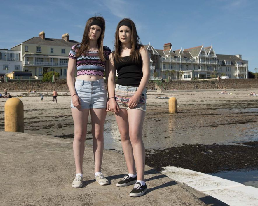
Both Sank and Toropstov’s photographic style is formal. Many similarities can be drawn from Toropstov’s image of “Vic Tanner Davy”[2] formally dressed in an office, holding a statue, with Sank’s image of two girls, “Chloe and Leah”[3]. They are both formal portraits, and it is apparent that both photographers have carefully considered how the image has been composed. Hands are used in both to symbolise the distance between the photographer and the subject. Sank keeps the hands of her subject down to convey a defensive pose, and Toropstov achieves this same effect by photographing the subject with his hands in his pockets, symbolic of a defensive nature. Both Sank and Toropstov were commissioned by Archisle “to live, work and teach for a term of six months”[4], and their outsider view of the island subsequently reflects this position. Their equally careful and methodical approach to dealing with their subjects explores how the work of both serves to express this outsider, and therefore limited perspective of island.

(Photographer: Yury Toropstov, Subject: Vic Tanner Davy, Jersey, 2014.)

(Photographer: Michelle Sank, Subject: Chloe and Leah, Jersey, 2013.)

Furthermore, similarities can be drawn from the considered approach to how Toropstov and Sank research their respective contexts and themes. In contrast to the work of Martin Parr, (also in the exhibition) both Sank and Toropstov convey a far more considered and formal approach to research, restricting the direction of their work to pre-determined themes, highlighted in Toropstov’s case by his image “Jess”[5] and the similarities this can draw with the archival image of Ivy Joan Vibert. Both artists use the Societe Jersiaise archive as the basis to inspire their work. Sank takes influence from social order of Henry Mullin’s mid-19th Century Portraits: “9,000 portraits of islanders placed and identified in grid configurations”[6], to explore class systems in the island, whereas Toropstov was inspired by footage of a young girl named Ivy Joan Vibert with her float ‘Fairyland’ at the 1937 Battle of Flowers, fuelling his exploration of the “discrete and mysterious”[7] nature of Jersey. The similar methods of research by both photographers to create their outcomes, draws clear similarities with both in terms of photographic approach, resulting in their work being of a similar pattern – very specific and concentrated themed images, of which this style of research based photography inevitably results in.

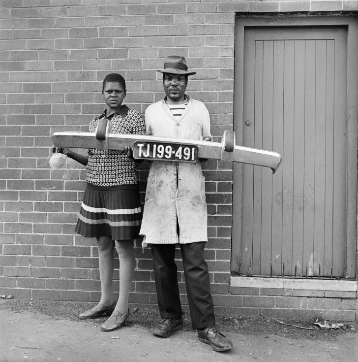
Although both similar in terms of research, the work of Sank and Toropstov are influenced in completely different artistic directions. All six Archisle artists nominated another artist whose work had influenced them, and this is a significant factor in differentiating Sank and Toropstov’s work. Sank chose David Goldbatt, who has four images in the exhibition, looking at the social barriers established by race in apartheid South Africa. One portrait is of a black couple holding up a registration plate, and they are shown to be poor and socially disadvantaged through the representation of their clothing and living conditions. Sank’s portrait of “Chloe and Leah”[8], draws striking similarities to the intentions of Golbatt, as the girl’s appearance of simplistic clothing and worn out shoes, implies too that they are working class. Sank therefore has very much been drawn down the artistic direction of exploring social status and order. Toropstov, on the other hand, was influenced by the concept of mystery and mysticism, an impression he established during his stay on the island,  citing the controversial ‘Cottingley Faries’[9] series by Elise Wright and Frances Griffiths as his influence. Sank’s influence is shown through her objective, documentary style, whereas Toropstov’s main influence inspires a degree of creativity, imagination and subjectivity.

(Photograher: David Goldblatt, “You’ll be the driver and i’ll be the Madam, Johanesburg – RSA, 1975.)

(Photographer: Michelle Sank, Subject: Chloe and Leah, Jersey, 2013.)

(Photographer:  Elise Wright and Frances Griffiths, “The Cottingley Faries”, Bradford – UK, 1917.)

Fundamentally, the main difference which highlights clear distinctions in Sank and Toropstov’s work is how they depict the theme of ‘islandness’[10]. Sank during her stay in Jersey became interested in the issue of class conflict on the island, as she describes, “I am interested in creating sociological landscapes”[11]. Her take on Jersey is that it is a place of extreme cultural diversity and social extremes; ranging from the the home of very rich to those in most abject poverty. The series is therefore an observational human study. In stark contrast to this objective viewpoint, Toropstov’s work reflects a more personal viewpoint of the island, and ‘Fairyland’ documents his own personal journey to “connect to island life”[12] and discover the hidden secrets of such a “mysterious and discrete place”[13]. Such a contrast largely impacts how the viewer interprets the images in the exhibition. Sank’s images invite the reader to reflect upon her work with a sense of observation and distance. On the other hand, the subjective nature of Toropstov’s work invites the viewer to interpret the images from a more abstract perspective, encouraging subjective experiences to determine judgement. This contrast is important as the mood established within the respective works is completely different.

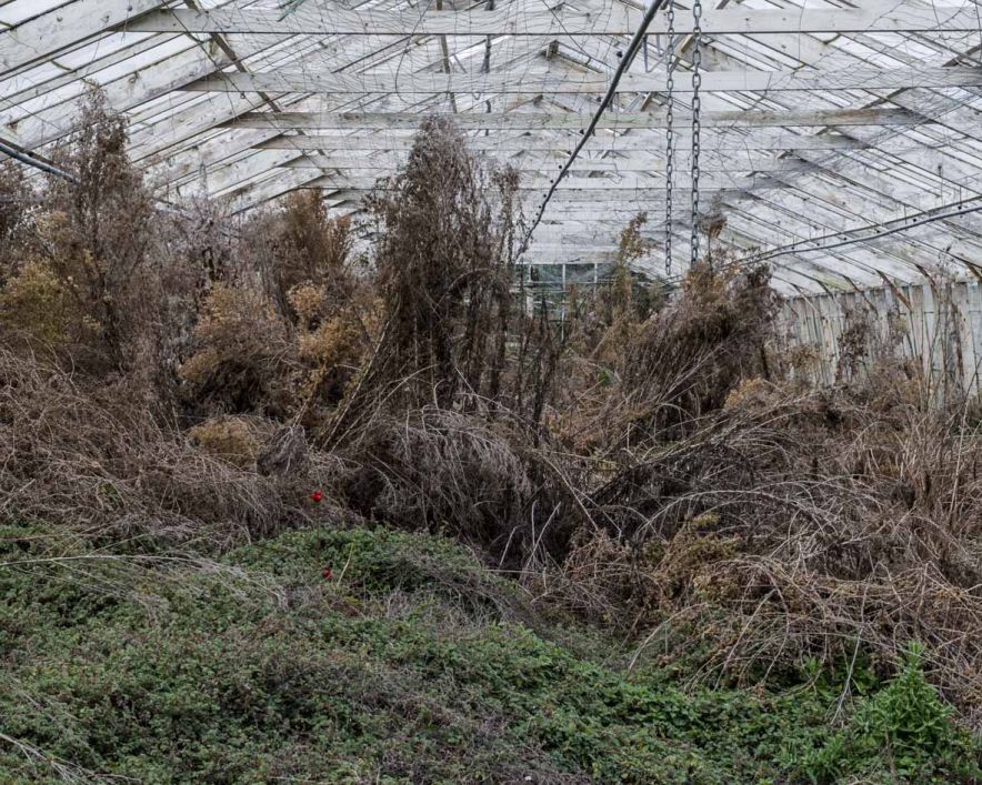
(Photographer: Michelle Sank, ‘Disused Glasshouse’, Jersey, 2013.)

It was interesting to reflect upon and compare the work of Sank and Toropstov. As respective IPIR, they were both completely new to the island and had the same time period and access to resources in which to make a photographic response. Although similar in terms style, it is undeniable that through their own personal influences, as well as opinions about island life that the context, intention and direction of their of their work is very different. Sank is far more direct in her photographic responses, whereas Toropstov response is more implied and metaphorical. For these reasons, I would argue that only to a very limited degree, is the work of Sank and Toropstov similar.


Bibliography

[1] Syvret. G, The Rescidency, Archilse Website, http://www.archisle.org.je/archisle-international-photographer-in-residence-programme-2015/ (2015)

[2] Syvret. G, Exhibition Text, ACCP (2015)

[3] Syvret. G, Michelle Sank – Insua, www.archisle.org.je/michelle-sank-insula (2013)

[4] Syvret. G, Exhibition Text, ACCP (2015)

[5] Toropstov. Y, Fairyland (Description), http://toroptsov.com/en/projects/fairyland.htm (2014)

[6] Syvret. G, Exhibition Text, ACCP (2015)

[7] Toropstov. Y, Fairyland (2014), https://vimeo.com/105940083 (2014)

[8] Sank. M, Portfolios – Insula, http://www.michellesank.com/insula (2013)

[9] Cooper. J, “Cottingley: At Last the Truth.” The Unexplained, No. 117, pp. 2338-40 (1982)

[10]Syvret. G, Archisle Celebrates Five Years with Quintessence, http://www.archisle.org.je/archisle-celebrates-five-years-with-quintessence-exhibition/ (2015)

[11] Sank. M, Artist Reference, http://www.michellesank.com/ (2013)

[12] Toropstov. Y, Fairyland (2014), https://vimeo.com/105940083 (2014)

[13] Toropstov. Y, Fairyland (2014), https://vimeo.com/105940083 (2014)


Quintessence essay

To what extent has David Goldblatt’s work influenced Michelle Sank’s work?

In this essay I am going to explore how Michelle Sank’s nominated artist David Goldblatt has influenced her work. I am going to do further research into both of the works displayed at the exhibition, to find further connections and relationships between them, beyond what is displayed on the surface.

David Goldblatt 

David Goldblatt is a South African photographer, he was born in South Africa after his Jewish parents fled Europe in the 1890’s . Since the late 1940’s he has photographed the social and physical landscape of South Africa. However, he is most well know for photographing people in South Africa during the period of apartheid, where black people were physically and socially segregated and treated differently  to white people through the use of separate facilities such as schools, accommodation and transportation. David Goldblatt has various publications and has won many awards. During this time period as a white person photographing black people was an unusual thing to be doing, because if you were caught Interacting with a black person you would be sentenced to prison.

http://www.moma.org/collection/artists/2214?=undefined&page=1

Michelle Sank 

Michelle Sank was born in Cape Town, South Africa. She has been living in England since 1987. Michelle photographs the human conditions exploring social and cultural diversity through documentary photography. Michelle has had many successful solo exhibitions and publications including books. She has also won many awards for example her most recent award was in 2013, Gold Award, San Francisco International Photographic Exhibition. She recently displayed her work both in Jersey and Guernsey.

http://www.michellesank.com

The photograph that I’m looking at by Michelle Sank that was published in the exhibition is actually from a larger collection of photographs under the title ‘Insula’ taken in April 2013. I read some more about the 6 months that Michelle Sank was in residency at the Archisle and found that she trying to photograph how being on the Island and within a ‘kept environment’ influenced peoples way of being. I then googled the definition of Insula, it showed that Insula means “a region of the brain deep in the cerebral cortex.” I then furher looked into the cerebral cortex and it is the part of the brain that is linked to your conscientious, self- awareness and perception. This is linked with the exhibitions idea of ‘islandness’ , being aware  socially and politically and also being aware and having other photographic connections outside of the island.  David Goldblatt also photographed peoples social and physical landscape and in this case for Michelle Sank it was Jersey.

One of the most damaging things that apartheid did to us, was that it denied us the experience of each other’s lives. – David Goldblatt

I then looked at David Goldblatt’s photograph which is of two black people holding a car bumper. I didn’t really understand what this represented or if it was a metaphor for something. However, when I looked at the tittle ‘ She told him: “You’ll be the driver and i’ll be the lady”, then they grabbed the car bumper and posed, Hillbrow, 1975’ I then connected with this photograph and found it quite touching. This photograph represented a dream that they couldn’t achieve due to the cultural segregation, which I think is wrong in everyway.  I think the fact that the bumper is straight, shows the divide between the people in the photograph who I think could have been servants and their ‘owner’ . The photograph is taken infront of a building which could be where they were living. The photograph was taken in Johannesburg which at the time was not a place were everyone was smoothly integrated, which renforces what David Goldblatt was photographing.  I think this photograph is very powerful and speaks for itself.

The first connection I saw between these photographs, although it was fairly obvious, was that they had both photographed a portrait of two people and included their surroundings, which allows us to get a better understanding. I then realised that David’s photograph at that time would have been of the working class, I then looked at Michelle photograph and by what they are wearing and their surrounding I think the girls are also from a middle/working class. I then questioned if there was any particular reason why she photographed twins, it could be that the people in David’s photograph are also related to each other although I don’t know this for sure. Other than the photograph itself I found connections between the photographers. The first one I found was that they were both born in South Africa and they are both white, this may be what inspired and influenced Michelle Sank and let her to choose David as her nominated artist. The second connection that I found although it was in different centuries they are both photographing cultural diversity and peoples physical and social landscape.

In conclusion, to answer my question I think that David Goldblatt is a huge influence for Michelle Sank  and there are many connections between not only their work but as people themselves. In this project Michelle Sanks work links closely to the work of David, as I have found above, however having looked at some of her other projects there aren’t as many connections although most of pictures are environmental portraits which show the differences between people as well as this I think the photographs portray personal identities. But these photos keep to the conjoint theme of photographing peoples physical and social landscape.

David-Goldblatt-FHCB_4-728x735
She said to him,’You be the driver and I’ll be the Madam’, then they picked up the fender and posed. Hillbrow. 1975
22
Chole and Leah.2013

Personal Study

What is a Personal Study?

The aim of this unit is to critically investigate, question and challenge a particular style, area or work by artists/ photographer(s) which will inform and develop your own emerging practice as a student of photography.

Your Personal Study is a written and illustrated dissertation, including a written essay (2000-3000 words) and a photographic body of work (250- 500 photos) with a number of final outcomes.

This year you have to make a photo book which you design to include both your essay (with title) and a final selection and sequence of your photographs produced as a response to your chosen theme of FAITH, FAMILY and COMMUNITY

In addition, we are also expecting that those of you who want to go above and beyond to achieve top grades will produce a podcast i.e. mini film with sound and images based on the same above

All your usual research, analysis, planning, recording, experimentation and evaluation will be posted onto your BLOG

Link to  Planner & Tracker Monitor and track your progress every  first 5 mins of lessons on Fridays and upload onto the blog

Week 15 and Christmas Holidays: 8th Dec 4th Jan

Objective: Criteria from the Syllabus

  • Essential that students build on their prior knowledge and experience developed during the course.
  • Develop your written dissertation in the light of your chosen focus from the practical part of previous coursework and projects.
  • Select artists work, methods and art movements appropriate to your previous coursework work as a suitable basis for your study.
  • Investigate a wide range of work and sources.

Blog: Produce a number of posts that show evidence of the following:

1.Reflect on your previous projects/modules and write and overview of what you learned. Link your chosen area of study to your previous work, knowledge and understanding based upon your chosen theme of FAITH, FAMILY and COMMUNITY. Include examples of previous work to illustrate your thinking.

2.Select artists/photographers work, methods and art movement appropriate to your chosen area of study. Find 3 different texts to read over Christmas that support your study from a variety of sources (books, articles, journals, magazines, websites, films/dvd.)

3.Write a specification that outlines your main focus, intentions and area of study, including what artists/ photographers you wish to investigate, respond to and write about in your essay.

4.Produce a detailed plan of a 3 photo-shoot for this Christmas holidaysMAKE PHOTOGRAPHS!

Link to folder with more examples M:\Departments\Photography\Students\Resources\Personal Study\student exemplars

A few Personal Studies from last year. 

Bryony SandersonGie us a wee word wi’ yer Mum: The title of this work is phrase I would hear both my Scottish Grandparents say almost every time I answered the phone.  During this project, I focused on my Scottish Heritage and the difficultly living in Jersey has bought to our relationship with my Grandparents.

Bryony’s exam project: Artificial: Being surrounded and fascinated in the prosthetic world through my parents’ occupation, I felt that this to be an appropriate area to explore under the theme flaws and imperfections. From the moment the idea sprung to mind, I knew this was going to be a challenge, being well aware it would push my abilities as an amateur photographer. However, I was firm in my decision to pursue this, making it my goal to depict the power, strength and determination of amputees, and how in-fact, their ‘imperfection’ or ‘flaw’ as some would call it, is certainly not a flaw at all.  Stuart Penn, the focus of my photographs, was such a pleasure to work and a huge inspiration, giving us the powerful message that anything really is possible. I feel honoured to have had the opportunity of taking his photographs and gaining insight into his incredible lifestyle.

Eve Ozouf A Lekker Christmas: For this project I captured the highlights of my family holiday to Durban, South Africa for Christmas 2014. The images were captured in a documentary style, which is my preferred approach as I enjoy capturing family life as well as landscapes where human activity has occurred. The word ‘Lekker’ which I used to describe my Christmas means ‘good’ in the native language of Afrikaans. My photographs show a variety of environments that South Africa has to offer with its vast land including urban built up areas to the deserted African plains. Some images show the ‘Durbanite’ way of life, including where my 14-year-old cousin demonstrates how to use my grandfather’s rifle to shoot the annoyingly noisy ‘Hadeda’ birds. South Africa is full of vibrant colours and textures which I particularly focused on when producing this body of work as a photograph isn’t just about how it looks, it’s how you imagine it feeling. A lot of experimentation was used to bring out different styles of photography including slow shutter speeds to dramatise events such as the bonfire sprites floating towards the sky. For me, these images capture the quality of life South Africa has to offer and should make the viewers want to visit this beautiful country for themselves.

Oliver Sharman You’s Company, Me’s a Crowd is a photo book in an autobiographical form, whereby I am re-enacting events that occurred in my recent life, venturing from visiting my brother at university and the hungover pain this brough, to partying and hanging out with friends in all manner of ways and the aftermath of this. So, here is an insight into me, often eventful life of a teen in the island of Jersey.

Matt Palmer: A Little Bit Longer: Not all disabilities are visible. You could know some your whole life and never know that they have a severe, life-long condition. On Tuesday 14th July 2009, I was diagnosed with an invisible illness; Diabetes Mellitus Type 1, a condition when the pancreas in the body loses the ability to produce insulin independently. Day to day, my life hasn’t changed; however, I have to inject myself four times a day, and manually balance my sugar levels for the rest of my life.

As diabetes is something you cannot see, it was very hard to photograph it. I took inspiration from Elinor Carucci, an Israeli-American photographer who photographed herself with her children from when she was pregnant, through the birth to her children growing up. Her work involves very revealing, close-up self-portraits to capture her emotions. I found this style to be inspiring in capturing one’s self, and adopted this style into my own.

This is the first time I have ever turned the camera on myself. You would think it would be hard, however, it was just like I was being a model for someone else, and since I’m very open, talking about my diabetes, I found it easy to show my emotions. Photographing events from having low blood sugar level in the middle of the night, to a regular check-up at the diabetes Centre, to an eye-screening at the hospital, and the different physiological outcomes I had to injure, all within one week.

Matt Palmer: I Need A Shovel  is the story of my Granddad, the house he has lived in since the 1960s and the clearing out of the house as it is now need to be sold. The name of this project came from my Dad. Him and a couple of others when ahead to my Granddad’s house whilst I went with my Aunt to pick my Granddad up. My Dad had the job of removing the upstairs toilet, which, when it stopped working, my Granddad kept on using it until it overflowed. When my Aunt and I arrived the first thing my Dad said to his sister was ‘I Need A Shovel.’ We all found that line funny when we heard it and then that line just stuck with me.

Lots of people can see little bits of themselves when they see my granddad’s hoarding, be it from collecting newspapers, or postcards, or whatever they’ve collected, it can all be related to what my Granddad has done over the past 50 years.

It is a growing problem. The family need to sell the house as the people next door want to buy the house, however, my Granddad doesn’t want anything to go or be moved. I feel that this could be happening to lots of people across not just the UK but the world. This project will speak to lots of families who are facing the same problem.

Tom Rolls: Angel; The Perfect being?  With this work, I am exploring Angels in relation to the project brief “Perfection/Imperfection” which I chose as part of my A2 final Photography exam. Throughout the project, my aim was to rekindle an idea of the Angelic being in relation to different people’s perceptions; for faith, protection, happiness, balance etc. I spoke with a number of different people about their definition of an Angel and what it meant to them. I interviewed my local church vicar who gave me a very brought insight into angels in both a religious and personal sense. I came away bewildered at the fact that Angels are a very important part of people’s lives, and realised that there is a whole other dimension to the subject. Having researched and gained enough primary knowledge, I began transforming these different perceptions into my own interpretations and pieced together a visual binding of all the ways in which an Angel spoke to me through others. I made a film which documents my journey in the sense of exploring what angels actually symbolise today, and how its image and meaning has changed over time. I hope you will also find this a journey for yourself and come away reflecting on this inner dimension from your own personal viewpoint. Are angels in fact the perfect being, or is it in fact their imperfections which make them so sacred?


Michelle Sank & David Goldblatt

To what extent has David Goldblatt artistically influenced Michelle Sank.


Michelle Sank and David Goldblatt are two artists that have been linked by an exhibition – Quintessence. This exhibition is a group exhibition celebrating the first five years of Archisle. The Archisle Programme, hosted by the Société Jersiaise Photo Archive promotes contemporary photography through an ongoing programme of exhibitions, education and commissions. Archisle connects photographic archives, contemporary practice and experiences of island cultures and geographies through the development of a forum for creative discourse between Jersey and international artists. Quintessence-bannerQuintessence selects works commissioned for the new Archisle Contemporary Collection at the Société Jersiaise Photographic Archive since 2011 to celebrate, critique, contrast and discuss what has been achieved over the first five years of the project. The exhibition features works by – Martin Parr, Tony Ray-Jones, Jem Southam,  Michelle Sank, David Goldblatt, Yury Toroptsov, Elsie Wright and Frances Griffiths, Tom Pope, Peter Finnemore, Mark le Ruez, John Gibbons, Martin Toft, Finn Larsen. All of these artists are or have been nominated by another to take part in the exhibition. The artists were asked to nominate another artist who they feel have been artistically  influential to them in their lives artistically. Michelle Sank therefore nominated David Goldblatt. These two are publicly linked due to the Quintessence exhibition as both photograph cultural diversity aswell as  peoples physical and social landscape.

Michelle Sank

Michelle was born in Cape Town, South Africa. She left there in 1978 and has been living in England since 1987. Her images reflect a preoccupation with the human condition and to this end can be viewed as social documentary. Her work focusses on issues around social and cultural diversity. The two images Iam focussing on were both shown in the exhibition, and are aesthetically linked. Sanks image was taken at Harve des pas, Jersey. And is apart of a larger project called Insula, conducted/researched in Jersey as some images are from the archive.BeFunky CollageHowever, in the Quintessence exhibition Michelle chose to exhibit two images, although only one showed an obvious link to Goldblatts work the other could be linked aswell. This is due to the theme the two artists are focusing on which is photographing people in their natural landscapes. The less obvious image shows a theme of this as the image is of a greenhouse and one bright red flower in the midst of the overgrown chaos.

David Goldblatt

David Goldblatt is a South African photographer, born in South Africa after his Jewish parents fled Europe in the 1890’s . Since the late 1940’s he has photographed the social and physical landscape of South Africa. Goldblatt is well know for photographing people in South Africa during the period of apartheid, this is when black people were totally segregated and treated differently to white people through facilities such as schools, accommodation and transportation. Goldblatt received knowledge and success from this as during this period, a white person photographing black people was an unusual occurrence, this is because if you were caught interacting with a black person you would be sentenced to prison. Goldblatts images within the exhibition were some of my favourite, due to the stories behind them and also the visual presentation of the images was very appealing to me.BeFunkby CollageGoldblatt was nominated by Sank for a degree of influence. This is obvious in the exhibition as one of the two images Sank exhibited is blatantly similar to one of the four photographs Goldblatt selected. This particular image was a photograph called -‘ She told him: “You’ll be the driver and i’ll be the lady”. This image was taken in Johannesburg, South Africa during the period of segregation, and sticking to the theme of social, cultural and physical landscape the image is of two people holding up a bumper of a car, and looked to be in the working class. This image particularly stood out as it is very similar to Sanks image of ‘Chloe and Leah’.
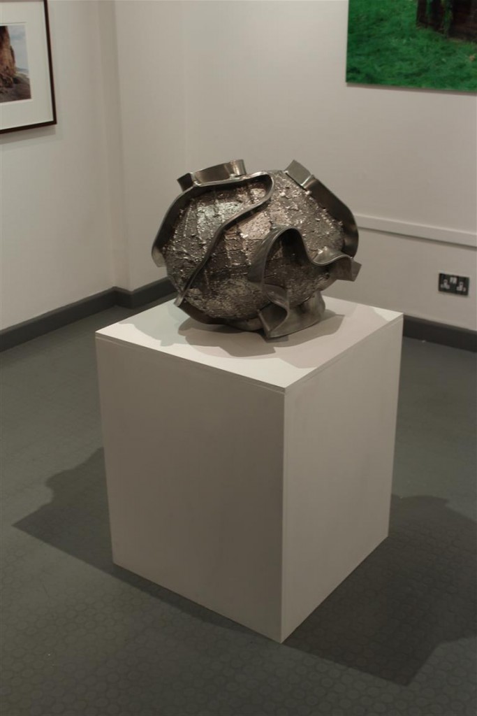
To conclue, David Goldblatt has influenced Michelle Sank artistically due to a theme of photographing peoples physical, social and cultural landscapes. The links between these two and influential traits that I have researched are visual and thematic links such as similar layouts to their images. Other considerable links between the two are that they were both born in South Africa, this could also have been a leading cause to the influence Goldblatt had on Sank. The photographs they both exhibited were picked due to the themes of social and cultural environments.

Note Taking from Quintessence Handout: Quintessence

 Quintessence Exhibition

Presents work by 14 different artists

  • Exhibiting, as a group exhibition, works from contemporary photography archive
    • Designed for future public enjoyment
  • Creative Partnership with Local and International photographers
    • Expanded and develop over the course of 4 Years
    • “they engage creatively with the idea that it is only through alterity that we come to know ourselves”
  • 6 from Archilse Contemporary Photography Collection (2011-15)
  • All of these Artists have completed projects for Archilse
  • Solo exhibitions from each artist


International Photographer in Residence (IPR) Programme

  • Sank, Toropstov and Pope
  • Brings photographers to live, work and teach in Jersey for 6 months
  • Body of work for exhibition and addition to Archive
  • IPR teach one day a week: over 100 workshops for islanders since 2011
  • Give Jersey community access to educational and professional development by internationally successful artists whilst building contemporary collection of photography in Jersey
  • ‘Quintessence’ marks first five years of Archisle Programme


The 6 Photographers

Michelle Sank

  • Influence from social order of Henry Mullin’s mid-19th Century Portraits

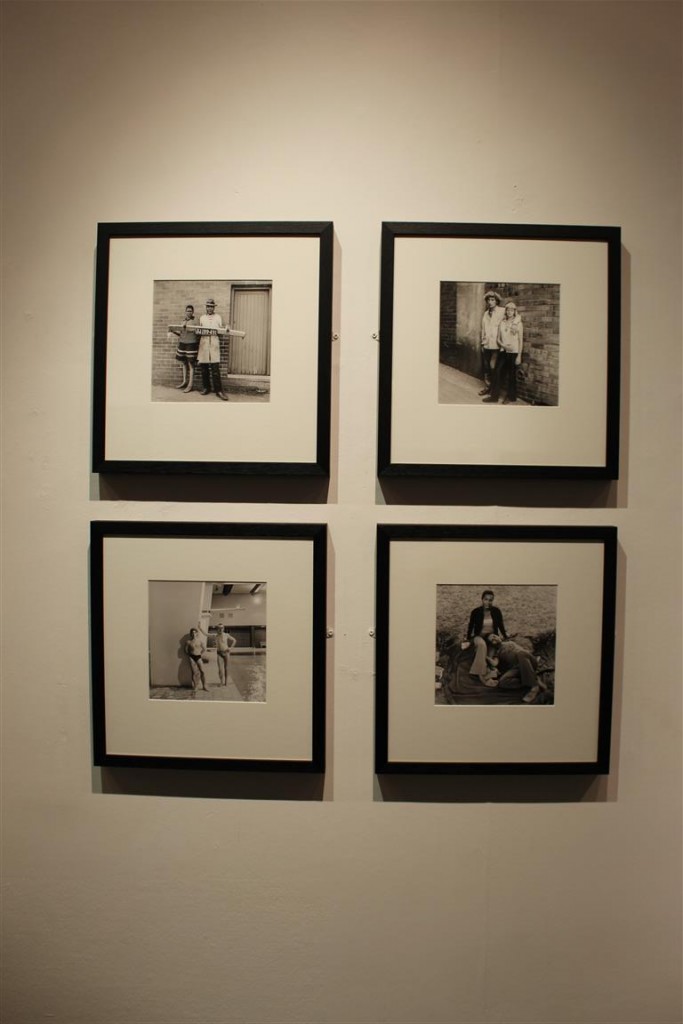
Clement William Henry – Photographed by Mullins

Mr de Quetteville – Photographed by Mullins 


Yury Toropstov

  • Character from ‘Fairyland’, a JBOF Carnival exhibit in 1937 British Pathé film

Tom Pope

  • Mask-making, subversive messages and game playing

files/gimgs/iamnottompopeyouarealltompope/website edit.jpg

Mark Le Ruez

  • Jersey born artist based in Berlin
  • 2014-15 Solo Exhibitions

Rügen #1. - Pigmented inkjet print. 22 x 22 cm


Martin Toft

  • Atlantus: transoceanic photography project between Martin Toft and Archilse
  • 350th Aniversity of Jersey Sir George Carteret naming U.S. State New Jersey after Jersey
  • 5 stories that respond to people, politics, landscapes, industries and indentites of Jersey and New Jersey
  • Binary Opposites: island vs. continental life

Martin Parr

  • World renowned British Photographer
  • Commissioned to Photograph 2013 Liberation Day Celebrations

PAM2013021G00393

GB. Jersey. Liberation Day. 2013.


8 nominated Artists

Gareth’s choice = Jem Southam

  • Jem Southam = Gareth’s Tutor at University of Plymouth
  • Red Mudstone Photographs = formal visual analyses of geological trauma
  • Rocks = “geographically an psychologically definite of island life”
  • Man made effects on environment

Martin Parr = Tony Ray Jones

  • Tony Ray Jones: 2013 exhibition only in England
  • Worked in the past with Ray-Jones’ negatives
  • Inspired very much the now distinct style of Parr

 Martin Toft = Finn Larsen

  • Martin’s Toft’s former mentor
  • Landscape photographer
  • Focuses on issue of changing landscape and climate due to man-made influences

# 02

# 01


Michelle Sank = David Goldbatt

  • South African photographer noted for his portrayal of South Africa during the period of apartheid
  • More recently that country’s landscapes
  • Inspiration for Michelle Sank study of social landscapes

Mark Le Ruez = John Gibbons

  • Irish conceptual artist – born 1949
  • Known for sculptures and ‘steelwork’

And the Earth Changes Shape

Sculpture: And the Earth Changes Shape

Tom Pope = Peter Finnermore

  • Welsh Conceptual Artist
  • Known for performance based, subversive photography
  • Influenced and inspired Pope’s playful, subversive and comical approach to photography and artistic performance


Note Taking from Quintessence Handout – Archisle

Background

  • Launched by Societe Jersiaise Photographic Archive in 2011
  • Promote contemporary photography through ongoing programme of exhibitions, educations and commissions
  • Connecting past with present
    • Archives with contemporary photography


Islandness

  • Starting a debate about how we represent our island through photography
    • Syvret suggests that ‘Islandness’ is not an open debate within Island life and community
  • Island culture = unique from continental views
  • Photographers on an island restricted in terms of context, audience and marketing
  • Project = first in Jersey of its kind: makes the people of Jersey question and embrace unique position of living on an island
  • ‘Archisle’ has potential to grow into worldwide project
    • Jersey host island games 2015: ‘inter-island lock in’ event organised – promoting the Archisle project to a wide audience who share in the concern of ‘Islandness’
  • International Photographer in Residence Programme: Establishing a relationship between local and international photographers


Pioneers of Photography in Jersey

Henry Mullins

  • English Photographer
  • Studio in Royal Square (1948-73)
  • Took over 9,000 portraits of islanders
    • Placed and identified in grid configurations based on social status
    • Interesting record of life in Jersey in Victorian times
    •  Use of photo archives as objective historical documentation

Mullins: Subject, Mr Aubin


Mullins: Subject, Mr Bertram


William Collie

  • Scottish Photographer
  • Experimented with proto-documentary methods
  • Creation of some of the earliest portraits of working class people in existence
  • Some of his images made it into 2007 exhibition of European Photography at Metropolitan Museum of Art, New York


Photography during Nazi Occupation

  • Nazi’s made every Islander be photographed:
    • Archive of 31,000 I.D. cards collected
  • Public Photography banned
    • Claude Cahun: Anti-Nazi activist
      • Photographed islanders as an act of resistance
    • Photographs taken during occupation
      • Explore views of rebellious counter-culture; form of resistance

Invaders: German soldiers with a 25-ton Char B tank used during the occupation of Jersey in the Second World War

Post War Photography

  • Recent photography is Jersey lacking specific focus and context. Archisle wants to change this
  • Jersey change over the course of century
    • 20th Century = farming
    • 21st Century = finance
  • Archisle – 125 Year Project in partnership with JEP
    • Selection of images from Jersey’s largest 20th Century Photographic Archive
    • Trying to promote the use of the archives in an interactive exhibition
    • Capturing Jersey’s progression from a first, second to third island

21 st Century Photography

  • Voice of the Jersey people is important
  • Jersey Archisle wants to promote the invention of specific archives looking into various aspects of Jersey life
    • Archisle Contemporary Photography Collection
    • JEP: form of contemporary photographic record. Hence its relationship with Jersey Archives
      • JEP = approximately 160,000 photos on-line in 11 categories


Summary

  • Identities of subjects and photographers absent in recent contemporary archives
  • Raising awareness of local photographers
  • Engage photographers with the culture of Jersey to create diverse an incisive visual archive


Link to the Official Archisle Website

http://www.archisle.org.je/


Case Study: Quintessence

Archisle Project

The ‘Archisle Project’ was launched in 2011 by Gareth Syvret, the photo archivist at the Societere Jersiaise. The aim of the project is to promote contemporary photography in Jersey through an ongoing programme of exhibitions, education and commissions. Syvret began the project out of concerns over the various restrictions local artists face in terms of context, exposure and marketing of their work. He hopes through the project, the inspire and give opportunities for young and developing photographers of the future, as well as the ordinary island public to be given access the quality, world-renowned international photographers, their work and extensive knowledge.

The project aims to celebrate and promote the concept of ‘islandness’, recognising Jersey’s unique island culture based on its isolated and ambiguous location in the English channel, subsequently being a mixture of Norman and English culture and identity. At the same time it aims to give photographers in Jersey more international exposure through inviting various internally renowned photographers to work, exhibit and teach on the island. This has seen the presence of various internationally acclaimed photographers on the island including Michelle Sank and Magnum Photographer Martin Parr.

The main goals hoped to be achieved through the Archisle Project

  • Promote the use of the archive as a source for creative work
  • Raise the status and context of photographers largely absent in recent contemporary archives
  • Engage international photographers with the culture of Jersey to create a diverse and inclusive visual archive.

Quintessence

The exhibition is a celebration of five years of the Archisle Project. It displays the work of six different artists who have worked for the Archisle project, and subsequently have such work displayed in the Societere Jersaise Photographic Archives. The exhibition was curated by Gareth Syvret, the photo archivist down at the Societere Jersaise, as well as the founder and leader of the Archisle Project.

The exhibition is arranged so that each artists work is distinct from one another and their chosen influence is next to that artist. The exhibition as well as being a celebration of the anniversary of Archisle, is also a representation of the growing profile of photography taken in Jersey and by Jersey photographs. The idea to include an influence of each of the artists is a clever way of recognising how locally based/born photographers are looking outside for external influence in their creative process, using the Archisle Project to then respond to this and therefore present the Jersey Public with a new and exciting body of photographic work based on their findings and developments.

  • Mark Le Reuz
  • Martin Parr
  • Martin Toft
  • Michelle Sank
  • Yury Toropstov
  • Tom Pope

These artists have all selected their own artists who they consider an influence.

The artists nominations are:

  • Mark Le Reuz = John Gibbons
  • Martin Parr = Tony Ray Jones
  • Martin Toft = Finn Larsen
  • Michelle Sank = David Goldblatt
  • Yury Toropstov = Elsie Wright and Frances Griffiths
  • Tom Pope = Peter Finnermore

Gareth, the curator,  has cited his own influence, Jem Southam who was  his tutor at Plymouth University, for a body of his own work to be included into the exhibition.

Evaluation

I enjoyed this exhibition a lot. In Jersey it is rare for top international photographers to be commissioned, and it was a very  good experience to see this very high quality of photographic work displayed and taken in Jersey, all for free. It was a very good educational experience as I have previously studied the work of Martin Parr and Yury Toropstov, and so it was very interesting to see life scale prints of their work.

The layout of the exhibition was very well considered and ordered. I liked how their wasn’t too many photographs only display and that the small size of the area was respected to include the right amount of images. In contrast the JEP exhibition was extremely cluttered and it ruined the atmosphere, making the room feel much smaller. This exhibition had just the right amount of images for the size, allowing space for the different sections. i.e. artists and their influences clearly separated.

The idea of placing the work of the artists next to their nomination was a good idea because it allowed for the audience to directly compare and consider the relationship of the artist/influence, their similarities and differences. This was particularity in the case in the work of Martin Parr and Michelle Sank as their respective influences; Tony Ray Jones and David Goldbatt explored very similar contextual themes; Parr and Jones through the concept off ‘britishness’ and Sank and Goldblattt through the concept of social/cultural identity.

Favourite/Least Favourite Images

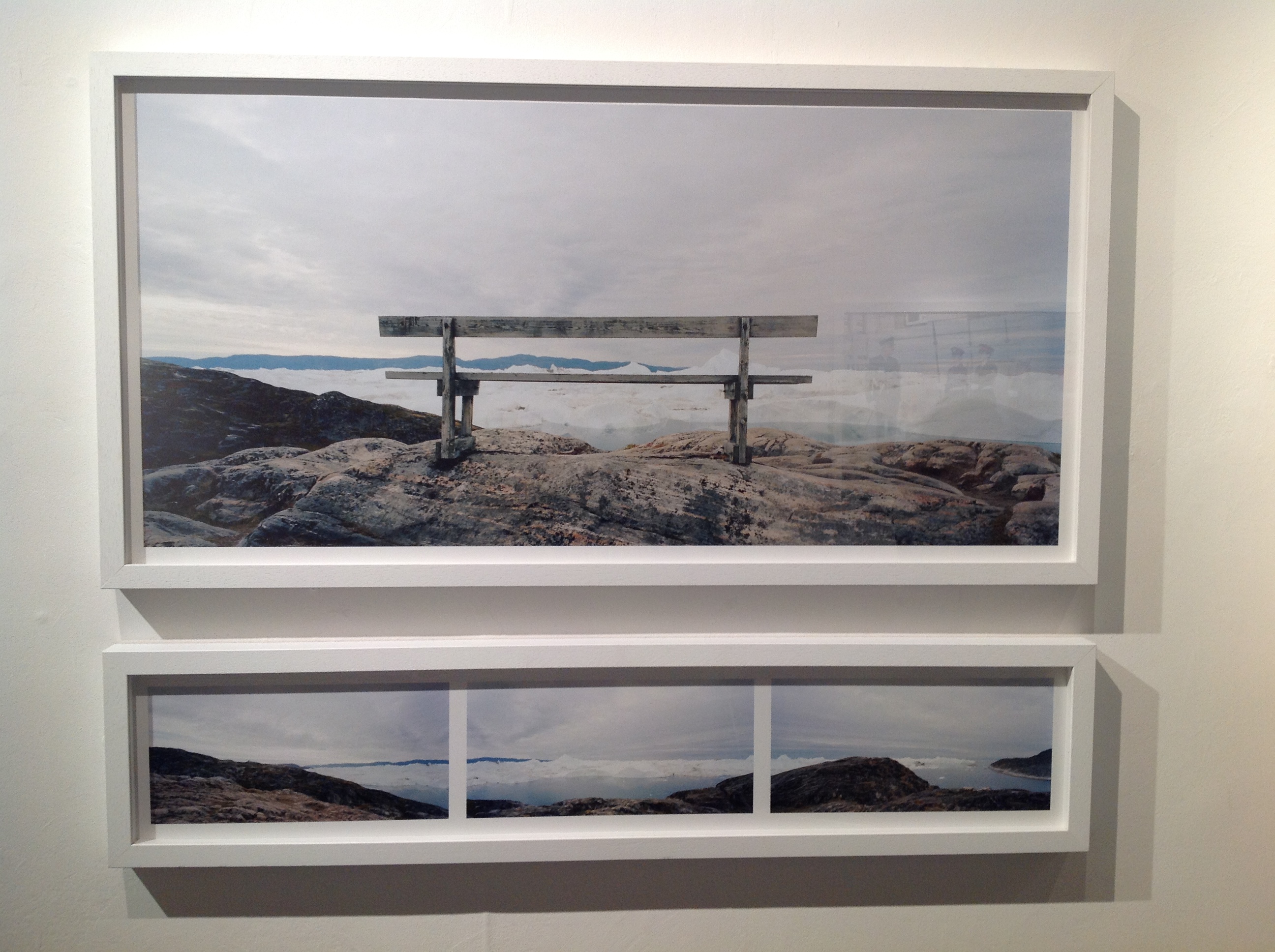
My favourite piece in the exhibition was Finn Larsen’s image of a bench overlooking an icy landscape. I like this image because I thought it was visually, an interesting e image. I find his representation of the sparse, sublime natural landscape to be very interesting to look at for both aesthetic as well as contextual reasons, as it is very much linked to the environmentalist concept of celebrating the natural world, whilst at the same time recognising its fragility. This idea is more important than ever nowadays and traditional landscape shots of the changing climate are quite often overlooked.

image

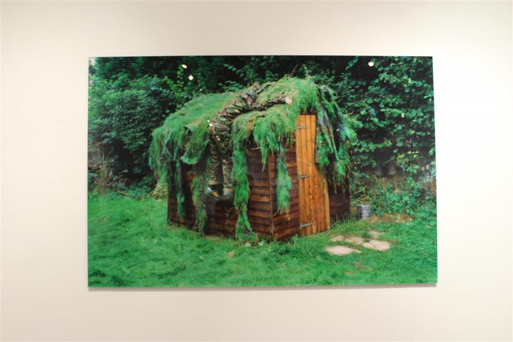
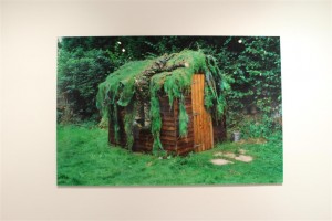
My least favourite image if the exhibition was Peter Finnermore’s image of a man climbing up a wooden shed covered in moss . To be honest I didn’t find the image to be particularity interesting., nor did I see the relevance/specific focus it had to the other images in the exhibition. I understood the concept but just didn’t particularity like the image.

image


Quintessence

How did Yury Toroptsov use the Jersey archive to help create his Fairyland exhibition? 

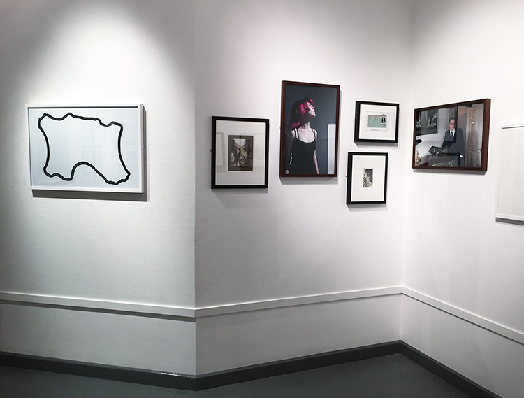
Recently I have been to visit the Quintessence photography exhibition at the Jersey art centre. This exhibition has been created in celebration of contemporary photography in Jersey and to mark a 5 year milestone for the Archisle. The work that was used in the exhibition was by artists who’s work was based on or inspired by our Island, Jersey. These artists were then asked to nominate a friend or a colleague to also participate in the Quintessence exhibition, these nominations were chosen in relation to their own work. The exhibition held a wide variety of photographs, which all held interesting context. All of the work was presented in clusters of each artists and were positioned next to their nominated colleague. I particularly took an interest in Yury Toroptsov, he presented some of his work from his FairyLand collection. As well as his own work he also included some of his research materials such as Jersey Archive photographs.

Yury’s ‘Fairy Land’ collection was created in 2014 when he came to stay on the island for 6 months. His first impression of Jersey was as well as it being a gorgeous Island, with lovely sunsets and beach’s he also came to the conclusion that “Jersey was a very mysterious and discrete place” (Toroptsov in FairyLand video 2014).

He wanted to get involved with the Island’s community and try and capture Jersey from his point of view. Yury’s first piece of inspiration was the traditional annual battle of flowers parade. He was digging in the archive and found a float from 1937. The float was called ‘FairyLand’.

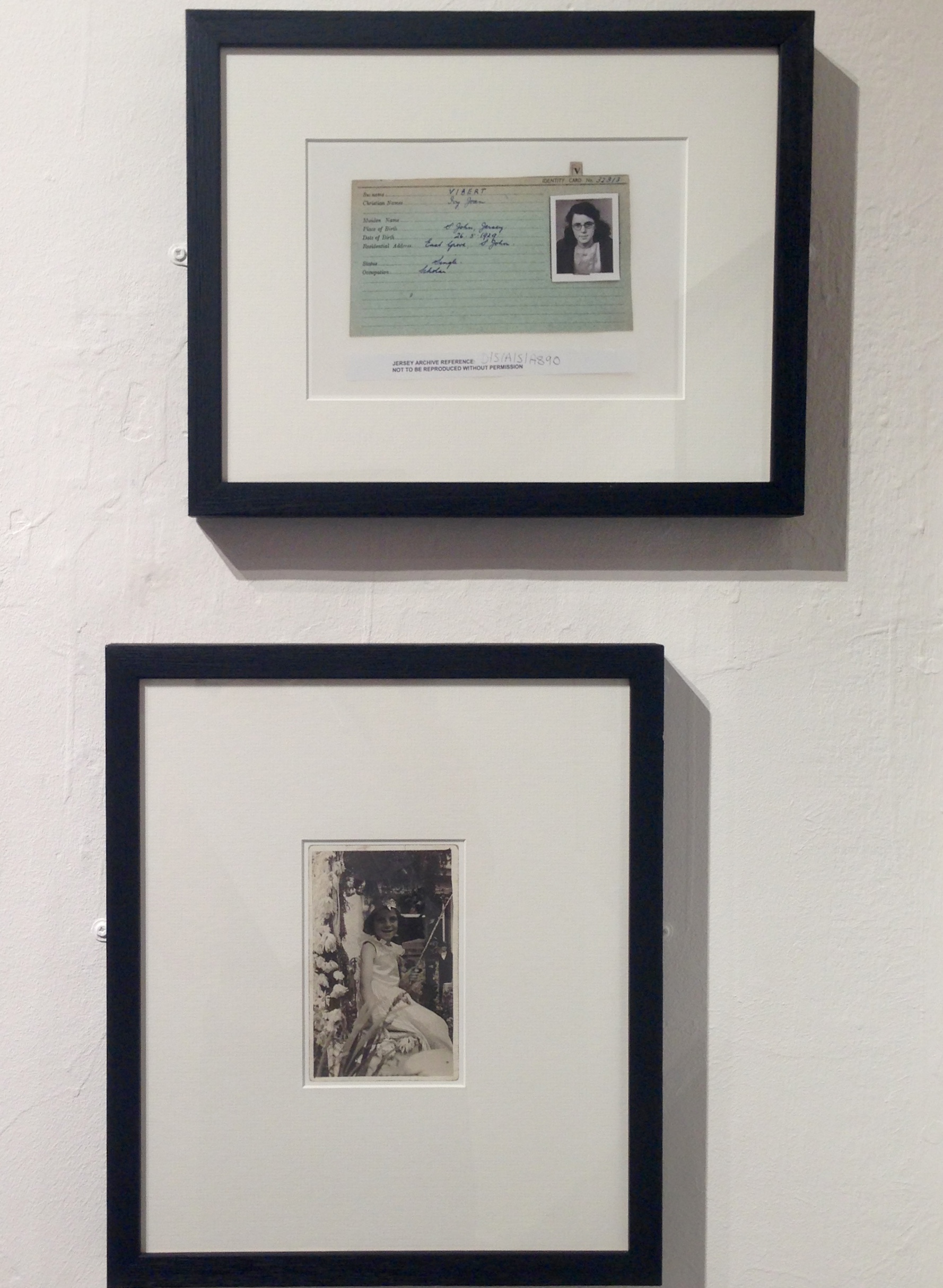
This float was created by Percy Vibert and his family, with his daughter Ivy Jean Vibert being the Fairy Queen of the Float. In Yuri’s collection of photographs that he chose to present at the Quintessence exhibition he included a portrait of the fairy queen. This portrait has Ivy Jean in the centre of the photo wearing a white dress with a flower crown. The photograph is in black and white, however it in rich in texture due to her being surrounded by flowers. I think this photo captures the innocence of Ivy Jean, and the innocence of the island. Another image that Yury presented in his collection is something that he found when looking up the Vibert family in the Jersey Archive. He found Ivy Jean Vibert’s juxtaposing portrait from when she was fourteen. This was her portrait from her German occupation registration card. Yury presented the two portraits together to tell the story of Ivy Jean growing up from a flower inspired queen to being a victim of the German occupation.

I really like that Yury has included archive photographs in his collection as I think it gives his work depth. It also gives the audience an understanding of were his idea’s have sprung from as well as making the collection have a wide variety of type of photographs to look at.

IMG_1013
Ivy Jean’s two different portraits

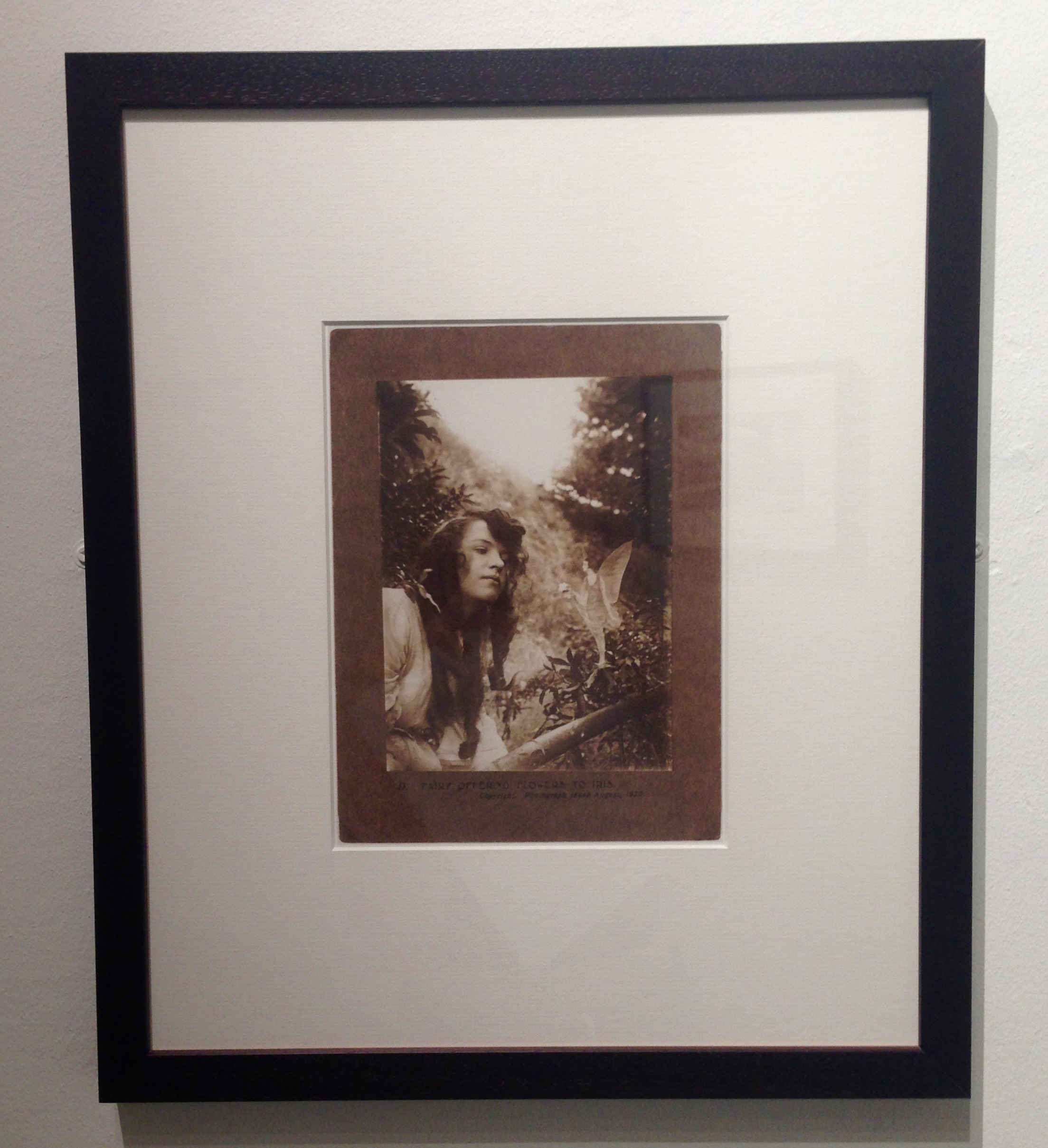
Another archive photograph that Yury Included in his work to help complete his collection is by Elsie Wright and Frances Griffiths called ‘Fairy offering Flowers to Iris’. Yury nominated Frances Griffiths as his chosen photographer, but he decided to include him work in within his cluster of photographs.

This photograph was taken by two children back in 1920, who were obsessing over fairies. They made a series of photograph’s featuring Elsie Write discovering fairies, which were edited on. I really like this photograph, firstly because of its age it has almost gone a sepia colour. Because of the absence of colour, it draws the viewers eye closer to the detail. For example the ringlets in Elsie’s hair, which have gone slightly frizzy, highlights the playful nature of the photograph. Secondly I like that it is surrounded by nature, which is similar to the portrait by Ivy Jean.

IMG_1011
Fairy offering Flowers to Iris

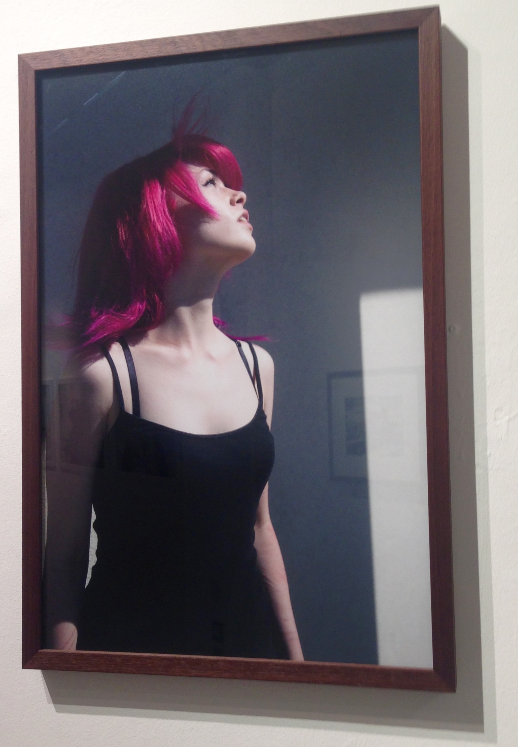
The final photo that I photograph that Yury presented is one of his own photographs called ‘Jess’. This photograph is in response to the theme of Fairy Land, with his modern interpretation. This photograph is perfectly composed and I believe it is a strong image.

IMG_1012
Jess

I think that the colours used in this photograph are very important; the reoccurring black and the scars left of Jess’s arms are  foreshadowing the darker side of teen hood. However the obvious bright pink hair, which immediately catches the viewers eye foreshadows that last bit of playfulness left in teens. 

The photograph captures Jess looking up into the sky, which exposes the side profile. All of her facial features are well defined and create detail for the photograph. The hair is being blow backwards which adds another dynamic to the image and introduces a different texture to the eye. However I think this photograph would be more interesting if you could see more of Jess’s face. The expression on a persons face and the look in their eyes, can change a photograph and the story it tells.

In conclusion, I think that the Quintessence was a very good exhibition that provided amazing photographs that were “Socially and Politically Connected” (Gareth Syvret the 9th December  at the Jersey Art Centre) all of the work had interesting stories behind them.

QUINTESSENCE: Task 1 – Questions

Quintessence is a group exhibition at the Arts center in town, celebrating the first five years of Archisle: The Jersey Contemporary Photography Programme. The Archisle Programme, hosted by the Société Jersiaise Photo Archive promotes contemporary photography through an ongoing programme of exhibitions, education and commissions. Archisle connects photographic archives, contemporary practice and experiences of island cultures and geographies through the development of a forum for creative discourse between Jersey and international artists. The exhibition features works by:

Martin Parr / Tony Ray-Jones / Jem Southam / Michelle Sank / David Goldblatt / Yury Toroptsov / Elsie Wright and Frances Griffiths / Tom Pope / Peter Finnemore / Mark le Ruez / John Gibbons / Martin Toft / Finn Larsen

IMG_1699blog

We all have three parts to this tasks, Task one is a set of questions, Two is an essay and three is a photo shoot in response

  • a) Write down the first thought about the exhibition that enters your head when you walk in?

When entering the exhibition I felt the room looked particularly empty but somehow cramped in some areas of the room. There were few images that really ‘stuck out’ for me, However there was one image that did stand out and was the first image I really noticed even though it was behind me as I entered the room. The photograph produced by ‘Peter Finnemore’ and the image was called ‘Koan Exercises’ from 2004. This image stood out for me due to the extreme saturation and size of the image.

  • b) Look at all the images on the walls. Now find a set of images that you like/ don’t like and write short descriptions of them.

Throughout this exhibition I came to realise that there were a considerable amount of pictures I did not like and few that I did.

PHOTOGRAPHS I DID LIKE 

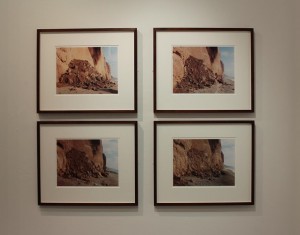
IMG_8121 (Medium)PETER FINNEMORE – KOAN EXERCISES IMG_8123 (Medium)FINN LARSEN – AL GORE WAS HERE. LLLULISSAT ICEFJORD, GREENLANDIMG_8122 (Medium) JEM SOUTHHAM – RED MUDSTONE, SIDMOUTIMG_8132 (Medium)IMG_8131 (Medium) JOHN GIBBONS – AND THE EARTH CHANGES SHAPEIMG_8126 (Medium)DAVID GOLDBLATT

I came to like the images above for many different reasons, some because on the contextual meanings and some purely because they were aesthetically enjoyable. Peter Finnemores Koan exercises is the first Iam to evaluate as it was the biggest and brightest in the exhibition, aswell as it being the first image to catch my eye. IMG_8121 (Medium)This is due to the bright and extremely saturating greens of the photograph. I found this image to be cleverly edited as the saturation and contrast increase make it the most ‘attractive image of the exhibition. I also find the image draws you in due to editing but the as you get closer to further examine it, you come to realize that there is a person in the image aswell. From afar the photograph just looks like a camouflaged shed, but a further examination reveals that there is infact a person hidden within the foliage. I find this type of image interesting as there are two stages to the perspective of the image. one from a far and one up close.


The two images by Finn Larsen were my favourite images from the exhibition. This is because I prefer ‘pretty’ photography rather than artsy and odd photography. These images I enjoy as they are both photographically correct Eg: well lined and edited. Rule of thirds is presented in the first image as there is an even and equal amount of space either side of the bench, aswell as the bench being horizontally straight.

IMG_8123 (Medium)The photograph has also been edited well as the colours of the image are seen as very clean cut and contrast well from the blues in the skies to the brown wood of the bench. I like how cold the image looks swell, how the focus of the image allows you to see the worn wood of the bench and the ice in the glaciers infant of the bench. However this project is infact about a landfill sight that is located behind the glaciers, Looking at the image on its own, one could not see that but researching the project it explains about the beauty in the nature of this image but you cannot see the ugliness of the landfill and garbage site beyond the ice.


The following image is taken by Jem Southam, This image drew me in due to the ‘warmness’ of the image. The clean cut layout of the four photographs was also aesthetically pleasing.  I was also draw in by this image as you believe it is a photo sequence or time lapse so you try to ‘spot the difference’, but you then discover that the four images were actually taken at different times.  IMG_8122 (Medium)The vibrance of this image also attracted me as the saturated landfall contrasted well with the pale blue skies.


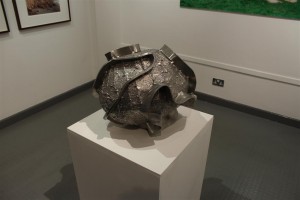
The next section of the exhibition was the only one of its kind in the room, a sculpture. This sculpture is by John Gibbons – And the Earth changes shape, I found this very intriguing as every other part of the exhibition was an image, in a frame, on the wall. This piece of work changed the feel of the exhibition as it was very different to the others. IMG_8132 (Medium)This piece of art I found interesting as the name obviously explains that the sculpture is of the earth due to the spherical shape, However there are rims that have been added on to the outside. This therefore interests the person viewing it and makes them wonder, why are there rims on the outside? why has the artist changed the sphere to have ridges on the outside?

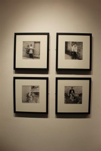
The next images attracted me within the exhibition purely because of the layout and clean cut presentation of the work. The colours of the photographs contrasted well with each other and well with the frames they were in. The frames and images being the same size and presented in the way they were complimented each other well and therefore when viewing you could see the link between them all. IMG_8126 (Medium)This artist was David Goldblatt nominated by Michelle sank a former ‘artist of residency’.


PHOTOGRAPHS I DID NOT LIKE:

IMG_8120 (Medium) IMG_8127 (Medium) IMG_8130 (Medium)

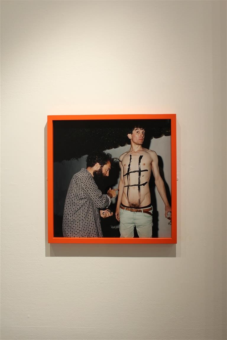
These three photographs I disliked due to their joint awkwardness. The photograph by Tom Pope I highly disliked due to the awkward and explicit nature, Im all for and explicit shoot and pushing the limits of ‘acceptable’ photography, but this image just made me feel very uncomfortable. IMG_8120 (Medium)However, some of the good things about this image was the frame and interest of it. The frame was the only coloured one of the exhibition so clearly caught the eyes of many. Even though the photograph is extremely awkward and uncomfortable for me, it did interest many of the people that viewed the exhibition.


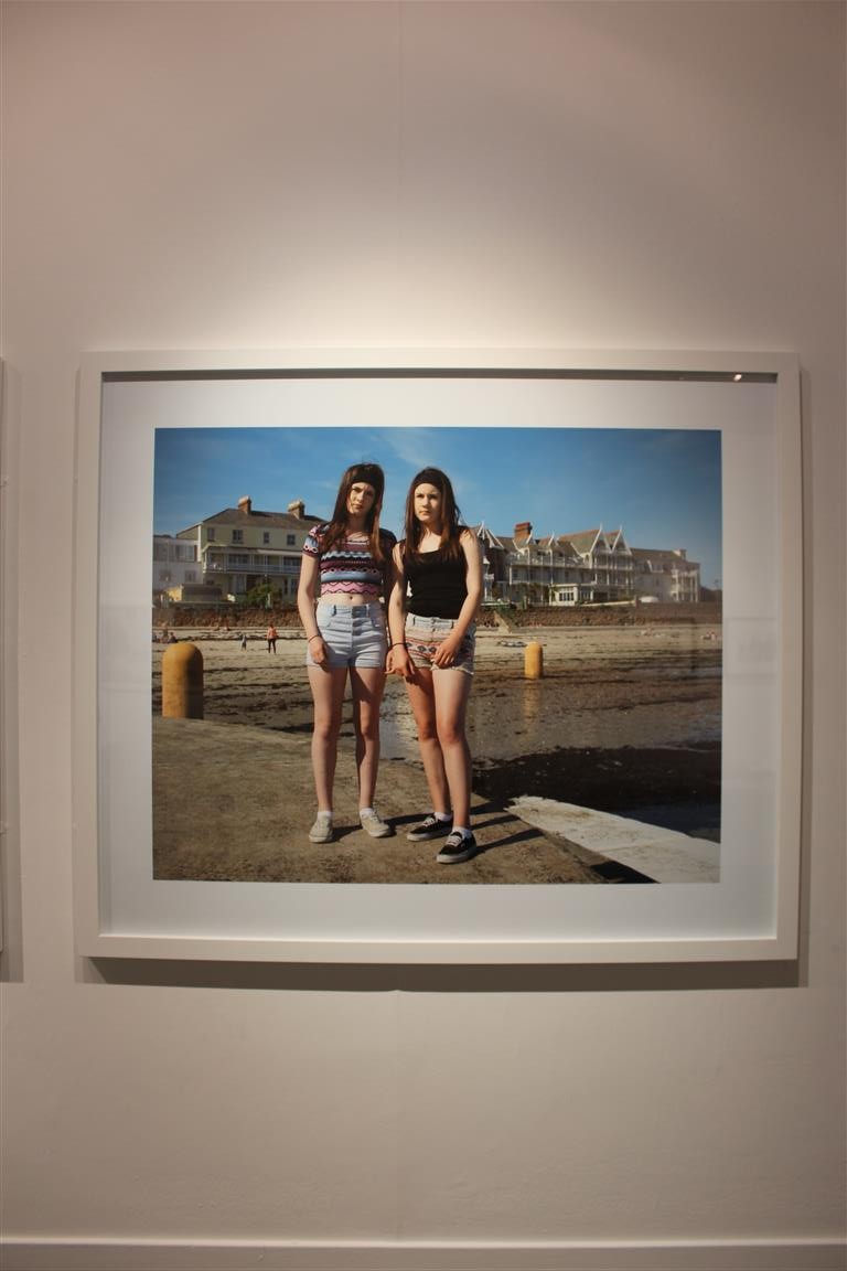
Although this image is well lined and edited, It also made me feel awkward and uncomfortable. This is because you can see the awkwardness that the two girls are feeling swell. Their body language and posture portrays discomfort and awkwardness.IMG_8127 (Medium)


This photograph by Martin Parr, I felt was very linked to his style of work and similar to the style and themes that he portrays in his projects. This image is well lined and has little negative space so therefore is technologically correct.
IMG_8130 (Medium)