Category Archives: Research

Filters

Author:
Category:

Archive Internship: How has this helped with my personal project?

Over the past half term, I have been working with the Societe Jersiaise Photographic Archive implementing key ideas to developing the Archive to my own personal project. These skills have made me develop various creative perspectives involving Archive extraction, research, experimentation and documentation. Exhibition and presentation design.

Some of the skills, which I have been contributing to my Archive experience, consist of:

  • Scanning & storing images
  • Image manipulation, resizing, creating composites
  • Producing teaching materials for Photo Archivist’s Workshop
  • Re-purposing images for Jersey Projection Gallery –(Ex.  Skip ton Arts)
  • Archive Searching database
  • Outputting digital prints, labeling and marking images from the
  • Understanding copyright policy
  • Retrieving original images from vintage collection in strong room
  • Working in secure areas, safe practice in the archive environment
  • Appropriate handling of original archive materials

My personal project has allowed me to evolve, as with help from Gareth Syvret, I’ve been able to manipulate photographs which relate to the history and period of my new house and how I can contrast the changes and traditions in everyday life today.

Danny Santos Research:

Danny Santos is a well know street photographer. He lives in Singapore where he captures daily shots of life.

Danny Santos - in the process of taking a strangers portrait
Danny Santos – in the process of taking a strangers portrait

Santos works in many mediums of photography such as studio portraiture and street portraiture. He grew fascinated by strangers as he wanted to capture their different characters and personalities through the lens.

I was especially captivated by a series of images he took in the rain and he entitled it “Bad Weather”.

“I used to always stay at home whenever the rain comes in the weekends. Eventually, I realized how the rain always brings refreshingly interesting scenes on how people react with it. I have written an article about my thoughts and experiences on shooting in the rain.” – Danny Santos

Here are some of his images that caught my eye:

danny-santos-03 bad-weather-22-1024x680 slide_291416_2326102_free untitled

As a response to his photograph’s, I’d like to create my own set. I think that the people’s responses and facial expressions are great. It’s a great variety from sad and angry to happy and cheerful.

Specification:

Who?

I want to photograph random strangers that are walking down the street.

When?

I shall be taking these photographs during the afternoon so the lighting will be quite dim and dark. Since the clock has gone back the daylight available is scarce. Therefore I may have to use flash in order to see the people.

Where?

I’d like to take these pictures in a city environment as the bright lights and detailed backgrounds will add to the image. It also gives it that urban feel.

What?

I want to aim to get a minimum of 50 photographs so that I have a wide variety of shots to pick from. I want to make sure that I capture people facing the camera and that there are minimal shots of people’s backs.

Family Photographer: Nick Waplington

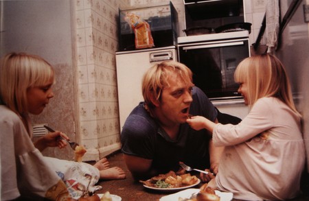
Nick Waplington is an artists and family photographer based in New York City and was born in 1965 in Sussex, United Kingdom. He went to study art at the West Sussex College of Art and Design in Worthing as well as studying at the Royal Acadamy of Art in London. His photographic work is usually amateur looking images of family, this interests me and I think that I can learn a lot from his work and the way that he photographs people.

About Waplington: http://www.claxtonprojects.com/books/nick-waplington/

Waplington’s website: http://nickwaplington.co.uk

Waplington’s Diary: http://nickwaplington.co.uk/diary

“I’ve never defined myself as a photographer. I make art” – Nick Waplington

“Photogragher Nick Waplington hit a creative high when he realised drugs were a waste of time” – Michael Fordham

Waplington mainly makes amateur style images to help portray his stories. His documentary style is almost like using a Polaroid camera or a disposable camera which is really interesting to me as they are quite artsy yet still seem to be of good quality. I like this style as it is different and stands out. Although I find his style interesting and unique for the images that I make I think that I want to keep to a higher quality style of images telling my story in a different way and relating more to Alain Laboile. I find that Waplington has a very unique and artsy style with weird unusual angles and amateur looking images. I find his work very interesting to look at as it is so different.

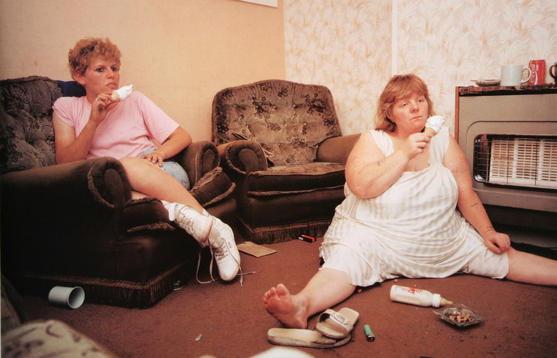
tumblr_mopnz8Kknz1sov71fo1_1280This is my favourite image of Waplinton’s as it is quite comical to look at. I find it really interesting to see the way the woman on the right side of the image is sat with her legs spread out as she slumps on the floor of the living room eating an ice cream with a blank facial expression on her face. I also like the way the woman on the left is sat as she looks very comfortable and they both look as though they are watching the television. This image doesn’t look staged at all to me and looks like a proper documentary image. I really like the entire composition of the image with the women not being totally in centre of the image and both being on either side of the image which allows the spectator to have a look at the whole of their surroundings. I like that this image is in colour as the spectator is able to see where the two women are and what kind of colours surround them. The colours are very yellow in this image which often connotes poverty or dirt as if they don’t have much money which is kind of evident with the entirety of the image showing how dirty the floor is and that one of the women is sat on the floor. Something that I really like about this image is the clothing that the women are wearing as it really interests me to see what fashion was like in the 80s and 90s. I like the colour of pink that the woman on the left is wearing as well as the, what looks like, undergarments or pyjamas that the woman on the right is wearing. I find that this image is very personal and was taken by Waplington as an insider to the family showing more of what an outsider photographer wouldn’t be able to do. This image really shows the behind the scenes of a working class family life and how they relax. I do however think that this family isn’t very clean and the house looks really dirty and as if they are less than working class and possibly living off of benefits or they are just jobless.

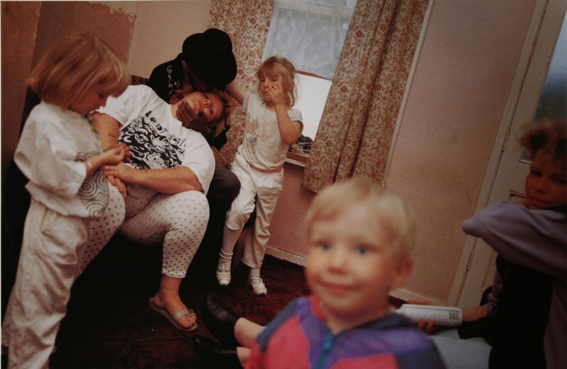
43bfb8edf94a2a3742ae910095c4e8b9I find this image hilarious as the little boy reminds me of the images that I have made of my niece smiling into the camera and interacting with the person behind the camera. I like that the children are all just stood around waiting for their mum to wake up. I find it hilarious how the woman is sat asleep really showing the struggles of parenthood and constantly being on the move to keep up with the children. Something that took me a bit longer to notice was that what I thought was a male with a beard was actually a female being held up by a man wearing a black hat sat on the arm of the chair. I think that this is down to the exposure of this image which just adds to the amateur of the entire shoot. I do think that the composition of this image is interesting as Waplington was able to capture everyone at a really great angle, with one of the young girls looking at her hands very bored while the girl right in the background of this image looks as if she is trying to capture the attention of the person holding up the woman. I just love the cute little smile on the boys face as he looks happy and as if he is looking off the camera and at Waplington himself.

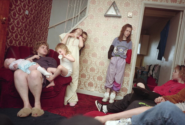
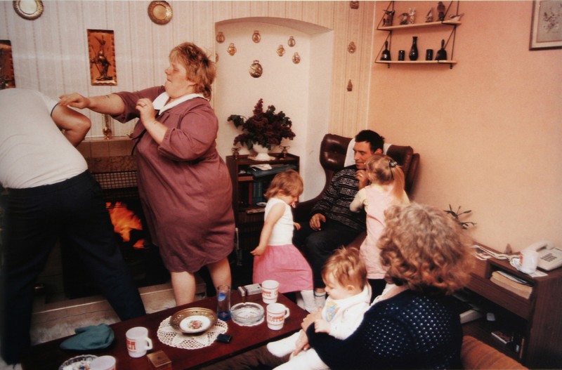
waplington-living-room-2-2I find this image very interesting to look at. It just looks like a typical family photograph of a regular family dealing with everyday quarrels and laughs. I don’t actually like this image that much as it doesn’t really do much for me as everyone is kind of everywhere and the composition doesn’t particularly appeal to me, I don’t find it very visually pleasing. I do however like the left part of the image where the woman is mid punch/push to the man that is half out of the frame. I find this the most interesting part of the image as it has a story to it but the rest of it is just random to me. I think that this image is definitely capturing a more amateur style photograph as it does just look like an image that a family member made at random on their disposable camera. I do think that Waplington has much better work that this particular image. I think that this image would have looked a lot better in Waplinton was looking up at the family from a low angle as it would have made everyone look a lot bigger and made for a much more interesting photograph.

My Documentary Spread – Magazine Layout:

The layout of the page is very important when presenting your photography. For our images we can apply them onto an A3 size of paper. Here’s a mood board of a few magazine spreads showcasing photography that i found:

1-Mosaic2mothers_day_photobook_7_webmagazine-layout-tiffany-ann7b-stylish-magazine-design

I have produced a two page spread that includes my favorite documentary outcomes. I’ve placed the pictures in a fairly varied layout. The photograph’s are all different sizes and dimensions. Accordingly, the angles at which I took them vary. I enlarged the image that I wanted as the main focus, because it intertwines the theme of ‘Family, Faith and Community’ in the best way.  All of the photographs are edited in some way or another. I included some very strong contrasts and vibrancy in them.

Here is my main picture:

DSC_0085 edit 2

This particular shot appears to be ‘layered photography’ due to the many subjects in one. In fact, no changes were made to the picture’s composition and nothing was moved.

Me and my family had just strolled to our car, that was parked in the church’s car park. As everyone was getting in the car, I took the opportunity to spontaneously take this.

I find it quite lucky that my friend was holding the booklet that we got given at our ‘Jersey Museum – 125 Hours’ visit:

fdgdh
“Your story, our history” booklet – Guidebook given to us at the Jersey Museum

I like how it shows the task booklet and gives a small detail about the photograph’s meaning. I believe that this manifests the theme of ‘community’, because it shows the assignment that our school was given to complete as a whole. Additionally the church in background adds depth whilst embodying the theme of ‘faith’. The girl in the picture is representative of the subject of ‘family’ in that I consider her to be my family.

I’ve tried out various designs in Photoshop as a form of ‘trial and error’ so that I could find the one design suited to illustrate my story.

Original layout:

Magazine spread - no text
Magazine spread – Original with no text

This was my initial magazine spread but i decided to alter it. I found that some of the images were out of context and didn’t relate to the overall subject.

Second layout:

magazine spread - 2nd try
Magazine spread – 2nd try with no text

For my second copy, I removed the picture on the bottom right-hand side as it was sort of an anomaly. I then moved some of the picture to create a balance. I aligned the photograph’s so that they would look more proportioned.

Third layout:

Magazine spread - 3rd copy
Magazine spread – 3rd copy

For my third alteration I expanded the titles so that they went across the top border of the A3 page. I wanted the writing to be spread out and aligned with the pictures.

Fourth layout:

sheet with photos 3rd try for the blog

This is my 4th try at the layout. I have added the text to go along with it and included some inspiring quotes associated with the subject I was doing. I also moved the two detail shots from the middle of the page to the top. This gives the layout more space for the writing and looks more balanced. Additionally, I altered the titles changing the color into purple. Purple is representative of imagination and individuality. ‘Impulsion Du Moment’ means ‘Spur-of-the-moment’ and this explains the whole spread, since I took the picture quite spontaneously as I wasn’t expecting to experience certain scenarios.

How to make a picture story using Light-room

Light-room is a good programme to design a picture story in. It has multi-functional purposes, allowing you to easily select, edit and then arrange photos. Light-room is much easier to work in then Photoshop because unlike Photoshop, all of your images are in the same place to where you edit. You can also plan out the narrative structure to your picture story, and then export your photos manually whilst presetting the size at the same time. This means the process is quicker with a lot less stress and hassle to deal with.


Step 1 – Storing your Images

Export all the images you want to create your picture story with onto the school M Drive. When you open your Light-room Catalog, import these images. Then make a ‘collection’ folder and move these images into a new folder. This means that you will be working with all of the relevant images.
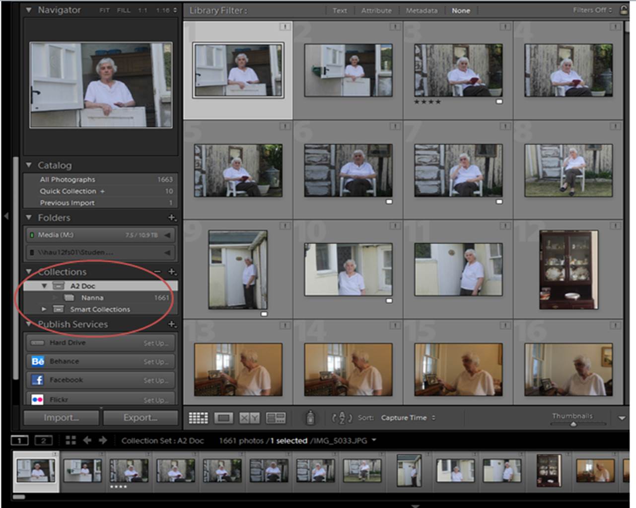
3


Step 2 – Making a Pre-selection

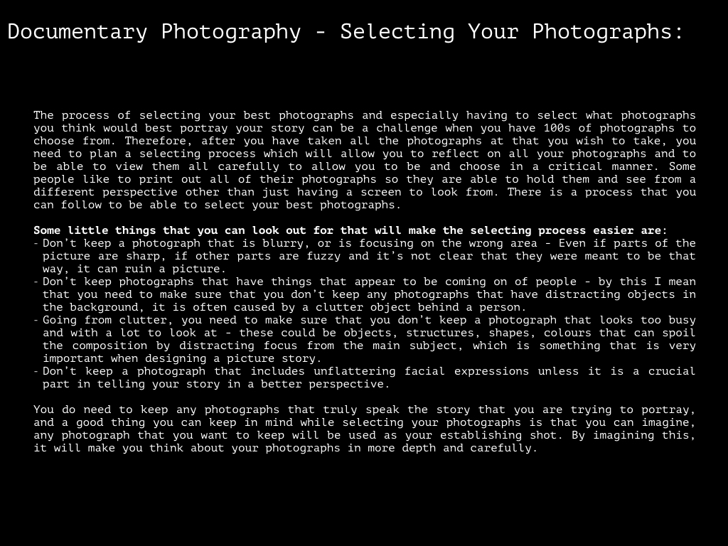
Now you have stored your images, you need to cut down on all the images you don’t want, leaving the best ones. You can separate the different images my changing the ‘star’ rating of the images, which is a view-able format in ‘library’ mode. My method is to leave the image I don’t want, images that i might want to use ‘3 stars’, and images I definitely want to use ‘4 stars’. It is a good idea to you over all the images again 2-3 more times, just to ensure you have made a right choices.
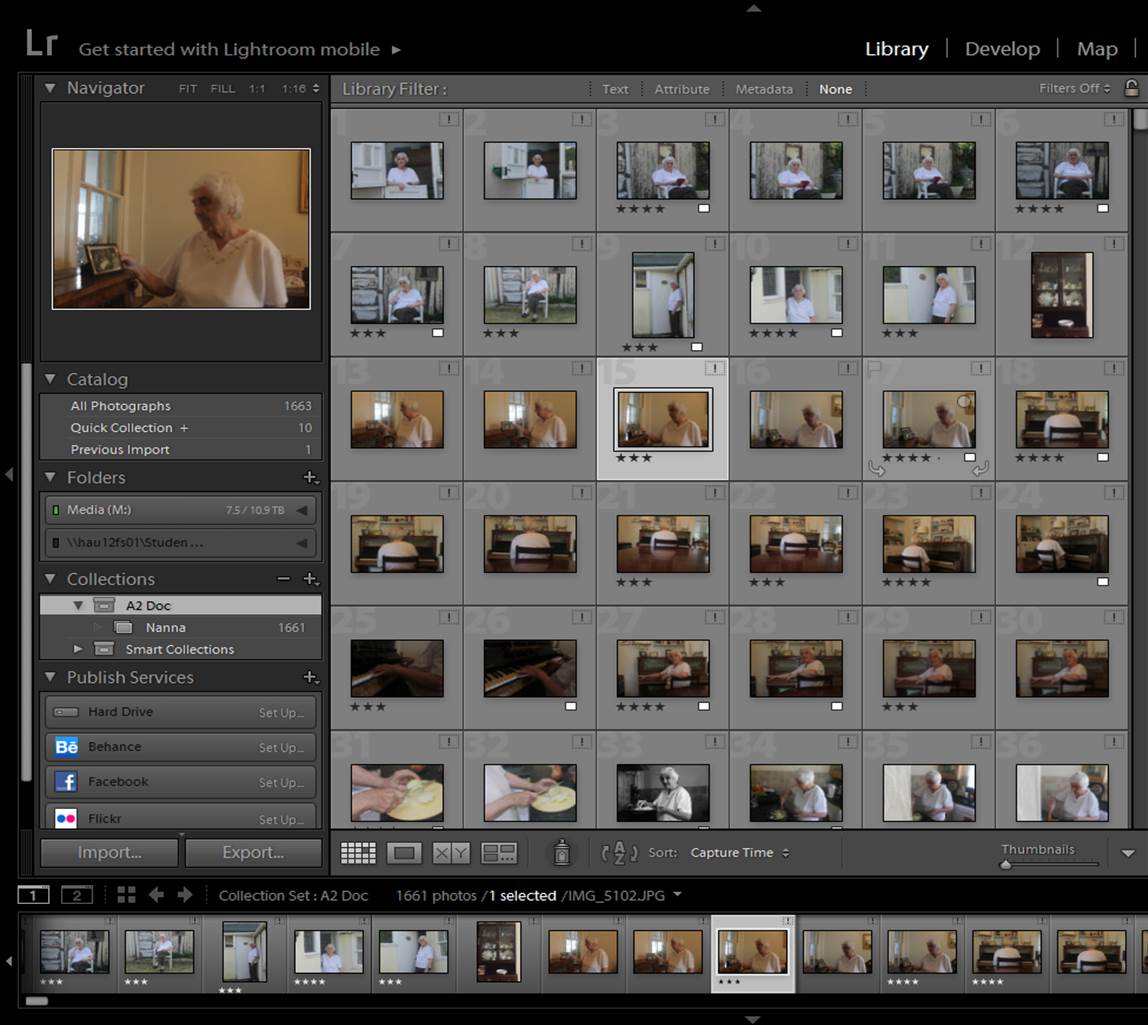
2

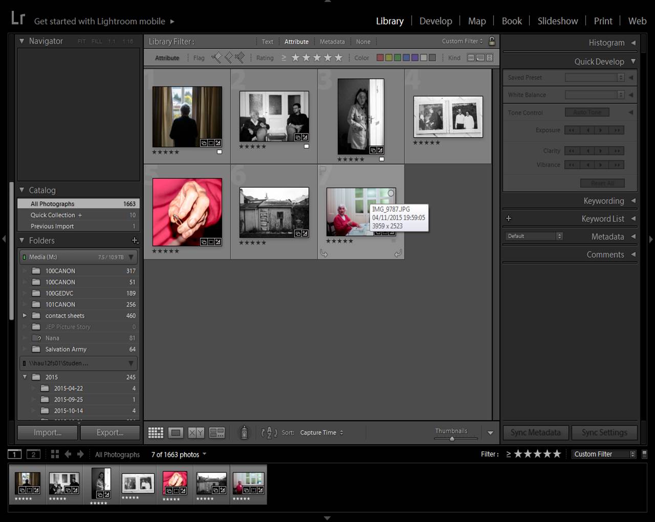
Step 3 – Filtering Pre-selection

To filter out to images you don’t need, select ‘attribute’ on the library filter section. If you want all your rated images, select the lowest star rating, if you want your highest, select your highest.
Picture1

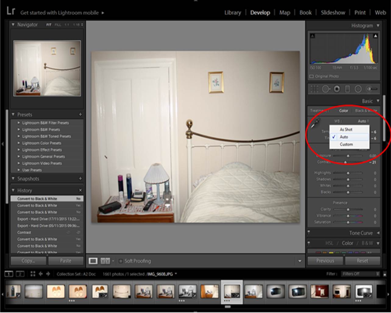
Step 3 – Editing your Pre-selection

With your 15-20 images, make a quick edit of the images. Small adjustments and auto-corrections only. This will give you an idea of what your images may look like in a picture story. To edit images, go to ‘develop’.
edits 2

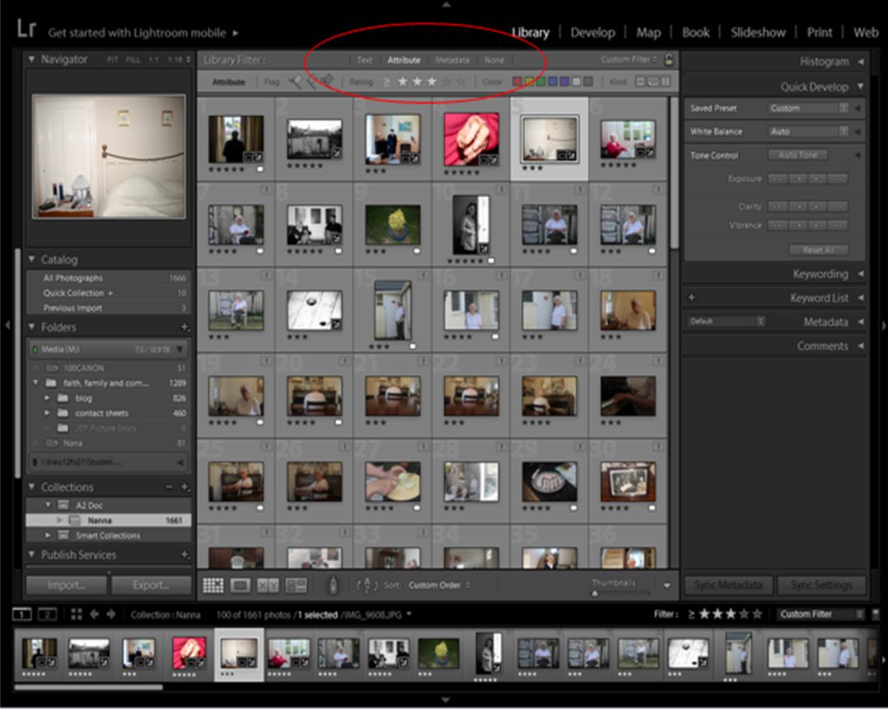
Step 4 – Cutting Down on Your Pre-selection

For a picture story you need 10-12 images. Play around with different images and orders until you have the section you want. When choosing/selecting the images you want, select ‘5 Stars’, this will create a fresh filtered page which can mimic a narrative order. Make sure all of your images are imported into the collection you are in, because otherwise you will not be able to swap the order of your images around!
edits 3

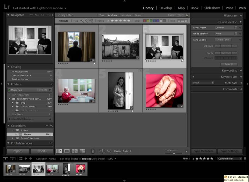
Step 5 – Re-arranging Order

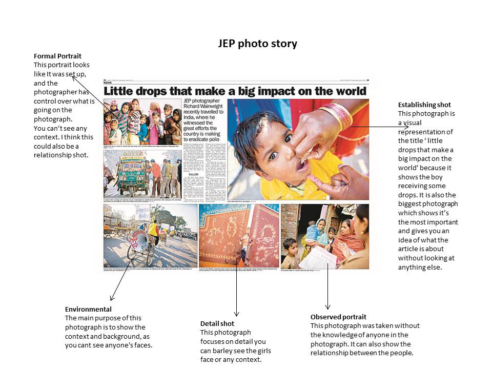
Now you have selected your best 10-12 photographs, consider how it is best to re-arrange your images. Consider different types of images (i.e. establishing/secondary establishing shot, detail shot, environmental portrait, relationship shot and people at work image), and how certain images will fit into certain parts of the story. You may need to change some of the final images around to make the images effective, strong and relevant in the particular story you want to create.
Picture1

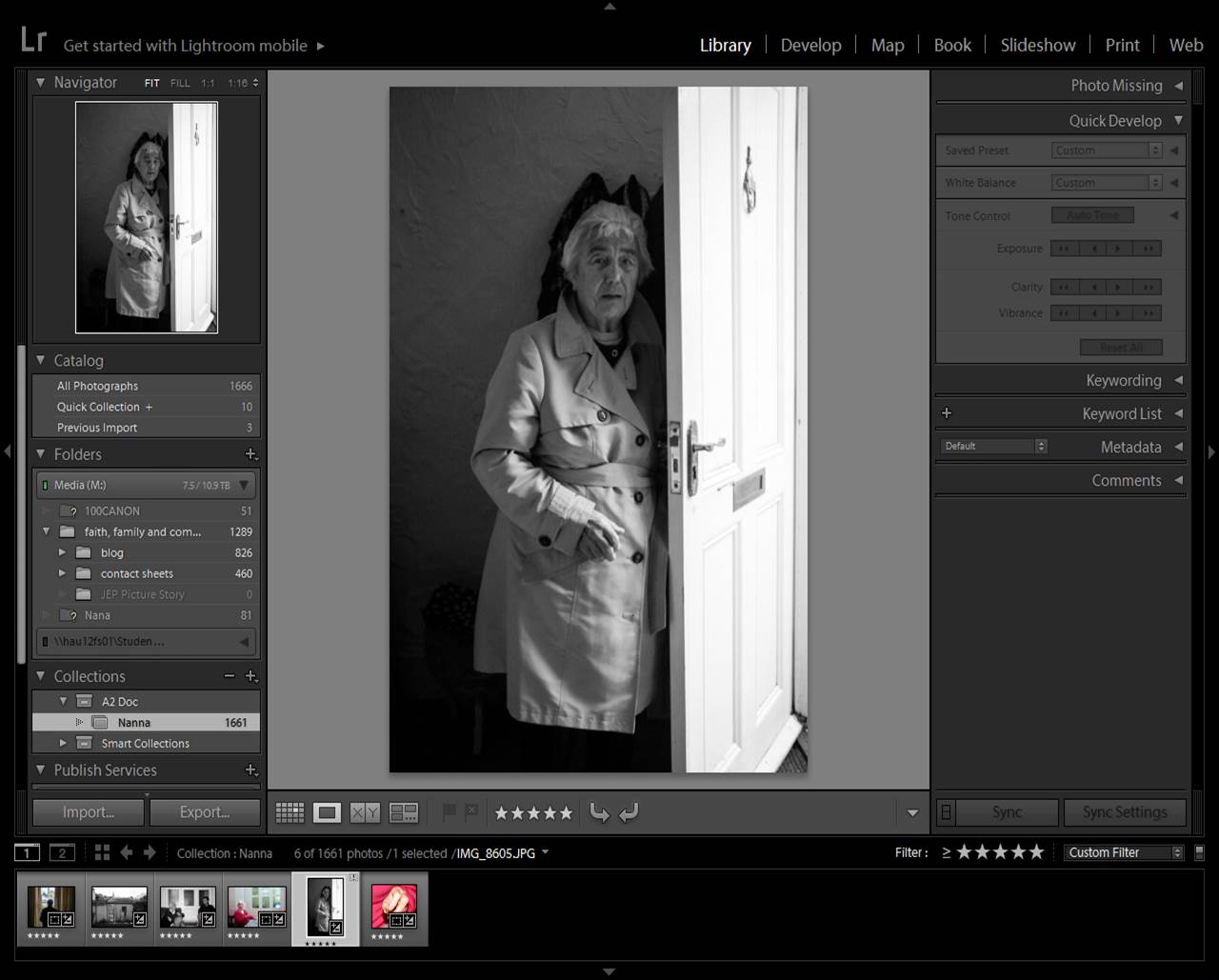
Step 6 – Final Edit

Once you are happy with your order, re-edit the images. Think about particular themes, (e.g. b/w, high contrast, high satuaration etc.)
Picture2

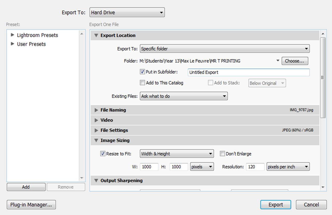
Step 7 – Export Images

To export your final selection, go to Export>Export to>Specific Folder>Select Folder>Choose
Picture4


Creating Picture Stories

There are common elements to picture stories including; title, headline as well a writing captions and headings within your piece. One of the most well-known picture stories is one created by Eugene Smith titled Country Doctor. Nowadays, newspapers are becoming less and less and are faced with competition through the internet, film and cinema. Photographers now have to compete with the media world. The oldest and most well known photographic company is Magnum Photos, often if a photographer is on Magnum they’ve made it in the photographic world.

Deconstructing a Picture Story

  • every photographer sees things differently so there is no right or wrong was of making your own picture story
  • there is no set way that a picture story is made

Recurring images
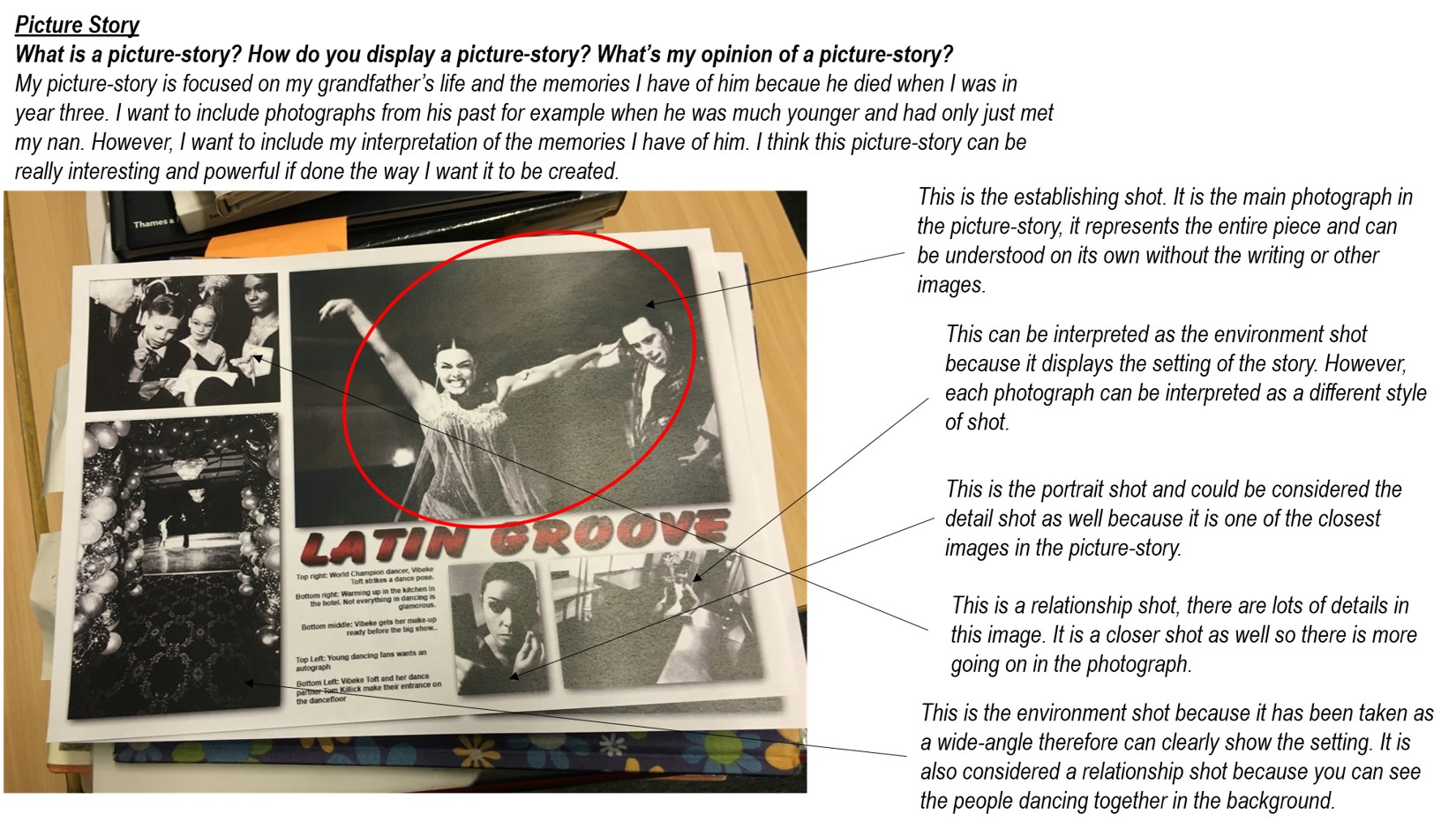
These are the most generic/common images that you would expect to see in a picture story

who is the person? What are they doing? How are they doing it? In what context are they doing it [different shot types/lens’ that the photographer uses telephoto lens – creates a narrow depth of field, wide angle lens. The environment that they are in]

  • person at work
    – this is simply making an image of a person in the work place and in their own working environment
  • relationship shot
    – what is the nature of someones relationship with someone/something? These type of image tends to have more than one person in it showing the relationship between the two subjects in the photograph
  • detail shot
    – gives more layers to the picture story and is often a close up of the little details within the environment that the photographer is in
  • establishing shot
    – this is the largest and most important image. It gives context and tells the spectator what is going on so they have a clear understanding with looking at the very first image. It sets the scene and the mood for the rest of the images within the picture story. These images usually have a strong focal point to draw the spectators attention to exactly what the photographer wants them to see
  • portraits
    – this image is the basic image of a person to show who is being photographed as well as the other shots setting up the environment and the atmosphere of where they are.
  • environmental shot
    – this is the shot that gives the spectator an insight to where the subject is and their surroundings

Eugene Smith – Country Doctor

Eugene Smith was born in 1918 and was an American photojournalist. Smith made photo journalistic images during World War II, the French Equatorial Africa as well as his most famous work following the dedication of an American country doctor and a nurse midwife.

Smith on Magnum Photos: http://10.93.17.43/access/web?id=0420ece7-8935-11e5-8515-002590c12864

“an instant classic,” – Life Magazine on Country Doctor

Eugene Smith – Country Doctor

Picture Stories Analysis

Analysis 1:
1st and 2nd page of article only
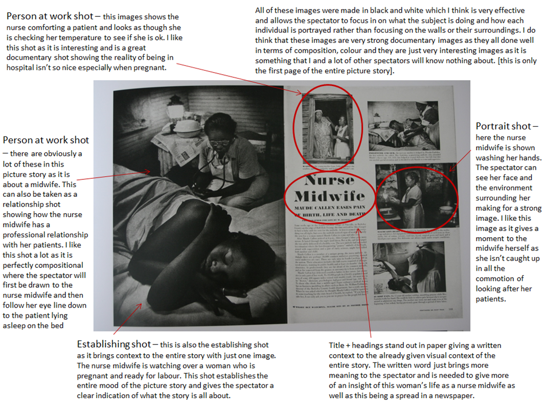
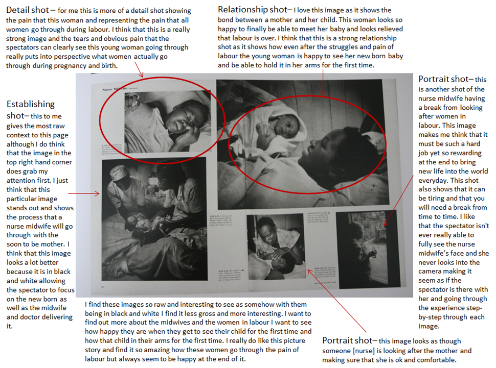
‘Nurse Midwife’ – by W Eugene Smith

pictur analysissss
page 1 analysis
picture analysis 2
page 2 analysis

Analysis 2:
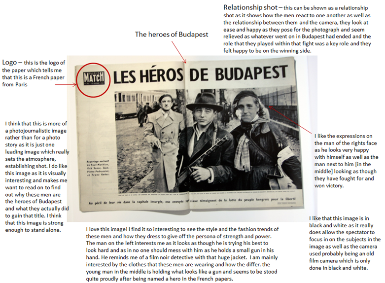
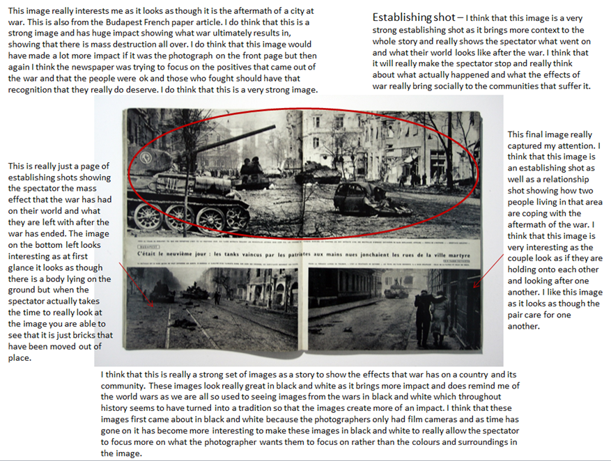
First two pages of article only
French paper on The Heroes of Budapest

picture analysis 3
page 1 analysis
picture analysis 4
page 2 analysis


Extra websites: 

http://www.panos.co.uk/

http://www.worldpressphoto.org/

Family Photography: Alain Laboile

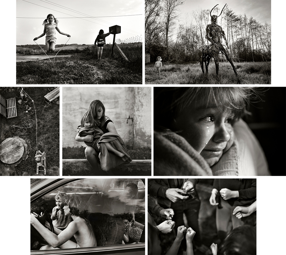
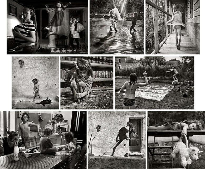
Alain Laboile is a French family photographer born in Bordeaux, France 1968. He is a father of six and uses his family as his subjects when photographing. In 2004 Laboile put together a portfolio of his work as a sculptor, this is where he picked up a camera and developed a taste for photography. A while after this Laboile pointed his camera onto his large family becoming his major subject. This is now what Laboile is known for, creating strong images of his family as well as being able to be at the heart of the family and documenting his children growing up. I like the concept of this because as a father he would be expected to go out and work but instead he is able to make stronger bonds with his children and be there for them whenever they need him as well as Laboile being able to do his photographic work which he is now known for.

“I am totally self-taught. When I began, I had a very limited photographic culture, no technique.” – Alain Laboile

alainnnn2

Laboile’s website: http://www.laboile.com/index.html

Lensculture ‘La Famille’ Archive: 
https://www.lensculture.com/alain-laboile?modal=true&modal_type=project&modal_project_id=8491

Lensculture Interview: https://www.lensculture.com/articles/alain-laboile-video-interview-alain-laboile

“Through my photographic work I celebrate and document my family life:A life on the edge of the world” – Alain Laboile

alain picsss2

Interview with Alain Laboile: http://www.all-about-photo.com/photographer.php?name=alain-laboile&id=528

I do like the work of Laboile as he simply makes images of his family when and wherever some good photo opportunities arrive. I think that his images look very professional and really capture some great family moments that can be quite similar to our own experiences and bring a sense of nostalgia to the spectators mind making them think more about the ups and downs of their own childhood as well as looking at Laboile’s photographs. I find these images very visually pleasing as each image is very crisp and clear allowing the spectator to see everything from a professional standard. These photos are really amazing with the composition and the entire mise-en-scene of the images especially from knowing that Laboile is a self-taught photographer and has only been photographing since 2004. He makes very strong and personal images showing not only the good side of being in a large family with lots of children but also the down side of having such a huge family where kids can fight etc. I do really like his work as it is so raw and real and is better than a usual family portrait kind of photo that spectators are used to seeing as he is an insider to the family and is part of the family so is able to use that to his advantage making images at times of the day and places that an outsider photographer wouldn’t be able to make.

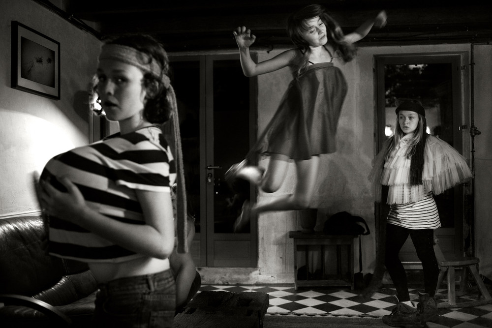
1c12c0857411f2142f75ab5988ac8109-largeI find this image really funny as the girls are all dressing up and messing around with what could be their mothers clothes. I think that this is a strong portrait as everything from the girl jumping in the air to the others standing and posing is so crisp and clear. I think the entire mise-en-scene of this image is perfect as the spectator is able to see their surrounding area and what kind of house they live in [seems like an old-fashioned house] as well as the facial expressions of the girls being really strong with the girl on the far left looking directly into the camera with a very serious facial expression while the girl in the back far right is posing similarly to her sister and looking off into the distance. I like the way that none of them are actually smiling or laughing as if they are very serious about dressing up in random outfits. It does look as though the girls were having a lot of fun dressing up and running round in their mums clothing. I do think that this image looks great and it being in black and white, for me, makes it a much stronger image as the spectator isn’t distracted by the colours of the light coming through or the colours of the clothes that those girls are wearing. Overall I think that this is a really strong image and is interesting to look at.

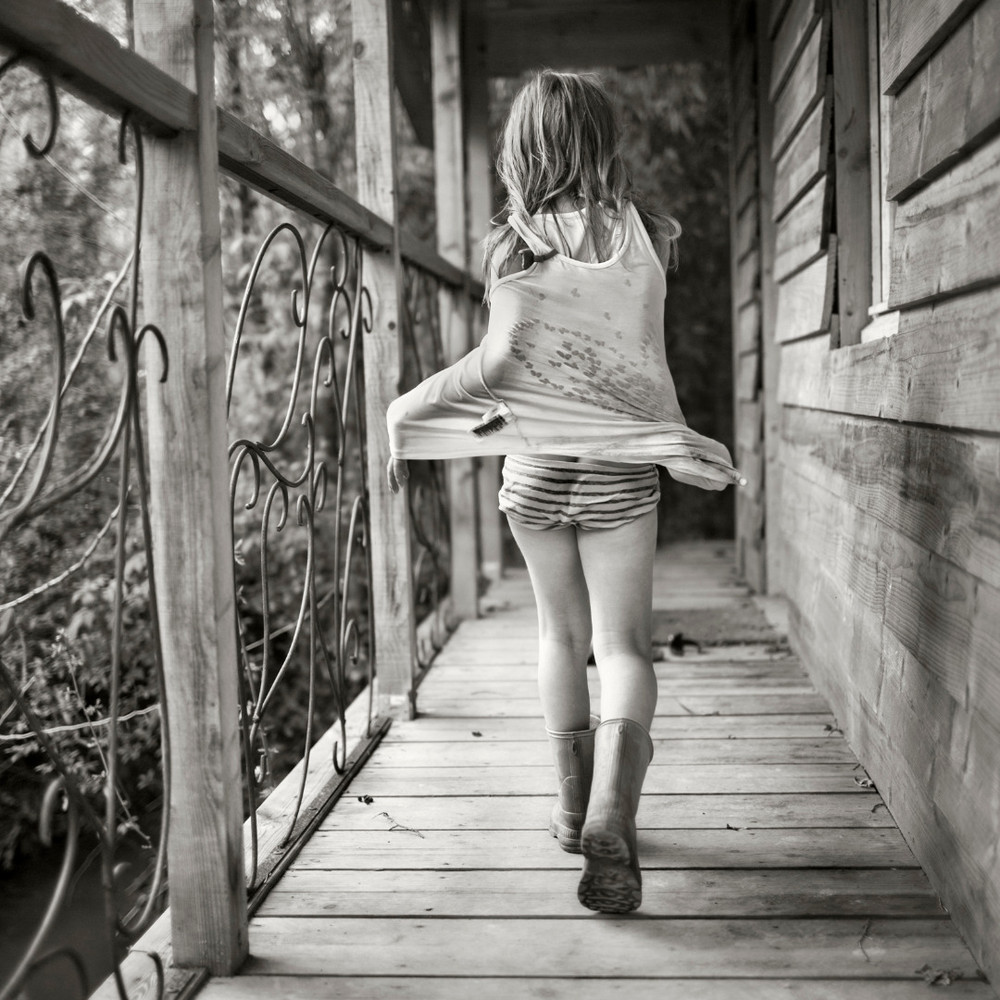
3a61400834ebf9bd122654aef12e30ed-largeThis is one of my favourite images because it is so simple. I like that Laboile caught one of his daughters walking along the patio of their house. I like that this photograph is taken from a more of a low angle as Laboile would most likely have been on his knees or leaning down low to make this image. This makes the patio balcony look a lot larger making the girl look smaller. The composition of this photograph is great as the spectator is directly drawn to the slight right of the image looking at the young girl. I also like what the little girl is wearing as her wellie boots suggest that she has been out in the muddy garden [shown in some of Laboile’s other images] as well as the back of her shirt looking wet as if she had been in a water/mud fight. I like that Laboile makes all of his images in black and white bringing across a theme as well as consistency of editing in the same style. This image is interesting and brings happy memories as it reminds the spectator of their youth and being younger with no cares or worries at all, we never even worried about getting our clothes muddy or dirty.

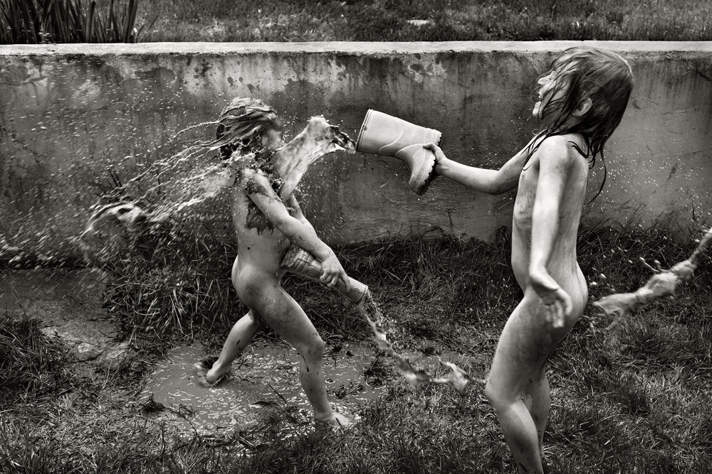
adeb70a9381d2ba40af65d014f2f11f6-largeI love that in a lot of Laboile’s images his children look like they are having the time of their lives and seem like such free spirits. I chose this image as I think that it really does show how free and comfortable these children are. It brings some nostalgia to the spectator bringing back memories of when they were younger and never had any cares and would just run around naked. I like the moment that Laboile has captured in this image, he has caught them laughing and having fun while throwing water from their wellies at one another. It seems extremely muddy where they are as the spectator is able to see the bottom left corner where the child’s foot is slipping. I find it hilarious that we only see one of the children laughing and having a good time while the other is too busy  trying to defend herself with the water right in her face as he wellie is lowered and the water is just tipping onto the muddy ground. It also looks as though there are more than just two of them having a water fight as in the right hand middle corner there is water about to catch the young girl on the back suggesting that there are more people involved. I think that this is a very strong image as it is very clear and easy to look at. It is more of a fun environmental image showing what ordinary children tend to get up to in their free time.

Picture story

A picture story usually include 6 or 7 pictures, the pictures are visually strong and informative and together they should be able to tell you a visual story.

  • Establishing shot – this photograph could show where and when the photo took place, and can include other elements such as mood, other people and weather.
  • Environmental shot – emphasizes the location of where the photograph is being taken,
  • Relationship shot – this photograph should be able to show you what is taking place and the relationship between the people.
  • Detail shot – concentrates on a place or a subject in particular.
  • Formal portrait –  where you are in control of the photograph.
  • Observed portrait –  more natural, the subject usually isn’t aware that the photograph is being taken.
  • Person at work – this photograph should be able to show you who the person is, what they are doing and what context they are doing it in.

picture story moodboard

Presentation1

Presentation2