Category Archives: Research

Filters

Author:
Category:

Documentary Photographer: Mary Ellen Mark

Mary Ellen Mark was a 75 year old American photographer, who died in May 2015. She has had 18 collections throughout her career that have been published and is known for her street/documentary photography. A lot of her works are exhibited in galleries and museums all over the world.

Mary Ellen Mark’s website: http://www.maryellenmark.com
Mary Ellen Mark’s portfolio: http://www.maryellenmark.com/gallery/gallery.html

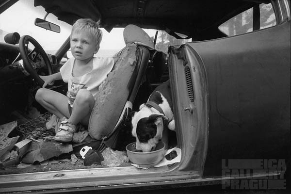
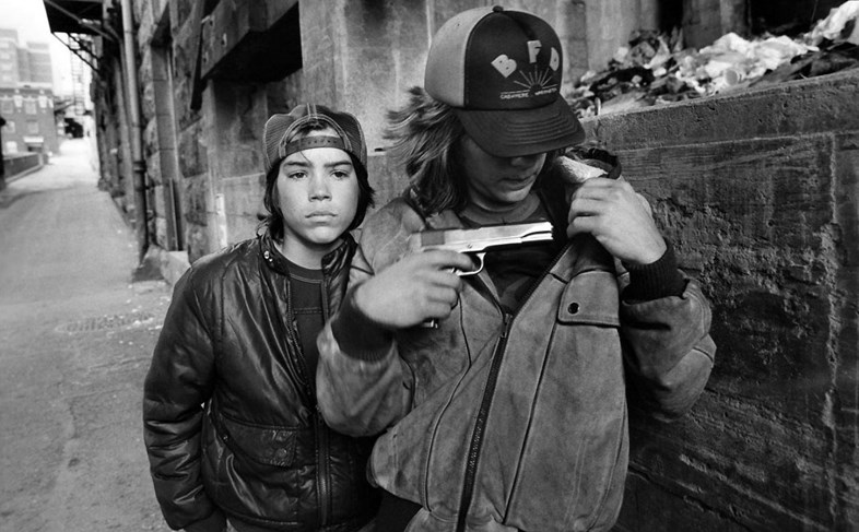
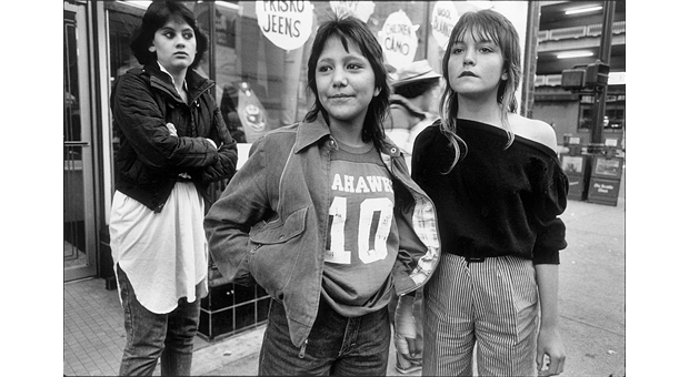
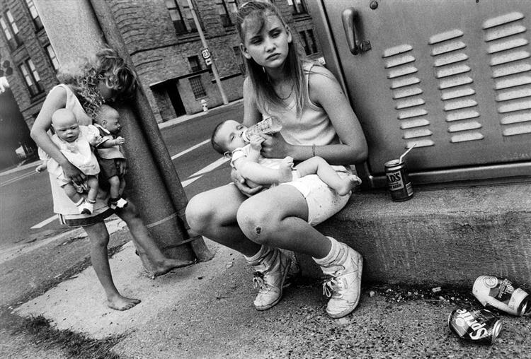
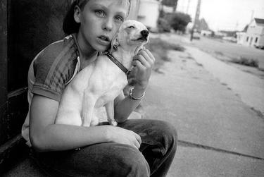
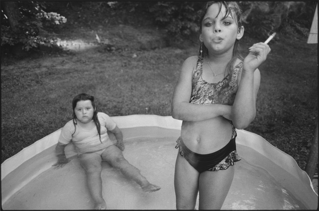
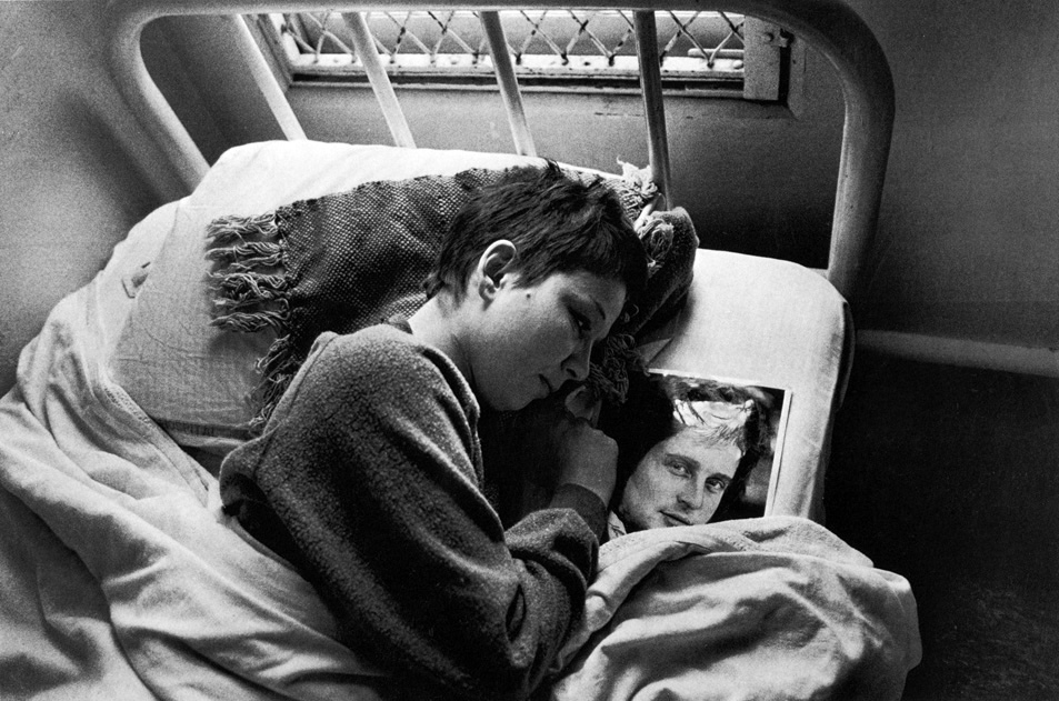
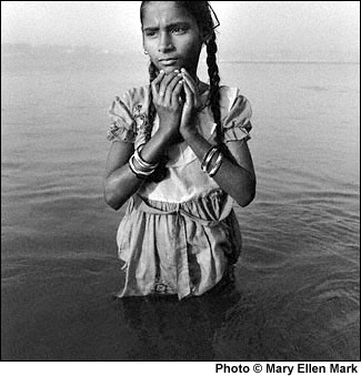
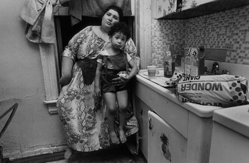
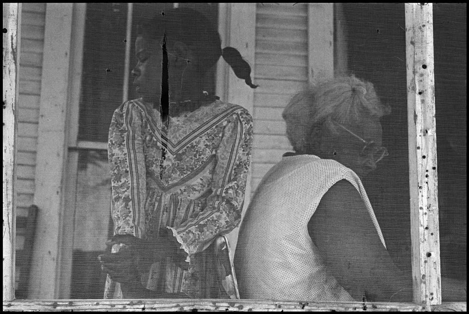
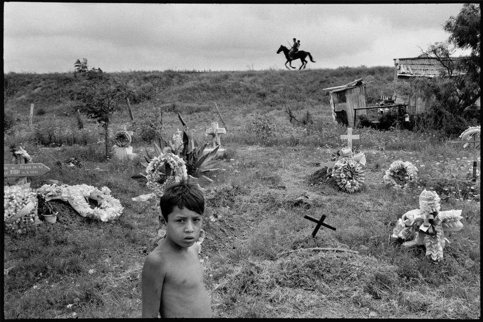
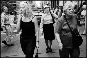
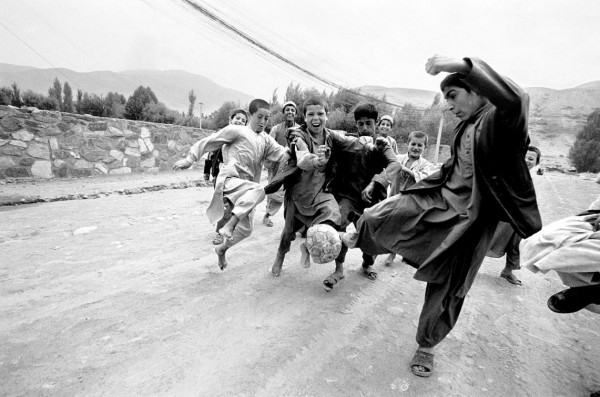
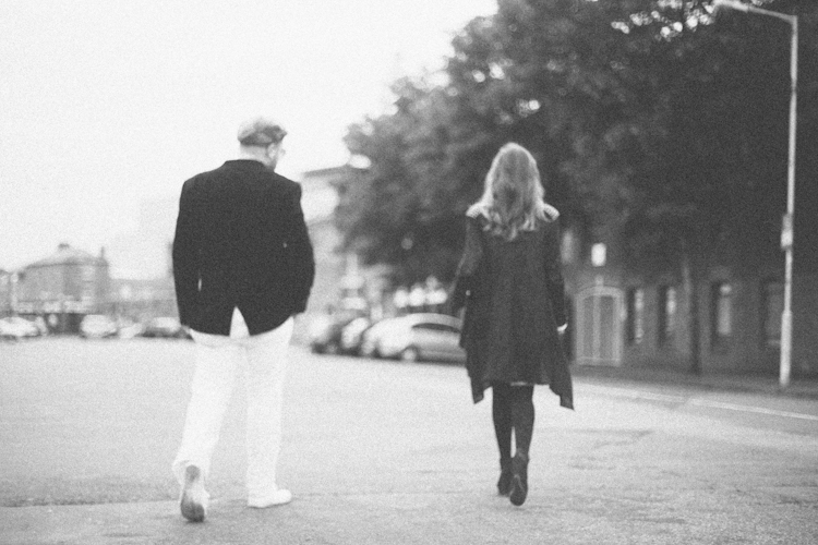
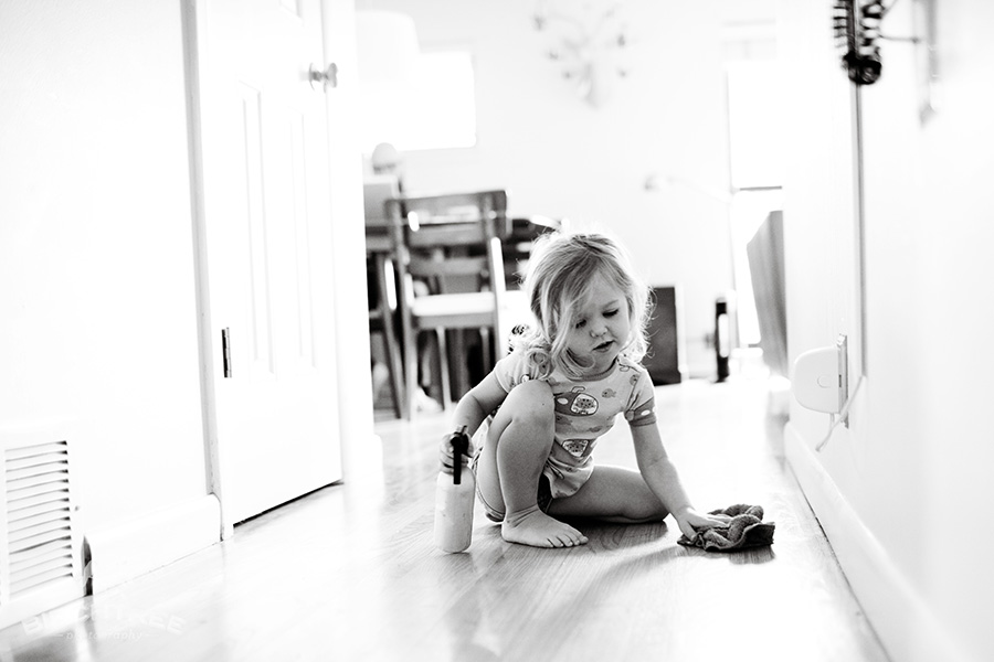
The reason I chose to look at this artist was because she does street photography which I find very interesting. I like that she finds different people from the norm and embracing that takes a good photo of them. I think that I will keep the concept of candid photographs on the streets in one of my own ideas for this project. I like how all of her images are in black and white, early on in her career this will have been the only available filter to use but more recently I think it is used to add more character to the environment and the people who she is photographing. This allows the spectator to focus in on the people in the image rather than being drawn in by all of the different colours, distracting them from the possible meaning behind the images she creates. I believe that a lot of Ellen Mark’s work fits into the tableau category as a lot of the time the people are looking directly into the camera and with a neutral facial expression which Ellen Mark will have had to ask them to do. I do think that the people are genuine and she comes across all of these different people on the streets yet it does hold the element of tableau photography that I think a lot of photographers will use in documentary photographs to make it more hard hitting and to make it more personal for the spectator to really be looking into the eyes of the subject in the images.

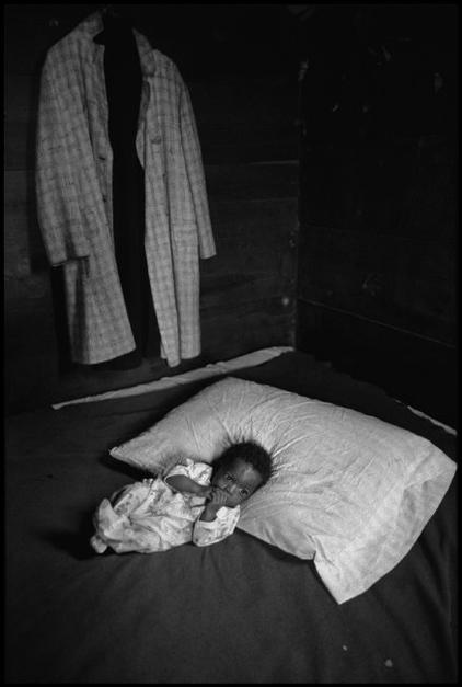
After looking at a few pieces of Mary Ellen Mark’s work I discovered that she tends to make images of poorer people or those who seem troubled. For  example there is one image where a small boy is sleeping in bed with his mother and father yet he is wide awake and looks crapped in the image. This shows that the family is poor and that they only have this one single mattress on the floor to share between the three of them and the boy is possibly troubled because maybe all he wants is his own space to grow and be happy. I feel like this young boy feels trapped by his parents but he can’t figure out a way to get out of it all and to escape into something better than the life he has with his parents. This could also be symbolic of how a lot of teenagers feel when they are finally growing into young adults but are still bombarded with pressure from their parents and still feel trapped under their wing even though they’ve been trying so hard to get away and create their own individual life. I like this image a lot because it really makes you appreciate what you have and allows the spectator to reflect a little on their own lives and the things we as humans always seem to take for granted, like having our own bed to sleep on each night.
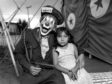
8362910539_fd509a0ec2This image creeps me out. I have no clue of what is going on in this image. I feel like the little girl really does not want to be there and is being held against her will by this freaky looking clown who is holding a gun! I just noticed that on his hat states ‘Captain America’, this could mean something. Captain America is a character from the Marvel comics. He is supposedly a hero who was frozen during the war and was to be brought back to life in the future to save America. Here the clown has a gun and looks as though he is casually aiming it towards the young girl, yet nothing seems forced. The little girl just looks as though she’s being in the photograph to please her parents and there is no real struggle. The clown looks extremely pleased with himself which creeps me out the most as I have no clue of what the motive of this image could actually be. Mary Ellen Mark could possibly be trying to say that this “Captain America” is just a stupid idea that would never work and that he would just become a clown for the government to play with and control. He would just follow orders and do as he was told no matter what the circumstance, hence the little girl possibly symbolising innocence. I really do not have a clue what is going on in this image and I think it is really random and difficult to figure out. Even though I did manage to create a possible meaning from this image I don’t think that it really has one. I think that this little girl was just at a circus with her family and the guy was dressed as the clown and then Mary Ellen Mark just asked them to sit together and she took this photograph, that is why he is not pressing her with the gun or holding onto her arm too tightly. They are just real people who were put into a real life situation together. The main thing I took from this was just a reminder of how much I dislike clowns.

An interview with Mary Ellen Mark: 

Debatably one of the most famous photographs of the 21st century was hers of the ‘Migrant Mother’. This is a very powerful image that throughout the years has caused much controversy with the subject herself and the photographer.
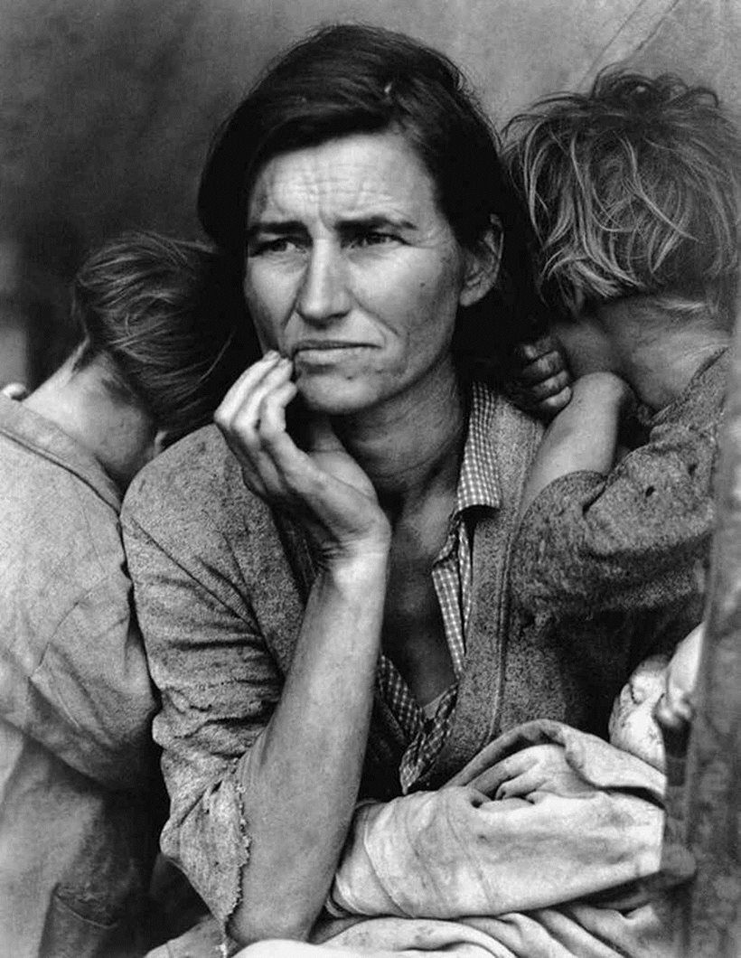
aaaaaaaThis is Mary Ellen Mark’s most iconic image. Here the children look as if they want their faces to be covered, that they are possibly ashamed to be seen in the photograph. Whereas, the mother looks as though she has a lot on her mind and possibly battling whether or not it was a good idea to take her and her three children out of their country and migrate to another for safety. They are all very dirty looking, including the little baby that she is holding with her left arm. To me this image is very sad as if all the happiness in the world wasn’t anything compared to all the sadness. This image allows the spectator to take from it what they want as well as bringing across a strong message of how lucky we are to live in a safe place where we don’t have to run away in fear of civil war or attacks from the governments. It has been stirred that a reporter talked to the migrant mother who claimed that she didn’t actually want Ellen Mark to take the photograph of her yet she did it anyway. I feel like this is possibly true because why would a migrant want their photo all over America? She is trying to get away from all the drama of her own country she doesn’t need to start her new life with her children filled with drama of a new kind, being constantly bombarded with questions about how she felt in that image and what was going on at the time. This image really does make me thankful for the life I have, to not have to escape a country in order to keep safe.

Overall, I think Mary Ellen Mark has made many inspiring images that I want  to try and follow in the footsteps of by possibly going to the streets and making images of people. I like the rawness of the images and having no plan until I am in a situation creating more spontaneous images rather than pre-planned and rehearsed ones.

Documentary Photography

Throughout summer I have been looking into our next topic, documentary photography. For this I wanted to find a way to bring in my own style and ideas without completely ignoring the original concept of documentary photography. To me documentary photography is simply taking photographs of a person’s everyday life, following them around and taking various action shots of all the elements of that person’s day. Documentation is an extremely popular media and I believe it to be something that we as humans have done for millions of years, even from the beginning when cave men made drawings on the stone walls, the carvings made by Egyptians to the stained-glass windows in churches. Documentation almost comes naturally to us. I believe that there is no perfect way to document something, however I do believe that documenting something visually is so much better than simply writing it down. I love watching videos diaries that people create and show the world from their perspective and those who document their day and what they have done. One YouTuber in particular that I really love is Jack Harries who has created a series of short documentary films as he travels the world and discovers new people and new places.

Jack Harries
YouTube channel:  https://www.youtube.com/user/JacksGap
T
witter: https://twitter.com/jackharries
Instagram: https://instagram.com/jackharries/?hl=en

My favourite videos of his
The Rickshaw Run series:

24 hours in series:

The reason I love watching this style of film documentary is because it’s so real and exciting. I like seeing different cultures and people and being able to discover new places even if I am sat watching it over the internet and not actually being physically there. The way these videos are filmed are excellent as Harries created his own Steadicam from a first person perspective. He used a bike helmet, put two weights on the back and his Canon 6D on the front with a view finder too right in front of his face to create the most real reactions possible while seeing the world from his perspective. I really enjoy discovering different cultures and seeing different streets of the world without even having to spend any money at all. Visual documentary is a great thing and, I think, the best way to lock in mementos of our modern world for the future generations to come.

Alex Webb
Alex Webb’s Portfolio: http://www.magnumphotos.com/C.aspx?VP3=CMS3&VF=MAGO31_10_VForm&ERID=24KL53Y_H
Alex Webb’s website: http://www.webbnorriswebb.co

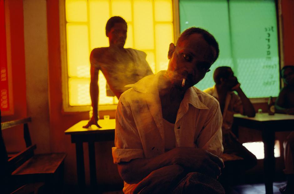
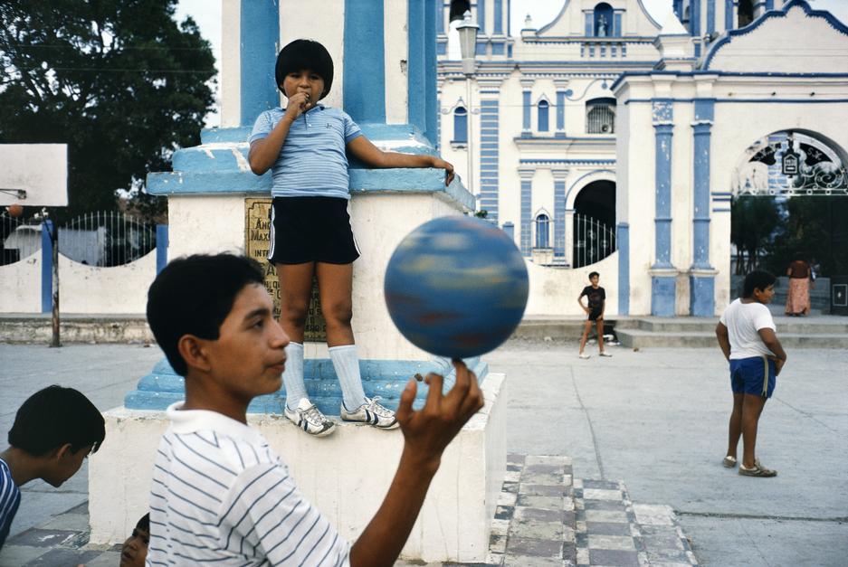
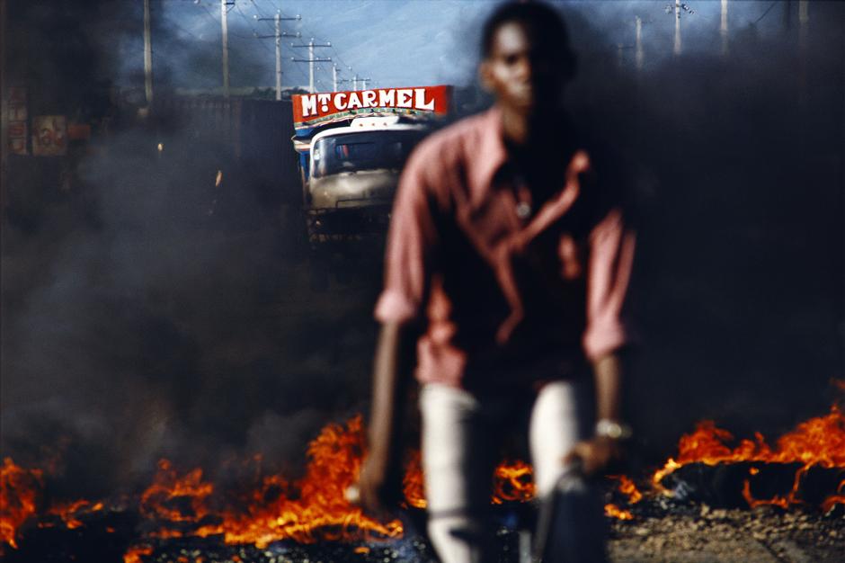
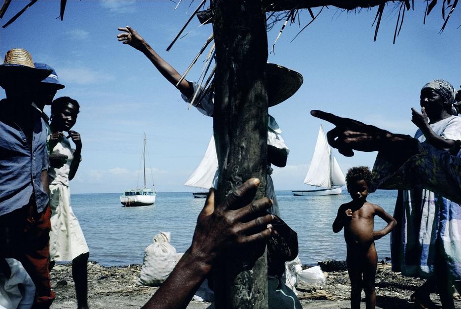
Below are some of Alex Webb’s images

I find Webb’s images interesting as they are somewhat staged but also documentary. His images lean more towards the tableau side of photography as when he goes into a situation he gets real people and repositions them to make for a more interesting photograph.

—-

At first I struggled to come up with, what I thought was, an interesting idea. I thought that it would be challenging to come up with a concept and a meaning behind each photograph but then I realised that the whole concept behind this style of photography is not to have some amazingly moving concept or meaning, it is simply a way of remembering. A way to hold on to memories for longer than our minds could ever hold onto. I began to question how interesting ordinary people’s lives were, mainly my own. I thought that my life was very mundane and not worth the documentation but then I realised that we are all different and all unique and it would be very interesting to see how every ordinary person lives their private life. What actually makes us ‘ordinary’? I want to find something different, someone who stands out from the norm. This is when I realised that we are all very different the way we handle and approach things and I think that this alone could be a really excellent exploration of documentary photography. I want to follow ordinary people throughout their day and see how each one of those people do things differently.

I believe that there is a set of ethics that photographers must follow from a humanitarian perspective. Each other their images must be true to its surroundings and not suggest something that is completely false. I think that photography can be very honest as photographers are able to express themselves through their work as well as in documentary photography, getting a true and real message across for the rest of the world to view. Photographers are able to manipulate events by only allowing the spectator to see what they want them to see. This can simply be zooming more into the environment only just allowing what the photographer wants their spectator to see. There has been debates between staged photography and the photojournalists methods of only bare witness. I like both methods and think that as long as the situation isn’t completely fabricated and manipulated to make a person, town or country look bad then I think it is fine to ask your found subjects to stand in certain places in order for the photographer to make the best photo possible. sometimes I think it all depends on what is actually in the image itself, a lot of documentary/photojournalism photography do not focus on composition at all as what is actually going on in the image is the most important thing which is the message that the photographer is trying to get across.
Nowadays photographers have blogs and can share their images all across the internet as well as explaining the situation as background information on their individual blog. I think this is a very honest process and allows photojournalists to tell their side of the story and what was actually going on outside of the image that they took. This makes it easier to avoid backlash and inquiries into why the photographer took the photo instead of helping out in the situation.

—-

I think that nowadays we all think that only celebrities are worth looking at and that watching them living their ‘perfect’ lives will somehow make up for our very much mundane ones but here is where I think we as humans fail. We shouldn’t be continuously watching the lives of celebrities but we should focus on our own lives and living them the way we want to.  I think that there is no such thing as the perfect life and no one on this earth is living it because obviously we all have our ups and downs. I will be exploring different versions of documentary photography including tableaux/staged photographs.

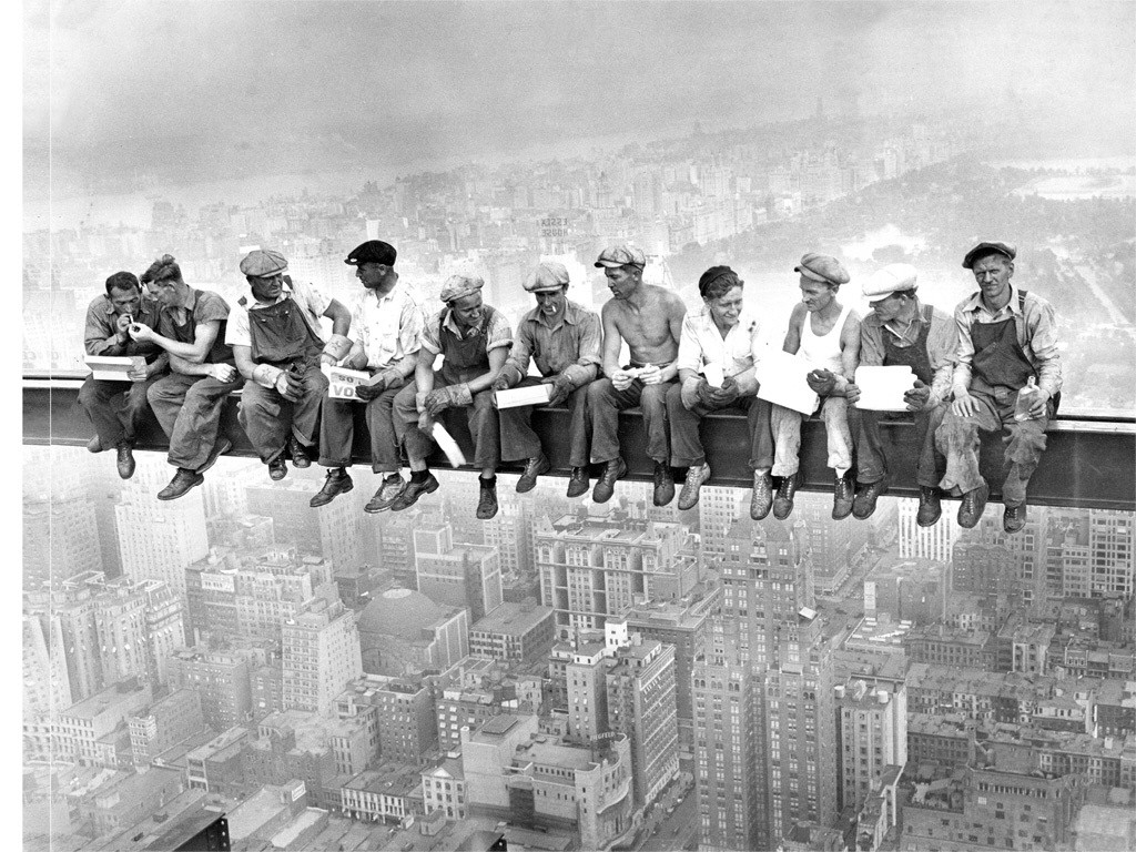
I also like that a lot of documentary photography is in black and white. This is done to make the images more shocking to the spectator and to really maintain focus on the people in the photograph as well as what kind of background the spectator might assume that they come from. I will use this method in  a lot of my photographs as a lot of my ideas will look a whole lot better if produced in black and white, however I do have one big[ish] idea that I want to make in colour as I think it will be more interesting as well as keeping a record of the colours and fashions of the modern world.

Below are some images that I have looked at for inspiration –

Documentary Photographers:
Corey Arnold – http://www.coreyfishes.com/#
Lauren Greenfield – http://www.laurengreenfield.com
Martin Parr – http://www.martinparr.com
Walker Evans – http://www.metmuseum.org/toah/hd/evan/hd_evan.htm
Ed Kashi – http://edkashi.com/event/everydayclimatechange
Abbas – http://www.magnumphotos.com/C.aspx?VP3=CMS3&VF=MAGO31_10_VForm&ERID=24KL53B_Y
Eugene Atget – http://www.nga.gov/feature/atget/
Robert Frank – http://www.danzigergallery.com/artists/robert-frank
Mary Ellen Mark – http://www.maryellenmark.com
Alex Webb – http://www.magnumphotos.com/C.aspx?VP3=CMS3&VF=MAGO31_10_VForm&ERID=24KL53Y_H

Tableaux Photography

There are different elements of documentary photography including  tableaux photography. This comes from the documentary style but is more commonly known as staged photography. This is were the photographer may find the subjects in an area and re-position them to make for an interesting photograph or they could be completely staged and prepared to bring across a message to the spectator as well as documenting more serious issues of the modern world, for example feminism.
Tableau came from a French phrase meaning ‘living picture’. Here the subject will dress up, possibly using props, using appropriate backgrounds and poses in an attempt to re-stage past/original events. This style of art was going on long before photography came around as was done in paintings many years before. The 1970s saw the rise of a now famous photographer, Cindy Sherman who began to voice her own thoughts as women were now beginning to express themselves more freely in the public eye. I like this style of documentary photography as I am able to stage some interesting images as well as get across important morals that I believe in and I think this style of photography is a great way to make hard hitting images to start people talking and to open up people’s minds on subjects they may have never thought about in the past.

Tableaux Photographers: 
Cindy Sherman – http://www.cindysherman.com
David Hilliard – http://www.davidhilliard.com

St. Malo Outcomes

Tom Pope - Whatcha Peeping Tommy?
Tom Pope – Whatcha Peeping Tommy?

Above is a photograph from Tom Pope’s series entitled ‘Weak Anarchy’. Pope is hiding behind a tree. All that can be seen is a glimpse of his face and body, however it’s very blurred and he looks unidentifiable. The picture seems to have been taken during the night as there is a lot of bright white light reflecting from the leaves. Also, the light looks artificial. There are many leading lines which are very opposite to each other. First of all, the bricks are horizontal and therefore my attention goes to the edges of the photograph. The leaves from the tree are pointed in all directions and direct me to look further up. Since the brightest place of the image is Pope’s head, that’s the first place that I’m drawn to.

For my response, I’ve emulated his picture in a very similar manner. Whilst in France, my group and I, spontaneously decided to recreate this image. A girl can be seen hiding behind a large tree. Amazingly, there was also a high wall under the girl, which was very similar to Pope’s one. In my responses I have edited by doing several processes and have kept one in colour and one in black and white.

tree

Above, is my first response to Tom’s Weak Anarchy image. I did some general edits to brighten and saturate it. I think that it has a very interesting rule of thirds. The shrubbery leaves the whole bottom third of the picture clear and occupies the top. Much like in his picture, my one exhibits very strong and bright sections of white light. The natural sunlight shining on the green leaves draw my eyes to those places and I think it adds intrigue to the photograph.

bw dd

As my second response, I have shown a very similar outcome. This one, however I cropped this one in a farther away fashion, to show the whole environment around it. I made this one black and white to vary my edits. I think it brings out the shadows better and shows the highlights and contrasts more clearly. At first it’s hard to spot the person, which is why I believe it’s more interesting to look at. I like how the spaces in the tree’s create pockets of light on the floor. It almost looks like fallen blossom. The rule of thirds is quite unbalanced. This is because the main focus isn’t placed on the key lines of the rule of thirds. Therefore this is even more interesting and for me, the ambiguity of not fitting into the perfect grids, is great.

Artist Research: John Baldessari

Here is a short, fresh and insightful video on Baldessari’s biography. I think it perfectly describes his way of working an shows his transition throughout the photography world. He made a very bold statement which stated: “I will not make any more boring art”. This became his theory for the rest of his life.

bild

Not only do I think that his work with abstract spots amazing, but I believe his earlier pictures are very creative. Examples include:

jbalessarri1 John_Baldessari_1w_artist

I really like the both of these. The top one shows a picture which is more based on designs and colour pop. Whilst the image below shows a performance aspect. He actually threw several orange balls into the air to create this image, therefore I’m guessing that this picture was edited to place all the three balls in a row. They sort of look like oranges drifting in mid air.

Eadweard Muybridge: Response

untitled I would like to respond to his work. I’ll be looking at people. My inspiration is the picture above. The man pictured is doing ‘the walk cycle’. Walk cycles are created frame by frame. Essentially they continue forever if you keep going back to the beginning of the cycle. Only six frames were used for Muybridge’s one above, therefore the full walking strides aren’t completed. Having said that, walk cycles are really difficult to capture. You must have precise and advanced knowledge to create one. V0048616 A man walking. Collotype after Eadweard Muybridge, 1887. in 1872, Eadweard Muybridge first started to weight out the skills needed to create one of these. His most famous investigation was the horse, as I mentioned in a previous post. After his massive success, he decided to try the same on humans, and therefore he produced many outcomes. He needed to put into account the force, mass shape, rhythm and others when photographing. By breaking down the images into various shots, he was able to put them back together again. This created clever animations, which is what I’ll be trying out. s2u_05_man-walk I’ll be taking a picture of a man against a plain background. He’ll be instructed to slowly walk whilst I snap some images, to capture the precise movements and motions whilst he walks. Just like Muybridge has done I’ll set them up in a sequence. During the editing process, I’ll experiment with black and white, to achieve the ‘olden’ effect that’s present in his images.

Artist Reference: Eadweard Muybridge

Eadweard Muybridge was a famous performance artist. He was born in 1830 at Kingston upon Thames near London. His most interesting creation in my opinion, is the Horse In Motion:

Horse in Motion, Eadweard Muybridge - 1886.
Horse in Motion, Eadweard Muybridge – 1886.

Produced in 1886, this photograph consisted of 16 still images all constructed together in a typology grid of 4 by 4. At that time, the way in which objects moved was still being discovered. Muybridge’s motion images helped to educate people on exactly how these movements worked.

Eadweard was hired by the professional photographer that he worked for, to take pictures of horses. Stanford, the University that hired him had some speculation about the racehorse’s at the time and most people betted on a statement. It was that ‘all four of a racehorse’ hooves are off the ground simultaneously’. It was Muybridge’s job to prove this, which he certainly did, as shown in the top row of the image above.

Since at the time, the camera equipment was less advanced, he found it very difficult to produce photographs without blur. Two years later he gained some experience, whilst abroad and came back with something quite special. He set up a row of cameras but this time using tripwires. Geniusly, they would take a picture in the split second the speedy horses went past.

Mood board of his work:

eadweard_muybridge_gehender_strauc39f_001
Emu
Cat
Cat
f5b1c2522a2c7ccdd4c4f5bd9fa4fd72008f6b62
Horse in Carriage
imagesKWLW0T27
Elephant
Elk
Elk

Bruce Nauman and Response:

Above is a YouTube link to Bruce Nauman’s piece of work. During this video, he applies gold make-up to his face and body. It was created in 1967. The 11 minute long video is very simple, yet the process in which he applies the product is quite interesting.

Bruce Nauman is greatly associated which performance photography and that’s exactly why I chose him as a reference. Also his ideas are simples, but efficient in conveying meaning. He would often record or shoot himself doing particular, repetitive things. His work was inspired by many movements such as Post-Minimalism, Conceptualism, Minimalism, performance art, and video art.

Bruce Nauman - A Rose Has No Teeth.
Bruce Nauman – A Rose Has No Teeth.

I have gotten my inspiration from the piece of performance photography he created above. He is simply pulling at his face and creating wrinkles and bulging in the skin.

For my study I’ll incorporate some makeup just like Nauman uses and show the different stages of which I cover my face with it. I will also only shoot in a close-up range, making sure that I don’t smile, so that my expressions are raw.

This is my response to Bruce Nauman. I shot various straight- on self-portraits in which I included the process in which I applied golden liner. Much like his performance in the ‘make-up’ video, I’ve used a similar concept of ‘covering my face’, however I captured my moments with still images. I’ve tried 3 different looks, here are the results of my first experiment:

g2       g3

g4       g5

Second experiment: For this one I used a pink lipstick and started off by only placing it on my lips. Then I began to smear it on my face as if I was trying to disguise my face.

p1       p3

p4       p5

p6       p9

p10       p7

Third experiment: Using a red liner I created scratch marks and lines on my face. Again they would get more detailed by time.

r1       r2

r3       r4

Salvador-artist reference

Salvador Dali is one of the most celebrated artists of all time. His fiercely technical yet highly unusual paintings, sculptures and visionary explorations in film and life-size interactive art ushered in a new generation of imaginative expression. From his personal life to his professional endeavors, he always took great risks and proved how rich the world can be when you dare to embrace pure, boundless creativity.


Tableaux Photography:

Tableaux photography involves people in a staged manner. The word is defined as a style where people are photographed in a formal and prepared environment. Therefore they are shown in a very particular manner, in a single shot. Here are some examples:

Jeff Wall, Knife Throw - 2008.
Jeff Wall, Knife Throw – 2008.
Jeff Wall, Volunteer - 1996.
Jeff Wall, Volunteer – 1996.

Jeff Wall took both of these great Tableaux images.

Pop art:

Pop art began in the year of 1955 and ended in the year 1974. During this 19 year period, the evolution of art has changed majorly and optimistically created a fresh begging in the world of visual arts.

Nowadays, pop art’s most important figures date back to the 1960’s. These New York artists revolutionised pop art. Some include: Andy Warhol, Roy Lichtenstein, James Rosenquist and Claes Oldenburg. It became very popular to draw over well known imagery. The artists that did this became part of an international craze.  Shortly after the Abstract Expressionists popularity, which modernised visual arts by reaching out on worldwide levels. The Abstract Expressionists mainly focused depicting on spontaneous and action filled scenes. Examples of their early work includes:
Mask – Jackson Pollock, 1941.
Head - Jason Pollock, 1940-1.
Head – Jason Pollock, 1940-1.