Category Archives: Research
Filters
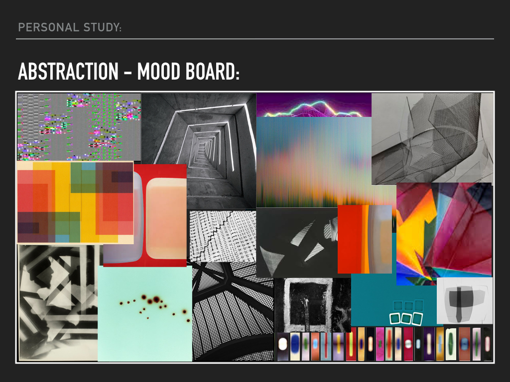
Personal Study – Abstraction – Research:
Personal Study – Abstraction – Research:
Personal Study – Abstraction – Research:
Personal Study – Abstraction:
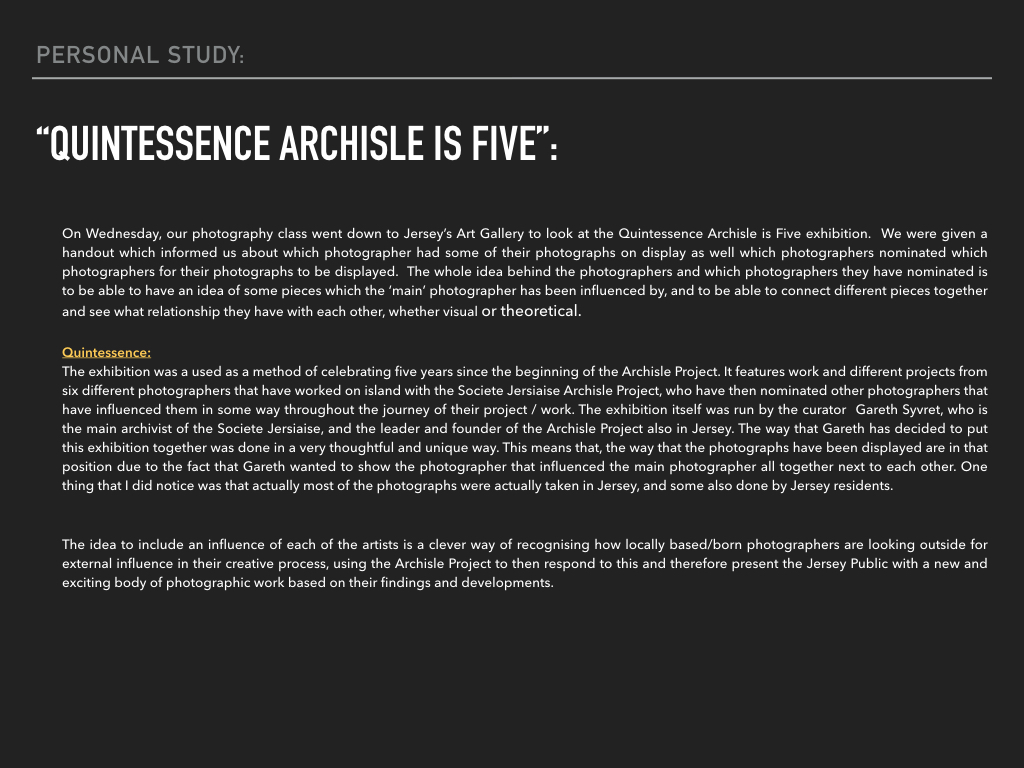
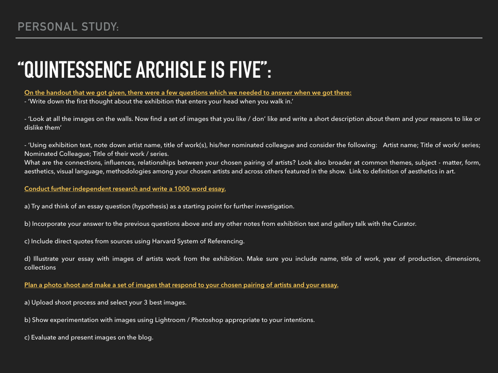
“Quintessence archisle is five”
Influenced Photo Book Design Ideas
The Title – “The Creation of a Home”
For my photo book study, I have decided to name the project ‘The Creation of a Home’, as I believe it fully addresses the key hypothesis’s of my project. ‘The Creation’ part, succumbs the development and construction of our new family lives and how as people we fit in to a certain place with our belongings and emotions. I also wanted to distinguish the difference between a ‘house’ and a ‘home’ as a ‘house’ can be defined as ” a building for human habitation”. This definition describes little life and personality, ‘human habitation’ vaguely suppresses the way humans act and become desirable to an environment – how they make it there own. A ‘home’ however, can be defined as: “the place where one lives permanently, especially as a member of a family or household”, or “the family or social unit occupying a permanent residence”. This sense of permanence allows the reader to understand the commitment and time taken to make a ‘house’ a ‘home’, as there is much more to a house than just walls and foundations.

First Pages and Title Page
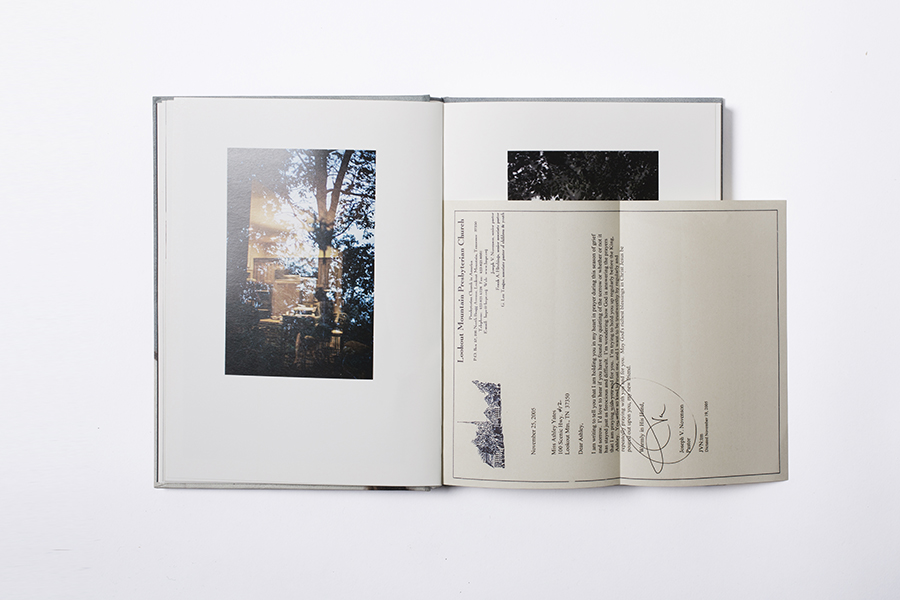
For my beginning title pages, I have began trying to experiment with my archival material. As mentioned in my personal study, Domingo, Costa and Dorley-Brown have all inspired me to incorporate archive material and mediums to create context and historical aspects, in order to relieve a sense of purpose and relationship with the reader. This beginning front cover allows the reader to get an idea, i like how the image I’ve chosen isn’t too clear, so the reader has time to picture what


Pages and Page Layout
I have started to explore the different formations and sequences my pictures can fit into, to make it more interesting and easy for the reader to understand. This is all in awe of the techniques used by the three artists I studied closely in my Personal Study: Rita Puig-Serra Costa (“Where Mimosa Bloom”), Inaki Domingo (“Ser Sangre”) and Chris Dorley-Brown (“The Longest Way Round”).

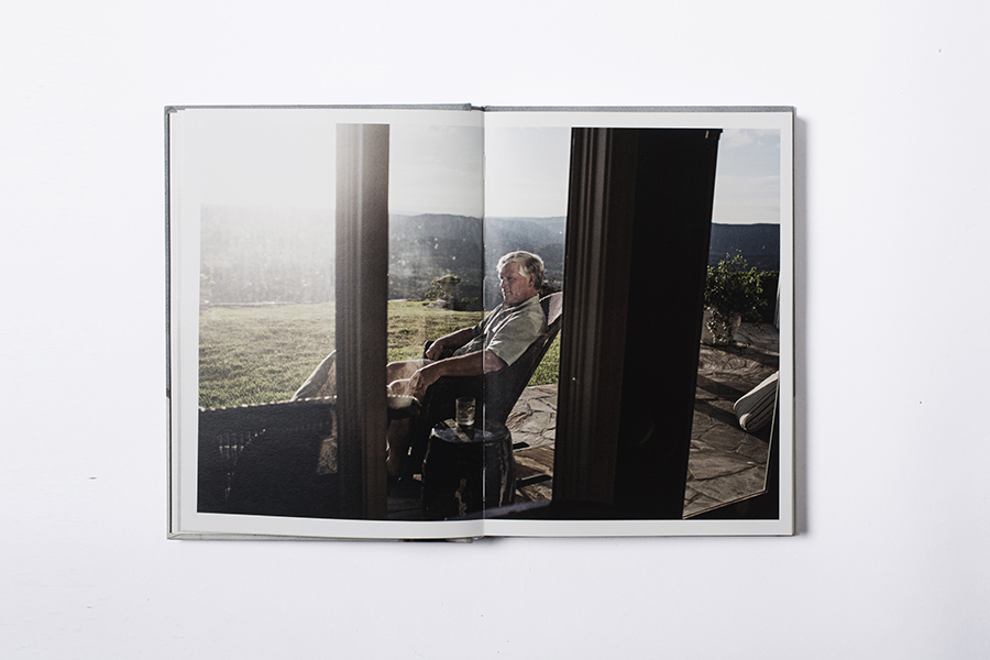
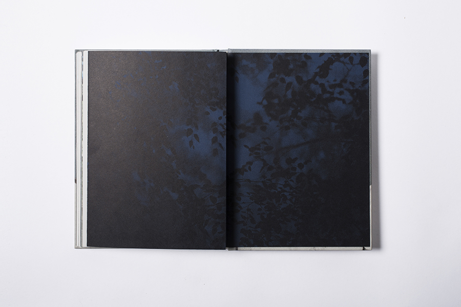
For some images (as seen above), I’ve used a double page spread so that the image is divided. I feel this technique is very effective, I really like the way it allows both pages to be covered but with the idea of there being a border there too, it lets the reader stand back and see the whole image without becoming too involved. This was in the style of Domingo as his piece “Ser Sangre” consists of multiple full page spreads.


I have also included drawings and more personal mediums as included in Domingo’s work “Ser Sangre” to make the feeling of ‘family’ more of a reality. I feel this effect allows


I have also used influence also from Chris Dorley-Brown’s: “The Longest Way Round” as his ongoing use of archival images of the War and Post War era are bounded together using his own photographs. During my internship at Jersey’s Photographic Archive, I came across similar styled images which show the history my new home. Placing the images in a formation like a comparison on either side of the pages, I wanted to establish to the reader the themes of ‘old’, ‘new’, transgression and change.


What type of book am I going to be using? (size / material/ etc. )
Size – Small Portrait (23×16.5 cm)
Paper Type – Matte paper
Blurb
Photobook
To make my photo book I am going to use blurb which is an online website which can be used to help photographers to create, self publish and share their photo book design. Blurb has already made 6 million books created by more than a half million customers and it ships to over 70 different countries. I can use light room to design my book then once I have finished I can import it to blurb or I could download a software directly from Blurb, which also allows me to design my book but it will also allow me to work on my book from home which is an advantage because I don’t have lightroom. I have explored blurb and found that they offer a variety of different sized books, layouts and designs which will allow me to have different compositions which is something I wanted to do.
I haven’t decided how I want to design the inside of my book, however I think after doing some research and looking at other photographers books I have decided that a portrait book would be better suited for my project because of the large amounts of portrait photographs that I am going to include. I think having the book in portrait will look better visually and it fits in with the style of photographs I have taken. I have also decided that I want a hard back book this is because I think it makes the book look more professional and more presentable visually.
Draft Essay
Draft Essay:
Question: How has Boltanski, Abril and Toroptsov represented the concept of capturing the invisible and reflecting the meaning of memory through the medium of photography?
Introduction:
‘Someone once said that you die twice: when you die the first time and when somebody finds a photo of you and no longer remembers who it shows.’
We are made up of fragmented memories and forgotten dreams. Our entirety rests in the fate of old letters, burnt photographs and meaningless possessions. We never question the invisible, it is as though we are on a relentless pursuit to try and capture the invisible. We abide by the rules and limitations that are enforced by the concept of death. But what happens to those who become untouchable, those who are no longer part of the flux. Their existence becomes empty and lost, they are no longer perceptible to the eye. Yet we still feel impossible and unexplained connections to the spiritless. We yearn to cherish the ‘good’ memories and except the restrictions we are faced with regarding mortality. In doing so, the feeling of life is created, the tangibility of pleasure and pain enters our worlds and consumes us. But, photographs hold heritage and meaning, they have a depth of knowledge and feeling to them. Photographs capture single moments of existence. They can tell a narrative of a second in a stranger’s life in an instance. Whether it is personal, isolated, private or rare, it is has an essence of being and timelessness. The allure of time, is its youthfulness. Time is the cure for it never fails to reveal the truth. ‘Human life is embedded in time: we remember the past, we plan for the future and we live in the present. We swim in an ever-rolling stream.’
I am exploring how the invisible can be captured and portrayed through the medium of photography. And why memories hold such a powerful influence over our past, present and future. I want to find out what makes a photograph meaningful, what gives the photograph reality and how through photography the memory of a person can live on. My project focuses on exploring the invisible through three female generation’s memories; this includes my grandmother, my mother and myself. These distinctive view points will enable my project to become more personal and really seek the depths of my grandfather’s life. I think memory is more than simply remembering a once present thought, but it is about connecting with the past in order for the past to live on.
Christian Boltanski, Laia Abril and Yury Toroptsov all delve into the idea of memory, seeking a way in which they can capture and meaningfully discover the rawness of an image and what it can represent. I took a considerable amount of influence from Laia Abril’s photo book ‘The Epilogue’, her scientific approach to the displaying of a young girl’s life and death is both moving and in depth. She thoughtfully inspires the ideas of a wasted life, an innocent women taken to early and the suffering the family must feel. The viewer becomes emotionally awakened by the tragic narrative. For there is no escaping the feeling of missing a cherished one. There appears to be no cure except for time, time is what has made the scar of Cammy’s life less painful to manage. Similarly, Yury Toroptsov toys with the concept of photographing the invisible
Deconstructing a photo-book:
Deconstructing a photo-book:
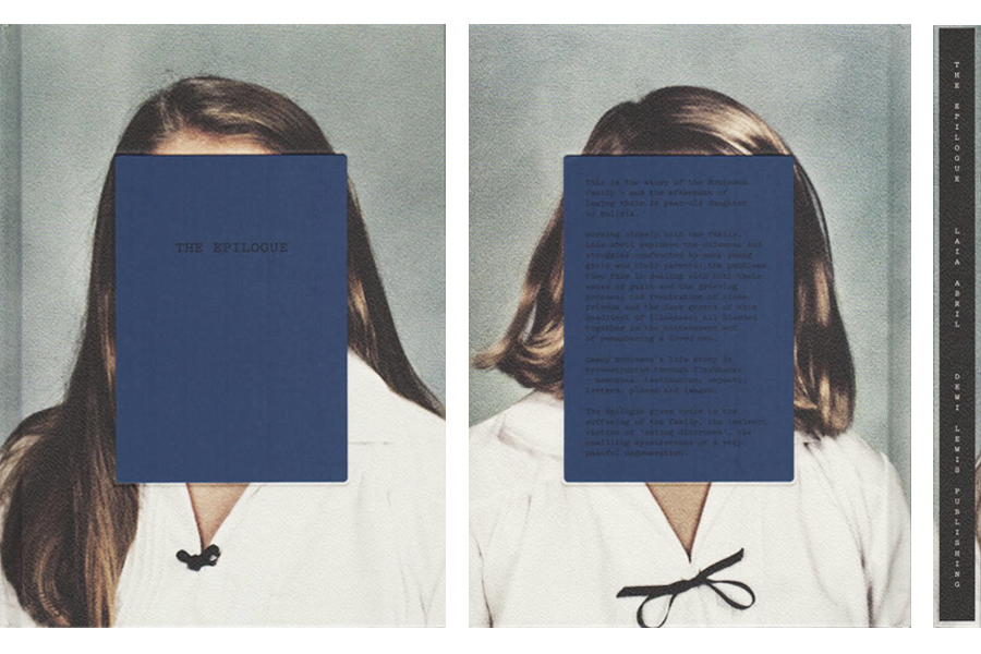
The Epilogue- Laia Abril
The Epilogue is designed in a scientific style, there is a variation of creativity for each section of the book. There is also a clear narrative followed throughout the book. The front page gives a hint to the story you are about to experience. The photograph on the front page is of the young woman when she was a child. A blue square is covering the child’s face with only the title across where her eyes would be, possibly suggesting her non-existence. The cover of the book is very simplistic which I think reflects the nature of the narrative, it is about a girl’s life and death. The project
Still Here- Lydia Goldblatt
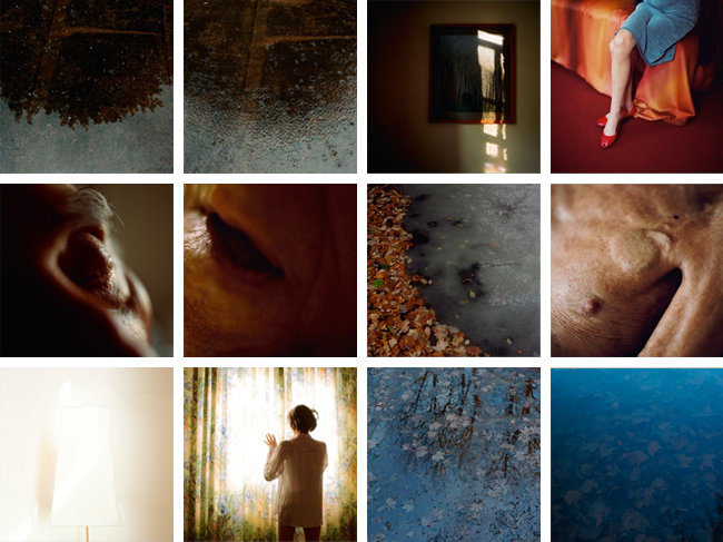
Lydia Goldblatt takes a less scientific approach and more a poetic and philosophical approach to the concept of memory. A great deal of the images featured in the book are either close ups or landscapes. The photographs are very detailed and personal, there isn’t much distance both physically and emotionally between the photographer and subject.
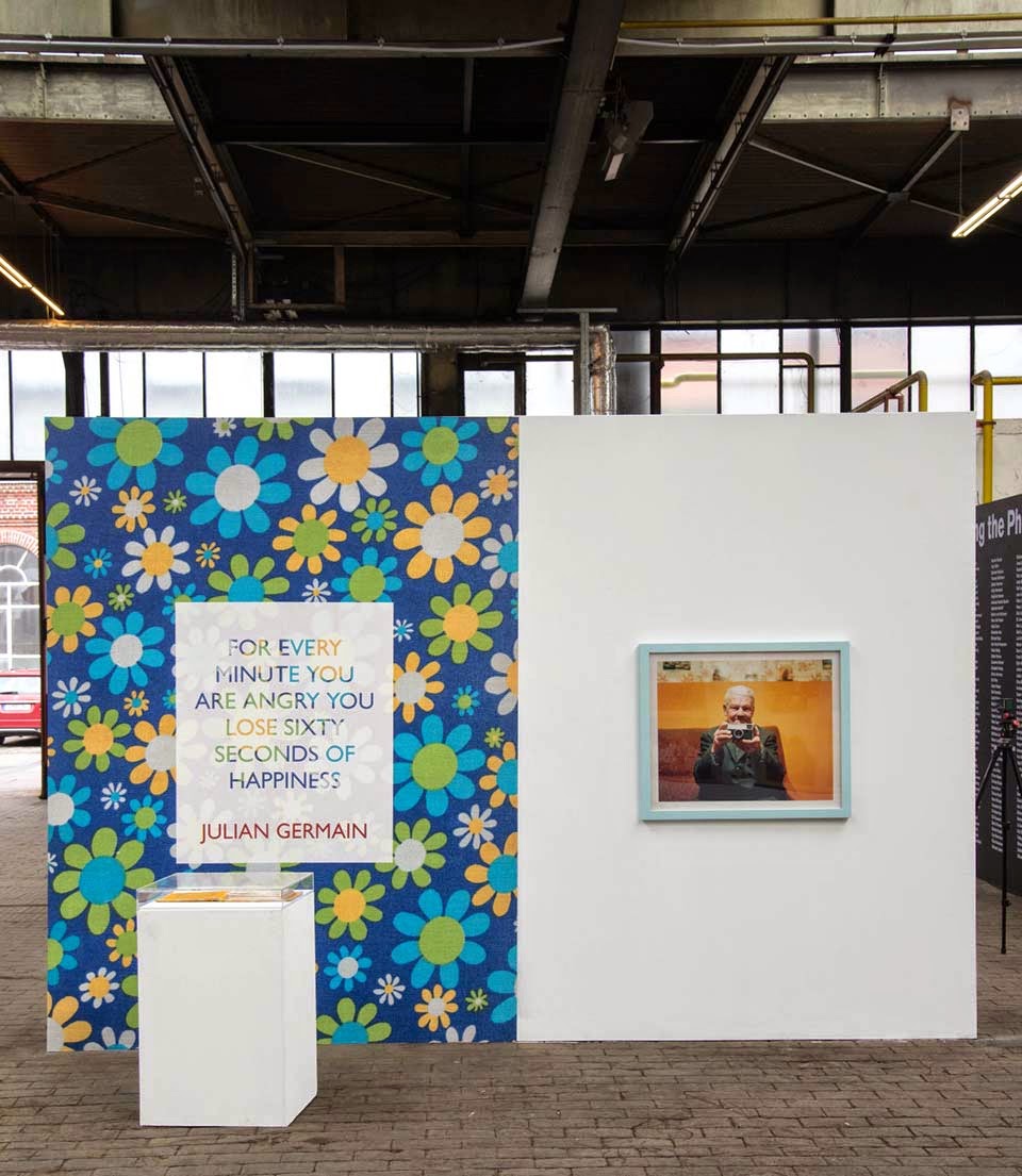
Julian Germain- For every minute you are angry you lose sixty seconds of happiness
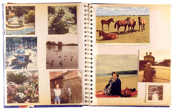
Julian Germain uses a great deal of archival images throughout the project. The design of the book reflects a scrap book or home album sort of style, it is much more casual and relatable than the other two photo books I have looked at.


