Picture stories are often used for photojournalism and documentary photography as they allow pictures and words to be mixed together to make the story more visually interesting to make people want to read the article.
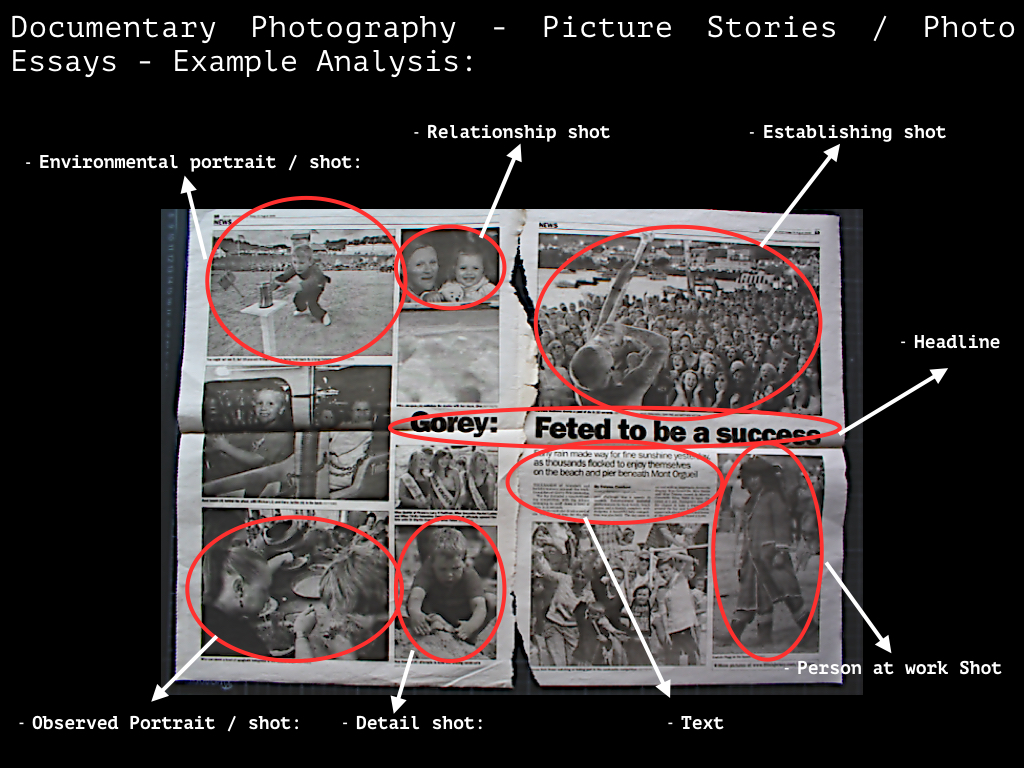
The most common images used in picture stories are:
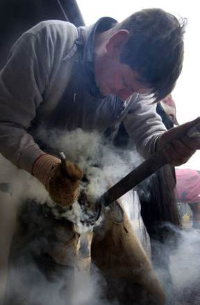
– Person at Work, quite literally, a person at work, showing context of the work they’re doing

– Relationship Shot, normally showing the relationship between a couple of people or a person and a thing.

– Establishing Shot, shows context and establishes the setting or what is happening in the story.

– Detail shot, shows a detail of a situation, like what someones holding, or a detail of the environment.

– Environmental Portrait, a shot of a person or a few people in the environment which hold the meaning for the story.

– Observed Portrait, taking photos without the subject aware that you’re there.

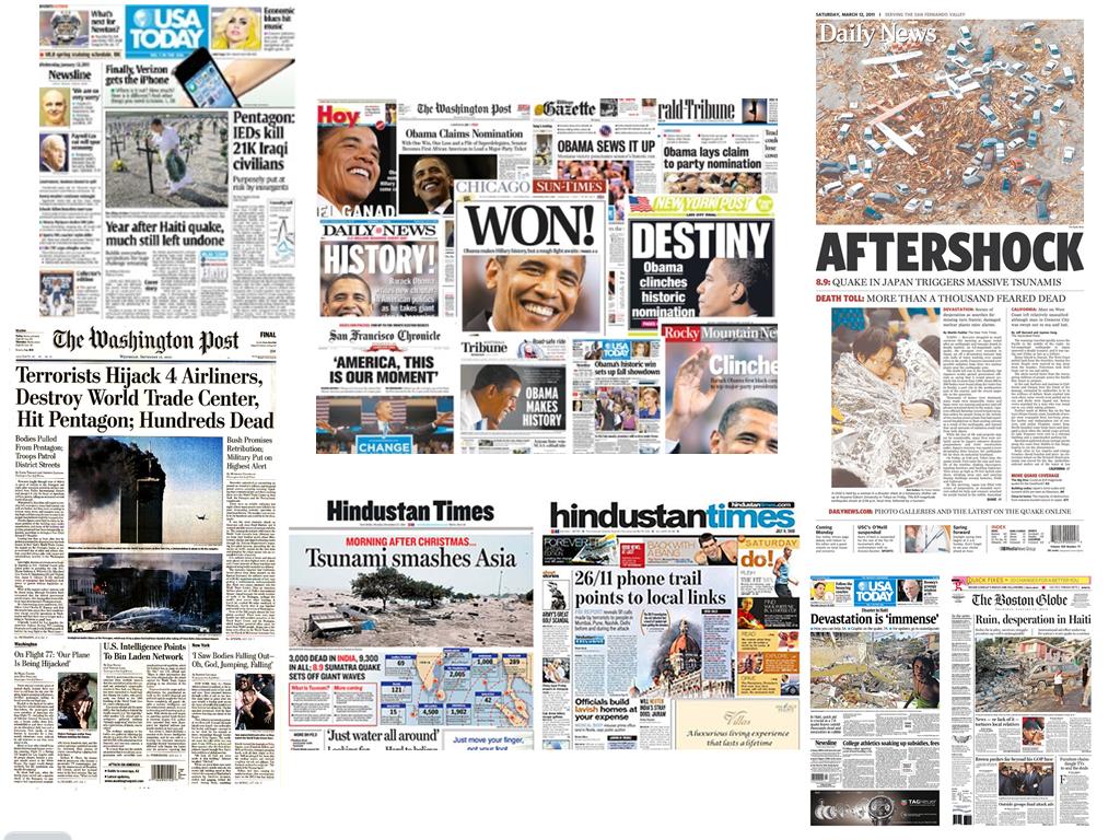
To be able to understand how to make an effective photo story to display my photographs I am going to analyse some existing photo stories and see what I think does and doesn’t work well. First i’ll look at magazine photo stories.
From looking at and comparing these there photo stories, the first thing that I notice particularly is the type of font used for these articles is mainly san-serif.
The last two examples use serif fonts for their titles, but all three use sans serif fonts for the rest of their text. This is because it looks smart and modern and is easy to read, hardly any magazines use cursive fonts either because they’re difficult to read and look very messy and unprofessional.
As the first article is more of a timeline of events, theres no particular establishing shot, because theres no one location of the story they’re trying to get across. The second magazine’s establishing shot , whilst isn’t the biggest image, is still a pretty big photo, so although it isn’t the main focus of the story, it still gives across information to the viewer. The last article uses and environmental portrait as an establishing shot. It shows all the people involved and an idea of the location of this story.
All three of these articles have four images within a double page spread and quite a small portion of text to go along with them. Although these seem to be the most formal types of articles, others may have one main image as the background, and bigger, bolder text overlapping images etc, which is quite common within music magazines, which tend to have a sense of high energy, often to capture the energy of the artists of the concerts and festivals they’re reviewing and writing about.
Some quotes (if the subjects of the story have been interviewed) which represent what the story is about in a few words tend to be bolder and larger than the rest of the text, they’re sometimes quite unusual quotes, to make the viewer want to read the rest of the article so they can find out the context of which they said that sentence.


