Category Archives: Record / Photoshoot

Filters

Author:
Category:

Jersey Museum takeover

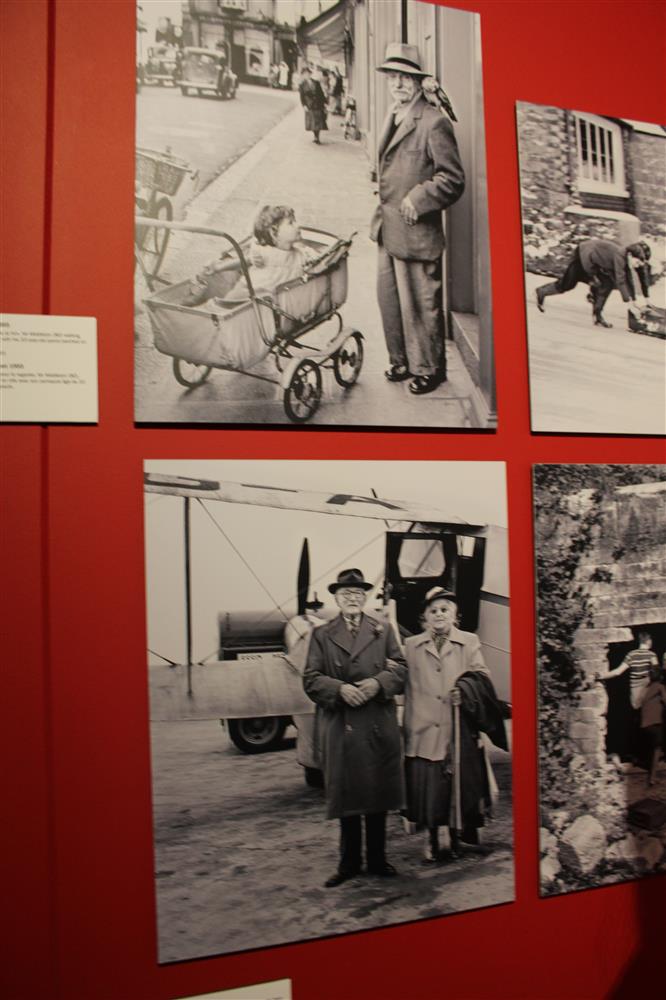
On Friday 23rd October we had the opportunity to visit the Jersey  Art Museum to see the exhibition which celebrates 125 years of the JEP to give us some inspiration for our task “Your Story, Our History: 125 years seen through a JEP lens”.

First impressions when you walk in?

  • Black, white and red eye catching
  • Red background linked to the JEP
  • Contrast
  • Simple layout
  • Small space

Although exhibition was celebrating 125 years they only had photographs representing about 50 years therefore the title was miss leading. They didn’t include any photographs from 2000, however I think this is were our task ‘125 hours through a teenagers lens’  may fit in. One thing I found that was really interesting, is there were no photographs of jersey and the community during the German Occupation In World War II, we then found out that this was because the Head of the JEP at the time burned all the images to make sure that the Germans didn’t get hold of them, I think this was an interesting way of preserving Jersey’s history/culture from the Germans. It also made me wonder if there were any important photographs or information that they didn’t want the Germans to find out about.

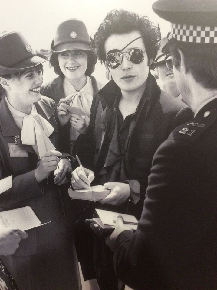
The first photograph I have chosen is ‘Prince Charming’ as one of my favourite photographs from the exhibition, this is because this was the first photograph that caught my eye when I walked into the exhibition, as it was placed in the middle and right in front of the entrance. Another reason why I chose this photograph as one of my favourites is because I think it portray’s a typical ‘ladies man’ although the person is famous. I think it was captured at the right moment and I like the composition. The only critique I have is I don’t know a lot about the context of the photograph or who the photographer is.

The second one I chose was the ‘housewife protest’ photograph because I think it’s a powerful image, due to what it represents rather than it’s composition, the photograph is of a protest during the 70’s which was a crucial time for ‘ the feminist movements’ when women not just in Jersey were fighting to have more rights and for the equality between men and women. I think the banner is the main point of focus and as a viewer it is the first thing your eye is drawn to. I usually don’t like when there is too much going on in a photo however in this case I like that the photograph was filled which gives you a lot to look at, the photograph was also taken from above which I think gives you a better view of what is going on, I think a photograph taken from above works better because of what it’s representing.

My least favorite photograph is the Cadet regatta 1948, because the people in the photograph are all facing the other way, so you can’t see their faces. The displayed photograph in the museum also looked a bit blurry. It doesn’t seem like there is much going on in the photograph which makes it uninteresting and reasonably forgettable among the other photographs. Another aspect of the exhibition that I didn’t really like was the wall of photographs about what happened inside the JEP I think that they focused to much attention on this and there were a couple of photographs illustrating the same thing.

http://jerseyeveningpost.newsprints.co.uk/search/byg/p/u/48/2/jep%20125th%20anniversary%20exhibition%20images

Vivian Maier:

Vivian Maier was a nanny and also a ‘secret’ photographer. She was described by friends as being introvert. She preferred to have a very private life and even asked for a lock to be placed on her room door. Maier had O.C.D. and with that she also took many photographs. Her ever-growing passion for photography lead her to the extreme of creating a darkroom in her bathroom. Spread out throughout the five centuries that she photographed, she managed to take over 100,000 negatives.

Vivian Maier’s website: http://www.vivianmaier.com/

Amazingly her work was only discovered in 2007 at a Chicago auction. She’d actually become very poor and had to sell one of her storage lockers in order to pay for her house. Inside there was a mass of photographs and a man called John Maloof unknowingly bought them. He was the man that got her famous. After all those years of storage and hiding the photograph’s were finally brought to light. He’s played a huge role in helping to archive her  work for future generations to cherish.  Maier’s street photography seems to be very contemporary although it was taken with a rather historical camera. One of her many camera’s was called ‘Rolleiflex’ and can be seen in her self-portrait:

Vivian Maier: Self-Portrait.

I have produced a similar photograph to this one. I actually took this picture spontaneously during the half-term and have edited it into black and white to create a similar effect to Maier’s. My face is not very visible but you can still see the outline of my reflexion on the car window.

Here’s my outcome:

DSC_0093 edit vmaier
my response

Her photography focused on the street life in urban areas. Since Maier was born in New York City during the 1920’s, she had many sources for inspiration. During her life Maier kept changing locations from the her hometown to France. In 1951 she finally decided to settle down in the U.S. where her passion for photography evolved. Her documentary style created meaning and evolved into a great story. Vivian incorporated both still images and video recordings into her work.

Here are some example’s of her street photography:

1953, New York, NY
1953, New York, NY
Undated, New York, NY
Undated, Canada
Undated, Canada
May 5, 1955. New York, NY

“Well I suppose nothing is meant to last forever. We have to make room for other people. It’s a wheel. You get on, you have to go to the end. And then somebody has the same opportunity to go to the end and so on.” – Vivian Maier.

Contact sheet reviews – COMMUNITY

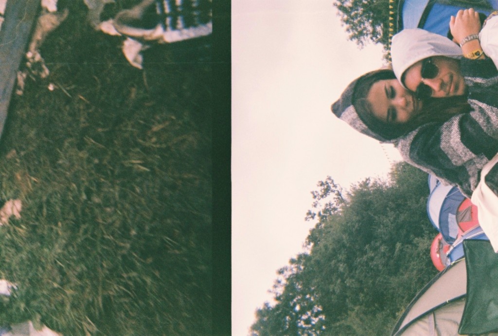
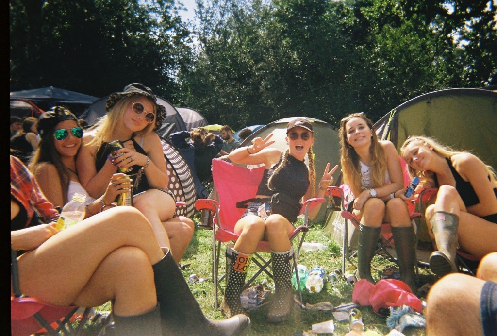
After gathering these images for my community study, I went through all 53 images and selected my favourite ones. Screen_Shot_2015-11-03_at_09.02.44[1] Screen_Shot_2015-11-03_at_09.02.13[1] Screen_Shot_2015-11-03_at_09.02.56[1]

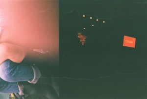
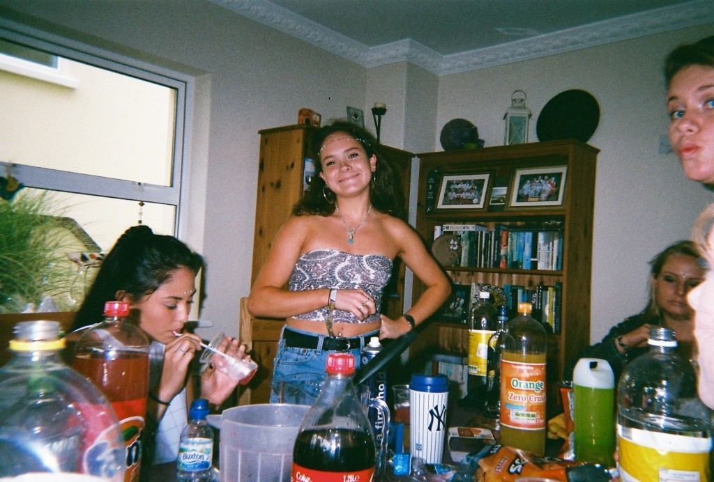
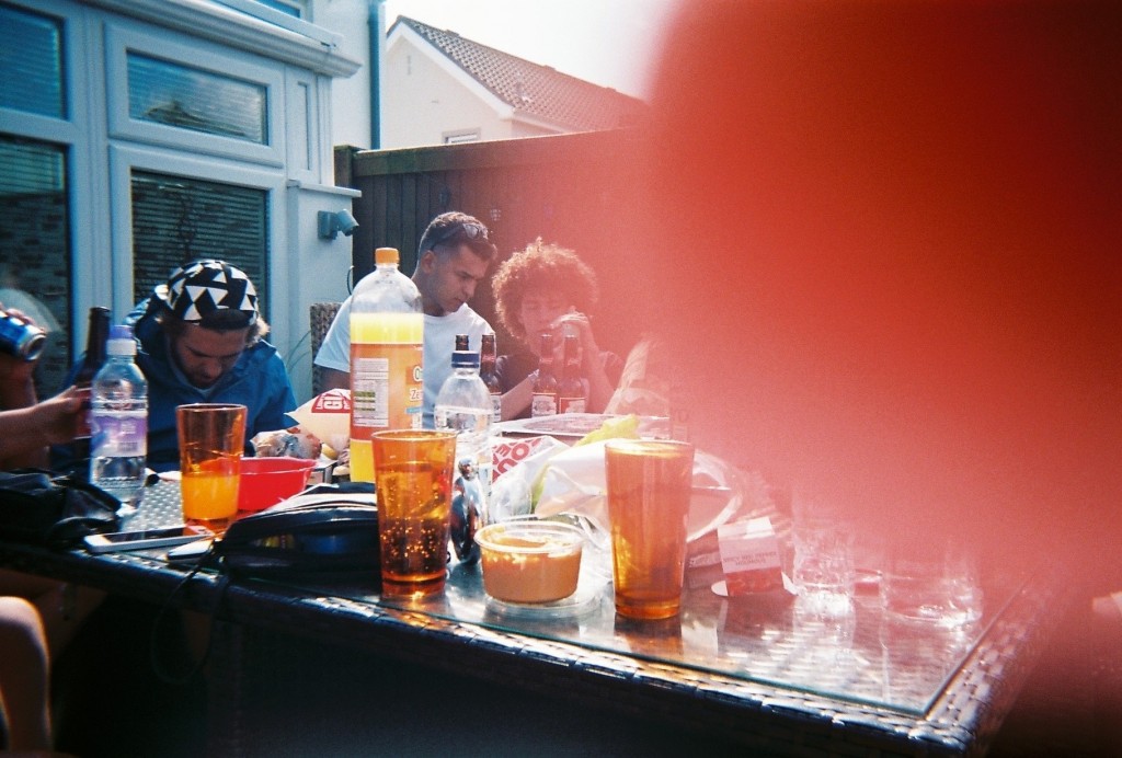
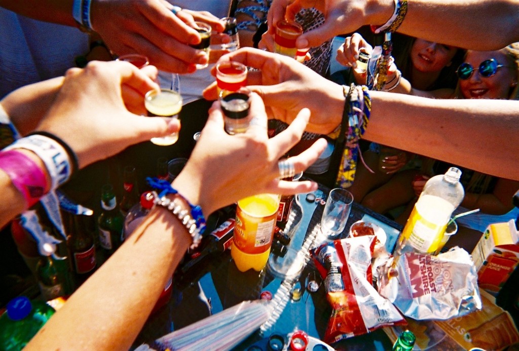
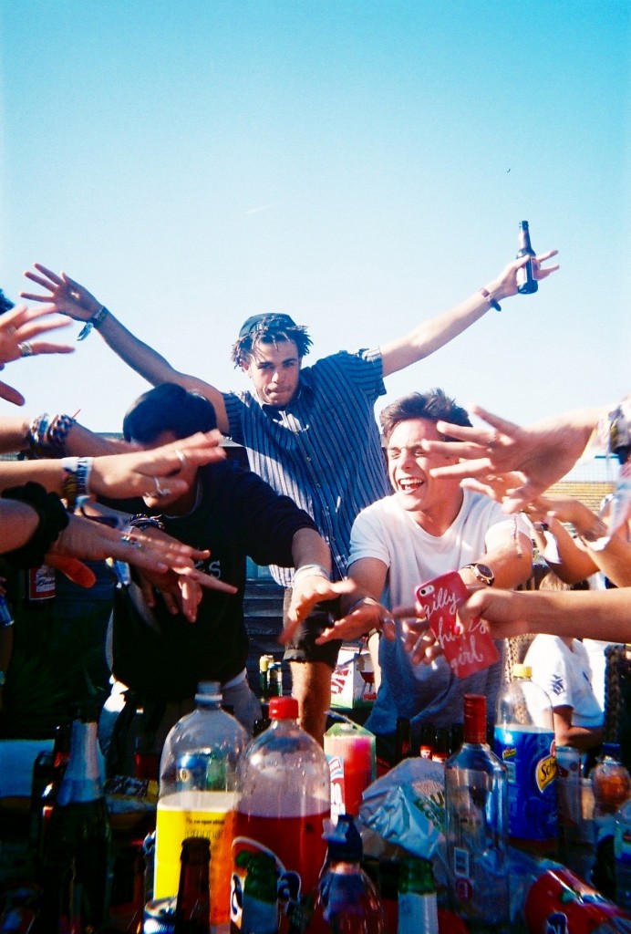
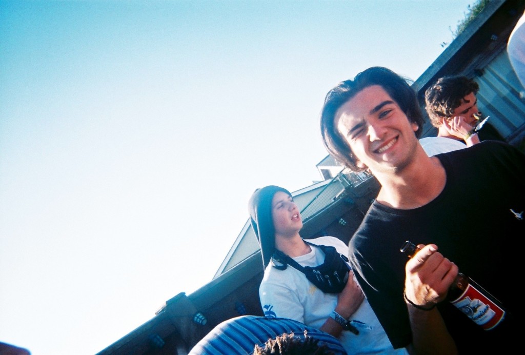
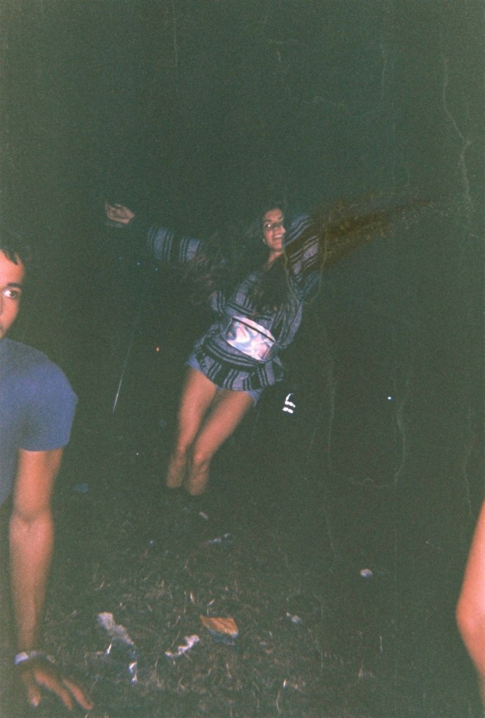
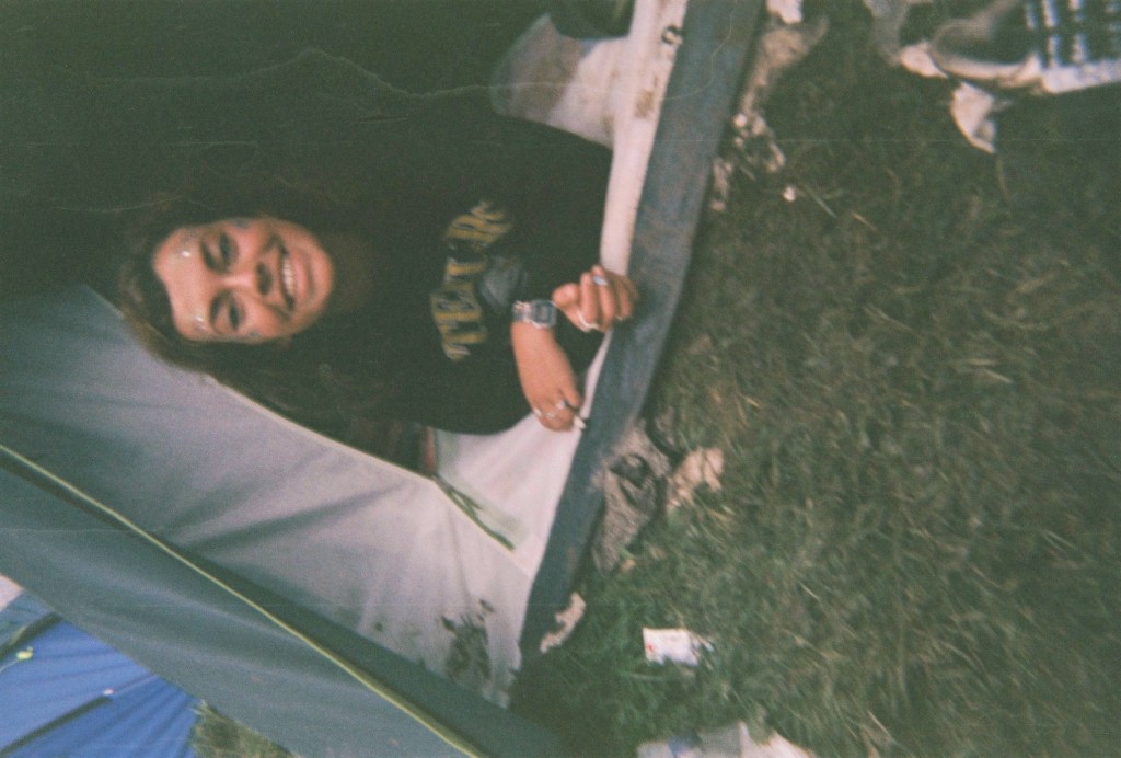
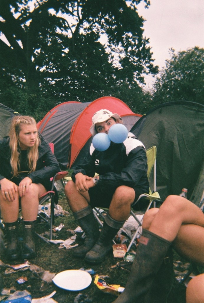
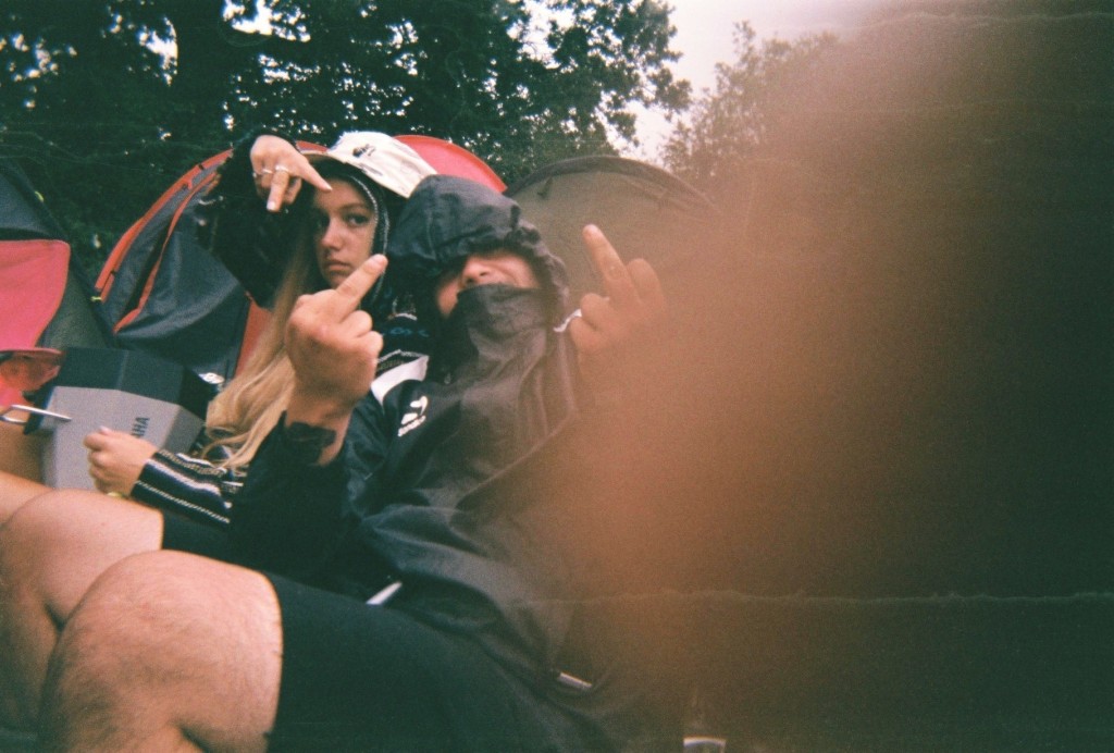
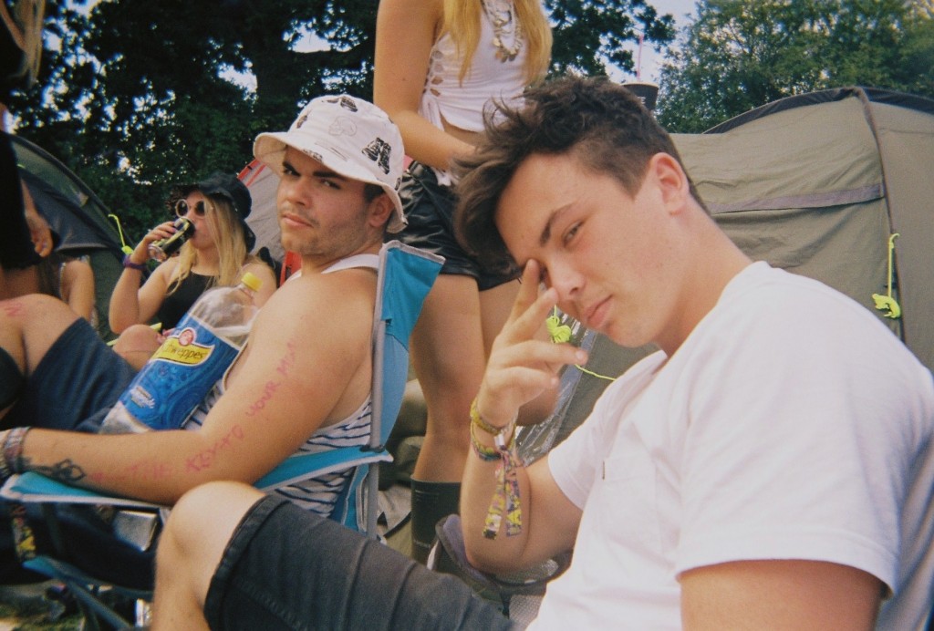
I chose the following images as i felt these were the most interesting and artistic. This is because of the angles, colours, and context of the images. All of the above images were taken on disposables, i took 6 disposable cameras to Reading festival as i love the style the cameras produce. They give a rough old look which i feel matches this topic perfectly. The below images are the images I have chosen as my favourite –

FH000001 FH000005 FH000011 FH000015 FH000025 IMG_9340 IMG_9341 IMG_9342 IMG_9343 IMG_9347 IMG_9352 IMG_9353 IMG_9357

Out of these images there are a select few that I feel are the best – The above and below image I picked as they both were actually intended to be the same image. This did not happen as i dropped and wet the camera multiple times, I believe these mistakes cause the split image and the damage that can be seen in some of the images. The above image uses the rule of thirds as it has something interesting in each section of the photograph, however there is a lot of negative space as the majority of the right side of the image is black, with a few splashes of red, spot lights and some water marks. The right side of the image was taken at the main stage of the festival and the left side in the camp with friends. I think the ‘mistake’ of the damage actually benefitted the image as I feel it made it very arty. The below image is similar as it is split, however i do not know where the left side of the image came from. The right is the other half of the previous image in camp. The below image I like as I feel it looks more laid out, The black block line down the centre of the image splits the two time periods and scenarios in two and joins them together. I also enjoy the image due to the emotional message behind it, the left side shows the mud, litter and dirt that is produced by the festival and the right side show the more intimate and emotional side that is also a big part of festivals. These two messages are on opposite sides of the festival spectrum but due to some freak mistake are shown in the same photograph.

IMG_9341

IMG_9340


The above image was taken in the arena of the festival while waiting for another act to come on a stage. I like the layout of the image as the main subject is in the centre. However surrounding her is a lot of negative space as it is just black. This image also has a lot of water marks which I feel makes it artistic. This image has also been damaged by a sort of split, as the subject is missing her arm. In real life her arms were spread apart like a star fish and in the produced image her arm has been removed and replaced by darkness and moved vertically. This is not very noticeable but I feel adds to the roughness of the image well.

IMG_9342


The above image was taken in camp of a friend who had just woken up after passing out for 8 hours. Water marks again make the image look rough and dirty, and the poor angle and positioning too. However the subject still remains roughly in the centre of the image. This image also looks better on its side or upsidedown. This is because when it is upright and normal, it looks ‘too normal’ and not arty enough.

IMG_9343 IMG_9347

The above two images also have watermarks and were taken in camp aswell. The angling is quite straight on which I feel makes the images quite clear.  The thumb print in the second image is the reason I chose it in a select few. The first image has a range of colours i feel contrast each other well, aswell as the odd act of two gas balloons in ones mouth, the blue contrasts well with the red tent in the background and the rubbish on the floor.

Gregory Crewdson’s Tableau’s and My Responses:

To be begin with I’m going to explore the American photographer Gregory Crewdson. He tends to photograph homes and suburban neighborhoods. He is referred to as a ‘realist landscape photographer’. Here are some of his photographs:

Gregory Crewdcin
Gregory Crewdson.
Gregory Crewdson - Dream House.
Gregory Crewdson – Dream House.

Since he’s a tableaux photographer, Crewdson’s pictures are completely staged and prepared. His work combines both nature and strange concepts. In my opinion, his amazingly interesting and dramatic set-ups create a dramatic essence.

I’m going to be taking my own photograph’s as a response to Crewdson’s tableau’s.

crewdson_2013v1 2
Gregory Crewdson.

For my first shoot, I took inspiration from the image above. There are various individuals gathered around a table to eat dinner. Strangely they are wearing masks as a form of disguise or identity. They are in a dimly lit room and Crewdson seems to have used flash as there is hard lighting.

For my response, I set-up an equally bizarre environment. I had my family member place a mask on and lay in bed. Then I placed a blue scarf around his neck. This strange combination embodies the same essence as Crewdson’s image. I also gave the man an empty plate and spoon for him to pretend to eat from.

DSC_0165 edit

DSC_0164 edit blue

I then asked him to pretend to eat whilst looking at the cupboard mirror. This reflection gave the photograph an interesting edge.

DSC_0169 edit

DSC_0160 edit red

DSC_0168 edit 2 small DSC_0168 edit small bw

Southampton

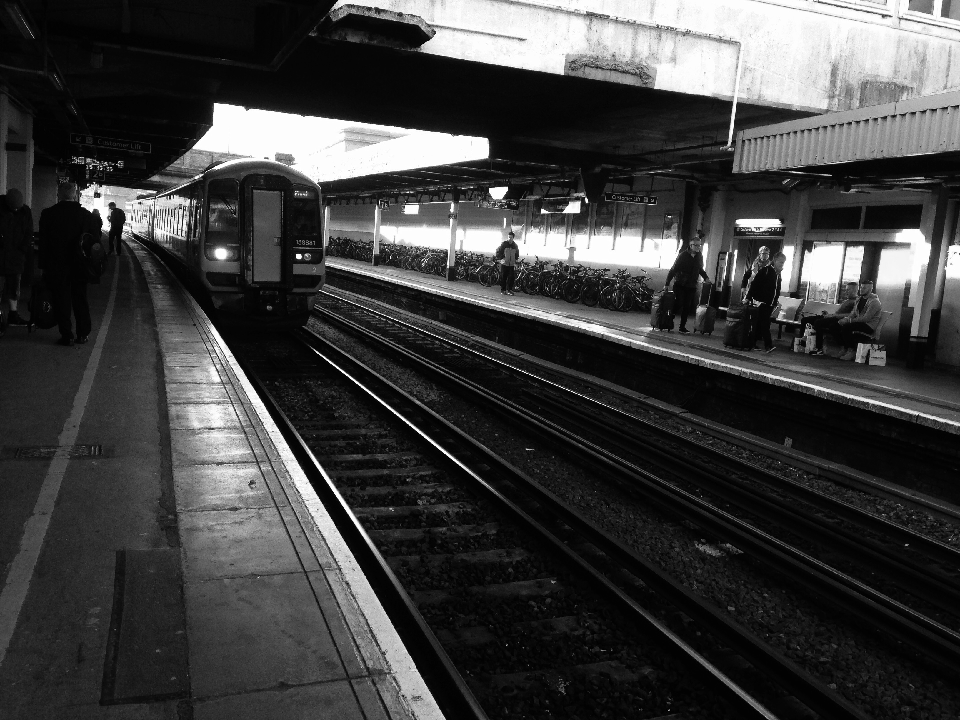
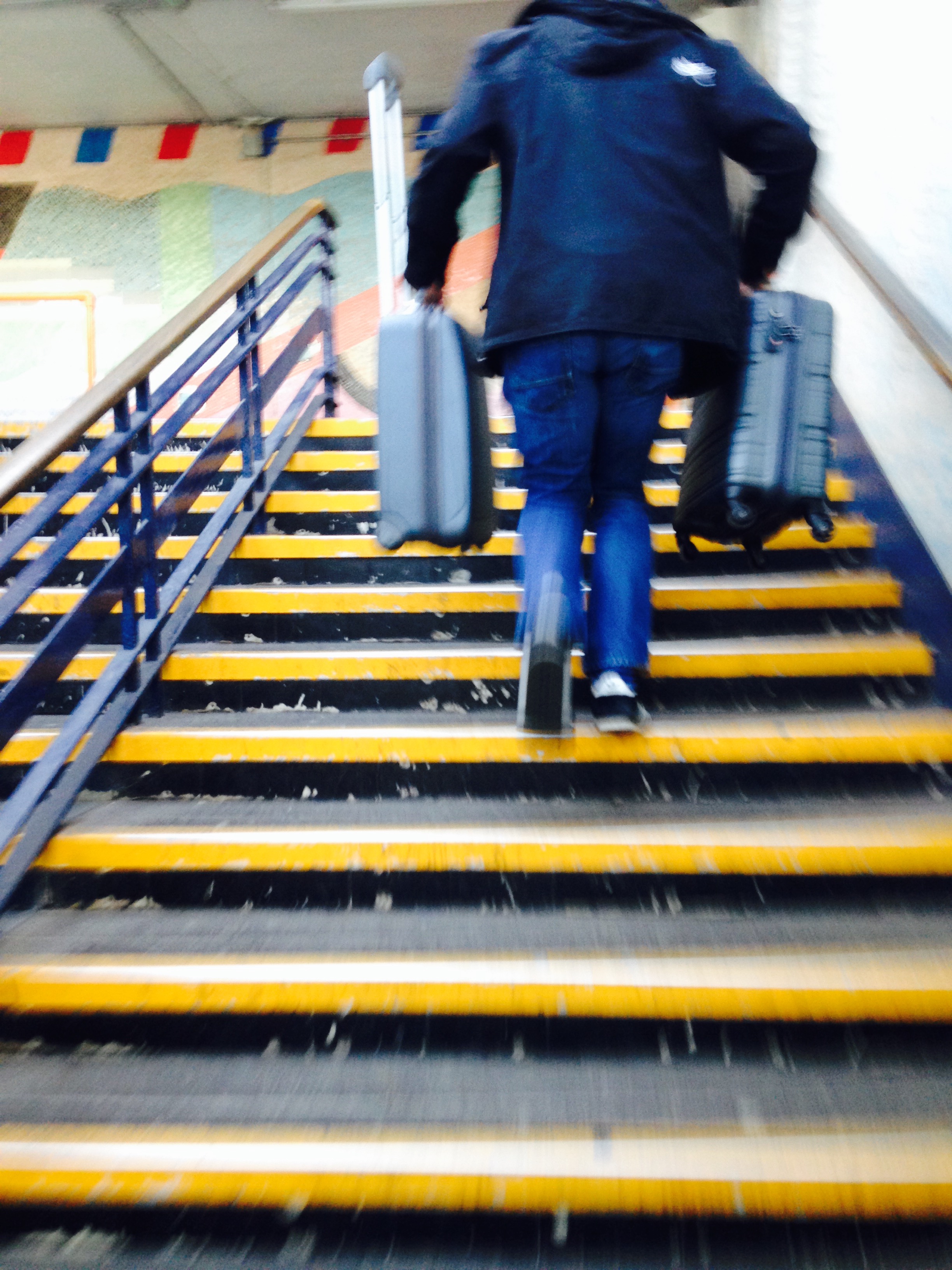
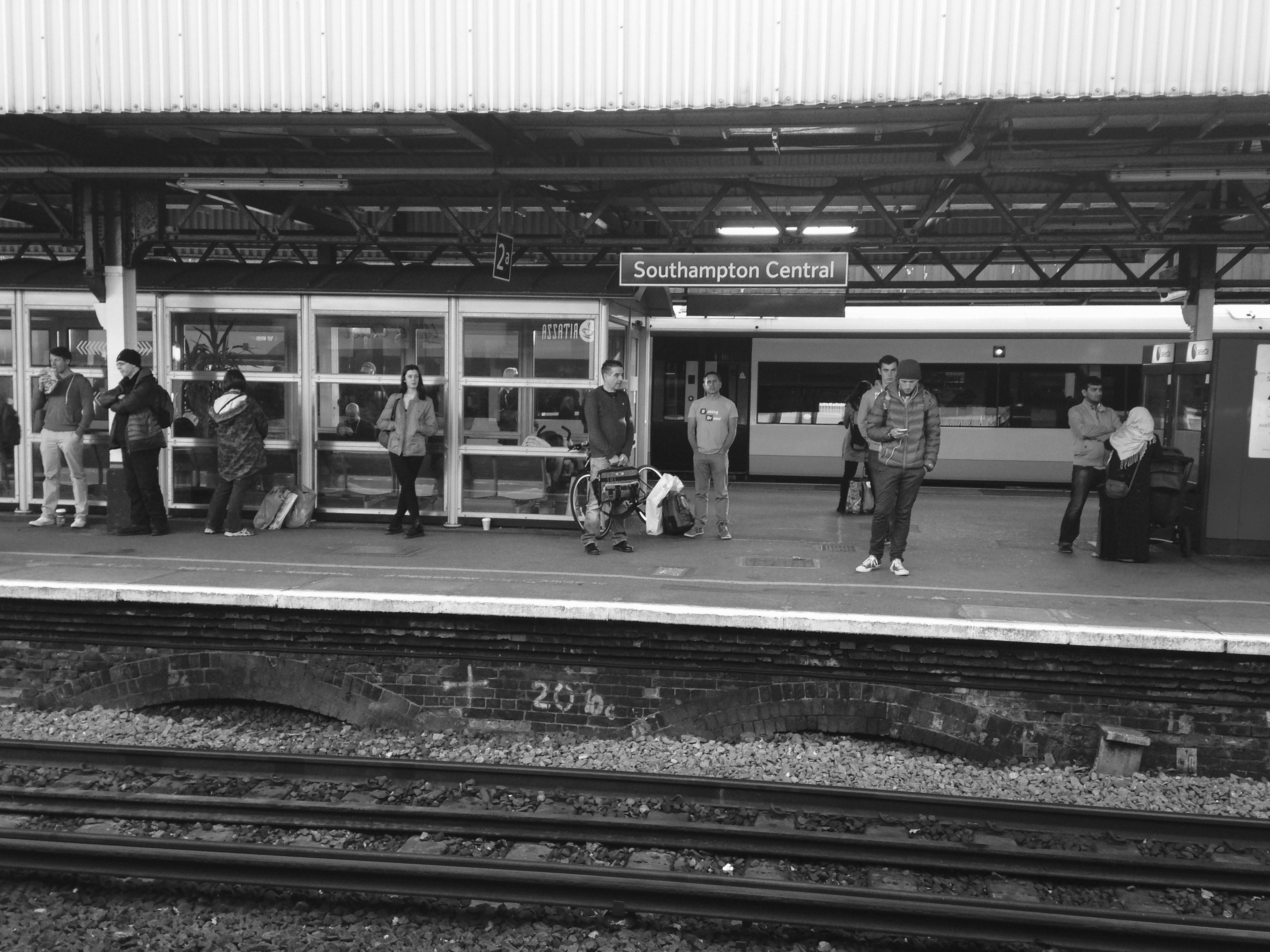
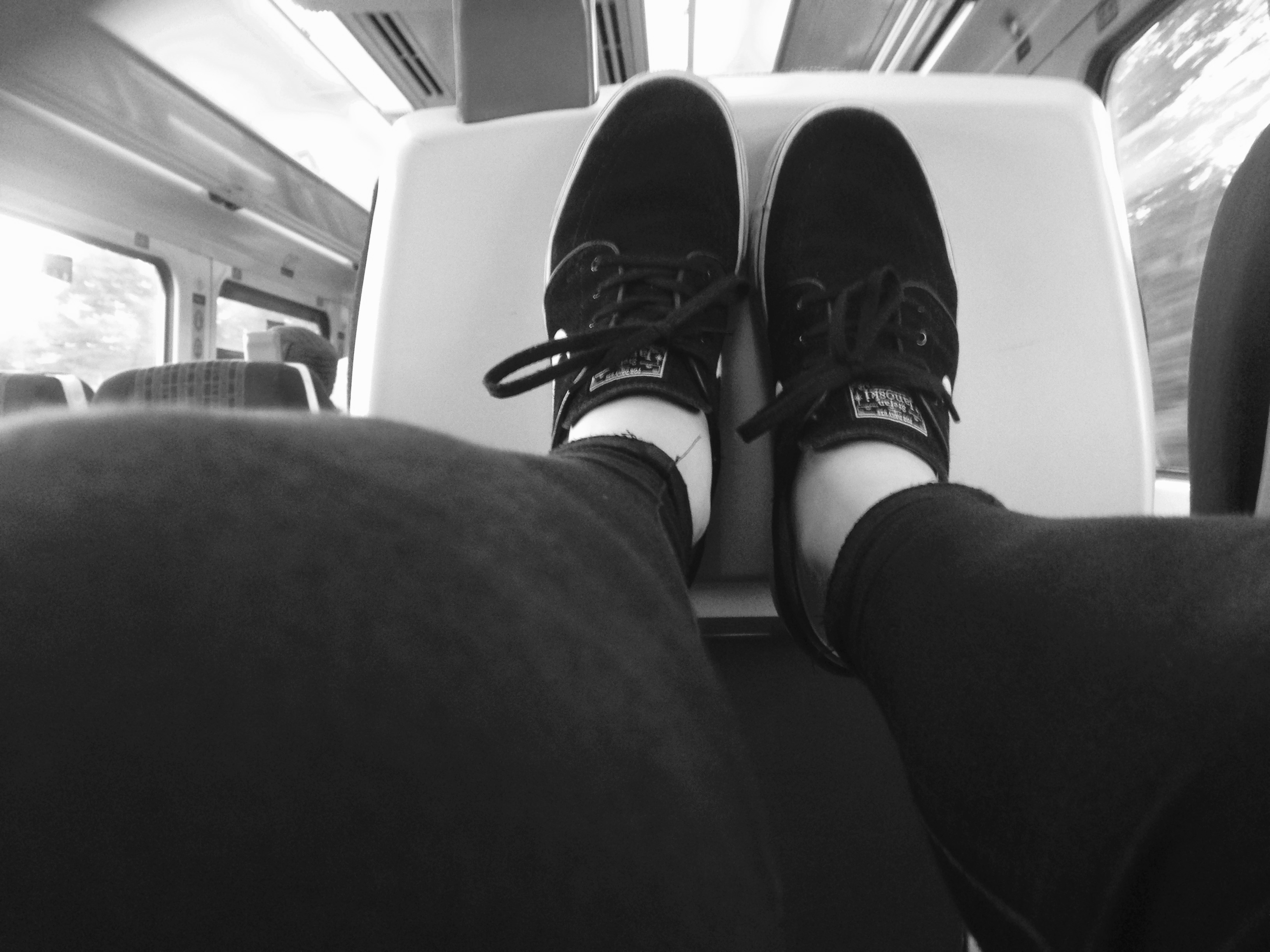
In the half term I visited Southampton due to a university test that I had to do. I was there for 2 days. I only really visited the town where the shopping centres were so didn’t experience much of what there society is like. It was a very dull town so I wasn’t inspired as much as I thought I was going to be. I didn’t take many photographs as I didn’t feel very inspired. I have taken a couple of images from the train station that I liked. A lot of my pictures have motion blur as I like the idea of having motion in a photograph. I took these images on my phone and added the iPhone effect ‘noir’. I like the pictures of the train station as they look very gloomy which perfectly represents the place.

FullSizeRender (1)

FullSizeRender (2)

FullSizeRender (3)

FullSizeRender (5)
This is my favourite image as I like the rustic look it portrays. I like the train tracks underneath and everyone are strangers, they all look and dress different and I like the overall composition.

FullSizeRender (6)

FullSizeRender

IMG_5387

IMG_7400

IMG_7407

Jersey Museum Takeover


For 125 years, islanders of Jersey have been reading the Jersey Evening Post. Through their visual storytelling, press photographs can tell remarkable and untold stories, inspire discussion and reminiscence. For much of its history JEP photographers have documented Island life, following the daily activities of Islanders and recording the changing landscape and cultures which have developed insignificantly over time to create the Island we live on today. On Friday 20th November,  we went to the John de Veulle Gallery, Jersey Museum to conduct research on Jersey’s Heritage. The JEP’s proposal was that Jersey Heritage participates in the national Takeover Day campaign to encourage children and young people across the country to get involved behind the scenes at museums and art galleries. Echoing the structure of a modern newspaper, this exhibition has shown highlights from the hundreds of thousands of photographs which have appeared over the year, from headline stories, news events, community features, entertainment and sport.

adam ant

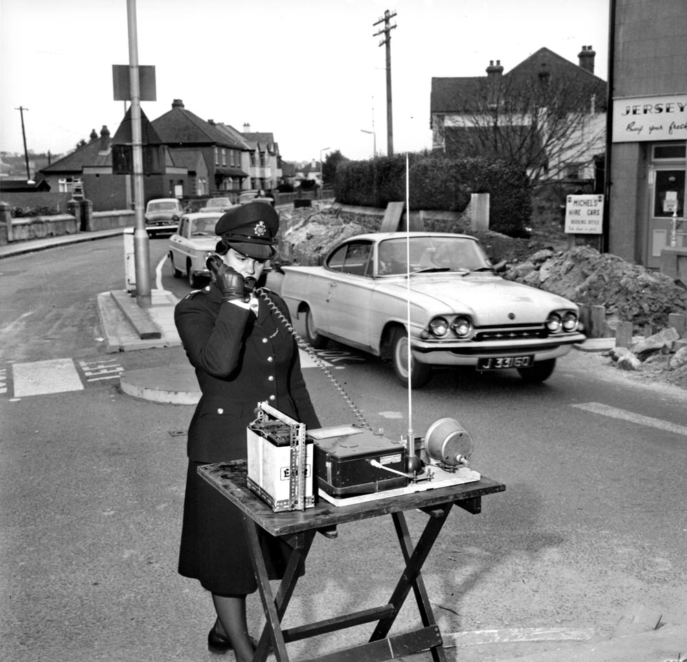
exhib Temps Passe H.Q. Calling …. 1964 No mobile phones in these days …. Police with walkie-talkie sets were used at peak periods to alleviate the problems caused on the Route de la Haule / Beaumont junction in November 1964, where the Jersey Electricity Company were laying a new main cable and where only single line traffic could pass. P.C. Susan Bond answers a call from Police Headquarters. Pic taken Wednesday 18th November 1964 Picture: Ron Mayne Report in JWP 26th November 1964 page 12 From Police box 23, neg bag 376 REF:01060515 Sixties chosen

At the museum we had the opportunity to partake in the following roles:

  • Curators – selecting the work to be exhibited and how it is hung, writing captions
  • Designers – deciding how to hang the temporary exhibition and producing a logo for the blank wall at the entrance to the gallery
  • PR – using social media to promote the exhibition and liaising with local media
  • Documenters – making a short documentary film or photographing the production of this pop-up exhibition.
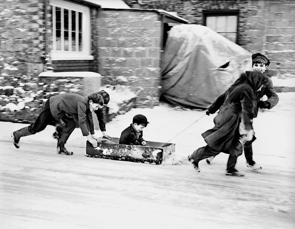
exhib TEMPS PASSE SNOW 1962   ON THE ICE -  A DRAWER FROM MUM'S CHEST OF DRAWERS MAKES THE PERFECT MAKESHIFT SLED FOR THESE CHILDREN OUT ENJOYING THE SNOW DURING THE FREEZING COLD WINTER  IN DECEMBER 1962.   (PIC TAKEN FRIDAY 28TH DECEMBER 1962) (FROM SNOW BOX 7, GLASS PLATE 109)  Sixties chosen
exhib TEMPS PASSE SNOW 1962
ON THE ICE – A DRAWER FROM MUM’S CHEST OF DRAWERS MAKES THE PERFECT MAKESHIFT SLED FOR THESE CHILDREN OUT ENJOYING THE SNOW DURING THE FREEZING COLD WINTER IN DECEMBER 1962.
(PIC TAKEN FRIDAY 28TH DECEMBER 1962)
(FROM SNOW BOX 7, GLASS PLATE 109)
Sixties chosen

This collaborative project has given me a chance to work behind the scenes with Jersey Heritage staff to curate and mount a pop-up exhibition. This has provided me with an excellent experience at museums and art galleries. Jersey Heritage has benefited me from developing a close working relationship with young people and their responses will enrich our understanding and knowledge of the collection.

What effect did the exhibition have on you? 

What where your favourite images from the exhibition? 

What do you think the photographer is trying to communicate with this image? What is it you like the most about this aspect? 

What is wrong with your least favourite image? How do you think it could be improved? 

Can you see any revelations within a selection of images? 

Here is a link to the photographs of the exhibition from the website – http://jerseyeveningpost.newsprints.co.uk/search/byg/p/u/48/1/jep_125th_anniversary_exhibition_images

Exploring Family

Ideas of Family: 

With the recent development of my life as a family, it is suitable to base this project on the transition of me moving house in early December 2015. This building project has been live for nearly over 5 years, and has been a long process due to the reserves for materials, dealing with the National Trust and allowing the correct methods to be done in order to restore the house’s natural and original  form. Le Petit Fort, for nearly half a decade has become the pivitol force within our lives as a family. Both of my parents have spent countless hours on the development of our new family home, as they have effortlessly incorporated the minimalist details of their own lives with reflects on what life was like when the house was first originally built.

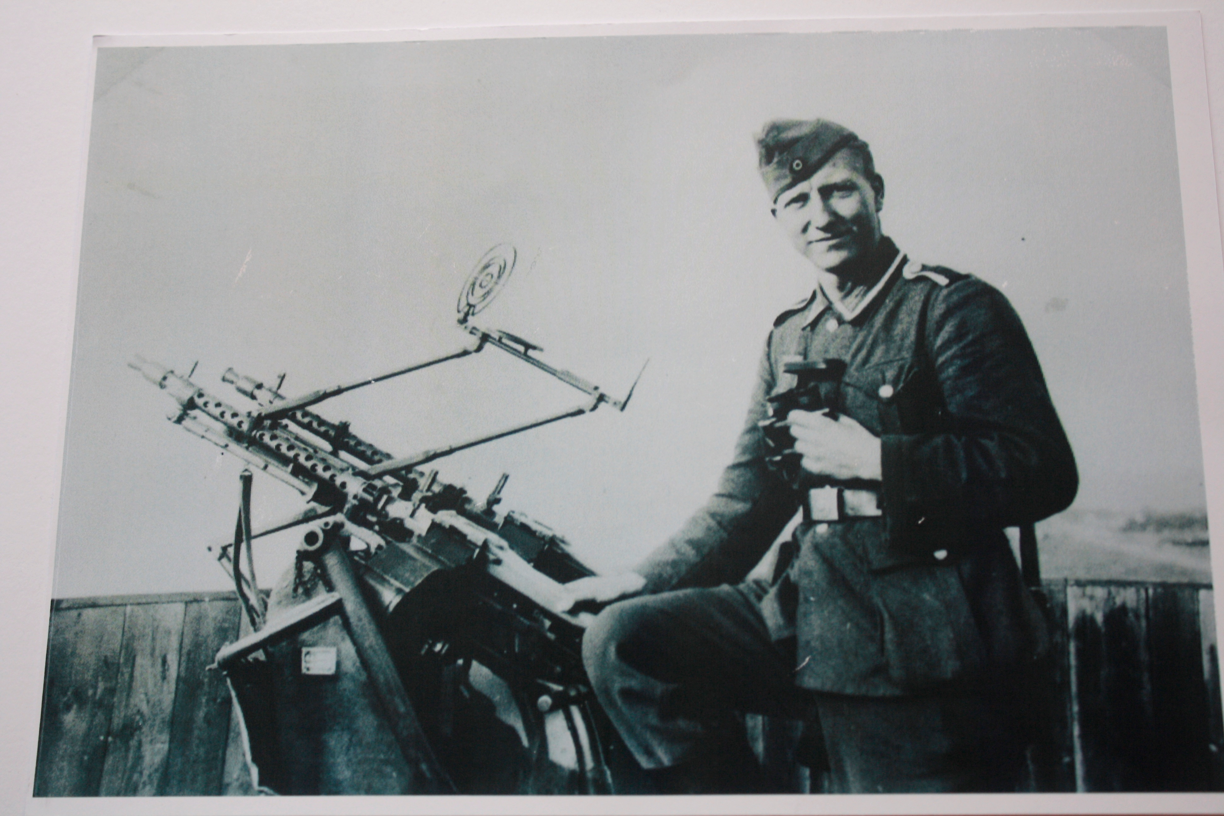
As a starting point, I have researched past images of the house in order for me to make a comparative link to suggest more relevance within my ideas. This was all done with help from the Societe Jerseiase and Jersey’s Photographic Archive. With help from Gareth Syvret, we researched these past images of the house with the references tagged along with the images. This was all stored in a box of photographs given by the Bailiff of Jersey, between the era’s of 1930’s and 40’s: a post war memorial. I then learnt that my house was an important artifact and gem to the German soldiers which were residence in St Ouen’s Bay during the time of the occupation in World War ll.  From this, my ideas then began to develop, I found relevance into my project by being able to contextualize and relate to the history of my new house.

  • Contextualizing with the changes and developments society have influenced the concept of a family.
  • Noticing society’s expectations of of a family: what is the control of responsibility? What are guidelines parents have to follow?
  • How do individuals within a family react towards each other? How are they genetically similar?
  • Are there individuals that look similar? How can you dictate these similarities?

This aspect for me is very interesting, and I would like to investigate these factors in greater depth by recreating this style myself. The style and resiliency of the prints when disposed are unconditional to the time period and era. The rustic and compound prints objectifies images in greater detail, as colours are abbreviated allot further along with edges and geometry created from sharp lines. This could be captured with use of a disposable camera. Exploring this theme of disposables allows me to reconnect back into my childhood, as a way of integrating with the present without compromising and changing the perceptions of the past. For me, as a kid, using disposable camera was a source of fun for me and my family. The camera acts almost as a time capsule, reflecting back on the times humorous and laughable things that wouldn’t usually be remembered by memory. As a kid, using this camera as a game enabled me to take chances with the outcomes, as once taken, I would look forward to the interpretation of the moment once developed.

As you can see from these pictures, a sense of history is elevated.   I want to approach this task open-minded, as from 2010, the growth and development of our family has changed and continues to change with a developing world.

I plan to initially capture my dad as the driving force of this project. He began this project initially from his idea, he was the one that initiated this move and constructed the foundations of the house as well as the various plans.