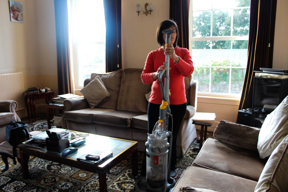
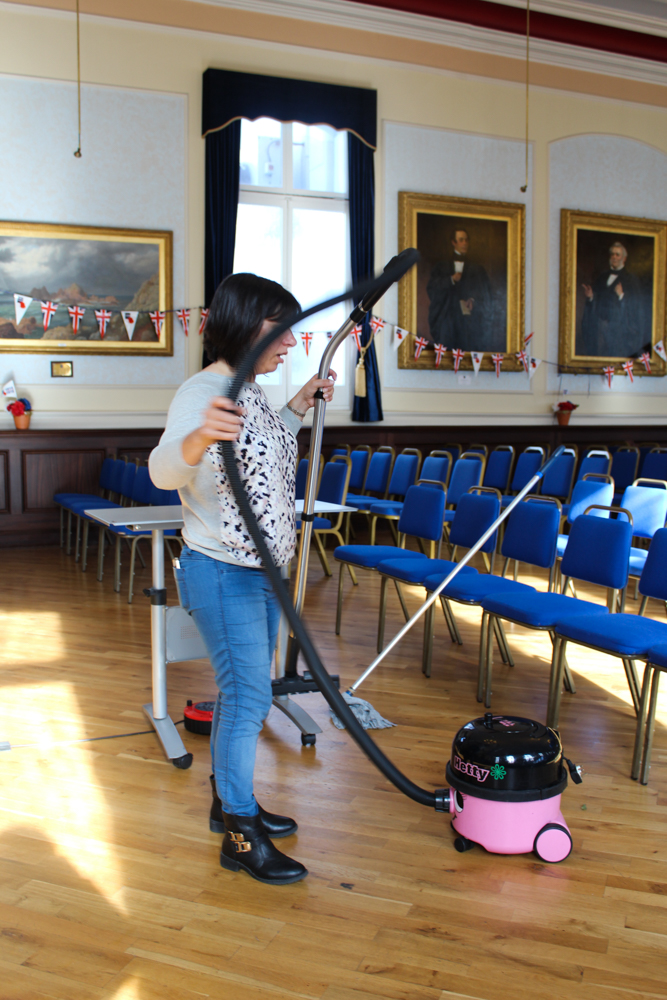
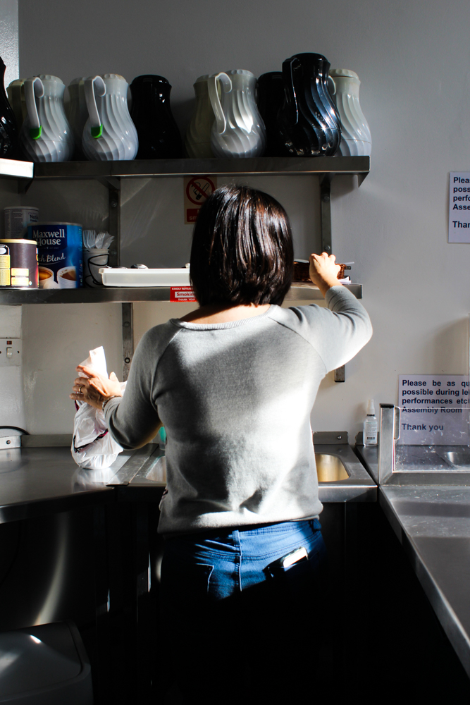
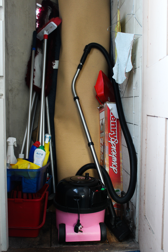
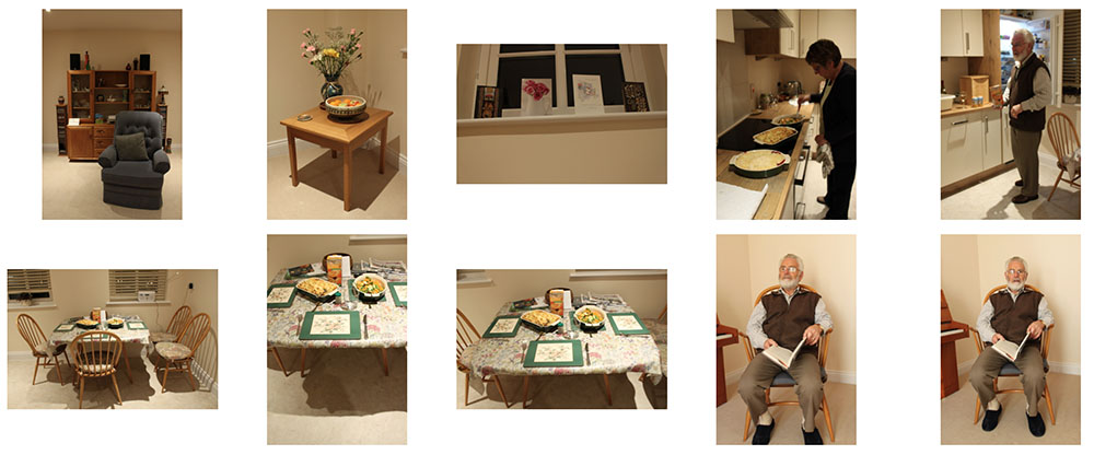
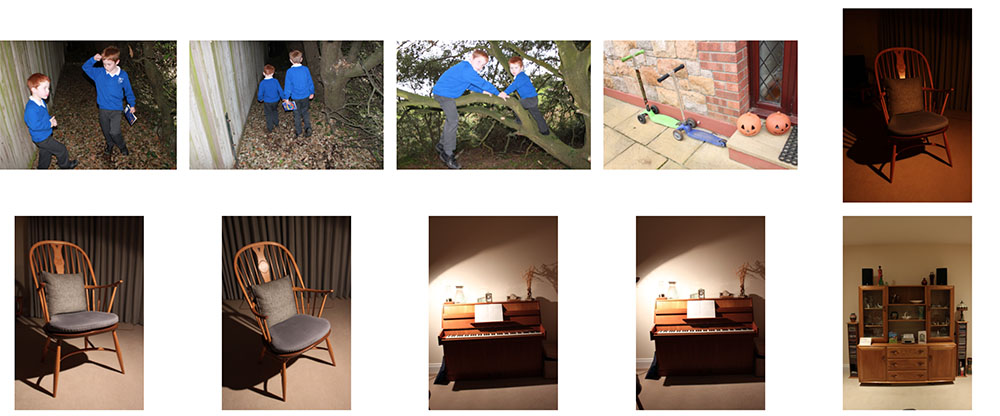
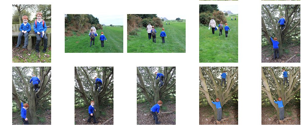
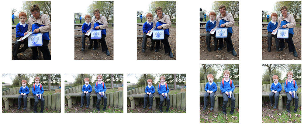
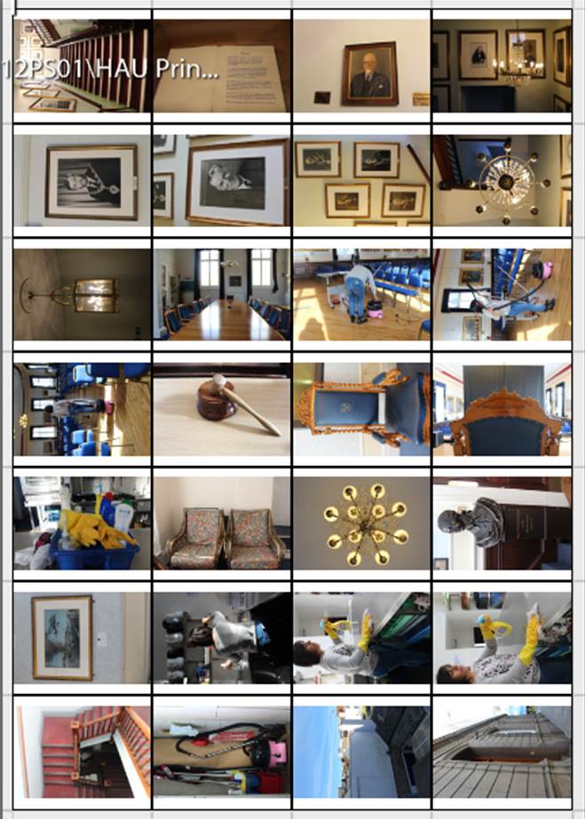
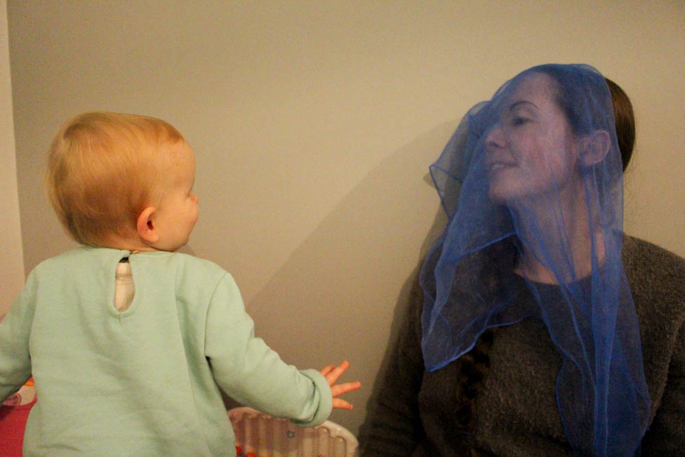
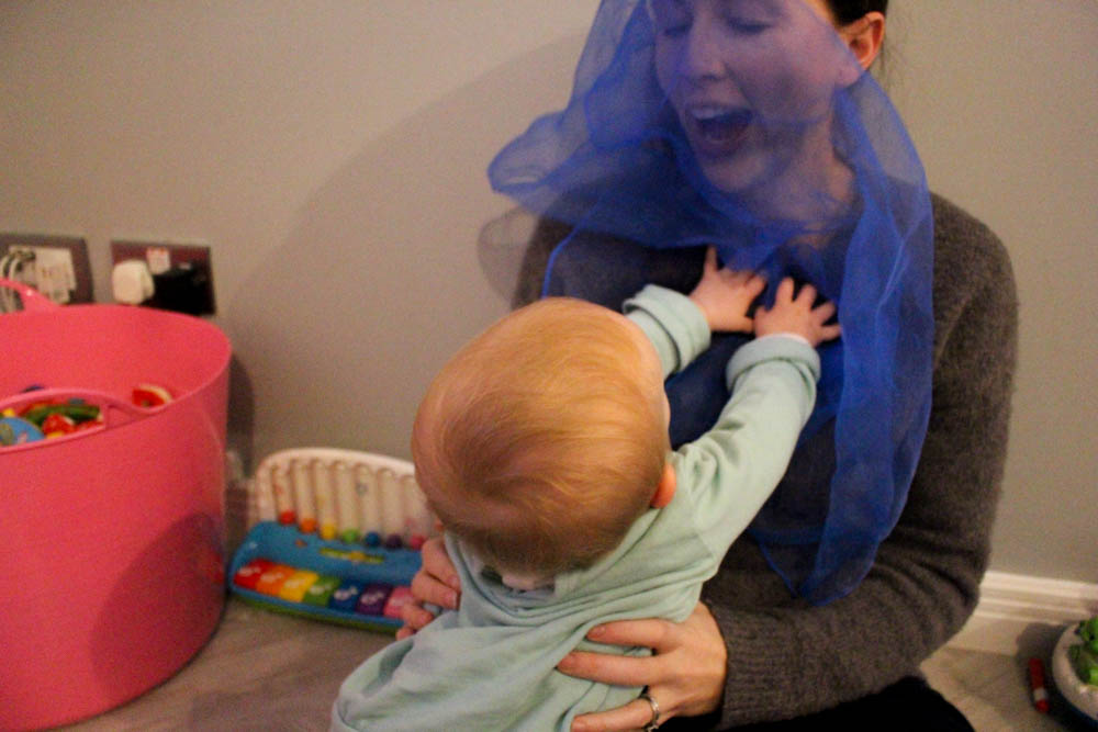
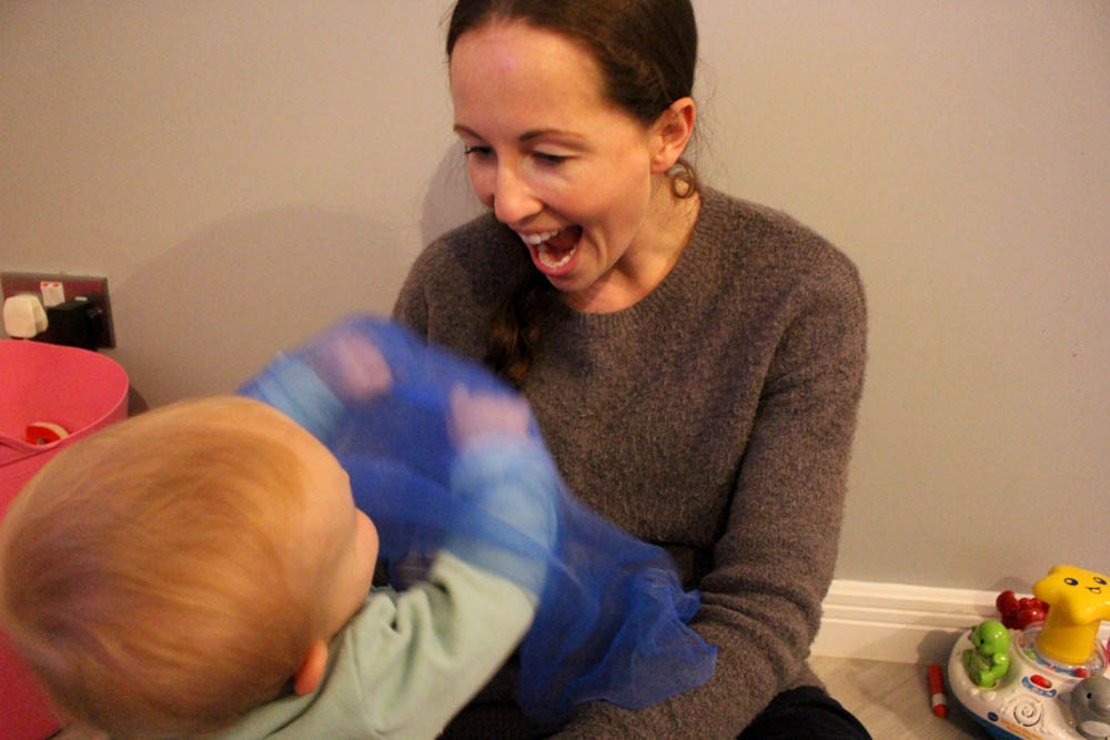
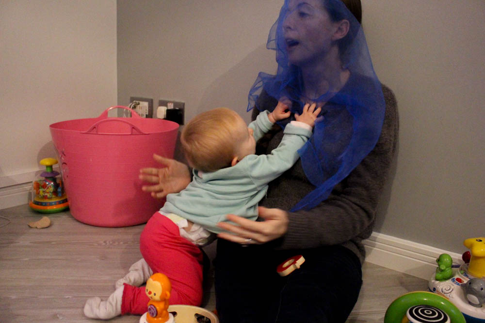
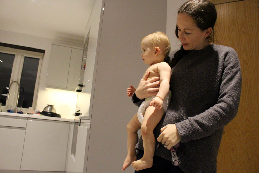
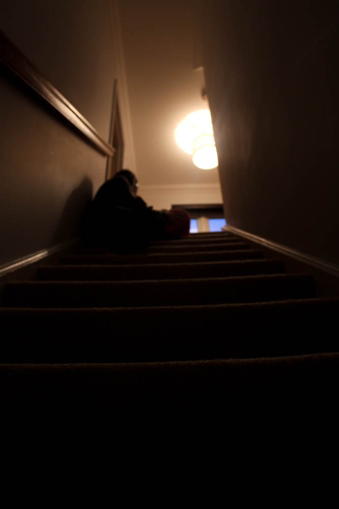
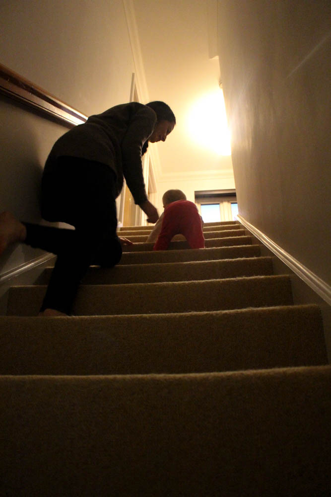
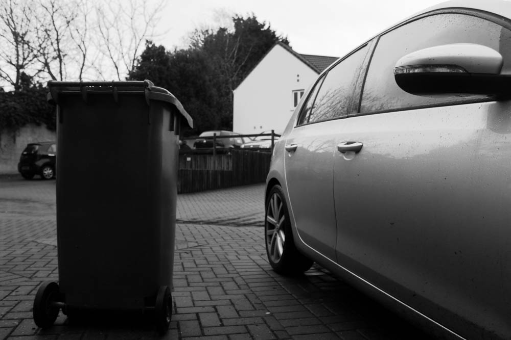
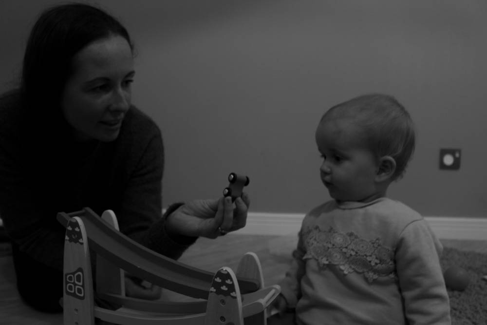
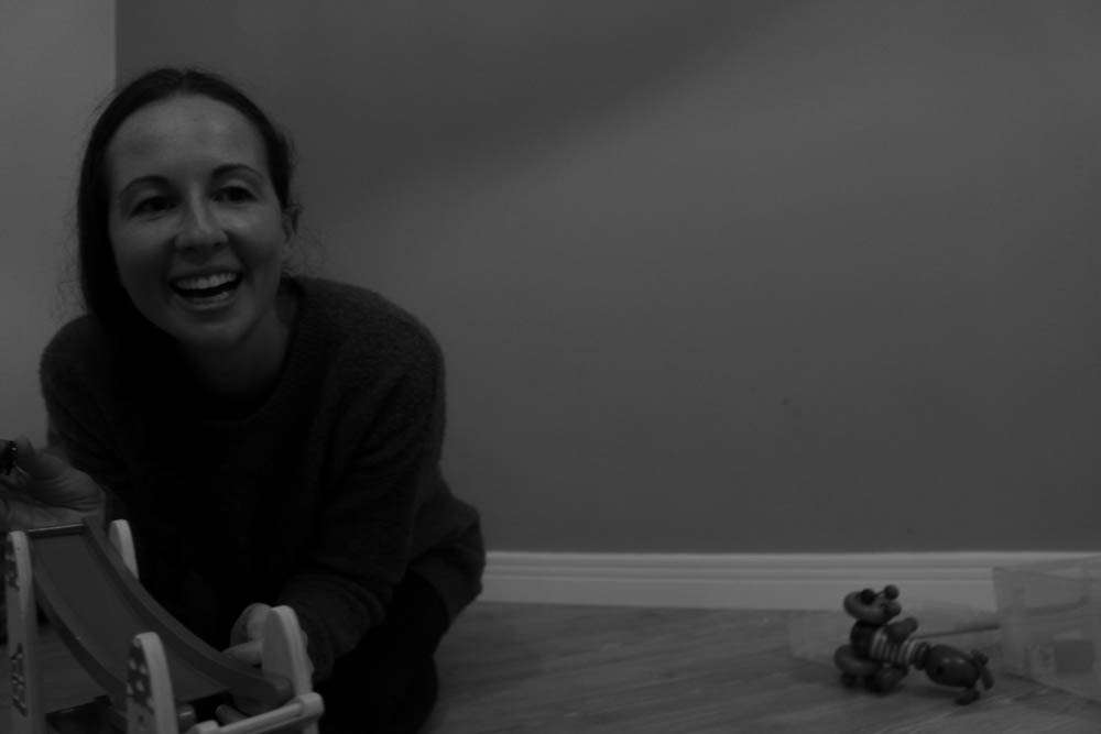
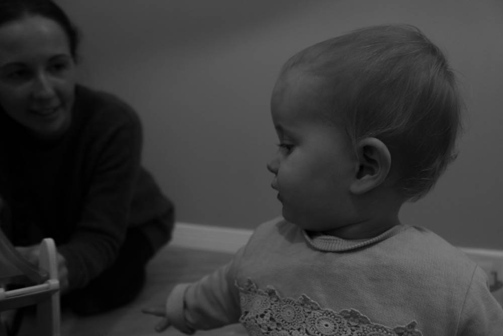
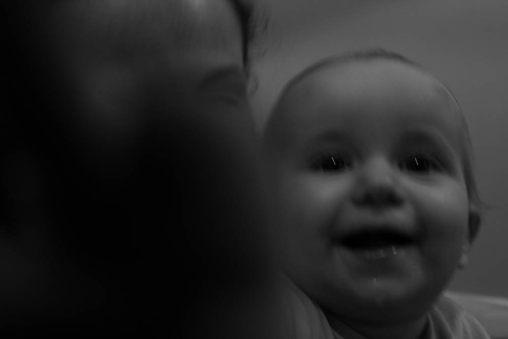
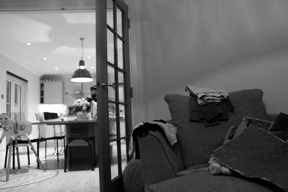
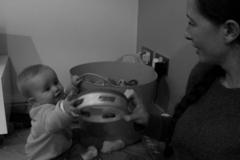
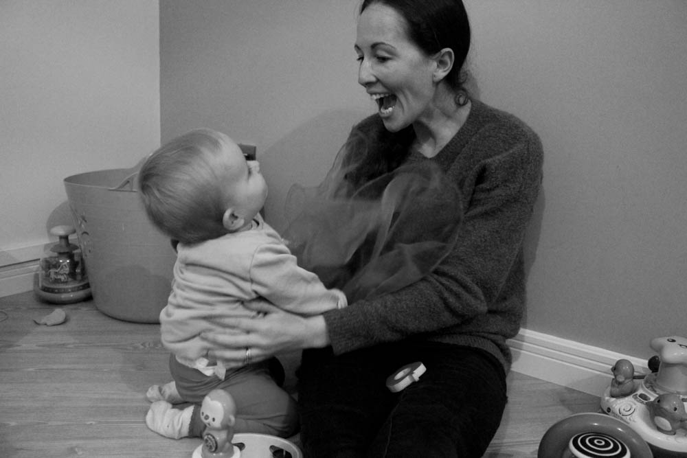
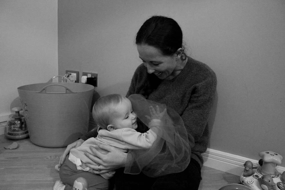
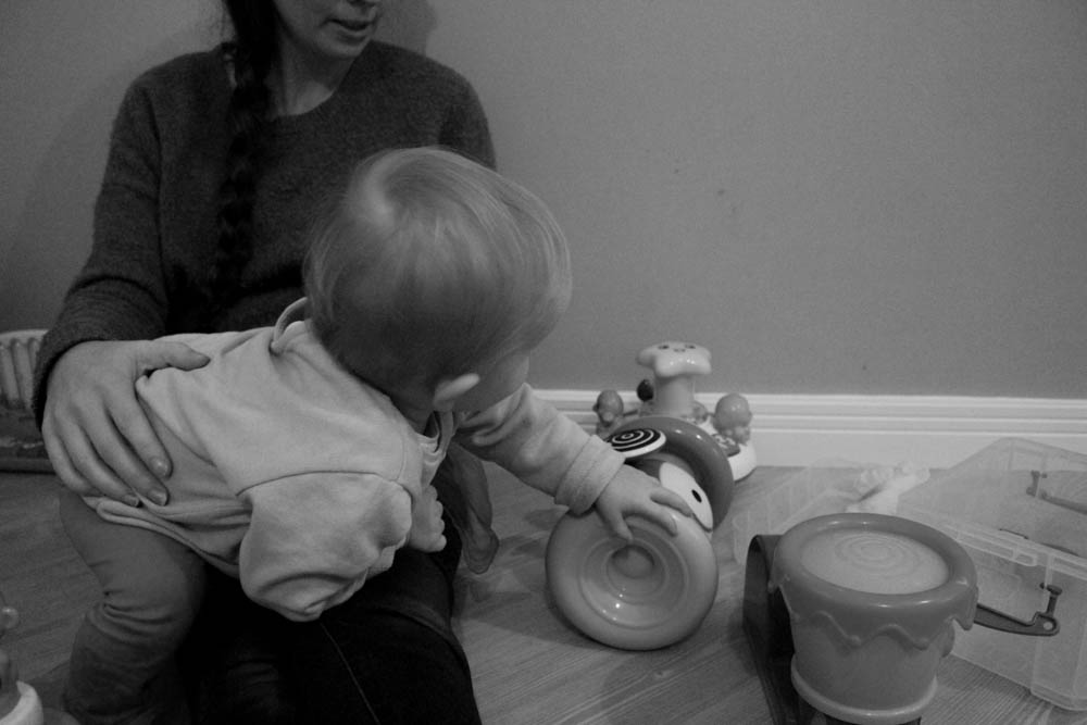
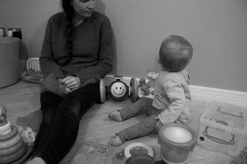
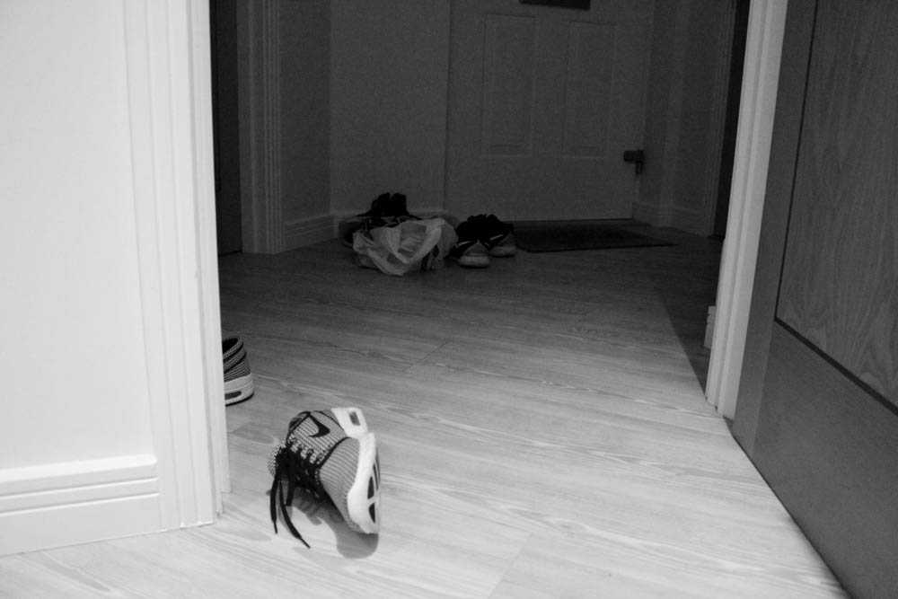
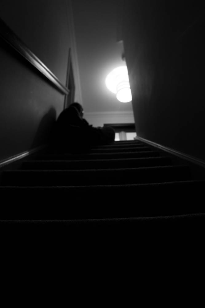
In response to the Jersey Heritage museum ‘Our Story, Half Term: 125 hours seen through a teenager’s lens‘ for the JEP’s 125th anniversary I took photographs that fit in with my project theme family, of my mum working in her working environment. I chose these 5 photographs as a series of images to tell a story and I put them forward to be displayed in the museum. All of the photographs are obscure, there is always an object hiding my mums face almost ‘hiding’ her identity, I think that this makes the photograph mysterious and therefore more interesting. I also tried to include the different environments which adds a bit more to the photograph.
Category Archives: Record / Photoshoot
Filters
Community- Record
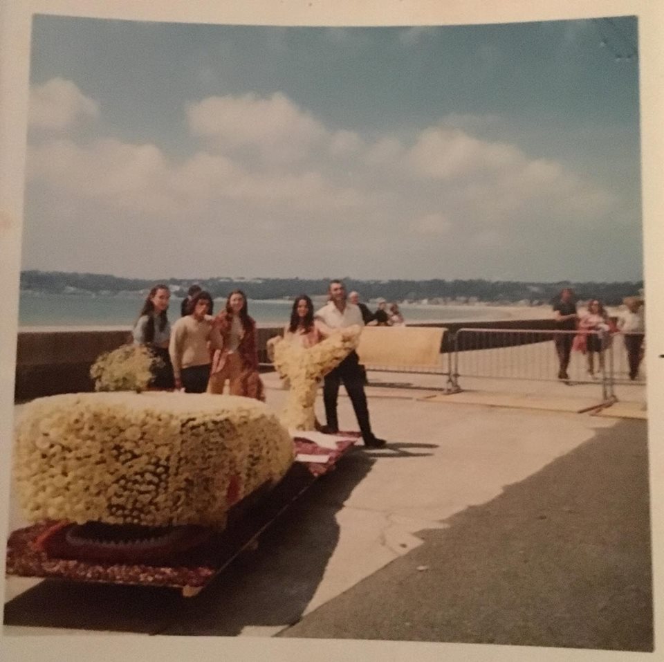
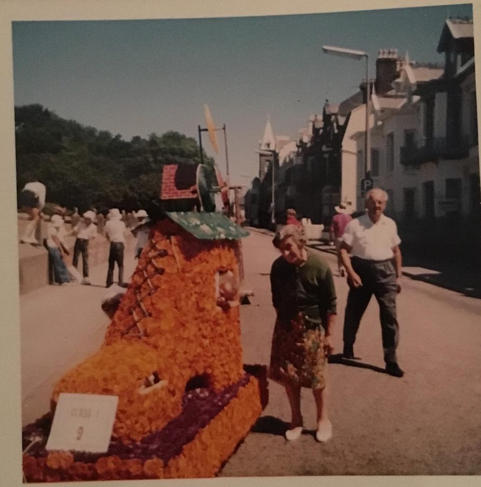
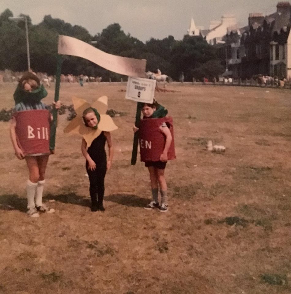
This collection of photographs range from the actual day of the battle to the revealing of the floats. All eight of my grandfather’s children participated in the event, because not only was it a community event but also a family one. Lots of families use to get involved with the battle creating their very own little creative floats.
These are a selection of photographs I have from my family’s albums of the Battle of Flowers. As previously said in another post, my mother’s family regularly took part in the annual event, making smaller floats in their gardens. I thought it would be interesting to include photographs like these in my picture-story because it can represent a time in the battle’s history but also my family’s too. I think it’s really special having my family members in the photographs because they symbolise hundreds of memories and share a part of the art with reality.
DOCUMENTARY PHOTOGRAPHY – PICTURE STORIES – TYPES OF PHOTOGRAPHS:
DOCUMENTARY PHOTOGRAPHY – COMMUNITY – MY COMMUNITY:
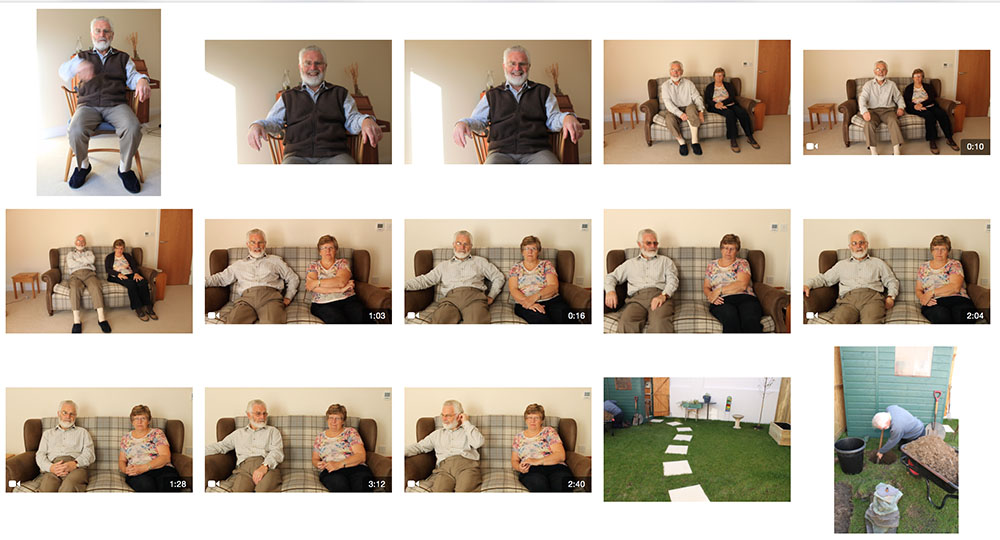
GRANDPARENTS PHOTOSHOOT
Photo shoot of Community Member:
As we departed for half-term, I began to take some general photographs of themes like: street photography, portraiture and environmental shots.
Whilst I was in a cafe with family and friends, we came across a familiar man. The family friend had been a customer where my mum had worked for many decades and everyone grew to know him well.
The thing that struck me about him was his strong character. Although he was suffering through a very difficult condition he still managed to smile through it and enjoy himself. His uplifting demeanor and happy attitude was refreshing.
I then respectfully asked him if I could take some pictures and he agreed to let me. I instructed him to stand outside the cafe whilst I tried out several shots and angles. However, I didn’t instruct him to pose or stand which he did naturally.
Here are my edited outcomes from this shoot:
This was the first shot that I took. I wanted to capture his device which he must carry around with him in order to breathe properly. I tinted the image into light blue. Blue is a cool color so I think that it made the mood gloomy which is what I wanted.
This picture below is both an establishing shot and a portrait. It involves the man’s body and environment.
I then took a side shot, because I wanted to incorporate a full-body shot.
As the family friend was looking away I captured this. In the distance, a greatly-timed cyclist appeared.
I think that the photography below is very striking. The man ‘s expression is very strong and he seems to be very concentrated.
I experimented with various colors whilst editing. Firstly black and white and then a purple solid color.
As another experiment, I did the same to these one’s except with the shades of grey and blue.
This is my favorite image. I changed it into black and white to demonstrate the intensity of the contrasting shades. He is looking directly into the camera with sharp eyes and a great presence. The look seems very real and the fact that he isn’t smiling is even better. This is because smiles tend to hide the truth about how someone’s feeling, so this is good to imagine.
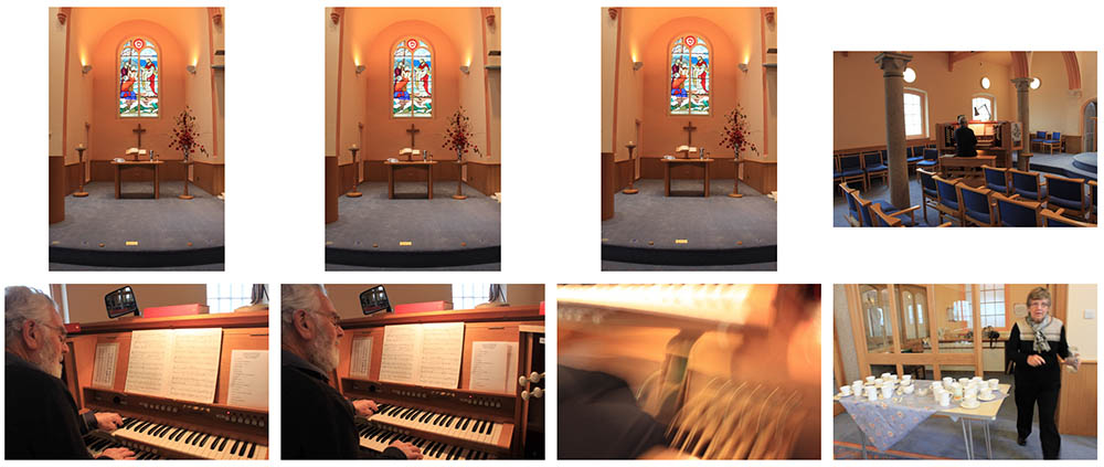
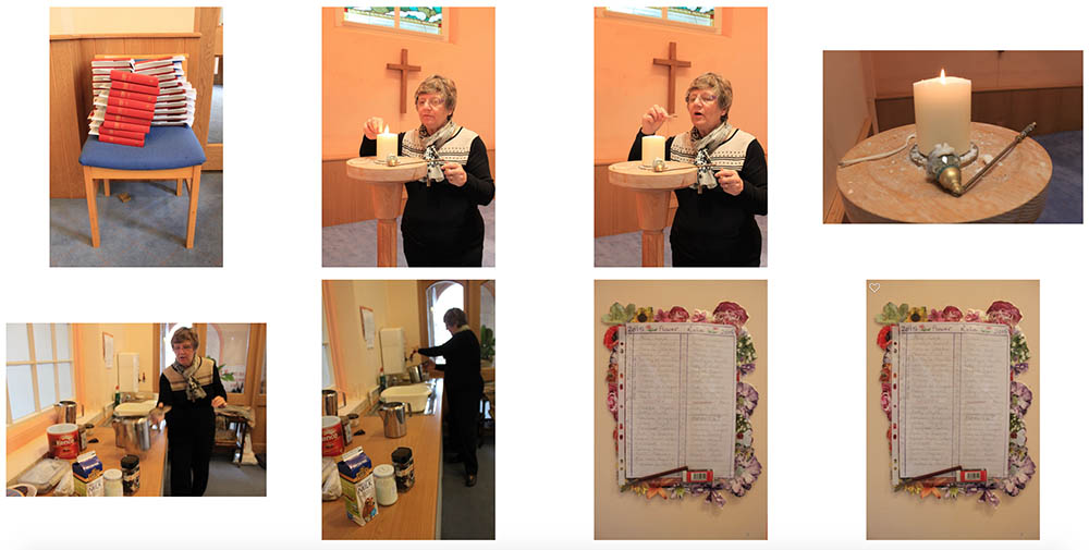
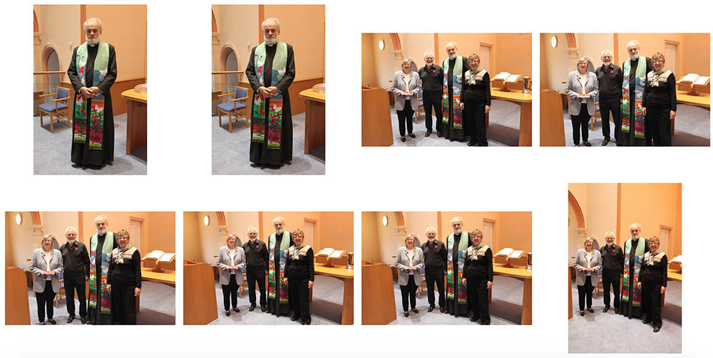
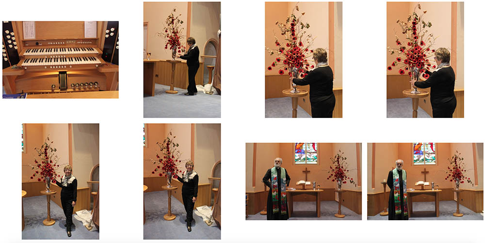
Church shoot contact sheet
Half term photoshoot
My [Extra] Shoot: Family Photography continued…
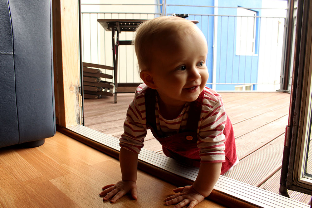
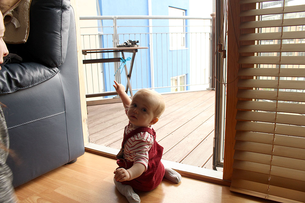
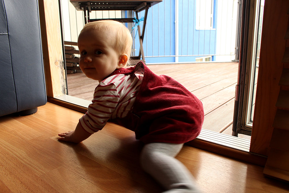
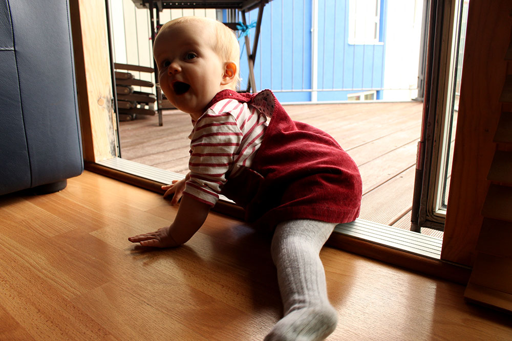
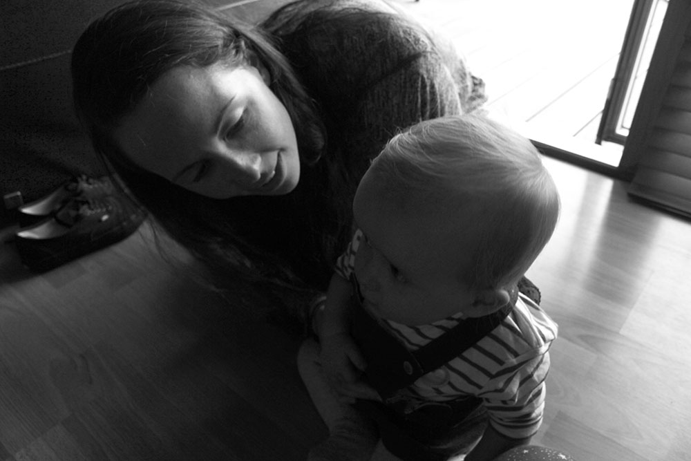
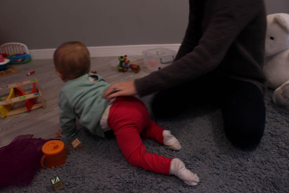
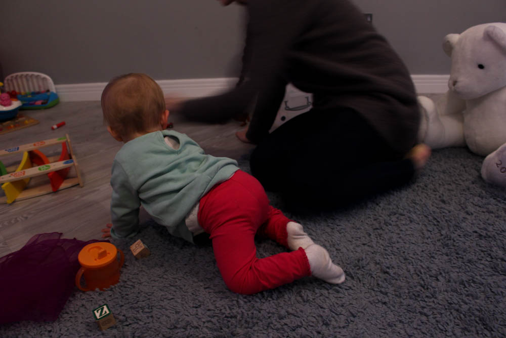
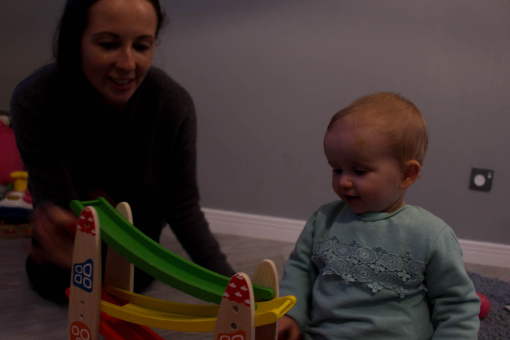
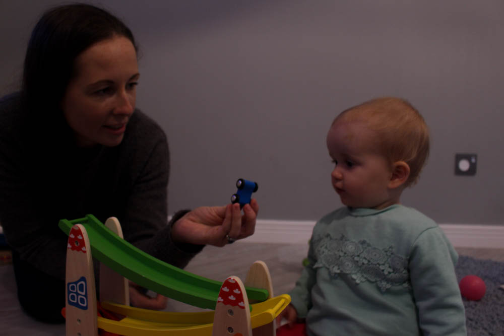
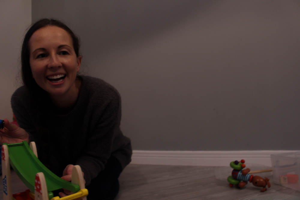
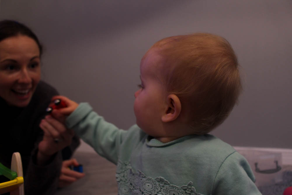
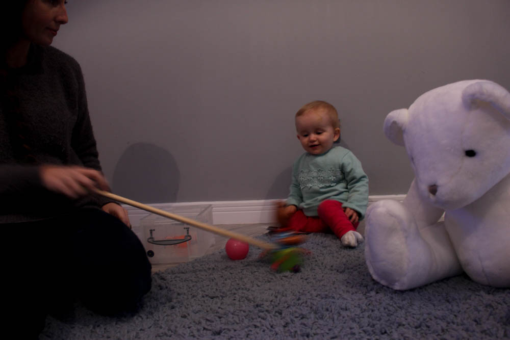
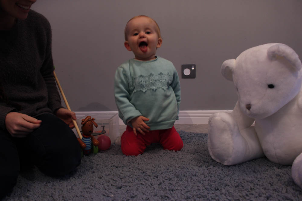
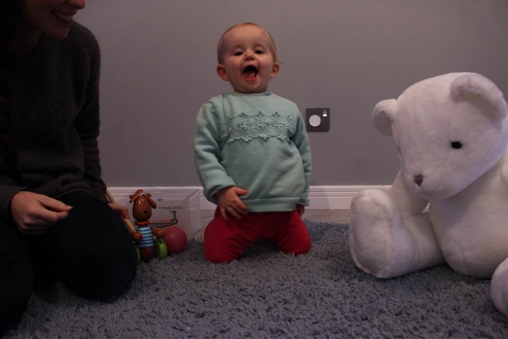
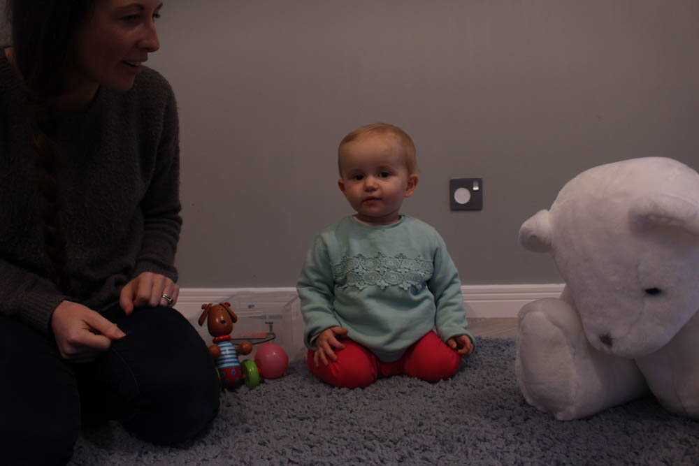
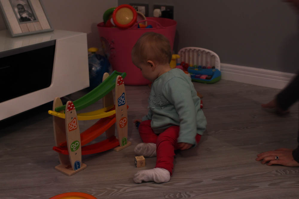
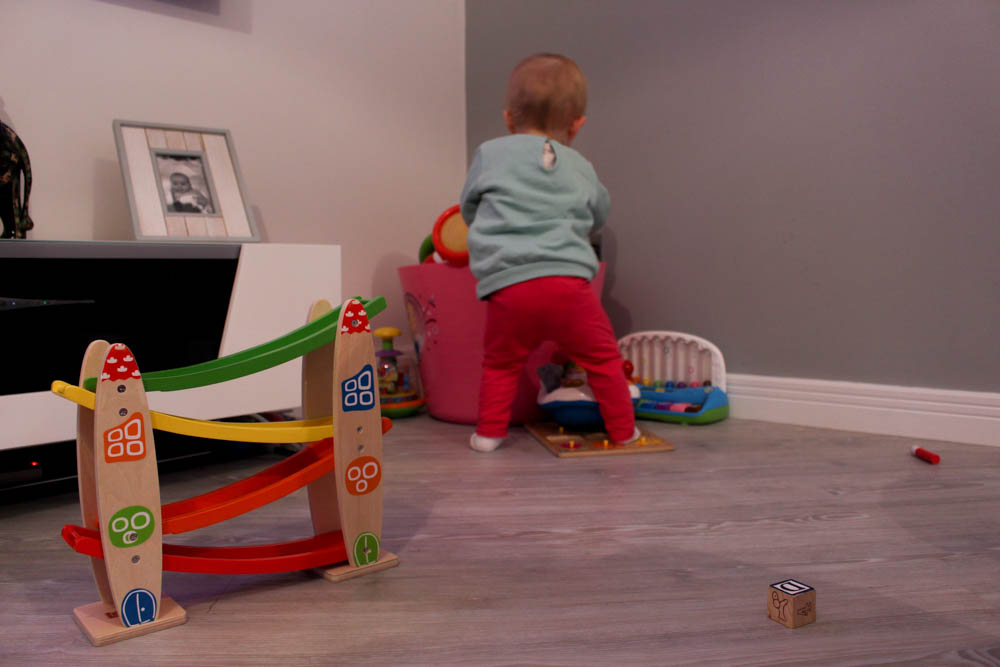
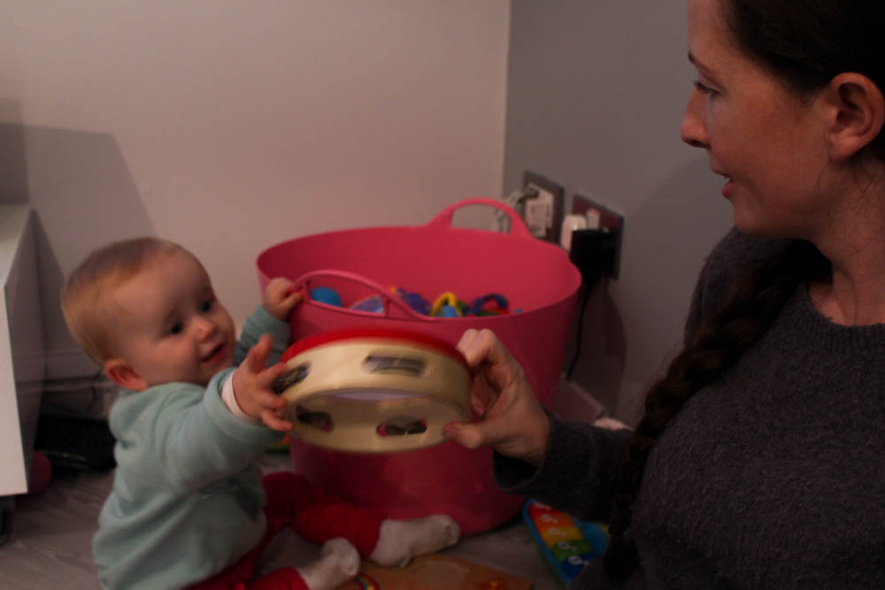
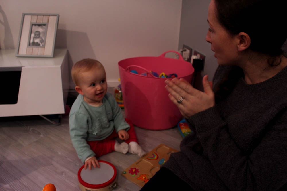
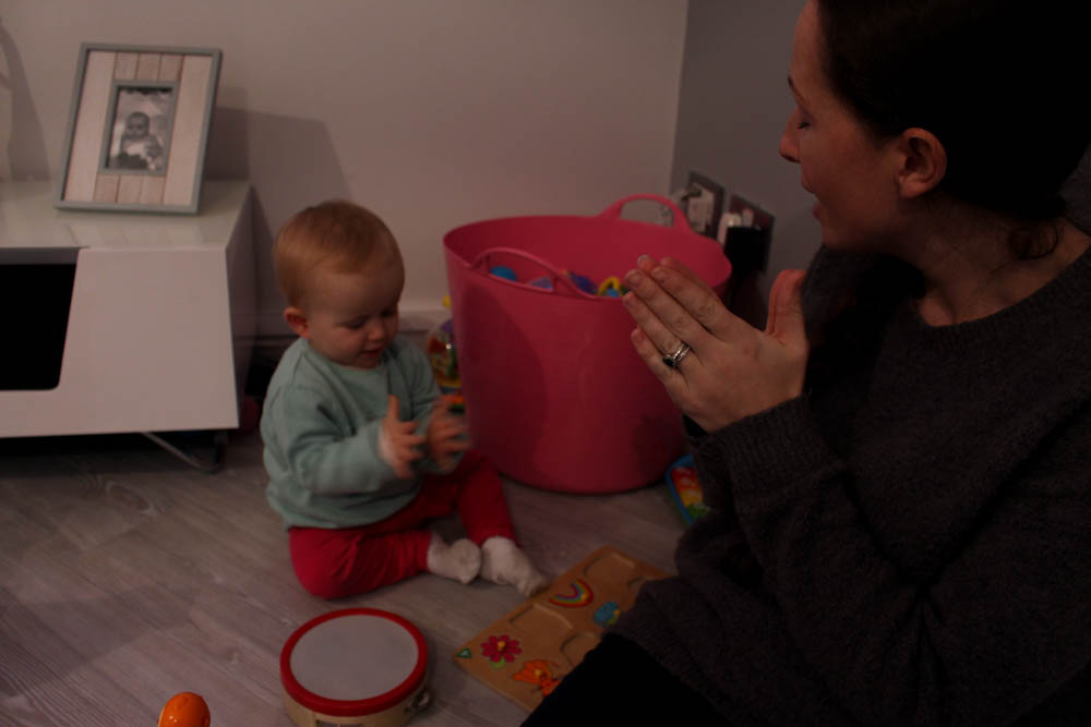
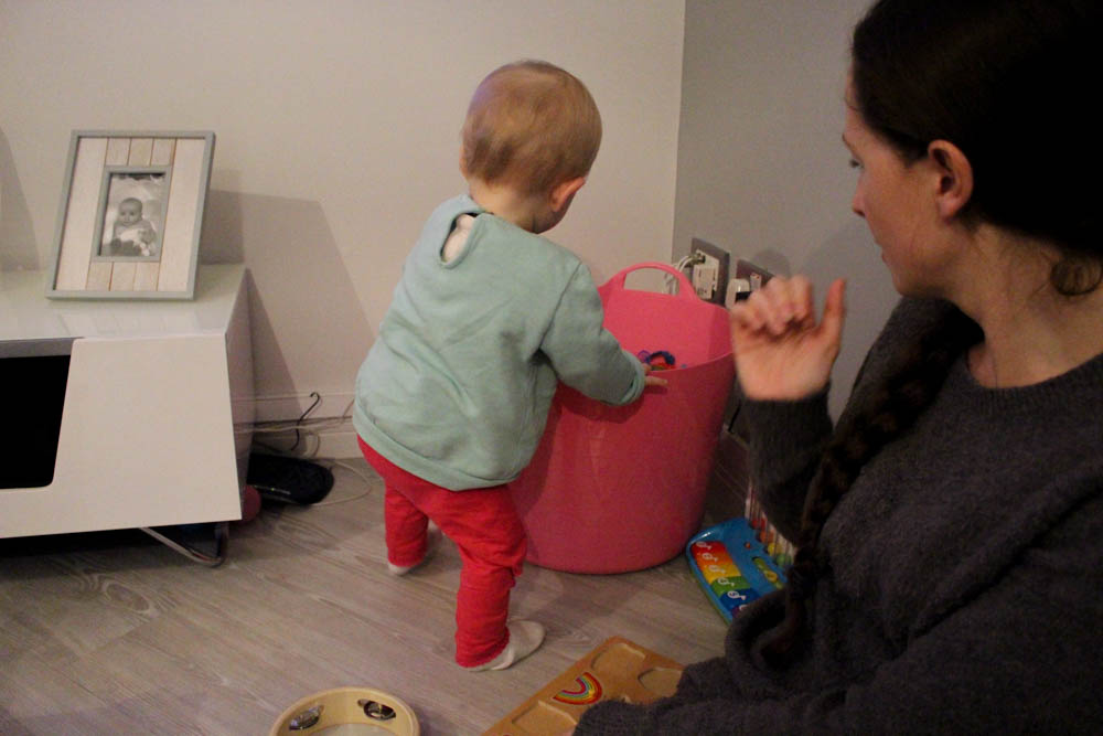
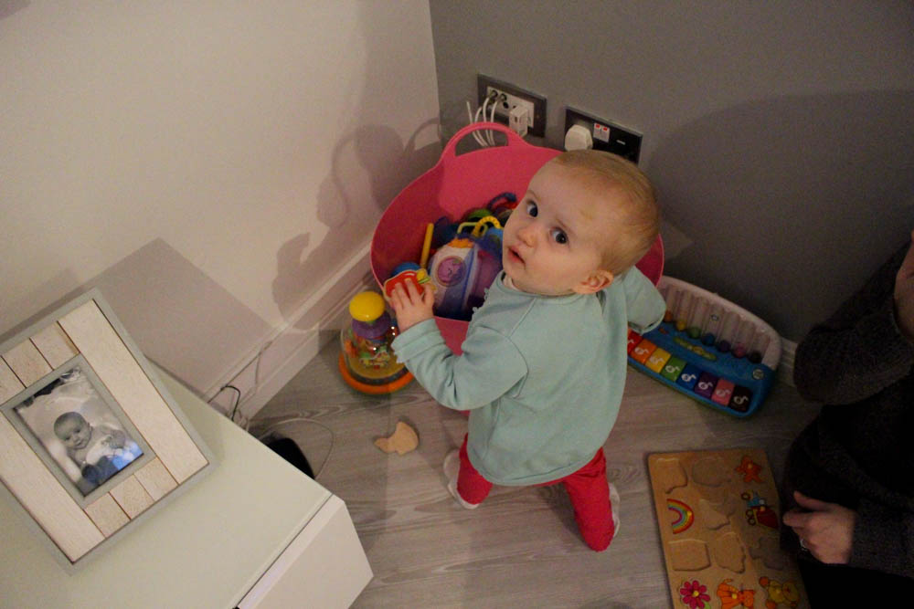
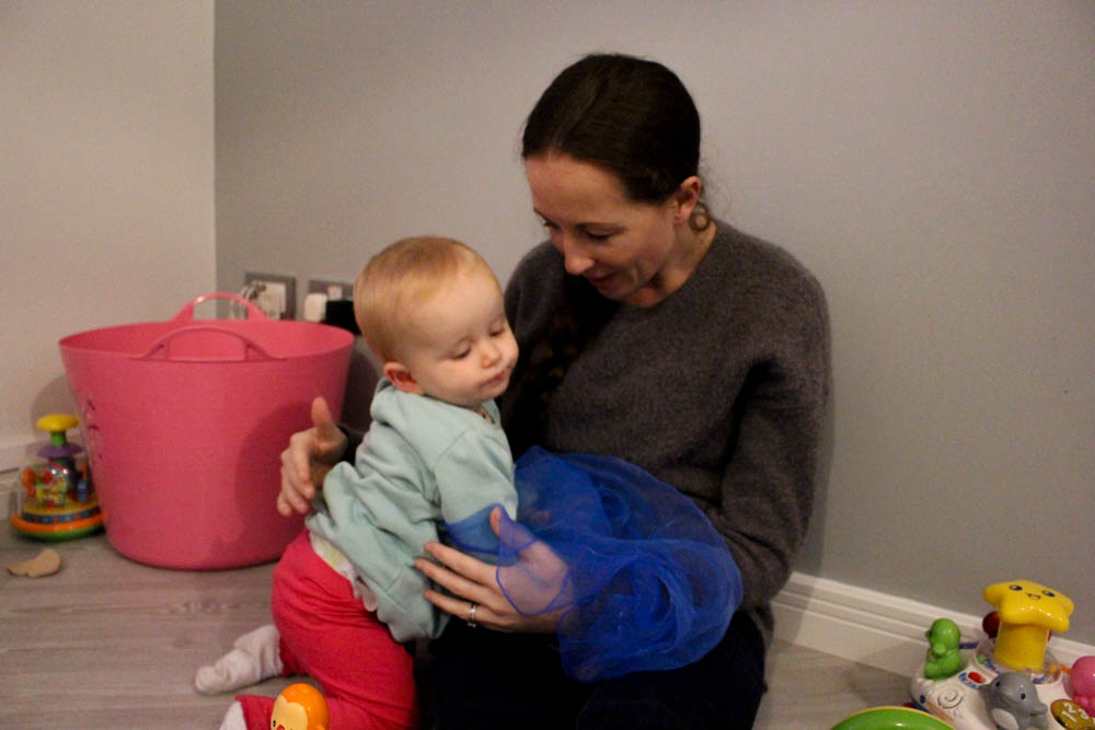
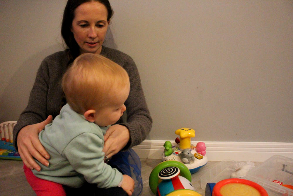
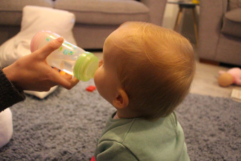
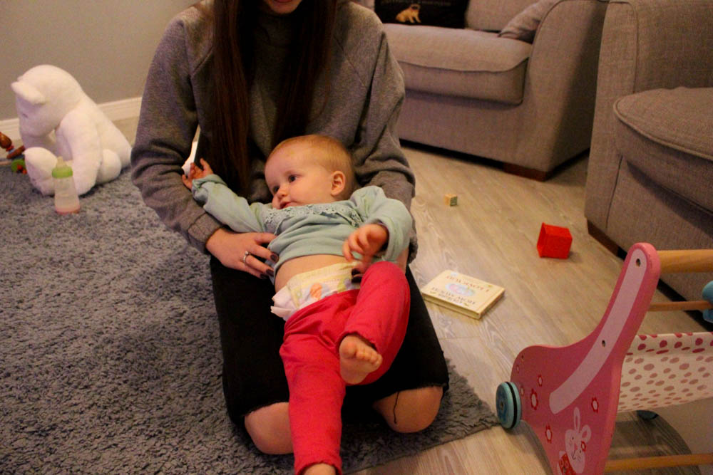
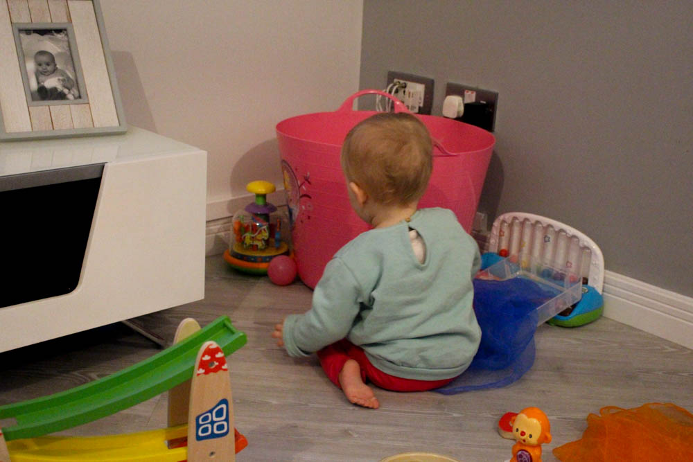
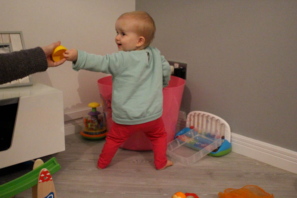
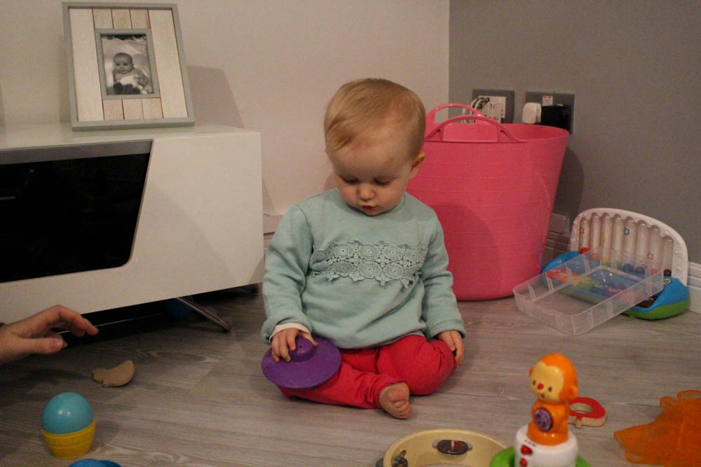
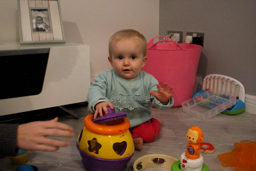
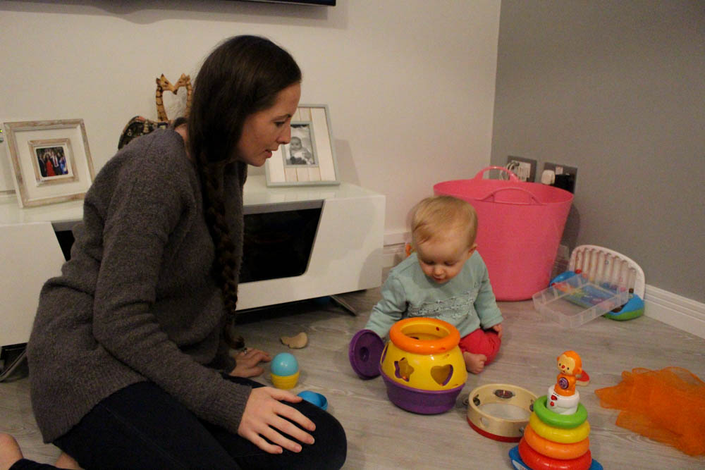
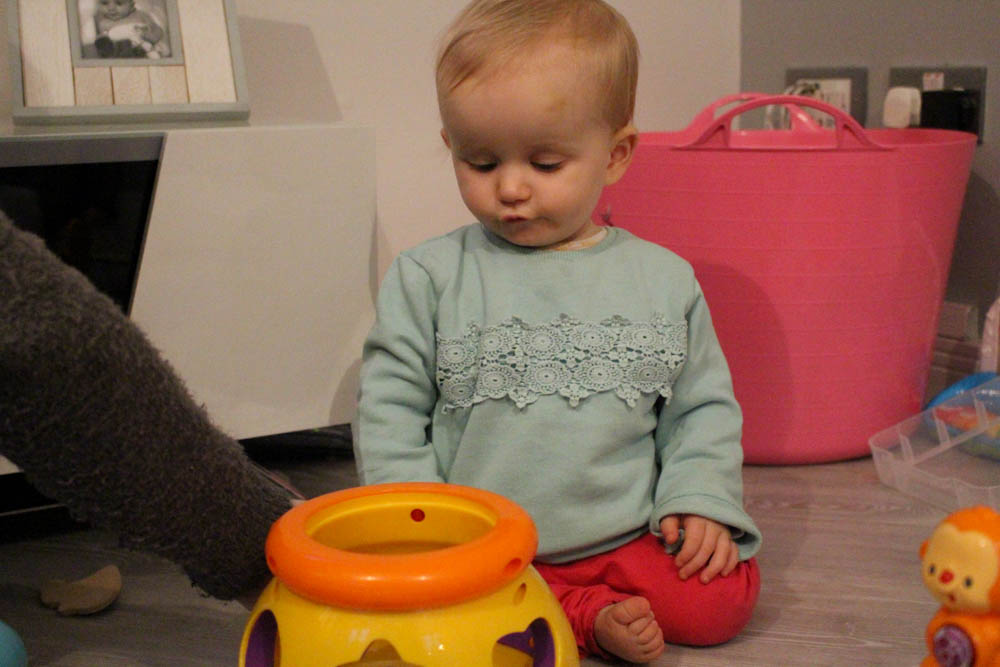
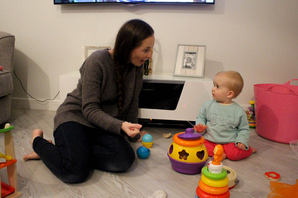
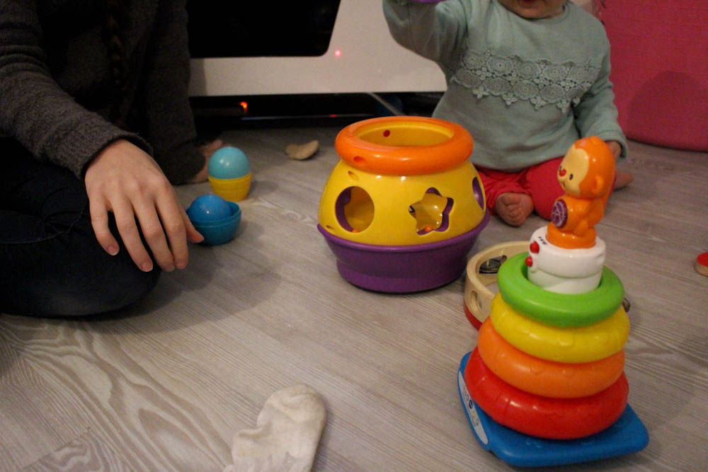
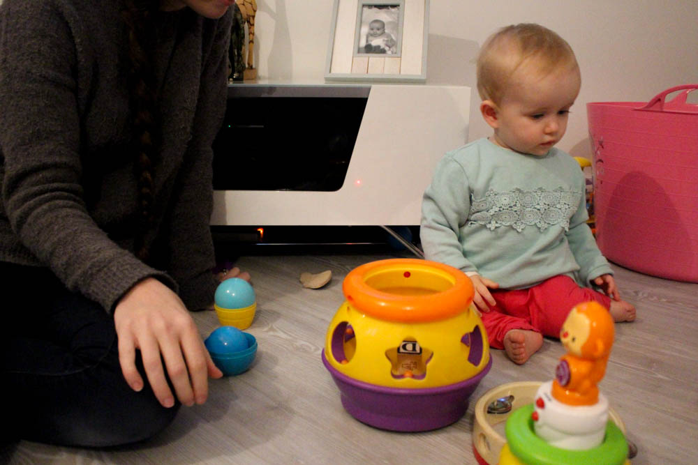
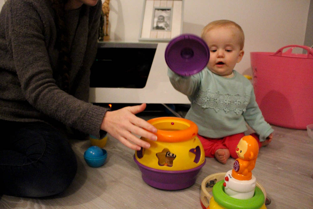
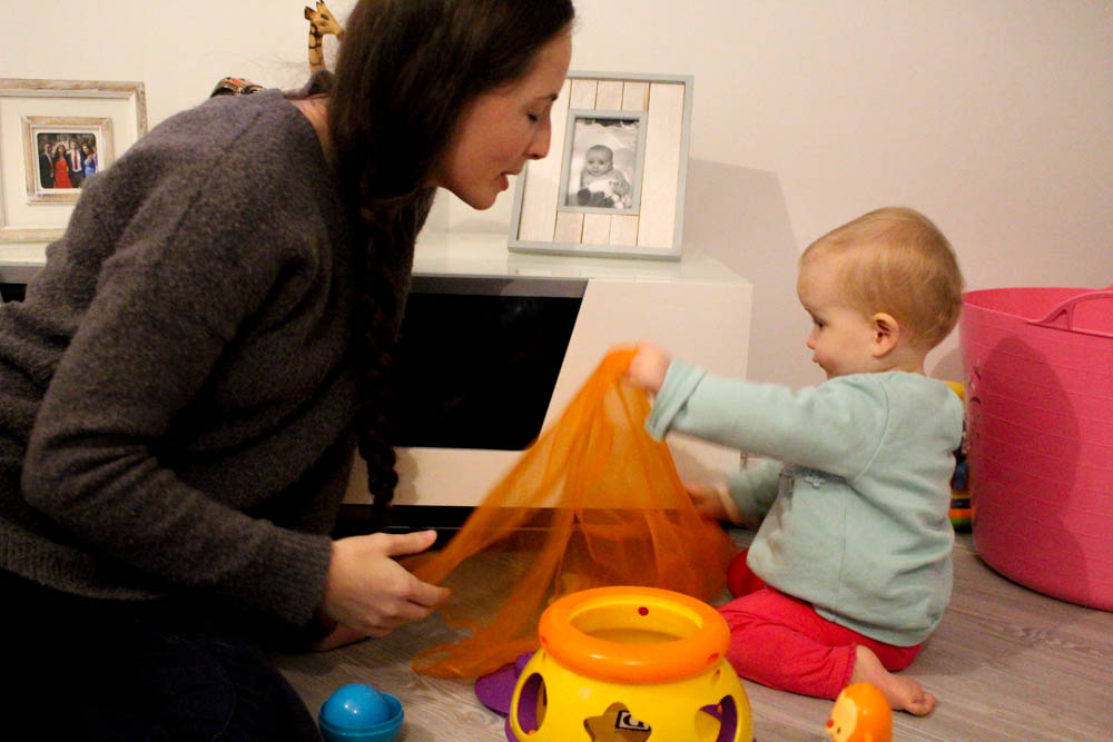
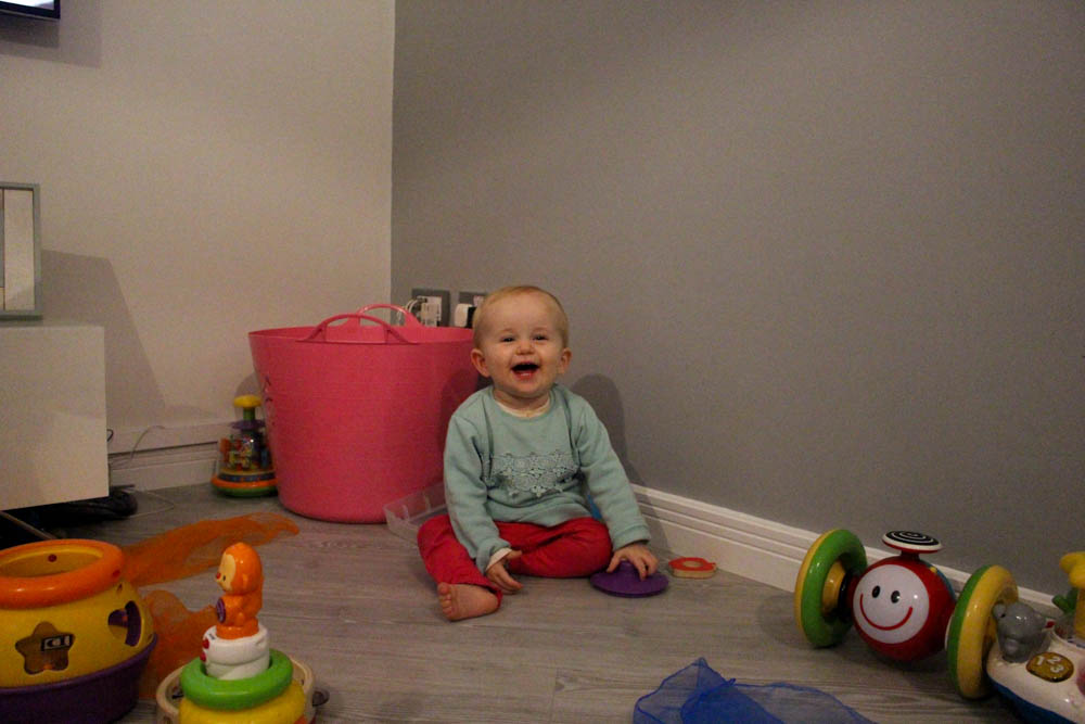
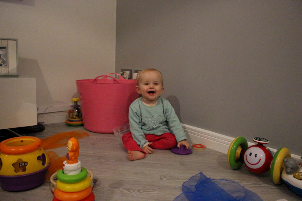
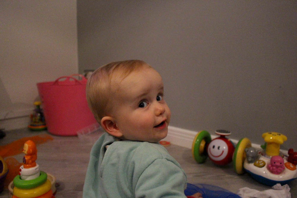
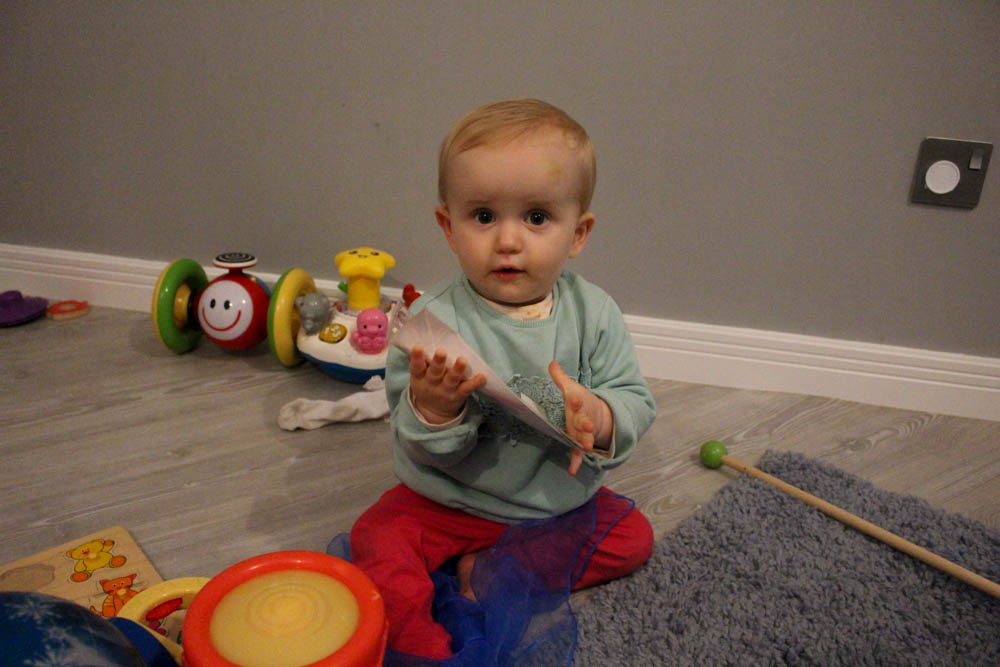
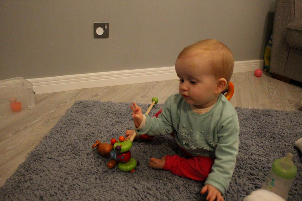
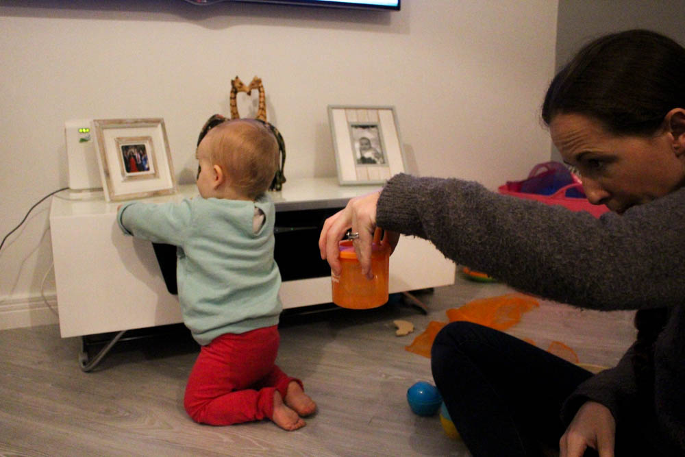
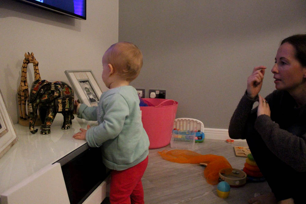
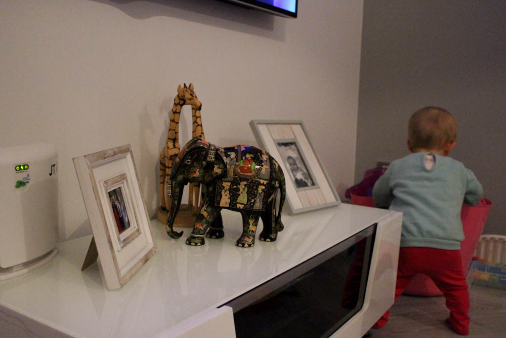
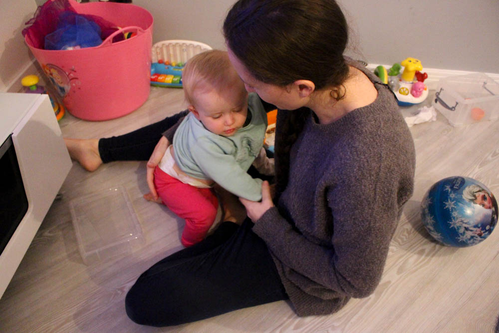
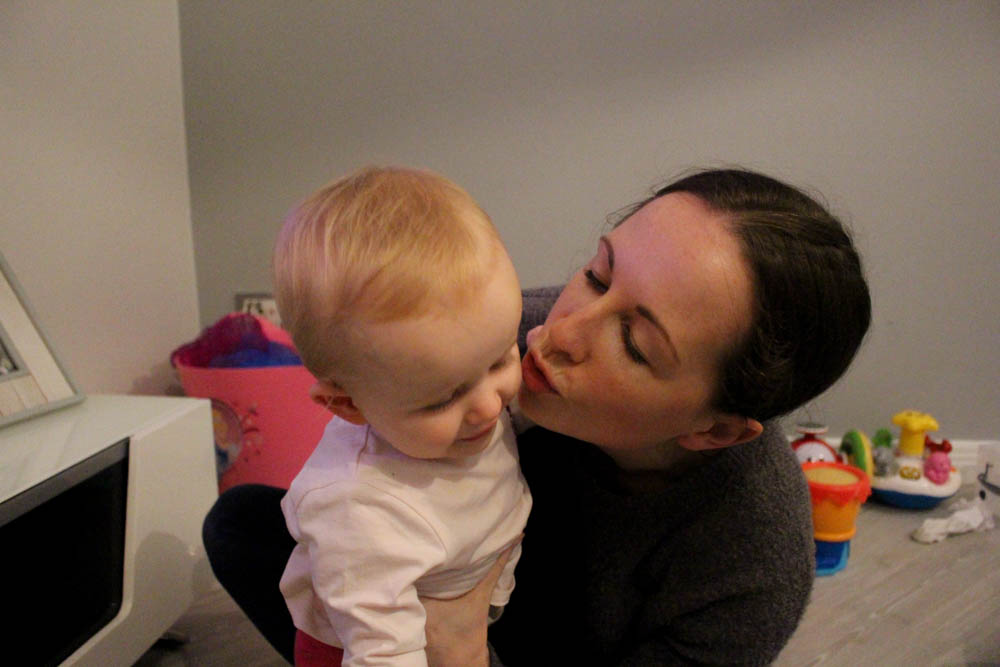
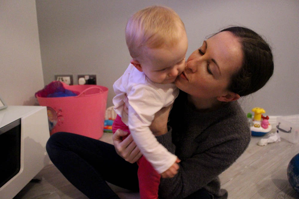
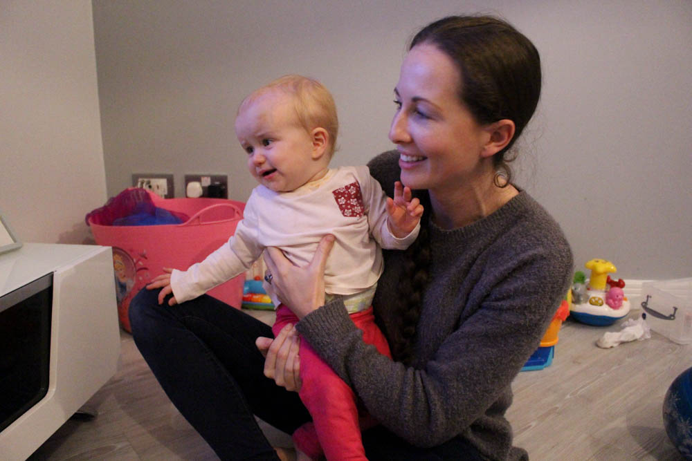
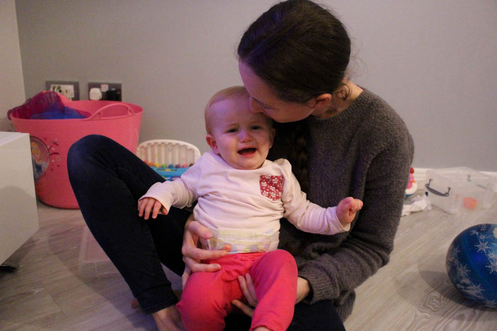
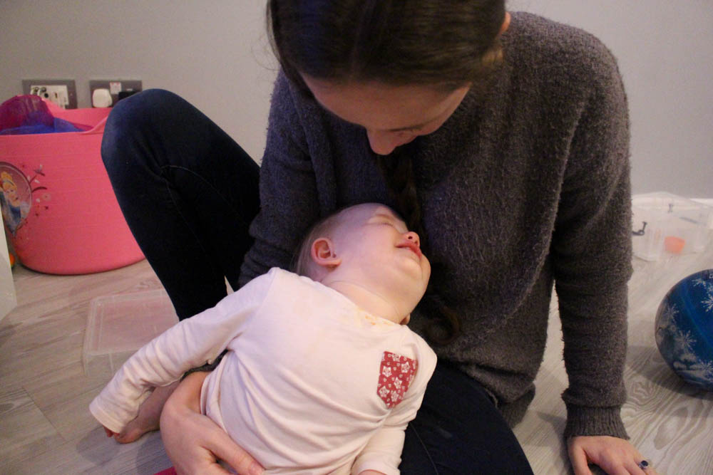
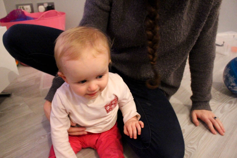
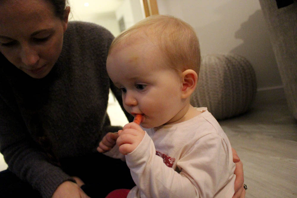
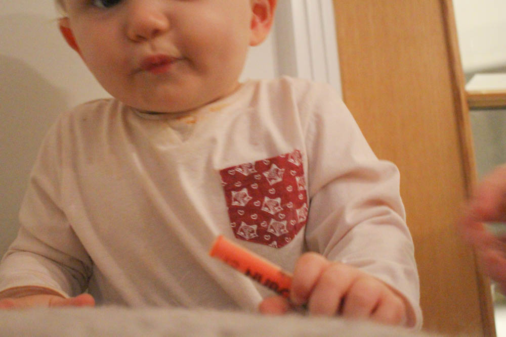
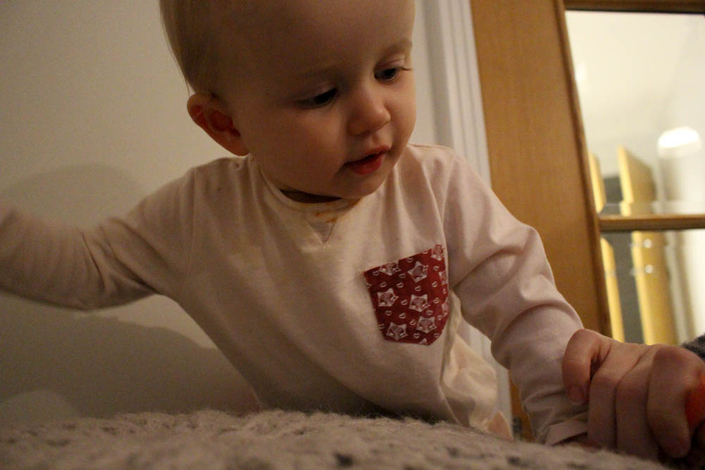
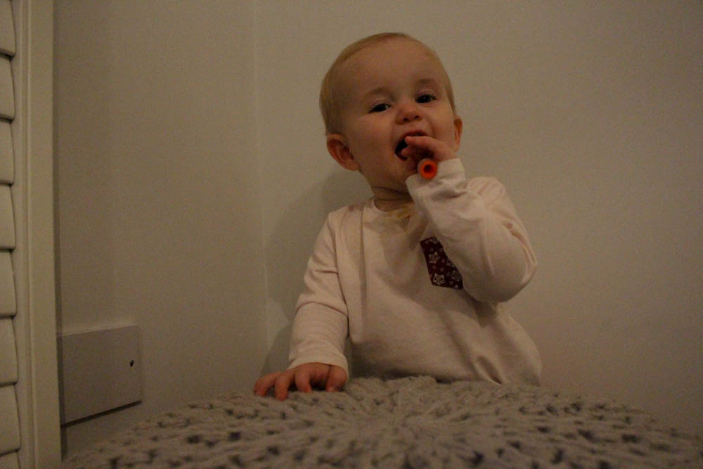
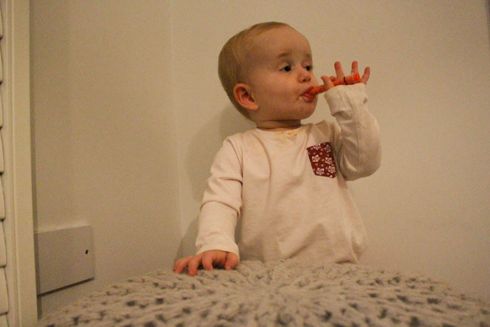
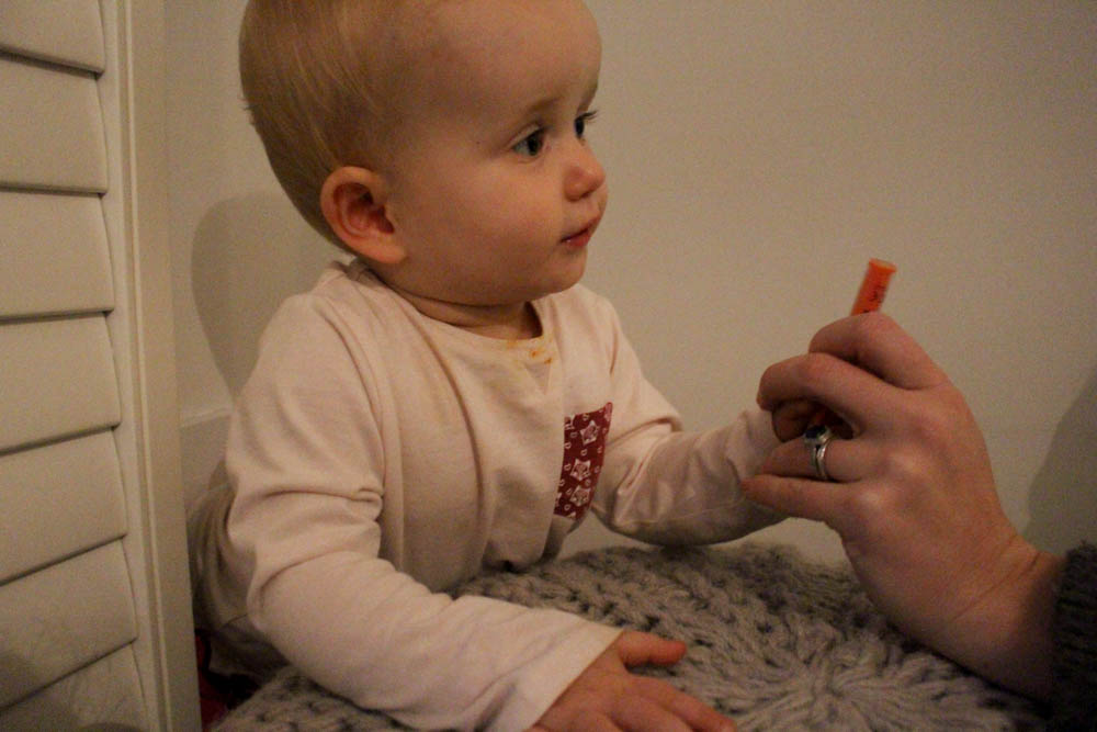
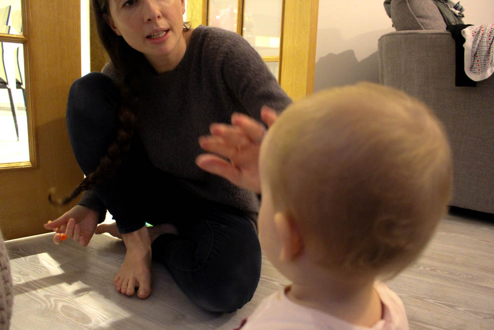
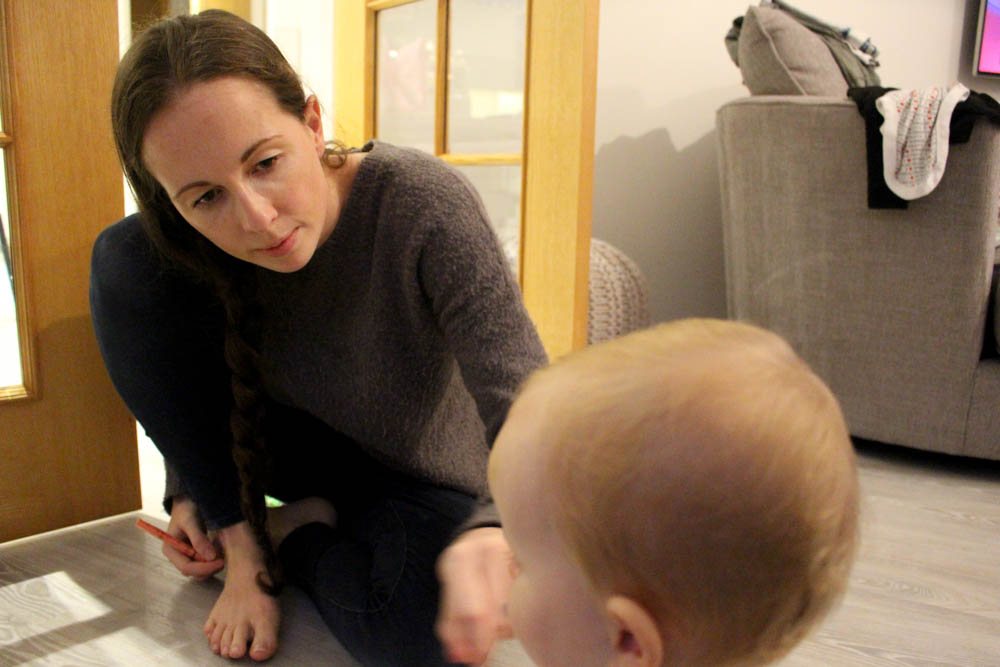
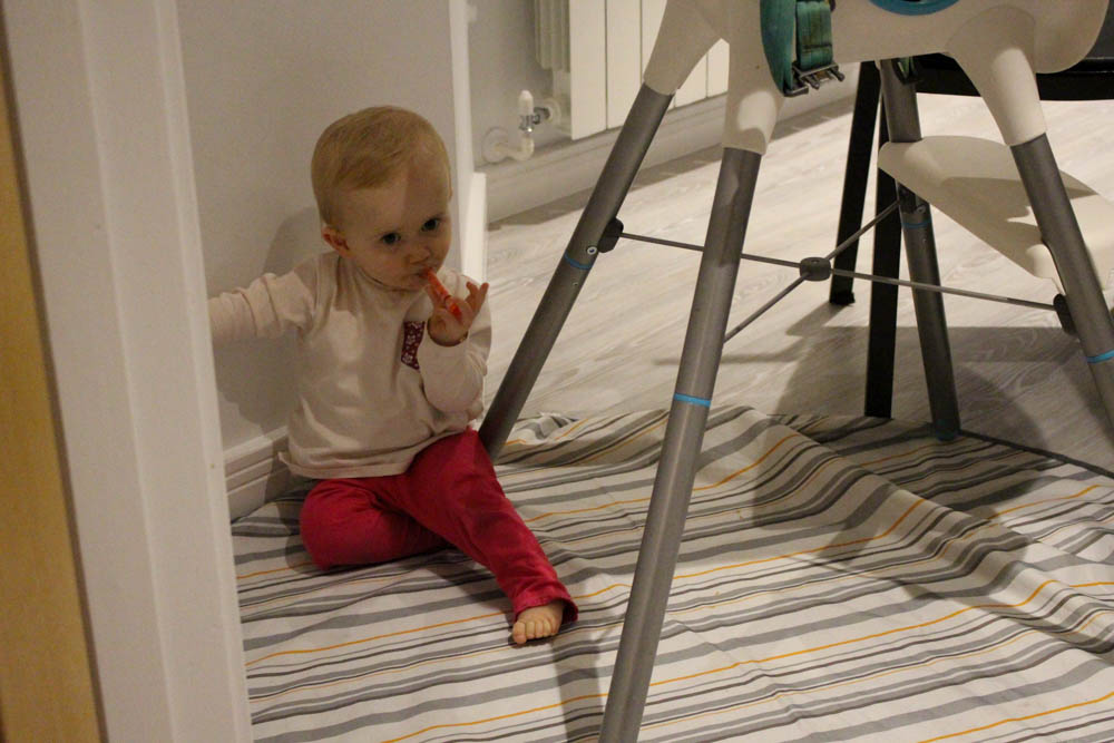
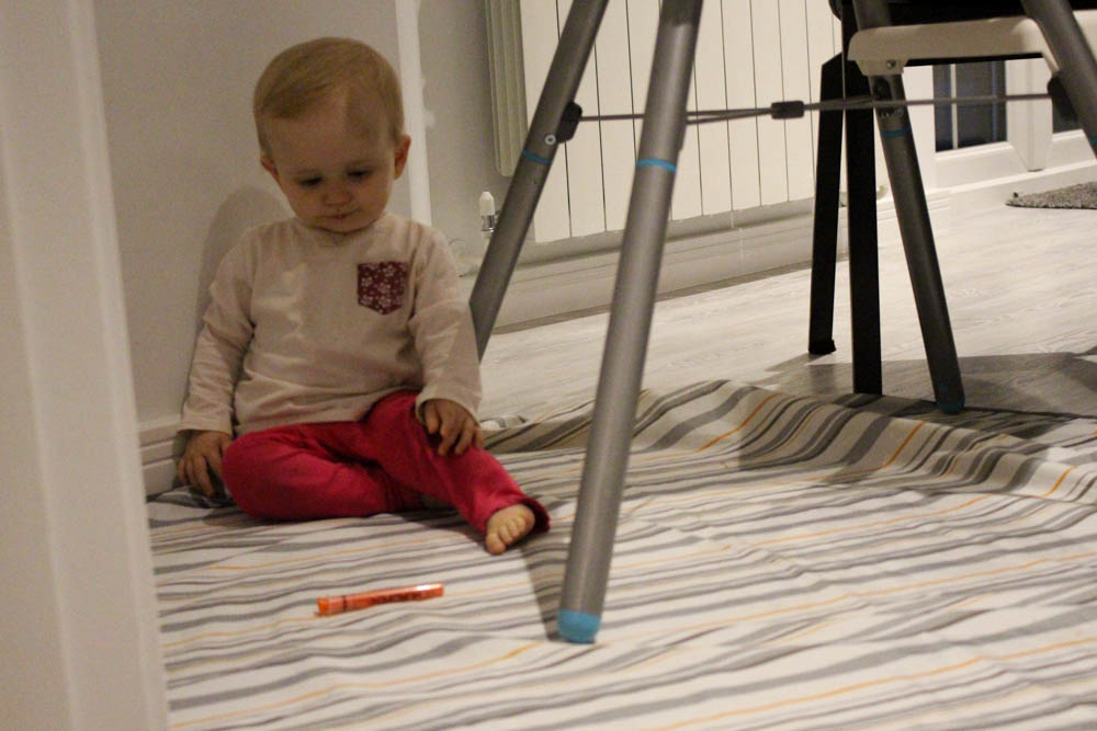
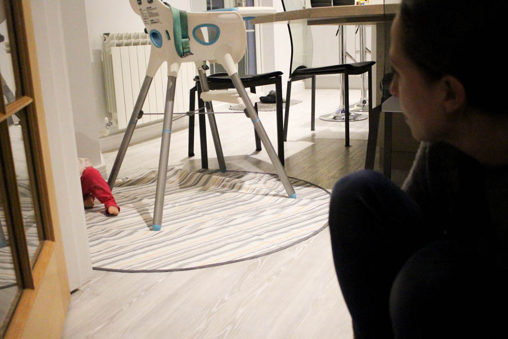
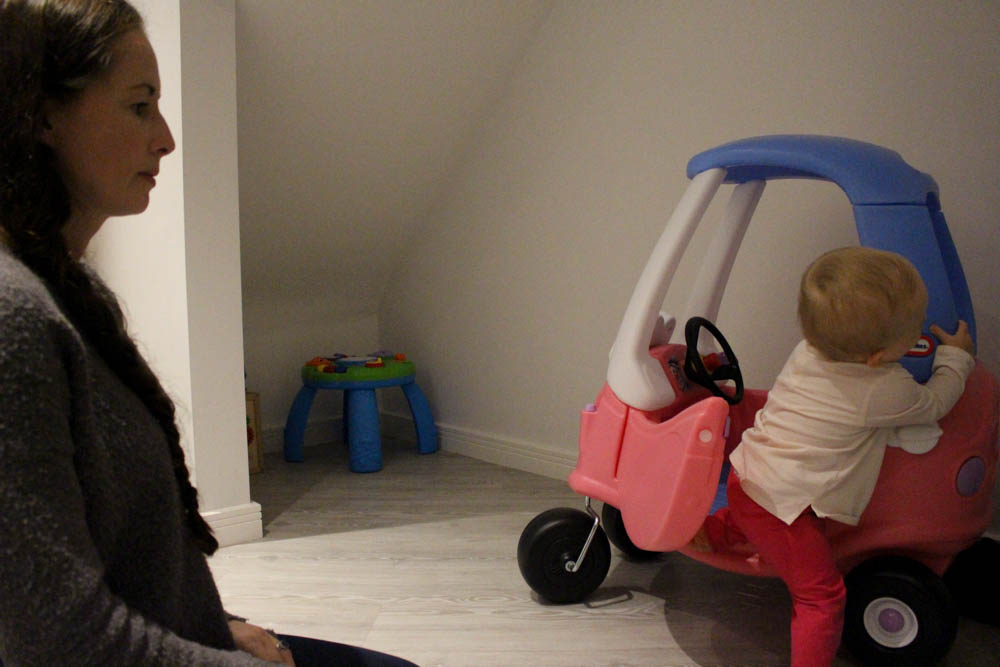
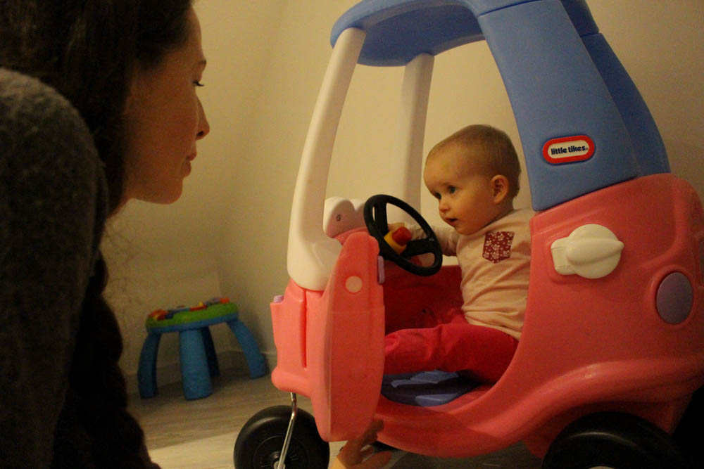
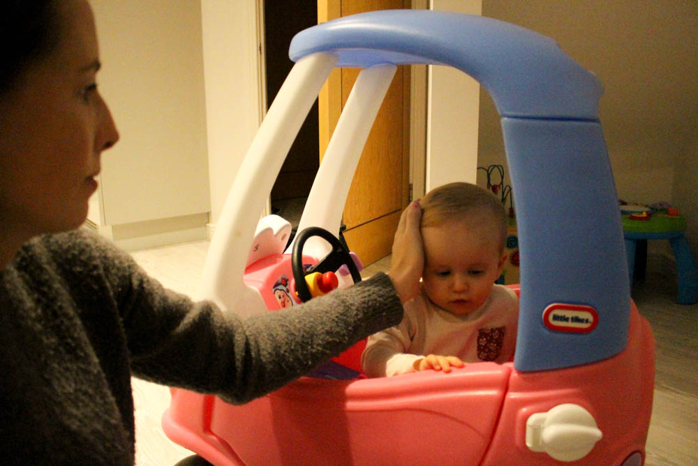
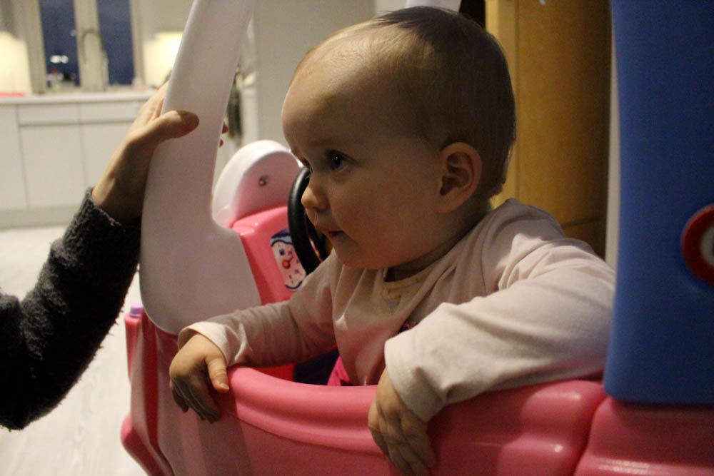
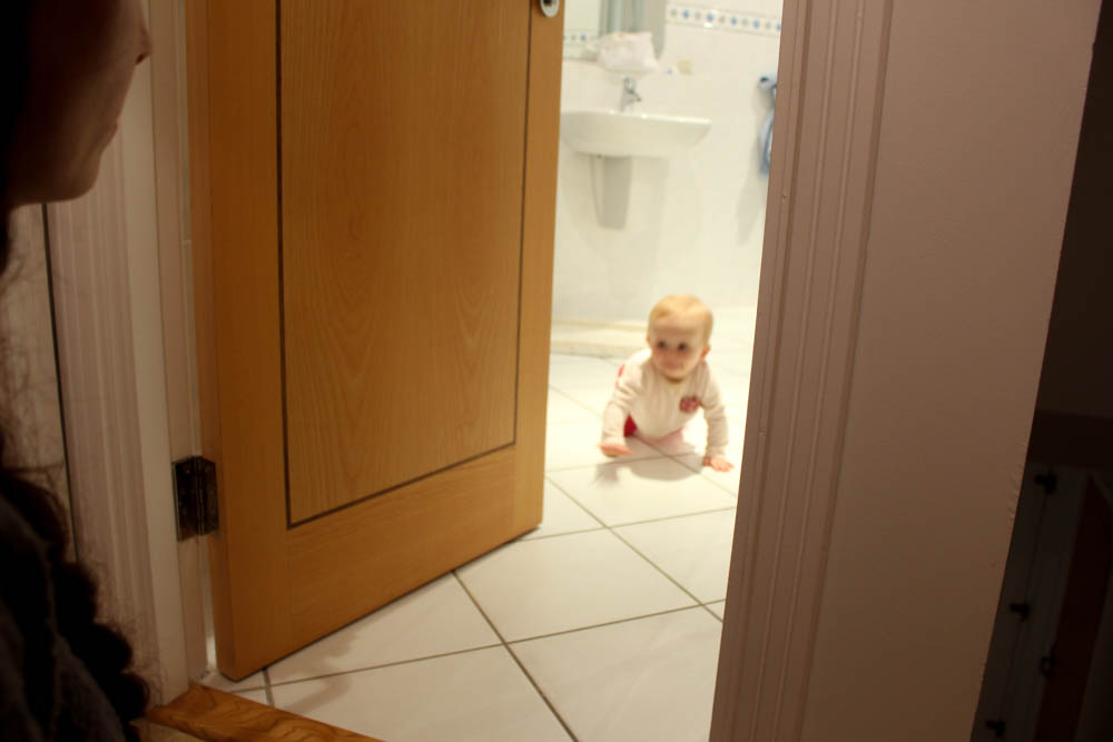
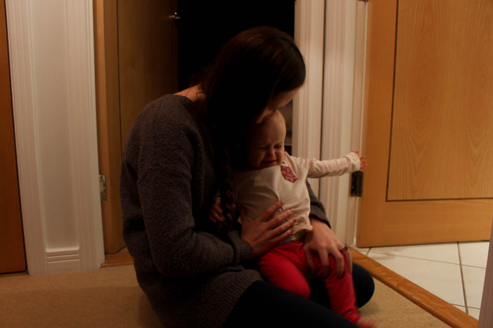
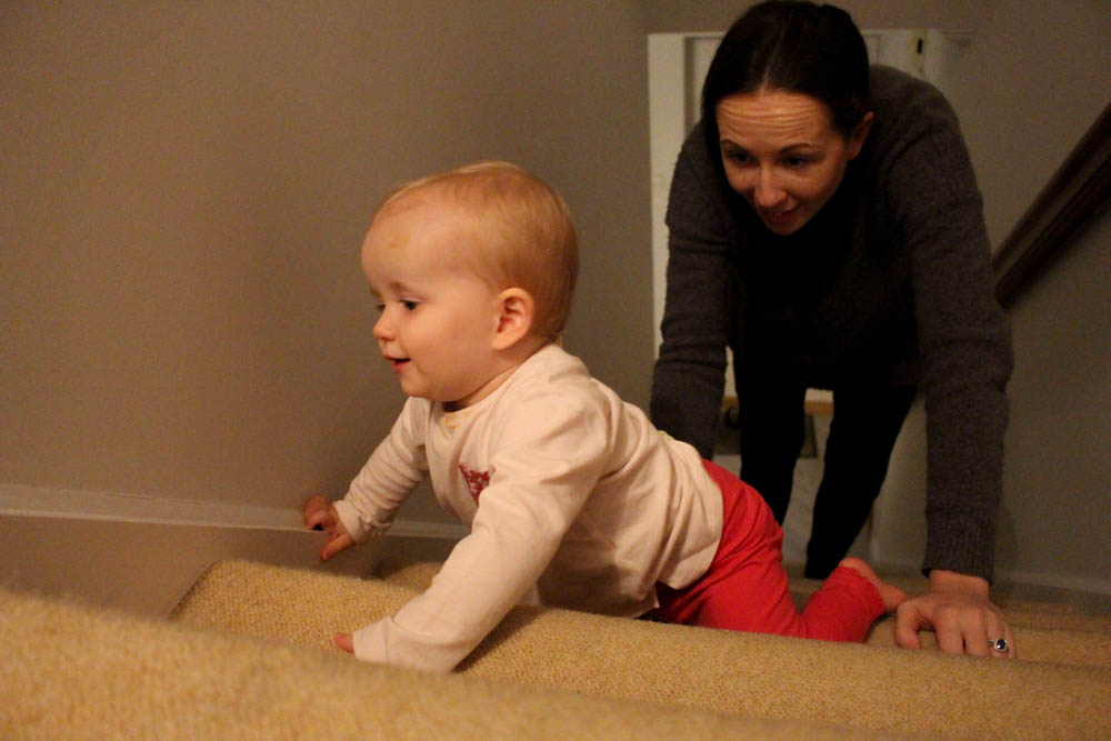
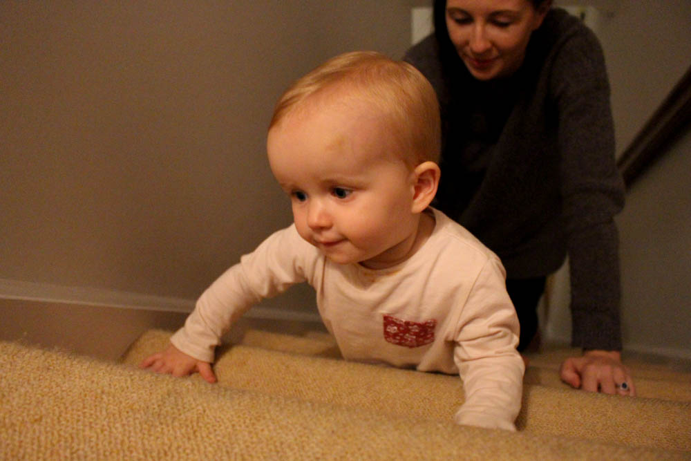
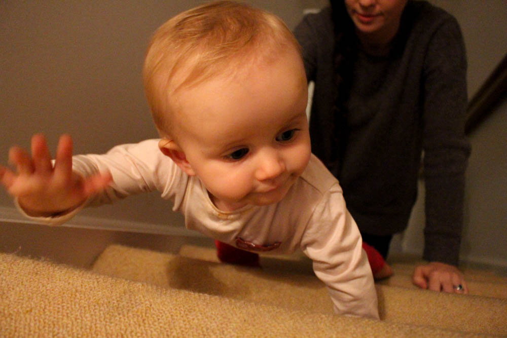
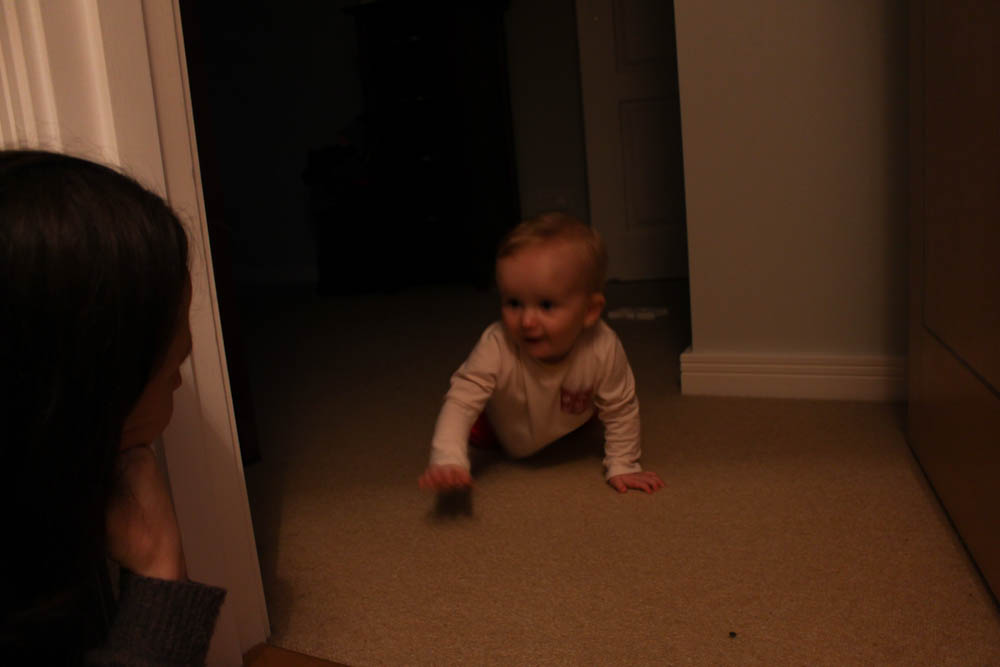
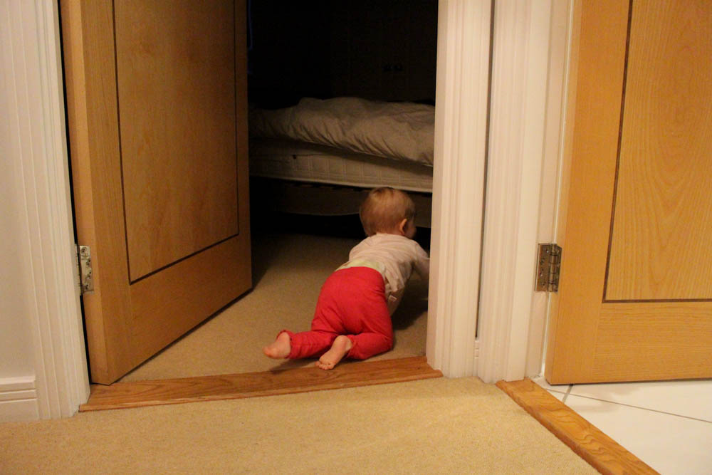
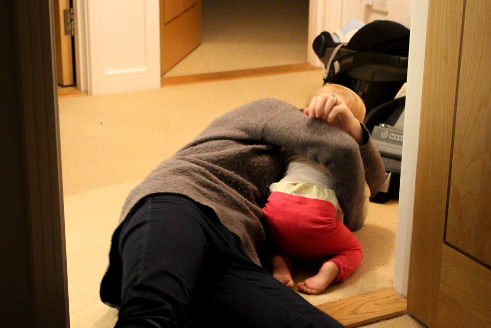
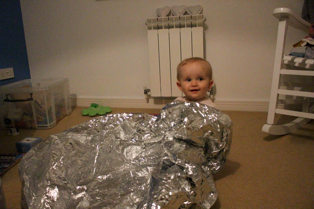
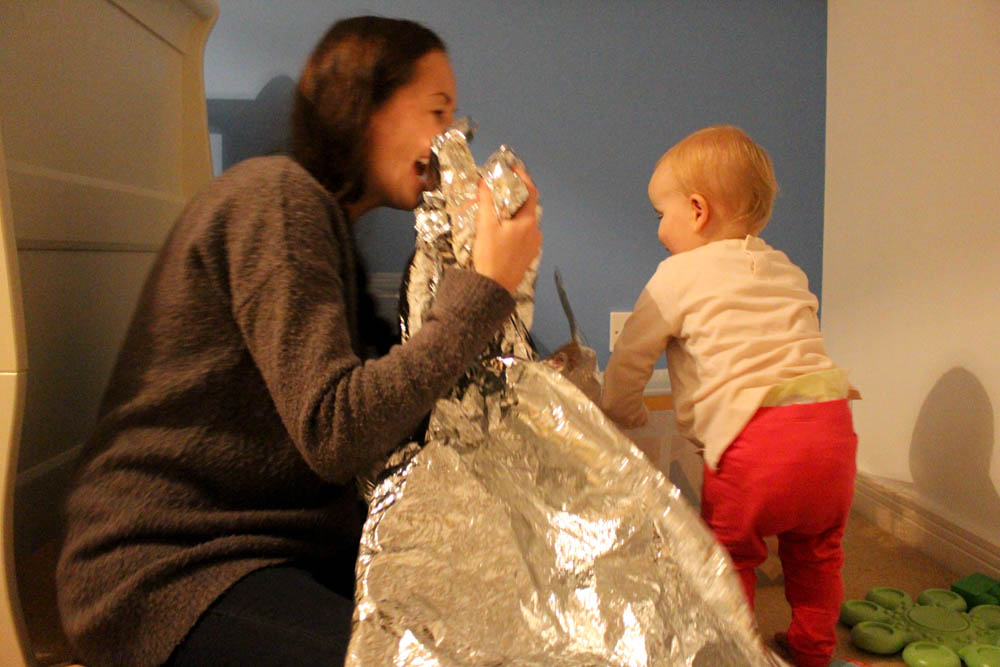
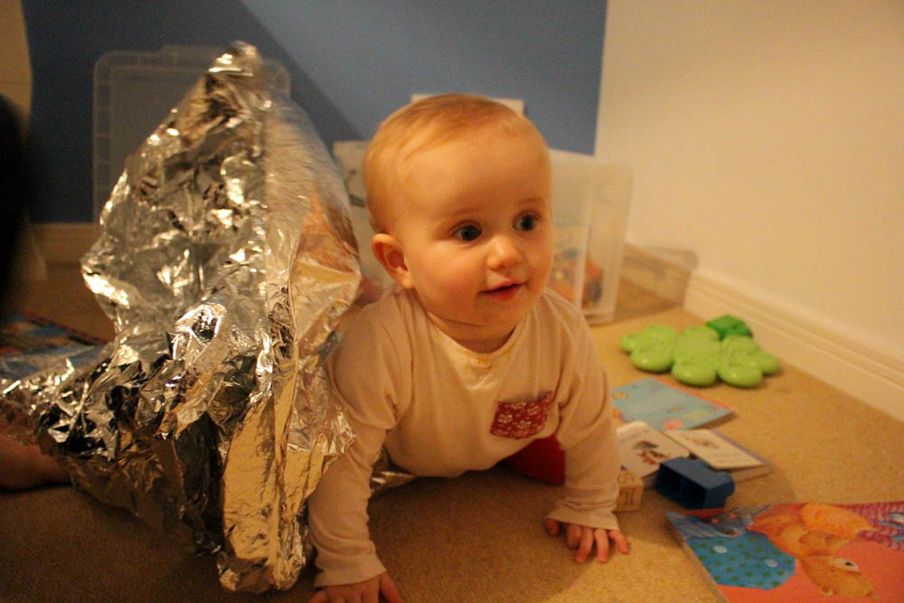
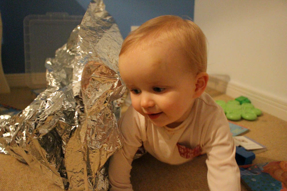
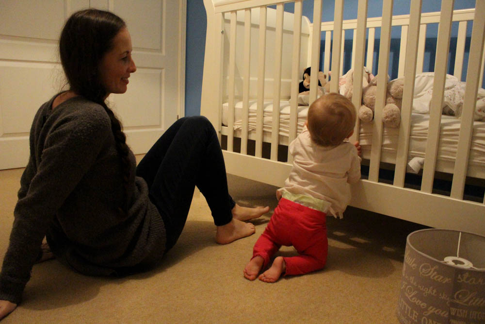
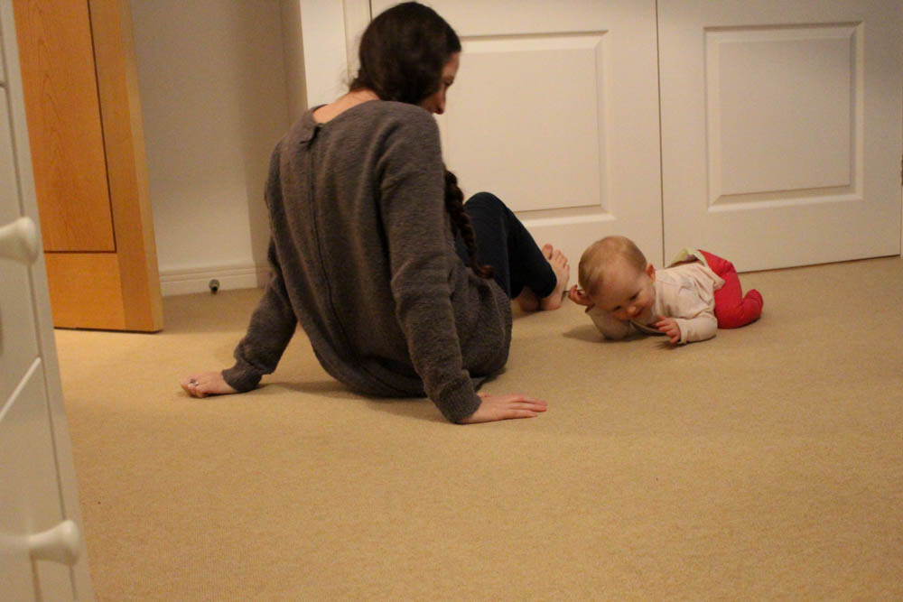
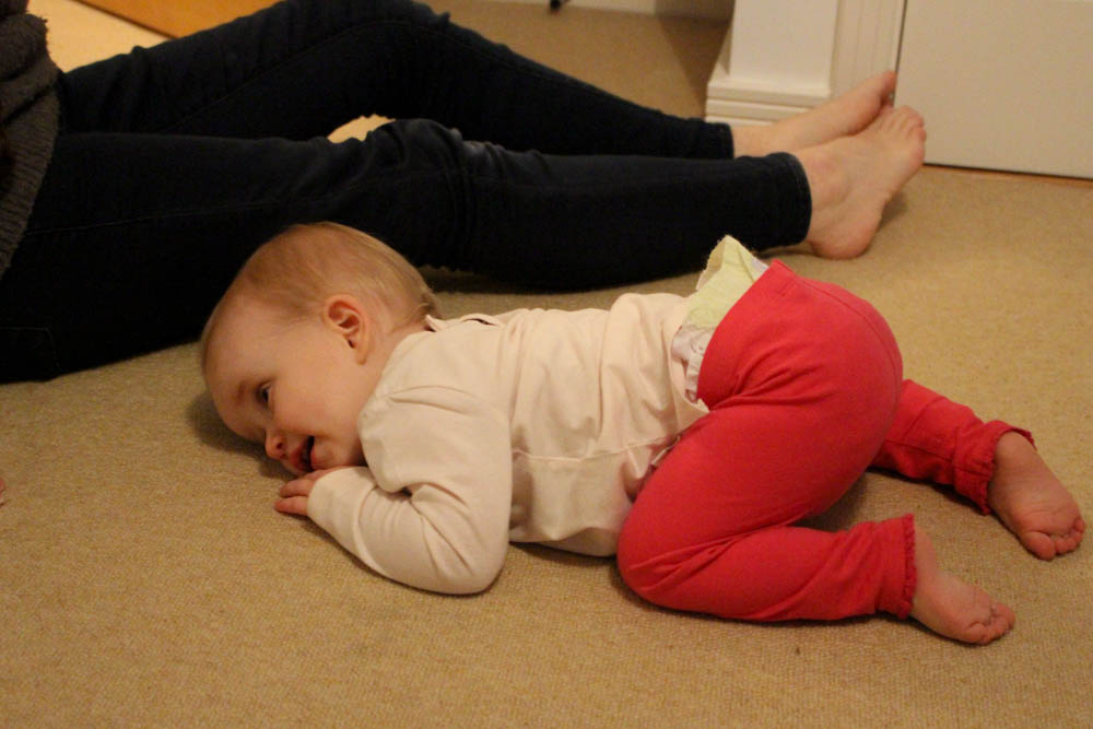
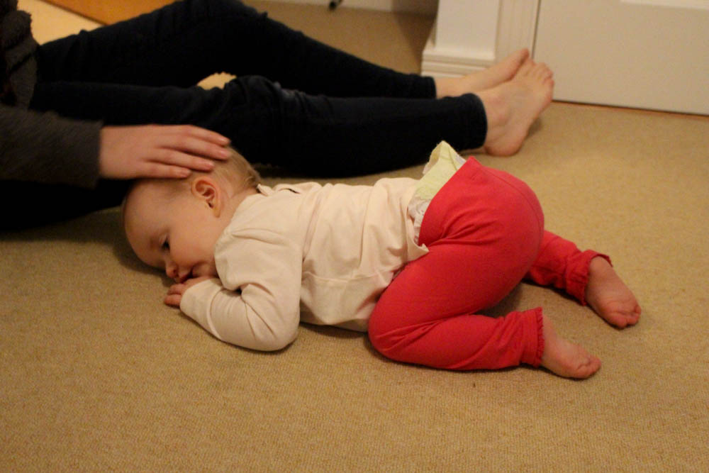
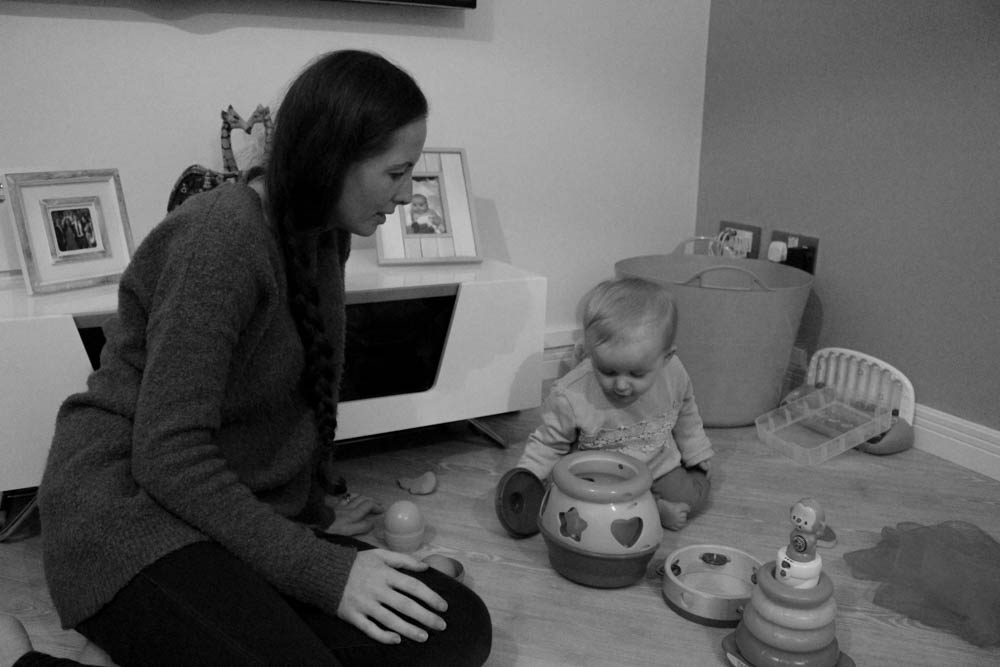
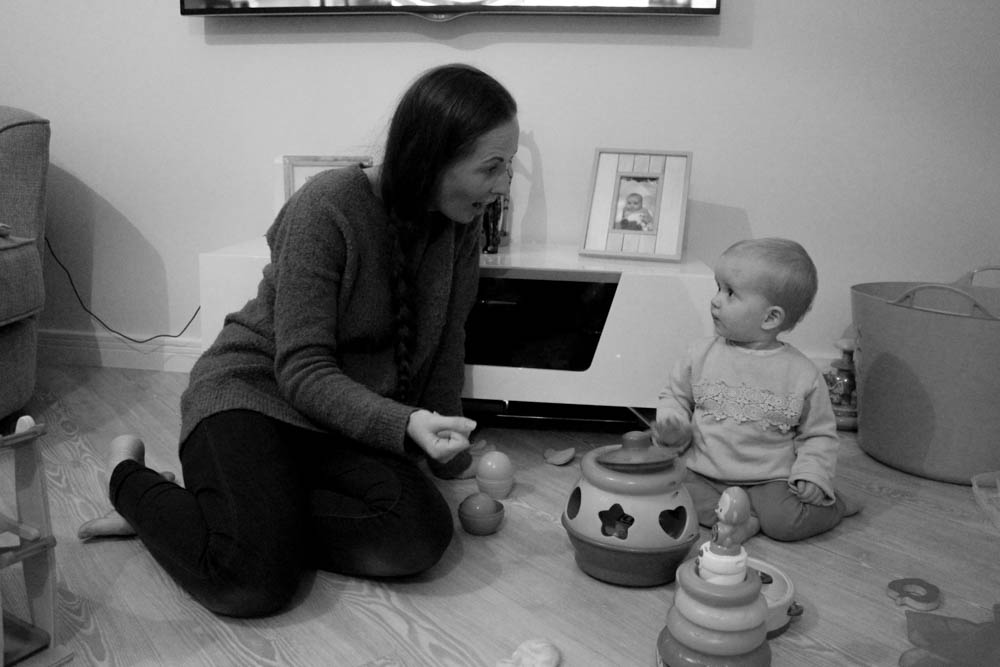
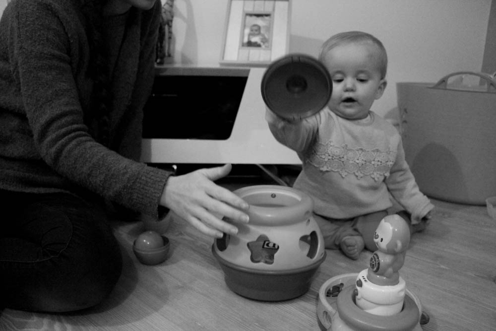
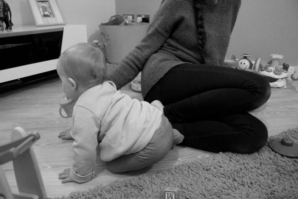
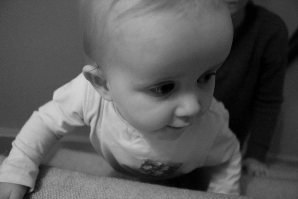
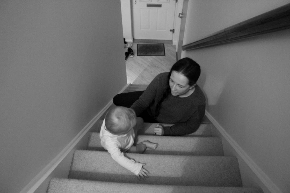
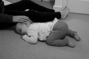
About a month ago I photographed my niece and family on her first birthday, since then I have made many images of random days when she has been coming along to the house as well as going to visit her at her own home. I think that this is really interesting to see how she interacts with different people as well as the relationship with me being behind the camera. I wanted to create a more realistic portrayal of life with a baby and so wanted to make images whenever possible instead of waiting for a specific event or something to happen. This gives the spectator more opportunity to see into the life of a new family and first time parents. I wanted to be able to create more of a story with this shoot and be able to bring across an actual day in the life of first time parents and their child. I did make photographs of my niece when she was first born back in AS photography and think that I will look back at these images and compare them to the new ones I have made to reflect on how much has changed and how my my niece has grown in the space of just one year.
I have decided to put all of the baby shoots into one post as they aren’t the best images and there aren’t really very many so there wouldn’t be enough for it to actually make it to more than one post. I also think this is a better idea as I am able to keep track of all of the images easily as they are right next to each other and on the same post. I think that my strongest shoot so far has been Bella’s first birthday party as it was outside and I managed to get the aperture and settings on my camera to create some really crisp and clear images. I think that there was always so much going on in those images and are more interesting for spectators to look at however I do want the spectator to get an insight of everyday life with a baby rather than just one day when everyone has come together to celebrate and be there for my niece. I think that I will keep going with this and get my camera out whenever I can as there is so much that I could tell in a story for this or even for the photo books that we will be creating to tell a story. I defiantly want to photograph around Christmas time and on Christmas Day as well because it is always a good time for family to come together and to appreciate everyone and everything that we have. I think that this will be exciting for my niece as well as it will be her second Christmas but most likely the first one that she will be able to actually be a part of as last year she was only 3 months old and couldn’t really do much. I am excited to document the growth of my niece as well and to see how quickly they really do develop and begin to understand things more. I really want to capture different moments within ordinary days as well and to document the little things that she really does understand and points out to us.
1st Mini Shoot
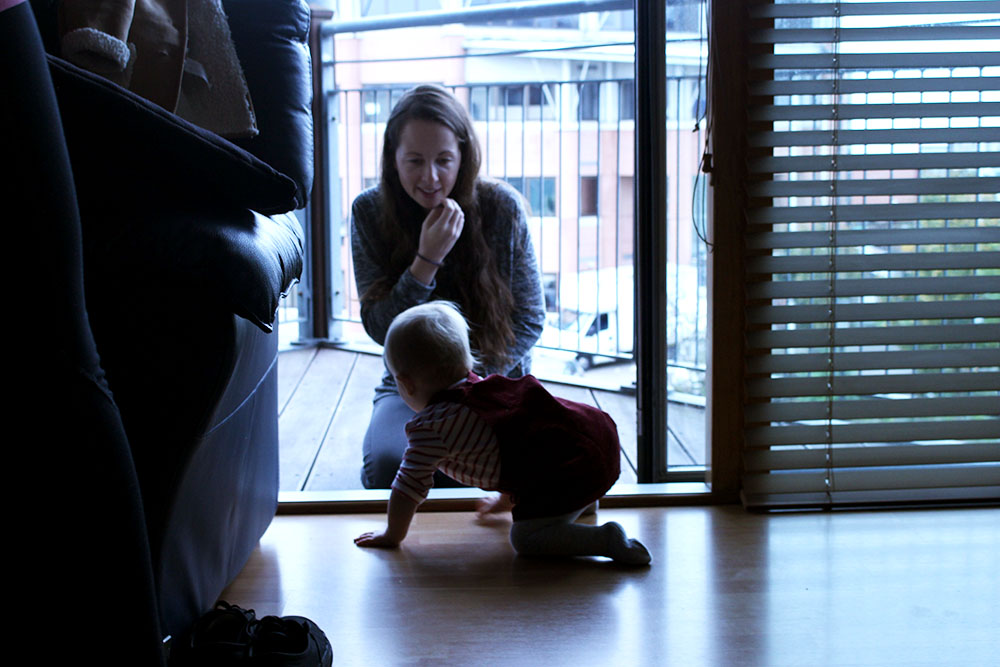
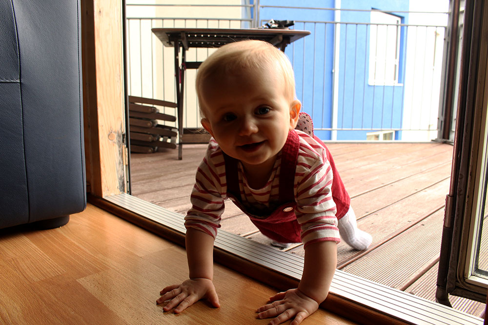
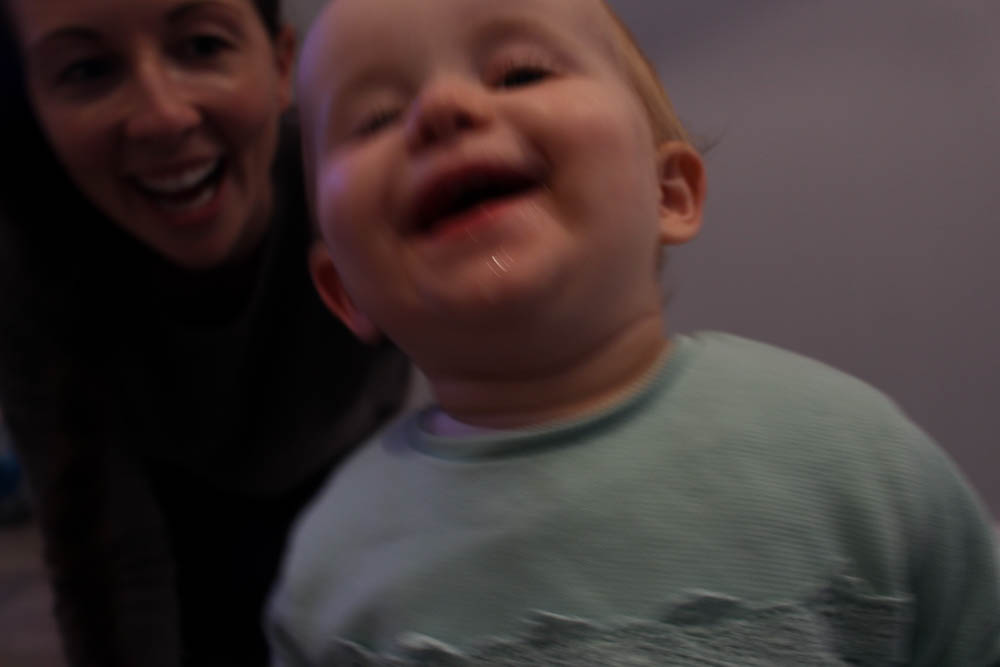
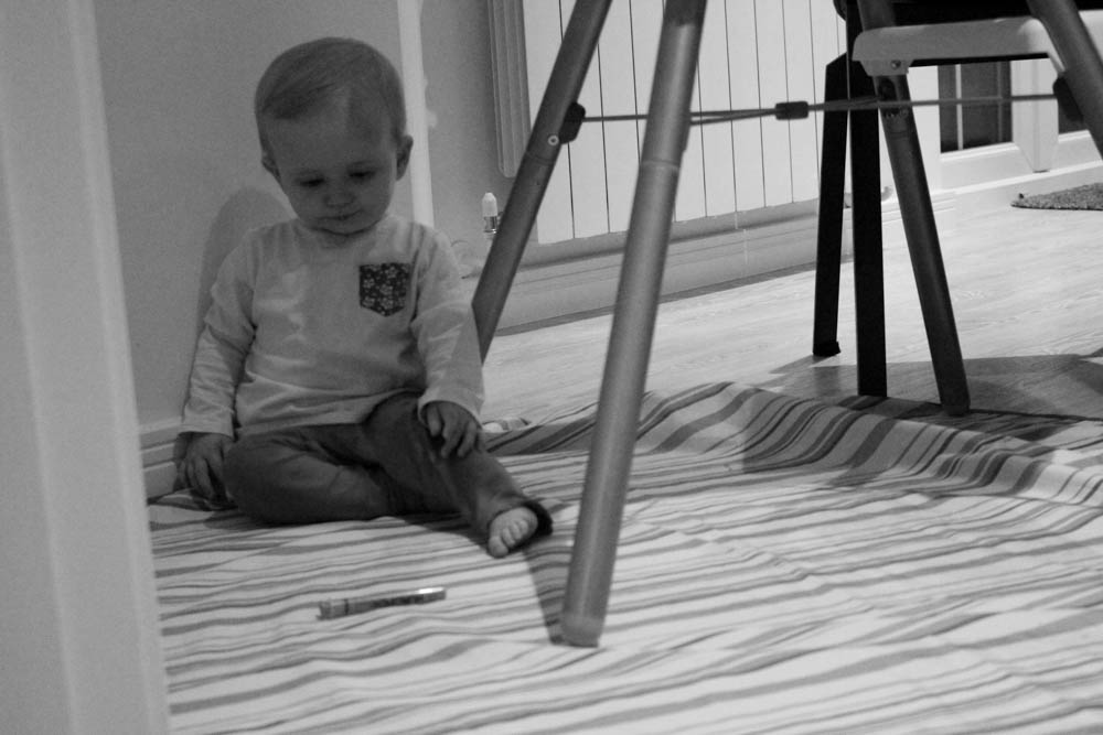
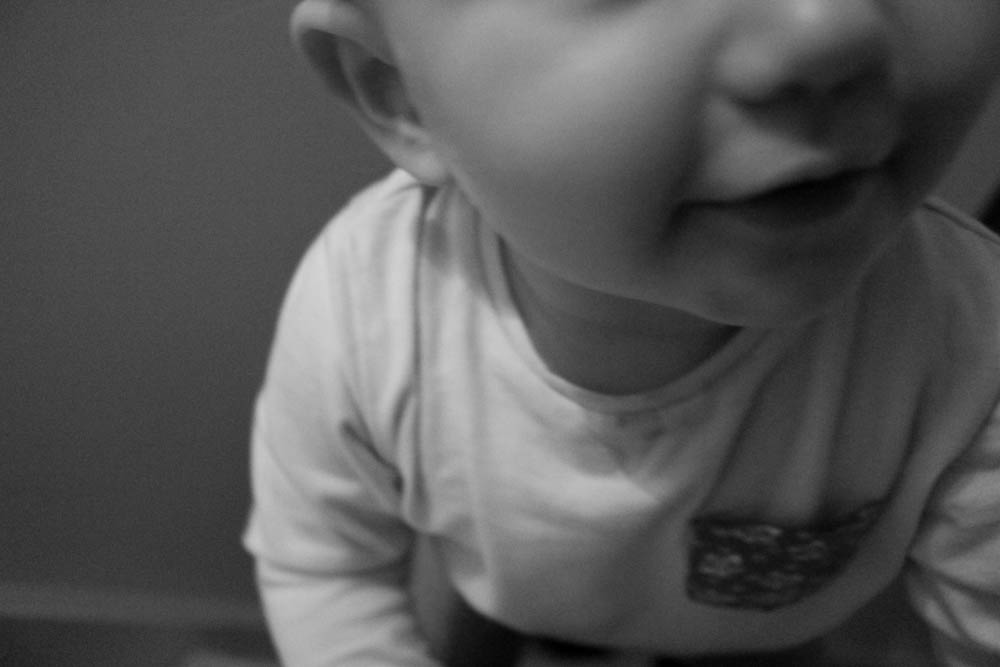
When looking through the images of this shoot I didn’t really think that any of them were strong enough images. I do like these images as my niece does look really cute but they seem to be more generic baby photos rather than more documentary style photos of her interacting with her family and different people. I did find that throughout a lot of the photographs my niece tends to interact a lot with the camera as she crawls up to it to grab it and play with me. I think it is interesting to see the way she responds to the camera and how she is with me. I think that some of these images show more documentary style than others as my niece tends to be constantly crawling about and going mad, I often catch a family member interacting with her for a couple of seconds before she shoots off somewhere else. I think that these images are cute and I will keep them but most of them are more just generic baby photos rather than what I am trying to go for with more documentary style photographs.
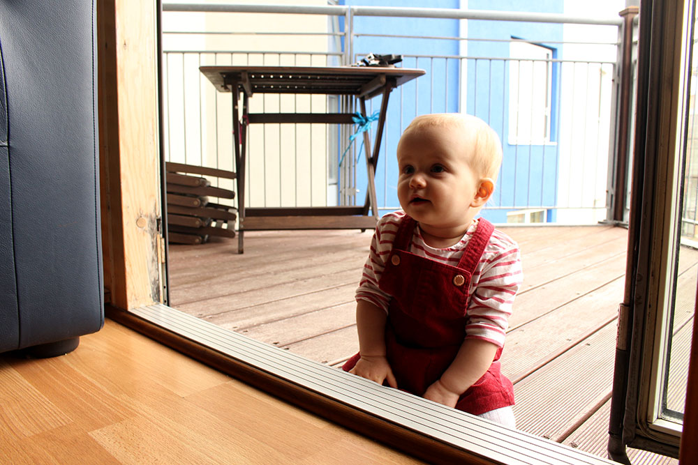
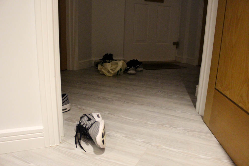
I really like this image purely because of the composition of it and how my niece is right in the centre of the frame. She looks really cute and almost as if she is posing and looking off into the distance. I know that it can look like a generic baby photo but I quite like it, the colours are strong and dark with the entire background of the image being her surroundings at my house. In the corner of the door the spectator is able to see a shoe where my sister was standing but she moved out of frame because she didn’t want to be photographed. It can be quite hard to just whip out the camera at random times to make images of my niece and my family interacting with her as a lot of the time they don’t want to be photographed but obviously my niece and her mum [my sister] don’t mind her being photographed.
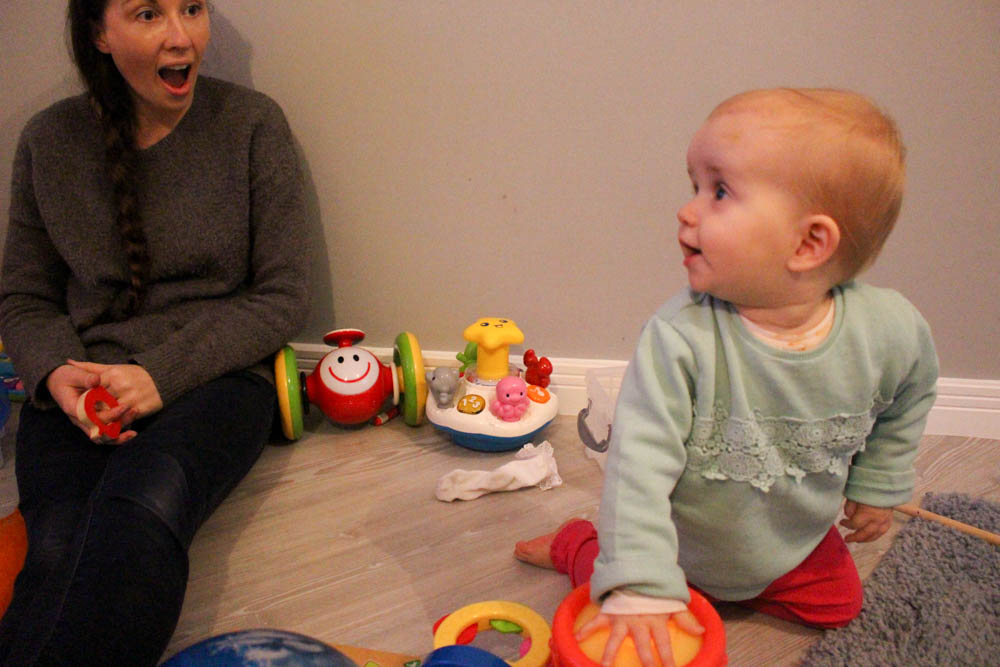
I love this image! I really like the lighting of this image too as it makes everything seem quite orange toned as if the sun was shining that day. I love how my little niece is smiling and looking over at something as my sister is stood trying to entertain her. This is a better documentary style photograph, which I want to stick to, as it shows other people interacting with her and their reactions to her being there. My mum is sat over on the left hand corner of the room probably having some lunch while my sister is playing with Bella. I just really like this image as it stands out from the others with there actually being other people in it a part from just my niece. I also want to experiment with making some images black and white to see if they are more effective than colour ones as sometimes the subject can get drowned in the amount of colour within the image.
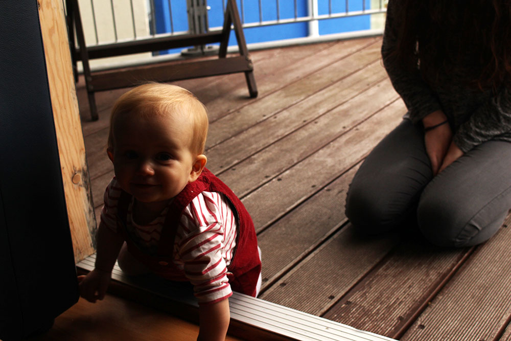
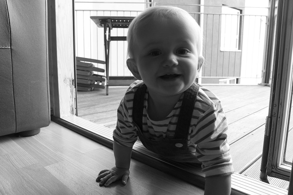
For some reason I love this photo even though half of my niece’s face is darkened out. I think that this is a strong image with my sister [Bella’s mum] sat outside in the background making sure that she is ok when crawling around all over the place. My niece looks quite cheeky in this image, smiling at the camera as if she is about to do something naughty. I really like this image because it is cute and even though it can be seen as more of a generic baby photo, I still really like it and think that there is more to it than that and raises questions in the spectators mind of what is going on in the image and what the baby is actually doing/going to do.
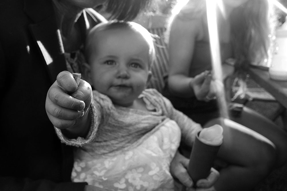
If I was going to create a set of images I would put these three together. I find them hilarious as my niece is basically performing for the camera and trying to grab it from me being cheeky and smiling. I think that these three images are very cute and uplifting. The image to the far left is so funny to me as my niece somehow managed to make herself look like someone taking a selfie on a drunken night out and it almost looks as if she is saying something to the camera, reminding me of drunk football supporters after a game. I don’t say that in a negative way because she does look so cute and it’s just funny to me that she makes all of these different facial expressions even at such a young age. I like the middle one as she really is interacting with the camera and could possibly translate as connecting with the spectator as she sees them and reacts to them when usually in documentary no one is acknowledging the camera and tends to shy away from it, with Bella being the complete opposite obviously. The far right one is so cute! She looks so cheeky when smiling into the camera with her two teeth on her top and bottom gums, it’s so strange how children can grow up so much within just one year and how much they seem to be able to develop in such a short amount of time.
Further experimentation
I like the look of these images in black and white as for me it makes them stand out a lot more and really allows the spectator to focus in on the subject rather than being distracted by all of the different colours in the subjects surrounding environment. They are interesting to look at and some of them are more documentary and more interesting to look at than others. I do think that some of these images are more generic baby photos, although they are slightly different in that they aren’t posed and the subject is just going about her everyday life.
I like this image both in colour and black and white as it is more interesting than a lot of other photos that I made that day. This image brings in more of the environment surrounding my niece and who is surrounding her as well as seeing how different people react with her being around. My niece’s facial expression is cute and happy as my sister is entertaining her. I do like this image but nothing really strongly stands out to me and I don’t think that the images taken from this day are as good as I would usually create or photograph.
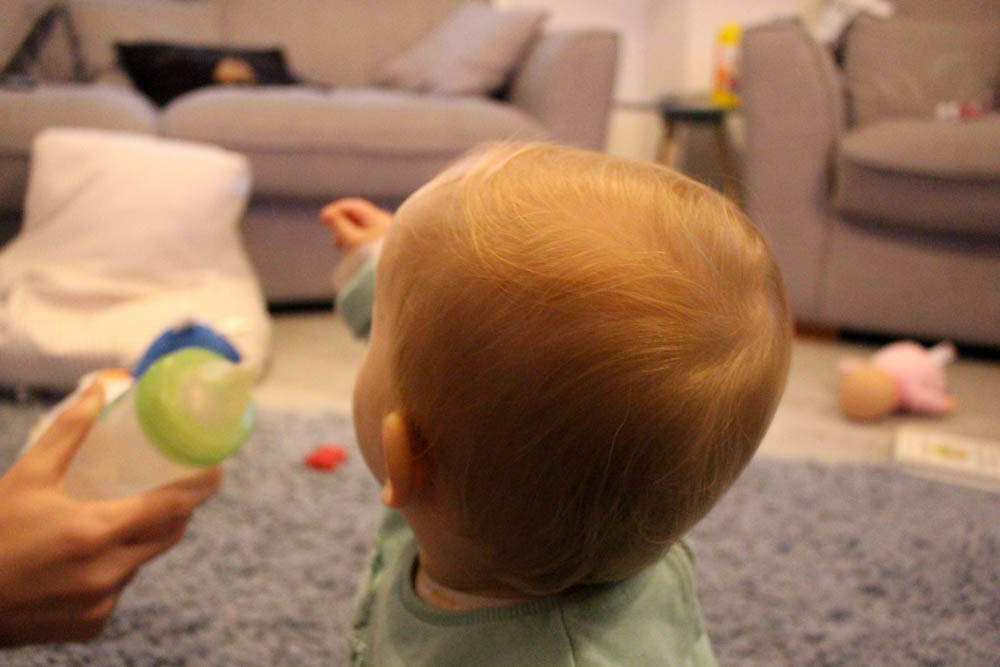
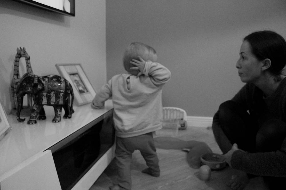
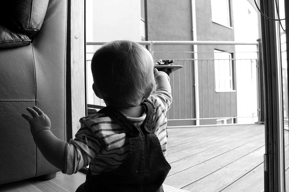 I really like this image as it shows my niece again pointing to something which she actually really loves to do. This has become a trend in the photographs that I have made of my niece that I like as it shows a little bit more about her character and what she will often do. She always points to things to show us something she finds interesting as she can’t communicate in any other way with us at the minute. Often my niece will use signs to communicate that my sister has taught her [she doesn’t know many but we get it]. I think this is a good image as it shows the back of my niece which is more of an uncommon photograph and the spectator is able to see what she is pointing out even if they are unable to figure out what it actually is. I like the position of this photograph too as my niece isn’t directly in the center, she is slightly off to the left of the frame. I like this as the spectator is able to see the environment surrounding her yet doesn’t give too much away as to who is there and looking out for her.
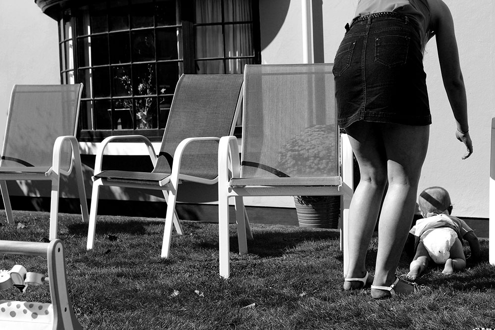
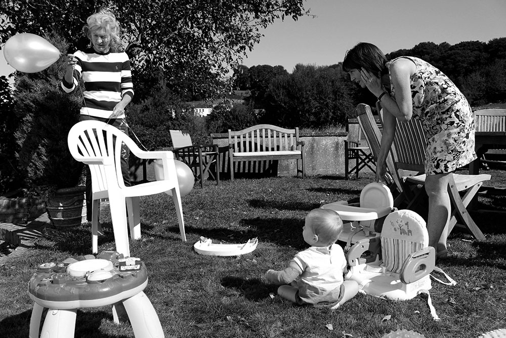
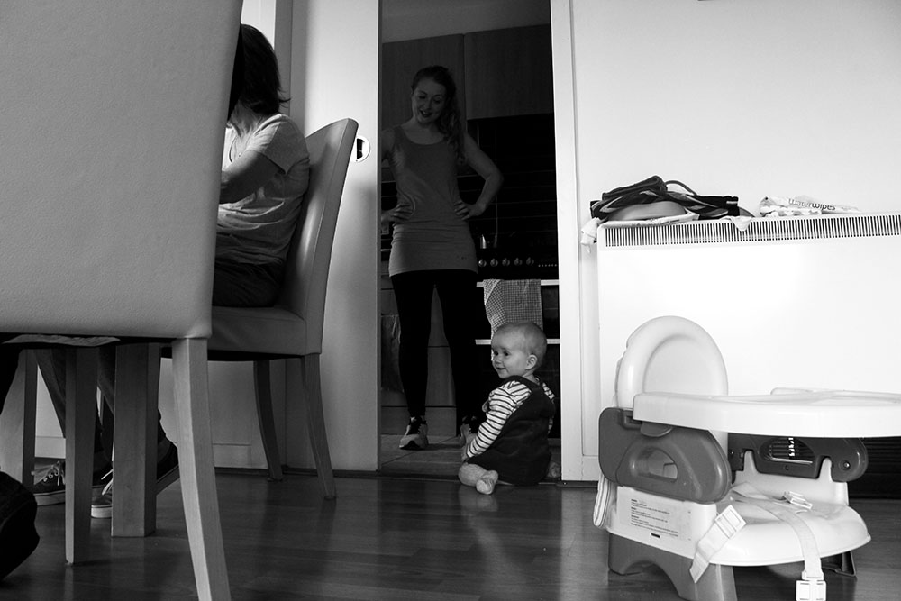
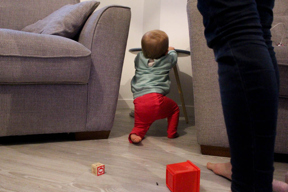
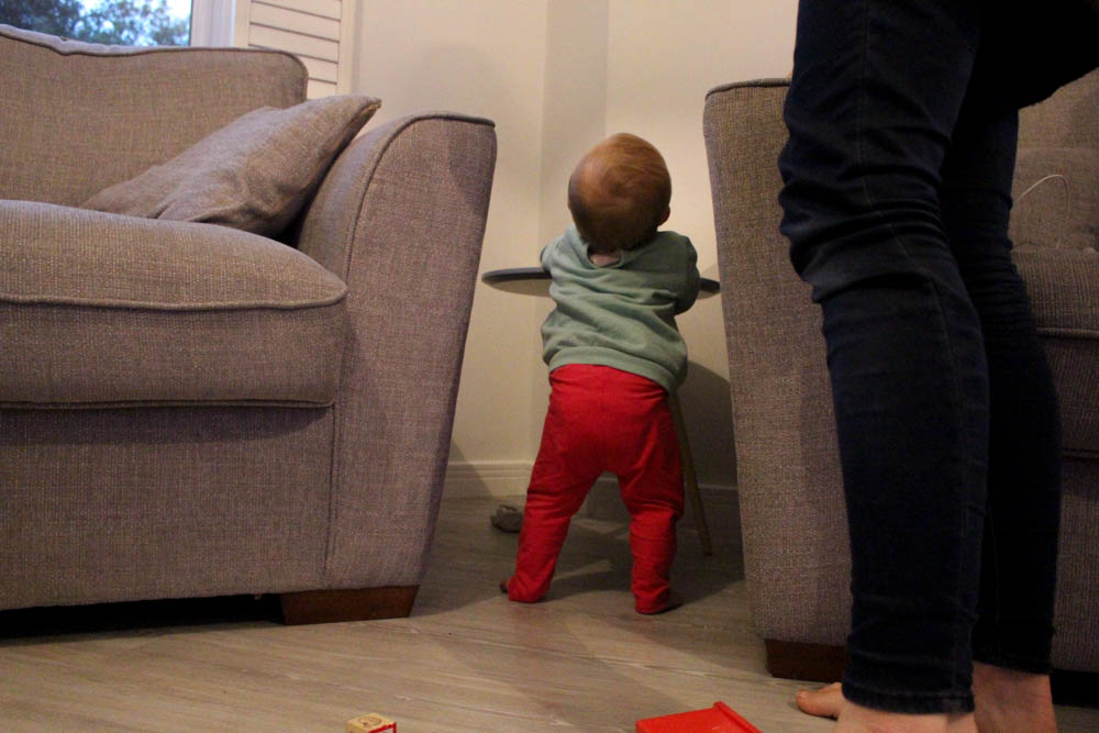
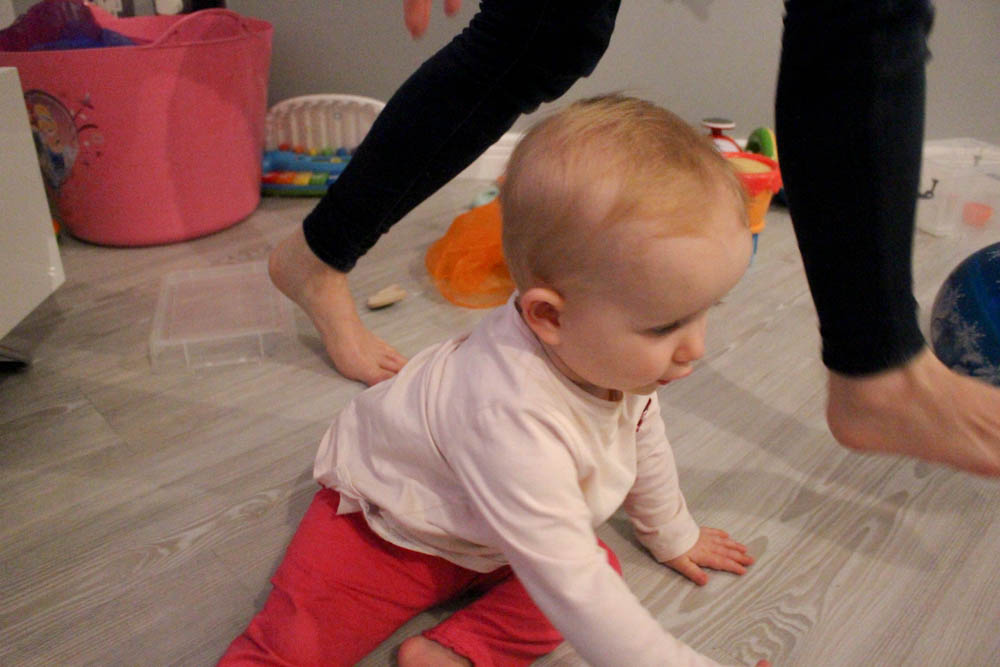
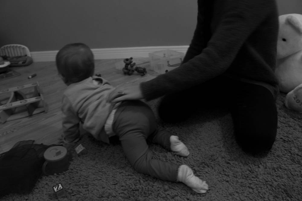
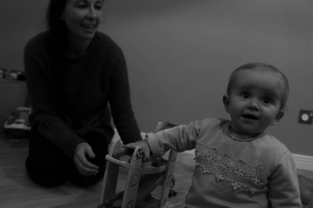
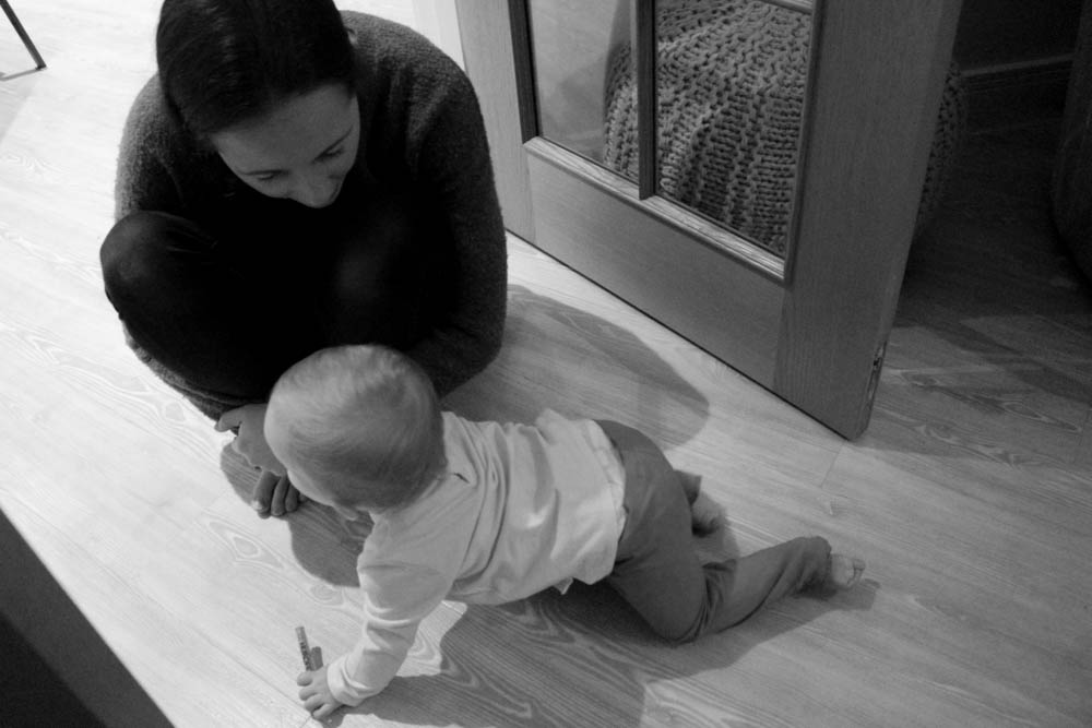
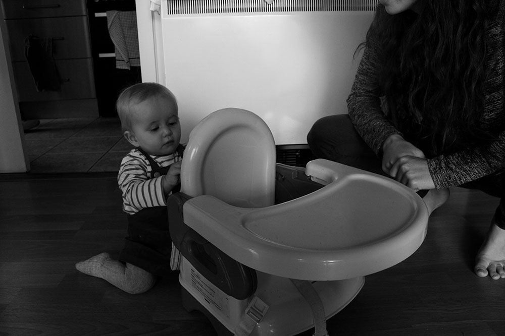 I chose this image because the spectator is able to see interaction with other people and not just my niece on her own. I like this image and I like making images of my niece this way. I always photograph her and cut off the adults so that the spectator cannot completely see them [when Bella is crawling on the floor]. I do this so that the spectator gets a feel of how small she is and how huge everyone and everything else must seem to her. I want to make everything around my niece look huge to show how little she actually is. I think this can make for some interesting photographs and they are quite unique in that I have gotten down to her level and basically sat on the floor to make images of her. I like this image because it is an action shot, with her mum [my sister] to the right smiling down at her while my niece is busy concentrating on trying to grab the bit of fabric off of the back of her little chair. I like this image in black and white as well as it makes it more effective and allows the spectator to maintain their focus on the subject rather than focusing on the distraction of all of the different colours surrounding her.
2nd Mini Shoot
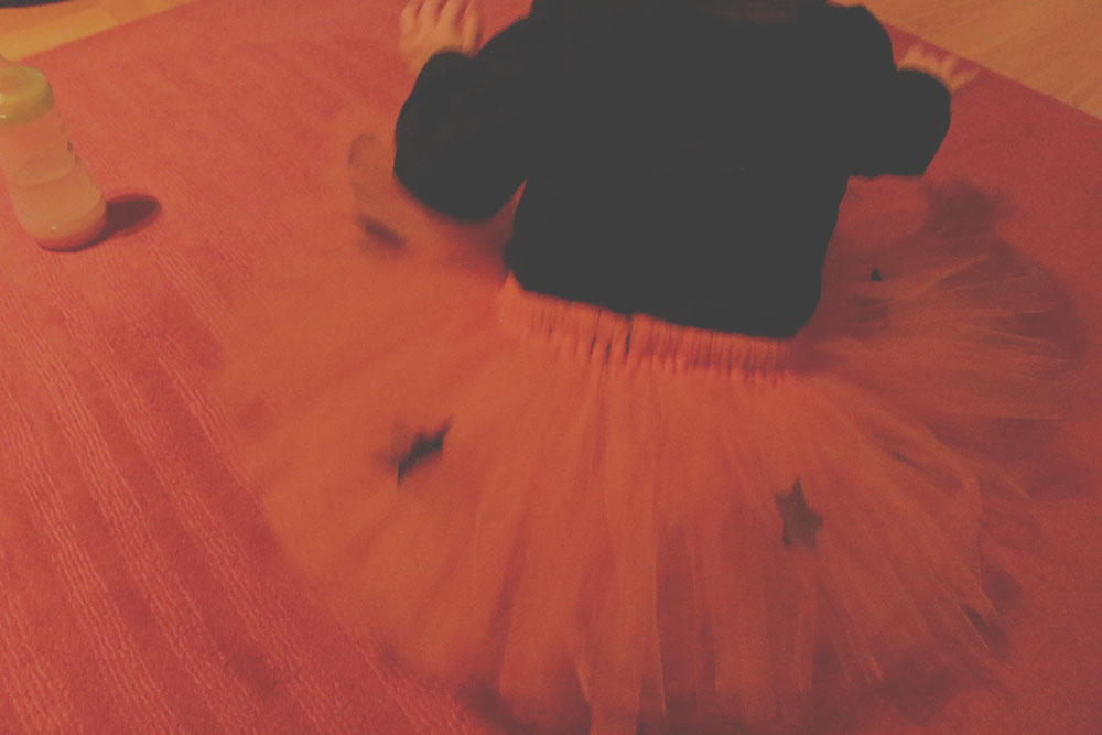
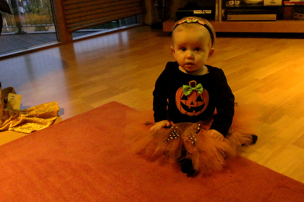
This shoot was awful as I only managed to make one or two images of my niece when she came around on Friday 30th October in the evening to show us her halloween outfit. They weren’t there for long and I couldn’t manage to get the lighting right. My house is very orange as the lights all have an orange tint as well as there being a lot of red around my house making the images look already very orange plus my niece was wearing an orange tutu on the red carpet so she kind of blended in a bit. I think that this shoot was unsuccessful but I am going to add in the images just for a note for next time to actually make more photos and to fix the aperture etc before hand. I’m actually really disappointed with this shoot as I didn’t take many photos at all, I wasn’t actually going to make images that evening but wanted to as more of a documentation for my own personal family archive.
3rd Shoot
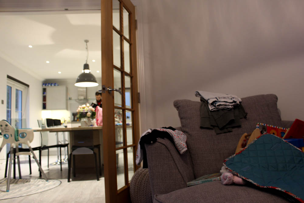
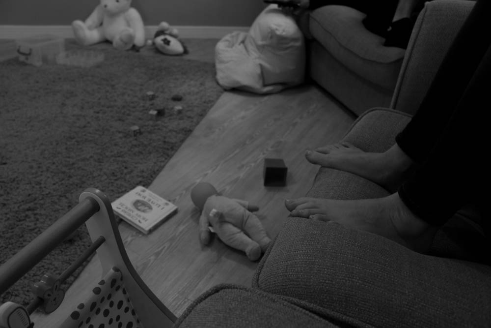
For this shoot I actually made quite a few images, a lot more than the other two shoots which I think makes up for the lack of shooting before hand. I do like these images as they are cute and it also shows more of the environment that my niece is constantly surrounded by everyday. On Thursday 5th November I went round to my sisters house to make photographs of Bella when she got home and see what she does on a normal day out. I think that this was a good idea as it shows a more personal side to their lives and what they do on an average day and not just on a day when an event is happening or when something exciting is going on. I enjoyed doing this shoot as my niece was excited to see me and I got to spend some more time with her as well as make images of her for my photography course as well as for a personal family archive and memories. I think that these images could have been better if there was more natural light but as this was the only time that I could go round and see my sister and niece that would have to do.
I didn’t actually realise how many images I made that evening so I only posted the ones that I chose to edit and that still managed to be a lot. I like these images but I don’t think that there is anything great about them as they are quite mediocre and the lighting really annoys me in most of the images. I think that I am going to experiment more with some black and white images to try and see if they look any better.
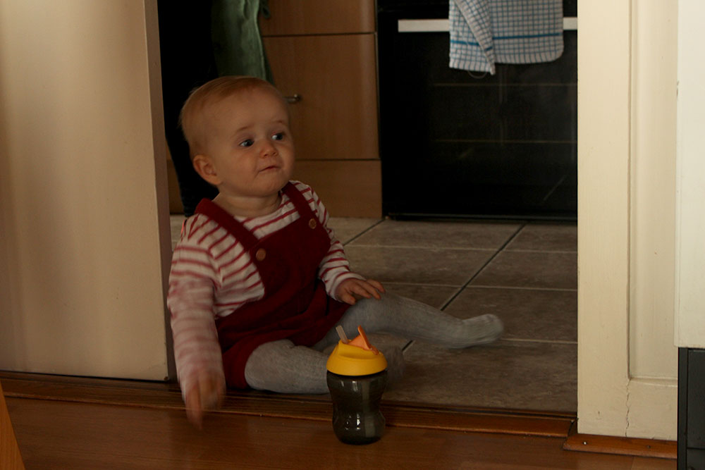
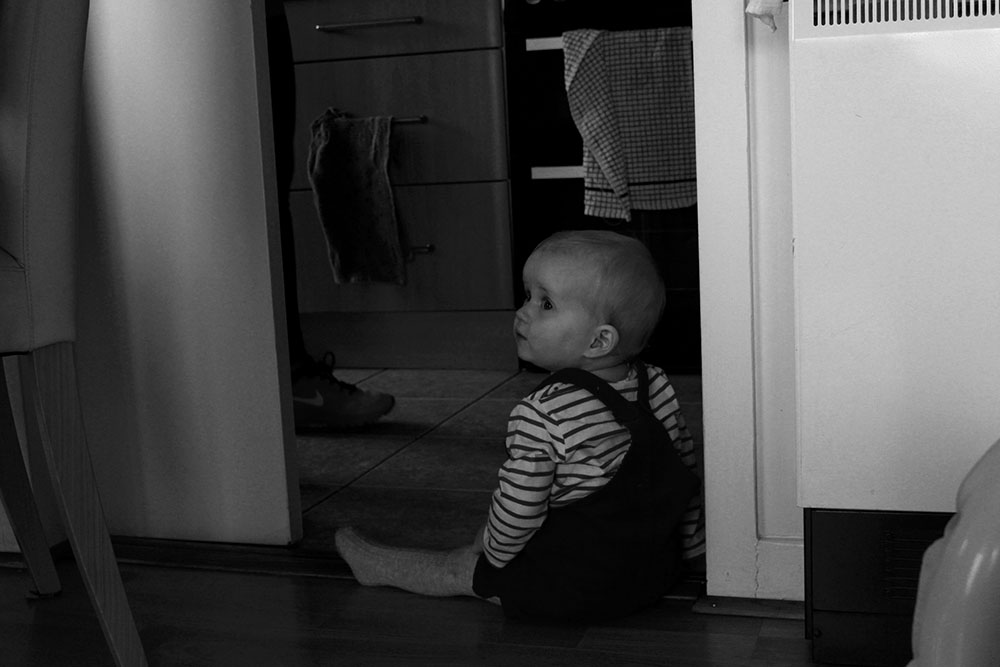
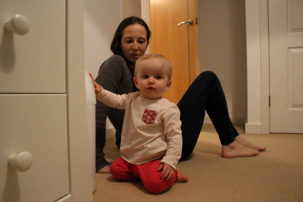 I like this image as it looks like a proper documentary photo, as if I’ve asked my niece to make a photo of her looking directly into the camera with a neutral facial expression. I really like this image. In reality my niece was starting to get upset that I was photographing her instead of playing with her. I like the way I’ve captured this moment, with a little bit of the drawers showing as well as my sister in the background following my niece around to make sure she is ok. Something that was evident throughout these photos is that my niece does not stop moving. She is constantly running around and barriers don’t seem to phase her at all as she’ll just try and climb over them. I really do like this image and find it interesting. The composition of my niece is perfectly in the center of the image with the second thing that the spectator will look at being my sister in the background watching her. I also like that this image is taken from a low angle to get to the level that my niece is on, which is a theme in the photos of my niece because I want the spectator to feel like they are there too and watching and looking around as she would and see what she can see too.
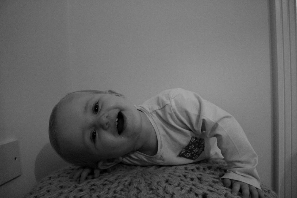
I find this image really cute. Here my niece is playing for the camera and having fun. This image shows the cheeky side of my niece, with her laughing and posing/lying on the cushion. I find this image really interesting but it is more of a generic baby photo. I think that this would be interesting for a spectator to look at within a series of images rather than as a stand alone image as I don’t think that it is strong enough to be on its own and I don’t think that it really makes much sense on its own either but I picked it out because I thought it looked cute.
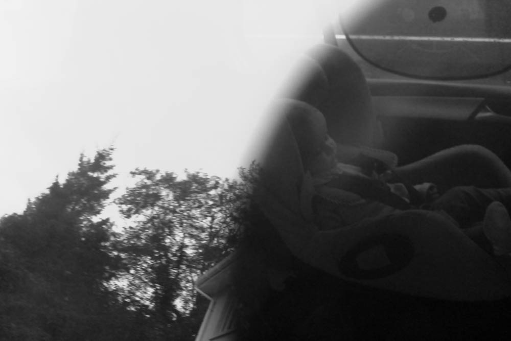
 I like this image as it is my niece asleep in the car after nursery. I like that the spectator is able to see my niece sleeping on one side of the image and also see the environment and her surroundings on the outside of the car through the reflection. I think that this image is very blue but that’s ok as I think that it gives off more of an atmosphere of what time of year it is, with it being autumn and getting colder. I do think that this image would benefit more in a series of images rather than having it as a stand alone image. I think that it would work well as the beginning image if I were to make this shoot alone into a small series.
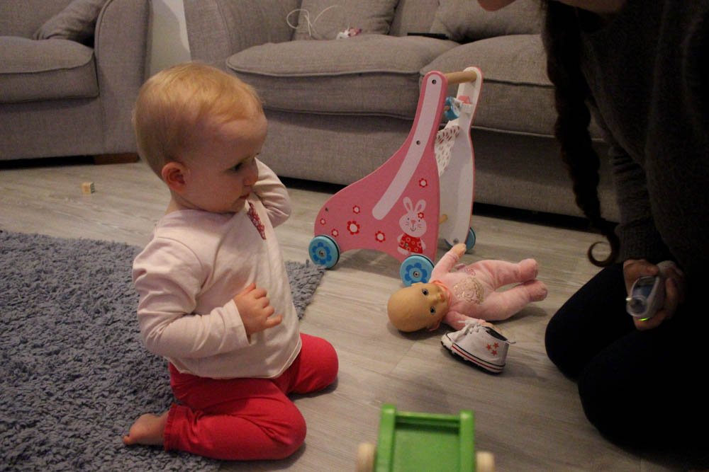
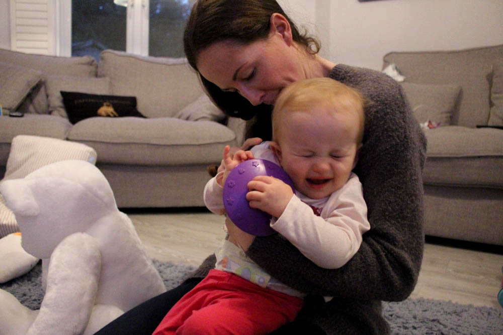
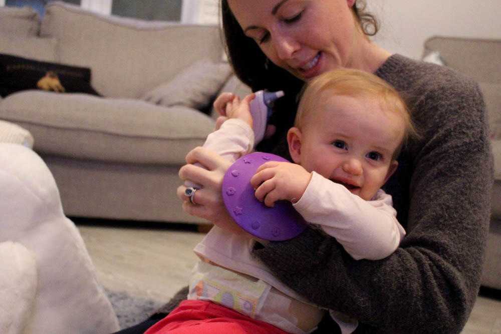
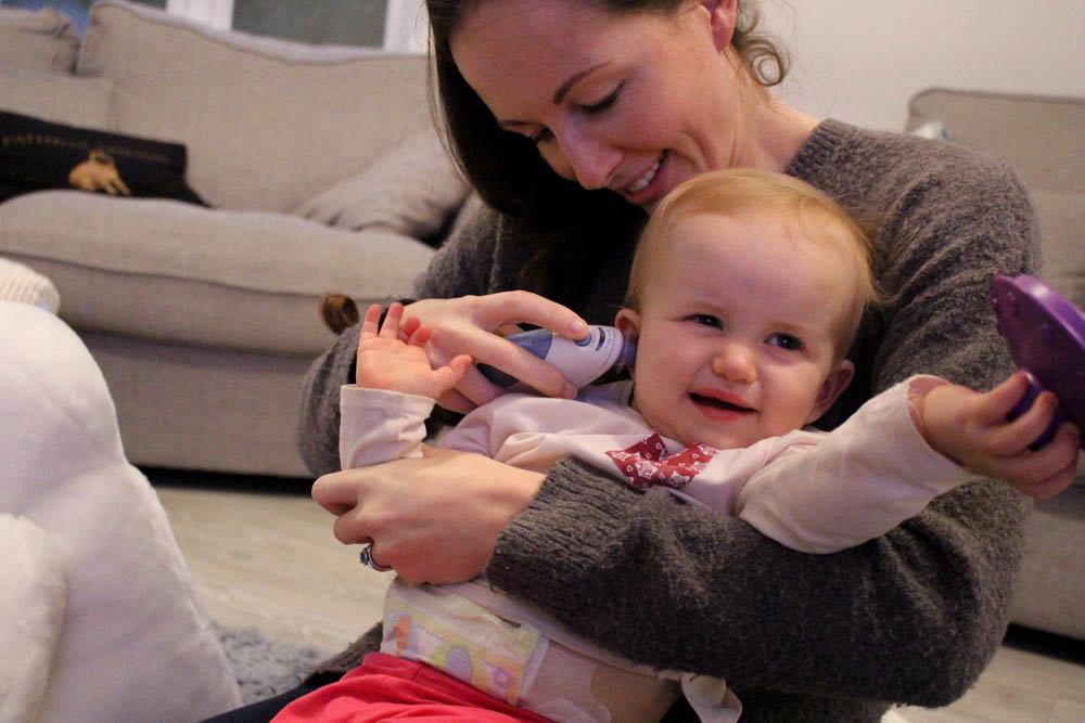
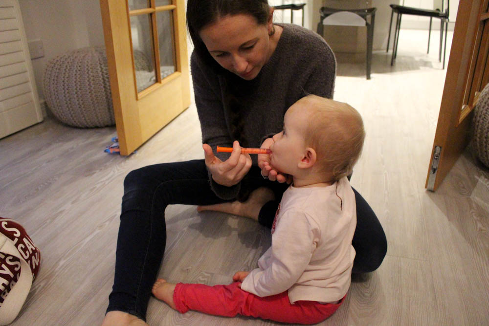
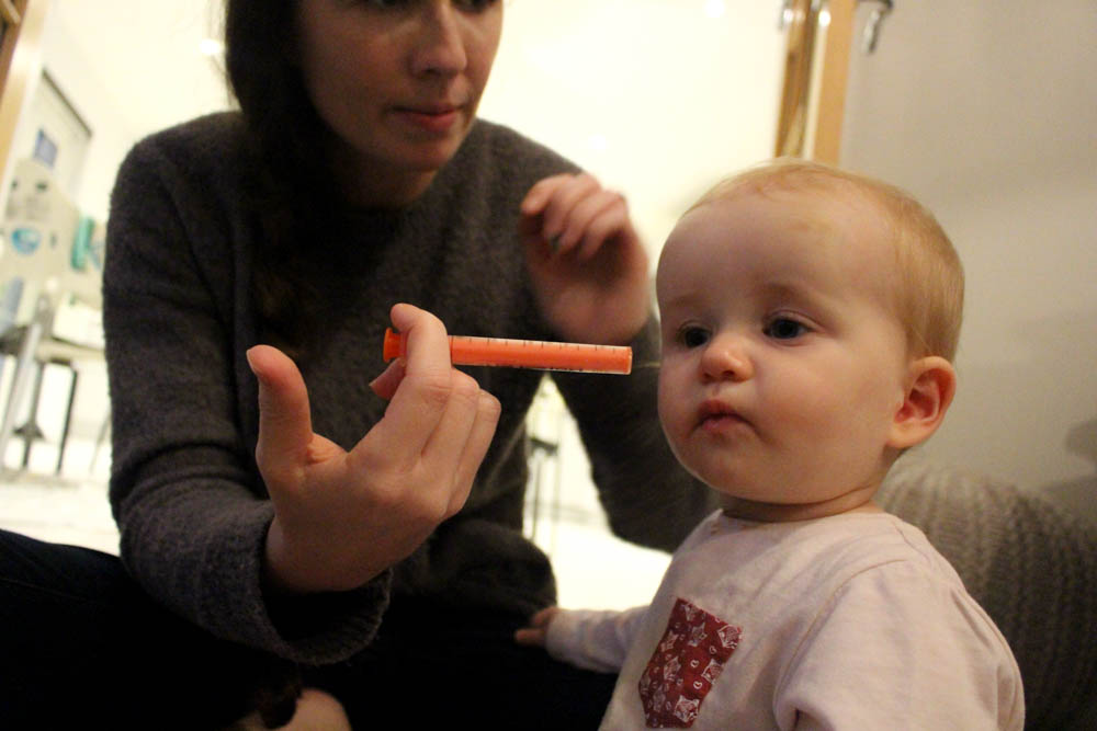
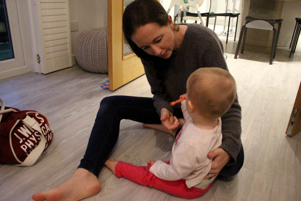
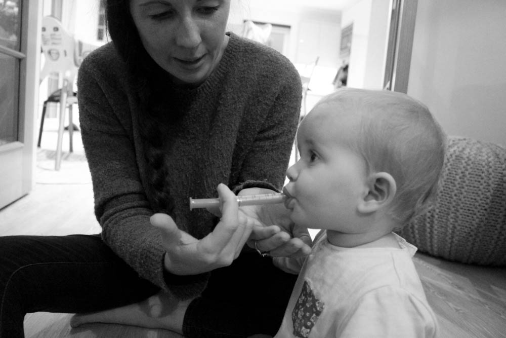
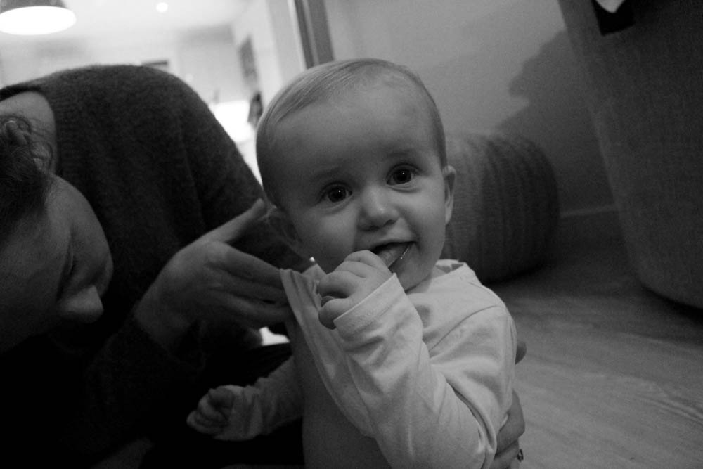
I decided to create a set of three images to tell a mini story with the little details. For this set of images I chose to focus on when my sister was checking my nieces temperature. Here the spectator can see that my niece wasn’t enjoying it very much and would try to run away from it being in her ear for too long. It did result in her getting to drink some baby medicine [which she seems to love, probably because it is mainly sugary]. I like these images as a set as it shows the conflict between mother and daughter although her mum was ultimately trying to help her and check whether or not she had a high temperature. I find the far left image hilarious as she really did not want that thermometer being put in her ear although a few months earlier whenever my sister would do it she was never phased. I believe that these three images represent the harder side of parenting that adverts and people tend to leave out, they let you find that one out on your own.
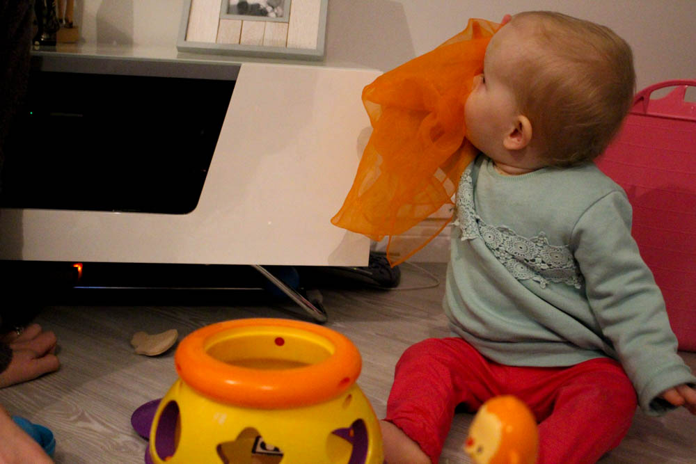
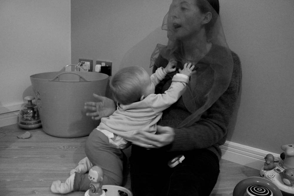
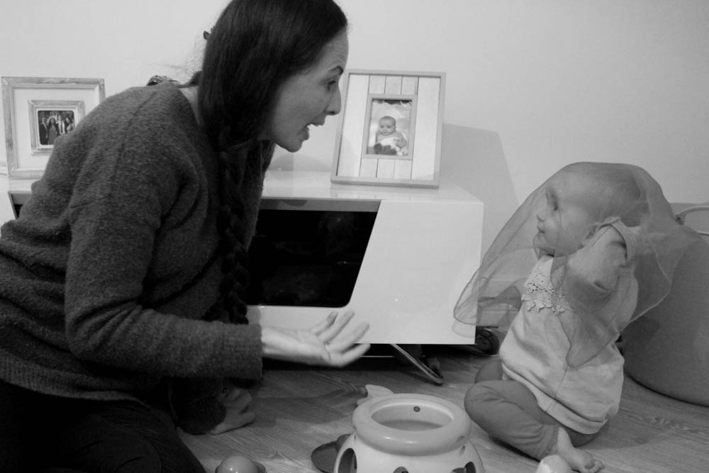
I love these images! They are so cute and show interaction that my niece has with her mum and how they are together. I like looking at these images as a mini series as it shows the spectator step-by-step what is going on and it is interesting to see. I like how in the far left image my niece is watching her mum and wondering what she is doing, to then in the middle photo getting excited and taking the cover off of her face through to the far right image of my niece finding her mum and being so happy that she knew where she was. I think that these images are really cute and interesting for the spectator to see that relationship between mother and daughter as well as being able to see what they do on an average day without there being any kind of special event or anything in particular going on.
Further Experimentation
Everything looks better in black and white. Something that I noticed when editing was that I could make a good photograph look great and allow different elements of the photo stand out. I prefer these images just because they look better and seem well put together in comparison to some of the others that are only in colour. I did find that some of the images didn’t look good in black and white so I didn’t add them in as the colours within the image aren’t strong enough and nothing really stand out, it all seems to blend. When editing it seemed as though I didn’t change many of the images to black and white but I did manage to get quite a few.
Again I edited more images that I thought and have ended up with plenty to look through and experiment further with. I like making a lot of these images black and white as it allows the spectator to focus in on what the subject of the image is doing rather than being sidetracked or distracted by whatever is going on in the background and any bursts of colour. I like a lot of these images in black and white but not all of them work well like this, as stated previously, some of the colours in my images aren’t strong enough and wouldn’t really look all that great in black and white.
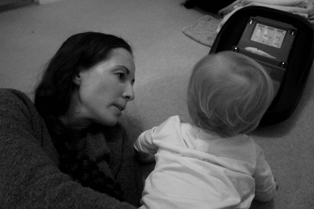
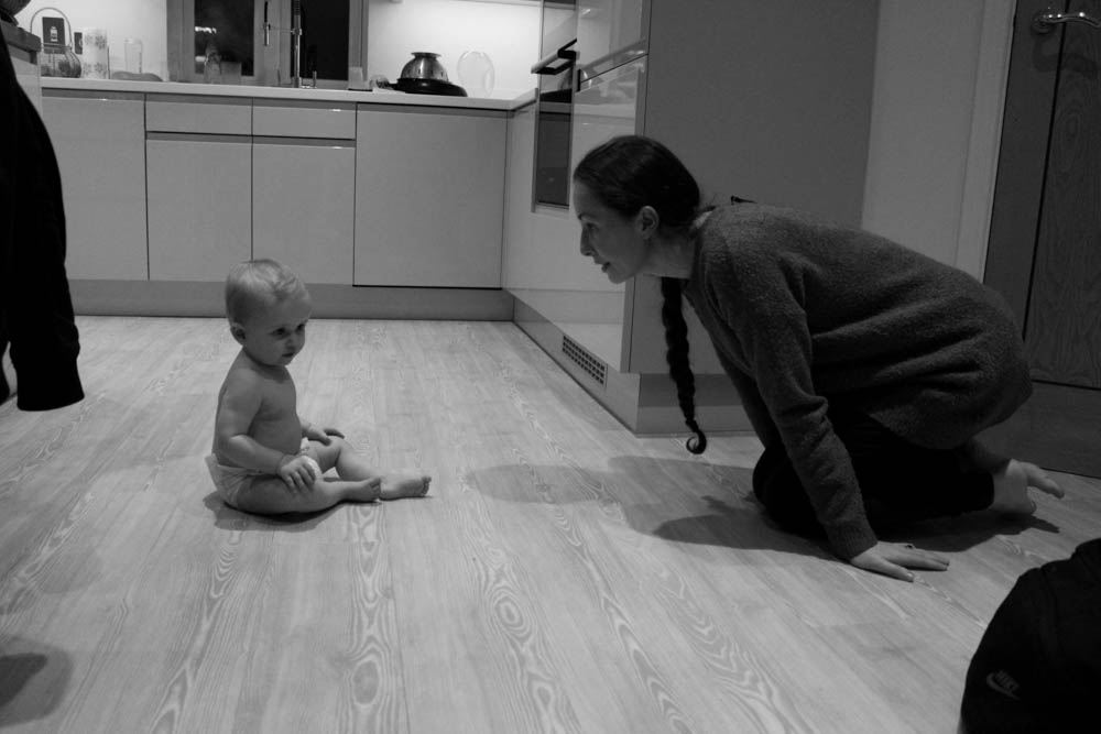
This image stands out to me as it shows how my niece is developing more and more each day with her knowledge of communication skills and being able to play and hide with her mother. I really like this image as the spectator is able to see my niece smiling up to her mum and playing along with her. I also like the expression on her mums face [my sister] as she is playing along and acting surprised as if she cannot see my niece. I think that this image really captures the communication skills that babies are able to pick up and develop without actually having to say anything. It interests me how babies are still able to understand and communicate things that they want without actually having to make any noise or even without directly speaking and telling her mum what she wants. I also think that the composition of this photograph is good as the two are opposite each other with no one being directly in the middle of the image. This image is a lot stronger in black and white as it allows the spectator to focus in on the subject rather than random background colours etc.
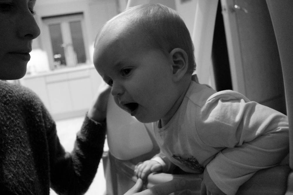
Another image that I think is strong is this one as it shows my sister giving my niece baby medicine to help with her temperature. I find it interesting to see how she reacts to different interactions with her mum. I think that I have captured this moment quite well and like the position that I have made this image in making my niece the main focus and subject of the image with her mum in the foreground adding more context to the image where the spectator is able to see what they are doing. I really like the facial expressions on the subjects faces as my niece and my sister both look concentrated on the medicine.
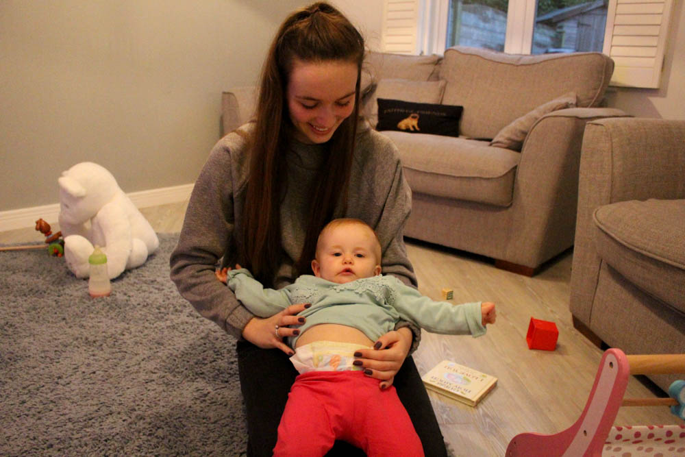
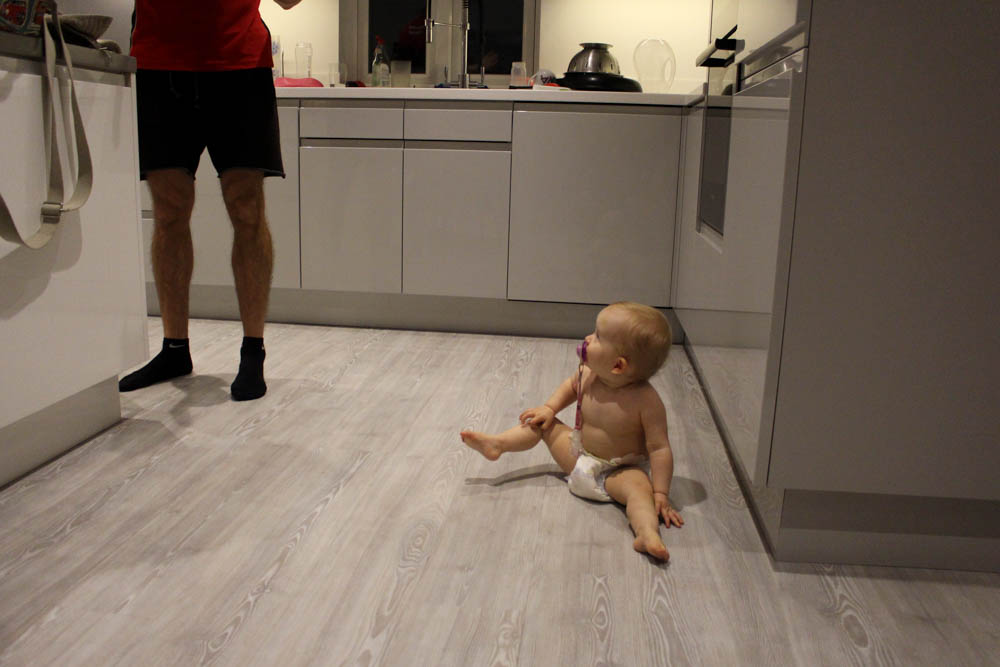
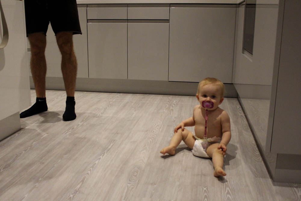
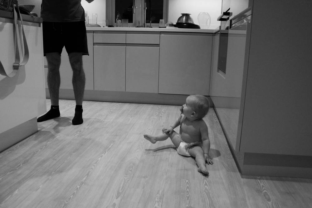
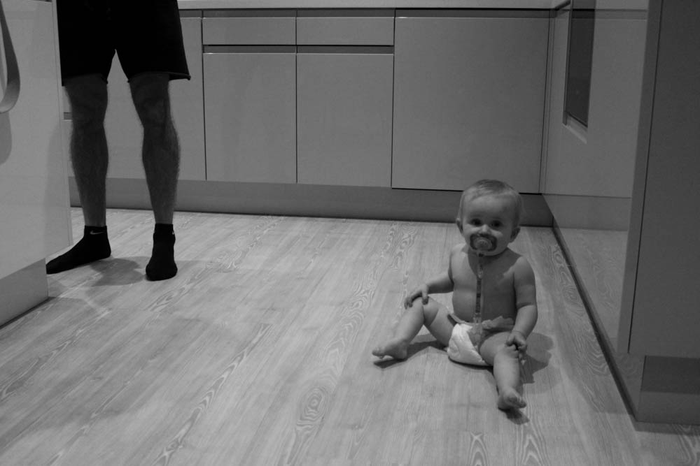
I really like this image. I like the way my niece is sitting with her leg slightly elevated off of the floor as she just sits in her nappy looking up at the dad. I think this shows how she looks up to her dad both physically and mentally [her dad wasn’t up for being in photos that evening]. I like that the spectator can only see what my niece sees and can’t actually see her dad or what is going on above the floor level. I think that my niece on the floor is really key and directs the spectators over to her first. I do think that this image is quite strong and could be a stand alone image as on its own it tells the story of how she sees her father. I also think that this image would not have been as effective if it was in colour as there isn’t really a main focal point that stands out as much as it does in black and white.
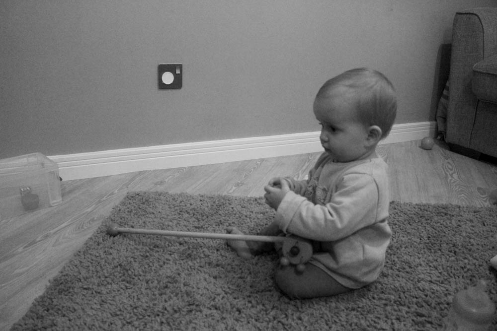 This image is very simple. I like how my niece is holding the toy while grabbing hold of another toy and looking off in the distance of the camera. The composition of this image is good as my niece is slightly off center and her facial expression looks as if she is almost in a trance looking at something off camera that the spectator can only imagine what is going on. I think that this image works well in black and white allows the spectator to focus on the subject and her facial expression.
125 Hours Project:
On Friday the 23rd of October, just before half-term we were assigned a project by the Jersey Museum. The task was to respond to the existing story at the museum called “125 years”, which I talked about in a previous post. We had to take at least 150 to 250 pictures for this. The name of our project was entitled “Our Story, Half Term: 125 hours seen through a teenager’s lens”.
Here are some of my photographs for this task:

