Category Archives: Record / Photoshoot

Filters

Author:
Category:

Grandma and Grandpa

I decided to interview my Grandparents as I think as well as photographing them, it is important to hear what they have to say. I was unsure of what to interview them about, so I selected 5 topics which I think are very important in their lives. These five topics are also the main areas in which I would like to associate photographing my grand parents with. The five topics are; Faith, Family, Wales, Jersey and Music.

I want to include, quotes from these interviews into my photobook, as I believe a stronger image is produced when it is alongside some dialogue.

Music:

Jersey:

Faith:

Family:

Wales:


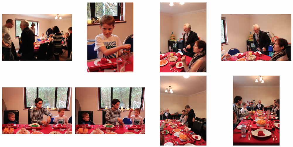
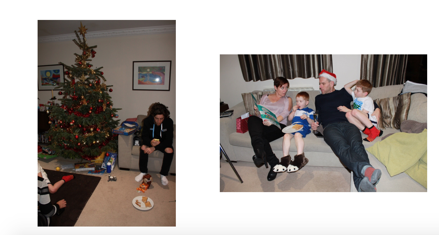
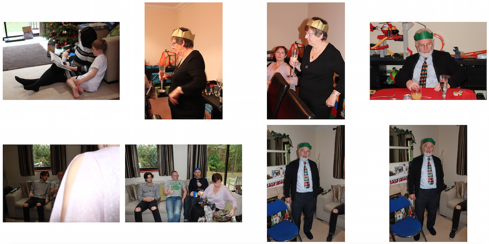
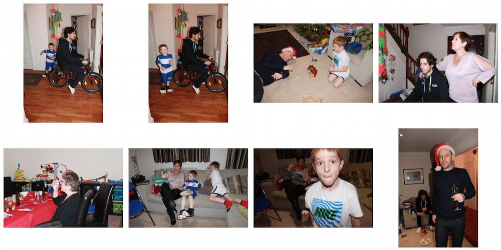
Christmas Day Shoot

My first shoot that I have done this holiday was on Christmas day. I chose todo a shoot because it is a very family orientated day, therefore I had the chance to photograph my grandparents surrounded by their family. Family is so important to my grandparents so I think I defiantly need to capture them in their family environment.

2

3 Screen Shot 2015-12-29 at 11.39.34 Screen Shot 2015-12-29 at 11.41.02 4 5 6

Government House

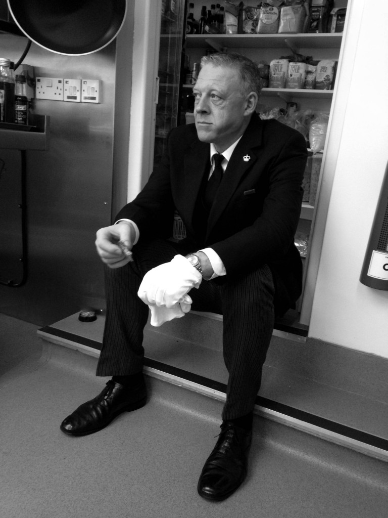
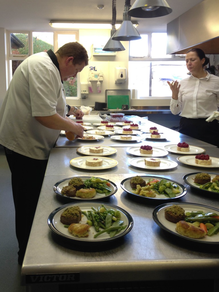
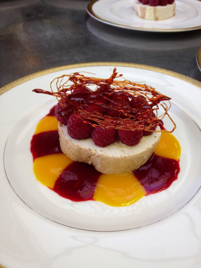
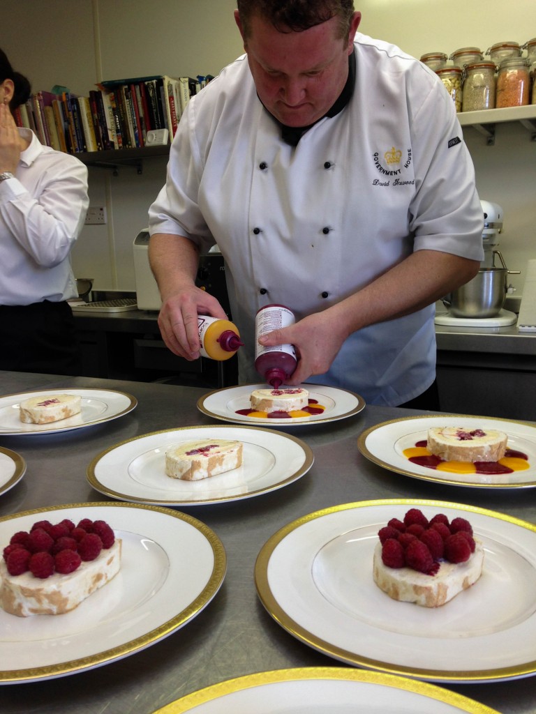
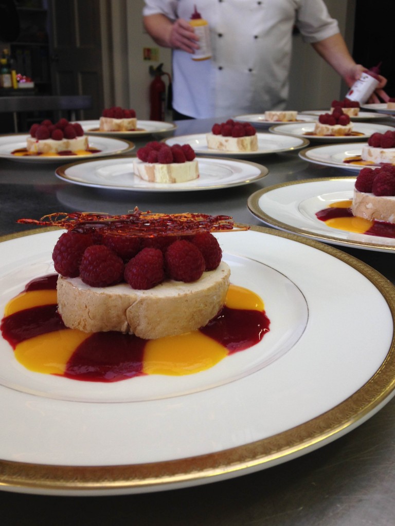
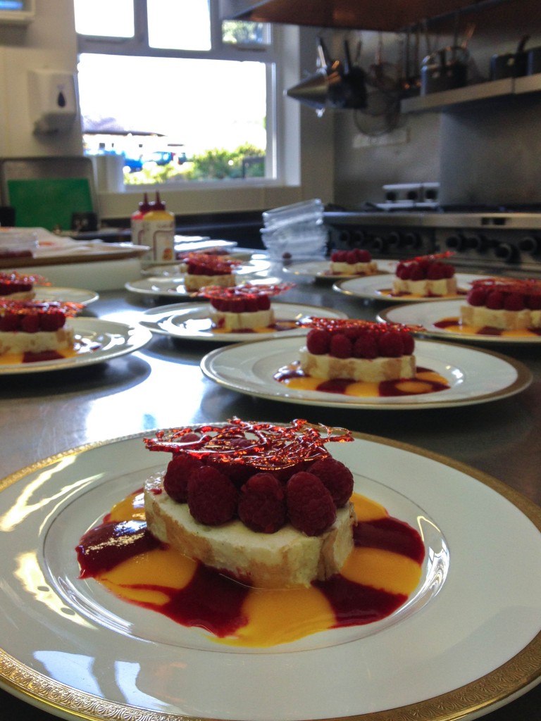
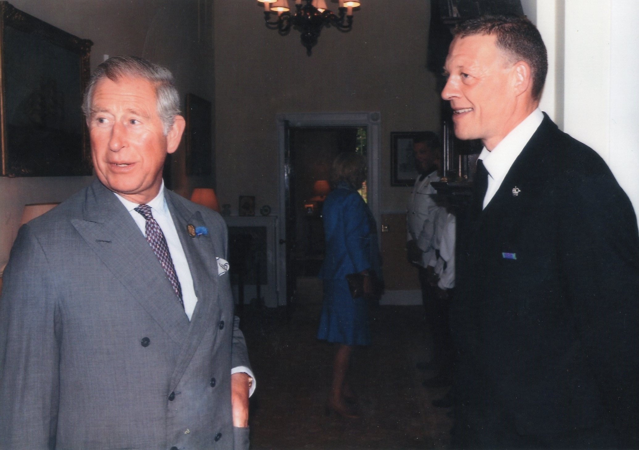
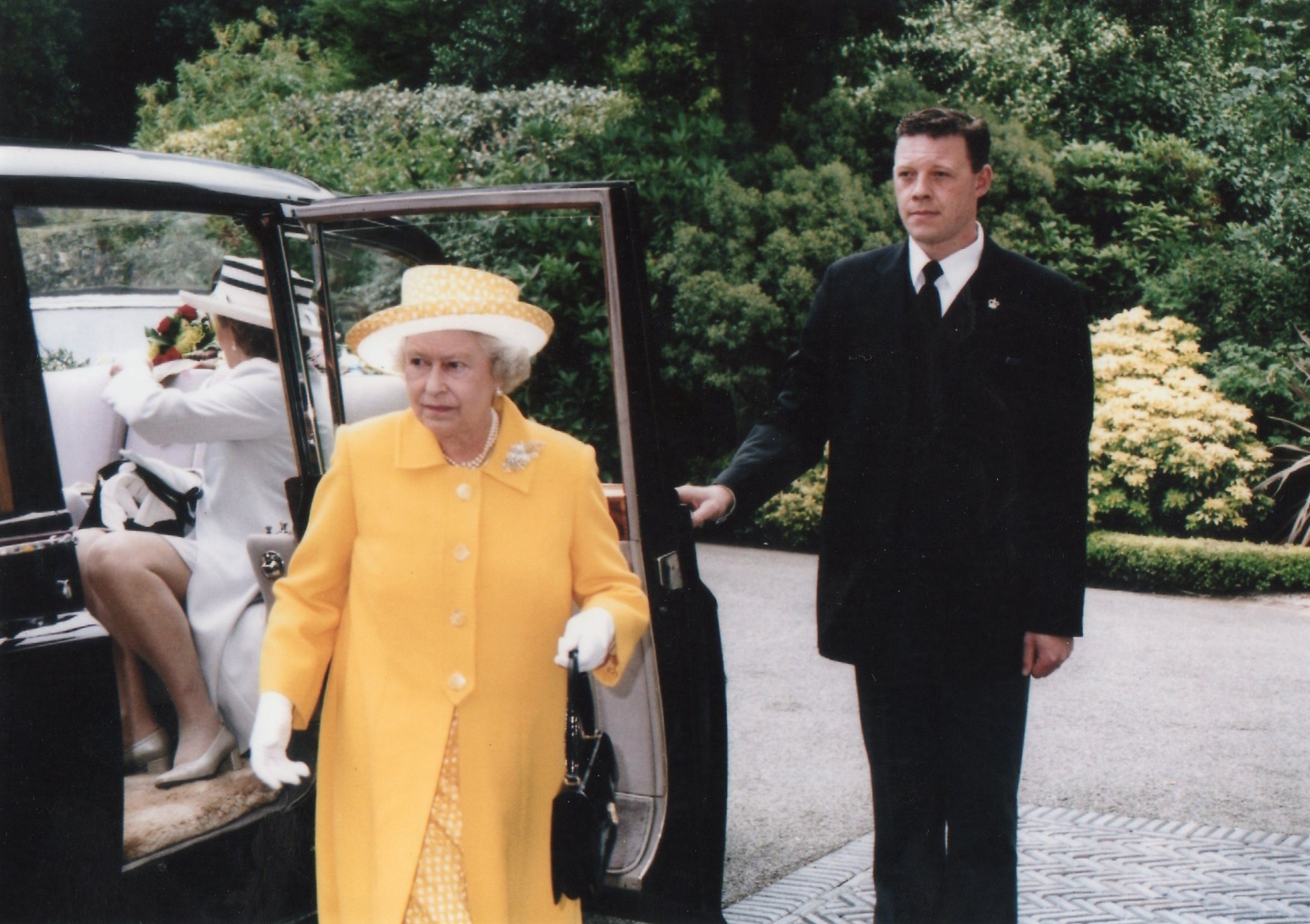
As I work at Government House I have the opportunity to take photographs of what I experience during my shifts. I worked at a lunch party yesterday and as we wait for the bell to ring to collect the plates the chefs prepare the next course, so I took a few images whilst waiting. I used my iPhone so the picture quality isn’t as good as my other photographs. It shows the life behind doors at government house which is an interesting topic.

IMG_5585

IMG_5589 IMG_5592

IMG_5587

IMG_5595

IMG_5597

img077

img078

Final Picture-story

Final outcome- Picture- Story:

final small

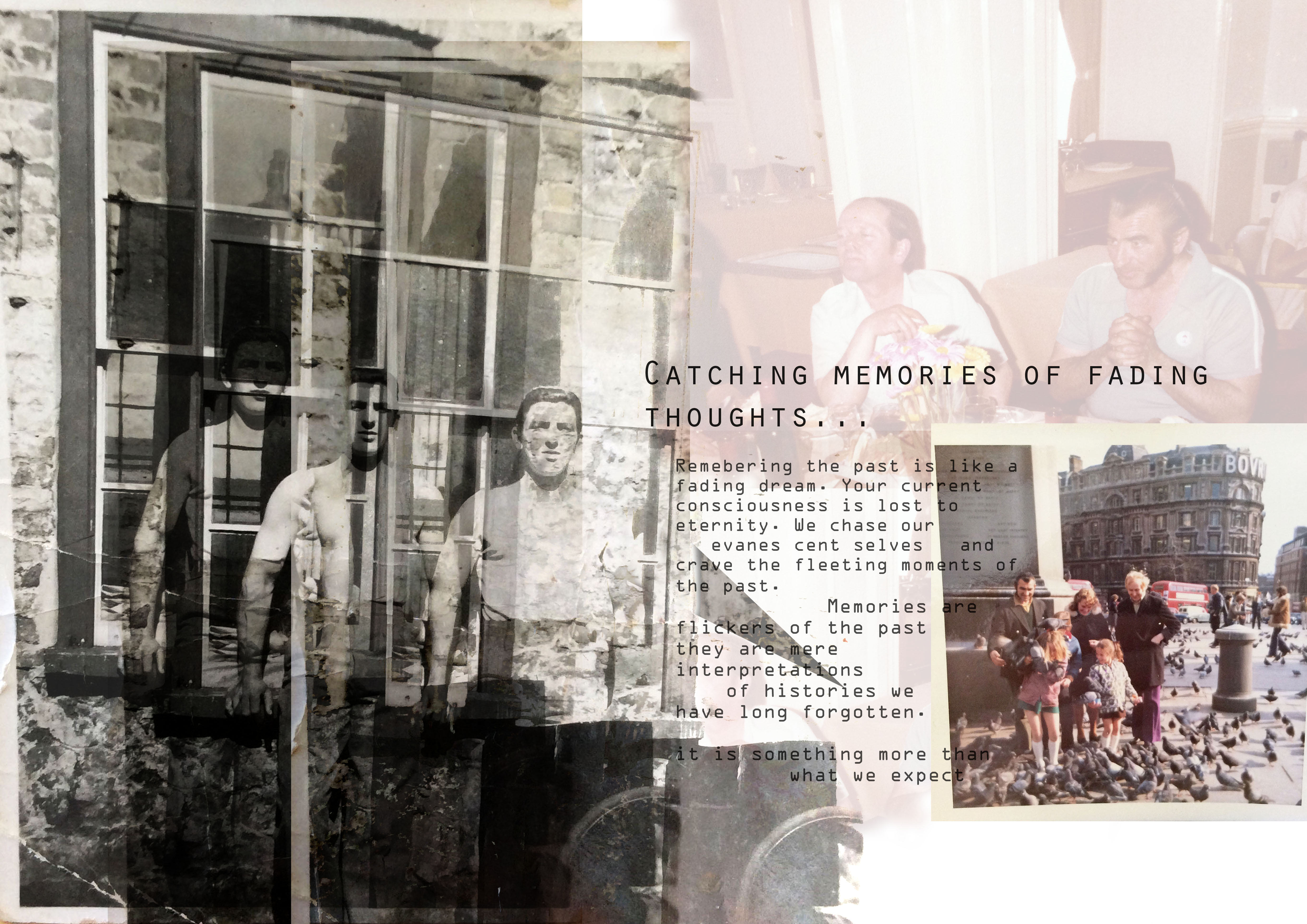
This is my final design for my picture-story, I have experimented with different styles. However, I have found this particular idea to work the best for my theme of memories. I wanted the photographs to look as one in a sense, so they appear as a fuzzy thought. I also wanted the writing to tie in with the images as though they are speaking the memories. Furthermore, the style of writing I have chosen is a type writing font which in my opinion works really well with the photographs. I have put photographs on top of each other and copied particular images. I have used different filters so that the images have a more powerful effect. The only image I have kept the same is the photograph in the bottom right hand corner because it represents my grandfather’s focus on his family. He was very much a family man and spent most his life devoted to supporting his children and grandchildren. 

With regards to the text, I chose the particular font because of the olden style it had about it. I liked the idea of it being like a type writer because I wanted the picture-story to feel old and vintage therefore this worked perfectly. For the title I explored with a range of different ideas, I looked at quotes online about memories but found a great deal of them were very sad and focusing on losing someone. This isn’t the idea of my picture-story therefore I decided to go with a title I thought suited the entire piece. I added the ellipsis on at the end in order for the sentence to trail off like a thought, I didn’t want it to have an end. 

When photographing these images I kept the burnt and broken sides of the pictures in because it made it look more authentic. Especially the image which I have not used any effects on, the edges stand out and represent a old and vintage look. 

I think this picture-story is close to what I initially wanted to produce from this project. I think I needed to include more modern photographs, however, I struggled with the concept of photographing someone that was essentially invisible. I think for when I carry this project on into my personal study, I will be more creative and open to exploring ideas which perhaps are more difficult but will capture the concept of memories. 

picture story one

This is my second picture story design, it is extremely different from my first picture story. I wanted the second one to be more professional and clean cut, I also wanted to include important quotes from condolence letters which were personal to my family. Archival images were a major factor in my picture stories, I think this was an important element as I have hundreds of photographs from my grandfather’s life. I used Photo Shop in order to design this picture story, I had previously leveled the images as well as adjusting the brightness and contrast. I then began the design by playing around with a selection of images, adjusting the size and angle to fit with the other images. I also played around with where the photographs were placed and the writings. 

Picture stories – FINAL DESIGNS

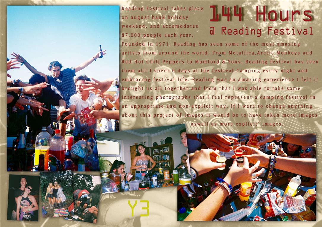
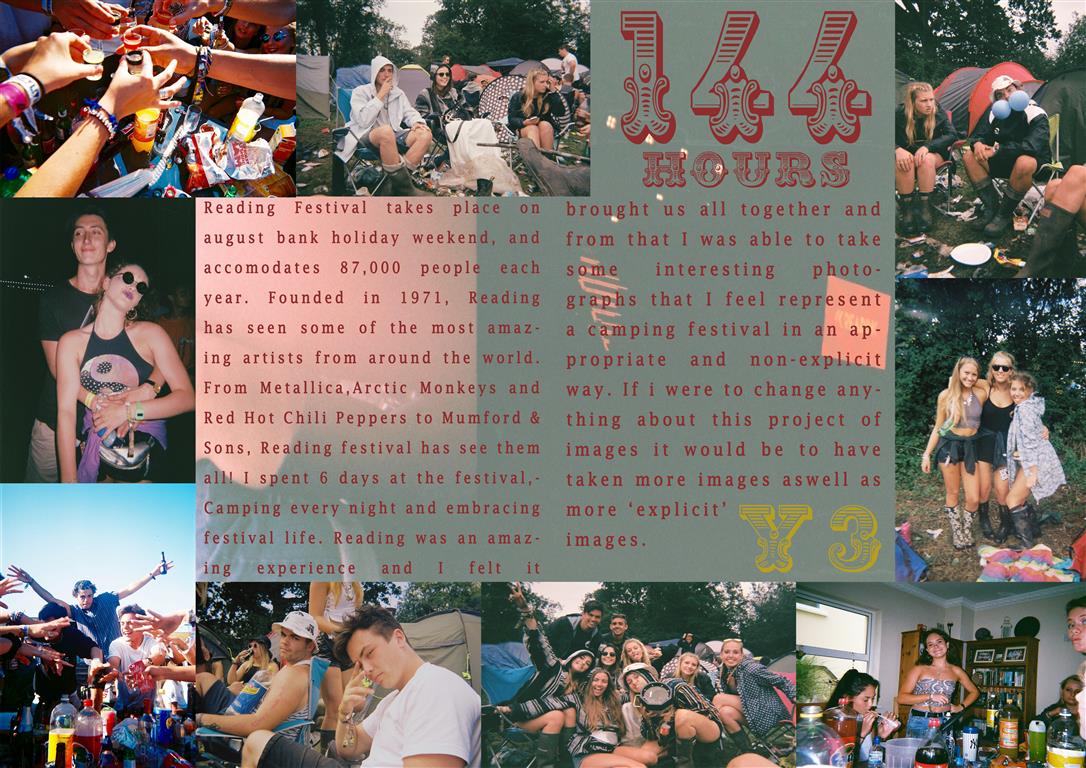
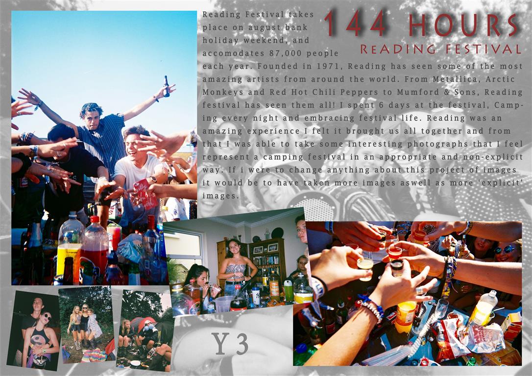
These are my final designs for my picture story, I experimented with many designs but came out with these two templates. I wanted the story to have a rough feel to it as my story was based around a festival I thought the theme should try to match the presentation. I kept the same font throughout the stories and a similar color scheme with red text and a faded picture for a back layer presented in all 3 stories. wacky 3 (Medium)
The above story was the first I created, attempting a graphical layout I had to twist and turn the images as well as add in ones that were different sizes. Adding drop shadows to the images also made them stand out more and created a non flat look. with 2 main establishing shots and a few relationship and observing shots to create a picture story with 7 images all together.
Untitled-1 (Medium)The above picture story was the second I edited and when completed was my favorite also. This story is presented more as a double page spread, with no drop shadows or highly edited images. I increased the vibrancy in all of the images to bring out the colors. I felt this was a cleaner and less artsy layout due to the symmetry and images laid out all in line. My favorite part of this layout was the title text, as it was very bold and very different to usual titles I felt it fit well in this design. This design also had a background image, this image was a corrupted photograph from the broken camera and I felt it fit very well as a background as there is nothing important within the image apart from a few corrupted images and water marks.
wacky 2 (Medium)This design was the third and least favorite design, The same layout as design 1 but with different color schemes and effects. The text should have been changed to another color as i feel it blends too comfortably with the background. I feel this story looks more of a poster than a picture story, The story is far from what i set out to design when i started but was an experiment and directed me towards editing my other stories more as i could then see what they were missing eg: drop shadows.

Headline, text, caption

Headline, text and caption

For the text in this picture-story I wanted to explore what people thought of memories and their interpretations of these invisible sentiments. However, when I was researching I found it to be very difficult to find what people thought memories actually were. Most of the information I found was very scientific which is not the sort of thing I wanted for this particular project. I wanted the piece to be a poetic picture-story therefore the words I used needed to reflect this. So in order for the concept to work I decided to ask my family’s ideas of what memories are, what we need them for, what they are made from and whether they exist at all. I wanted to take a philosophical approach to this area of work because I think specific philosophers have some insightful ideas for example Sartre. 

The headline for the picture-story is also very poetic. I wanted the title to explain everything about the picture-story as well as not giving anything away. 

What is a memory? What do you think our memories made up of and why do we have it? Does everyone have a memory? Can our memories deceive us? Are they reliable? 

phototoo

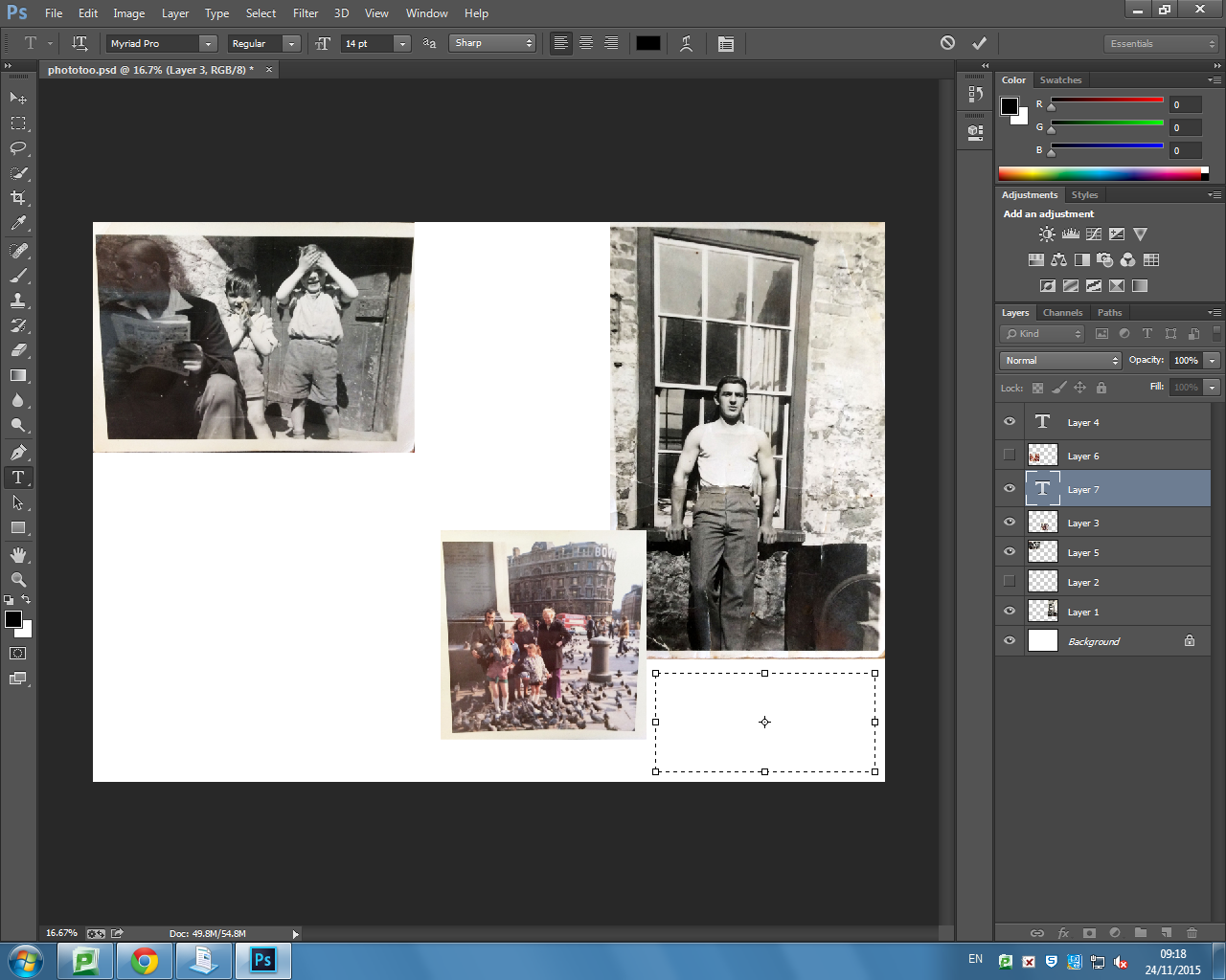
Due to my first picture story being very poetic and artistic because I wanted it to reflect the haziness of the memories of my grandfather therefore, it was important the photographs almost merged together. The only image that is slightly separate in comparison to the others is the archival image on the bottom right hand side, because it is a memory of my mother, it made it realistic and truthful listening to her remember it so vividly. Therefore, the second picture story is more simplistic and only focusing on the images singularly rather than looking at them as a merged sort of collection. 

picture story one

Photo-shop: creating a picture-story

The stages of creating my picture-story:

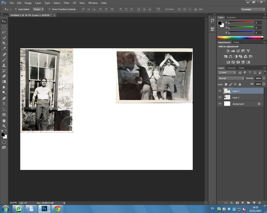
Firstly, I opened a new page of photo-shop, which needed to be size A3 and was international paper. Next, I selected the archival images I wanted to use and adjusted them so that I could see which designs looked best. I wanted to have a combination of black and white images as well as coloured images too. I decided my establishing shot to be the only photograph I have of my grandfather on his own because I found it fitting for it to be the main image which an audience looks at first. 

ttttt

wwww

After experimenting with the more traditional style of picture-story, I decided I wanted to take a more contemporary modern approach. I think the theme of my project being memories means the design needs to reflect it in order for it to work well. I took inspiration from one of the magazine spreads I found on the internet. I thought it was very imaginative and creative which is what I want my picture-story to portray. I overlayed the images of my grandfather because I have so many memories of him and he has lots of different aspects of him which I want to show in my study. This will be the establishing shot and the title will go in the top right corner so that they correspond. I think I want to experiment with having snap shots of family moments down the right side. But I will also produce a second versions of this picture-story however, instead I want to put more focus on the photographs I have taken now. I want the flower image to be the background which I will use the opacity tool to change the intensity. 

pic

picture story photo

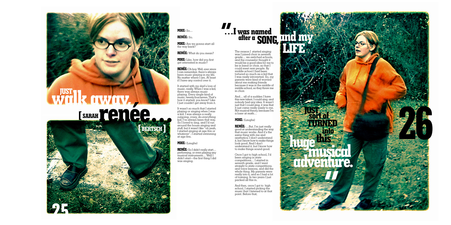
Inspiration: These are some examples of picture-stories I found on the internet. They are magazine spreads and are very contemporary which is the style I want to experiment with. My favourite is the second one, I like the theme of it and the way it has been designed. It goes very well with the theme of memories and the past. Plus it has writing on the right and the photograph on the left of the page which is what I wanted. 

20000101_6619

magazine4