Category Archives: Record / Photoshoot

Filters

Author:
Category:

Behind Every Good Man There Is A Great Woman | My Shoot

This shoot is very personal to me. It is about my mother and how she runs the house and seems to do everything. I wanted to do this shoot to show the unfair pressures that are put on women with families as they always seem to have to run the household and run around everywhere and be expected to do it all every single day. This is a more ‘traditional’ or old-fashioned household where the woman is now expected to work a full-time job only to come home to do all the cooking, cleaning and maintaining the home. Through my work my mother represents many women that go through this every single day. Growing up I would always look at my mothers role and think that I don’t want that kind of life, where I’m expected to do everything and basically live to serve. To me, she almost becomes a slave in her own home. I don’t want that kind of life and through this shoot I want to find out more about her role and what she thinks about it through interviews with her.
I get really annoyed when I see my mum running around and doing everything for my family. I do have to say that sometimes I am really lazy and don’t do much but I am a teenager and we are known for being extremely lazy. Both my parents should be doing equal amounts of chores to maintain the house, not just my mum. It is so frustrating to see my mum come home later than my dad and go straight into the kitchen to start making dinner when my dad has been home and is more than capable of making it too. However, my dad does sometimes make me dinner but only when my mum is working late or out. They should both equally be spreading things out and working as a team to get all of the chores done rather than just allowing my mum to do it all. There is another side to this though because there have been occasions when I’ve tried to help my mum peel potatoes or vacuum the floor and she just tends to prefer to do it all herself but this is because it is what she is used to and how she has grown to become accustomed to just doing it all on her own. There is not a single part of me that looks at my mums role in the household and wants to do it. I don’t want to come home from a hard day of working to them work some more and not get to rest until I go to bed. I have no desire to be a ‘housewife’ and run after my husband day in and day out. It just isn’t for me. Yet some women are happy and willing to do this which I accept but I feel that, with my mum especially, it has been placed on them since a young age so they know no different and just think that doing everything is the norm and they should always be doing the chores, cleaning and food shopping. Through some interviews I hope to find out a bit  more about why she does it all and what she actually thinks about all of the work that she does.

Reflection | Progress so far

After reviewing footage that I have already got of my mum, none of it seems good enough to me to be a still. It just isn’t that interesting on its own. I want to make this film great and for it to stand out and be as visually pleasing as it is interesting to listen to. I am constantly looking at the composition of the shots and getting different angles to make my film more appealing and it is going well. I have managed to collect some good shots together that flow well with the interview which I have playing over the footage. It looks great altogether and really does make sense and is interesting but a still on its own just doesn’t look right and, in my opinion, isn’t a strong enough image to really impact my spectator. This footage will be staying as a film and not made into stills. The only stills that might make it as finals will be the ones of me re-staging and parodying my mums role in the household from the footage I have made of her. I think that this is the best way to move forward as it will be a whole lot more interesting for my spectator who can then go to the film and watch it to get more background and context to the images that I have made. Honestly, I find looking at stills of the film boring and it makes me disinterested, maybe that’s because I see it all the time and I’m just used to seeing my mum doing all the work but I just don’t think the shots look good enough to make a spectator think ‘whoah, this is amazing’ so I’m definitely going to be making this a film ONLY and then using the images that I will be making as stills.

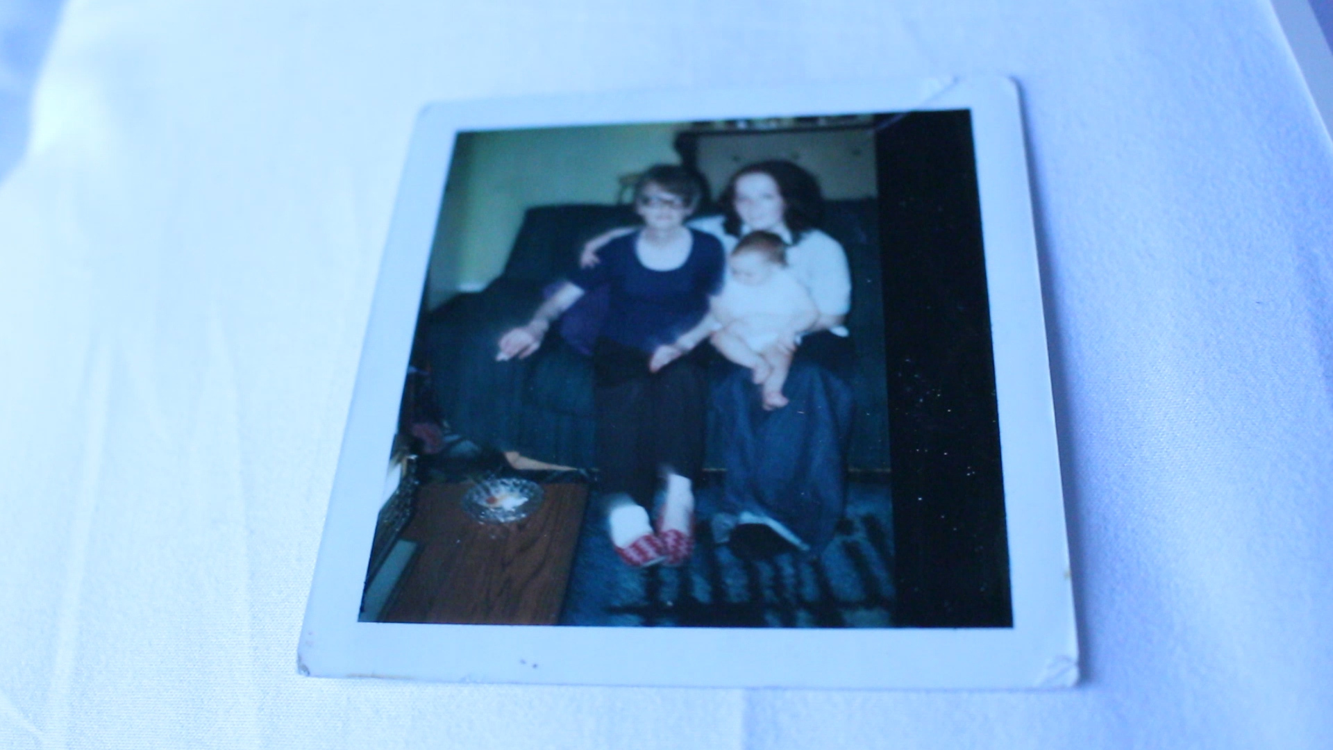
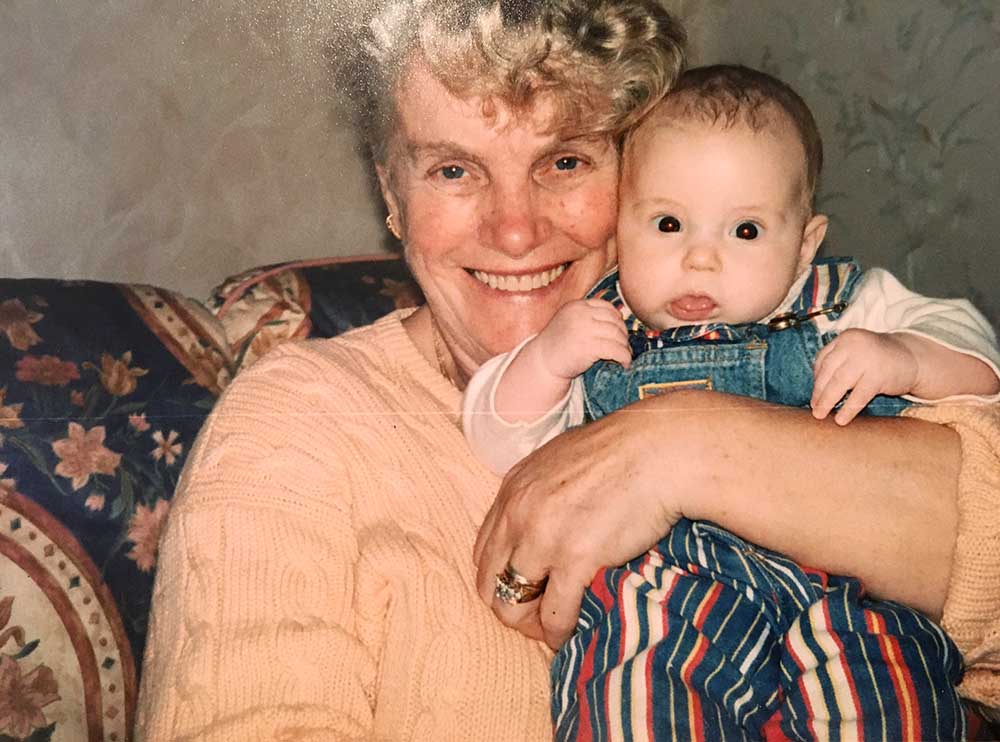
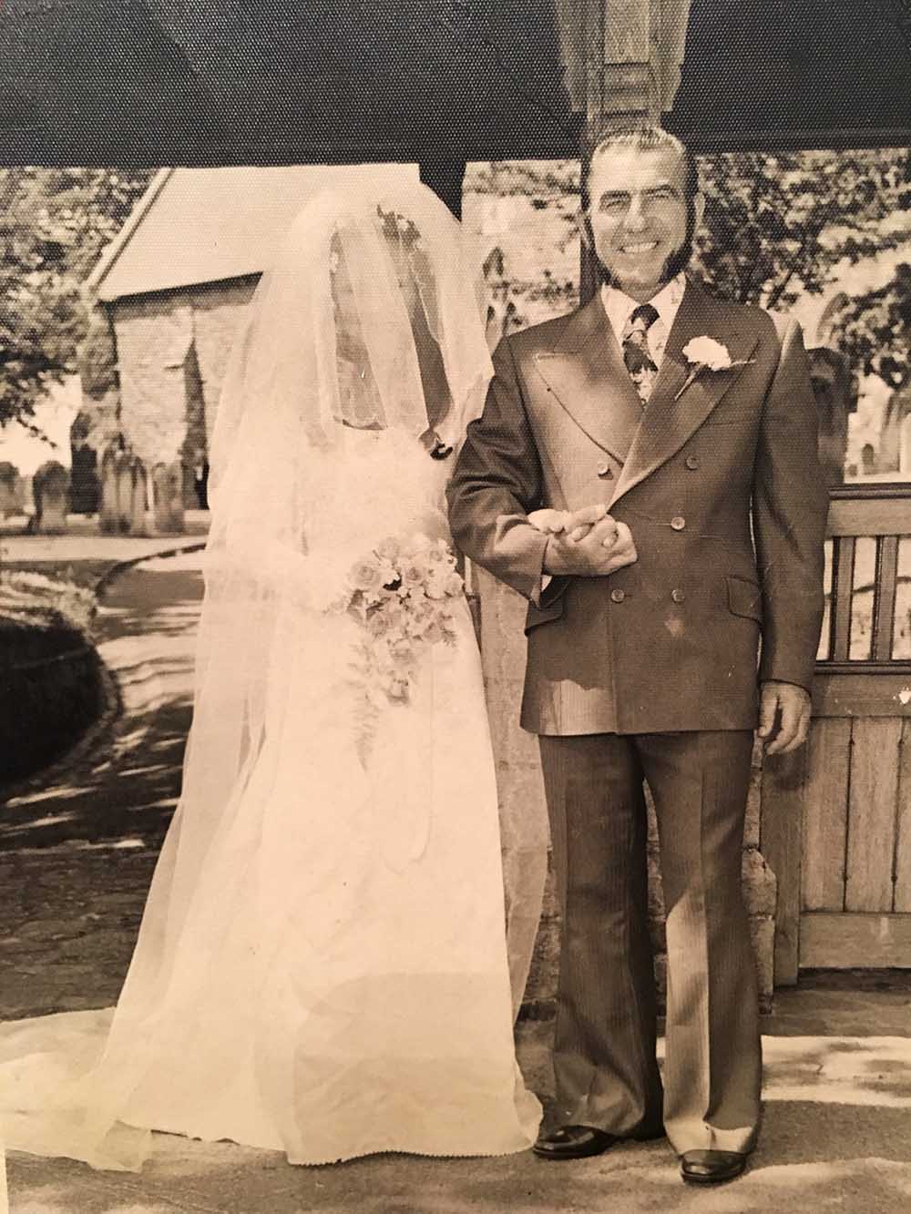
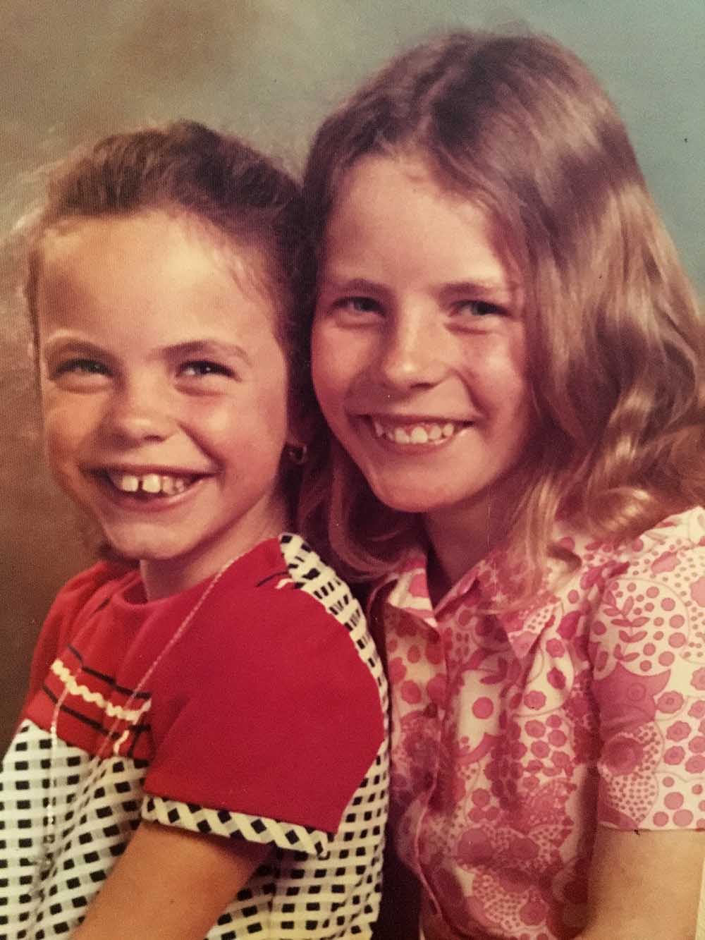
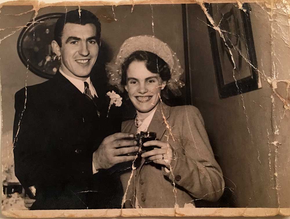
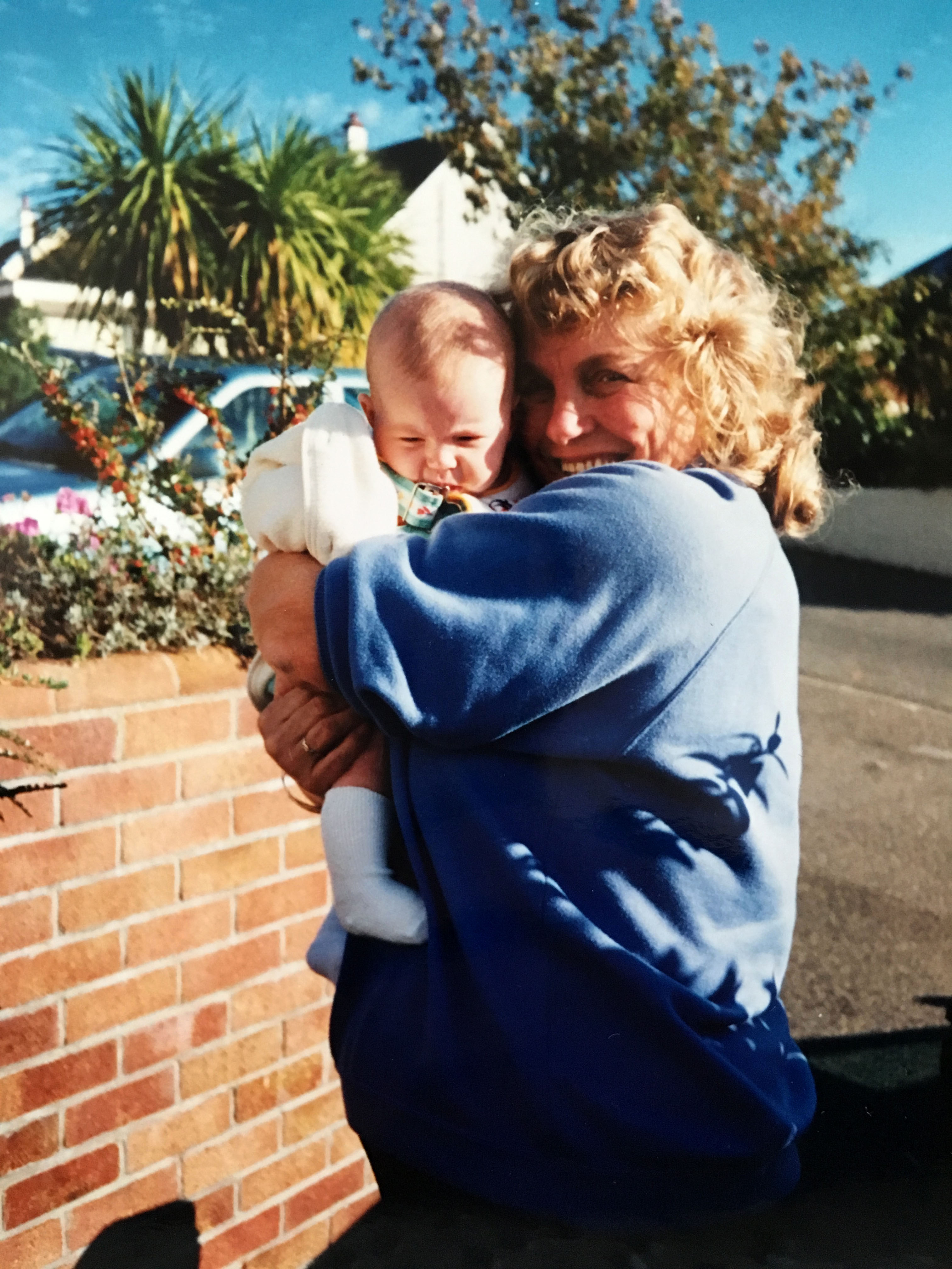
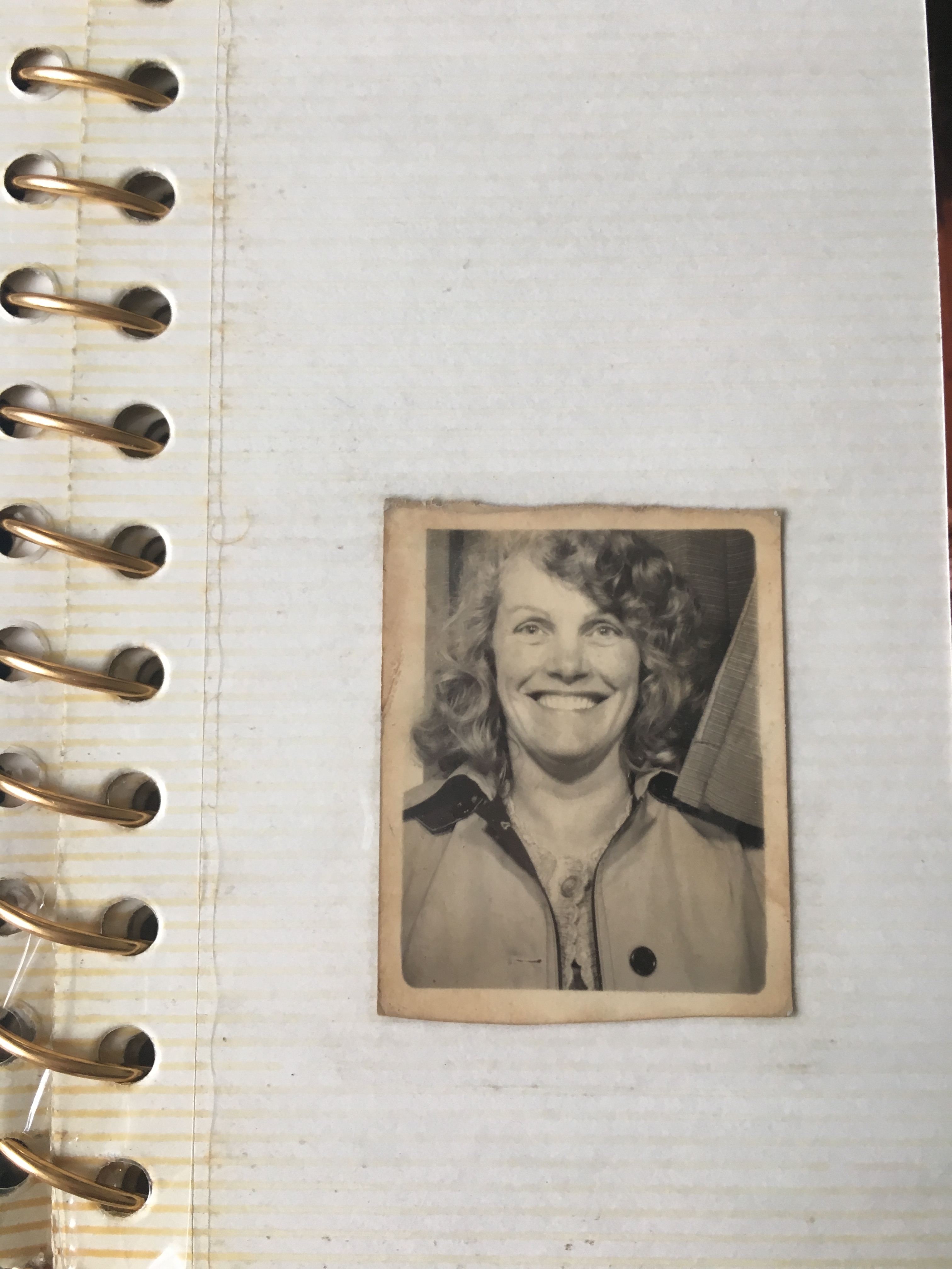
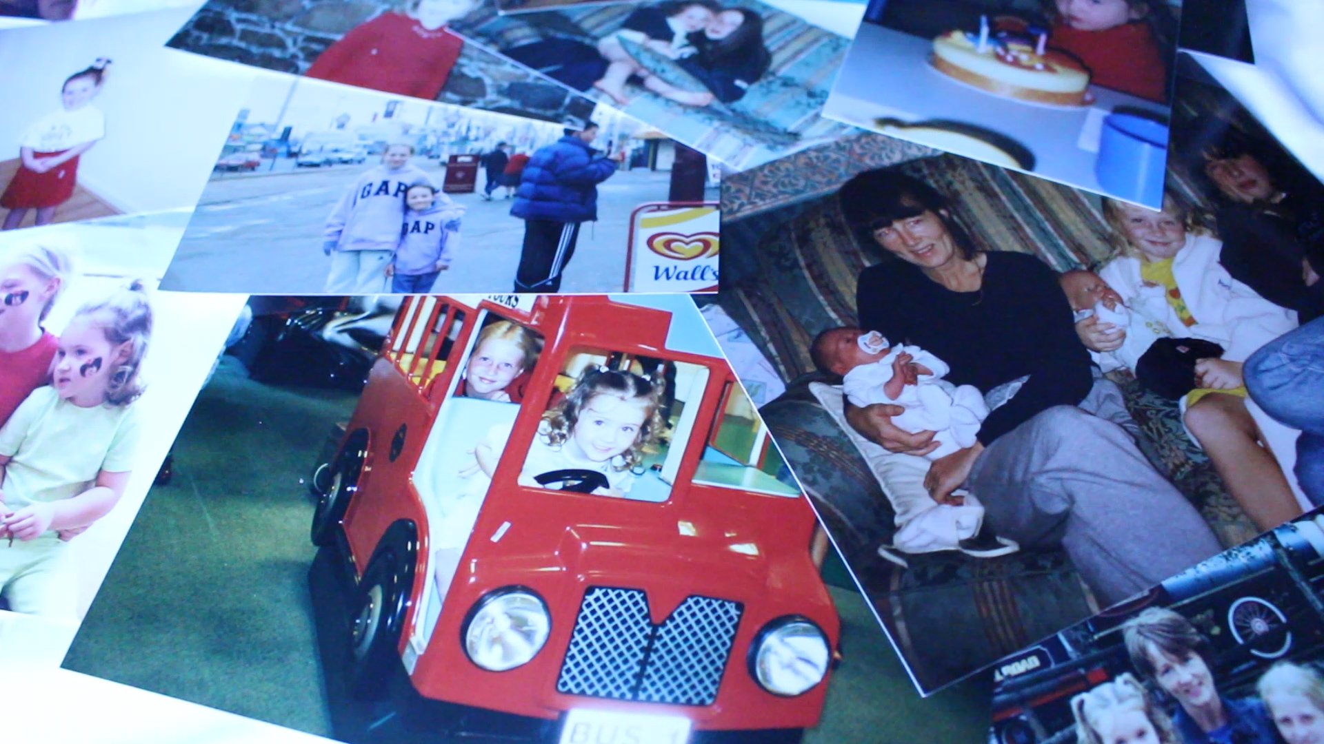
I’m continuously collecting together shots of my mum and her life to be able to make the best film that I possibly can. A new layer which I have added to my film is archive images, here I got my mum to find images of her parents and of herself when she was younger just to make it that more personal as well as putting a face to the name with the interview. I have also got some footage of my own archive images of me when I was younger and also images alongside my older sister and my mum [my dad was always behind the camera]. I really like the footage that I have so far and think that it really makes my short film that much better allowing my audience in on my personal life and my mother’s life a bit more. This was really nice to see images of my grandparents as I have never met either of them, they both died before I was born, so seeing these images was a nice experience. It was also quite funny to look back at old family images of me and my sisters too. I like the idea of adding in these archive images as I really love the way those old images look, they are all old images from the 60s of my mums family.
I also have more footage of my mum. I went food shopping with her and have filmed her doing what she would usually do when food shopping, this was interesting to see the heavy bags that my mum lifts and how boring food shopping can be, especially when you have to do it alone. I really appreciate what my mum does and I want my work to reflect that, to show just how much she does for me and my family. The shots are coming together nicely and I am well into the editing process and have accumulated many shots to bring visuals to the audio interview that I did with my mum. One thing that I think I will need to change about my audio footage is the ending as it just kind of ends and I want it to have a better ending, something that will have more of an impact and that will also leave my audience thinking about the role that their own mothers have within their household.

After editing the clips together for a while now I am starting to really see progress and am liking what I have created so far. I still need to collect together some other shots of archive images as well as possibly some more footage of my mum just to bring the whole video together and to get the final bits needed. I am actually missing a bit of a chunk of footage within my short film where my mum is talking about her religion and why she didn’t bring me up in the same way that she was brought up which I haven’t made much footage for and am trying to come up with ideas as to how I would be able to fill that gap as my mum literally only has one small candle in our whole house that resembles her religion and the rest is pretty neutral. I also can’t film her parents as neither of them are alive and my mum only really has one proper image of them and that is in a family photo with my mums parents and two of her sisters. I think that I might be able to get some footage of my two Auntie’s as they are over from Scotland [from 9th-13th February] but I am unsure how relevant this will be in my short film. I have also got the idea of possibly going to a church and filming around there to fill in the gaps in my short film, I also actually have some shots from a Notre Dame church when I went to the South of France a few years ago which I may be able to use.
I’ve had a think and reviewed my short film so far and think that it will just be best to actually go to a local church and ask if I can film around to get the clips and shots that are needed. I couldn’t find the clips from when I went away on holiday with my parents and we visited a Notre Dame church so I will just have to go out and get the new footage as planned. I also don’t think that it would be relevant to get footage of my auntie’s as they are not mentioned at all throughout the interview and it just wouldn’t fit in with the rest of my short film. Overall, I am happy with how it looks so far and think that it has potential to look really good once everything is added and it is all done. Watching this short film come together and listening to what my mum has to say has given me some inspiration to create another short film about feminism with a voice over. I think that this will be beneficial to my project and will actually work out much better than a magazine would as I will be able to take stills from this project and put them into a photo book.
UPDATE: Over the half term I have been working on my short film and managed to get some extra footage of a church to fit in with the audio where my mum talks about her religion. I think that these shots have worked well in my short film and it is really starting to come together. I realized which editing that I still need to get some shots of my mum putting on her work clothes and getting ready for work as there is a section where she mentions what she does so this would fit in quite nicely. I will be getting these shots this week and adding them into my short film.

What next?

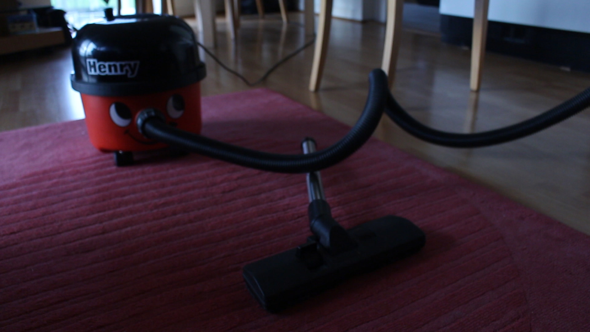
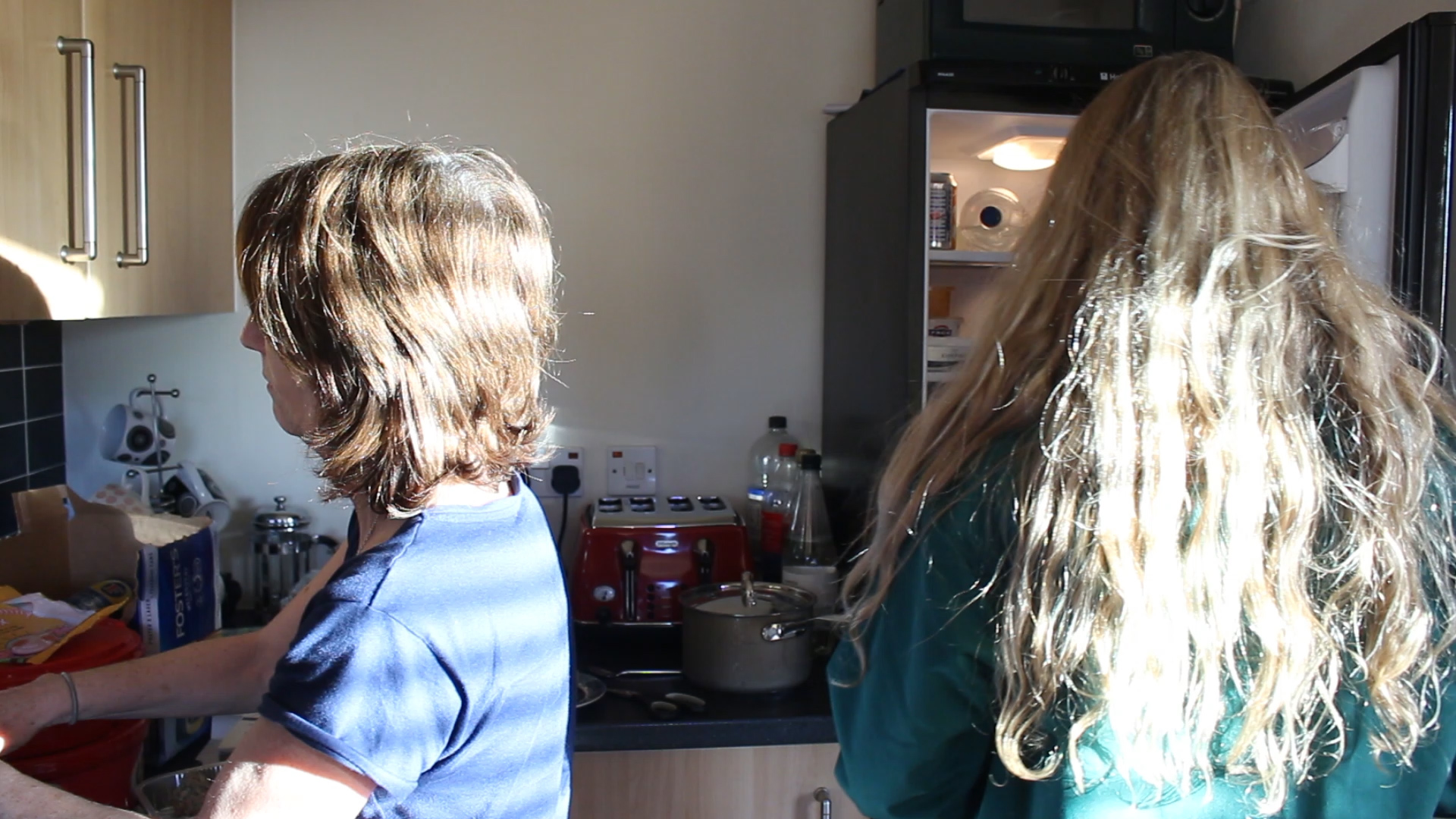
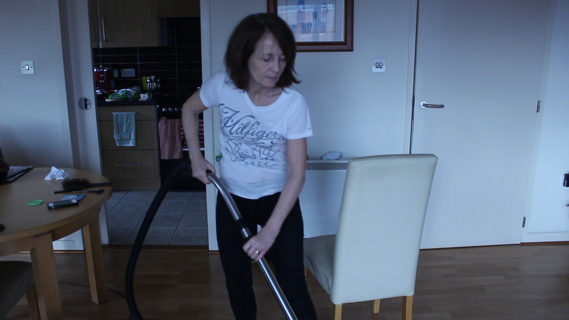
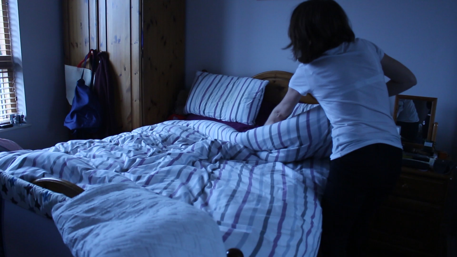
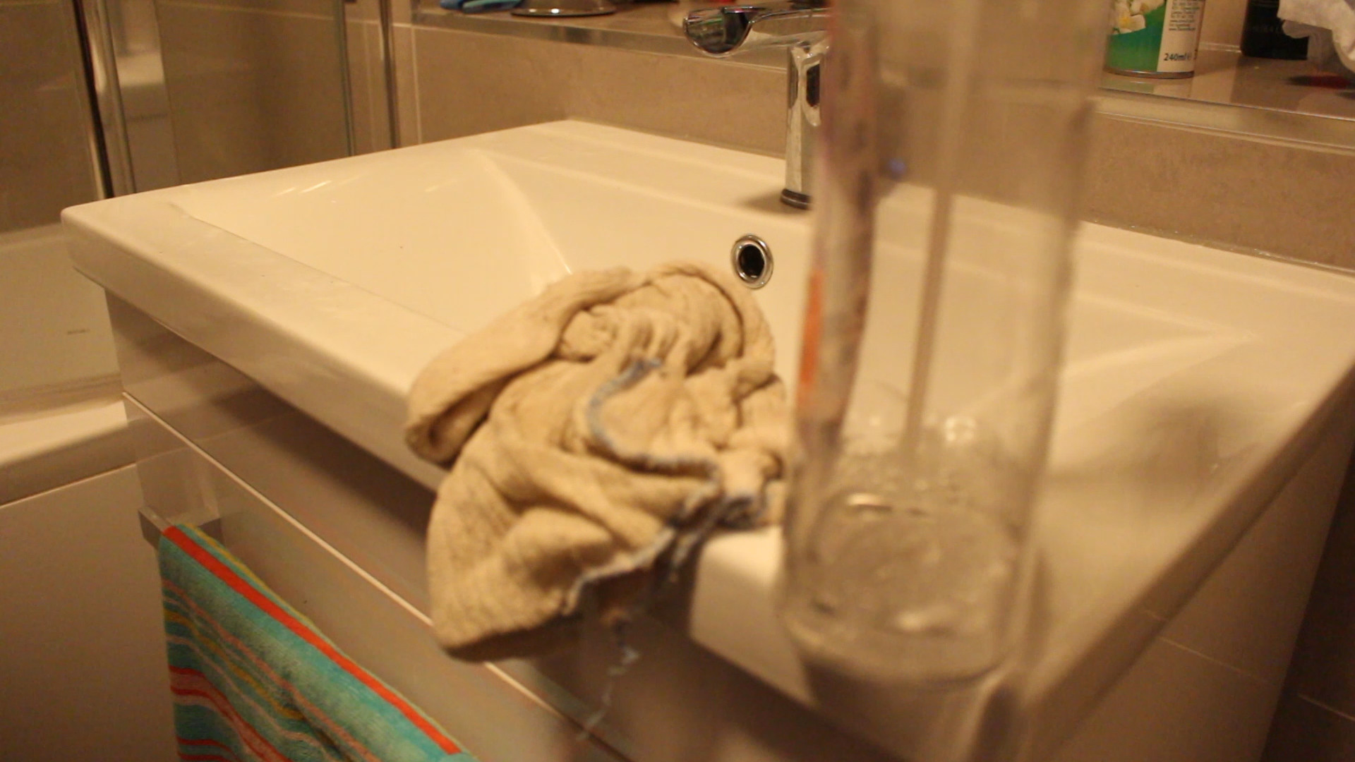
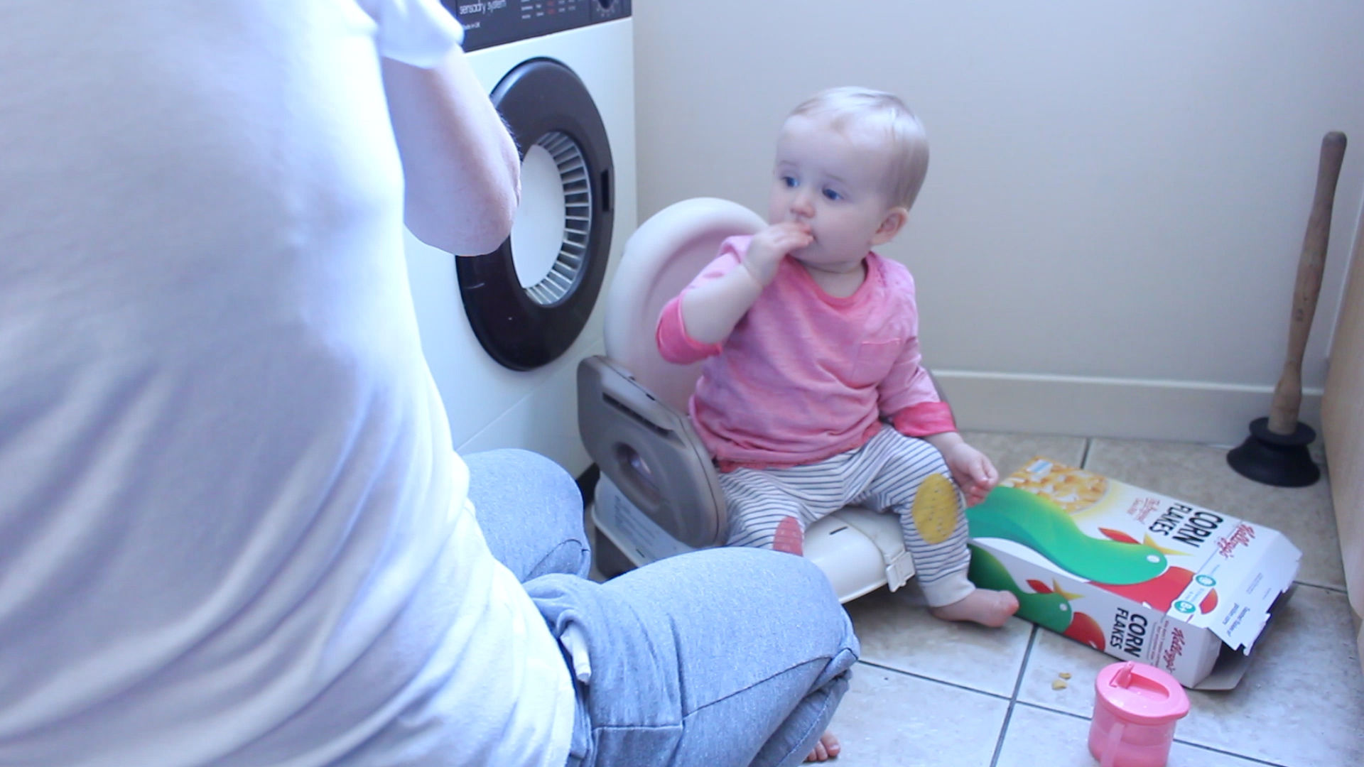
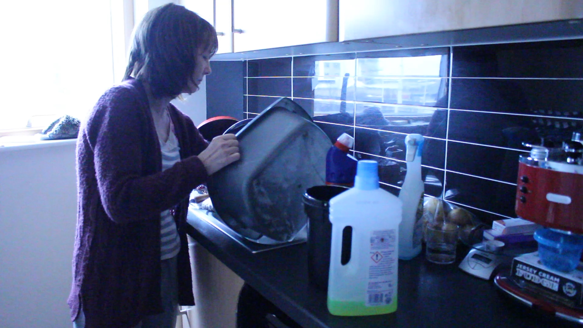
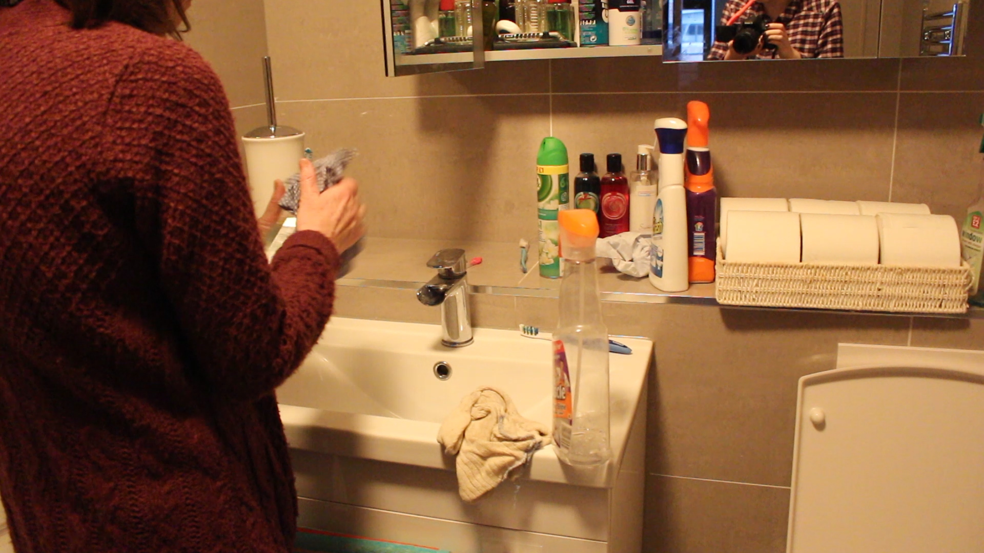
So after looking through this footage and putting together the whole video I wanted to keep up with my idea of parodying her role and mimicking what she does myself in a series of images. I want these images to be a reflection of how I see my mum and what she kind of represents to me. I am going to be staging images dressed in one of my mum’s dresses and I am going to change my hair around so that it looks like her hairstyle. I want to make these images stand out and to be interesting to look at, somehow I need to make cooking and cleaning look interesting. Taking inspiration from Cindy Sherman I want to make my new persona/character almost unrealistic, something that you would only ever see in movies or something. This will just make the images stand out more and will really emphasis that I am parodying the way women, specifically my mum, are perceived within our modern society. These images will be taken over the half term and my aim is to get at least two images from each part of my mums role. For example, I will be doing a shoot in the kitchen, one shoot will be in the bathroom cleaning, another will be in the living room cleaning and another shoot would also be food shopping. Little shoots that I want to hold big impact and to really send a clear message to my spectator about the role of women in modern society and how flawed it all is.

Short Film | An interview with my mum

Here is the finished short film all about my mum. I interviewed her asking various questions and from there have created a sequence of shots that correspond to what she is saying. I think that this short film has worked well and it gave me more of an insight as to what my mum thinks and as a personal study has really helped me to develop my thoughts on feminism as well as how I see my mums role compared to my own. This short film has given me inspiration to create more images based around the woman’s role within our Western society and what is expected of her.

https://www.youtube.com/watch?v=cx5ayloQdsI

Short Film | Evaluation

I wanted to explain some of the shots I made in my short film in a bit more depth to show the meaning behind them. I feel that my short film has been successful and does represent my mother and many other women that follow the same traditional role as her. I wanted my short film to stand out and for the visuals to bring to life what my mother is saying in the interview. I really think that this project has given me a better understanding of my mother’s role and has really solidified for me the fight for equality in not only the Western world but the entire globe. I feel that this project has allowed me to develop my knowledge and understanding of other women fighting for their freedom and has helped me to understand more clearly that women need to fight for their rights and for our voices to be heard we need to stand up for what we believe in.

Image analysis 1
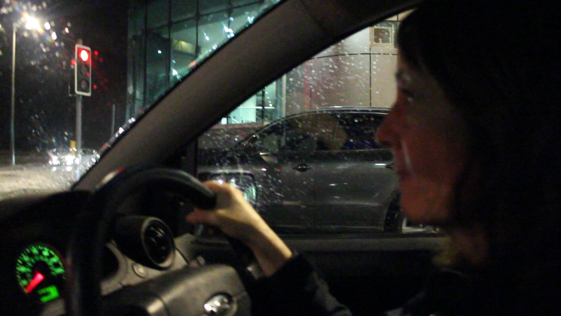
MVI_2556.00_01_21_24.Still020
clip from short film

I put this clip in where my mum talks about her mother and how my mum’s role is harder than that of her own mother’s as she has a full-time job. The reason for this is actually because in the background of this is the location of my mum’s work and I wanted to have it as a subtle background just because I think that it looks better this way. I like this shot as my mum is concentrating on the road and not on the camera so it looks a lot more natural and she is acting as if the camera isn’t even there. I think that I was at an advantage throughout as my mum obviously feels comfortable around me and isn’t worried or nervous about what I am filming of her. I think being an insider for this project has helped me to create a much more precise and accurate project as I’ve known my mum my entire life and by now I understand her role and I am there everyday so I know what she does and doesn’t do. I feel that this clip is also interesting as it is slightly darker than a lot of my footage and stands out making my audience/spectator look at it more and want to analyse it more.

Image analysis 2
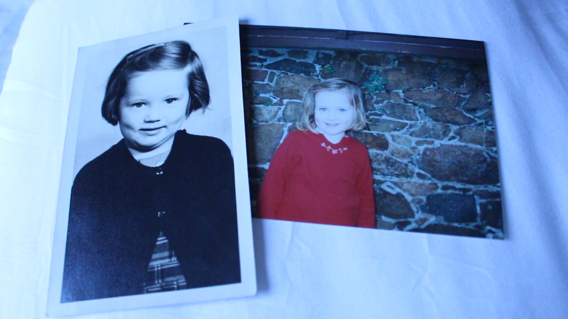
MVI_2556.00_02_00_01.Still022
clip from short film

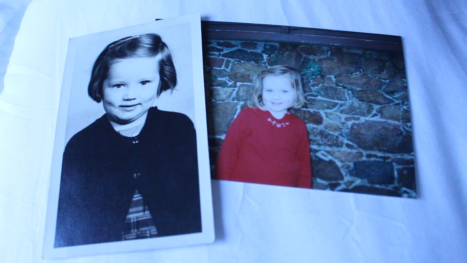
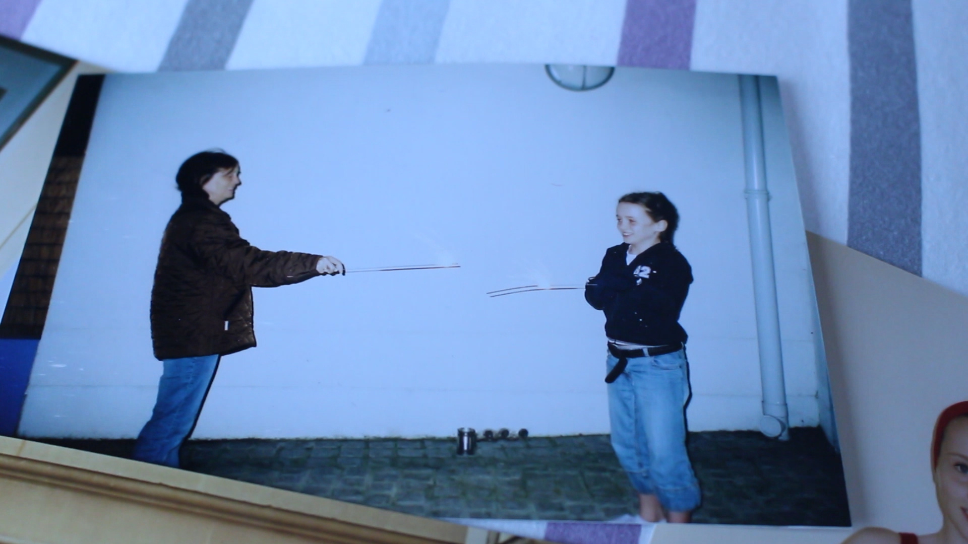
I love this still! This is an archive image that I decided to add into my project just to add more layers and to make it more personal for audience. The photo on the left is of my mother when she was younger and the one on the right is of me. I wanted to put the two next to one another as I find that we look so much alike in these images. I like this clip as it fits in to what my mum was talking about and the question I asked about how I was raised compared to how my mum was raised. I think that using archive images really helps with the development of my project and makes it more personal to me sharing old photographs of my childhood as well as looking more into the childhood of my mother. I this that the composition of this photograph is good as there is an even amount of space around the sides of the entire image and I also like how I have placed the images too. I wanted them to slightly overlap one another as I wanted the main elements of the images to be how similar I look to my mother when we were both younger. I chose to just put the images on a bed with a white cover as this is the room that my mum keeps the images, right next to her bed in a cupboard and in a small box. I think that this just makes it more authentic and adds yet another more personal layer to my project.

Image analysis 3
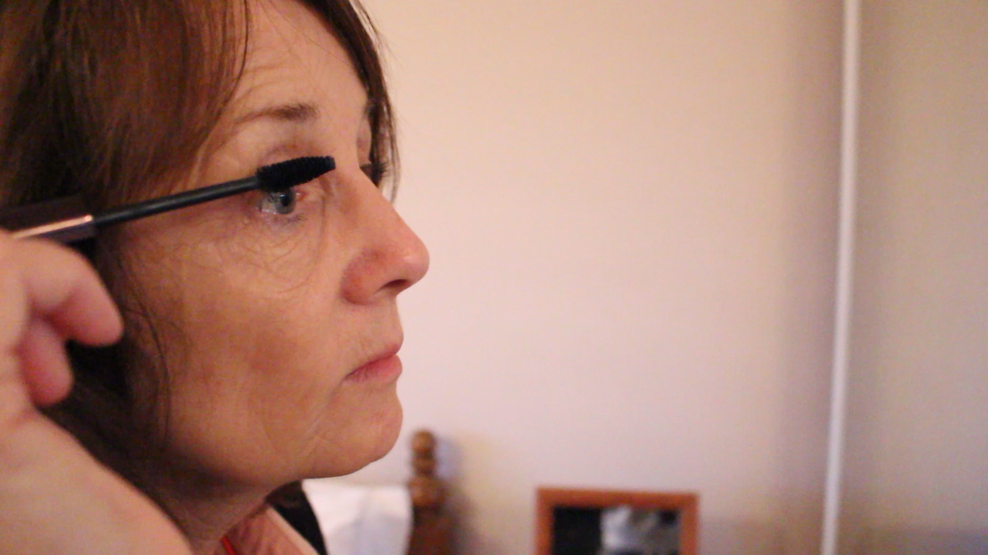
MVI_2556.00_03_13_01.Still025
clip from short film

This shot is from a mini sequence that I created of my mum getting ready for work. Here the audio is my mum explaining her job and how many females there are at her work. I didn’t want to film her at work as the whole thing about my project is her life at home and her role within the household. I wanted my mum to be putting on her makeup as she usually does as it shows the expectation put on women to be glamorous and to look feminine. I just thought that this would be a nice extension on showing what are expected of women within our society as being the homemaker as well as constantly being glamorous. This has helped me with the idea for my stills mimicking my mums role and creating a new persona that parody’s her role and the traditional expectation of the role of women in our society. I also think that this is a good shot and I like the composition of a close up of my mum on the left hand side of the clip while the right hand side shows the mirror she is looking into adding more context to the still. I really like this still as it is clear and interesting to look at and one of the rare shots showing my mum at a closer angle than I usually do. Within my short film I have mainly shot from afar and looking at my mum from a distance but this shot makes it more personal and shows the actual features of my mum’s face more up close.

Image analysis 4
MVI_2556.00_02_45_24.Still017
clip from short film

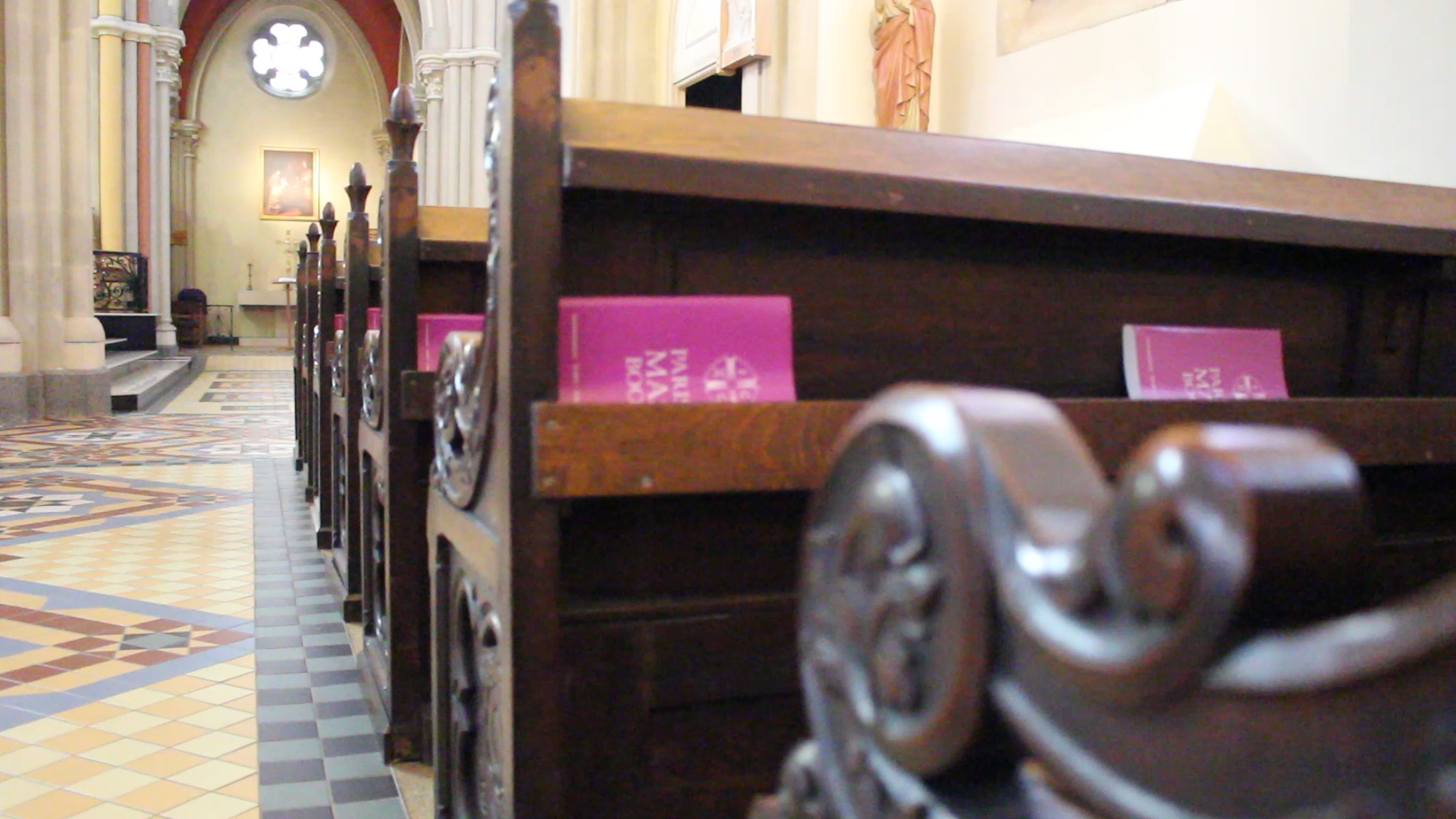
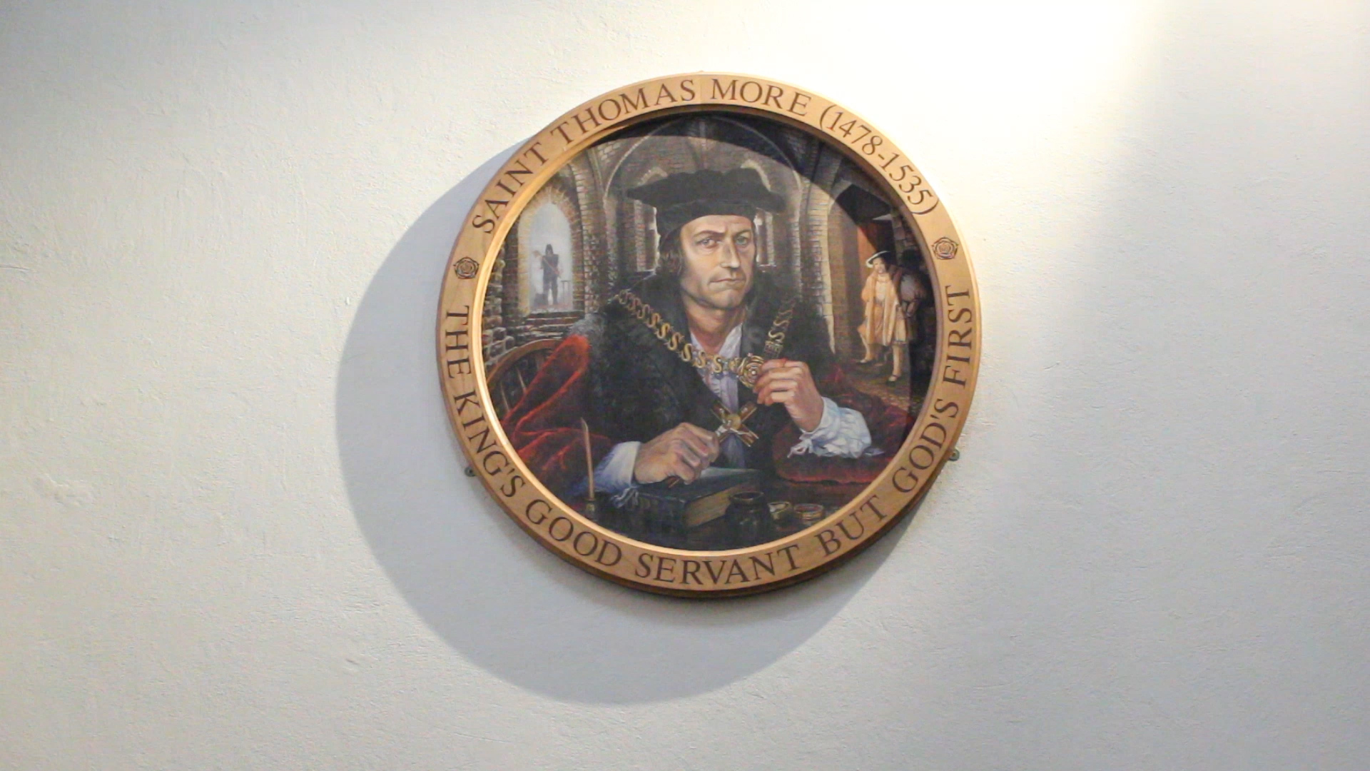
I decided to go down to St. Thomas’ church to get some footage around the building to go with the audio of my mum talking about her early life as a Catholic and her religion. I find that these shots bring to life what my mum is talking about and blends well with the whole film. I like this shot in particular as the painting in the frame is perfectly centered in the middle of the clip and I really like how the shadow falls as the light shines down on the painting. I also chose to film this particular painting because of the writing around it, ‘THE KING’S GOOD SERVANT BUT GOD’S FIRST’.  I find this really interesting as it shows how devoted people are to their religion and that they would first follow God over any ruler. I also wanted to add this in kind of as a symbol of how my mum doesn’t really practice Catholicism. I really like that the light is shining down on the painting as many people see God as a ray of light and his light will shine down on you. This just brings the still together and adds to how many people see religion.

Image analysis 5
MVI_2556.00_05_22_01.Still029
clip from short film

I added in archive images for my short film as it makes it a lot more personal and as I’m interviewing my mum I thought it would fit to share images of my early life and the life of my mum. I like the images that I have chosen as it shows happy moments in our lives and it matches with what my mum is talking about. It is also good for my spectator to see a little more of my life and my family and how I was brought up compared to how my mum had been brought up. I like adding in archive images as there is something quite unique about them, they are printed and show an older form of media which seems to be getting lost in the age of phones and storing images of computers.

Image analysis 6
MVI_2556.00_04_34_03.Still027
clip from short film

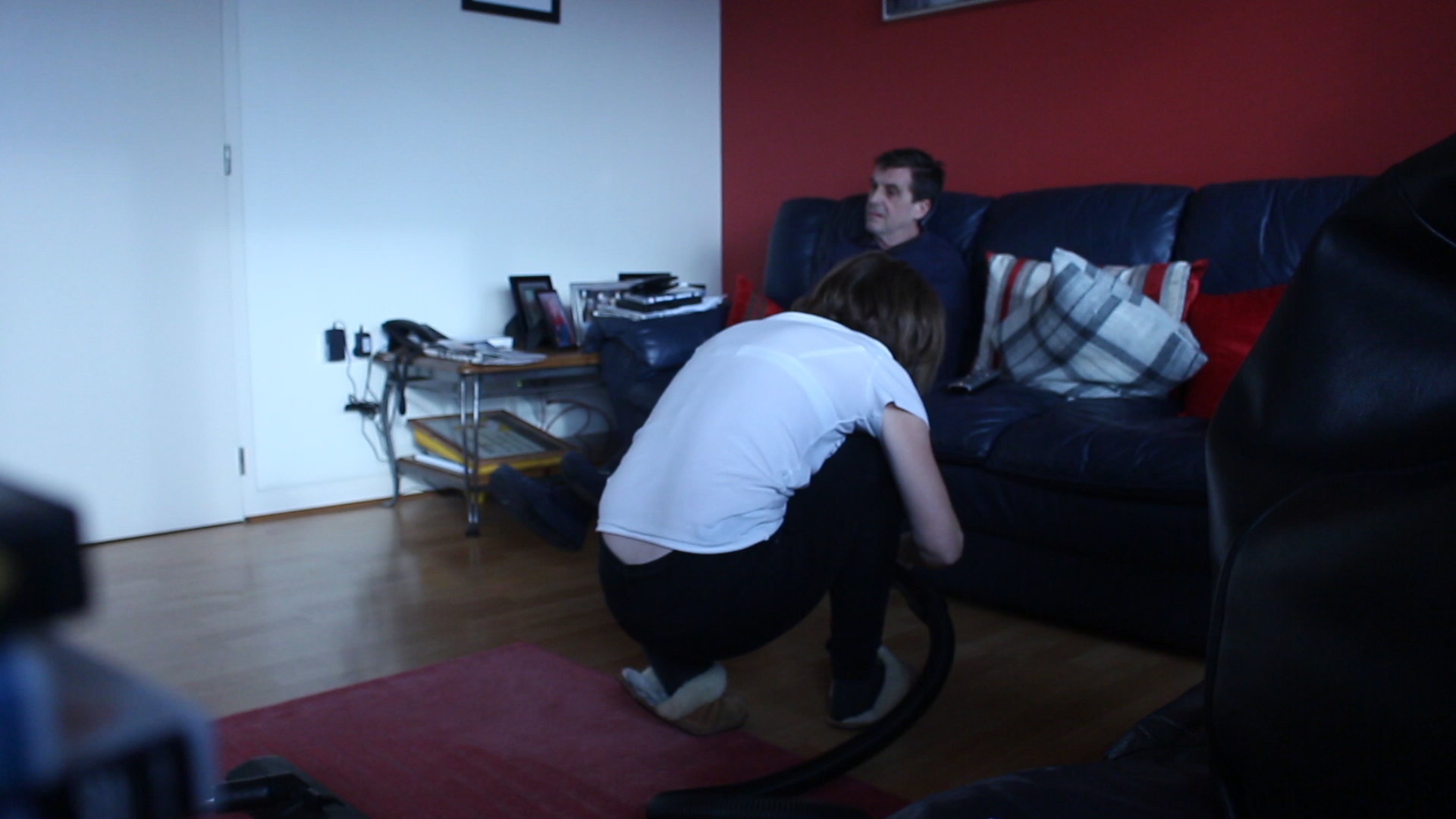
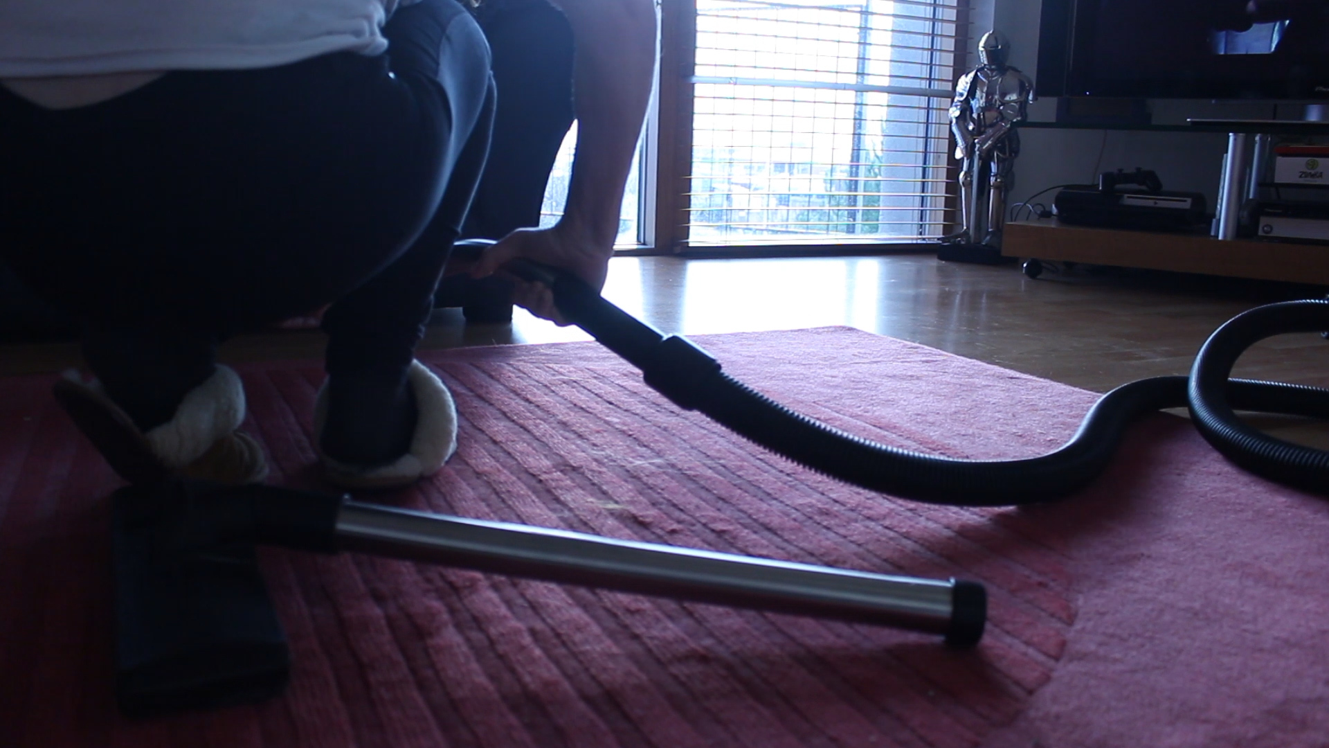
I really like this shot of my mum cleaning as you aren’t really able to see her too clearly but the focus is on what she is doing and her surroundings. I like that my mum’s face isn’t visible in the shot as it adds a sense of mystery and makes my audience want to see her face and to find out a little more about her. I like the harsh lighting in this image with it being quite dark and just a ray of natural light coming through the large windows. I think that this still adds to the story of how my mum is continuously cleaning up after everyone and is even getting down on her hands and knees to make sure the flat is looking how she wants it to look. This shot does work really well within my short film and adds to the little details of what my mum does and how she does it. This also gave me some inspiration for my photo shoot as she always seems to be in awkward positions to try and get everything clean and she seems to always be juggling so many jobs at one time. I wanted to exaggerate this in my own work and this image has really helped me to develop this idea further.

Extra Clips Used | Research

Here are the videos that I got snippets from for my short film to add more context to what my mum is saying and to also give my short film more layers and allow my audience to visually see what my mum may be talking about and expressing.

https://www.youtube.com/watch?v=zWsfNyBZebY

https://www.youtube.com/watch?v=OXeY344_sMI

Recording one- interviews

Recording three- interviews:

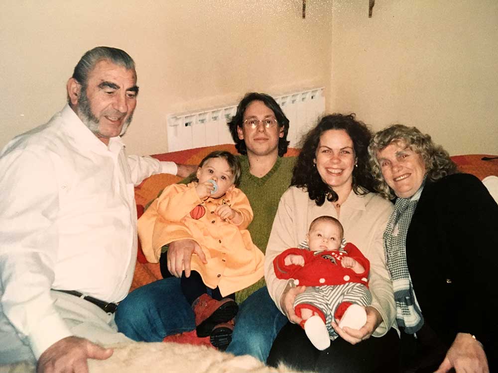
I have interviewed both my mother and grandmother in order to fully understand my grandfather’s life and the memories they have of him. I wanted to learn how my grandmother and grandfather met, the struggles of their divorce and how they managed to remain close friends years after. I also wanted to know what it was like to raise eight children and the type of life style they had. The more I find out about my grandfather the better I can produce images which truly symbolise him. Furthermore, when interviewing my mother I wanted to find out about the type of father daughter relationship they had. 

Interview one- Mary Robins

What reminds you of Richard Le Claire?

M- What reminds me of Richard Le Claire? My children, yes my children, er one in particular my second son looks a lot like him. Whenever I see him I remember, I remember when we were very young, we met when we’d play together, when I was about five and he was about twelve. That’s when I first met him, I didn’t see him for a few years and then I met him again and we use to all go out together, his sister Anne and Reg, they are both gone now. And we use to go sit on Howard Davis Park and have tea together, that reminds me of him.  He was a very very shy man, we use to go to the Dinner dances for the post office, it was my once a yearly outing. I use to dance but he didn’t dance. Sometimes after we had our meal and the dancing started he would disappear and go home. He didn’t like dancing but he didn’t mind me staying.
What sort of jobs did he have?

Well he worked for Horn Brothers for many many years but it wasn’t a very good paying job, and he was a carpenter and plasterer and it was hard work. Sometimes he would have to lose days because there wasn’t enough work for him to do, but then somebody offered him a job at the brewery. He loved the work at the brewery because it was inside and he made a lot of friends, and he worked there until he was retired.

Could you tell me a little bit about your wedding and your children?

My wedding, well we go married in the town church, I wore blue with a little hat. We lived together with the children, we were there until Robert, Richard and Jenny were born. It was quite an old house, the yard was pretty grim but we were very happy. But then we moved to Grassett Park when, I think I was pregnant with Michael, I had Andrew, Joy and Christine at Grassett Park.

Do you still have the wedding ring?

No, when we quarrelled he threw it away, which I was quite upset about really but we became very good friends after that we were only bad friends for a little while.

Do you miss him?  

Yeah I miss him, I was very upset when he died we had some good years together, we didn’t have a lot of money but we had fun. We made the best of what we had and we loved eacherother for a long time. I still think of him a lot and still love him.

Do you cherish the memories you had with him?

Yeah, I do, I do cherish the memories. I was very sorry he died when he did it was very sad.

Interview two- Christine Benning 

What reminds you of Richard Le Claire? For example, smells, colours, holidays etc. 

Do you miss him?

How did you deal with the grieving of your father?

Do you find comfort and happiness when looking at archive images of him? 

Influenced Photo Book Design Ideas

The Title – “The Creation of a Home” 

For my photo book study, I have decided to name the project ‘The Creation of a Home’, as I believe it fully addresses the key hypothesis’s of my project. ‘The Creation’ part, succumbs the development and construction of our new family lives and how as people we fit in to a certain place with our belongings and emotions. I also wanted to distinguish the difference between a ‘house’ and a ‘home’ as a ‘house’ can be defined as ” a building for human habitation”. This definition describes little life and personality, ‘human habitation’ vaguely suppresses the way humans act and become desirable to an environment – how they make it there own. A ‘home’ however, can be defined as: “the place where one lives permanently, especially as a member of a family or household”, or “the family or social unit occupying a permanent residence”. This sense of permanence allows the reader to understand the commitment and time taken to make a ‘house’ a ‘home’, as there is much more to a house than just walls and foundations.

Screen Shot 2016-02-25 at 10.26.11
Hard-Cover First Page

First Pages and Title Page 

For my beginning title pages, I have began trying to experiment with my archival material. As mentioned in my personal study,  Domingo, Costa and Dorley-Brown have all inspired me to incorporate archive material and mediums to create context and historical aspects, in order to relieve a sense of purpose and relationship with the reader. This beginning front cover allows the reader to get an idea, i like how the image I’ve chosen isn’t too clear, so the reader has time to picture what

Screen Shot 2016-02-25 at 10.59.11
The page before my main title page – I wanted to give the reader a flavour of what is to come by containing an image of the new home. I felt this cleverly contrasted with the main front cover as well as this incorporated the predominate theme of ‘old’ and ‘new’ and that there has been a development yet to be discovered.
Screen Shot 2016-02-25 at 10.59.17
Main Title Page – I chose this font and size I wanted it to be quite simple, like Rita’s “Where Mimosa Boom”, the style is quite classic and I wanted that feature to be replicated in my own study.

Pages and Page Layout

I have started to explore the different formations and sequences my pictures can fit into, to make it more interesting and easy for the reader to understand. This is all in awe of the techniques used by the three artists I studied closely in my Personal Study: Rita Puig-Serra Costa (“Where Mimosa Bloom”), Inaki Domingo (“Ser Sangre”) and Chris Dorley-Brown (“The Longest Way Round”).

Screen Shot 2016-02-25 at 10.47.27
My own archived image of my old house’s advertisement – this is what my parents viewed when wanting to buy the house before I was born. The next image on the following page shows an image captured by my dad once moved in. This sequencing I felt initiated the idea of how time has passed and a decision had been made, following the flowing theme of transgression and change in my overall project’s hypothesis.

Screen Shot 2016-02-25 at 10.55.38

For some images (as seen above), I’ve used a double page spread so that the image is divided. I feel this technique is very effective, I really like the way it allows both pages to be covered but with the idea of there being a border there too, it lets the reader stand back and see the whole image without becoming too involved. This was in the style of Domingo as his piece “Ser Sangre” consists of multiple full page spreads.

ID_REPROS_SERSANGRE_008

Screen Shot 2016-02-25 at 10.50.29
My portrait of close family member Paula, with an image of a landscape near to our new home.
Rita_PuigSerra_Dani_Pujalte10_670
Pictured above is Rita Puig-Serra Costa’s original image from her series photo-book “Where Mimosa Bloom”. As you can clearly see, I have manipulated her style by incorporating objects or landscapes connected with that person, as photographed next to it. I feel this style is really effective, and during my planning and development of my book I found this an easy way to address my notions within my hypothesis so that the reader can simply understand.

I have also included drawings and more personal mediums as included in Domingo’s work “Ser Sangre” to make the feeling of ‘family’ more of a reality. I feel this effect allows

Screen Shot 2016-02-25 at 11.36.07
An extract from “Ser Sangre” – Drawing
Screen Shot 2016-02-25 at 11.24.52
In my own photo book used drawings like Domingo to fit his style.

I have also used influence also from Chris Dorley-Brown’s: “The Longest Way Round” as his ongoing use of archival images of the War and Post War era are bounded together using his own photographs. During my internship at Jersey’s Photographic Archive, I came across similar styled images which show the history my new home.  Placing the images in a formation like a comparison on either side of the pages, I wanted to establish to the reader the themes of ‘old’, ‘new’, transgression and change.

Screen Shot 2016-02-25 at 11.41.14
Pictured left is my own archived image of the new house, with a contrasted image I took myself.
AB1249-The-Longest-Way-Round-2
Images from “The Longest Way Round” which shows the use of Dorley-Brown’s constant use of extracted archival material.

What type of book am I going to be using? (size / material/ etc. )

Size – Small Portrait (23×16.5 cm)

Paper Type – Matte paper

Recording five- memorable places

Recording five- memorable places:

IMG_0429 blog

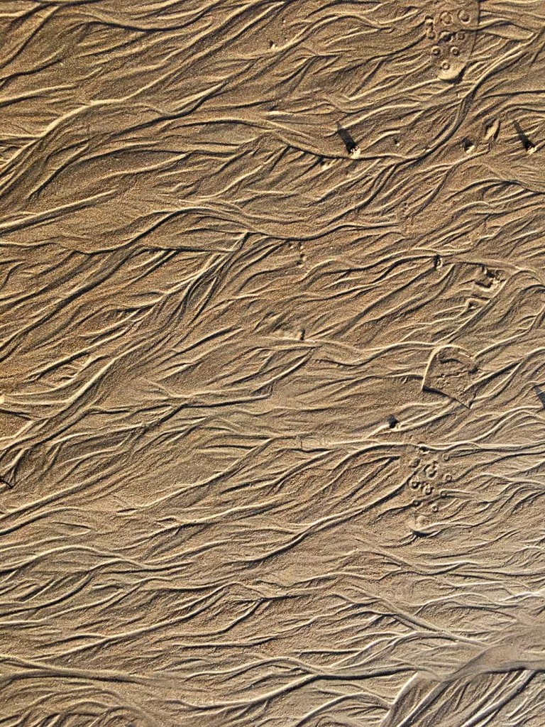
This is one of my favourite images I have produced from the setting shoots I have attempted. I wanted to include abstract images of places I remembered as being linked to my grandpa in some way. When I asked my mother and grandmother about areas in Jersey where they felt connections to my grandfather they both mentioned Green Island. However, this particularly photograph I think will be used in my personal section of the book. I think this is one of the places I find makes me feel closest to my grandfather. Memories are different for all individuals and they can be brought about by many various senses. My grandfather lived his entire life in Jersey therefore he always was near the sea and this is what always makes me think of beaches. Furthermore, when I was trying to interpret a way I could photograph the beach without it being another mundane typical image, I thought about the concept of abstract styles. Therefore, when I was down the beach I attempted lots of different angles, view points and patterns. However, this was the main photograph which I thought worked really well. I think the undefinable lines in the sand are ever changing and clearly represent the essence of life and the distinct nature of memory.

Recording four- archival images

Recording four- archival images:

IMG_0644 blog

IMG_0628 blog

blog

IMG_0623 blog

IMG_0649 blog

For my fourth shoot I wanted to try and be more creative with the way I presented the archival images. I think because there is such a range of photographs spanning over his life, I wanted to include lots therefore a interesting and beautiful way of composing a piece would be to create a collage. This piece can form one page of my final book, I want it to be colourful and full of life. The photographs I have chosen relate to a poignant moment in my grandfather’s life, whether that be his birthday, Christmas, the birth of one of his children or holidays. I also have included everyday photographs which hold no significant memory but show part of his daily life which, I think is very important. 

IMG_0814

IMG_0815

IMG_0832


Recording three- personal items:

Recording three- personal items:

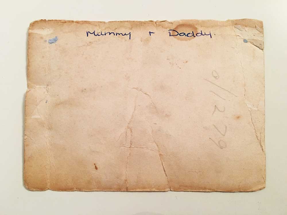
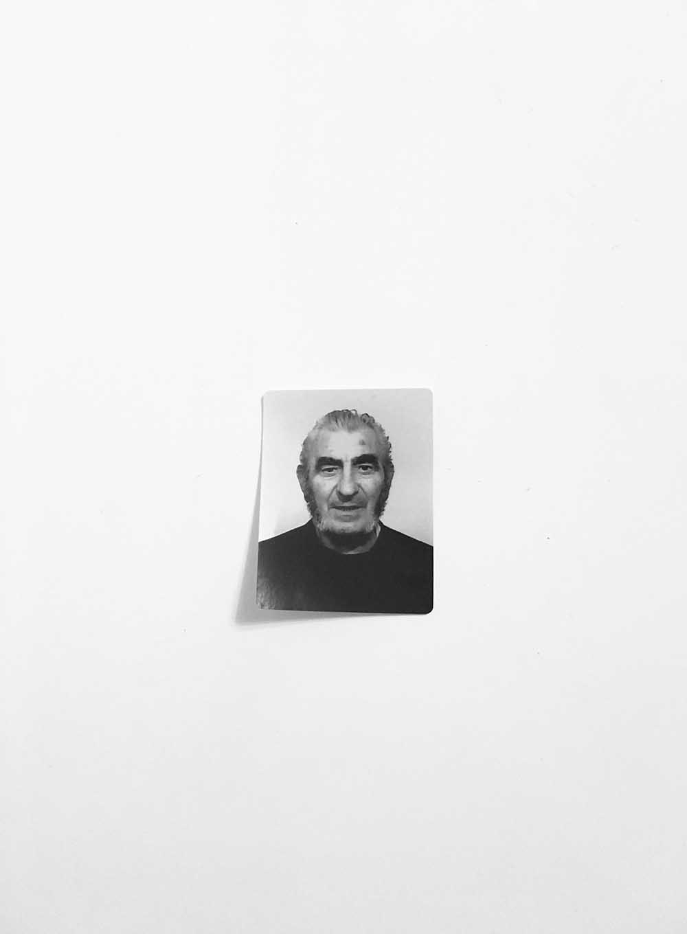
I carried on photographing the personal items I found of my grandfathers. I especially liked the images of the back of photographs, I think they reveal more about the photographs especially with the typography and dating. I also like the colour of the image, it looks very faded and vintage, there are visible rips and marks all over the back clearly demonstrating it is very old and has life in it so to speak. The following image is a passport photo of my grandfather that I found when clearing out old photographs. I wasn’t sure how to include it in the project but I wanted to because it represents his identity. I am interested in the purpose and function of the small image because it was used for years in order for him to travel, prove his identity and purchase products. It is powerful in its own right because it represents a life. Therefore, when I photographed the image I wanted for it to remain simple and effortless. I didn’t think there was a need for adding effects or having a background. 
IMG_0657 blog

IMG_0664 blogIMG_1187

IMG_0798


Main Influence: Rita Puig-Serra Costa

Rita Puig-Serra Costa is a spanish photographer who works in the publishing Terranova in Barcelona. After studying Humanities and an MA in Comparative Literature , she studied Graphic Design and Photography at IDEP in the CFD and Observatory .

Most memorably, her book ‘Where Mimosa Bloom’ deals with the grief she suffered following the death of her mother, Where Mimosa Bloom takes the form of an extended farewell letter; with photography skillfully used to present a visual eulogy or panegyric. This grief memoir about the loss of her mother is part meditative photo essay, part family biography and part personal message to her mother. These elements combine to form a fascinating and intriguing  discourse on love, loss and sorrow. Rita’s connections with her family reflect a deeply personal insight into the life of herself, her relatives and her beloved mother who it mirrored throughout her photo book.

Screen Shot 2016-01-17 at 21.46.33
The opening verse to ‘Where Mimosa Bloom’. This idea of a translated script of where Rita originates from indices a personal approach to her project. Her song words set the receiver up to her project. A verse of words at the beginning of my photo book may be a great start to creating a visual narrative, as the reader can follow on from where I left off. The set of images to the side mark the first sequence of media is that of Rita’s family tree, the three generations of her family to mark he change and transitions of death.

Rita’s Style 

Rita’s fundamental idea of taking a detailed, vivid portraits and placing it on one side of the page, to then mirror an object reflecting that persons character is idyllic, it reflects a clear idea of personality and connection, making the reader instantly catch on to her family traits and commodities. Using objects of memorabilia and substance tells an abstract narrative for the receiver, they are invited in to celebrate the fortunes of those related to Rita’s mother.

Rita_PuigSerra_Dani_Pujalte17_670

Rita_PuigSerra_Dani_Pujalte07_670-1

Rita_PuigSerra_Dani_Pujalte10_670

Rita_PuigSerra_Dani_Pujalte20_670

Rita_PuigSerra_Dani_Pujalte14_670

Here is a link to Costa’s online E-Book of ‘Where Mimosa Bloom’: http://www.phasesmag.com/rita-puig-serra-costa/where-mimosa-bloom/#s-12

An article from ‘photo-eye’ indicates that:

“There aren’t any words on the book’s cover, just a detail of a faded snapshot of Puig-Serra Costa as a girl in her family’s light-dappled garden. This could indicate that it’s a book of photographs, but its intimate size is more akin to a literary work.”

Here is the link to the photo-eye article: http://blog.photoeye.com/2015/02/book-review-where-mimosa-bloom.html

Daniel Smith, the reviewer,  continues to mention  how Costa’s work revolves concisely around the themes of ‘memory’ and ‘transition’, fitting in nicely with the themes of my project. Rita’s work is highly symbolic, the mention of the dried tree at the beginning of the book, a still life of a dried mimosa branch from the same tree does appear later in the book, an indication, like title itself, of the tree’s symbolism. Puig-Serra Costa combined these and other images with memorabilia to create a lyrical visual elegy to her mother, Yolanda Costa Rico (1959-2008).

Rita_PuigSerra_Dani_Pujalte09_670
Capturing most favoured items or objects is something Rita does to reminisce to times when her Mother was still there. Including items from the past and the present, signifies change but life without someone Rita cared for dearly. Bringing life back up and regurgitating memories allows the reader to connect heavily with her life beforehand, leaving only her mother absent. This, in effect, dictates a sense of transition and movement, certainly change thats happened for Rita and everyone thats featured in her photo-book. With my recreation, I wish to dictate the same sort of messages but with my project of moving house, I want to subvert mainstream expectations, but to capture things seen as ‘outside the box’ – things which wouldn’t usually be associated with moving house.

My Interpretation of Costa: 

IMG_0618

IMG_0575 

IMG_0627

IMG_0630

IMG_0649

IMG_0640

My Fashion Shoot: Duck Lips and Big Hips

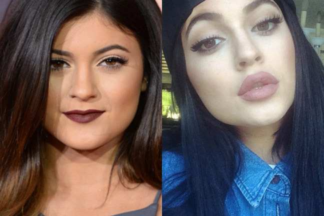
The idea of not being ‘perfect’ does stick in many young peoples heads and I find that young women often face such challenges of being beautiful and having an amazing body. I want my spectator to stop and think ‘whoah, what?’ and be intrigued enough to read on and want to find out more and more about what it means. I decided that this would be a good shoot as it shows the problems we have within our society and how judgmental we as a society and community really are. There is constant body shaming in magazines that people actually buy and young people will actually listen to and start to think that if they don’t look a certain way then they aren’t good enough. I think that this is important to focus on as we tend to overlook these kinds of things and never think about how damaging our comments on celebrities posts could actually be on young people, both boys and girls. I came up with the idea for this shoot when I saw a video about an 18 year old girl who got lip fillers and a nose job. I find that nowadays it’s almost common for a young girl to get work done because we as women never seem to feel good enough for anyone and the only way that we can improve ourselves is if we change ourselves and remold our natural look and beauty. I think that it is sad because young women so often feel insecure and as if things need to change and if we don’t look a certain way then we are not good enough and no one will ever love you which is untrue.
Linked to this I have taken inspiration from Cindy Sherman and will make a photograph of myself barefaced and then a photograph where I have ‘work done’ and so I will over draw my lips dramatically and somehow change my nose etc with a full face of makeup and changing my body too by adding pillows in certain areas. I think that this will be a fun shoot that will bring in more concepts to my main project of feminism and the rights and expectations of women. From this shoot I want to be able to add these images into my fashion magazine as one of the ad campaigns on one side will be the natural woman and in her natural form while on the other page next to it I will have an image of myself wearing a full face of makeup with overdrawn lips and everything will be exaggerated including my hips and breasts. I want this message to be clear and to the point so that my spectator can clearly see what the message is. I find that we live in a world where it is more acceptable to get plastic surgery than to actually embrace your natural beauty.

cindy sherman
Cindy Sherman inspiration [mini moodboard]
1418074163_kylie-jenner-lips-transformation-350
Kylie Jenner lip transformation [age 18]

My Response | Experimentation

duck lips

I like the images that I have chosen as my final ones and think that they work well. These images will work well in my magazine and I will be able to add advertisements next to the final chosen image so that it blends well with the magazine. I found this shoot really fun to do as it was something different and I was able to parody women who look this way and make a light-hearted joke at how they present themselves and what women that have gone through plastic surgery will often present themselves like. This will work well in the whole sarcastic aspect of my magazine and will really make each image look individual. The reason I wanted to add this in was because I find so many young women are bombarded with images of how they are expected to be and what they are expected to look like physically which is totally unfair and ultimately unrealistic as women are born with different body shapes and what looks good on one woman might not look the same on another, that is just part of who we are. It makes me sad to see young women getting lip fillers and boob implants because they are so insecure of how they look. I feel that as a society we focus way too much on feminine beauty and not enough on education, rights and the actual treatment of women. I wanted this shoot to be obviously staged and sarcastic to give my spectator a clear understanding of the message that I am trying to get across.