Category Archives: Record / Photoshoot

Filters

Author:
Category:

Blanket Series: Air

nmml

This is my first edit from the ‘air’ series. This was the picture that I took first. The zoom was larger and as I went on I decreased the zoom. The pictures from this experiment are quite different. We did about three different throws, therefore the results vary. Particularly in this one, the rule of thirds is quite good. The blanket intersects the lower horizontal line of the grid. This adds balance to the image, and directs me to look exactly at the blue blanket. Also the colour is important. The blue shaded windows in the background, balance the foreground to it. It almost reflects the colour.

Image7.jpg nkm

For my third picture, it shows a further away shot. There is a lot of depth and certainly a lot of distracting features. The angle upsets the symmetry, but this is what causes the composition to be very interesting and amazing.

DSC_0233 air kkk

I’ve edited this image to increase the contrasting colours. There wasn’t much vibrancy, so I also altered it. Moving onto the compositional elements, I think that this photograph has got a great rule of thirds. Since the blanket is intersecting one of the two vertical lines, the images has a sort of balance to it. The leading lines in the background are very distracting. The rectangle and square shapes on the buildings create a very abstract view. I think that the curled up blanket, that’s soaring mid-air adds an interesting component to it. The off-balance distracts me from the solid background and I think that the difference is perfect. Also, the angle at which is the picture was taking is also quite intriguing. I was standing at the bottom of the staircase, whilst pointing my camera lens upward. The way in which it was taken really changes my perspective and even makes the blanket look bigger than it really is. It’s hard to tell if the blanket is closer to the building or to the wall. This picture has great depth. The background, middle ground and foreground are all filled with objects, therefore it has a three dimensional effect. The layers in the scene draws me into the image.

This in all, creates a series, which shows the blanket being thrown. You can see where the blanket starts, higher up in the left hand corer of the staircase and where it ends up. The result of this performance was very effective in my view. At the end, the blanket goes over the top of the wall, which I managed to capture at the last minute.

Blanket series:

During our trip to France, we found a lost blue blanket on the ground. As an idea, we brought it around everywhere we went. We would place it on various objects and locations, as we saw them. I think that this documented a performance, as we showed the different settings we reached and incorporated the blanket into the journey. Below, is how it was originally found.

Image3.jpgfklm

Image2.jpg mf

On the next part we travelled down a small alleyway and decided to place it on this doorway. I took this in a front on angle. I think that the blanket disturbs the patterns and symmetry. In result, it creates a very interesting shot.

Image1.jpg blanket

I really like this image. This is because the rustic effect on the walls adds an antique aesthetic to it. The barrel in the background is also quite vintage. I like the contrast between the olden look and the newer aura transmitted from the blue blanket. It also appears quite unusual as it’s not normal to see a blanket perfectly tucked behind some signs. The depth of field is strong in my opinion. The elongated and narrowed view on the left hand side creates a lot of depth. There are so many leading lines. Most of my attention goes to the left hand side of the picture. I think it’s because of the direction of the vertical lines.

rtfghfgh

I edited the photograph above. I added a purple hue and decreased the vibrancy. For me, the only colours that are present are purple and the rest is in black and white.

Image8.jpg jl

Next, it was placed on a metal shape. The other one is visible on the right side. I like how it adapts to the rounded shape, and needs context to know what shape it actually is.

DSC_0211jhk

Then, we came upon this sign. The signs have been completely covered in graffiti and looks vandalised. I think there’s a great contrast between evil and good here. The signs are covered in dirt and are marked, whilst the blanket is clean and pure.

Image5.jpg nnk

 Lastly, we came across a construction site. The obstruction which was a hole was surrounded by a bright red gate and tape.

St. Malo Experiment:

DSC_0147 g

This is the sign that we put up. It was a little experiment that we did as a group to capture performances in different ways. The disposable camera was tied around a tree in the centre of the town and we put up a notice asking the locals to take a picture. It said “Bonjour! Nous sommes Jersey etudiants en photographie, et nous aimerions votre aide pour un projet. S’il vous plait pourriez-vous prendre une photo avec cet appareil? S’il vou plait ne pas supprimiere cette camera. Merci”. This translates into “Hello! We are Jersey students who are studying photography, and we’d like your help for a project. Please can you take a picture with this camera? Please don’t remove this camera. Thankyou”.

DSC_0181jjjjjj Image4 Image5 Image6

Outcomes part 2:

Image3

This is the first photograph of the sequence. It is simply a playground slide in the center of St. Malo’s walls. The camera was set up  on a plastic train, just a few meters away from the slide. This provided stability and made sure that the picture was always taken in a similar position.

Image1

For the second image, we can see a girl appear. She is attempting to go down the slide. I like the fact that she displays a child-like behavioral pattern. Her head intersects the top third line of the rule of thirds and creates a good point to attract us. Also there is quite a lot of depth as there is shadows and objects in the fore, middle and background.

Image2

Lastly, this is the third image. The girl is just about to get off the slide after completing a ride on the slide. I like this because it captures the ending part of her performance. It demonstrates the movements of her shadow when she starts to when she finishes.

St. Malo Outcomes

Tom Pope - Whatcha Peeping Tommy?
Tom Pope – Whatcha Peeping Tommy?

Above is a photograph from Tom Pope’s series entitled ‘Weak Anarchy’. Pope is hiding behind a tree. All that can be seen is a glimpse of his face and body, however it’s very blurred and he looks unidentifiable. The picture seems to have been taken during the night as there is a lot of bright white light reflecting from the leaves. Also, the light looks artificial. There are many leading lines which are very opposite to each other. First of all, the bricks are horizontal and therefore my attention goes to the edges of the photograph. The leaves from the tree are pointed in all directions and direct me to look further up. Since the brightest place of the image is Pope’s head, that’s the first place that I’m drawn to.

For my response, I’ve emulated his picture in a very similar manner. Whilst in France, my group and I, spontaneously decided to recreate this image. A girl can be seen hiding behind a large tree. Amazingly, there was also a high wall under the girl, which was very similar to Pope’s one. In my responses I have edited by doing several processes and have kept one in colour and one in black and white.

tree

Above, is my first response to Tom’s Weak Anarchy image. I did some general edits to brighten and saturate it. I think that it has a very interesting rule of thirds. The shrubbery leaves the whole bottom third of the picture clear and occupies the top. Much like in his picture, my one exhibits very strong and bright sections of white light. The natural sunlight shining on the green leaves draw my eyes to those places and I think it adds intrigue to the photograph.

bw dd

As my second response, I have shown a very similar outcome. This one, however I cropped this one in a farther away fashion, to show the whole environment around it. I made this one black and white to vary my edits. I think it brings out the shadows better and shows the highlights and contrasts more clearly. At first it’s hard to spot the person, which is why I believe it’s more interesting to look at. I like how the spaces in the tree’s create pockets of light on the floor. It almost looks like fallen blossom. The rule of thirds is quite unbalanced. This is because the main focus isn’t placed on the key lines of the rule of thirds. Therefore this is even more interesting and for me, the ambiguity of not fitting into the perfect grids, is great.

John Baldessari Responses: Spots

DSC_0086

Above is a photograph that i took whilst i was in Portugal. It shows a young man, alongside his grandma and a middle-aged woman. The old woman, who lives in a small shed has a very intriguing habitat. The poorly clothed, but richly wise lady is sitting the single wooden bench which she has outside. She is holding onto some wooden sticks which are used as walking sticks. In all, this photograph portrays a lot of meaning and has a vintage effect to it. I only placed a dot onto the boy’s face because he was smiling whilst showing his teeth. This displays less of his raw emotions. Also, i wanted it to be mysterious.

edit 21a

Again, in the same location but further down, I found these sheds. Since Baldessari’s work includes portraiture and uses other people, i decided this one of a man would work well. The rustic and hand-built sheds add a country feel to this photograph. I used a white dot again to simply cover his face and hide his facial expression. All that can be seen is his head shape and hairline, whilst leaving the most important features to the imagination.

dm

This is the last picture that i have included from my trip to Portugal. I found that there was a very weird but interesting compositions in this one. Particularly because the dogs are on the edges of the photograph. They almost go out of the shot. I think that the depth is very good here because of the sizes of the dogs. In reality they’re very similar in size, however the way that they are positioned, one looks larger than the other. Thee one on the right is closer to the stone wall, and the black and gold one is more in the center. I covered both of these dogs faces to emulate Baldessari’s work.

Image8


Above, is a picture which i took in France. Within it, there are five students from my photography class, which chose to disturb the normal conventions of society with a performance. They laid out a towel and crossed their legs. They then started to meditate. I like how the people in background seem astounded and astonished. I blocked out everyone’s faces to keep the theme of secrecy and disguise going through.

Bruce Nauman and Response:

Above is a YouTube link to Bruce Nauman’s piece of work. During this video, he applies gold make-up to his face and body. It was created in 1967. The 11 minute long video is very simple, yet the process in which he applies the product is quite interesting.

Bruce Nauman is greatly associated which performance photography and that’s exactly why I chose him as a reference. Also his ideas are simples, but efficient in conveying meaning. He would often record or shoot himself doing particular, repetitive things. His work was inspired by many movements such as Post-Minimalism, Conceptualism, Minimalism, performance art, and video art.

Bruce Nauman - A Rose Has No Teeth.
Bruce Nauman – A Rose Has No Teeth.

I have gotten my inspiration from the piece of performance photography he created above. He is simply pulling at his face and creating wrinkles and bulging in the skin.

For my study I’ll incorporate some makeup just like Nauman uses and show the different stages of which I cover my face with it. I will also only shoot in a close-up range, making sure that I don’t smile, so that my expressions are raw.

This is my response to Bruce Nauman. I shot various straight- on self-portraits in which I included the process in which I applied golden liner. Much like his performance in the ‘make-up’ video, I’ve used a similar concept of ‘covering my face’, however I captured my moments with still images. I’ve tried 3 different looks, here are the results of my first experiment:

g2       g3

g4       g5

Second experiment: For this one I used a pink lipstick and started off by only placing it on my lips. Then I began to smear it on my face as if I was trying to disguise my face.

p1       p3

p4       p5

p6       p9

p10       p7

Third experiment: Using a red liner I created scratch marks and lines on my face. Again they would get more detailed by time.

r1       r2

r3       r4

Croatia

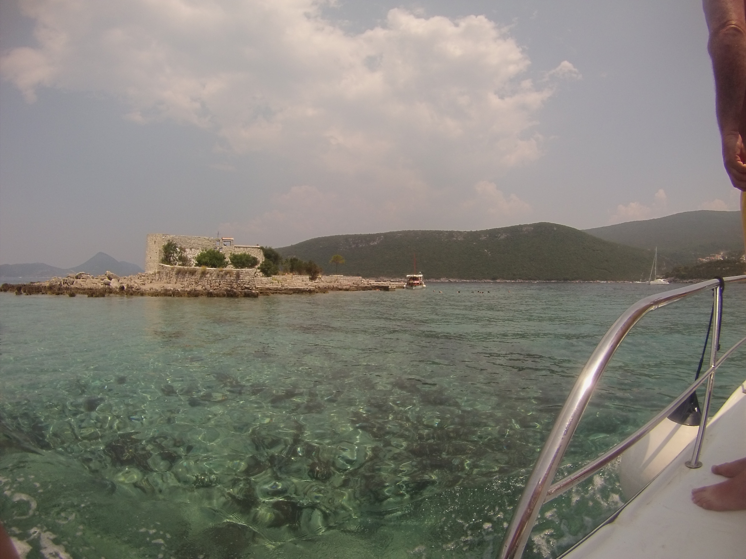
For the last 10 days, I visited Croatia, in Dubrovnik for a family holiday and wanted to present some photographs I took of the beautiful country and explain some of the history behind some of the architect. I took most of the photographs on my iPhone, so the quality of the photographs aren’t to a very high standard if I wanted to print them out. I also took some photographs on my GoPro Hero 3  which give the photographs more of a fish eye effect to them.

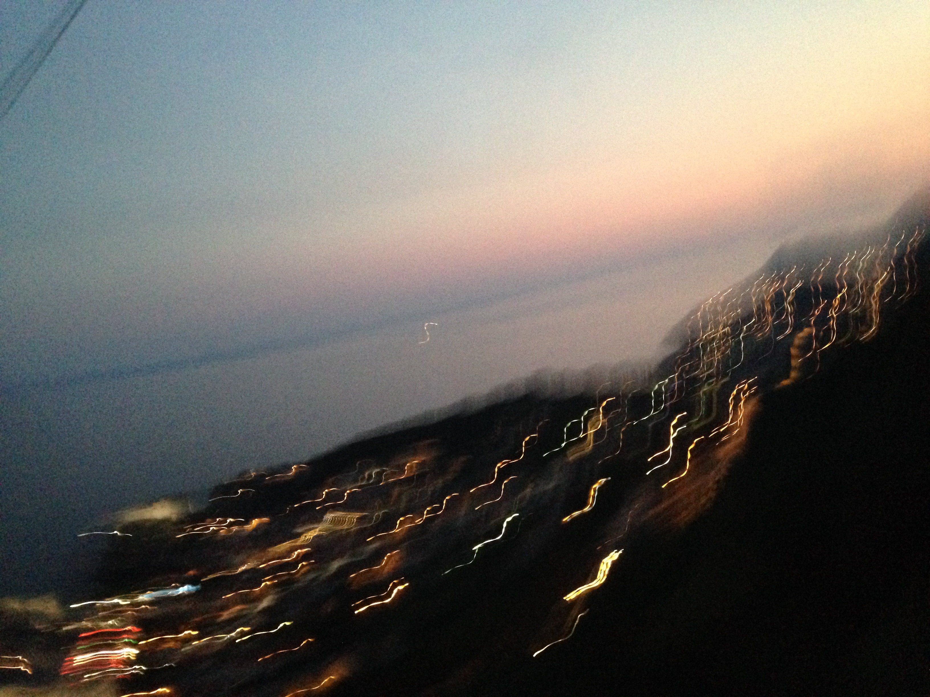
We went up on the cable car in Dubrovnik to get a greater view of the old city. This blurred photograph happens to be one of my favourite just because the colours running through the photographs are beautiful and the streams of lights shows the direction of travel with the camera as i was trying to achieve movement in the photograph.

IMG_4469

IMG_4500
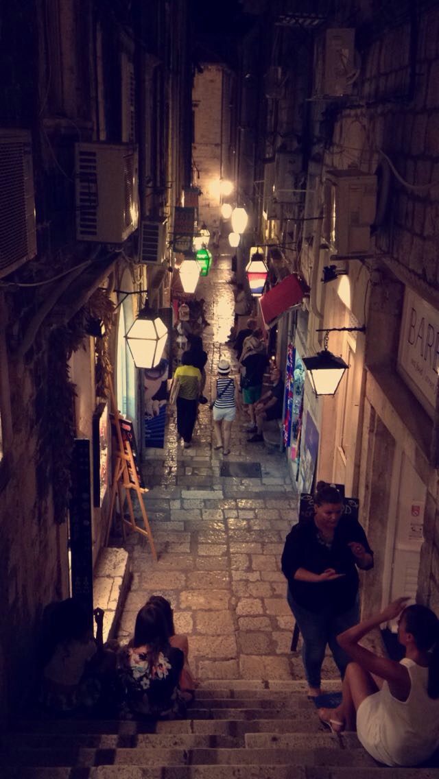
Walking down the stairs to the main street of the old city of Dubrovnik

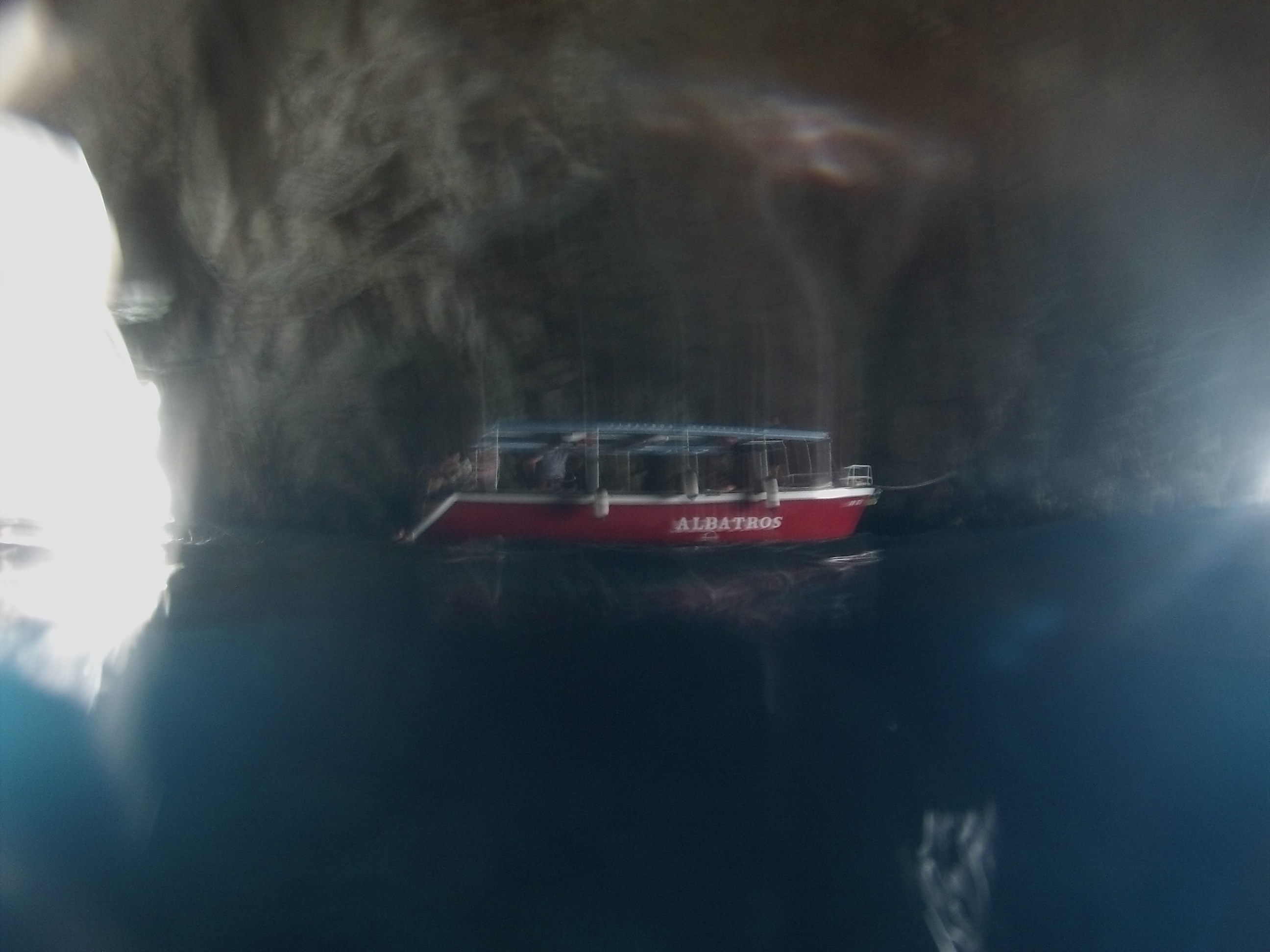
This photograph was taken in the ‘blue cave’ it is called that because the water was such a vibrant blue and it was so clear, I got the chance to swim in it. So I used the GoPro to get a picture of this boat in the cave by putting it half way between the water and the surface to get the boat and underneath the boat. Unfortunately it came out blurry but I like how you can still notice how blue the water is. This was on our way to Montenegro.

DCIM100GOPRO
DCIM100GOPRO
DCIM100GOPRO
DCIM100GOPRO


My final outcomes

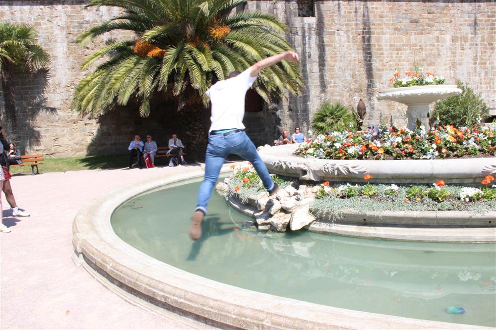
ContactSheet-001These are my final out comes for Chance Change and Challenge, I choose to present the same performance in both stills and as a video because I think the video incorporates the audience more as you can see their reactions as they look at whats going on in disgust while others just choose to ignore what we were doing. With the stills you can only see moments of the performance which makes it more interring and makes you wonder what happened next. I also think that the stills look more appealing to the eye. I think that this performance fits in well with our project title and with Tom Pope’s work because it challenges what is and isn’t acceptable in society by behaving in a way which isn’t deemed to be appropriate in public spaces. I think this links back to my initial research about the Situationists and Space Hijackers and the idea of reclaiming public spaces, the water fountain was in a public area and I think we were pushing the idea of  “who said we can only look but not touch the monuments”.  Overall I am happy with how my final outcomes turned out.

Photoshoots

IMG_9956 (Custom)

This was one of the first photoshoots we did in St. Malo , however it was unplanned we came across this water fountain while we were deriving. I like this photoshoot because I think It fit’s in well the concept of pushing the boundaries of what is and isn’t accepted in society. There was a few spectators sitting on the benches behind the fountain it was interesting to see their reaction, some of them stared in disgust while others choose to ignore it.

IMG_9975 (Custom)

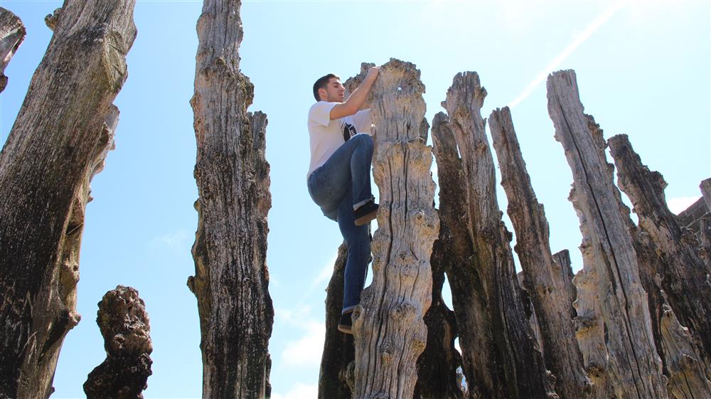
This was the second photoshoot we did, while deriving. The concept behind this idea is similar to the first one as these ‘trunks’ were put there to be looked at and not to be climbed almost as a type of monument. However I don’t think this idea worked as well as the first one because there wasn’t many people on the beach therefore we weren’t able to get an audience reaction or participation.

IMG_0007 (Custom)

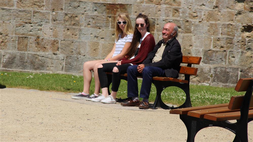
For this photoshoot, the girls sat down next to the man on the bench and copied his movements although this photoshoot wasn’t pushing any boundaries I think it was a brave thing to do and isn’t in the norms of what society would expect you to do in public especially with a stranger.  It was also interesting to see his reaction, I think he was embarrassed at the beginning but then understood what was going on and found it quite amusing.

IMG_0107 (Custom)

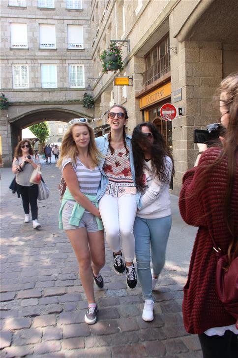
When we were with Tom Pope we came up with the idea of carrying Holly around in a populated area. I think that this was a good idea however it was hard to keep a straight face and not laugh which at times made it look like we were just messing around between friends. There was also no participation from the audience which Tom Pope likes to incorporate into his work, it was more of an ‘closed’ photoshoot.

IMG_0051 (Custom)

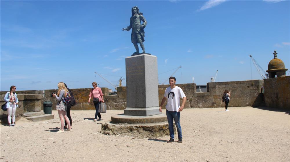
For this photoshoot we took it in turns to wonder up to the statue and copy the position in which the statue was standing we made a video out of this however this is just a snapshoot. In the video we were able to capture the audience walking by and looking at what we were doing. However I don’t think that this photoshoot was pushing the boundries very far and therefore we didn’t get a big reaction out of the public.