Here is a link to my final book design.
http://www.blurb.co.uk/bookstore/invited/6217410/78391bdcd04f14c765ed6231fdc67f4846be4f6a
Here is a link to my final book design.
http://www.blurb.co.uk/bookstore/invited/6217410/78391bdcd04f14c765ed6231fdc67f4846be4f6a
I have completed my phonebook based upon my dad, the Butler of Government House in a way that portrays both my dads and the rest of the staff’s involvement within the House. As my topic was quite unique, it has enabled me to get the audiences attention by using pictures that are not seen by the public eye, and incorporating them within the book. Such as, pictures of the Lieutenant Governor in his dress down clothes, reading a newspaper chilling. As this topic is quite top secret, it was hard for me to get all the images I was hoping for but as a final result, I am happy with how my book turned out.
Here is a link to my book on blurb: http://www.blurb.com/bookstore/invited/6234286/464aa7d7783c1979303dccb00945483a0c46e8fe
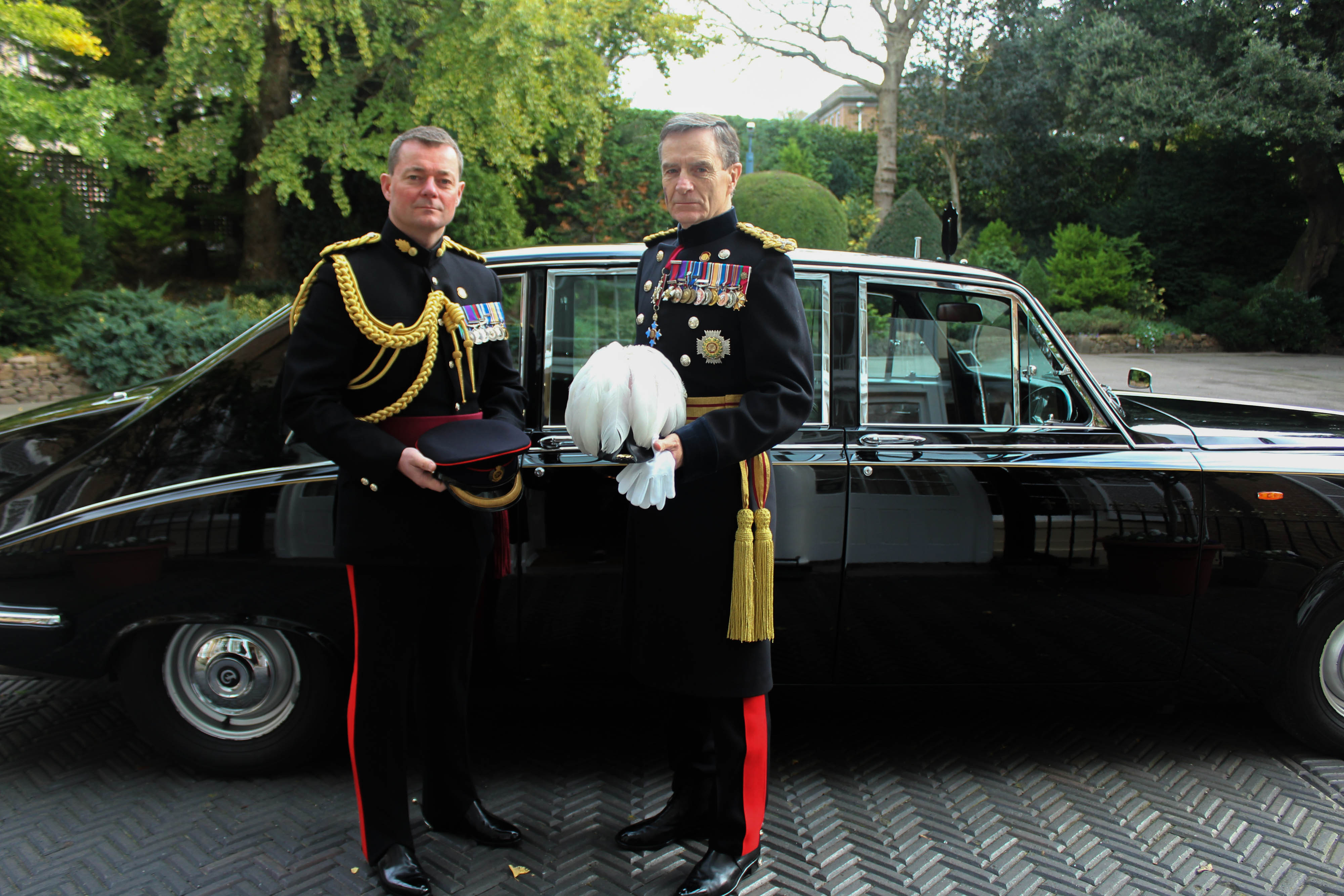
Front Cover -I chose this as my front cover because I thought it needed a powerful image in order to exert power over the book, as the topic is important. I chose not to put the Butler on the front cover becauseI think a powerful picture of the Governor and his Chief of Staff would set the scene into what the life at Government House is like and the demands my Dad, the Butler has to work under.
Back Cover – I chose this as my back cover because I wanted to incorporate both archive images with similar images that I had taken at Government House and present them in a way that tells a story. I like this image as it is similar to the front cover with regards to the car and how its just outside the house. This archive image is from the German occupation so it is interesting to see the contrast from back Government House was occupied by the Germans.

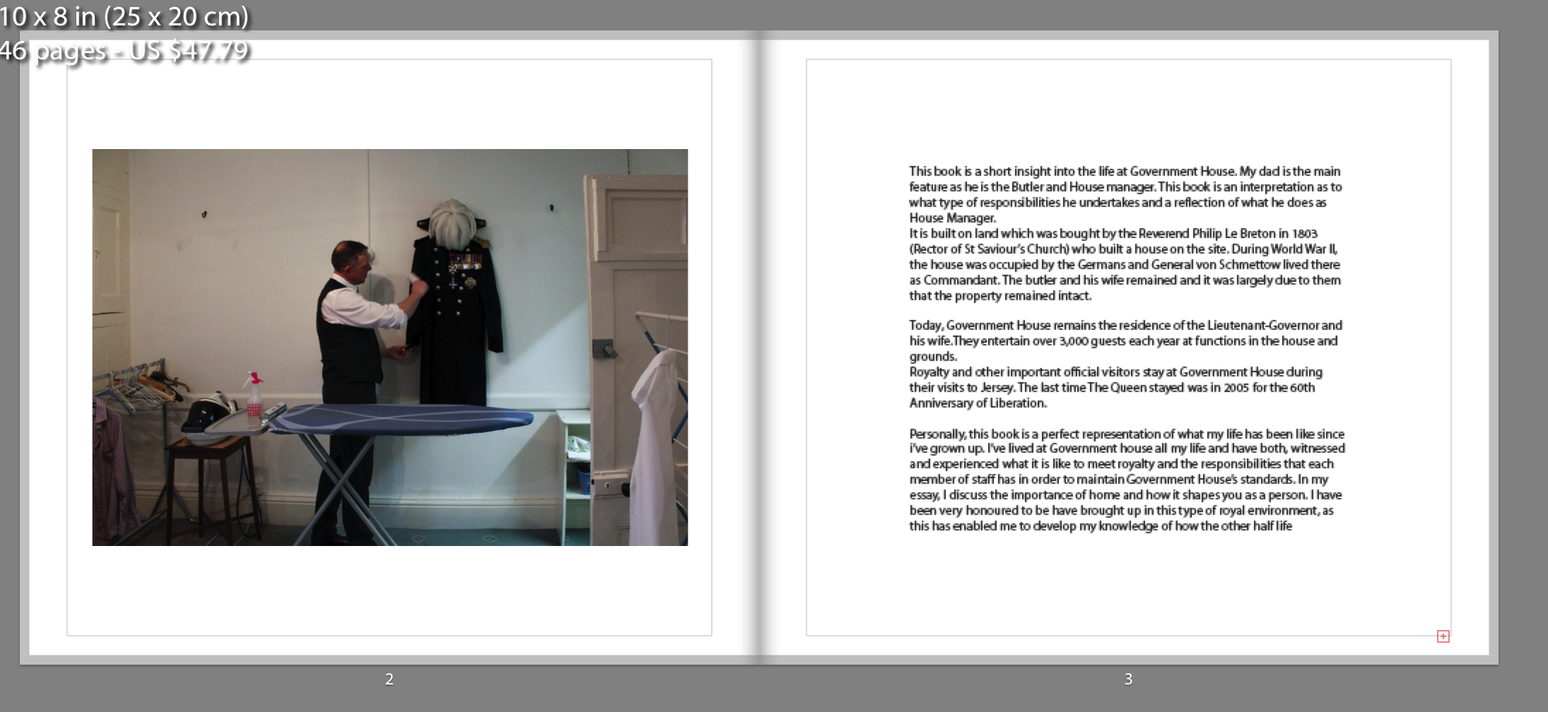
Page 1 – I wanted to make the front page a true representation of what the book is going to be by putting my Dad on the first page with him cleaning the Governors uniform. This is followed by a short passage of what the book initials and why I chose this topic.

This image is a representation of the ‘upstairs-downstairs’ lifestyle. This image is my Dad, the Butler, going upstairs from the workers floor to the upstairs where the he attends the Governor and his wife.


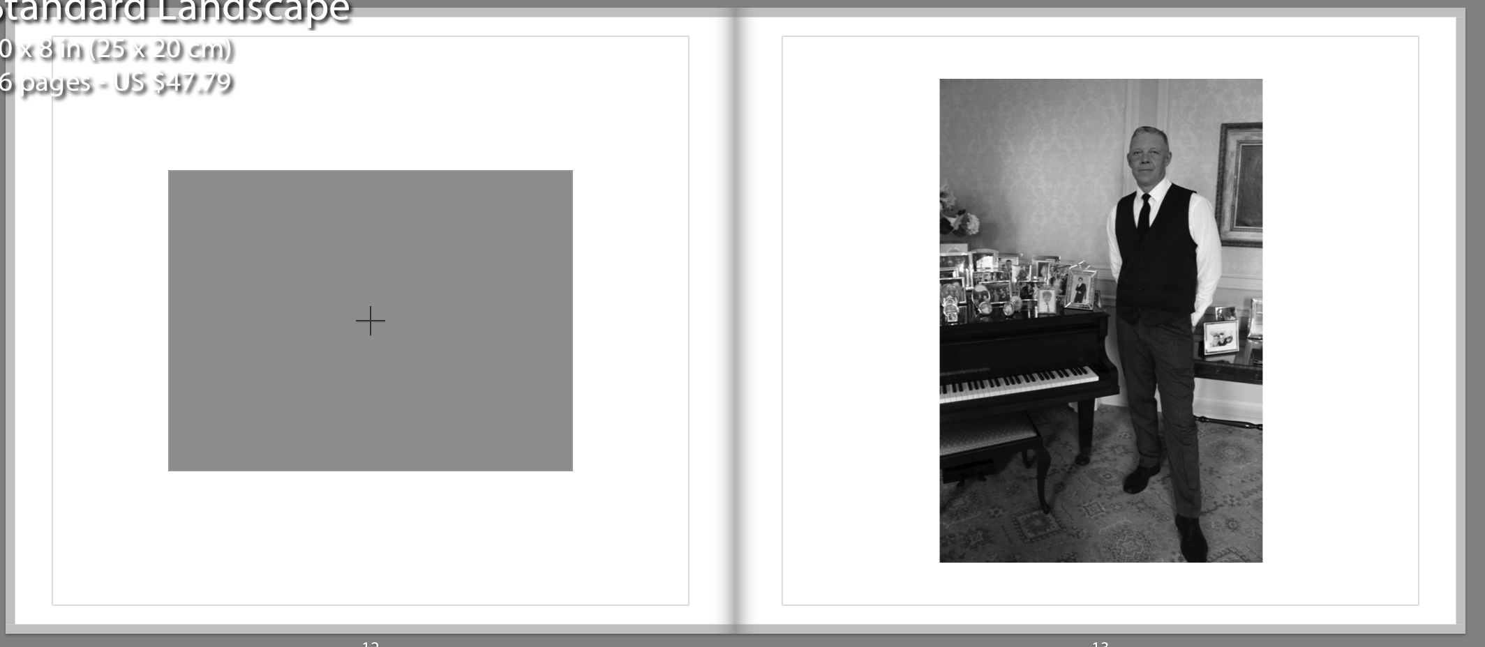


This is my favourite image as I like how the contrast is visible from when my dad was young to his age now. This photograph was from about 10 years ago and I think its a key image as it has the Queen in it and shows the types of royalty that he meets and serves.

My essay contains a comparison between Pieter Hugo and Phillip Ebeling and their interpretation of home. I include both my ideas and what I think about their books, and then explain as to why I was interested in them and how they relate to my project. My project incorporates with the aspect of home as Government House is where I live because of my Dad’s job. I chose this because I wanted to have a more unique project that isn’t so visible to the public eye.


The Americans, Robert Frank
This photo has been considered one of the most influential photo books that have given inspiration to many new photographers starting out. This was produced with the help of a scholarship that allowed Frank to go on road trips across America, this was during a two year period. Frank was trying to portray American society in the post-war period. This photo book has contributed to a new style and subjective approach to documentary photography.
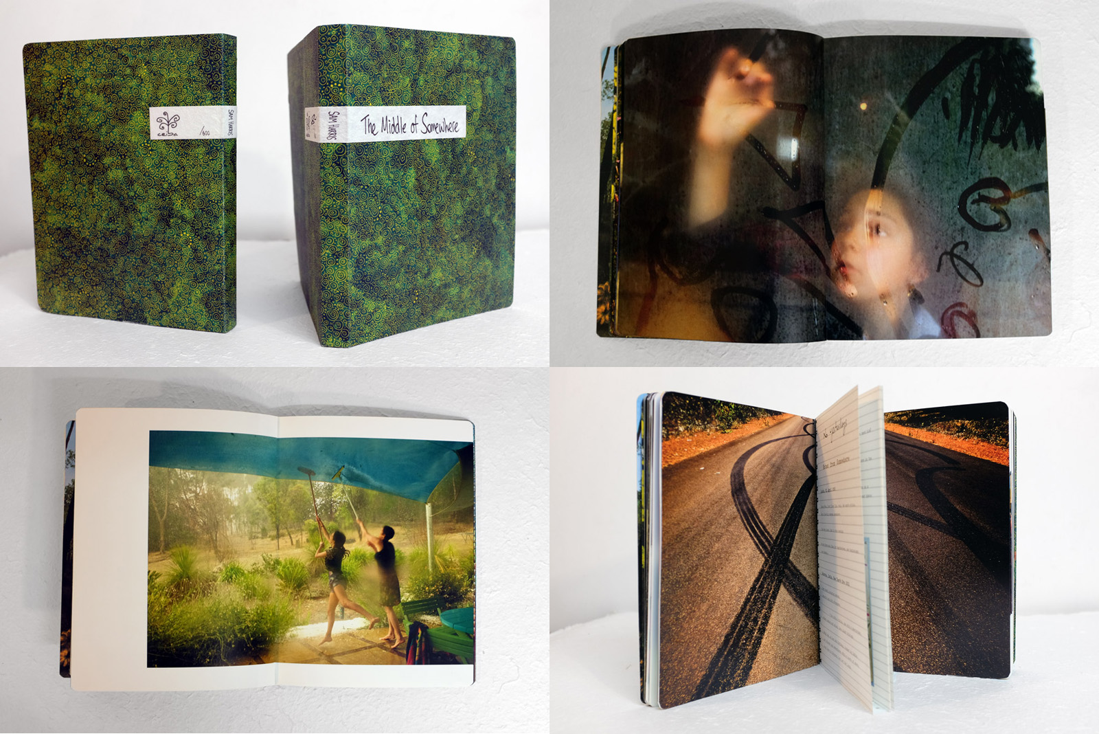
Sam Harris is an Australian photographer and educator. He self taught himself photography while he was a teenager, he turned his bedroom in London into a DIY makeshift darkroom. Harris has worked as an editorial photographer for places such as The Sunday Time and Esquire but also throught the 90’s he photographers portraits and sleeve art for numerous recording artists. While Harris’ career started in London in 1990 photographing editorial portraits and sleeve art his career changed into one of London’s leading young editorial portrait. Sam decided to abandon his career and changed it so that he could have more quality family time, in this time he turned his camera onto himself to photograph his own life. Harris’ lives his life with his two young daughters and his wife where he goes between India and Australia, which he setteled down in the forest of Southwestern Australia, Harris still continues to photography his on-going family dairy and he also runs workshops.
This photobook by Sam Harris gave me inspiration for my photobook in the different aspects of it and how i would like to lay out my images. This photo book communicates this narrative through different images of Sam Harris’ family while they are in the South West corner of Western Australia. This photobook is considered the next chapter in Harris’ on-going family dairy. It follows on from Harris’ other work called ‘Postcards from Home, made in 2008-2011, and is made around Harris’ two daughters Uma and Yali growing up, in a remote part of the world. In this photobook is has different aspects including some of the images are full blead on the pages and others have space which creates a boarder around the images to frame them. I think that this photobook displays the subject-matter of the two children growing up in Australia through the different note-pad like add ins in the photobook to make it seem like a journal. This creates almost a journal for the family in which they can look back on of their children growing up in Australia. The different text which is in the images in incorperated into the images by having other stick ins which are placed on top of the image, these are not fully stuck onto the page which makes the photobook a more realistic journal. This photobook portrays Sam Harris’ children growing up and i think that this is really interesting to see the two children growing up in Australia. This photobook also uses the journal like pages throughout the book of their family holidays and also writing which Sam Harris has wrote in different things that have happened throughout the years of making this photobook.

This photobook is a portrait photo book which is of A5 size, it is layed out like a journal which focuses on Sam Harris’ two daughters growing up, the images are mostly placed full blead onto the pages, this means that they are fully to the edges of the photobook and by doing this the photographer looses to corner of the images, however some photographers do this because it brings you closer into the image and makes you look at the different aspects of the image, rather than framing the images. However, some of these photographs in the photobook have space to frame the image usually on the top and bottom or placed in the middle, however the other parts of the image are also full blead to the edges. This is broken up occasionally by one large image on the page which fills three quarters of the page and leaves some white space on the page to frame the image, this brakes up the photobook and makes it more interesting to look at, and creates a more exciting photobook to flick through. Sam Harris’ images go across the gutter which can be said to loose part of the image as you cannot always see what is going on in a picture. Harris also does this when he has two images on a double page spread where he makes both of the images go across the gutter which creates an almost panoramic look to the images and makes you look from the image which is placed onto the left and then onto the right, almost creating like it is one single image. The relationship between the images on the different pages are linked together through a relationship of something that is similar in the images, for example one is taken of the Sam Harris and his wife looking at the stars in the sky and then the next image is of a room which has disco ball lighting on the ceiling, and this is how Harris changes between his images, through a mutual relationship between the two images. I think that all of the images that have been used are images that Sam Harris has taken over the years documenting his two daughters growing up, and there are no archival images that have been used, however there has been found material, as there are little sticky notes that his daughters have placed around and Harris has picked these up and placed them into his photo book, i think that this adds to the idea of this being a family journal. These pieces of sticky notes and journal like pages in Harris’ photo book add value to the story being told, as it adds a personal touch from his daughters which makes this a genuine family archisle.
When looking at the book title, ‘The Middle of Somewhere’ i think that this implies how these images have been taken in between two different places in the journey and the image have been taken from places in between and in India and Australia. On the first page of the photo book their is a small poem, by W.H. Davies, Leisure, 1911, this poem is about life and how time passes by fast and i think this represents how Harris’ daughters are growing up fast before his eyes and these image show their childhood years. In the journey like pages, ‘no yesterdays, Notes from Somewhere’ this is showing all of the places that they traveled around showing their journey through the years, remembering the places they visited. This is also present in the other journal like pages in Harris photo book ‘Travelogue’ which shows them in India – Australia between 2002-2006, i think this is so that it is separate from the rest of the story as this was a break from their usual life, in this there are images of their holiday but also includes the mother giving birth to one of the daughters. There are no captions on any of the images, i think this is so that the images are looked at as a whole and the writing which would be placed with the image would distract from the images. In the back on the book there is a page which says ‘Many Thanks’ this is where Harris says thank you to everyone involved in the process and there is a picture of the family in the bed, this image is not stuck to the page


Photo Book | My Thoughts
I decided this week that I was going to make a photo book for my project as I have made some staged images and think that this will work really well with the short film that I created of my mum. I want it to look as professional as possible and for my work to stand out. I do not want to add the essay to the end of my photo book as for me it takes away from the images. I don’t want to have other photographers work in my own photo book as I want to exhibit my own work and to show my stylistic approach rather than evaluating someone else’s. I do have my essay on the blog and think that looks good enough. Editing together the photo book is going well and I am also adding in some quotes from my essay to bring more context to the photo book. I think that this is the best way to include my essay and is more original and interesting for my spectator rather than having to go through a huge chunk of text. I like to make my own quotes that hold impact and think that these look a lot better than an essay would and really embody the whole message that I want to get across in my images. I have really enjoyed making a photo book and think that it looks really great and professional as it all comes together.
Layout Idea | 1
This first idea consists of black and white staged images as well as images in colour that are of objects. I wanted to have some double page spreads as I really like the way it looks as well as a mix of colour and black and white. I like this idea but I am unsure whether or not it takes a bit away from the black and white images as they are supposed to be my main focal point. I have just been experimenting around with different layouts and am trying to find what looks best for my work. I don’t think that I will be using this for my final book as it isn’t strong enough and doesn’t look as professional as I would like it to look. This mainly just helped me get into Lightroom and how to move photos around and how to use the editing software to create the book. I feel that this design/layout is a bit all over the place with the colour and black and white images. I do think that it would look a lot better if I just stuck to having all of my images black and white and kept to a better sequence than this one. I still really like the double page spread and might use this in the future for other projects but it just doesn’t work as well for this particular project for me.

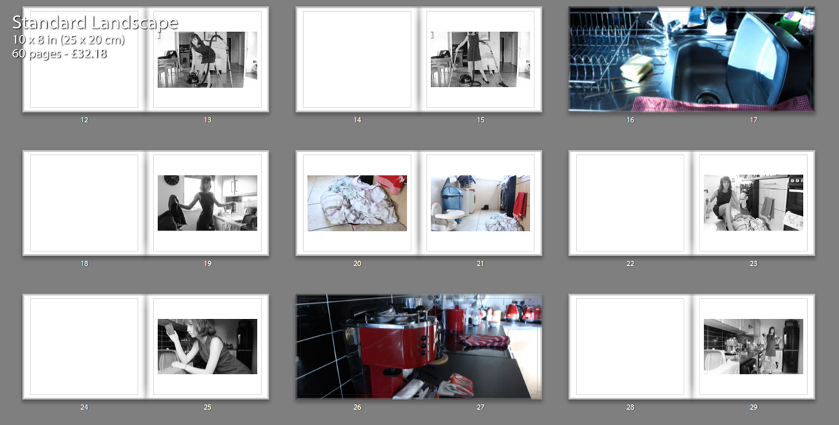


Layout Idea | 2
This layout is the one that I want to use as my final book. I think that it does look professional and is interesting for the spectator to look at. I really like that I have started with a quote of my own and ended the book with a quote of my own. I think this book is more effective as everything is in black and white so all of the images compliment one another. I tried to order my photos in such a way that represents how my mum cleans the house and in the same order that she actually cleans it. Starting from the kitchen and then ending in her bedroom this is the way my mum cleans the house. I decided to use few images as I only wanted to include my very best and my favourites. I think that this has worked out well and I have plenty of images to make an effective book. When creating this photo book I didn’t really have any photographers photo book in mind. I created something that made sense to me and that looked good for my project, I wouldn’t have been able to mimic someone else’s work or take inspiration from them as I know myself what I wanted to produce. I feel that doing this gave me more freedom to experiment and create whatever I wanted to without feeling that I need to create my book in a similar style to that of someone else’s.


Quotes for book [my own]:
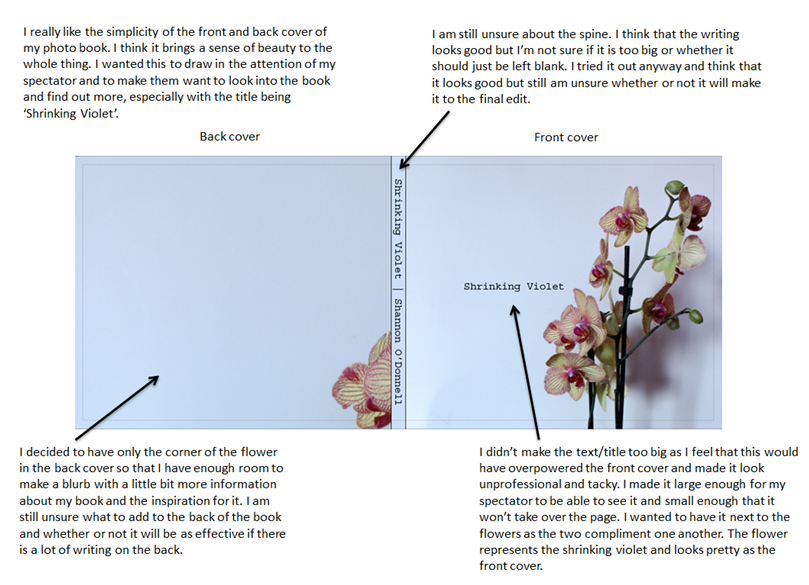
Opening quote – ‘I refuse to be a shrinking violet. I will not allow old tradition to consume my freedom and make me succumb to the societal norms that are expected of me
End of book quote – ‘Gender defines everyone and, at times, can be limiting. It makes us feel that we need to belong and conform to the expectations placed on us at birth solely on whether we were born male or female.’


After experimenting with different front covers including a plain white cover, I chose this photograph because I think it is one of my strongest photos and it’s also a key image in the story telling process. I also experimented with different back covers, I was originally going to have a blurry photograph of my mum cleaning, however after arranging the order of the photographs within my book I found that the photograph of my mum with the flowers didn’t fit in with the sequence although it is one of my favorite photographs. I then tried it as the back cover and found that it worked much better with the front cover due to the colours and was a much stronger image. I chose to put the title Domestic on my mums back because I think it works well as symbolism of a ‘label’.

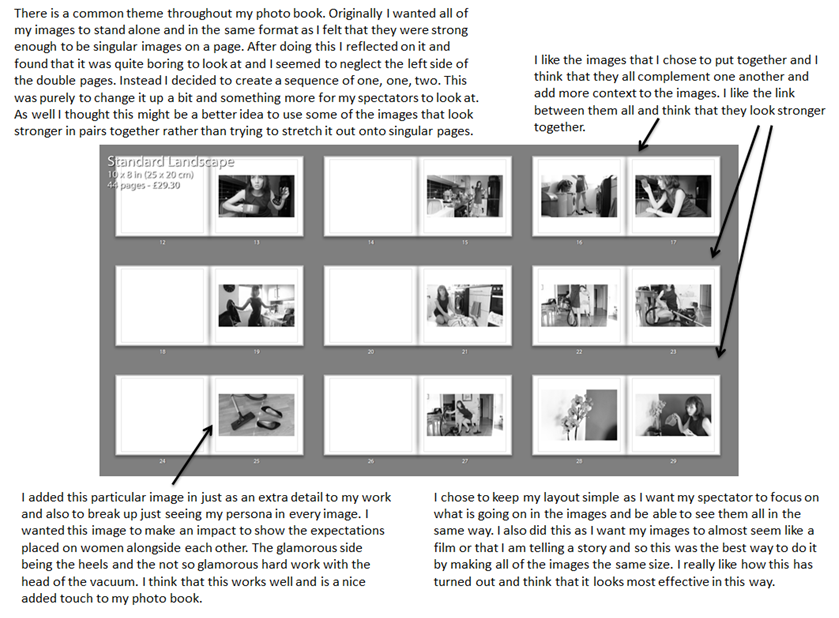
My inspiration for the inside of the book was ‘Mimosa Bloom’ by Rita Puig I. choose this book as an inspiration for my photo book design because we are both female photographers with a similar background photographing our mothers although the context is different. I also like the way that she has laid out the book, with portraits and and object opposite. In my book I have used a mixture of this layout with portraits of my mum cleaning and an object within that location or a photograph of the location itself. I also put key images over a double page spread to emphasize this. I also made some strong photographs in full bleed which I think makes the viewer feel like they are in the room. The final thing I did with the photographs is I sized them at 20pt I did this mostly with objects to show that they are not as important as the portraits however they are essential to tell the story properly. Throughout the whole sequence I tried to keep a consistency in photograph size and I was continuous about matching colours.

For the final part of my book I ended it with photographs of my mum at home which i photographed before and after she came back from work. I used this as the last ‘stage’ of the book with the other ‘stages’ being photographs of her at different work locations. I did this because I think it was a nice way to conclude the book. I began the photographs of my mum at home with a photograph of my cat, because I thought this was a good way to break up the photographs and give the viewers a sense of something more personal. I have also added quotes onto some pages which are facts about the Portuguese working culture. I think this helps to narrate the story and gives the viewer some more insight into my mums culture. I now need to add my final essay into the back of my book along with some illustrations.
The Title – “The Creation of a Home”
For my photo book study, I have decided to name the project ‘The Creation of a Home’, as I believe it fully addresses the key hypothesis’s of my project. ‘The Creation’ part, succumbs the development and construction of our new family lives and how as people we fit in to a certain place with our belongings and emotions. I also wanted to distinguish the difference between a ‘house’ and a ‘home’ as a ‘house’ can be defined as ” a building for human habitation”. This definition describes little life and personality, ‘human habitation’ vaguely suppresses the way humans act and become desirable to an environment – how they make it there own. A ‘home’ however, can be defined as: “the place where one lives permanently, especially as a member of a family or household”, or “the family or social unit occupying a permanent residence”. This sense of permanence allows the reader to understand the commitment and time taken to make a ‘house’ a ‘home’, as there is much more to a house than just walls and foundations.

First Pages and Title Page
For my beginning title pages, I have began trying to experiment with my archival material. As mentioned in my personal study, Domingo, Costa and Dorley-Brown have all inspired me to incorporate archive material and mediums to create context and historical aspects, in order to relieve a sense of purpose and relationship with the reader. This beginning front cover allows the reader to get an idea, i like how the image I’ve chosen isn’t too clear, so the reader has time to picture what


Pages and Page Layout
I have started to explore the different formations and sequences my pictures can fit into, to make it more interesting and easy for the reader to understand. This is all in awe of the techniques used by the three artists I studied closely in my Personal Study: Rita Puig-Serra Costa (“Where Mimosa Bloom”), Inaki Domingo (“Ser Sangre”) and Chris Dorley-Brown (“The Longest Way Round”).


For some images (as seen above), I’ve used a double page spread so that the image is divided. I feel this technique is very effective, I really like the way it allows both pages to be covered but with the idea of there being a border there too, it lets the reader stand back and see the whole image without becoming too involved. This was in the style of Domingo as his piece “Ser Sangre” consists of multiple full page spreads.


I have also included drawings and more personal mediums as included in Domingo’s work “Ser Sangre” to make the feeling of ‘family’ more of a reality. I feel this effect allows


I have also used influence also from Chris Dorley-Brown’s: “The Longest Way Round” as his ongoing use of archival images of the War and Post War era are bounded together using his own photographs. During my internship at Jersey’s Photographic Archive, I came across similar styled images which show the history my new home. Placing the images in a formation like a comparison on either side of the pages, I wanted to establish to the reader the themes of ‘old’, ‘new’, transgression and change.


What type of book am I going to be using? (size / material/ etc. )
Size – Small Portrait (23×16.5 cm)
Paper Type – Matte paper
One of the main books I have used as inspiration for my book design is Martin Usborne’s book ‘I’ve Lived In East London For 86 1/2 Years’. This photo book is about an old man who is living in East London and Martin Usborne, the photographer is photographing him in his everyday life.
I really like how each photo is presented alongside a couple of sentences which are Joseph’s words. These words show Joseph’s view on a topic. I think it makes the book have more character as you are able to read his thoughts and different views on modern life.

In my photo book, which has a similar concept to Martin Usborne’s book I will be taking extracts of my grandparents words. I will be taking these extracts from the interviews that I conducted with them a couple of months ago. The main headings/ topic heading will be; Music, Family, Jersey, Wales and Faith.
For the cover of my photo book, I am going to cover it with a patterned material, rather than a photograph. An example of this is Julian Germain’s photo book ‘For Every Minuet You Are Angry You Loose Sixty Seconds Of Happiness’. This cover is very colorful and eye catching. The type of pattern gives an essence of what the theme of the book is going to be.
This photo book has presented its pictures with white boarders around the pictures rather than full bled. I do like the white space around the photographs as I think it gives the book a clean cut look. Germain has also included random plain white pages, which breaks the book up nicely.

In this book, Germain presents some archive photos:

Although it is effective I not like the style he has presented these photographs. I don’t like how he has scanned the whole photo album, however I do like the positioning of the archive photo’s in the book. Germain has positioned them all together, in the middle of the book. I am still yet to decide how I would like to preset my archive photographs in my book. Either have them all together in a cluster, in the middle of the book. Or have them spread evenly throughout the book.
I am choosing to title my photo book ‘The Heavens’ because I think it has a strong sound to it, and makes the book clear what is going to be about.


