Category Archives: Personal Study
Filters
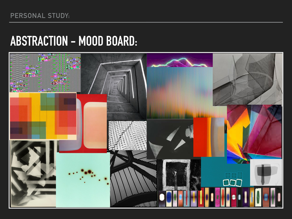
Personal Study – Abstraction:
Final Outcomes | Personal Study
Here are all of the final outcomes that I have produced for my personal study. I have found this process fun and something different with creating a photo book and a short film. I have really enjoyed exploring the role of my mother and how she sees it herself. This really inspired me to create images and to make an even better final piece in the forms of a short film and a photo book. I have also added in a PDF link to my essay.
Personal Study | Essay
Shannon O’Donnell | Personal Study Essay
Behind Every Good Man There Is A Great Woman | Short Film
https://www.youtube.com/watch?v=cx5ayloQdsI
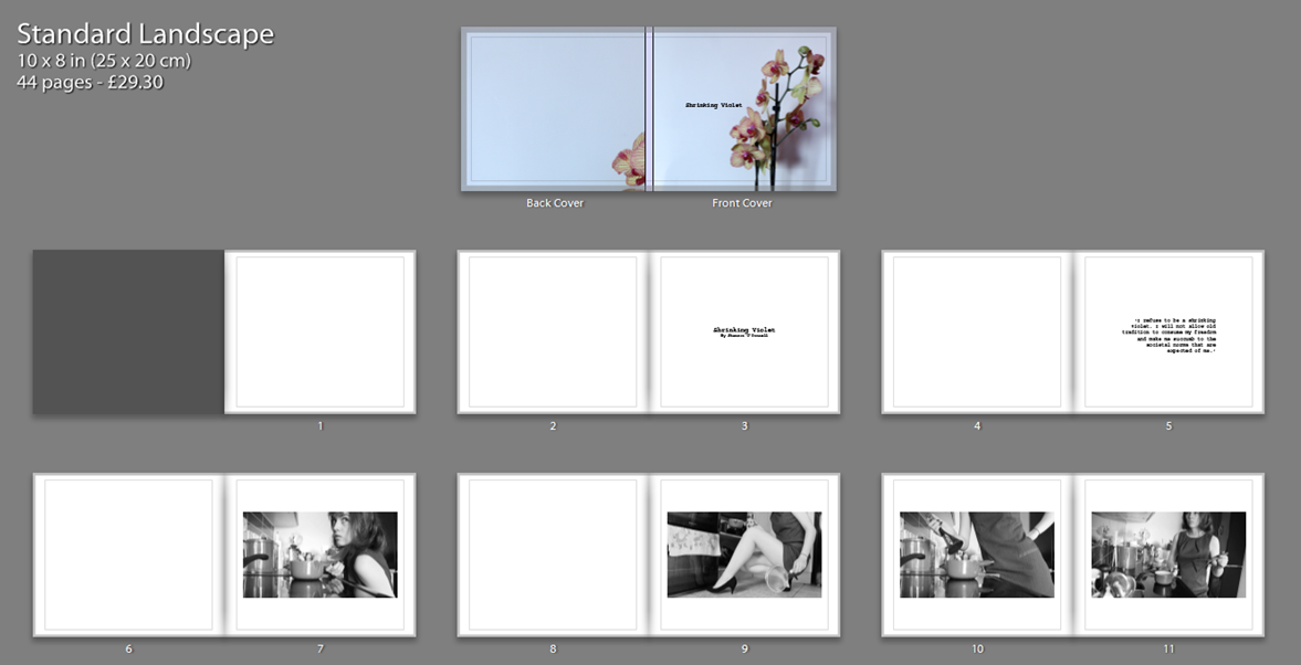
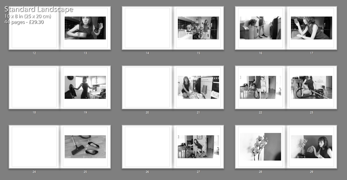
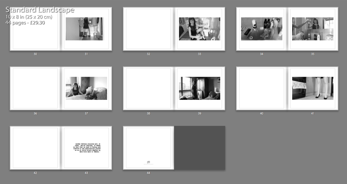
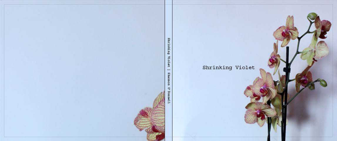
Shrinking Violet | Photo Book
Link to photo book: Shrinking Violet | Shannon O’Donnell
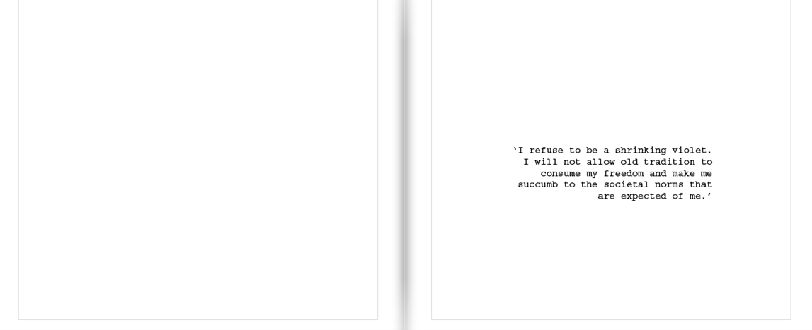
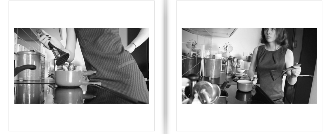
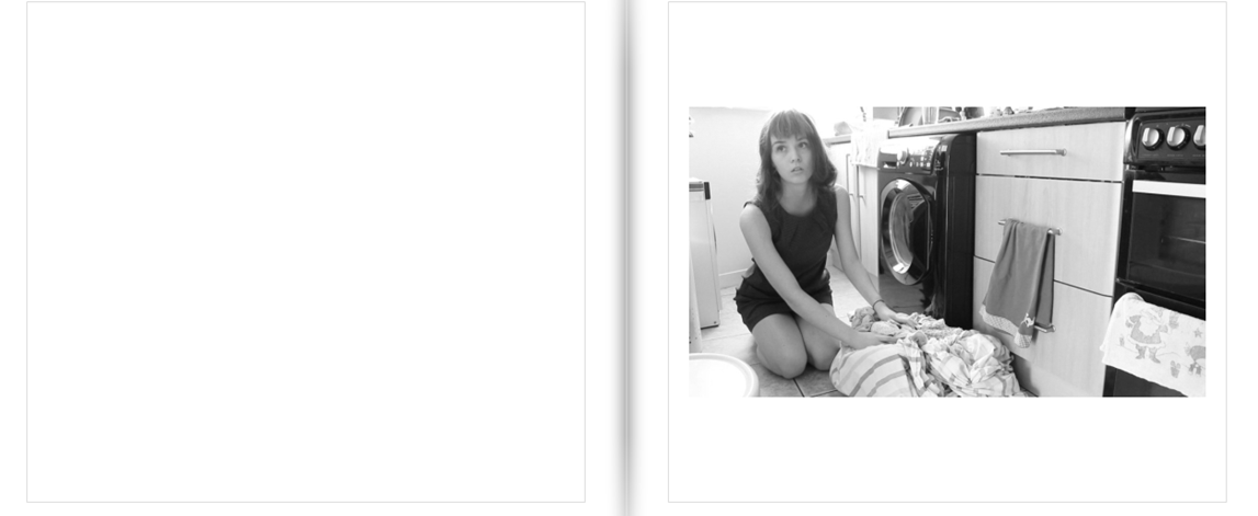
Close up tasters of pages:
FINAL ESSAY
How is the work of Corrine Day and Phillip Toledano autobiographical?
“Good friends make you face the truth about yourself and you do the same for them, as painful, or as pleasurable, as the truth may be.” – Corinne Day, Diary, 2000
An autobiography is an account of the life of a person written by that person. In other words, it is the story that a person wrote about themselves. In this essay I will be evaluating the work and reputations of Corinne Day and Phil Toledano, and how their work has an autobiographical element. Phillip Toledano has many projects of photography based work. However the project that attracted me the most was his work from which he produced a photo book – When I Was Six. This book is a very moving book, it draws you in with confusion and intriguing elements. When Toledano was six, his sister died. His family never talked of her again. But when his parents died, Toledano discovered a box in the back of their wardrobe. It was full of Claudias belongings, and of pictures they had taken of her. The box had been untouched for years and was made by Toledanos parents in Claudias memory. From this discovery sprouted and idea, a year elapsed between his discovery of Claudias belongings and finding the strength to begin When I Was Six. “It was almost hilariously miserable,” he says. “I’d take a picture, then I’d start crying. I’d go to sleep and then wake up, take some more pictures, and start crying again. It was just so exhausting, on a molecular level.” He eventually created a photography book called “When i was 6” – he was 6 when she died and he tried to remember memories of her and also things he was interested in in that period of his life.
“When I saw the pictures, she seemed so grown up, and that was so shocking to me, she was a real person. I guess it’s easy to think you’ve lost a baby than you’ve lost a person.” – Phillip Toledano
Toledano photographed multiple items of the box’ contents, These created beautiful images that draw you in with interest and contrasting lights. This work quickly started to become and show autobiographical elements by a documentation of Claudias belongings. Creating an untold story that the Toledano parents had withheld from Phillip for years. Some of the images i find extremely interesting, also the idea that these belongings of a sister Toledano has very little remembrance of intrigues me. What does he remember? what doesn’t he know? I love the way these images have been taken and presented aswell. A typical presentation would be just flat on a table and taken from a birds eye view. Toledano changed this and made the images of the objects interesting aswell, by using natural lights to create contrasting shadows and propping the objects up aswell as piling things up to increased perceived quantity but letting the eye only see the most interesting one. However the contrasting and strong natural light with created shadows makes the images look moody and mysterious, this I feel sets a great theme for the book. Some of the best images from this piece of work, I feel are the images of a lock of Claudias hair, a ceramic pig in a box and a pencil. Although these images may not seem or sound very interesting, I feel that they are some of the best in the book. The lock of Claudias hair is one of my favorite images, this is due to the whole aura and feel of the image. The color of the hair makes you try to imagine, what she looked like? How long was her hair? questions that we dont know the answer to by just perceiving this image. The hair represents the last piece of claudias body in this world, this whole concept is extremely creepy to me. Due to this exact creep and discomfort it has pushed this image to be one of my favorite. Another interesting image would be of claudias pencil. This photograph is very simple, this simplicity is what makes it great. The pencil is shown as half in the light and half in darkness, giving the photograph a moody and mysterious affect. Yet again the sheer simplicity of the image is one of its best characteristics, focusing the eye on the pencil and light contrasts alone. This type of image makes you wonder what the pencil was used for? Where is the text/pictures Claudia wrote/drew now? Are they inside the box aswell? Trying to imagine how her small hands and fingertips clasped round this pencil looked is the first thing which comes to mind for me when I see this image. Toledano seemed to do this with the majority of the images by making you question what the image represents and how does it make you feel? The majority of Toledanos images force your mind to wonder. Toledano also does this with the quotes shown in the beginning of the book – “I have only two memories of my sister,” he writes in the opening jet-black pages of the book. “Kicking the door of her room, screaming, ‘I wish you were dead!’ and on the day of Claudias death “Two policeman at our door, tall and official. Telling us there had been an accident…”. These quotes only bring a feel of complete heartbreak and regret. The emotions Toledano must has felt and is feeling for saying these terrible things to his sister must be horrific. The book twists and turns throughout, jumping focus from Claudia to Phillip. This is done by Toledano threading another, more impressionist, narrative through the book, evoking another vast, empty world into which he escaped in his sisters absence: a world of space travel, distant planets and far-flung galaxies – places that seemed impossible to reach and understand.
The work of Phillip Toledano has links to the work of Corrine Day – Diary, due to both of their autobiographical elements. These elements are thing such as documentations of lives and possessions, creating autobiographys for the piece of work it links to. For example, Corrine Days work for her photography book ‘Diary’.
Corinne Day is a British photographer whose influence on the style and perception of photography in the early 1990s has been immense. As a self taught photographer, Day brought a more hard edged documentary look to fashion image making, in which she often included biographical and raw edgy elements. Her best work, is in the photography book which is called ‘Diary’. The book is a collection of photographs spanning ten years of Corinne Days life. Focusing on many characters within her life, but mainly of ‘Tara’. Tara seems to be Days best friend and some of the photographs of her are really heart wrenching. “tara crying at home stoknewington 1999” is a photograph that really moves me. She’s looking straight into the camera smoking a rollup and everything about her face tells you she’s probably only on a two-second break from bursting back into tears. Throughout the book you’ve got some shockers in there from bloody knickers on the floor of an apartment to a nice looking guy in a cozy cardigan shooting up. You have Day herself smoking heroin and touching herself in bed and much more of the same theme. Some of Days best work within the book I feel are the images shown on this page. These images are very strong and moving images. For example, The image show at the top of this page – “Tara crying at home stokenewington 1999” is one of my favorite, as described on the previous page as a hysterical smoking session. The photograph of Tara pregnant is a gentle break from all the heroin and nudity to a simple shot of Tara in the reflection of a mirror, admiring her pregnant self. This image is a very strong one due to its sheer simplicity and gentle feel. The casting white light from the window brightens and lightens the image giving it a clean perception. The photography to the right of pregnant Tara is called “Tara wales 1997”, this image makes me smile because you can see for a change Taras sheer happiness and playful side. Kneeling on the floor wrapped in tinsel and what appears to be laughing, this image is yet again a playful and fun change to the hardcore drug seen shown throughout the majority of the book. Below is another photograph of Tara crying. Red faced and blotchy she is yet again crying hysterically over something that once again we do not know the reason. Throughout the book to counter these photos, you see Tara doing things like emptying the baby pool looking all purposeful and busy, covered in mud in the garden smiling having a smoke. They all have a kind of homely quality to them. Due to the way in which you are introduced to Tara, you may find that these photos genuinely make you smile for her, which gives you an inkling of how pulled into these peoples’ lives you suddenly find yourself. Halfway through the book you get slapped in the face with an image of Day sitting on a bed picking her nails and trying not to cry, the title is “Me after the doctor told me I had a brain tumor Bellvue Hospital New York 1996”. This image stops you in your tracks and you heart sinks but as you go on, you see her go down for surgery, recovering, being visited in hospital by her family, Mark and Tara. You feel genuinely relieved that your storyteller is ok and well enough to carry on the story
My own work is also similar to both of these photographers, and to showing an autobiographical element of my own life through my images and documentations. For this piece of work I decided on an idea called ‘The Box’, This idea comes from a ‘special box’ that I was given when i was born. This is why I linked my work to the work of Phillip Toledano because we both have the advantage of having a sort of ‘autobiographical box’. My sister was also given an identical one also. Throughout our lives, my mother has collected things from our childhood that have been of significant memory and has put them in the box. These things range from baby scans of us inside my mother, hospital bands from the day we were born, our first shoes, presents we were given as children and much much more. These objects in these boxes have become very special to us, and are restricted and hidden in chosen places in our bedrooms. My parents, particularly my mother doesn’t like anyone who is not family looking at these boxes, I’m unsure of the reason why but I
assume privacy reasons. I feel this relates me to Toledano as only I could tell this story as all of the objects in the box have sentimental value and memories related to them that nobody would understand apart from me, aswell as Toledano having the same situation presented in front of him when his parents died and he found Claudias box. I also decided link my project of work to another photographer Corinne Day her project Diary. For these images I tried to recreate similar images to Toledanos work in ‘When I was Six’. I was very pleased with how the images turned out. I also tied in a set of Corinne Days Diary inspired images that I have taken over the past year. These images are similarly linked to Corinne Days work in Diary because they are all based and taken in a party scene. The images I have taken over the past year have been at events such as festivals, parties and trips to town. These images are autobiographical because they are snapshots from my life taken by me. This therefore creates a link between my work, Corinne Day & Phillip Toledanos work. We all have links to eachothers pieces of work, perceptual similarities aswell as previously spoken autobiographical images. We all had the same bases and idea of documentation of something, an inspiration to tell a personal story. I enjoyed conducting this project because I discovered things that I wouldn’t have if I hadn’t conducted and perused it. I have grown to love Corinne Days Diary because The way she has created the book it feels as though you are apart of her community of friends and when the book finishes you miss all the characters and you read it again. Her work has also taught me to appreciate my friends more and all that they do for me. My favorite quote from Corinne Day is shown below, the work of Phillip Toledano has taught me to refrain from saying such awful things to my sister and to collect and treasure more items that I could add to my box that my mother has made for me.

My Shoot: Shrinking Violet
Possible introduction for my photo book: ‘I refuse to be a shrinking violet. I will not allow old tradition to consume my freedom and make me succumb to the societal norms that are expected of me.’ I made this quote up myself and thought that it would be good to have at the front of my photo book as this is something that many women say they aren’t yet they seem to contradict themselves by taking on the role of homemaker and taking care of the house. I think that the images that I have created will add to the sarcasm of my work and really reflect how I feel about the traditional role of the woman.
This shoot came from a short film that I made of my mum and her role within the household. I really took on board what she had to say and found it very interesting, which inspired me to come up with the idea for this shoot. One of the main points of this shoot is sarcasm, in a sense it is a parody of my mother and how she is represented. I find that the role of the modern day woman is still very much focused on old traditions and leaves women in an in-between of full-time work and full-time chores at home. Instead of women staying at home and doing all of the cooking, cleaning and food shopping they are now going out and getting jobs yet the expectation still lies solely on the shoulders of women to do all the cooking, cleaning and food shopping. I find it ridiculous that even in a modern society we still have these unfair expectations, women aren’t slaves and shouldn’t be treated so within their own homes. This shoot embodies my mother in a more glamorised sense as many people try to say that doing all of the household chores isn’t that bad and I wanted to add in the expectation built up and constantly pushing down on women of having to be perfect and to look beautiful all of the time. This notion of beauty and being perfect for a man is bizarre and something that no woman should think she has to aspire to. This shoot really tells the story of all women and brings a visual understanding to the expectations and limitations women are faced with in our Western world.
The reason that I titled this shoot ‘Shrinking Violet’ is because when interviewing my mum she used this term and while reviewing the footage and listening to the audio over and over this is what really stood out to me. It made me think about how women seem to automatically become shrinking violets in their own home, many women just accept that their role is to be the homemaker and shy away from the possibility of creating a more equal living space simply because it wasn’t the way that they were brought up. I feel that this can partly be a generation thing but my mum has always been an important figure to me and she does all of the cooking, cleaning and food shopping yet I don’t want to be the same as her and I don’t want to live in the same way that she does. Somewhere down the line, that shrinking violet changes her mind and realises that she doesn’t need to be the one and shouldn’t be the one to do all of the chores and to be a housewife. Nowadays most women have jobs yet a lot of those women still think that it is ok to do 100% of the chores and the housework. I like the title Shrinking Violet purely because I liked it and it seemed to really fit with what I am doing.
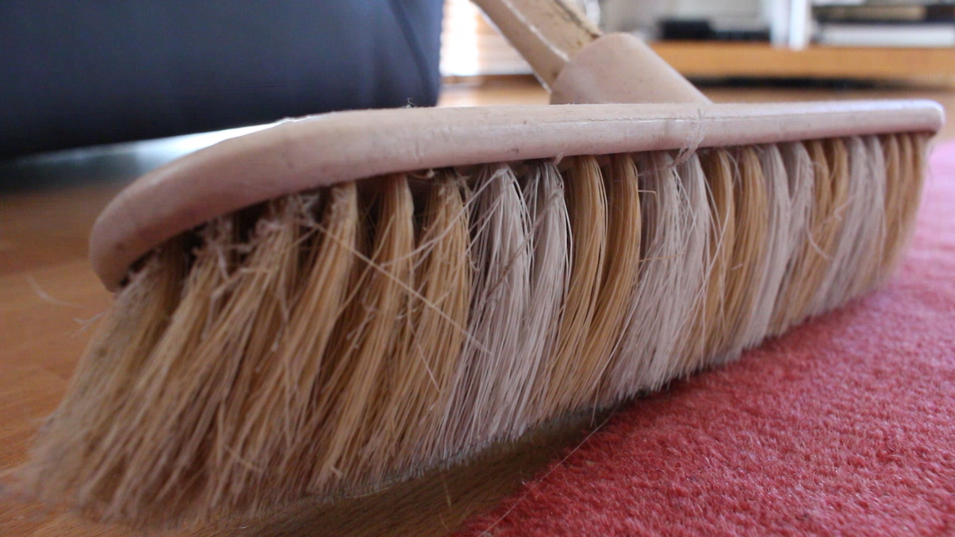
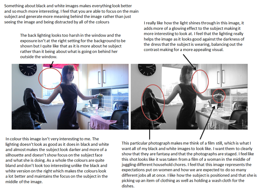
I made images around my house of cleaning products and parts of the house that you usually wouldn’t focus on. I wanted to show the little details of what is around my house and the usually boring elements of cleaning etc. I want to add these images in colour into my book to add more detail to my work and to show the reality of what goes on in an average household. Along with this I will be adding black and white images that I am in as they are the staged images and parody the traditional role of the woman within our society. I chose to make these images black and white so that they would stand out more against the coloured images and I just find that with them being in black and white the spectator is more able to actually focus in on the message behind the images and what the subject is doing rather than looking around the image and being attracted to different colours, leaving my spectator distracted from what I actually want them to focus on.
How I made staged images
Instead of going back and forth to make photographs being both the director and the subject of the photos, I came up with the idea to just film myself. This was so much easier as I was able to just stand still in the footage and change the position of my body and the direction of my head and eyes. I then put that footage onto Adobe Premier Pro and took screenshots of my favourite images. I then took to Photoshop and edited them all individually. I prefer Photoshop to Lightroom and although it does take longer I’m just used to editing my photos there. After editing all of the images and making them black and white I opened them up in Lightroom and began making my photo book. This was challenging at first as I didn’t really know how to use Lightroom but eventually I got the hang of it and made my final photo book which I am happy with. I am also very happy with the images that I produced for this project and feel that they have been done well.
This is one of my favourite images in the whole series as it brings more detail to the spectator and really does remind me of a film still. I feel that this image is effective in black and white and adds to the mystery of the image. I took inspiration from Cindy Sherman’s Untitled Film Stills and how she presents herself within those images. She never really looks into the camera and always looks off into the distance in some sort of trance. I feel that my portray and version of this has worked well and really does portray my persona as a robotic traditional woman. I chose to compose my image at a bit of a lower angle and rested my camera on the worktop with a folded bag holding up the lens to the angle that I wanted it. I then recorded for a short while of me posing in similar ways to then take stills from to create images. This is my favourite still from this particular video. The facial expression of my persona looks very neutral and possibly unimpressed. As if I am unhappy doing what I am doing yet I still do it out of routine and tradition.
I wanted to explain this image more in depth. This particular image was inspired by some footage that I made of my mum while filming her for my short film. In the footage I found that my mum was always in awkward positions and always down on her knees to get every last bit of the house clean. I took that and wanted to make an image where my subject is stood in an awkward looking position. In this image I also wanted to try and represent how these women always seem to be juggling two different things at once. I also decided to look off into the distance as if it is systematic for me to be doing the chores and I don’t even need to concentrate to be able to do it. I really like this image and like that my persona is centred in the middle of the image with the two open doors either side of the subject. I wanted the doors to be open as I thought it would look better than it just being plain white in the background.
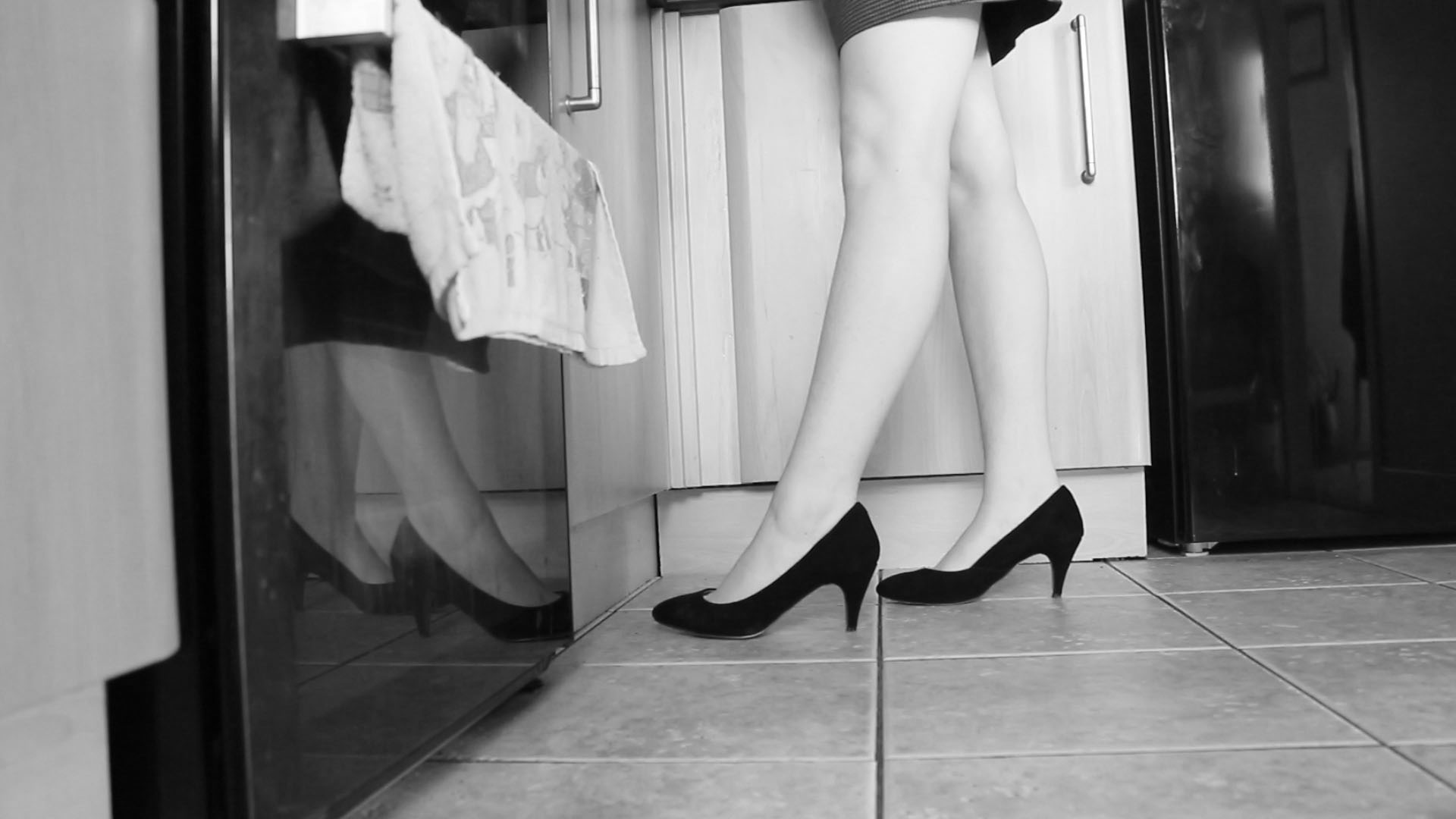
I wanted to make this image purely because it is different and not a usual photograph that you would expect to see. I wanted to have the subject in heels on one side with the other showing the oven and a tea towel in the shot to show how women are expected to be glamorous and to always be put together. I feel that women are faced with this expectation constantly and are always being put down and ridiculed if they aren’t constantly put together. This is one of my favourite images as it doesn’t show much of who is doing the chores but represents women that do. It allows my spectator to identify more with the persona and think of themselves in her shoes. I also like the light shadow that is at the top of my legs from my dress, it just makes the image more interesting. 
This particular image is heavily inspired by a shot that I got of my mum when making my short film for this project. I liked how it looked and wanted to recreate this with my persona. I find this image interesting, it almost looks strange too. It is odd to find a woman doing house chores in heels and a dress but that is the whole point of my shoot. I just really like this image and think that my spectators will like to look at it. I find that this shoot makes the mundane of doing house chores look a lot more exciting. I find that the position that the subject is in looks robotic and this is exactly what I wanted to portray.
Feeding the shrinking violet. I chose to have these flowers act as the shrinking violet because they are beautiful yet quite, obviously as they are flowers. I like this image as I chose to look away and make it seem as though I didn’t even know that I was feeding it which symbolises what many women seem to do. They allow themselves to take on the traditional role of the woman without ever challenging it or wanting to change the expectations placed on women. I like this image and the position of my persona as it looks as though I’m not even trying, again this is something that I feel women do. They just repeat the same old process and routine without even thinking about it, they become slaves in their own homes. I like the composition of this photograph and that it is a medium shot of my persona. I feel that the image is at the perfect size and angle to get the flower in as well as its plant pot as well as just enough detail of my persona to fit into the image too.
Image comparison | B&W vs colour


Influenced Photo Book Design Ideas
The Title – “The Creation of a Home”
For my photo book study, I have decided to name the project ‘The Creation of a Home’, as I believe it fully addresses the key hypothesis’s of my project. ‘The Creation’ part, succumbs the development and construction of our new family lives and how as people we fit in to a certain place with our belongings and emotions. I also wanted to distinguish the difference between a ‘house’ and a ‘home’ as a ‘house’ can be defined as ” a building for human habitation”. This definition describes little life and personality, ‘human habitation’ vaguely suppresses the way humans act and become desirable to an environment – how they make it there own. A ‘home’ however, can be defined as: “the place where one lives permanently, especially as a member of a family or household”, or “the family or social unit occupying a permanent residence”. This sense of permanence allows the reader to understand the commitment and time taken to make a ‘house’ a ‘home’, as there is much more to a house than just walls and foundations.

First Pages and Title Page
For my beginning title pages, I have began trying to experiment with my archival material. As mentioned in my personal study, Domingo, Costa and Dorley-Brown have all inspired me to incorporate archive material and mediums to create context and historical aspects, in order to relieve a sense of purpose and relationship with the reader. This beginning front cover allows the reader to get an idea, i like how the image I’ve chosen isn’t too clear, so the reader has time to picture what


Pages and Page Layout
I have started to explore the different formations and sequences my pictures can fit into, to make it more interesting and easy for the reader to understand. This is all in awe of the techniques used by the three artists I studied closely in my Personal Study: Rita Puig-Serra Costa (“Where Mimosa Bloom”), Inaki Domingo (“Ser Sangre”) and Chris Dorley-Brown (“The Longest Way Round”).

For some images (as seen above), I’ve used a double page spread so that the image is divided. I feel this technique is very effective, I really like the way it allows both pages to be covered but with the idea of there being a border there too, it lets the reader stand back and see the whole image without becoming too involved. This was in the style of Domingo as his piece “Ser Sangre” consists of multiple full page spreads.


I have also included drawings and more personal mediums as included in Domingo’s work “Ser Sangre” to make the feeling of ‘family’ more of a reality. I feel this effect allows


I have also used influence also from Chris Dorley-Brown’s: “The Longest Way Round” as his ongoing use of archival images of the War and Post War era are bounded together using his own photographs. During my internship at Jersey’s Photographic Archive, I came across similar styled images which show the history my new home. Placing the images in a formation like a comparison on either side of the pages, I wanted to establish to the reader the themes of ‘old’, ‘new’, transgression and change.


What type of book am I going to be using? (size / material/ etc. )
Size – Small Portrait (23×16.5 cm)
Paper Type – Matte paper
Final Essay
Question: How has Boltanski, Abril and Toroptsov represented the concept of capturing the invisible and reflecting the meaning of memory through the medium of photography?
‘Someone once said that you die twice: when you die the first time and when somebody finds a photo of you and no longer remembers who it shows.’
We are made up of fragmented memories and forgotten dreams. Our entirety rests in the fate of old letters, burnt photographs and meaningless possessions. We never question the invisible, it is as though we are on a relentless pursuit to try and capture what we cannot see. We abide by the rules and limitations that are enforced by the concept of death. But what happens to those who become untouchable, those who are no longer part of the flux. Their existence becomes empty and lost, they are no longer perceptible to the eye. Yet we still feel impossible and unexplained connections to the spiritless. We yearn to cherish the ‘good’ memories and except the restrictions we are faced with, regarding mortality. In doing so, the feeling of life is created, the tangibility of pleasure and pain enters our worlds and consumes us. But, photographs hold heritage and meaning, they have a depth of knowledge and feeling to them. Photographs capture single moments of existence. They can tell a story of a second in a stranger’s life in an instance. Whether it be personal, isolated, private or rare, it is has an essence of being and timelessness. The allure of time, is its youthfulness. Time is the cure for it never fails to reveal the truth. ‘Human life is embedded in time: we remember the past, we plan for the future and we live in the present. We swim in an ever-rolling stream.’
I am exploring how the invisible can be captured and portrayed through the medium of photography. And why memories hold such a powerful influence over our past, present and future. I want to find out what makes a photograph meaningful, what gives the photograph reality and how through photography the memory of a person can live on. My project focuses on exploring the invisible through three female generation’s memories; this includes my grandmother, my mother and myself. These distinctive viewpoints will enable my project to become more personal and really seek the depths of my grandfather’s life. I think memory is more than simply remembering a once present thought, but it is about connecting with the past in order for it to live on.
Christian Boltanski, Laia Abril and Yury Toroptsov all delve into the idea of memory, seeking a way in which they can capture and meaningfully discover the rawness of an image and what it can represent. I took a considerable amount of influence from Laia Abril’s photo book ‘The Epilogue’, her scientific approach to the reconstruction of a young girl’s life and death is both moving and deeply insightful. The viewer becomes emotionally awakened by the tragic narrative. For there is no escaping the feeling of missing a cherished one. There appears to be no cure except for time, time is what has made the scar of the family’s loss more bearable. Laia Abril’s interpretation of the concept of memories is identified in her project The Epilogue. The narrative explores the Robinson family’s journey and aftermath of losing their beloved twenty-six year old daughter, Cammy, to bulimia. Laia Abril reconstructed Cammy’s life through the abstraction of memories. She beautifully and scientifically crafted the grief and suffering the family fought, as well as, the raw emotions which surrounded the topic of remembering a loved one. A book absent of clichés, emotionally awakens its audience by the sadness and intensity the story brings to the forefront. The individual becomes invested in each photograph, due to there being some sort of significance shown of the young women’s life. The cover of the piece offers the first simplistic reflection of the nature the narrative. Personal readings, letters and clippings brings Cammy’s life into reality and makes her existence more than a death certificate. Diaries, agenda books and medical records express her desperation she must of felt, proving she once had emotions and felt the way we feel today. Archive images of family members, friends, houses, locations and objects symbolize Cammy’s life history and her importance as well as her mark on the world. In particular images there is a sense of honesty and peacefulness. For Cammy did not live her whole life consumed by the illness, therefore, had childish memories, typically ones which we would expect at a younger age.
Abril photographs several aspects of Cammy and her family’s life, however, I think the most powerfully beautiful images are the ones which really project her innocence, vulnerability and regret. A memorial collage of photos of Cammy, which is in the living room of the Robinson’s house, is alike to a snapshot of Cammy’s life. It exudes life and happiness, although this may have not truly reflected her feelings and illness she faced at the time. It is there for the comfort of her family to know and remind themselves that she once was a content and fortunate child. Abril has included a pop up of an extract from what looks like a newspaper. It could possibly be a memorial or announcement viewable for the public, Abril has designed it to lie next to the collage and create a shadow over it slightly. Although this is a very subtle detail it translates a distinct message; it shows the favorable memories behind the harshness and rawness of her death. Moreover, Abril creates an interactional style which allows an audience to become involved in the memories and life of Cammy, as well as, the curiosity of knowing and desiring to understand more of the invisible. On the opposite page Abril has photographed the hundreds of letters of condolence the Robinson family received. Again this contrasts with the following photograph of the collage, Abril has created a book that is a constant rollercoaster ride of emotion. The archival images used have been chosen specifically to evoke a sense of feeling especially the ones of her as a child. The photographs have history and meaning to them; there is an essence of the past and remembrance reflected through each one. The individual archival images have importance and uniqueness which symbolize the compelling nature of memory. Abril’s work inspired the idea for my collage of archive images I had found and been given to my family members. The majority of photographs in my project are concentrated on the death of my grandfather and his absence, therefore I felt it would be beneficial in order to create a piece which reflected small moments of his extraordinary life in a simple flick of a page.
Similarly, Yury Toroptsov toys with the concept of creatively discovering the invisible. Deleted Scene focuses on a journey in search of a father he never knew was led by an invisible path. With a relentless pursuit Toroptsov traveled to Eastern Siberia in order to tell us a unique and complex story. Toroptsov’s project is parallel with Abril’s interpretation of making the invisible visible. Furthermore, mutually they have intertwined the character and personality of the ‘people’ they are ‘photographing’. The topic Toroptsov is tackling is one many may struggle with in terms of the emotional exposure. Toroptsov has taken a more poetic approach with his style in this particular photo book. Rather than displaying objects and using archival images in an almost scientific way, he has explored the idea of creating his story from metaphorical photographs. The meaning behind the photographs he has chosen are not simplistic nor are they easy interpretations. They are filled with emotion and desire to learn who his father was. The images are ones in which you need to consume yourself in so to speak. However, when it comes to the concept of memory and photographing the invisible Toroptsov has allowed his audience to deduce whatever they will from the photograph. In order to successfully answer the question I have posed, analyzing a single image from Toroptsov’s project Deleted Scene, will support me with grasping a more in depth comprehension of how he has managed to photograph such a complex conception. As I previously mentioned Toroptsov’s work takes on a much more poetic and metaphorical approach, therefore I thought it would be appropriate to analyze a one which symbolized this. The title page of Toroptsov’s project is a simplistic yet inviting opening to the narrative, this is a particular favourite of mine in comparison to other projects I have studied. I think it is very clever how the design of the front cover hides the individual’s face, which is their identity. Furthermore, the colour it has been edited to brings a vintage and classical style to it. Which is further emphasized by the Polaroid type of photograph chosen to be displayed on the initial page.
The third academic to be addressed when concentrating on memories and understanding the medium of photography is Christian Boltanski. Boltanki believes every individual is unique, because of each one comprising the capability to think and remember differently. Implying we consist of all these experiences and memories. ‘What is most important is most fragile.’ Boltanski wants to touch people, even make them weep, in order to stir emotions. The role of art today in Boltanski’s view is to move people, it is to ask people questions about good and evil, about disappearance after death and so on. Although Boltanski has claimed he has no answers for such questions. ‘In my view you can equate the photograph with a dead body, just like an item of used clothing; it has the memory of something, and it is an object where the person behind it has disappeared.’ I think Boltanski’s analysis of memory offers an alternative to traditional views, as well as his thoughts around the medium of photography. He genuinely thinks people should connect with the art work and attempt to have an understanding of it on a higher level. Therefore, when completing my project I focused on the importance of having meaning and intensity behind the image.
Overall, Abril, Toroptsov and Boltanksi all have their own individual techniques and thoughts on how to capture the invisible and convey the concept of memory, through the medium of photography. I have found each photographer to be heavily influential over the development of my photographic project. However, I have found Abril’s project The Epilogue to be particularly striking and relatable. Likewise, Toroptsov’s project, Deleted Scene, proved to be highly effective with regards to the poetic and metaphorical interpretation of the concept of memory. For example, I photographed specific places where I felt memories of my grandfather were the most prevailing. Places such as Queens Valley Reservoir are key remembrances which are where I feel closest to him. As I am personally not religious, the idea of remembering someone or wanting to feel closer to them is not directly linked the church or other religious pathways. Rather, my elucidation of a religion and having the opportunity to remember someone is to surround yourself with a place which reminds you on that individual. Boltanski opened a more intellectual and exclusive attitude to memory. His approach made me think more deeply about the type of photographs I wanted to produce, for example, I created a photograph of a set of photo frames my family have on the window sill. I have combined both artistic styles of photography to create a photo book which shows the complexity and intricacy of photographing an individual who no longer exists. I wanted to include emblematic images in order to truly express the value, worth and beauty of my grandfather’s life. For the time my grandfather was alive is not the limit to his existence, the memories which are carried on through family members such as my grandmother and mother are what make his memory live on. The archive images, readings and objects which I has used all have some sort of relevance to his life. Their continuing existence enable my grandfather’s invisibility to be visible.
‘I believe in the importance of every single human being, but even the most important ones disappear quite quickly, especially their little memory. What is most important is most fragile.’
Design your photo book
PHOTO BOOK DESIGN – work over h-term
DEADLINE: Thurs 25 February MOCK EXAM!
1. Create a BLURB account using your school email address. With Blurb you have different options on how you design your book:
a) Using Lightroom to design your book which is integrated with BLURB. Only for use on school computers, unless you have LR at home on your own laptop.
b) Download Bookwright via Blurb onto your own laptop and work offline at home and you can work indecently of school. Here you have full control of layout/ design features. Once completed, you upload photo book design to Blurb
c) Choose online option if you want to work directly online. Very limited layout/design options (not recommended!)
For those who wish to make their own hand-made photo-book or if you want to customize your Blurb book see me for more details on how to do it.
2. Using Lightroom make a rough selection of your 40-50 best pictures from all shoots. Produce contact-sheets in Lightroom and edit photos – make sure you have adjusted and standardised all the pictures in terms of exposure, colour balance, contrast, brightness and produced a duplicate a set in B&W.
3. Decide on format (landscape, portrait) size and style of your photo-book. Begin to design your photo book, considering carefully, narrative, sequencing, page spreads, juxtaposition, image size, text pages, empty pages, use of archival material etc.
4. At the end of your photo book, add your illustrated essay including title, any captions (if needed), bibliography, illustrations of artists work (incl data) and images of your own responses. Think carefully about font type, size and weighting.
5. Produce screen prints of layout ideas as you progress and add to Blog for further annotation. Photo-book; show screen prints of page layout and narrative/ sequencing/ juxtaposition of pictures. Podcast; produce screen prints as work progress that show your editing skills/ decisions.
6. Select a set of 5-6 photographs as final outcomes and evaluate – explaining in some detail how well you realised your intentions and reflect on what you learned in your Personal Study.
7. Save final outcomes in a shared folder, in a high-resolution (at least 3000 pixels on the long edge) and each images saved in your name i.e. first name_surname_title_1, and 2, 3 and so on.
See blog posts: Podcast/ Film for those of you who have made a film on how to show evidence of work on the blog, how to edit and upload/ completion.
DEADLINE: Thurs 25 February MOCK EXAM!
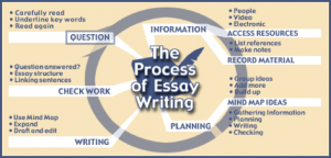
Essay Writing
Week 18-19: 18th – 29th Jan
DEADLINE: Hand in draft version of your essay Fri 29th Jan.
Objective: Criteria from the Syllabus
- Be aware of some of the methods employed by critics and historians within the history of art and photography.
- Demonstrate a sound understanding of your chosen area of study with appropriate use of critical vocabulary. – use for image analysis
- Investigate a wide range of work and sources
- Develop a personal and critical enquiry.
Quotation and Harvard System of Referencing
- Use quotes to support or disprove your argument
- Use quotes to show evidence of reading
- Take notes when you’re reading…key words, concepts, passages etc.
- Write down page number, author, year, title, publisher, place of publication so you can list source in a bibliography
- Use Harvard System of Referencing…see Powerpoint: harvard system of referencing for further details on how to use it.
ESSAY STRUCTURE
See below for a possible essay structure. Further help can be found here essay structure or see link here The Royal Literay Fund
Essay title: Hypothesis
Opening quote: Choose a quote from either one of your photographers or critics. It has to be something that relates to your investigation
Introduction (250-500 words).
Think about an opening that will draw your reader in e.g. you can use an opening quote that sets the scene. You should include in your introduction an outline of your intention of your study e.g. what and who are you going to investigate. How does this area/ work interest you? What are you trying to prove/challenge, argument/ counter-argument? Include 1 or 2 quotes for or against. What links are there with your previous studies? What have you explored so far in your Coursework or what are you going to photograph? How did or will your work develop. What camera skills, techniques or digital processes in Photoshop have or are you going to experiment with?
Paragraph 1 Structure (500 words) : Use subheading. This paragraph covers the first thing you said in your introduction that you would address. The first sentence introduces the main idea of the paragraph. Other sentences develop the subject of the paragraph.
Content: you could look at the following…exemplify your hypothesis and introduce your first photographer. Select key works, ideas or concepts and analyse in-depth using specific model of analysis (describe, interpret and evaluate) – refer to your hypothesis. Contextualise…what was going on in the world at the time; artistically, politically, socially, culturally. Other influences…artists, teachers, mentors etc. Personal situations or circumstances…describe key events in the artist’s life that may have influenced the work. Include examples of your own photographs, experiments or early responses and analyse, relate and link to the above. Set the scene for next paragraph.
Include relevant examples, illustrations, details, quotations, and references showing evidence of reading, knowledge and understanding of history, theory and context!
Paragraph 2 Structure (500 words) : Use subheading. In the first sentence or opening sentences, link the paragraph to the previous paragraph, then introduce the main idea of the new paragraph. Other sentences develop the paragraphs subject (use relevant examples, quotations, visuals to illustrate your analysis, thoughts etc)
Content: you could look at the following…Introduce key works, ideas or concepts from your second photographer and analyse in-depth – refer to your hypothesis…Use questions in Pg 1 or add…What information has been selected by the photographer and what do you find interesting in the photograph? What do we know about the photograph’s subject? Does the photograph have an emotional or physical impact? What did the photographer intend? How has the image been used? What are the links or connections to the photographer in Pg 1? Include examples of your own photographs and experiments as your work develop in response to the above and analyse, compare, contrast etc. Set the scene for next paragraph.
Include relevant examples, illustrations, details, quotations, and references showing evidence of reading, knowledge and understanding of history, theory and context!
Paragraph 3 Structure (500 words) : Use subheading. In the first sentence or opening sentences, link the paragraph to the previous paragraph, then introduce the main idea of the new paragraph. Other sentences develop the paragraphs subject (use relevant examples, quotations, visuals to illustrate your analysis, thoughts etc)
Content: you could look at the following…Introduce key works, ideas or concepts from your third photographer and analyse in-depth – refer to your hypothesis…Use questions in pg 1 and pg 2 or add…How does the photograph compare or contrast with others made by the same photographer, or to other images made in the same period or of the same genre by other artists. How does the photograph relate to visual representation in general, and in particularly to the history and theory of photography, arts and culture. What are the links or connections to the photographers in pg 1 and 2? What are the similarities, differences or links and connections? How does this work compare to yours? Include examples of your own photographs and experiments as your work develop in response to the above and analyse, compare, contrast etc. If more paragraphs are required, set the scene for the next paragraph.
Include relevant examples, illustrations, details, quotations, and references showing evidence of reading, knowledge and understanding of history, theory and context!
Conclusion (500 words) : Write a conclusion of your essay that also includes an evaluation of your final photographic responses and experiments.
List the key points from your investigation and analysis of the photographer(s) work – refer to your hypothesis. Can you prove or Disprove your theory – include final quote(s). Has anything been left unanswered? Do not make it a tribute! Do not introduce new material! Summarise what you have learned. How have you been influenced? Show how you have selected your final outcomes including an evaluation and how your work changed and developed alongside your investigation.
Bibliography: List all the sources that you used and only those that you have cited in your text. Where there are two or more works by one author in the same year distinguish them as 1988a, 1988b etc. Arrange literature in alphabetical order by author, or where no author is named, by the name of the museum or other organisation which produced the text. Apart from listing literature you must also list all other sources in alphabetical order e.g. websites, exhibitions, TV/ Videos / DVD/ Music etc.
DEADLINE: Hand in draft version of your essay Fri 29th Jan.
DON’T FORGET TO MAKE PHOTOGRAPHS & EXPLORE YORU IDEAS!!
- Produce a photographic response to your investigation in Personal Study. You must plan and produce at least another 3 photo-shoots in the next 3 weeks (e.g. responding to photographers subject-matter, style, form, aesthetics, specific skills, techniques, methods)
- Continue to review your responses and shootsand experiment with your pictures appropriate to yoru intentions Lightroom/Photoshop e.g. cropping, change colour balance/ b/w, brightness/ contrast, blurring/ movement, blending/ montage techniques.
- Select your best experiments and picturesand include in your Personal Study for analysis and comparisons.
We will begin work on editing and designing a photobook next week. If you don’t have any content i.e. text and images you can’t make a photo book!


