Category Archives: Final presentation
Filters
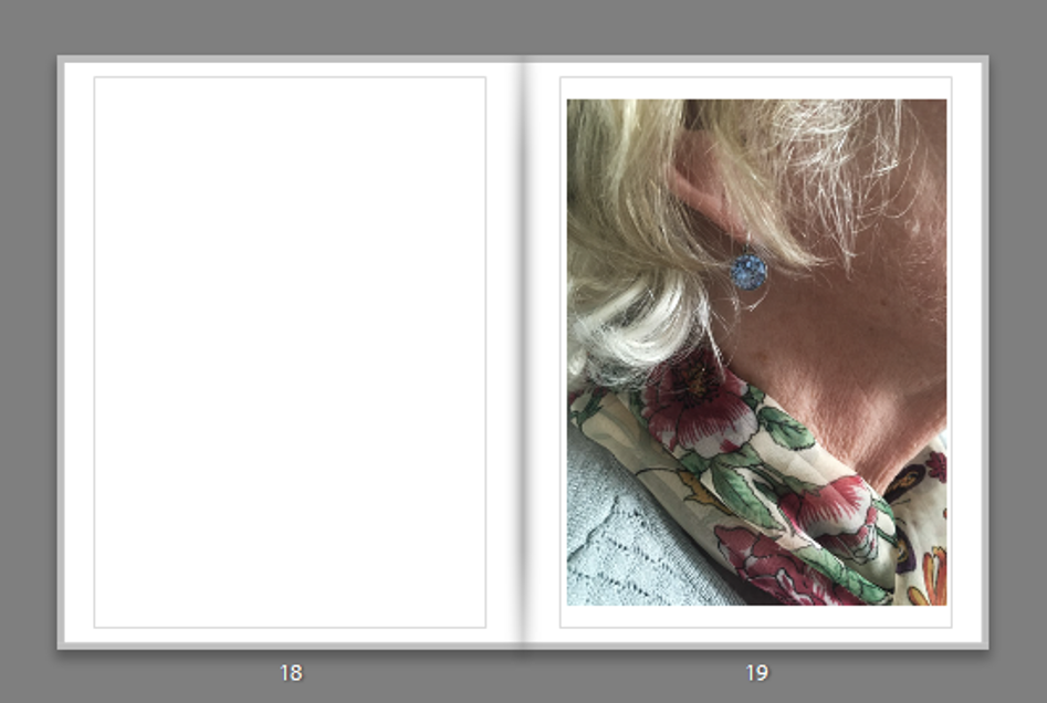
Synthetic Distortion – Photo Book Layout:
Personal Study – Abstraction – Bibliography:
rexer l the edge of vision 2009 new yorrk by aperture foundation
lenman r the oxford companion to the photograph 2005 oxford new york
https://en.wikipedia.org/wiki/Abstract_photography – Mike Weaver (1986). Alvin Langdon Coburn, Symbolist Photographer. NY: Aperture. p. 20.
http://barbarakasten.net/second-nature-abstract-photography-then-and-now/
http://www.theartstory.org/movement-color-field-painting.htm
http://www.newrafael.com/websites
http://www.moma.org/collection/artists/1164?=undefined&page=1
http://www.neromagazine.it/n/?p=7957
http://www.britannica.com/topic/vortograph
http://lumieregallery.net/wp/202/aaron-siskind/
http://www.mocp.org/detail.php?type=related&kv=6783&t=people
http://arthistory.about.com/od/modernarthistory/a/color_field_10one.htm
http://www.visual-arts-cork.com/history-of-art/colour-field-painting.htm
http://arthistory.about.com/od/modernarthistory/a/cubism_10one.htm
http://www.metmuseum.org/toah/hd/cube/hd_cube.htm
http://www.theartstory.org/movement-cubism.htm
http://www.tate.org.uk/learn/online-resources/glossary/c/cubism
http://www.britannica.com/biography/Alvin-Langdon-Coburn
http://www.brainyquote.com/quotes/keywords/abstract.html
http://mastersofphotography.blogspot.com/2011/04/alvin-langdon-coburn.html
http://www.brainyquote.com/quotes/quotes/a/aaronsiski141150.html
http://www.andrearosengallery.com/exhibitions/2003_10_aaron-siskind-an-abstract-expressionist-eye
https://www.lensculture.com/siegfried-hansen
http://aesthetic.wikia.com/wiki/Vaporwave
http://knowyourmeme.com/memes/subcultures/vaporwave
https://www.youtube.com/watch?v=PdpP0mXOlWM
http://anothercountyheard.blogspot.com/2013/03/the-verdict-on-vaporwave.html
FINAL BOOK
Here is a link to my final book design.
http://www.blurb.co.uk/bookstore/invited/6217410/78391bdcd04f14c765ed6231fdc67f4846be4f6a
Final Outcomes:
FINAL OUTCOMES
FINAL BOOK LAYOUT
Finals from my Christmas Shoot
These are my three favourites from my Christmas Day photo shoot. During this shoot, I experimented using the flash, which I think worked effectively because it produced crisp clear images. My Christmas day includes a christmas lunch with my whole family, and games. I have two little cousins which lift the excitement of the day.
My first final, is of my Grumma and Grandpa. My Grandpa is sitting on a chair with my Grumma standing at his side. This gives the photograph levels and allows both of their faces to be seen my the camera. They are both wearing Christmas cracker hats which I love, because I think it gives a stereotypical Christmas day feel to the photograph. I also really like that there is shadows behind both of them which I think creates a thick texture to the picture.
This portrait is of my Grandpa sat at the dinner table, he is still wearing his christmas hat, which provides a reoccurring theme through the photographs. The background to the photo is a children play set, which gives the photograph a playful feel. It also adds a lot of colour and shape. The image includes lots of colours which makes it interesting to look at.
This image is one of my favourite, however it doesn’t include either of my grandparents. My parents, are reading a story to my two younger cousins. This photographs contains comedic features such as the santa’s hat, and the bear slippers. However it also tells a story which is easy and accessible by the viewer.
Michelle Sank & David Goldblatt
To what extent has David Goldblatt artistically influenced Michelle Sank.
Michelle Sank and David Goldblatt are two artists that have been linked by an exhibition – Quintessence. This exhibition is a group exhibition celebrating the first five years of Archisle. The Archisle Programme, hosted by the Société Jersiaise Photo Archive promotes contemporary photography through an ongoing programme of exhibitions, education and commissions. Archisle connects photographic archives, contemporary practice and experiences of island cultures and geographies through the development of a forum for creative discourse between Jersey and international artists.  Quintessence selects works commissioned for the new Archisle Contemporary Collection at the Société Jersiaise Photographic Archive since 2011 to celebrate, critique, contrast and discuss what has been achieved over the first five years of the project. The exhibition features works by – Martin Parr, Tony Ray-Jones, Jem Southam, Michelle Sank, David Goldblatt, Yury Toroptsov, Elsie Wright and Frances Griffiths, Tom Pope, Peter Finnemore, Mark le Ruez, John Gibbons, Martin Toft, Finn Larsen. All of these artists are or have been nominated by another to take part in the exhibition. The artists were asked to nominate another artist who they feel have been artistically influential to them in their lives artistically. Michelle Sank therefore nominated David Goldblatt. These two are publicly linked due to the Quintessence exhibition as both photograph cultural diversity aswell as peoples physical and social landscape.
Michelle Sank
Michelle was born in Cape Town, South Africa. She left there in 1978 and has been living in England since 1987. Her images reflect a preoccupation with the human condition and to this end can be viewed as social documentary. Her work focusses on issues around social and cultural diversity. The two images Iam focussing on were both shown in the exhibition, and are aesthetically linked. Sanks image was taken at Harve des pas, Jersey. And is apart of a larger project called Insula, conducted/researched in Jersey as some images are from the archive. However, in the Quintessence exhibition Michelle chose to exhibit two images, although only one showed an obvious link to Goldblatts work the other could be linked aswell. This is due to the theme the two artists are focusing on which is photographing people in their natural landscapes. The less obvious image shows a theme of this as the image is of a greenhouse and one bright red flower in the midst of the overgrown chaos.
David Goldblatt
David Goldblatt is a South African photographer, born in South Africa after his Jewish parents fled Europe in the 1890’s . Since the late 1940’s he has photographed the social and physical landscape of South Africa. Goldblatt is well know for photographing people in South Africa during the period of apartheid, this is when black people were totally segregated and treated differently to white people through facilities such as schools, accommodation and transportation. Goldblatt received knowledge and success from this as during this period, a white person photographing black people was an unusual occurrence, this is because if you were caught interacting with a black person you would be sentenced to prison. Goldblatts images within the exhibition were some of my favourite, due to the stories behind them and also the visual presentation of the images was very appealing to me. Goldblatt was nominated by Sank for a degree of influence. This is obvious in the exhibition as one of the two images Sank exhibited is blatantly similar to one of the four photographs Goldblatt selected. This particular image was a photograph called -‘ She told him: “You’ll be the driver and i’ll be the lady”. This image was taken in Johannesburg, South Africa during the period of segregation, and sticking to the theme of social, cultural and physical landscape the image is of two people holding up a bumper of a car, and looked to be in the working class. This image particularly stood out as it is very similar to Sanks image of ‘Chloe and Leah’.
To conclue, David Goldblatt has influenced Michelle Sank artistically due to a theme of photographing peoples physical, social and cultural landscapes. The links between these two and influential traits that I have researched are visual and thematic links such as similar layouts to their images. Other considerable links between the two are that they were both born in South Africa, this could also have been a leading cause to the influence Goldblatt had on Sank. The photographs they both exhibited were picked due to the themes of social and cultural environments.
Final Picture-story
Final outcome- Picture- Story:
This is my final design for my picture-story, I have experimented with different styles. However, I have found this particular idea to work the best for my theme of memories. I wanted the photographs to look as one in a sense, so they appear as a fuzzy thought. I also wanted the writing to tie in with the images as though they are speaking the memories. Furthermore, the style of writing I have chosen is a type writing font which in my opinion works really well with the photographs. I have put photographs on top of each other and copied particular images. I have used different filters so that the images have a more powerful effect. The only image I have kept the same is the photograph in the bottom right hand corner because it represents my grandfather’s focus on his family. He was very much a family man and spent most his life devoted to supporting his children and grandchildren.
With regards to the text, I chose the particular font because of the olden style it had about it. I liked the idea of it being like a type writer because I wanted the picture-story to feel old and vintage therefore this worked perfectly. For the title I explored with a range of different ideas, I looked at quotes online about memories but found a great deal of them were very sad and focusing on losing someone. This isn’t the idea of my picture-story therefore I decided to go with a title I thought suited the entire piece. I added the ellipsis on at the end in order for the sentence to trail off like a thought, I didn’t want it to have an end.
When photographing these images I kept the burnt and broken sides of the pictures in because it made it look more authentic. Especially the image which I have not used any effects on, the edges stand out and represent a old and vintage look.
I think this picture-story is close to what I initially wanted to produce from this project. I think I needed to include more modern photographs, however, I struggled with the concept of photographing someone that was essentially invisible. I think for when I carry this project on into my personal study, I will be more creative and open to exploring ideas which perhaps are more difficult but will capture the concept of memories.
This is my second picture story design, it is extremely different from my first picture story. I wanted the second one to be more professional and clean cut, I also wanted to include important quotes from condolence letters which were personal to my family. Archival images were a major factor in my picture stories, I think this was an important element as I have hundreds of photographs from my grandfather’s life. I used Photo Shop in order to design this picture story, I had previously leveled the images as well as adjusting the brightness and contrast. I then began the design by playing around with a selection of images, adjusting the size and angle to fit with the other images. I also played around with where the photographs were placed and the writings.


