Category Archives: Experimentation

Filters

Author:
Category:

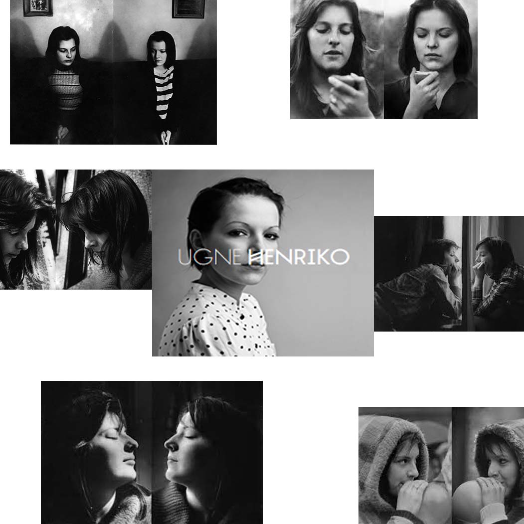
Ugne Henriko – Similar

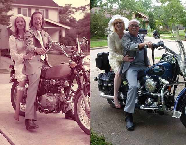
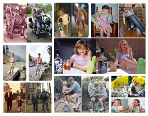
People all around the world seem to have the same idea as Ugne. As you can see in images below they have taken sentimental or normal images and recreated them some time later. i find this type of photography interesting as you can see the changes the people and items have gone through in the time period between the two pictures. Untitled-1YU

For example, the couple below got married and took a photograph on a motorcycle as shown on the left. 40 years later! on their 40th wedding anniversary they tried recreated the image, a view visual errors but they also tried to take it in the same drive way as they did 40 years prior.

weddingbeforeafter

Another example would be a father and son also did a similar thing outside their family home. They took an image on the grass outside their house and then recreated it 20 years later! and succeeded as they paid good attention to detail, such as clothes and even the football the son was holding.

20-years-later

Blanket Series: Air

nmml

This is my first edit from the ‘air’ series. This was the picture that I took first. The zoom was larger and as I went on I decreased the zoom. The pictures from this experiment are quite different. We did about three different throws, therefore the results vary. Particularly in this one, the rule of thirds is quite good. The blanket intersects the lower horizontal line of the grid. This adds balance to the image, and directs me to look exactly at the blue blanket. Also the colour is important. The blue shaded windows in the background, balance the foreground to it. It almost reflects the colour.

Image7.jpg nkm

For my third picture, it shows a further away shot. There is a lot of depth and certainly a lot of distracting features. The angle upsets the symmetry, but this is what causes the composition to be very interesting and amazing.

DSC_0233 air kkk

I’ve edited this image to increase the contrasting colours. There wasn’t much vibrancy, so I also altered it. Moving onto the compositional elements, I think that this photograph has got a great rule of thirds. Since the blanket is intersecting one of the two vertical lines, the images has a sort of balance to it. The leading lines in the background are very distracting. The rectangle and square shapes on the buildings create a very abstract view. I think that the curled up blanket, that’s soaring mid-air adds an interesting component to it. The off-balance distracts me from the solid background and I think that the difference is perfect. Also, the angle at which is the picture was taking is also quite intriguing. I was standing at the bottom of the staircase, whilst pointing my camera lens upward. The way in which it was taken really changes my perspective and even makes the blanket look bigger than it really is. It’s hard to tell if the blanket is closer to the building or to the wall. This picture has great depth. The background, middle ground and foreground are all filled with objects, therefore it has a three dimensional effect. The layers in the scene draws me into the image.

This in all, creates a series, which shows the blanket being thrown. You can see where the blanket starts, higher up in the left hand corer of the staircase and where it ends up. The result of this performance was very effective in my view. At the end, the blanket goes over the top of the wall, which I managed to capture at the last minute.

Blanket series:

During our trip to France, we found a lost blue blanket on the ground. As an idea, we brought it around everywhere we went. We would place it on various objects and locations, as we saw them. I think that this documented a performance, as we showed the different settings we reached and incorporated the blanket into the journey. Below, is how it was originally found.

Image3.jpgfklm

Image2.jpg mf

On the next part we travelled down a small alleyway and decided to place it on this doorway. I took this in a front on angle. I think that the blanket disturbs the patterns and symmetry. In result, it creates a very interesting shot.

Image1.jpg blanket

I really like this image. This is because the rustic effect on the walls adds an antique aesthetic to it. The barrel in the background is also quite vintage. I like the contrast between the olden look and the newer aura transmitted from the blue blanket. It also appears quite unusual as it’s not normal to see a blanket perfectly tucked behind some signs. The depth of field is strong in my opinion. The elongated and narrowed view on the left hand side creates a lot of depth. There are so many leading lines. Most of my attention goes to the left hand side of the picture. I think it’s because of the direction of the vertical lines.

rtfghfgh

I edited the photograph above. I added a purple hue and decreased the vibrancy. For me, the only colours that are present are purple and the rest is in black and white.

Image8.jpg jl

Next, it was placed on a metal shape. The other one is visible on the right side. I like how it adapts to the rounded shape, and needs context to know what shape it actually is.

DSC_0211jhk

Then, we came upon this sign. The signs have been completely covered in graffiti and looks vandalised. I think there’s a great contrast between evil and good here. The signs are covered in dirt and are marked, whilst the blanket is clean and pure.

Image5.jpg nnk

 Lastly, we came across a construction site. The obstruction which was a hole was surrounded by a bright red gate and tape.

St. Malo Experiment:

DSC_0147 g

This is the sign that we put up. It was a little experiment that we did as a group to capture performances in different ways. The disposable camera was tied around a tree in the centre of the town and we put up a notice asking the locals to take a picture. It said “Bonjour! Nous sommes Jersey etudiants en photographie, et nous aimerions votre aide pour un projet. S’il vous plait pourriez-vous prendre une photo avec cet appareil? S’il vou plait ne pas supprimiere cette camera. Merci”. This translates into “Hello! We are Jersey students who are studying photography, and we’d like your help for a project. Please can you take a picture with this camera? Please don’t remove this camera. Thankyou”.

DSC_0181jjjjjj Image4 Image5 Image6

St. Malo Outcomes

Tom Pope - Whatcha Peeping Tommy?
Tom Pope – Whatcha Peeping Tommy?

Above is a photograph from Tom Pope’s series entitled ‘Weak Anarchy’. Pope is hiding behind a tree. All that can be seen is a glimpse of his face and body, however it’s very blurred and he looks unidentifiable. The picture seems to have been taken during the night as there is a lot of bright white light reflecting from the leaves. Also, the light looks artificial. There are many leading lines which are very opposite to each other. First of all, the bricks are horizontal and therefore my attention goes to the edges of the photograph. The leaves from the tree are pointed in all directions and direct me to look further up. Since the brightest place of the image is Pope’s head, that’s the first place that I’m drawn to.

For my response, I’ve emulated his picture in a very similar manner. Whilst in France, my group and I, spontaneously decided to recreate this image. A girl can be seen hiding behind a large tree. Amazingly, there was also a high wall under the girl, which was very similar to Pope’s one. In my responses I have edited by doing several processes and have kept one in colour and one in black and white.

tree

Above, is my first response to Tom’s Weak Anarchy image. I did some general edits to brighten and saturate it. I think that it has a very interesting rule of thirds. The shrubbery leaves the whole bottom third of the picture clear and occupies the top. Much like in his picture, my one exhibits very strong and bright sections of white light. The natural sunlight shining on the green leaves draw my eyes to those places and I think it adds intrigue to the photograph.

bw dd

As my second response, I have shown a very similar outcome. This one, however I cropped this one in a farther away fashion, to show the whole environment around it. I made this one black and white to vary my edits. I think it brings out the shadows better and shows the highlights and contrasts more clearly. At first it’s hard to spot the person, which is why I believe it’s more interesting to look at. I like how the spaces in the tree’s create pockets of light on the floor. It almost looks like fallen blossom. The rule of thirds is quite unbalanced. This is because the main focus isn’t placed on the key lines of the rule of thirds. Therefore this is even more interesting and for me, the ambiguity of not fitting into the perfect grids, is great.

Bruce Nauman and Response:

Above is a YouTube link to Bruce Nauman’s piece of work. During this video, he applies gold make-up to his face and body. It was created in 1967. The 11 minute long video is very simple, yet the process in which he applies the product is quite interesting.

Bruce Nauman is greatly associated which performance photography and that’s exactly why I chose him as a reference. Also his ideas are simples, but efficient in conveying meaning. He would often record or shoot himself doing particular, repetitive things. His work was inspired by many movements such as Post-Minimalism, Conceptualism, Minimalism, performance art, and video art.

Bruce Nauman - A Rose Has No Teeth.
Bruce Nauman – A Rose Has No Teeth.

I have gotten my inspiration from the piece of performance photography he created above. He is simply pulling at his face and creating wrinkles and bulging in the skin.

For my study I’ll incorporate some makeup just like Nauman uses and show the different stages of which I cover my face with it. I will also only shoot in a close-up range, making sure that I don’t smile, so that my expressions are raw.

This is my response to Bruce Nauman. I shot various straight- on self-portraits in which I included the process in which I applied golden liner. Much like his performance in the ‘make-up’ video, I’ve used a similar concept of ‘covering my face’, however I captured my moments with still images. I’ve tried 3 different looks, here are the results of my first experiment:

g2       g3

g4       g5

Second experiment: For this one I used a pink lipstick and started off by only placing it on my lips. Then I began to smear it on my face as if I was trying to disguise my face.

p1       p3

p4       p5

p6       p9

p10       p7

Third experiment: Using a red liner I created scratch marks and lines on my face. Again they would get more detailed by time.

r1       r2

r3       r4

Subversion Experiment

As one of my experimentations I have made an 8 minute video whereby I follow my family around with a video camera. My attempt is to be as intrusive and as socially awkward as possible. This did not make the final selection of outcomes but nevertheless I am proud of the way that the video has turned out. The film follows the theme of subversion, my role as a subversive individual trying to create trouble in a peaceful, quiet setting.

Dadism

Dadaism, is an art movement of the European Avant-Garde in the early 20th century.  Dada, in Zurich, Switzerland began in 1916 and was reaction against the horror and futility of WW1.

“Freedom. Dada, Dada, Dada, crying open the constricted pains, swallowing the contrasts and all the contradictions, the grotesqueries and the illogicalities of life” – Tristan Tzara, 1918

dadiasm 3

Dadaism focused primarily against an art subversive to any traditional values and morals. This meant abolishing all logic and wanting to destroy the deceptions of reason. This meant that Chance and spontaneity:  what ever came along would be considered art in every form. This  was then considered a anarchical and irrational action and event which sparked emotions such as shock, surprise and scandal. This was all result on a wanted audience reaction, testing their taste and level of tolerance.

dadaism

daism 2


Dada has influenced most of the 20th century art movements: Surrealism, Russian Constructivism,   Situationism, Fluxus, Pop Art, Conceptual Art, Minimalism and Performance Art.

Dada was used as a model of revolt for these movements, including influence from the ‘Sex Pistols’ and Punk rock.