I have been experimenting with different designs when making my story board. Whilst experimenting I have been manipulating: colour schemes, amount of images, image selection, image size and fonts.
Here are some of my final outcomes:
Category Archives: Experimentation
Filters
Personal Study – Abstraction – Planning:
Personal Study – Abstraction – Planning:
Personal Study – Abstraction – Planning:
Experimentation:
Experimentation:
For my experimentation I have taken inspiration from some of the artists I have previously researched like Laia Abril and Yury Toroptsov. I wanted to find a more interesting way of displaying archive material rather than simply having it as a single image, unless they are powerful and meaningful enough. Therefore, I decided to create a collage style page in my book I am designing. However, looking over my collage again I think I need to make the image size smaller so that I can put more photographs of his life in it. I want it to represent as many memories of his life as possible.
After looking back over The Epilogue I think I need to readjust the size of the images. They need to be a lot smaller in order to fit more photographs in and therefore more memories in.
Stereotypes | Research
Why stereotypes?
I think that I want to create another short film with a voice over sharing my thoughts on feminism and what it means to me. I want to create an effective video to go along with it and put a visual aspect to what I say. I think that this is a good idea, although it will be a challenge to get it all done in such a short space of time. I wanted to do some added research into my work to make sure that it is accurate. I think that this is pivotal in making an effective piece of work and something that my spectators and audiences are able to really connect with and understand. I went deeper into researching about certain stereotyped groups of people. This was important for the creation of a video that I am creating as it really included all kinds of people and allows my spectator/audience to really get the concept and the meaning behind my work and the movement that I am a part of. One group of people that I wanted to focus on was the black female community, specifically how they need to style their hair to maintain its condition. I find black culture so interesting and want to embrace it myself as well as obviously standing up for the rights of black people too. I find it important for those who are faced with suppression to come together and realise that we are all in it together just at different levels. I also wanted to focus on gay people and the stereotypes that are thrown at them and how being gay seems to label you and put you into a bracket which to me is totally wrong and shouldn’t be the case. I also wanted to work on how transgender people feel within our community and the way that for so many years transgender people, more than others, are being suppressed and made to hide their true selfs and their most authentic selfs. I find all of these people so important in understanding the inequalities of our society and wanted to add this into my work as part of a short film that I am planning on making. I really do believe that the road to equality comes when we realise that we are not alone and that our culture and our being doesn’t need to clash but it can come together to fight suppression. This research is for a small segment of a short film that I will be making which I have decided is going to be my main project and will be getting stills of to create my final book.
How To | Head Wrap
For this particular shoot I wanted to highlight how many white people are happy enough to stand up for black culture yet when it comes to standing up for black lives they take a backseat and don’t want to cause any trouble. I chose the head wrap as I find that it is a clear symbol of black culture and I want my spectators/audience to be able to clearly identify that. This will be a part of a short film that I am currently creating which gives mention to the suppression of black people. I find head wraps so beautiful and think that it makes women of colour look so unique and to me really embraces their culture. After reading more into the reasoning behind the head wrap I really got to grips with just how much of black African culture it represents. The use of the head wrap is to give the hair a break and so that hair can go through deep conditioning, something that black women have to do to maintain their hair. I wanted to embrace this in my work and to really get it right and so I went looking for videos on how to do a proper head wrap. This was really interesting to research and to watch how easy it is to actually do a head wrap yet to me it looks so well put together. Here is a video that really helped me when it came to doing a head wrap on my own head.
Gay stereotypes
There are so many stereotypes within our society today and a lot of those stereotypes come from film or generalisations. I find that movies will often mimic a gay person for comic effect and will over exaggerate a gay person to make it easier for the audience to identify them as ‘the gay one’. I feel that these generic stereotypes have seeped into our society and now people actually think that all gay people are a certain way and have specific attributes. I find this so ridiculous as a sexual preference should not define you as a human being and it shouldn’t be a dominant factor in what you are like as a person. People seem to use these stereotypes to belittle gay people and to put them into a specific box that traps them and often I find that gay people are suppressed. It takes some people so long to ‘come out’ as gay and to actually tell people that they are attracted to the same sex. I really feel that with a lot of people there is a block of what they understand of gay people and think that the movies that they watch portray what gay people are like when in fact you shouldn’t be putting gay people into one category as they are just people who are attracted to the same sex.
Transgender | What it’s like
I really wanted to get what it is like to be transgender more so that I am able to successful portray my character in such a way that will represent this. I am intrigued with transgender people as it seems like such a hard place to be in and can be so isolated at times as I get the feeling that there is a lot of fighting going on in your own head of what is right and wrong and how gender should be. We tend to focus ourselves on how we should look, a woman should look one way and a man should look another way, limiting how people are expected to be. For me transgender people are trapped inside the wrong body, they aren’t authentically themselves if they remain trapped and if they conform to what is expected of them within society. I really want to be able to express the suppression that many transgender people go through as they are not given equal opportunities and people seem to turn a blind eye and think that it’s ‘just a phase’. Funny how our society has really only started to accept gay people over the past few years and they were labelled with the same thing, ‘just a phase’. I want to show how being transgender isn’t a phase and that people actually struggle through and are suppressed by our society.
My response | Experimentation
Originally this work was going to be a part of a short film that I wanted to create but I have now reshaped my idea and will no longer need this content for it but I wanted to post it anyway as this experimentation has helped inform my final project and has helped me to develop my skills with staged images, props and creating different and unique personas. I find this work to be exciting and will get my spectator thinking. This idea came from a short speech that I made with the intent of creating a short film adding in clips over the audio to visualize what I was saying. However, this idea isn’t too relevant to my other work and I feel that, although would have been good, isn’t necessary in my final project.


Photo Book Influences and Ideas: Rita Puig-Serra Costa
https://player.vimeo.com/video/99219686?title=0&byline=0&portrait=0&color=edea15
This is a video demonstrating the page by page layout of Rita Puig-Serra Costa’s book “Where Mimosa Bloom”. As you can see from the video, Rita’s style of layout sparks essence of formal and non-formal themes. As you can see below, the hard cover first page displays a large image, cutting off the boarder and in effect drawing the reader in as the image erupts the ‘gutter’ and indents on the book.
In contrast, Rita’s work sometimes changes throughout the book, for example, when the pages are sometimes broken up by a blank page or text. This technique can usually done to make the story more interesting, and simply creates anticipation for the reader as they are wondering what is going to appear next. Rita’s simplistic style co-ordinates her archaic photographs, the simple image similarly makes a larger impact by the focus the pages have on them.
Fashion Magazine | Experimentation
Here is all of the experimentation that I have done towards making my fashion magazine. I have changed my mind on what I want to create for the fashion magazine but I still wanted to add in this experimentation as creating all of the different personas has really helped me to create a better final outcome and to really get into character.
These images are parodying those young women that get lip fillers and work done on their bodies. I find this so trivial and something that young women shouldn’t even have to worry about. But that is the society we live in. We ridicule women publicly in magazines, on TV shows and to one another that it becomes hard for any woman to ever feel good about herself. The ideal of being the perfect woman is constantly drilled into young women’s minds making them feel that if they do not look a certain way then they aren’t good enough or that no one could ever love them. This ideal is so stupid and I wanted to make that clear in these images showing clearly how silly it makes young women look and that they should just embrace themselves and stop dwelling on the physical unimportant things. I do have to mention that I am nowhere near body confidence and I do see myself in a negative light, like most women. This is because we are constantly bombarded with celebrities and their flaws so if a celeb is flawed what does that make me? We forget that we are all human and that there are times where we aren’t going to look our best but there is nothing wrong with that, it’s what makes us human.
 Above is an experimentation that I originally wanted to use as the front cover of my fashion magazine. The words written across my face are words that I’ve either been called or seen other women being called online and in person. I wanted to impact my spectator straight away and show them few derogatory words that are thrown at women daily. I came up with the idea and took inspiration from a past shoot that I did on femme fatales and found as many derogatory terms aimed at women as I possibly could. This research and previous experimentation has really helped me with this experiment. I also took inspiration from a video that I watched of a feminist activist group called the Pussy Riots. I came across such words in the comments that people had written anonymously. These comments were so offensive and vulgar. It really made me think about what those words meant and how someone can just through such words around as if they don’t hold much meaning or aren’t that offensive. Some of the language used to define women is absolutely disgusting and really belittles women is such a way that cannot really be defended. So in this shoot I am taking back those words, I wear them on my skin to show that the words that those people use to define me do not change who I am and they are just words. The term ‘feminazi’ came from a comment I saw and it really stood out to me. The fact that feminists, people that want equality, are compared to that of the Nazi’s that killed millions upon millions of innocent men, women and children is absolutely wrong and unjust. I find the word extremely offensive and something that shouldn’t have even been thought of. It really does show to me that the people who make these comments don’t know what they are talking about and they aren’t worth it. Those people who use words as if they are part of the english dictionary really make me wonder. How can people be so blinded by pure hatred and how can they be so stuck in their ways that they don’t even want to think about the idea of equality and won’t even try to understand what the word feminism actually means.
Some of my experimentation’s are incomplete but this is purely because I changed my mind on the whole magazine idea. I think that what I was working towards was good work and I feel that I have been able to portray both the male and female characters well. I chose to become both male and female in my shoots as I took inspiration from Claude Cahun and her work challenging the norms of how men and women should be. I wanted my work to stand out and to make sense to a wide variety of spectator. This experiment was fun to do and has helped me with the process of choosing appropriate props and settings for my final outcomes. The above image is the start of a magazine layout idea that I had and acts as a double page spread. I wanted to show the differences in male and female style as well as the idea of being masculine and feminine. I wanted to mimic existing model’s style and the way magazine photographers want their models to look and how to be positioned. I do like these images as I do think that I look like a male in the images and think that I was able to successfully portray a stereotypical masculine physique by the positions that I am standing/sitting in.
For this shoot I made a t-shirt that I got inspiration for while watching a feminist campaign online. I saw a sign that stated ‘Feminism. Back By Popular Demand’ and thought it was great and wanted to take that and bring it into my own work. I decided to paint it free-hand on the back of a plain white t-shirt that I had and on the front I decided to free-hand the symbol of female. I thought that this would work well and be a clear indication to my spectator that it was a step towards supporting feminism. For my characters I created a male and female. The male is wearing the front of the shirt with the female showing off the back of it. I thought it would also be a good idea for them to be holding paint brushes to show that they created the shirts together and are unified together. I really wanted this to be a clear message and easy for my spectator to understand. I think that this worked out well and the images came out successfully. The reason I decided against this idea of creating a magazine was because there would be so much editing to do and the lighting wasn’t right in the images as well as the fact that I came up with a new better idea. These ideas went well at the time but I did not want to develop them further.
Into The Woods | Creative Pathways Work
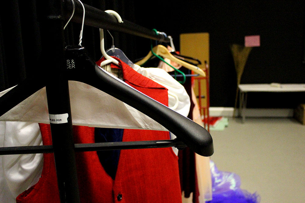
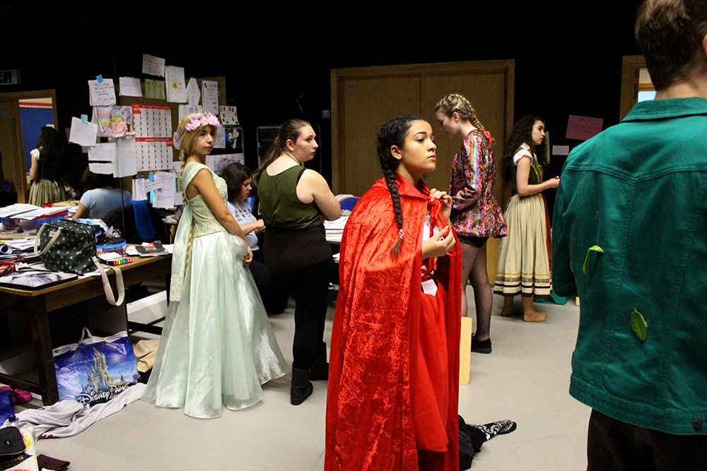
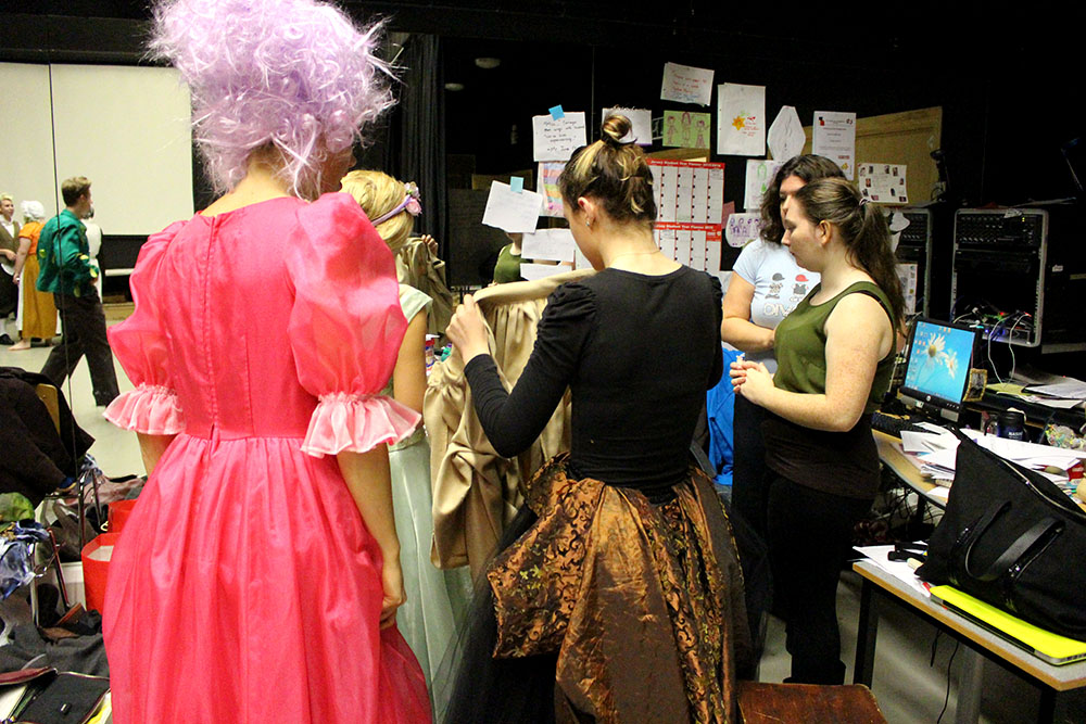
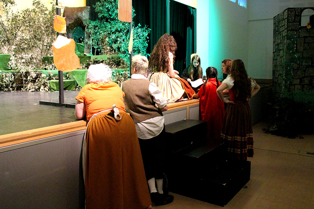
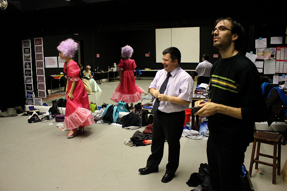
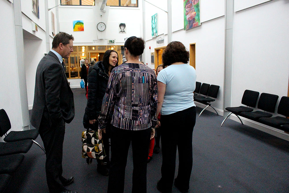
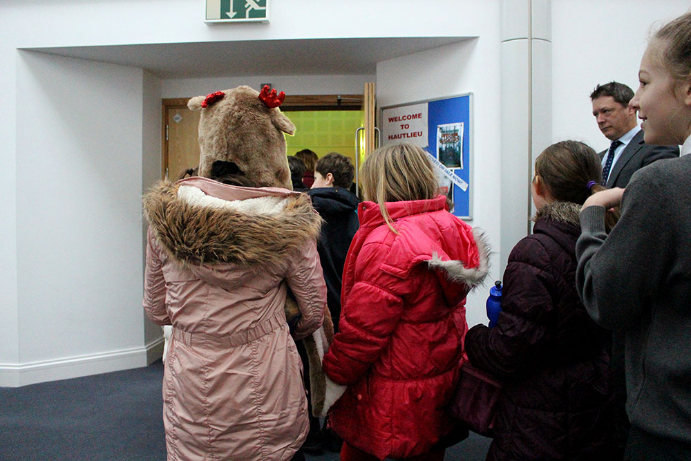
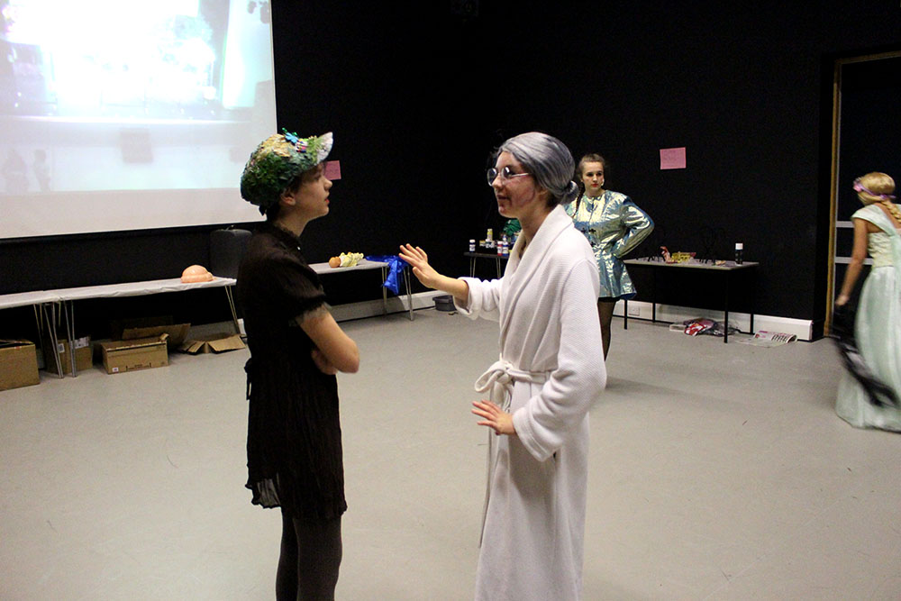
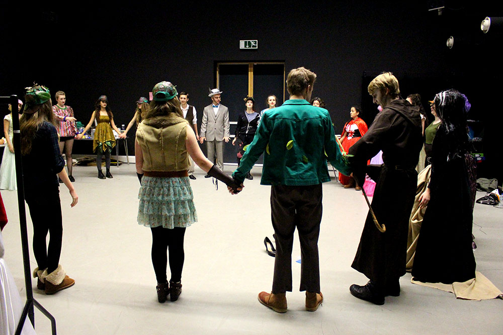
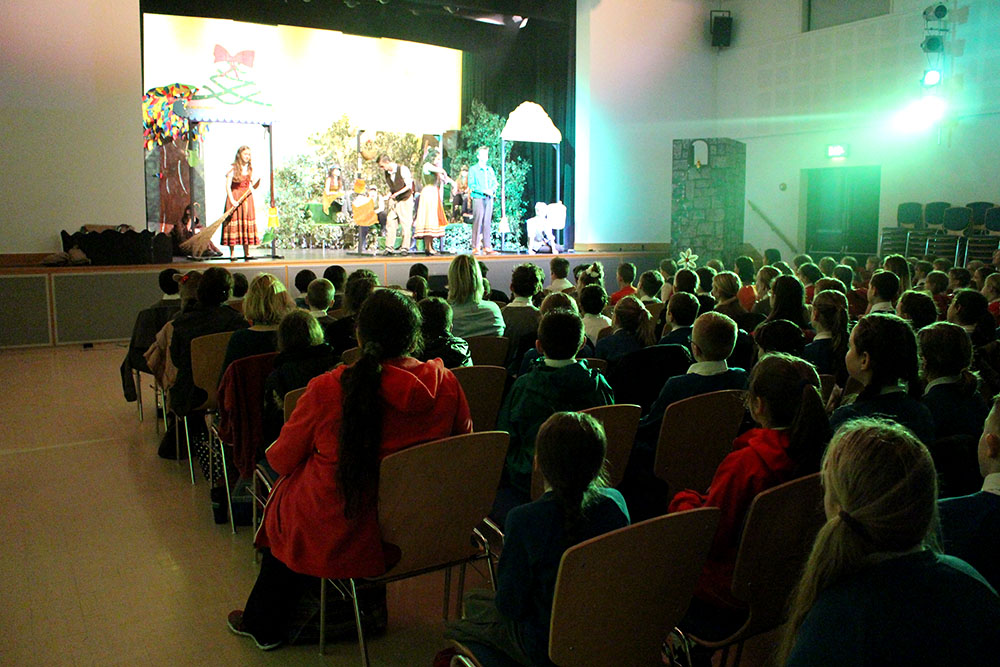
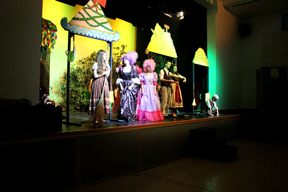
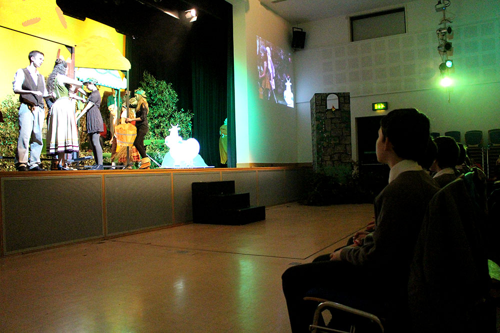
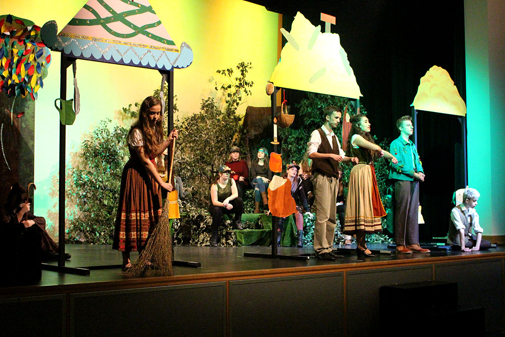
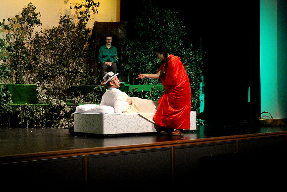
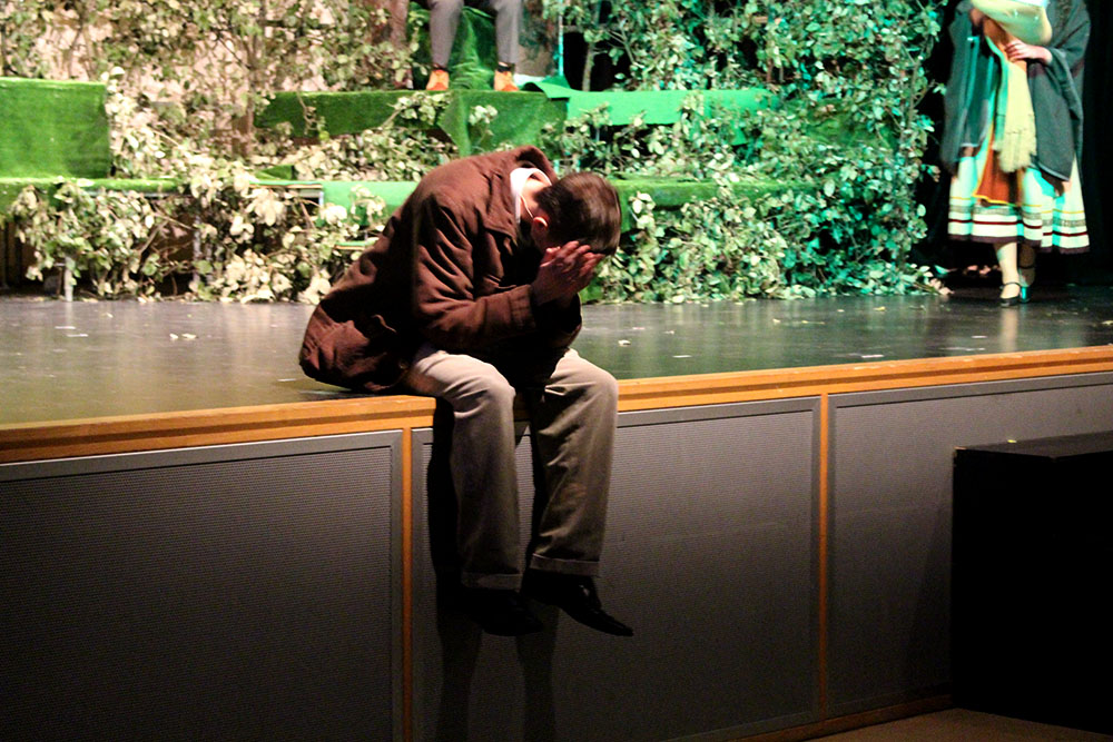
Here is a bit of an experimentation that I did while the Hautlieu School production was going on. I was asked to go down to the drama department and make images throughout the day where cast and crew were performing for their first proper audience of a load of primary school children. I decided to make images from behind the scenes to get more of an inside view of what goes on backstage before and throughout a proper show. I wanted to capture the expressions and emotions of the actors and those watching. I found this to be a great and interesting new experience to be able to go into a more professional environment and for the cast to be comfortable and welcoming to being photographed. The behind the scenes action began at around 10AM and went on until about 2PM. In that time I made over 700 images and have gone through and edited them all and narrowed it down to my favourites in this post. Most of the images that I made throughout the day are from behind the scenes and give a bit more detail into the goings on in a Hautlieu School production. The images are documentary style and are simply behind the scenes of the school production giving the spectator more of an insight into what goes on when the actors aren’t on stage and turned on as well as some images from their performance in front of their first proper audience.
Hypothesis of overall Personal Study
Objectives:
- Establish coherent and sustainable links between your own practical work with that of historical and contemporary reference.
- Show evidence for an on-going critical and analytical review of your investigation – both your written essay and own practical work in response to research and analysis.
Hypothesis: Possible questions to investigate
Within my personal study, there is evidence of various techniques. These include: Portraiture, Documentation, Landscape, Abstraction and Reflections on Photography (themes of Aesthetics, Codes, Truth, Seeing, Looking)
Questions to consider concluding my overall hypothesis:
Portraiture
Does a portrait tell us more about the person portrayed or the photographer?
Here is a link to an interesting article by Canon, who released a project directed to the relationship between the camera and the person.
Canon Experiment Article – http://petapixel.com/2015/11/04/6-photographers-asked-to-shoot-portraits-of-1-man-with-a-twist/
After reading this article, I strongly believe that a portrait can be re-represented in any way. The photographer is the pivitol force within a photo-shoot. Emphasis to strong stereotyping and styles are reflected throughout the article, but with persuasion photographers perceive an image in a different way, therefore reflecting the photographer more.
Can personality and identity be expressed in a portrait?
Visual Arts –
- Portraits contain clues about the people pictured in them that can tell us things about the subjects’ cultures, identities, traditions, and roles in society.
- Portraits can express how people think about themselves and their world.
- Portraits can include symbols that reference interesting aspects of the people in them.
- When creating a portrait, an artist makes many artistic choices that affect how we understand the image.
- Artists make choices about media, style, background, and embellishments to visually describe themselves or others
What are the differences/ similarities in a formal or informal approach to portrait photography?
What makes an iconic Photograph?
What are the Influences of the Old Masters and other painters on modern photographic portraiture?
What are the key elements if Portraiture and Intimacy?
How Can Photography reflect inner emotions such as fear and isolation?
Documentary and Street photography:
Is it possible for photography to capture moments in time objectively and truthfully?
Examining the documentary aesthetics: A photograph should not be manipulated, so that its authenticity, veracity and sense of realism can be maintained?
What is the relationship between photography and realism?
How can photography bear witness to the ways of life and events of the world?
What is the relationship between Henri Cartier-Bresson’s theory of the ‘decisive moment’ and subjectivity?
What are the intentions of Voyeurism and the nature of observation and intervention in documentary photography?
Landscape photography
Issues in Landscape Photography: Romantic or idyllic representation of nature vs culture and the man-made world.
What is beauty in landscape photography?
How does people control, interact and construct the environment in which they live?
In what way has the work of Ansel Adams influenced Joe Cornish?
To what extent could the work of Ansel Adams be considered spiritual?
What is the Meaning behind William Eggleston?
How Is William Eggleston At War With The Obvious?
What was so different about the ‘New Topography’ exhibition in 1975?
Two Photographers, One Aim: Preserving nature. Looking at the different approaches to landscape photography between Ansel Adams and Robert Adams.
Abstraction:
Two photographers, one aim: Looking at the different approaches to abstract photography between Eliot Porter and Aaron Siskind.
In what way can abstraction make visible what is invisible in the natural and urban landscape?
Reflections on Photography; Aesthetics, Codes, Truth, Seeing, Looking
Examining the documentary aesthetics: A photograph should not be manipulated, so that its authenticity, veracity and sense of realism can be maintained?


