Category Archives: Evaluation

Filters

Author:
Category:

“I Am Not Tom Pope, You Are All Tom Pope”

Within Tom Pope’s time in Jersey, he has explored various conceptual and contemporary ideas surrounding Jersey’s Photographic Archive. The Societe Jersiaise has worked with Tom in order to re-create aspects of the Archive by designing existing and inventive procedures so that the public can interact with historic events the library withholds. Gareth Syvret, the creator and program leader from the photographic Archive described pope’s work as extensive, underlining the sheer developments Tom made to bring the archive to life. Syvret contributed to tom’s influences by grasping ranges of sources which were kept untouched from the Archive, which were then later on added back into modern life by techniques of restoration. Gareth, in his report on Tom’s final exhibition goes on to quote Sekula from 1997:


“Certain theoretical perspectives directed at photographic archives have sought to interrogate the disciplining power of the archive as a system within which, once accessioned, photographs lose meaning by becoming abstracted from the networks of communication and use to which they were put before entering the repository”.

DSC_0399 edit
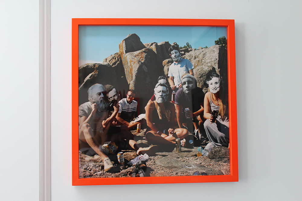
A section of the wearable masks Tom produced for the public to wear and use.

At the end of Tom’s time here, his ending exhibition: “I Am Not Tom Pope, You Are All Tom Pope”, which was presented in The Old Town Police Station in St Helier, Jersey, coincides towards his recreation of the archive. One of the techniques Tom used to present a section in time was to cut out faces which he thought were ‘memorable’ or ‘significant’ which were then later on post-created into masks. Pope then questioned the public into wearing these masks, significantly ‘activating’ the Archive. This then relates back to Pope’s title: ‘You Are All Tom Pope’, reflecting that you are now the active Archive. Within a section of his exhibition, Tom continues to prolong the initiation of the Archive by using full spread pictures, took from a section of history. When Pope visited our school, the starting activity was to place these full spread sheets on a flat surface. We were then encouraged to flip a coin onto these photographs and wherever it lands would be cut out. This circle where the coin once was got turned into a badge, effectively to be ‘wearing’ and travelling the Archive.

Documentary Photography14
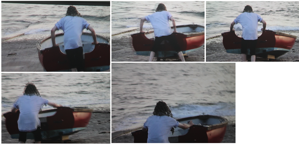
A collage of images I created of the movements of his video ‘Pushing The Boat Out’.


Documentary Photography15
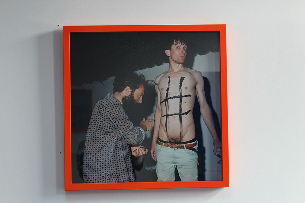
‘Come Play Me’


Toms indigenous ideas console the reflection of how his work is very interactive and playful. In his works ‘Come Play Me’ you see Tom standing upright being turned into a human naughts and crosses board. This idea of how us as the reader we can evaluate and become one with the image is evident, as you are almost thrown into the image by Toms direct.

Documentary Photography17
‘We Can Be Together’
Documentary Photography16
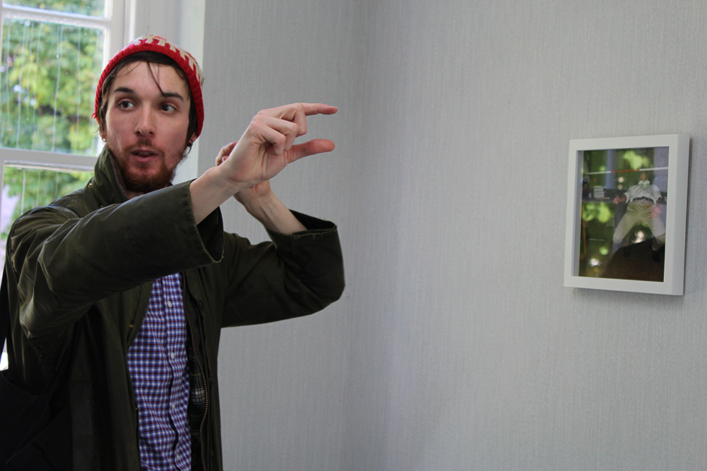
Tom demonstrating his works ‘Low Vs High’.

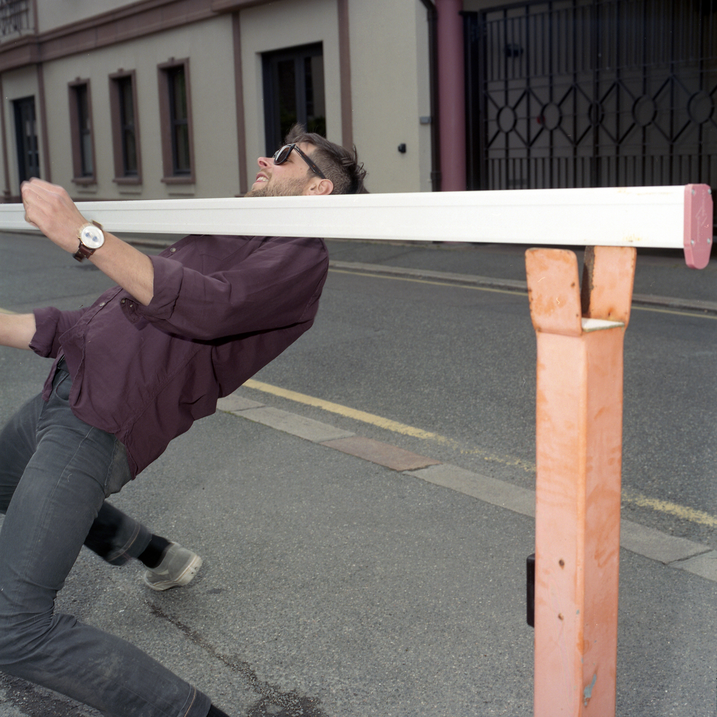
Here, Tom initiates this idea of connecting the next section of his images by connecting the geometric and lines naturally composed within the image. ‘Low Vs High’ shows the connections between objects such as poles, stands and infrastructures in order to make the images ‘flow’. This narrates a different certain type of story and document of the different series and periods of time which allows the reader to relate in a significant type of way.


Deleted Scenes – Response to Images

The front cover of ‘Deleted Scenes’ is interesting because it shows a part of an archival image of Yury’s father. The back cover of the book shows the other section of the image, which is of a much bigger proportion. By showing a small glimpse of Yury’s father in the image the reader is given a brief indication that the story is perhaps about this half-revealed figure, there is no indication that his photograph on either the front or back cover is in fact Yury’s late father. From Yury’s perspective choosing a small glimpse of his father works well because firstly it symbolises that Yury knows little about his father. The juxtaposition with the back-cover completing the image works well because it presents how over the course of making the book, Yury has learned more about his father and therefore can more informatively relate to and recognise his portrait.


Shots of the barren landscape of Eastern-Siberia like this appear consistently throughout ‘Deleted Scenes’. The incorporation of images such a this enable Yury to highlight the remote way of life for the community of his village, full of hardships caused by the extreme cold weather. At the same time Yury is trying to romanticise this way of life to the viewer by framing shots such as this which make the landscape appear beautiful and idyllic. It is a build up of images such as this that enable Yury to reflect his pride for his small village.


This image of a child’s toy, perhaps a toy from his own child-hood, draws the theme of his own into his book. By reflecting on his past through an image of a lonesome toy, it is suggested that Yury has somewhat throughout his life felt to  degree lonely and lost in the absence of his father. Yuri uses chiaroscuro lighting in order to reflect a dark, sombre mood. This idea hints at Yury’s likely sadness growing up without a father-figure. The toy horse looking out of a window is perhaps a metaphor for Yury’s lifelong quest to get to know his father. Personally I find this image to be very moving because it explores the tragedy and anguish of Yury’s situation.


This image is of a caged tiger. Through this image Yury explores the storyline of Japanese film-director Akira Kurosawa when he visited Yury’s village, and cross paths by chance with Yury’s parents. In the film, Kurosawa shot a film of a tiger, the same scene which Yury’s parents briefly appeared in. This image serves as a reminder both for Yury and subsequently in the storyline of his father. In contrast to the previous image I responded to, this is a more positive reflection, showing an actual event which helps to bring his father’s memory to life. As well as re-counting the story of his parents in this image, Yury is additionally portraying Eastern-Siberia in a powerful and mysterious light, as the tiger a symbolic of the strength and power of the region, as well as serving as a reminder of the dangers and difficulties related to living in that region, as if the tiger is both metaphor of this threat but it’s beauty at the same time.


I am Not Tom Pope, You Are All Tom Pope: Review

Background

We went to view Tom Pope’s exhibition last week. The exhibition was a collection of all the work completed by Tom over the course of his six month photographer’s residency for the Société Jersey’s Archisle Contemporary Photography Project. Tom’s work was based his distinctive genre of performance photography, incorporating photographs from the Société Jersey’s photographic archive, brought back to life through Tom’s unique style. The exhibition was held at the Old Police Station, filling up 5 full-sized rooms, as well as a smaller room.
tom pope2

What I liked

1. Satirical Postcards

“Jersey is very different to what I am used to, coming from a metropolitan area”

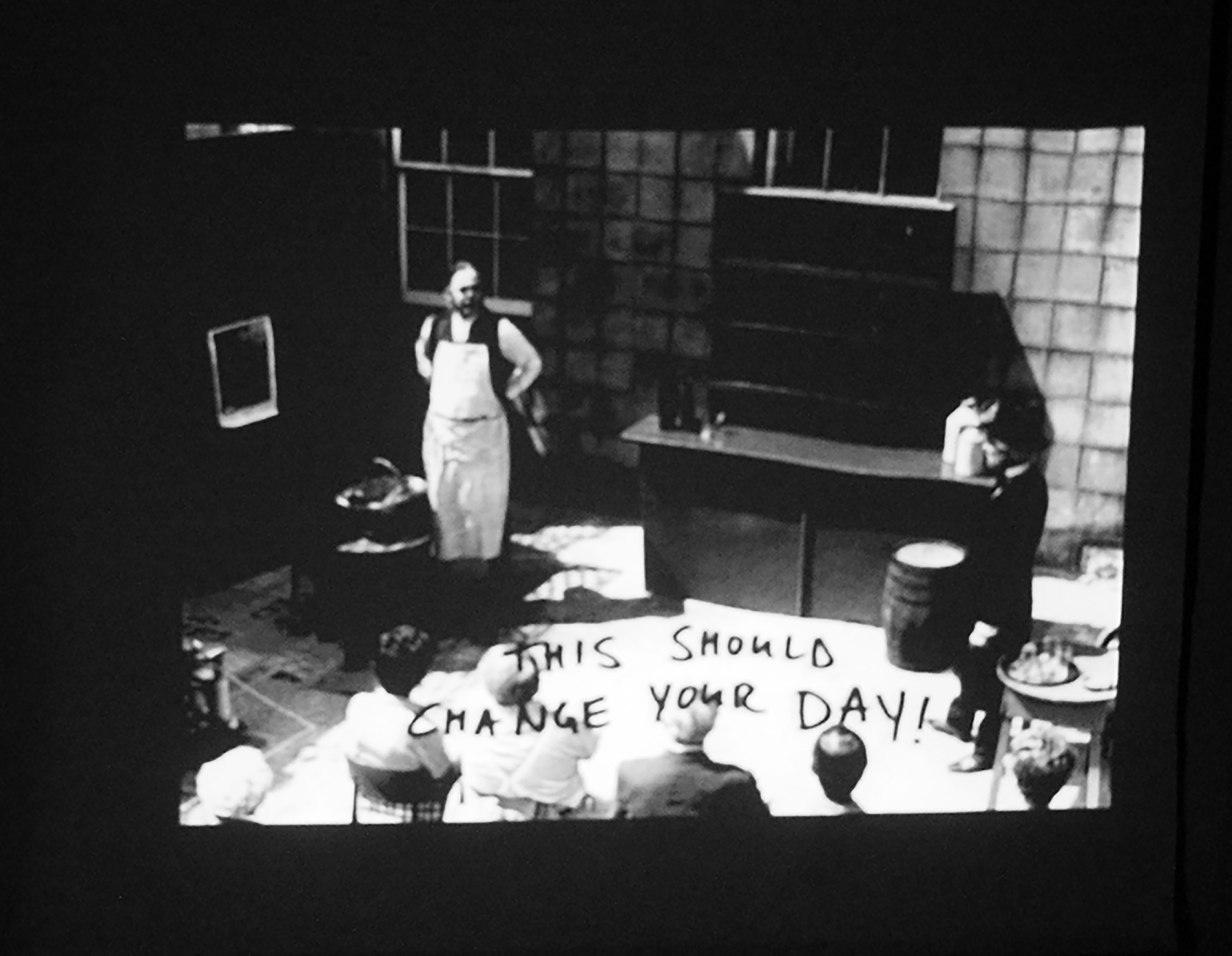
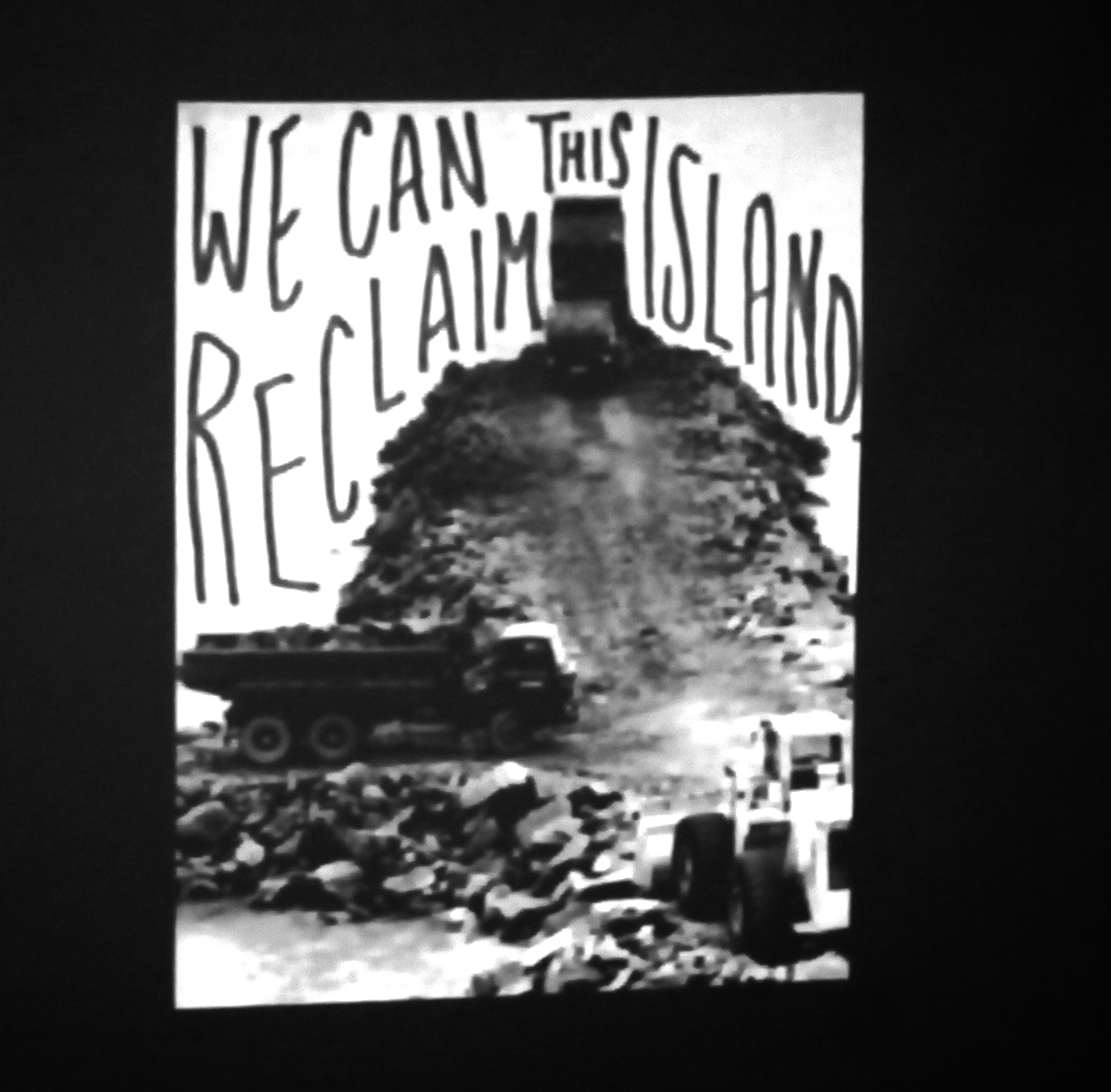
I really liked Tom’s slideshow presentation where he wrote subversive statements over old archival photograph’s. The concept was a very simple one, taking direct influence from conceptual artist John Baldessari, who would edit over previously existing artwork and images, and make it his own. In this piece, Tom made satirical statements related to Jersey. During his talk Tom spoke of how he “soon felt a sense that the Island was very private and exclusive”. Tom, living in metropolitan London and a follower of liberalist views described how found this impression of Jersey, “very different to what I am used to, coming from a metropolitan area”. This project was therefore Tom’s way of reflecting how he felt as a guest to to an Island which prides itself on traditional values.

Although Tom is adamant that the statements were not a criticism of the Island I do believe that the project was a clear example of how Tom incorporates his mischievous nature into his photography to test boundaries, clearly ridiculing the conservative, conformist values of Jersey, a concept which is linked to the Dadaist movement of the 1920s which ridiculed middle-class  attitudes of Western Europe at the time. The simplicity of what he did was very effective, he made use of photographs available to him,  and this allowed for a more observed response because what he interpreted from the photos were not corrupted by his own ideas or bias, which they may been the if he used his own photographs. Coming from Jersey myself I found it interesting to compare my views of the Island with Tom’s views expressed on the post-cards. I tried not to be too critical or of what Tom wrote, and I tried as much as possible to appreciate his outsider perspective in relation to what he was saying. After all, he was only having a bit of fun at the expense of the people of Jersey, and should not be taken too literally.
ff

tp

2. ‘Pushing the Boat Out’

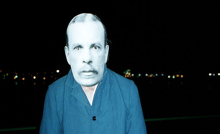
Tom’s 20 minute video documenting his project to push a boat on wheels across the Island East to West was an outcome that I was very impressed with, both aesthetically as well as conceptually speaking. The video, edited in Tom’s quirky, surrealist style explores different aspects  of the day. I found the unusual style of the video, with a series of film clips served to gradually build up a story of the day; of all aspects that it, not just the act of pushing the boat, but instead a deeper insight into the response of this action, how the community of Jersey witnessed, responded and helped with the project. I liked the idea of the live music playing in the background however the selection of music I would suggest could have been more uplifting as to reflect the theme of the project more appropriately, in my opinion the actual music did little in terms of helping the film.

The style of the movie meant that there was a sense that it was hard to know exactly what was going in. I enjoyed this idea because it made me search for the interpretation of the film myself, instead of relying on a structured narrative. This lack of structure is in many ways a subtle reflection of the work of Monty Python film-maker Terry Gilliam, as they both are contain elements of humour derived from surrealism. I would suggest perhaps that the film may have been too long. I noticed it was easy to switch of at certain points because of it’s intensity and length. However I admire Tom’s risk-taking approach in this  film and it was an exciting film to view, feeling somewhat part of it at times due to the use of close-up shots and cut-outs.

What I didn’t like

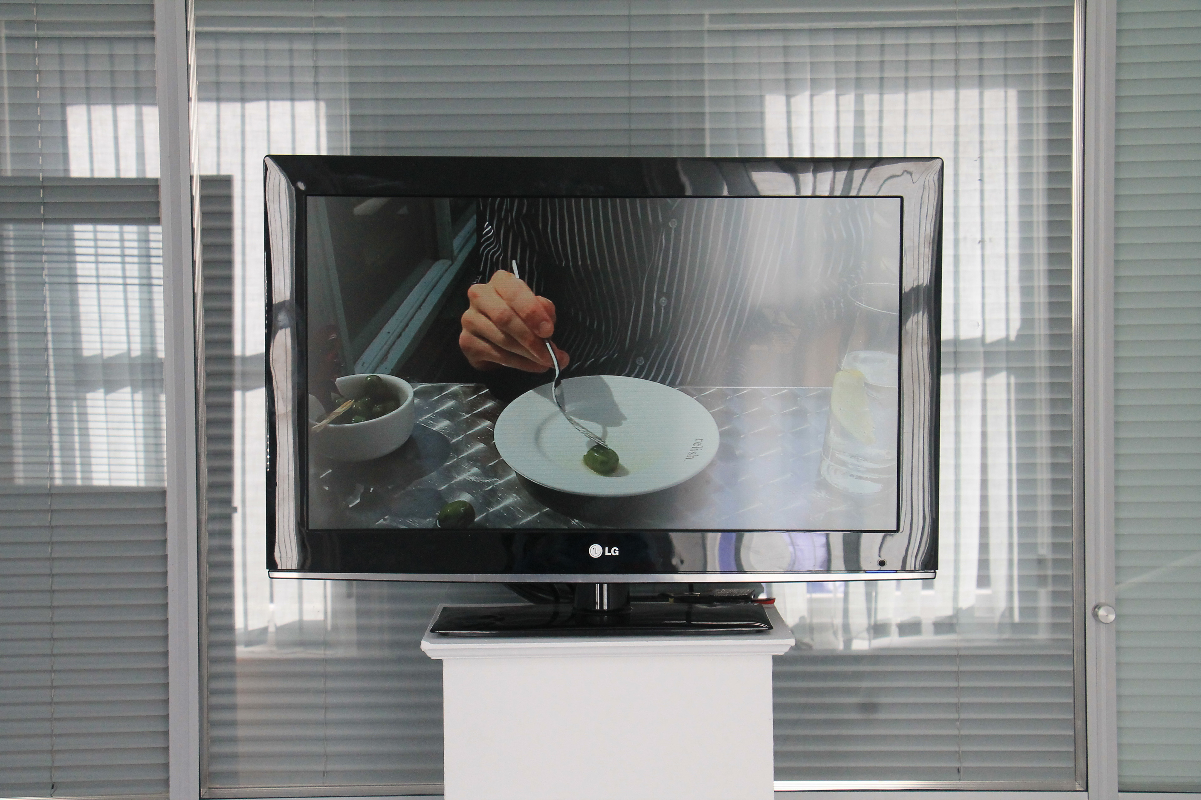
I really didn’t like Tom’s 30 minute video of him playing with an olive. I didn’t find the film particularly interesting or exciting. All Tom did was play with an olive on his plate for 90 minutes, edited down.Watching the film was greatly frustrating because the repetitive action of the film felt boring and monotonous.

I will give the film credit the the extent that it definitely had an impact on me. It caused a reaction, a reaction of frustration but nevertheless a reaction. If Tom’s intention was to tease the audience and make them question art (considering the film was in his final exhibition) then I would argue Tom succeeded. I also admire Tom’s patience in doing so, it couldn’t have been that exciting to do such a monotonous task for such a long time. I also appreciate the point that Tom expressed about being able to hear conversations in the background serving as a narrative. it was an interesting concept which added another dimension to the film, and it made me question, was the story about the act of Tom playing with the olive, or was did he use it as an excuse to listen into/record the conversation as a form of documentary?

I ultimately did not like the film however because I do not see what it added to the exhibition. I tried my best to be open-minded to Tom’s complex ideas throughout the exhibition however this film was just a little too extreme, and in my opinion pointless. What was interesting watching the film was the reaction of the audience, some appeared profoundly impressed by the film. Whilst I respected people had different opinions, I would observe however that by some of the verbal responses that a couple of individuals were trying too hard to look for a meaning to the film. I fail myself to see much meaning to the film. I believe it was successful to the extent that it was controversial but would not rate it highly in comparison with some of his over work.
IMG_7648

Summary

All of Tom’s outcomes throughout the exhibition were very well planned, researched and considered. Tom created a very interesting body of work with made good use of the Société’s  photographic archive. Tom pieced together his display in a very audience friendly manner, and explained his complex ideas in a similar manner. Tom clearly did a lot of work during his six months and produced a very successful and experimental series. My biggest compliment of Tom’s work is how he brought the archive to life, in particular through the face-masks and post-cards. I enjoyed viewing his exhibition and learned a lot of interesting ideas, as well as gaining a lot of inspiration from it.
Ray’s a Laugh – Responses to Images

rays a laugh

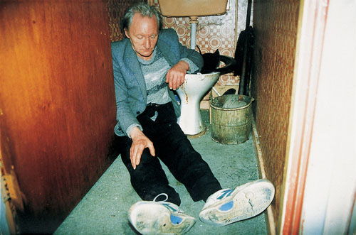
This photo of Ray I find to be very saddening. It captures Ray drunk, completely unaware of his surroundings. In many ways this image is quite repulsive. It shows Ray asleep in a disgusting, unsanitary looking toilet, an image which shows Ray clearly in a bad way. This image is designed to unsettle the reader and make them consider Ray’s desperate situation, inviting them the reflect on the theme of alcoholism. Ray’s alcoholism in this image is shown as in no way glamorous. The chaotic composition of this image reflects the complexity of Ray’s situation.

Richard Billingham: '<b>Ray's A Laugh</b>'

Billingham stated that when living in the council flat, Ray hardly ever left the house, nor was able to distinguish night from day. This photo of Ray shows him asleep with the glaring sunlight implying that it is daytime. Again, this is a saddening image because it explores the sense of isolation experienced by Ray, cut of from the outside world. I find the shadows in this image to be interesting, because they reflect how Ray has cut himself of through the outside world, hidden in shadows. At the same time, this image is to some way comical because it reveals quite how peculiar Ray’s existence is, showing how he is quite care-free despite his situation.

This image directly explores Ray’s alcoholism. Ray is completely focused  on his drink. Billingham frames the image so that the act of Ray picking up his drink is the only focus of the image. The simplicity of this image is key because it symbolises the simplicity of Ray’s mindset, his desire get his fix for a drink. I find this to be a very bold image that address Ray’s problem directly without over-emphasising the meaning. This is a subtle photograph that makes the reader reflect. It is simple and not over-dramatic.


Irina Werning – Photo recreation

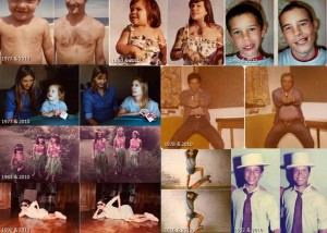
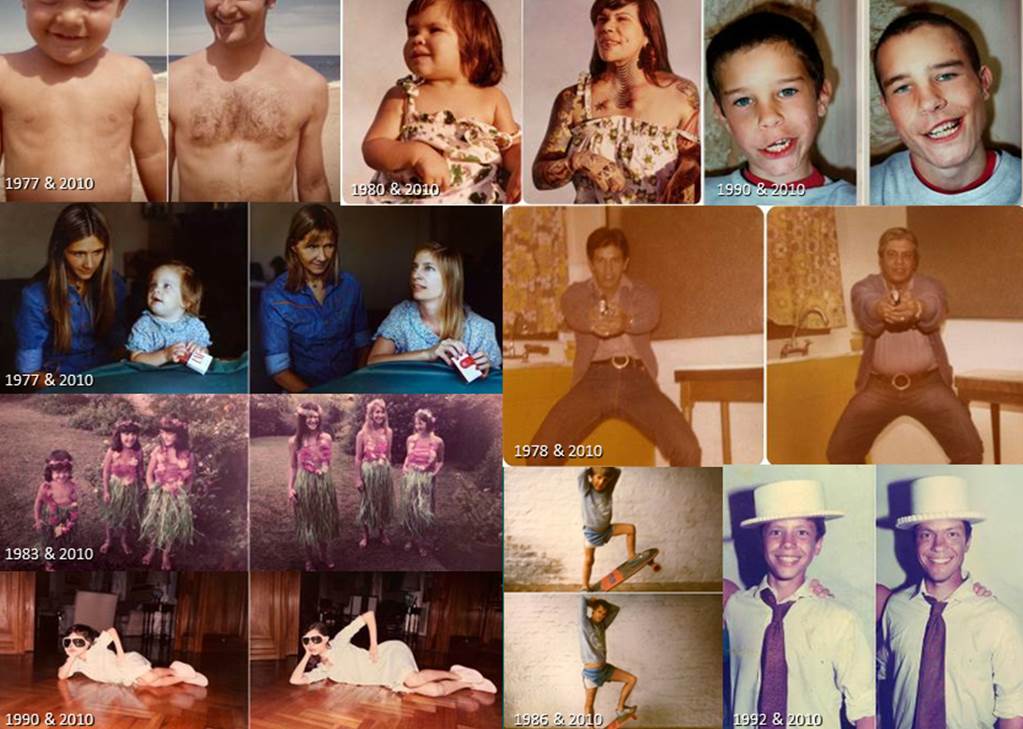
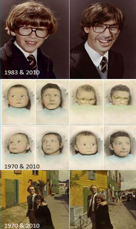
Irina Werning is an Argentinean photojournalist. She started her ‘Back to the Future’ project in 2010, recreating old photos of family and friends. It then expanded out into taking photos of a diverse range of people from all over the world. In 2011 she completed the second project, ‘Back to the Future 2’ and she is currently working on an Argentinean project of the same theme.

She studied both Economics and History before moving into Photographic Journalism, which she has a masters degree in. Although she has carried out several photo projects before, mainly focusing on Argentinean culture, she has gained viral recognition through this project.

Werning puts a lot of time and planning into the photos, collecting an average of 30 items per photo to make them as similar to the original as possible. Her low budget makes this difficult however she claims the imperfects of the comparison is what makes the photos so special. The emphasis on detail is important as any noticeable difference takes the impact of the photo away.

Picture12

Picture11