Category Archives: Evaluation
Filters
DOCUMENTARY PHOTOGRAPHY – COMMUNITY – ARTIST:
DOCUMENTARY PHOTOGRAPHY – COMMUNITY:
Jersey Museum Takeover Task
My thoughts of the exhibition
First Impressions
On entering the exhibition room for the first time, I was impressed at the vast display of photographs which were on offer. I would say there was probably about 200-300 images on display. One noticeable feature about this was that all of the photographs were in black and white. At first I was quite critical of this because in the last 10 years the JEP have been photographing and printing a great numbers of their photographs in colour and I think that this should have been recognized, as part of the last 125 years. One possible reason for this however may be that the archives is recognizing the fact that traditional photographs have always been I black and white. On evaluation however I am disappointed that the exhibition didn’t include this as an aspect.
The layout of the display I found was very symmetrical and well ordered. This immediately gave me a good feel about the exhibition because I think that it is important for it to laid out in a methodical manner so that the display looks tidy, reflecting the effort put into displaying. I also liked how the room was quite open. We had about 80 people that fitted comfortably in the room and I think if there was less people in the room this vast size would have been even more apparent.
My first impression of the images on display was quite mixed. Some of the images included I thought was better than others, and at times the layout appeared to be quite inconsistent as to show different themes and time periods scattered around. In honesty, I would have preferred if the images were laid out in a more chronological order so that you could literally travel through the timeline of the 125 years the exhibition attempted to convey. Some of the images however I thought were really interesting and in a way I like how a variety of different images (i.e. themes and topics) were shown alongside each other because it visually helped to mix up what was being shown. In addition, I think that the inclusion of colour images would have further added to this variation.
What is it that you like about your favourite image – be as specific as you can? What is the photographer trying to communicate?
This image shows German troops parading outside town, just outside Lloyds Back, which still exists today. I like this image because I think it gives a fascinating insight into what it may have been to live through the occupation. The thought of armed troop parading around a small island such as Jersey must have been quite a scary and unpleasant experience for the islanders. This tension is emphasized well through the presence of the two citizens, standing outside the Pomme D’or, looking very uncomfortable.
The best aspect of this photograph is that is effectively captures a theme and a moment. It is important to look back on images that shows the everyday occurrences of life under the Nazi occupation, which is something which this image effectively conveys.

This photo shows a few children enjoying the old cable cars of fort regent, which are longer in operation. These cable cars were once considered an important aspect of fort regent and St Helier in general, enjoyed by both tourists and islanders. I am pleased that the exhibition included an image of the cable cars because although not a crucial part of Jersey’s history, it was nevertheless an integral part of Jersey’s identity for a number of years, especially being a symbol of Jersey’s long history and economic reliance on tourism. I find the history of cable cars to be very interesting because my Dad used to work as a member of Fort Regent staff who were in charge of the cable car, and so had first hand experience off the mechanics behind it.
In terms of composition, this image is possibly not the best, however it is a very interesting documentation of the cable cars. The fact that cable cars are no longer in existence in Jersey means that it is vitally important that images such as this remain and are preserved in the archives for years to come, as a way of preserving an aspect of Jersey’s his.
4. What is wrong with your least favourite image? How could it be improved?

This image, presumably a group portrait of machinery workers, is an image from the exhibition which I did not think was particularly good. I didn’t like this image because as a portrait I didn’t find the composition to be very good, nor the image to be particularly exciting.
The use of flash makes the lighting very harsh, and I find such an inclusion to be furthermore unnecessary. Certain compositional elements were clearly not well thought out beforehand, fr example where the subjects are positioned, the alignment of the table, and the pencil and measuring equipment scattered in the bottom right of the frame, again an aspect which is unnecessary. I don’t find the image to be in any way balanced in terms of lighting or composition.
If this image was to be improved I would consider that greater thought and care should be taken into composition. Also don’t use flash as it is not needed in this instance, and it ruins the subtlety of the image.
Finals from October shoot
I went for another visit to my grandparents house this October half term to see them unpacked and settled in. They have unpacked their furniture and started to make the house more homely. However they haven’t hung any paintings or pictures on the wall as they had lots hung up in their old house, therefor they have lots to choose from. It was also my Grandpa’s Birthday. They are very sociable people and have a large circle of friends who sent cards, called and visited on him on this day. Two of their closest friends, called round for a cup of tea whilst I was photographing.
I have chosen a couple of finals from this shoot which I think portray my grandparents very well. I managed to get a nice portrait of both my Grandma and Grandpa and some nice photographs of around the house. My first photograph is of my Grandpa;
I really like this photograph because of the soft lighting and the neutral colours used throughout. My Grandparents house is a new build therefor they have been able to choose the colour of the walls, carpets, interior ext. They have chosen browns and beiges as a general colour through the house. You can see in the photo that there is nothing that stands out due to bold colours therefor it gives the photo a calm and gentle feel.
My Grandpa is sitting on his piano stool, where he spends a lot of time. He is looking through his Eisteddfod paper work, which is an annual Jersey event which he has participates/ helps out in every year. My Grandpa is a big music lover, as he plays piano and the organ for his church every Sunday. However he is mainly a singer. He has been singing in choir’s and performing solo performances ever since he was a child.
The one thing that I would change about this photograph’s composition is; I would move the brown plant from behind his head. As I think the photograph would be more atheistically pleasing if it wasn’t there. To further this photo, I would like to take a portrait of my grandpa in his brown chair, this is his chair that he always sits in, and watches his sport matches in.
This portrait of my Grandma has a similar colour scheme of browns and neutral colours. I really like the couch that my grandma is sitting on in this photograph because it adds lots of different textures to the photograph; the brown leather on the arm rests, the studded detail and the cross patch material on the majority of the seated area. As well as detail from the textures, the photograph contains other details such as her glasses are steamed up from her tea. I really love details like this is photographs, because it adds character.
My Grandma is also on the phone in this picture, I think this is a good representation of what type of person she is; very sociable and likes to keep in contact with all her family members and friends. I do like this portrait because I like the angle, lighting ext. But if I were to reshoot, I would take the photo without the cup in front of her face.
This photograph is of their new bedroom, I like the photograph because of the line of symmetry running through the middle. The matching nightstands which both have a book and a bible, a lamp and a mug coaster.
Just before coming upstairs to photograph my Grandma ran up in front of me saying;
“No Emily you can’t go up there yet, I haven’t even made the bed. I can’t have people thinking I don’t make the bed in the morning”
This is the last final from this photoshoot. It is of my Grandpa and his good friend, who has come to visit his on his birthday. They are in their front room, and are having a joke about something.
Contact sheet reviews – COMMUNITY
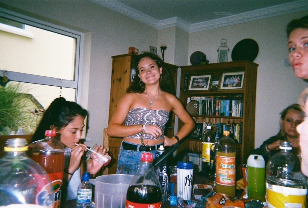
After gathering these images for my community study, I went through all 53 images and selected my favourite ones. ![Screen_Shot_2015-11-03_at_09.02.44[1]](https://hautlieucreative.co.uk/photo16a2/wp-content/uploads/sites/2/2015/11/Screen_Shot_2015-11-03_at_09.02.441.jpg)
![Screen_Shot_2015-11-03_at_09.02.13[1]](https://hautlieucreative.co.uk/photo16a2/wp-content/uploads/sites/2/2015/11/Screen_Shot_2015-11-03_at_09.02.131.jpg)
![Screen_Shot_2015-11-03_at_09.02.56[1]](https://hautlieucreative.co.uk/photo16a2/wp-content/uploads/sites/2/2015/11/Screen_Shot_2015-11-03_at_09.02.561.jpg)
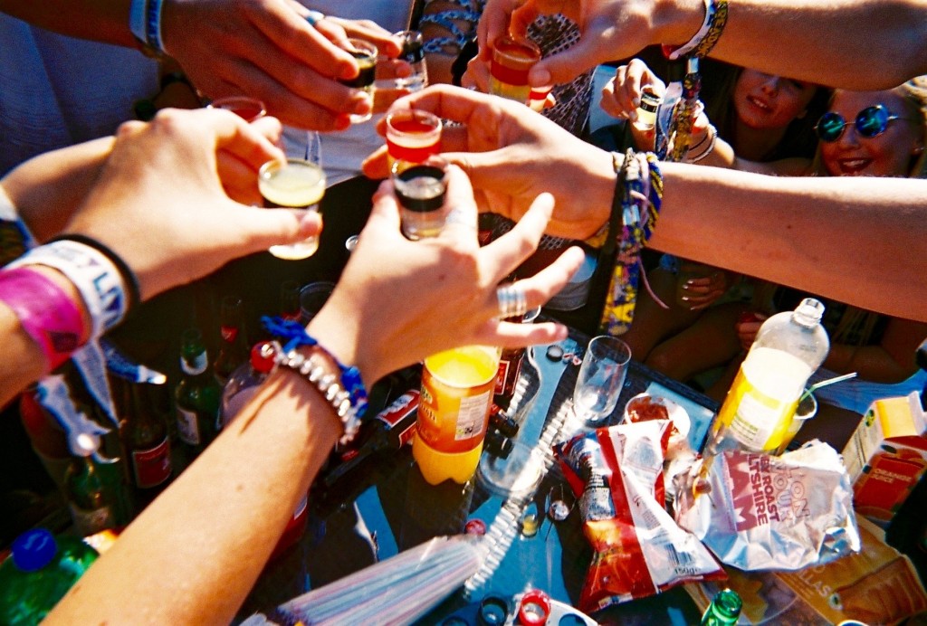
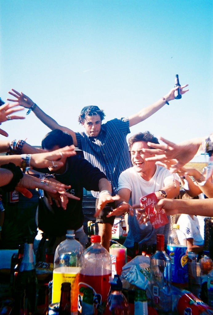
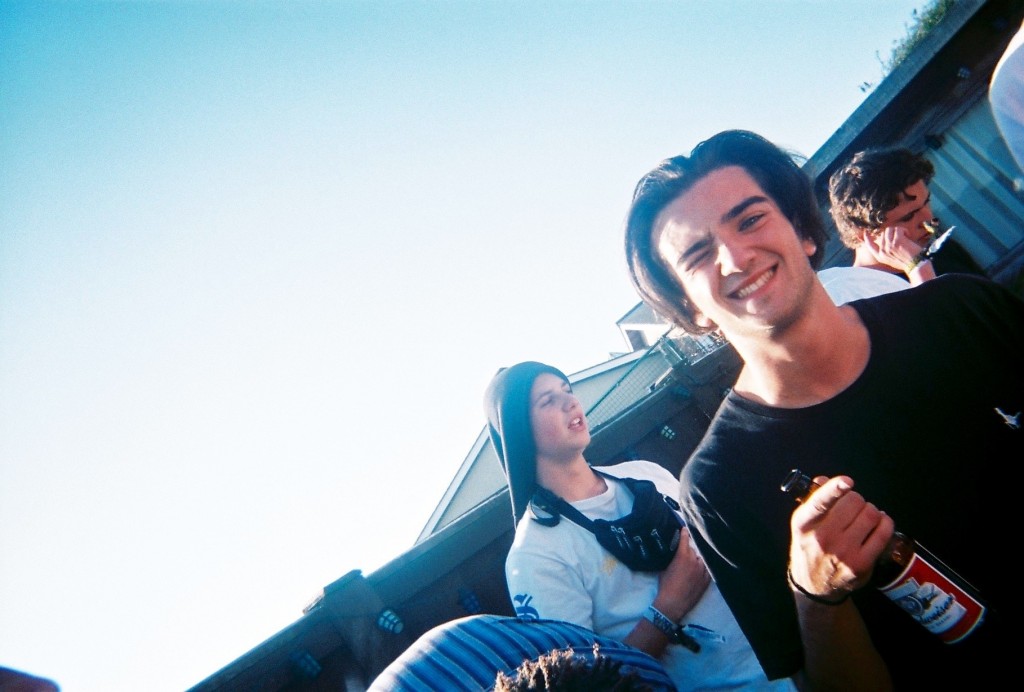
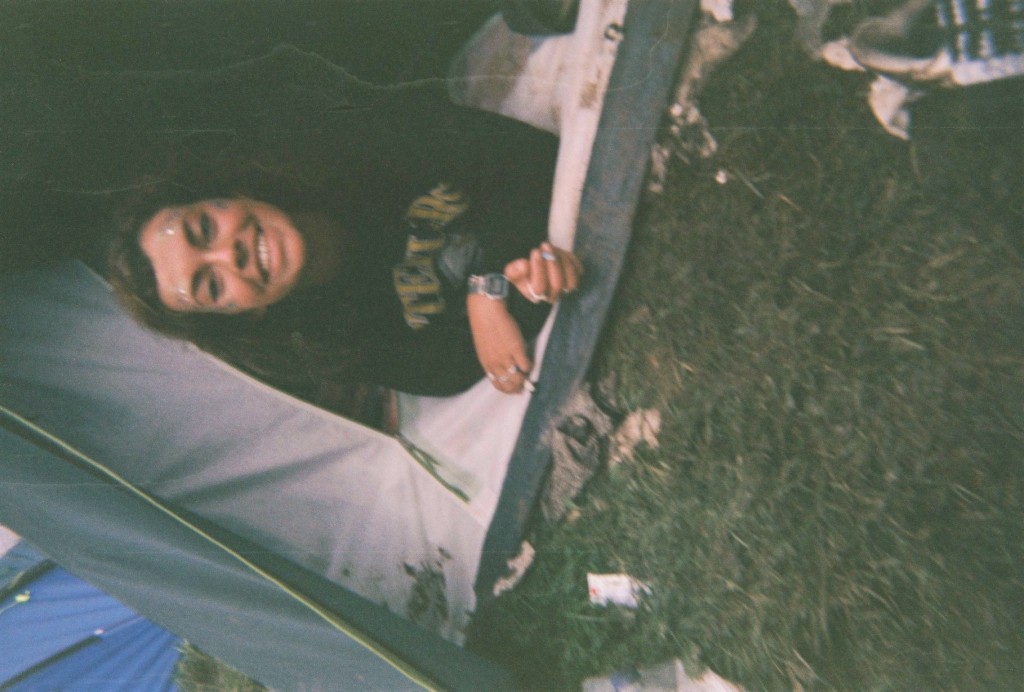
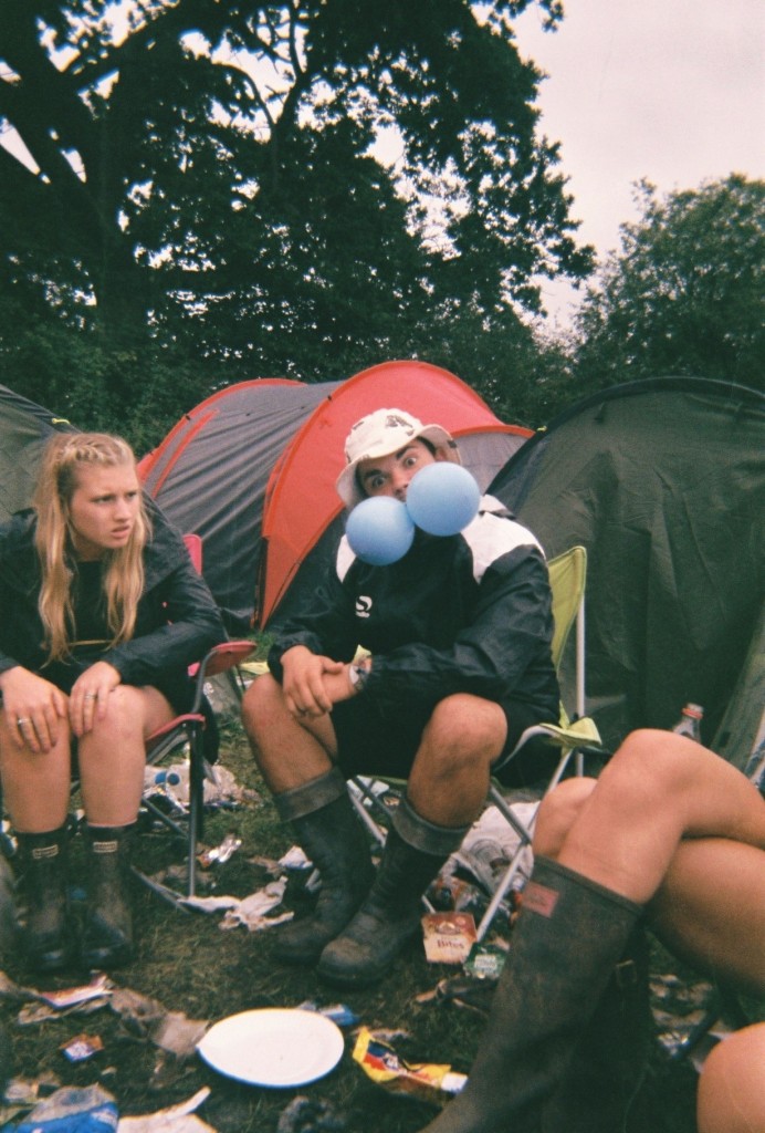
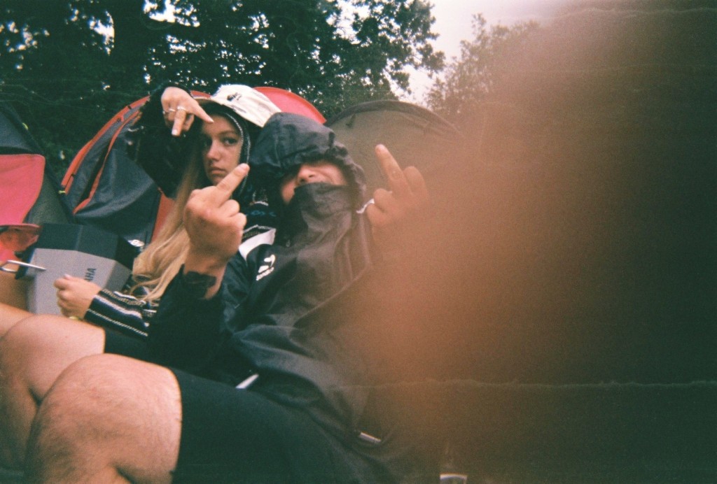
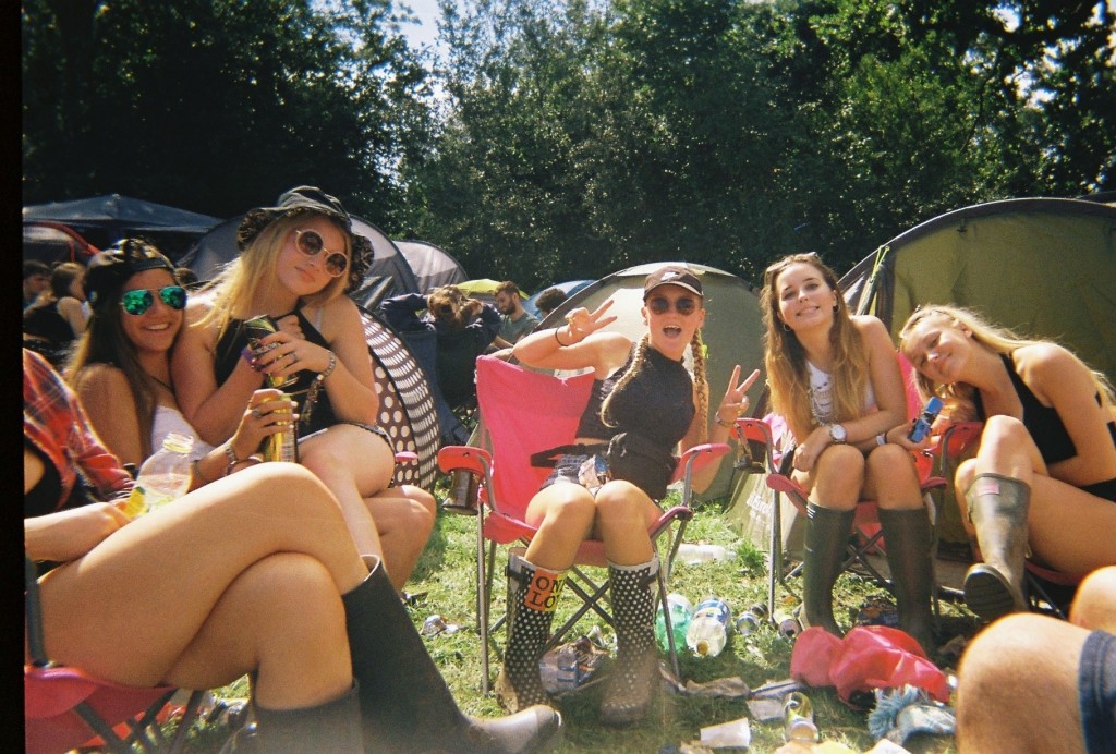
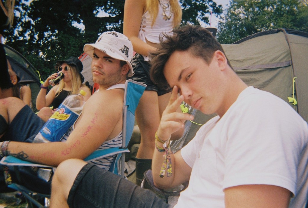
I chose the following images as i felt these were the most interesting and artistic. This is because of the angles, colours, and context of the images. All of the above images were taken on disposables, i took 6 disposable cameras to Reading festival as i love the style the cameras produce. They give a rough old look which i feel matches this topic perfectly. The below images are the images I have chosen as my favourite –
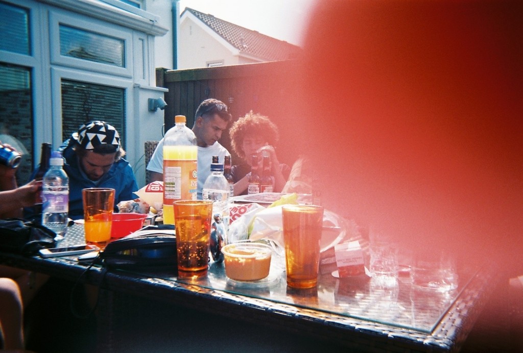
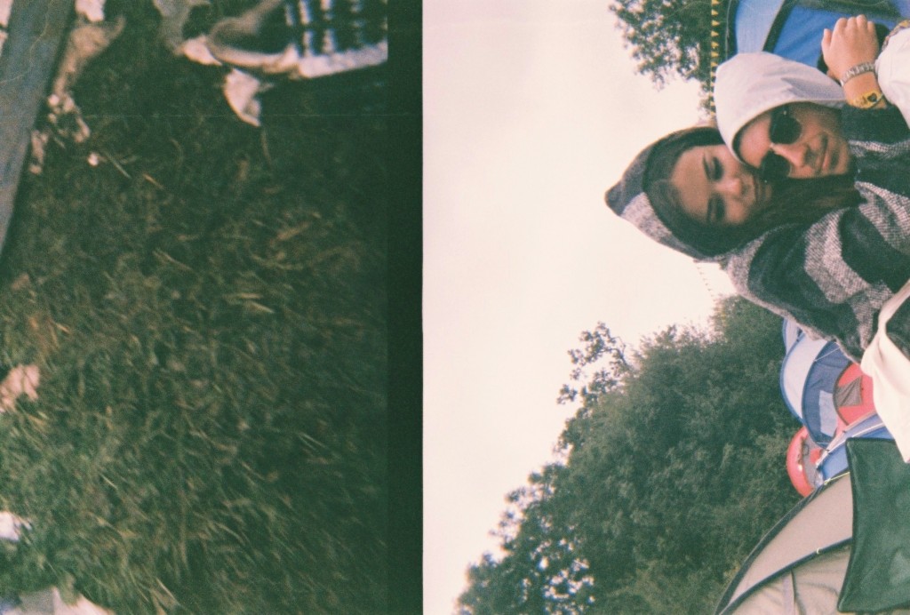
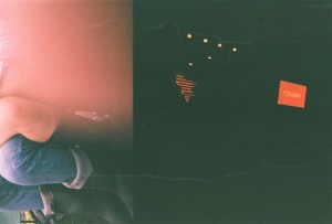
Out of these images there are a select few that I feel are the best – The above and below image I picked as they both were actually intended to be the same image. This did not happen as i dropped and wet the camera multiple times, I believe these mistakes cause the split image and the damage that can be seen in some of the images. The above image uses the rule of thirds as it has something interesting in each section of the photograph, however there is a lot of negative space as the majority of the right side of the image is black, with a few splashes of red, spot lights and some water marks. The right side of the image was taken at the main stage of the festival and the left side in the camp with friends. I think the ‘mistake’ of the damage actually benefitted the image as I feel it made it very arty. The below image is similar as it is split, however i do not know where the left side of the image came from. The right is the other half of the previous image in camp. The below image I like as I feel it looks more laid out, The black block line down the centre of the image splits the two time periods and scenarios in two and joins them together. I also enjoy the image due to the emotional message behind it, the left side shows the mud, litter and dirt that is produced by the festival and the right side show the more intimate and emotional side that is also a big part of festivals. These two messages are on opposite sides of the festival spectrum but due to some freak mistake are shown in the same photograph.
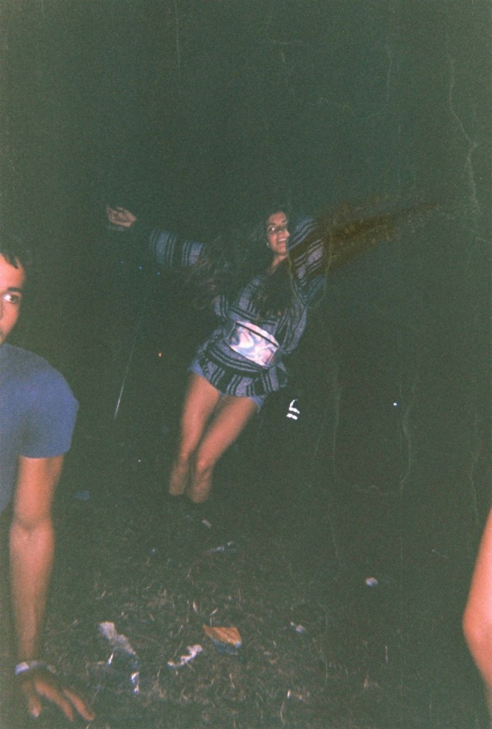
The above image was taken in the arena of the festival while waiting for another act to come on a stage. I like the layout of the image as the main subject is in the centre. However surrounding her is a lot of negative space as it is just black. This image also has a lot of water marks which I feel makes it artistic. This image has also been damaged by a sort of split, as the subject is missing her arm. In real life her arms were spread apart like a star fish and in the produced image her arm has been removed and replaced by darkness and moved vertically. This is not very noticeable but I feel adds to the roughness of the image well.
The above image was taken in camp of a friend who had just woken up after passing out for 8 hours. Water marks again make the image look rough and dirty, and the poor angle and positioning too. However the subject still remains roughly in the centre of the image. This image also looks better on its side or upsidedown. This is because when it is upright and normal, it looks ‘too normal’ and not arty enough.
The above two images also have watermarks and were taken in camp aswell. The angling is quite straight on which I feel makes the images quite clear. The thumb print in the second image is the reason I chose it in a select few. The first image has a range of colours i feel contrast each other well, aswell as the odd act of two gas balloons in ones mouth, the blue contrasts well with the red tent in the background and the rubbish on the floor.
Responses to Family Archive Research
Family Archive Research
Over the past term, I have been working with the Societe Jersiaise Photographic Archive implementing key ideas to developing the Archive to my own personal project. These skills have made me develop various creative perspectives involving Archive extraction, research, experimentation and documentation. Exhibition and presentation design.
Some of the skills, which I have been contributing to my Archive experience, consist of:
- Scanning & storing images
- Image manipulation, resizing, creating composites
- Producing teaching materials for Photo Archivist’s Workshop
- Re-purposing images for Jersey Projection Gallery – Skipton Arts Series 10-14 November
- Searching database
- Outputting digital prints, labeling and marking images from the archive
- Understanding copyright policy
- Retrieving original images from vintage collection in strong room
- Working in secure areas, safe practice in the archive environment
- Appropriate handling of original archive materials
My personal project has allowed me to evolve, as with help from Gareth Syvret, I’ve been able to manipulate photographs which relate to the history and period of my new house and how I can contrast the changes and traditions in everyday life today.
125 HOURS – JERSEY MUSEUM TAKEOVER AND JEP EXHIBITION:
Exploring Family
Ideas of Family:
With the recent development of my life as a family, it is suitable to base this project on the transition of me moving house in early December 2015. This building project has been live for nearly over 5 years, and has been a long process due to the reserves for materials, dealing with the National Trust and allowing the correct methods to be done in order to restore the house’s natural and original form. Le Petit Fort, for nearly half a decade has become the pivitol force within our lives as a family. Both of my parents have spent countless hours on the development of our new family home, as they have effortlessly incorporated the minimalist details of their own lives with reflects on what life was like when the house was first originally built.
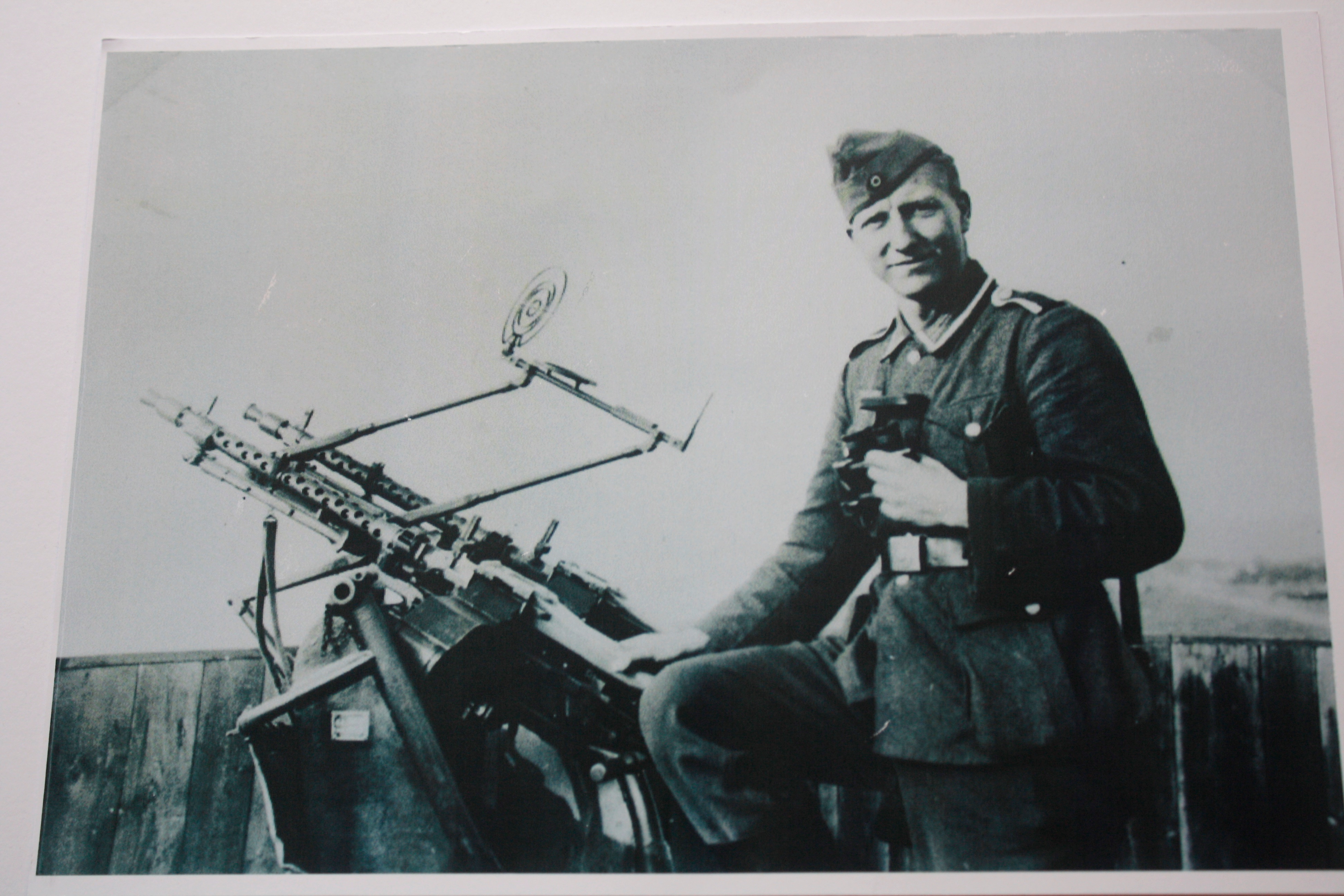
As a starting point, I have researched past images of the house in order for me to make a comparative link to suggest more relevance within my ideas. This was all done with help from the Societe Jerseiase and Jersey’s Photographic Archive. With help from Gareth Syvret, we researched these past images of the house with the references tagged along with the images. This was all stored in a box of photographs given by the Bailiff of Jersey, between the era’s of 1930’s and 40’s: a post war memorial. I then learnt that my house was an important artifact and gem to the German soldiers which were residence in St Ouen’s Bay during the time of the occupation in World War ll. From this, my ideas then began to develop, I found relevance into my project by being able to contextualize and relate to the history of my new house.
- Contextualizing with the changes and developments society have influenced the concept of a family.
- Noticing society’s expectations of of a family: what is the control of responsibility? What are guidelines parents have to follow?
- How do individuals within a family react towards each other? How are they genetically similar?
- Are there individuals that look similar? How can you dictate these similarities?
This aspect for me is very interesting, and I would like to investigate these factors in greater depth by recreating this style myself. The style and resiliency of the prints when disposed are unconditional to the time period and era. The rustic and compound prints objectifies images in greater detail, as colours are abbreviated allot further along with edges and geometry created from sharp lines. This could be captured with use of a disposable camera. Exploring this theme of disposables allows me to reconnect back into my childhood, as a way of integrating with the present without compromising and changing the perceptions of the past. For me, as a kid, using disposable camera was a source of fun for me and my family. The camera acts almost as a time capsule, reflecting back on the times humorous and laughable things that wouldn’t usually be remembered by memory. As a kid, using this camera as a game enabled me to take chances with the outcomes, as once taken, I would look forward to the interpretation of the moment once developed.
As you can see from these pictures, a sense of history is elevated. I want to approach this task open-minded, as from 2010, the growth and development of our family has changed and continues to change with a developing world.
I plan to initially capture my dad as the driving force of this project. He began this project initially from his idea, he was the one that initiated this move and constructed the foundations of the house as well as the various plans.


