
Category Archives: Evaluation
Filters
Personal Study – Abstraction – Evaluation:

Evaluation:
The final evaluation of my project Three Chapters.
Overall, I think my project had both positive and negative aspects to it. Firstly, the research and planning that went into the project I think was successful, I looked into a diverse range of sources including, websites, books, magazines and newspapers. I think it is important when beginning a new project there must be a comprehensive and thorough investigation into the theme and concept behind the project. Therefore, it was appropriate for the research to heavily influence my original work. The second part to my project is the actual recording and photo-shoots. I began my project by interviewing my grandmother, I wanted to learn more about my grandfather and the best possible person to talk to is his ex wife and best friend. The interview was very interesting and evoked a great deal of emotions from my grandmother, she found it incredibly difficult to talk about my grandfather. This then led me to begin looking at my grandfather’s past, I started looking at archive images that my mother had kept. There was a collection of images that stood out to me, photographs of him with his children, on his wedding day, at his retirement do, holidays, birthdays and normal everyday events. I also thought it was appropriate to look through the box my mother has of some of his belongings. There was lots of condolence letters and cards sent to my family, there was the death certificate, birth certificate of his child Christine Benning who is my mother and there were personal items like his after shave and darts. Other photo-shoots I produced were focused on personal items that I had found, images from interviewing my grandmother, photographs from visiting places that reminded me of him like Green Island beach and Queens Valley Reservoir. I think it was important to include several types of images for example, portraits, landscapes, close-ups and stills. The next aspect of my project was on the experimentation, each photograph was cropped, levelled and adjusted regarding the contrast and brightness. I used the black and white effect on particular images and especially concentrated on Photoshop when arranging the collage I created of my grandfather’s life. However, I do think that I needed to focus on experimentation a great deal more in this project. Therefore, for my next project I will specifically spend more time concentrating on the experimentation of the images I have.


With regards to the essay, I found it difficult to think of a title in the beginning but came up with the title ‘How has Boltanski, Abril and Toroptsov represented the concept of capturing the invisible and reflecting the meaning of memory through the medium of photography?‘ I think it was specific enough but still allowed me to look at lots of different aspects and include my family’s interpretation as well as my interpretation. I enjoyed writing the essay because it explained the path I was taking regarding my influences from photographers, academics and artists. I found the analysis of images complicated and hard to understand sometimes due to some of the images being more metaphorical and therefore could have multiple meanings. I wanted my introduction to be more poetic and abstract but I wanted the conclusion to complete the essay, basically finish it off by answering the question simply. I think the design of the book was successful, I researched the designs of books on the Blurb website as well as designs of other photographers both professional and amateur. My book design was a combination of scientific and metaphorical, I wanted my images to contrast and compliment each other. I thought it took a great deal of time to design my own book, especially when designing the essay into my book. I wanted it to look clean and precise but it was not as simple as I initially anticipated. I am happy with my final design for my photo-book, I think the title works really well and the sequencing of the images are strong. But I do think it would of benefited by project if I had started designing my book a lot earlier so that I could experiment with book more, with regards to the layout and order.
I think I have managed to confidently capture the concept of photographing the invisible and the idea of memory. I wanted to explore how the invisible can be made visible. I think the idea was initially quite daunting because it seemed such a complex concept but once I properly looked into it more, I decided the project would work.
Influenced Photo Book Design Ideas
The Title – “The Creation of a Home”
For my photo book study, I have decided to name the project ‘The Creation of a Home’, as I believe it fully addresses the key hypothesis’s of my project. ‘The Creation’ part, succumbs the development and construction of our new family lives and how as people we fit in to a certain place with our belongings and emotions. I also wanted to distinguish the difference between a ‘house’ and a ‘home’ as a ‘house’ can be defined as ” a building for human habitation”. This definition describes little life and personality, ‘human habitation’ vaguely suppresses the way humans act and become desirable to an environment – how they make it there own. A ‘home’ however, can be defined as: “the place where one lives permanently, especially as a member of a family or household”, or “the family or social unit occupying a permanent residence”. This sense of permanence allows the reader to understand the commitment and time taken to make a ‘house’ a ‘home’, as there is much more to a house than just walls and foundations.

First Pages and Title Page
For my beginning title pages, I have began trying to experiment with my archival material. As mentioned in my personal study, Domingo, Costa and Dorley-Brown have all inspired me to incorporate archive material and mediums to create context and historical aspects, in order to relieve a sense of purpose and relationship with the reader. This beginning front cover allows the reader to get an idea, i like how the image I’ve chosen isn’t too clear, so the reader has time to picture what


Pages and Page Layout
I have started to explore the different formations and sequences my pictures can fit into, to make it more interesting and easy for the reader to understand. This is all in awe of the techniques used by the three artists I studied closely in my Personal Study: Rita Puig-Serra Costa (“Where Mimosa Bloom”), Inaki Domingo (“Ser Sangre”) and Chris Dorley-Brown (“The Longest Way Round”).


For some images (as seen above), I’ve used a double page spread so that the image is divided. I feel this technique is very effective, I really like the way it allows both pages to be covered but with the idea of there being a border there too, it lets the reader stand back and see the whole image without becoming too involved. This was in the style of Domingo as his piece “Ser Sangre” consists of multiple full page spreads.


I have also included drawings and more personal mediums as included in Domingo’s work “Ser Sangre” to make the feeling of ‘family’ more of a reality. I feel this effect allows


I have also used influence also from Chris Dorley-Brown’s: “The Longest Way Round” as his ongoing use of archival images of the War and Post War era are bounded together using his own photographs. During my internship at Jersey’s Photographic Archive, I came across similar styled images which show the history my new home. Placing the images in a formation like a comparison on either side of the pages, I wanted to establish to the reader the themes of ‘old’, ‘new’, transgression and change.


What type of book am I going to be using? (size / material/ etc. )
Size – Small Portrait (23×16.5 cm)
Paper Type – Matte paper
PHOTOBOOK DESIGN
Task 2: Research the examples of books that have been produced, consider the size and style that you would like to work with. There are many example within the blurb site but feel free to find examples either in school or elsewhere. Produce a mood-board of some of your choices, select two of three examples and explain your thoughts and why the design, look and feel works for your images.
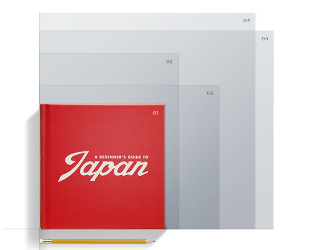
The photobook I have taken inspiration from is Phillip Toledanos – When i was six. This book is also the book from which i gained my contextual inspiration aswell.
The design of the book is quite ‘scrap booky’ as the hard back cover is material and covered with white spots and childish writing announcing the cover.

When making a photobook it is important to think about all of the ‘characteristics’ of the photobook in order to get an idea of what it will look like. Eg: size, shape, texture, colors, photolayouts and photo sizes. All of these factors can change the feel of the book and the images themselves. The layout of the majority of toledanos book is full bleed images and contrasting lights seen in the images. The size of the book ‘When i was six’ is standard landscape. The images are single page. The cover is a hardback material cover, The paper in the book ranges from standard photograph paper to grainy textured paper. Throughout the book there are also shortened pages added in, to draw attention to that page and to break the book up.
Hypothesis of overall Personal Study
Objectives:
- Establish coherent and sustainable links between your own practical work with that of historical and contemporary reference.
- Show evidence for an on-going critical and analytical review of your investigation – both your written essay and own practical work in response to research and analysis.
Hypothesis: Possible questions to investigate
Within my personal study, there is evidence of various techniques. These include: Portraiture, Documentation, Landscape, Abstraction and Reflections on Photography (themes of Aesthetics, Codes, Truth, Seeing, Looking)
Questions to consider concluding my overall hypothesis:
Portraiture
Does a portrait tell us more about the person portrayed or the photographer?
Here is a link to an interesting article by Canon, who released a project directed to the relationship between the camera and the person.
Canon Experiment Article – http://petapixel.com/2015/11/04/6-photographers-asked-to-shoot-portraits-of-1-man-with-a-twist/
After reading this article, I strongly believe that a portrait can be re-represented in any way. The photographer is the pivitol force within a photo-shoot. Emphasis to strong stereotyping and styles are reflected throughout the article, but with persuasion photographers perceive an image in a different way, therefore reflecting the photographer more.
Can personality and identity be expressed in a portrait?
Visual Arts –
- Portraits contain clues about the people pictured in them that can tell us things about the subjects’ cultures, identities, traditions, and roles in society.
- Portraits can express how people think about themselves and their world.
- Portraits can include symbols that reference interesting aspects of the people in them.
- When creating a portrait, an artist makes many artistic choices that affect how we understand the image.
- Artists make choices about media, style, background, and embellishments to visually describe themselves or others
What are the differences/ similarities in a formal or informal approach to portrait photography?
What makes an iconic Photograph?
What are the Influences of the Old Masters and other painters on modern photographic portraiture?
What are the key elements if Portraiture and Intimacy?
How Can Photography reflect inner emotions such as fear and isolation?
Documentary and Street photography:
Is it possible for photography to capture moments in time objectively and truthfully?
Examining the documentary aesthetics: A photograph should not be manipulated, so that its authenticity, veracity and sense of realism can be maintained?
What is the relationship between photography and realism?
How can photography bear witness to the ways of life and events of the world?
What is the relationship between Henri Cartier-Bresson’s theory of the ‘decisive moment’ and subjectivity?
What are the intentions of Voyeurism and the nature of observation and intervention in documentary photography?
Landscape photography
Issues in Landscape Photography: Romantic or idyllic representation of nature vs culture and the man-made world.
What is beauty in landscape photography?
How does people control, interact and construct the environment in which they live?
In what way has the work of Ansel Adams influenced Joe Cornish?
To what extent could the work of Ansel Adams be considered spiritual?
What is the Meaning behind William Eggleston?
How Is William Eggleston At War With The Obvious?
What was so different about the ‘New Topography’ exhibition in 1975?
Two Photographers, One Aim: Preserving nature. Looking at the different approaches to landscape photography between Ansel Adams and Robert Adams.
Abstraction:
Two photographers, one aim: Looking at the different approaches to abstract photography between Eliot Porter and Aaron Siskind.
In what way can abstraction make visible what is invisible in the natural and urban landscape?
Reflections on Photography; Aesthetics, Codes, Truth, Seeing, Looking
Examining the documentary aesthetics: A photograph should not be manipulated, so that its authenticity, veracity and sense of realism can be maintained?
Personal study specification
Chance, change and challenge
At first when I was introduced to this project I found it hard to understand the concept and the meaning behind Tom Pope’s work as there was no explanation and most of his videos were in silent of him doing a repetitive performance. However after the day at the Societe where Tom explained what he was trying to achieve,I got a better understanding of the idea of pushing boundaries and his videos made more sense to me. I also liked that we were working with a photographer making our work more practical which is something we haven’t done before. I found this project interesting because it was something I hadn’t given much thought to or questioned before. I also like the fact that we were working with the archive and got to explore Jersey’s history, before this I wasn’t aware of the archives existences. I think it was challenging to think outside the box however the more the more you think about it the easier it becomes. In France I was able to do most of the ideas that I had planned to do and I was pleased with the outcomes.
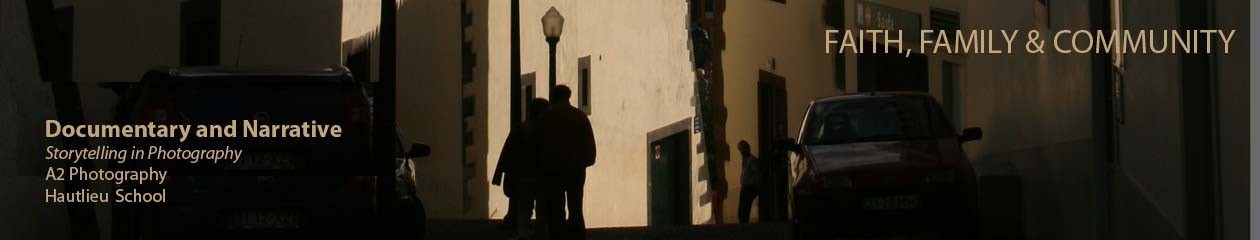
Family, faith and community
At the beginning of this project when we were first introduced to documentary photography, I thought that it was a powerful form of communication. I enjoyed looking at ethics within documentary because I think it is a interesting and a subjective topic which allowed me to think deeper, although I didn’t find any right or wrong answers I was able to develop my opinion. I also like that we were able to draw on real life situations such as the Vietnam war which documentary had a big influence on, this also gave me a better understanding. I also learned about the sub genres within documentary such as photojournalism and street photography which is something I hadn’t done before.
At the beginning of this project we started looking at the theme of family. I enjoyed exploring this theme both taking photographs and researching other family photographers. I found that I connected with this theme more than the others although I think it’s more personal than the other two themes. When I first started photographing my family I felt that I was making them vulnerable and opening them up to be judged, however after a few photo shoots this ‘feeling’ faded. I started to explore the theme of community through research and a photo shoot however, I struggled with deciding what and who to photograph. Due to the lack of time I didn’t get to explore the theme of faith, which is something that I would have liked to do as most of my family is religious.
Overall I enjoyed this module and I am going to carry on with the theme of family for my personal study by photographing my mum in her working environment.
Finished Print Products
I have designed two different Print products. One being a newspaper article and the other being a magazine layout.
The newspaper was the easiest of the two to design, as I am a to more familiar with the layout of a newspaper, as they all have very similar structures, whereas magazines have a much wider variety of layouts and design possibilities.

I think the newspaper is very affective, and one of my classmates even asked if my images had been in the paper, because he saw a print out of it and thought it was a photocopy, or nice version of the newspaper print. I really like the simplicity of newspaper spreads and I feel that my newspaper spread has worked really well.

The magazine was a bit harder, but instead of creating a design first, I started with the two colours red and black, creating the banner at the top and header, I then looked at the scope and how i could add it into my spread, and decided the best way to do this was putting a photo behind it. I then decided which images I wanted as background images, then made them slightly transparent. Trying to fit the text in proved much harder than it did with the newspaper spread, as magazines normally have much more creative ways of displaying text.
I do feel that both my products look very affective and somewhat professional and I am happy with how they have both turned out.
Picture story design finals
After experimenting with various different designs, I have chosen my final two picture story designs, overall I am pleased with both outcomes.
 The picture story above, was the first one I created, I wanted this one to look more professional and ‘clean cut’. I previously had this design in colour however I chose to change it to black and white because I think It works better and it ties it all together. Although there is no colour I think the black and white makes it look more ‘sophisticated’ and it’s still eye catching. I like the line I have created starting from the top right of photographs of my mum ending with the one on the bottom left, I think this makes the picture stories composition much better and it allows the viewers eyes to travel across the picture story fluidly without jumping from one image to another. I also like the use of photographs of the environment where my mum works because I think it gives the picture story more context and depth. I found writing the captions and the paragraph at the top one of the hardest things to do, however when I got started it became a lot easier. Through out the photographs you can’t see my mums face almost as if I was hiding her identity I think this make it more interesting and mysterious to a certain extent.
This was my second picture story, this one was supposed to be more like something that you would see in a magazine. I had less time to produce this outcome after spending most of my time on the first design, however I am happy with it. I choose to put a background in this one, the photograph is of me and my mum. This photograph is originally a coloured photo however I chose to put it in grey so it wouldn’t be over powering and because it is a memory, almost like a flash into the past. I then put the 4 photographs at the bottom take recently in black and white to establish this difference. I chose to put two photographs of my mum and two photographs of objects of her surroundings to make a pattern and make it more interesting. I used the same text for this one as the previous picture story, however when writing the text I tried to avoid typing over my mums face, so you could see her, which is one of the main differences between the picture stories. Finally, I chose to put a white edge around the title to make it stand out a bit more from the background. This picture is not to overcrowded and much more simple which is what I like about it.
Final Picture Stories
I went with two different kinds of designs for these picture stories to get the most varied spreads and to appeal to more spectators/readers. I went for a traditional newspaper spread taking inspiration from the photo story of The Midwife. I decided to go with this design as it looks really great and I like the idea of making it all black and white with text underneath each image. The second design I went with was a magazine style print which is a lot more modern and I do really like this type of design. I think that it will appeal more to a broader variety of people and age groups as a lot of people nowadays are in to reading magazines.
Newspaper Layout:


For the newspaper layout I decided it would be best to follow two double page spreads to tell my story like my style model as I wanted to develop the story a bit more and for the spectator/reader to be able to visually see as much as possible by adding in plenty of images for them to see and to add more context to the story and the text. I think that this works best as a professional layout and looks good in black and white as well as with all of the captions underneath the images as I think this really makes it that much more professional. I like this design as it is interesting to look at and will hopefully make the reader/spectator want to read on and look at more images. I do think that my title and the text needs to be changed as it isn’t as effective as I would want it to be. I want to change it to the same text as the magazine layout designs as this is the best one that I have written and I think that it works better with the images too.


I prefer this title as it stands out more and seems more interesting to read as it reflects how unpredictable babies are and how much care and attention you need to give them as a parent. I also like the images that I used as they are interesting to look at and give the spectator and insight as to what life is like as a parent having a crazy one year old. I also made the font size of the little captions a lot smaller as that is what it would have been like in an actual newspaper. I like the layout of this design and think that it works well. Overall, this is my favourite newspaper design as it looks the most professional and stands out to me the most. I like the black and white images as it is more like a traditional newspaper layout which I like.
Magazine Layout:
 Here is the final layout of my magazine design. I moved the text and the title to the bottom left hand corner as this is where I had empty space with nothing going on and wanted the focus of the main image to be my niece looking up at her dad. I think that it looks a lot better like this and is more interesting to look at. I like this design as it is the most professional looking out of all of the designs that I have made and looks the most interesting to a spectator. I have also made the font size smaller as it took over too much space and I did want the focus to mainly be on the images rather than to focus in on the text. I think that this balances everything out and it is all evenly spaced out and shaped. I chose these images as I found that they worked well with my text and title showing how fast pace and manic children can be, you have to follow them around constantly to make sure that they don’t get themselves hurt or stuck anywhere. Overall, I am happy with this layout and think that it does tell the story well enough for the spectator to know the story and what is going on within it.