Category Archives: Editing

Filters

Author:
Category:

Blanket series:

During our trip to France, we found a lost blue blanket on the ground. As an idea, we brought it around everywhere we went. We would place it on various objects and locations, as we saw them. I think that this documented a performance, as we showed the different settings we reached and incorporated the blanket into the journey. Below, is how it was originally found.

Image3.jpgfklm

Image2.jpg mf

On the next part we travelled down a small alleyway and decided to place it on this doorway. I took this in a front on angle. I think that the blanket disturbs the patterns and symmetry. In result, it creates a very interesting shot.

Image1.jpg blanket

I really like this image. This is because the rustic effect on the walls adds an antique aesthetic to it. The barrel in the background is also quite vintage. I like the contrast between the olden look and the newer aura transmitted from the blue blanket. It also appears quite unusual as it’s not normal to see a blanket perfectly tucked behind some signs. The depth of field is strong in my opinion. The elongated and narrowed view on the left hand side creates a lot of depth. There are so many leading lines. Most of my attention goes to the left hand side of the picture. I think it’s because of the direction of the vertical lines.

rtfghfgh

I edited the photograph above. I added a purple hue and decreased the vibrancy. For me, the only colours that are present are purple and the rest is in black and white.

Image8.jpg jl

Next, it was placed on a metal shape. The other one is visible on the right side. I like how it adapts to the rounded shape, and needs context to know what shape it actually is.

DSC_0211jhk

Then, we came upon this sign. The signs have been completely covered in graffiti and looks vandalised. I think there’s a great contrast between evil and good here. The signs are covered in dirt and are marked, whilst the blanket is clean and pure.

Image5.jpg nnk

 Lastly, we came across a construction site. The obstruction which was a hole was surrounded by a bright red gate and tape.

Outcomes part 2:

Image3

This is the first photograph of the sequence. It is simply a playground slide in the center of St. Malo’s walls. The camera was set up  on a plastic train, just a few meters away from the slide. This provided stability and made sure that the picture was always taken in a similar position.

Image1

For the second image, we can see a girl appear. She is attempting to go down the slide. I like the fact that she displays a child-like behavioral pattern. Her head intersects the top third line of the rule of thirds and creates a good point to attract us. Also there is quite a lot of depth as there is shadows and objects in the fore, middle and background.

Image2

Lastly, this is the third image. The girl is just about to get off the slide after completing a ride on the slide. I like this because it captures the ending part of her performance. It demonstrates the movements of her shadow when she starts to when she finishes.

St. Malo Outcomes

Tom Pope - Whatcha Peeping Tommy?
Tom Pope – Whatcha Peeping Tommy?

Above is a photograph from Tom Pope’s series entitled ‘Weak Anarchy’. Pope is hiding behind a tree. All that can be seen is a glimpse of his face and body, however it’s very blurred and he looks unidentifiable. The picture seems to have been taken during the night as there is a lot of bright white light reflecting from the leaves. Also, the light looks artificial. There are many leading lines which are very opposite to each other. First of all, the bricks are horizontal and therefore my attention goes to the edges of the photograph. The leaves from the tree are pointed in all directions and direct me to look further up. Since the brightest place of the image is Pope’s head, that’s the first place that I’m drawn to.

For my response, I’ve emulated his picture in a very similar manner. Whilst in France, my group and I, spontaneously decided to recreate this image. A girl can be seen hiding behind a large tree. Amazingly, there was also a high wall under the girl, which was very similar to Pope’s one. In my responses I have edited by doing several processes and have kept one in colour and one in black and white.

tree

Above, is my first response to Tom’s Weak Anarchy image. I did some general edits to brighten and saturate it. I think that it has a very interesting rule of thirds. The shrubbery leaves the whole bottom third of the picture clear and occupies the top. Much like in his picture, my one exhibits very strong and bright sections of white light. The natural sunlight shining on the green leaves draw my eyes to those places and I think it adds intrigue to the photograph.

bw dd

As my second response, I have shown a very similar outcome. This one, however I cropped this one in a farther away fashion, to show the whole environment around it. I made this one black and white to vary my edits. I think it brings out the shadows better and shows the highlights and contrasts more clearly. At first it’s hard to spot the person, which is why I believe it’s more interesting to look at. I like how the spaces in the tree’s create pockets of light on the floor. It almost looks like fallen blossom. The rule of thirds is quite unbalanced. This is because the main focus isn’t placed on the key lines of the rule of thirds. Therefore this is even more interesting and for me, the ambiguity of not fitting into the perfect grids, is great.

John Baldessari Responses: Spots

DSC_0086

Above is a photograph that i took whilst i was in Portugal. It shows a young man, alongside his grandma and a middle-aged woman. The old woman, who lives in a small shed has a very intriguing habitat. The poorly clothed, but richly wise lady is sitting the single wooden bench which she has outside. She is holding onto some wooden sticks which are used as walking sticks. In all, this photograph portrays a lot of meaning and has a vintage effect to it. I only placed a dot onto the boy’s face because he was smiling whilst showing his teeth. This displays less of his raw emotions. Also, i wanted it to be mysterious.

edit 21a

Again, in the same location but further down, I found these sheds. Since Baldessari’s work includes portraiture and uses other people, i decided this one of a man would work well. The rustic and hand-built sheds add a country feel to this photograph. I used a white dot again to simply cover his face and hide his facial expression. All that can be seen is his head shape and hairline, whilst leaving the most important features to the imagination.

dm

This is the last picture that i have included from my trip to Portugal. I found that there was a very weird but interesting compositions in this one. Particularly because the dogs are on the edges of the photograph. They almost go out of the shot. I think that the depth is very good here because of the sizes of the dogs. In reality they’re very similar in size, however the way that they are positioned, one looks larger than the other. Thee one on the right is closer to the stone wall, and the black and gold one is more in the center. I covered both of these dogs faces to emulate Baldessari’s work.

Image8


Above, is a picture which i took in France. Within it, there are five students from my photography class, which chose to disturb the normal conventions of society with a performance. They laid out a towel and crossed their legs. They then started to meditate. I like how the people in background seem astounded and astonished. I blocked out everyone’s faces to keep the theme of secrecy and disguise going through.

Bruce Nauman and Response:

Above is a YouTube link to Bruce Nauman’s piece of work. During this video, he applies gold make-up to his face and body. It was created in 1967. The 11 minute long video is very simple, yet the process in which he applies the product is quite interesting.

Bruce Nauman is greatly associated which performance photography and that’s exactly why I chose him as a reference. Also his ideas are simples, but efficient in conveying meaning. He would often record or shoot himself doing particular, repetitive things. His work was inspired by many movements such as Post-Minimalism, Conceptualism, Minimalism, performance art, and video art.

Bruce Nauman - A Rose Has No Teeth.
Bruce Nauman – A Rose Has No Teeth.

I have gotten my inspiration from the piece of performance photography he created above. He is simply pulling at his face and creating wrinkles and bulging in the skin.

For my study I’ll incorporate some makeup just like Nauman uses and show the different stages of which I cover my face with it. I will also only shoot in a close-up range, making sure that I don’t smile, so that my expressions are raw.

This is my response to Bruce Nauman. I shot various straight- on self-portraits in which I included the process in which I applied golden liner. Much like his performance in the ‘make-up’ video, I’ve used a similar concept of ‘covering my face’, however I captured my moments with still images. I’ve tried 3 different looks, here are the results of my first experiment:

g2       g3

g4       g5

Second experiment: For this one I used a pink lipstick and started off by only placing it on my lips. Then I began to smear it on my face as if I was trying to disguise my face.

p1       p3

p4       p5

p6       p9

p10       p7

Third experiment: Using a red liner I created scratch marks and lines on my face. Again they would get more detailed by time.

r1       r2

r3       r4

Dadaism: My Experimentation

Here I have just put a few photo montages together in an attempt to practice and see what my outcomes could look like. Over the week I think that I am also going to print off some images which I have made and cut them out and put them back together in a different way to try and create a brand new image. I am going to use photos from my old family archive and my Great Uncle Archie’s photographs to make a montage of a load of his old war photos and to create one image as a memory of him and the time in which he fought during World War II.

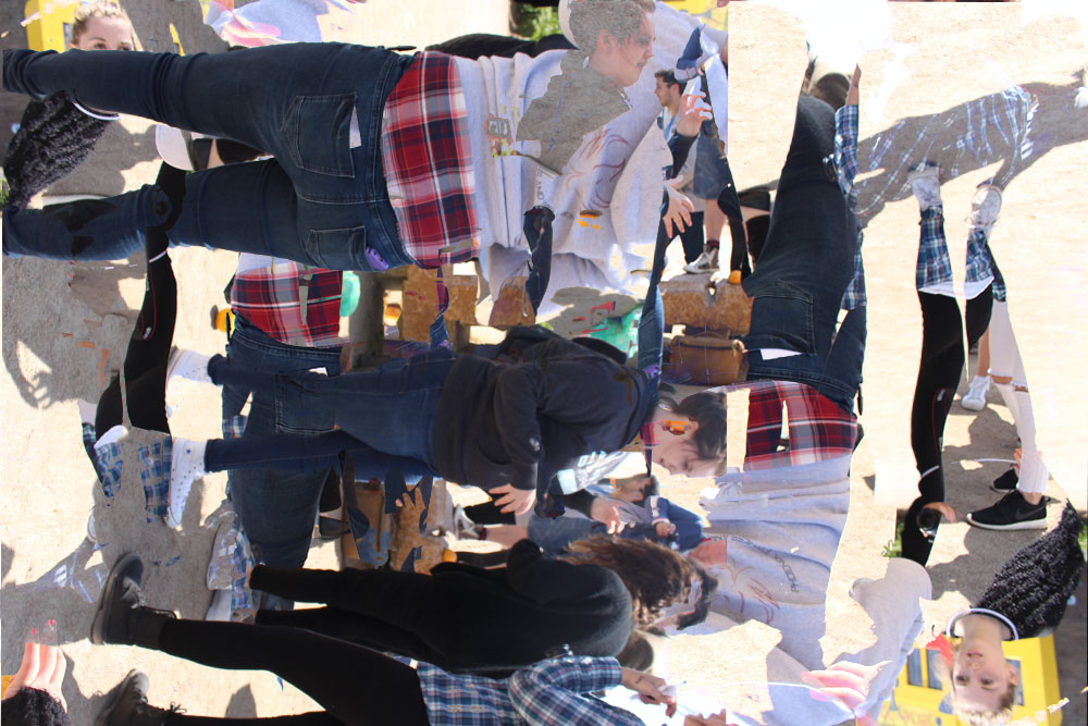
For this image on top of itself and rotated it each time. I think this worked well as it looks odd and possibly like something from a dream where you have no idea what is going on and there are just so many faces everywhere making you confused. Workshop with Tom Pope experimentation
IMG_662476656
This image is similar to the one above and is the same photograph but has been edited in a slightly different way. Workshop day experimentation

I am going to experiment more with this as well and make more images and try different ways to montage them all together as I find this an interesting concept and want to explore it further.

Surrealism: My experimentation

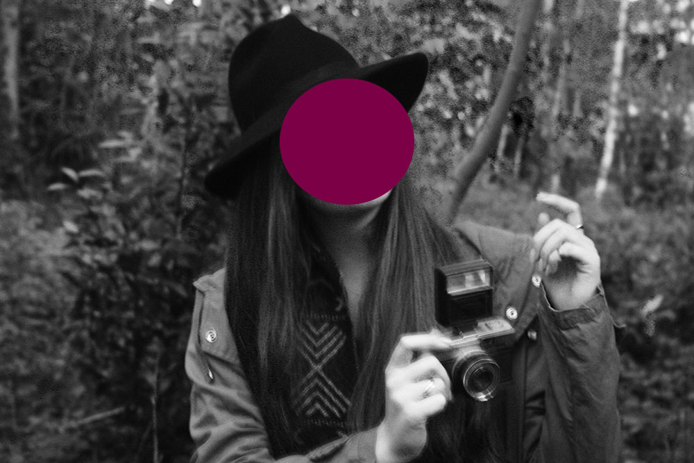
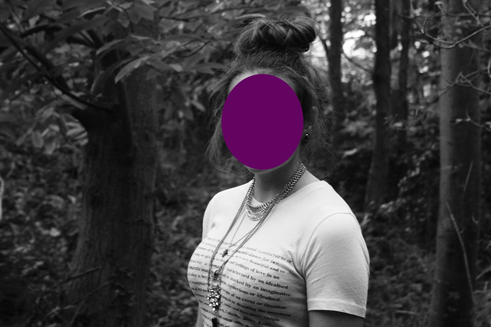
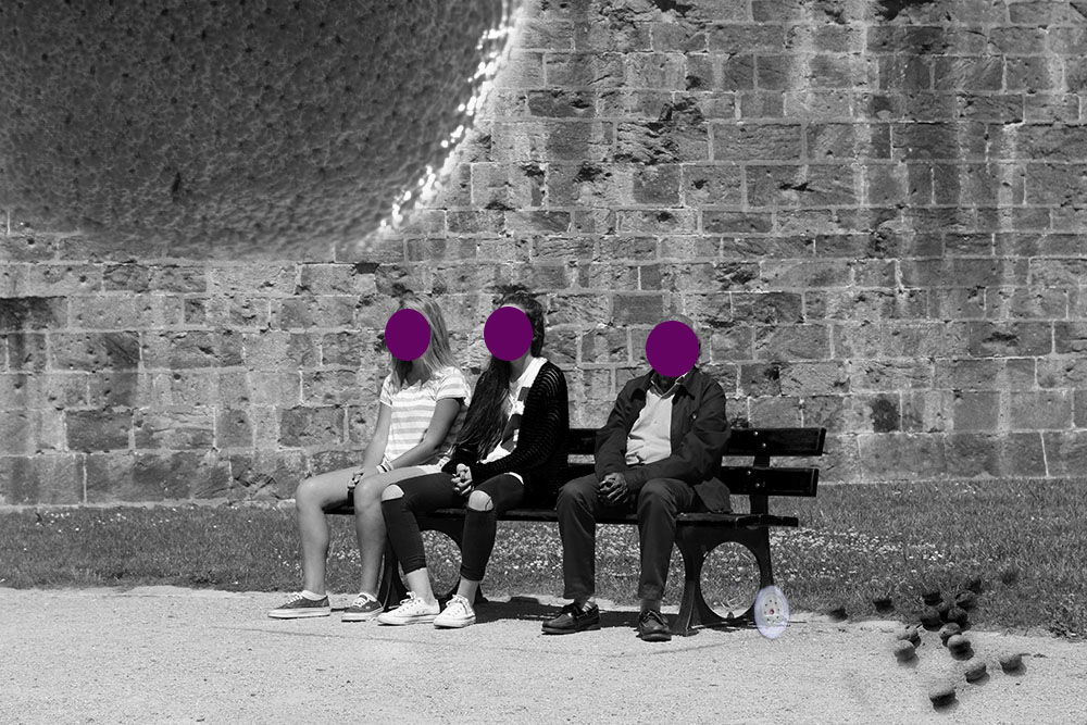
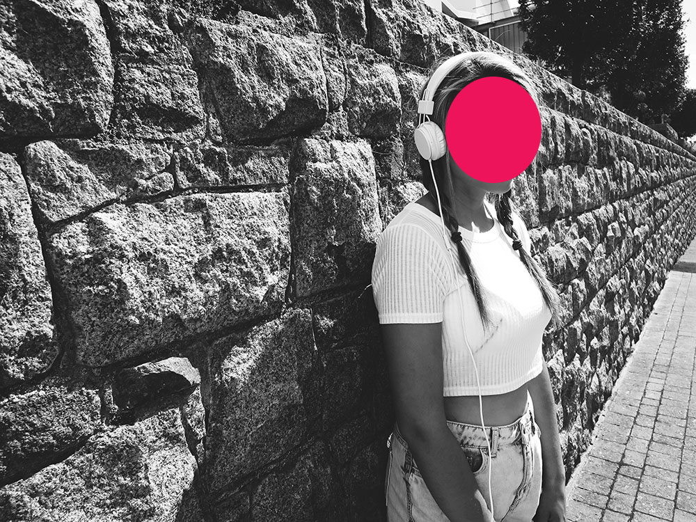
I am really interested in this movement and have decided that I want to create images based around this. For this have taken inspiration from John Baldessari and have recreated his works with the dots in front of people’s faces. I used photographs which I have already taken and just added in the dots on top of the images. I am also going to take inspiration from Christopher Mckenney and will be experimenting with his style throughout the week as well as experimentation with photo montage and dream-like images.

Family Album – My sister and I

I have also been looking at the surrealist photographer Christopher McKenney and I find a lot of his work very interesting and I enjoy looking at it, which is why I am using his work as influence for my own work and my own surrealist dreams brought to life through photography. I wondered what it would be like if two surrealist photographers joined together to create a brand new image, unique to the rest of their own images and I decided that I wanted to use my inspiration from John Baldessari and Christopher McKenney in order to create a new surrealist photograph. I have started with some experimentation and used photographs that I had taken while on the St Malo trip and on the workshop with Tom Pope. This is just so I can get a feel of what I will need to do during the week to make the perfect image. I am not using this next image as one of my final outcomes but it is just an experimentation to see how I will need to take photographs throughout the week. blogrjrjeThe meaning behind this photograph has different elements. The oranges on the floor and the giant orange represent the workshop day out we had and the small wheel on the floor represents our day in St. Malo. The reason I chose to have all of the faces covered in the same purple dot was because Sophie and I were copying this man and imitating him so I thought it would be a good idea to have the same coloured dot as we are supposed to look the same as one another.
Tom Pope Workshop Outcomes:

yhh-1tp-1

Above are some photographs of my surroundings on the day of the first Tom Pope workshop. Our task was to get into groups, and each member would have to write down a task that everyone must perform for a minute.

orangesss-1orangesss-2

The images above are the outcomes of a very intriguing experimentation with Tom. We had to throw the oranges in the air to another partner, and take a still-image whilst they were coming towards us. I left it in color when editing because i wanted the orange color to stand out. I had to use a very zoomed out camera lens, so that i could capture the fast moving object. This relates to Tom Pope’s work because he’s always trying to find new ways and perspectives to capture images. This also relates rather well to the theme of

couple -1

For this outcome, we were told to stand on one leg whilst taking pictures. I really like how the lighting coming from the direct sunlight creates a shadows and contrasts the people’s bodies.

upside d-1purp-1

I edited this picture to add a violet tone. This picture was taken whilst performing. We each had to come up with an activity to do for a while, from each member in our group. We were told to hold our camera upside upside down for this one, which gave me these outcome. they turned out to be perfectly aligned, and i didn’t have to rotate them to make the horizon straight. The purple tone and orange highlights make this image look very mysterious and unrealistic, which i like.

purp-1

Here Tom Pope was demonstrating a third activity to us. The aim was to try and take as many selfies as possibles, but on the other persons camera.

yell-1

Above, is another one of my outcomes from this day. The camera was being held upside down and at an angle. I spontaneously took this, whilst moving around. I also managed to capture someone else during their performance in background.

Editing

After the french trip, I used premiere pro to edit my videos to collaborate them together in a sequence to form a video. I did this by importing separate videos . This enabled me to fade in and out of the videos so that it looked smoother, my videos weren’t the best quality but I feel like the contextual side still made my final a good standard. Next time, I would like to improve by experimenting with the flowers more by tricking the public that i’m going to give them one and just holding it in front of them with the camera close to them to see how they deal with the situation. Also, I want to add the other video that has some people rejecting me so that I have positive and negative reactions in my video to show a contrast.

Also, I want to improve the video by possibly adding music to it to make it more interesting as the video as a whole isn’t at a high quality. However, I do like the idea of involving people in my videos and this was a very good way to interact with them, therefore, I am pleased with this video but improvements can always be made.