Category Archives: Editing

Filters

Author:
Category:

Developing a Picture Story

For this task I decided to use images of my niece. I think that this is my most interesting story so far and think that the other stories that I have are’t as developed as the ones of my niece. I’ve been experimenting with different images and wanted to create the best possible picture story for my shoots. I took a lot of inspiration from the newspaper article on the ‘Nurse Midwife’ by W. Eugene Smith.

Tips:
– write the text in third person
– talk as though you are a journalist
– add different sized images
– make sure images tell your story
– don’t make text like a blog post
– fontspace.com for differnt font types

Experiment 1
bella article page 1 blog
page 1
bella article page 2 blog
page 2

I am not too keen on this layout as I don’t think it looks very good and doesn’t really seem like much of a newspaper article. I think that with my next experiment I will try a different layout and change it around to make it more visually appealing. I do like the colours in my images and think that they stand out and look good as part of a newspaper article. I also think that the text can be improved a lot more.

Experiment 2

bella picture story idea 2blog
page 1
bella picture story ideablog
page 2

I prefer this layout to the first experiment as it looks well put together [compared to the other one] and was more inspired by the work of W. Eugene Smith with his paper article of Nurse Midwife. I made these images black and white to fit in more with my inspiration newspaper and I do think that it looks good. Through my next experiment I think that I will leave the images in colour and start to create a  text in columns and more suited to the newspaper style.

Experiment 3

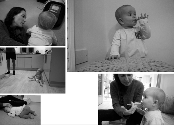
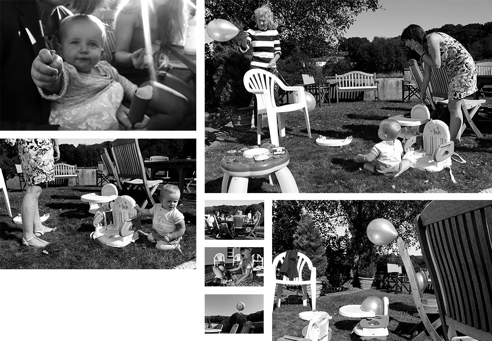
keeping up with the babyblogHere is an unfinished experiment that I have done. I plotted where I wanted the text to go and have filled it in but not with the actual text that I am going to be writing. I do think that this experiment is more newspaper like but I think the images that I chose are too much as it looks as though there is way too much going on and the spectators eyes wont be able to direct to one part of the image, I feel like it is bombarded with different colours and images where a lot seems to be going on. I need to focus more on finding images that create on larger story and that work well together and compliment one another rather than images that feel cluttered and not very good.

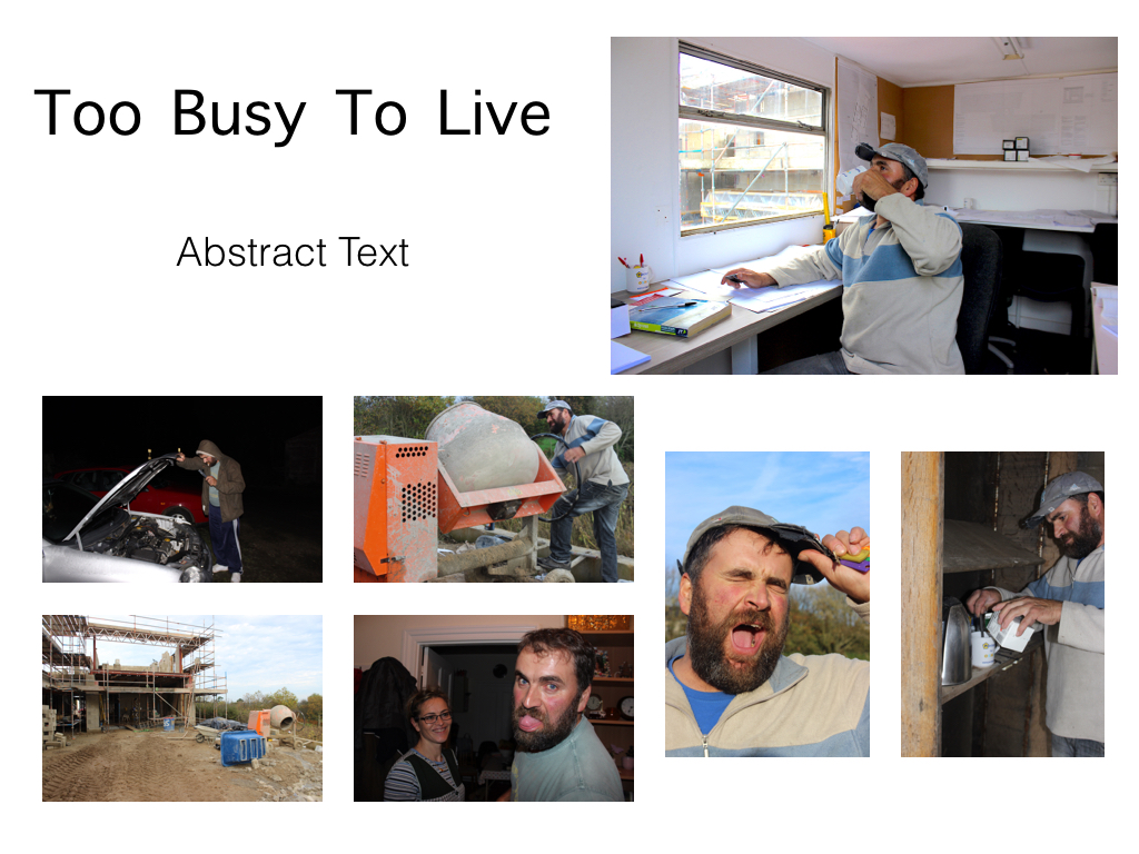
Photo-shop: creating a picture-story

The stages of creating my picture-story:

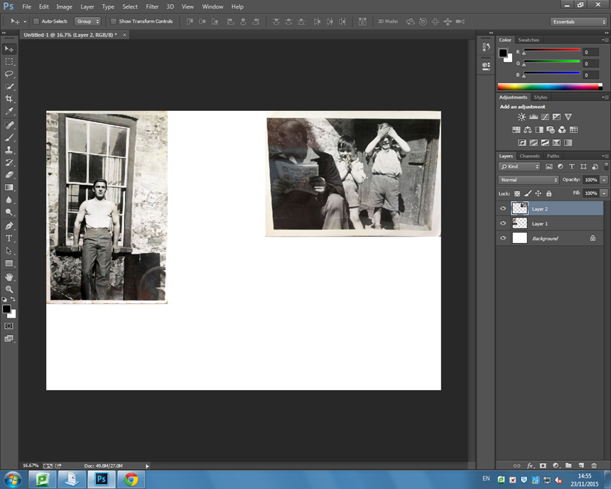
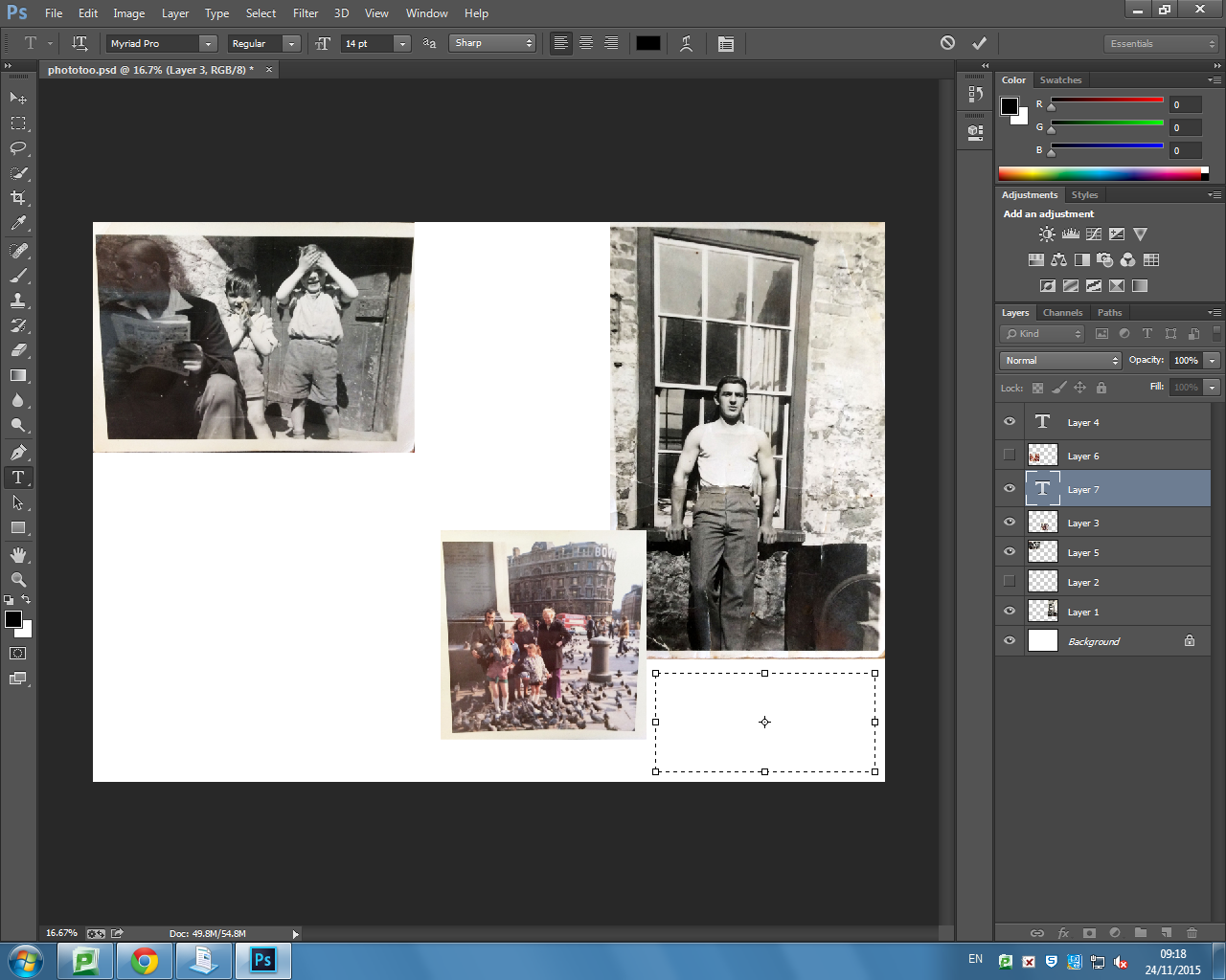
Firstly, I opened a new page of photo-shop, which needed to be size A3 and was international paper. Next, I selected the archival images I wanted to use and adjusted them so that I could see which designs looked best. I wanted to have a combination of black and white images as well as coloured images too. I decided my establishing shot to be the only photograph I have of my grandfather on his own because I found it fitting for it to be the main image which an audience looks at first. 

ttttt

wwww

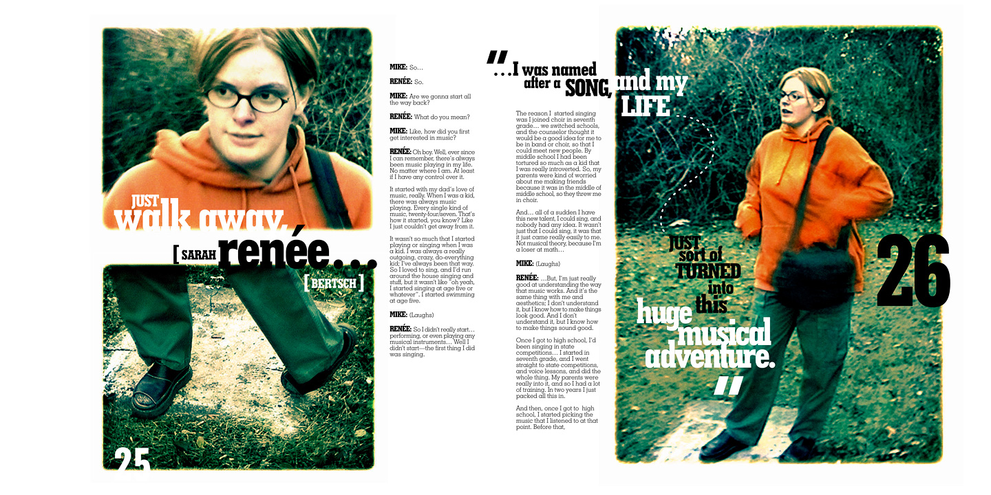
After experimenting with the more traditional style of picture-story, I decided I wanted to take a more contemporary modern approach. I think the theme of my project being memories means the design needs to reflect it in order for it to work well. I took inspiration from one of the magazine spreads I found on the internet. I thought it was very imaginative and creative which is what I want my picture-story to portray. I overlayed the images of my grandfather because I have so many memories of him and he has lots of different aspects of him which I want to show in my study. This will be the establishing shot and the title will go in the top right corner so that they correspond. I think I want to experiment with having snap shots of family moments down the right side. But I will also produce a second versions of this picture-story however, instead I want to put more focus on the photographs I have taken now. I want the flower image to be the background which I will use the opacity tool to change the intensity. 
pic

picture story photo

Inspiration: These are some examples of picture-stories I found on the internet. They are magazine spreads and are very contemporary which is the style I want to experiment with. My favourite is the second one, I like the theme of it and the way it has been designed. It goes very well with the theme of memories and the past. Plus it has writing on the right and the photograph on the left of the page which is what I wanted. 

20000101_6619

magazine4

PHOTOSHOP: MAKING MY PICTURE STORY

When creating a picture story you need to choose a range of images and play around in Photoshop with where you want to place the images. First when starting you need to choose an establishing shot and this will be the biggest image, this is the one that should be in the left top hand corner as this is where a person would first look when they are reading a magazine or a newspaper. yhj

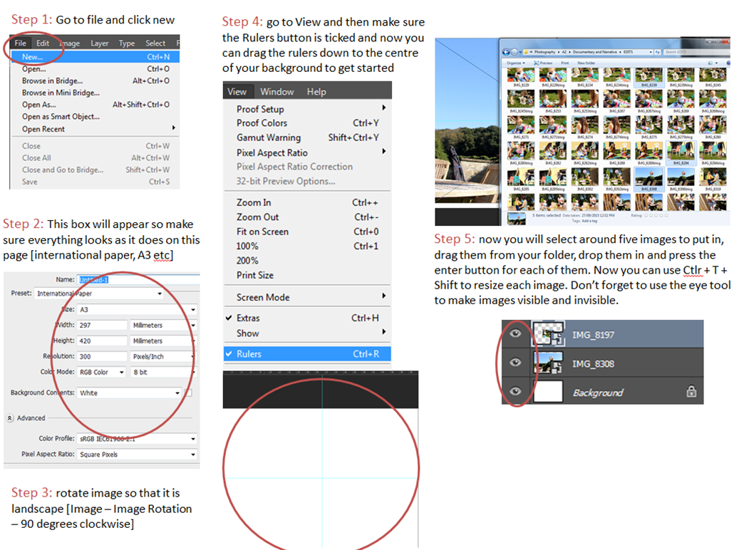
When making this picture story you need to use rulers to make sure that the spacing of the images is the same which makes it look neater and cleaner. By using rulers it can ensure that there is the same amount of spacing that is between the images. 

Untitled-1

This is my final picture story, i need to write some text in the spaces that i have left. For the writing i need to write in the third person. To expand on these picture stories i will make different lay outs for the images and place writing in different spaces. For some of the images i am going to place one of the images as the background and then place other images on top of that one. I will experiment with black and white and images left in colour. In this picture story the main image is the one that i have placed the largest and to the left so that it is the first thing that is seen that is on the page. 

Experiment 1: 

Mum

This is the picture story that i made of my mum. Around the images i wrote text that describes in general how anxiety makes people feel and how it makes people feel isolated sometimes. I also in the corner added a quote which my mum says a lot, i added this quote as she usually always feels very drained from feeling stressed which means that she is tired often. I made sure that the spacing was the same between all of the images and the text to make it look neat, i think that by having some of my images in black and white and the other in colour makes it more interesting as it makes the one in colour stand out.  

Experiment 2: 

image black and colour - mum

For this picture story which is the same as the last one, i changed the bottom image to colour so there was a range of black and white image and colour images, so that it was not just one image that stood out. 

Creating Your Own Picture Story

How to: Design a picture story using PhotoShop – 

making a picture sotry

bella grace
editing progress [title + caption needed]
  • For these images make sure that your design is right to the edge and once you have finished you can then make a board round the outside. Your eyes are ALWAYS drawn to the right side of the image first as it is right there as soon as you open the page so here is usually where you will put your largest establishing shot image. You will also need to come up with a title and a small caption explaining what the story is about. Now experimenting with your images and how you want them to look will be a lot easier.
  • save experiments as JPEG’s and put them on the blog
  • remember to use the ruler tool to create an even amount of spacing between each of the images
  • Ctrl + H hides the ruler tool for when you want to have a look at your picture story as it would look when printed
  • Adding text – go to Windows then ‘Character’ to get the little editing box for your text. To get text all you do is click the T button down the left side of PhotoShop.

Experimentation with different designs

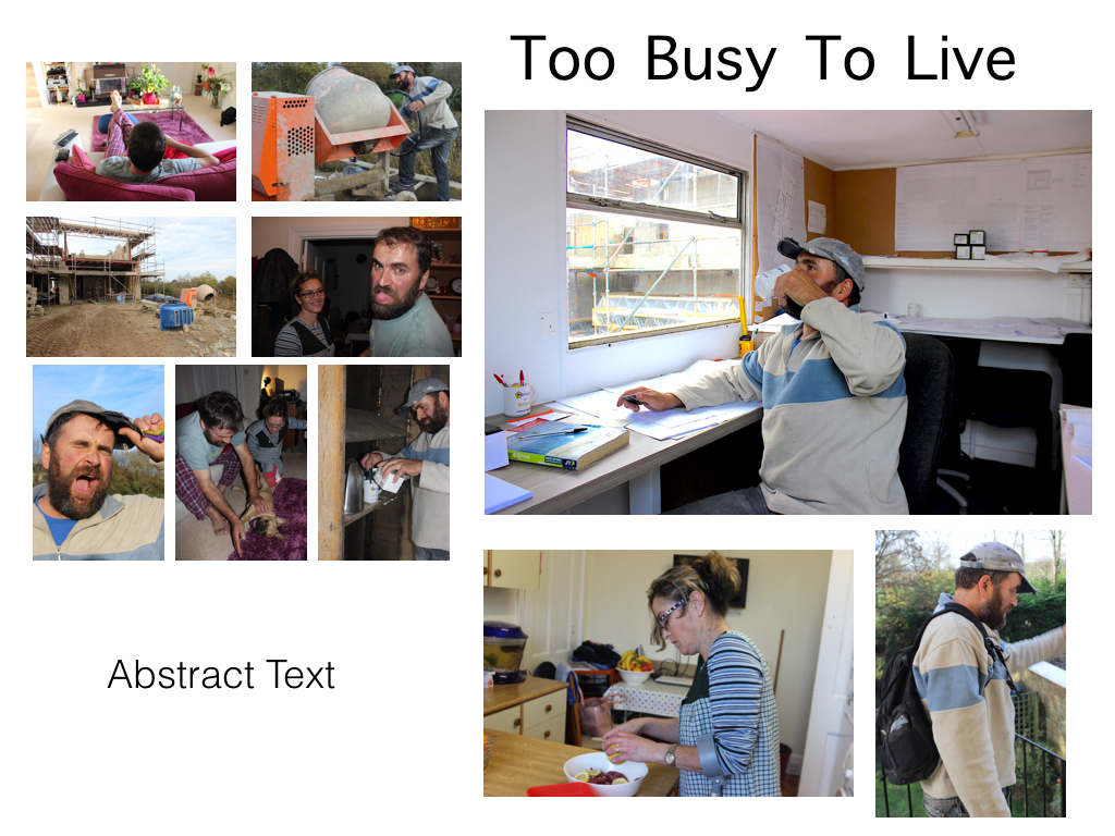
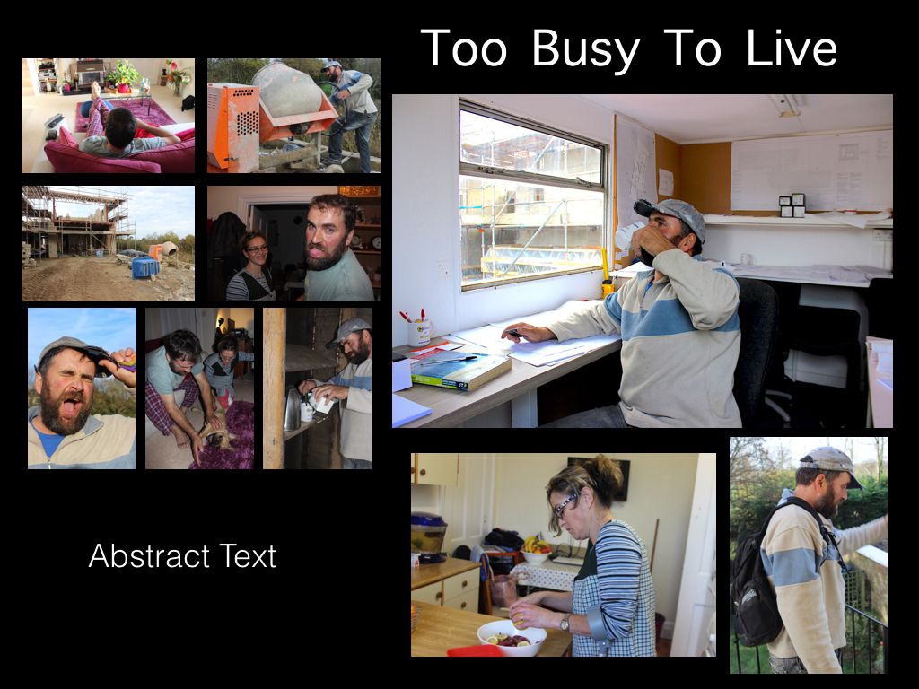
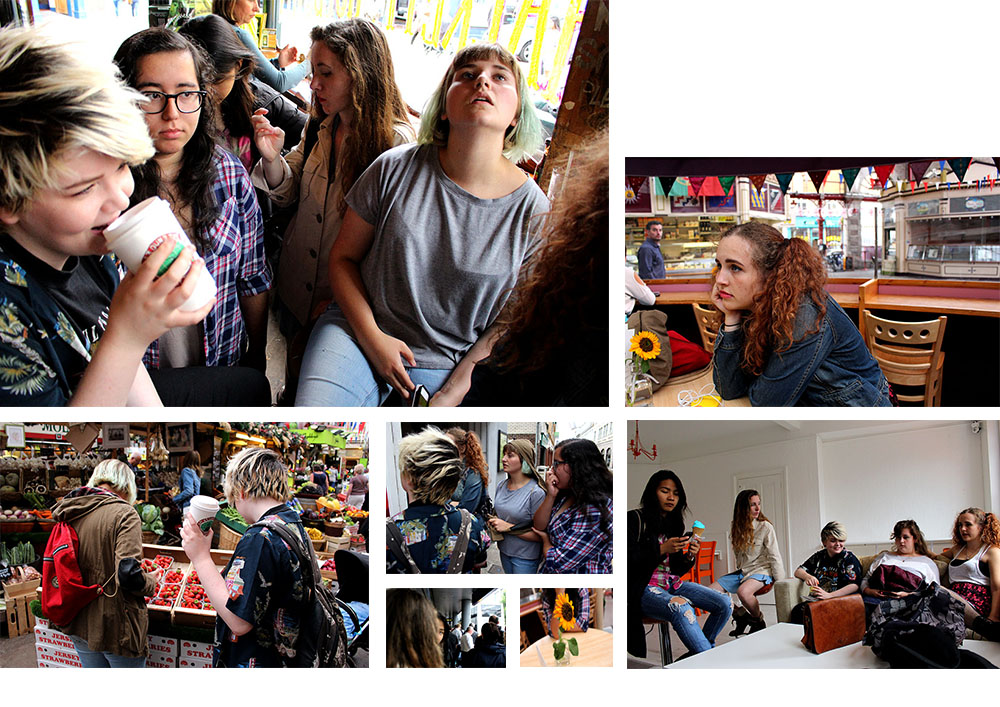
I have started to collect a few of my images together to create different picture stories, I haven’t found my favourite images yet that really work well and portray the story well but I am experimenting with the different shoots that I have done to make the best format and layout for my final chosen picture stories.

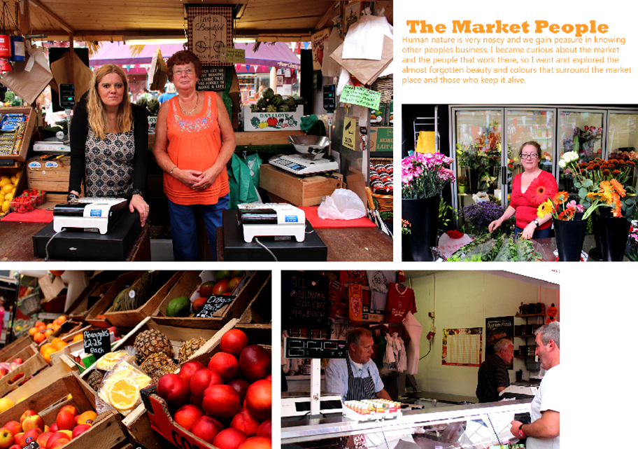
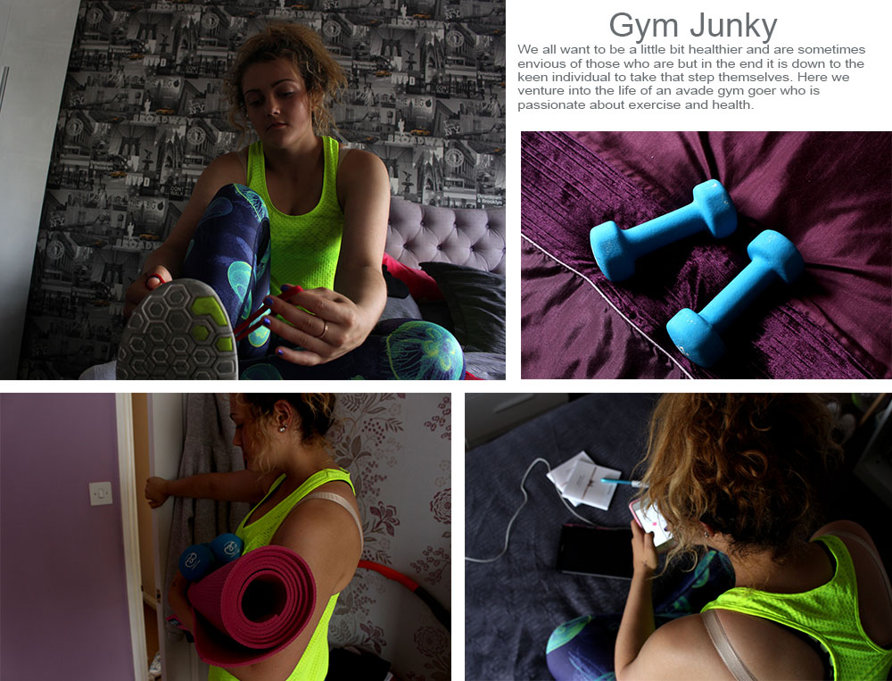
Here are just two different experiments with the some of the images that I have produced. I am still working around with the different images and positions of the images to find my favourite ones. So far I have only experimented with two shoots and I am unsure which images look best and if they actually stand out or whether or not they contrast each other too much and are overpowering one another. I think that I will have a look at all of my shoots again and try to make a design where I have a portrait, establishing and possibly a person at work shot just so it is more spread out and it isn’t just the same type of images being created each time.

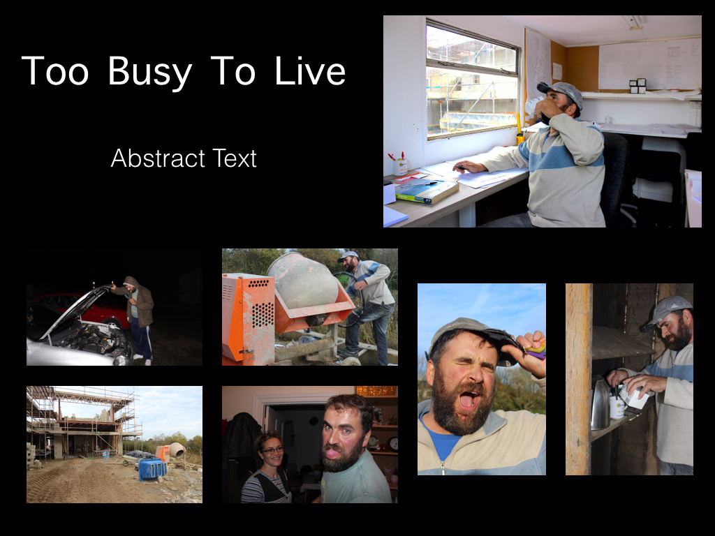
markettttt
The Market People story experimentation
emma gym
experimentation with different shoots

I don’t really like any of the experiments that I have produced as they aren’t complete and quite boring. I want to create a proper picture story that is interesting. I have gained inspiration from all of the newspaper articles that I’ve looked at and think that I want to create something similar to this as it is more interesting and I am able to get more images into the project rather than trying to squeeze in a load of images that don’t look right or are out of place.

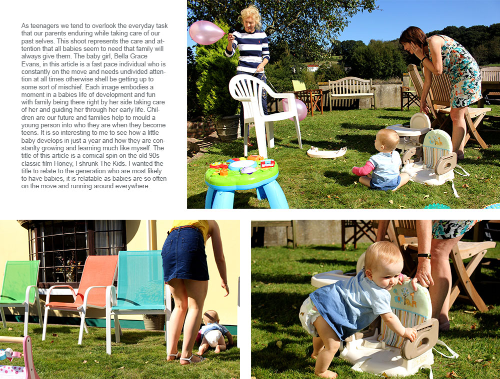
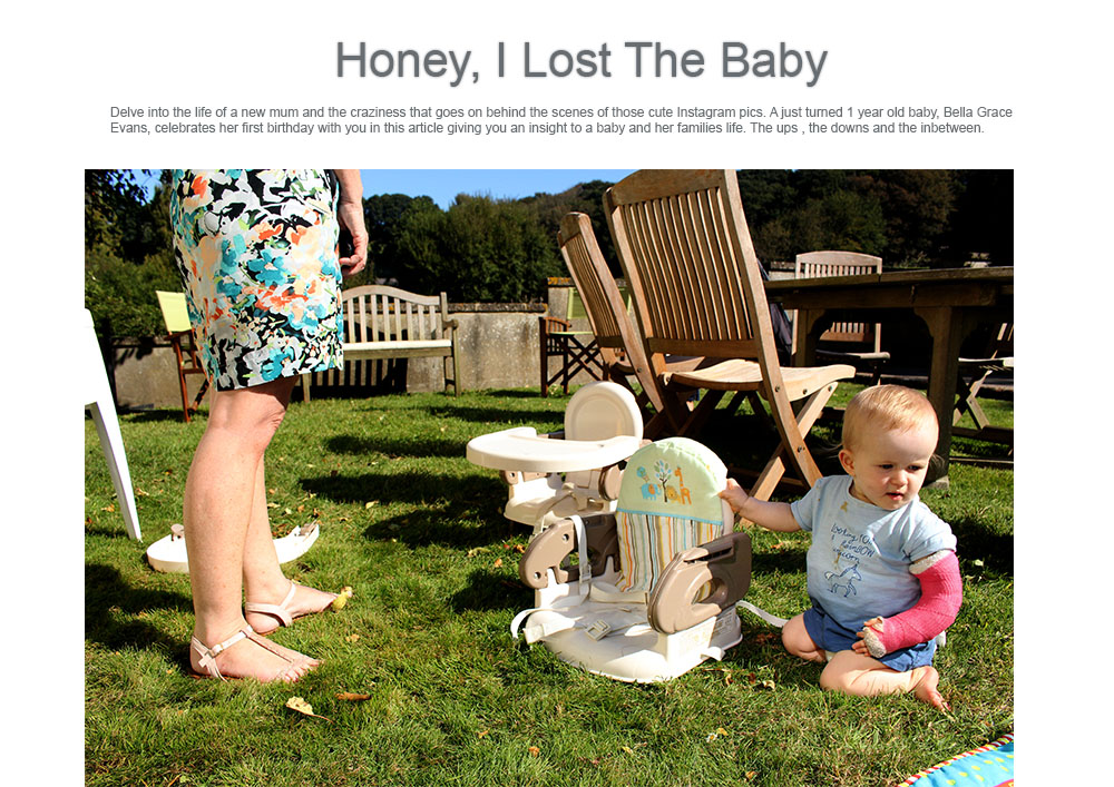
For this little article I took inspiration from newspaper articles as I find them a lot more visually pleasing and exciting compared to the picture stories that I have created above. I think that this is a lot more interesting as well as the information giving the reader/spectator more of an insight of what life is like being a new mother with an active baby. I do love these images and think they are interesting to look at with all of the bright colours surrounding the environment. I like the sharpness of these images as it makes them a whole lot more interesting to look at and will make the spectator want to read on as they will be drawn to the bright colours in the front cover image.

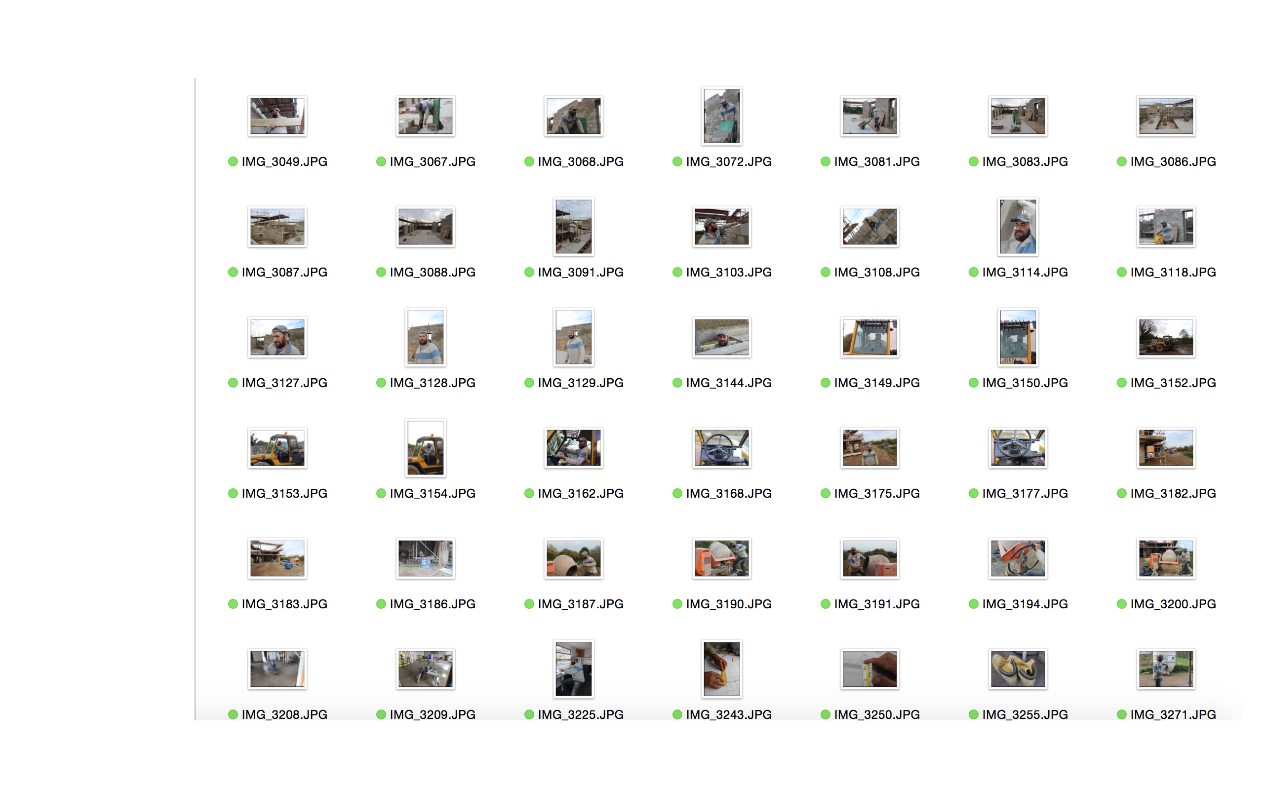
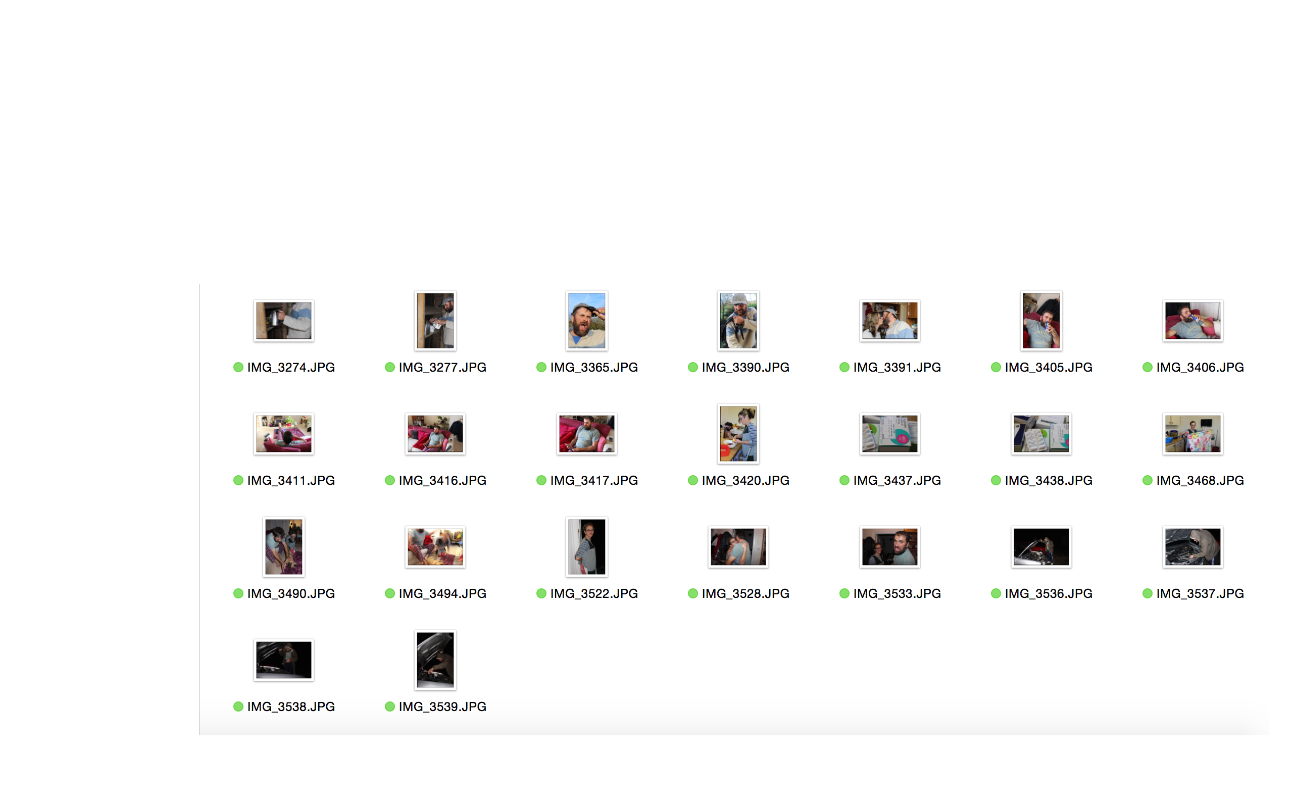
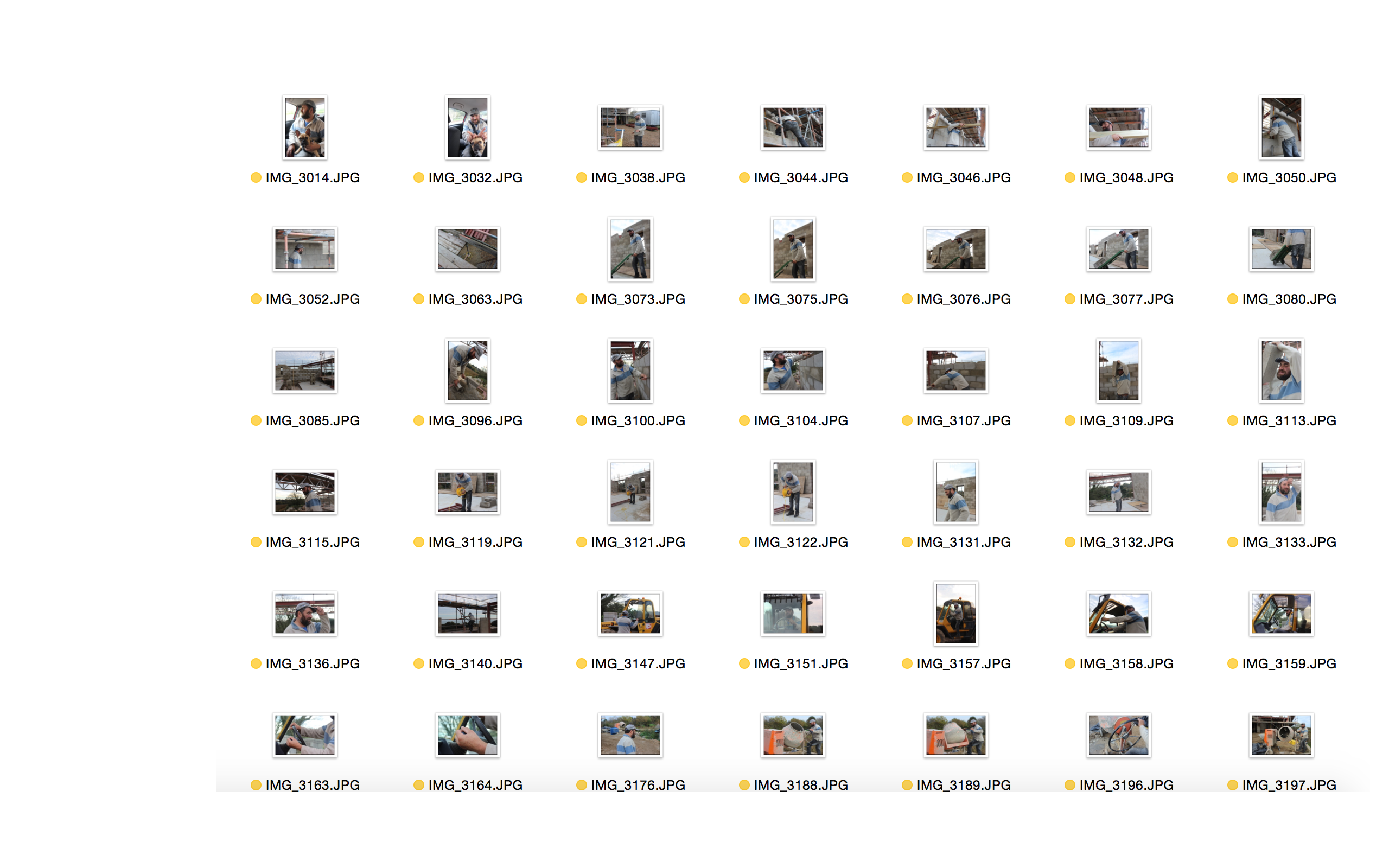
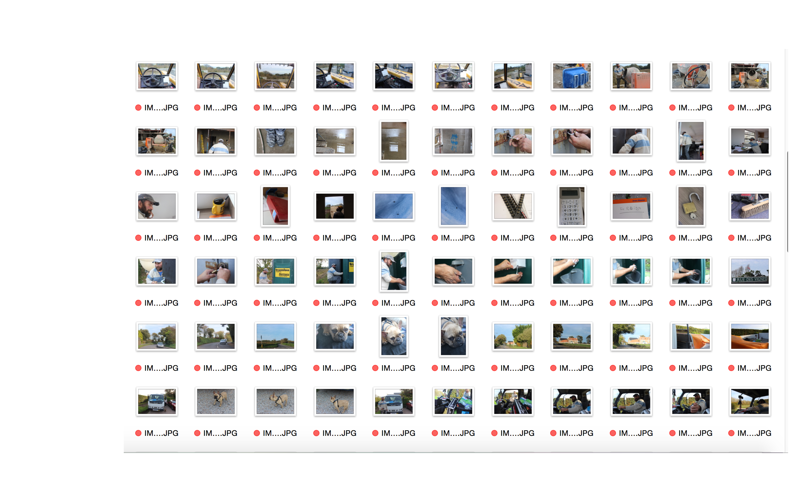
DOCUMENTARY PHOTOGRAPHY – SELECTING PROCESS – YELLOW:

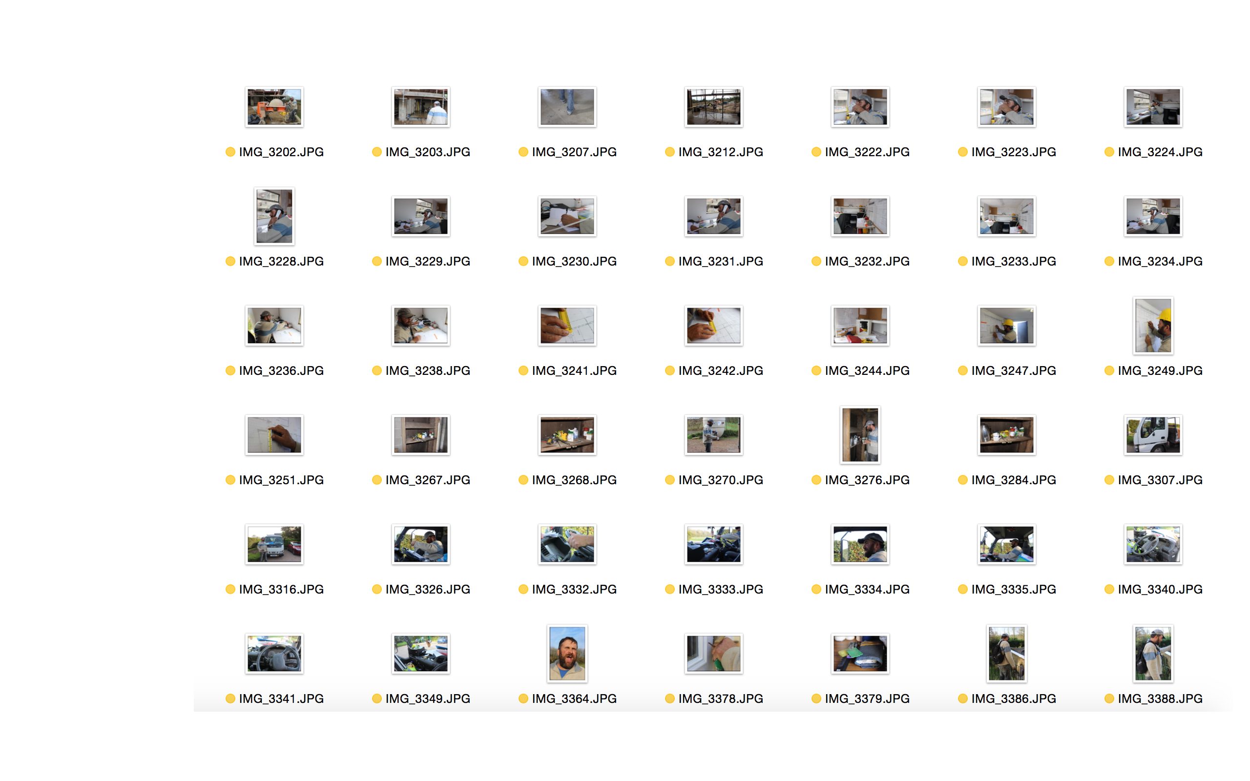
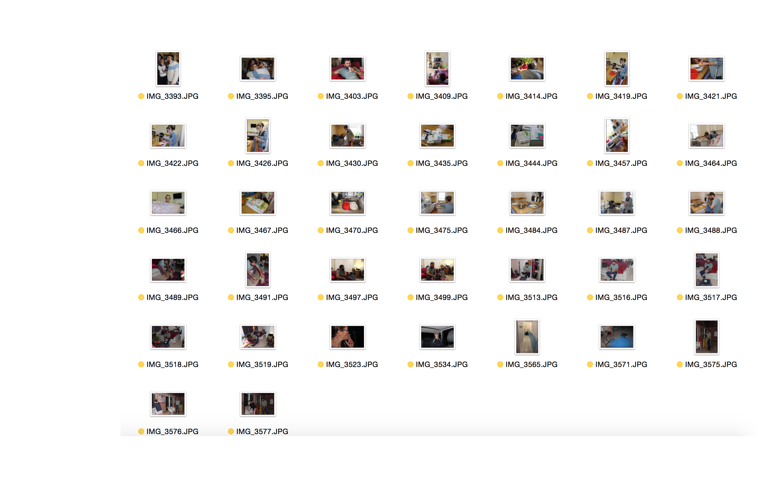
These are the selection of photographs that I think could be used and that I personally like, however feel like I may have better photographs that I feel could portray the story that I am trying to tell with my photographic essay. However I have made this selection as there may be some photographs or perspectives that I may want to include however didn’t make the cut for the photographs I am definitely wanting to use. 

Screen Shot 2015-11-23 at 10.18.58 Screen Shot 2015-11-23 at 10.19.09 Screen Shot 2015-11-23 at 10.19.15

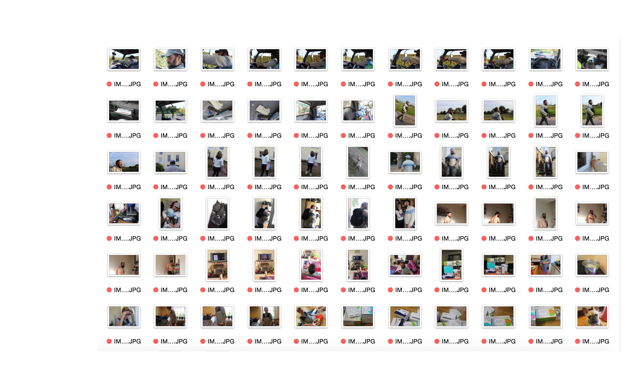
DOCUMENTARY PHOTOGRAPHY – SELECTING PROCESS – RED:

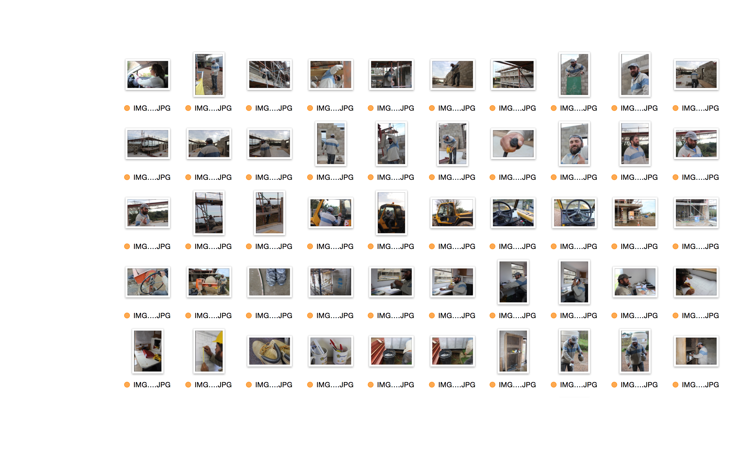
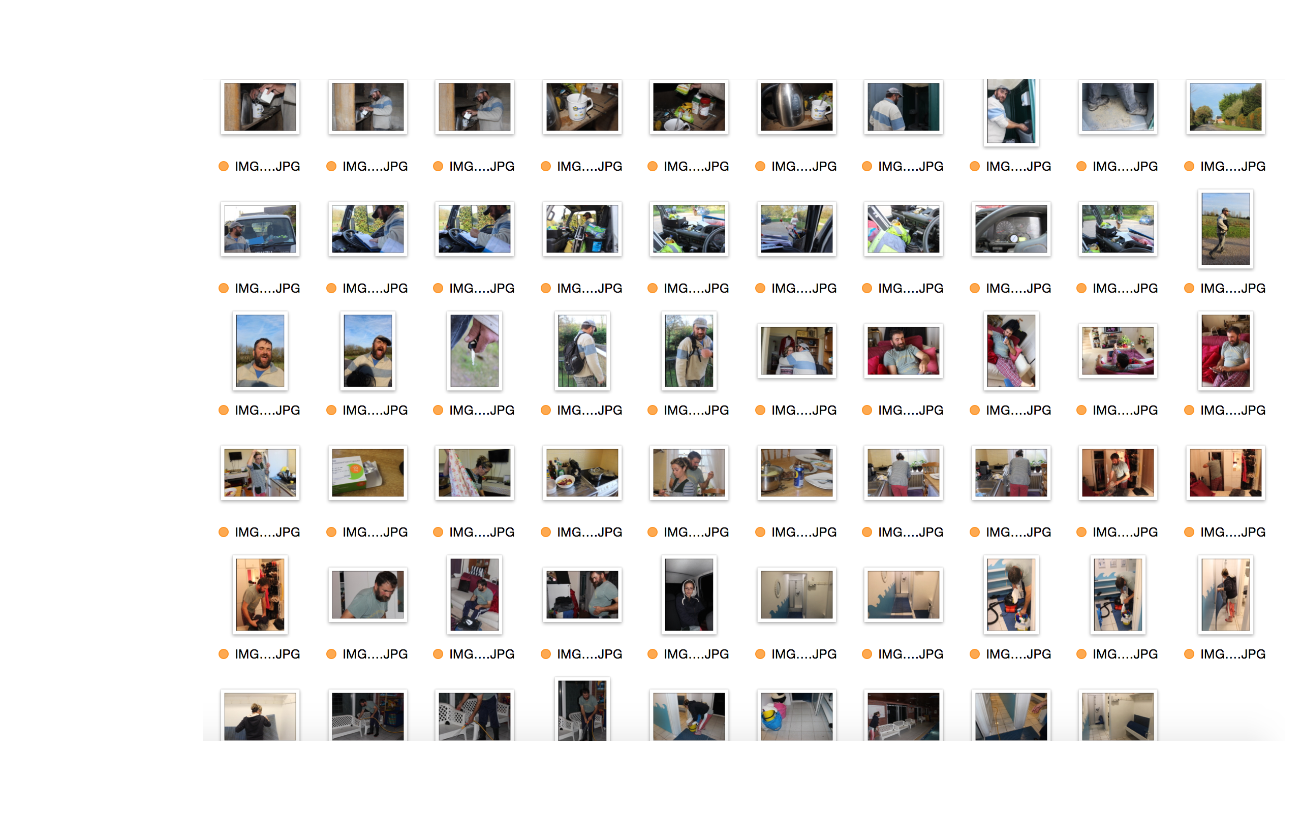
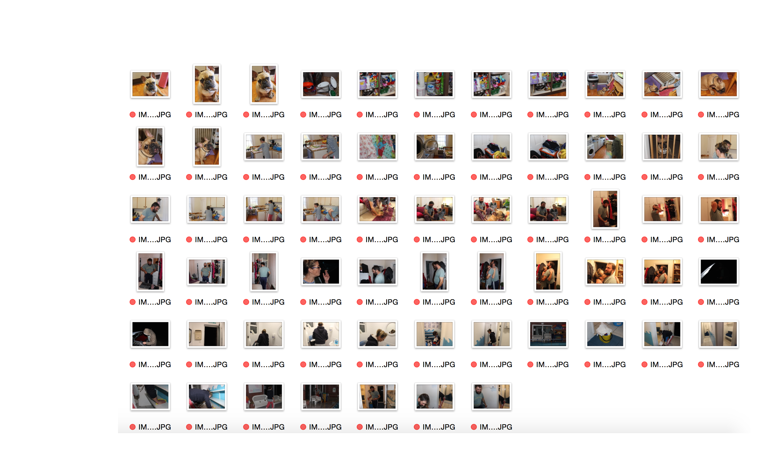
These are the selection of photographs that I do not wish to use in any way for my project.  The reason as to why I did not want to  use them at all in my project was because they were either poorly composed, or were distracting from the main idea that I have for my picture story, therefore having a poor or no link to my idea, or simply because I took too many photographs and had many that were very similar in composition. Screen Shot 2015-11-20 at 13.23.26 Screen Shot 2015-11-20 at 13.23.39 Screen Shot 2015-11-20 at 13.23.48