I have been experimenting with different designs when making my story board. Whilst experimenting I have been manipulating: colour schemes, amount of images, image selection, image size and fonts.
Here are some of my final outcomes:


I have been experimenting with different designs when making my story board. Whilst experimenting I have been manipulating: colour schemes, amount of images, image selection, image size and fonts.
Here are some of my final outcomes:


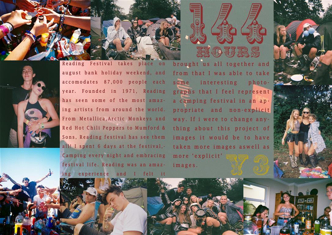
When designing my photo book I was weary of overcrowding and putting too many unneeded photographs or quotes. Therefore, before I began by design I researched photo books which had been created through Lightroom in order to grasp an understanding of how to use the programme. I knew already I wanted to reflect Laia Abril’s style from her project The Epilogue. The essay needed to feature photographs from the photographers I had spoken about in it. However, I wanted it to remain looking clean and professional.

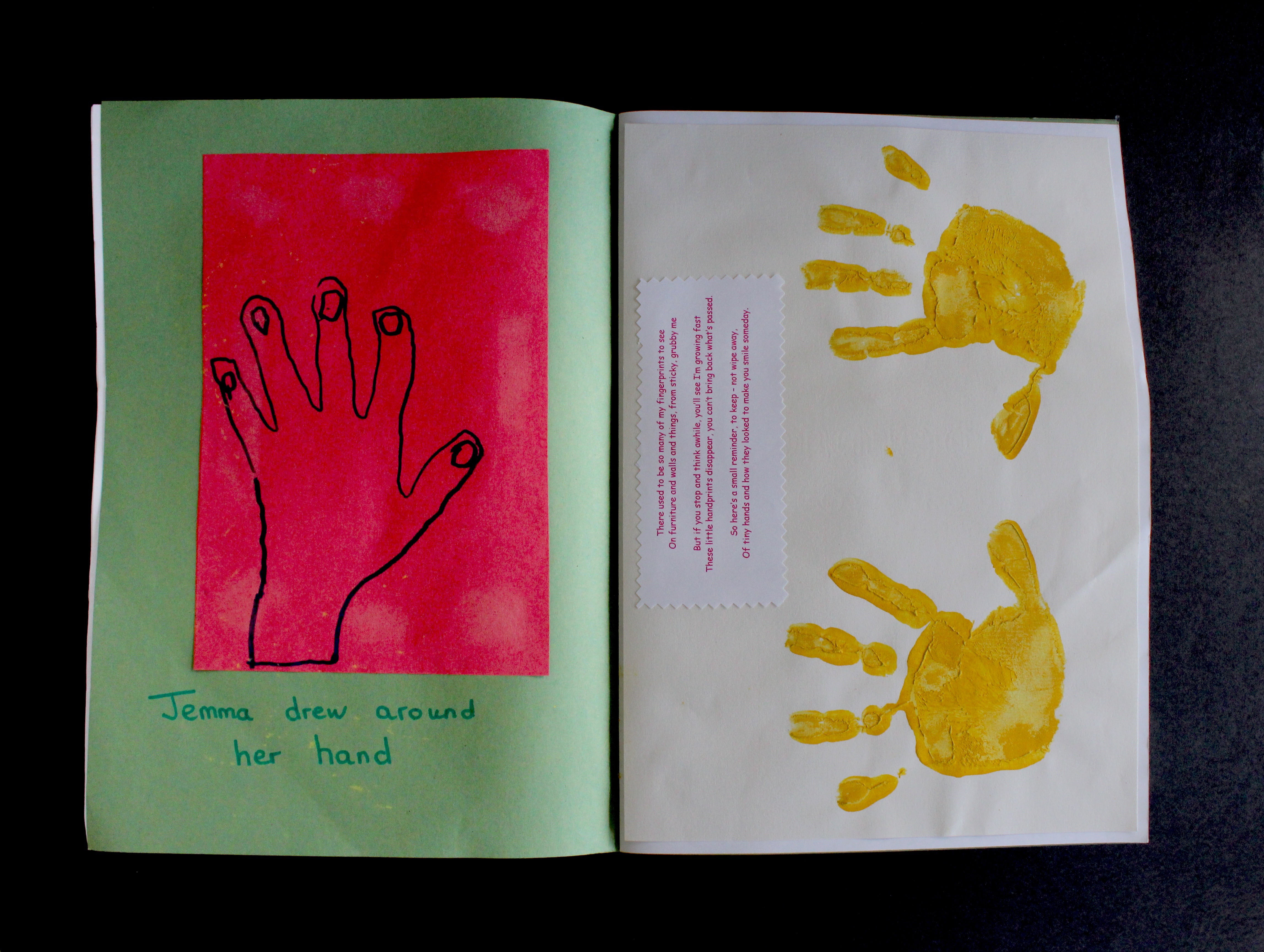
I included a variety of different image styles, for example I wanted to use landscape shots in order to represent the places that remind me of my grandfather. I also have included close ups for the detail, portraits of my grandmother and still images of the items and objects of my grandfather’s that my mother kept. It was important that the narrative followed in an appropriate sequence so that it makes chronological sense and aesthetically pleases the eye.


Before I placed the photographs in their order I developed them slightly, I adjusted the exposure and contrast to make sure the lighting of the image was right. I also amended the clarity and detail so the photograph would look more interesting and intricate. Cropping was also essential so those images which were either scanned in or needed to be similar to another image.


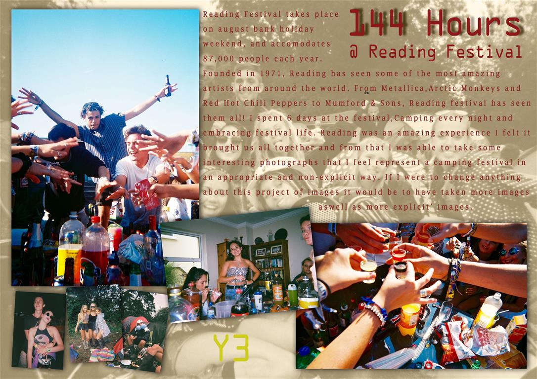
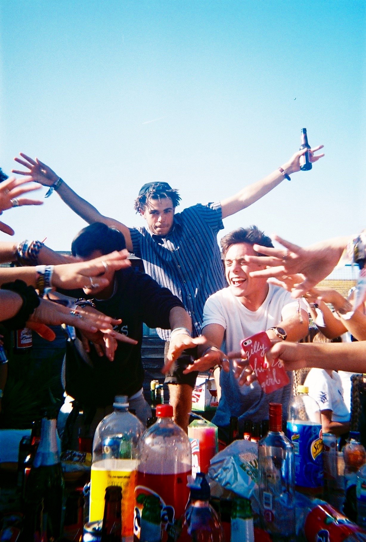
 The above picture story was the second I edited and when completed was my favorite also. This story is presented more as a double page spread, with no drop shadows or highly edited images. I increased the vibrancy in all of the images to bring out the colors. I felt this was a cleaner and less artsy layout due to the symmetry and images laid out all in line. My favorite part of this layout was the title text, as it was very bold and very different to usual titles I felt it fit well in this design. This design also had a background image, this image was a corrupted photograph from the broken camera and I felt it fit very well as a background as there is nothing important within the image apart from a few corrupted images and water marks.
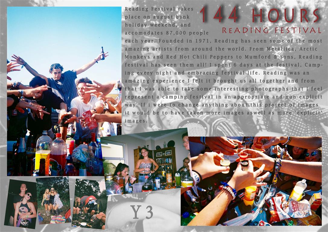 This design was the third and least favorite design, The same layout as design 1 but with different color schemes and effects. The text should have been changed to another color as i feel it blends too comfortably with the background. I feel this story looks more of a poster than a picture story, The story is far from what i set out to design when i started but was an experiment and directed me towards editing my other stories more as i could then see what they were missing eg: drop shadows.
I have played around with the arrangement of my picture story on Photoshop and have found an outcome that I am starting to like. I wanted to incorporate the archive photograph into the background of the image as it makes my pictures stand out and look more effective. The title is important as the Governor has to stand out the most as he is the most important individual in the story. The portraits look effective as a three, 2 in colour and my main character in black and white (my dad). I have left space for a couple more images in the bottom right corner, however, I like how there is space otherwise it will be too overwhelming. The colours in this picture story are very bright and I like how their is contrast between the black and white background with the coloured photographs. I am going to experiment with a few more designs to see which is the best outcome.

To create the document in Photoshop – New document, International paper, A3, RGB colour.
First off place the images in Photoshop and place them onto the page. You should make all of the images into a line and re-size them all to the same size for some of the images. Place another image in the is larger which will be the establishing shot and tilt the image so that it is slanted. Then to place a shape into the picture story – elliptical marquee tool will make circle shapes that you can place into the picture story, you can use the paint bucket to change the colours of the shape. Polygon lasso tool will give you a triangular shape and rectangular marquee tool with give a rectangle shape. Place another image into Photoshop that can be placed into the background of the image, use blending modes to blend the image into the background so that it sits behind all of the other images. By adding a layer mask you can choose black and white, black foreground, white black ground, then you can erase back and keep the the parts of the real images that you want to keep. In addition by changing the opacity of some of the layers it will make the images more clear that you want, once you have used the blending modes as some of the images may be covered.
The writing
The writing has to be journalistic, you have to write about the story which you have explored. This will be written from a third person perspective. What i will look up is what is anxiety, and why do people struggle from anxiety. The text will be a deign feature, columns will make the text look more interesting on the picture story. You can look up different fonts by looking on Adobe and looking at all the the different fonts which you can download to add to the picture story.

I made this picture story on what we learnt in class and by placing my image differently to create a unique looking picture story. I think that placing the right side of the picture story images into black and white it makes them stand out from the other image. On the images on the left i copied them using the duplicate tool to make this dragged out effect which i think looks really interesting because of the colours that are in this image. For this picture story i need to make a title.
Experiment 1: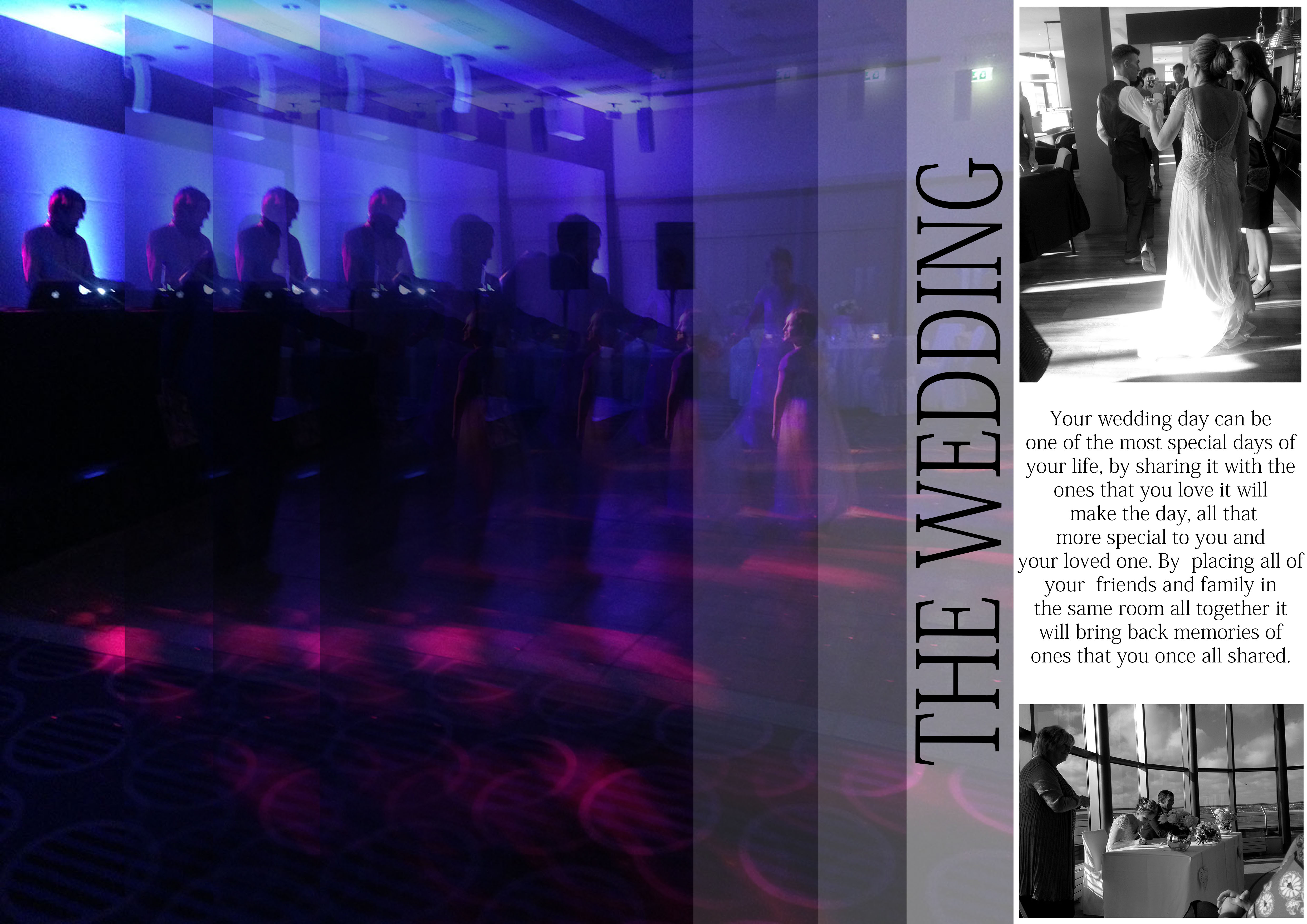
I added a title to this picture story which i slanted on the side which i think fits in with these images that are in this story board.
Experiment 2:

This is my second edit from my wedding shoot that i took, i placed one of my images as the background and placed the image in black and white, i think that this image looks good because the images are in colour and the background is in black and white. In this text i wrote about how a wedding can be special to someone and how it is shared between two people.
Experiment 3:

For this experiment i selected over my image and (select, layer via copy) and changed the colour of the background, i did this by placing a colour overlay over my image, and then i changed the colour of it to purple to match the purple in one of my images. I used the blending modes to blend the colour overlay into the image and then changed the opacity to soften it. I also selected a strip down the right hand side to made it darker also, this makes some of the features in the image stand out as well and makes the image better.