Category Archives: Book creation
Filters
Synthetic Distortion – Photo Book Layout:
Photobook Layout
FINAL BOOK
Here is a link to my final book design.
http://www.blurb.co.uk/bookstore/invited/6217410/78391bdcd04f14c765ed6231fdc67f4846be4f6a
My Book- ‘The Heavens’
Creating my Photo Book
My personal study is all about my Grandparents, Ruth and Rowland and their lives. I have titled my project ‘The Heavens’ as I think that the surname of ‘Heaven’ is quite intriguing. I also think that using the name that they both share as the title is the first indication that the book is about a married couple and about their love for one another.
In this project I tried to incorporate lots of different angles of their lives, I have tried to divide the book up and format it in a way that is easy to view.
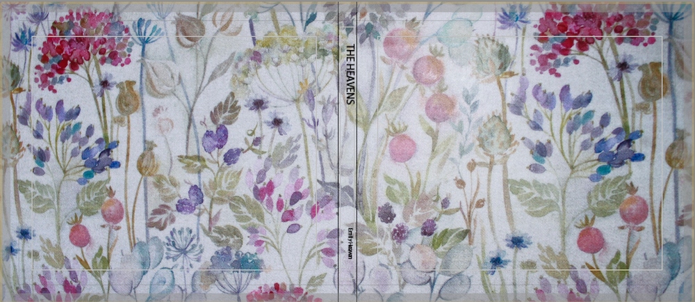
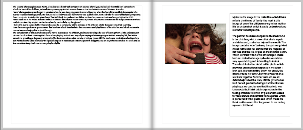
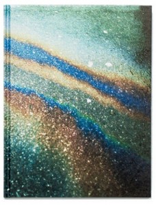
I decided that I didn’t want to use a key image from my photo book as my cover, instead I used a picture of my grandparents table cloth as the cover image. I also decided to not put the title, ‘The Heaves’ on the front cover. I wanted to leave the contains of the book a bit ambiguous. These formatting styles got inspired by Sam Harris’ book, ‘The middle of Somewhere’.
Sam Harris’ cover was designed by one of his daughters. I thought it was really eye catching and gave the book a slick look.
The next pages of my book contains a bright blue page followed by the title page.
I thought that the blue was very eye catching and added colour straight into the book. I also think that having a couple of blank pages leading into the book is nicer than jumping straight into pictures.
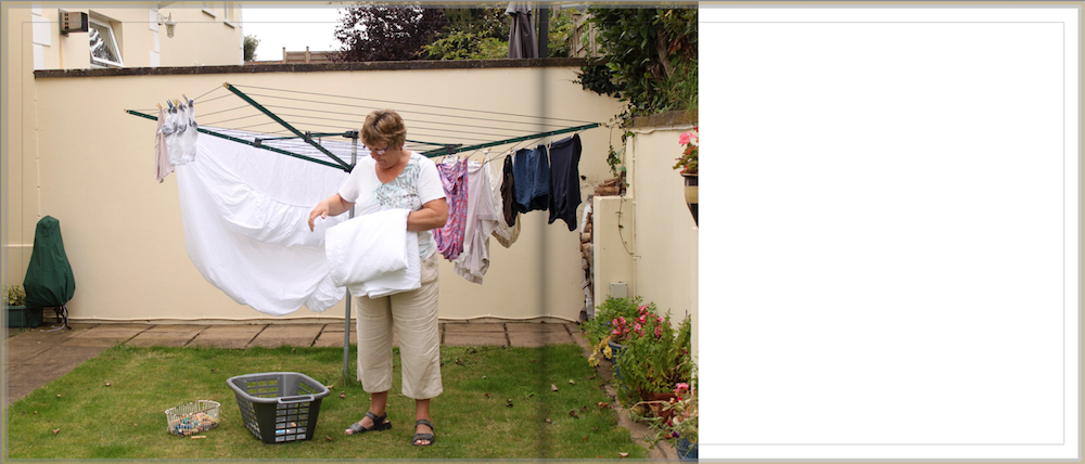
I chose to use a couple of different picture formats throughout the book to keep it interesting.
This portrait of my Grandpa sat on his piano stool is a full bled image that is presented on the left page of the book. I think because this is a key image in this collection it is important to make it a large image. I also think that by having a plain white page on the right ride of the book, it emphasises the image. Sam Harris’ photobook contains all full bled images, as it suited his style of book, a family journal.
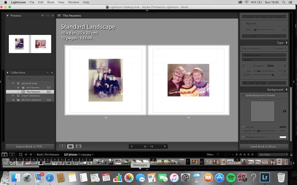
Another image layout I used is smaller images that are padded giving it a white boarder all the way round the image.
I mainly used this format when using archival images, as I didn’t want the images to be large and pixilated. In this example above I used my Grandparents favourite family photograph from when they were a young couple with their three boys. I then presented on the right side of the page an archival image of their three sons.
I tried to create a sequence by following these archival images with a picture of my younger cousins.
I chose to use this picture of my cousins as the next photo in the sequence as they are around a similar age that my uncles were in the previous image. I think you can see the resemblence between my uncles and my cousins; the ginger hair, pale skin, cheeky smiles.
I had extracted my favourite quotes from my interviews with grandparents and wanted to insert them into my book. I divided these quotes into 5 categories; Faith, Family, Jersey, Wales and Music. I presented them like this in my book.
I didn’t want to accompany the words with any images as I wanted the views full attention on the quote. I got inspiration from Martin Usborne’s ‘Ive lived in East London for 86 1/2 years’. His project was on Joseph Meek.
The final formatting design I used was using archival images. At the begging of my book I used two separate images of my grandparents as children. I positioned them on joining pages with the same amount of padding. I also used two similar archival image but they were taken around the time they got married. I put these images on the final pages of the book.
Over view of my project
I am really happy with the way my project turned out. I think my images represent my grandparents lives well. I have really enjoyed working with the theme of family, as I think it has allowed me to really get stuck into the project, by working with a subject that I am familiar and comfortable with.
FINAL BOOK LAYOUT
Grandparents Quotes
I have re-listened through my interviews with my grandparents and have extracted my favourite quotes from each topic heading. I plan to put these quotes into my photo book.
Faith
Faith is a huge part of my life because my life is build around what I believe and I believe in God and i Believe that gods son died for me with unconditional Love.
Our christian faith has taught us to look beyond our self and look to see how we can help our family first and other people second.
Family
I think family is extremely important to me. I try and do for my family, by going the extra mile. Sometimes when I am asked to help out, it can be extremely inconvenient but I always try to go that extra mile… or two.
Wales
Living in Wales as a child, I was always surrounded by lots of aunts and uncles, so we were never short of baby sitters. Our town was a very close loving community in which we lived, and I sometimes think today that this is one of the things that we lack. We don’t have the time to look outside our door and see the needs of how we can help other people.
Jersey
Ruth and I were engaged when I got appointed a role at St Marks primary school. We got married the following March 1964. We came to live in a flat in Jersey and despite changing flats and houses a few times we never anchored to move back to the mainland. All our children are Jersey born, which has an advantage and have all come back to live on the island. So who knows, perhaps the Heaven household will be in Jersey for a while yet.
Music
We have always been surrounded in music, I began piano lessons at the age of 7 and started to play the organ for our Sunday serves at the age of 15. Eventually when I moved to Jersey somebody asked me not to play the piano for them, but would I sing, and there began my “singing career”.
I enjoy listening to music, whereas my husband likes to perform. I think this is one of the good things about our marriage that we are both interested in music, in different ways and that a huge thing in our life. There is nothing more wonderful for me than to be in the kitchen working and your Grandpa to be playing the piano in the lounge.
Marriage
I often think we were very young when we got married and if it was a daughter of mine I would say no don’t get married that young. But we were fortunate that we have stuck together for 51..52 years, so we have had a wonderful married life and we are really very fortunate.
Married; March 1964
Photobook Design
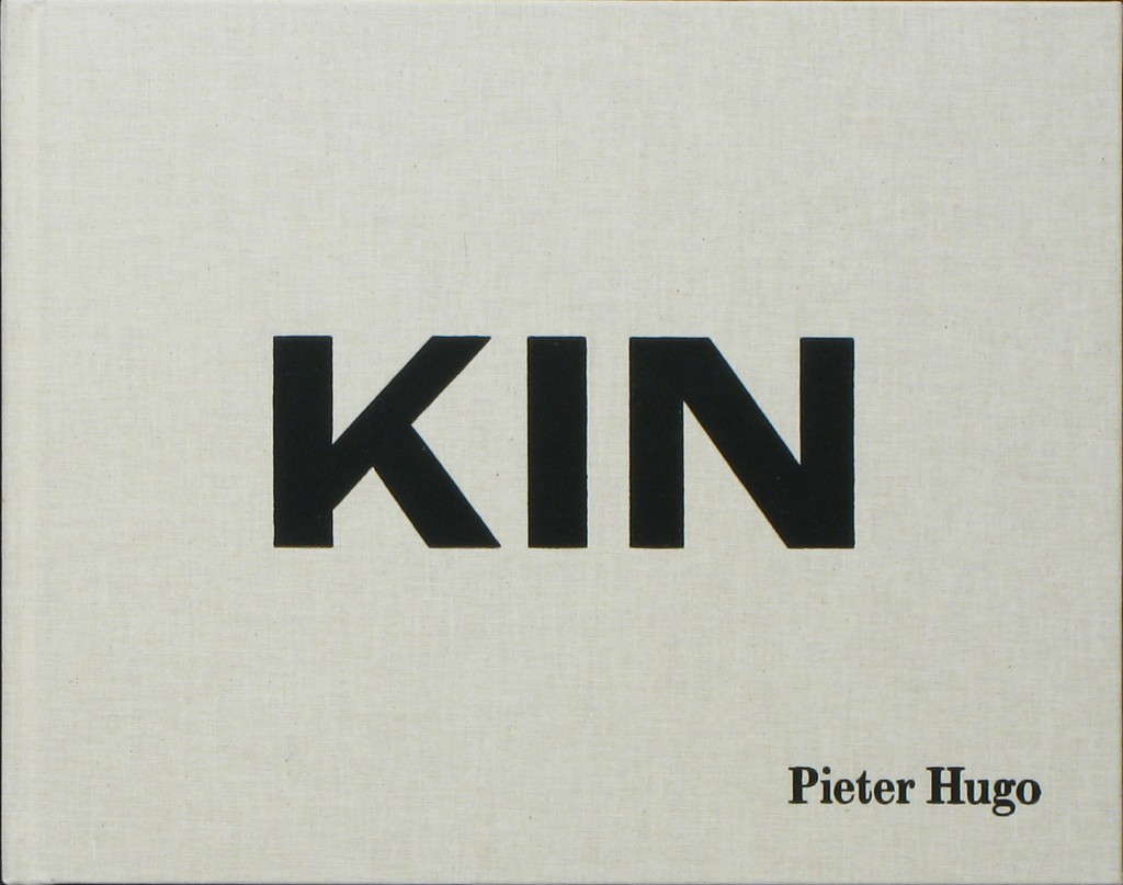
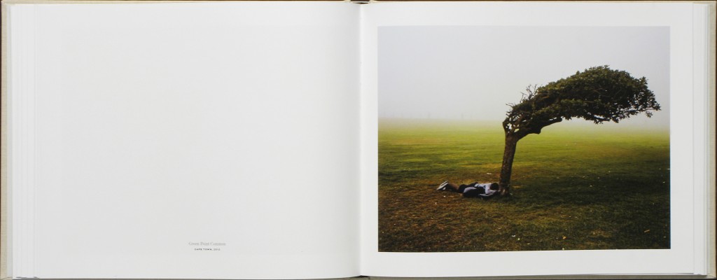
I have been researching different types of photobooks in order to get inspiration into designing my own book. As I have been studying Pieter Hugo’s book ‘Kin’ I have looked into his design and found that I really like it. Hugo’s book has a combination of large and small images, cut in different sizes. I like the divresity of the layout as his images are very powerful, I like how the potraits are smaller and are cut to half a page rather than making the picture expand.
The photographs in Kin are portraits, still lifes and landscapes made throughout South Africa, between 2006 and 2014. Hugo deftly intermingles the private and public — presenting portraits of his family and the people who raised them, alongside images of people and environs that speak to the diverse experiences of living in South Africa today.
A particularly striking sequence shows a young black man, bundled in many layers, photographed in front of the beach where he sleeps. The next page depicts a well-manicured, white family of four grinning widely from the comfort of their couch — the quintessential family portrait.
Comparing Pieter Hugo’s photobook to Theo Gosselin’s photobook, I like how Pieter Hugo’s photographs are clearer and glossy. The images are visually better to look at, however, I do love Gosselin’s style and the way the pictures have been printed, as they match the context perfectly. Just like Hugo’s, his images neeeded to be clear like this to show the power behind them, they match the context.
I want to present my images in large and small sizes to show some dimensions within the book. As the context of my book is quite formal, I also think I want to add a coloured or opaque sheet inbetween the photographs instead of having blank pages as it relates to more old fashioned photobooks where images are protected by a layer of material. My baby book and my parent’s wedding book both have these sheets inbetween them to protect the images, and I like the idea of incoperating old with the new as my book will contain archieval images and new images together. This contrast will work well with the context of my story.
I think the front cover of the book is the most important. So far, i am envisioning a plain cover, maybe material with a bold title. I think I am going to go with an archive image for the front cover, the one of a previous governor and then the back cover to be a recent image of the governor. I want the book to be a standard size book, with a hard back cover on it. I will make the pages glossy and the images quite large. I am adding archival photographs into my book as my chosen topic makes it very relevant to add these images.
PHOTOBOOK DESIGN
Task 2: Research the examples of books that have been produced, consider the size and style that you would like to work with. There are many example within the blurb site but feel free to find examples either in school or elsewhere. Produce a mood-board of some of your choices, select two of three examples and explain your thoughts and why the design, look and feel works for your images.
The photobook I have taken inspiration from is Phillip Toledanos – When i was six. This book is also the book from which i gained my contextual inspiration aswell.
The design of the book is quite ‘scrap booky’ as the hard back cover is material and covered with white spots and childish writing announcing the cover.
When making a photobook it is important to think about all of the ‘characteristics’ of the photobook in order to get an idea of what it will look like. Eg: size, shape, texture, colors, photolayouts and photo sizes. All of these factors can change the feel of the book and the images themselves. The layout of the majority of toledanos book is full bleed images and contrasting lights seen in the images. The size of the book ‘When i was six’ is standard landscape. The images are single page. The cover is a hardback material cover, The paper in the book ranges from standard photograph paper to grainy textured paper. Throughout the book there are also shortened pages added in, to draw attention to that page and to break the book up.


