Category Archives: Analysis
Filters
Atlantus: Analysis
Analysis
Atlantus: Ways of telling a Story
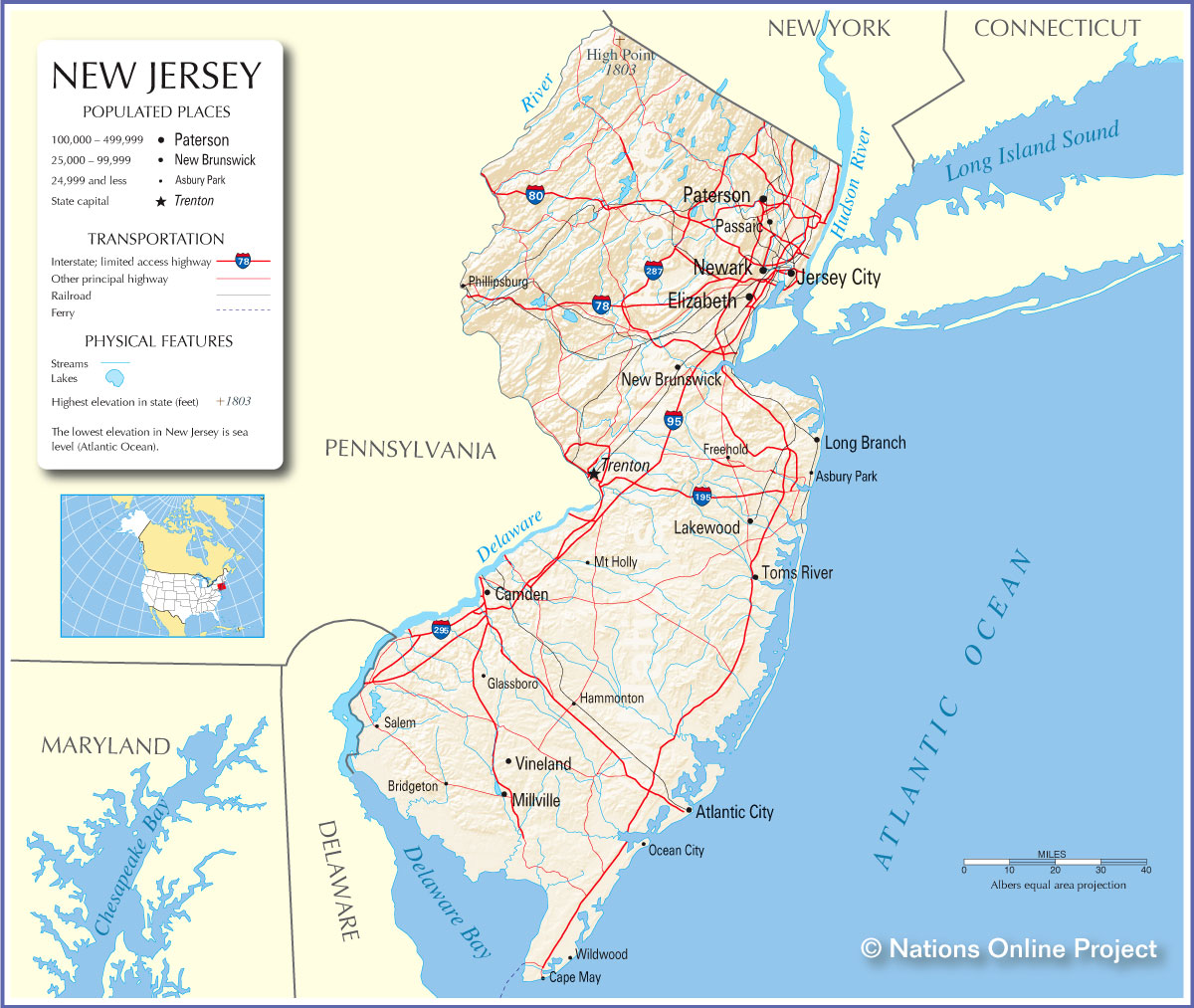
The story told through Atlantus is viewable as a newspaper as well as a pop up display. The images are by Martin Toft and the text is written by Gareth Syvret. The story basically explores the relationship between Jersey and New Jersey, two places; (Old) Jersey a small Island in the British Isles and the other, New Jersey, the 11th Most Populated U.S. State. Toft tells a narrative of this relationship between the themes, places, cultures and peoples of both places, which began 350 Years ago when Jerseyman Sir George Carteret, went over to America and found the territory of New Jersey which later became the State of New Jersey after US independence in 1776.
Text
Syvret’s writing is incorporated into ‘Atlantus’ in order to guide the reader through Toft’s visual story. Each of the five stories are accompanied by a large body of text, approximately 5-6 paragraphs which explain in detail each of the five themes. The introduction by Syvret explores the context and historical value of each of the themes. Small paragraphs of text are also included to explain and add a written narrative to each of the individual images. Text is effectively an aid that Toft uses in ‘Atantus’ to enable to viewer to be better informed of what is being shown. The story would not be able to develop if the text did not act as a bridge. Additionally, image annotations help to link images together. For example in ‘Precious Galinthia’, Toft looks at how the Jersey Cow links New Jersey and Jersey together. The text in this instance, helps to establish a relationship between different images by linking it to a particular storyline/context.
Symbolism
A lot of the meanings that Toft draws into the story are subtle. Toft uses symbolism to develop the storyline and link images together. His meaning are implicit and must be interpreted by the viewer. A form of symbolism used is connecting different images to a common theme. For example in one of the stories, Toft explores the connection of horses in Jersey and New Jersey through three very different images, related to this theme. However it is done in a very subtle and poetic way, whereby the connection is not overly obvious. Over time the story is linked together through images relating together and each time, exploring slightly different themes. The text helps to distinguish these ideas properly.
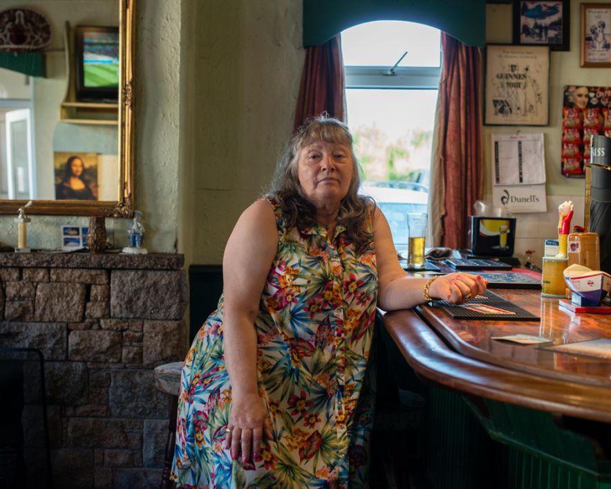
Toft was required to work with people he had not met before, often visiting them many time to gain their trust and to get the right photos, this simply can’t be done in one shoot.
There are three photographic styles that Toft includes to tell to story in ‘Atlantus’, in addition to archival photographs ; ‘Portraits’, ‘Still-Lifes’ and ‘Landscapes’
Portraits
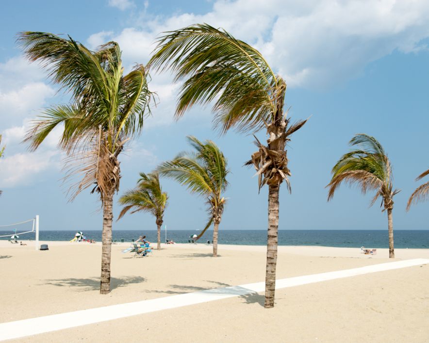
Toft uses portraits as a way of exploring the people that live on both sides of the Atlantic. Toft experiments with different aspects of portraiture, ranging from formal tableaux style photographs of political leaders, for example the Mayor of Carteret, to informal candid style images of subjects engaging in activities. Portraits are used to illustrate the human impact regarding particular themes.
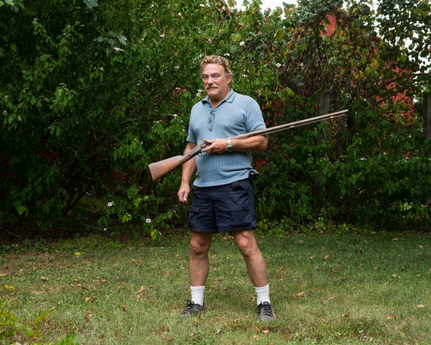
Portrait: Ted Johnson, August 21 2014
Still-lifes
Still-lifes are close-ups of any type of object, images which are not usually photographed for aesthetic purposes. They are an effective way to record and document. Toft uses still-lifes throughout ‘Atlantus’. For example, in the specific story also entitled ‘Atantus’ Toft Photographs the archival records of Sir George Carteret at St Ouens Manor Library. These type of photographs have no aesthetic value, but are merely a form of visual documentation which help to illustrate the context of the storyline
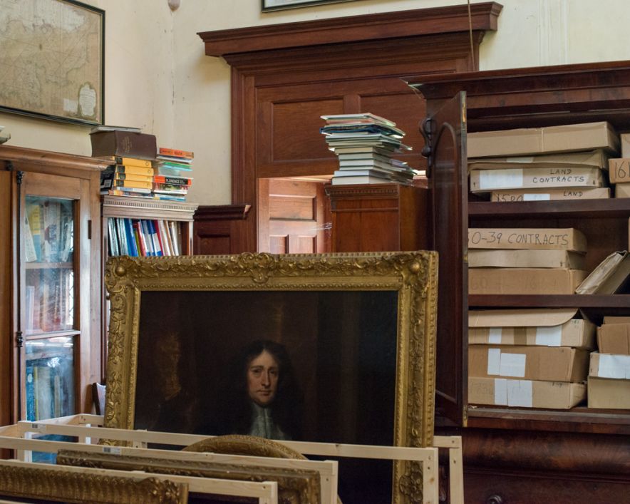
Still-life of the Library of St Ouens Manor, April 9 2014
Landscapes
Landscapes are included by Toft in order to show to geographical relationship that Jersey and New Jersey share i.e. coastlines, beaches, landmarks and buildings. The story ‘The Transoceanic Journey’ specifically looks at the geographical similarities and differences of the two locations, and so incorporates many different landscape shots in order to illustrate this connection
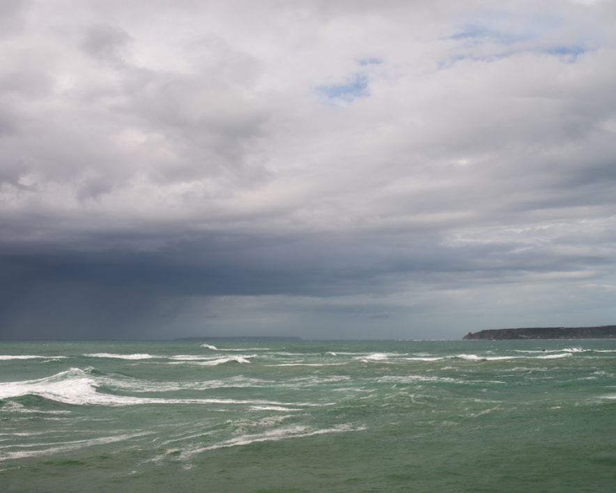
Landscape: Atlantic Ocean April 14 2014
Archival Photographs
Toft uses archival photographs as a key component of the narrative. Archive photos are key in highlighting the different themes and context. A great deal of Syvret writing is influenced by the types of archival photographs. These type of images help to direct the narrative back to a historical/contextual basis. In terms of storytelling, I find archives photo are a very good means of providing evidence of a theme, and help to shape the way the viewer conceives the photographer own images.
Context
Artists that have influenced ‘Atlantus’
Alex Soth; images which tell and interesting story about communities
Mikael Subozty; historical/cultural documentary; conceptual forms of presenting his work – videos, slideshows, voice recordings etc.

Steve McCurry; powerful images with strong, deliberate composition to enhance level of drama; close-up portrait images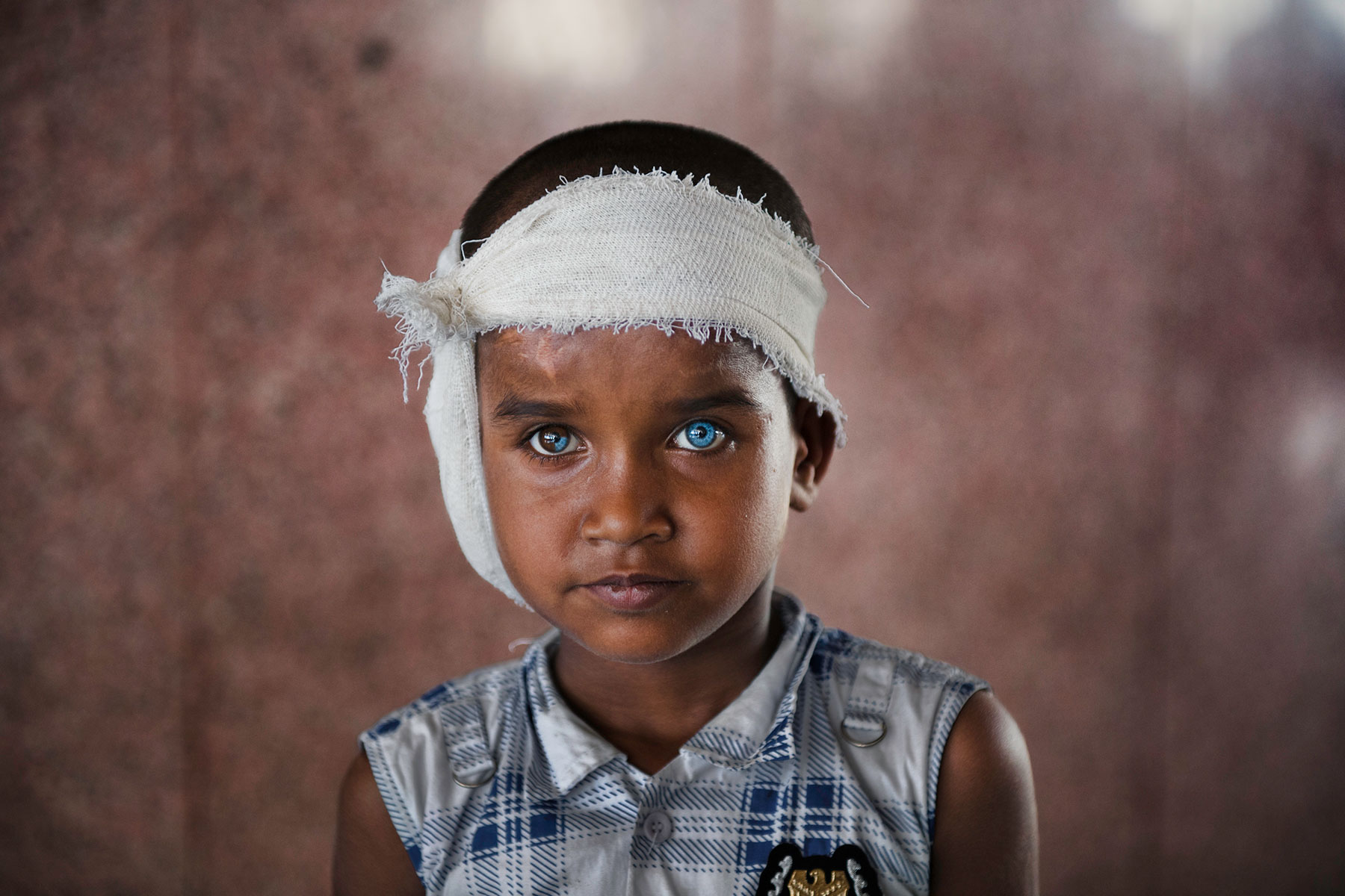
Robert Frank; observed candid shots
Martin Parr; close-up/still-lifes

Style
‘Atlantus’ is a form is social documentary. Toft’s main focus within ‘Atlantus’, is to explore the different relationship between the people Jersey and New Jersey. All non-portrait images, ‘still-life’, ‘landscapes’ and archival images each time relating this directly back to the study of people. Toft explores the sub-genre of community within the project. He is photographing from a completely outsider perspective, and was required to gain the trust of the people he photographed and worked with.
What I like about ‘Atlantus’
The layout of ‘Atlantus’, both as a newspaper as well as a pop-up display I find to work very well, it is a very innovative and creative concept. In particular I like the pop-up display because it is very different and unusual. The pop-up display has many advantages; firstly it allows all of the images of the narrative to link to as a visual newspaper. Secondly, it is very user friendly and the simplistic format of newspaper that the photographs are printed means that the viewer is able to easily view what is shown without it appearing too intimidating, which can sometime be the case. Lastly, it is very cheap to produce in comparison with printing and framing photographs. This allow ‘Atlantus’ to be printed in mass and distributed to many more areas than an exhibition would enable, meaning that the story can be spread across a wider distribution. The purpose of ‘Atlanus’ is to connect the two places together and so a compact newspaper format I believe is most effective in doing so.
I also like Toft’s use of poetic gestures to connect images. This idea is very subtle and makes the viewer use their own initiative to so e degree to connect the theme. This sense of openness to the images, contextual interpretation makes the narrative more viewer interactive and friendly
What I didn’t like about ‘Atlantus’
The way the newspaper was packaged means that it has been folded into 4. The images are display horizontally, means that in many of the images there is a crease. I find that this disrupt the visual flow of some of the images, and is quite noticeable. When newspaper material is exposed to light it changes colour, turning a yellowish colour, a problem mainly when a pop-up display is created. This can affect how easy the images and text are viewed. At the same time however it can create is vintage effect to the newspaper which I would say is more effective as a newspaper format. I don’t like how the structure of the narrative works in some aspects when viewable as a newspaper. On the first page of ‘The Transoceanic Journey’ for example; there is half a photograph of debris displayed. When viewable as a pop-up display the full image is shown, however the newspapers layout means that in many cases, larger images which take up more than one page in size cannot be fully viewable. This I find, can be very confusing and makes the narrative, to a degree, somewhat difficult to follow.
http://www.phmuseum.com/grant/martintoft/atlantus-jersey-new-jersey
SLEEPING BY THE MISSISSIPPI
Alec Soth is an American photographer, based in Minneapolis, who makes “large-scale American projects” featuring the Midwestern United States. The project Iam looking to study is his project ‘sleeping by the Mississippi’. SBTM is a photography book made from Soth travelling down the Mississippi and taking photographs in the areas around the river. 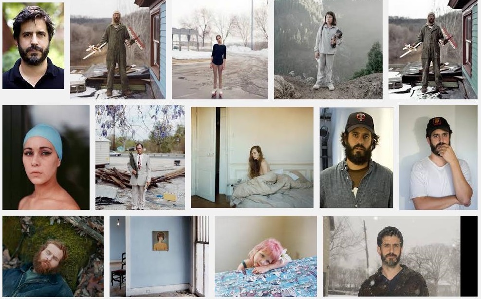
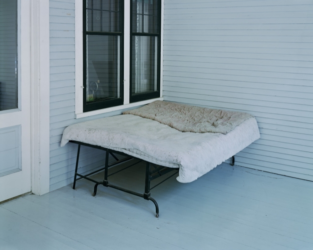
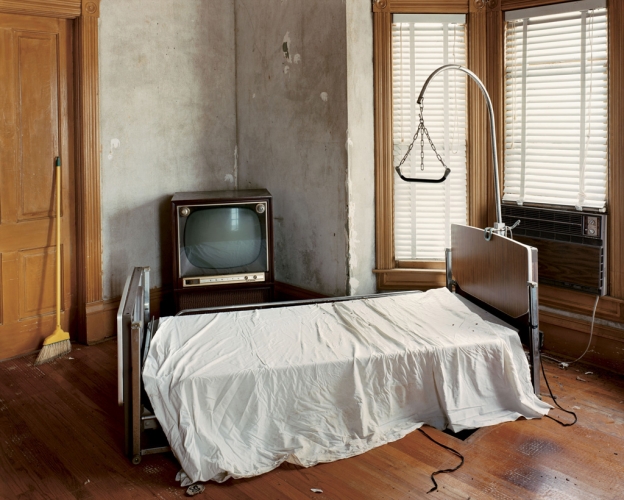
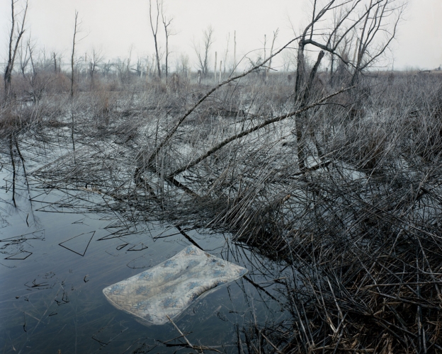
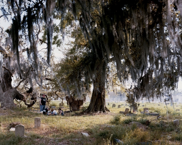
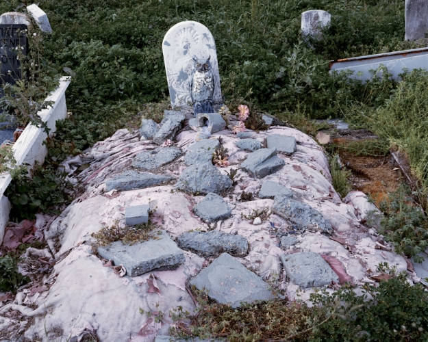
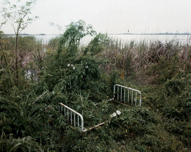
The project contains many fascinating images, all of these images somehow relate to ‘sleeping by the Mississippi’. Some of the images more so than others, the following are some of my favorite images from the project – These images mainly focus around beds and occasionally death, which can be interpenetrated as sleeping beyond life.
My two favorite images are the photographs where you can see bed/mattresses in the water itselfs. This relates extremely closes to the title ‘SLEEPING by the MISSISSIPPI’ as it has bed posts and mattresses which are used for sleeping. Therefore the images show quite clearly a representation of ‘SLEEPING by the Mississippi’. Here are my two favorite images –
James Nachtwey:
After watching some very inspirational short films on James Nachtwey’s work, I have developed my views further.
Nachtwey quoted: “I have been a witness, and these pictures are my testimony. The events I have recorded should not be forgotten and must not be repeated”.
I think that this is an extremely powerful statement. James is inciting that he wants to put a stop to all of the problems of the war and he’s using his photograph’s to make a positive change. I truly believe that he wants to make a difference in the world and the fact that he doesn’t change anything about the scene by using the camera as a mere tool, to record the situation is fantastic. Nachtwey himself remains a ‘witness’, all he has to show is what he’s taken. So for me, the ‘testimony’, shows that he has lived through the situation and has viewed a certain moment and wants to present it to the rest of the world.
Here’s a video about his war photography. It includes him working and some interesting information on his practice:
The documentary pictures he displayed were so meaningful and powerful. Behind every single picture there was a message. He focuses on very the very powerful subject of war.
For example, he took various pictures of a homeless Indonesian family living at a train station. They had very poor circumstances and even had to live on the actual rails, extremely close to the passing trains. Also, In an unfortunate event the father lost two of his limbs: his left leg and his left arm. This was due to a train accident and the man was left without a job. Subsequently, he couldn’t further provide for his family and their current situation would’ve worsened. Here’s Nachtwey’s picture, that I’m referring to:

This series of photograph’s made people realize the family’s situation and subsequently take action. Soon the family were living in substantial conditions. It can take as little as a deteriorating and shocking image to change people’s views. In effect this changed their environment and lifestyle for the better. It surely shows that his documentary picture have the power to make a massive difference, which is amazing.
Nachtwey spoke at a TED talk entitled ‘My Photographs Bear Witness’. He discussed the picture above at @13:07 minutes into the clip. James also talked about various other photographs in the following video:
James Nachtwey produced a very powerful video, on a TED talk It begins at @2:00 minutes. It shows various pictures that he took from around the world. They all focus on one particular subject. It’s about XDR, a drug-resistant strain of Tuberculosis that has begun a worldwide medical crisis. Here’s the video:
Nachtwey’s photography in this film is very raw. He aims to show the negative sides of life and doesn’t sugar-coat anything at all. I also thought that the colours he used to be very effective. James utilised a bright yellow font against a dark background in-between the pictures. The yellow really popped and grabbed my attention. Yellow is the most luminous color in the spectrum. Interestingly, Nachtwey’s choice of bright yellow may have to do with the images being shown. Although the color can be representative of happiness, there are other underlying traits. In particular it represents physical illnesses for example: jaundice, malaria, and in this case TB. It screams the word caution, like in road signs. Insightfully, it’s also has many negative connotation worldwide like: Mexicans used bright yellow to signal death, Jews in the Middle Ages were labeled with yellow before prosecution. Therefore, I believe that Nachtwey chose this color to symbolize the negative effects. He may have chosen it to relate to ideological viewpoints of people and outline how serious and deadly the things he showed were.
ATLANTUS – JERSEY TO NEW JERSEY
Atlantus is a project that Mr.Toft has been working on for the past few years along side Gareth syvret. The project is based around the archisle: The Jersey Contemporary Photography Program at the Société Jersiaise where they have embarked on a major creative research project using the Photo-archive as a vector in exploring historical and cultural links between Jersey and New Jersey.
This project is inspired partly by the 350th anniversary, in 2014, of the founding of the State of New Jersey, USA in 1664 by Jerseyman, Sir George de Carteret. As part of this project Mr.Toft will be producing new work both in (old) Jersey and New Jersey, exploring both places unique cultures, histories, identities and geographies. Immediate plans is to design a pop-up exhibition in New Jersey to coincide with major celebrations across the state throughout the summer. The long term objectives of this 4-5 year project are to make exhibitions, publications and establish contemporary photographic archives in Jersey and New Jersey.
Case Study – Introduction (Task 1)
Background
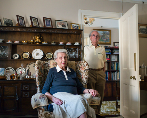
‘Atlantus’ is a photography project completed this year by Martin Toft – in association with The Archilse Comtemporary Photography Project – set up by Gareth Syvret at the Societe Jersai Photographic Archives. The project explores the relationship between Jersey in the Channel Islands and the State of New Jersey in America.
In 1664, Jerseyman Sir George Carteret, a royalist statesman was offered Land in the American Colonies by King Charles II, in recognition for the Island’s loyalty to the Royalists during the English Civil War. The territory given to Carteret was named ‘New Amsterdam’, which Carteret re-named ‘New Jersey’, in honour of his Birthplace. This territory later became known as the State of New Jersey after American independence from the British Empire in 1776.
After discovering that the Societere Jersai had virtually no photographic or written historical archives concerning New Jersey nor the relationship between Jersey and New Jersey, Toft therefore decided to make a photographic response exploring the connection. Along with Gareth Syvret and the team at Archilse, Toft embarked on a large 18 month photography project. The project explored both the historical as well as cultural links between these two places.
The finished project was made into a multi-functional newspaper edition, linked together on an exhibition display and shown as a visual story, of which 3,000 copies have been made. There are 5 different stories within ‘Atlantus’, which make up 5 different newspapers to complete the series. ‘Atlantus’ explores the connections shared between the communities of Jersey and New Jersey, historically, politically and socially. The choice of locations were the West Coast of Jersey and the East Coast of New Jersey, a poetic gesture as these two locations Geographically face one another, a therefore the photos of ‘Atlantus’ metaphorically builds a bridge which connects the two distant lands together.
The photographs taken by Toft over the course of the project goes to tell a story. Toft in doing so, uses many forms of narrative techniques to tell this story. Toft uses historical events and archival images over the course of the project as a way of creating a common connections, then explored in greater detail through the documentation of his own photographs. ‘Atlantus’ is body of work related to the genre of documentary photography but incorporates many different sub-categories of this, including ‘still-lifes’, ‘formal portraits/tableaux’, as well as classic documentary photography.
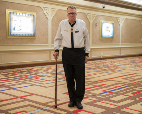
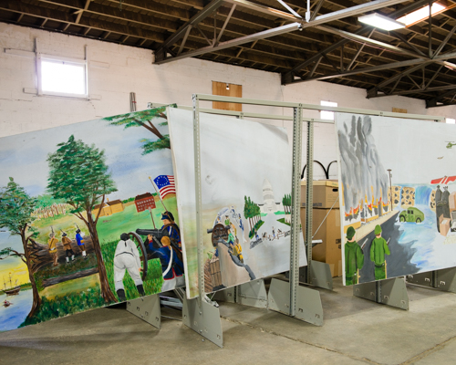
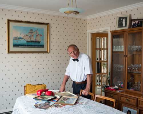
Alec Soth:
We watched a short clip, where he explained his work and medium. I have stated some of my thoughts on him, in this short response:
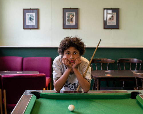
Most of Soth’s work includes working with strangers. Being that he is a shy character he finds this challenging, but that drives him more. He quoted: My own awkwardness comforts people.” He also added: “I still get nervous today… I did a picture for a The New Yorker recently and I was drenched in sweat by the end and it was the middle of winter.”
Much like Trent Parke, Soth is also into street photo photography, although that’s not his main practice. The American photographer looks at large scale projects including: portraits, landscapes, still-life’s, etc. It’s complicated to explain it, as he says. But he tried to ‘weave all the pictures together to show this larger world’. He creates some many portraits of complete strangers and other amazing works.
He imagines what he wants to capture before he even photograph’s it. He has a purpose and an aim. Most of the time, the Magnum photographer writes down a list of things he wants to look at, for instance ‘bird watchers’
Here’s an example of Alec’s old business card:

Soth said that in he see’s ‘photography as different from conventional storytelling in that in some ways, the photographer is the protagonist’. He believes that ‘the photographer is the protagonist’. This means that they have as much input as the people being shot and that the photographer can ‘experience the movement’.
Since he’s a documentary photographer, he believes that “you need multiple images to tell a story.” He adds “being frozen in time, means you can’t really tell stories.” His contemporary photography is amazing. It captures great moments such as vulnerability, both in him and the people he photograph’s. Soth is very interested in vulnerability as he thinks there’s something beautiful about it. He added “(I’ve been) amping up the vulnerability, but also my own vulnerabilities, exposing more of myself. Throughout the process in which he takes, edits and uploads pictures vulnerability is definitely a major theme.
He’s essentially an artist that uses photography to tell stories. Although his approach isn’t the typically traditional.
For instance here’s some of his work entitled Sleeping by the Mississippi


Most people would imagine that during the ‘Mississippi’ series all Alec did was take pictures of random places. Contrarily to popular belief, Soth actually wanted to capture a ‘journey’ and magical moments as he travelled through the state.
Trent Park:
In class, we watched a video on Trente Parke. He described his photography, techniques and philosophies. I have written some paragraphs on my initial thoughts:
Trent has so much motivation and determination. He has got an extremely strong sense of light and visual components. He takes documentary pictures, meaning that he takes pictures daily. He loves the process of making pictures, from taking them, to processing them in the dark room. His passion for photography started when he was 10 years old, after his mother’s passing. Parke wanted to capture special moments in time and keep them forever. He said ” Photography is a discovery of life which makes you look at things you’ve never looked at before.” His photographs contain very sharp strong light. Here are some examples of his work, which are in both color and black and white:


He quoted “I am forever chasing light. Light turns the ordinary into the magical.”
His pure perseverance to get the perfect shot is apparent. Trent once tried shooting the same scene for a period of three months. He saw something in the film that he wanted to recreate and he went back to that place every chance he could. In this occasion it was at a train station. He managed to finally capture the shadows in a magical way. This is the picture that he was referring to:

Concerning the picture above Parke stated the following: “I went each evening, for about 15 minutes, when the light came in between two buildings. It happens only at a certain time of the year: you’ve just got that little window of opportunity. I was relying so much on chance – on the number of people coming out of the offices, on the sun being in the right spot, and on a bus coming along at the right time to get that long, blurred streak of movement. If I didn’t get the picture, then I was back again the next day. I stood there probably three or four times a week for about a month. I used an old Nikon press camera that you could pull the top off and look straight down into, because I was shooting from a tiny tripod that was only about 8cm high. I had tried to lie on the ground, but people wouldn’t stand anywhere near me. I finally got this picture after about three or four attempts. I shot a hundred rolls of film, but once I’d got that image I just couldn’t get anywhere near it again. That’s always a good sign: you know you’ve got something special.”
This really solidifies that he is a very determined man. His pure perseverance and love for photography drives him to try again and again. For me, it’s sort of like ‘trial and error’ where he aims to get a shot that’s very close to perfect.
He originally came from Newcastle and rose to fame, winning many awards. However, Parke’s enthusiasm is driven from his love for photography; he isn’t concerned with winning awards, but catching amazing life moments.
The Australian has a passion for street photography. He first began by travelling to certain places and he’d wait for the exact right moment to shoot. The light would have to be exact and well reflected.
In a particular shot, Parke was able to photograph a very unusual scene:

He saw a black ‘aboriginal’ woman with her ‘albino’ child. He doesn’t usually go up to people and ask for pictures, but Trent felt compelled by this unique opportunity. Just as he was clicking the camera button, the sky began dark and cloudy. He’d regretted wasting that chance, since he thought that the darkened sky had ruined the shot. It wasn’t until ten years later that Parke processed the image and fell in love with it. I think that the strong lighting creates a bold and powerful contrast, which works really well here.
His work is normally presented in grand displays. Here’s one of his exhibitions called ‘Please step quietly everyone can hear you’.

Here are some of his pictures that I discovered online: http://www.stillsgallery.com.au/artists/parke/
Trent Parke’s work is very Contemporary. The word in itself, originated from Latin of ‘Con’ which translates to ‘with’ and ‘temporarius’ which signifies ‘of the time’. Therefore, Contemporary now equates to the word ‘modern’. Nevertheless, just because the picture is modern doesn’t mean that it can be called this. The photography’s normally described as abstract or unusual. It’s all about recording up-to-date, present-day moments, for instance Urban Development, Terrorism, Pollution, etc.
Web link to post called “12 lessons that Trent Parke has taught me about street photography”: http://erickimphotography.com/blog/2014/02/10/12-lessons-trent-parke-has-taught-me-about-street-photography/
David Moore – Family Artist Reference
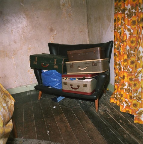
From the book ‘Photoworks’, David Moore explores the life of ‘Family and Community of the 1980s‘ Britain. In his project ‘Pictures from the Real World’, Moore elevates the routines of his daily life, stories of his relatives overthrowing the mundane home-based lifestyle of his childhood. Contextually, you retrieve a sense of history from his work, the muted colours which are harsh and sharp reflect the quality of the photography: initially captured at the time of documentation.
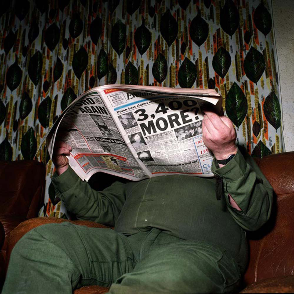
Moore’s family which he depicts ceases unease about the more politically manifestations of collecting working class identity. Moore hoped to reinforce the socially stabilising cement of the traditional family structure, strong, and able to stand on his feet financially, then they could have only been perplexed by reality. This brings to question issues relating into Moore’s work. The reader asks themselves: how half hearted were the governments attempts to do much about the social revolution? And what was the scale and speed of change of this lifestyle? I believe that from Moore’s images, you understand the struggles and imperfection of living a working-class lifestyle in the 80s, never the less thought out willingly that this is the only life they’ve ever led.
David Moore’s Pictures From the Real World reminds us that the stock images that are endlessly reproduced this family and life in 1980s Britain was more often captured what was exceptional rather than commonplace about that decade. Moore’s photographs show
Here is a link to an article written by ‘The Guardian’ Entitled: “Photographer David Moore’s dingy, deteriorating Derby is the real deal”.-http://www.theguardian.com/artanddesign/2013/apr/10/photographer-david-moore-real-world
“This chronicler of 80s working-class England peers behind closed doors to capture a community indelibly marked by Margaret Thatcher.”
Sean O’Hagan, the producer of this Article writes on the chronicles of Moore’s life. My most favoured quote:
“That it does stop is down to Moore’s social conscience, which is on the side of the marginalised whose lives, under Thatcher, were rapidly becoming more precarious – and have remained so ever since. You could say that Moore’s photographs record the the beginnings of a new social class recently dubbed the precariat.”
Sally Mann
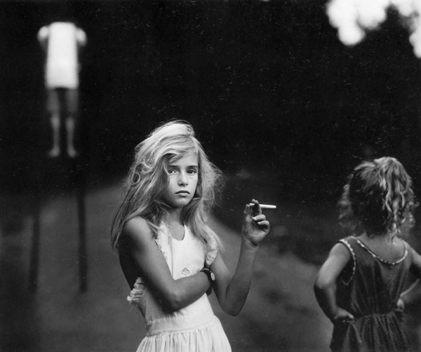
“In photography there is a reality so subtle that it becomes more real than reality” – Alfred Steiglitz (quote used to describe this photograph)
This photograph was taken by Sally Mann of her eldest daughter for her publication Immediate Family. This photograph can be seen as controversial because it’s of a girl who looks around 12 years of age holding a cigarette. I think the controversy makes the photo more powerful because it draws your attention. The girl is holding the cigarette in what can be deemed as an ‘adult pose’ which could also be described as the girl ‘playing adult’. The background is blurred you can just make out that they are in woods outdoor type of environment. This is done to make to main focus of the photograph the girl. There is also a strong contrast between black and white this makes the subject stand out more. In this photograph we don’t know what happened before or after, I think in this case the less we know about what is happening the more interesting the photograph becomes.


