Category Archives: Analysis

Filters

Author:
Category:

Jersey Museum Takeover


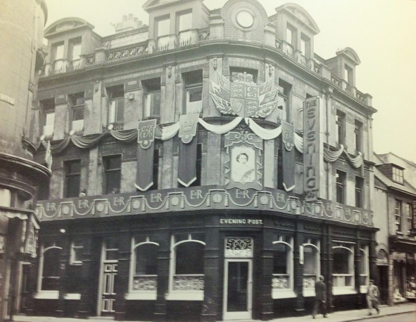
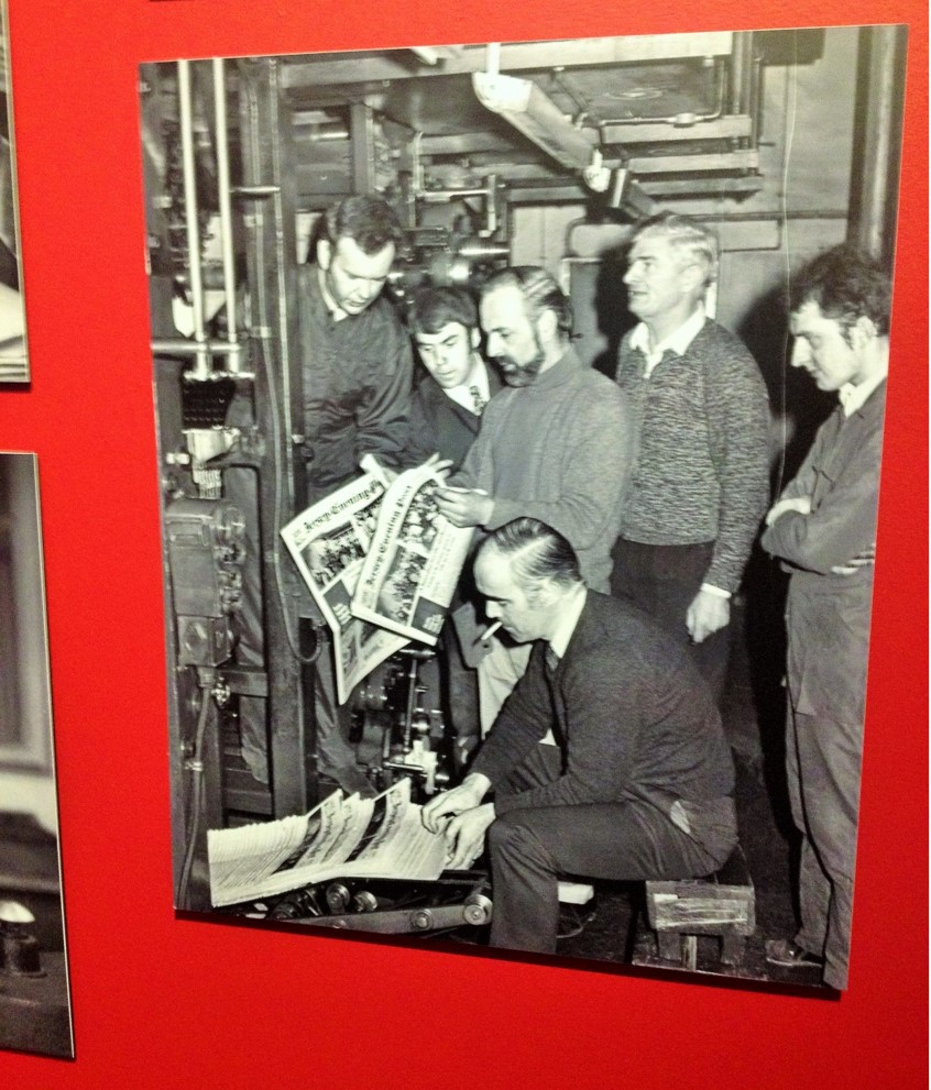
For 125 years, islanders of Jersey have been reading the Jersey Evening Post. Through their visual storytelling, press photographs can tell remarkable and untold stories, inspire discussion and reminiscence. For much of its history JEP photographers have documented Island life, following the daily activities of Islanders and recording the changing landscape and cultures which have developed insignificantly over time to create the Island we live on today. On Friday 20th November,  we went to the John de Veulle Gallery, Jersey Museum to conduct research on Jersey’s Heritage. The JEP’s proposal was that Jersey Heritage participates in the national Takeover Day campaign to encourage children and young people across the country to get involved behind the scenes at museums and art galleries. Echoing the structure of a modern newspaper, this exhibition has shown highlights from the hundreds of thousands of photographs which have appeared over the year, from headline stories, news events, community features, entertainment and sport.

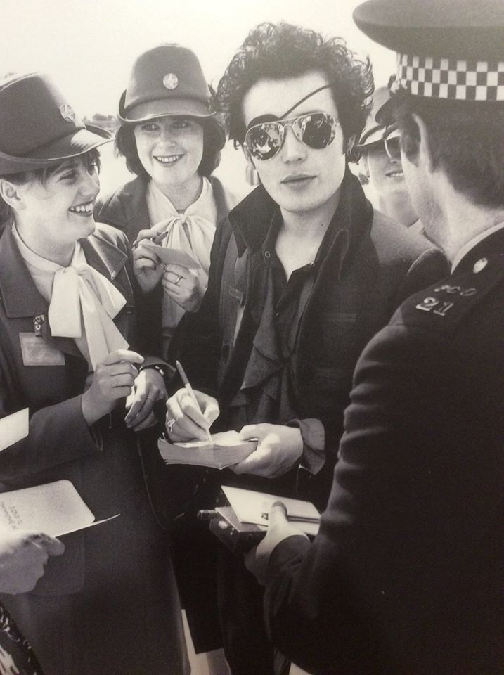
adam ant

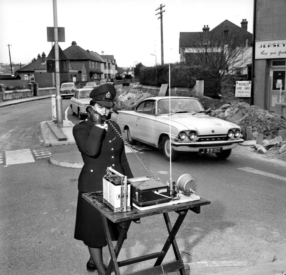
exhib Temps Passe H.Q. Calling …. 1964 No mobile phones in these days …. Police with walkie-talkie sets were used at peak periods to alleviate the problems caused on the Route de la Haule / Beaumont junction in November 1964, where the Jersey Electricity Company were laying a new main cable and where only single line traffic could pass. P.C. Susan Bond answers a call from Police Headquarters. Pic taken Wednesday 18th November 1964 Picture: Ron Mayne Report in JWP 26th November 1964 page 12 From Police box 23, neg bag 376 REF:01060515 Sixties chosen

At the museum we had the opportunity to partake in the following roles:

  • Curators – selecting the work to be exhibited and how it is hung, writing captions
  • Designers – deciding how to hang the temporary exhibition and producing a logo for the blank wall at the entrance to the gallery
  • PR – using social media to promote the exhibition and liaising with local media
  • Documenters – making a short documentary film or photographing the production of this pop-up exhibition.
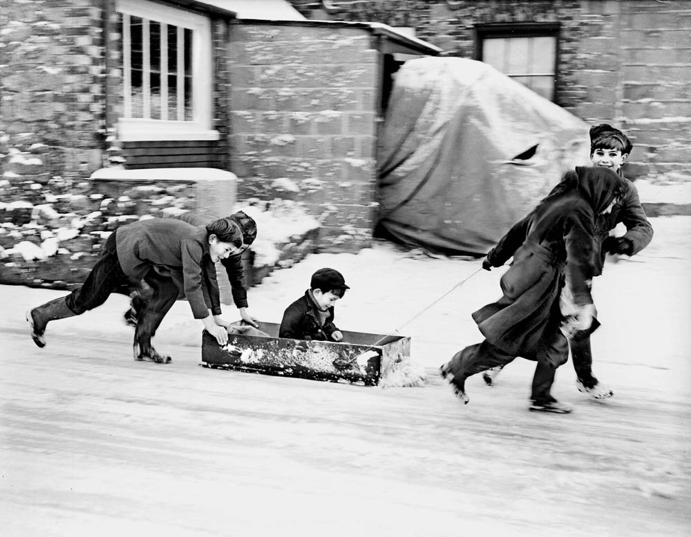
exhib TEMPS PASSE SNOW 1962   ON THE ICE -  A DRAWER FROM MUM'S CHEST OF DRAWERS MAKES THE PERFECT MAKESHIFT SLED FOR THESE CHILDREN OUT ENJOYING THE SNOW DURING THE FREEZING COLD WINTER  IN DECEMBER 1962.   (PIC TAKEN FRIDAY 28TH DECEMBER 1962) (FROM SNOW BOX 7, GLASS PLATE 109)  Sixties chosen
exhib TEMPS PASSE SNOW 1962
ON THE ICE – A DRAWER FROM MUM’S CHEST OF DRAWERS MAKES THE PERFECT MAKESHIFT SLED FOR THESE CHILDREN OUT ENJOYING THE SNOW DURING THE FREEZING COLD WINTER IN DECEMBER 1962.
(PIC TAKEN FRIDAY 28TH DECEMBER 1962)
(FROM SNOW BOX 7, GLASS PLATE 109)
Sixties chosen

This collaborative project has given me a chance to work behind the scenes with Jersey Heritage staff to curate and mount a pop-up exhibition. This has provided me with an excellent experience at museums and art galleries. Jersey Heritage has benefited me from developing a close working relationship with young people and their responses will enrich our understanding and knowledge of the collection.

What effect did the exhibition have on you? 

What where your favourite images from the exhibition? 

What do you think the photographer is trying to communicate with this image? What is it you like the most about this aspect? 

What is wrong with your least favourite image? How do you think it could be improved? 

Can you see any revelations within a selection of images? 

Here is a link to the photographs of the exhibition from the website – http://jerseyeveningpost.newsprints.co.uk/search/byg/p/u/48/1/jep_125th_anniversary_exhibition_images

Jersey Museum Takeover

Jersey Museum Takeover 

Students at Haultieu have been offered the opportunity to be involved in a collaborative project with Jersey Heritage. We will have the chance to work with staff at Jersey Museum behind the scenes and mount a pop-up exhibition on Friday 20th November 2015. On Friday 23rd October we will be going on a trip to the Jersey Museum in order to engage with the images and gain experience and inspiration. The exhibition was held to to mark the newspaper’s 125th anniversary. It consists of a snapshot of the photographic archive, which goes back nearly 100 years. The assignment is to produce a response to the exhibition, Your story, our history: 125 years seen through a JEP lens. However, our version will be your story our history: 125 hours seen through a teenager’s lens.

  1. Write down the first thoughts about the exhibition that enters your head when you walk in?

The first thoughts that entered my head when I walked into the exhibition was the contrasting colours of the red background and the black and white photographs. I thought that it was clever to present the images in this way because it captured your attention, plus, the neat and precise display may it easy to understand which photographs went with the text. I also thought the photographs which had people as their subject were the most interesting to me; they stood out for me. However, overall I thought the exhibition came across very confusing, I didn’t understand why the project was called 125 years when only approximately 50 years was displayed. Also the little tiles of text were quite random and didn’t always clearly correlate with the image closest. In my opinion, I think the photographs would look more aestheically pleasing if they were displayed in a better way, possibly more spacing between the images and making them a better quality print as well as enlarging them. 

  1. Look at all the images on the walls. Now find 3 images including your favourite image in the exhibition and one that you don’t like and write a short description of them.

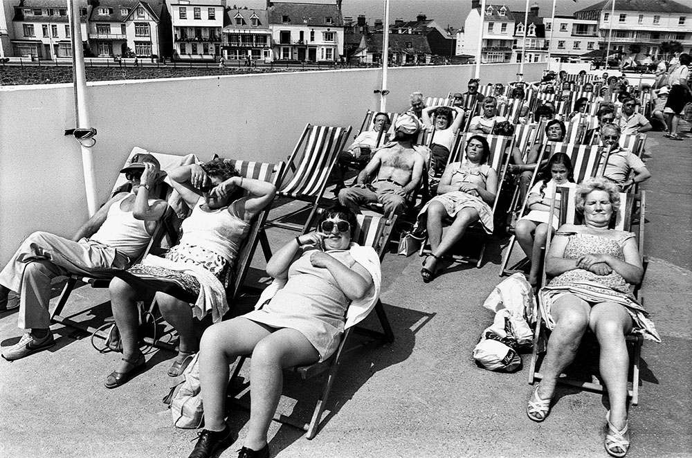
The three images below are my favourite photographs from the exhibition mainly because they all incorporate people and society into the theme. The first image I selected as one of my favourites was because I like the authenticity of it, it feels almost movie like. I like the black and white style because it looks sophisticated and brings out the tones. 

Temps Passe Decked out for Summer 1982 Summer at last! - Locals and visitors alike relax in the sun at the Havre des Pas Pool Fete on Bank Holiday Monday in May 1982 Pic taken Monday May 31st 1982 Ref: 82-1649 neg 7 Eighties exhib chosen
Temps Passe Decked out for Summer 1982
Summer at last! – Locals and visitors alike relax in the sun at the Havre des Pas Pool Fete on Bank Holiday Monday in May 1982
Pic taken Monday May 31st 1982
Ref: 82-1649 neg 7
Eighties exhib chosen

01846098-707x1024

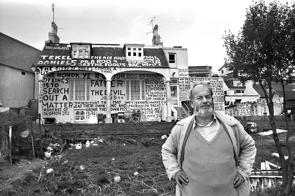
Temps Passe Robert Bisson 1988 Writng On The Wall: Island character Robert Chalmers Bisson pictured outside his property "The White Lodge" or "The Retreat" at Mont Cochon in February 1988 (also known as Tekel) Pic taken Thursday February 4th 1988 at 2pm Picture: Reg Cridland Original Ref: 88-367 neg 14 REF:01101901 Eighties exhib chosen
Temps Passe Robert Bisson 1988
Writng On The Wall: Island character Robert Chalmers Bisson pictured outside his property “The White Lodge” or “The Retreat” at Mont Cochon in February 1988 (also known as Tekel)
Pic taken Thursday February 4th 1988 at 2pm
Picture: Reg Cridland
Original Ref: 88-367 neg 14
REF:01101901
Eighties exhib chosen
  1. What is it that you like about your favourite image?

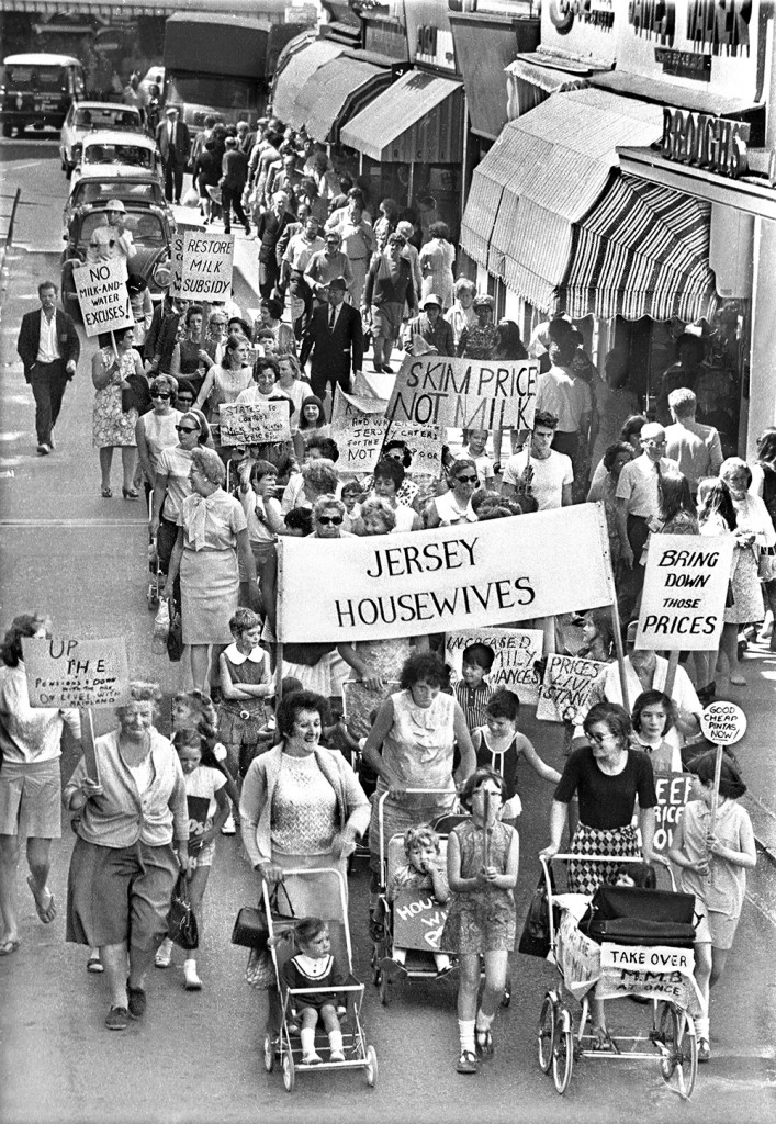
The reason I picked this image as my favourite from the exhibition is because it represents women fighting for something they feel passionate about. I also like the angle it has been taken at, it offers a different perspective showing all the women’s faces from young to old. It is an inspiring image which shows a variation of textures and depths. Furthermore, the framing is also extremely important in this photograph, it captures the power and enthusiasm the women feel. 

  1. What is wrong with your least favourite photograph?

I don’t have a least favourite photograph in the exhibition because I think there are some photographs that really stand out and then the rest are average. In my opinion, as I mentioned earlier I don’t think the images were shown to the best of their ability; they could be a great deal more powerful. Although, I didn’t particularly understand the photographs of the Jersey Evening Post being made in the early years of its existent. I didn’t like these images as much because I don’t think they are that interesting or inspiring. 

  1. Do any of the photographs in the exhibition show similar events or activities to what you will be doing in half-term?

Lots of the photographs in the exhibition show similar events or activities to what I will be doing in the half term. The landscapes in the photographs are the same as today because the buildings have been kept the same. A great deal of the images involve people from the island which I think is an important aspect to consider. 

Picture1

pic 2


Henri Cartier-Bresson:

Henri Cartier-Bresson is a well known and successful photojournalism photographer. The Paris born man was the co-founder of the successful Magnum Photos Agency.

He used to be an ordinary photographer until he saw a certain image. In fact he was moved by a picture that was taken by Martin Munkacsi. This 1930’s picture had many tones and contrasts, that fascinated Cartier-Bresson. He stated: “I must say that it is that very photography which was for me the spark that set fire to fireworks”. He referred to the picture below:

Martin Munkacsi - Three Boys At Lake Tanganyika.
Martin Munkacsi – Three Boys At Lake Tanganyika.

“As far as I am concerned, taking photographs is a means of understanding which cannot be separated from other means of visual expression. It is a way of shouting, of freeing oneself, not of proving or asserting one’s own originality. It is a way of life.” – Henri Cartier-Bresson.

He first wanted to be known as a ‘Surrealism’ photographer, but was soon told that that wouldn’t be very successful as the world wouldn’t take that title seriously. Therefore he changed it to ‘Photojournalist’ and then he continued his passion.

His first book was called ‘Decisive moments’. It was what established him as a photographer and inspired many other people. Cartier-Bresson photographs people in a ‘candid’ way that reflects onto his photojournalism. His amazing work got him known as on of the ‘Fathers of Photojournalism’, which is a great honor. Here’s a picture from the 1st book:

Henri Cartier-Bresson - Seeing beauty where other not.
Henri Cartier-Bresson – ‘Seeing beauty where others not’.

He got his title ‘The decisive moment’ from the following quote: “There is nothing in this world that does not have a decisive moment”, which was said by a 17th century French Cardinal.

I think that the picture above is a great photojournalism picture. The two extremes add impact and create polarization. Polarization is two completely different concepts and views of each other. In this case the two main things are war and peace. The men on the left are holding sharp weapons and are pointing them in an aggressive fashion. Meanwhile the woman on the right looks completely relaxes and innocent. Her non-malicious body language demonstrates that she is completely at ease. This is great because it portrays a very interesting meaning. The woman may be trying to communicate that she see’s beauty in the littlest things, such as the flower she’s holding. Cartier-Bresson has maintained a great composition by balancing the two ideals in a symmetrical manner. The leading lines are also efficient and work well as the weapons point to the woman and the flower points to the men. Symbolically, weapons are a representation of the following: war, aggression, male power, power, anger, defense, pain, revenge, sacrifice, betrayal and more. On the other hand, flowers represent the following: happiness, freedom, nature, natural, patient, cheerful, life, innocence, hope, health, everlasting love, friendship, devotion, sympathy, youth, devotion, faithfulness and more. Therefore, the two majorly different ideals create a very fascinating photograph.

Here are some other famous pictures of his:

gandhi_henri_cartier-bresson_1
Henri Cartier-Bresson – Mahatma Ghandi – Magnum Photos.

“Of all means of expression, photography is the only one that fixes a precise moment in time” – Henri Cartier-Bresson.

Henri Cartier-Bresson - The dying days of a regime: Shaghai in 1949.
Henri Cartier-Bresson – The dying days of a regime: Shaghai in 1949.

“In photography, the smallest thing can become a big subject, an insignificant human detail can become a leitmotiv” – Henri Cartier-Bresson. A ‘Leitmotiv’ is defined as: ‘A recurrent theme that’s associated with a particular person, idea or subject’.

I found a website that includes 29 of Henri Cartier-Bresson’s best quotes: http://www.johnpaulcaponigro.com/blog/12018/29-quotes-by-photographer-henri-cartier-bresson/

Family Response:

As a repose to my ‘Specification for Family Shoot’ post that I uploaded before I have produced a set of images.

DSC_0006 edit

Above, is a photograph of my cousins daughter. She is simply playing on her game. Her body language is laid-back and relaxes as she sits on the sofa. Her full concentration is placed on the mini screen. The placement of the boots on the stone floor adds balance to the picture. This is because the shot doesn’t feel as empty.

DSC_0043 edit

The picture above was taken spontaneously as my family we in the middle of a conversation. I took this is an un-staged manner. The coffee cup is placed on top of a dark red car, which adds interest to the picture.

DSC_0051 edit

This shows my family members chatting before the man in the helmet leaves. Again this picture was taken in an un-staged manner, as they were casually occupied and oblivious that I took this picture.

DSC_0064 edit

Above, is another shot that I took in an un-staged manner. As you can see it’s very hectic and animated. There is a lot going on here, from the man moving his bike, to my cousin drinking his coffee and my uncle in the green top, walking out. With that comes the confused face on the girls face as she figures out what’s happening. Everybody seems to be in their own little world and they’re all doing something different. Nevertheless, their faces all show confusion as they are mostly squinting their eyes and pursing their lips.

DSC_0065 edit 1

Here, my dad is pictured on his motorbike. I asked him to pose for this image and asked him to look at the camera. This is a medium shot, so it shows his whole body and also some surroundings. In addition, I also captured the following two photographs from this set:

DSC_0066 edit

This is a much closer version of the previous on. Additionally, the motorbike driver is looking away.

DSC_0069 edit 2

Finally, my dad is seen leaving the house as my small cousin looks on. You can tell that she is very intrigued and has even left her game to look up and see him leaving.

DSC_0090 edit

Later, my male cousin and uncle were having a discussion outside the house. The tattoo is a sign of permanence and meaning so it’s significant that he has it on his arm. My cousins sheer look of concentration whilst speaking demonstrates that he’s probably very interested in capturing my uncles attention and the mix of facial expressions and body language points that out.

DSC_0096 edit

Above, my cousin turned around as I was taking this and I caught him mid-talking. My uncle in turn was left to look at hi neck and ponder what he was doing. My cousin seems alert and annoyed. The raised eyebrow may suggest that he is suspicious.

DSC_0100 edit

I captured this shot by using different focuses. I wanted to catch the neighbor just behind the girls head. He was doing some yard work and sweeping excess waste from the floor. I positioned myself at eye-level to my female cousin and then focuses solely on the man.

DSC_0117 edit

Then I got my uncle to let me take a self portrait of him. He usually dislikes taking pictures, therefore he wasn’t very eager to let me take this. I used the grey wall from the backyard as a background. My uncle’s didn’t smile, which I believe is great. This shows a real rawness to his character.

DSC_0123 edit

Next, I decided to explore inside the house. My cousin was talking to me as I took this. She was showing me around the house and the floor captured my attention. Since the house is being  re-furbished and new carpets are yet to be put in the wooden flowing was left looking dull. You’re able to see the discolored pieces and jagged edges of the material. This is just a small detail of the house which on a whole adds to the meaning.

DSC_0140 edit

Meanwhile, this is another close-up shot of the door that leads up to the bedrooms. The door is covered with cream tape and in effect is unfinished. The natural sunlight coming from the far right enters through the small squares on the door, that have been created by the tape. The light shines on the wall on the left and I think that it looks very magical.

DSC_0148 edit

Here, my auntie posed in front of her car. I didn’t even have her to pose as it was an automatic response. In this case the photograph is categorized as staged. This is because she acted differently in accordance to me having a camera with me, whereas in the other ‘un-staged’ images, my family was caught off-guard.

The following images are of my auntie. My auntie hates getting her picture taken therefore she’s always hiding in some way or covering her face:

DSC_0150 edit

In the one above, she hides her face looking down at her feet.

DSC_0153 edit

When she saw me, she immediately turned her face away whilst I took a photograph of her leaning against the blue car. Her pose is quite relaxed but she seems tense in her mood.

Moving on, I captured some more details around the house.

DSC_0177 edit

I believe that this photograph has good very good balancing elements: from the scrupled-up black plastic material that’s being held down, to the grey meter on the left. I like how the meter is small in size and compares to the heavy materials placed on the right. Also the fact that it’s not neat and simply left there adds interest to me.

DSC_0209 edit

I also incorporated more inside shots into this response. Here my uncle, which is standing up is trying to unravel his granddaughters blanket as a playful act. The family dog is seen scratching herself also. All in all there is a lot of different movements going on here: from the dog scratching, to my uncle lifting the blanket and my cousin relaxing on the couch. This was taken in an amateur approach as I didn’t bother with compositional elements or any professional photography basics. I simply captured the moments as I saw it, and in turn I was able to exude the emotions in the picture.

DSC_0212 edit

My auntie and also godmother was piking up some vegetables when I took this. She remained unaware that I was taking this and carried on with her routine.

DSC_0217 edit

Then after a while the little girls mother arrived. She had just come from work and the vibes of tiredness and stress were felt. Here, I took a medium shot, to catch the moment in which she interacted with her daughter as she got home.

DSC_0219 edit

After that, the mother discusses something with her husband. I captured this from afar and let them have their moment. Meanwhile, they were completely candid and in an un-staged manner. You can see their facial expressions and gestures to each other.

DSC_0220 edit

Another moment in the kitchen displays the girl dancing as the mom tidies the groceries. Her expression seems to be agitated, although that’s just my opinion. It’s a bit shaken, for instance on small cousins arm where the movement blurred her hand.

The following two pictures are taken of my two cousins playing with the family dog. It captures excitement, happiness and sometimes anxiety from the animal:

DSC_0222 edit

DSC_0223 edit

Below, are two action or movement shots that I took in the front porch. The dog is playing with his new toy and is very energetic and excited. The dog’s persistence to bite the pink toy is present. She’s filled with pure joy as she runs around biting and exploring the new smells with her mouth:

DSC_0229 edit

DSC_0250 edit

Halfway through a green apple, the mother is looking up at her surroundings. In this particular image, she was aware that I was taking a photograph of her, therefore she looked away. Although her frustration was kept whilst she chewed the fruit.

DSC_0252 edit

Outside again, my dad and my aunties boyfriend were inside the car on the laptop. My dad was teaching the man what to do. The window was already rolled down a bit, so this gave me the perfect opportunity to take this.

DSC_0263 edit

Then, other family members stood outside showing each other the houses and talking about building. I captured this in an un-staged manner and in a amateur way.

DSC_0271 edit

Also, this one was un-staged, the woman was simply laughing at my little cousin outside of the picture frame.

DSC_0274 edit

Below, my dad is in the background whilst my cousin is pictured smiling and looking up at someone. Her smile looks real and joyful. Meanwhile my dad is staring at his phone. I like how this picture has a realness to it and depicts a truthful moment. This is because I didn’t plan this and took it randomly.

DSC_0278 edit

For the next series of images, I photographed my godfather in his room:

DSC_0200 edit

To begin with I took an establishing shot. This is the room in which he shares with his wife, my godmother. I wanted to show the environment and the different details in it.

DSC_0202 edit

Since, he was alone it was harder to capture him in a un-staged way. Therefore, I chose to create portraits of my uncle whilst he sat on his bed. In this photograph the man was looking at the wall in a posed manner. I edited the lighting and saturation to create light tones.

DSC_0205

Finally, this is my favorite picture out of this series. My uncle has a very relaxed pose. I only instructed him to look at the window, but I think that the way he placed his hand on his chest added personality. He appears to be thinking very thoughtfully about a certain think and generally seems to be day-dreaming or mesmerized. This is kind of like an environmental portrait because he’s in his own environment of his room.
ARTIST REFERENCES – THILDE JENSEN

Thilde Jensen 


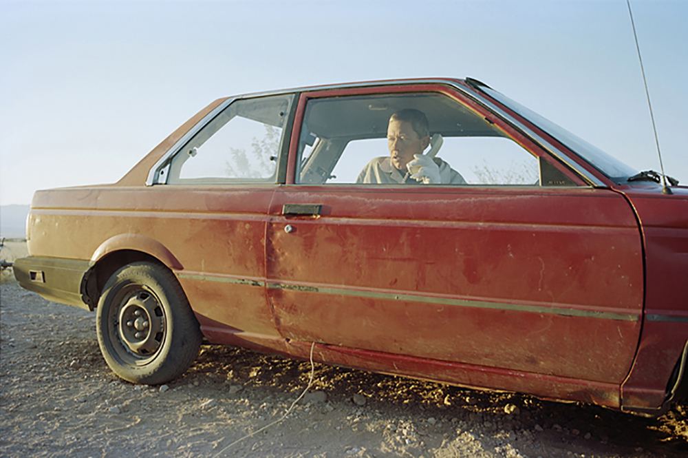
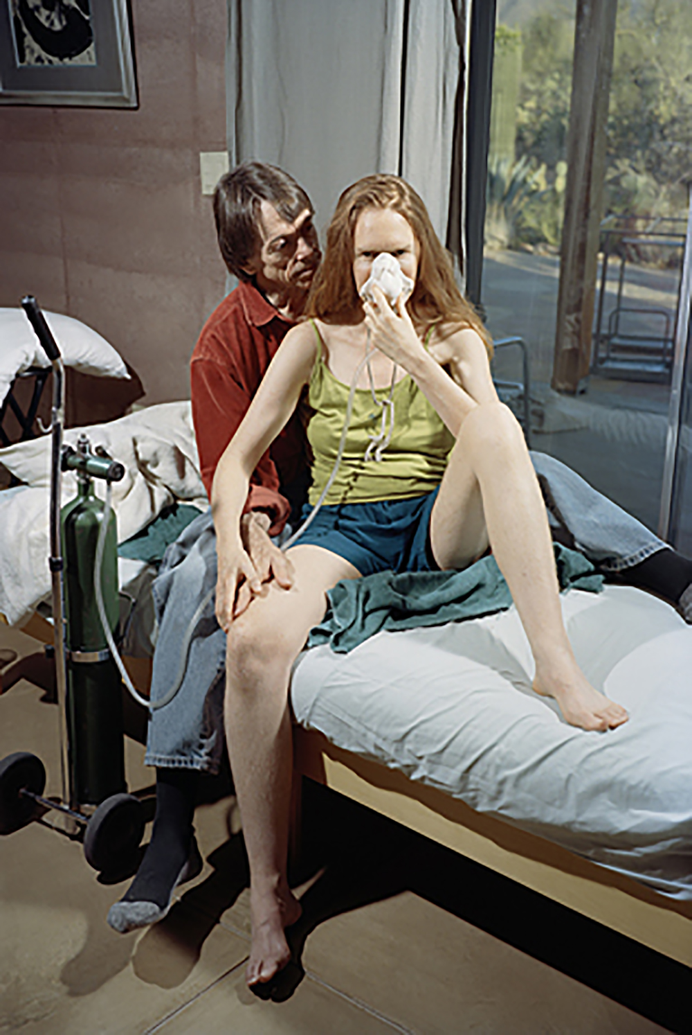
Thilde Jensen is a photographer from Denmark, in 1997 she moved to New York, six years later her life changed as she got a sudden development of severe Environmental Illness and her documentary and editorial photography was cut short. Thilde decided to make a series about Environmental Illnesses called ‘The Canaries’ these were published in The New York Times and other magazines. Thilde’s first monograph ‘The Canaries’ was published in 2013. http://thildejensen.com/ These are a set of images that Thilde Jensen took when she had Environmental Illness and she went around and photographed others who had the same to see what their lives were like. Throughout Thilde’s books there are little A5 slips of paper that have been slipped in throughout, these have writing in which shows what the people in some of these images were saying when she met them at the time she was taking the photographs, these notes of paper give an insight into the conversions that Thilde was having with these subjects but also into the mind of someone who has Environmental Illness.

Roll 083_p2_3 001
Roll 083_p2_3 001
Ginger + david bed 3 001
009
009

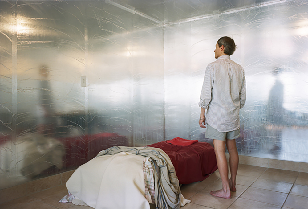
In this image this man is in his bedroom where he has a foil barrier. This man has Environmental Illness which is why he has covered his room in foil, this is to protect him. To this man, this room is his safe place. On Thilde’s website and in her book it does not say what illness this man has, so i am unsure of his condition. However, the man has no shoes on which can arguably show that he is living in some sort of state of poverty. This image documents this man’s life in this one photograph and implies the struggles that he faces on a daily basis. I think that this image is interesting because of the reflection that is on the foil, it shows the a glimpse of the outside world, which it looks like the man is missing, as you can see the sun that is coming through the windows.

me tent other scanner 001

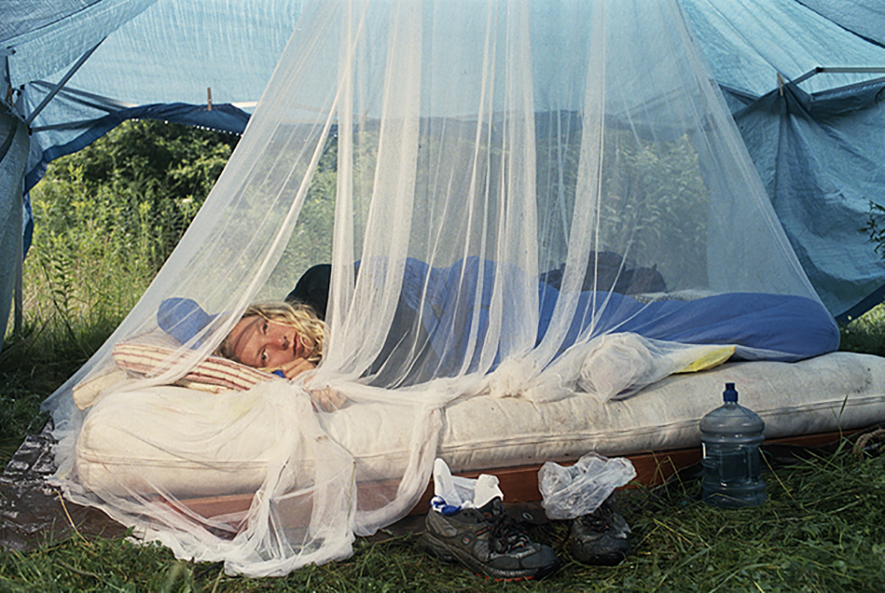
In this image this is Thilde Jensen herself, as she got Environmental Illness she had to stop taking her normal photographs that she liked to take. Instead she began taking photographs of others who had Environmental Illness while she tried to tackle it herself as well. I think that this image is interesting as Thilde’s face in this image shows the pain that she is in, and how hard it must be living with Environmental Illness.

6x9 - 003 001
6×9 – 003 001

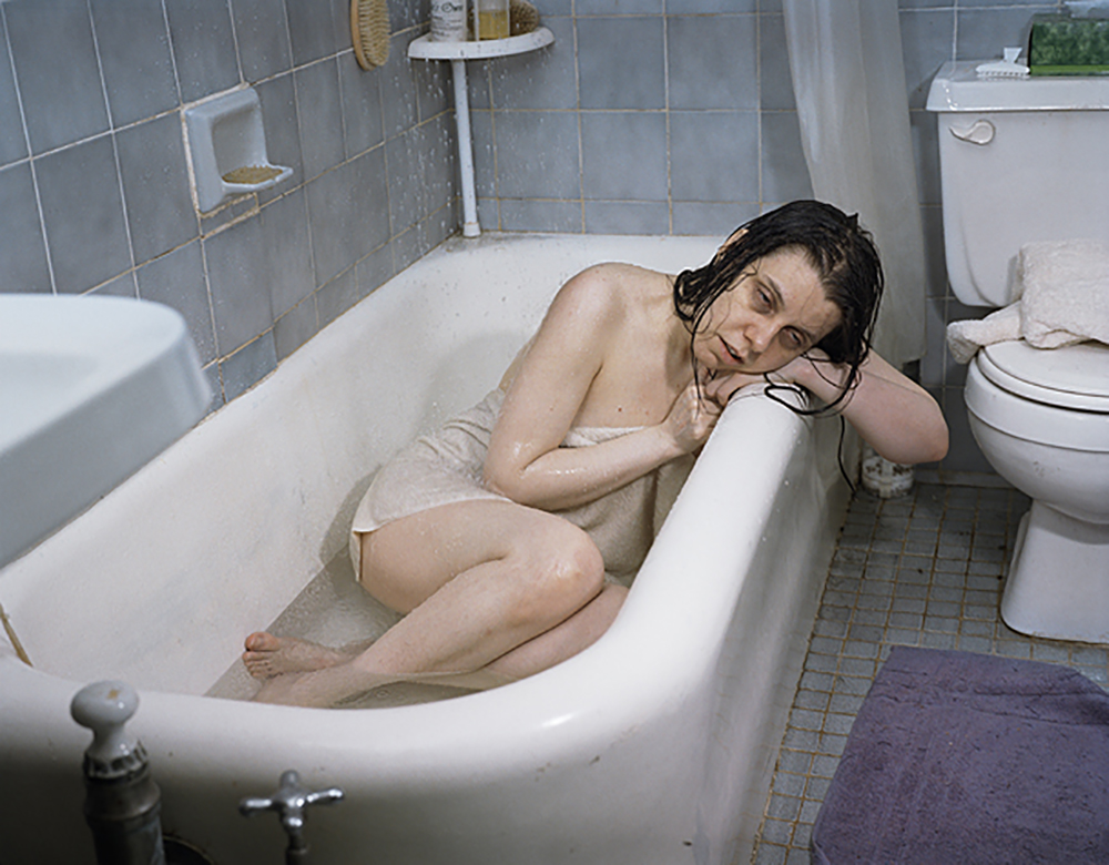
I think that this image out of all of the ones from the series ‘The Canaries’ this one is the most shocking as the women looks violently ill in this image. This image is of a lady called Jen, she is stuck in the bath tub as she is too fatigued to move. This portrait image is striking because of the the lady Jen’s bags that are under her eyes, they imply that she has not had sleep in a while and shows the stress that Environmental Illness is having on her.


Satellites: Response to Images

This image was taken at a large metal works in Siberia. The photograph is a new topographic styled landscape shot which Bendiksen has clearly taken influence from the work of William Eggleston, known for his dark portrayal of bleak landscapes. The image is very ambiguous because to some degree it shows the factory in a dramatic, romanticized manner, whilst at the same time it depicts the factory as grim and unpleasant. My judgement is that the image is a metaphor for evaluating Communist Russia (1917-1991), which on one hand was highly impressive in terms of what it achieved, but at the same time a regime which was responsible for great atrocities; death, persecution and mass suffering, in particular under the leadership of Joseph Stalin (1922-1953). Specifically this photograph explores the influence Communist Russia had over the industrialization of Russia.

Bendiksen explores this ambiguity by framing to image to showing factory as impressive, by arranging the image in a traditional landscape format. Bendisken still however through the incorporation of a low level of lighting and the red glow, giving an eerie mood, is highlighting the fact that despite this impressiveness, it still has a darker side to it.

The context behind this photograph is that Bendiksen was out photographing landscapes in the countryside. He then came across a piece of scrap metal, which was the left over of a Russian satellite. The two men on the top of the scrap metal are satellite collectors, people who make a living out of collecting and selling these pieces of scrap meatal. Suddenly as Bendisken was about to photograph the two men, standing on the large piece of scrap metal, thousands of butterflies suddenly appeared out of nowhere. Bendisken stated that “things came together .. you had the swarm of butterfly’s, you had the spaceship, you had the farmers, the stormy dark clouds in the background, the sun was just starting to break out. It was just a perfect storm of different elements.”

This photo relates to Herni Cartier Bresson’s theory of the ‘decisive moment’. Bendisken has combined his knowledge of composing photographs with an element of luck, being the light and butterflies. The result an incredibly powerful and raw image, with a sense of peculiarity which captivates the viewer into wanting to find out more about the context, and so delve deeper into interpreting its meaning. I almost find that this photograph is somewhat dream-like and separate from reality. This theme of being being dream-like is effective because it is able to serve as a metaphor for the scrap metal collectors optimists and dreamers, taking advantage of the rich opportunities that selling the remains of these magnificent displays of metal-work have to offer.  This is an image which I find to be quite positive and uplifting, an image which symbolises hope in an uncertain future.

The image shows a snippet of a darkened room, with the subject appears to the concentrating on a task. On the television set, the face of former Communist leader Josef Stalin’s face can be shown. The presence of Stalin into the frame is very sinister as a result of this and the glim mood established through the green illumination of low level of lighting, it is a very frightening and unsettling. Without Stalin piercing into the photograph this image would not be as effective because it creates this added suspense.

This photograph directly explores the theme of Russia’s Communist past. Russia under Stalin regime was infamous as a society of excessive  social control. Propaganda would appear everywhere. Stalin appearing on the television set symbolises this theme of social control, and serves to unsettle the viewer, reminding them of the horrors of Stalin’s regime and Communism.

Overall I find this type of image to be a more experimental side to Bendiksen’s photography. In terms of composition it is perhaps not the best image however I like the mood and feel that the image establishes.


Niagara: Response to Images

Rainbow Inn 2005

This image explores the region of Niagara in the cold winter period, depicting a barren, urban landscape. This image very much connects to the themes of isolation and loneliness, due to features such as; the dull skyline, unsaturated colour, malnourished trees and spacious composition. This image arguably serves as a metaphor for the troubles and difficulties of relationships that Soth is attempting to convey within the narrative. When viewing this image, I immediate associate the image as raw and revealing. In juxtaposition with some of Soth’s previous images in the series, this is one of a much darker mood. The inclusion of images such as this in the narrative require the viewer to reflect on what they have previously witnessed in the story line.  This photograph is very anti-climactic and forces a much calmer emotional response from the viewer in contrast to the exciting lively scrap-book layout, and hard-hitting portraits of some of the couples. This type of landscape shot is the polar opposite of some of Soth’s dramatic landscape shots of Niagara Falls, therefore establishes a completely different mood and response from the viewer.

The Flecks 2005

This image by Soth is a large family portrait taken at a wedding, entitled ‘The Flexs’. The portrait is composed in a very traditional manner; a basic background; the subjects staring directly into the camera; and the subjects are looking at the camera in a neutral manner, with some of the younger children glimpsing a smile. Composition is a key component that Soth has considered when making this image, and it is clear that Soth has intervened with the arrangement of the subjects, directing them the stand in a straight, up-right position. The balanced composition makes for a visually inviting photograph that displays a sense of warmth. The mood within this image is very positive and upbeat, and the use of soft lighting, excitement apparent on the subjects facial expressions (in particular the children), creates the mood of anticipations. In terms of context, I gain the sense from how the subjects present themselves that they are clearly a very happy family looking forward to a momentous occasion, it is therefore a ‘happy’ photograph.

Tricia and Curtis 2005

The photograph, entitled ‘Tricia and Curtis’, shows the young couple lying on the grass, staring directly up into the camera. This image displays a very romantic theme which the young woman resting gently onto the torso of the man. The backdrop of the grass adds to the romantic sense of the image and invites the viewer in with a great sense of warmth. Lighting serves as an important part of this image. Soth uses front, soft lighting. Again, this is done to establish the romantic mood that Soth is attempting to convey.

This is clearly a very raw and emotional image. The fact that the man has his top, helps to portray the young couple in a very intimate and personal manner. The man being topless symbolizes that through this image, that the young  couple’s relationship and exposed, and in a sense hints at its vulnerability. I find this image is very effective because Soth has deliberately used lighting and composition to create a certain mood. It is also very honest and revealing which works well in helping to build up a sense of narrative.

Falls 34 2005

This image is a dramatic landscape shot of Niagara Falls. It is a traditional landscape style, and clearly has taken influence from landscape photographers such as Ansel Adams and Edward Weston. The classic style that the photograph has been composed, with a large format camera, slow-shutter speed, tripod and large aperture: creates an image which fits into the genre of formalism. Subsequently the image strongly links to the theme of romanticism, and the intention of this image is to reflect the Soth’s own emotional response to such a visually stunning location. It terms of aiding the narrative, this photograph helps both to document the location, as well as serving as a metaphor which connects to themes of emotion and beauty, therefore reflecting the theme of love which the narrative is based on.

Such an image is a good example of how Soth uses carefully thought composition as a means of shaping the narrative.

PHILLIP TOLEDANO – FAMILY STUDY

Attempting to learn more about Phillip Toledano online proved difficult, Toledano has little information on him specifically and what I found useful was a quote from his website –

“I was born in 1968 in London, to a French Moroccan mother and an American father.

I have a BA in English literature. My art education came from my father, who was a full time artist.

It would be fair to say that I learned by osmosis.

I consider myself a conceptual artist: Everything starts with an idea, and the idea determines the execution.

Consequently, my work varies in medium, from photography to installation, sculpture and painting. The themes of my work are primarily socio-political, although lately I’ve strayed into the deeply personal.”

c

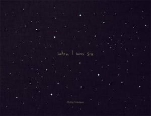
When Phil Toledano was six, his sister died. His family never talked of her again. But when his parents died, they left a box of her belongings. He therefore made a photography book called “When i was 6” – he was 6 when she died and he tried to remember memories of her he has and also things he was interested in in that period of his life. When his parents died, Toledano discovered a case in the back of their wardrobe. It was full of Claudia’s belongings, and of pictures they had taken of her.

“When I saw the pictures, she seemed so grown up, and that was so shocking to me,” he says. “She was a real person. I guess it’s easy to think you’ve lost a baby than you’ve lost a person.”

When_I_was_six_plano_cover_HR

A year elapsed between his discovery of Claudia’s belongings and finding the strength to begin When I Was Six. “It was almost hilariously miserable,” he says. “I’d take a picture, then I’d start crying. I’d go to sleep and then wake up, take some more pictures, and start crying again. It was just so exhausting, on a molecular level.”

download (1)

Some of the images i find extremely interesting, also the idea that these belongings of a sister toledano has very little rememberance of intrigues me. Finding this box caused him to make a photo book of her belongings, here are some of the images from the book thati find the most interesting.

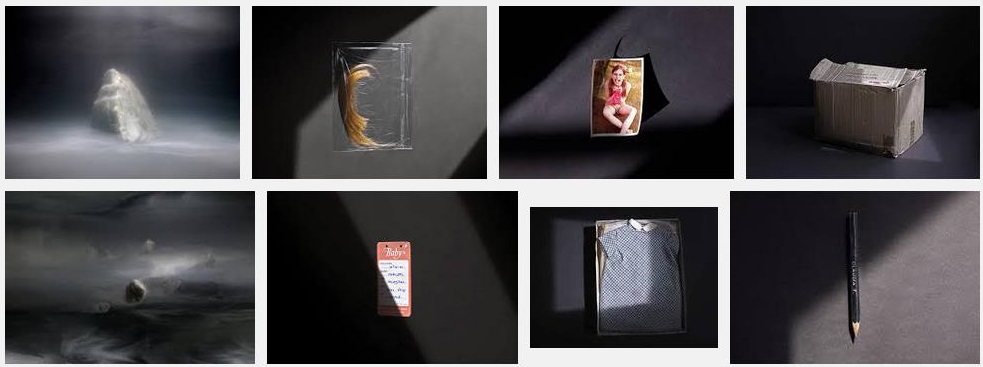
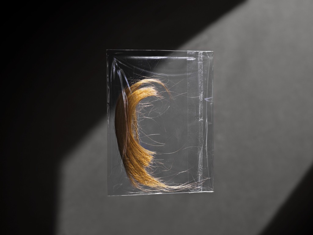
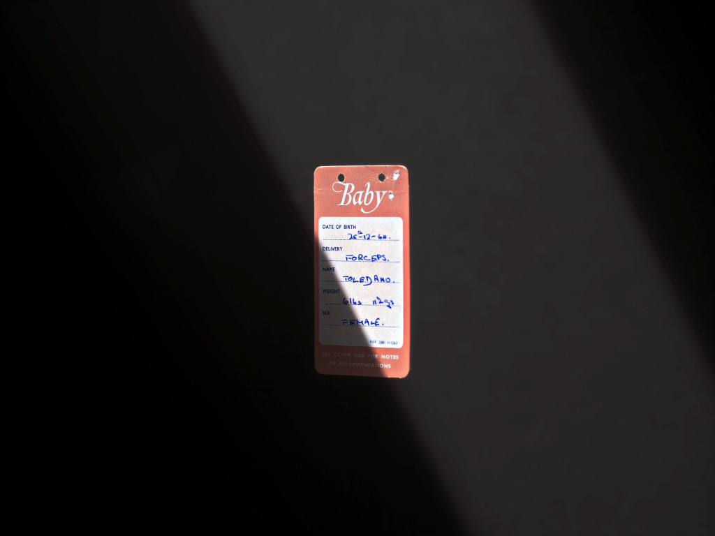
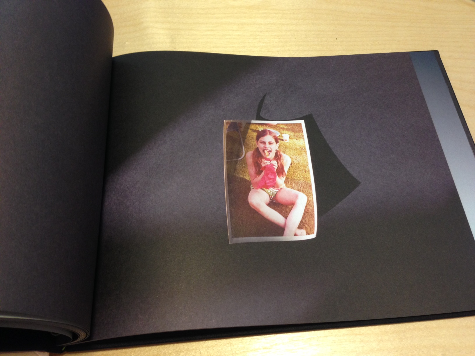
claduia-cards-2423_3278663b IMG_0225-1024x768 IMG_0231-1024x768 IMG_2262 more-claudia-20143_3278651b

I love the way these images have been taken and presented aswell. A typical presentation would be just flat on a table and taken from a birds eye view. Toledano changed this and made the images of the objects interesting aswell, by using natural lights to create contrasting shadows and propping the objects up aswell as piling things up to increased perceived quantity but letting the eye only see the most interesting one. However the contrasting and strong natural light with created shadows makes the images look moody and mysterious, this I feel sets a great theme for the book.

FAMILY / COMMUNITY / FAITH SPECIFICATION IDEAS

FAMILY IDEAS –

For my Family study i have decided on an idea called ‘The Box’, This idea comes from a ‘special box’ that i was given when i was born. My sister was also given an identical one also. Throughout our lives, my mother has collected things from our childhood that have been of significant memory and has put them in the box. These things range from baby scans of us inside my mother, hospital bands from he day we were born, our first shoes, presents we were given as children and much much more. These objects in these boxes have become very special to us, and are restricted and hidden in chosen places in our bedrooms. My parents, imparticularlly my mother doesn’t like anyone who is not family looking at these boxes, I’m unsure of the reason why but i assume privacy reasons. I would like to study thing as my “Family” area of work as i feel firstly it is a very family related idea and very few people could tell this story as all of the objects in the box have sentimental value and memories related to them that nobody would understand apart from me.

COMMUNITY IDEAS –

My community study i feel is going to be the most interesting and intriguing to conduct. This is because the idea and plan of the study is based on unexpected behaviour and events. My community idea is based around my community of friends. Your friendship community are the people you surround yourself with and tend to do everything with, bad and good. I would like to therefore document my community of friends to study and capture the behaviours and events that happen when you are in company with each other. Typically at this age alcohol is a bit part of social occasions, due to 18th birthdays and social party events. Behaviour that is present at these events and gatherings depends on the company and degree of comfort you feel when you are around them. You therefore allow behaviour that is not accepted or performed in front of others e.g: Family. My idea for this area of work is capturing and photographing these events and to catch this behaviour and intoxication on camera swell as memory.

FAITH –

I have no ideas for Faith so far, however will update this post when I do.

Sam Harris:

I have chosen an artist from the Guernsey Photography Festival, from 2014. This is the link to the website: http://guernseyphotographyfestival.com/

Sam Harris is a self-taught, London born photographer. Harris has a very precise style of working.  He photographs in a documentary style and captures every-day moments, sort of like a diary.

Here’s a link to his website: http://samharrisphoto.com

Before, Sam produced portraits and sleeve art for various companies in the music world. However, he soon came to realize that he wanted to start something different and new. His desire to photograph his family began on a family trip. Instead of photographing exterior subjects, Harris began to document his close family. With this, he learnt a lot about himself and found his calling.

The way that he forms the pictures is amazing. The images almost have an artistic quality to them. Here’s a very famous example:

Sam Harris
Sam Harris

It almost looks as if this picture was produced in a professional studio. The rule of thirds is aligned adequately as his daughters eyes and hand are positioned against the hot-spots of the grid. The orangery-red background gives the frame warmth and interest. There’s also a lot of depth here. The girl in foreground contrasts with the bright green bird in the middle-ground. In effect, the picture has a sort of three-dimensional essence to it. The focus is mostly placed on the right hand side, leaving the girls face a bit blurry. This is probably because Harris doesn’t believe in ‘over-exposing’ his children to the world.

Here’s some examples of four of his photograph’s from the collection ‘The Middle Of Somewhere’:

b522cf8201a9585d68c8fbdf70898c56-large
Sam Harris – The Middle Of Somewhere

Harris said that this image was taken because of pure chance. He was cooking one night and the window steamed up. His daughter then began drawing on the glass and creating amazing shapes. Harris took the opportunity to capture this moment with a single shot. It has a very magical essence to me and I think that it looks very mysterious.

d1bbf84a29add8b0ef5e1965d7b4fdc6-large
Sam Harris – The Middle Of Somewhere

This picture is great in my opinion. I think that Harris has framed this image very well. The dark blue material around the rabbit cage restricts me to look directly in the center of the picture, where the brightest light is shown. I also believe that the angle that he used is effective. It creates interest and gives us a similar view to what the little girl might be seeing. Also, the dark shadows, caused from the blockage of light, give the rabbits a black outline. Again, this picture is quite mysterious because you can’t really see any fine details, all you see is shapes. Additionally, the girl looks very mesmerized by what she’s seeing. She looks relaxed and eager to learn.

ed86e9a685203f7d18f872e219b81100-large
Sam Harris – The Middle Of Somewhere

This picture captures Harris’s daughter and wife trying to get the water off the plastic roof with brooms. In my view, this picture is quite amateur and doesn’t really follow any compositional rules, however it works. The yellow hints and hue’s in the background add a golden and warm feeling to it. The color yellow is significant of hope and happiness. I think that the contrast between the yellow light translucently shining on the ground and the water is great. There’s an aspect of freshness to it, the bright colors throughout exude positive vibes. You can tell the sheer energy and probably excitement that they are feeling whilst pushing the roof up. It seems as if they are having lots of fun as they’re both smiling and their body languages show signs of joy. Likewise, the green and calm field in the background adds serenity. Green is significant of power and growth. You can also see a bit of a blur in between the girl and the mother’s bodies that was created through their movement. On the whole, this image has a summer feel to it and is great in capturing a fun family moment.

98b4a109724d82f4d0f13b1ea16c67e9-large
Sam Harris – The Middle Of Somewhere

Lastly, here’s a picture of Harris’s wife doing the laundry. Sam says that she hates taking pictures, so she always try’s to get her face covered in some way or another. You can see that her arm is up in an unnatural manner. It’s these moments that make the picture so intriguing. I’d like to find out more about this scene. Like the previous image, this is cropped in a rather different matter. I think that the tree on the left takes my focus to the left side, whilst the leaves on the right also divert my attention. This is because there is not much alignment or hot-spots from the rule of thirds. Nevertheless, I think that the sense of surprise and ambiguity is greater than if the shot is perfectly framed or not. I like how it’s been taken in such a way, that it doesn’t follow the perfect compositional rules or techniques. It’s just simple, refreshing and shows an engaging moment in family life.