This is my interpretations of the reactions I received as a reader when analyzing picture stories from newspaper’s and magazines. 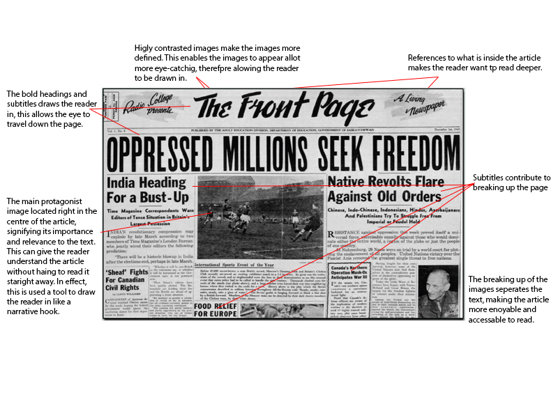
Category Archives: Analysis
Filters
125 HOURS: JERSEY MUSEAUM TAKEOVER
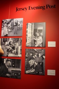
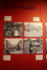
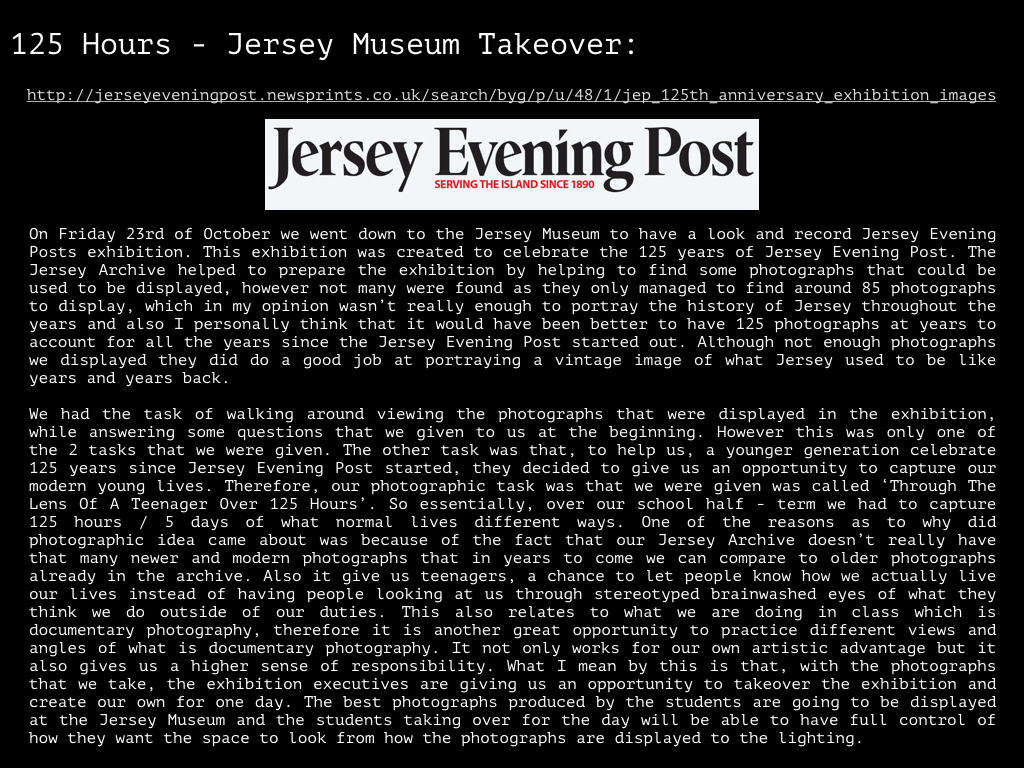
On Friday 23rd October the whole of year 12 and 13 photography students headed down to the Jersey Art Museum where we were delivered an opportunity to get our creative work exhibited within the Jersey Museum. This was created to celebrate 125 years of the Jersey Evening Post [originally named Evening Post]. This would be a really great opportunity to get our work out there within the Jersey community as well as actually being a part of an exhibition.
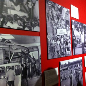
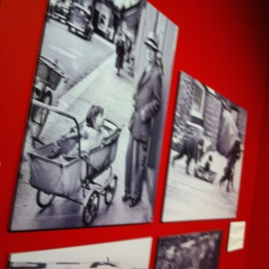
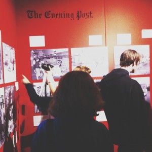
The film cameras were great, as I’am fond of vintage cameras, it really brought the whole exhibition into perspective that people actually used to use these to make photographs for the papers and looking around at the images they were all so amazing without any editing being done at all. I personally was unable to attend the exhibition but from pictures and research i have done i have a clear imagery of what the room and presentation looked like. I do not like the layout of the exhibition and thought it could have been done a lot better. The very bright red background was too intense and set off the view to the images. However the contrast of the black and white images onto the red was very complimentary. The captions of the photographs were too high up the wall and very small so they were unreadable from a low level. The actually quality of the prints at the exhibition were very poor also.
The space that the exhibition was in the Jersey Museum and the space was also very small for the images shown. Ceilings were relatively low and makes the space feel cramped and small. The lighting was very harsh and did not compliment the photographs well at all, On a whole i thought the exhibition was very poor and could have been done ALOT better. This is a shame because the conceptual idea is a good and if done well could have been a successful and well perceived.
Jersey Museum Exhibition
Jersey Museum Exhibition- Analysis of favourite and least favourite photographs
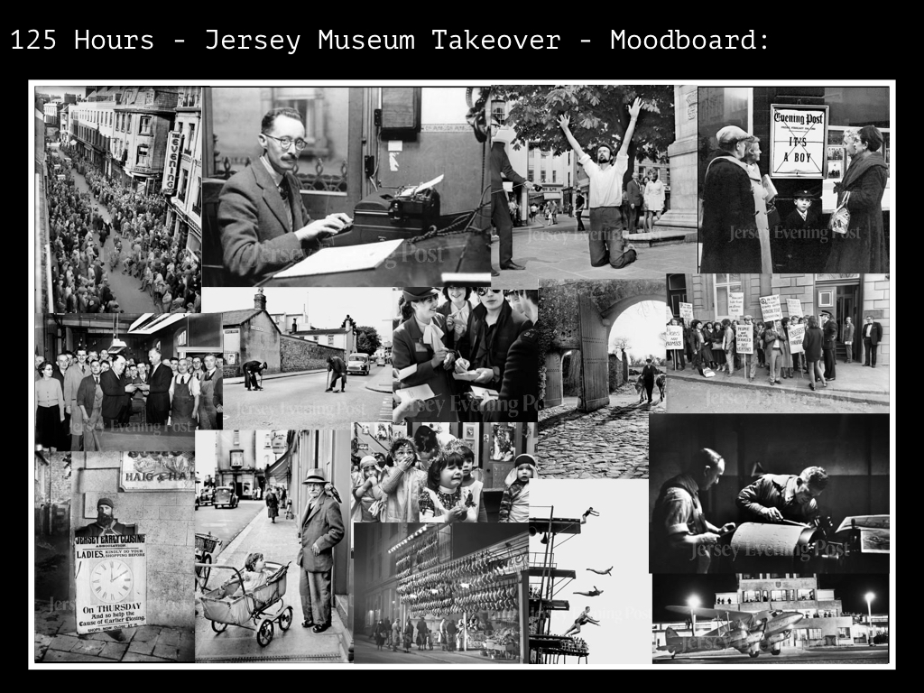
I have chosen this as one of my favourite photographs because I like portraiture photography, especially this black and white style. It has a very ‘poppy’ ‘rockstarry’ feel to the image, also the policeman’s hat being in the image connotes to the idea of trouble and control. This feeling is highlighted by the possibly fans asking for autographs which has been captured at the bottom of the image. The reflection in the subject’s sunglasses also makes the audience focus on this area of the photograph. Moreover, I like the framing of the image because the main focal point is in the centre of the image and the complimentary subjects are there as an additional. I do not think this image would of worked as well if it hadn’t been in black and white. This photograph doesn’t looked as though it were staged, it’s more a documentary photograph where it has been captured for the news or in this case for the JEP Newspaper.
This is my second favourite image because I think it has a very natural feeling to it; the simplicity of the photograph is what makes it interesting for me. Also the position they are both in gives the image a sense of unity and support. Through the subjects linking arms they have created a warm and endearing photograph which could connote to their love for one another. Framing is also very important for this image, having the subjects at the right makes it almost formal and as though it were set up. It is also clever how the photographer has included parts of the plane in order to relate to whatever news story was being published.
My least favourite photographers were of subjects creating the newspapers in the factories. I thought there were too many of this type of image because they didn’t actually have much relevance to the specific project. Furthermore we were not told any of the photographers that took the images, which I found very strange as this could of potentially been a research point for us to begin from.
Research: Picture Stories
Picture stories are techniques commonly used in newspapers and magazines. Photojournalists report media in a way of interpreting news. Picture stories however, can be seen easily as inconspicuous
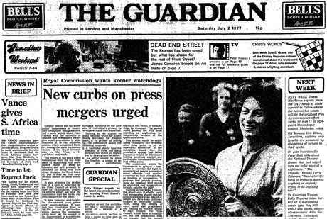
The Guardian is a British national daily newspaper. Founded in 1821 as a local paper. The Guardian Newspaper and Magazine has redeveloped the photo-history of picture stories, as it has impacted readers from over 150 years.
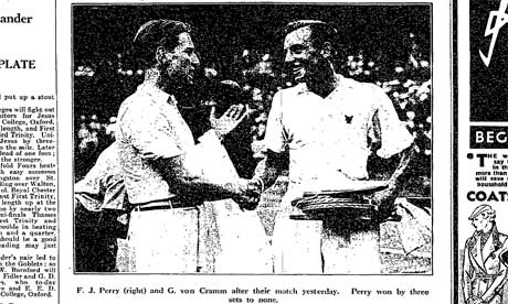
The Guardian is renown for its technical response to society, and ever changing life events and
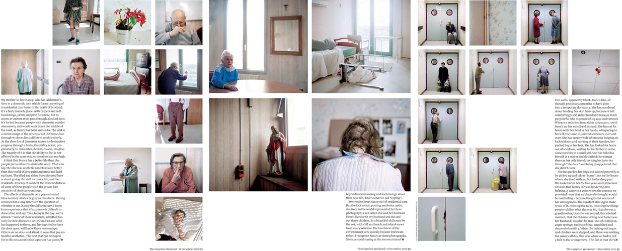
This technique is very efficient, it draws readers in.
Another example is Motion Picture Magazine. This was an American monthly fan magazine about film, published from 1911 to 1977. It was the first fan magazine.
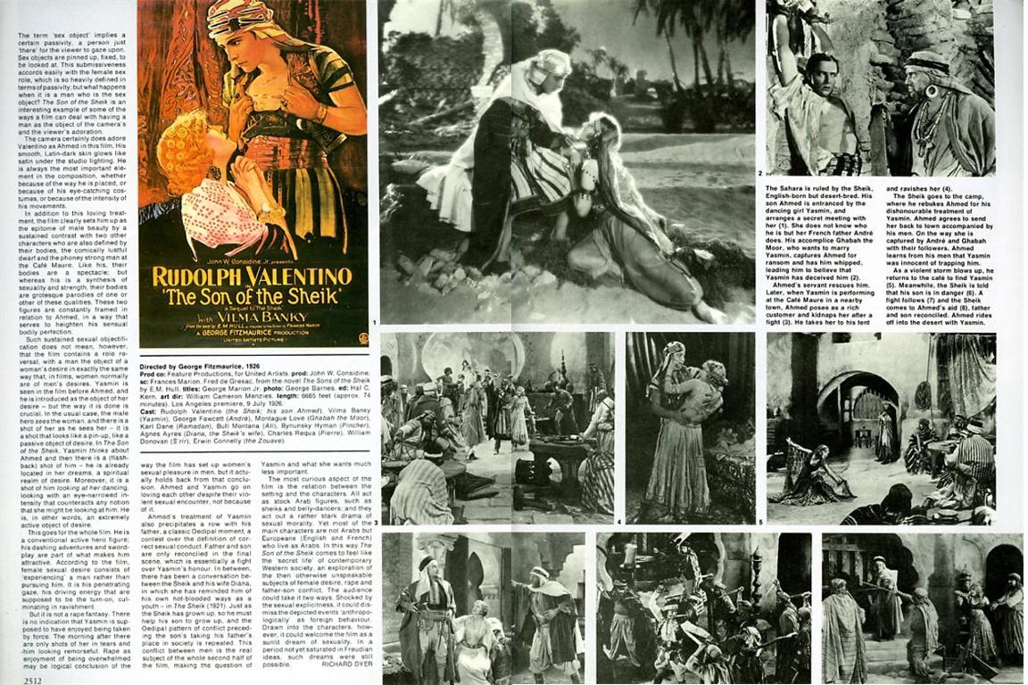
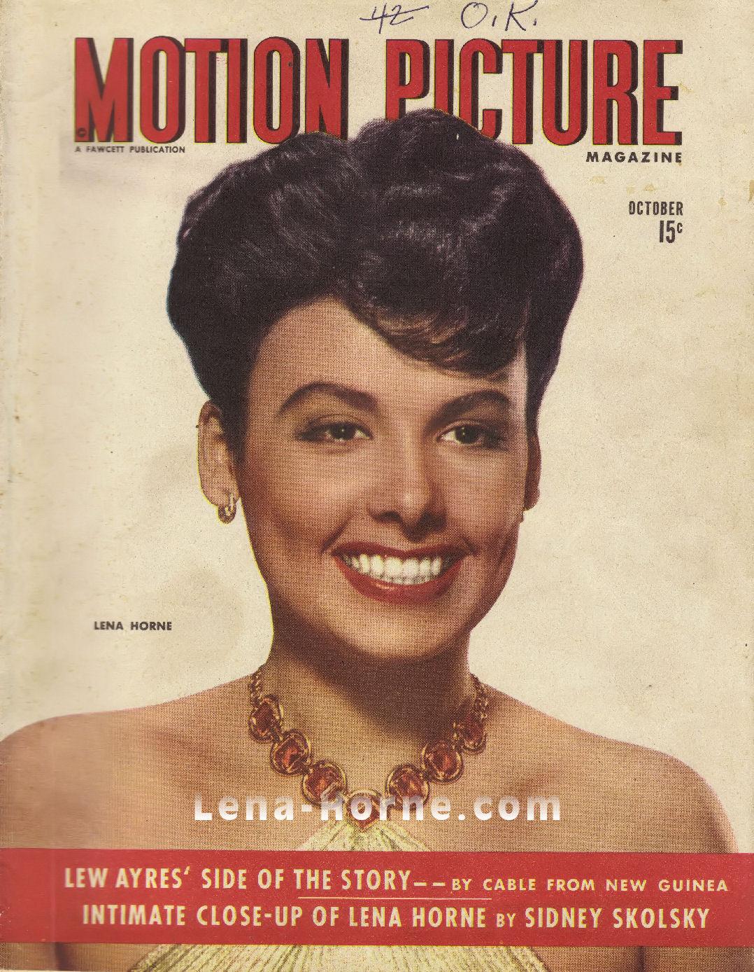
The aim is to make sure the reader can interpret the image in a certain way. obstacles like captions can throw away the original perceptions you want the reader to consider.
Vivian Maier:
Vivian Maier was a nanny and also a ‘secret’ photographer. She was described by friends as being introvert. She preferred to have a very private life and even asked for a lock to be placed on her room door. Maier had O.C.D. and with that she also took many photographs. Her ever-growing passion for photography lead her to the extreme of creating a darkroom in her bathroom. Spread out throughout the five centuries that she photographed, she managed to take over 100,000 negatives.
Vivian Maier’s website: http://www.vivianmaier.com/
Amazingly her work was only discovered in 2007 at a Chicago auction. She’d actually become very poor and had to sell one of her storage lockers in order to pay for her house. Inside there was a mass of photographs and a man called John Maloof unknowingly bought them. He was the man that got her famous. After all those years of storage and hiding the photograph’s were finally brought to light. He’s played a huge role in helping to archive her work for future generations to cherish. Maier’s street photography seems to be very contemporary although it was taken with a rather historical camera. One of her many camera’s was called ‘Rolleiflex’ and can be seen in her self-portrait:

I have produced a similar photograph to this one. I actually took this picture spontaneously during the half-term and have edited it into black and white to create a similar effect to Maier’s. My face is not very visible but you can still see the outline of my reflexion on the car window.
Here’s my outcome:

Her photography focused on the street life in urban areas. Since Maier was born in New York City during the 1920’s, she had many sources for inspiration. During her life Maier kept changing locations from the her hometown to France. In 1951 she finally decided to settle down in the U.S. where her passion for photography evolved. Her documentary style created meaning and evolved into a great story. Vivian incorporated both still images and video recordings into her work.
Here are some example’s of her street photography:


“Well I suppose nothing is meant to last forever. We have to make room for other people. It’s a wheel. You get on, you have to go to the end. And then somebody has the same opportunity to go to the end and so on.” – Vivian Maier.
Contact sheet reviews – COMMUNITY
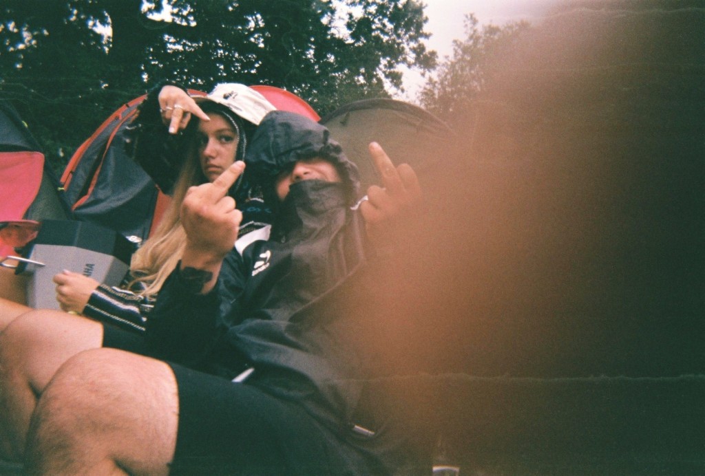
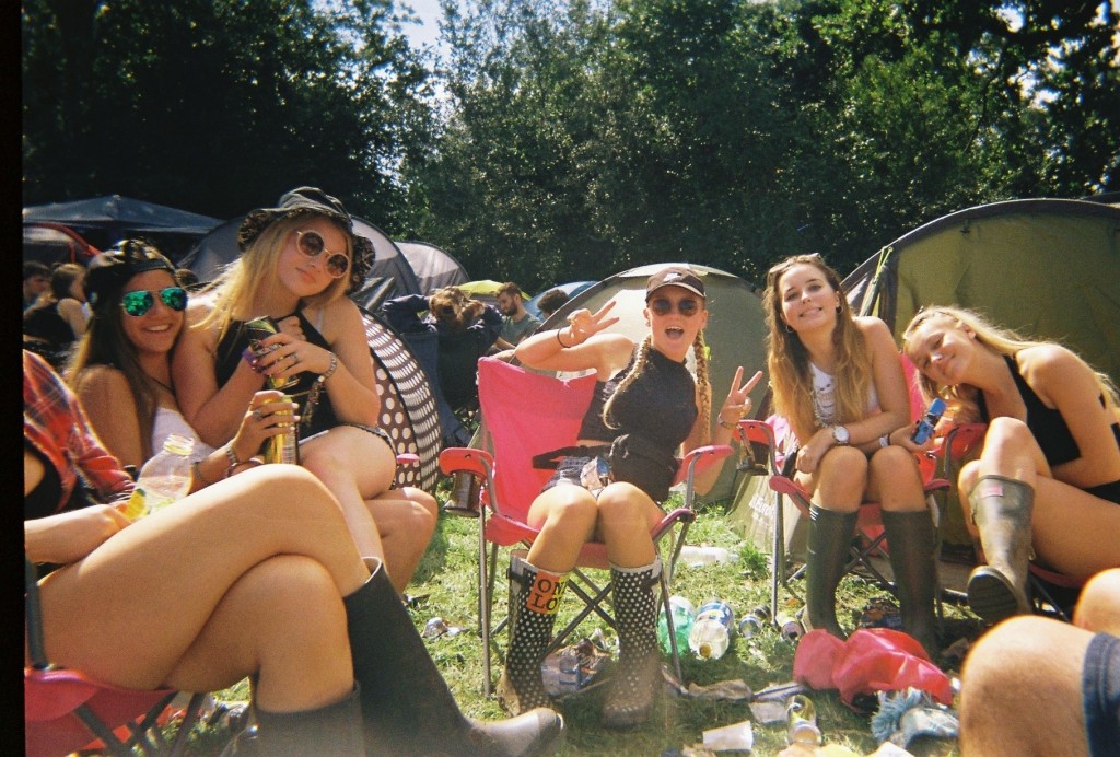
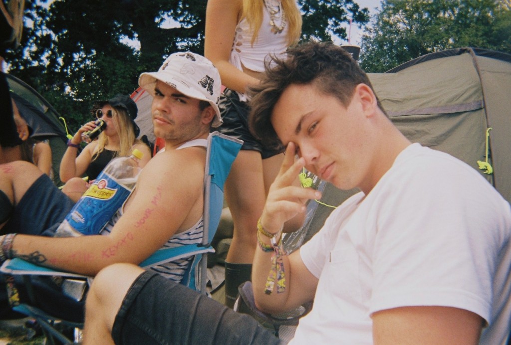
After gathering these images for my community study, I went through all 53 images and selected my favourite ones. ![Screen_Shot_2015-11-03_at_09.02.44[1]](https://hautlieucreative.co.uk/photo16a2/wp-content/uploads/sites/2/2015/11/Screen_Shot_2015-11-03_at_09.02.441.jpg)
![Screen_Shot_2015-11-03_at_09.02.13[1]](https://hautlieucreative.co.uk/photo16a2/wp-content/uploads/sites/2/2015/11/Screen_Shot_2015-11-03_at_09.02.131.jpg)
![Screen_Shot_2015-11-03_at_09.02.56[1]](https://hautlieucreative.co.uk/photo16a2/wp-content/uploads/sites/2/2015/11/Screen_Shot_2015-11-03_at_09.02.561.jpg)
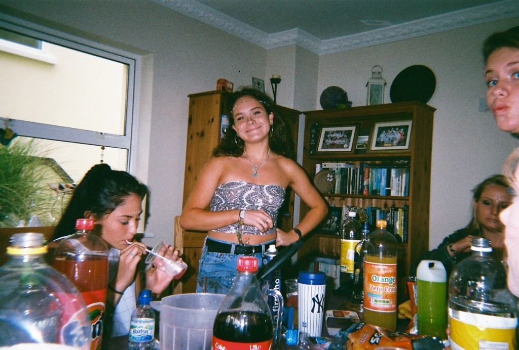
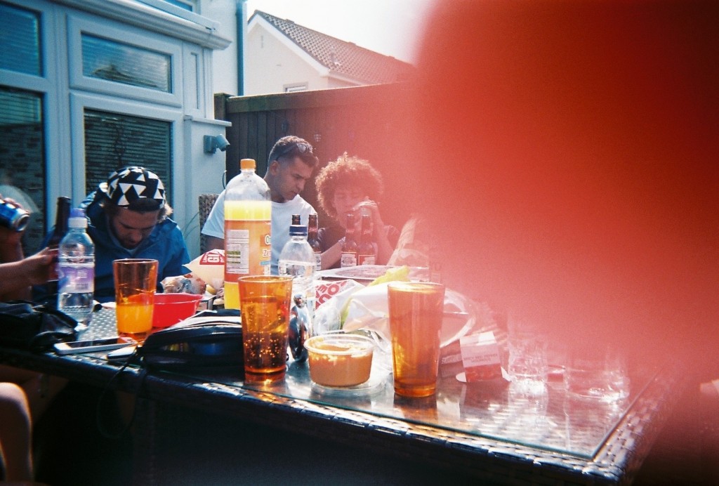
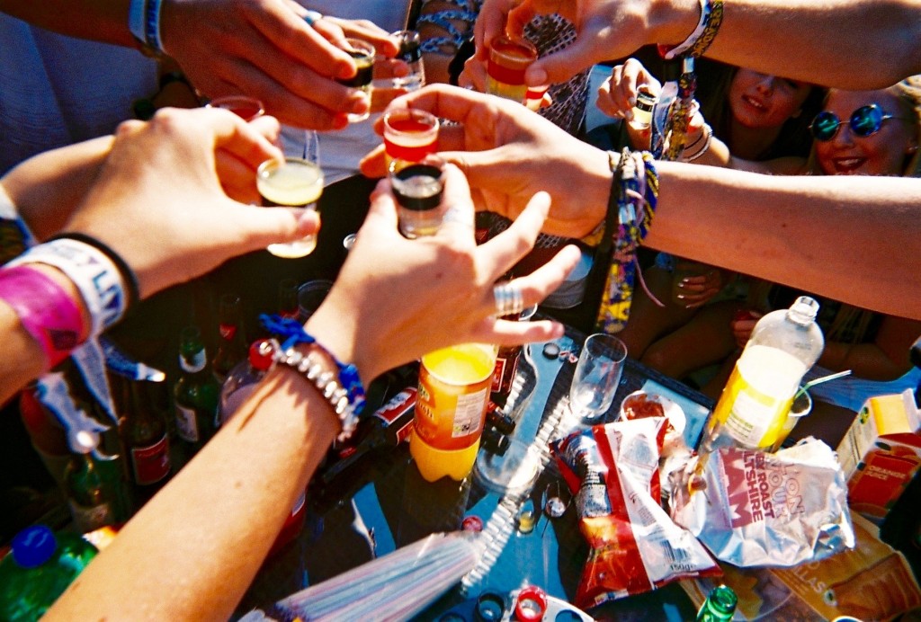
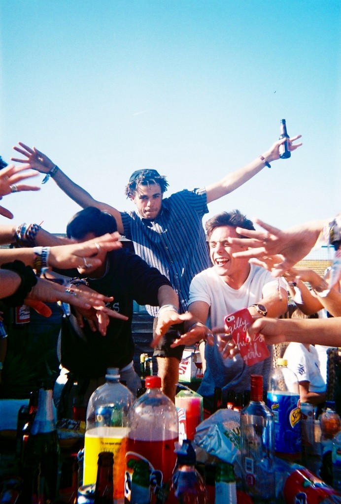
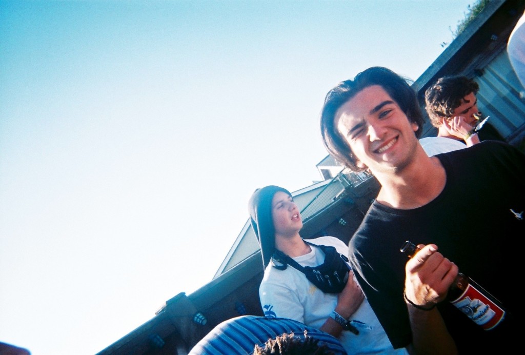
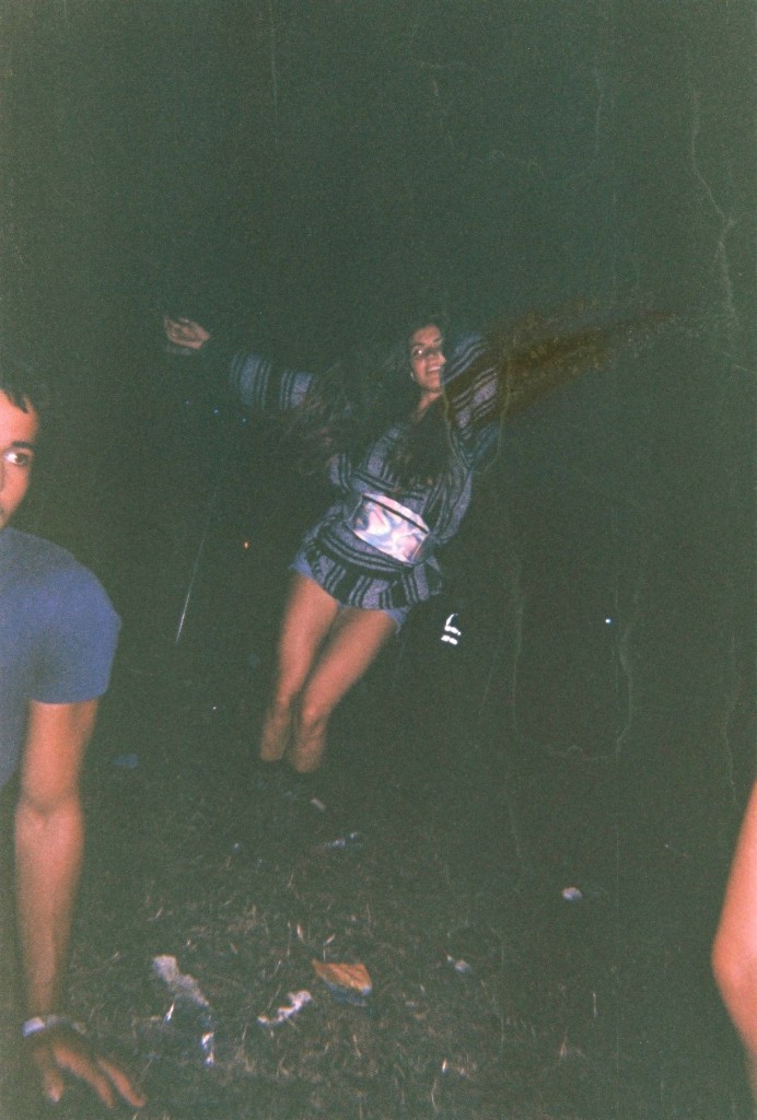
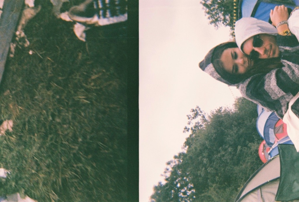
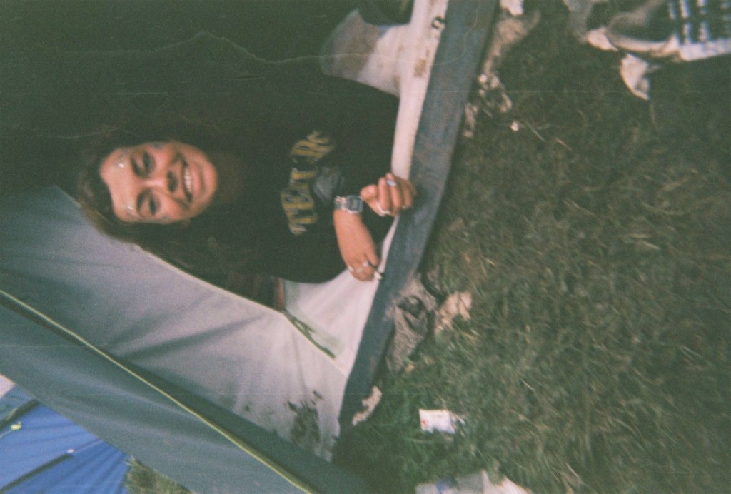
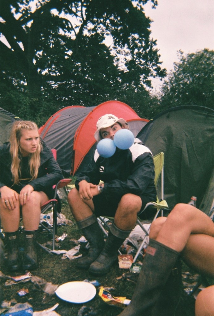
I chose the following images as i felt these were the most interesting and artistic. This is because of the angles, colours, and context of the images. All of the above images were taken on disposables, i took 6 disposable cameras to Reading festival as i love the style the cameras produce. They give a rough old look which i feel matches this topic perfectly. The below images are the images I have chosen as my favourite –
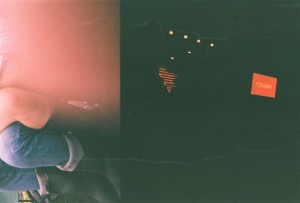
Out of these images there are a select few that I feel are the best – The above and below image I picked as they both were actually intended to be the same image. This did not happen as i dropped and wet the camera multiple times, I believe these mistakes cause the split image and the damage that can be seen in some of the images. The above image uses the rule of thirds as it has something interesting in each section of the photograph, however there is a lot of negative space as the majority of the right side of the image is black, with a few splashes of red, spot lights and some water marks. The right side of the image was taken at the main stage of the festival and the left side in the camp with friends. I think the ‘mistake’ of the damage actually benefitted the image as I feel it made it very arty. The below image is similar as it is split, however i do not know where the left side of the image came from. The right is the other half of the previous image in camp. The below image I like as I feel it looks more laid out, The black block line down the centre of the image splits the two time periods and scenarios in two and joins them together. I also enjoy the image due to the emotional message behind it, the left side shows the mud, litter and dirt that is produced by the festival and the right side show the more intimate and emotional side that is also a big part of festivals. These two messages are on opposite sides of the festival spectrum but due to some freak mistake are shown in the same photograph.
The above image was taken in the arena of the festival while waiting for another act to come on a stage. I like the layout of the image as the main subject is in the centre. However surrounding her is a lot of negative space as it is just black. This image also has a lot of water marks which I feel makes it artistic. This image has also been damaged by a sort of split, as the subject is missing her arm. In real life her arms were spread apart like a star fish and in the produced image her arm has been removed and replaced by darkness and moved vertically. This is not very noticeable but I feel adds to the roughness of the image well.
The above image was taken in camp of a friend who had just woken up after passing out for 8 hours. Water marks again make the image look rough and dirty, and the poor angle and positioning too. However the subject still remains roughly in the centre of the image. This image also looks better on its side or upsidedown. This is because when it is upright and normal, it looks ‘too normal’ and not arty enough.
The above two images also have watermarks and were taken in camp aswell. The angling is quite straight on which I feel makes the images quite clear. The thumb print in the second image is the reason I chose it in a select few. The first image has a range of colours i feel contrast each other well, aswell as the odd act of two gas balloons in ones mouth, the blue contrasts well with the red tent in the background and the rubbish on the floor.
Responses to Family Archive Research
Family Archive Research
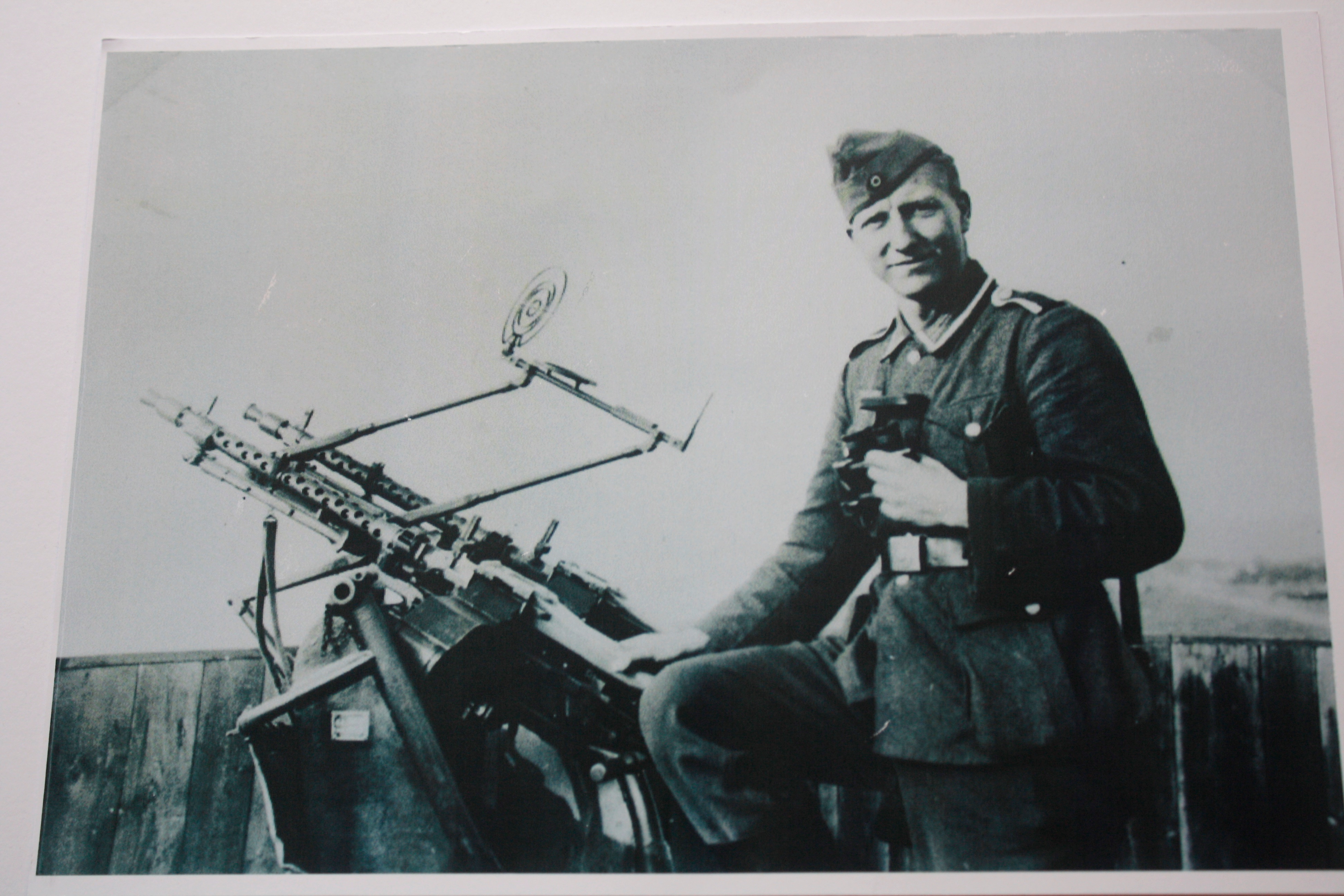
Over the past term, I have been working with the Societe Jersiaise Photographic Archive implementing key ideas to developing the Archive to my own personal project. These skills have made me develop various creative perspectives involving Archive extraction, research, experimentation and documentation. Exhibition and presentation design.
Some of the skills, which I have been contributing to my Archive experience, consist of:
- Scanning & storing images
- Image manipulation, resizing, creating composites
- Producing teaching materials for Photo Archivist’s Workshop
- Re-purposing images for Jersey Projection Gallery – Skipton Arts Series 10-14 November
- Searching database
- Outputting digital prints, labeling and marking images from the archive
- Understanding copyright policy
- Retrieving original images from vintage collection in strong room
- Working in secure areas, safe practice in the archive environment
- Appropriate handling of original archive materials
My personal project has allowed me to evolve, as with help from Gareth Syvret, I’ve been able to manipulate photographs which relate to the history and period of my new house and how I can contrast the changes and traditions in everyday life today.
125 HOURS – JERSEY MUSEUM TAKEOVER AND JEP EXHIBITION:
Gregory Crewdson’s Tableau’s and My Responses:
To be begin with I’m going to explore the American photographer Gregory Crewdson. He tends to photograph homes and suburban neighborhoods. He is referred to as a ‘realist landscape photographer’. Here are some of his photographs:


Since he’s a tableaux photographer, Crewdson’s pictures are completely staged and prepared. His work combines both nature and strange concepts. In my opinion, his amazingly interesting and dramatic set-ups create a dramatic essence.
I’m going to be taking my own photograph’s as a response to Crewdson’s tableau’s.

For my first shoot, I took inspiration from the image above. There are various individuals gathered around a table to eat dinner. Strangely they are wearing masks as a form of disguise or identity. They are in a dimly lit room and Crewdson seems to have used flash as there is hard lighting.
For my response, I set-up an equally bizarre environment. I had my family member place a mask on and lay in bed. Then I placed a blue scarf around his neck. This strange combination embodies the same essence as Crewdson’s image. I also gave the man an empty plate and spoon for him to pretend to eat from.
I then asked him to pretend to eat whilst looking at the cupboard mirror. This reflection gave the photograph an interesting edge.


