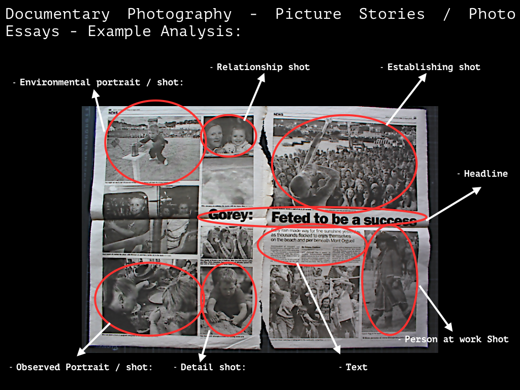
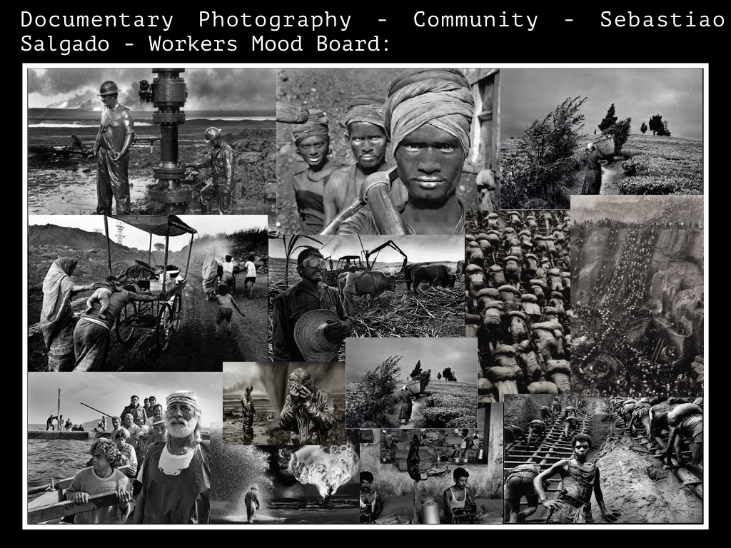
Category Archives: Analysis

Filters

Author:
Category:

Picture Design 1

Design 3

Inspiration

It is unquestionable that the death of a loved one is extremely horrible and painful. However the phrase “time is a great healer” is extremely accurate. A reality of life is that people learn to cope with their love ones dying, a difficult but natural process. Grief is not a bad thing, it teaches people to accept that someone is gone and learn to move on with their lives. Grief is personal and subjective process and I believe it is deceptive to show grief as negative and soul destroying. Death is a major taboo in western society, and it is considered wrong or insensitive to grief in a way other than solemn reflection. A lot of non-western cultures, especially in Africa and South America for instance treat death and funerals as a major celebration that is reflective of happiness and joy. In Atzec dominant regions of  Mexico for example, they have a celebration known as ‘Dia de los Muertos’, meaning ‘Day of the Dead’, a ceremony in which people celebrate the lives of their passed loved ones in a very open way. This alternative view of death is very interesting.

My thoughts

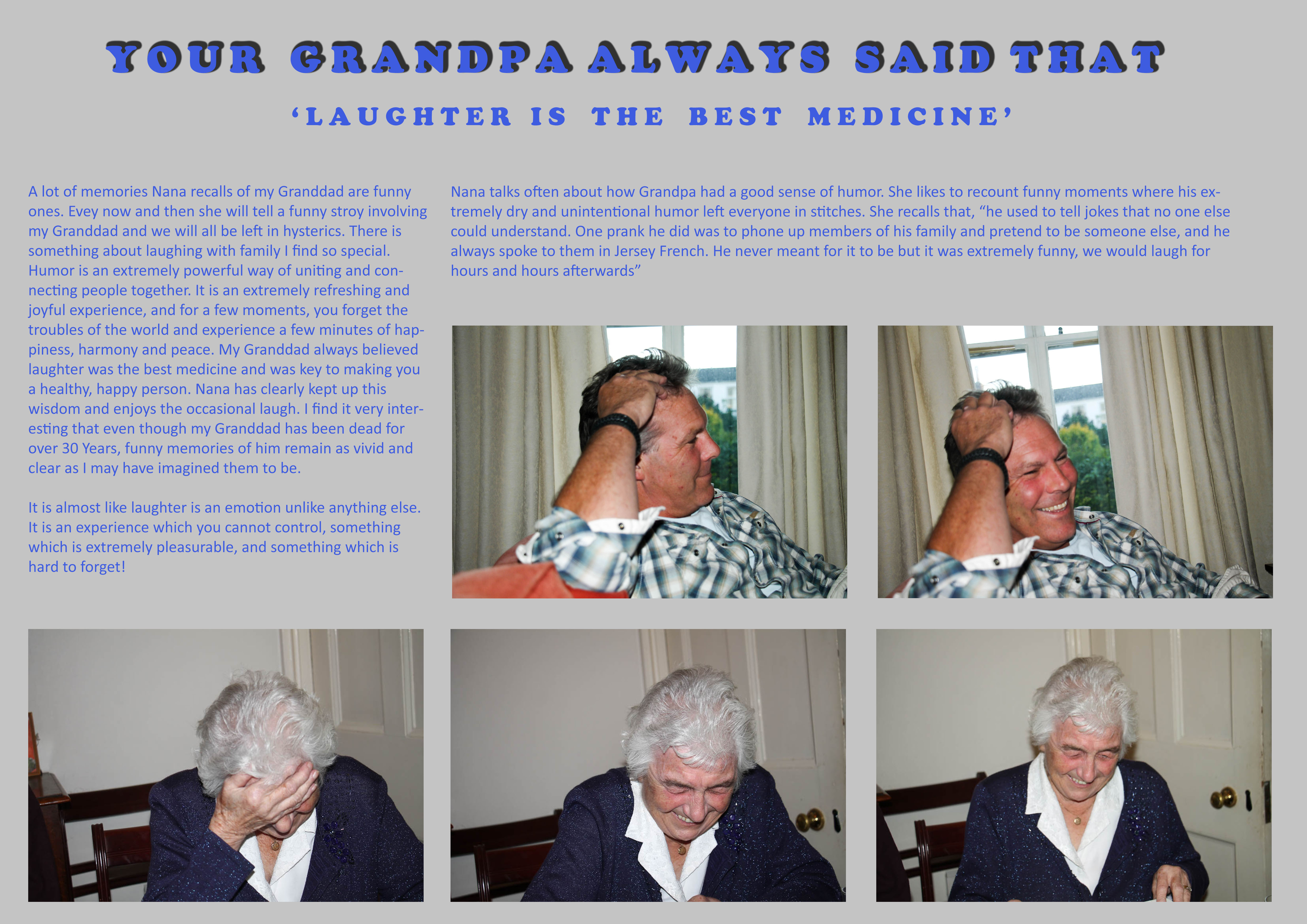
A big issue  I have had recently is my representation of Nana in my photographs. A lot of my images seem to represent Nana in a way which is sombre and sad all the time. Whilst it is true that Nana misses him greatly, it is not fair to say that she spends her whole time alone or sad. My Granddad died over 30 years ago. It is simply untrue to say that Nana has spent every single day of this existence sad and unhappy. Instead, she carries his memory on through the joy he brought his family, his achievements and the example he can set for everyone moving forward. Nana has never been uncomfortable talking about  him. A large part of her grieving process was and still is laughter. She is always recounting jokes about my Granddad, remembering the life he lived, not that he is no longer hear. This I feel brings her great solace and comfort and so of course be represented in this project.

Analysis

Therefore this picture story is my way of questioning my own style of portraying Nana in this project. Instead of just portraying her as sad for my Granddad’s passing, I want to represent the more pragmatic viewpoint that although she misses him greatly, the thought of him does not actually sadden or distress her. She still has a lot of reason to be happy in her life, a lot of family and a modest amount of close and long-standing friendships. It is important to show this part of Nana’s life as it is a more honest way of presenting the type of person she is, someone who struggles with loneliness and grief, yet at the same time someone who embraces life as something which is joyful and precious.

Summary

I like the idea of what I have done because it is a very simplistic idea. I enjoyed making the picture story and it was refreshing to  create images of Nana which are happy and joyful, something I should do a lot more often moving forward in this project. My Granddad at the end of the day was a normal man who liked to have fun. Nana recalls that he always believed, “laughter is the best medicine”, which is what I have based this picture story on. I don’t think he would want his family to think of him in a sad or tragic way. Of course it is sad that I never got to meet him, but and the same time and I think he would be pleased that Nana is keeping his memory alive in a happy and positive way, and that his existence was never something suppressed behind a taboo of the fact he is dead.

Here is an extract from a documentary looking about how the Aztec’s view death. The contrast with how we as western countries view death is startling and interesting to reflect on.

Picture stories – FINAL DESIGNS

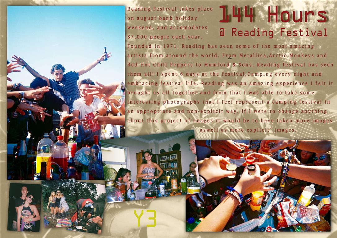
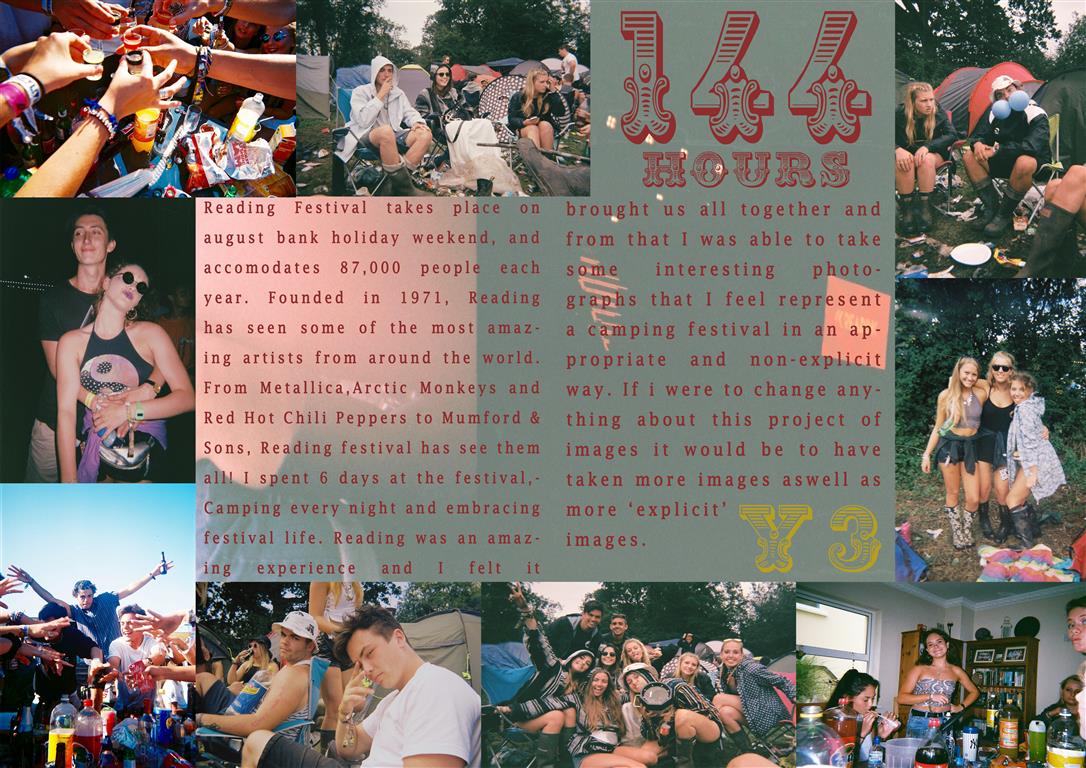
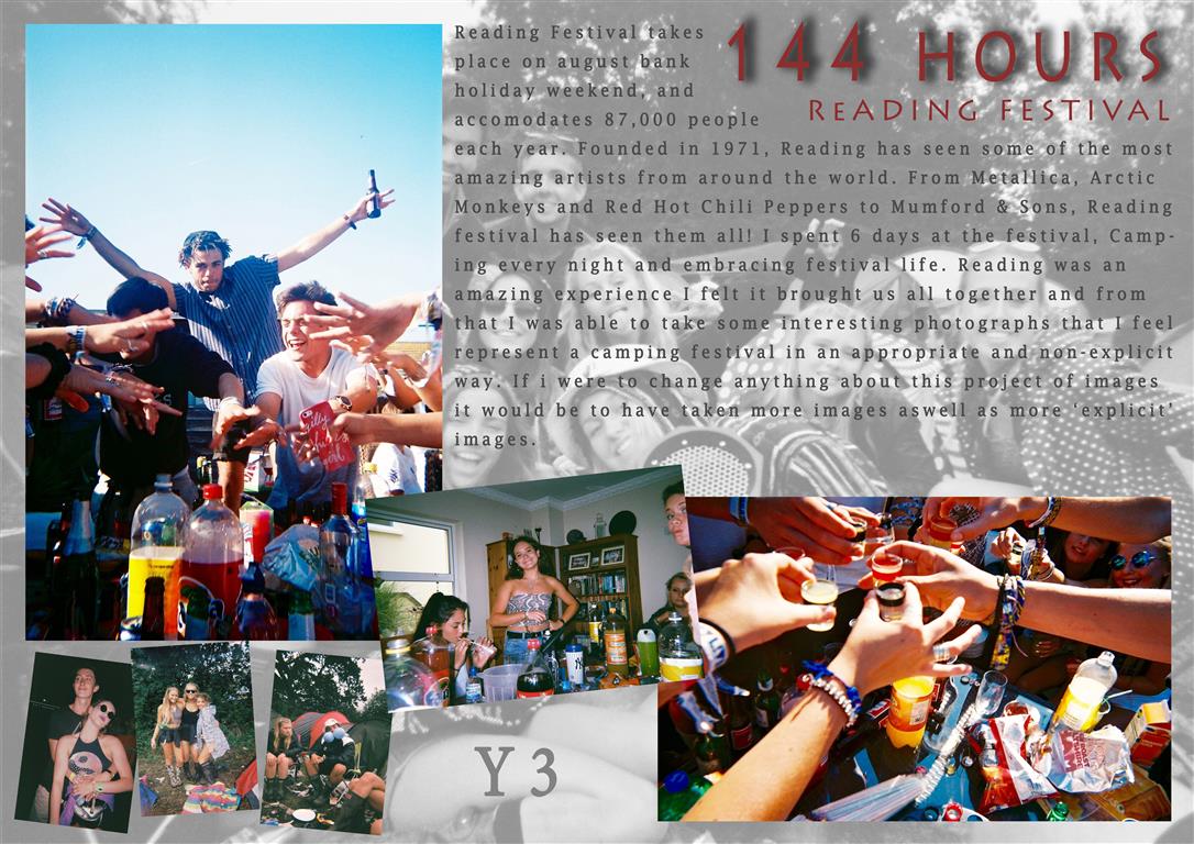
These are my final designs for my picture story, I experimented with many designs but came out with these two templates. I wanted the story to have a rough feel to it as my story was based around a festival I thought the theme should try to match the presentation. I kept the same font throughout the stories and a similar color scheme with red text and a faded picture for a back layer presented in all 3 stories. wacky 3 (Medium)
The above story was the first I created, attempting a graphical layout I had to twist and turn the images as well as add in ones that were different sizes. Adding drop shadows to the images also made them stand out more and created a non flat look. with 2 main establishing shots and a few relationship and observing shots to create a picture story with 7 images all together.
Untitled-1 (Medium)The above picture story was the second I edited and when completed was my favorite also. This story is presented more as a double page spread, with no drop shadows or highly edited images. I increased the vibrancy in all of the images to bring out the colors. I felt this was a cleaner and less artsy layout due to the symmetry and images laid out all in line. My favorite part of this layout was the title text, as it was very bold and very different to usual titles I felt it fit well in this design. This design also had a background image, this image was a corrupted photograph from the broken camera and I felt it fit very well as a background as there is nothing important within the image apart from a few corrupted images and water marks.
wacky 2 (Medium)This design was the third and least favorite design, The same layout as design 1 but with different color schemes and effects. The text should have been changed to another color as i feel it blends too comfortably with the background. I feel this story looks more of a poster than a picture story, The story is far from what i set out to design when i started but was an experiment and directed me towards editing my other stories more as i could then see what they were missing eg: drop shadows.

Jersey Museum Exhibition

On Friday 2nd November, we went on a trip to the Jersey Museum to look at the exhibition of photographs from the Jersey archive. The photographs were all put in one red room. I like how they chose a bright colour to put as the background to these black and white images. However, I don’t like the way they have set out the images as it just looks like they haven’t spent a lot of time thinking about how to set out the images and captions effectively. It doesn’t represent Jersey as it should. The title is very misleading, “125 Years”, when really the photographs only have a range of 50 years. I would have preferred if they had put less writing about the images as it just looks like it has been chucked on under and above the image. The quality of the images are not at a high standard either and could have been displayed bigger. They also didn’t contrast black and white images with coloured images as they are look the same which didn’t catch my eye as much. It looked like a pin board with small paragraphs underneath, it could have been set out more artistically with more thought behind it.

I found an image that I really liked as I was instantly drawn to it. This image is of a class of children going on a field trip it looks like. I think I was drawn to at first as I love children and my career path has always been to teach children, and this image is really sweet of them in matching raincoats and wellington boots.  I like how uniformed the picture is, the teachers in traditional clothing shows the vintage style to the image which is what I love. I also how it is in black and white as it makes it more powerful and shows that the picture is very old and sentimental.

Danny Santos Research:

Danny Santos is a well know street photographer. He lives in Singapore where he captures daily shots of life.

Danny Santos - in the process of taking a strangers portrait
Danny Santos – in the process of taking a strangers portrait

Santos works in many mediums of photography such as studio portraiture and street portraiture. He grew fascinated by strangers as he wanted to capture their different characters and personalities through the lens.

I was especially captivated by a series of images he took in the rain and he entitled it “Bad Weather”.

“I used to always stay at home whenever the rain comes in the weekends. Eventually, I realized how the rain always brings refreshingly interesting scenes on how people react with it. I have written an article about my thoughts and experiences on shooting in the rain.” – Danny Santos

Here are some of his images that caught my eye:

danny-santos-03 bad-weather-22-1024x680 slide_291416_2326102_free untitled

As a response to his photograph’s, I’d like to create my own set. I think that the people’s responses and facial expressions are great. It’s a great variety from sad and angry to happy and cheerful.

Specification:

Who?

I want to photograph random strangers that are walking down the street.

When?

I shall be taking these photographs during the afternoon so the lighting will be quite dim and dark. Since the clock has gone back the daylight available is scarce. Therefore I may have to use flash in order to see the people.

Where?

I’d like to take these pictures in a city environment as the bright lights and detailed backgrounds will add to the image. It also gives it that urban feel.

What?

I want to aim to get a minimum of 50 photographs so that I have a wide variety of shots to pick from. I want to make sure that I capture people facing the camera and that there are minimal shots of people’s backs.

My Documentary Spread – Magazine Layout:

The layout of the page is very important when presenting your photography. For our images we can apply them onto an A3 size of paper. Here’s a mood board of a few magazine spreads showcasing photography that i found:

1-Mosaic2mothers_day_photobook_7_webmagazine-layout-tiffany-ann7b-stylish-magazine-design

I have produced a two page spread that includes my favorite documentary outcomes. I’ve placed the pictures in a fairly varied layout. The photograph’s are all different sizes and dimensions. Accordingly, the angles at which I took them vary. I enlarged the image that I wanted as the main focus, because it intertwines the theme of ‘Family, Faith and Community’ in the best way.  All of the photographs are edited in some way or another. I included some very strong contrasts and vibrancy in them.

Here is my main picture:

DSC_0085 edit 2

This particular shot appears to be ‘layered photography’ due to the many subjects in one. In fact, no changes were made to the picture’s composition and nothing was moved.

Me and my family had just strolled to our car, that was parked in the church’s car park. As everyone was getting in the car, I took the opportunity to spontaneously take this.

I find it quite lucky that my friend was holding the booklet that we got given at our ‘Jersey Museum – 125 Hours’ visit:

fdgdh
“Your story, our history” booklet – Guidebook given to us at the Jersey Museum

I like how it shows the task booklet and gives a small detail about the photograph’s meaning. I believe that this manifests the theme of ‘community’, because it shows the assignment that our school was given to complete as a whole. Additionally the church in background adds depth whilst embodying the theme of ‘faith’. The girl in the picture is representative of the subject of ‘family’ in that I consider her to be my family.

I’ve tried out various designs in Photoshop as a form of ‘trial and error’ so that I could find the one design suited to illustrate my story.

Original layout:

Magazine spread - no text
Magazine spread – Original with no text

This was my initial magazine spread but i decided to alter it. I found that some of the images were out of context and didn’t relate to the overall subject.

Second layout:

magazine spread - 2nd try
Magazine spread – 2nd try with no text

For my second copy, I removed the picture on the bottom right-hand side as it was sort of an anomaly. I then moved some of the picture to create a balance. I aligned the photograph’s so that they would look more proportioned.

Third layout:

Magazine spread - 3rd copy
Magazine spread – 3rd copy

For my third alteration I expanded the titles so that they went across the top border of the A3 page. I wanted the writing to be spread out and aligned with the pictures.

Fourth layout:

sheet with photos 3rd try for the blog

This is my 4th try at the layout. I have added the text to go along with it and included some inspiring quotes associated with the subject I was doing. I also moved the two detail shots from the middle of the page to the top. This gives the layout more space for the writing and looks more balanced. Additionally, I altered the titles changing the color into purple. Purple is representative of imagination and individuality. ‘Impulsion Du Moment’ means ‘Spur-of-the-moment’ and this explains the whole spread, since I took the picture quite spontaneously as I wasn’t expecting to experience certain scenarios.

Moises – Evaluation

Background

‘Moises’ is a book produced by Argentinian photographer Mariela Sancari. In 1980, when Sancari was 14 years old, her father Moises Sancari committed suicide. Sancari and her twin sister went through traumatic periods of grief, and have suffered from episodes of anxiety and depression.

After her father passed away, Sancari tried to fill the loss of her father through her imagination. She would stare at any stranger who bore resemblance to Moises, a habit which soon became an obsession. Sancari went through a stage of grief known as denial and effectively created a fantasy that her father was still alive somewhere, and seeing men  that would of been her father’s agitated this obsession.

Sancari, who trained as a photographer worked for eights for a large Mexican newspaper. See soon however became disillusioned with this and starting to work to her own, personal photographic projects. In 2011 she gained a photographer in residence place at the Centro de la Imagen, and during this time she worked on a project entitled ‘Moises’.

Evaluation

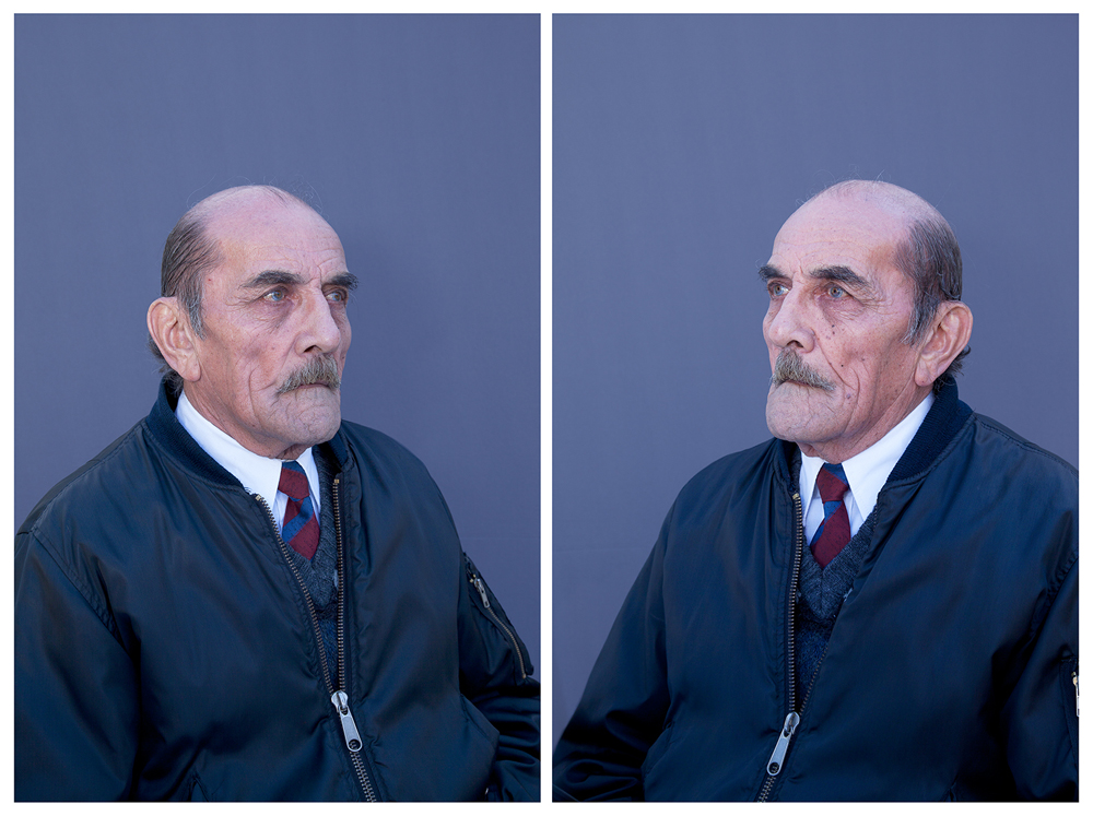
‘Moises’ is a very personal and unique project. Sancari put out a newspaper ad asking for men in their 70s that bore resemblance to her father, (the age Moises would have been if he was still alive) to pose for portraits.She dressed the men up in old clothes of her father, getting them to complete similar activities she remembered her father doing, such as shaving and brushing Sancari’s hair. Sancari described the process as a “very strong, intense situation”. The outcomes of this photo-book, displayed in an unusual pop-style display are very raw, original and authentic. The images are effectively a retrospect of what her father may have been like, had he have lived.

I find that the concept of this series to be very effective and powerful. Sancari uses memories of her father, as she describes, “my memories of him are very childlike. I’ve built a shrine.”. The images included in the photo-book are very simplistic, classically composed portrait styled photographs with a plain blue background. The subjects in the book stare camera into the camera, conveying a plain, neutral expression. I find that this simplicity is very effective makes the story very raw and grounded solely in the theme of Sanceri father. The impression I gain about Moises through her retrospective representation of him is that he was a very normal, loving family man. A theme that Sanceri subtly explores through the photographs is intimacy, convey most clearly through close ups of one of the men saving.

Overall I enjoyed this book. The handmade, pop-up style makes the book very personal and the story Sancrini tells is very subtle, poetic whilst at the same time being heartfelt and consistent to the difficult but fascinating theme of Sanceri attachment to her deceased father. It tells a personal story

I like how Sanceri has used men her father’s age to fill the gap as obviously she can’t photograph Moises. This might be an interesting theme to explore within my own project, the use of other subject to retrospectively image what my granddad may have looked like had he still been alive today. The image composition is very basic and simplistic, whilst at the same time being strong and striking. This simplicity is something I want to emulate more when I take my images. Is emphasis of mood over how an image looks is interesting and my exploration into vernacular photography is a good starting point to reflect within this.