Category Archives: Analysis
Filters
DECONSTRUCTING PHOTO BOOK DESIGNS
The Americans, Robert Frank
This photo has been considered one of the most influential photo books that have given inspiration to many new photographers starting out. This was produced with the help of a scholarship that allowed Frank to go on road trips across America, this was during a two year period. Frank was trying to portray American society in the post-war period. This photo book has contributed to a new style and subjective approach to documentary photography.
The Middle of Somewhere, Sam Harris
Sam Harris is an Australian photographer and educator. He self taught himself photography while he was a teenager, he turned his bedroom in London into a DIY makeshift darkroom. Harris has worked as an editorial photographer for places such as The Sunday Time and Esquire but also throught the 90’s he photographers portraits and sleeve art for numerous recording artists. While Harris’ career started in London in 1990 photographing editorial portraits and sleeve art his career changed into one of London’s leading young editorial portrait. Sam decided to abandon his career and changed it so that he could have more quality family time, in this time he turned his camera onto himself to photograph his own life. Harris’ lives his life with his two young daughters and his wife where he goes between India and Australia, which he setteled down in the forest of Southwestern Australia, Harris still continues to photography his on-going family dairy and he also runs workshops.
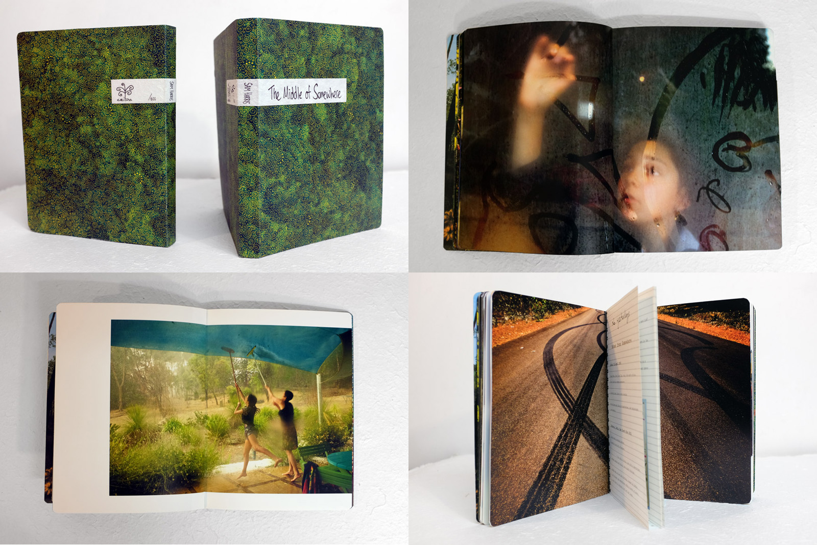
This photobook by Sam Harris gave me inspiration for my photobook in the different aspects of it and how i would like to lay out my images. This photo book communicates this narrative through different images of Sam Harris’ family while they are in the South West corner of Western Australia. This photobook is considered the next chapter in Harris’ on-going family dairy. It follows on from Harris’ other work called ‘Postcards from Home, made in 2008-2011, and is made around Harris’ two daughters Uma and Yali growing up, in a remote part of the world. In this photobook is has different aspects including some of the images are full blead on the pages and others have space which creates a boarder around the images to frame them. I think that this photobook displays the subject-matter of the two children growing up in Australia through the different note-pad like add ins in the photobook to make it seem like a journal. This creates almost a journal for the family in which they can look back on of their children growing up in Australia. The different text which is in the images in incorperated into the images by having other stick ins which are placed on top of the image, these are not fully stuck onto the page which makes the photobook a more realistic journal. This photobook portrays Sam Harris’ children growing up and i think that this is really interesting to see the two children growing up in Australia. This photobook also uses the journal like pages throughout the book of their family holidays and also writing which Sam Harris has wrote in different things that have happened throughout the years of making this photobook.

This photobook is a portrait photo book which is of A5 size, it is layed out like a journal which focuses on Sam Harris’ two daughters growing up, the images are mostly placed full blead onto the pages, this means that they are fully to the edges of the photobook and by doing this the photographer looses to corner of the images, however some photographers do this because it brings you closer into the image and makes you look at the different aspects of the image, rather than framing the images. However, some of these photographs in the photobook have space to frame the image usually on the top and bottom or placed in the middle, however the other parts of the image are also full blead to the edges. This is broken up occasionally by one large image on the page which fills three quarters of the page and leaves some white space on the page to frame the image, this brakes up the photobook and makes it more interesting to look at, and creates a more exciting photobook to flick through. Sam Harris’ images go across the gutter which can be said to loose part of the image as you cannot always see what is going on in a picture. Harris also does this when he has two images on a double page spread where he makes both of the images go across the gutter which creates an almost panoramic look to the images and makes you look from the image which is placed onto the left and then onto the right, almost creating like it is one single image. The relationship between the images on the different pages are linked together through a relationship of something that is similar in the images, for example one is taken of the Sam Harris and his wife looking at the stars in the sky and then the next image is of a room which has disco ball lighting on the ceiling, and this is how Harris changes between his images, through a mutual relationship between the two images. I think that all of the images that have been used are images that Sam Harris has taken over the years documenting his two daughters growing up, and there are no archival images that have been used, however there has been found material, as there are little sticky notes that his daughters have placed around and Harris has picked these up and placed them into his photo book, i think that this adds to the idea of this being a family journal. These pieces of sticky notes and journal like pages in Harris’ photo book add value to the story being told, as it adds a personal touch from his daughters which makes this a genuine family archisle.
When looking at the book title, ‘The Middle of Somewhere’ i think that this implies how these images have been taken in between two different places in the journey and the image have been taken from places in between and in India and Australia. On the first page of the photo book their is a small poem, by W.H. Davies, Leisure, 1911, this poem is about life and how time passes by fast and i think this represents how Harris’ daughters are growing up fast before his eyes and these image show their childhood years. In the journey like pages, ‘no yesterdays, Notes from Somewhere’ this is showing all of the places that they traveled around showing their journey through the years, remembering the places they visited. This is also present in the other journal like pages in Harris photo book ‘Travelogue’ which shows them in India – Australia between 2002-2006, i think this is so that it is separate from the rest of the story as this was a break from their usual life, in this there are images of their holiday but also includes the mother giving birth to one of the daughters. There are no captions on any of the images, i think this is so that the images are looked at as a whole and the writing which would be placed with the image would distract from the images. In the back on the book there is a page which says ‘Many Thanks’ this is where Harris says thank you to everyone involved in the process and there is a picture of the family in the bed, this image is not stuck to the page


Draft Essay
Draft Essay:
Question: How has Boltanski, Abril and Toroptsov represented the concept of capturing the invisible and reflecting the meaning of memory through the medium of photography?
Introduction:
‘Someone once said that you die twice: when you die the first time and when somebody finds a photo of you and no longer remembers who it shows.’
We are made up of fragmented memories and forgotten dreams. Our entirety rests in the fate of old letters, burnt photographs and meaningless possessions. We never question the invisible, it is as though we are on a relentless pursuit to try and capture the invisible. We abide by the rules and limitations that are enforced by the concept of death. But what happens to those who become untouchable, those who are no longer part of the flux. Their existence becomes empty and lost, they are no longer perceptible to the eye. Yet we still feel impossible and unexplained connections to the spiritless. We yearn to cherish the ‘good’ memories and except the restrictions we are faced with regarding mortality. In doing so, the feeling of life is created, the tangibility of pleasure and pain enters our worlds and consumes us. But, photographs hold heritage and meaning, they have a depth of knowledge and feeling to them. Photographs capture single moments of existence. They can tell a narrative of a second in a stranger’s life in an instance. Whether it is personal, isolated, private or rare, it is has an essence of being and timelessness. The allure of time, is its youthfulness. Time is the cure for it never fails to reveal the truth. ‘Human life is embedded in time: we remember the past, we plan for the future and we live in the present. We swim in an ever-rolling stream.’
I am exploring how the invisible can be captured and portrayed through the medium of photography. And why memories hold such a powerful influence over our past, present and future. I want to find out what makes a photograph meaningful, what gives the photograph reality and how through photography the memory of a person can live on. My project focuses on exploring the invisible through three female generation’s memories; this includes my grandmother, my mother and myself. These distinctive view points will enable my project to become more personal and really seek the depths of my grandfather’s life. I think memory is more than simply remembering a once present thought, but it is about connecting with the past in order for the past to live on.
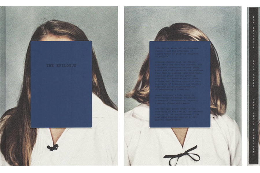
Christian Boltanski, Laia Abril and Yury Toroptsov all delve into the idea of memory, seeking a way in which they can capture and meaningfully discover the rawness of an image and what it can represent. I took a considerable amount of influence from Laia Abril’s photo book ‘The Epilogue’, her scientific approach to the displaying of a young girl’s life and death is both moving and in depth. She thoughtfully inspires the ideas of a wasted life, an innocent women taken to early and the suffering the family must feel. The viewer becomes emotionally awakened by the tragic narrative. For there is no escaping the feeling of missing a cherished one. There appears to be no cure except for time, time is what has made the scar of Cammy’s life less painful to manage. Similarly, Yury Toroptsov toys with the concept of photographing the invisible
Deconstructing a photo-book:
Deconstructing a photo-book:
The Epilogue- Laia Abril
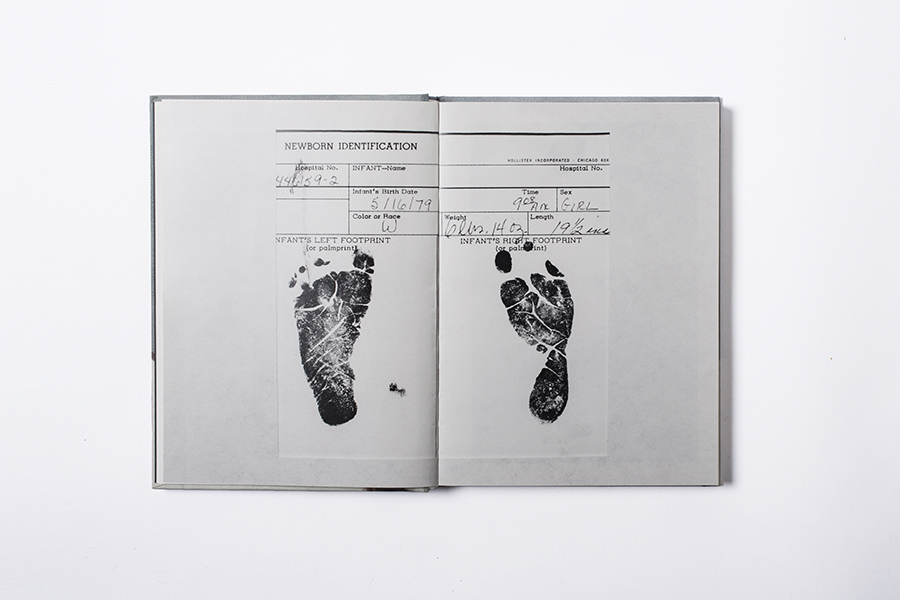
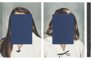
The Epilogue is designed in a scientific style, there is a variation of creativity for each section of the book. There is also a clear narrative followed throughout the book. The front page gives a hint to the story you are about to experience. The photograph on the front page is of the young woman when she was a child. A blue square is covering the child’s face with only the title across where her eyes would be, possibly suggesting her non-existence. The cover of the book is very simplistic which I think reflects the nature of the narrative, it is about a girl’s life and death. The project
Still Here- Lydia Goldblatt
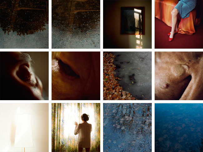
Lydia Goldblatt takes a less scientific approach and more a poetic and philosophical approach to the concept of memory. A great deal of the images featured in the book are either close ups or landscapes. The photographs are very detailed and personal, there isn’t much distance both physically and emotionally between the photographer and subject.
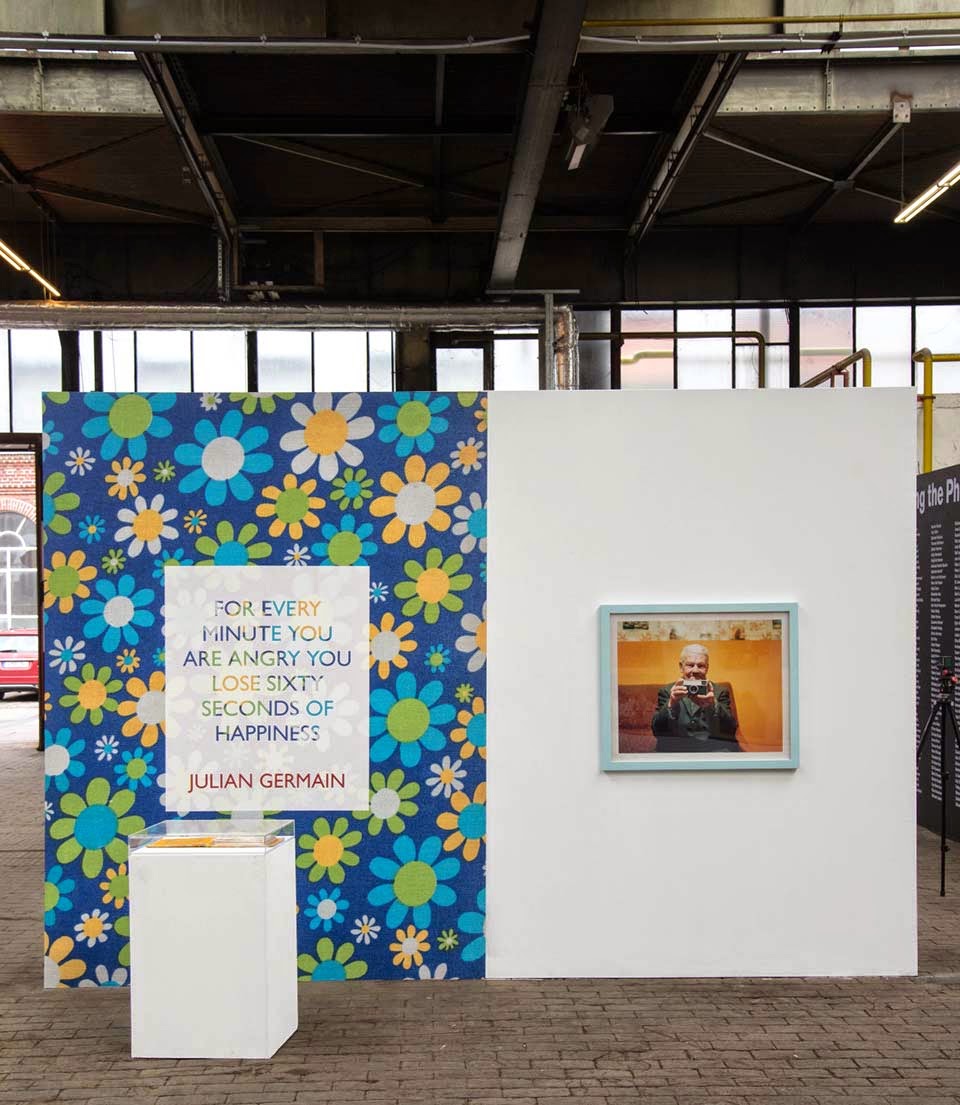
Julian Germain- For every minute you are angry you lose sixty seconds of happiness
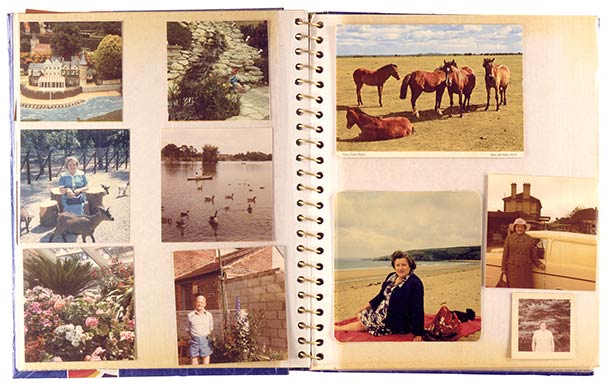
Julian Germain uses a great deal of archival images throughout the project. The design of the book reflects a scrap book or home album sort of style, it is much more casual and relatable than the other two photo books I have looked at.
Main Influence: Rita Puig-Serra Costa
Rita Puig-Serra Costa is a spanish photographer who works in the publishing Terranova in Barcelona. After studying Humanities and an MA in Comparative Literature , she studied Graphic Design and Photography at IDEP in the CFD and Observatory .
Most memorably, her book ‘Where Mimosa Bloom’ deals with the grief she suffered following the death of her mother, Where Mimosa Bloom takes the form of an extended farewell letter; with photography skillfully used to present a visual eulogy or panegyric. This grief memoir about the loss of her mother is part meditative photo essay, part family biography and part personal message to her mother. These elements combine to form a fascinating and intriguing discourse on love, loss and sorrow. Rita’s connections with her family reflect a deeply personal insight into the life of herself, her relatives and her beloved mother who it mirrored throughout her photo book.

Rita’s Style
Rita’s fundamental idea of taking a detailed, vivid portraits and placing it on one side of the page, to then mirror an object reflecting that persons character is idyllic, it reflects a clear idea of personality and connection, making the reader instantly catch on to her family traits and commodities. Using objects of memorabilia and substance tells an abstract narrative for the receiver, they are invited in to celebrate the fortunes of those related to Rita’s mother.
Here is a link to Costa’s online E-Book of ‘Where Mimosa Bloom’: http://www.phasesmag.com/rita-puig-serra-costa/where-mimosa-bloom/#s-12
An article from ‘photo-eye’ indicates that:
“There aren’t any words on the book’s cover, just a detail of a faded snapshot of Puig-Serra Costa as a girl in her family’s light-dappled garden. This could indicate that it’s a book of photographs, but its intimate size is more akin to a literary work.”
Here is the link to the photo-eye article: http://blog.photoeye.com/2015/02/book-review-where-mimosa-bloom.html
Daniel Smith, the reviewer, continues to mention how Costa’s work revolves concisely around the themes of ‘memory’ and ‘transition’, fitting in nicely with the themes of my project. Rita’s work is highly symbolic, the mention of the dried tree at the beginning of the book, a still life of a dried mimosa branch from the same tree does appear later in the book, an indication, like title itself, of the tree’s symbolism. Puig-Serra Costa combined these and other images with memorabilia to create a lyrical visual elegy to her mother, Yolanda Costa Rico (1959-2008).

My Interpretation of Costa:
Hypothesis of overall Personal Study
Objectives:
- Establish coherent and sustainable links between your own practical work with that of historical and contemporary reference.
- Show evidence for an on-going critical and analytical review of your investigation – both your written essay and own practical work in response to research and analysis.
Hypothesis: Possible questions to investigate
Within my personal study, there is evidence of various techniques. These include: Portraiture, Documentation, Landscape, Abstraction and Reflections on Photography (themes of Aesthetics, Codes, Truth, Seeing, Looking)
Questions to consider concluding my overall hypothesis:
Portraiture
Does a portrait tell us more about the person portrayed or the photographer?
Here is a link to an interesting article by Canon, who released a project directed to the relationship between the camera and the person.
Canon Experiment Article – http://petapixel.com/2015/11/04/6-photographers-asked-to-shoot-portraits-of-1-man-with-a-twist/
After reading this article, I strongly believe that a portrait can be re-represented in any way. The photographer is the pivitol force within a photo-shoot. Emphasis to strong stereotyping and styles are reflected throughout the article, but with persuasion photographers perceive an image in a different way, therefore reflecting the photographer more.
Can personality and identity be expressed in a portrait?
Visual Arts –
- Portraits contain clues about the people pictured in them that can tell us things about the subjects’ cultures, identities, traditions, and roles in society.
- Portraits can express how people think about themselves and their world.
- Portraits can include symbols that reference interesting aspects of the people in them.
- When creating a portrait, an artist makes many artistic choices that affect how we understand the image.
- Artists make choices about media, style, background, and embellishments to visually describe themselves or others
What are the differences/ similarities in a formal or informal approach to portrait photography?
What makes an iconic Photograph?
What are the Influences of the Old Masters and other painters on modern photographic portraiture?
What are the key elements if Portraiture and Intimacy?
How Can Photography reflect inner emotions such as fear and isolation?
Documentary and Street photography:
Is it possible for photography to capture moments in time objectively and truthfully?
Examining the documentary aesthetics: A photograph should not be manipulated, so that its authenticity, veracity and sense of realism can be maintained?
What is the relationship between photography and realism?
How can photography bear witness to the ways of life and events of the world?
What is the relationship between Henri Cartier-Bresson’s theory of the ‘decisive moment’ and subjectivity?
What are the intentions of Voyeurism and the nature of observation and intervention in documentary photography?
Landscape photography
Issues in Landscape Photography: Romantic or idyllic representation of nature vs culture and the man-made world.
What is beauty in landscape photography?
How does people control, interact and construct the environment in which they live?
In what way has the work of Ansel Adams influenced Joe Cornish?
To what extent could the work of Ansel Adams be considered spiritual?
What is the Meaning behind William Eggleston?
How Is William Eggleston At War With The Obvious?
What was so different about the ‘New Topography’ exhibition in 1975?
Two Photographers, One Aim: Preserving nature. Looking at the different approaches to landscape photography between Ansel Adams and Robert Adams.
Abstraction:
Two photographers, one aim: Looking at the different approaches to abstract photography between Eliot Porter and Aaron Siskind.
In what way can abstraction make visible what is invisible in the natural and urban landscape?
Reflections on Photography; Aesthetics, Codes, Truth, Seeing, Looking
Examining the documentary aesthetics: A photograph should not be manipulated, so that its authenticity, veracity and sense of realism can be maintained?
Analysis: The Epilogue
Although this image is simple, it poetically and beautifully symbolises the individual’s beginning of life. It represents the starting of life with the optimism and happiness her parents would of felt having their little girl in the world. It makes me think of the hopefulness and expectations her parents may have had for her and the wishes they had desired. It is an exceptional opening piece, which Abril has chosen intelligently with insightfulness and care. I want to begin my project in a similar way because I think it gives rise to a very powerful message. This image could of been either taken as a photograph or scanned into the computer. It depends what effect the photographer wants to achieve. I have similar images for my own project for example, I have my grandfather’s passport which signifies his existence and makes it official that he was alive. Therefore, I think it is similar to a birth certificate. I also have his will and eulogy which are also significant items in his life, his will was written on a scrap piece of paper in his hand writing and had mistakes crossed out throughout it. I think this example is a perfect reflection of the man he was. He didn’t want to complicate life, he took it as it came and always tried to make the best out of something. The image some how seems to make sense of the chaos of memory.
‘She was an awesome older sister, she was caring, she understood her role, she was supposed to protect me’ … childhood photo of Tommy Robinson with his sister Cammy in The Epilogue. Photograph: Laia Abril
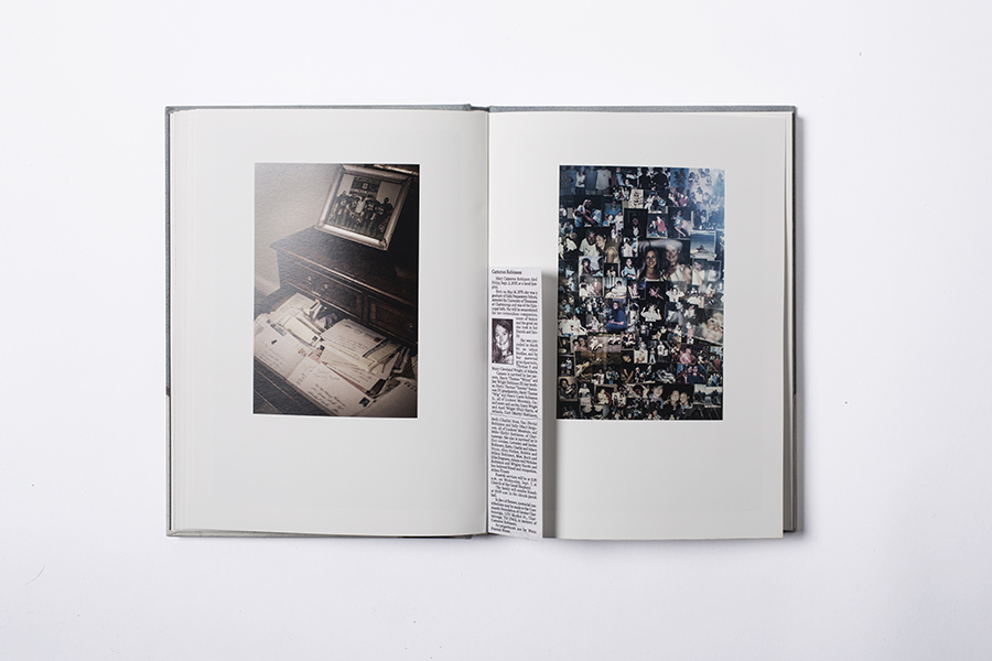
Memorial collage of photos of Cammy, which is in the living room of the Robinson’s house. Photograph: Laia Abril
Hundreds of letters of condolence for the Robinson family. Photograph: Laia Abril
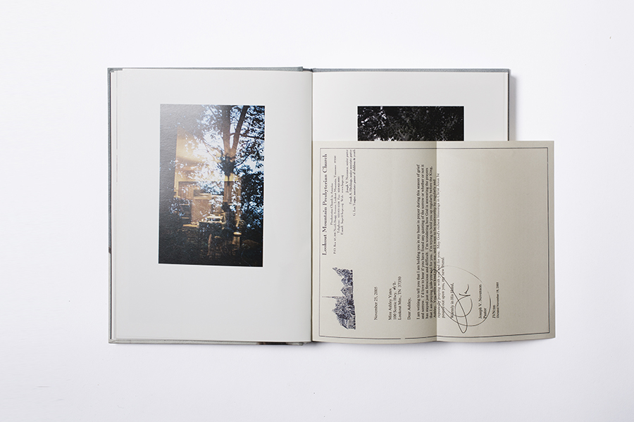
This particular page includes an extract of a new paper, I like how Abril has decided to have personal readings, letters or clippings in the project. It brings the individual’s experiences to life and helps the audience to understand the type of person she once was. The book is also more interactional and allows the person who views it to be more involved. These pages also include a sort of collage of photographs of the girl’s life, I think it would be interesting it I created a similar one of the archival images from my grandfather’s life. There is also an image of a set of draws with a photograph in a frame on top and lots of letters in the first draw. There is no definite interpretation of what is in this image but it comes across as very personal. It has a very vintage and traditional sense as well.
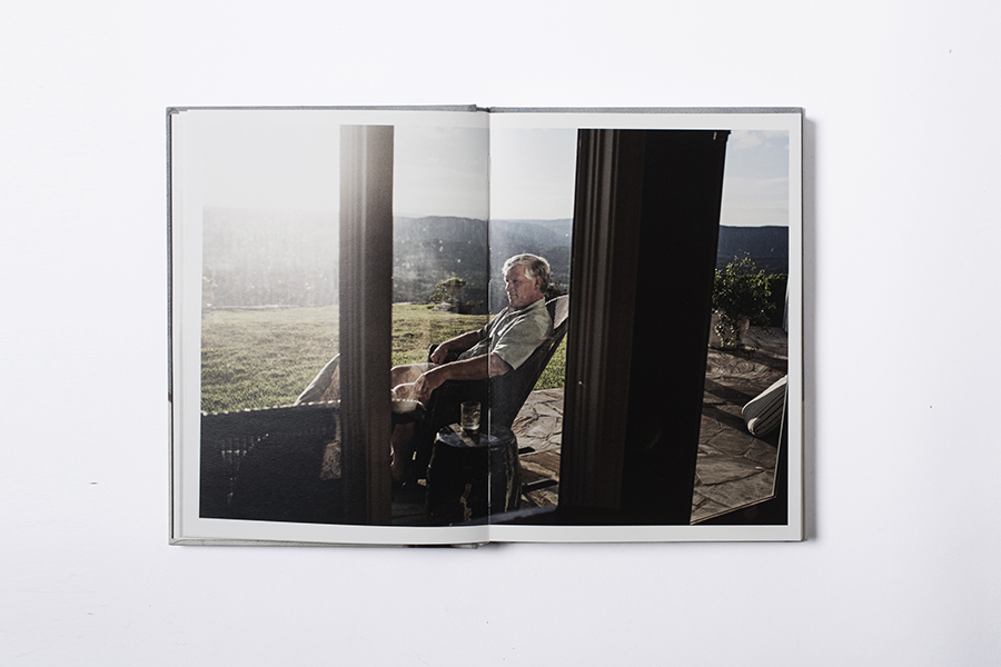
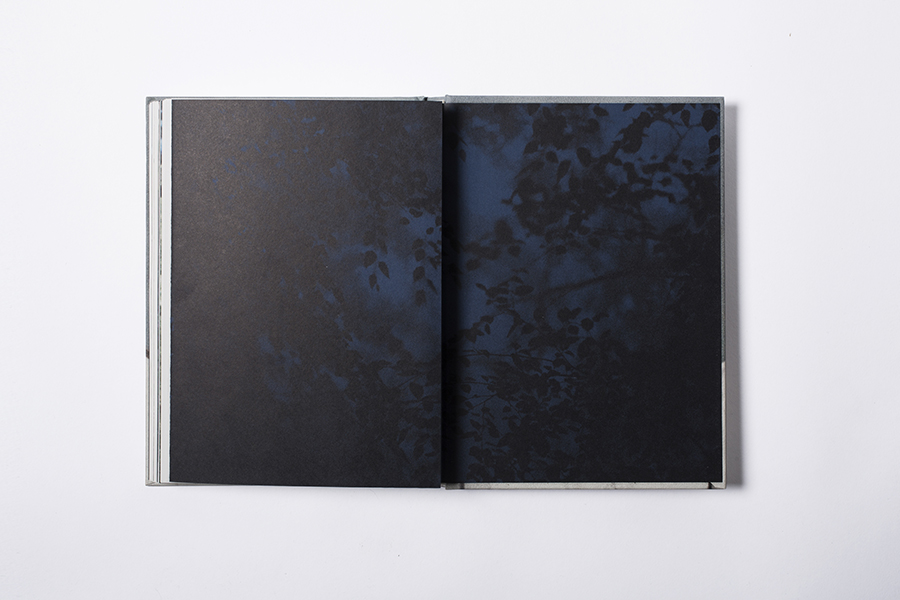
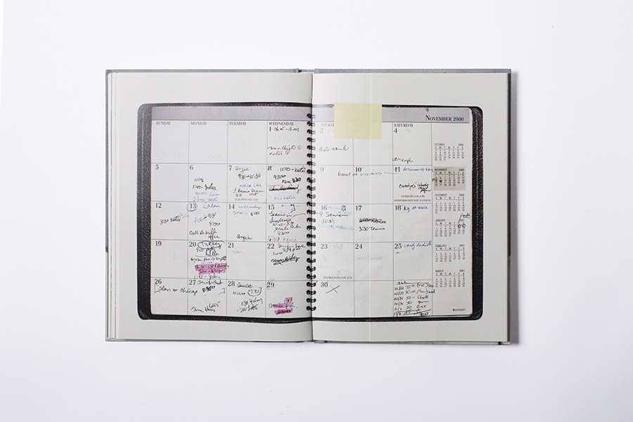
This is one of my favourite images from the project ‘The Epilogue’. I think I like it so much because it is unusual but very clever. It shows the individual’s diary before they died. The photograph evokes a sense of recognition and shows the girl was just another person living their daily lives but had hidden struggles. There are letters, diaries, agenda books, medical records and the death certiifcate included in the book. There are also photographs of family members and friends, houses, locations and objects. Abril also spoke to lots of family members and friends in order to understand and grasp Cammy’s life, what they told Abril can be read in the book too. I like this particular aspect because it allows words to translate something a photograph cannot. For the words from someone grieving are far more powerful than an outsiders artistic interpretation. Hearing first hand about the individual can provide priceless and hearty information which the photographer cannot possibly know.
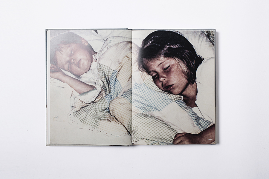
This particular image shows the individual as a young girl when she was innocent and free of worries and obsessions. It shows her sleeping and being peaceful which I think contradicts the other images in the book because it brings about a sense of happiness and honesty. It is an archival image therefore has history and meaning to it. There is an essence of the past in this image, because the photograph itself has stayed with the family since it was taken. It gives it a sense of importance and uniqueness.
GREEK SCULPTURES
James Davidson
Davidson went to a new exhibition of the body in Greek art called the ‘Naked ambition’ in this he noticed that the male nude sculptures and nudity have become normal to us over the past 2,500 years, and it is what we expect from ancient statues. Most statues are ignored when going around a museum for example and people do not tend to focus on them as art pieces, or look at the muscular figures of the Greek sculptures. ‘Ancient statues are looked at and not seen’. When noticing the Greek statues Davidson said there is something which all seem to have, he said that the statues reveal a ‘ superb imperial torso that would not disgrace the cover of Men’s Health magazine. I think that this shows how even since 300 BC when human sculptures were formed, there was still an idea of the ‘perfect male’ and how men had to have a perfect torso to make them attractive. The ‘Greek nude’ which Davidson addresses is to do with nudity in practice, Greek homosexuality, a passion for gymnasium and athletics. One concept which Davidson also relates to seems to be the idea of body building, ‘ Nudity was a kind of costume, an idea enhanced by the fact that much time seems to have been spent oiling oneself up and scraping oneself down.’ I think that this implies the idea of bodybuilding and how men choose to make them self look as muscly as possible by using other factors such as oil to make their personal aesthetics appear greater, i.e. to make the bodybuilders more muscly on stage in a competition.


‘Often cited as an example of balance and geometry, but the abstracted albeit beautiful classical head contrasts with the straining toes in balance not just of weight but of realism against idealism.’http://www.theguardian.com/artanddesign/2015/mar/20/naked-ambition-why-the-greeks-first-stripped-nude

Throughout this review in the newspaper Davidson covers the Greek male statues and why we are not concerned by their nakedness, and says that we are so use to seeing these Greek statues with no clothes on that we have come accustomed to it, and it does not surprise us as it use to in 300 BC. These masculine figures are covered from head to toe in muscles, and have amazing torsos, and Davidson questions whether this is why nowadays males are so concerned with getting the ‘perfect’ male body, which includes these masculine aesthetics.


Faith, Family, Community Photo book
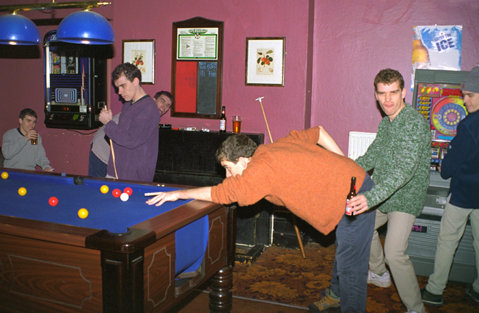
For the Faith, Family, Community project I have been going to events to take lots of images over Christmas. When I started looking through the images I had taken, I then thought about looking into my own personal archive of work, to see what images I have already taken in the past which show communities families and friends (as I haven’t yet taken any images focusing on religion). Although not all the images have been taken in the same style as I would like, I am still going to keep them in consideration for my Photo book.
The photos I have collected vary from last year when the Chinese students from Ba Yi High School came to visit, to photos I have taken when I went to London and images I took for other projects.
Hopefully some of these photos will be of use for my Photo book, and will give a greater set of gatherings.
Paul M Smith – Alistair Hayman
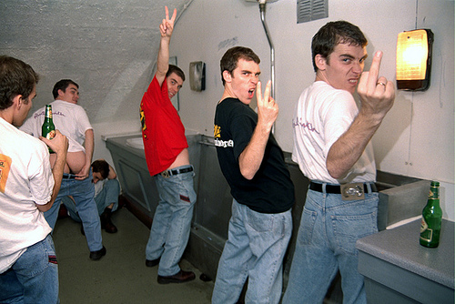
Smith originally studied Fine Art, between 1991 and 1995 at Coventry University and as part of his course he undertook a research project into contemporary art which included living on an Aboriginal reserve for four months. After completing his degree at Coventry he completed a Masters degree in Photography at the Royal College of Art. During this time he examined the meaning and construction of masculinity, concentrating on the cultural and visual creation of various alpha male identities.Most of Paul Smith’s photography depicts scenes from British male culture. There’s a cartoonish, theatrical element to it enhanced by the fact that all the men in each set of themed work are the same man, created through the tricks of digital photography.
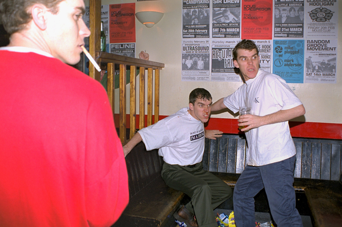
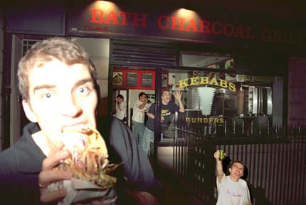
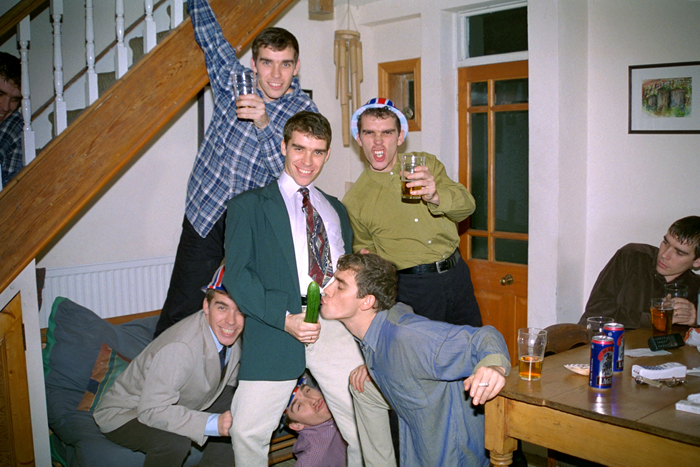
In another series of photographs, the project on which has inspired me to create my photo boo., Make My Night, Smith depicts the excesses of a boy’s night out. In one, set in a pub, a man sits at a table cluttered with empty beer glasses, in front of a dart board, with a condom pulled down over his face down to his upper lip. Next to him, another man clutching a beer laughing while on the other side another man aims a lit cigarette at the tip of the condom. Of course, all three men are the same man, presumably Smith himself. In the next image, the boys are back at someone’s house, posing for the camera. The central figure holds a cucumber out from his crotch, leaning backwards, while another man, cigarette in one hand, kneels down and theatrically puckers up kissing the cucumber. Behind them, one man stands on a couch, clutching his beer, smiling at the camera and another man grimaces at the camera, wearing a union jack plastic hat. The fact that all these men are the same man is more striking in this image, making it both funny and disorienting.
Some of this has echoes of the work of Martin Parr, the documentarian of British life shot in garish colors. the drunken excesses of night life, the exercises of army troops, the crowd dynamics of soccer games, or the action hero of the movies. But Smith’s work is consciously artistic in its manipulation of the image, and the extremely posed nature of every shot. He is showing some of the stereotypes of masculinity, examining them with a sense of fun and explicit nature.


