All posts by Shannon O'Donnell

I am an A Level student currently studying at Hautlieu School. My subjects include, Media Studies, Photography and History. My blog includes updates of my current work in both media and photography where I am able to show research, planning and experimentation. I update this blog weekly with different posts relating to my subject topics.

Filters

Author:
Category:

Atlantus – Jersey and New Jersey

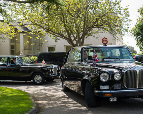
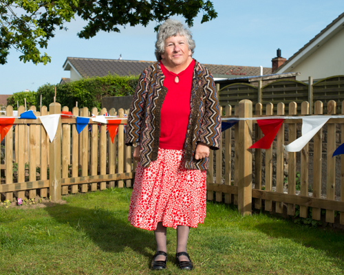
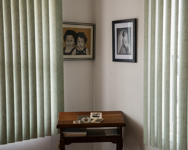
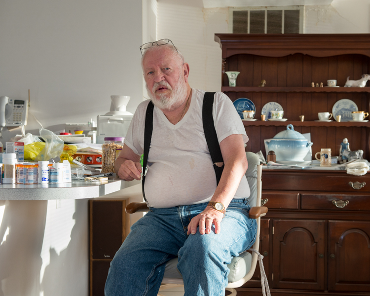
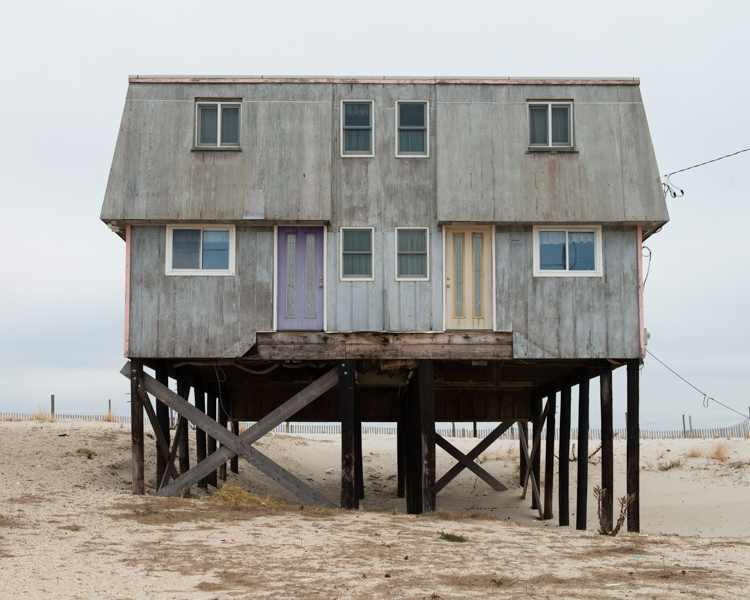
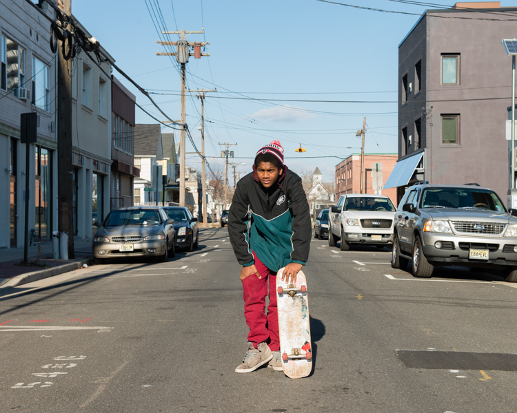
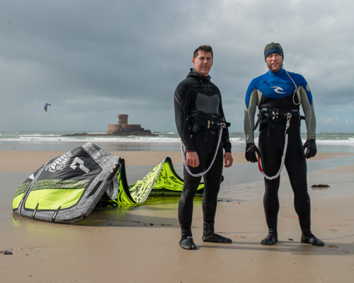
Martin Toft and Gareth Syvret came together at the Jersey photo archive and decided to embark on a project comparing and contrasting the similarities and differences with Jersey and New Jersey. New Jersey was actually named after the small island of Jersey when a British man named James who visited Jersey and was warmly welcomed and treated as an honoured guest before moving to France. The Governor of Jersey at the time was called Sir George Carteret and James wanted to honour him when he found the colony and decided to name the State New Jersey. Toft’s project explores the idea of how two places on the opposite side of the Atlantic ocean perceive each other within archives and cultural memory. I like the idea of this project because I feel that not many people from New Jersey know the origin of its name and don’t even know that Jersey exists. Toft decided to do this as there has been no archival evidence of the link between Jersey and New Jersey.

“I must admit…I prefer the winter to summer on the Jersey Shore…quiet, cold, friendly.” – Martin Toft

Instead of creating one large exhibition with framed and printed photographs Toft and the Societe Jersey decided to create a newspaper that would be sent out to different places in the world where spectators could create their own exhibitions wherever they are. To make an exhibition you would need two copies on the newspaper. This newspaper was created by a professional company in order to get it to the highest of quality and so that it would work all spread out. I think that this is more interesting than a regular exhibition as the spectator is able to read it as a newspaper with all of the text and then they are able to make a small exhibition themselves and being able to see the photographers larger. The newspaper is more of a DIY concept allowing spectators to piece everything together themselves. There were 3,000 copies of the newspaper printed and were sent out to different places in the world including schools in New Jersey. This newspaper will be put into the archive as a part of Jersey history and in hundreds of years to come spectators will be able to look at this newspaper and see the link between the two and how possibly different that link will be in the future.

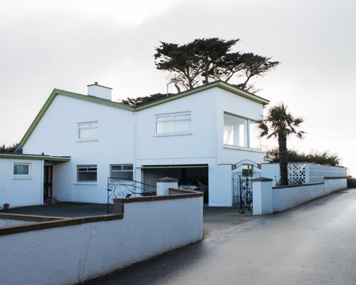
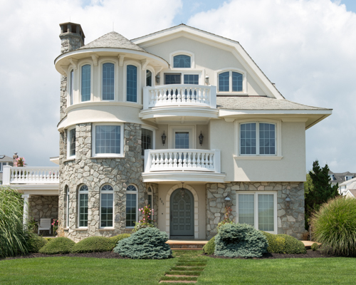
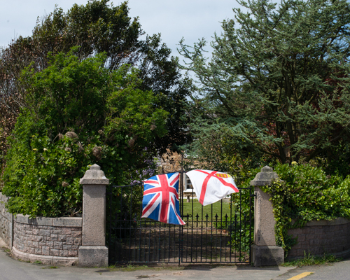
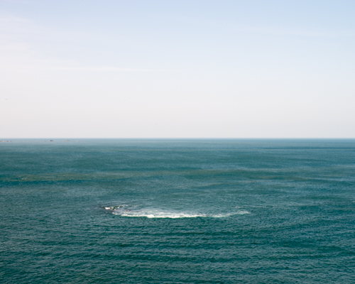
Toft explored many different places around Jersey and went to St. Ouens manner were Sir George Carteret lived. It is an 11th century castle. Toft’s project focuses on the West Coast of Jersey facing America and the East Coast of New Jersey that faces Jersey through the Atlantic ocean. Through visits to and from New Jersey and Jersey Toft discovered that Jersey was much more rural whereas New Jersey is a lot more urbanised. They seem to be binary opposites to one another. Toft successfully shows the political, social and economic difference between Jersey and New Jersey including the people, landscapes, industries and identities. The Atlantus Project makes connections with memories, the archives and photographs two lands on opposite sides of the Atlantic ocean.

Toft’s website: http://martintoft.com

Archisle page: http://www.archisle.org.je/category/projects/jersey-new-jersey/

Atlantus newspaper:

How are they similar and how do they differ?

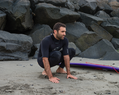
I like to compare images from Jersey and New Jersey to compare and contrast them. Looking at the two images above I can see how the two aren’t so different in that they are both facing the ocean, obviously Jersey is an island and totally surrounded by the ocean whereas New Jersey is facing the Atlantic ocean on one side. I think that we can identify the two together through the love of surfing and how surfing often brings people together. I like that these images show the similarities within the beaches of both Jersey and New Jersey and how they can be brought together this way. I particularly like the New Jersey image here as the surfer looks as if he is getting ready to go when Toft approached him to make a photograph and she almost looks very natural and as if was already positioned there.

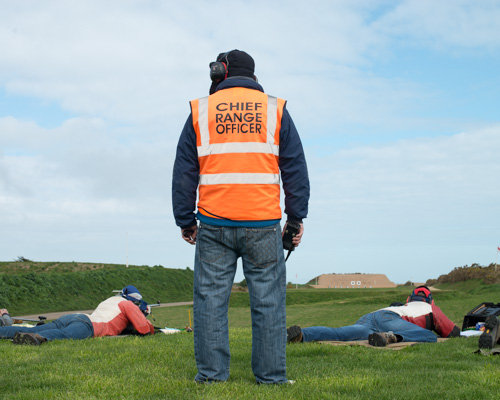
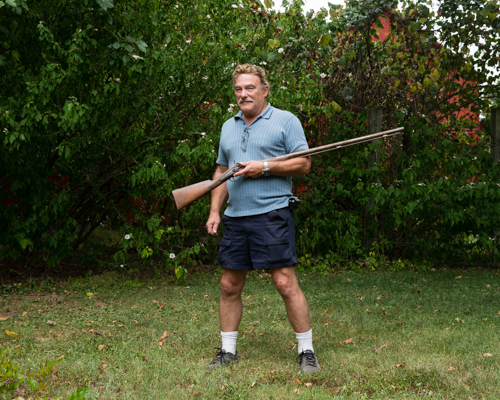
These two images really stood out to me and I wanted to put them beside each other because I wanted to see the difference between the way the channel islands deal with guns and the way America deals with them. I really do think that America has a gun problem with mass killings every single month. The image to the right shows a New Jersey man holding his riffle gun in his back garden so casually. In America guns are allowed and people seem to be able to get licenses so easily. Unlike, Jersey Channel Islands were you must be in a club to get access to a gun. This is obviously more expensive and organised with officials and people there to take care of the guns in a safe environment where they are only able to shoot at objects that are prepositioned and ready for them. I find this so interesting as there is a ‘Chief Range Officer’ watching over all of the people on the shooting range in the Channel Islands whereas in America they just have them in their homes with no one there to ensure safety. I think it is so crazy to see these photos side-by-side because of how different they are. The people of America can so easily access guns and carry them around anywhere they please in contrast to the Channel Islands were you must be watched over and stay within the grounds of the actual riffle club.

Atlantus Archive gallery: http://www.archisle.org.je/category/jersey-new-jersey/

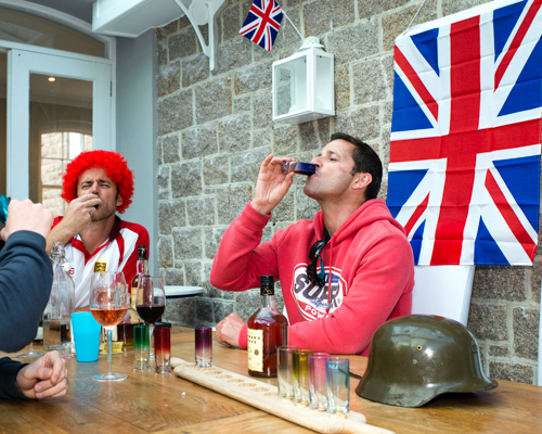
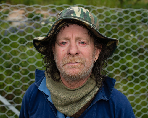
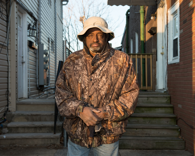
For some reason I love putting these two images beside each other. I think I decided to do this because they were both wearing similar hats. I find this interesting because they are two completely different men with completely different backgrounds, the American being a Vietnam veteran and the British [Jersey Bean] being a semi-retired fisherman. The fisherman wears a camouflage hat while the Vietnam veteran wears a camouflage jacket. It is weird to think that camouflage has transitioned from being a way of blending in with the environment to actually becoming a fashion statement, not that the fisherman is making a fashion statement. I think both men will use the camouflage pattern to blend with their environment but more likely the war veteran would use it more effectively. I like these two images as the spectator is able to look at the two men and see two completely different and unique stories.

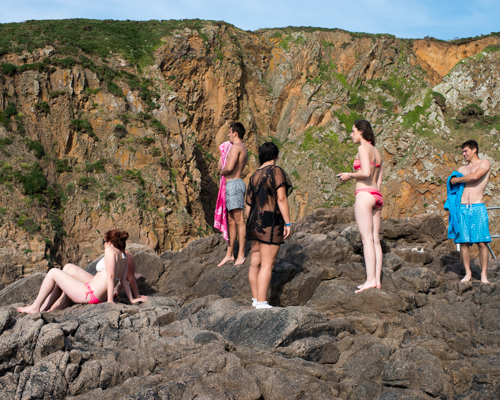
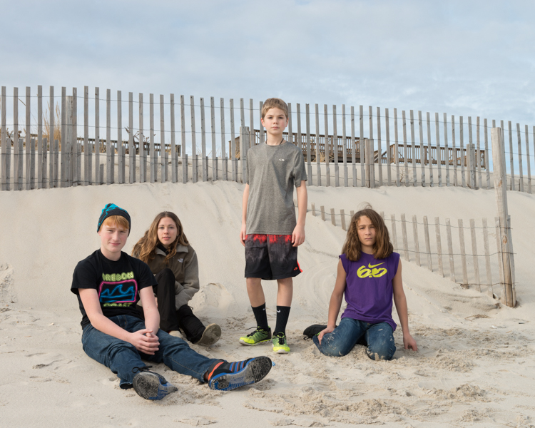
These two images are similar in that they are both on beaches. The different is that the American teens look as if they are just chilling and hanging out as it seems to be getting cooler, possibly getting later in the day. Compared to the Channel Islands photo which seems to be midday and all of the teens have just been out for a swim. These images differ in the youths and just the groups of people that are hanging out on the beaches. I like these images as they show different communities in two different places and environments.
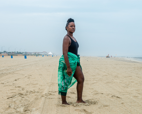
New Jersey, United State of America

This is my absolute favourite image of the entire project. There is just something about it that I really like, it is easy to look at and the subject is very interesting. I think the colours work really well in this image, with the green really standing out and flattering the skin tone of the subject. This woman is very beautiful and looks really good in this image, she is interesting making the spectator want to know a little bit more about her. I think that the composition of this photograph is great as she is directly in the centre making her the key subject. I think that the green and the colour of her skin really makes her stand out against the light sand and the light blue cloudy sky which is really effective and draws the spectators attention to her. I don’t really have a main reason for liking this image apart from the fact that it is just very interesting to me and I enjoy looking at it and trying to find out more and more about the subject and the plain environment surrounding her.

Overall, I think that the Atlantus project successfully shows the links that Jersey has with New Jersey and how their communities vary in similarities and differences. It is interesting to see the historical links between the two as well and how Jersey actually has a State in America named after it even though it is such a small island. I really like this project as it allows more people to learn more about the Channel Islands as I feel not a lot of people in New Jersey and around the world even know that it exists.

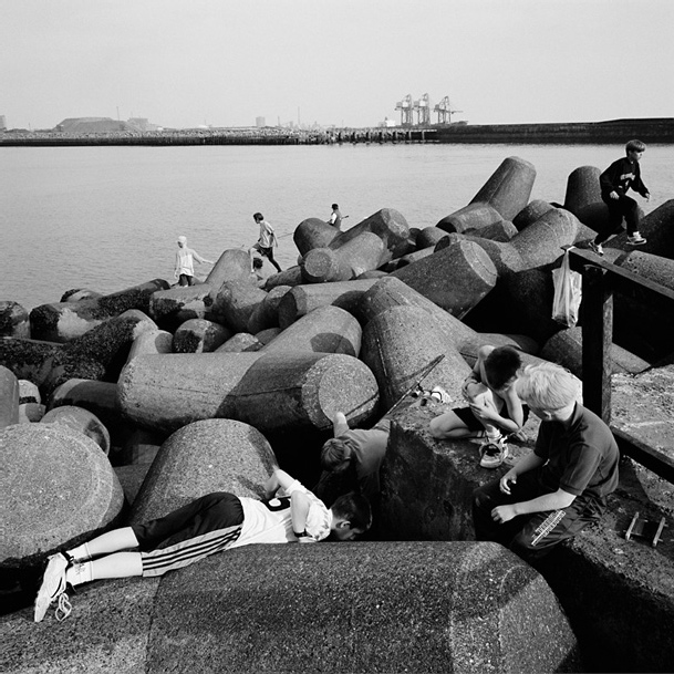
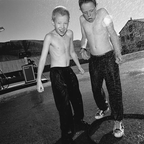
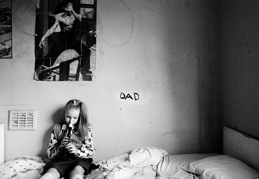
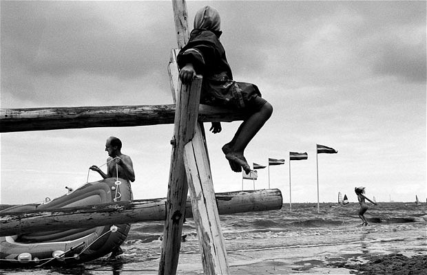
Community Photographer: Mark Power

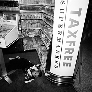
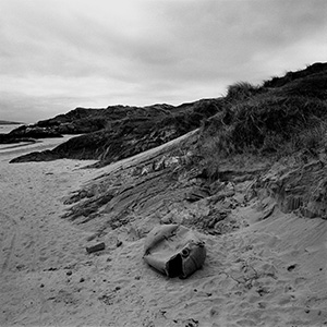
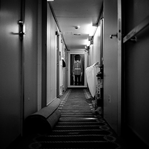
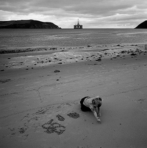
Mark Power in an English photographer born in Harpenden, England 1959. He is a Professor of Photography in The Faculty of Arts and Architecture at the University of Brighton. Power embarked on creating The Shipping Forecast between the years of 1992 and 1996. This project involved travelling to and photographing all 31 areas covered by the Shipping Forecast broadcast on BBC Radio 4. I like that this work is very specific and structured so Power knows exactly where he is going to be making his photographs. This particular project was published as a book and was a touring exhibition across the UK and France. Power drove around in a car for the entire project taking inspiration of works from Tony Ray-Jones.

Mark Power [1959 - present]
Mark Power [1959 – present]
Tony Ray-Jones

Tony Ray-Jones was an English photographer who inspired Power. He died in 1972 at only age 30. Ray-Jones was a documentary photographer who took interest in photographing the way of the British and wanted to delve into this more in depth. He wanted to look at his own society in a new way by using irony, compassion, nostalgia and humour. He became hugely influential on the development of British documentary photography from the 1970s through to the present.

“My aim is to communicate something of the spirit and the mentality of the English, their habits and their way of life, the ironies that exist in the way they do things, partly through their traditions and partly through the nature of their environment and their mentality.” – Tony Ray-Jones

Power’ Magnum portfolio: http://www.magnumphotos.com/C.aspx?VP3=CMS3&VF=MAGO31_10_VForm&ERID=24KL535BZY

Power’s website: http://www.markpower.co.uk

Mark Power photography

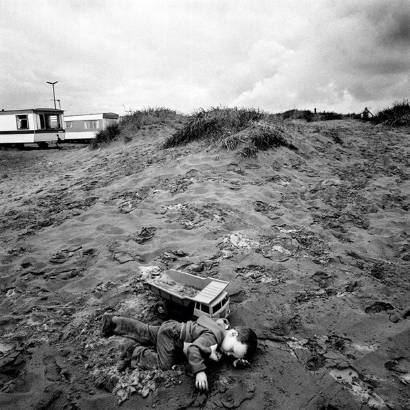
I particularly like this photograph with the small boy lung down on the beach seemingly tired. It looks as if he is fiddling with the sand instead of playing with the digger toy next to him. The spectator is able to see that this young boy is getting tired and just wants to chill out so he decided to lye on the sand and just wait for his parents to come and get him to go home. I like this image because it is simple. The subject is what the spectators eyes will be drawn to straight away as he is the only object around other than the sand and the background beach houses. This image is from the series The Shipping Forecast and mainly based on the beaches of each weather forecast location covered by BBC Radio 4.

Interview with Mark Power: 

https://www.youtube.com/watch?v=eRObYFKELY4

Mark Power photography

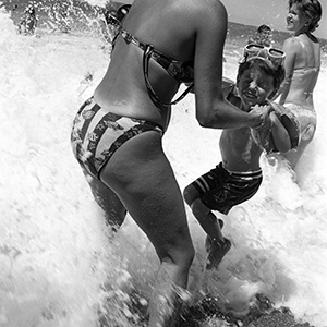
Another image that I like is the one above because it really is a candid action shot. It brings in some nostalgia for me of when I was younger and when my parents used to have to lift me up from the waves coming for me when I was too small to stand against them myself. I really like this image as it does bring back some funny memories with my family. It is an image that I think a lot, if not everyone, can relate to at some point or other in their lives. It is such a simple image but holds so many memories and good times. The subjects in this image don’t necessarily matter, it is more about what they are doing and what the image is bringing to the spectator. The wave looks so huge compared to the little boy who would defiantly been taken under by it yet it in comparison to the woman holding him the wave doesn’t seem so big, it looks a lot smaller and less intimidating. The wave does look very powerful in this image and that it could knock the both of them down. I also like the woman in the background who doesn’t look phased at all by the wave as she just seems to be walking straight through it. This image shows many different emotions with the small boy looking scared/worried and the woman in the background looking chilled out and not bothered. This image reminds me of all the times as a young child that I would overdramatise everything and that most things seemed like a big deal whereas now they become meaningless and are not to be dwelled on. That comes with age and maturity but I love that this image shows that, in a way. This is a great documentation of families on the beach and how usually people are. The woman doesn’t have her bikini strap on obviously she has been trying to tan and not get a paler line along her back from the straps when her son/possibly brother asked her to play in the water with him. The young boy is wearing armbands, learning how to swim and he also has goggles. This images makes me think of how when you were young you didn’t really care about anything, in the way you looked or the way people saw you but as you get older you tend to care a whole lot more about your image. I do really like this image as there is a lot going on and the spectator is able to access memories just by looking at this particular image.

The Shipping Forecast video: http://www.markpower.co.uk/Audio-Visual-Projects/The-Shipping-Forecast

The Shipping Forecast on Power’s website: http://www.markpower.co.uk/Photographic-projects/THE-SHIPPING-FORECAST

Community Photographer: Tom Wood

Tom Wood is a British community photographer. He was worked on photographing the working class in Liverpool for many years. Originally Wood was trained as a painter at the conceptually orientated Leicester Polytechic from 1973-1976. He first explored lens-based media through extensive viewing of experimental films. Wood’s approach to photography is more fluid than other current conventions of post-Conceptual photography and photojournalism. Wood works will colour negative film and has done so since 1976, using bother black and white and colour in different locations. This is interesting as a lot more photographers are going back to using film cameras instead of digital ones, especially documentary photographers in order to make the more real and raw images possible. Wood is currently working as a part time lecturer in photography at Coleg Llandrillo in north Wales and is 64 years old.

About Tom Wood Interview: http://paper-journal.com/tom-wood/

Men/Women series: https://www.lensculture.com/twood?modal=true&modal_type=project&modal_project_id=5351

I find the Men/Women series very interesting as it is a collaboration of all of Wood’s work and simply separated into two books, one filled with the images of men and the other of women. I find this concept interesting as to why he would separate the two by gender as a way of possibly showing the difference and the divisions within the two genders. I think that this would have been the easiest division for Wood to make as he made his photographs in the UK back when there weren’t many different people in cultures or religions etc. He basically made photographs of British people getting on with their everyday lives. I think that this is a really good way to document different communities and by going round photographing in the same  place a lot of the time he is getting familiar with the people that live around there making them a lot more comfortable with him being around them and making candid and staged photographs with him.

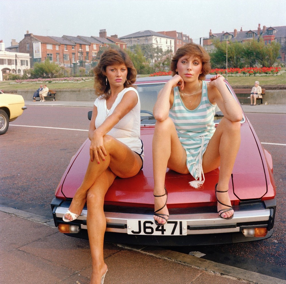
8863e5080df649869732f8db40b8bf31-largeFor some reason this image stood out for me and I love the way it looks. The two women are posing for the camera as they sit on the bonnet of their car. The pair are covering in makeup, wearing fake tan and wearing heels and massive earrings. I don’t have a particular reason for liking these images accept for the fact that it interests me and that there is a lot going on in it. The position of the two women is perfect and the facial expression almost suggests that they have a sassy attitude, they seem to enjoy posing for the camera. I like this image as well because of the entire background, the fashion and the way people were back when this photo was taken is completely different to how people are now. I just find that there is a lot going on in this image and spectators will have plenty to look at and interpret for themselves what they think is going on and who the subjects are. I like that this images shows older people in the background sitting on benches just enjoying the view compared to nowadays where so many people are constantly on their phones and laptops that they forget to look outside and just take a moment to relax without having to worry about their electronic devices.

I like the collection of Wood’s work as it is just great documentation of life in Britain from years ago and the community surrounding those people. I like to see this to compare and contrast my own community and how it may differ from these ones and how things have changed and how people are a lot different now. Even though these photos aren’t from too long ago, so much has changed and developed that we have become different beings.

Telegraph article on Wood: http://www.telegraph.co.uk/culture/culturepicturegalleries/9895436/Tom-Wood-Photographs-1973-2013.html

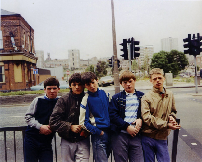
tom-wood-photographer_8-inspiration-influence-mood-board-ratcatcher-ramsay-www.lylybye.blogspot.com_Another image that I really like is the one above of a group of teenage boys. I find it interesting to see the on trend fashion back when this image was taken and how nowadays people are bringing this back as more of a vintage or retro look. I enjoy seeing these documentary images as it shows the kind of people living in that community and I can relate this to people I see now in my own community. This photo also reminds me a lot of the film Stand By Me with a bunch of boys who look similar to these ones and go on an adventure. The subjects are unconventional in that they are unlikely models but they seem to all look very good in front of the camera in the way that they are conveying the story. They look like a bunch of boys who were just hanging out in their local community when Wood approached them and asked to make a photograph of them. They’re just normal young boys having fun within their community and hanging out together, sharing their experiences. I think that I would like to explore more in depth the different teenage communities within our society and what they actually do in local places instead of seeing the negative things that minorities of teenagers do broadcast on the news and in newspapers. I like Wood’s work and find it very interesting and just great documentation of Britain in the past.

Community Photographer: John Divola

Divola is a contemporary American photographer, born 1949. He often takes landscape photographs in different areas of community and looking at the edge between the abstract and the specific. Divola doesn’t tend to use people in his images and will make photographs of the landscape that surrounds them instead. I like the idea of this as it shows the environments that are surrounding us that we can often ignore or not notice but when it becomes the subject matter we are able to completely focus in on the environment around us and share that environment with others. I find Divola’s concept interesting as through is images spectators are able to see different communities environments and are able to compare the differences with their own environment. This would also make some interesting documentary photographs as it is showing how we leave within modern day society.

John Divola self portrait

Divola’s website: http://www.divola.com

About Divola: http://www.getty.edu/art/collection/artists/3775/john-divola-american-born-1949/

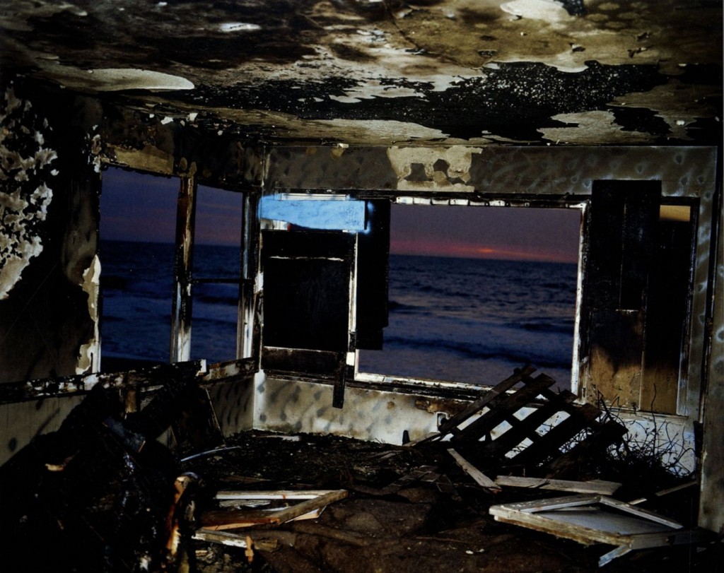
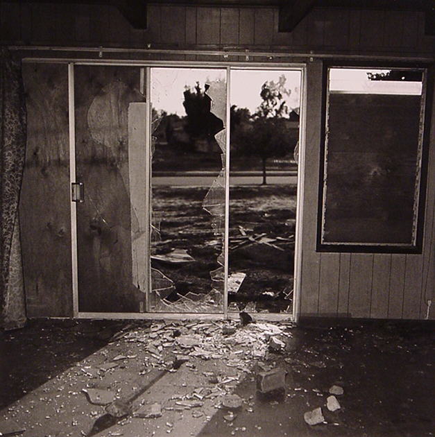
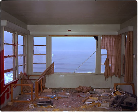
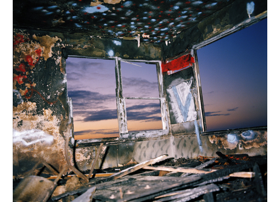
Something that I noticed in some of Divola’s photographs is that he makes images of the abandoned places within our community, the places that seem to have been forgotten and disregarded. I find this very interesting as it shows the more negative side of our community and how we are humans will just leave things to rot instead of actually trying to resurrect it and help make it better. I think that I will be able to respond these images in different locations around Jersey and think it will be a fun shoot to do as it is something we are all aware of but tend to ignore for no particular reason. I think that Divola’s work is quite unique for documentary photography in that he doesn’t use people to tell the story, the environment speaks for itself. His work is very abstract and to the point. I like that he doesn’t need to use any people to tell his story and that each of his images work as stand alone ones. They can come across as quite hard hitting with the state of the place he is in looks. Each images looks as if people have come in and destructively ruined this environment which shows the kind of people that are living within that community.

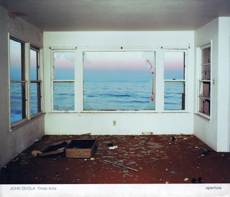
aperture-divola-three-acts1This particular image really interests me as it looks like a beach house with a beautiful view of the ocean and the sunset. I find that this image is beautifully lit as well as looking brutally destroyed. I enjoy looking at this image because of the background sunset. This photograph stood out to me initially because of the sunset but then I looked closer and saw all of the windows have been smashed with glass covering the floor and an old-fashioned suitcase sits open on the ground. This makes me intrigued as I wonder what went on in this environment and who could have possibly done this. One theory I have is that it was the ocean that thrashed against the glass breaking it as the glass is on the inside of the house. Another theory is that people came in and decided to wreck the place. I wonder why there is a suitcase there and that maybe someone living there just left it behind. There is so much going on in this image allowing the spectator to look around as if they are in the room and looking at the environment surrounding them. This image is part of the series called ‘Three Acts’. They are unique to any other documentary photos I’ve seen before and stand out to me as they the photos are not ones spectators would usually expect to see. This image is taken from the series photographed in a condemned neighbourhood bought by an airport to serve as a noise buffer for new runways. The buildings are all destroyed and Divola decided to make images as evidence of violent entries by vandals by shattering windows as well as doors torn from their hinges. After watching some videos of Divola I discovered that he was the one actually vandalising these houses and adding colour by using graffiti which is becoming a popular art nowadays.

“Once seen, the work of John Divola is not easily forgotten.” – David Campany

https://www.youtube.com/watch?v=rVHw8S_2Xqc

After watching the video above I had a closer look at Divola’s photographic art work and found that a lot of it I could relate to performance photography and the work of Tom Pope and John Baldessari capturing something midair and throwing things around and just capturing it. I also found out that Divola could only shoot those images at certain times of the day so that he could get the right lighting and that he would always revisit the same places and keep on going back to them adding different works of graffiti each time as well as noticing other vandals workings. I found this video very useful and interesting to find out more about Divola’s personal opinion and the message he was trying to get across. I enjoy looking at his work and think that if I was to respond to this I would more likely just visit certain places and photograph them every so often and not touch them to make it more authentic and not to vandalise any of these places any further.

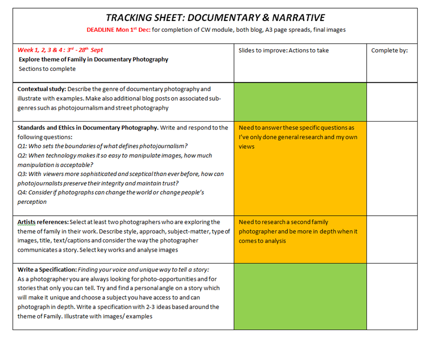
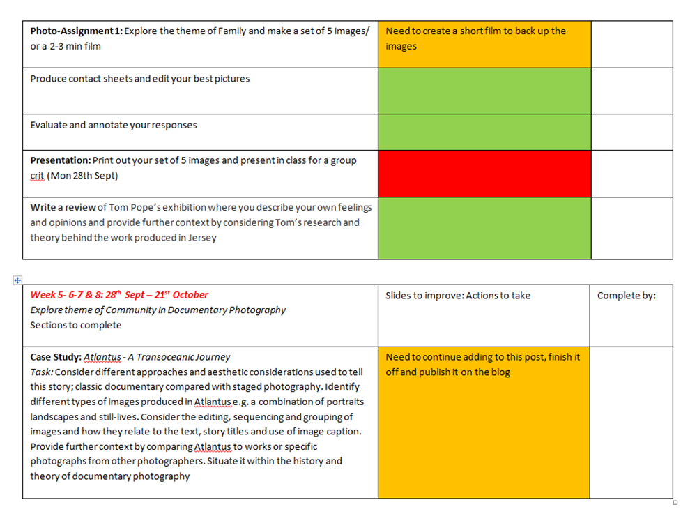
Tracking Sheet

Week 1
12th Oct – 16th Oct

  • this week I will make photographs of my family based around my niece, research another family photographer. Develop responses to Lewis, compare and contrast and evaluate in depth.
  • I will also be making tableaux photographs in response to Cindy Sherman’s work and a personal study of adopting the idea of documentary in a completely staged and more dramatic way [this will just be an extra shoot done to explore staged photography more].
  • Do research on Film Noir and look more in depth at Femme Fatales and try and find a way to form a radical representation of this, either conforming to the genre of a femme fatale or opposing it and making my own juxtaposition.

Week 2 
19th Oct – 23rd

  • carry on making images of niece, go visit them at her home on Thursday 22nd to get some real images of life with a small child.
  • Start storyboarding and making images of film noir inspired femme fatales. Experiment with lighting, make images at night time to make for a more mysterious atmosphere as well as keeping subject as key focus.
  • edit images from previous week [will edit as I go]

Week 3 [Half Term]
26th – 30th

  • continue to make Film Noir inspired images and add in some more responses to the work of feminist photographers including Cindy Sherman.
  • make more artist references on tableaux photographers and generate own meaning and come up with an interesting response and interpretation.
  • do community shoot with different groups of friends to show differences in teenage life
  • stay with sister and make images of niece throughout the day and night, follow them around for the day and throughout the night to show what life is really like as a first time mother and father.
  • use other models to be a part of shoots on feminism, society and film noir
  • start to make short film on chosen subject; family, community, faith or tableaux

Week 4 
2nd Nov – 6th Nov

  • edit all images from previous weeks and create sets of favourite images
  • further explore ideas if they are unfinished including feminism shoots and film noir shoots.
  • evaluate work and pick out favourite shoots and then best images from each of the shoots

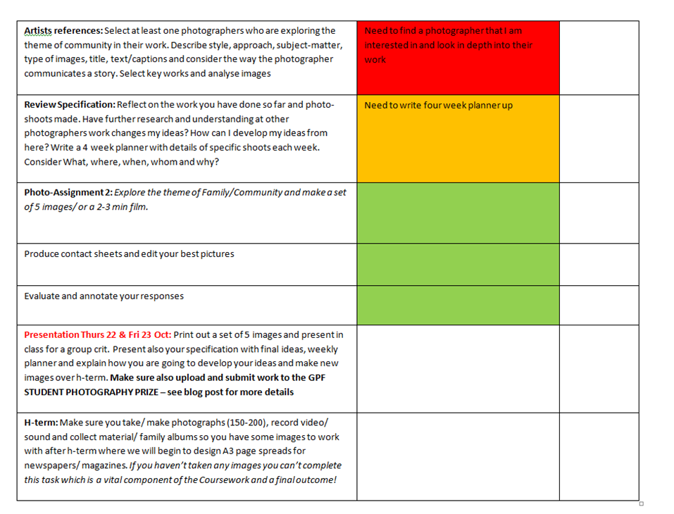
Tracking Sheet:

TRACKING-SHEET-H-TERM


My Shoot: A Day In Our Lives

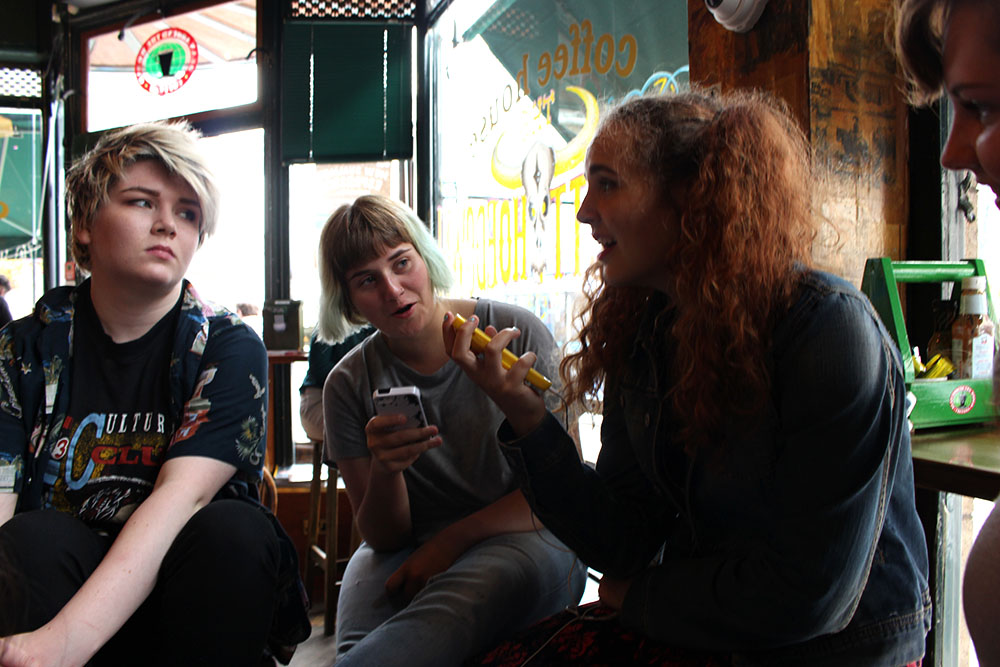
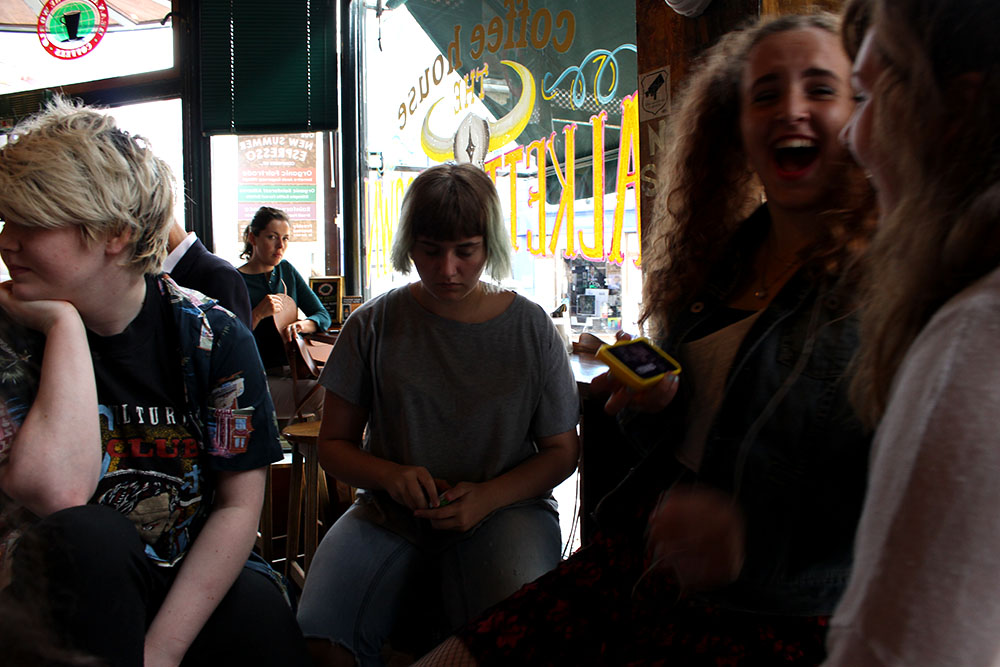
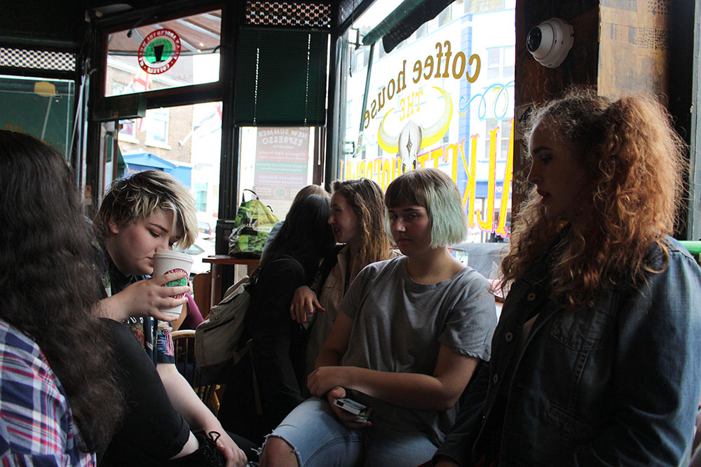
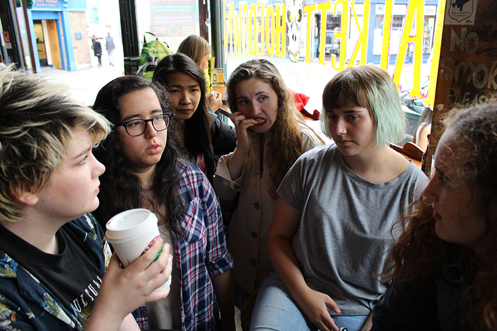
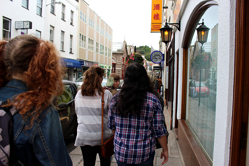
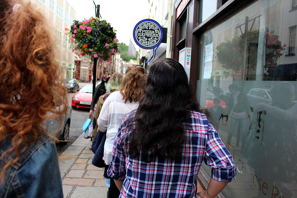
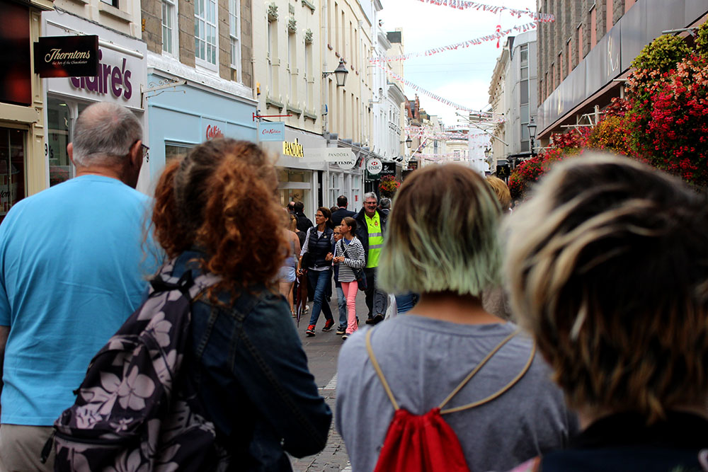
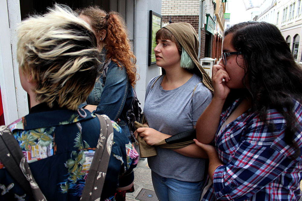
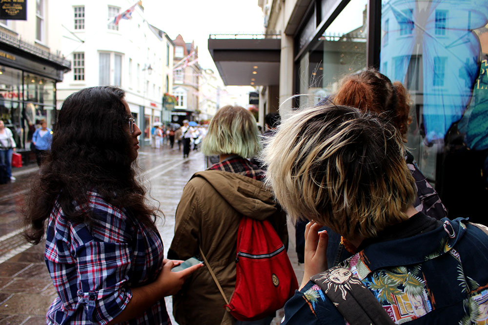
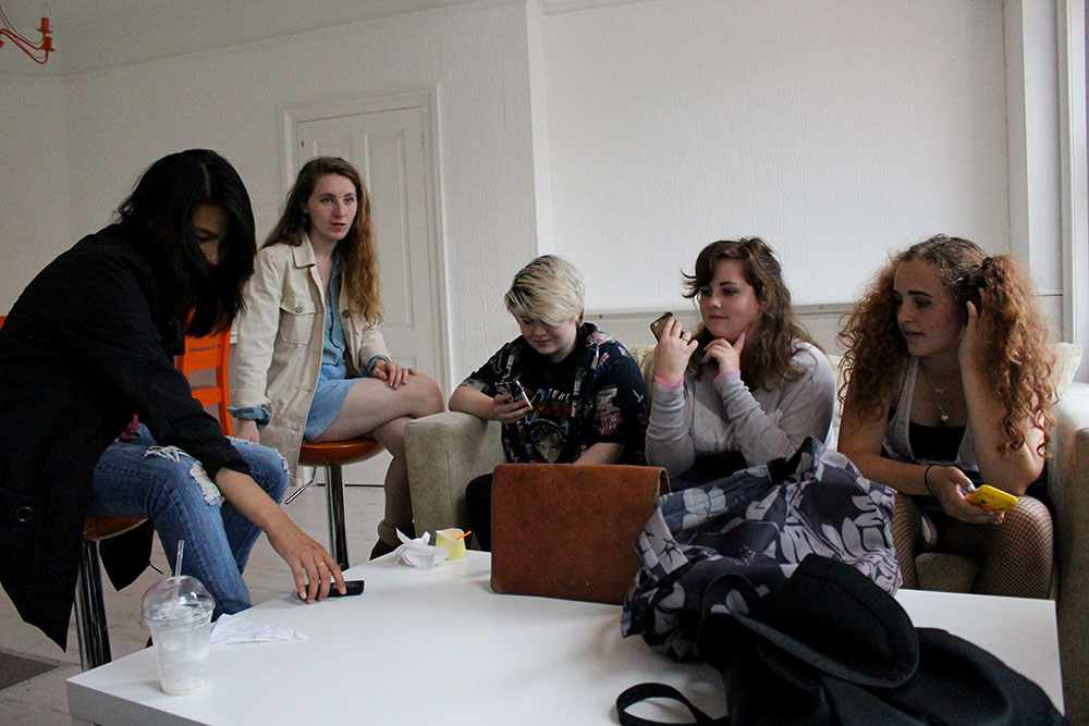
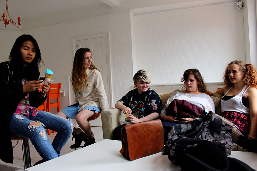
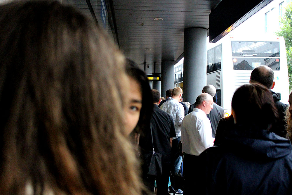
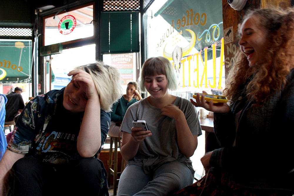
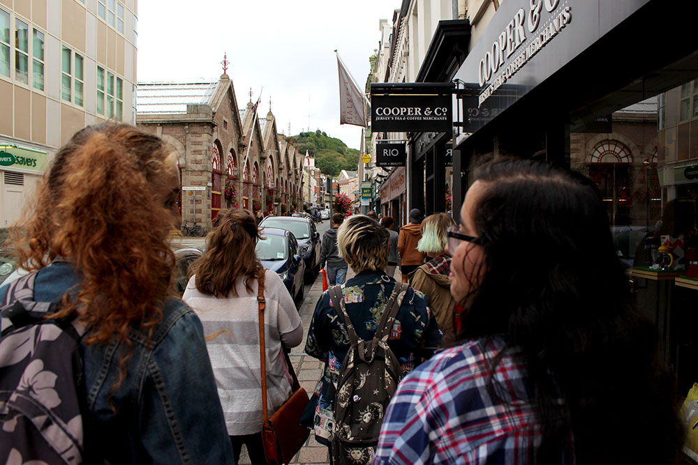
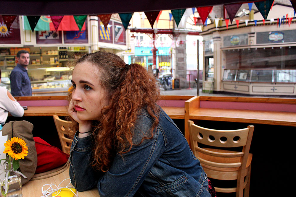
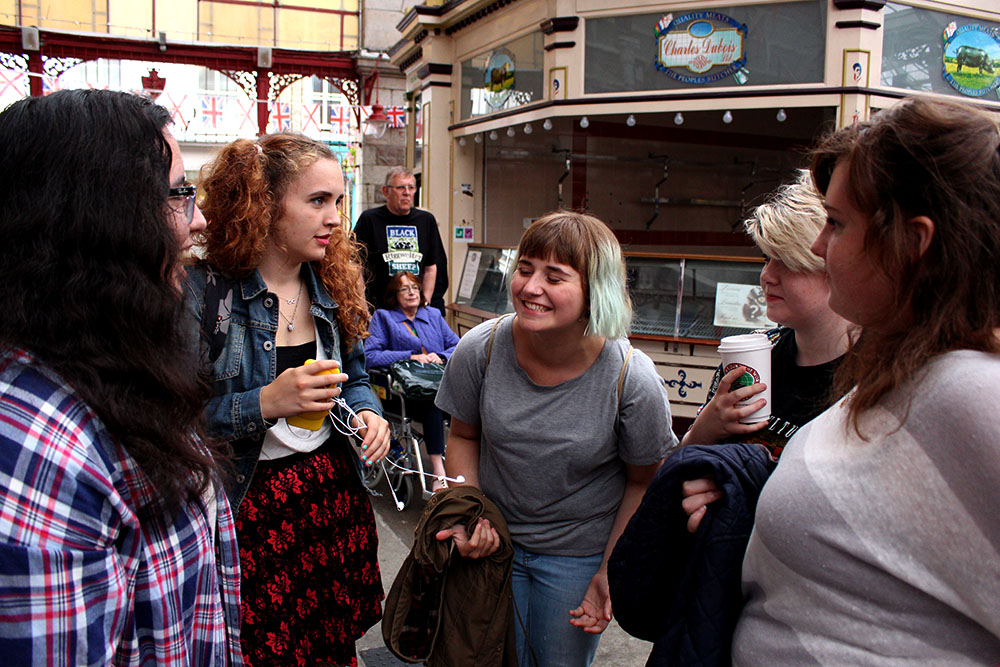
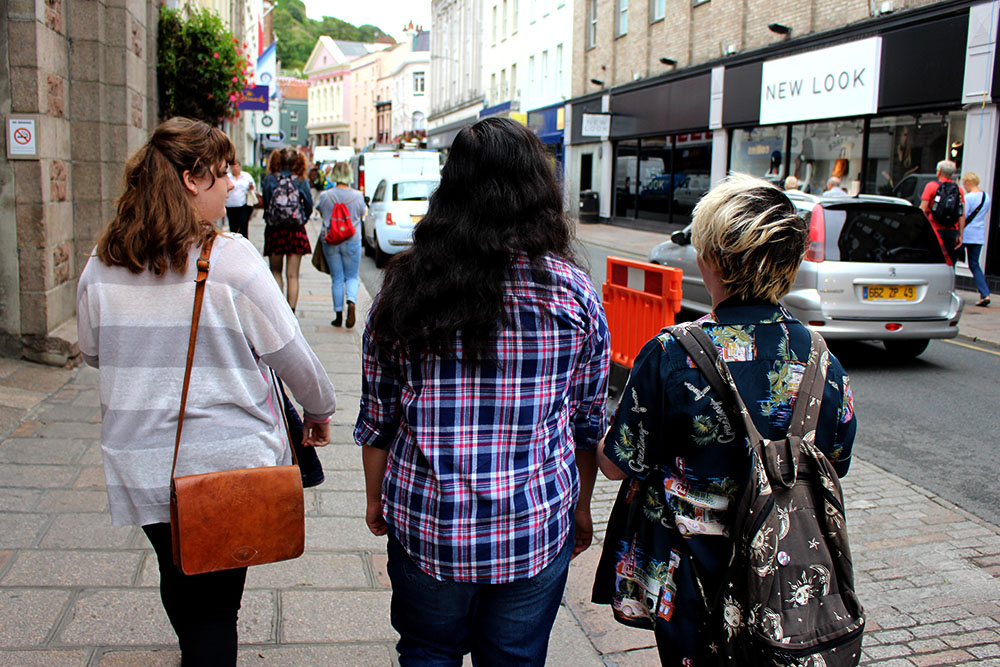
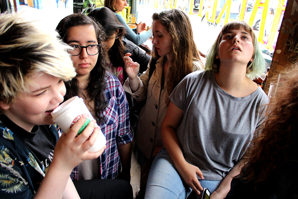
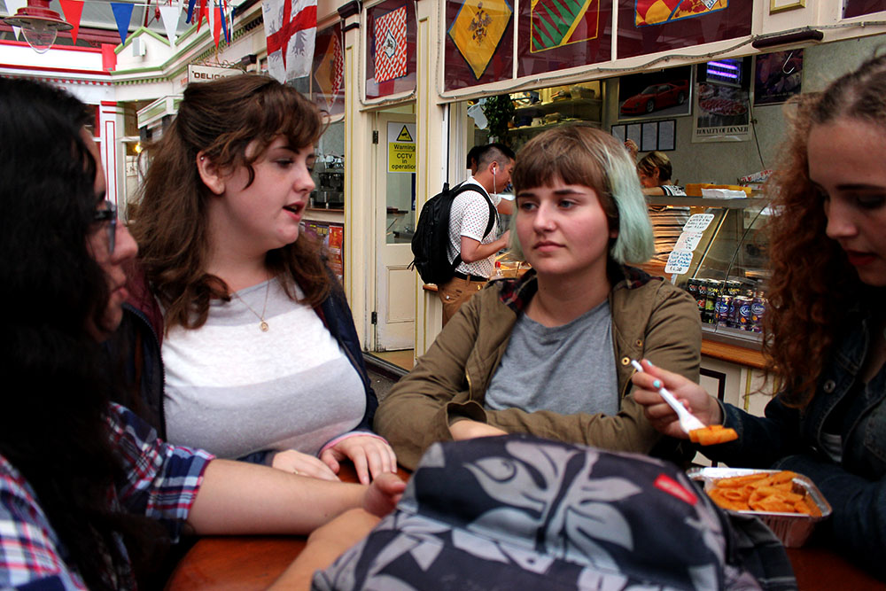
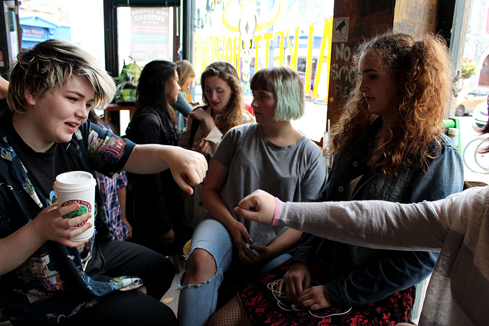
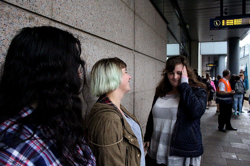
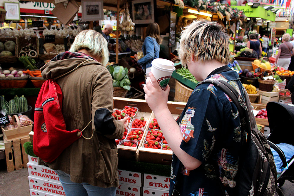
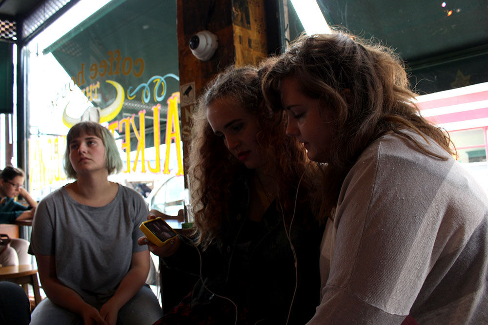
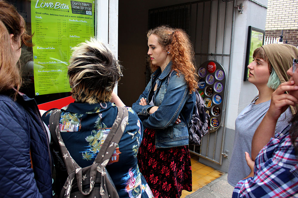
For this shoot I got a few of my friends together and asked if I could simply follow them around throughout their day. This was successful and I got a lot of photographs. I liked this shoot as I was able to capture different elements of our daily lives that we would maybe ignore or overlook. I wanted to do this photo shoot as I wanted our community to have a look into the lifestyle of teenagers and to get rid of any stigma that us teenagers are faced with. This shows a side of teenagers that is more real and shows how we actually are and what we really get up to instead of what a lot of adults presume we do. I feel that this shoot tells more of a story and allows the spectator to get to know its own community in more of a personal way.

I enjoyed doing this shoot as I was able to just hang out with friends for the day as well as making some interesting photographs. One of the most important parts, to me, is the facial expressions on each of my friends faces within different situations. I like that they were comfortable enough to allow me to make images of them without them posing, fixing their hair or having to see each photo after it had been taken. This was an enjoyable task for me. I really wanted to show what teenagers really get up to in a day and that they don’t run around being destructive and obnoxious. I have also thought of maybe following around this particular group of friends one evening time to see what they get up to at different times of the day. This will be an interesting experiment to try out.

I don’t think that any of these images are stand alone ones as I think that each individual shot comes together to create more of a story and brings more depth into the images themselves. I would put them in sets to create various little stories and then bring each of these little stories together to create the bigger picture. The different facial expressions of my friends make the images more interesting and gives spectators more to look. Something that I have noticed with this particular group of friends is that we are always finding somewhere to sit down and chill out. This group of friends tends to just like to sit around, chill out with one another and chat about anything and everything.

IMG_7853blog

IMG_7867blog

IMG_7886blog

IMG_7910blog

IMG_7926blog

IMG_7951blog

I like these images as I find it interesting to see a teenagers perspective of life and what teens do on a normal day just hanging out. I wanted to show the ups and downs of friendships and having groups of friends that we hang out with on a regular basis. I found that the subjects of these images worked well with not looking to the camera and ignoring it as I am an insider in this group and so they can feel more relaxed and at ease with me making photos of them. I enjoyed this shoot and may do some more shoots in the future of different friendship groups and how they act with one another.

IMG_7853blog

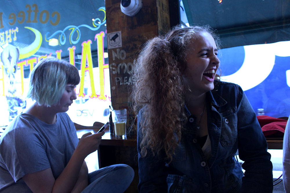
This is one of my favourite images as it shows different emotions within it. This image was an action shot of reactions to making a decision on where to go for food. Obviously it took some time to decide as a lot of the group look bored and fed up. I like the contrast of different emotions, with one person looking so fed up and annoyed [far right] with another subject [far left] enjoying herself and laughing at how annoyed everyone is getting. I think that there is a lot going on in this image and it is interesting to look which I think that the spectator will enjoy to look at and interpret. I feel like the positioning of the subjects is, obviously, very natural and does look like a proper documentary photograph to me. I think that, although this is a part of a series of images, this image could stand alone and make sense to the spectator. However, I would keep this in its set of images as I don’t find this image as interesting when taken out of context. I want to put images from throughout the day together into different emotional states, for example, bored facial expressions would be one set of images. I think this will be interesting for the spectator to see and I want to show different ups and downs that teenagers experience throughout their day.

IMG_7880blog

Another one of my favourite images is this one of my friend, Jamie-Lee. The facial expression gives the spectator a clear indication of what is going on and how she is feeling along with her body language. I really like this image because of its simplicity and how obvious it is. I wanted to capture real emotions on the subjects faces to make it as honest as possible in the terms of documentary photography. I didn’t do anything to change these photographs and don’t think that the subjects acted any different to how they usually would which is exactly what I wanted them to be like.

Sets of emotions

joy/happiness

neutral 


bored/fed up

curiosity 

My Shoot: The Market Place

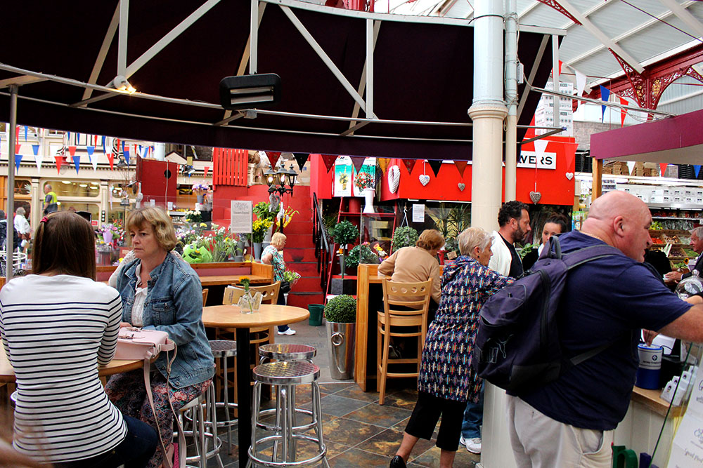
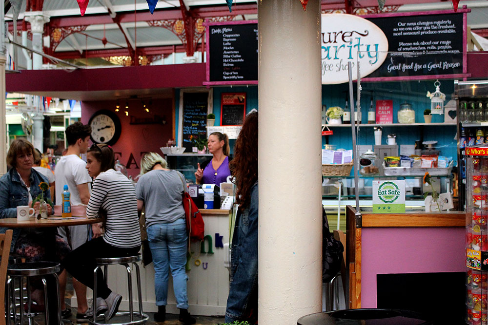
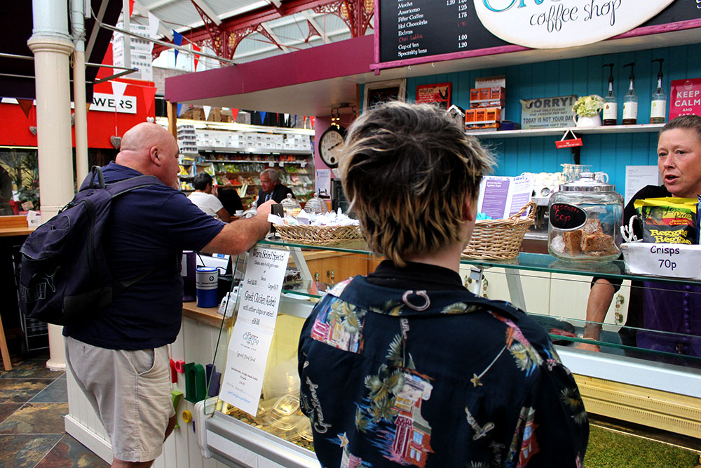
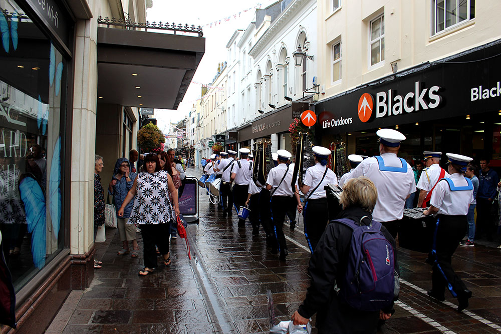
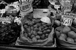
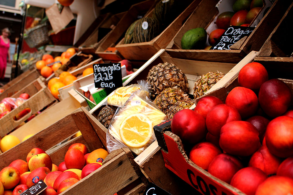
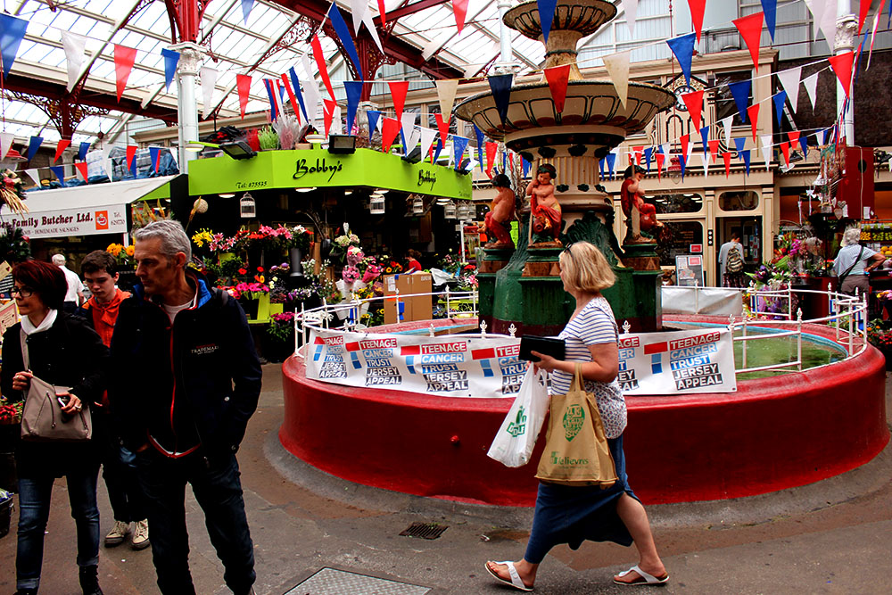
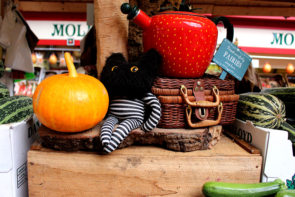
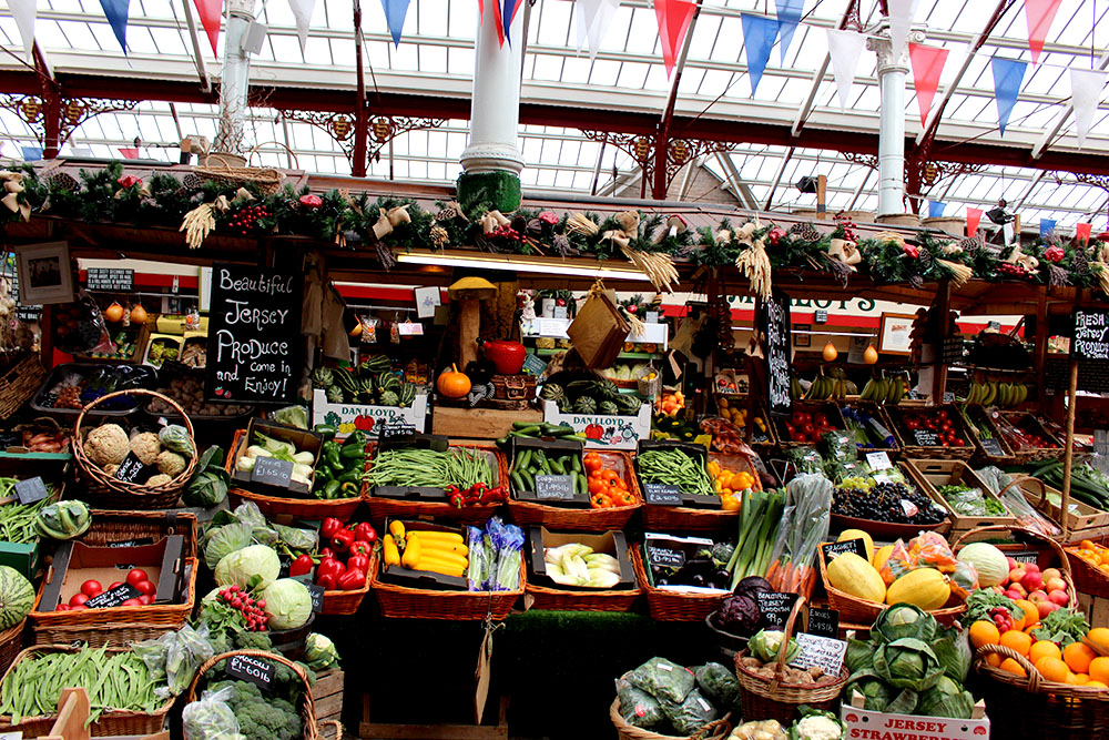
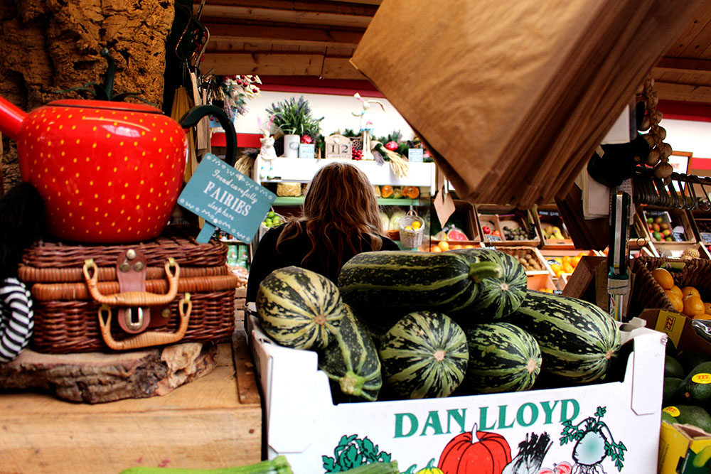
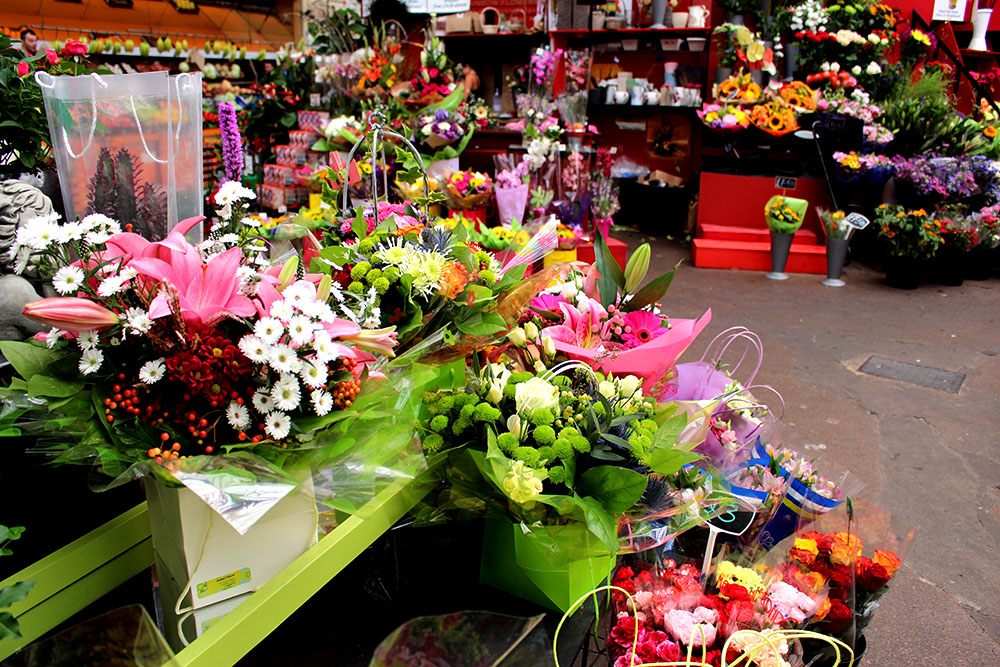
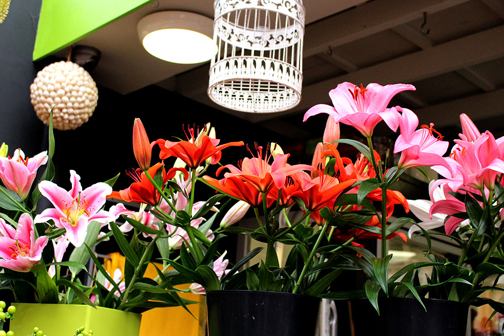
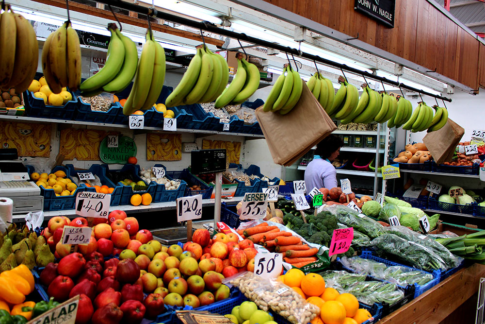
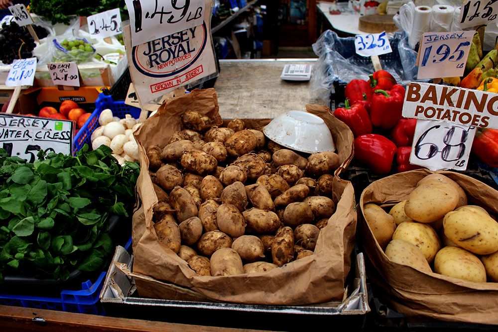
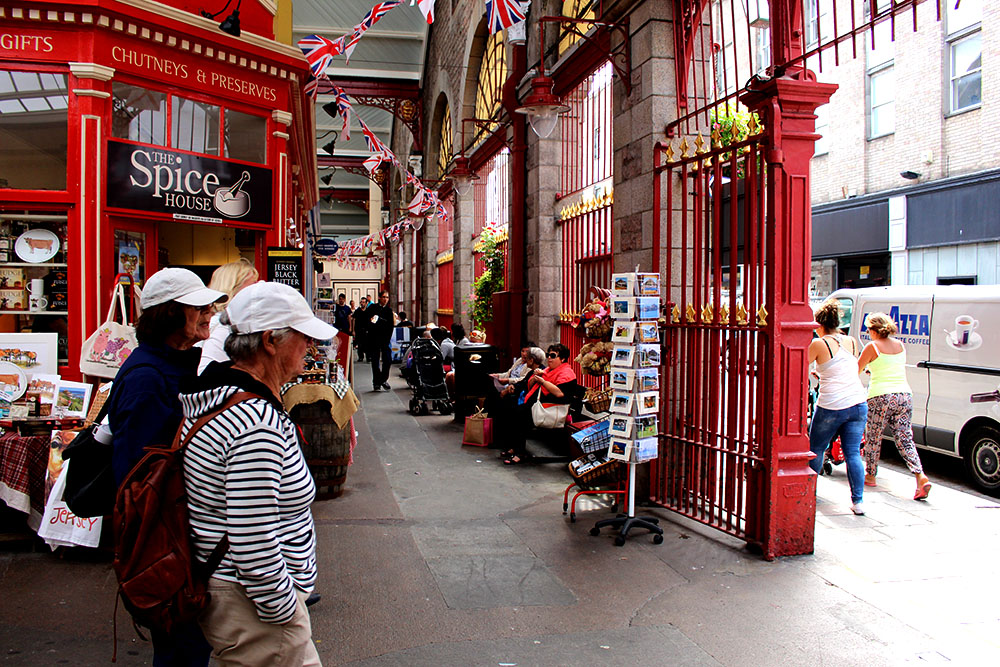
For this shoot I decided to go out into our community and document those who work and wonder round the market. I think that markets are getting lost in our modern world and they seem to be getting lesser and lesser. I wanted to make my images as clear and real as possible. I like the vibrant colours showing that the market place is still very much alive with so much to see and explore. I feel like it is a world that often young people overlook and ignore.
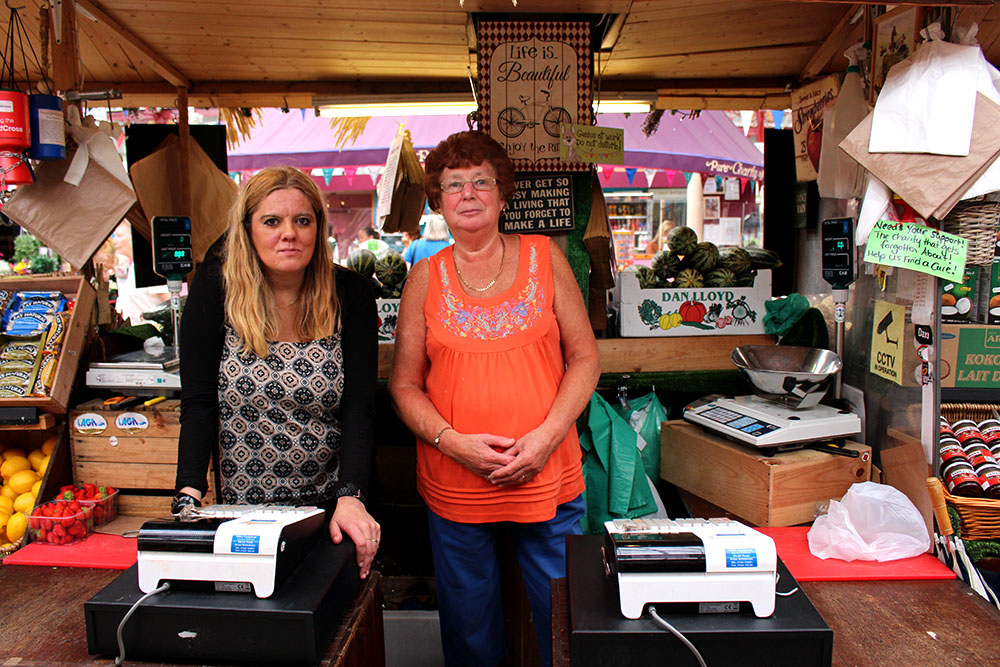
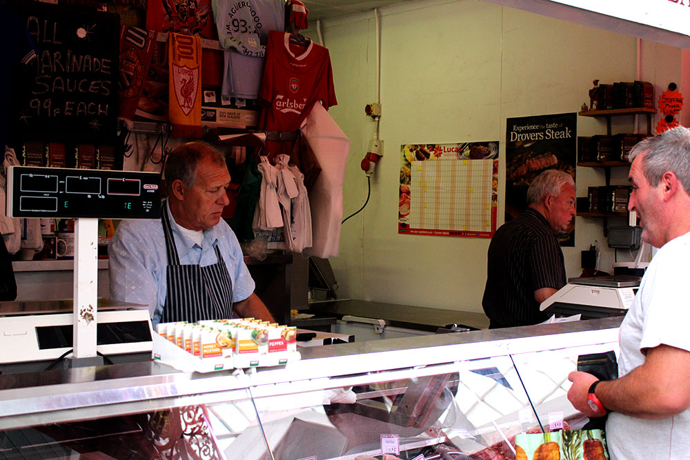
During the summer I went round the market and made some images of those who were walking around, I also asked a couple of people that worked there if I could make images of them after explaining what it was for. Only a few people allowed me to make photos of them but the images that I was able to take I am happy with [all photos are my own].

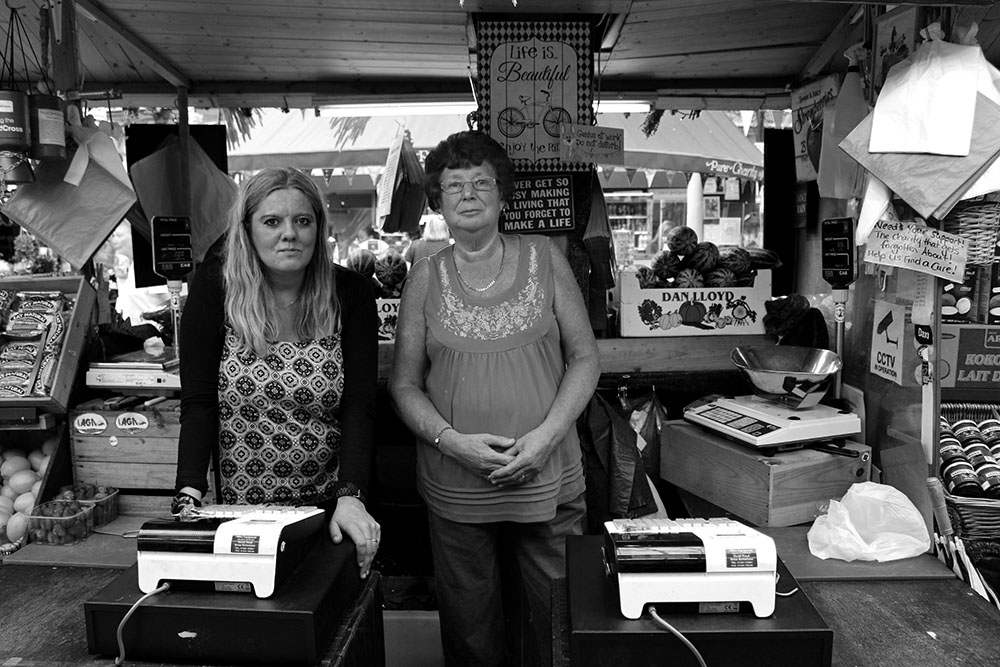
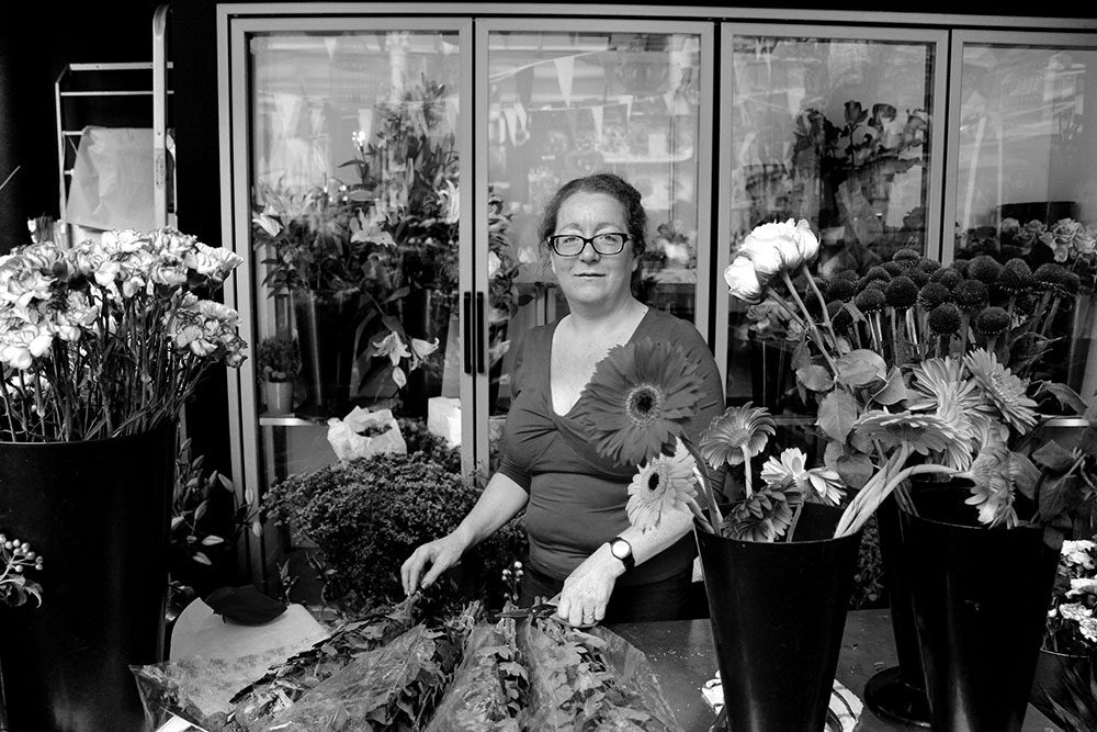
IMG_79811The images that I found the most effective were the ones with the subjects looking into the camera. I like these images as I did have to go up to these people, explain what I was doing and hope that they would be willing to contribute and be in my images for me. These image stand out because the subject is actually looking into the camera, making it more personal for the spectator. I like these images as it shows the environment surrounding the people that work in the market and shows what they do for a living. I find these images interesting to look at as there is a lot going on and a lot of different colours for you to look at. I enjoyed making these photographs and think that they look good although I do not want to progress this shoot into anything more and like it how it is. I want to find something different to explore and go more in depth on.

IMG_7995blog

After venturing round the market a couple of times and making some interesting images I realised that I wasn’t that interested in this and do not want to further develop this through my study as I think it is very self explanatory and not something I feel passionate about. I think that these images tell the story however they do not provoke anything or ignite a spark. I am pleased with how these images turned out though.

More experimentation 

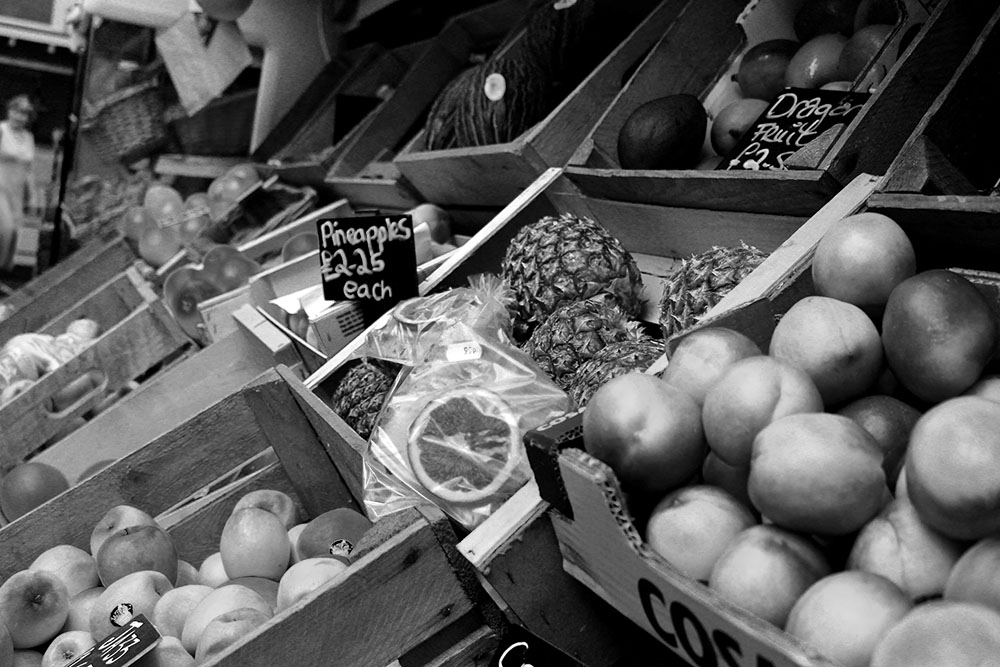
IMG_7977bwblogI think these images work well in black and white because there are so many colours going on in each image it makes it more effective. I think that these images look interesting and that the spectator will want to find out more and look at more images from the market. I really like these images and I find them a lot more interesting in black and white allowing the spectator to focus in on what is going on in the photographs rather than focusing in on the bright colours etc. I think that the reason the black and white worked so well was because there were so many different colours that stood out and made for a more interesting photo and different shades of grey and black.

IMG_7981bwblog

Documentary Specification: Community

We are constantly surrounded by our communities and we are always sharing experiences with others. Through making photographs of our communities we are able to share with the world different aspects of other people’s lives and we are able to give them an insight on what is going on in different parts of the world and how people act with one another. I think we have many different communities everywhere and they are yet to be explored. This will be challenging to go out and find and be able to make photographs as an insider. I think that you have more opportunity as an insider on what’s going on within your group and you already know those personalities rather than being an outsider, not knowing much and just coming into a new community and possibly representing them in a different light to how they would actually like to be represented. People are often a lot more comfortable with you and in the photographs if they know you. Spectators are able to different communities around them and across the globe. Screen Shot 2015-10-06 at 19.02.46

Standards and Ethics in Documentary Photography

Photographers actually have a code of ethics when making documentary photos. This mostly consists of photographers not taking advantage of a staged photo opportunity. This is only for photojournalists as they are simply supposed to be bare witness and should not manipulate the scene to make for a more interesting and visually pleasing image. I think that this is the best concept for photojournalists as they shouldn’t manipulate the truth as it is news reporting and will be shown across the world as fact. I believe that this method of photojournalism is important to be followed and agreed upon in the photographic world. I think that this code of ethics does not apply to documentary photography in itself as I think that photographers are able to make stronger images if they are able to slightly manipulate and remould the way the photograph is going to turn out. Documentary photographers are able to collaborate with their subject in order to make great images, like asking them to look directly at the screen emotionless. Photographers are able to send out a message to the world and to challenge spectators views on different issues including, political, social and economic ones. For me tableaux photography has no limits and no rules, it is completely staged and the photographer has complete control. Here photographers are able to freely express themselves often with hidden meaning that includes the political, social and economic meanings behind them.

Agreement made by photojournalists:   https://nppa.org/code_of_ethics

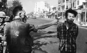
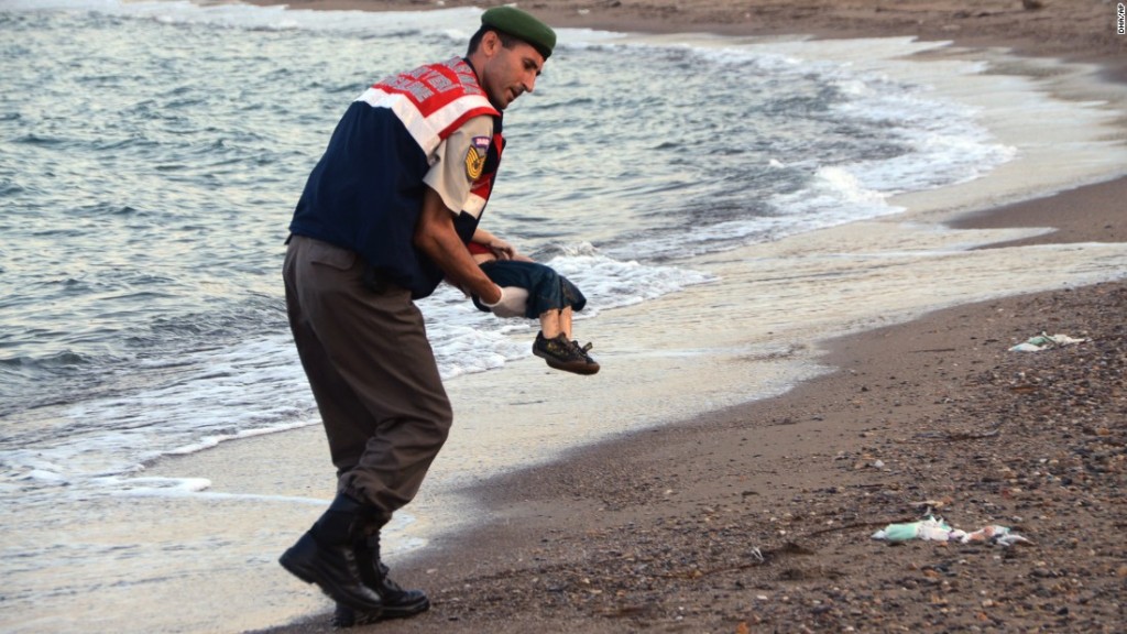
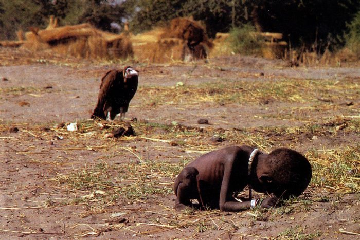
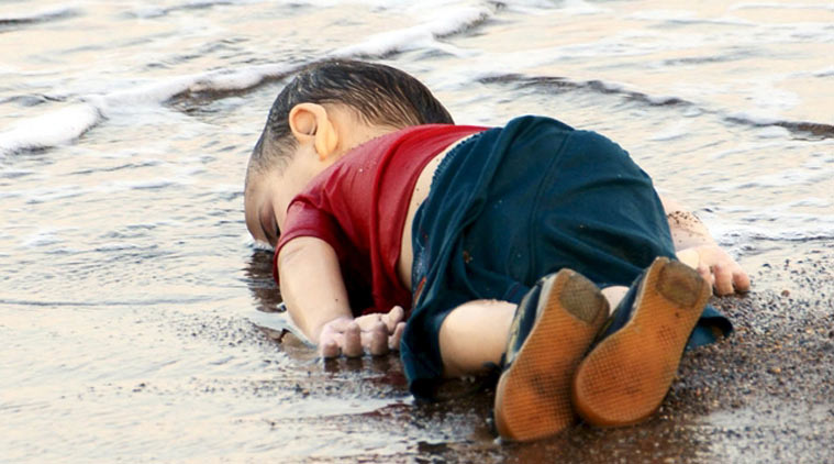
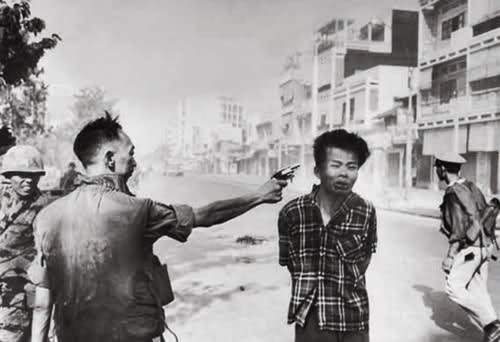
I believe that there is a certain point in documentary photography where it can all become too real in that the photographer might be photographing during a war and suddenly they come across a soldier covered in blood. The question is should they make the photograph or should they try and help them? There has always been a lot of controversy with this topic but for me I believe that taking that one photograph can change the world. The photographer doesn’t need to make the photograph and walk away as if there is nothing going on, they have the opportunity to share the torment and the troubles that these individuals go through in order to reach a broader audience. It is one thing to hear someone say that a small child was washed up on the shore but it is another to actually see it. These kind of documentary photos really put your own life into perspective, they provoke change making more and more people want to go out and help whether that be raising money or changing who they vote for or even going out to that country and personally helping those in need. So yes I think that that photo should be taken because through that single image we as a society are able to provoke change in the way people think. Spectators will see these hard hitting images and want to make change. Without these images we wouldn’t be able to really visualise what others across the world are going through. These types of images may anger people and make them wonder why someone who make an image rather than help a person but ultimately they will be the ones getting the message out and getting more people to help.

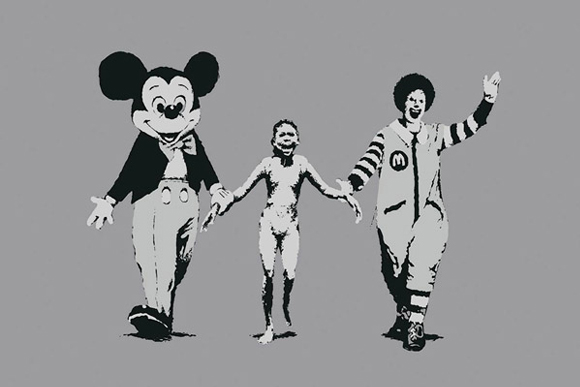
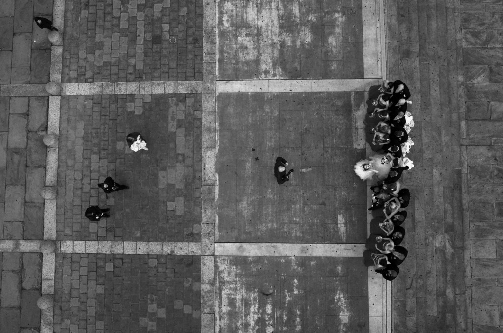
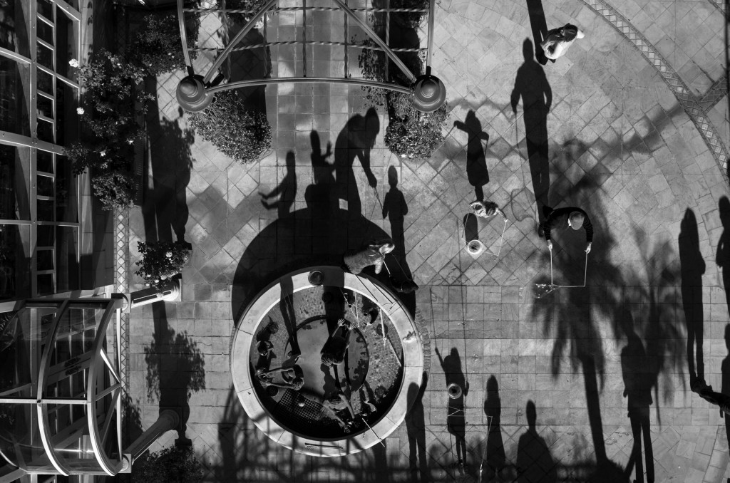
The link below is from a photography competition. The photographer used a drone with a camera attached to this to make these images, they are supposed to represent the drones that the US send out intelligent airstrikes in Pakistan, Yemen and Somalia. These attacks have been going on since 2002 and have resulted in large numbers of fatalities, this includes hundreds of civilians. These images were made across the US that are usual airstrike locations and events abroad [funerals, groups of people exercising or praying and weddings]. This photographer made these images to get the message across to the US of what they are doing to average and innocent civilians in their own country doing their own thing. This reminds me of the image of the young girl with her clothing burned off by the acid bomb attack America made on Japan, but more this image reminds me of the Banksy version of that photograph.

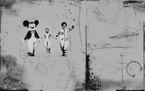
Banksy’s image is world known and really sends out a message to the rest of the world as this young girl is crying and screaming as her clothes and skin are being burned she is holding hands with Mickey Mouse and Ronald Mcdonald who are known to the world as American ‘icons’ in that people would associate them with America. I think that this is a very strong image and makes the spectator rethink and understand that what the US was doing was affecting innocent civilians and not the people that it was actually aiming for. This is where Tomas Van Houtryve’s work ties in as he is showing that the places that he has photographed with a small drone and his camera attached to it is what the US is attacking in other countries. It doesn’t make sense and is constantly effecting innocent civilians lives. I think that these images are very strong as the shadows on a lot of the images are so huge and the people are so little, I like that it has a political meaning behind it in the hopes for change and for America to stop ruining innocent lives as the places the US has and is bombing are the places that many Americans enjoy everyday of their lives and do not know what it feels like to feel that they cannot express themselves or go to pray in the fear that they will be killed by US airstrikes.

Thomas Van Houtryve work: http://www.worldpressphoto.org/collection/photo/2015/contemporary-issues/tomas-van-houtryve

Tom Pope Exhibition

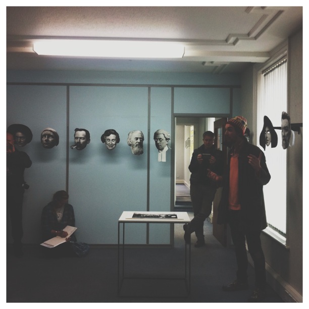
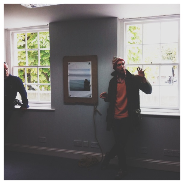
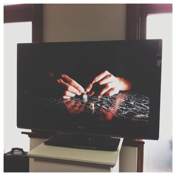
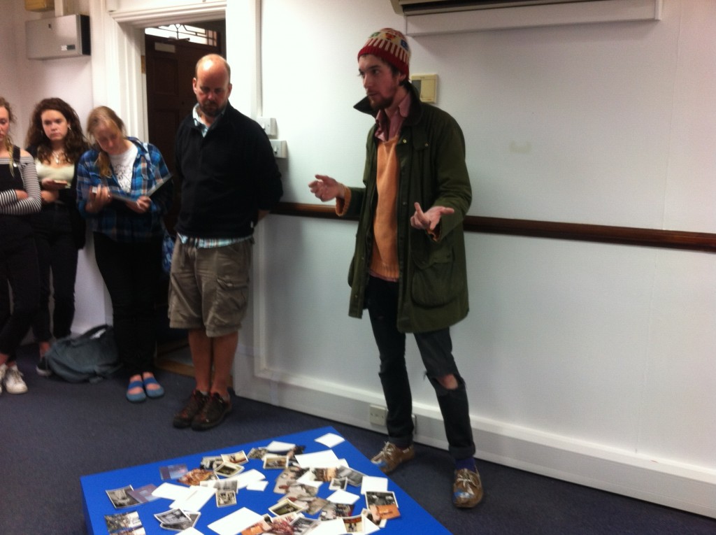
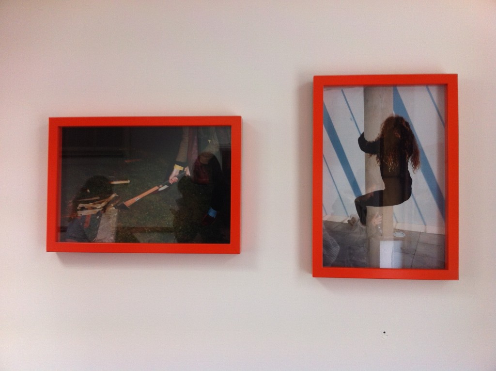
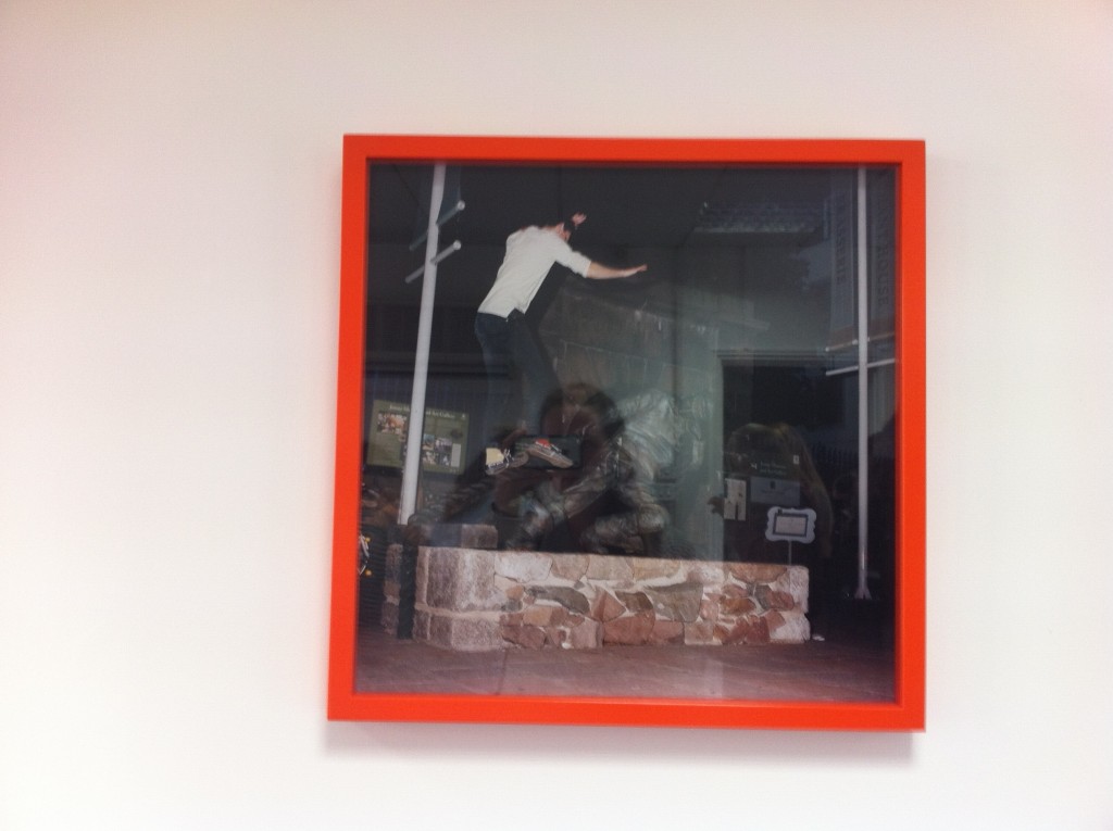
On Friday 25th September our group went down to the old police station in town to see Tom’s exhibition. This was interesting to go and see as we have worked with him on a workshop earlier in the year as well as going to France for the day with him and the Archisle people to explore performance photography. Here we were able to express ourselves in the public eye, this was fun and we got to see what it was like to be a performance photographer like Tom Pope. Most of Pope’s work is based on weak anarchy that he has already explored, as seen on his blog. Pope wants to challenge the way people think and to challenge authority by doing things that aren’t necessarily illegal but they are deemed as unacceptable. I think that this is a vey interesting concept and think that Pope can work with so much for this too.

Pope’s Weak Anarchy: http://www.tompope.co.uk/weakanarchy.html

Pope’s Archive Exhibition: http://www.tompope.co.uk/iamnottompopeyouarealltompope.html

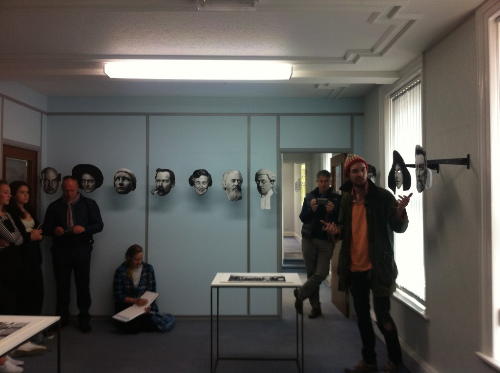
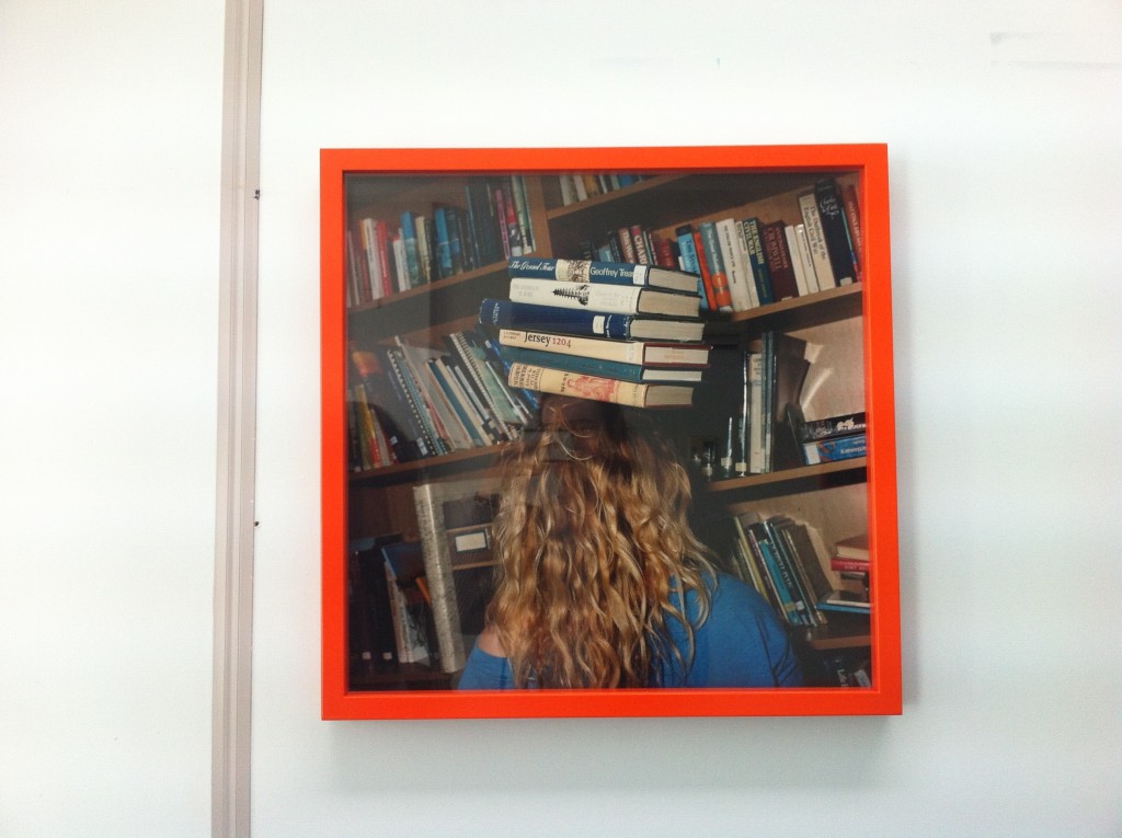
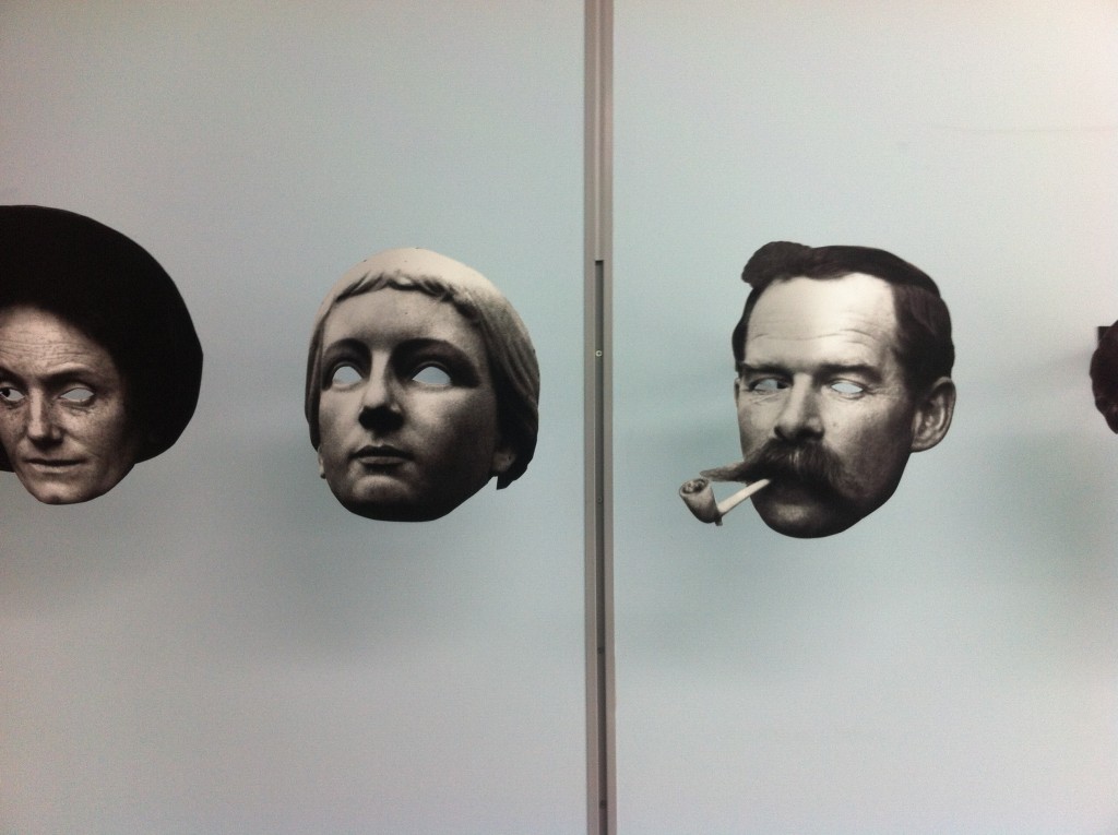
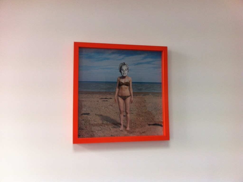
Tom took us through his exhibition explaining the meaning behind a lot of his work. Most of his work was inspired by John Baldessari as well as using his film camera for his photographs. The best part of the exhibition for me was the room filled with cutout faces of people from the archive. I found this really interesting to go around and look at all of the different people that lived in Jersey at some point throughout history. I think that this was a really great idea as well as Pope taking these cutouts around with him and randomly asking people that he met to wear one so he could make a photograph of them. I thought this was a really great way to spread the archive and get it out and around to the people in Jersey.

John Baldessari

Baldessari Portfolio:  http://www.moma.org/collection/artists/304

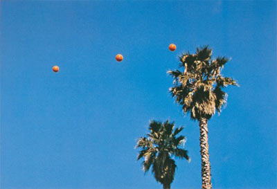
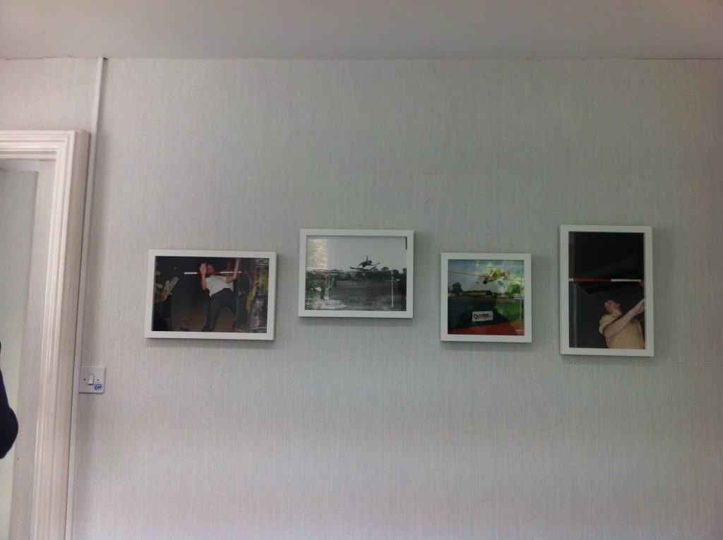
Pope was inspired by Baldessari’s work, including his work on throwing a ball up in the air editing it together to make three balls inlined with one another up in the air. This is where Pope did a small workshop with us when we tried to throw oranges at one another and catch it while making a photograph. I think that this was a unique way to respond to Baldessari’s work. In Baldessari’s image it looks as if he was throwing oranges which is where I think Pope gained inspiration for his mini workshop challenge. This was fun and a unique way to make photographs which allowed us to broaden our minds when it came to performance photography as well as just photography in general.

John Baldessari work

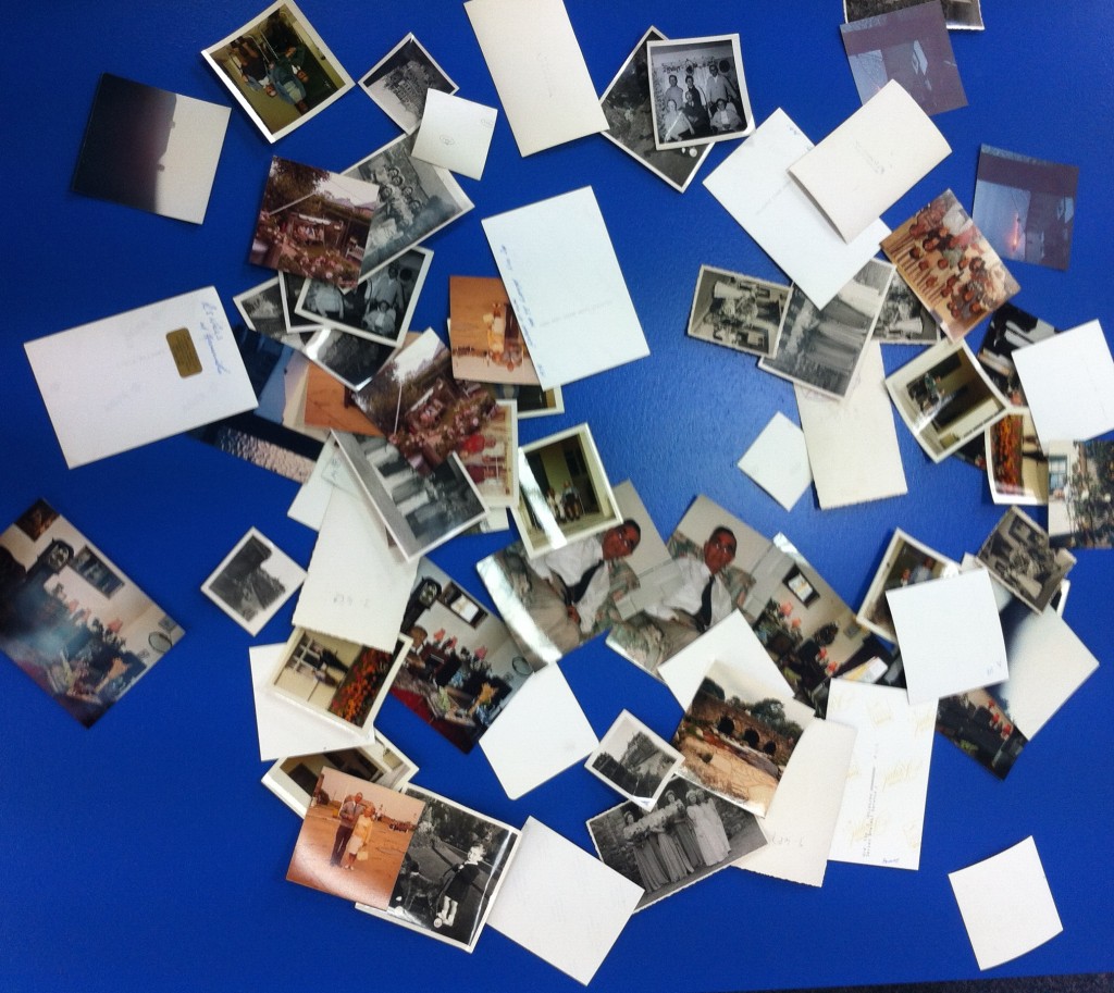
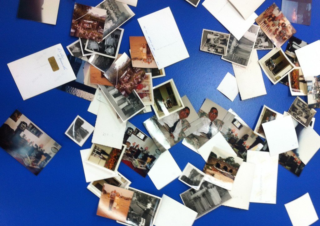
Another aspect of Baldessari’s work that has inspired Pope was the specific use of the colour blue. This makes his images stand out and capture the spectators attention straight away as the colour blue is very inviting. Pope applied this to his exhibition using it as a background for the images that were done in threes [like Baldessari’s image of the balls in the sky] and he dropped them onto the table. They fell in their position by chance and Pope changed this everyday for his exhibition so that they would constantly be changing. I found this interesting and fun to look and and try to spot the copies of each photograph from the archive. These images were taken from the archive again to bring it out from where it is hidden, into the public eye and so that as many people as possible are able to see these images.

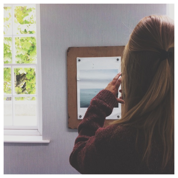
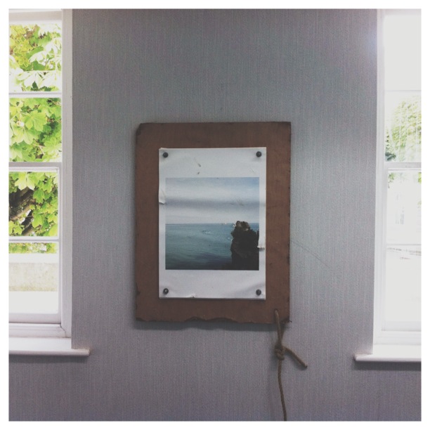
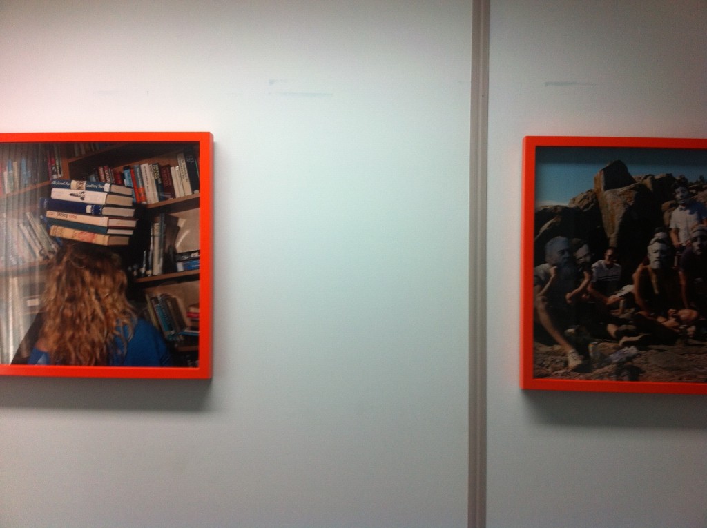
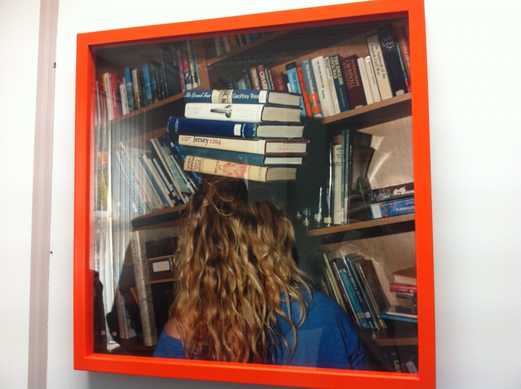
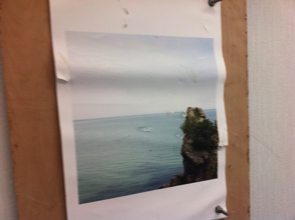
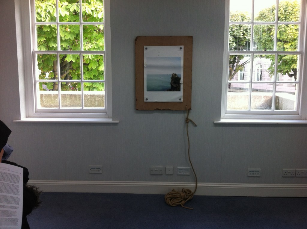
One particular image that I really liked was titled, Jeffery’s Leap. Here Pope went to a cliff edge, with a wooden board and threw it into the ocean while someone else made the image. Pope went out to the bottom and got the board back. He then printed out the image 12 times to go along with the film camera that he has, Hasselbald, that has 12 exposes. This was interesting as Pope is using old film cameras instead of modern digital ones, meaning that the one photo that is taken at the time is the only one and it has to work straight away because film is very expensive to buy nowadays. Now Pope printed it out 12 times, he drilled a hole and added a bit of string to the board so that he could retrieve it easily when throwing it in. He added one image at a time and screwed it down then throwing it off the cliff and into the ocean. Each time he added another of the same image until all 12 had hit the water. Whatever had happened to them while hitting off rocks and being thrashed about in the ocean was how it was going to look and end up. This was all by chance and whatever the turn out was, was what Pope was going to add to his exhibition. I really liked this part of the exhibition as it was interesting to hear the story behind it as well as it looking really great and standing out almost like it was on a canvas, compared to the rest of the images that were all in orange frames.