All posts by Shannon O'Donnell

I am an A Level student currently studying at Hautlieu School. My subjects include, Media Studies, Photography and History. My blog includes updates of my current work in both media and photography where I am able to show research, planning and experimentation. I update this blog weekly with different posts relating to my subject topics.

Filters

Author:
Category:

Artist Reference | Roy Lichtenstein

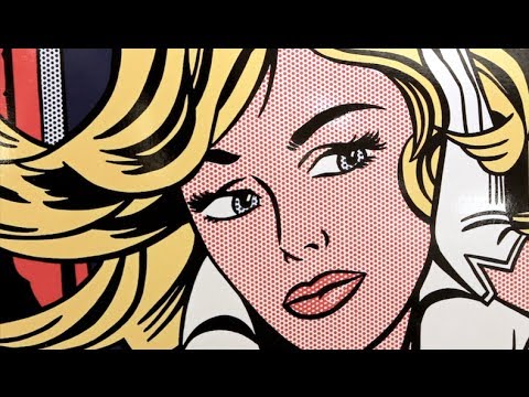
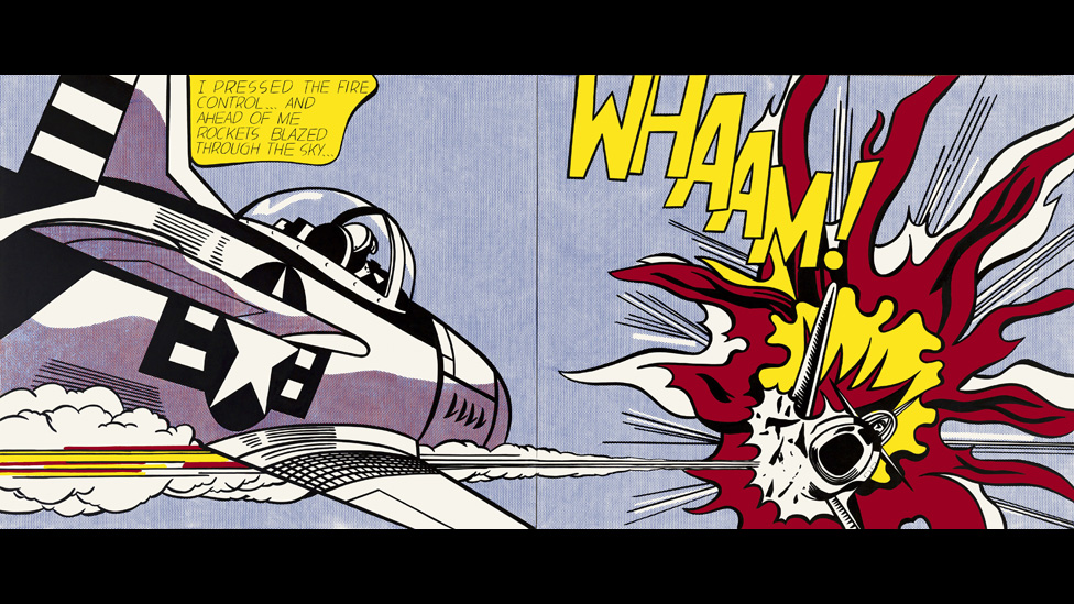
Roy Lichtenstein is an American artist, born in New York City in 1923. Lichtenstein’s career hit a high in the 1960s when he became a leading figure of the new Pop Art movement. His work is inspired by comic strips and advertisements, using bright and graphic works parodied American popular culture and the art world. This work was a reaction to some work of artists including Jackson Pollock and Willem de Kooning. He wanted to stand out and to challenge the way spectators view art and so became more inspired by advertisements and comic strips making his work unique. Lichtenstein died in New York in September 1997.

Roy Lichtenstein website: lichtensteinfoundation.org/

About Lichtenstein: http://www.biography.com/people/roy-lichtenstein-9381678

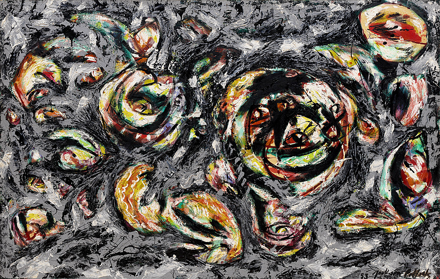
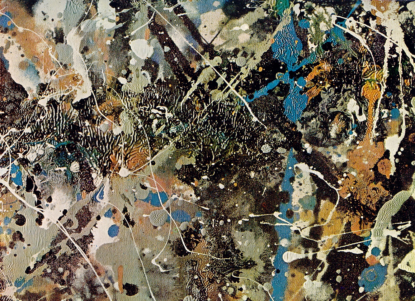
Jackson Pollock | Artist of the same period

Jackson Pollock was an artist who was making work at the same time as Lichtenstein. He was very famous and his work is admired by many people today including some celebrities and actors [e.g Matthias Schoenaerts]. He was an American painter and was a leading face behind the abstract expressionism movement. He is known for being one of the most radical abstract art in history of modern art. Lichtenstein wanted to stand out from this and make his own mark on the world and so felt inspired by Pollock’s work but at the same time he wanted to challenge it or even go in a different direction which was to stand out even more than the work of Pollock himself. I really like Pollock’s work although it can seem like just a huge mess, easy and with a load of paint squiggles everywhere. However, I have tried to make painting similar to his and they haven’t been so successful and it is harder than it looks to get exactly what you want your painting to look like. I do think that his work is unique and it is interesting to see all the bursts of colour and different styles that he used within his paintings.

About Jackson Pollock: http://www.jackson-pollock.org/

Jackson Pollock website: http://www.jacksonpollock.org/


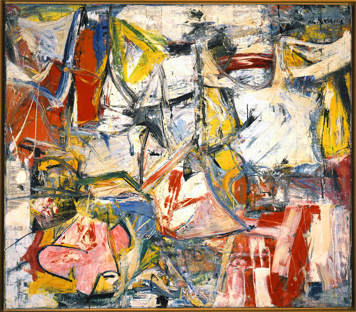
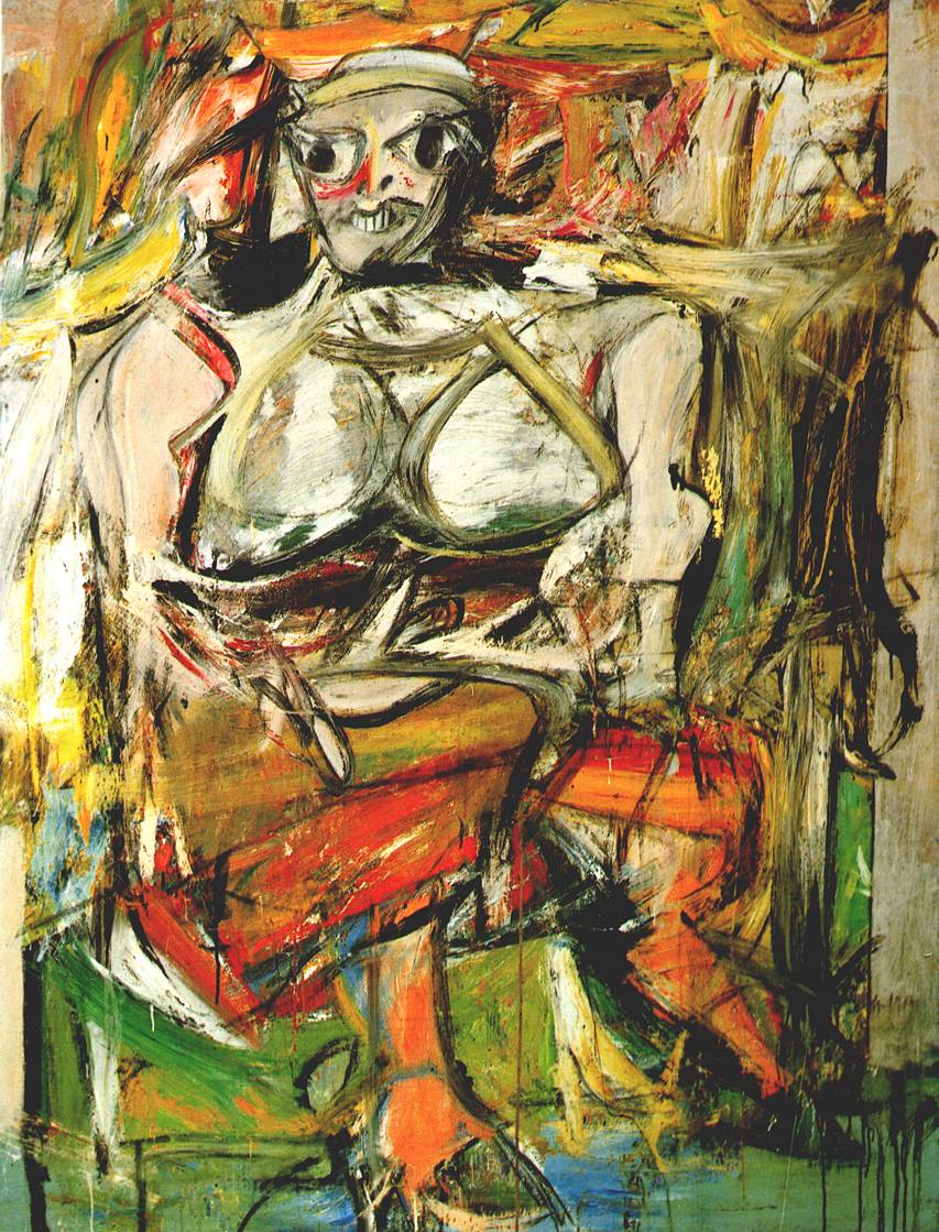
 Willem de Kooning | Artist of the same period

About willem de Kooning: http://www.theartstory.org/artist-de-kooning-willem.htm

Willem de Kooning was also an artist at the time and was seen as one of the most prominent and celebrated abstract expressionist painters after Jackson Pollock. His work contains many images of distorted womenly shapes, which reminds me of the work of Picasso. He was a very traditional painter who became famous for his paintings of women, painted in different periods of his life. Lichtenstein was inspired by him through his use of women in art and paintings, which a lot of painters used [and still do] for inspiration. I think that Lichtenstein wanted to pose women in a more human like way showing their emotional states rather than how he physically sees them contrary to the work of Kooning. I don’t really like the work of Kooning as it kind of disfigures the women and makes them come across more as things or objects rather than actual human beings. They look so distorted and messed up that they don’t look human at all, which really does remind me of the work of Picasso and how he would change the facial features and make geometrical shapes out of them to make them unidentifiable.


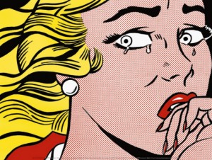
New York State Pavilion of the 1964 World’s Fair in New York City was a body of work that Roy Lichtenstein famously created. He made images mainly of women being emotional and to me his images see women as weak and small minded. I am unsure whether or not that was his intent but women are shown in more of a negative light through his work. His work is very theatrical and reminds me of the way women are portrayed in Film Noir films and the way those women are seen as being there for the man and only caring about what men think of her, including the femme fatales of those films who are seemingly set out to ruin the man who they have been hurt by.
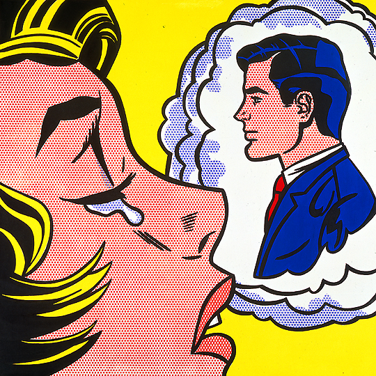
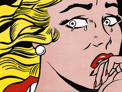
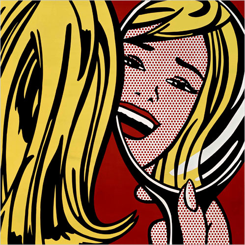
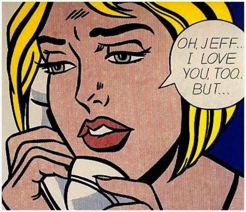
Roy Lichtenstein artwork

This piece of artwork stands out most to me as it is very simple and obvious. Lichtenstein portrays this woman as crying over a man that she is dreaming and thinking about all the time. It makes her seem weak and desperate to fall in love with this man or to be with him. I do like this image as I think that it is very powerful as I do think that a lot of women do get upset over stupid men but then again I know that women don’t feel sad for long about that one thing or person, we often move on and become stronger. I feel that Lichtenstein does portray women in more of a negative light in that they are constantly obsessing over men and wanting to be around men and that they need men to function properly which I think is wrong. I would like to respond to his work in some way on how women are actually much stronger than what Lichtenstein portrayed them as and that we can do things for ourselves without thinking about what men are going to think or what they have told us we should be doing. I do think the way that Lichtenstein has created this artwork is very unique and I like his comic strip style as it is different and interesting. A possible meaning behind the idea of using the comic strip could be that it is fantasy and women aren’t actually like that as all comic strips are fiction and are usually made with superheroes and made for the entertainment of the spectator to escape to a different world but ultimately he most likely just used this style so that his work would stand out from everyone else’s.

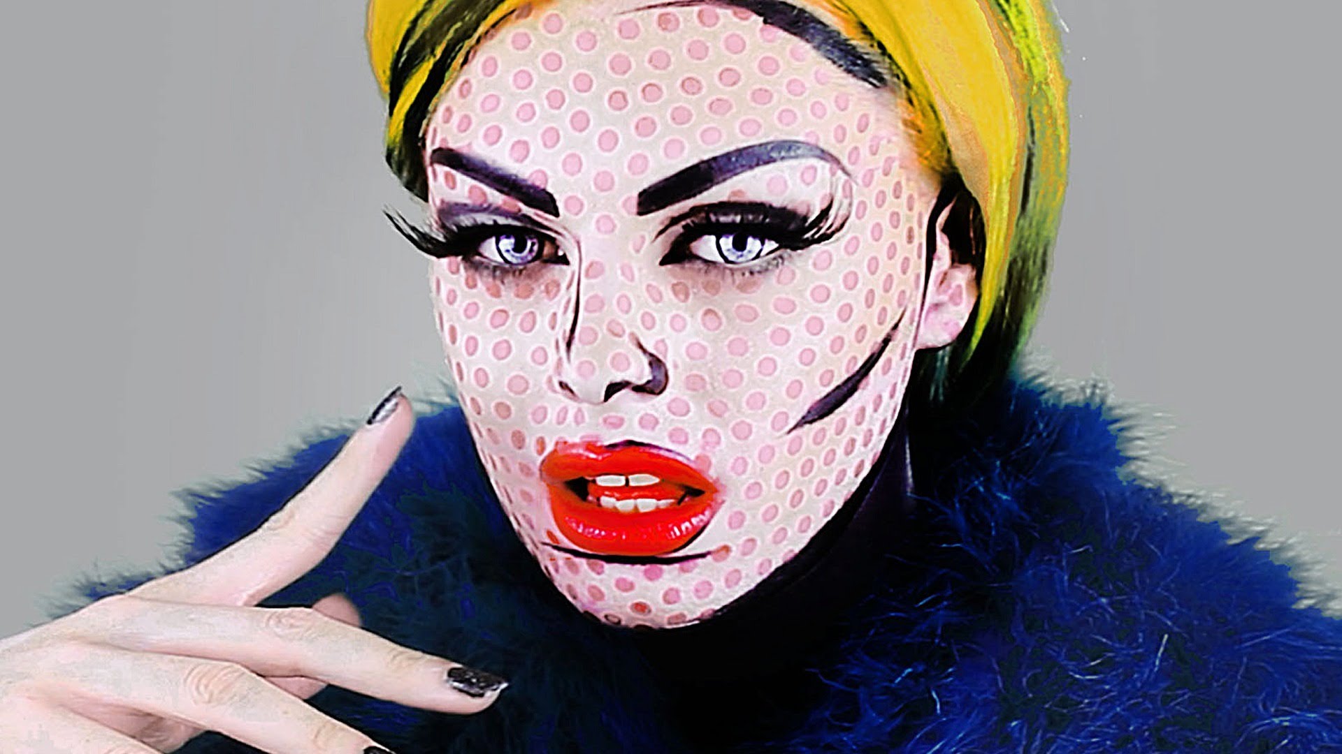
I also found images of women that have taken the style of Lichtenstein and given themselves a makeover to look like the woman does. I find these images really interesting and almost like a response to his work showing possibly how unrealistic they are and how his drawings don’t really reflect the way women actually are. I like this image of the woman with yellow hair as it again just shows how inhuman this woman is and how she is an ideal that Lichtenstein created that is impossible for women to meet and be like. Much like the drawing the women have used their makeup to make themselves look like a cartoon character and shows how it isn’t a realistic representation of a woman at all and although comic strips are exaggerated they don’t really dehumanize anyone with characters mainly consisting of superheroes with the most prominent element being the exaggerations of their body features.

Shoot Planning

Shoot 1 | Planning and Ideas

For this first shoot I want to make some more images of my niece just so that I have more images of her that I would be able to use as a backup in case my focus of my personal study doesn’t go according to plan. I will make images whenever she comes round and on Christmas day. I want to carry on with the same style of shooting from her perspective and what she sees as a little baby. I also think that it will be a nice way to just document the day and spending time with family. As I am working for most of the holidays I will only really be able to make images of my niece on Christmas day and boxing day but I think that I will make enough images that are interesting and that I am able to add onto the images that I have already made of her previously. I have also got an idea of doing a tableau shoot with her and stage different photographs featuring my little niece but this might be quite difficult as she is only 1 years old and doesn’t much understand composition or how to be still. This will be fun and interesting to do.

Shoot 2 | Planning and Ideas

 For this shoot I will be taking inspiration from my Film Noir project and making night time tableaux images out on the streets of Jersey. Here I will get my subject to wear high heels with a trench coat stood near to a lamp post. This will be an interesting shoot to do and adds a sense of allure and mystery to my Film Noir images. I also want to make a few more femme fatale images and stage different women dressed as well known femme fatales and will edit them when I get back to add to my photo book. I also want to start thinking about making some extra images for my photo book of different elements of feminism and make some more documentary style images as well.

Shoot 3 | Planning and Ideas

For this shoot I will be making documentary style images of my family, more specifically my parents. I want to photograph them and show their roles in the house and how they differ. I think that this shoot will be successful as it is such a personal shoot to me and it really works well with my whole photo book idea. I want to make these images to show the almost old-fashioned ways of the older generations and show in a different way how even though they are stuck in their old ways that the newer generations are becoming a lot more equal in aspects of house work. I think that I might make some images of my sister and brother-in-law to show the differences and similarities in the way that they live with one another. I think that it is really only a more recent generation thing, my generation, that fully understands and takes on the idea that there should be an equal half and half scheme of cleaning and doing house chores. I think that these will be strong shoots and will reflect what my hypothesis is about and the way that I want to make a photo book incorporating real life documentary images along with staged images to add more of an effect on my spectators and so that they get the actual side of the story as well as the staged one.

Personal Study | What to do

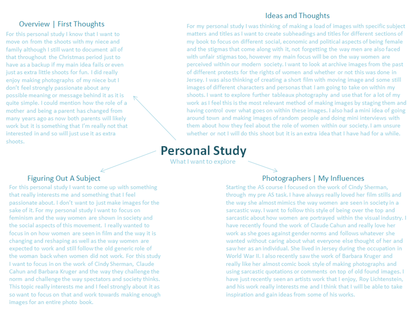
personal study brainstorm
personal study ideas and brainstorm
cahun, sherman etc
inspiration mood board

Photographers

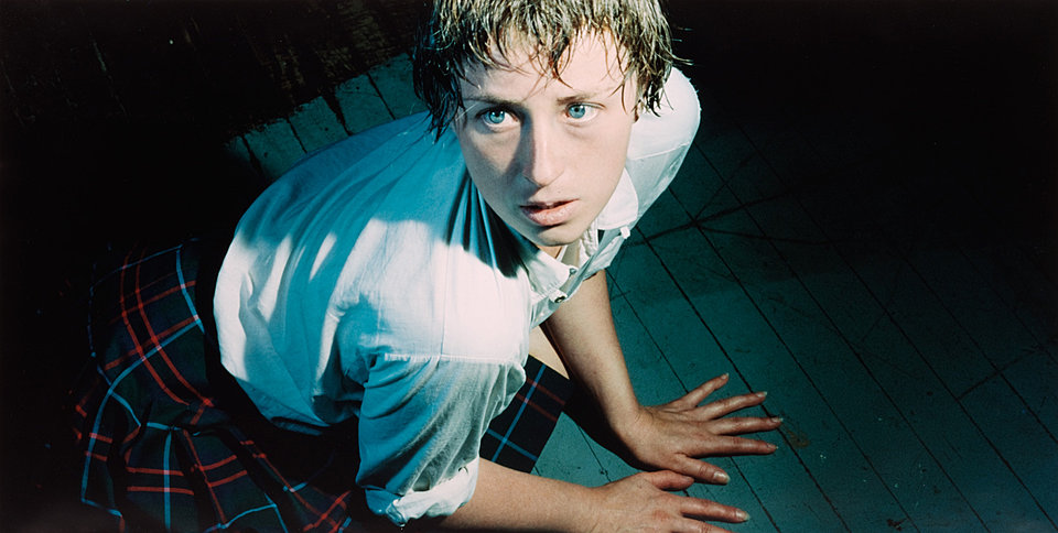
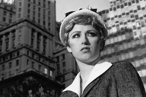
  • Cindy Sherman
  • Claude Cahun
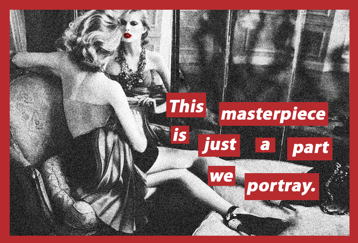
  • Barbara Kruger
  • Yoko Ono
  • David Goldblatt
  • Roy Lichtenstein [artist]

Extra ideas | Notes

  • possibly create a fashion magazine
  • create a photo book [make 250-500 photos] – either using blurb or possibly create a handmade one [do whatever is the most appropriate to you and what your own personal preference is]
  • defying gender norms and creating new ideals – relate to Claude Cahun
  • must do further research into topics to get best work
  • make a comparative essay based on photographers work that you enjoy – cross compare them and see their relevance to one another
  • start to make more images and relate all ideas together

The Course So Far | Reflection

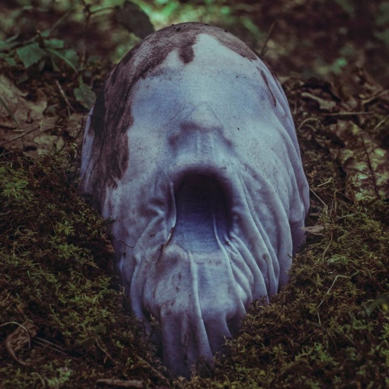
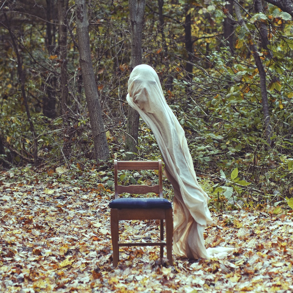
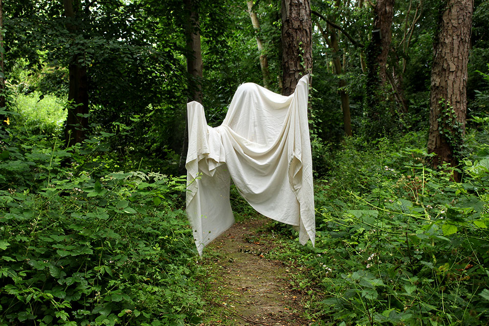
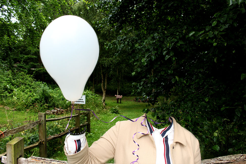
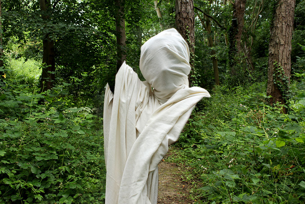
At the beginning of the A2 year we worked alongside photographer Tom Pope and adopted the idea of performance photography. I really engaged with this and found it so new and exciting, it was so different to anything that we had produced back in the AS course. I did research and one of the movements within performance photography was the idea of surrealism. This was something that I really gripped onto and loved producing this kind of dream-like and unreal work that I was able to produce. It was fun to create new world’s for my spectators to see and enjoy. I took inspirations from young photographers that I hadn’t heard of before including, Christopher McKenney and Brian Oldham. I do really like this style of work and think that I will be incorporating this into my own work again as it was so fun to create and come up with more unique ideas. I also love the genre of dystopian films and find it so interesting to see an imaginary world from the photographer or directors mind come to life. I will incorporate this through my own work too.

Christopher McKenney website: http://www.christophermckenney.com/

Brian Oldham website: http://brianoldham.format.com/home

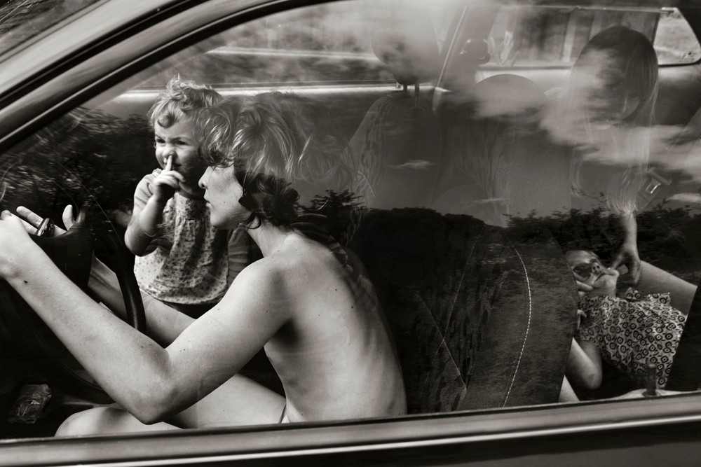
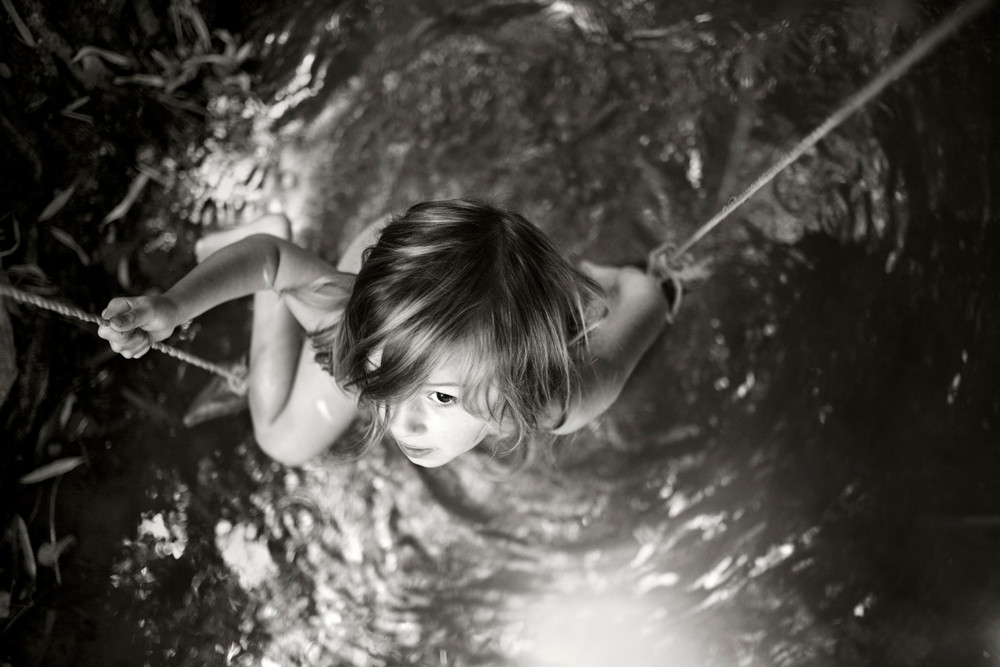
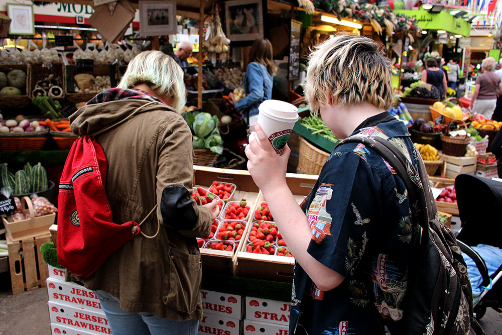
Further on in the course we started the study of documentary and narrative photography. Throughout the summer I made images of a day out with my friends and also did a shoot around the market community. These shoots were interesting to do and I like the images that I produced but do not want to develop those experiments any further. I learnt a lot with looking at the documentary work of other photographers and found this very interesting, especially the work of Alain Laboile. I do think that I will use the idea of documentary photography by making images of my own personal everyday life while also incorporating different methods of editing like in my own surrealism shoots to make for more interesting images as well as adopting John Baldessari’s method of making the subjects anonymous. I really want my spectator to focus on the general thing that the person/people are doing rather than who they are and their own personal background.

John Baldessari website: http://www.baldessari.org/

Alain Laboile website: http://www.laboile.com/

Reflection | Personal Study

Looking back at the course so far I realised that I did enjoy a lot of it and want to focus in on the idea of surrealism and incorporate it along with tableaux work and how women are represented within our society. I want to further develop these ideas to create a picture story as I find it the most interesting and fun to do and it is also something that I feel strongly about and want to expand my knowledge and research further in that particular area. I think that this will be the most successful as I have previously done work and research on this subject. I feel that I still have a whole lot more to talk about and express through my work on feminism and the way that women are treated within our society. For this I am also going to further develop my research of Claude Cahun, Cindy Sherman and Barbara Kruger. I like their styles and ways of photographing as well as the meaning that their images hold behind them. I will be making different images and I want to adapt different styles of my visual literacy including taking inspiration from Film Noir and also different techniques from AS with triptych’s, panoramic and doing more studio work. I think that this will make for the best final outcomes and I have an idea of a photo book too or possibly a fashion style magazine that I will also produce.

Claude Cahun work: http://courses.washington.edu/femart/final_project/wordpress/claude-cahun/

Cindy Sherman website: http://www.cindysherman.com/

Barbara Kruger work: http://www.theartstory.org/artist-kruger-barbara.htm

Case Study | Jem Southam

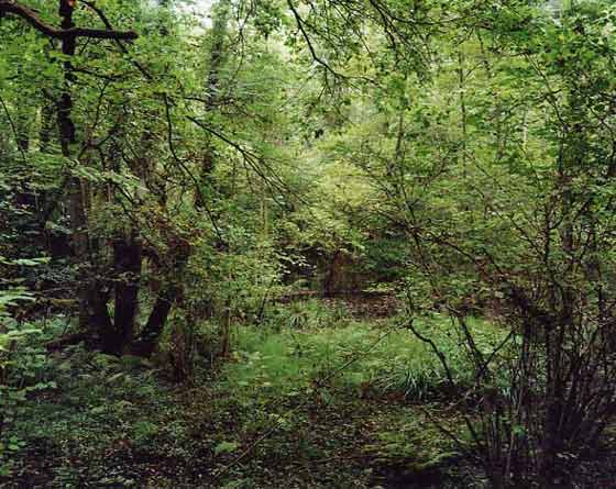
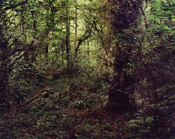
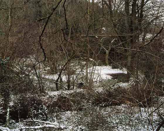
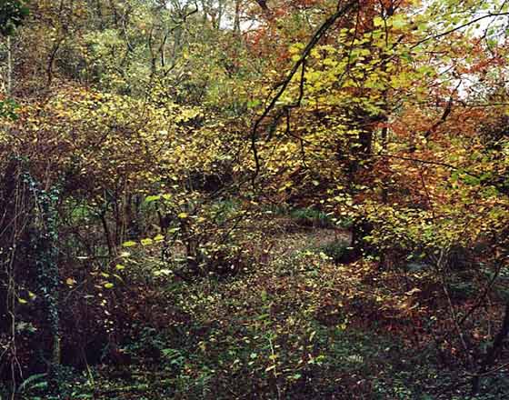
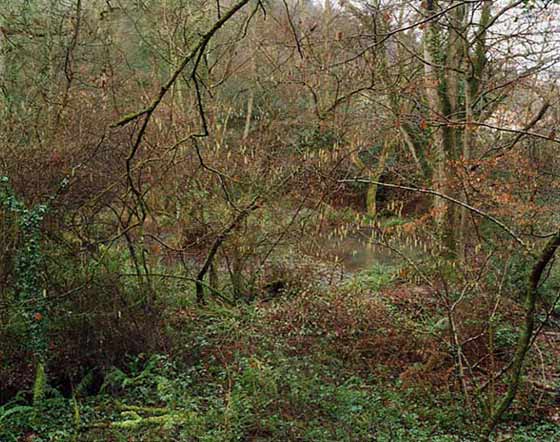
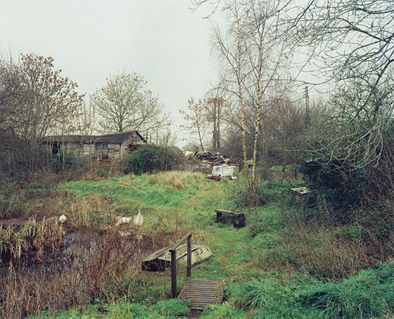
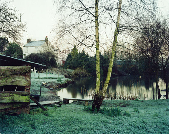
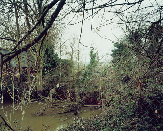
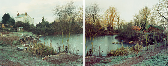
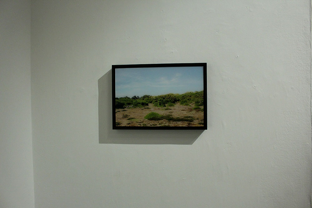
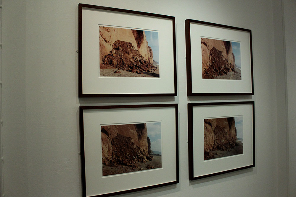
This photographer was chosen by the creator of the whole exhibition event Gareth Syvret. Jem Southam is a landscape photographer who makes rural landscape images used as a way to document man’s intervention in nature. Something that Southam does is photograph the same locations over months and years to show the difference that mankind has made in such a short period of time. Southam has photographed places across England. Southam was born in Bristol in 1950 and is one of the UK’s leading photographers.

Jem Southam on Artsy: https://www.artsy.net/artist/jem-southam

“I became heavily influenced by the Bechers, and pursued architectural landscape work.” – Jem Southam [interview with Seesaw Magazine]

Overview | What I think

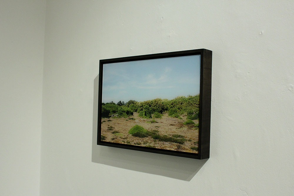
After having a look at Jem Southam’s work I have actually been quite inspired by how beautiful his images look. I think that they are all effortlessly beautiful images and I also like the way that Southam makes images of the same locations over a period of months and years, this is really interesting and shows how we are constantly changing as a society and how much people can effect the way the natural world is and looks. I find it so interesting that Southam makes images from the same locations and tends to stick to around the same area when usually quite a lot of photographers will travel around to a load of different locations and places. I do think that Southam is working on a huge project to make images of the same places which will give the most effect in years to come when spectators will be able to see how much has changed and how much people have changed it.

****

26965-large

Q. How does the work of Jem Southam reflect the way we are as a society?

In this essay I will reflect on how much our society can be changed and re-moulded just by the environment we are living in and how much manmade objects change even the natural world.
Firstly, I really like the work of Jem Southam as it is really visually pleasing and interesting as the natural beauty of the images is really intriguing to look at. I can really relate to this work as growing up I always found the beauty in the natural environment around me like around an area where Liberty Warf and the office buildings are now. I had so many memories of playing and running around with my friends along there and memories with my family just from that patch of grass but now it seems that all those memories have been taken from me with the creation of offices and shops. I find that we live in a world that wants to become a lot more corporate and we tend to forget about the natural world and how beautiful it was before humans inhabited it. This is why I like to look at the work of Jem Southam so much as I feel that I can personally relate to it.
Another way that Southam’s work reflects our society is that his images are so simple yet is really interesting.
Secondly, I chose this mini set of images above as I found them really interesting. It looks so lovely and almost like a fairytale book, where you would expect a fiction character or someone to live. I like that there is one house in the far distance on the left hand side of the image as it shows how much the natural world rules over this part of the countryside but it also shows how our buildings and our society have moulded themselves and pushed into the natural world making more of a manmade one. This image interests me as I want to find out more and see what that particular location looks like in  a couple of years and to see whether or not the natural beauty is still there or if the corporate world has taken over. To me Southam’s work represents the greed of people and how much we seem to benefit from creating more and more corporate and unnatural environments just to make a bit of money. It really is fascinating to think about the lengths people will actually go to in order to make money, even destroy the natural habitat of so much wildlife, creates and just natural beauty and plants.
I really like the work of Southam as it is so interesting and he somehow makes his images look really beautiful even though the message is showing how much man has changed the way our world looks. Southam seems to make images more in the woodland areas or around the coastline to show how different these places may look after months and years. I think that Southam’s work reflects our society in somewhat of a beautiful and positive light with all of his images being visually pleasing and almost magical looking, however the meaning behind these images is a really strong one showing how much society has changed and how quickly we are expanding in the world and how much the populations are growing that we have to go into natures territory and claim it for our own. 


Case Study | Michelle Sank and David Goldblatt

Michelle Sank is the local photographer part of the Quintessence exhibition here in Jersey, as a visitor to the island previously she has a localized body of work. When asked who her influences were and her inspiration Sank said David Goldblatt. He is one of the most well-known photographers across the world.

Michelle Sank website: http://www.michellesank.com/
David Goldblatt website: http://www.davidgoldblatt.com/

About Michelle Sank

Michelle Sank was the photographer in residence at the Jersey Archisle back in 2013. Sank was born in Cape Town, South Africa but moved and has been living in England since 1987. Sank usually makes images of social documentary and tends to focus around issues of social and cultural diversity. While in Jersey Sank worked on social portrait images showing the difference in social classes and the way locals are compared to how they used to be in the Archisle images.

About David Goldblatt

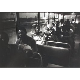
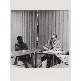
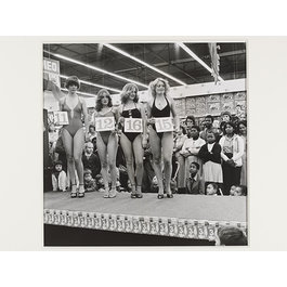
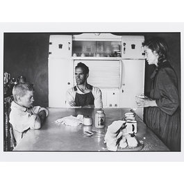
David Goldblatt is a South African photographer and was born in 1930 in Randfontein, South Africa. Goldblatt has an interesting history as he was the son of Lithuanian-Jewish parents who fled from Europe in the 1890s [with their own parents] and Goldblatt lived in South Africa at a time of deep segregation between black and white people. He seemed to challenge this and made images of black people, showing that they aren’t so different. Goldblatt became a full-time photographer in 1962.

More info about Goldblatt: http://www.vam.ac.uk/content/articles/d/david-goldblatt-and-the-v-and-a/

Goldblatt in moMA: http://www.moma.org/interactives/exhibitions/1998/goldblatt/

Comparison | Michelle Sank and David Goldblatt

Q. Through the work of Michelle Sank and David Goldblatt how are we able to see the difference in society and the way our world has changed?

In this essay I will compare and contrast one of Michelle Sank’s chosen images compared to that of David Goldblatt and what social impact they have. I will be comparing the differences in world opinion from the time David Goldblatt made his images [1950s] and to present day when Sank made her images back in 2013.
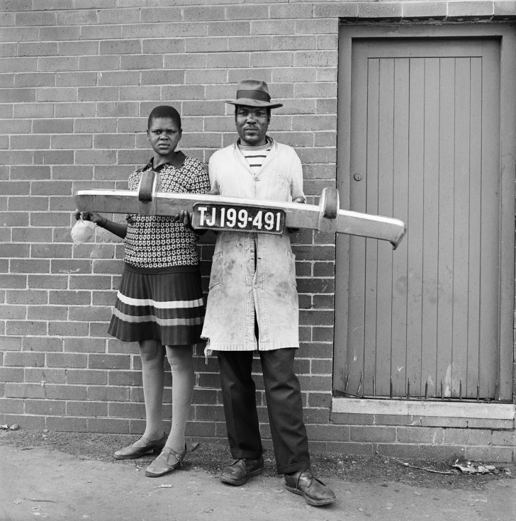
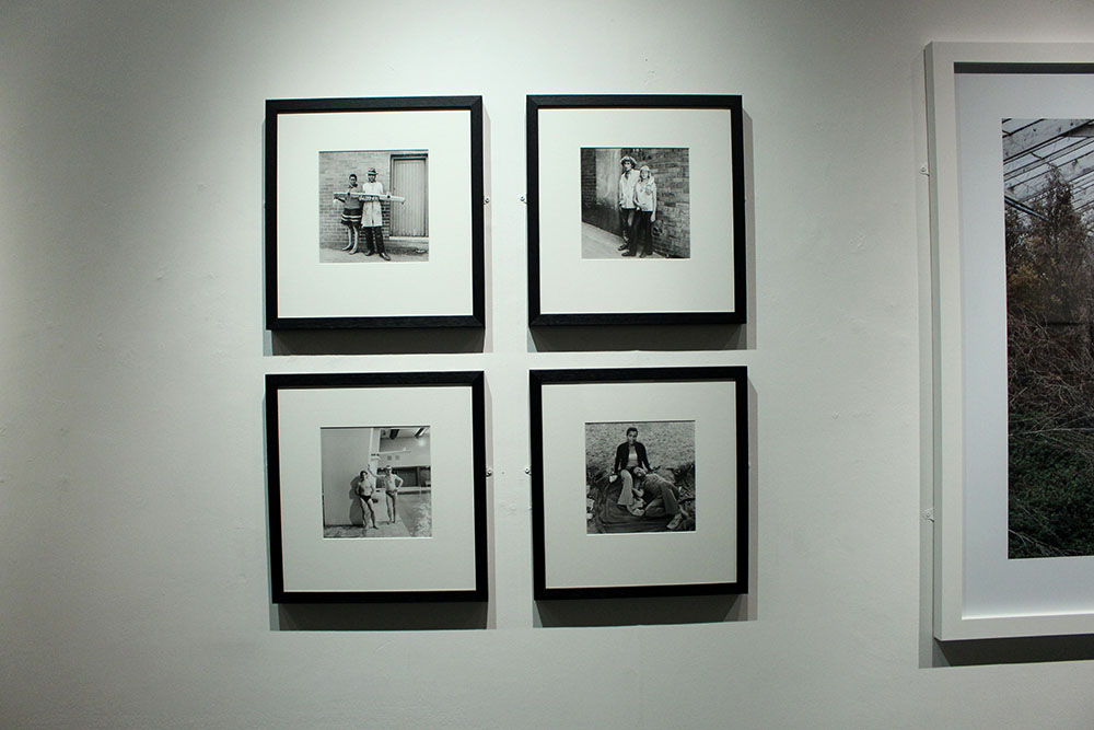
The above image made by David Goldblatt really interests me. I just like the  composition of this image with the two right in the center of the frame and are looking very seriously with a neutral expression into the camera, making the image a lot more personal and as if the pair are actually looking at the spectator. I find this image so intriguing as I wonder why they are holding a bumper to a car with a number plate, suggesting that the man is a mechanic as he is also wearing dirty looking overalls. They could also be stood outside their own house with the door off to the right side of the image. I really like that this image is in black and white, mainly because of the time it has been made, as it makes the image a lot more effective and allows the spectator to focus in on the subjects within the photograph rather than staring a the colour of the door or the colour of the lady’s dress.
Furthermore, I did some further research into the time period that this image was made, 1950s, and saw how South Africa was still a very racist place [it still isn’t completely desegregated today]. In South Africa they segregated everything, much like early 1900s America, there were separate toilets, cinemas, buses, schools etc. This, for me, is a very powerful image as David Goldblatt was a white photographer and it would have been seen as a radical notion to go out and photograph black people, it was seen as wrong to even talk to them at all. I really love the message behind this image showing that black and white people are no different, showing that we all have similar jobs and can work to the same standard there is no real difference between any of us. I think that this holds a strong social message showing how people can change, this photographer went out and made these images on his own free will.
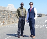
I chose to compare the images above as they both hold significance. The photograph made by Michelle Sank that I chose really went well together and almost complimented each other through their social attributes. The image made by Sank shows how far we as a community and society have re-moulded and adapted our closed minded way of thinking to becoming more accepting beings that realize that everyone is equal. Sank’s image would seem like a revelation if it was shown to those photographed in Goldblatt’s image. This image shows two men, one black and one white, stood next to one another as equals both wearing suits and ties. These men both represent workers and their attire represents this too showing how far we as a society have been able to change and develop our way of thinking. However, if I had no context or hadn’t been comparing Sank’s image to Goldblatt’s then I would not have thought anything of it at all and don’t find it to be a visually interesting image a part from the history and meaning behind the whole thing it isn’t really a strong image to me. I do find it similar in composition to the photograph of Goldblatt’s in both the subjects are slightly off center and to the side of the image but that is just how each of them made their photographs and I don’t think that there is any real relation there.
Likewise, I really do find Sank’s visually boring as there isn’t much going on in the background a part from an empty country road and it doesn’t really give any extra context to who these men are and where they possibly work. As an environmental portrait I don’t like it but what the men are both wearing suits shows what kind of people they are and suggests what they do as a job. I feel like the background is all too perfect with the blue sky and perfect light but with nothing in the background it just looks really quite dull to me. Comparing the two images I much prefer the work of Goldblatt visually and with everything that it represents too. I do like the work of Michelle Sank and like that she makes images showing the different communities and people within our society.
Overall, I feel that these two images alongside one another work really well and do show how society and world view has changed from the 1950s to present day. Through these images the spectator is able to see how far black and white people have come together in the creation of equality of life and jobs. I like these images and think they are strong together and reflect how much has changed in such a short period of history.

Case Study | Tom Pope and Peter Finnemore

I wanted to look more into these two as I have studied the work of Tom Pope and found it really interesting and unique. I find the chosen photographs of Peter Finnemore’s really interesting and engaging, they are strangely unique linking to the work of Pope. I find the two have very unique styles and the idea of performance really shows through their work. Finnemore was Pope’s teacher who he looked up to and was influenced by in photography.

Tom Pope’s website: http://www.tompope.co.uk/index.html
Peter Finnemore website: http://www.peterfinnemore.com/main.html

About Tom Pope

Tom Pope was the photographer in residence at the Jersey Archisle in 2015. He is a performance photographer and is currently living in London after graduating with a Ma in Photography from The Royal College of Art back in 2011.. Pope’s work is very unique and has strong political and social messages behind it. Much of Pope’s work is based around his project of Weak Anarchy and challenging the way we think as a society and what is right and wrong in the eyes of the community surrounding us.

Interview with Tom Pope: 

About Peter Finnemore

Peter Finnemore is a photographer born in Llanelli, Wales. He was one of the first students at the new Fine Art Photography Course, set up in 1984 by Thomas Joshua Cooper, at the Glasgow School of Art, Scotland. Finnemore gained an MFA in Photography at the University of Michigan, USA. Finnemore is a visiting professor in Photography at the University of Derby. He also lives and works in Llanelle, Wales. Finnemore’s work consists of many landscape images, environmental images that show the natural world.


Comparison | Tom Pope and Peter Finnemore

Q. How has Peter Finnemore influenced the style and genre of Tom Pope’s photography?

In this essay I am going to compare and contrast photographers Tom Pope and his chosen artist, from the Quintessence exhibition, Peter Finnemore. I really love the style of Finnemore and wanted to explore it further and find out more about the location of his work as well as how Pope relates to him and how their work differs.
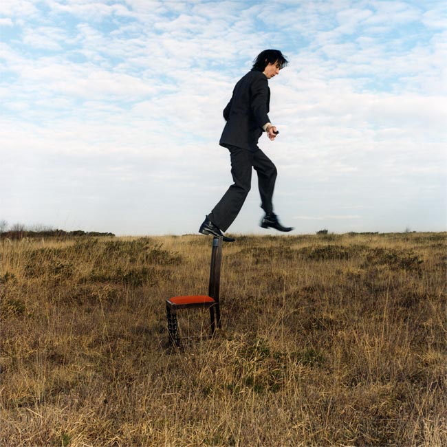
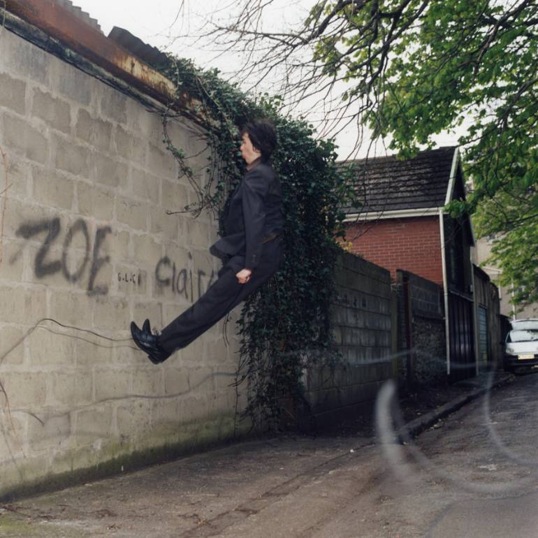
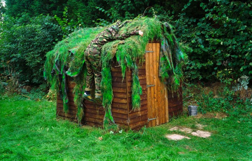
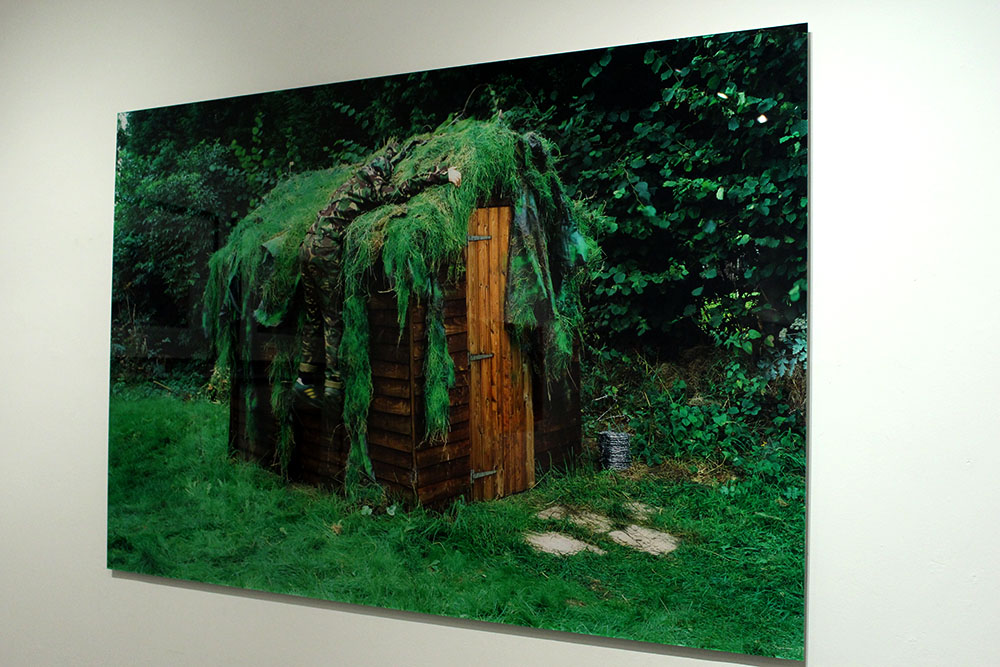
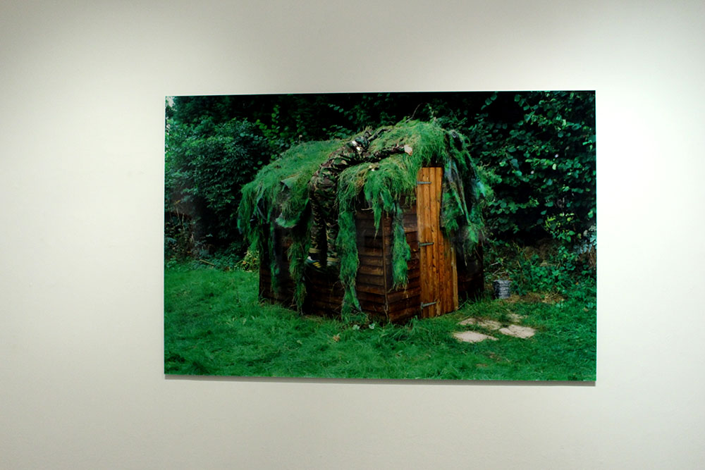
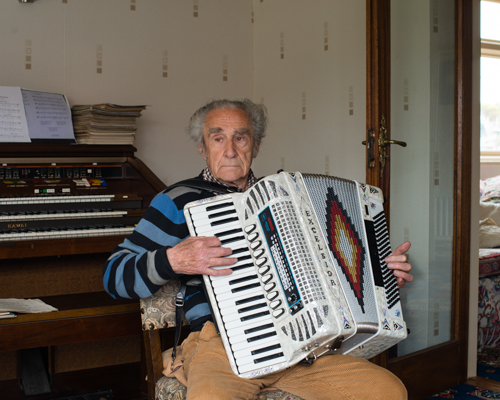
I find that Pope and Finnemore have similar styles of photography. They tend to take the element of performance to the next step and really get into their role and what they want to do. One thing that they differ in is that Finnemore seems to prepare a lot of his work and knows what he wants to do and will usually make all of his images in his back garden whereas Pope tends to have a basic idea of what he wants to do and leaves it all up to chance in one image taken on a film camera and will perform in public and not stop if there are any passersby. Their work differs in the sense that Pope is very classic with the types of cameras that he decides to use and Finnemore is more modern using newer digital cameras as you are able to tell in the different ways that the images above look, with the way they capture the light and everything in the frame of the image.
I chose the two images above as they interested me the most. I really love the photograph by Finnemore, there is just something about it that is really intriguing and makes me want to find out more about what is going on in this image and possibly a deeper meaning behind it. It reminds me of war and how during the war, in Jersey, they had to cover up an underground hospital with grass and dirt to make it just look like more land when the enemy flew over looking down and not actually being able to see that something is there. This image really interests me as the subject in the image, a man, blends in with his atmosphere and at first glance I didn’t even notice him at all. I really do find this image engaging as it is so odd and random yet it seems to remind me of war and how the world was at one stage in our recent history. To me it looks as though the subject just jumped at the shed and is clinging onto it to try and hold himself up. It’s also interesting to know that this was all taken in his back garden. Something that I really like about this image is that I am so interesting in it and really would like to find out more about it and if the meaning that I have generated from looking at it is actually the meaning and the message that Finnemore is trying to put across.
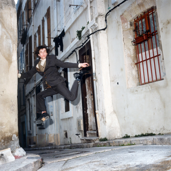
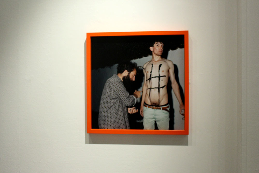
Contrary, I find Popes image very different. It doesn’t really make me think of anything political at all, I like the image but I am unsure as to what influence it has over me. I guess I could say that it makes me think we should all just be as carefree as Pope is and do things in public without worrying or being overly aware of the other people around, to be the real you. This image also reminds me of going on holiday as the lane and the brick flooring just reminds me of a place like Portugal or Spain or even the South of France. I do find this image interesting and almost amusing because of the way Pope is positioned in this image. I also like that he uses film cameras in his work to make everything authentic and when he does do his performances it is all down to chance that the camera will capture the moment that he wants it to really get.
The reason that I chose to compare these two images is because of the way both photographers approach photography as a performance and they do it for themselves and if someone happens to walk past then that performance has been seen by someone else but primarily they will just do it for themselves. I feel like Pope has been influenced by this through Finnemore’s work. Finnemore’s work is more of a poetic symbol in that it is about showing the world his home, his territory and his paradise. He wouldn’t want anyone else to steal his home or to invade his personal paradise. Contrasting to this I find that a lot of Pope’s work is very abstract and unusual but can also be poetic and symbolic of a deeper more political meaning.

Case Study | Martin Toft and Finn Larsen

For this case study I chose to look at Toft and Larsen first as when looking around all of the images these were the ones that really stood out most to me. I found Larsen’s images so visually pleasing and beautiful but I knew nothing about the images and what they represented and was shocked when I found out what they were really about. I love finding out new things in the photographic world and what underlining messages there are behind these types of images.
Martin Toft is the local photographer who nominated Finn Larsen. He is a Danish man and is currently living in Sweden. Toft was 25 years old when he figured out that he wanted to be a photographer and if he hadn’t met Larsen, Toft says that he wouldn’t be a photographer. He basically mentored him giving him a load of photographers photo books to read and study for one week, a box filled, the next week he would go back to see Larsen where they would discuss everything Toft had found out and learnt. They did this every week. This really helped Toft become a better photographer and so Larsen has become one of his biggest influences.

Martin Toft’s website: http://www.martintoft.com
Finn Larsen’s website:
 http://thephotographersprint.com/products-page/finn-larsen/

“The photographs and the art that interest me enter into a global and historical dialogue about how the world looks and how it can be understood. It is about seeing the world, society, the landscape as soberly as possible, without God, sentiments, nationalism, symbols and other abominations.” – Finn Larsen

About Martin Toft

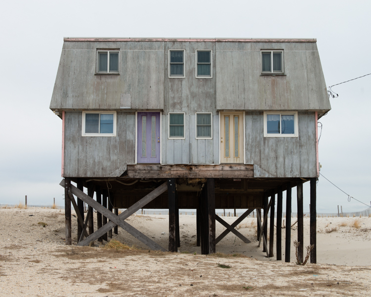
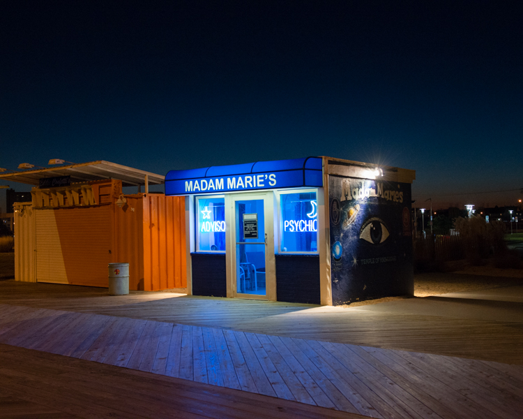
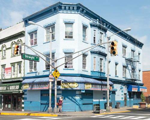
Martin Toft is a local photographer originally from Denmark. He is working as an A Level teacher here at Hautlieu school. Toft has worked on a huge project called Atlantus. This is a project showing the connections and contrasts between Jersey, Channel Islands and New Jersey. Through Toft’s work we are able to see how different and how similar the two are. It is strange that a lot of the world doesn’t even know that Jersey exists and this project in particular is interesting as it explores a place named after Jersey.

About Finn Larsen

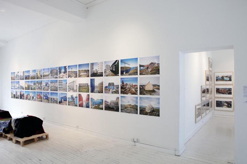
Finn Larsen is an international photographer nominated by Martin Toft. He is a Danish photographer now living in Sweden. Larsen graduated as a photographer in 1980. He is a member of the Society of Artists and the Association of Visual Artists in Denmark. He is also a member of the National Organisation of Artists in Sweden. Larsen has published books over the years and has recently worked on a project titled ‘Mansland’ where he made images in Greenland of all of the waste and dump on the island.

Comparison | Toft and Larsen 

Q. What underlining social and cultural messages are held in the work of Martin Toft and Finn Larsen?

In this essay I will compare the similarities and differences between Martin Toft’s photographic work as part of the Quintessence exhibition and his chosen artist Finn Larsen.
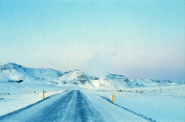
Firstly, I find these two photographers different in their approach and their style. Toft’s project shows people and the environment surrounding those people and how different and similar Jersey and New Jersey are compared to one another. He also looks into the history of these two parts of the world and shows, through his images, how far each place has come and how different it is now compared to in the past, especially in New Jersey. Whereas Larsen’s images are pure landscapes giving little away but with a deep political and environmental meaning behind it. I like both photographers but for very different reasons. I find Toft’s work very interesting in the people he chooses to make his images and their facial expressions, the way they look and feel in front of the camera. Toft’s work shows how a place can be named after another place yet have nothing in common with the original place or it even shows different sides of the spectrum and how they take care of things differently. Contrary, Larsen’s work is more just landscape work with strong political meaning behind them. I find that his work is a lot more subtle in that you wouldn’t guess what is going on in just one image, you would need to see the entire project to understand what is going on. I find his work very interesting as he has some really beautiful images with a deeper meaning that you most likely wouldn’t get if you did not read more into it.
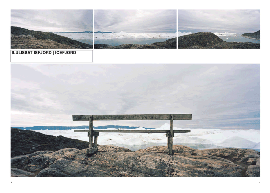
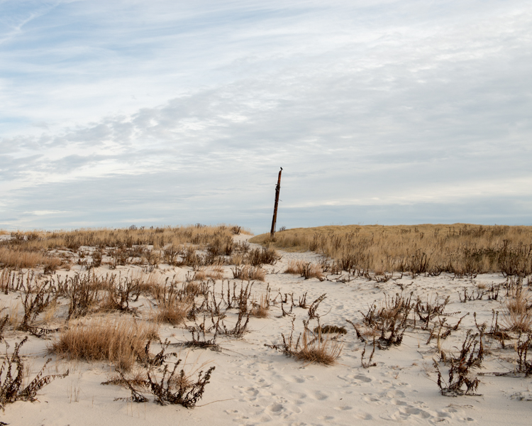
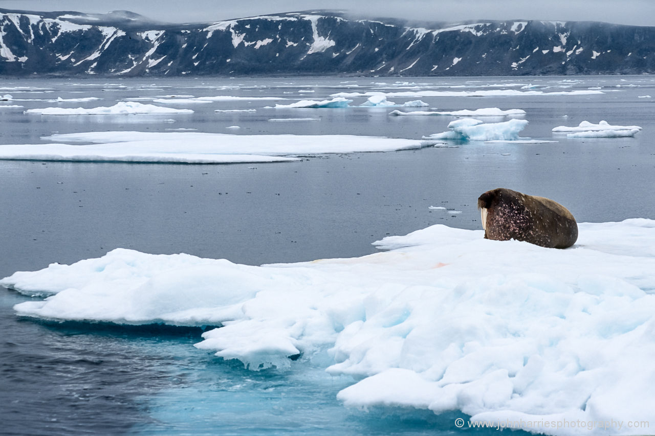
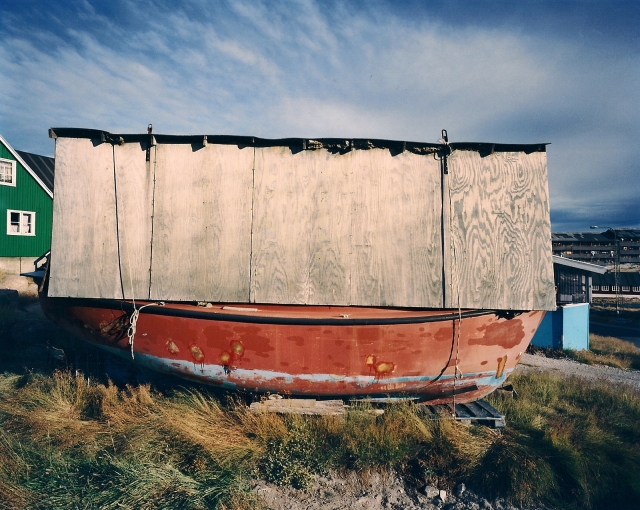
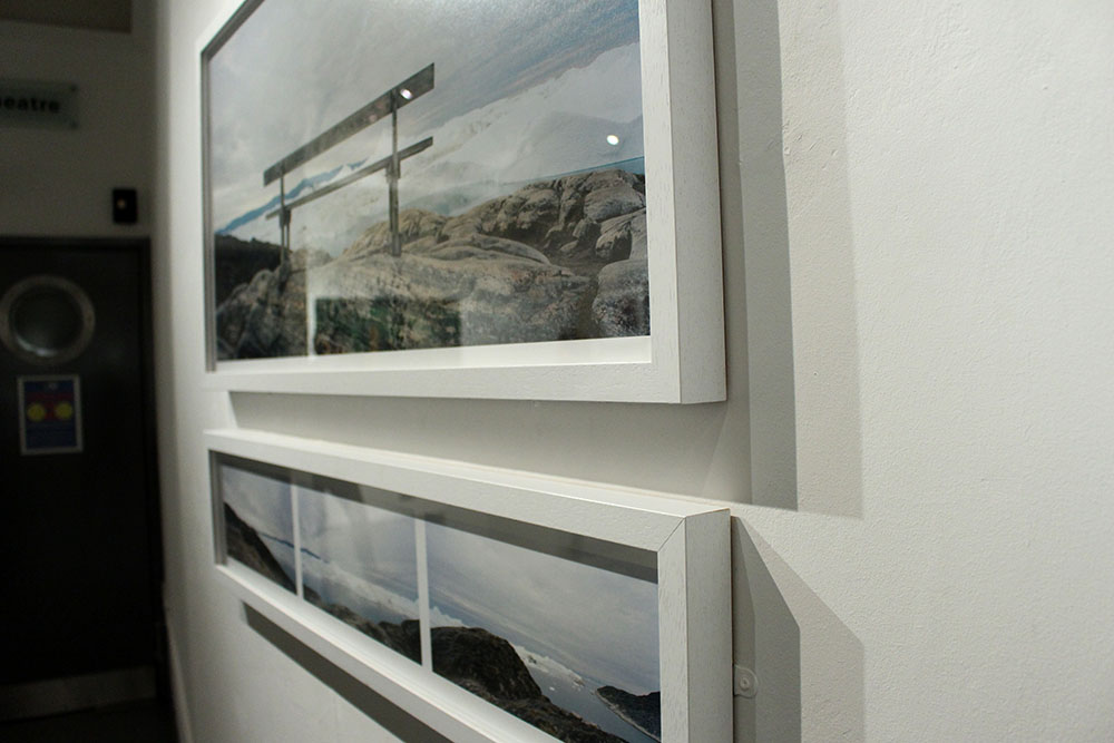
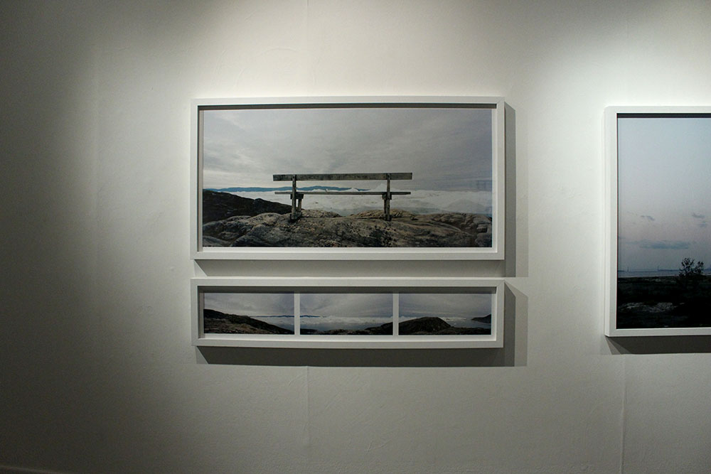
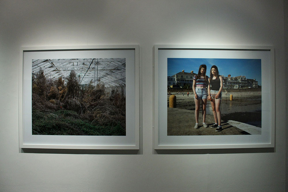
However, I chose to compare the images above as I saw similarities in them visually. In the center of both of these images is an object, Toft’s is a large stick or pole and Larsen’s is a wooden bench. I find that Toft’s image shows the natural beauty of the land, it is simple yet the cloudy skies and the landscape is captivating. On the other hand, Larsen’s image looks,at first glance, like another beautiful landscape image of glaciers in the water with the perfect view from the bench but reading more into this project I found out that just beyond those glaciers is a dump, filled with human waste. It is so sad, to me, to see both of these beautiful landscapes yet our own destructive human nature is slowly destroying that and taking over with these landscapes being ruined by our waste and dumping. I find Larsen’s image very powerful and almost sending out a political message to the rest of the world saying that this beauty is being destroyed and ruined by our wasteful nature.
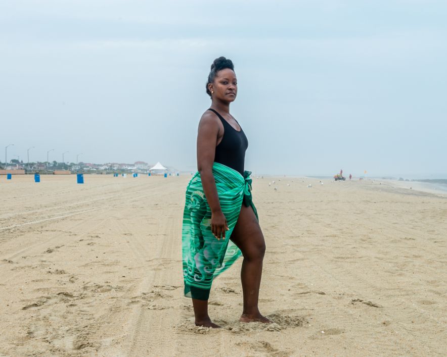
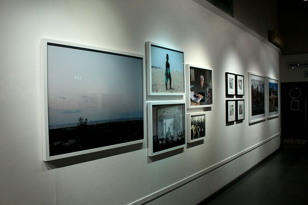
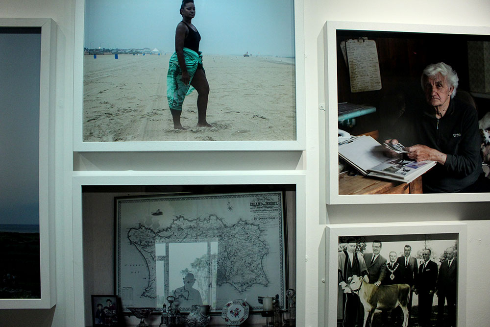
Contrary, better suited for the comparison would be the image Toft made of a black woman at a beach in New Jersey. This image represents a lot. It represents the struggle that black citizens of America went through. This image was made in a place in New Jersey called Asbury Park where black slaves used to stand and serve their white masters over 100 years ago. This is why this image represents a lot and is so significant in how far we have come as humans. In contrast, the image made by Larsen shows how really little we have come in society hiding our waste and dumping our unwanted rubbish behind a beautiful natural glacier. I really like these two images together as they both hold a lot more behind just that one image. It is captivating and interesting and the more you know about the subjects and the behind the scenes of what has gone on in the past or what is going on in the background makes the image even more powerful. I like these two photographers, Toft and Larsen, as their work holds meaning and doesn’t just tell us or show us in that single image, we aren’t given everything yet are left thinking about it and what it could represent. These images aren’t as simple as they look and have generated meaning behind them.
Likewise, a common theme that I am beginning to notice in both Toft’s and Larsen’s work is that it holds a deeper meaning. There is more to it than what you see as a spectator and their images hold so much significance and beauty. Both of their subject matters seem to reflect us as a society. The young black woman stood on the beach represents how far we have come as human beings and being able to bypass ridiculous laws and change the way we think to be broader minded and actually accept everyone as human beings. On the other hand, Larsen’s work represents society in a more negative light. This cant be seen in the beautiful image of his above as it shows the beauty of the glaciers and the sea and the cloudy skies but behind all that there is a disgusting dump filled with our own human waste and it shows how as a community and society we still don’t know how to control our own waste, how to not ruin the natural world that we have. It shows how we as a society are constantly taking over the natural world and making it a corporate one.

timthumb
Martin Tofts photography | Tamika Tolliver, Asbury Park

Quintessence Archisle | Case Study

About personal study
The personal study needs to be finished by the end of the February half term and is a self directed study, you will make a hypothesis of what you want and are going to find out in this study. All of your work relating to this hypothesis must be enough to make up an entire book. You must find a subject and choose a story, finding a real issue and explore it. You’ll also be writing an essay about this of about 2,000-3,000 words.

Case study | Quintessence Archisle
This project brings together select Jersey photographers and international photographers in an exhibition set up by the Archisle. The Archisle was put together back in 2010 and has now been around for 5 years.
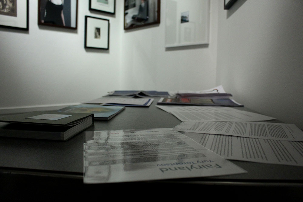
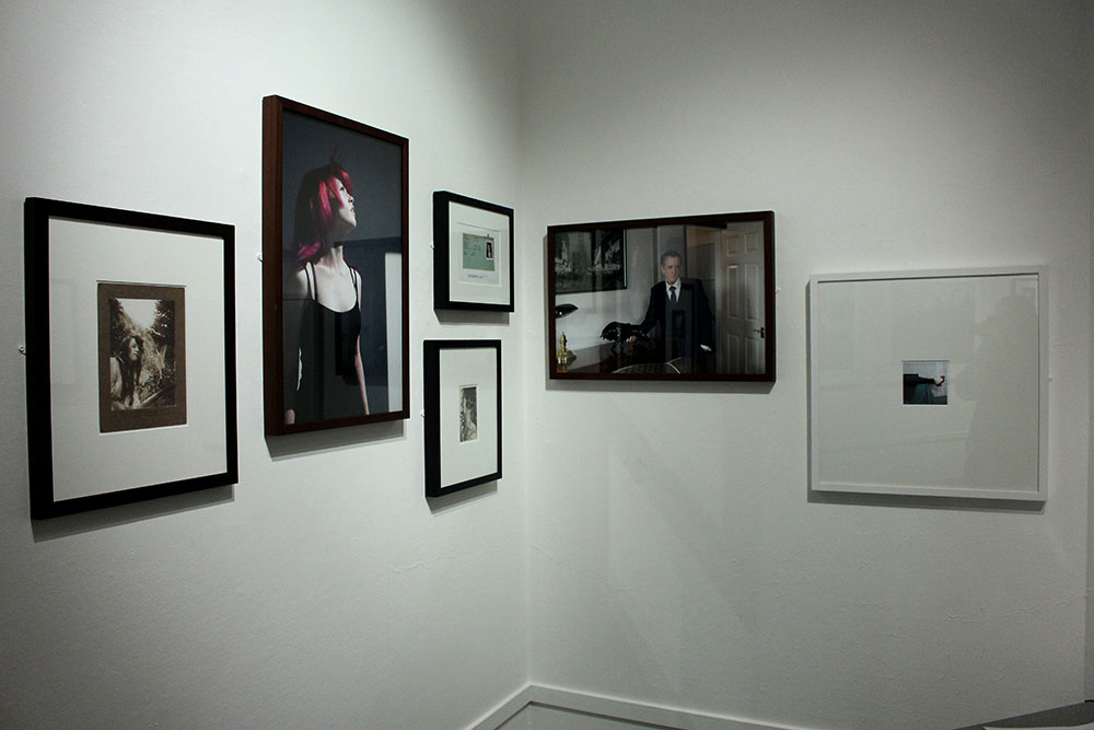
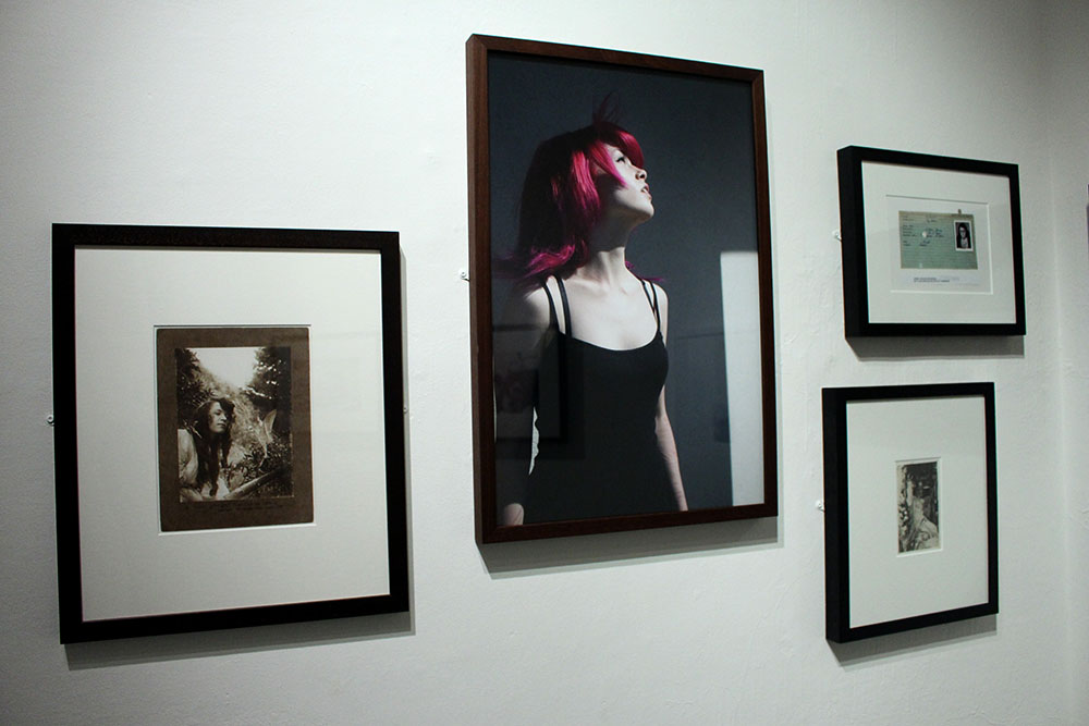
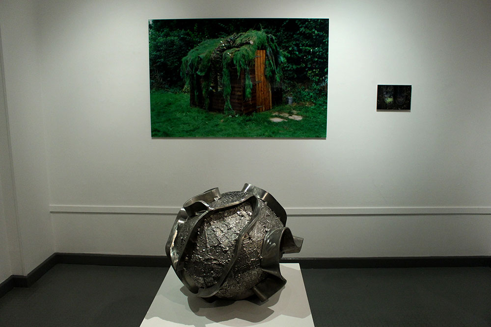
The Societe Jersiaise Photographic Archive in 2011 launched the Jersey Contemporary Photography Programme to promote contemporary photography in an ongoing programme of exhibitions as well as through eduction bringing Hautlieu into the mix. This brings in ideas to connect photographic archives, contemporary practise and experiences of island cultures. Jersey has become a big part in photographic history and has influenced many artists and new ideas. This exhibition celebrates the first five years of the Archisle. The exhibition contains work from 6 artists either from Jersey or whom have worked with the Archisle and they were each asked to come up with another artist who has inspired and influenced them. The artists are; Martin Toft – Finn Larsen, Tom Pope – Peter Finnemore, Michelle Sank – David Goldblatt, Yury Toroptsov – Elsie Wright and Frances Griffths, Martin Parr – Tony Ray-Jones, Mark Le Ruez – John Gibbons, Jem Southam.

Islandness | What I think
I really like the concept of islandness. To me it really makes sense as I do feel that as an island we are really bubbled from the rest of the world, unique. We tend to see the world differently to those living in the UK. For example, a mass murder in Jersey will hit headline news and be all everyone talks about for months and no one forgets but in America things like that seem to happen all the time and you lose count of how many killings there have actually been. This could be because of the fact that Jersey is so small and these things happen in America because it is so vast and huge but we do seem to reflect on the world in a different way. The idea of islandness is supposed to connect the thousands of islands across the world together. Our concept of identity is different to the rest of the worlds.
Our upbringing and culture moulds us and makes each of us unique. We can change with anything or anyone we meet or a place we go to and it can have good or bad results. Everything that you encounter changes you in one way or another, you can be somehow influenced by something in your life without even noticing it.

The Exhibition | My thoughts
answering questions

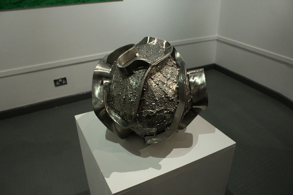
When entering the exhibition firstly I thought that it was in a much better location being in the Jersey Art Centre as it is quite a quirky place with the cafe beneath it and is in a more accessible part of town which a lot more teens and adults will likely know about. I also much prefer the layout of this exhibition compared to the Jersey Evening Post – Your Story, Our History: 125 Years Through a Jersey Evening Post Lens. This exhibition looks very professional and I prefer the white walls with the white frames on more of the images. I find the whole thing just looks a lot more professional and clear it is very well constructed and just altogether a better exhibition. I like that the Jersey photographers have their chosen artist/photographers work next to their own to show who they have been influenced and inspired by. I really like this idea of sharing and being influenced by other artists. I find it great that this exhibition is also able to sell the photographers work and showcase their talents to the community of local Jersey islanders. I have decided to do some further research on the work of Finn Larsen as I find his work captivating and after discussion at the exhibition I found that there is so much more to the beauty of the images that are shown in the exhibition itself which I am excited to explore further.
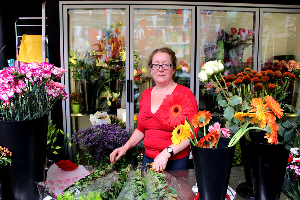
Final Picture Stories

I went with two different kinds of designs for these picture stories to get the most varied spreads and to appeal to more spectators/readers. I went for a traditional newspaper spread taking inspiration from the photo story of The Midwife. I decided to go with this design as it looks really great and I like the idea of making it all black and white with text underneath each image. The second design I went with was a magazine style print which is a lot more modern and I do really like this type of design. I think that it will appeal more to a broader variety of people and age groups as a lot of people nowadays are in to reading magazines.
Newspaper Layout:

For the newspaper layout I decided it would be best to follow two double page spreads to tell my story like my style model as I wanted to develop the story a bit more and for the spectator/reader to be able to visually see as much as possible by adding in plenty of images for them to see and to add more context to the story and the text. I think that this works best as a professional layout and looks good in black and white as well as with all of the captions underneath the images as I think this really makes it that much more professional. I like this design as it is interesting to look at and will hopefully make the reader/spectator want to read on and look at more images. I do think that my title and the text needs to be changed as it isn’t as effective as I would want it to be. I want to change it to the same text as the magazine layout designs as this is the best one that I have written and I think that it works better with the images too.
I prefer this title as it stands out more and seems more interesting to read as it reflects how unpredictable babies are and how much care and attention you need to give them as a parent. I also like the images that I used as they are interesting to look at and give the spectator and insight as to what life is like as a parent having a crazy one year old. I also made the font size of the little captions a lot smaller as that is what it would have been like in an actual newspaper. I like the layout of this design and think that it works well. Overall, this is my favourite newspaper design as it looks the most professional and stands out to me the most. I like the black and white images as it is more like a traditional newspaper layout which I like.

Magazine Layout: 

magazinneeeeeeee layoutblogHere is the final layout of my magazine design. I moved the text and the title to the bottom left hand corner as this is where I had empty space with nothing going on and wanted the focus of the main image to be my niece looking up at her dad. I think that it looks a lot better like this and is more interesting to look at. I like this design as it is the most professional looking out of all of the designs that I have made and looks the most interesting to a spectator. I have also made the font size smaller as it took over too much space and I did want the focus to mainly be on the images rather than to focus in on the text. I think that this balances everything out and it is all evenly spaced out and shaped. I chose these images as I found that they worked well with my text and title showing how fast pace and manic children can be, you have to follow them around constantly to make sure that they don’t get themselves hurt or stuck anywhere. Overall, I am happy with this layout and think that it does tell the story well enough for the spectator to know the story and what is going on within it.