All posts by Max Le Feuvre

Filters

Author:
Category:

Atlantus: Analysis

Analysis

Atlantus: Ways of telling a Story

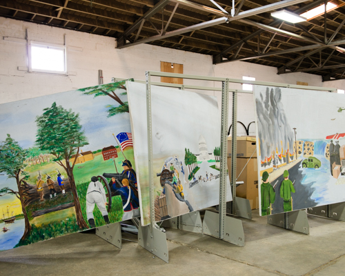
The story told through Atlantus is viewable as a newspaper as well as a pop up display. The images are by Martin Toft and the text is written by Gareth Syvret. The story basically explores the relationship between Jersey and New Jersey, two places; (Old) Jersey a small Island in the British Isles and the other, New Jersey, the 11th Most Populated U.S. State. Toft tells a narrative of this relationship between the themes, places, cultures and peoples of both places, which began 350 Years ago when Jerseyman Sir George Carteret, went over to America and found the territory of New Jersey which later became the State of New Jersey after US independence in 1776.

Text

Syvret’s writing is incorporated into ‘Atlantus’ in order to guide the reader through Toft’s visual story. Each of the five stories are accompanied by a large body of text, approximately 5-6 paragraphs which explain in detail each of the five themes. The introduction by Syvret explores the context and historical value of each of the themes. Small paragraphs of text are also included to explain and add a written narrative to each of the individual images. Text is effectively an aid that Toft uses in ‘Atantus’ to enable to viewer to be better informed of what is being shown. The story would not be able to develop if the text did not act as a bridge. Additionally, image annotations help to link images together. For example in ‘Precious Galinthia’, Toft looks at how the Jersey Cow links New Jersey and Jersey together. The text in this instance, helps to establish a relationship between different images by linking it to a particular storyline/context.

Symbolism

A lot of the meanings that Toft draws into the story are subtle. Toft uses symbolism to develop the storyline and link images together. His meaning are implicit and must be interpreted by the viewer. A form of symbolism used is connecting different images to a common theme. For example in one of the stories, Toft explores the connection of horses in Jersey and New Jersey through three very different images, related to this theme. However it is done in a very subtle and poetic way, whereby the connection is not overly obvious. Over time the story is linked together through images relating together and each time, exploring slightly different themes. The text helps to distinguish these ideas properly.
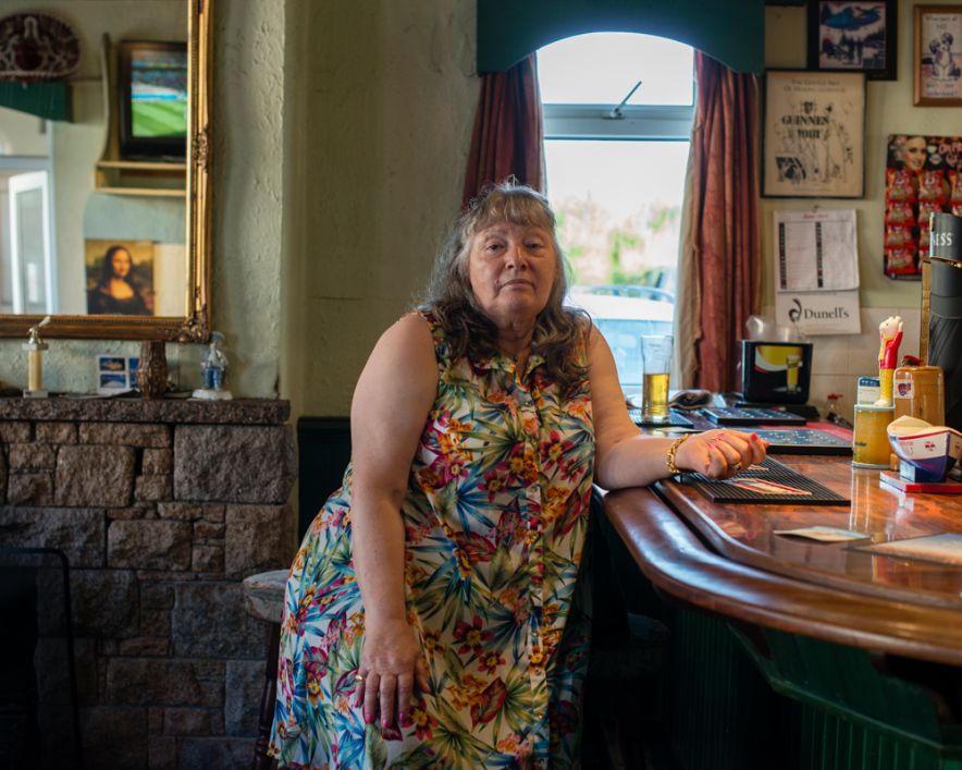
Toft was required to work with people he had not met before, often visiting them many time to gain their trust and to get the right photos, this simply can’t be done in one shoot.


There are three photographic styles that Toft includes to tell to story in ‘Atlantus’, in addition to archival photographs ; ‘Portraits’, ‘Still-Lifes’ and ‘Landscapes’

Portraits

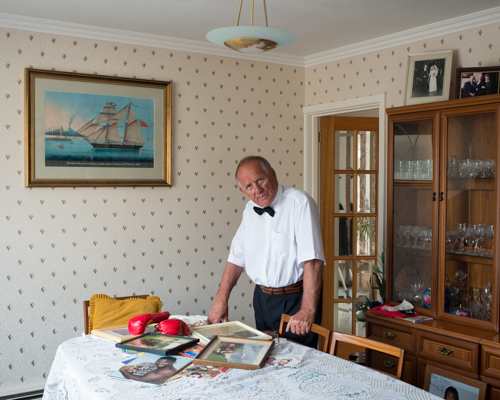
Toft uses portraits as a way of exploring the people that live on both sides of the Atlantic. Toft experiments with different aspects of portraiture, ranging from formal tableaux style photographs of political leaders, for example the Mayor of Carteret, to informal candid style images of subjects engaging in activities. Portraits are used to illustrate the human impact regarding particular themes.
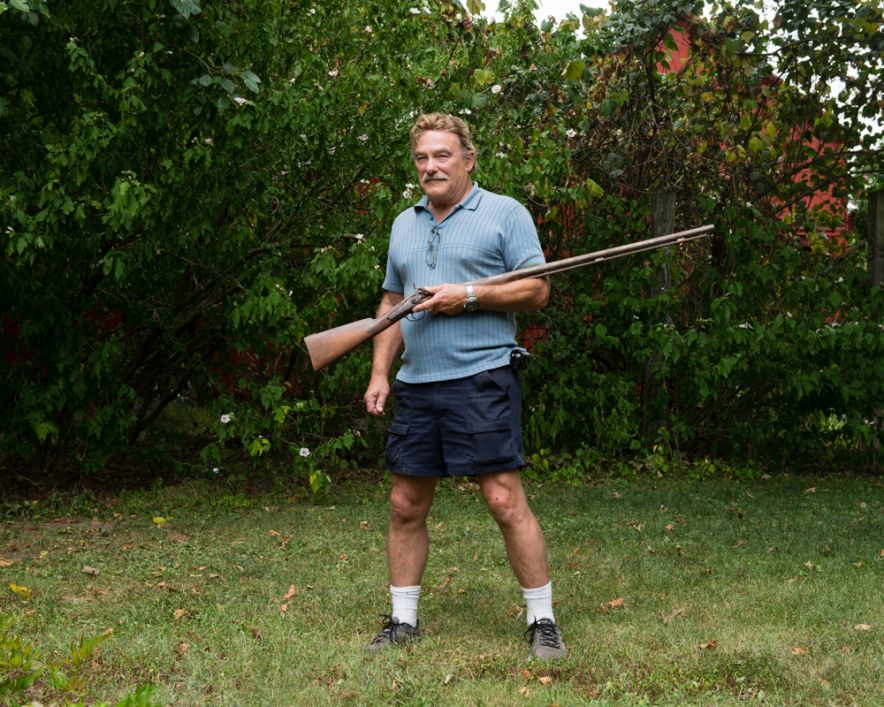
Portrait: Ted Johnson, August 21 2014

Still-lifes

Still-lifes are close-ups of any type of object, images which are not usually photographed for aesthetic purposes. They are an effective way to record and document. Toft uses still-lifes throughout ‘Atlantus’. For example, in the specific story also entitled ‘Atantus’ Toft Photographs the archival records of Sir George Carteret at St Ouens Manor Library. These type of photographs have no aesthetic value, but are merely a form of visual documentation which help to illustrate the context of the storyline
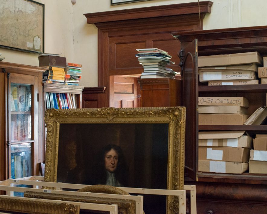

Still-life of the Library of St Ouens Manor, April 9 2014

Landscapes

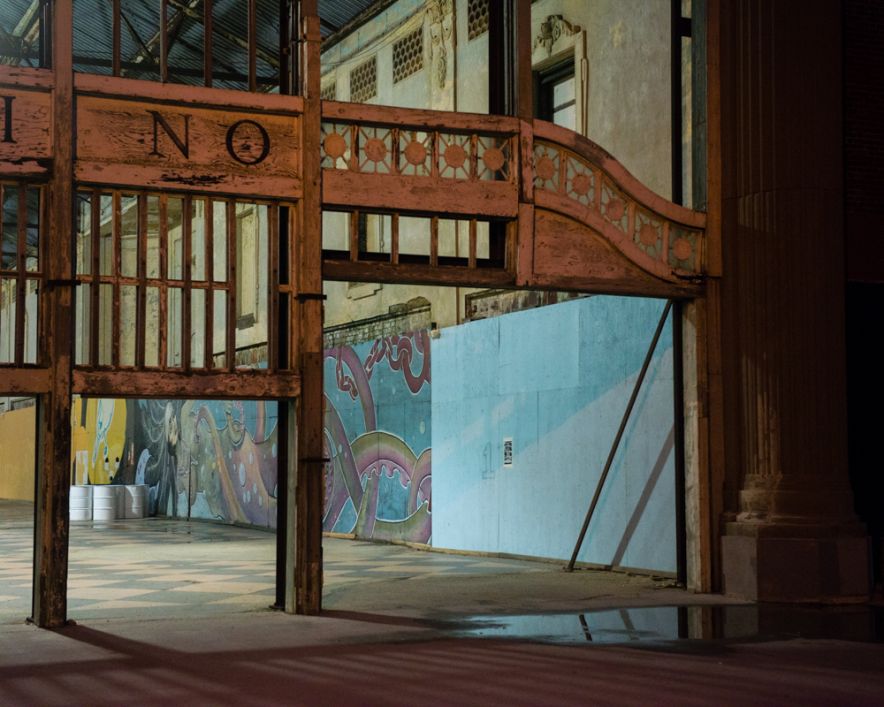
Landscapes are included by Toft in order to show to geographical relationship that Jersey and New Jersey share i.e. coastlines, beaches, landmarks and buildings. The story ‘The Transoceanic Journey’ specifically looks at the geographical similarities and differences of the two locations, and so incorporates many different landscape shots in order to illustrate this connection
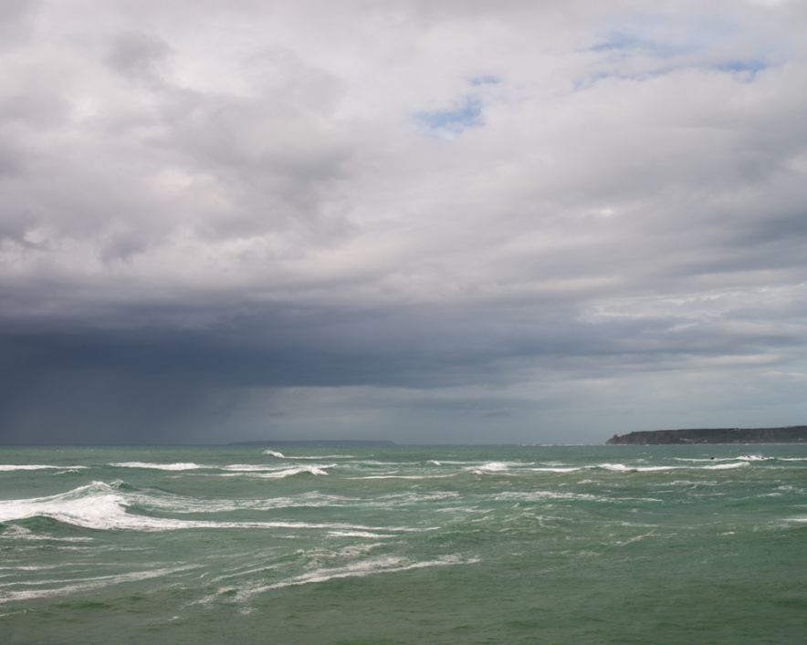
Landscape: Atlantic Ocean April 14 2014

Archival Photographs

Toft uses archival photographs as a key component of the narrative. Archive photos are key in highlighting the different themes and context. A great deal of Syvret writing is influenced by the types of archival photographs. These type of images help to direct the narrative back to a historical/contextual basis. In terms of storytelling, I find archives photo are a very good means of providing evidence of a theme, and help to shape the way the viewer conceives the photographer own images.


Context

Artists that have influenced ‘Atlantus’

Alex Soth; images which tell and interesting story about communities

Mikael Subozty; historical/cultural documentary; conceptual forms of presenting his work – videos, slideshows, voice recordings etc.

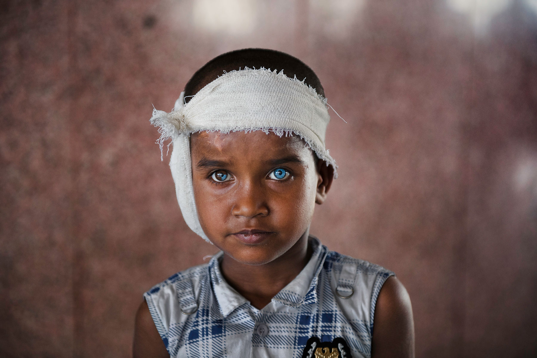
Steve McCurry; powerful images with strong, deliberate composition to enhance level of drama; close-up portrait images
Robert Frank; observed candid shots

Martin Parr; close-up/still-lifes

Style

‘Atlantus’ is a form is social documentary. Toft’s main focus within ‘Atlantus’, is to explore the different relationship between the people Jersey and New Jersey. All non-portrait images, ‘still-life’, ‘landscapes’ and archival images each time relating this directly back to the study of people. Toft explores the sub-genre of community within the project. He is photographing from a completely outsider perspective, and was required to gain the trust of the people he photographed and worked with.

What I like about ‘Atlantus’

The layout of ‘Atlantus’, both as a newspaper as well as a pop-up display I find to work very well, it is a very innovative and creative concept. In particular I like the pop-up display because it is very different and unusual. The pop-up display has many advantages; firstly it allows all of the images of the narrative to link to as a visual newspaper. Secondly, it is very user friendly and the simplistic format of newspaper that the photographs are printed means that the viewer is able to easily view what is shown without it appearing too intimidating, which can sometime be the case. Lastly, it is very cheap to produce in comparison with printing and framing photographs. This allow ‘Atlantus’ to be printed in mass and distributed to many more areas than an exhibition would enable, meaning that the story can be spread across a wider distribution. The purpose of ‘Atlanus’ is to connect the two places together and so a compact newspaper format I believe is most effective in doing so.

I also like Toft’s use of poetic gestures to connect images. This idea is very subtle and makes the viewer use their own initiative to so e degree to connect the theme. This sense of openness to the images, contextual interpretation makes the narrative more viewer interactive and friendly


What I didn’t like about ‘Atlantus’

The way the newspaper was packaged means that it has been folded into 4. The images are display horizontally, means that in many of the images there is a crease. I find that this disrupt the visual flow of some of the images, and is quite noticeable. When newspaper material is exposed to light it changes colour, turning a yellowish colour, a problem mainly when a pop-up display is created. This can affect how easy the images and text are viewed. At the same time however it can create is vintage effect to the newspaper which I would say is more effective as a newspaper format. I don’t like how the structure of the narrative works in some aspects when viewable as a newspaper. On the first page of ‘The Transoceanic Journey’ for example; there is half a photograph of debris displayed. When viewable as a pop-up display the full image is shown, however the newspapers layout means that in many cases, larger images which take up more than one page in size cannot be fully viewable. This I find, can be very confusing and makes the narrative, to a degree, somewhat difficult to follow.

http://www.phmuseum.com/grant/martintoft/atlantus-jersey-new-jersey

Case Study – Introduction (Task 1)

Background

‘Atlantus’ is a photography project completed this year by Martin Toft – in association with The Archilse Comtemporary Photography Project – set up by Gareth Syvret at the Societe Jersai Photographic Archives. The project explores the relationship between Jersey in the Channel Islands and the State of New Jersey in America.

In 1664, Jerseyman Sir George Carteret, a royalist statesman was offered Land in the American Colonies by King Charles II, in recognition for the Island’s loyalty to the Royalists during the English Civil War. The territory given to Carteret was named ‘New Amsterdam’, which Carteret  re-named ‘New Jersey’, in honour of his Birthplace. This territory later became known as the State of New Jersey after American independence from the British Empire in 1776.

After discovering that the Societere Jersai had virtually no photographic or written historical archives concerning New Jersey nor the relationship between Jersey and New Jersey, Toft therefore decided to make a photographic response exploring the connection. Along with Gareth Syvret and the team at Archilse,  Toft embarked on a large 18 month photography project. The project explored both the historical as well as cultural links between these two places.

The finished project  was made into a multi-functional newspaper edition, linked together on an exhibition display and shown as a visual story, of which 3,000 copies have been made. There are 5 different stories within ‘Atlantus’, which make up 5 different newspapers to complete the series. ‘Atlantus’ explores the connections shared between the communities of Jersey and New Jersey, historically, politically and socially. The choice of locations were the West Coast of Jersey and the East Coast of New Jersey, a poetic gesture as these two locations Geographically face one another, a therefore the photos of ‘Atlantus’ metaphorically builds a bridge which connects the two distant lands together.

The photographs taken  by Toft over the course of the project goes to tell a story. Toft in doing so, uses many forms of narrative techniques to tell this story. Toft uses historical events and archival images over the course of the project as a way of creating a common connections, then explored in greater detail through the documentation of his own photographs. ‘Atlantus’ is body of work related to the genre of documentary photography but incorporates many different sub-categories of this, including ‘still-lifes’, ‘formal portraits/tableaux’, as well as classic documentary photography.

Deleted Scenes – Response to Images

The front cover of ‘Deleted Scenes’ is interesting because it shows a part of an archival image of Yury’s father. The back cover of the book shows the other section of the image, which is of a much bigger proportion. By showing a small glimpse of Yury’s father in the image the reader is given a brief indication that the story is perhaps about this half-revealed figure, there is no indication that his photograph on either the front or back cover is in fact Yury’s late father. From Yury’s perspective choosing a small glimpse of his father works well because firstly it symbolises that Yury knows little about his father. The juxtaposition with the back-cover completing the image works well because it presents how over the course of making the book, Yury has learned more about his father and therefore can more informatively relate to and recognise his portrait.


Shots of the barren landscape of Eastern-Siberia like this appear consistently throughout ‘Deleted Scenes’. The incorporation of images such a this enable Yury to highlight the remote way of life for the community of his village, full of hardships caused by the extreme cold weather. At the same time Yury is trying to romanticise this way of life to the viewer by framing shots such as this which make the landscape appear beautiful and idyllic. It is a build up of images such as this that enable Yury to reflect his pride for his small village.


This image of a child’s toy, perhaps a toy from his own child-hood, draws the theme of his own into his book. By reflecting on his past through an image of a lonesome toy, it is suggested that Yury has somewhat throughout his life felt to  degree lonely and lost in the absence of his father. Yuri uses chiaroscuro lighting in order to reflect a dark, sombre mood. This idea hints at Yury’s likely sadness growing up without a father-figure. The toy horse looking out of a window is perhaps a metaphor for Yury’s lifelong quest to get to know his father. Personally I find this image to be very moving because it explores the tragedy and anguish of Yury’s situation.


This image is of a caged tiger. Through this image Yury explores the storyline of Japanese film-director Akira Kurosawa when he visited Yury’s village, and cross paths by chance with Yury’s parents. In the film, Kurosawa shot a film of a tiger, the same scene which Yury’s parents briefly appeared in. This image serves as a reminder both for Yury and subsequently in the storyline of his father. In contrast to the previous image I responded to, this is a more positive reflection, showing an actual event which helps to bring his father’s memory to life. As well as re-counting the story of his parents in this image, Yury is additionally portraying Eastern-Siberia in a powerful and mysterious light, as the tiger a symbolic of the strength and power of the region, as well as serving as a reminder of the dangers and difficulties related to living in that region, as if the tiger is both metaphor of this threat but it’s beauty at the same time.


Yuri Turopstov – Deleted scene

Bio

“when you experience a world of culture you start feeling a desire for self-expression and you want to do something yourself”

Yuri Toropstov is a Russian Photographer who has worked on the theme of family. Yury was born in 1974 in a small village called Vladistov, at the time a special administrative region of to U.S.S.R, near the border of China and North Korea. Yuri is of Eastern Siberian origins, and grew up in the Soviet Union until the collapse of communism in Russia in 1991. Growing as an ethic minority in Communist Russia gave Yury a unique perspective of life. Yuri’s father died when Yuri was  1 year old, and he was brought up by his mother.

Yury left Russia in 1998 to study at the New School for Social Research in New York, winning a prestigious scholarship to study project management. He was inspired by the social changes taking place in Russia at the time. Yury travelled to America working as a translator of an Non-Profit Organisation. This trip greatly inspired him, broadening his mind to different cultures and ways of life as he states in a JEP newspaper newspaper article, “when you experience a world of culture you start feeling a desire for self-expression and you want to do something yourself”. At age 30, Yuri decided he wanted to become a photographer, and so he left his job working at the United Nations and became an assistant for a fashion photographer.

Since then Toropstov has been working as a documentary photographer based Paris. He has completed various projects, made into slide-shows, films and books. His projects include ‘Deleted  Scene’, ‘Why was I born in Russia’, ‘Define Retribution’ and ‘Marylin and I’. In 2014 Yuri worked for 6 months in Jersey as the ‘Archisle International Photographer in Residence’. This 6 month project was finalised  with an exhibition entitled ‘Fairyland’.

Yury’s ‘Fairyland’ Exhibition Display

Video of  Yury’s project ‘Marylin and I’. Yury tends to make video’s summarising all of his projects

Deleted Scene

“I never knew my father. There is not much one can do about that, you just have to find a way to live with it”


Deleted Scene is a photo-book by Toroptsov, recently completed. It is a collection of images, documenting the isolated and remote region  of Eastern-Siberia. In this project Yury combines a combination of landscapes which reflect the beauty of the region, along with subtle close-up images, giving a glimpsing perspective into the communities that live their. Deleted Scene is also a personal journey for Yury. His father died when he was only one year old and so at the time he knew virtually nothing about him as Yury reflects, “his untimely death turned him into an abstract character existing on the verge of oblivion”. Yury used this opportunity to learn something about the father he never knew, studying where his father grew up, incorporating old archival images of him into the photo-book.

The story also focuses on the chance meeting between Japapese film-maker Akira Kurosawa and Yury’s parents when he visited the village to shoot his Oscar-winning film ‘Dersu Uzala’. By sheer chance, Yury’s parents appeared on a small section of the film.

There is no text to this narrative, and so it is up to the reader to make up their own interpretation of Yury’s father based on the images they are presented with. I like this series a lot because it documents a very personal journey of the photographer to document a man he never got to know. The images ‘Deleted Scene’ are in many ways a collection of self-portraits that show Yury’s background, where he is from and his influences.

My initial impression of this story is that what is revealed is only very subtle. This idea reflects on the fact that there may still be a lot more that Yury does not know about his father, hinting a sombre reflection that the book can never be fully revealing as he will never meet  his father in person, but instead is a brief insight done with the limited resources Yury had to work with.

I like how Yuri has incorporated his family archive in this series. I find that he did it in a way that does not limit the narrative to focus entirely on the past but instead balances Yury’s search to find out about his father both through historical account as well as through observation of his present day findings.

Studying this book and Yury’s personal story has greatly inspired me in exploring my own theme of family. It is important to make my own work meaningful and personal to me, even if that means exploring subjects which are potentially difficult and emotional. I will search for a topic point I feel I can relate to personally, like Yury has done in this series.

Link to the  series on Yury’s blog: http://toroptsov.com/en/projects/deletedscene.htm

I am Not Tom Pope, You Are All Tom Pope: Review

Background

We went to view Tom Pope’s exhibition last week. The exhibition was a collection of all the work completed by Tom over the course of his six month photographer’s residency for the Société Jersey’s Archisle Contemporary Photography Project. Tom’s work was based his distinctive genre of performance photography, incorporating photographs from the Société Jersey’s photographic archive, brought back to life through Tom’s unique style. The exhibition was held at the Old Police Station, filling up 5 full-sized rooms, as well as a smaller room.

tom pope2

What I liked

1. Satirical Postcards

“Jersey is very different to what I am used to, coming from a metropolitan area”

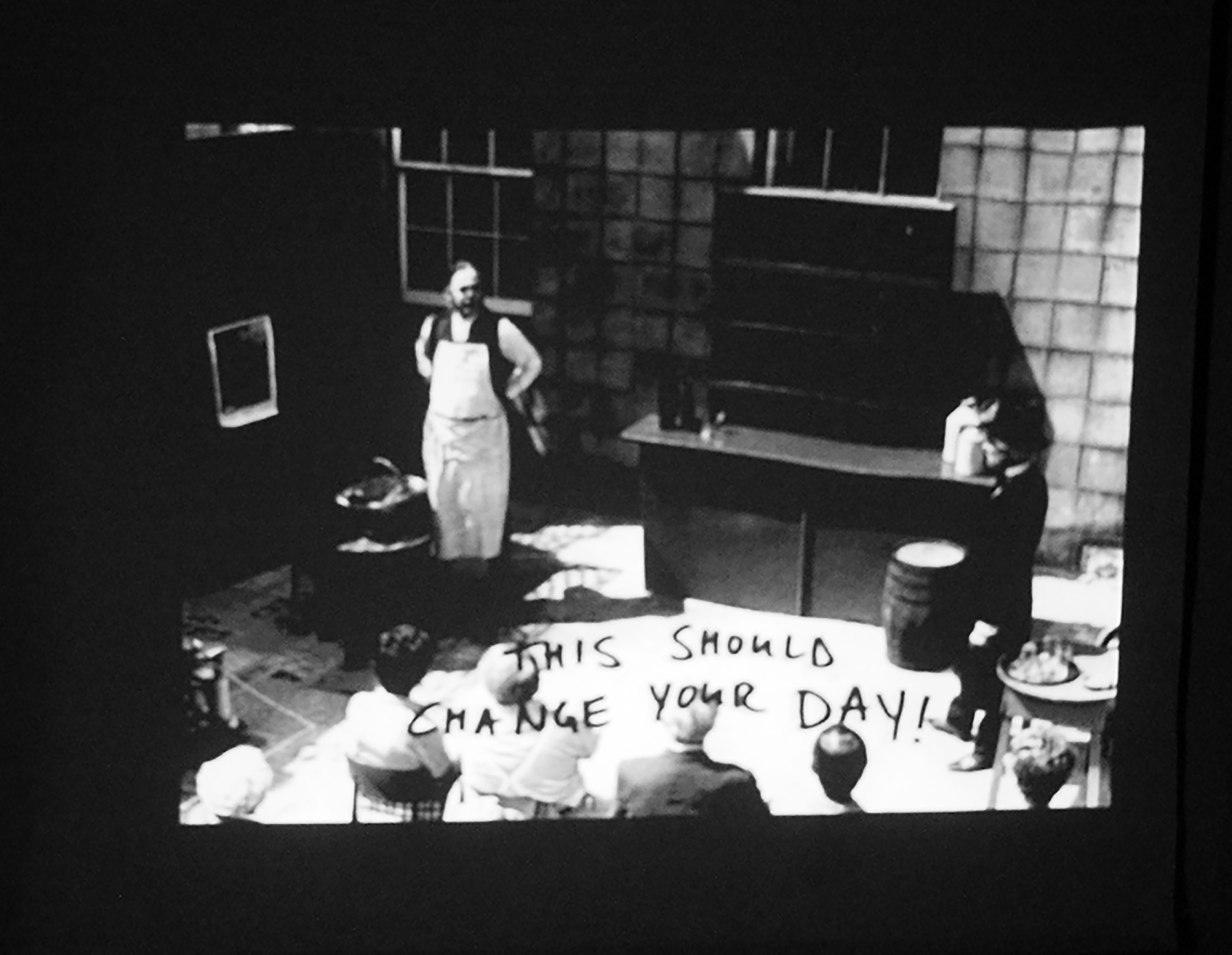
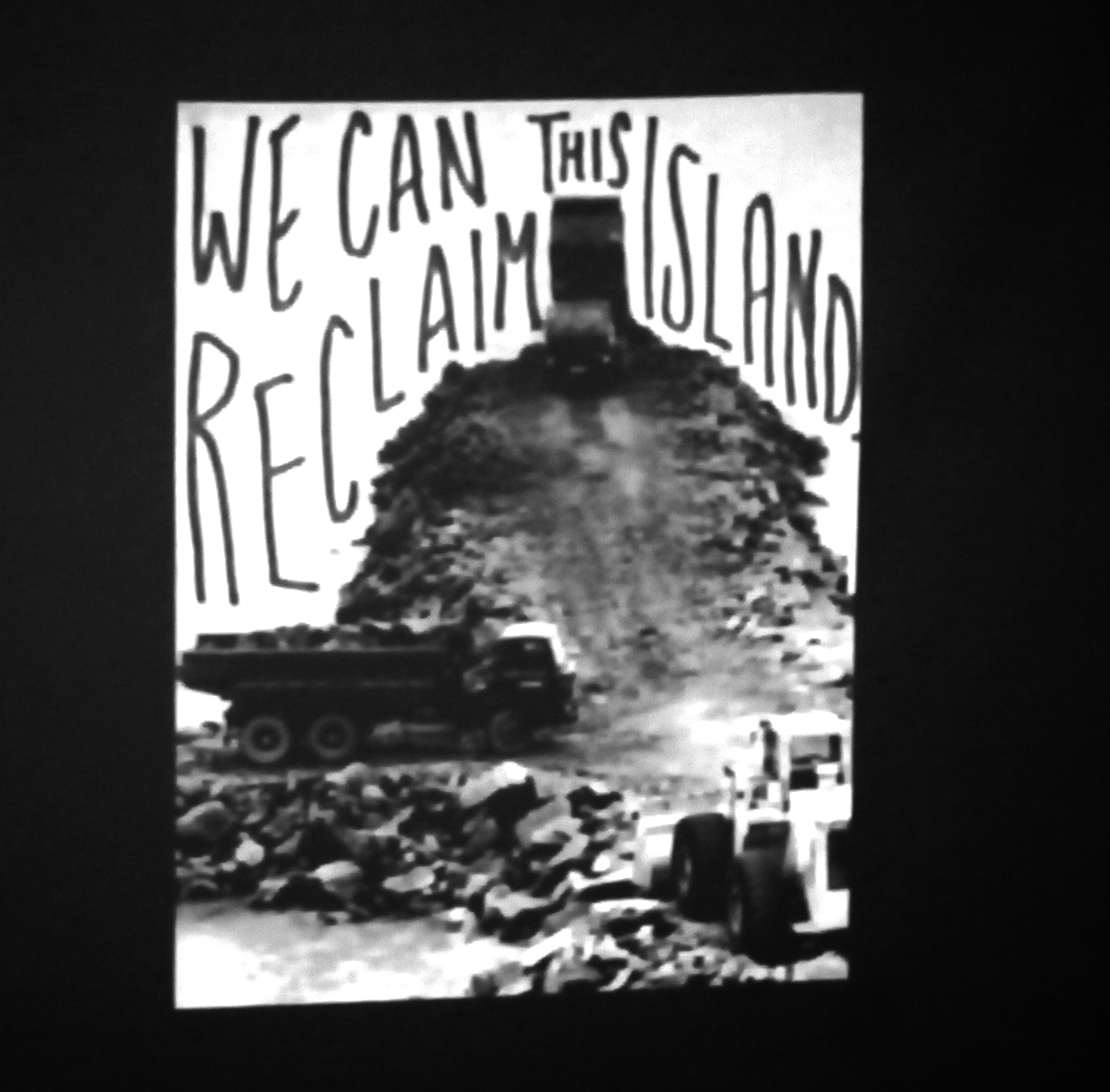
I really liked Tom’s slideshow presentation where he wrote subversive statements over old archival photograph’s. The concept was a very simple one, taking direct influence from conceptual artist John Baldessari, who would edit over previously existing artwork and images, and make it his own. In this piece, Tom made satirical statements related to Jersey. During his talk Tom spoke of how he “soon felt a sense that the Island was very private and exclusive”. Tom, living in metropolitan London and a follower of liberalist views described how found this impression of Jersey, “very different to what I am used to, coming from a metropolitan area”. This project was therefore Tom’s way of reflecting how he felt as a guest to to an Island which prides itself on traditional values.

Although Tom is adamant that the statements were not a criticism of the Island I do believe that the project was a clear example of how Tom incorporates his mischievous nature into his photography to test boundaries, clearly ridiculing the conservative, conformist values of Jersey, a concept which is linked to the Dadaist movement of the 1920s which ridiculed middle-class  attitudes of Western Europe at the time. The simplicity of what he did was very effective, he made use of photographs available to him,  and this allowed for a more observed response because what he interpreted from the photos were not corrupted by his own ideas or bias, which they may been the if he used his own photographs. Coming from Jersey myself I found it interesting to compare my views of the Island with Tom’s views expressed on the post-cards. I tried not to be too critical or of what Tom wrote, and I tried as much as possible to appreciate his outsider perspective in relation to what he was saying. After all, he was only having a bit of fun at the expense of the people of Jersey, and should not be taken too literally.

ff

tp

2. ‘Pushing the Boat Out’

Tom’s 20 minute video documenting his project to push a boat on wheels across the Island East to West was an outcome that I was very impressed with, both aesthetically as well as conceptually speaking. The video, edited in Tom’s quirky, surrealist style explores different aspects  of the day. I found the unusual style of the video, with a series of film clips served to gradually build up a story of the day; of all aspects that it, not just the act of pushing the boat, but instead a deeper insight into the response of this action, how the community of Jersey witnessed, responded and helped with the project. I liked the idea of the live music playing in the background however the selection of music I would suggest could have been more uplifting as to reflect the theme of the project more appropriately, in my opinion the actual music did little in terms of helping the film.

The style of the movie meant that there was a sense that it was hard to know exactly what was going in. I enjoyed this idea because it made me search for the interpretation of the film myself, instead of relying on a structured narrative. This lack of structure is in many ways a subtle reflection of the work of Monty Python film-maker Terry Gilliam, as they both are contain elements of humour derived from surrealism. I would suggest perhaps that the film may have been too long. I noticed it was easy to switch of at certain points because of it’s intensity and length. However I admire Tom’s risk-taking approach in this  film and it was an exciting film to view, feeling somewhat part of it at times due to the use of close-up shots and cut-outs.

What I didn’t like

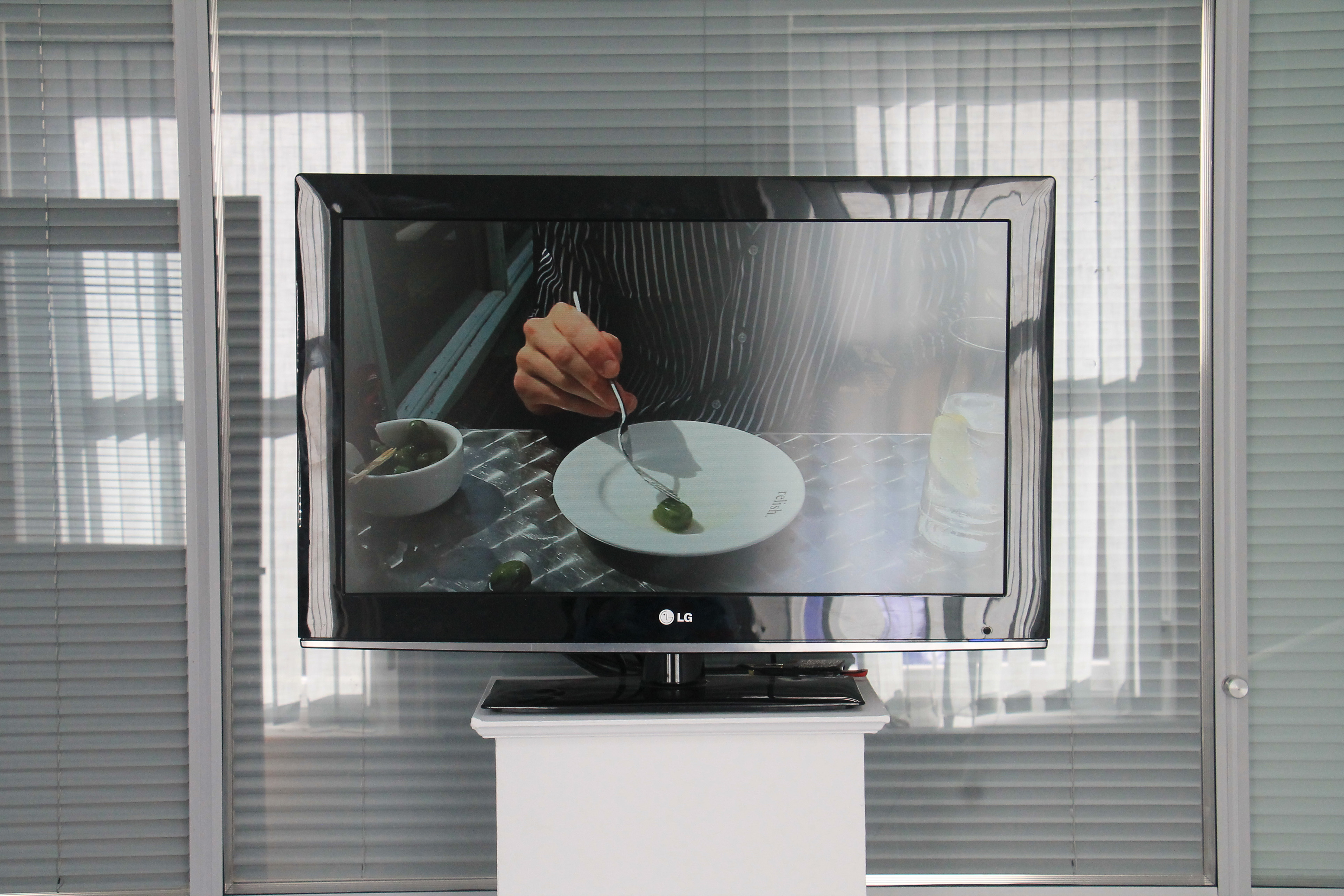
I really didn’t like Tom’s 30 minute video of him playing with an olive. I didn’t find the film particularly interesting or exciting. All Tom did was play with an olive on his plate for 90 minutes, edited down.Watching the film was greatly frustrating because the repetitive action of the film felt boring and monotonous.

I will give the film credit the the extent that it definitely had an impact on me. It caused a reaction, a reaction of frustration but nevertheless a reaction. If Tom’s intention was to tease the audience and make them question art (considering the film was in his final exhibition) then I would argue Tom succeeded. I also admire Tom’s patience in doing so, it couldn’t have been that exciting to do such a monotonous task for such a long time. I also appreciate the point that Tom expressed about being able to hear conversations in the background serving as a narrative. it was an interesting concept which added another dimension to the film, and it made me question, was the story about the act of Tom playing with the olive, or was did he use it as an excuse to listen into/record the conversation as a form of documentary?

I ultimately did not like the film however because I do not see what it added to the exhibition. I tried my best to be open-minded to Tom’s complex ideas throughout the exhibition however this film was just a little too extreme, and in my opinion pointless. What was interesting watching the film was the reaction of the audience, some appeared profoundly impressed by the film. Whilst I respected people had different opinions, I would observe however that by some of the verbal responses that a couple of individuals were trying too hard to look for a meaning to the film. I fail myself to see much meaning to the film. I believe it was successful to the extent that it was controversial but would not rate it highly in comparison with some of his over work.

IMG_7648

Summary

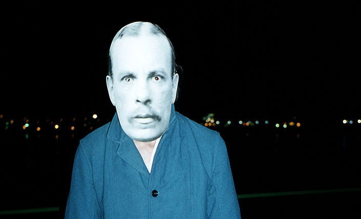
All of Tom’s outcomes throughout the exhibition were very well planned, researched and considered. Tom created a very interesting body of work with made good use of the Société’s  photographic archive. Tom pieced together his display in a very audience friendly manner, and explained his complex ideas in a similar manner. Tom clearly did a lot of work during his six months and produced a very successful and experimental series. My biggest compliment of Tom’s work is how he brought the archive to life, in particular through the face-masks and post-cards. I enjoyed viewing his exhibition and learned a lot of interesting ideas, as well as gaining a lot of inspiration from it.

Ray’s a Laugh – Responses to Images

rays a laugh

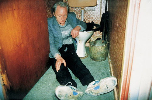
This photo of Ray I find to be very saddening. It captures Ray drunk, completely unaware of his surroundings. In many ways this image is quite repulsive. It shows Ray asleep in a disgusting, unsanitary looking toilet, an image which shows Ray clearly in a bad way. This image is designed to unsettle the reader and make them consider Ray’s desperate situation, inviting them the reflect on the theme of alcoholism. Ray’s alcoholism in this image is shown as in no way glamorous. The chaotic composition of this image reflects the complexity of Ray’s situation.

Richard Billingham: '<b>Ray's A Laugh</b>'

Billingham stated that when living in the council flat, Ray hardly ever left the house, nor was able to distinguish night from day. This photo of Ray shows him asleep with the glaring sunlight implying that it is daytime. Again, this is a saddening image because it explores the sense of isolation experienced by Ray, cut of from the outside world. I find the shadows in this image to be interesting, because they reflect how Ray has cut himself of through the outside world, hidden in shadows. At the same time, this image is to some way comical because it reveals quite how peculiar Ray’s existence is, showing how he is quite care-free despite his situation.

This image directly explores Ray’s alcoholism. Ray is completely focused  on his drink. Billingham frames the image so that the act of Ray picking up his drink is the only focus of the image. The simplicity of this image is key because it symbolises the simplicity of Ray’s mindset, his desire get his fix for a drink. I find this to be a very bold image that address Ray’s problem directly without over-emphasising the meaning. This is a subtle photograph that makes the reader reflect. It is simple and not over-dramatic.


Richard Billingham – Ray’s a Laugh

Bio

Richard Billingham is an English Photographer, born in Birmingham in 1970, the eldest of two children born to Ray, a factory worker and Liz, a housewife. Billingham is from a working class background, and when he was 10 the family faced great hardship when Ray lost his job, forcing the family to sell their home and move into council housing. Ray became an acoholic, forcing Liz to eventually move out. Richard’s younger brother Jason was taken into care, leaving Richard on his own to care for his father.

“Jason says Ray’s a Laugh but doesn’t want to be like him” – Ray with Jason 


Ray’s a Laugh

Billingham was a keen artist with a talent for drawing and painting. Billingham gained a place at the Bournville College of Art, studying painting. He decided to create a series of paintings based on his father Ray, documenting his struggle with alcoholism and depression for one of his exams. Billingham could not get Ray to pose for long enough, so decided instead to photograph Ray as an aid to help his painting, using cheap film and processing. When Billingham presented some of his paintings to an art examiner, he asked Billingham if he coud see the aids he used to make the images. Billingham showed the examiner his photographs and he was immediately impressed by what he saw, advising Billingham strongly to forget about painting and concentrate on photography instead.

richard-billingham1.jpg

Billingham’s art examiner was more impressed by the photograph used to base the paintings on then the paintings themselves

Over the course of the next 6 years, Billingham continued extensively to photograph Ray, as well as his mother Liz who moved back in to the family home, and his younger brother who returned from care. Billigham also transferred from Boruneville College of Art to the University of Sunderland, obtaining a degree in Fine Arts. In 1995, Billigham’s first photographic exhibition was held in The Antony Reynolds Gallery London. entitled ‘Ray’s a Laugh’. The series was recieved both positive and negative responses, but overall was an overwhelming financial and critical aclaim. The photographs from this  exhitibition was made into Billingham’s book of the same title, the defining work of Billingham’s career. This book shot Billingham to instant fame as a photographer. In 1997 ‘Ray’s a Laugh’ was  featured in a major exhibition entitled ‘Sensations’ at the Royal Academy in London.

Ray’s a Laugh was a brutally honest insight into the struggles of working class British life during the 1990s

One of the major criticisms Bilingham received for ‘Ray’s a laugh’ was the claim that his work was nothing more than a shameful exploitation of his family. Billingham was only 26 at the time ‘Ray’s a Laugh’ was released and so some critics, perhaps unfairly attacked Billingham, citing his work as ‘insensitive’ and ‘exploitative’. In reality Billingham had no idea how much success he would generate, and creating the series did in fact have a profound  emotional impact upon him. Billigham has defended himself over this issue numerous times, denying he exploited he parents.


Later Career

After this initial success Billingham explored landscape photography, incorporating his unique style to highlight the landscape of modern Britain with a similar sense of honesty and realism explored in ‘Ray’s a Laugh’. A series of Billingham’s landscape work was made into a book entitled ‘Landscapes: 2001-2003’. Other works credited to Billingham include; Fishtank 1998; 1998, Liz Smoking 1998, Tony Smoking Backwards 1998, Ray in Bed 1999 Playstation 1999; and Dewi Lewis, 2008.

<b>BILLINGHAM</b> 2001, Fence.

Billigham is a lecturer in Fine Art Photography at the University of Gloucestershire and a third year tutor at Middlesex University.

www.saatchigallery.com/artists/richard_billingham.htm

Lesson Response – Nan Goldin

Nancy “Nan” Goldin is an American Documentary Photographer born in Washington D.C. in 1953. Goldin is a highly successful photographer, renowned for her exploration of extreme subject matters, counter-cultures and personal stories.

Born in Washington D.C in 1953 to middle-class Jewish Parents, Nan’s family moved to Boston, Massachusetts when she was very young. Goldin had a troubled upbringing, getting involved in alcohol and drug-taking from a very young age (these early experiences would shape her later work). Goldin left her home at the age of 13, where she joined a group of young people occupied with drugs, violence and sex. In the midst of her troubled lifestyle, Golding enrolled at ‘Steya Community School’, where at age 15, her school-friend introduced her to photography. Photography was a form of escape for Goldin, allowing her to express herself creatively. It gave her chaotic life a sense of direction and purpose. Goldin’s early artistic influences included visual artist Andy Warhol, surrealist film-maker Fedrico Fellini, and fashion photographers such as Guy Bourdin and Helmut Newton. These influences, along with her own experiences inspired Goldin to use photography as a way of exploring extreme counter-cultures such as sexuality, lifestyle, dependencies etc.

Early Beginnings 

At the age of 18 Goldin became interested with sexual themes, interests and gender-identities that are consider counter-culture; homosexuality, bisexuality, cross-dressers and trans-sexual people. In particular Goldin studied and immersed herself into the world of “drag queens”. (men who cross-dress as woman for entertainment and enjoyment). This interest was explored in 1973 with a solo exhibition studying Boston’s gay and transsexual communities. Goldin gained a sense of admiration for these groups. After this initial exposure into the photographic world, Goldin studied at the Museum of Fine Arts, Boston University. Goldin continued to venture in the underground world of subcultures throughout the course of the 70s.

The Ballard of Sexual Dependency

After graduating from University, Goldin moved to New York City, and began to document the post-punk new-wave music scene. Between the course of 1979-1986 Goldin decided to embark on an ongoing photography project exploring her own perspective and struggles. This idea ventured away from Goldin’s previously objective ‘outsider’ style of photographing, and began to document from an ‘insider’ perspective of her own family and community. This project concluded in 1986 with Goldin’s highly successful publication ‘The Ballard of Sexual Dependency’, originally made as a slideshow presentation. The piece revealed with great honesty an insight in Goldin’s life and the relationship’s she shared with different people, including her abusive ex-boyfriend. Goldin herself described the piece as “the struggle in relationships between autonomy and intimacy”

 A image from Goldin’s ‘Ballard of Sexual Dependency’ 

Nan Talking About ‘The Ballard of Sexual Dependencies’, her evaluation of the series, and an insight into her ideas and inspirations

Later Career

Nan continued to photograph the world of underground sub-subcultures. She ventured in the theme of morality and death, through a series of images called Family of Nan, 1990–92, in reference of Edward Steichen’s ‘Family of Man series in the 1950, documenting her friends’ AIDS-related deaths. She also began to travel outside of America, for example photographed Japanese youths while travelling in Asia, and in 1995 she published those images in the book Tokyo Love: Spring Fever 1994. In 1995 she also worked with the BBC for a documentary film entitled ‘I’ll Be Your Mirror’ , with film-maker Edmund Coulthard.

Golding has held exhibitions at the Whitney Museum of American Art in New York City (1996–97) and at the Centre Georges Pompidou in Paris (2001).  She has been the received numerous awards for her photography, including the prestigious Hasselblad Award in 2007.

Link to Nan Goldin’s Documentary, ‘I’ll Be Your Mirror’

What is Family?

‘Family’ is a social relationship shared between different people, who are considered to be ‘related’ in some way to one another. Family has a very open-ended and general meaning. After researching on thee internet I found numerous interpretations of what family means

  • a group of people related to one another by blood or marriage
  • the children of a person or couple
  • all the descendants of a common ancestor
  • a race or group of peoples from a common stock
  • close friends or group of friends

The definition of family isn’t hugely important. The important idea to grasp is that  family is effectively a strong bond shared between people or groups of people that is built on trust and understanding. Family whether through friendship, community or blood, is arguably the strongest bond between human beings, and has massive influence over a person’s morals, beliefs, ideas and livelihoods. Family usually lasts through an individuals life and is critical towards the decisions a person makes, there general well-being and personal development, with both  negative and positive effects. Instinctively, people feel a strong need to join into different social relationships and organisations. ‘Fitting in’ to a social group of some description can help to provide a person with a sense of comfort and security. It is based on a survival instinct – people feel less vulnerable to attack if they belong to a supportive group, hence the concept of ‘safety in numbers’.

Exploring Family through different forms of art.

The broad meaning of family makes it an effective topic to study . The openness of the way family can be interpreted allows for creative and original responses. An artist exploring the idea of family has the freedom to question its meaning.

In photography, an insider perspective of family may be easy or difficult to explore dependent on the artists viewpoint. A photographer willing to reveal an honest, emotionally attached perspective may find such a concept very easy. On the other hand, a photographer who finds such an idea difficult to reveal to a larger audience because of personal reasons may struggle much more with this idea. An insider perspective, i.e. photographing members of your family does have a considerable advantage because the photographer is less likely to face challenges getting access. It can however be quite limiting because you are only photographing what you already know, issues that strectch onnly within your comfort zone.

tina barney

American Photographer Tina Barney is well known for photographing her close friends and family. She therefore explores the idea of family from an ‘insider’ perspective.

An outsider perspective may present similar challenges. Although it allows for an observed, detached perspective which some photographers may find more comfortable to explore, with greater diversity and rang, it is often however more challenging because the photographer is not considered ‘one of the group’, and therefore may face the challenge of gaining trust to photograph different people. Because photography is a very personal form a communication, many people may find the idea of being photographed by a stranger very uncomfortable.


Chris Hondros – Analysis of Work

In 2004 Hondors completed an assignment exploring the Israeli-Palestinian Conflict. This conflict is an ongoing dispute between the State of Iserael and the State of Palestine over various territory disputes concerning the region of Palestine. The dispute is religiously motivated, as the region of Palestine is considered sacred the both Jewish and Muslim people. Iserael is run by Jewish Authorities, whereas Palestine is controlled by Muslim Authorities. The consequence has resulted in a in a series of small-scale guerilla warfare over the course of 20 years, still ongoing today.

This image by Hondros shows an eleven-year-old Palestinian boy called Abdallah looking through a hole from a window which was left by the Israeli sniper bullet that killed his mother. This image is a very harrowing and sensitive image which explores the devastating consequences that the conflict has had on the civilians involved. Abdallah’s mother was caught in the crossfire of a guerilla battle between Israeli and Palestini insurgents. This image is to an extent subjective because it highlights Hondros’ sympathetic viewpoint towards the Palestinian people. The image uses symbolism to portray an account of the helplessness experienced by the civilians caught in the dispute.

The broken glass that Abdallah is looking through symbolises  how the Palestine region has been broken by the conflict. Abdallah, representative of the young generation of those in the region, is portrayed through the symbolisation of looking through the broken glass as vulnerable and fragile, faced with the prospect of a homeland which is dangerous, broken and tragic. The distorted viewpoint created through the glass symbolises the complexity of the conflict, juxtaposed with the sombre mood expressed by Aballah’s reflective stare, which clarifies the simpleness of the fact that tragedy still occurs, making the complexity of the tragedy inexcusable to cost innocent lives.

This is a very emotional and hard-hitting image. Hondros has captured a moment which distances its focus away from the war, forcing the viewer to consider from the heartbreaking perspective of a young boy loosing his mother as a direct consequence of violence. By viewing the war in the a manner which conveys a young boy’s personal tragedy, there is a suggestion that Hondros is criticising the Israeli and Palestinian’s government’s failure to peacefully settle the conflict, due to the devastating cost that such a conflict impacts on both sides.