All posts by Max Le Feuvre

Filters

Author:
Category:

Case Study: Quintessence

Archisle Project

The ‘Archisle Project’ was launched in 2011 by Gareth Syvret, the photo archivist at the Societere Jersiaise. The aim of the project is to promote contemporary photography in Jersey through an ongoing programme of exhibitions, education and commissions. Syvret began the project out of concerns over the various restrictions local artists face in terms of context, exposure and marketing of their work. He hopes through the project, the inspire and give opportunities for young and developing photographers of the future, as well as the ordinary island public to be given access the quality, world-renowned international photographers, their work and extensive knowledge.

The project aims to celebrate and promote the concept of ‘islandness’, recognising Jersey’s unique island culture based on its isolated and ambiguous location in the English channel, subsequently being a mixture of Norman and English culture and identity. At the same time it aims to give photographers in Jersey more international exposure through inviting various internally renowned photographers to work, exhibit and teach on the island. This has seen the presence of various internationally acclaimed photographers on the island including Michelle Sank and Magnum Photographer Martin Parr.

The main goals hoped to be achieved through the Archisle Project

  • Promote the use of the archive as a source for creative work
  • Raise the status and context of photographers largely absent in recent contemporary archives
  • Engage international photographers with the culture of Jersey to create a diverse and inclusive visual archive.

Quintessence

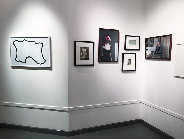
The exhibition is a celebration of five years of the Archisle Project. It displays the work of six different artists who have worked for the Archisle project, and subsequently have such work displayed in the Societere Jersaise Photographic Archives. The exhibition was curated by Gareth Syvret, the photo archivist down at the Societere Jersaise, as well as the founder and leader of the Archisle Project.

The exhibition is arranged so that each artists work is distinct from one another and their chosen influence is next to that artist. The exhibition as well as being a celebration of the anniversary of Archisle, is also a representation of the growing profile of photography taken in Jersey and by Jersey photographs. The idea to include an influence of each of the artists is a clever way of recognising how locally based/born photographers are looking outside for external influence in their creative process, using the Archisle Project to then respond to this and therefore present the Jersey Public with a new and exciting body of photographic work based on their findings and developments.

  • Mark Le Reuz
  • Martin Parr
  • Martin Toft
  • Michelle Sank
  • Yury Toropstov
  • Tom Pope

These artists have all selected their own artists who they consider an influence.

The artists nominations are:

  • Mark Le Reuz = John Gibbons
  • Martin Parr = Tony Ray Jones
  • Martin Toft = Finn Larsen
  • Michelle Sank = David Goldblatt
  • Yury Toropstov = Elsie Wright and Frances Griffiths
  • Tom Pope = Peter Finnermore

Gareth, the curator,  has cited his own influence, Jem Southam who was  his tutor at Plymouth University, for a body of his own work to be included into the exhibition.

Evaluation

I enjoyed this exhibition a lot. In Jersey it is rare for top international photographers to be commissioned, and it was a very  good experience to see this very high quality of photographic work displayed and taken in Jersey, all for free. It was a very good educational experience as I have previously studied the work of Martin Parr and Yury Toropstov, and so it was very interesting to see life scale prints of their work.

The layout of the exhibition was very well considered and ordered. I liked how their wasn’t too many photographs only display and that the small size of the area was respected to include the right amount of images. In contrast the JEP exhibition was extremely cluttered and it ruined the atmosphere, making the room feel much smaller. This exhibition had just the right amount of images for the size, allowing space for the different sections. i.e. artists and their influences clearly separated.

The idea of placing the work of the artists next to their nomination was a good idea because it allowed for the audience to directly compare and consider the relationship of the artist/influence, their similarities and differences. This was particularity in the case in the work of Martin Parr and Michelle Sank as their respective influences; Tony Ray Jones and David Goldbatt explored very similar contextual themes; Parr and Jones through the concept off ‘britishness’ and Sank and Goldblattt through the concept of social/cultural identity.

Favourite/Least Favourite Images

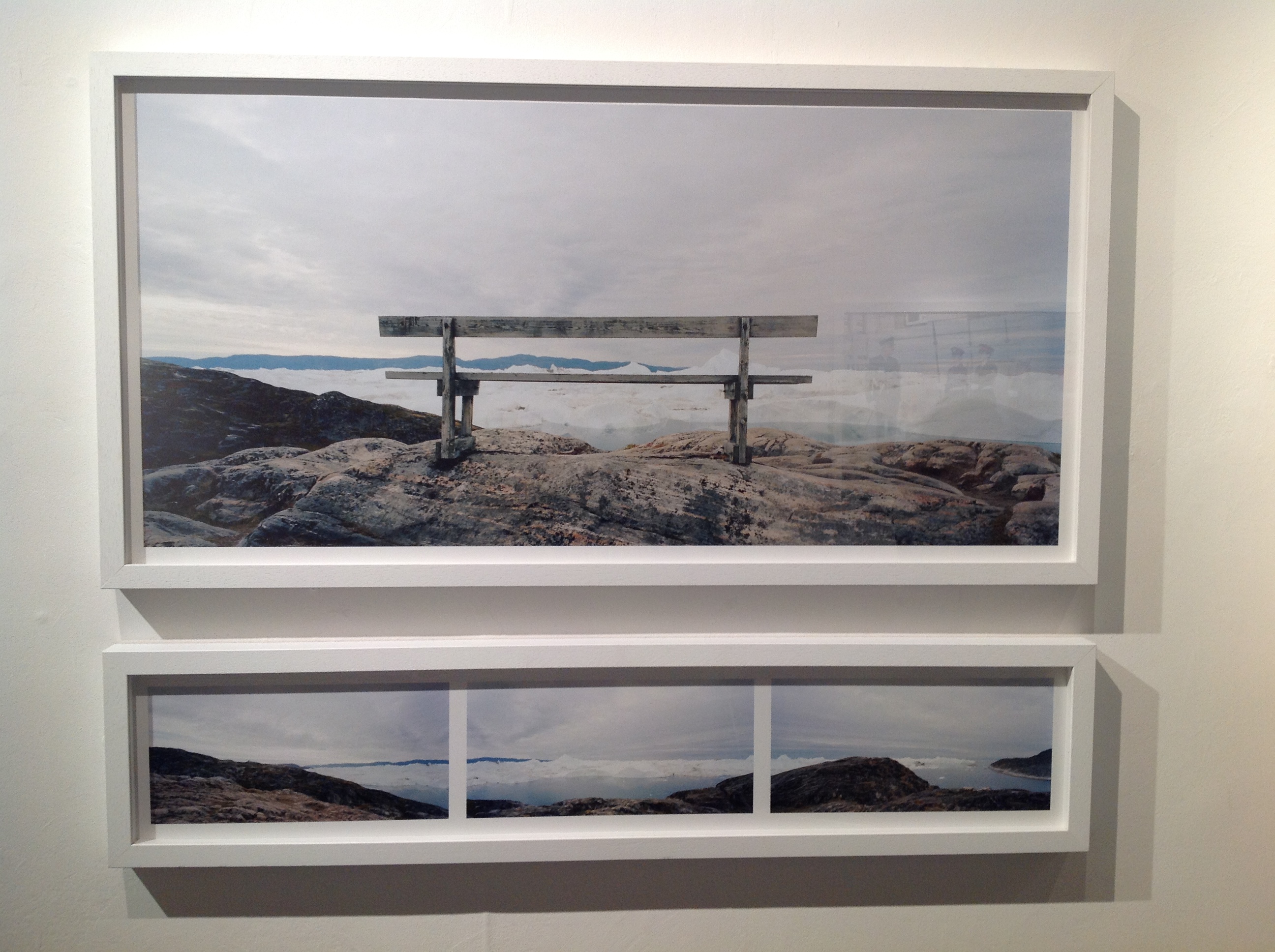
My favourite piece in the exhibition was Finn Larsen’s image of a bench overlooking an icy landscape. I like this image because I thought it was visually, an interesting e image. I find his representation of the sparse, sublime natural landscape to be very interesting to look at for both aesthetic as well as contextual reasons, as it is very much linked to the environmentalist concept of celebrating the natural world, whilst at the same time recognising its fragility. This idea is more important than ever nowadays and traditional landscape shots of the changing climate are quite often overlooked.

image

My least favourite image if the exhibition was Peter Finnermore’s image of a man climbing up a wooden shed covered in moss . To be honest I didn’t find the image to be particularity interesting., nor did I see the relevance/specific focus it had to the other images in the exhibition. I understood the concept but just didn’t particularity like the image.

image


Picture Design 2

Untitled-1

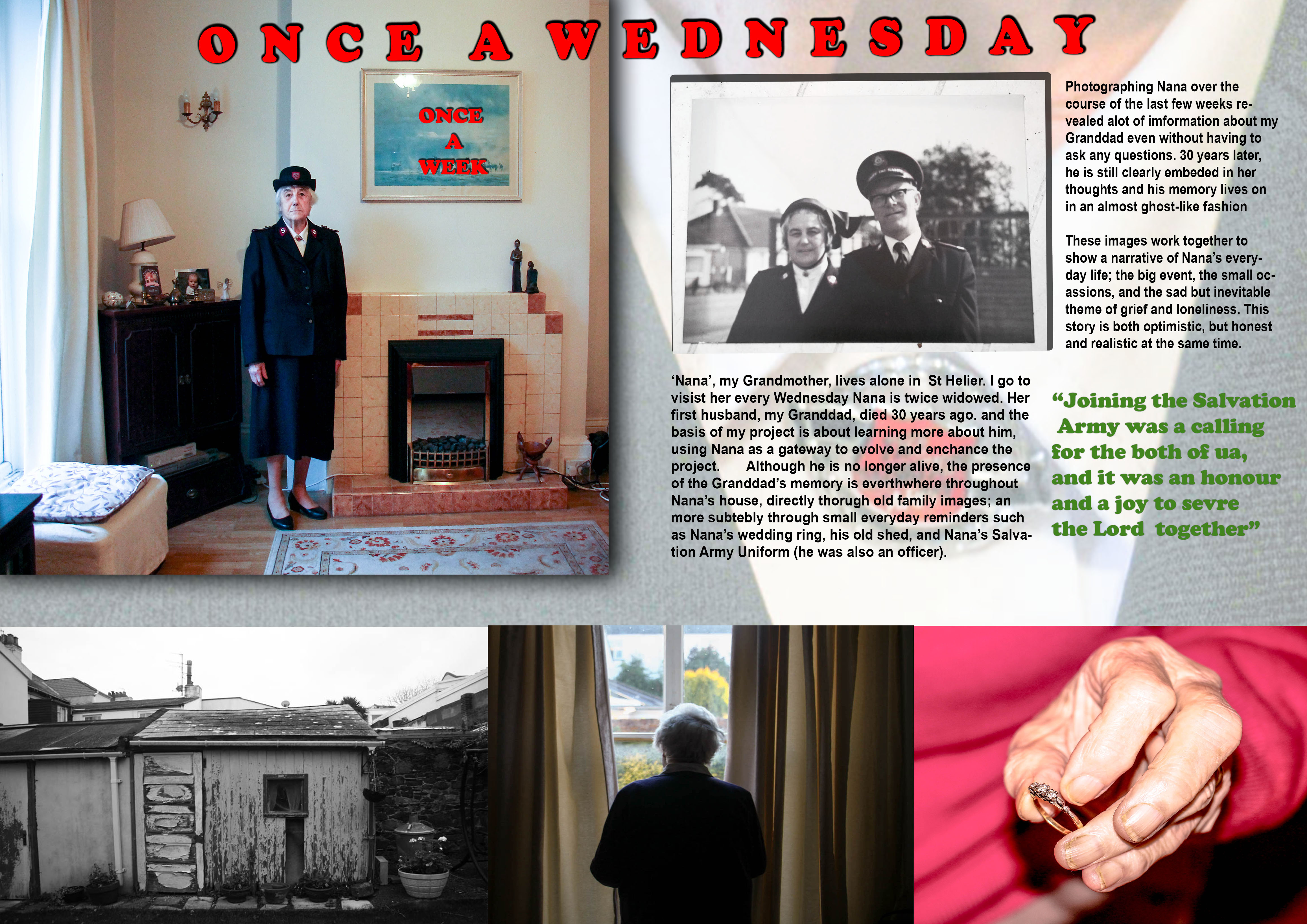
This is the revised edition of my first design. I wanted to make a much more traditional design template, one which is clearer and more suitable to the type of images I am currently making over the basis of this project. I included the same three images from the first story, however not as a triptych this time.

I felt a lot more confident making this design. I struggled making the the first design and was not happy with it. I learned a lot of skills however and used it as practise for this design

Layout

I changed the establishing shot which was originally Nana staring out of the window, to the portrait of her in her Salvation Army Uniform. I decided that this was a strong establishing shot because it directly introdues the theme of the Salvation Army, allowing the link with my Granddad to be easily conveyed as a result. Visually it is also a stronger image

This design, like the previous one, includes  a triptych.

  • The left-hand image is a picture of the shed in Nana’s Garden –  used as the background picture in the previous design. I like this image, especially in black-and-white, because the run-down appearance of the shed in addition to the images high contrast made possible in black-and-white, means the image has a very strong texture, subsequently giving it a powerful and defining presence in the story.
  • The middle image is the photo of Nana looking out of her window.
  • The right-hand image is the one of Nana holding her ring

I decided for this design not to include any image captions or descriptions. This is because I wanted to create a story which was much more subtle, not giving as much away about the story. Also I felt that in my last design I included far to much writing, and this time around I wanted to simplify the layout.

The relationship shot for this picture is an old photograph of Nana and my Granddad. This links directly to the establishing shot of Nana, the through link of The Salvation Army, as Nana is wearing her Salvation Army Uniform in my portrait of her, and the archive image shows them both on duty, with their uniform on. The Army played an important part in my Granddad’s life and Nana’s also, and so I felt this was a good theme to establish for this story, as it establishes a link between them.

The background image is a close-up shot of Nana’s Uniform. This image confirms the theme of the Salvation Army as the main aspect of the story. Visually it is a good image to use as a background because it allows for text to be written over easily whilst remaining clear.

The use of drop shadow, which I have included for some of the images is effective because it helps to make the image visually stronger. I have done the same for the text in order to make it bold and easy to read, as I found on reflection that the text in the first design was visually quite weak. The red colour of the text further adds to the bold presence.

The quote is a reference to my Grandparents service in the Salvation Army. I chose this quote to make it relevant to the underlining theme of the Salvation Army, further adding context to the narrative.

Evaluation

Overall, this picture story is much more better than the first one. The images flow more on the page and the story and text fits much cleanly on the page. The inclusion of the drop shadow for the images and creates for a three-dimensional perspective, adding strength and depth to the presentation

Picture Design 3

Nana Story

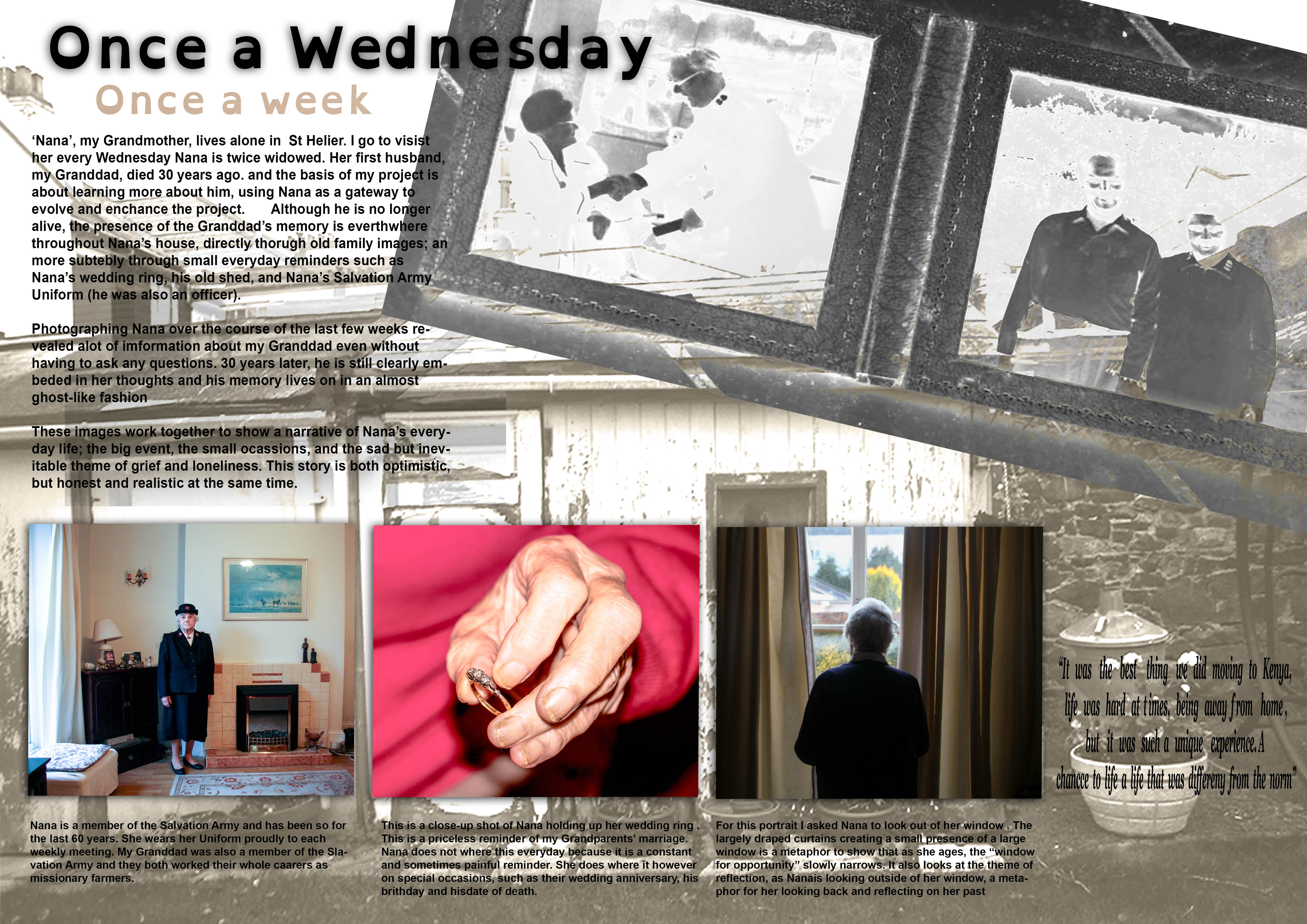
I struggled in the making of my first picture story design. I was just working out the different process and photo-shop skills needed to make a photo-story and so I found the process to be very challenging. I had no clear plan of how to go about making my first design and so tried to be as creative a possible in the designing process, changing my themes and ideas as I went along.

I started of by selecting my title. I decided on the title of ‘Once a Wednesday, Once a Week’ because it was the title I had previously used for by AS Exam Book I made and it works quite well.

Main Images

The three images in this story work as a triptych

Left-hand image: This portrait of Nana in her Salvation Army uniform is an ‘environmental ‘ shot. This is a good image to use as it is a strong and confident portrait that clearly establishes the theme of the Salvation Army. There is a sense of order to this image, it is calm and well considered, and therefore allows the viewer to reflect the theme in a focused way.

Middle Image: The image is a close-up shot of Nana holding her wedding ring which she wore when she was married to my Granddad. The close-up shot is very reflective of the style of Martin Parr (extremely close-up abstract style and with the use of flash), making for a strong, detailed image. Using a similar style to Parr was important in this instance in creating a raw and authentic image. For example, the rugged appearance of Nana’s hands which this style achieves highlights somewhat a biopic of her life, one which has been of hard-work and sacrifice to raise children whilst devoting herself to her work/religion at the same time. This makes the story more realistic.

Right Image: The last image of the series shows Nana staring out of a window in a reflective manner. This image is contains a lot of metaphors which I have explained in the image description. I find that this image works very well as an establishing shot because it is a strong image but at the same time is not too specific and keeps to the subtly of what I am trying to convey

Background Images

The way the background images have been arranged is quite unusual. The old photograph of Nana and my Granddad that I have included has been blended in the layer mode to present it in a silhouette style. This is a  feature I have embedded into the story which explores my how Granddad and his memory almost a ghost-like apparition to Nana – still existent but an old and fading memory. The other image, a black and white image of a shed in Nana’s garden, again is presented in a very dream-like manner.

Text

The main body of text briefly explains my project learning more about my Granddad, and the work I have been doing with Nana in relation to this project.

The captions explain my image choices and provide context to the story in a narrative-like way.

I have included a quote which is a comment Nana made concerning the time they spent in Kenya. I included this quote because it explore how Nana often reflects into the past in a fond way.

Evaluation

I have worked hard in making my first design and it has been a good practise. The actual design however  is very complicated and a bit confusing in terms of layout, especially the text. For my next design I think it will be a good idea to go for a slightly more traditional picture story, as the type of narrative I want to convey is more suited to this. I also need to reconsider my image selection to be able to give a more directed narrative.

Picture Design 1

Design 3

Inspiration

It is unquestionable that the death of a loved one is extremely horrible and painful. However the phrase “time is a great healer” is extremely accurate. A reality of life is that people learn to cope with their love ones dying, a difficult but natural process. Grief is not a bad thing, it teaches people to accept that someone is gone and learn to move on with their lives. Grief is personal and subjective process and I believe it is deceptive to show grief as negative and soul destroying. Death is a major taboo in western society, and it is considered wrong or insensitive to grief in a way other than solemn reflection. A lot of non-western cultures, especially in Africa and South America for instance treat death and funerals as a major celebration that is reflective of happiness and joy. In Atzec dominant regions of  Mexico for example, they have a celebration known as ‘Dia de los Muertos’, meaning ‘Day of the Dead’, a ceremony in which people celebrate the lives of their passed loved ones in a very open way. This alternative view of death is very interesting.

My thoughts

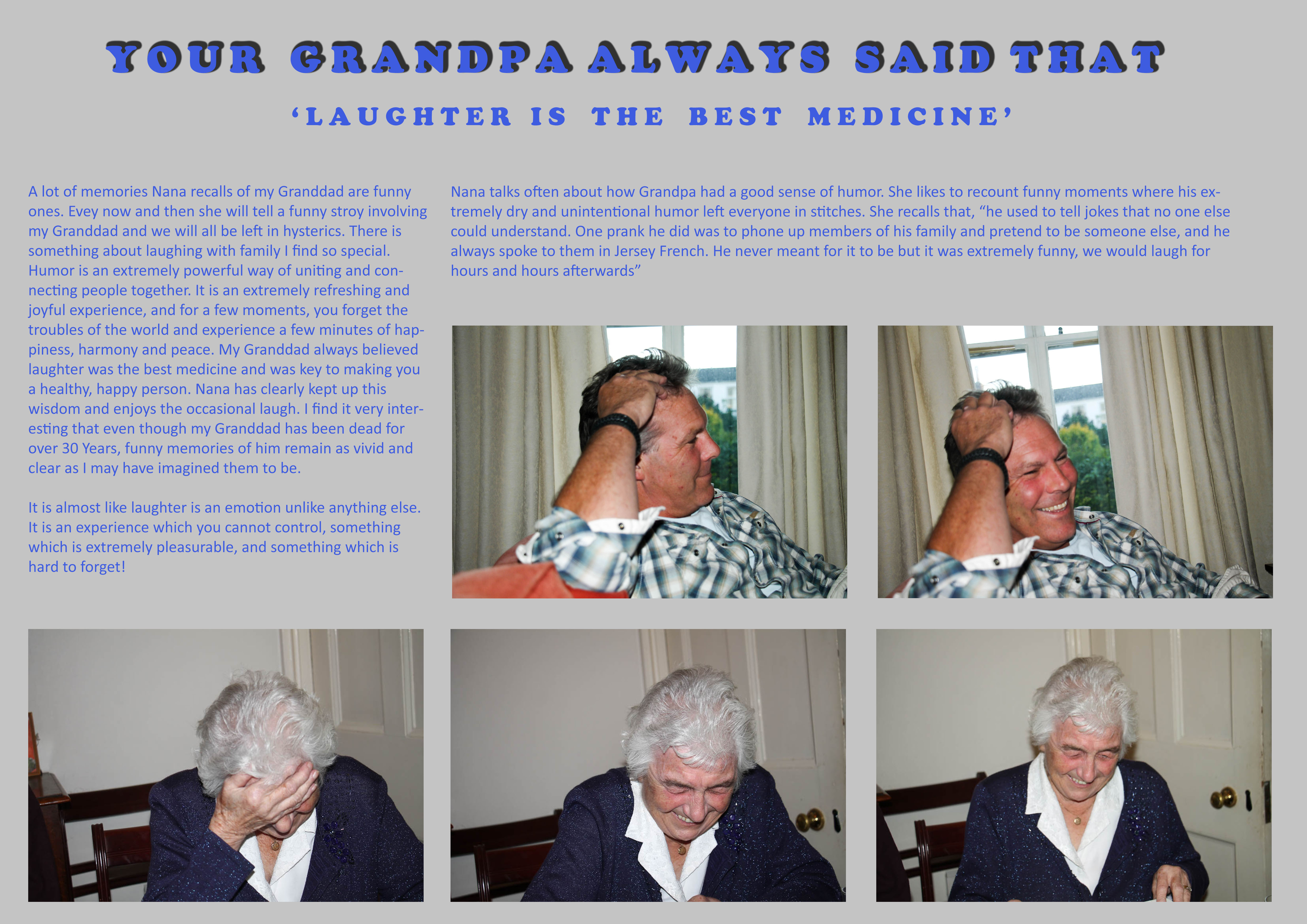
A big issue  I have had recently is my representation of Nana in my photographs. A lot of my images seem to represent Nana in a way which is sombre and sad all the time. Whilst it is true that Nana misses him greatly, it is not fair to say that she spends her whole time alone or sad. My Granddad died over 30 years ago. It is simply untrue to say that Nana has spent every single day of this existence sad and unhappy. Instead, she carries his memory on through the joy he brought his family, his achievements and the example he can set for everyone moving forward. Nana has never been uncomfortable talking about  him. A large part of her grieving process was and still is laughter. She is always recounting jokes about my Granddad, remembering the life he lived, not that he is no longer hear. This I feel brings her great solace and comfort and so of course be represented in this project.

Analysis

Therefore this picture story is my way of questioning my own style of portraying Nana in this project. Instead of just portraying her as sad for my Granddad’s passing, I want to represent the more pragmatic viewpoint that although she misses him greatly, the thought of him does not actually sadden or distress her. She still has a lot of reason to be happy in her life, a lot of family and a modest amount of close and long-standing friendships. It is important to show this part of Nana’s life as it is a more honest way of presenting the type of person she is, someone who struggles with loneliness and grief, yet at the same time someone who embraces life as something which is joyful and precious.

Summary

I like the idea of what I have done because it is a very simplistic idea. I enjoyed making the picture story and it was refreshing to  create images of Nana which are happy and joyful, something I should do a lot more often moving forward in this project. My Granddad at the end of the day was a normal man who liked to have fun. Nana recalls that he always believed, “laughter is the best medicine”, which is what I have based this picture story on. I don’t think he would want his family to think of him in a sad or tragic way. Of course it is sad that I never got to meet him, but and the same time and I think he would be pleased that Nana is keeping his memory alive in a happy and positive way, and that his existence was never something suppressed behind a taboo of the fact he is dead.

Here is an extract from a documentary looking about how the Aztec’s view death. The contrast with how we as western countries view death is startling and interesting to reflect on.

Photographing at Victoria College

For my next shoot I want to photograph areas of Victoria College, the secondary school my Granddad attended from 1932-38. My Granddad was a proud ‘Old Victorian’, and was a member of Dunlop House. During his time at Victoria College he was a member of the XI Football Team, and in the teams for Athletics, Cross Country, Cricket and Hockey. I attended Victoria College myself so this is a significant connection I share with my Grandfather. I hope to go to the college and photograph areas  which are significant to my Granddad, such as; the sports pavilion and football pitch, the great hall, the opening of the building, and the commemorative plaque of his name on the First XI Football Honours Board.

This will be a very good part of my project if it is possible. First of all I need permission from the headmaster, Mr. A. Watkins. I have emailed him to ask for permission.

This is the email I sent Mr. Watkins,

Dear Mr Watkins,
I am emailing you today to ask whether it would be possible to photograph some areas of Victoria College at some point at the end of this term or the beginning of the next.
I am currently doing an A-Level Photography project about my Grandfather, Arthur Maitland Le Feuvre (1921-84) (O.V. 1932-38). With your permission, I was hoping to  photograph some areas of the school with relevance to him which would help me with this project, for example; the sports pavilion and football pitch, the great hall, the opening of the building, and the commemorative plaque of his name on the First XI Football Honours Board.
I do not know if this is legally possible but thought I would check with you, and if it is to ask whether it is okay to do so.
I would be very grateful if you would be able to assist me with this. If you have any questions or require any extra information as to what the project is about, please feel free to email me back.   
Thank you,
Kind Regards, Max Le Feuvre (O.V.).


How to make a picture story using Light-room

Light-room is a good programme to design a picture story in. It has multi-functional purposes, allowing you to easily select, edit and then arrange photos. Light-room is much easier to work in then Photoshop because unlike Photoshop, all of your images are in the same place to where you edit. You can also plan out the narrative structure to your picture story, and then export your photos manually whilst presetting the size at the same time. This means the process is quicker with a lot less stress and hassle to deal with.


Step 1 – Storing your Images

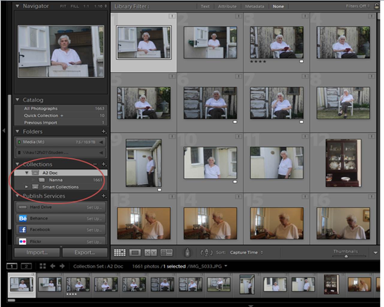
Export all the images you want to create your picture story with onto the school M Drive. When you open your Light-room Catalog, import these images. Then make a ‘collection’ folder and move these images into a new folder. This means that you will be working with all of the relevant images.

3


Step 2 – Making a Pre-selection

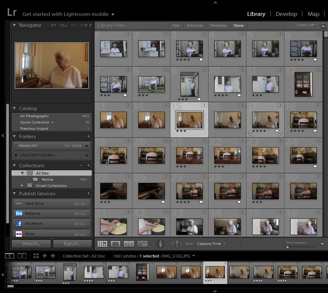
Now you have stored your images, you need to cut down on all the images you don’t want, leaving the best ones. You can separate the different images my changing the ‘star’ rating of the images, which is a view-able format in ‘library’ mode. My method is to leave the image I don’t want, images that i might want to use ‘3 stars’, and images I definitely want to use ‘4 stars’. It is a good idea to you over all the images again 2-3 more times, just to ensure you have made a right choices.

2

Step 3 – Filtering Pre-selection

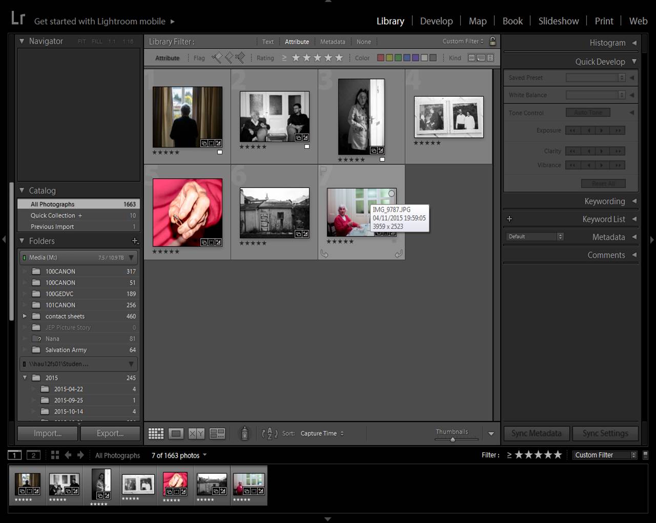
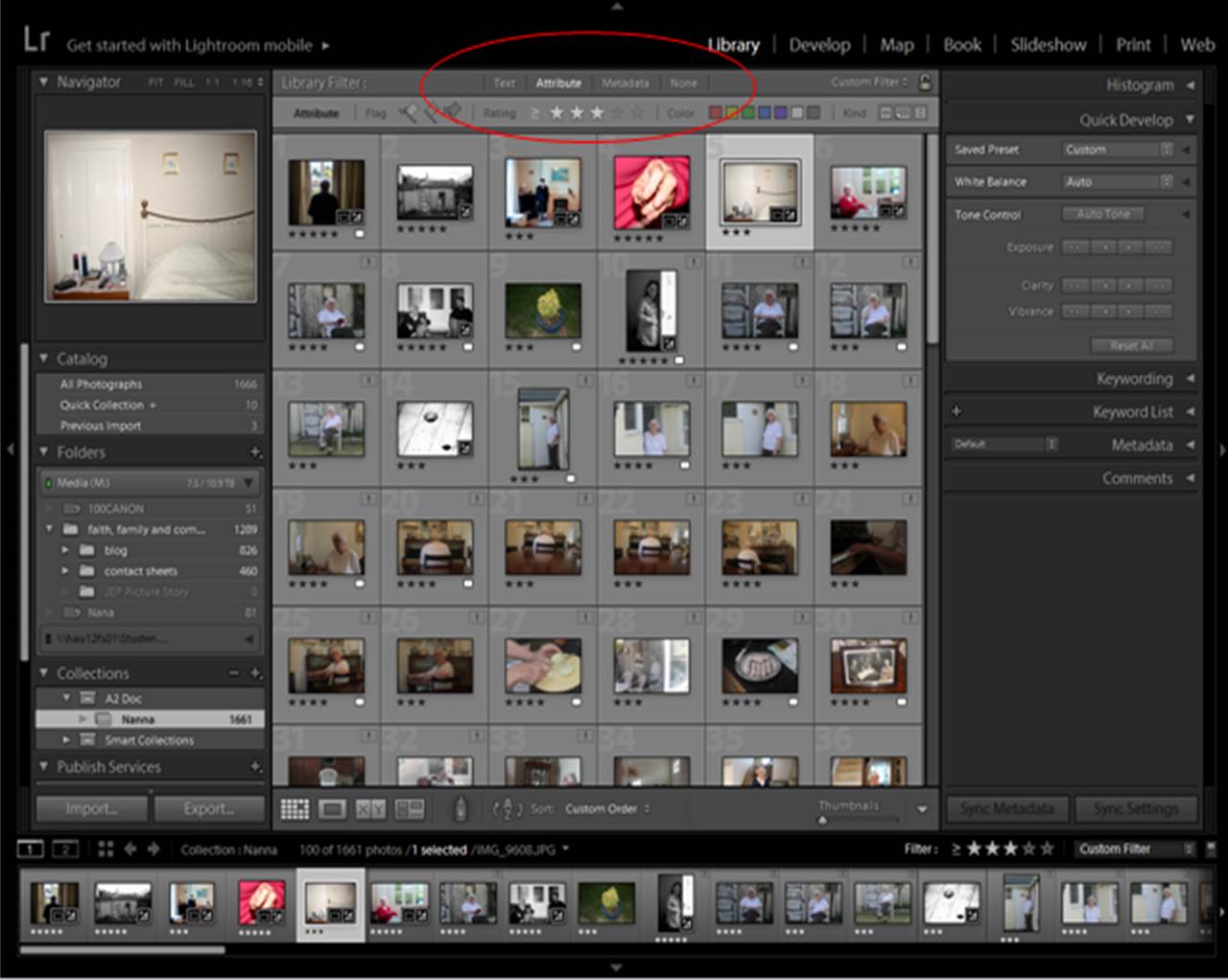
To filter out to images you don’t need, select ‘attribute’ on the library filter section. If you want all your rated images, select the lowest star rating, if you want your highest, select your highest.

Picture1

Step 3 – Editing your Pre-selection

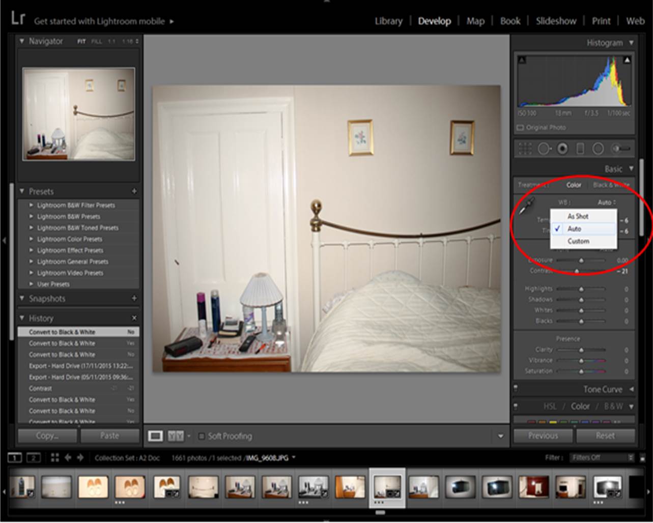
With your 15-20 images, make a quick edit of the images. Small adjustments and auto-corrections only. This will give you an idea of what your images may look like in a picture story. To edit images, go to ‘develop’.

edits 2

Step 4 – Cutting Down on Your Pre-selection

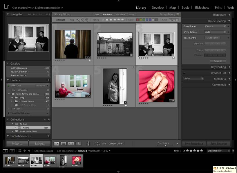
For a picture story you need 10-12 images. Play around with different images and orders until you have the section you want. When choosing/selecting the images you want, select ‘5 Stars’, this will create a fresh filtered page which can mimic a narrative order. Make sure all of your images are imported into the collection you are in, because otherwise you will not be able to swap the order of your images around!

edits 3

Step 5 – Re-arranging Order

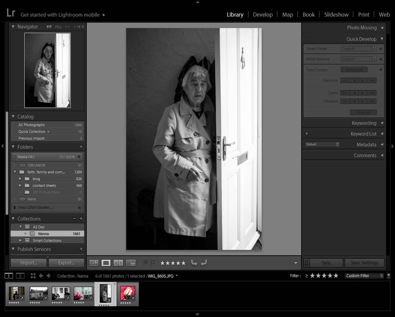
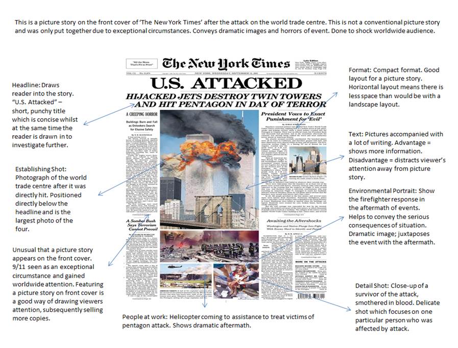
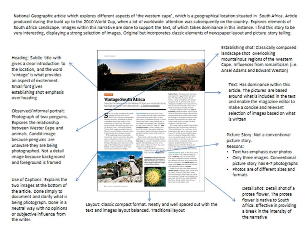
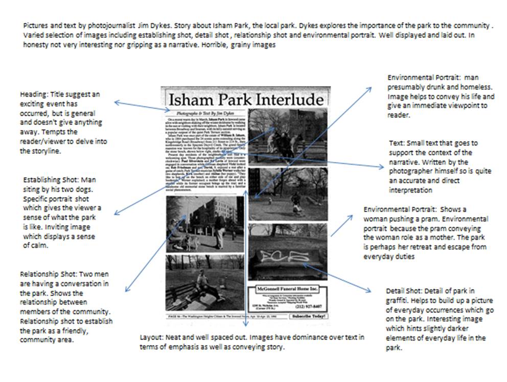
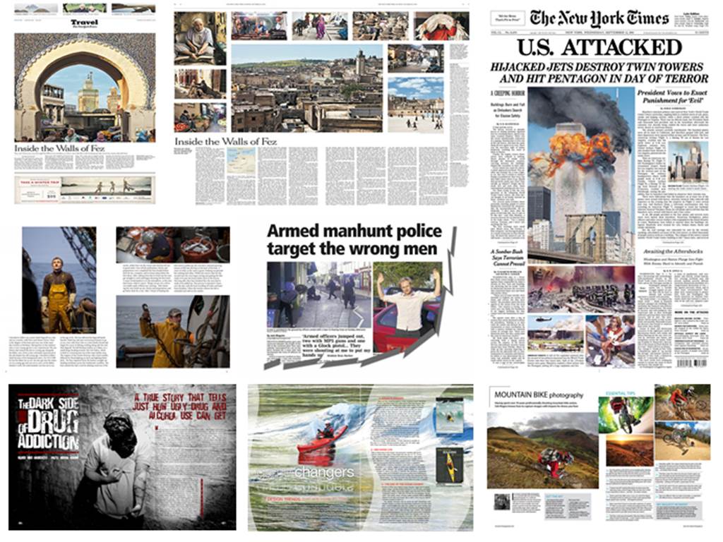
Now you have selected your best 10-12 photographs, consider how it is best to re-arrange your images. Consider different types of images (i.e. establishing/secondary establishing shot, detail shot, environmental portrait, relationship shot and people at work image), and how certain images will fit into certain parts of the story. You may need to change some of the final images around to make the images effective, strong and relevant in the particular story you want to create.

Picture1

Step 6 – Final Edit

Once you are happy with your order, re-edit the images. Think about particular themes, (e.g. b/w, high contrast, high satuaration etc.)

Picture2

Step 7 – Export Images

To export your final selection, go to Export>Export to>Specific Folder>Select Folder>Choose

Picture4


Moises – Evaluation

Background

‘Moises’ is a book produced by Argentinian photographer Mariela Sancari. In 1980, when Sancari was 14 years old, her father Moises Sancari committed suicide. Sancari and her twin sister went through traumatic periods of grief, and have suffered from episodes of anxiety and depression.

After her father passed away, Sancari tried to fill the loss of her father through her imagination. She would stare at any stranger who bore resemblance to Moises, a habit which soon became an obsession. Sancari went through a stage of grief known as denial and effectively created a fantasy that her father was still alive somewhere, and seeing men  that would of been her father’s agitated this obsession.

Sancari, who trained as a photographer worked for eights for a large Mexican newspaper. See soon however became disillusioned with this and starting to work to her own, personal photographic projects. In 2011 she gained a photographer in residence place at the Centro de la Imagen, and during this time she worked on a project entitled ‘Moises’.

Evaluation

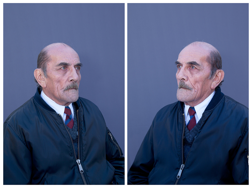
‘Moises’ is a very personal and unique project. Sancari put out a newspaper ad asking for men in their 70s that bore resemblance to her father, (the age Moises would have been if he was still alive) to pose for portraits.She dressed the men up in old clothes of her father, getting them to complete similar activities she remembered her father doing, such as shaving and brushing Sancari’s hair. Sancari described the process as a “very strong, intense situation”. The outcomes of this photo-book, displayed in an unusual pop-style display are very raw, original and authentic. The images are effectively a retrospect of what her father may have been like, had he have lived.

I find that the concept of this series to be very effective and powerful. Sancari uses memories of her father, as she describes, “my memories of him are very childlike. I’ve built a shrine.”. The images included in the photo-book are very simplistic, classically composed portrait styled photographs with a plain blue background. The subjects in the book stare camera into the camera, conveying a plain, neutral expression. I find that this simplicity is very effective makes the story very raw and grounded solely in the theme of Sanceri father. The impression I gain about Moises through her retrospective representation of him is that he was a very normal, loving family man. A theme that Sanceri subtly explores through the photographs is intimacy, convey most clearly through close ups of one of the men saving.

Overall I enjoyed this book. The handmade, pop-up style makes the book very personal and the story Sancrini tells is very subtle, poetic whilst at the same time being heartfelt and consistent to the difficult but fascinating theme of Sanceri attachment to her deceased father. It tells a personal story

I like how Sanceri has used men her father’s age to fill the gap as obviously she can’t photograph Moises. This might be an interesting theme to explore within my own project, the use of other subject to retrospectively image what my granddad may have looked like had he still been alive today. The image composition is very basic and simplistic, whilst at the same time being strong and striking. This simplicity is something I want to emulate more when I take my images. Is emphasis of mood over how an image looks is interesting and my exploration into vernacular photography is a good starting point to reflect within this.


Vernacular Photography

Background and History

Vernacular Photography is a style of photography which appears ‘amateur’, but done so in a well considered way by the photographer. Vernacular photographers deliberately attempt to photograph subjects and landscape in a ‘snap-shot’ style manner, whilst deliberately altering the white balance of the image to give in an old retro feel.

The avant-garde art movement of the 20th century, began to recognize the context of art oppose to merely its aesthetics form. This started to change the way individuals viewed art.  Avant-garde is a movement which has inspired a range of art movements throughout the 20th century – including surrealism, dadaism and pop-art, as well as art movements in the early 21st century including ‘brit-art’. Avant-gardve as an artistic form is controversial because it constantly tested how society views what art is.

Classic landscape photographers such as Edward Weston and Ansel Adams made their photographs based on the concept of formalism which was linked to the romanticism movement. Their images were all based on good form and composition. Weston’s intricate close-ups and Adams stunning and inspiring landscape shots, helped to set the bench-mark for photography and defined what made a good photograph. Photographers such as William Klein, who produced grainy, blurred images of 1950s New York, began to re-define what photography was. As society slowly became used to the concept of photography as something much more than pretty, romanticized  images, avant-garde photographers began to test this definition more and more, which photographers such as Stephen Shore and William Eggleston, pioneering a completely new style of landscape photography, ‘new topography’.

Although Vernacular photography as a concept has existed since 1940s, it is often a very undervalued and under appreciated artistic style. It has inspired the work off many revolutionary photographers such as Walker Evans. In 1996, the work of Richard Billingham in ‘Ray’s a Laugh’ began to recognition of vernacular photography as a serious form of art in its own right. The photographs in Billingham’s book consist of snap-shot styled images. The actual form and composition of the images are terrible, however  they reflect such a deep and personal story in a way which is dark and authentic. It was Billingham’s work in which people started to take seriously the concept of ‘vernacular photography’.

What actually is vernacular photography?

Vernacular photography is any type of photography which is considered to be amateurism, whether through intent or by accident. Family snap-shot taken by amateur photographers are considered the most popular form of vernacular photography, and the retro style of these shots is what has inspired the format. It  is very difficult for a trained photographer to take vernacular styled image but it requires a complete dismissal of form and composition. Taking a powerful and well consider vernacular photograph is therefore extremely difficult to achieve.

The style of vernacular photograph are very snapshot styled. The color balance of the photographs are often made to look ‘greenish’ as they would with old Polaroid snap. Motion blur is also a common theme of this type of photography.

Inspiration

I first became interested in the concept of venacular photography through looking at some of my music album covers. The covers of  the Stereophonic’s ‘You Gotta Go There to Come Back’, Oaisis’s ‘Heathen Chemistry’ and Jake Bugg’s self titled ‘Jake Bugg’, all use vernacular styled images.

I have looked at the work of Richard Billigham (Ray’s a Laugh), Martin Parr (Think of England) and Tom Hunter (Le Crowbar). Here are a few images from Tom Hunter’s series ‘Le Crowbar’.Le Crowbar

Le Crowbar

Le Crowbar

Reflection

For the start of this project I have started to explore Vernacular photography in my own work. I felt this style was interesting to explore.  For this project I want to create subtle form of vernacular images, meaning that the images I create will be classically composed images with considered lighting and form, however I will incorporate vernacular techniques to give my images a slight ‘edge’, making them more interesting then just simply classically composed ‘clean’ looking images.