All posts by Max Le Feuvre

Filters

Author:
Category:

Evaluation of my Photo-Sequencing

Summary

The making process of my photo-book has been a challenging but enjoyable experience. The end product is that I have successfully designed a hand-made photo-book, printing off my photographs and placing them in a traditional photo-album I brought.

This process has required a large amount of work and effort. I will now evaluate the end result and refer to the stages and thought-processes behind this finished product.

Sequencing of my Photo-Book
IMG_0423

The sequencing design I have gone for is based on slowly building up context to my story; starting off slowly and revealing more clues as I go along.

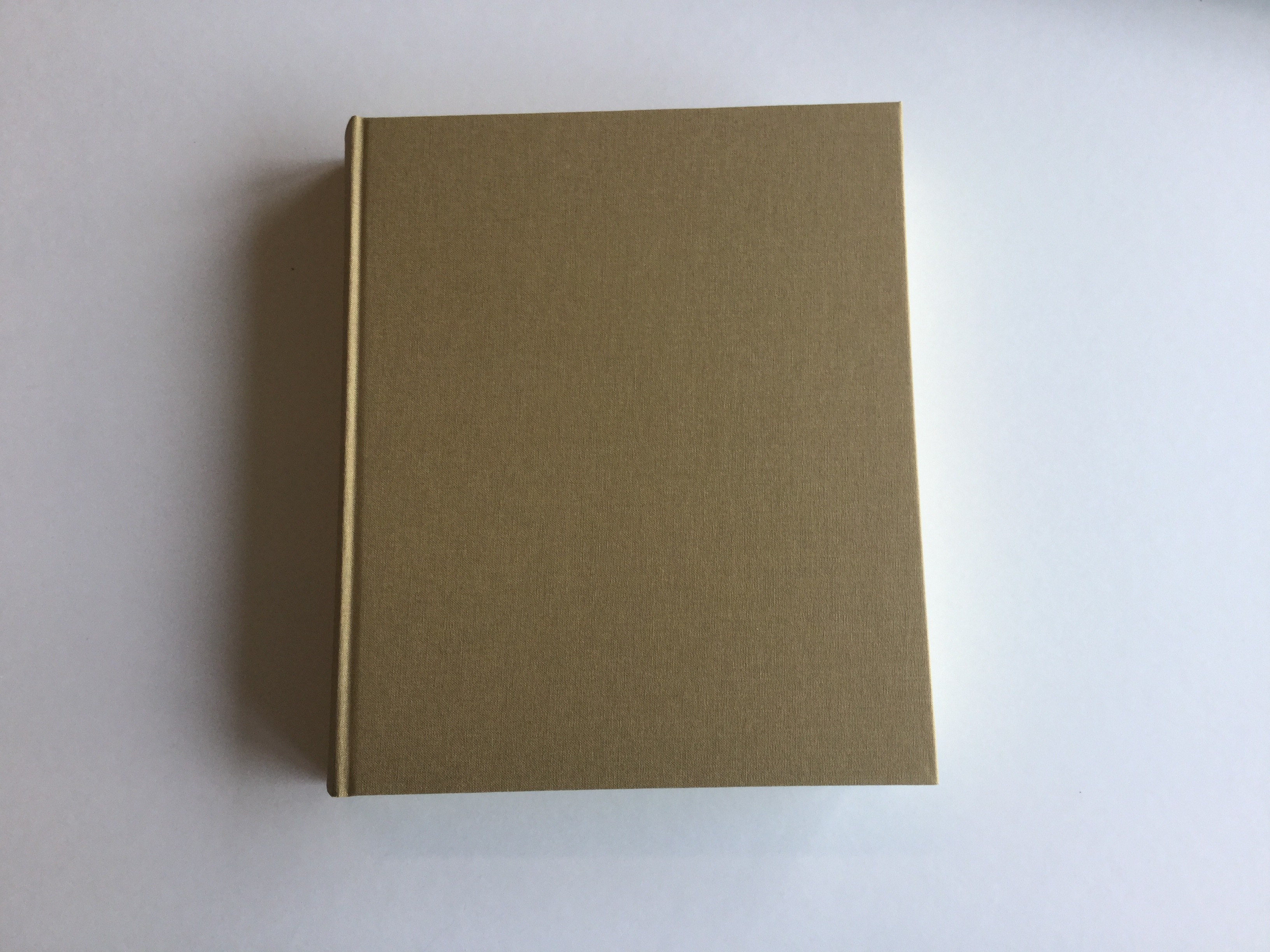
I have started off with a very simple front cover by keeping the original brown cover as it is; not adapting or changing anything. I have done this because I want to images to speak for themselves, and to establish a degree of subtly straight away.

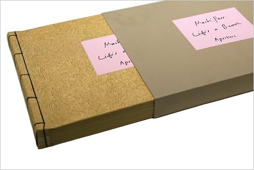
To further this sense of intrigue I have placed my images in a cardboard folder, usually used for storing paper documents. This idea was influenced by a similar designed evoked by Martin Parr in ‘Life’s a Beach’ in which he placed his photo-book in a cardboard style folder. I like this feature because it adds a sense of playfulness to my book – it is interactive and emphasizes the photo-book as an object in itself, to be significant.

IMG_0424

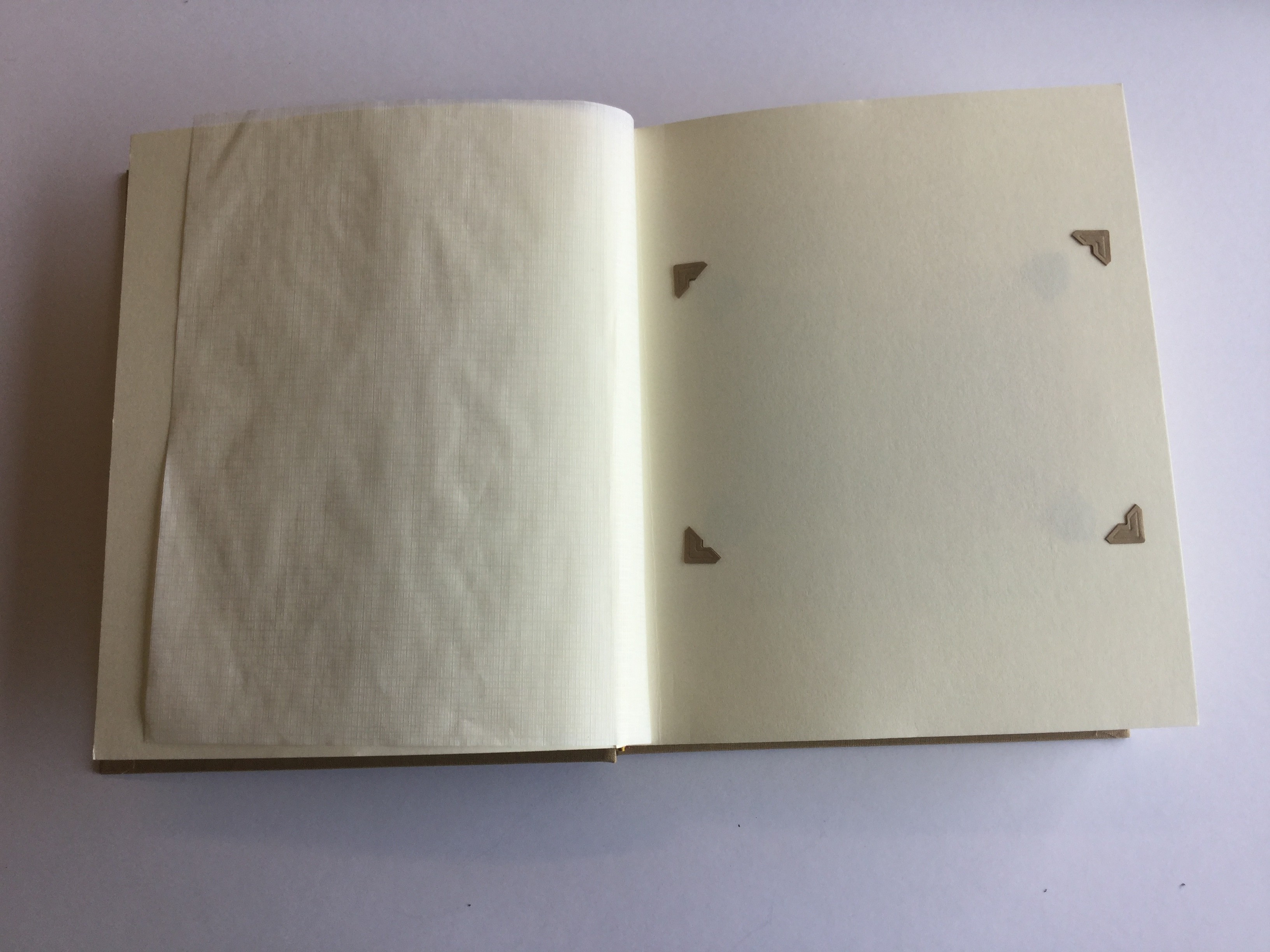
For the first part of my story I wanted to address immediately the theme of absence. To explore this idea in a subtle way I decided to put photo-corners into the first page of the story – which I have then taken out, leaving a page with photo-corners but with no photograph inside. My thought process behind such an idea is that the empty pages serve as a metaphor for the fact my Grandfather, who is the basis behind the story, cannot be photographed, and cannot therefore exist in any of my photographs. This sets up the idea therefore that  the images within the book are somehow all connected to this absence, telling a story about something which isn’t there. Like Toropstov’s work therefore, mine is very much a journey of discovery.

IMG_0425

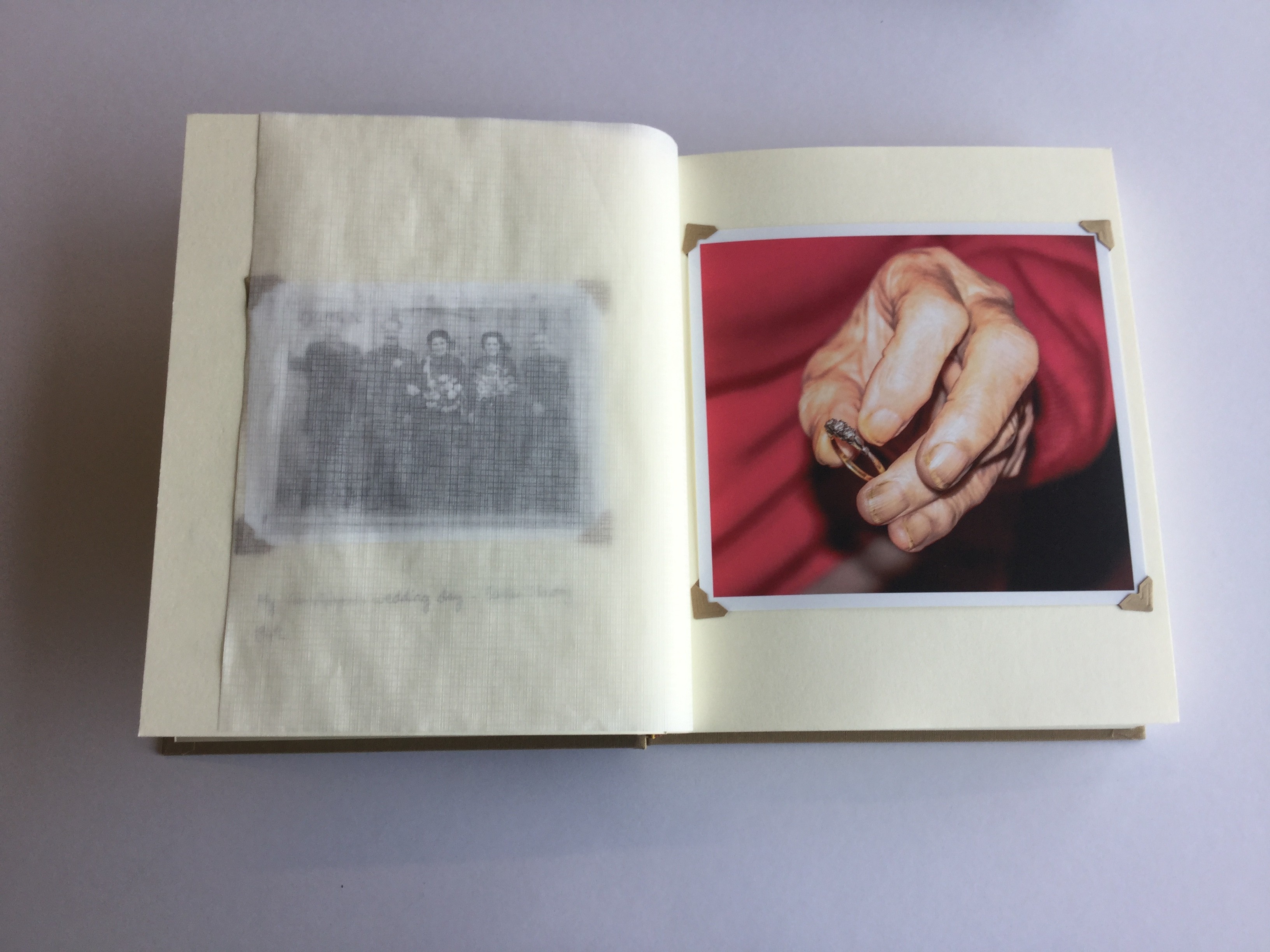
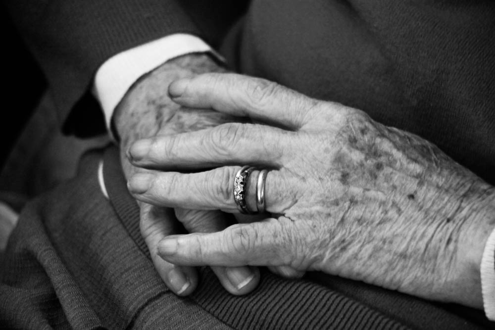
I did not mention at the start of my photo-book that my Grandfather was no longer alive, nor do I even suggest that the story is based on him. This is because it will make it easier to build-up a narrative slowly and overtime, without giving anything away. The first two images of the narrative start to suggest the story is based around my Grandparents; the left-hand image is a old archival image and I have included the caption “my Grandparents wedding day – 1949”. The right-hand image is a close-up of my Grandmother holding her wedding ring  (which she wore when she was married to my Grandfather. The fact she is holding the ring does subtly imply the fact my Grandfather is no longer alive, a symbol of something which is no longer here; a object which connects to the past.

IMG_0426

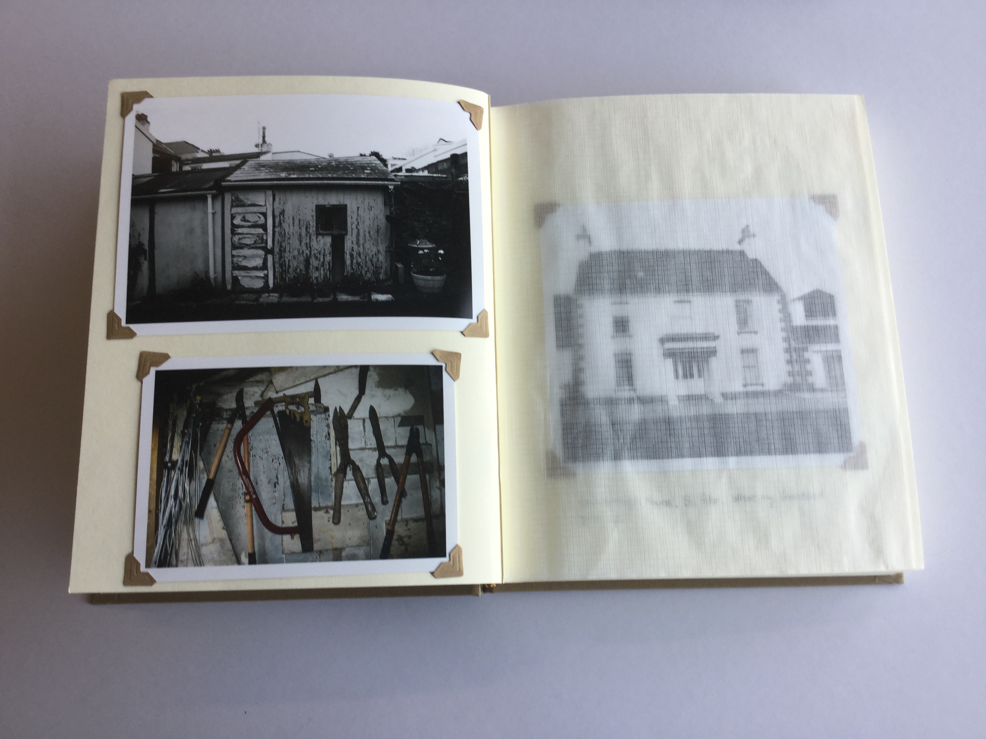
The fifth page of my story –  consisting of two images on one page – relates to my Grandfather in a symbolic way. The images are of his shed in the back of my Grandma’s Garden, and the still-life is of the tools which he would have used. This use of symbolism is one of the main ways in which I have been able to replicate a sense of his presence. This use of symbolism extends the degree of intrigue behind the story because the viewer will not yet be able to fit. On the next page however, I have included the caption “Sommerleigh House, St. Peter. Where my Granddad grew up.”. This will invite the suggestion that there is a link between my Grandfather with page 5, and well as an implication of his presence throughout the entire story.

IMG_0427

For the next couple of pages I continued this process of taking candid images reflecting my journey of discovery; photographing my Grandma, her garden and the gates to the graveyard where my Grandfather is buried. The light-switch is a key point in breaking up the narrative, as immediately on the following page, I have jumped away from the present time line and to some degree theme, by including an archival image of my Dad. This begins a smalls break in the narrative of two images,one of a watch and one taken of the moon late a night, the latter in particular reflecting not reality but instead a state of mind.


IMG_0428

I would also consider these two pages as key images because they are very poetic images, designed to represent the the perspective of my Grandmother, photographing things that she would view going about her everyday activities. I have again connected my Granddad directly by including the caption, “Your Granddad served in WWII as a navigator for the RAF. He never spoke much about it”. This continues the viewers gradual introduction to my Granddad. On the following page a similar reflection can be shown, through an image of a Masai Mara statue and I have included a caption through which my Grandmother discusses her view of the time the family spent in Kenya. during the 1980s

IMG_0429

To again break the flow in the narrative, I have included five landscape images of the scenery of St Ouens. These images don’t show anything in particular and are more-so metaphors for the journey I have taken. In a way I think they represent my state of mind and mood when making this photo-book. As they don’t really represent anything they therefore have quite a low intensity and thus provide a nice break before the ending of my narrative.

IMG_0430

The penultimate image of the photo-book is one of my Grandparents in their Salvation Army uniform. My Granddad was nearing the end of his life by point and it is one of last photos ever taken of him. Even by this point I have not yet mentioned my Granddad is no longer alive, although his absence implies this. In this image I have included the caption “We planned to retire in 1986. Your Granddad wanted to visit his Brother Frank, in Australia”


IMG_0431

On the next page/final image I wanted the image of both my Grandparents in their uniform on the last page to contrast directly with this one – emphasizing the fact he is no longer here. I feel that this image is an extremely powerful image because it emphasizes the fact my Grandmother is still part of the Salvation Army, but is now doing so alone. The simple caption explaining that my Granddad died in 1985 aged 63, finalizes the narrative and clarify his absence. I felt that relating this caption with the image of my Grandmother alone, emphasizes the reality of this situation.


Making My Photo-Book

1. Printing off images

I have now taken all of my images and selected the ones that I want to print off.

Gareth has kindly agreed to let me use the photo printer at the Société Jersiaise Photographic Archives to print off my images. Therefore I will spend a few hours over the next couple of days getting all of my images printed off.

2. Choosing the Paper

I had to decide the type of photo-paper I wanted to print my images on. I was given the choice of three different types of paper;  matte, smooth-pearl, or gloss. The style of all of the different papers are as follows .

Deciding the right type of paper to use is very important because it affects the appearance, style, mood and feel of the images. What paper my images is on is therefore very important because it

1.Gloss Paper

  • very shining surface
  •  smooth texture
  • high colour saturation
  • good for commercial/promotional images
 2. Matte Paper
  • coarse, grainy texture
  • not great for printing out colour images
  • most expensive due to the way it is made
  • gives a very rustic, natural feel
  • seen as the most professional and highest quality
  • not vulnerable to being marred by fingerprints and it produces a non-glare
 3. Smooth Pearl Paper
  • ‘in-between’ of Gloss and Matte Paper
  • ‘fine-art’ paper quality
  • some (but low) gloss
  • widely used in photo-books: seen as more traditional than matte paper

I have decided to go  for Smooth Pearl Paper because  felt it was a nice balance of the two paper styles. I didn’t think the style of images that the matte paper produced would work well for the type of photographs I had created. The coarse texture of matte paper, along with the fact there is no gloss means that the images would be slightly blurred and dull in appearance. This is acceptable if the

At the other extreme, gloss paper in my opinion would have over-saturated my images, and in general I do not like the glare it creates as it would be very overbearing on the page, taking away from the subtle and reflective nature I want to maintain throughout. I also find that gloss paper really compromises the quality of the images, to the extent that it makes the images look to commercial, lacking any degree of subtly and sensitivity.

Smooth Pearl paper on the other hand ensures that my images are sharp and of good quality, whilst keeping a very simplistic and basic feel /appearance. Upon reviewing a test print I really liked the clarity of the printing, the photograph was very smooth and flowed easily on the page. This paper thus ensured I would be able to print out my images in mass, knowing the quality and saturation of the images would remain consistent.


3. Printing off

I started the printing process of yesterday and am about half-way there. Here is a step-by-step guide I am using to print my images off…

Part 1 – Designing

  • Transfer the images to a TIFF format at a resolution of 360
  • Go to Abode Bridge a select all the images you need.
  • In Photoshop, open a document file and apply the images into it accordingly – set it to A3
  • The images are separated by different layers – activate the ‘auto-select’ button beforehand and each time you select an image it will automatically transfer to that layer
  • Toggle the image size to how you want it by adjusting the corners using the shift key
  • Move the images around dependent

Part 2 – Printing 

  • Go to file + print. Customise the printing settings to make it specific (see screen shot below)
  • Place the A3 Printing Paper in alignment to the right-hand side of the printer
  • To print select ‘proceed’ and review on print preview (if not happy cancel and re-do this process)
  • When happy select ‘print’

[UPDATE – I HAVE DONE 2/3 OF THE PRINTING + HOPE TO PRINT THE REST OF BY THE END OF FRIDAY]

4. Trimming the Photographs

Now I have printed off all of my images I will need to begin the process of trimming these prints down to the right size, to then place inside my photo-book. I have agreed that two different format sizes will work well in this instance – 10 x 15cm + 13 x 18cm. As I discussed with Gareth, getting these sizes perfect isn’t crucial as the merits of a hand-made style of photo-books is that I have room for error and that an anomaly isn’t always a bad thing.

To cut the images out I will use a standard A4 paper cutter. Beforehand I will need to ensure the following ………

  • the grid-line is straight and secure
  • the blade is sharp
  • the paper is fastened in properly beforehand so that it does not move/jam during the cutting process
  • have got to right measurements and cut to the markings
4. Selecting the Photo-corners

I want to use photo-corners in this photo-book to tie in with the old fashioned photo-album design I am trying to replicate. Therefore a key consideration in the process of selecting photo-corners will be to chose an old fashioned design.

Ideally (like the photo-paper) I am looking for a design which is a balanced in terms of what it adds to the page. I am aiming for my photo-corners to be a basic and simple design which blends in subtly into the page, not taking the viewers attention away from the images. At the same time I don’t wish for them to be too weak and they need to have a certain presence to them that supports but importantly, does not overpower the images.

Once I have done all my prints I will then buy some photo-corners. My instinct is to buy simple brown photo-corners which are slightly larger than standard white/black photo-corners. This subtle and neutral colour with give my images fairly established presence that is old fashioned to provide a nostalgic connection. Nevertheless I may change my mind as I have printed off. I will also discuss this with Gareth and ask for his opinion.

5. Choosing my Order + Presentation

I went through my photo-sequencing with Gareth down at the Photographic Archives. We laid my 40 final images on a big table and played around with the order.  I found that there was a lot of advantages of working with photo-sequences using real-life prints oppose to using a computer screen. It was much more visual and interactive this way and allowed me to connect and make links much clearer. It was also easier to change to order around without the restrictions of a computer screen. The sequencing took about 45 minutes do to properly. I am happy with how it has turned out.

6. Sticking the images down

To stick the images down in my book I am using self-adhesive photo-corners. My method is to put one photo-corner in first to use this as a guide to get all of my other photo-corners straight. It was quite a long and fiddly process but I am happy with the way that it turned out

7. Captions

I have kept the style of my captions very simple, including only occasional captions – a few words/sentences expressing simple and basic thoughts which help link and flow aspects of the narrative together. I find it makes my work more personal and allows my own thoughts and ideas to subtly impact/guide the viewer in the way they perceive the story.

The Meaning Behind Format

This blog post is a response to the type of work I have been doing at the archives concerning how the way an image is presented can explain the photographer's intent and thus the  effect and meaning. This work has been useful to my 'personal study' course because it has informed the way I have gone about the presentation of my photo-book.

“You don’t take a photograph, you make it.” – Ansel Adams.

Adams saw the advantages of dark-room development and manipulation to change the  meaning of images. In a BBC interview conducted in the 1980s he described the negative as the “musical score” and the manipulation and printing process as “the performance”. In his view, the way in which the image was developed, processed and presented was just as important as how it was taken in terms of what it meant and visually expressed.

Just as a photograph itself is never purely objective, it is simply not possible to create a photo-book in a manner which can be considered neutral with the photographs alone serving as the viewer’s only consideration. This is because the act of the photographer constructing a photo-book immediately draws questions concerning ‘why’ and ‘how’ this was done. If the photographer makes a hand-made photo-book for example, there is a very personal and intimate feel created within the narrative; whereas an on-line printed photo-book would suggest  a desire to make the work more marketable, as it can be cheaply re-produced and at less cost of time. A similar comparison for  example is a hand-written letter rewritten v.s. an automated email; you lose the personal touch but it is simply easier and more practical to reproduce.  Thus, it can be argued that the way the photographer chose to present his or her photo-book is by no means accidental, and that there is always a purpose to this which the viewer will either consciously or sub-consciously interpret.

The idea that a photograph is determined by the way it is presented is an interesting concept. This idea is certainly true if the view that a photograph is an interpretation is taken into consideration. I will use an example of my own work for to explain this. One of my images this year is a close-up of my Grandmother wearing her wedding ring.

IMG_9573

Upon viewing this one could interpret this ring purely as a symbol of love, happiness and longevity. However if the context is considered, it is more accurate to interpret such an image with the themes of reflection, memory and absence as this ring was the same one she wore when she was married to my Grandfather. Therefore as he is no longer alive, such a theme evokes an entirely different connotation than it would have if he was still alive. This view is carried on to consider how presentation effects meaning because if I chose to present the image with a hand-written note of context than the way the image will be seen is entirely different. This view of varied interpretations created through image presentation can be seen by evaluating the work of landscape photographer Ansel Adams. When photographing Adams would use a large format camera. This enabled him to develop his negatives at a large scale and resolution whilst maintaining a sharp visual display. As Adam’s intention throughout his life’s work was to show the beauty of nature whilst conveying its fragility: “Simply look with perceptive eyes at the world about you”, it can be argued therefore that the reason behind this was to depict nature in an extreme, sublime way showing the fullest extent of its beauty, not entirely truthful but an expression of his own ideas. On the other hand, photographer William Klein in his collection of street photographs of 1950s New York, created distinctive, grainy motion blur images through the use of a small hand-held format camera, creating small resolution negatives more appropriate for presentation in a compact photo-book – somewhat in the form of a newspaper journal/photo-diary. This idea shows how the two styles photograph although similar in the sense they depict 20th Century America in black-and-white, they are in meaning very different as they are different in terms are style and intent and thus presented in different manners.

My photo-book ‘Once a Wednesday, Once a Week’, which I made for my AS Exam Project was presented in the format of a traditionally printed photo-book. On reflection I found my book lacked somewhat in terms of how creative the presentation was. For a first effort of making a photo-book I did not do badly, however it is apparent the way I presented my narrative was somewhat predictable and over time repetitive. First of all it lacked in my opinion, a sense of individuality as I failed to do anything whereby the work was uniquely my own, using a very safe and conventional format. Whilst this style gave my photo-book a sense of simplicity, I nevertheless considered the narrative as somewhat impersonal through such a generic presentation. From this experience I learned the draw-backs of traditional photo-book presentation. Although this style – conventionally considered as blank left hand pages with equally formatted images on the right hand page – can indeed be effective, noting the example of Robert Frank’s ‘The Americans’, a free-flowing narrative journey looking documenting brief glimpses of 1950s American culture, there is certain drawbacks to this. Firstly it very much limits the mood of the narrative, confining the images to be viewed with a sense of similarity and predictability. Secondly, (more so a criticism of the printed photo-book in general)  it that it is not very authentic in the sense it can be “mass produced”, an advantage in terms of making the book easily accessible but a disadvantage if one considers it limits the personal feel that a original, handmade and limited/only edition book can more easily evoke. On the other hand, certain material aspects of the book was in my view effective. For example its size and compatibility made it easy to hold, flick-through and read. From reviewing this work, I recognized the importance of the how photographic presentation can affect how it is viewed. I failed to push boundaries in terms of how my book was presented; and in the process the personal-nature I wanted to create was very much compromised.

The differences in availability of these two books is staggering - Frank's 'The Americans' was produced in it tens of thousands upon first print whereas Parr's special edition handmade copy of 'Life's a Beach' was only made in a one-off batch of 1000 copies. The style and feel of these two books is different as these to videos highlight.

For my A2 photo-book therefore, I intend to create something which is in my view, more personal and has a more complex and developed narrative. Whilst my AS Book focused mainly on the images alone, I will now consider another dimension by which I create my visual narrative: which is the concept that the photo-book is not just a collection of images but is itself an artifact, as Elizabeth Edwards describes in her 2002 essay publication – ‘Material beings: object-hood and ethnographic photographs’: “Material and presentational forms of photographs are central to their meaning as images”. The material used to create a photo-book is important because it determines the way in which the viewer experiences the images on display, as Edwards then goes on to argue: “visual experiences are meditated through the material nature and material performances” . This is certainly true based on the idea the my style of placing printed photos into a traditional photo-album will hopefully present the viewer with a nostalgic connection as they would experience in a similar way if they opened an old family album from the recent or distant past. There is a certain sense of simplicity to this style of work, hopefully making my prints timeless in their feel, an important consideration as I hope it will serve a sense as importance in years to come, a visual collection of my family history – bringing the archives to life and its itself being appropriately collectable as an archival source.

Ultimately, the ‘way’ in which something is experienced determines the meanings which can be intended by the photographer/editor, and in the process extracted by the viewer. The construction of a photo-book therefore; whether that be through a traditional photo-album, a scrap-book, an on line blog design, a printed photo-book, or even an exhibition layout, plays a substantial part in what type of story is told. In fact, the simple concept that the shape and style of a window affects what can be seen outside can also be considered true for a presentation of a photo-book. As the photographs material value therefore affects its artistic value it can be argued that these two factors are linked; two necessary factors of a photograph with the presentation largely influencing what is told.

Handmade Book

Overview

In this blog post I will explore the reasons why I am going to make a hand-made book. I will also begin to explore these reasons in further detail, looking at the positives as well as the negatives of doing so, in the process tackling the issues facing me so I produce work of good quality, similar to that if I made a successful online photo-book.

Despite some draw-backs which I will explore later on this blog-post, I have decided to go ahead with my idea to make an old-fashioned styled photo-album.

From the archives I looked at the work of photographer Henry Thomas who made a series of scrap-book styled albums of his daughter from the period of 1930-50. This research fueled my ambition to evoke a similar style of collecting and presenting images, moving away the general idea of most of the class, which is to make an on-line photo-book using ‘Blurb’

I have begun the process of looking into either buying and designing my own photo-book. Making my own photo-book instead of using Blurb is an idea I am determined to go forward with.

However before I do though I need to think carefully beforehand; there are certain risks involved with making a homemade book and many considerations need to be looked into beforehand. In my previous blog post I looked at the positives of making a photo-book; essentially the aspirations of how I want my own work to turn out like. But, if I am going to make a success of this idea, I will need to accept and  look into some of the drawbacks of this type of style; which I need to be aware of in order to avoid making similar mistakes. Here is a summary of the positives and negatives of making a hand-made photo-book.


Positives

  • More personal – writing my own personal notes.
  • Retro feel/style.
  • Bit different; chance to express my work in a different direction and challenge myself more – I have already made an online photo-book.
  • Allows me to add stuff other than photos; archival images, letters, documents etc.
  • Alot cheaper: £20-£30 for everyhting I need oppose to £5-60
  • Fun to make and not restricted to a computer.
  • Resonates that of a family album.
  • Links to the work I am doing at the archives.


Negatives

  • Can potentially become a scrap-book; may look tacky and unprofessional.
  • Photos printed off could be of bad quality.
  • Missing out on the chance to produce a really good quality online photo-book
  • Takes a lot of time to make – need to spend time to do it properly
  • Little room for mistakes; if not carefully planned will look flawed


How I will respond to these Negative Points

  1. Issue of scrap-book

Solution

  • Look to make work more in the style of a photo-album
  • Research contemporary professional photographers who have successfully made a hand-made book in a way which looks good

2.   Bad Quality Images

Solution

  • One advantage of handmade book is their is leeway for quality; is able to look a bit rustic/vernacular
  • Printing my photos off at the Société Jersiaise
    photographic archives: can chose and decide the right type of photo paper I want

3. Compensating for online style design

Solution

  • Don’t ignore influences I can take from photo-books; ways of displaying a narrative
  • Can compromise to some degree; will have a clearer idea once I have looked into everything more
  • My attitude is that measuring success of art is subjective and there is no right or wrong; yes an on-line photo-book would look cool, but what is there to suggest that making a hand-made book wouldn’t look equally as good?

4. Taking a lot of time to make

Solution

  • Plan carefully so I don’t run out of time.
  • Stay on task and don’t procrastinate.
  • Quality over quantity.

5. Little room for mistakes

Solution 

  • Embrace the leeway which I have with my decision to evoke a semi-vernacular style.
  • Take risks and be creative: this is the whole point as to why I am making a photo-book in this style.
  • Do it properly; buy a proper photo-album beforehand with good quality pages – look at Martin Parr’s ‘Life a Beach’. Change, adapted front cover if needed to make it more personal
  • Research a reasonable amount

Conclusion

I enjoyed making a photo-book last year for my AS photography project. Nevertheless there was certain difficulties I faced during this process and found it to some extent, quite restrictive. Also, doing the photo-story design on Photoshop was a challenge I found difficult. I recognize that online/computer design is definitely one of my weakness. As I made a photo-book last year to measured success, I believe I don’t have anything to proof in terms of making a online book and so can use this time instead to try something a bit different.

In many ways this is a huge re-think of the direction of my project. My research and concept will not change however, but just I will explore a few more ideas and style to compliment to work of Toropstov, Sancari and Germain, of which my study is more or less  influenced by.

I will begin to research other photographers who have successfully made a hand-made book, which includes British Photographer Martin Parr in his photo book ‘Life’s A Beach’, of which I will make another blog post.

I will construct a careful plan of how to go about my photo-book in a manner which allows room for change whilst at the same time is a realistic plan for the remaining time I have.

Although I know it wont be easy I am convinced if I make and construct a home-made photo-book that I will be able to produce a very successful response to this project. I will successfully find a balance between creating something which is both homemade but professional looking at the same. I don’t want to as Mr Toft has fairly pointed out, make my book look tacky and of low quality because if I do so, the good progress I have made in my project so far will essentially be lost. I will work hard and research well however to ensure that this is not the case.

I am aware that this will be challenging and a  risk. Nevertheless I want to make use of the month or so I have to complete this project in a productive way which pushes me out of my comfort zone and stretches my understanding.

I am open to a degree of compromise on this idea, which I will explore in the next few blog post this concept of photo-book design has inspired me to produce.


Plan for Making a Photo-book

This is my step by step plan for making and constructing my handmade photo-book.

Before Half – Term

Develop and research ideas – DONE

Blog Post on Martin Parr – DONE

Choose and buy photo-book in town – DONE

Specification of my ideas and what I want to – DONE

Blog Post on importance of photo-book presentation

Decide photos I want to print off for photo-book

Half Term

Buy photo-corners Finish Essay + publish all stuff on blog post

Research front cover design ideas – maybe write a blog post on these findings?

Get other work done and free up time to work on photo-book for next couple of weeks

After Half-Term

Monday 22nd = Go through layout with Mr Toft Put photos in book presentation order Put photos in right resolution: 300 Resolution +Tiff Format

Print off A2 contact sheet on archive printer first week back: may have to make a couple of trips

Cut out images Put into photo-frames

Annotations and anything extra I need Print out essay in type-writer format

Archives – Week 3

image

IMG_0339

IMG_0348

Objective

This week I have begun the process of writing my essay. This meant that Gareth was able to see the work I have done and make suggestions for me to improve, as well as give me ideas in which to take my project.

I began this session by talking to Gareth about where I want to take my project and what I am trying to learn. I therefore mentioned how I want it to be a personal journey in which I try to document  my Grandfather, through the photographic style of Julian Germain in ‘For , but  in style similar to that of how Yury Toropstov has gone about his work in ‘Deleted Scene’. I then showed Gareth the work I have done so far on my essay, through which he marked and gave me some feedback on. I found this feedback to be useful and it gave me some good ideas about how to write my last paragraph of the essay, which I am struggling for ideas on.

What interested Gareth in particular was the concept that I was creating a narrative based around a person who is not alive and who I therefore cannot photograph. Gareth defined this concept as an ‘interpretation’ – photographing things related to the subject but not the subject directly.

Gareth came up with an idea: we went down to the archive room where we collected a series of photo scrap-books made by  photographer George Adolphus Thomas (born 1900) – 10 in total over the course of 30 years. Many of these photographs included and were focused around Thomas’ young daughter: Pamela Georgina Thomas (born 1929). Pamela was photographed constantly and fanatically by her father, which has resulted in a extensive body of work documenting and recording her upbringing

My challenge was to look at these photographs, make a few notes, and draw a series of conclusions based on findings – as well as attempt to put these photographs in chronological order. In particular, Gareth wanted me to consider the idea that because Pamela was photographed an extensive amount; in different places, points of times and context, that a clear narrative of her can therefore be told through the images. In contrast, Gareth got be to consider the contrast this has with my own project, as I am attempting to create a story about someone who is no longer alive.

Response

The task was relativity easy to complete, I had to look in all the books and then date them in chronological order. I more or less completed this task however it was at times hard to decide which ones to put in order because of the timeline of the album sometimes overlapped. It was interesting to see to variety of images which had been taken, over such a long period of time.

Whilst I was doing this task I became more interested in the actual book, in particular the hand-made, scrapbook appearance to them. There was something that really appealed to me about this presentation, it was simple but personal. The photos were arranged in this scrap-book manner and Thomas included little personal notes, presumably for this own benefit of remembering when pictures were taken and what happened. I found doing so gave the book a very unique feel to it, it could never be re-produced as the photographer had put their own stamp on it. There was something almost satirical about some of the notes, it added comical elements to the narrative, in many ways glimpse of the photographer’s personality embedding itself into the narrative.The way Thomas had arranged the photographs was quite simple; he simply made little cut outs and placed the developed images in the individual pockets – sometimes one large photo taking up an entire page and sometimes up to 6 photos on a page. This order was random and spontaneous.

The concept of the book was very clever. Thomas had carefully arranged the photos in a roughly chronological order. The choice of images were definitely not random because the photos all displayed a certain narrative by which different images linked to the next. Thomas did not simply just photograph his daughter; he did it in a considered manner, resulting in a variety of images of her in different situations.

At the end of session I had a talk with Gareth about what I had learned. I spoke about how it inspired my personal study – mentioned in the next section – and my thoughts of the books in general. We got onto the discussion of how image presentation very much affects how the viewer interprets and meanings behind photographs. We also spoke about the contrasts between my own work and that of George Thomas. We distinguished the concept that although me and this photographer have based our work of the same  concept, to paint a visual picture of a particular subject, we are however doing so in very different manners; Thomas used the subject directly to tell a story, whereas I am painting a story of a subject who is not around to be photographed. Therefore we determined that my photo-book could be a response to Thomas’ work, however done in a different way.

“Your work could be edition four?” – Gareth Syvret

How has this session helped my Personal Study?

Doing this task gave me a an idea for my own Personal Study; to make a handmade photo-book made of a simple scrap-book I will buy. I will then create a narrative by printing the photos off of sticking them into the book.

This session has therefore in my view, been very useful because it has given a clearer idea about how to present my photo-book. It has also given me a better idea about how to go about the last paragraph, due to both to the useful essay feedback Gareth has given me as well as the extra context I have gain about the photographer, George Thomas, whom is another inspiration I can link to my own writing and to the basis of my project in general.

All of three sessions I have done so far have all been useful in different ways. This week has been the most useful in terms of providing me with creative ideas.

My Photo-book Design Idea

The main advantage of me doing this is that I will able to include this in the book other than the actual photos, such as real documents and hand-written notes.

My main intention of doing so is to make a book which is personal and uniquely my own. Through this I mean I will make a book which only can be made once and never duplicated, because the photos will be original prints and I will include authentic documents and my own hand-written notes. Unlike making an on-line book, which can be easily re-ordered and duplicated, my book will instead be a one off design; customised and personalised to my particular desire, not limited by the restrictions of a web design. I also think it will be a fun and creative task to complete and I think it is an idea which is a bit different. I like the idea of including stuff other than photos, which means I can make more of a pop-up style book, a bit more creative than simply just photos; therefore more personal and subjective.

My essay, instead of being included on the page will be printed of separately on a piece of paper and either stapled in the book or placed in an attached envelope. I think that this will be a good idea because it will mean will essay can be read in an easier manner, as the paper can be separated from the book and therefore handled easier. I will also be a fun and creative way to play on the pop-up idea, and the font can be a type-writer font, again a response to the idea that the book is a retro design.

For extra inspiration I have looked at an old book I had from about 8 years ago. It is called ‘Eygptology’ and was a book with interactive pop-up features. This book was a history book and made use of similar archival documents that I want to use in my own book, such as letters and old photographs.

I also looked at a YouTube video of a hand-made book,  made by a photographer named Greg A. Chiana, as well as a prehaps more well known handmade photo-book, made by Martin Parr entitled ‘Life’s a Beach’


Martin Parr: Life’s a Beach

“Tropical prints frame images shot in Parr’s journalistic style, creating a nostalgic aesthetic that recalls a timeworn photo album” – Bettina Korek

Martin Parr’s special edition photo-book ‘Life’s a Beach’, is a good example of a successfully produced hand-made photo-book.

Parr in this book has evoked the traditional style of a photo-album; images framed on thin cardboard paper, with the individual pages separated with a thin paper cloth. The way Parr has displayed his photos also resonates this idea of a traditional photo-album; images stuck to the page with photo-corners and formatted in a simplistic manner, slightly quirky, vernacular manner.

What makes Parr’s work in ‘Life’s a Beach’ different to a normal amateur album is the extremely considered way he has presented his work. Parr has, in a subtle manner, moved away the the old-fashioned appearance of a photo-album; instead gone for a more contemporary approach which embracing the advantages of some aspects of this retro appearance.

The paper cloth sheet which separates the images continues this pattern of evoking a traditional photo-album. I find it is effective because it provides a sense of delicately to the photo-book; a sense of ritual which reminds the viewer of the fragile and unique nature of the book.

The way Parr has chosen to present his book at first glance is very interesting. Instead of just displaying the book on its own Parr has gone for an unusual idea of presenting the book in an encased cardboard box. This gives a very unique and personalised feel to the book, reflecting the idea that it is somewhat like a packaged gift/parcel. It also adds a sense of fun to the book, because the viewer must go through the process of opening the book from a case, as if they were opening a gift or wanted packaging. Practically speaking it also helps to preserve and protect the photo-book for longer.

Parr’s front cover does not necessarily resonate that of a traditional photo-album – it has a more modern and professional feel. The material of the front and back cover is wood. This material provides the book with rustic hand-made feel,  therefore conveying a sense of ‘lightness’ and a simplicity. It is also slightly unusual to use wood as a material for a book; it makes Parr’s ”Life’s a Beach’ therefore slightly different, again an idea which appeals to me,; to make a piece of work which is a bit different.


I like Parr’s idea of including hand-written notes next to each of the photos. The only disadvantage of using handwriting in a book is that it can make the pages look more like a collection of thoughts in a scrap book then a proper photo-book. However Parr has not overdone the notes, only writing a few words about each of the images, still enabling the photographs alone to determine how the viewer interprets/reflects upon the narrative. In Parr’s case, the notes serve to guide to viewer through the images by giving the ;locations and sometimes at name and date; further personalising the nature of the document.

The use of photo corners is similar to what I want to do for my own photo-book. In ‘Life’s a Beach’ photo corners work well because they help to give the photographs a stronger and more three-dimension presence. I also like how it gives a retro style to the images, making them appear like comp temporary, vernacular snap-shot images in juxtaposition to the traditional nature of a photo-album, albeit altered and customised to give a comp-temporary feel. This subtle contrast gives an edge to the work; it look professional and at the same time, somewhat amateurish/vernacular.

A photo-album is often linked with the idea of storing and preserving memories in a personal way. What Parr has done through making this book has recorded a documentation of British seaside culture in a way which the viewer can reflection upon in a personal way, looking back on Parr’s findings in a similar way they would look fondly back at a family photo-album. My conversation with Gareth on Tuesday got me thinking about the ways in which the presentation of photographs can effect how they are viewed. Subsequently, it is clear that because of this style of presenting images – which evoke the style of holiday snapshots placed in a family album  – that Parr is evoking the concept that the images are not simply documentations; but instead a subjective narrative which tells a contextually based story which can subsequently conjure of nostalgic memories and links to the past.

Evaluation

I like the simplistic style of ‘Life’s a Beach’. It is engaging and entertaining for go through, visually different to a traditional printed photo-book. It is a very clever concept that the style of the photo-book manipulates how the viewer perceives the images, inviting them not just to view the images but reflect in a nostalgic way of the nature of the images.

This is the sort of style I will go for should I decide to make a photo-book is this hand-made manner. It is personal and vernacular, but at the same time well considered, and importantly; presented and laid out in a professional manner – as good as if it was an on line template.

As this example shows, subtlety and simplicity is key to creating a successful hand-made book. The authentic feel of snap-shot images being personally placed in a hand-crafted book must not override the fact that the paper, layout and photo-prints must be well considered and of good quality.

Archive Project – Week 2

For the second week of my internship I began at Jersey Arhcives in the morning to order my copies of two documents; Francis Le Feuvre’s will & testament, as well as his German Occupation Registration Card. I registered as a Jersey Archive member in which I recieved a started pack and watched a short 5 minute video outlining the process and consideration of using the ‘reading room’.

IMG_0091

I then went up to the reading room and ordered the two documents I needed. I found the process to be difficult to follow at first because I had never been exposed to such an environment before. The staff there however were really friendly and hellped me out a lot.

I then reported my findings to Gareth back at the Société Jersiaise and we had a brief chat about my views of this experience and my evaluation of my findings.

  • The reading of Francis’ will (saw the original copy in the archives)was fascinating to explore and divulge into. Although I already knew this, it was interesting to see that my Granddad was not included in the testament. I suppose seeing the document in person made such a concept more real and graphic as I could see the exact nature of what was intended  and written. We both decided it would be a good idea to trace evidence with relates to such reason, which I speculate from what I heard was to do with my Granddad’s decision to join the Salvation Army.
  • The registration card was equally a fascinating and insightful document to study. The glaring presence of Francis in the image very much impimises  the characteristic of what I have heard about him, a stern and foreboding character! Again, as Gareth also noticed, I can see firm Le Feuvre family residence

I spoke to my Nan about the image in question of Jack, David and Edward Le Feuvre – of whom all emigrated to New Zealand. She stated clearly that this had no connection to possibly my Granddad’s brothers.

  • Although she stated the he did have a brother named Edward whom was sent to Australia after getting into trouble and encountering some  difficulties, of which my Francis decided in this instance to send him away. 
  • This finding in itself was interesting in formulating a viewpoint of my Francis of which I can use to articulating an interpretation of his relationship with his other children, and thus my Granddad.

On this note, we decided to venture downstairs to the Societere library where I went 2 years prior with my Dad and Uncle to view (a very large!) Le Feuvre family tree. This family tree was created by renowned Jersey-French author George Le Feuvre (1891-1984), known professionally under his pen name ‘George d’la Forge’. D’la Forge was distant relative of the family. My Nan recalls providing hospitality for him on a few occasions he visited the family in Kenya.

image

image

image

The aim of this visit was to confirm some of the discoveries we have made in the last week. We wanted furthermore to establish the identity of the three Le Feuvre brothers who emigrated to New Zealand.

The tree, consisting of 7 A1 Pages, is an extensive record of the genealogy of the family, dating back to to the mid 16th Century with our oldest ancestor on record, Pierre Le Feuvre. We sourced my Granddad on the tree and his  direct line. From this line we established that the three boys in question on the photograph were my Granddad’s first cousins. This may be a possible link to follow in my coursework, however I am unsure whether I have sufficient time to do.

After looking at the family tree, Gareth then got me to complete a task, as a way of furthering my understanding of working life at the Societere. He asked me to fill in a survey looking at the portrait collection of Henry Mullins. I had to source every single photo and then fill on the survey the gender of subject and the backdrop of which their portrait was taking. This proved to be quite a repetitive task and as Gareth jokingly put it “this is the boring side of working at the archives” . Nevertheless it was still fastinating to see the extent of the detail taken at the societere to ensure the photographs and photography collections are as detailed, tracked and monitored as possible. It has made realise quite how obsessive and methodical Gareth is in his approach to running the photo archives.

image

Afterwards Gareth invited me to read  a couple of extracts in a book looking at prominent Jersey people. There we two Le Feuvre’s documented on this book: George Le Feuvre (who wrote the family tree) and Philip Le Feuvre (of which Philip Le Feuvre house is now named after).

Evaluation

Again, I enjoyed my two hours I spent down at the Societere Jersai. I found reviewing my family tree to be very interesting and I forgot just have large it is. My time down archives before the internship to order the registration card and will, was a new and challenging experience. It was interesting to see how the archives centre works, I was surprised quite how simple it was to register to the system and make use of the extremely large quantity of resources on offer.

IMG_0102