“Tropical prints frame images shot in Parr’s journalistic style, creating a nostalgic aesthetic that recalls a timeworn photo album” – Bettina Korek
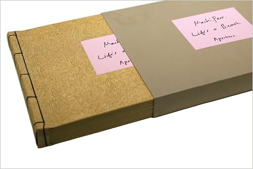
Martin Parr’s special edition photo-book ‘Life’s a Beach’, is a good example of a successfully produced hand-made photo-book.
Parr in this book has evoked the traditional style of a photo-album; images framed on thin cardboard paper, with the individual pages separated with a thin paper cloth. The way Parr has displayed his photos also resonates this idea of a traditional photo-album; images stuck to the page with photo-corners and formatted in a simplistic manner, slightly quirky, vernacular manner.
What makes Parr’s work in ‘Life’s a Beach’ different to a normal amateur album is the extremely considered way he has presented his work. Parr has, in a subtle manner, moved away the the old-fashioned appearance of a photo-album; instead gone for a more contemporary approach which embracing the advantages of some aspects of this retro appearance.
The paper cloth sheet which separates the images continues this pattern of evoking a traditional photo-album. I find it is effective because it provides a sense of delicately to the photo-book; a sense of ritual which reminds the viewer of the fragile and unique nature of the book.
The way Parr has chosen to present his book at first glance is very interesting. Instead of just displaying the book on its own Parr has gone for an unusual idea of presenting the book in an encased cardboard box. This gives a very unique and personalised feel to the book, reflecting the idea that it is somewhat like a packaged gift/parcel. It also adds a sense of fun to the book, because the viewer must go through the process of opening the book from a case, as if they were opening a gift or wanted packaging. Practically speaking it also helps to preserve and protect the photo-book for longer.

Parr’s front cover does not necessarily resonate that of a traditional photo-album – it has a more modern and professional feel. The material of the front and back cover is wood. This material provides the book with rustic hand-made feel, therefore conveying a sense of ‘lightness’ and a simplicity. It is also slightly unusual to use wood as a material for a book; it makes Parr’s ”Life’s a Beach’ therefore slightly different, again an idea which appeals to me,; to make a piece of work which is a bit different.

I like Parr’s idea of including hand-written notes next to each of the photos. The only disadvantage of using handwriting in a book is that it can make the pages look more like a collection of thoughts in a scrap book then a proper photo-book. However Parr has not overdone the notes, only writing a few words about each of the images, still enabling the photographs alone to determine how the viewer interprets/reflects upon the narrative. In Parr’s case, the notes serve to guide to viewer through the images by giving the ;locations and sometimes at name and date; further personalising the nature of the document.

The use of photo corners is similar to what I want to do for my own photo-book. In ‘Life’s a Beach’ photo corners work well because they help to give the photographs a stronger and more three-dimension presence. I also like how it gives a retro style to the images, making them appear like comp temporary, vernacular snap-shot images in juxtaposition to the traditional nature of a photo-album, albeit altered and customised to give a comp-temporary feel. This subtle contrast gives an edge to the work; it look professional and at the same time, somewhat amateurish/vernacular.
A photo-album is often linked with the idea of storing and preserving memories in a personal way. What Parr has done through making this book has recorded a documentation of British seaside culture in a way which the viewer can reflection upon in a personal way, looking back on Parr’s findings in a similar way they would look fondly back at a family photo-album. My conversation with Gareth on Tuesday got me thinking about the ways in which the presentation of photographs can effect how they are viewed. Subsequently, it is clear that because of this style of presenting images – which evoke the style of holiday snapshots placed in a family album – that Parr is evoking the concept that the images are not simply documentations; but instead a subjective narrative which tells a contextually based story which can subsequently conjure of nostalgic memories and links to the past.
Evaluation
I like the simplistic style of ‘Life’s a Beach’. It is engaging and entertaining for go through, visually different to a traditional printed photo-book. It is a very clever concept that the style of the photo-book manipulates how the viewer perceives the images, inviting them not just to view the images but reflect in a nostalgic way of the nature of the images.
This is the sort of style I will go for should I decide to make a photo-book is this hand-made manner. It is personal and vernacular, but at the same time well considered, and importantly; presented and laid out in a professional manner – as good as if it was an on line template.
As this example shows, subtlety and simplicity is key to creating a successful hand-made book. The authentic feel of snap-shot images being personally placed in a hand-crafted book must not override the fact that the paper, layout and photo-prints must be well considered and of good quality.
