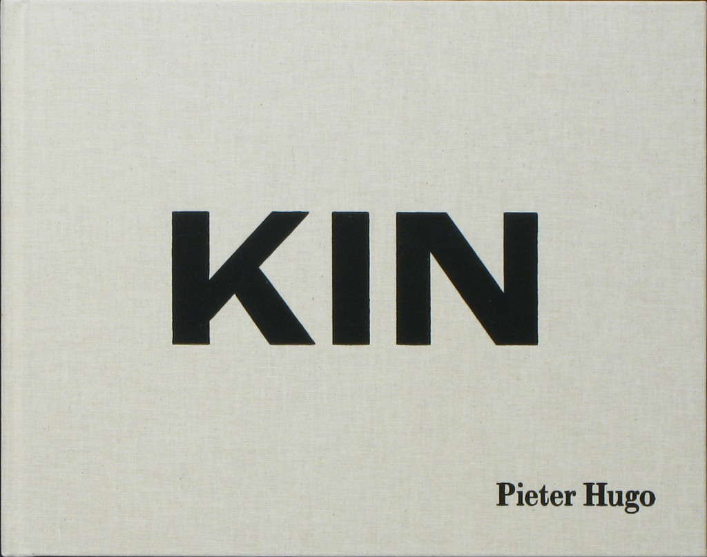
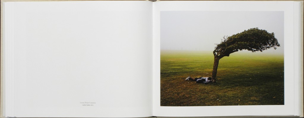
I have been researching different types of photobooks in order to get inspiration into designing my own book. As I have been studying Pieter Hugo’s book ‘Kin’ I have looked into his design and found that I really like it. Hugo’s book has a combination of large and small images, cut in different sizes. I like the divresity of the layout as his images are very powerful, I like how the potraits are smaller and are cut to half a page rather than making the picture expand.
The photographs in Kin are portraits, still lifes and landscapes made throughout South Africa, between 2006 and 2014. Hugo deftly intermingles the private and public — presenting portraits of his family and the people who raised them, alongside images of people and environs that speak to the diverse experiences of living in South Africa today.
A particularly striking sequence shows a young black man, bundled in many layers, photographed in front of the beach where he sleeps. The next page depicts a well-manicured, white family of four grinning widely from the comfort of their couch — the quintessential family portrait.
Comparing Pieter Hugo’s photobook to Theo Gosselin’s photobook, I like how Pieter Hugo’s photographs are clearer and glossy. The images are visually better to look at, however, I do love Gosselin’s style and the way the pictures have been printed, as they match the context perfectly. Just like Hugo’s, his images neeeded to be clear like this to show the power behind them, they match the context.
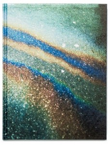
I want to present my images in large and small sizes to show some dimensions within the book. As the context of my book is quite formal, I also think I want to add a coloured or opaque sheet inbetween the photographs instead of having blank pages as it relates to more old fashioned photobooks where images are protected by a layer of material. My baby book and my parent’s wedding book both have these sheets inbetween them to protect the images, and I like the idea of incoperating old with the new as my book will contain archieval images and new images together. This contrast will work well with the context of my story.
I think the front cover of the book is the most important. So far, i am envisioning a plain cover, maybe material with a bold title. I think I am going to go with an archive image for the front cover, the one of a previous governor and then the back cover to be a recent image of the governor. I want the book to be a standard size book, with a hard back cover on it. I will make the pages glossy and the images quite large. I am adding archival photographs into my book as my chosen topic makes it very relevant to add these images.


you need to provide more details and deconstruct photo books in more detail e.g.
Deconstruct the layout of the book e.g. think about format (portraiture/ landscape/ square), size (A5, A4, A3), sequencing (single page, double-spread, multiple images on a page), juxtaposition of photographs on opposing pages etc. How is the narration of the images used, i.e. formal or conceptual relationship between images. Any use of archival or found material? How does it add value to the story being told? Describe also, how the book title, text (foreword, essay, statement by artists) and captions (if any) are use.