Yesterday, we went on a photography to the art centre to view the most recent exhibition that our teacher, Mr Toft is in. As soon as I walked in I was pleasantry surprised when I saw how the photographs were displayed. I liked how they were mostly all uniform with white picture frames, and especially the size of the images as they were large which made it better to look at. My favourite photograph in the exhibition is one of the photographs that Mr Toft took, the one of the Tamika Tolliver in Ausbury Park, New Jersey. This portrait is really stunning in my opinion because I love the contrast between her skin colour and the bright green sarong that she is wearing. The two colours really compliment each other, her skin looks flawless and is a lovely tone. I like how the background is clear of people and the strip of sand goes on and on. Her pose is also very striking and I like how shes looking at the camera with little emotion, it makes the photograph more effective. The story behind the photograph is also interesting as the idea have come from an achieve photograph, as Ausbury park was place where rich people use to go and relax and is now for any member of the public.
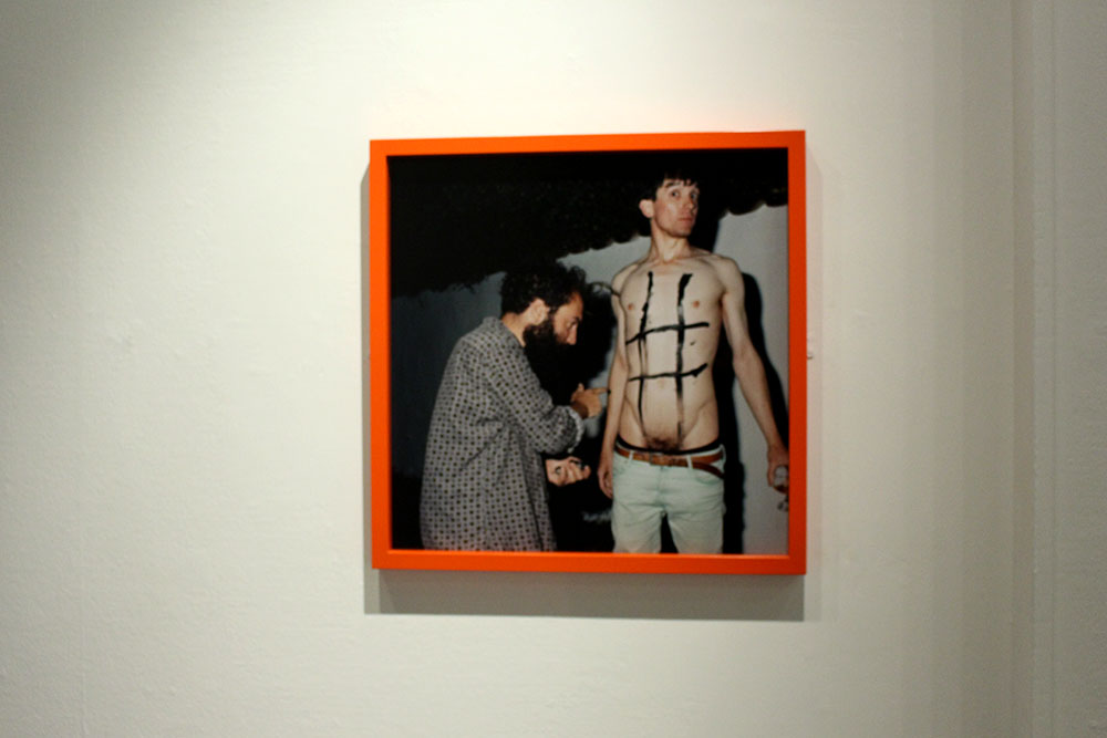
I liked how Tom Pope’s photograph was in a different colour frame, the orange was very striking as the photograph was by itself, it needed something like that to make it stand out. His image is very much performance photography is exciting to look at, however, isn’t the style of photography that I am leaning towards.

I liked how the exhibition had an extra something to it, as the photographs had to chose a photographer that inspired them to take images in Jersey. The photographs of their chosen photographer were placed next to their images which enabled me to view the connection between the old photographs with the new, using unique ideas. These achieve pictures were much smaller which was important because the main images were the ones which were taken more recently. Overall, I liked the layout of the exhibition and the way the pictures were presented largely in a smaller space. The impressive sculpture made by John Gibbons really tied the space together, it was very artistic and well presented on the white stand.

