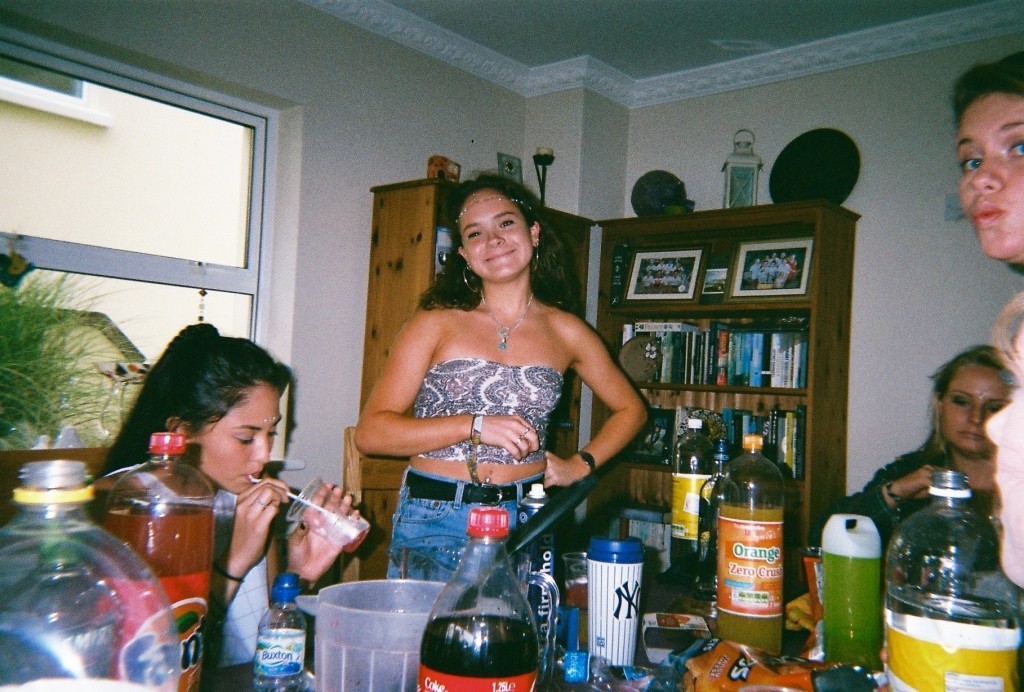
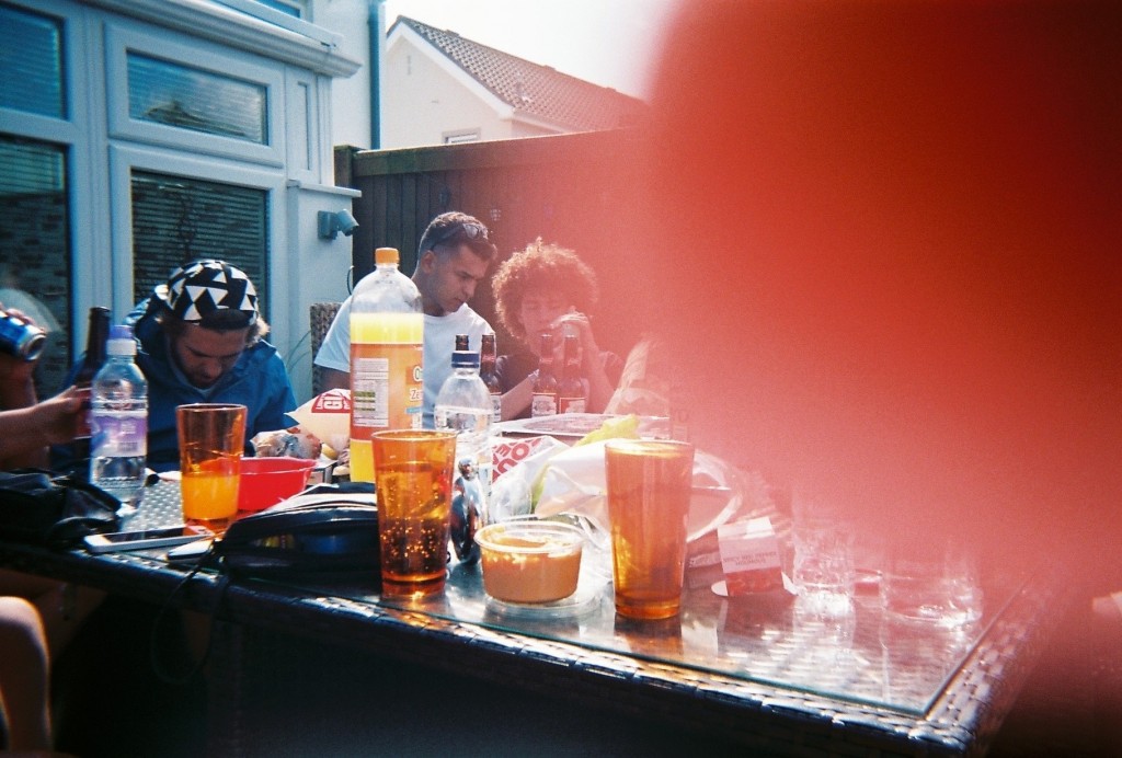
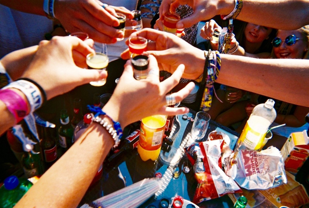
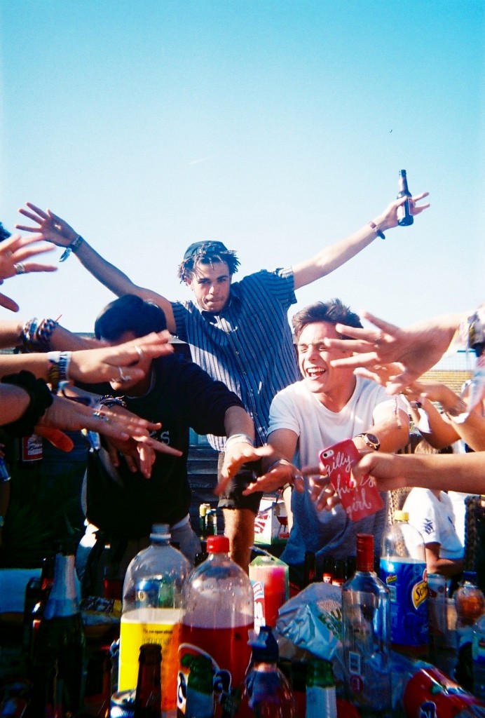
After gathering these images for my community study, I went through all 53 images and selected my favourite ones. ![Screen_Shot_2015-11-03_at_09.02.44[1]](https://hautlieucreative.co.uk/photo16a2/wp-content/uploads/sites/2/2015/11/Screen_Shot_2015-11-03_at_09.02.441.jpg)
![Screen_Shot_2015-11-03_at_09.02.13[1]](https://hautlieucreative.co.uk/photo16a2/wp-content/uploads/sites/2/2015/11/Screen_Shot_2015-11-03_at_09.02.131.jpg)
![Screen_Shot_2015-11-03_at_09.02.56[1]](https://hautlieucreative.co.uk/photo16a2/wp-content/uploads/sites/2/2015/11/Screen_Shot_2015-11-03_at_09.02.561.jpg)
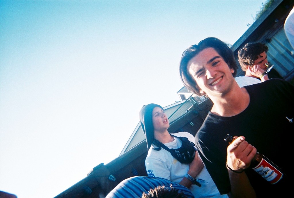
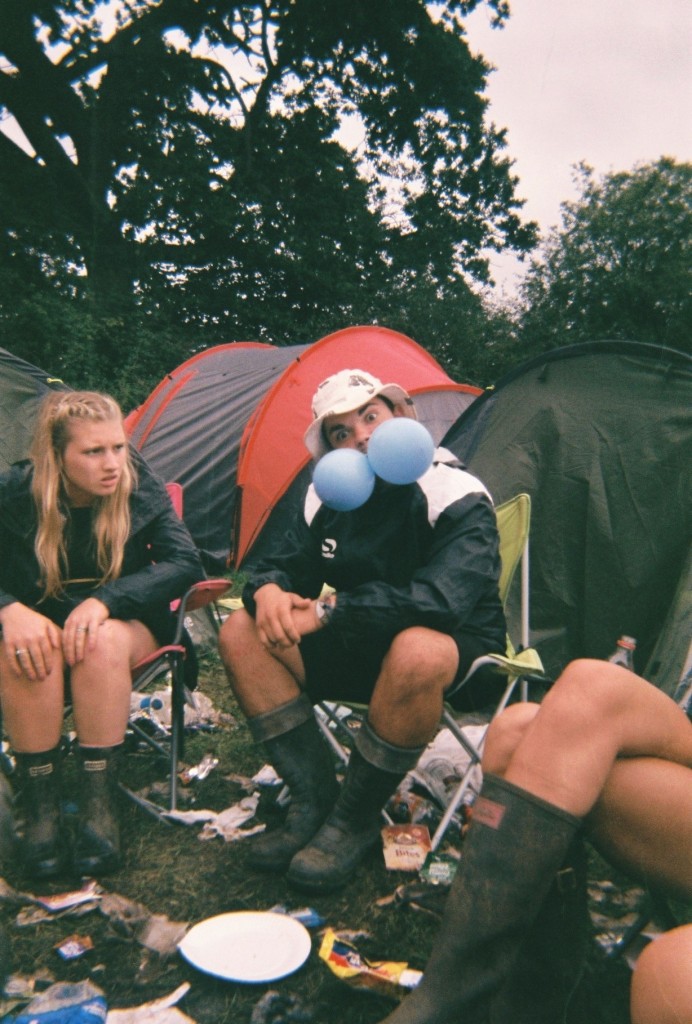
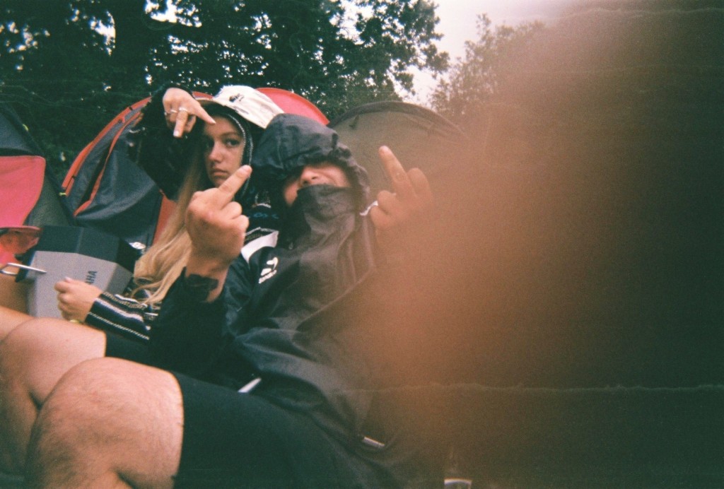
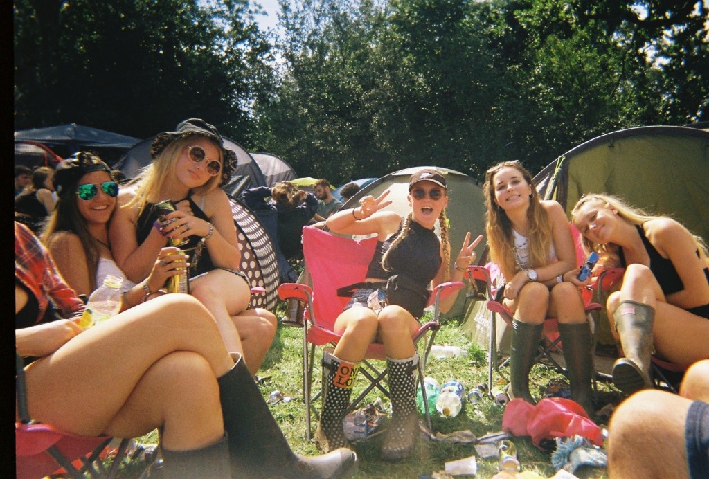
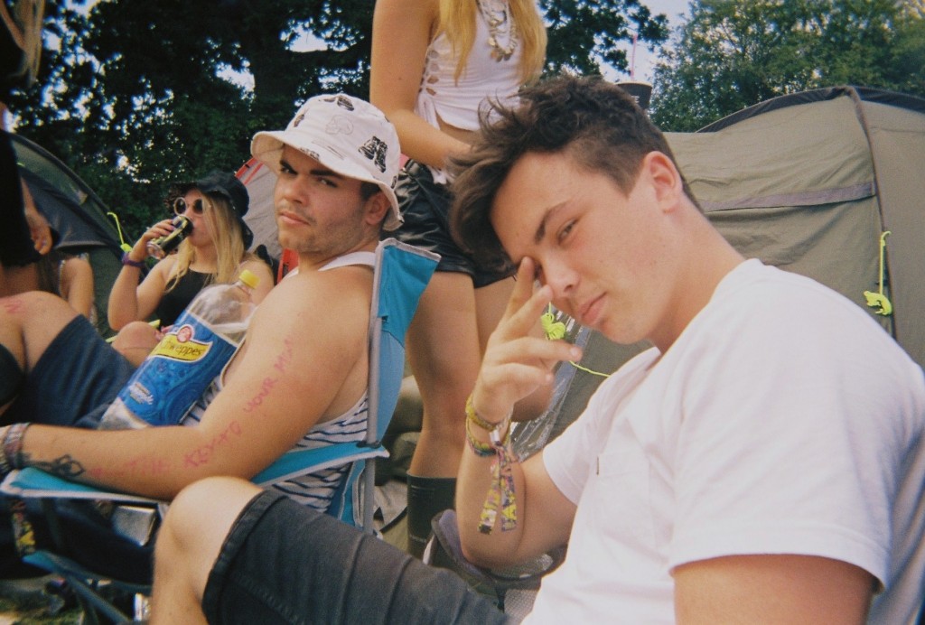
I chose the following images as i felt these were the most interesting and artistic. This is because of the angles, colours, and context of the images. All of the above images were taken on disposables, i took 6 disposable cameras to Reading festival as i love the style the cameras produce. They give a rough old look which i feel matches this topic perfectly. The below images are the images I have chosen as my favourite –
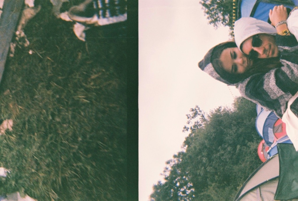
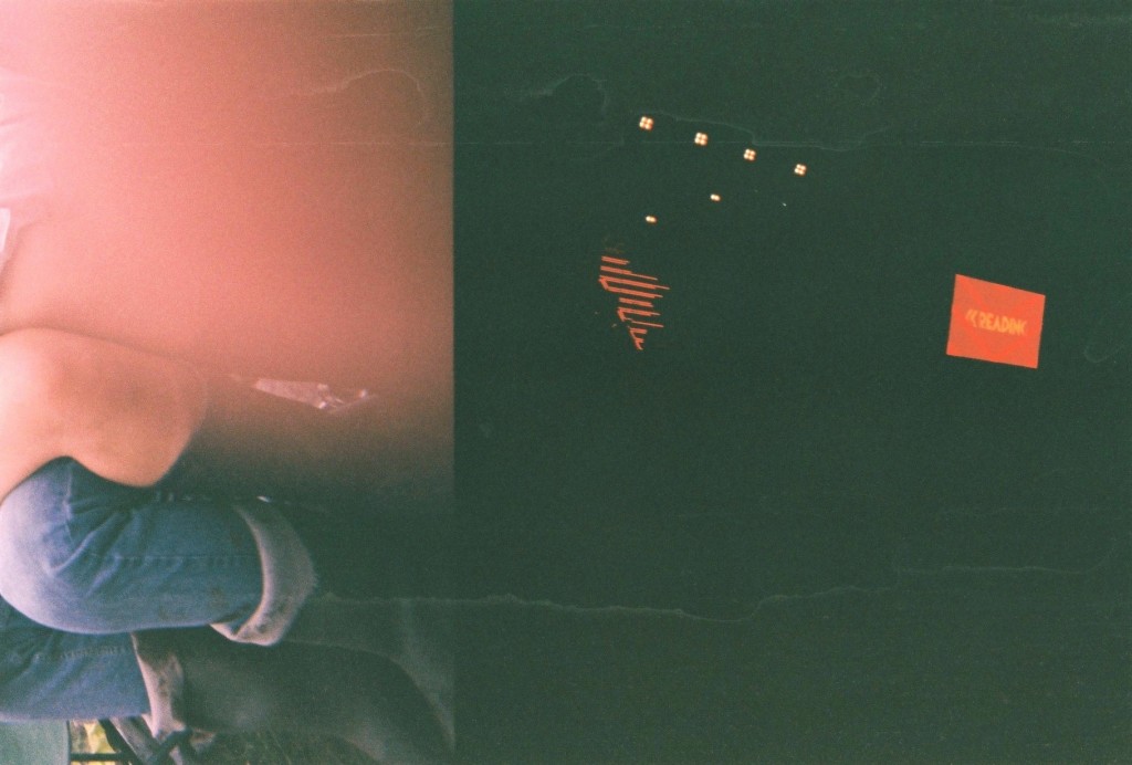
Out of these images there are a select few that I feel are the best – The above and below image I picked as they both were actually intended to be the same image. This did not happen as i dropped and wet the camera multiple times, I believe these mistakes cause the split image and the damage that can be seen in some of the images. The above image uses the rule of thirds as it has something interesting in each section of the photograph, however there is a lot of negative space as the majority of the right side of the image is black, with a few splashes of red, spot lights and some water marks. The right side of the image was taken at the main stage of the festival and the left side in the camp with friends. I think the ‘mistake’ of the damage actually benefitted the image as I feel it made it very arty. The below image is similar as it is split, however i do not know where the left side of the image came from. The right is the other half of the previous image in camp. The below image I like as I feel it looks more laid out, The black block line down the centre of the image splits the two time periods and scenarios in two and joins them together. I also enjoy the image due to the emotional message behind it, the left side shows the mud, litter and dirt that is produced by the festival and the right side show the more intimate and emotional side that is also a big part of festivals. These two messages are on opposite sides of the festival spectrum but due to some freak mistake are shown in the same photograph.
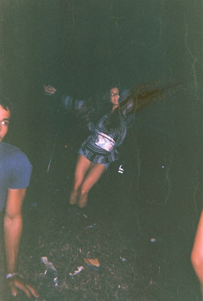
The above image was taken in the arena of the festival while waiting for another act to come on a stage. I like the layout of the image as the main subject is in the centre. However surrounding her is a lot of negative space as it is just black. This image also has a lot of water marks which I feel makes it artistic. This image has also been damaged by a sort of split, as the subject is missing her arm. In real life her arms were spread apart like a star fish and in the produced image her arm has been removed and replaced by darkness and moved vertically. This is not very noticeable but I feel adds to the roughness of the image well.
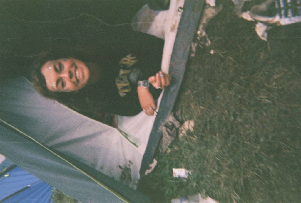
The above image was taken in camp of a friend who had just woken up after passing out for 8 hours. Water marks again make the image look rough and dirty, and the poor angle and positioning too. However the subject still remains roughly in the centre of the image. This image also looks better on its side or upsidedown. This is because when it is upright and normal, it looks ‘too normal’ and not arty enough.
The above two images also have watermarks and were taken in camp aswell. The angling is quite straight on which I feel makes the images quite clear. The thumb print in the second image is the reason I chose it in a select few. The first image has a range of colours i feel contrast each other well, aswell as the odd act of two gas balloons in ones mouth, the blue contrasts well with the red tent in the background and the rubbish on the floor.


