PHOTOBOOK DESIGN

Task 2: Research the examples of books that have been produced, consider the size and style that you would like to work with. There are many example within the blurb site but feel free to find examples either in school or elsewhere. Produce a mood-board of some of your choices, select two of three examples and explain your thoughts and why the design, look and feel works for your images.

The photobook I have taken inspiration from is Phillip Toledanos – When i was six. This book is also the book from which i gained my contextual inspiration aswell.

The design of the book is quite ‘scrap booky’ as the hard back cover is material and covered with white spots and childish writing announcing the cover.

When_I_was_six_plano_cover_HR

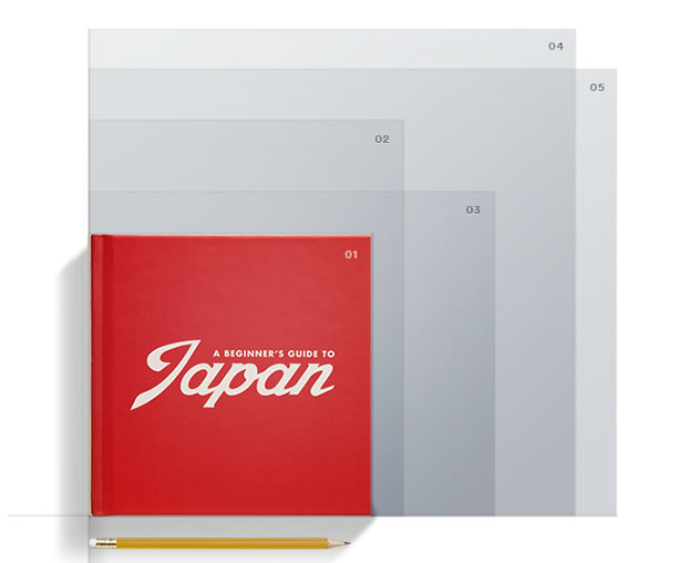
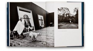
When making a photobook it is important to think about all of the ‘characteristics’ of the photobook in order to get an idea of what it will look like. Eg: size, shape, texture, colors, photolayouts and photo sizes. All of these factors can change the feel of the book and the images themselves. The layout of the majority of toledanos book is full bleed images and contrasting lights seen in the images. The size of the book ‘When i was six’ is standard landscape. The images are single page. The cover is a hardback material cover, The paper in the book ranges from standard photograph paper to grainy textured paper. Throughout the book there are also shortened pages added in, to draw attention to that page and to break the book up.

genres_photo-general_assets_sizes_A1_7x7

Modern Day Feminism

Modern day feminism, we now live in a world where women have more rights than ever before yet we are constantly suppressed and still face inequalities within our society, politically and economically. Feminism will always remain within our societies as it is something that needs to be fought and people need to be enlightened to. Until both men and women are treated equally within every society on the planet feminism will remain. It is a huge part of many peoples lives, some are against it and don’t really know anything about it and so resort to belittling it and undermining it as they seem to fear it. People often don’t know about feminism and the movement behind it so they bash it thinking that feminists are a bunch of middle aged women with hair arm pits, who don’t wear bras and hate men. This is the complete opposite of what feminists stand for and what feminism is all about. We aren’t here to say that men aren’t as good as women or that women should be running the world and make men see how it feels to be suppressed and belittled by the opposite sex. Feminism is looking for equality, for men and women to live equally among each other and for women to be seen as human beings and equals rather than as objects or less human because of their sex. We need to understand that slut shaming isn’t acceptable and the double standards placed on men and women is so wrong and unjustifiable. As a modern and supposedly more educated society we need to realise that wanting equality isn’t a bad thing and feeling that women are suppressed is actually happening. Across the world we are at different stages of feminism, some are fighting for the right to vote like in Saudi Arabia (up until 2015) and Vatican City, some are fighting for the right to their education in places like Nigeria and Pakistan and many women are fighting for equal pay and equal standards within society. Feminism is such a huge topic and there is still so much to fight for and to stand for, it just takes someone to stand out and want to make that change and want to make the world and much better and equal place.

“I’ve always considered myself a feminist, although I was always afraid of that word because people put so much on it, when honestly, it’s very simple. It’s just a person that believes in equality for men and women.” – Beyonce Knowles Carter

Screen Shot 2016-01-28 at 13.06.56

Modern day feminism is continuously growing and different issues and inequalities are coming up daily. Women across the world are being singled out purely because of their sex especially now in Europe, women are beginning to stand up against the way women are treated. For example, the Pussy Riot band in Russia go against Putin and make songs exclusively aimed at Putin himself. Another modern feminist group are the Femen group, an organisation of young women from the Ukraine  who protest around with no tops on. Feminism is forever growing and more and more people are becoming aware of this. A news paper article that I have read recently, written by Rachel Spence, on feminism within art nowadays. ‘Women in art | Exhibitions held together purely by gender may be inadequate, even distasteful – but are they still a necessary evil?’ – Rachel Spence. The article basically talks about how women only exhibitions are almost offensive and kind of single women out rather than putting them onto the same level as men. We need to realise that both men and women are equally capable of making great art and we shouldn’t be looked at for our sex. I don’t want someone to look at my work and say ‘that’s good for a woman’. I want people to look at me as a photographer/filmmaker without having the label ‘female’ in front of it. I understand that these exhibitions are highlighting the success of women and somewhat empowering women that we are good enough to have our own work exhibited and it does bring light to female artists yet I really do think that it defeats the purpose and the aim that women want to achieve. I really want to get the message across that we should not be defined by our sex in any form of work. I hate hearing people say ‘male nurse’, ‘female doctor’, ‘male nanny’, ‘female boss’. I don’t know why we are labelled with our sex in front of our job description just because it seems unusual for a man or a woman to be doing that job.
Another interesting part of the article that I read was that only 7% of works on the walls of MoMA are women. I find this really shocking as women are so poorly represented here. This isn’t actually too shocking as I don’t actually know of many female artists/photographers that do have a strong backing and great work, like Cindy Sherman. I feel that women are underrepresented within the art world and yet become the subject of so many paintings and images. Historically, women have been objectified in paintings and almost made unidentifiable in works such as Picasso’s as he used geometric shapes to create his images which made the women faceless and more as objects rather than human beings. ‘In the US, women make up 60 per cent of art students but just 30 per cent of representation in galleries’ – Rachel Spence. This statement is quite shocking to me as it is so strange to have the statistics that only half the women that are within the creative industry and learning the trade are being successful and actually being exhibited. I feel that there is a prejudice within many careers and societies that women are less capable than men. I find this notion ridiculous as we are only focusing on the small-minded opinions from hundreds of years ago. Women fought for their right to vote, for their right to an education and women have fought and finally we live in a more equal world than it was a hundred years ago. Women have done more than prove themselves capable of being equal to men and keeping up with men. I just cannot comprehend why someone would focus on my sex rather than actually looking at the content that I create and the brains behind it. Women are suppressed all over the world in first, second and third world countries. We are just at different levels. I feel that suppression of women can also be related to a more extreme form of segregation in the rights of black people. In America so many black people are still fighting, loosing their lives and being singled out purely because of the colour of their skin. I don’t understand. Why does any of this matter to people? We shouldn’t be focused on the colour of someone’s skin, their background or their gender, it is so irrelevant. Just because I am female does not mean that I am less capable than a man and just because I am a female does not mean that I cannot think in the same way that a man does and just because I am female does not mean that I am less intelligent than a man. Equality comes when people recognise that there is something wrong and act on it. When people actually stand up for what is right, this is where change happens. Feminism isn’t just about women and feminism doesn’t only have female members, the more men get involved the more we are can recognise as equals and co-exist.

“as long as women aren’t free, men won’t be either.” – Noah Berlatsky

The Guardian article on feminism [written by Antony Loewenstein]  http://www.theguardian.com/commentisfree/2014/oct/28/feminism-lite-is-letting-down-the-women-who-need-it-the-most

Screen Shot 2016-02-01 at 09.33.59

Magazine Research

I wanted to devote a few double page spreads of my magazine to different issues that I also feel strongly about and think need to be highlighted. I wanted to show a bit more diversity within my magazine and not just solidly focus on the rights and inequalities of women. I am going to add an article about black rights and also the rights of animals as I feel that these issues are also really huge and have, in recent years, been coming into light. This will also make an interesting change in my work and will show another side to my style of work. I really do feel strongly about all three issues that I am going to have in my magazine and believe that each of them are so important and we should really look at them much more than we do. I feel that when people don’t want to get in ‘too deep’ or don’t want to disturb the peace they tend to glaze over these subjects, ignore them and pretend they aren’t there but really all of these issues are right in front of us and we need to start making changes now and we can’t keep on ignoring issues that affect all of our everyday lives.

Embracing black culture

I wanted to make an image about embracing black culture but also being there to fight for the rights for those people who face inequalities. I am constantly seeing black American citizens being ridiculed and attacked just for being black. They face police brutality and always seem to be at the receiving end of their fists. I have never really understood why people discriminate at someone simply because of the colour of their skin. It just seems so stupid and small-minded to me. I would never look as a black person, or anyone for that matter, and think that they are ‘below’ me. I see everyone as my equal and I feel that the rest of the world should see that too. I came across a song by Macklemore and Ryan Lewis entitled White Privilege II and it really made sense. Through this song they express how white people will happily adopt the culture of black people, dress like them, take their music style and yet when it comes to standing up for black rights many white people take a step back and stay silent. This is something that I don’t understand is why wouldn’t they stick up for what is right? I feel that people are in fear that they might get hate or that what they are doing is fine and that there aren’t really any problems. This is wrong, just like feminism people are afraid of it and are unwilling to help because it will make them stand out and some people may try to put them down and tell them that what they are doing is wrong but there is nothing wrong with wanting and fighting for equality. We need to understand that everyone is equal and that we cannot stay silent and just allow these inequalities to persist. The fight for equality doesn’t only lie with women and that is what I want to express through my magazine by adding pages with other unequal parts of our society and highlighting the change that we need to create a better and more equal world.


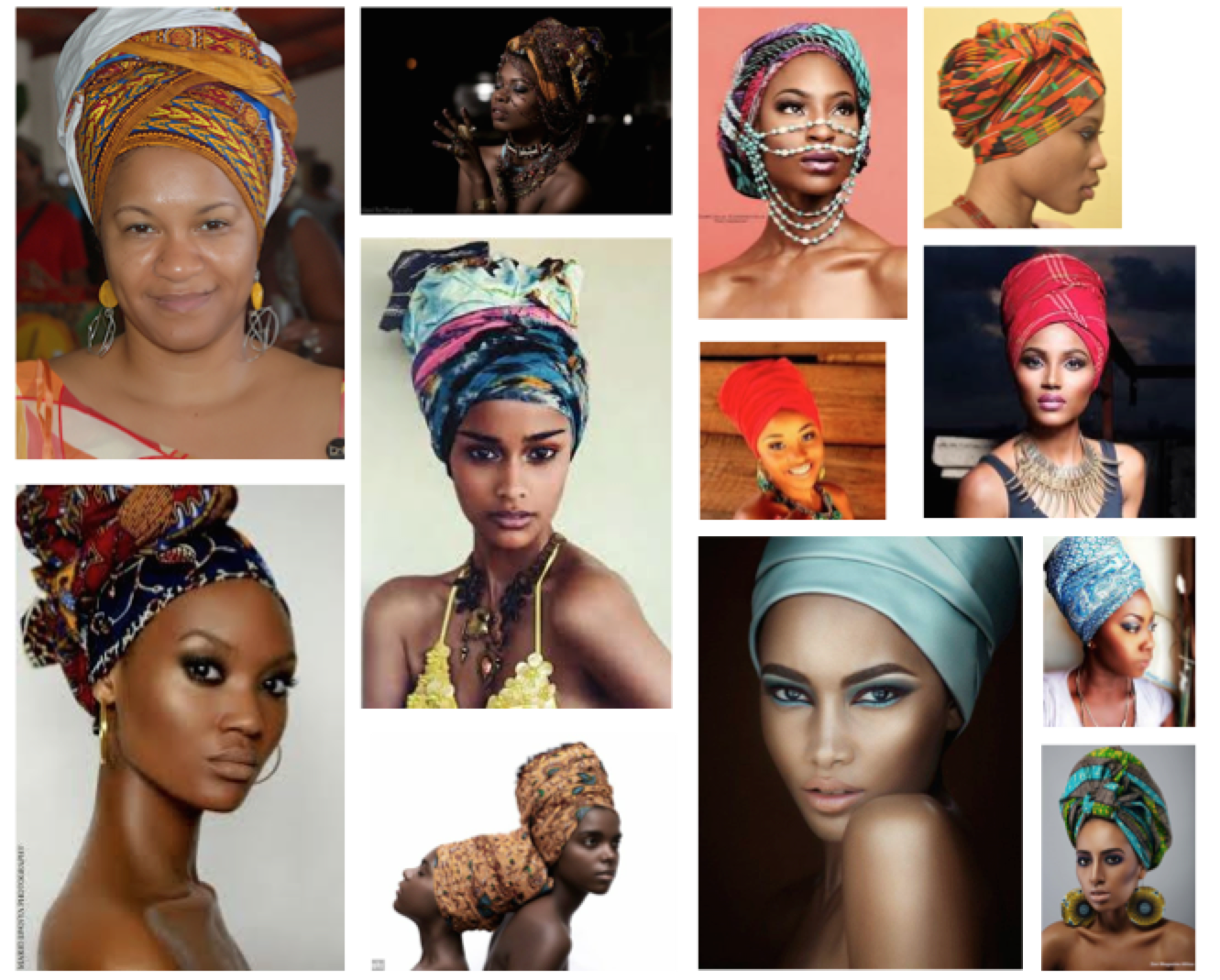
For this double page spread I am adding into my magazine, I want to have the right page filled with an article that I will make expressing my opinion as well as some facts and statistics about black culture and the way black citizens are treated in the Western world and on the left page I want to create an image of myself wearing a head wrap to show me embracing black culture and to make it really stand out I want to add a caption or slogan down the side, more of a statement that will stand out and make my spectator stop and want to read the next page to find out more about the image and to really understand the message that I am putting across. I have wanted to create an image like this for a while as I feel that it is so important to understand, especially with the constant news reports making worldwide news from America showing white police brutality on black citizens. I chose to wear a head wrap because it holds so much meaning. Before researching I didn’t know much about the head wrap and why African (American) women wore them. I’ve even seen celebrities like Beyonce wear them. After doing some additional research into the meaning behind it I found something very interesting. The head wrap was given to black slaves in America by white American’s who used it as a way of saying that they are owned by them and as a badge of enslavement. This was a way of belittling black people and making them feel less than equal and to show that they were slaves for someone else. It has now evolved into something much more than that, black American’s have taken it back and are embracing their descendants and to show that the head wrap is not a symbol of enslavement but rather a helmet of courage that has evoked an image of true homeland. It has become a uniform of identity and more a uniform of rebellion signifying their resistance to inequalities. I find that the head wrap holds such significance in black history and it really empowers women to embrace their culture and to be proud of who they are. I wanted to add this into my project because it is so strong and I want my entire magazine to be filled with strong and clear images.

Meaning behind the head wrap –  http://char.txa.cornell.edu/griebel.htm

Screen Shot 2016-01-28 at 10.52.23
head wrap mood board

Standing out against animal testing

For a few years now I have really been made aware of animal testing on products. I find it all so barbaric and just cruel. In the past testing on animals has been a part of doctors finding out more about our own anatomy but then they moved on to testing on corpses and opening them up to see what is inside. In the beginning testing makeup products on animals may have been acceptable because mixing chemicals together is risky and really we don’t know how they could effect our bodies, yet part of me wonders why make these products if you can’t be sure that they will be safe on our skin? I really do question current animal testing. We now know what works on our bodies and skin types so why are they continuing to test on animals? The answer lies with marketing, many makeup brands want to be able to sell their products in China and in China in order to be able to sell any products they need to have proof of testing on animals. This is disgusting and unnecessary. There is absolutely no justification in torturing a animal just so you can make more money on your products. I choose not to buy these kinds of products but it can be difficult to tell whether or not products do use animal testing which is why often those that don’t will have that as part of their packaging and marketing, for example all lush products are cruelty free. Starting in the 90s a lot of makeup brands stopped animal testing and decided against it until a few years ago when a large parent company, Estee Lauder, decided that they wanted to branch out to China for more profits so this meant re-introducing animal testing. Under the umbrella parent company of Estee Lauder is companies such as Mac cosmetics, Smashbox, Bobbi Brown, Benefit and many more. There is only one makeup brand that I know of that does not use any animal testing at all and that is Urban Decay. I admit that I do have products from Mac and Benefit but I got these products before I found out about the animal testings that are going on and I won’t be buying any more of their products again, unless animal testing is stopped. Some companies don’t surprise me with the use of animal testing like Chanel and Dior as their clothing obviously uses leather and real fur, they make their money off of stripping animals of their skin and selling it for thousands of pounds. I will say that I have leather items and I do eat meat so some part of me does use animals. However, I will not use or wear products that have been tested on animals. They get tortured, burnt, blinded and starved all for a lipstick that you might wear once or twice a week. I can’t stand the amount of testing on animals and the fact that many people aren’t really being exposed to this annoys me because everyone should know and see what is going on behind the scenes and how these animals are being treated. Animals that are tested on include: rats, mice, hamsters, rabbits and sometimes dogs. A lot of people will say ‘their rodents it doesn’t matter’ but again is there really any justification AT ALL for torture? How can we allow any form of life to be abused in the way that these animals are. I really hate it and think that it should be stopped.
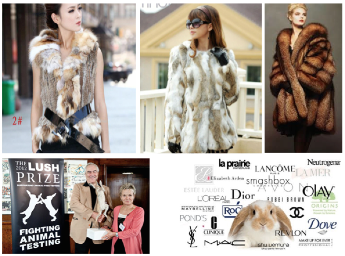
For my shoot idea I want to create a double page spread I want to make images in an ad campaign style with myself as the model posing for the camera but with my hair slicked back with blood and blood covering my hands to show the real effects of the makeup and clothes that a lot of women (and men) wear. I want it to be hard hitting and for my spectator to really think about themselves and what kind of makeup they carry around with them. I wanted to show what it makes me feel like to wear products that have been tested on animals. The reason the blood will be in my hair is because there are also so many hair products that use animal testing and the blood in my hands will add more effect and create a strong image. I also wanted to create an image of a woman walking down the street wearing a fur coat holding bags from companies that do use animal testing. I just think that this will bring in more context and be an interesting image for my spectator to look at.

Animal tested brands (Source): http://www.crueltyfreekitty.com/companies-that-test-on-animals/

Article on animal testing protest: http://www.dailymail.co.uk/news/article-2134555/Lush-animal-testing-protest-Woman-subjected-experiments-horrified-shoppers.html

Screen Shot 2016-01-28 at 12.09.34

Main Influence: Rita Puig-Serra Costa

Rita Puig-Serra Costa is a spanish photographer who works in the publishing Terranova in Barcelona. After studying Humanities and an MA in Comparative Literature , she studied Graphic Design and Photography at IDEP in the CFD and Observatory .

Most memorably, her book ‘Where Mimosa Bloom’ deals with the grief she suffered following the death of her mother, Where Mimosa Bloom takes the form of an extended farewell letter; with photography skillfully used to present a visual eulogy or panegyric. This grief memoir about the loss of her mother is part meditative photo essay, part family biography and part personal message to her mother. These elements combine to form a fascinating and intriguing  discourse on love, loss and sorrow. Rita’s connections with her family reflect a deeply personal insight into the life of herself, her relatives and her beloved mother who it mirrored throughout her photo book.

Screen Shot 2016-01-17 at 21.46.33
The opening verse to ‘Where Mimosa Bloom’. This idea of a translated script of where Rita originates from indices a personal approach to her project. Her song words set the receiver up to her project. A verse of words at the beginning of my photo book may be a great start to creating a visual narrative, as the reader can follow on from where I left off. The set of images to the side mark the first sequence of media is that of Rita’s family tree, the three generations of her family to mark he change and transitions of death.

Rita’s Style 

Rita’s fundamental idea of taking a detailed, vivid portraits and placing it on one side of the page, to then mirror an object reflecting that persons character is idyllic, it reflects a clear idea of personality and connection, making the reader instantly catch on to her family traits and commodities. Using objects of memorabilia and substance tells an abstract narrative for the receiver, they are invited in to celebrate the fortunes of those related to Rita’s mother.

Rita_PuigSerra_Dani_Pujalte17_670

Rita_PuigSerra_Dani_Pujalte07_670-1

Rita_PuigSerra_Dani_Pujalte10_670

Rita_PuigSerra_Dani_Pujalte20_670

Rita_PuigSerra_Dani_Pujalte14_670

Here is a link to Costa’s online E-Book of ‘Where Mimosa Bloom’: http://www.phasesmag.com/rita-puig-serra-costa/where-mimosa-bloom/#s-12

An article from ‘photo-eye’ indicates that:

“There aren’t any words on the book’s cover, just a detail of a faded snapshot of Puig-Serra Costa as a girl in her family’s light-dappled garden. This could indicate that it’s a book of photographs, but its intimate size is more akin to a literary work.”

Here is the link to the photo-eye article: http://blog.photoeye.com/2015/02/book-review-where-mimosa-bloom.html

Daniel Smith, the reviewer,  continues to mention  how Costa’s work revolves concisely around the themes of ‘memory’ and ‘transition’, fitting in nicely with the themes of my project. Rita’s work is highly symbolic, the mention of the dried tree at the beginning of the book, a still life of a dried mimosa branch from the same tree does appear later in the book, an indication, like title itself, of the tree’s symbolism. Puig-Serra Costa combined these and other images with memorabilia to create a lyrical visual elegy to her mother, Yolanda Costa Rico (1959-2008).

Rita_PuigSerra_Dani_Pujalte09_670
Capturing most favoured items or objects is something Rita does to reminisce to times when her Mother was still there. Including items from the past and the present, signifies change but life without someone Rita cared for dearly. Bringing life back up and regurgitating memories allows the reader to connect heavily with her life beforehand, leaving only her mother absent. This, in effect, dictates a sense of transition and movement, certainly change thats happened for Rita and everyone thats featured in her photo-book. With my recreation, I wish to dictate the same sort of messages but with my project of moving house, I want to subvert mainstream expectations, but to capture things seen as ‘outside the box’ – things which wouldn’t usually be associated with moving house.

My Interpretation of Costa: 

IMG_0618

IMG_0575 

IMG_0627

IMG_0630

IMG_0649

IMG_0640

Design your photo book

PHOTO BOOK DESIGN – work over h-term

DEADLINE: Thurs 25 February MOCK EXAM!

1. Create a BLURB account using your school email address. With Blurb you have different options on how you design your book:

a) Using Lightroom to design your book which is integrated with BLURB. Only for use on school computers, unless you have LR at home on your own laptop.

b) Download Bookwright via Blurb onto your own laptop and work offline at home and you can work indecently of school. Here you have full control of layout/ design features. Once completed, you upload photo book design to Blurb

c) Choose online option if you want to work directly online. Very limited layout/design options (not recommended!)

For those who wish to make their own hand-made photo-book or if you want to customize your Blurb book see me for more details on how to do it.

Screen Shot 2016-01-31 at 14.41.42

Screen Shot 2016-01-31 at 14.42.14

2. Using Lightroom make a rough selection of your 40-50 best pictures from all shoots. Produce contact-sheets in Lightroom and edit photos – make sure you have adjusted and standardised all the pictures in terms of exposure, colour balance, contrast, brightness and produced a duplicate a set in B&W.

3. Decide on format (landscape, portrait) size and style of your photo-book. Begin to design your photo book, considering carefully, narrative, sequencing, page spreads, juxtaposition, image size, text pages, empty pages, use of archival material etc.

4. At the end of your photo book, add your illustrated essay including title, any captions (if needed), bibliography, illustrations of artists work (incl data) and images of your own responses. Think carefully about font type, size and weighting.

5. Produce screen prints of layout ideas as you progress and add to Blog for further annotation. Photo-book; show screen prints of page layout and narrative/ sequencing/ juxtaposition of pictures. Podcast; produce screen prints as work progress that show your editing skills/ decisions.

6. Select a set of 5-6 photographs as final outcomes and evaluate – explaining in some detail how well you realised your intentions and reflect on what you learned in your Personal Study.

7. Save final outcomes in a shared folder, in a high-resolution (at least 3000 pixels on the long edge) and each images saved in your name i.e. first name_surname_title_1, and 2, 3 and so on.

See blog posts: Podcast/ Film for those of you who have made a film on how to show evidence of work on the blog, how to edit and upload/ completion.

DEADLINE: Thurs 25 February MOCK EXAM!

Understanding photo book design

UNDERSTANDING PHOTO BOOK DESIGN: LAYOUT, SEQUENCING,  NARRATIVE, CONCEPT

DEADLINE: Fri 5 February 

Blog: Produce a number of posts that show evidence of the following:

1. Research a photo-book that you have used as inspiration in your personal study and describe how  it communicates a narrative, concept, subject-matter using a combination of images, text, archival material. Some of you may already have done this in your research.

Consider: Who is the photographer? Investigate background, conception and context of why he/she made the photo book and the photographs within it.

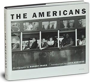
E.g Robert Frank’s “The Americans” was conceived with the help of a scholarship that allowed Frank to go on road trips across America during a two year period. He wanted to portray American society in the post-war period and his book has influenced (and still influence) many photographers since and also contributed to a new style and subjective approach to documentary photography. Why?

robert-frank-americans-cover-300

2. Deconstruct the layout of the book e.g. think about format (portraiture/ landscape/ square), size (A5, A4, A3), sequencing (single page, double-spread, multiple images on a page), juxtaposition of photographs on opposing pages etc. How is the narration of the images used, i.e. formal or conceptual relationship between images. Any use of archival or found material? How does it add value to the story being told? Describe also, how the book title, text (foreword, essay, statement by artists) and captions (if any) are use.

3. Research photo books for design ideas, look also at BLURB online book making website. Produce a moodboard of design ideas based on your research above and look at other photo book examples from photographers, incl what is shown on Blurb or see previous books produced by Hautlieu students. Describe in detail how you want to design your photo book in terms of look and feel considering the above layout options.

DEADLINE: Fri 5 February

Screen Shot 2016-01-31 at 15.15.11

online books

In order to create my final book, we have been instructed to research it online and look at layouts and designs.

The website we used was: http://www.blurb.co.uk/

Here is a mood board of some photo books i liked:

hero_03

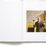
I like how the photograph is places by itself on the right hand side of the page. The white border surrounding it gives it neatness and a bold outline that catches my attention.

Photography-book-Clark-3

Similarly, I like how this photograph is displayed across 3/4 of the rectangular book.

Considerations:

  • what type of cover will i use?
  • will the cover have various images or just one?
  • how much space will i leave in between images?
  • what borders will i use? color selection?

Include:

  • quotes from the photographers and the people that i interview
  • podcasts – either music or them speaking
  • always have some sort of text (describing), even if the picture takes up the whole page
  • maybe some illustrations to go with it, or special associations with the subject – eg drawing, plaque with name, newspaper article – this makes it very personal and interesting

personal study draft version

Personal Study for Photography

Question: How do two different islands, with environmental and cultural differences, change people’s outlooks on life?

Introduction

In this personal study I want to explore the various differences between Madeira and Jersey; which are European islands situated in the Atlantic. Since I was born in Jersey and have many Madeiran family members, I’ve always been intrigued by these two worlds. During the course I became quite interested in documentation and I liked the idea of capturing real moments. I’ll be comparing two photographers throughout my study; this includes Sebastiao Salgado and David Alan Harvey. Although both artists work in a diverse style, the many similarities in their work unite them. Salgado’s photographs focus mostly on rural places which opposes Harvey’s creations. Salgado stated: “The only way to give us an incentive, to bring hope, is to show the pictures of the pristine planet.” This quote highly applies to the peaceful and majestic images that I took in Madeira as 77% of the region is uninhabited. The photojournalist shows mostly traditional scenes with portraits of people in their natural surroundings. David Alan Harvey’s street photography also captures exquisite moments in modern and developed counties. He said: “Don’t shoot what it looks like. Shoot what it feels like.” He portrays the fact that the feeling in the image is better than the aesthetical qualities. I have emulating his work and taken pictures of Jersey, since it’s a very lively and developed place. This will make for a very interesting comparison as both of them have separate ideologies, opinions on people and the earth. During editing I want to experiment with black and white filters much like Salgado and also some colour like Harvey uses. I’d like to discover if: the environment, culture, community, tradition, family, lifestyle, etc; has an impact on us and how that effect changes depending on the style it’s photographed in.

Paragraph 1 – Jersey and Madeira

Jersey and Madeira have many similarities, but in accordance they also have a lot of differences. For instance, they are both situated in the North Atlantic Ocean in the continent of Europe. Jersey’s a British island situated off the coast of France; it’s famous for its Jersey cows, natural produce and lovely picturesque beaches. Much like Madeira, it’s the biggest island in its channel.

The environment in Jersey is maintained and kept clean in the majority of areas; where trees are in abundance and wildlife can thrive. In fact it’s is the only location in Britain, where green wall lizards naturally occur. Similarly, they resemble the Madeiran wall lizard which is also native to the island. Nonetheless, once in the capital of St. Helier, you can notice the change; the town and surroundings are filled with an array of: business buildings, houses and hotels, which give it a much more civilised ambience; especially in the high-street, since there is a lack of green spaces in that area. In accordance to culture, the island holds many events, for instance: Battle of Flowers, Jersey Live, the Eisteddfod, Bonfire night, Battle of Britain, market days and even food festivals; which incorporate Portuguese food and make a connection to Madeira. Tourists may be attracted to vintage landmarks such as: castles, underground hospital and bunkers. These historical places enclose many intriguing stories and demonstrate the struggles of the time, for instance when the German’s invaded.

In accordance, the Madeiran environment is made up of beautifully natural areas. The picturesque surroundings are filled with wild plants, animals and buildings. Most parishes contain an array of the common orange-tiled houses; but since 77% of the island is uninhabited, it’s not surprising that the overall island is eco-friendly. Madeira is commonly associated to the slogan: “Pearl of the Atlantic.” The pearl referred to is actually black; which makes sense as it reflects Madeira’s black sandy beaches and volcanic terrains. The word is also connected to beauty and value, which the island upholds. The capital city of Funchal is always beaming with different activities like: cable cars, hot air balloon rides, toboggan sled rides, etc. Cultural activities include:


Content: you could look at the followingexemplify your hypothesis and introduce your first photographer. Select key works, ideas or concepts and analyse in-depth using specific model of analysis (describe, interpret and evaluate) – refer to your hypothesis. Contextualise…what was going on in the world at the time; artistically, politically, socially, culturally. Other influences…artists, teachers, mentors etc. Personal situations or circumstances…describe key events in the artist’s life that may have influenced the work. Include examples of your own photographs, experiments or early responses and analyse, relate and link to the above. Set the scene for next paragraph.

Paragraph 2 – Influences and Styles – (287 words) and (? words)

Salgado was born in Brazil and grew up in a humble manner surrounded by uninhabited landscapes that covered approximately 70% of his small town; he had a real sense of community. His interest in economics, lead him to study it at university; the course taught him about: production, consumption, transfer and wealth. After dropping all for a pursuit in the photography world, he started to passionately photograph human and animal conditions, and I believe that these topics were influenced by his previous economical knowledge, as well as the fact that he witnessed his hometown changing into industrial mayhem. He stated: “my photography is consistent ideologically and ethically with person I am”; this could indicate that his: life experiences, goals, family life and opinions are used as inspiration for his studies. He also mentioned that: “I don’t believe a person has a style. What people have is a way of photographing what is inside them. What is there comes out”; this further justifies that his photographs are based on his ideological viewpoints of the world. Nevertheless, Salgado was inspired by many photographers’ works such as: Lewis Hine, W. Eugene Smith and Walker Evans’s. Their sullen and bold style included dramatic contrasts of black and white, which Salgado liked. I think that Salgado used black and white to create a timeless image that could be portrayed by viewers in either one way or another, like the phrase ‘black and white way of seeing’. Black is symbolic of: purity, equality, fairness, independence, hope, etc. Meanwhile black signifies: hidden, unknown, fear, negativity, depression, etc. Whereas grey indicates: neutral and indecisive. Growing up in a modern time allowed Salgado to submerge himself into new insights which he discovered through travelling the world.