What I am Doing

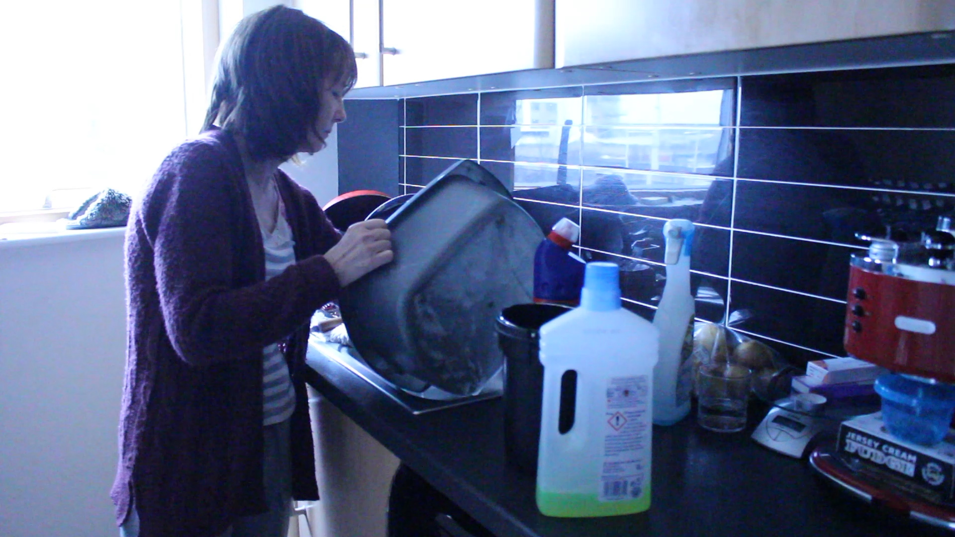
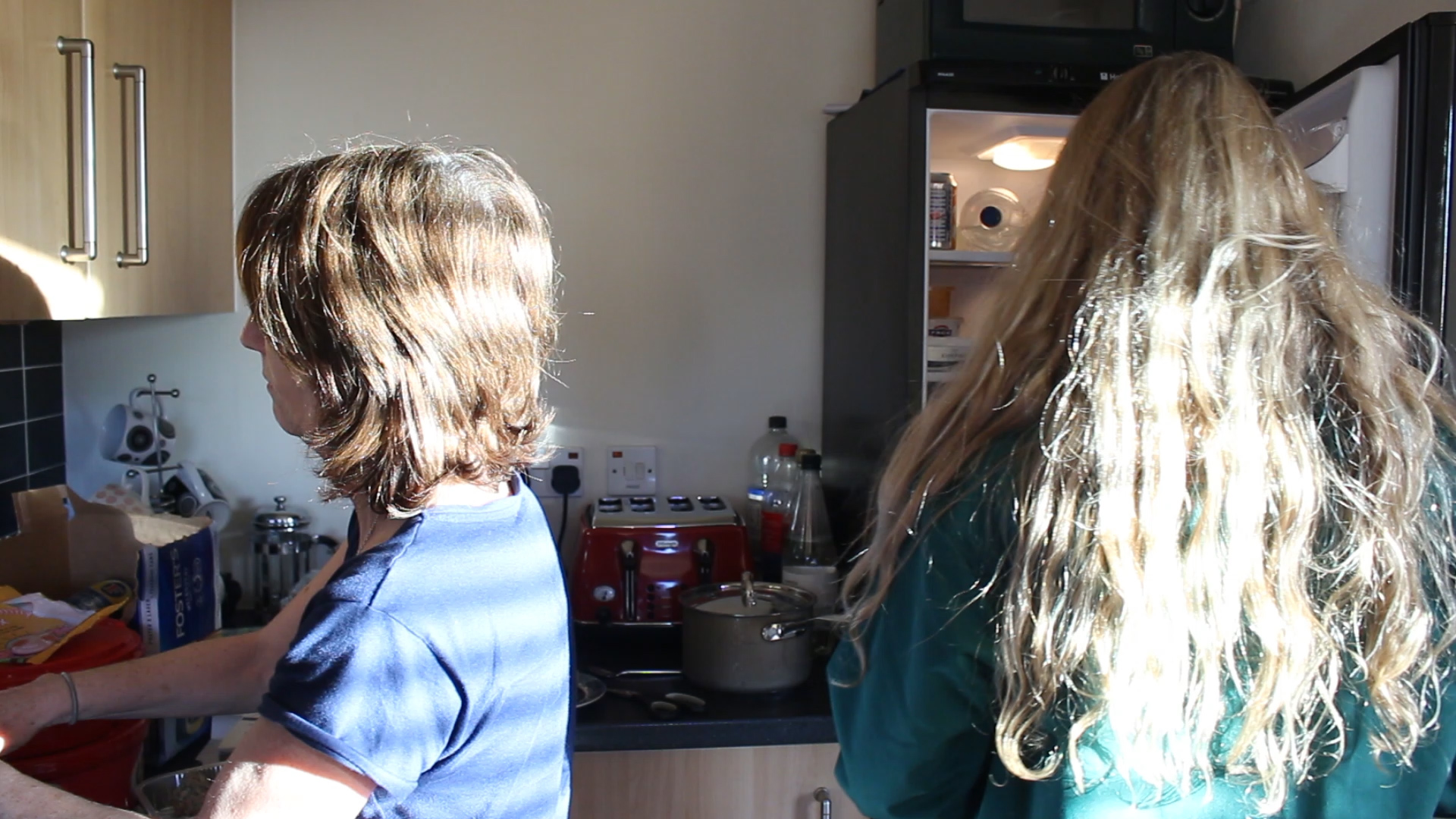
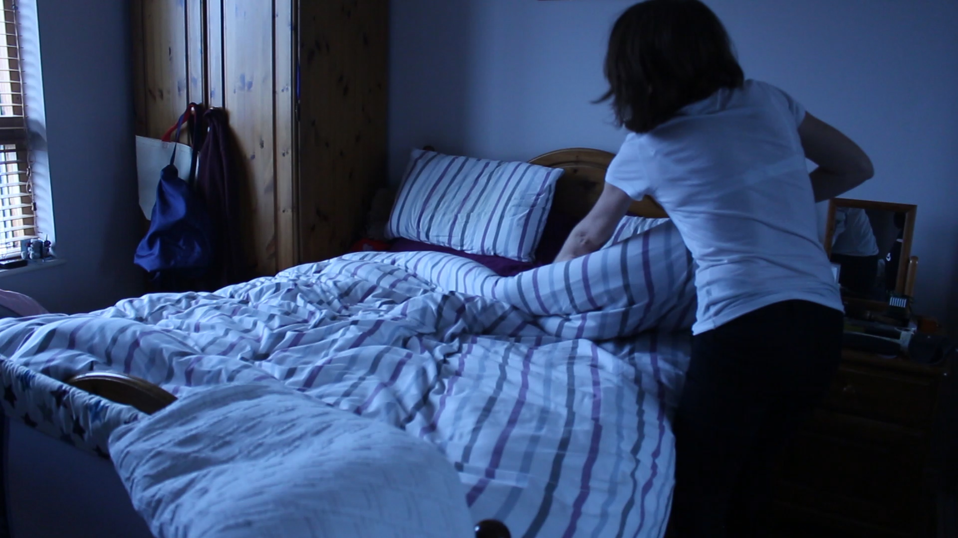
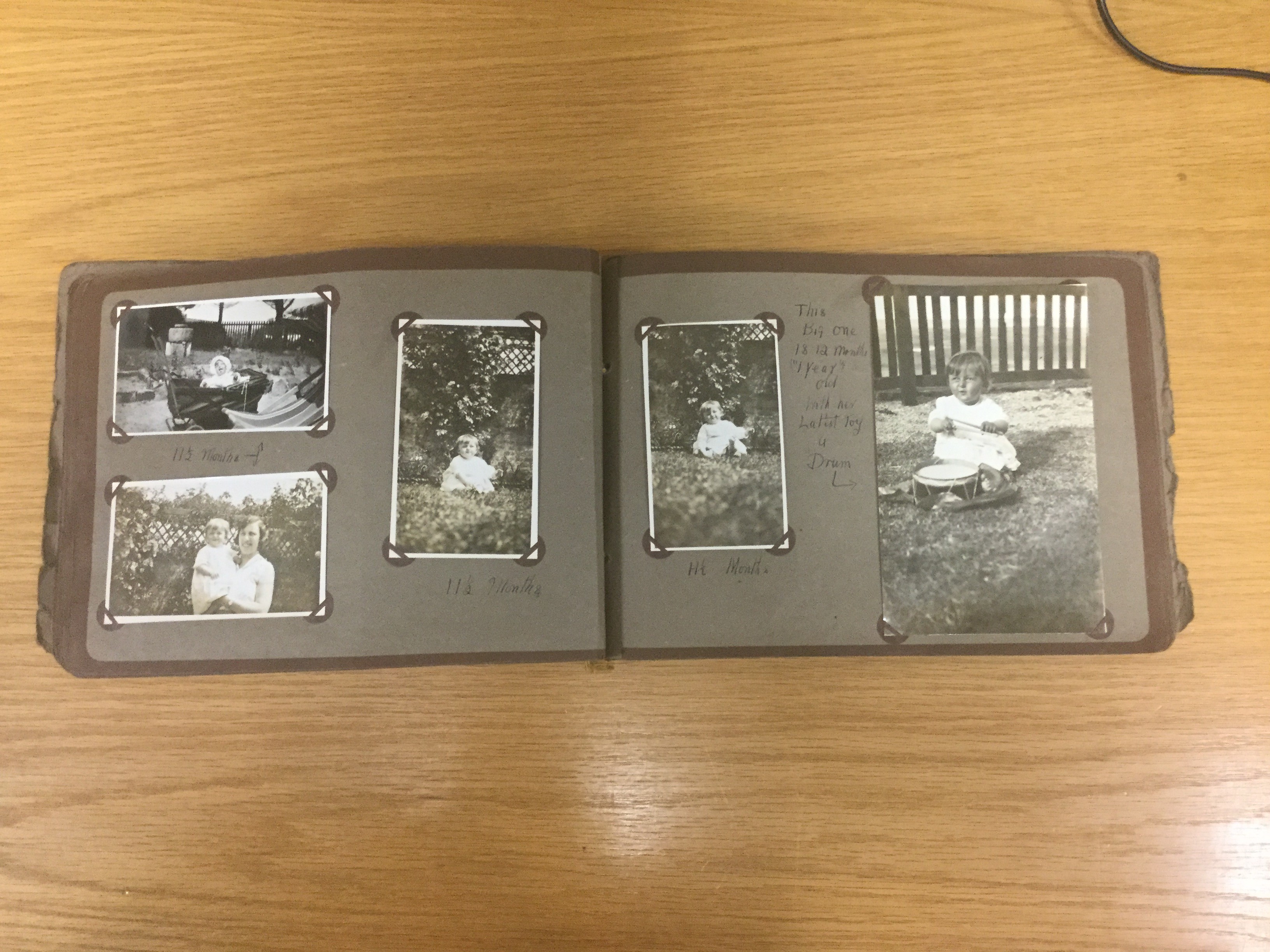
Over the past couple of weeks I have been experimenting with different photo shoots and styles that I want to create. I originally had the idea of creating a fashion magazine, taking inspiration from Claude Cahun and dressing up as both the male and female models. This worked out well at the time and I think that the experiment was successful but I think that something was missing. All of the previous work that I have created in the lead up to my final idea has actually helped me a lot and is still very relevant to how I am going to go about my final piece. The work done has taught me what to do and what not to do. What I now know will work and what won’t. The experimentation has really helped me get my head around a final project. So for my final project I am sticking to creating a short film of my mum which is very nearly finished. I took inspiration from this short film and the interview that I did with my mum and have also made some images of myself mimicking my mother’s role. I think that this is working out well and will be the best final project for me to create. For my staged shoot I took much of my inspiration from Cindy Sherman and her Untitled Film Stills. On the photo book aspect of this I have been looking at past students work and think that possibly a small handmade book will be the most effective as I don’t think that I would have enough photographs to make an entire photo book. This gives me room to be more creative and to experiment a bit more, I want my images to almost be like film stills and to look different. I think that this will complement my short film nicely and they will work well together. Another reason that I would want to create my own book is actually because I came up with the idea of creating a folder type thing to put it in. I want to get a tea towel, sew around the edges, leaving a hole in the top obviously, and have my book live inside it. I think that this will be really interesting and give my spectator more to look at and it will just be another layer into the mix as well as photographs and film. I also think that this will add to the whole idea of stereotypes in my work as I myself will be sewing the fabric and putting it all together which is what women are actually expected to do. I think that this will work out well and showcase another element of female stereotypes in my work. The book that I want to create will be quite small and I am considering making the images square to mimic an old film camera, bringing it back to the traditional roles that were always expected of women and still are today. This will be an interesting experiment and I think that it could work out really well.

duck lips

Short Film | Review

My short film is an audio interview with my mum and visuals that correspond to what she is saying. This has worked out really well and given me inspiration for my essay as well as what photographs to produce. I found the film really fun to create as I got to make videos instead of just photographs and it was interesting to actually get to know my mum a little bit more and about her upbringing and her own life. I found the whole experience of making this short film exciting as it is something new and something that I was interested in. If it was on any thing other than the topic of feminism or something that I am passionate about I don’t think that I would have enjoyed it as much and I wouldn’t have been able to create the work I have. This short film has been a really great gateway towards figuring out what kind of photo book I want to create and how I should go about creating it.

Photo Book | Idea

For a while now I’ve had the idea of making a folder/blanket for my photo book. I’ve known what I want the outside of my photo book to look like more than what I want the actual photo book to look like itself. I want to sew around a tea towel and have my book live inside this tea towel, this will just add yet another layer to my entire project and I think that it will work really well. I have recently come up with the idea of completely making a photo book on my own as a way of showing how women seem to do everything, even make their own photo book. This will be an added element showing the stereotypes that women are faced with as well. I think that this will be a nice added touch to my project and will work out really well. I want a small photo book as I don’t think that I will have enough images to make an entire one and it will just look better if I create it myself and make it look more like stills from a film as if it is unreal or something that shouldn’t be real. I might make my book look like one that waiters/waitresses have where they take your order. This will also add to the detail that women are seen as slaves in their own homes and the unfair expectations opposed on them. This will be interesting to create but I think that I will be able to manage it. If I don’t manage to make my own book by hand I want to create a small book on blurb but still have it living inside of a tea towel.

photo book idea

Half term

What I have left to do?

  • 2 photo shoots
  • Portrait of my mum
  • Archive material
  • Edit new photographs
  • Finish essay
  • Start photo book

Over this half term I plan to do my final two photo shoots of my mum. I am going to revisit one of the houses that she works at because I think the quality of some of the photographs can be improved and so that I can build upon the photos I already have. I am also going to continue taking photographs of my mum at home before and after work continuing the theme of a ‘hidden identity’  . After I have done this I should have enough photographs to choose from for my photo book.  Although I already have some archival material I need to scan them so I have a digital copy ready to use. Finally, I am also going to try and start putting my photo book together on blurb by downloading the software and creating an account, so I can do this from home.


Handmade Book

Overview

In this blog post I will explore the reasons why I am going to make a hand-made book. I will also begin to explore these reasons in further detail, looking at the positives as well as the negatives of doing so, in the process tackling the issues facing me so I produce work of good quality, similar to that if I made a successful online photo-book.

Despite some draw-backs which I will explore later on this blog-post, I have decided to go ahead with my idea to make an old-fashioned styled photo-album.

From the archives I looked at the work of photographer Henry Thomas who made a series of scrap-book styled albums of his daughter from the period of 1930-50. This research fueled my ambition to evoke a similar style of collecting and presenting images, moving away the general idea of most of the class, which is to make an on-line photo-book using ‘Blurb’

I have begun the process of looking into either buying and designing my own photo-book. Making my own photo-book instead of using Blurb is an idea I am determined to go forward with.

However before I do though I need to think carefully beforehand; there are certain risks involved with making a homemade book and many considerations need to be looked into beforehand. In my previous blog post I looked at the positives of making a photo-book; essentially the aspirations of how I want my own work to turn out like. But, if I am going to make a success of this idea, I will need to accept and  look into some of the drawbacks of this type of style; which I need to be aware of in order to avoid making similar mistakes. Here is a summary of the positives and negatives of making a hand-made photo-book.


Positives

  • More personal – writing my own personal notes.
  • Retro feel/style.
  • Bit different; chance to express my work in a different direction and challenge myself more – I have already made an online photo-book.
  • Allows me to add stuff other than photos; archival images, letters, documents etc.
  • Alot cheaper: £20-£30 for everyhting I need oppose to £5-60
  • Fun to make and not restricted to a computer.
  • Resonates that of a family album.
  • Links to the work I am doing at the archives.


Negatives

  • Can potentially become a scrap-book; may look tacky and unprofessional.
  • Photos printed off could be of bad quality.
  • Missing out on the chance to produce a really good quality online photo-book
  • Takes a lot of time to make – need to spend time to do it properly
  • Little room for mistakes; if not carefully planned will look flawed


How I will respond to these Negative Points

  1. Issue of scrap-book

Solution

  • Look to make work more in the style of a photo-album
  • Research contemporary professional photographers who have successfully made a hand-made book in a way which looks good

2.   Bad Quality Images

Solution

  • One advantage of handmade book is their is leeway for quality; is able to look a bit rustic/vernacular
  • Printing my photos off at the Société Jersiaise
    photographic archives: can chose and decide the right type of photo paper I want

3. Compensating for online style design

Solution

  • Don’t ignore influences I can take from photo-books; ways of displaying a narrative
  • Can compromise to some degree; will have a clearer idea once I have looked into everything more
  • My attitude is that measuring success of art is subjective and there is no right or wrong; yes an on-line photo-book would look cool, but what is there to suggest that making a hand-made book wouldn’t look equally as good?

4. Taking a lot of time to make

Solution

  • Plan carefully so I don’t run out of time.
  • Stay on task and don’t procrastinate.
  • Quality over quantity.

5. Little room for mistakes

Solution 

  • Embrace the leeway which I have with my decision to evoke a semi-vernacular style.
  • Take risks and be creative: this is the whole point as to why I am making a photo-book in this style.
  • Do it properly; buy a proper photo-album beforehand with good quality pages – look at Martin Parr’s ‘Life a Beach’. Change, adapted front cover if needed to make it more personal
  • Research a reasonable amount

Conclusion

I enjoyed making a photo-book last year for my AS photography project. Nevertheless there was certain difficulties I faced during this process and found it to some extent, quite restrictive. Also, doing the photo-story design on Photoshop was a challenge I found difficult. I recognize that online/computer design is definitely one of my weakness. As I made a photo-book last year to measured success, I believe I don’t have anything to proof in terms of making a online book and so can use this time instead to try something a bit different.

In many ways this is a huge re-think of the direction of my project. My research and concept will not change however, but just I will explore a few more ideas and style to compliment to work of Toropstov, Sancari and Germain, of which my study is more or less  influenced by.

I will begin to research other photographers who have successfully made a hand-made book, which includes British Photographer Martin Parr in his photo book ‘Life’s A Beach’, of which I will make another blog post.

I will construct a careful plan of how to go about my photo-book in a manner which allows room for change whilst at the same time is a realistic plan for the remaining time I have.

Although I know it wont be easy I am convinced if I make and construct a home-made photo-book that I will be able to produce a very successful response to this project. I will successfully find a balance between creating something which is both homemade but professional looking at the same. I don’t want to as Mr Toft has fairly pointed out, make my book look tacky and of low quality because if I do so, the good progress I have made in my project so far will essentially be lost. I will work hard and research well however to ensure that this is not the case.

I am aware that this will be challenging and a  risk. Nevertheless I want to make use of the month or so I have to complete this project in a productive way which pushes me out of my comfort zone and stretches my understanding.

I am open to a degree of compromise on this idea, which I will explore in the next few blog post this concept of photo-book design has inspired me to produce.


Plan for Making a Photo-book

This is my step by step plan for making and constructing my handmade photo-book.

Before Half – Term

Develop and research ideas – DONE

Blog Post on Martin Parr – DONE

Choose and buy photo-book in town – DONE

Specification of my ideas and what I want to – DONE

Blog Post on importance of photo-book presentation

Decide photos I want to print off for photo-book

Half Term

Buy photo-corners Finish Essay + publish all stuff on blog post

Research front cover design ideas – maybe write a blog post on these findings?

Get other work done and free up time to work on photo-book for next couple of weeks

After Half-Term

Monday 22nd = Go through layout with Mr Toft Put photos in book presentation order Put photos in right resolution: 300 Resolution +Tiff Format

Print off A2 contact sheet on archive printer first week back: may have to make a couple of trips

Cut out images Put into photo-frames

Annotations and anything extra I need Print out essay in type-writer format

Archives – Week 3

image

IMG_0339

IMG_0348

Objective

This week I have begun the process of writing my essay. This meant that Gareth was able to see the work I have done and make suggestions for me to improve, as well as give me ideas in which to take my project.

I began this session by talking to Gareth about where I want to take my project and what I am trying to learn. I therefore mentioned how I want it to be a personal journey in which I try to document  my Grandfather, through the photographic style of Julian Germain in ‘For , but  in style similar to that of how Yury Toropstov has gone about his work in ‘Deleted Scene’. I then showed Gareth the work I have done so far on my essay, through which he marked and gave me some feedback on. I found this feedback to be useful and it gave me some good ideas about how to write my last paragraph of the essay, which I am struggling for ideas on.

What interested Gareth in particular was the concept that I was creating a narrative based around a person who is not alive and who I therefore cannot photograph. Gareth defined this concept as an ‘interpretation’ – photographing things related to the subject but not the subject directly.

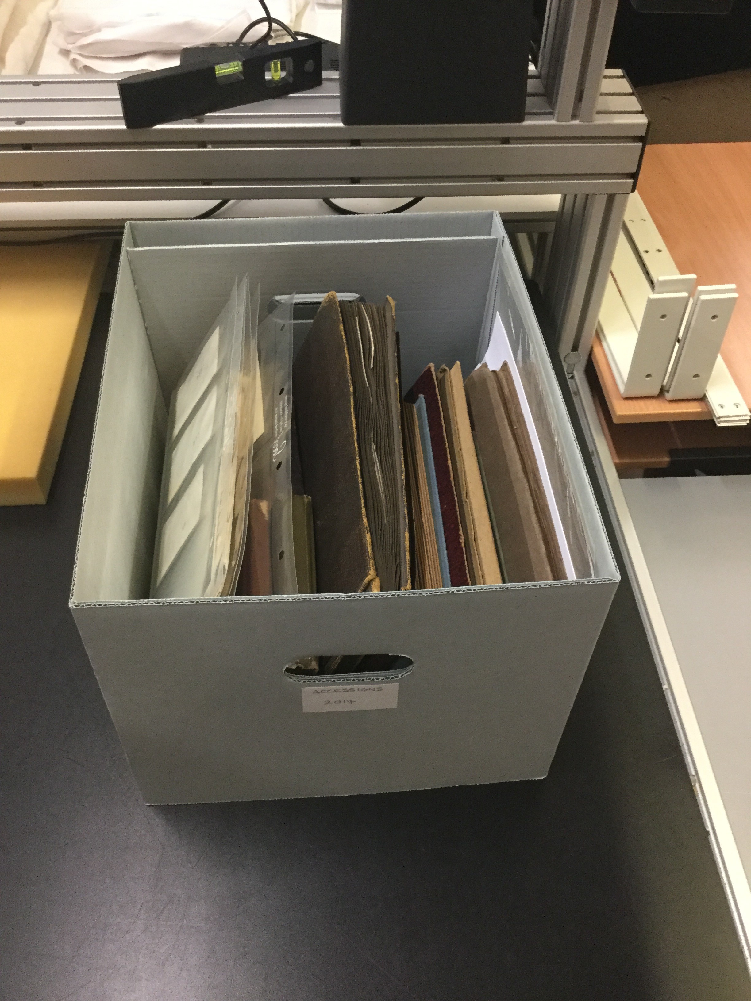
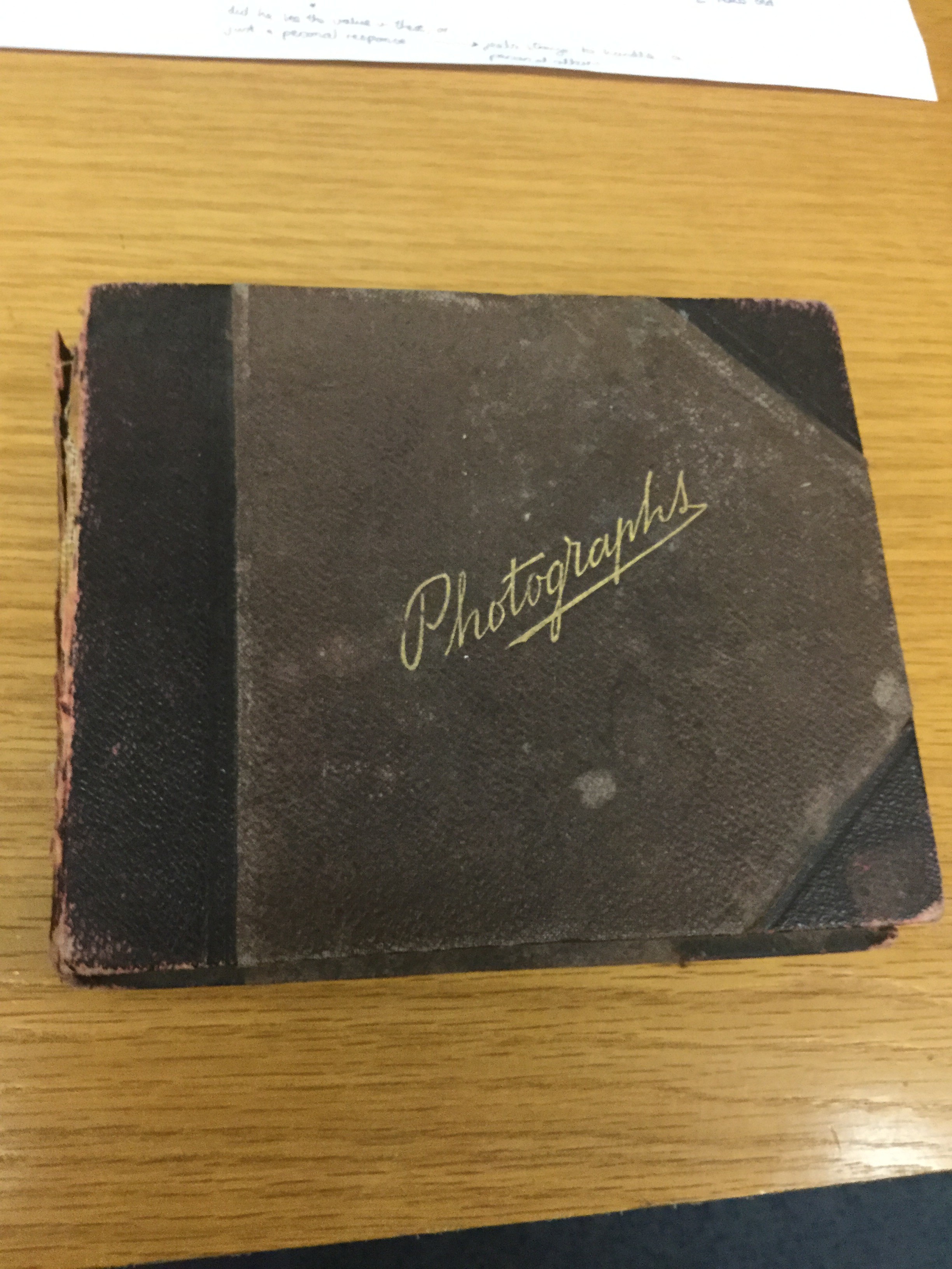
Gareth came up with an idea: we went down to the archive room where we collected a series of photo scrap-books made by  photographer George Adolphus Thomas (born 1900) – 10 in total over the course of 30 years. Many of these photographs included and were focused around Thomas’ young daughter: Pamela Georgina Thomas (born 1929). Pamela was photographed constantly and fanatically by her father, which has resulted in a extensive body of work documenting and recording her upbringing

My challenge was to look at these photographs, make a few notes, and draw a series of conclusions based on findings – as well as attempt to put these photographs in chronological order. In particular, Gareth wanted me to consider the idea that because Pamela was photographed an extensive amount; in different places, points of times and context, that a clear narrative of her can therefore be told through the images. In contrast, Gareth got be to consider the contrast this has with my own project, as I am attempting to create a story about someone who is no longer alive.

Response

The task was relativity easy to complete, I had to look in all the books and then date them in chronological order. I more or less completed this task however it was at times hard to decide which ones to put in order because of the timeline of the album sometimes overlapped. It was interesting to see to variety of images which had been taken, over such a long period of time.

Whilst I was doing this task I became more interested in the actual book, in particular the hand-made, scrapbook appearance to them. There was something that really appealed to me about this presentation, it was simple but personal. The photos were arranged in this scrap-book manner and Thomas included little personal notes, presumably for this own benefit of remembering when pictures were taken and what happened. I found doing so gave the book a very unique feel to it, it could never be re-produced as the photographer had put their own stamp on it. There was something almost satirical about some of the notes, it added comical elements to the narrative, in many ways glimpse of the photographer’s personality embedding itself into the narrative.The way Thomas had arranged the photographs was quite simple; he simply made little cut outs and placed the developed images in the individual pockets – sometimes one large photo taking up an entire page and sometimes up to 6 photos on a page. This order was random and spontaneous.

The concept of the book was very clever. Thomas had carefully arranged the photos in a roughly chronological order. The choice of images were definitely not random because the photos all displayed a certain narrative by which different images linked to the next. Thomas did not simply just photograph his daughter; he did it in a considered manner, resulting in a variety of images of her in different situations.

At the end of session I had a talk with Gareth about what I had learned. I spoke about how it inspired my personal study – mentioned in the next section – and my thoughts of the books in general. We got onto the discussion of how image presentation very much affects how the viewer interprets and meanings behind photographs. We also spoke about the contrasts between my own work and that of George Thomas. We distinguished the concept that although me and this photographer have based our work of the same  concept, to paint a visual picture of a particular subject, we are however doing so in very different manners; Thomas used the subject directly to tell a story, whereas I am painting a story of a subject who is not around to be photographed. Therefore we determined that my photo-book could be a response to Thomas’ work, however done in a different way.

“Your work could be edition four?” – Gareth Syvret

How has this session helped my Personal Study?

Doing this task gave me a an idea for my own Personal Study; to make a handmade photo-book made of a simple scrap-book I will buy. I will then create a narrative by printing the photos off of sticking them into the book.

This session has therefore in my view, been very useful because it has given a clearer idea about how to present my photo-book. It has also given me a better idea about how to go about the last paragraph, due to both to the useful essay feedback Gareth has given me as well as the extra context I have gain about the photographer, George Thomas, whom is another inspiration I can link to my own writing and to the basis of my project in general.

All of three sessions I have done so far have all been useful in different ways. This week has been the most useful in terms of providing me with creative ideas.

My Photo-book Design Idea

The main advantage of me doing this is that I will able to include this in the book other than the actual photos, such as real documents and hand-written notes.

My main intention of doing so is to make a book which is personal and uniquely my own. Through this I mean I will make a book which only can be made once and never duplicated, because the photos will be original prints and I will include authentic documents and my own hand-written notes. Unlike making an on-line book, which can be easily re-ordered and duplicated, my book will instead be a one off design; customised and personalised to my particular desire, not limited by the restrictions of a web design. I also think it will be a fun and creative task to complete and I think it is an idea which is a bit different. I like the idea of including stuff other than photos, which means I can make more of a pop-up style book, a bit more creative than simply just photos; therefore more personal and subjective.

My essay, instead of being included on the page will be printed of separately on a piece of paper and either stapled in the book or placed in an attached envelope. I think that this will be a good idea because it will mean will essay can be read in an easier manner, as the paper can be separated from the book and therefore handled easier. I will also be a fun and creative way to play on the pop-up idea, and the font can be a type-writer font, again a response to the idea that the book is a retro design.

For extra inspiration I have looked at an old book I had from about 8 years ago. It is called ‘Eygptology’ and was a book with interactive pop-up features. This book was a history book and made use of similar archival documents that I want to use in my own book, such as letters and old photographs.

I also looked at a YouTube video of a hand-made book,  made by a photographer named Greg A. Chiana, as well as a prehaps more well known handmade photo-book, made by Martin Parr entitled ‘Life’s a Beach’


2nd essay draft

How does my mum’s role as breadwinner abdicate from her culture?

“A Legend of the Strength of… Motherhood.” [20]

Motherhood is the state or experience of having and raising a child.

In this essay, the first thing I am going to do is analyse and compare the links between my personal study outcomes and Dorothea Lange’s Iconic ‘Migrant Mother’ photographs. I have chosen to analyse the photograph of ‘Migrant Mother’ In particular because it is such a well-known photograph with a powerful context behind it which is very interesting to me. Furthermore I have found that it relates to my personal study. Secondly, I am going to explore my mum’s work ethic, female traditional roles and how my mums’ role as a breadwinner of my family abdicates from her culture. My mum was born in Madeira which means that the female exceptions of her are very different to the role that she ‘plays’ now.  To explore this concept I have been photographing my mum in her working environment over a period of months. I am also going to include my personal archive photographs to compare my mum’s role before and now.

Migrant Mother by Dorothea Lange

‘Humanity is a hypothesis that has run its course’ ( Aragon 2002:21) – Dorothea Lange: The Heart and Mind of a Photographer

In 1939 during the Great Depression Dorothea Lange was working on a project for the Farm Security Administration (FSA), which was created to help combat American poverty. The aim of this project was to capture the effect that the Great Depression had on people. According to Dorothea Lange, this photograph was taken when she was driving past a camp site and she then stopped and approached ‘Migrant Mother’ within 10-15 minutes she had taken 6 different exposures. Dorothea Lange said that ‘Migrant Mother’ had been living off frozen vegetables from the field and wild birds the children caught and they could not move on, because her husband had just sold the tires from their car to buy food. On the other hand Florence Owens Thompson who is ‘Migrant Mother’ herself says that the encounter happened differently. She said that the photograph was taken on a camping site where they had set up temporarily while her husband had gone to get the car radiator repaired. Lange had also promised that the photographs would not be published, however she sent it to San Francisco News as well as to the Resettlement Administration in Washington, D.C. Since then the photograph has become an Icon and a representation of the Great Depression.

Propaganda is the formation, of photographs or other sources of information, especially of a biased or misleading nature, used to promote or publicize a particular political cause or point of view. Some people argue that the photograph of Migrant Mother was used as propaganda to raise awareness of the 1930’s from a specific point of view, which is the depression and poverty. The photograph is of a mother and her children which are subjects that everyone can relate too and therefore this creates a lot of empathy from the viewers. The photographs were also used to raise money, however none of that money was given to Migrant Mother herself, and however some of the money that was raised was given to the people on the crop farm where the photograph was originally taken. The photographs were then appropriated on to many things such as stamps and cartoons; so much so it soon became the most reproduced photograph in the history of photography.

ADD ANALYSIS PARAGRAPH

Blurb

Photobook

To make my photo book I am going to use blurb which is an online website which can be used to help photographers to create, self publish and share their photo book design.  Blurb has already made 6 million books created by more than a half million customers and it ships to over 70 different countries. I can use light room to design my book then once I have finished I can import it to blurb or I could download a software directly from Blurb, which also allows me to design my book but it will also allow me to work on my book from home which is an advantage because I don’t have lightroom.  I have explored blurb and found that they offer a variety of different sized books, layouts and designs which will allow me to have different compositions which is something I wanted to do.

I haven’t decided how I want to design the inside of my book, however I think after doing some research and looking at other photographers books I have decided that a portrait book would be better suited for my project because of the large amounts of portrait photographs that I am going to include. I think having the book in portrait will look better visually and it fits in with the style of photographs I have taken. I have also decided that I want a hard back book this is because I think it makes the book look more professional and more presentable visually.

blurb 1

blurb 2

Photobook Design


image1

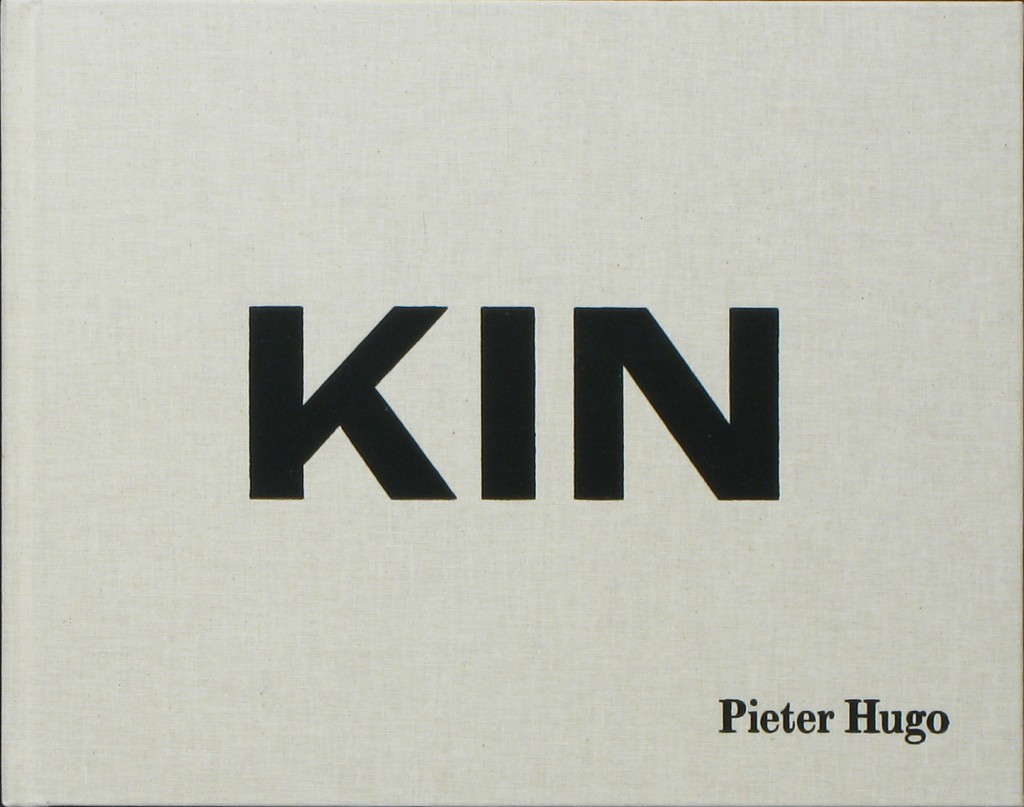
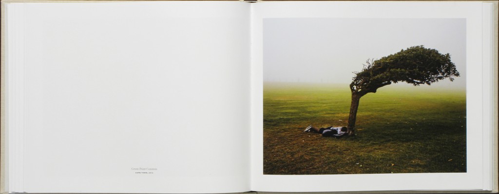
I have been researching different types of photobooks in order to get inspiration into designing my own book. As I have been studying Pieter Hugo’s book ‘Kin’ I have looked into his design and found that I really like it. Hugo’s book has a combination of large and small images, cut in different sizes. I like the divresity of the layout as his images are very powerful, I like how the potraits are smaller and are cut to half a page rather than making the picture expand.

The photographs in Kin are portraits, still lifes and landscapes made throughout South Africa, between 2006 and 2014. Hugo deftly intermingles the private and public — presenting portraits of his family and the people who raised them, alongside images of people and environs that speak to the diverse experiences of living in South Africa today.
A particularly striking sequence shows a young black man, bundled in many layers, photographed in front of the beach where he sleeps. The next page depicts a well-manicured, white family of four grinning widely from the comfort of their couch — the quintessential family portrait.

image8

Comparing Pieter Hugo’s photobook to Theo Gosselin’s photobook, I like how Pieter Hugo’s photographs are clearer and glossy. The images are visually better to look at, however, I do love Gosselin’s style and the way the pictures have been printed, as they match the context perfectly. Just like Hugo’s, his images neeeded to be clear like this to show the power behind them, they match the context.

1427284177_Screen Shot 2015-03-25 at 11.47.08

I want to present my images in large and small sizes to show some dimensions within the book. As the context of my book is quite formal, I also think I want to add a coloured or opaque sheet inbetween the photographs instead of having blank pages as it relates to more old fashioned photobooks where images are protected by a layer of material. My baby book and my parent’s wedding book both have these sheets inbetween them to protect the images, and I like the idea of incoperating old with the new as my book will contain archieval images and new images together. This contrast will work well with the context of my story.

I think the front cover of the book is the most important. So far, i am envisioning a plain cover, maybe material with a bold title. I think I am going to go with an archive image for the front cover, the one of a previous governor and then the back cover to be a recent image of the governor. I want the book to be a standard size book, with a hard back cover on it. I will make the pages glossy and the images quite large. I am adding archival photographs into my book as my chosen topic makes it very relevant to add these images.


Martin Parr: Life’s a Beach

“Tropical prints frame images shot in Parr’s journalistic style, creating a nostalgic aesthetic that recalls a timeworn photo album” – Bettina Korek

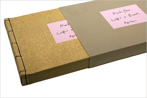
Martin Parr’s special edition photo-book ‘Life’s a Beach’, is a good example of a successfully produced hand-made photo-book.

Parr in this book has evoked the traditional style of a photo-album; images framed on thin cardboard paper, with the individual pages separated with a thin paper cloth. The way Parr has displayed his photos also resonates this idea of a traditional photo-album; images stuck to the page with photo-corners and formatted in a simplistic manner, slightly quirky, vernacular manner.

What makes Parr’s work in ‘Life’s a Beach’ different to a normal amateur album is the extremely considered way he has presented his work. Parr has, in a subtle manner, moved away the the old-fashioned appearance of a photo-album; instead gone for a more contemporary approach which embracing the advantages of some aspects of this retro appearance.

The paper cloth sheet which separates the images continues this pattern of evoking a traditional photo-album. I find it is effective because it provides a sense of delicately to the photo-book; a sense of ritual which reminds the viewer of the fragile and unique nature of the book.

The way Parr has chosen to present his book at first glance is very interesting. Instead of just displaying the book on its own Parr has gone for an unusual idea of presenting the book in an encased cardboard box. This gives a very unique and personalised feel to the book, reflecting the idea that it is somewhat like a packaged gift/parcel. It also adds a sense of fun to the book, because the viewer must go through the process of opening the book from a case, as if they were opening a gift or wanted packaging. Practically speaking it also helps to preserve and protect the photo-book for longer.

Parr’s front cover does not necessarily resonate that of a traditional photo-album – it has a more modern and professional feel. The material of the front and back cover is wood. This material provides the book with rustic hand-made feel,  therefore conveying a sense of ‘lightness’ and a simplicity. It is also slightly unusual to use wood as a material for a book; it makes Parr’s ”Life’s a Beach’ therefore slightly different, again an idea which appeals to me,; to make a piece of work which is a bit different.


I like Parr’s idea of including hand-written notes next to each of the photos. The only disadvantage of using handwriting in a book is that it can make the pages look more like a collection of thoughts in a scrap book then a proper photo-book. However Parr has not overdone the notes, only writing a few words about each of the images, still enabling the photographs alone to determine how the viewer interprets/reflects upon the narrative. In Parr’s case, the notes serve to guide to viewer through the images by giving the ;locations and sometimes at name and date; further personalising the nature of the document.

The use of photo corners is similar to what I want to do for my own photo-book. In ‘Life’s a Beach’ photo corners work well because they help to give the photographs a stronger and more three-dimension presence. I also like how it gives a retro style to the images, making them appear like comp temporary, vernacular snap-shot images in juxtaposition to the traditional nature of a photo-album, albeit altered and customised to give a comp-temporary feel. This subtle contrast gives an edge to the work; it look professional and at the same time, somewhat amateurish/vernacular.

A photo-album is often linked with the idea of storing and preserving memories in a personal way. What Parr has done through making this book has recorded a documentation of British seaside culture in a way which the viewer can reflection upon in a personal way, looking back on Parr’s findings in a similar way they would look fondly back at a family photo-album. My conversation with Gareth on Tuesday got me thinking about the ways in which the presentation of photographs can effect how they are viewed. Subsequently, it is clear that because of this style of presenting images – which evoke the style of holiday snapshots placed in a family album  – that Parr is evoking the concept that the images are not simply documentations; but instead a subjective narrative which tells a contextually based story which can subsequently conjure of nostalgic memories and links to the past.

Evaluation

I like the simplistic style of ‘Life’s a Beach’. It is engaging and entertaining for go through, visually different to a traditional printed photo-book. It is a very clever concept that the style of the photo-book manipulates how the viewer perceives the images, inviting them not just to view the images but reflect in a nostalgic way of the nature of the images.

This is the sort of style I will go for should I decide to make a photo-book is this hand-made manner. It is personal and vernacular, but at the same time well considered, and importantly; presented and laid out in a professional manner – as good as if it was an on line template.

As this example shows, subtlety and simplicity is key to creating a successful hand-made book. The authentic feel of snap-shot images being personally placed in a hand-crafted book must not override the fact that the paper, layout and photo-prints must be well considered and of good quality.