This blog post is a response to the type of work I have been doing at the archives concerning how the way an image is presented can explain the photographer's intent and thus the effect and meaning. This work has been useful to my 'personal study' course because it has informed the way I have gone about the presentation of my photo-book.
“You don’t take a photograph, you make it.” – Ansel Adams.
Adams saw the advantages of dark-room development and manipulation to change the meaning of images. In a BBC interview conducted in the 1980s he described the negative as the “musical score” and the manipulation and printing process as “the performance”. In his view, the way in which the image was developed, processed and presented was just as important as how it was taken in terms of what it meant and visually expressed.
Just as a photograph itself is never purely objective, it is simply not possible to create a photo-book in a manner which can be considered neutral with the photographs alone serving as the viewer’s only consideration. This is because the act of the photographer constructing a photo-book immediately draws questions concerning ‘why’ and ‘how’ this was done. If the photographer makes a hand-made photo-book for example, there is a very personal and intimate feel created within the narrative; whereas an on-line printed photo-book would suggest a desire to make the work more marketable, as it can be cheaply re-produced and at less cost of time. A similar comparison for example is a hand-written letter rewritten v.s. an automated email; you lose the personal touch but it is simply easier and more practical to reproduce. Thus, it can be argued that the way the photographer chose to present his or her photo-book is by no means accidental, and that there is always a purpose to this which the viewer will either consciously or sub-consciously interpret.
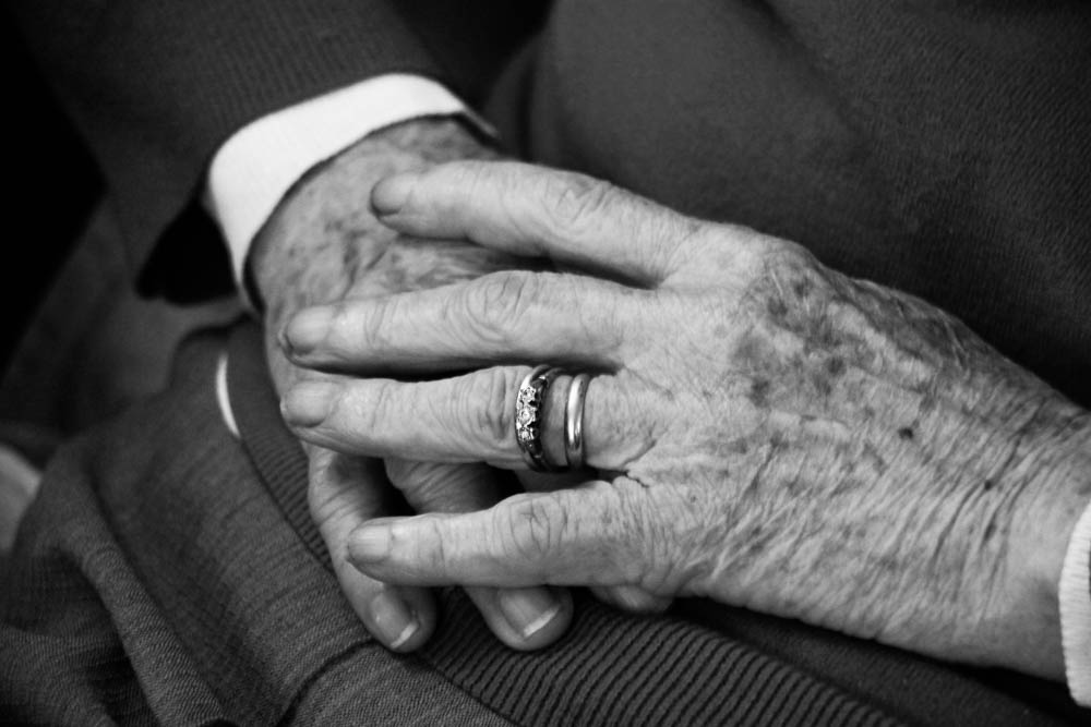
The idea that a photograph is determined by the way it is presented is an interesting concept. This idea is certainly true if the view that a photograph is an interpretation is taken into consideration. I will use an example of my own work for to explain this. One of my images this year is a close-up of my Grandmother wearing her wedding ring.

Upon viewing this one could interpret this ring purely as a symbol of love, happiness and longevity. However if the context is considered, it is more accurate to interpret such an image with the themes of reflection, memory and absence as this ring was the same one she wore when she was married to my Grandfather. Therefore as he is no longer alive, such a theme evokes an entirely different connotation than it would have if he was still alive. This view is carried on to consider how presentation effects meaning because if I chose to present the image with a hand-written note of context than the way the image will be seen is entirely different. This view of varied interpretations created through image presentation can be seen by evaluating the work of landscape photographer Ansel Adams. When photographing Adams would use a large format camera. This enabled him to develop his negatives at a large scale and resolution whilst maintaining a sharp visual display. As Adam’s intention throughout his life’s work was to show the beauty of nature whilst conveying its fragility: “Simply look with perceptive eyes at the world about you”, it can be argued therefore that the reason behind this was to depict nature in an extreme, sublime way showing the fullest extent of its beauty, not entirely truthful but an expression of his own ideas. On the other hand, photographer William Klein in his collection of street photographs of 1950s New York, created distinctive, grainy motion blur images through the use of a small hand-held format camera, creating small resolution negatives more appropriate for presentation in a compact photo-book – somewhat in the form of a newspaper journal/photo-diary. This idea shows how the two styles photograph although similar in the sense they depict 20th Century America in black-and-white, they are in meaning very different as they are different in terms are style and intent and thus presented in different manners.


My photo-book ‘Once a Wednesday, Once a Week’, which I made for my AS Exam Project was presented in the format of a traditionally printed photo-book. On reflection I found my book lacked somewhat in terms of how creative the presentation was. For a first effort of making a photo-book I did not do badly, however it is apparent the way I presented my narrative was somewhat predictable and over time repetitive. First of all it lacked in my opinion, a sense of individuality as I failed to do anything whereby the work was uniquely my own, using a very safe and conventional format. Whilst this style gave my photo-book a sense of simplicity, I nevertheless considered the narrative as somewhat impersonal through such a generic presentation. From this experience I learned the draw-backs of traditional photo-book presentation. Although this style – conventionally considered as blank left hand pages with equally formatted images on the right hand page – can indeed be effective, noting the example of Robert Frank’s ‘The Americans’, a free-flowing narrative journey looking documenting brief glimpses of 1950s American culture, there is certain drawbacks to this. Firstly it very much limits the mood of the narrative, confining the images to be viewed with a sense of similarity and predictability. Secondly, (more so a criticism of the printed photo-book in general) it that it is not very authentic in the sense it can be “mass produced”, an advantage in terms of making the book easily accessible but a disadvantage if one considers it limits the personal feel that a original, handmade and limited/only edition book can more easily evoke. On the other hand, certain material aspects of the book was in my view effective. For example its size and compatibility made it easy to hold, flick-through and read. From reviewing this work, I recognized the importance of the how photographic presentation can affect how it is viewed. I failed to push boundaries in terms of how my book was presented; and in the process the personal-nature I wanted to create was very much compromised.
The differences in availability of these two books is staggering - Frank's 'The Americans' was produced in it tens of thousands upon first print whereas Parr's special edition handmade copy of 'Life's a Beach' was only made in a one-off batch of 1000 copies. The style and feel of these two books is different as these to videos highlight.
For my A2 photo-book therefore, I intend to create something which is in my view, more personal and has a more complex and developed narrative. Whilst my AS Book focused mainly on the images alone, I will now consider another dimension by which I create my visual narrative: which is the concept that the photo-book is not just a collection of images but is itself an artifact, as Elizabeth Edwards describes in her 2002 essay publication – ‘Material beings: object-hood and ethnographic photographs’: “Material and presentational forms of photographs are central to their meaning as images”. The material used to create a photo-book is important because it determines the way in which the viewer experiences the images on display, as Edwards then goes on to argue: “visual experiences are meditated through the material nature and material performances” . This is certainly true based on the idea the my style of placing printed photos into a traditional photo-album will hopefully present the viewer with a nostalgic connection as they would experience in a similar way if they opened an old family album from the recent or distant past. There is a certain sense of simplicity to this style of work, hopefully making my prints timeless in their feel, an important consideration as I hope it will serve a sense as importance in years to come, a visual collection of my family history – bringing the archives to life and its itself being appropriately collectable as an archival source.
Ultimately, the ‘way’ in which something is experienced determines the meanings which can be intended by the photographer/editor, and in the process extracted by the viewer. The construction of a photo-book therefore; whether that be through a traditional photo-album, a scrap-book, an on line blog design, a printed photo-book, or even an exhibition layout, plays a substantial part in what type of story is told. In fact, the simple concept that the shape and style of a window affects what can be seen outside can also be considered true for a presentation of a photo-book. As the photographs material value therefore affects its artistic value it can be argued that these two factors are linked; two necessary factors of a photograph with the presentation largely influencing what is told.
