Monthly Archives: February 2016
Filters
Creating my Photo Book
My personal study is all about my Grandparents, Ruth and Rowland and their lives. I have titled my project ‘The Heavens’ as I think that the surname of ‘Heaven’ is quite intriguing. I also think that using the name that they both share as the title is the first indication that the book is about a married couple and about their love for one another.
In this project I tried to incorporate lots of different angles of their lives, I have tried to divide the book up and format it in a way that is easy to view.
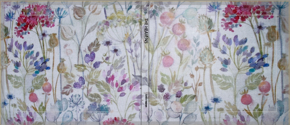
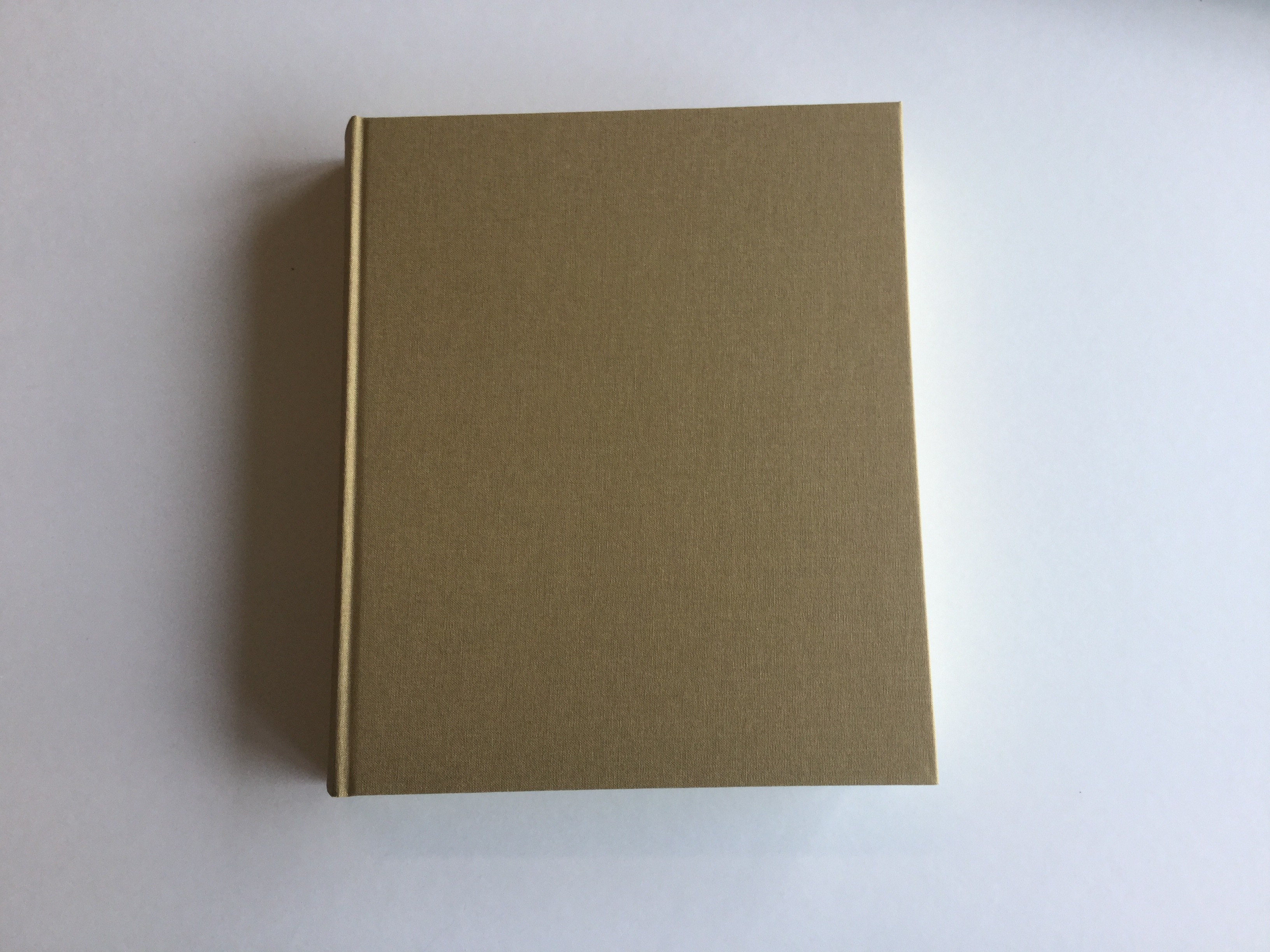
I decided that I didn’t want to use a key image from my photo book as my cover, instead I used a picture of my grandparents table cloth as the cover image. I also decided to not put the title, ‘The Heaves’ on the front cover. I wanted to leave the contains of the book a bit ambiguous. These formatting styles got inspired by Sam Harris’ book, ‘The middle of Somewhere’.
Sam Harris’ cover was designed by one of his daughters. I thought it was really eye catching and gave the book a slick look.
The next pages of my book contains a bright blue page followed by the title page.
I thought that the blue was very eye catching and added colour straight into the book. I also think that having a couple of blank pages leading into the book is nicer than jumping straight into pictures.
I chose to use a couple of different picture formats throughout the book to keep it interesting.
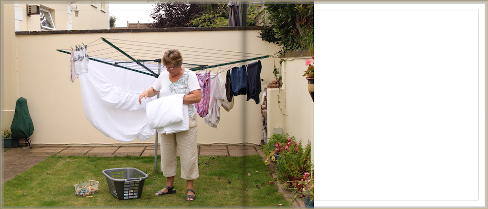
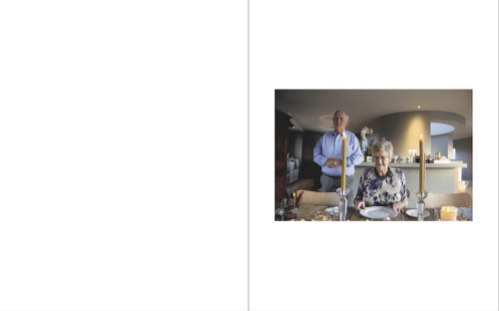
This portrait of my Grandpa sat on his piano stool is a full bled image that is presented on the left page of the book. I think because this is a key image in this collection it is important to make it a large image. I also think that by having a plain white page on the right ride of the book, it emphasises the image. Sam Harris’ photobook contains all full bled images, as it suited his style of book, a family journal.
Another image layout I used is smaller images that are padded giving it a white boarder all the way round the image.
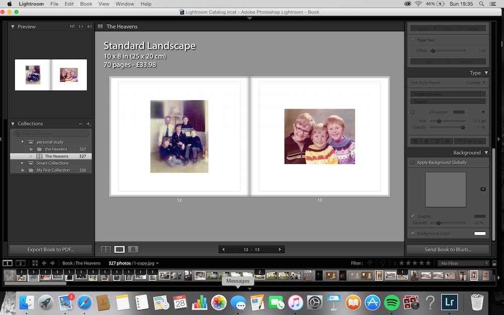
I mainly used this format when using archival images, as I didn’t want the images to be large and pixilated. In this example above I used my Grandparents favourite family photograph from when they were a young couple with their three boys. I then presented on the right side of the page an archival image of their three sons.
I tried to create a sequence by following these archival images with a picture of my younger cousins.
I chose to use this picture of my cousins as the next photo in the sequence as they are around a similar age that my uncles were in the previous image. I think you can see the resemblence between my uncles and my cousins; the ginger hair, pale skin, cheeky smiles.
I had extracted my favourite quotes from my interviews with grandparents and wanted to insert them into my book. I divided these quotes into 5 categories; Faith, Family, Jersey, Wales and Music. I presented them like this in my book.
I didn’t want to accompany the words with any images as I wanted the views full attention on the quote. I got inspiration from Martin Usborne’s ‘Ive lived in East London for 86 1/2 years’. His project was on Joseph Meek.
The final formatting design I used was using archival images. At the begging of my book I used two separate images of my grandparents as children. I positioned them on joining pages with the same amount of padding. I also used two similar archival image but they were taken around the time they got married. I put these images on the final pages of the book.
Over view of my project
I am really happy with the way my project turned out. I think my images represent my grandparents lives well. I have really enjoyed working with the theme of family, as I think it has allowed me to really get stuck into the project, by working with a subject that I am familiar and comfortable with.
Final Outcomes | Personal Study
Here are all of the final outcomes that I have produced for my personal study. I have found this process fun and something different with creating a photo book and a short film. I have really enjoyed exploring the role of my mother and how she sees it herself. This really inspired me to create images and to make an even better final piece in the forms of a short film and a photo book. I have also added in a PDF link to my essay.
Personal Study | Essay
Shannon O’Donnell | Personal Study Essay
Behind Every Good Man There Is A Great Woman | Short Film
https://www.youtube.com/watch?v=cx5ayloQdsI
Shrinking Violet | Photo Book
Link to photo book: Shrinking Violet | Shannon O’Donnell
Close up tasters of pages:
Evaluation:
The final evaluation of my project Three Chapters.
Overall, I think my project had both positive and negative aspects to it. Firstly, the research and planning that went into the project I think was successful, I looked into a diverse range of sources including, websites, books, magazines and newspapers. I think it is important when beginning a new project there must be a comprehensive and thorough investigation into the theme and concept behind the project. Therefore, it was appropriate for the research to heavily influence my original work. The second part to my project is the actual recording and photo-shoots. I began my project by interviewing my grandmother, I wanted to learn more about my grandfather and the best possible person to talk to is his ex wife and best friend. The interview was very interesting and evoked a great deal of emotions from my grandmother, she found it incredibly difficult to talk about my grandfather. This then led me to begin looking at my grandfather’s past, I started looking at archive images that my mother had kept. There was a collection of images that stood out to me, photographs of him with his children, on his wedding day, at his retirement do, holidays, birthdays and normal everyday events. I also thought it was appropriate to look through the box my mother has of some of his belongings. There was lots of condolence letters and cards sent to my family, there was the death certificate, birth certificate of his child Christine Benning who is my mother and there were personal items like his after shave and darts. Other photo-shoots I produced were focused on personal items that I had found, images from interviewing my grandmother, photographs from visiting places that reminded me of him like Green Island beach and Queens Valley Reservoir. I think it was important to include several types of images for example, portraits, landscapes, close-ups and stills. The next aspect of my project was on the experimentation, each photograph was cropped, levelled and adjusted regarding the contrast and brightness. I used the black and white effect on particular images and especially concentrated on Photoshop when arranging the collage I created of my grandfather’s life. However, I do think that I needed to focus on experimentation a great deal more in this project. Therefore, for my next project I will specifically spend more time concentrating on the experimentation of the images I have.
With regards to the essay, I found it difficult to think of a title in the beginning but came up with the title ‘How has Boltanski, Abril and Toroptsov represented the concept of capturing the invisible and reflecting the meaning of memory through the medium of photography?‘ I think it was specific enough but still allowed me to look at lots of different aspects and include my family’s interpretation as well as my interpretation. I enjoyed writing the essay because it explained the path I was taking regarding my influences from photographers, academics and artists. I found the analysis of images complicated and hard to understand sometimes due to some of the images being more metaphorical and therefore could have multiple meanings. I wanted my introduction to be more poetic and abstract but I wanted the conclusion to complete the essay, basically finish it off by answering the question simply. I think the design of the book was successful, I researched the designs of books on the Blurb website as well as designs of other photographers both professional and amateur. My book design was a combination of scientific and metaphorical, I wanted my images to contrast and compliment each other. I thought it took a great deal of time to design my own book, especially when designing the essay into my book. I wanted it to look clean and precise but it was not as simple as I initially anticipated. I am happy with my final design for my photo-book, I think the title works really well and the sequencing of the images are strong. But I do think it would of benefited by project if I had started designing my book a lot earlier so that I could experiment with book more, with regards to the layout and order.
I think I have managed to confidently capture the concept of photographing the invisible and the idea of memory. I wanted to explore how the invisible can be made visible. I think the idea was initially quite daunting because it seemed such a complex concept but once I properly looked into it more, I decided the project would work.
Final Outcomes:
Experimentation:
Experimentation:
For my experimentation I have taken inspiration from some of the artists I have previously researched like Laia Abril and Yury Toroptsov. I wanted to find a more interesting way of displaying archive material rather than simply having it as a single image, unless they are powerful and meaningful enough. Therefore, I decided to create a collage style page in my book I am designing. However, looking over my collage again I think I need to make the image size smaller so that I can put more photographs of his life in it. I want it to represent as many memories of his life as possible.
After looking back over The Epilogue I think I need to readjust the size of the images. They need to be a lot smaller in order to fit more photographs in and therefore more memories in.
Personal Study Essay
How do Larry Sultan and Sam Harris’ photographs of their family represent the concept of Love?
Larry Sultan and Sam Harris are two photographers who work with the theme of family. Larry Sultan’s ‘Pictures from Home’ captures his mother and father in their home of California over a decade. The work captures their love for one another as well as their lifestyle. This photographer has been a main inspiration to my work, as I also photographed my grandparents in their home and tried to incorporate all of the important things in their lives into the project. Sam Harris’ ‘The Middle of Somewhere’ is an on going family journal, showing the family’s travels through Australia and his two daughters growing up. This photographers main inspiration to me was his design of photo book and the styles of images that he took. Although these two photographers present very different types of work, both are very relatable. Throughout this essay I am going to explore how Harris and Sultan’s photographs represent the concept of love. I will then be showing the way I have tried to include my Grandparents Love for each other and their surrounding into my project.
Photographing family members has always been a typical subject for a photographer to photograph. ‘From the beginning, amateur and professionals practised lighting techniques and rehearsed stances using members of the family.’ ( Hattersley-Smith.K 2006:457) Although the style of photography has developed over the years and has been explored, the theme of taking images of your family has remained the same. I think this is because when the photographer feels comfortable with their subject they feel more comfortable spending time perfecting the image.
Larry Sultan uses his hometown of California’s San Fernando Valley as his main source of inspiration for a number of his projects. One of my favourite collections of his called ‘Pictures From Home” was a 10 year long project where he photographed his mother and father in their suburban life. Sultan was able to photograph both portrait and landscape photographs which captured his parents retired lifestyle and their loving relationship. Sultan has selected a range of photographs containing intimate portraits, still life images from around their home and action shots of them doing their everyday activities; such as hoovering the lounge, watching the TV and reading the news paper. Overall the project portrays a happy retired couple that are living comfortably in their home. Because the majority of the photographs contain both his mother and his father, I get the impression that they do almost everything together. I really enjoyed looking through this collection of photographs because I thought he captured not only the strong love between his mother and father, but also their strong individual characters.These photographs are accompanied by quotes from his parents, which I think really makes the collection come to life.
One of my favourite photographs from this collection is the portrait of both his mother and father seen below. It looks like it has been taken in a dark room with only a leak of light illuminating the main view point of the image, his parents faces. The lighting of this photograph has been adjusted to draw the viewers eye into the centre of the image, making the background and the edges significantly darker than the centre. The photograph has a tinge of yellow/orange which takes away the harsh contrasting colours making it more gentle to match the theme of the image. The father is the main focus of this portrait because you can see the whole of his face, and which also contains intricate details for the viewer to engage with; such as the position and the shape of his hand, which is clasped over his mouth and the watch that is attached to his arm. Because the father is the dominant focus of the image, the views eye is firstly drawn to him. The horizontal lines on his shirt act as leading lines taking the viewers eyes over to his wife, who is hugging his shoulder. The reason I like this photograph is because it is the first image in the collection we see the couple being physically intimate. The other photographs present the activities the couple get up to during their day, where as this photograph presents the love they have for one another.
His father is wearing a pair of glasses, which he is not wearing in any other photograph. His mother has her two arms around him with her head is resting on his shoulder. The photo shows the couple relaxing and I think it was taken during the evening due to the dim lighting.

I think the collection ‘Pictures from home” reflects heavily what type of family the Sultans are. The photographs can be seen as a record of how the parents like to keep themselves busy since their retirement with activities such as, gardening, reading, swimming etc. The photos suggest that they seem to spend much of their time together and do not have much contact with friends or family. However it appears that they have a close relationship and feel comfortable being affectionate with each other whilst their son is taking photographs of them.
Sultan says ‘What drives me to continue this work is difficult to name. It has more to do with love than with sociology’ (- Larry Sultan -Roswell Angier, (2011), americansuburb.com)This says to me that, he really enjoys using his parents as his stimulus to work around as he has kept it as an open project which he kept working on for a decade. By working with his family it has enabled him to create a project which contains intimate details, such as the quotes, which adds to the character of the book.
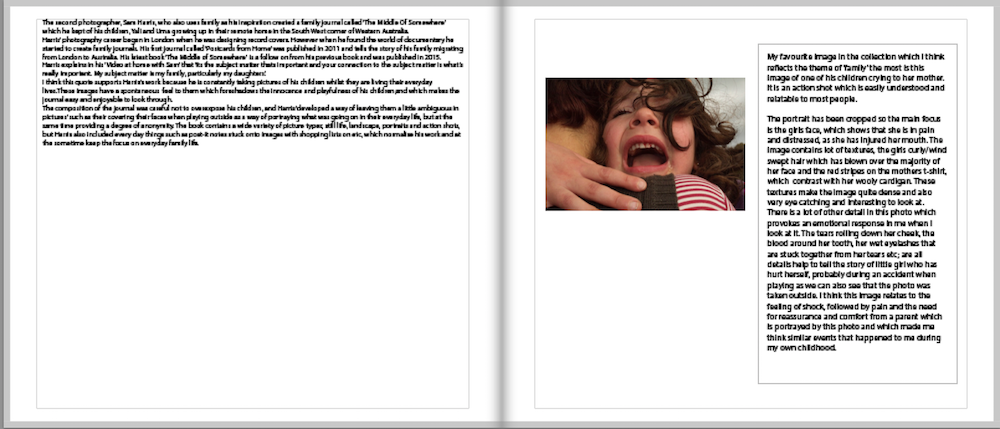
The second photographer, Sam Harris, who also uses family as his inspiration created a family journal called ‘The Middle Of Somewhere’ which he kept of his children, Yali and Uma growing up in their remote home in the South West corner of Western Australia.
Harris’ photography career began in London when he was designing record covers. However when he found the world of documentary he started to create family journals. His first journal called ‘Postcards from Home’ was published in 2011 and tells the story of his family migrating from London to Australia. His latest book ‘The Middle of Somewhere’ is a follow on from his previous book and was published in 2015.
Harris explains in his ‘Video at home with Sam’ that ‘its the subject matter thats important and your connection to the subject matter is what’s really important. My subject matter is my family, particularly my daughters’. (- Sam Harris, http://samharrisphoto.com/633647/the-middle-of-somewhere/)
I think this quote supports Harris’s work because he is constantly taking pictures of his children whilst they are living their everyday lives. These images have a spontaneous feel to them which foreshadows the innocence and playfulness of his children,and which makes the journal easy and enjoyable to look through.
The composition of the journal was careful not to overexpose his children, and Harris ‘developed a way of leaving them a little ambiguous in pictures’ (The Telegraph, London 2015) such as their covering their faces when playing outside as a way of portraying what was going on in their everyday life, but at the same time providing a degree of anonymity. The book contains a wide variety of picture types; still life, landscape, portraits and action shots, but Harris also included every day things such as post-it notes stuck onto images with shopping lists on etc, which normalise his work and at the sometime keep the focus on everyday family life .
My favourite image in the collection which I think reflects the theme of ‘family’ the most is this image of one of his children crying to her mother. It is an action shot which is easily understood and relatable to most people.

The portrait has been cropped so the main focus is the girls face, which shows that she is in pain and distressed, as she has injured her mouth. The image contains lot of textures, the girls curly/wind swept hair which has blown over the majority of her face and the red stripes on the mothers t-shirt, which contrast with her wooly cardigan. These textures make the image quite dense and also very eye catching and interesting to look at.
There is a lot of other detail in this photo which provokes an emotional response in me when I look at it. The tears rolling down her cheek, the blood around her tooth, her wet eyelashes that are stuck together from her tears etc; are all details help to tell the story of little girl who has hurt herself, probably during an accident when playing as we can also see that the photo was taken outside. I think this image relates to the feeling of shock, followed by pain and the need for reassurance and comfort from a parent which is portrayed by this photo and which made me think similar events that happened to me during my own childhood.
Thinking about the theme of family was really enjoyable for me. I decided to use my grandparents as my stimulus as they were moving house at the time. I photographed them moving into their new home and tried to capture them decorating the place to make it their own. I liked working with family members as I was able to gain a deeper source of information and context by including some family archive photographs.
I decided to develop my project further by photographing my grandparents everyday lives and the things that are most important to them;faith, family, Jersey, Wales and music. I wanted to photograph them at family events, such as Christmas day, and also just a Sunday afternoon at home.
I collected a variety of material but taking inspiration from Martin Usborne’s ‘I’ve lived in East London for 86 1/2 years’ I decided that I also wanted to include my grandparents words in my book. So I conducted an interview with them on these 5 topics, and chose my favourite quotes to put into my book. I think by having words as well as photographs it gives the project more depth and it helps the reader to develop an understanding of my grandparents personalities.
One of my favourite portraits from my collections is from my first shoot. It is of my Grandma in the back garden bringing the washing in.
In this photograph, my Grandma is at my house taking our washing in. This supports her quote of ‘We always try and go the extra mile for family’.
It is a very simple photograph, just folding her washing off the line yet it creates an image which is interesting to look at. There are lots of details from around the garden which are attractive to the eye for example the row of flower pots along the side of the garden and the socks individually pegged on the washing line. The image contains lots of rich colours such as the reoccurring green and the dominant colour of beige on the wall.
Another thing that I like about this photograph is the way it is divided by natural leading lines, the top of the brick wall, leading your eyes from one side of the photograph to the other side. There is also the leading line from the grass. These lines transport your eyes around the photograph.
Another photograph from my collection that I particularly like is this photograph that was taken on Christmas day. It is of my parents reading a bed time story to my younger cousins. Christmas is a very family orientated day which is filled with family traditions, this is why I think this photo fits nicely into my photo book. This photograph contains comedic features such as the Santa’s hat, and the bear slippers.
In conclusion I believe that both Sultan and Harris’ photographs of their families represent their concept of love. The way the photographers have taken their photo’s show that they know their subjects very well and the subjects look like they are comfortable with having their photographs taken by a person that they know and trust. I think that the main drive for a photographer is their love for the subject and this inspires them to want to spend lots of time and attention on their projects and in this case they are creating a memento of their family life which also will have a shared meaning with the subjects as they are family members.
I think both of these photographs show their love for their families through both the sensitivity and humour obvious in the some of the moments captured in the pictures. The images also represent the interests and similarities that can be found by the viewers with their own lives, creating a sense of shared meaning and understanding of what is going on. I have found that these works have had a powerful effect on me, which has inspired me to create something similar that I can share with my family.
1- Germann. M, Gorner. M, Zander. T (Eds) (2010), Katherine Avenue Larry Sultan Gottingen: Steidl introduction to quot’quote’ (Germann 2010:14)
2- Burbridge.B, Celia.D (Eds) (2013) Photoworks, Family politics. Brighton: Grande Parade introduction to quote ‘quote’ (Williams.V 2013:85)
3- Hattersley-Smith.K, Spenser.J (Eds) (2006), Photography: A Cultural History 2nd edition, Mary Warner Marien. London: Great Russell Street http://www.americansuburbx.com/2011/10/roswell-angier-roswell-angier-on-larry-sultan-pictures-from-home-2006.html
4- http://larrysultan.com
5- http://www.americansuburbx.com/2011/10/roswell-angier-roswell-angier-on-larry-sultan-pictures-from-home- (Roswell Angier, (2011), americansuburb.com
6-http://www.theaustralian.com.au/life/weekend-australian-magazine/sam-harris-the-middle-of-somewhere-and-photographs-of-a-new-life/news-story/df8ba352e7e9a3a20549f9e25eab6842 (The Telegraph, London 2015)
Evaluation of my Photo-Sequencing
Summary
The making process of my photo-book has been a challenging but enjoyable experience. The end product is that I have successfully designed a hand-made photo-book, printing off my photographs and placing them in a traditional photo-album I brought.
This process has required a large amount of work and effort. I will now evaluate the end result and refer to the stages and thought-processes behind this finished product.
Sequencing of my Photo-Book
The sequencing design I have gone for is based on slowly building up context to my story; starting off slowly and revealing more clues as I go along.
I have started off with a very simple front cover by keeping the original brown cover as it is; not adapting or changing anything. I have done this because I want to images to speak for themselves, and to establish a degree of subtly straight away.
To further this sense of intrigue I have placed my images in a cardboard folder, usually used for storing paper documents. This idea was influenced by a similar designed evoked by Martin Parr in ‘Life’s a Beach’ in which he placed his photo-book in a cardboard style folder. I like this feature because it adds a sense of playfulness to my book – it is interactive and emphasizes the photo-book as an object in itself, to be significant.
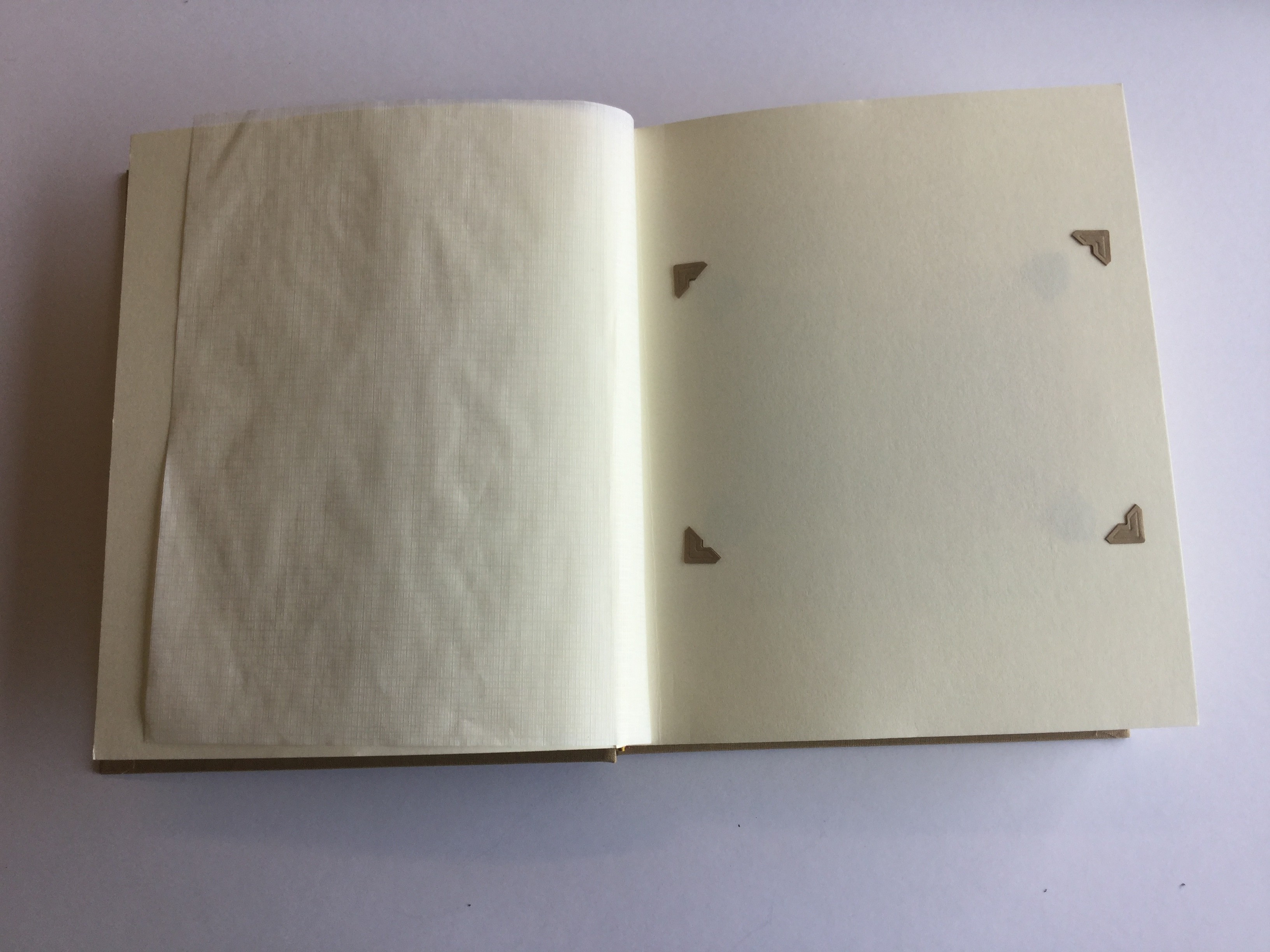
For the first part of my story I wanted to address immediately the theme of absence. To explore this idea in a subtle way I decided to put photo-corners into the first page of the story – which I have then taken out, leaving a page with photo-corners but with no photograph inside. My thought process behind such an idea is that the empty pages serve as a metaphor for the fact my Grandfather, who is the basis behind the story, cannot be photographed, and cannot therefore exist in any of my photographs. This sets up the idea therefore that the images within the book are somehow all connected to this absence, telling a story about something which isn’t there. Like Toropstov’s work therefore, mine is very much a journey of discovery.
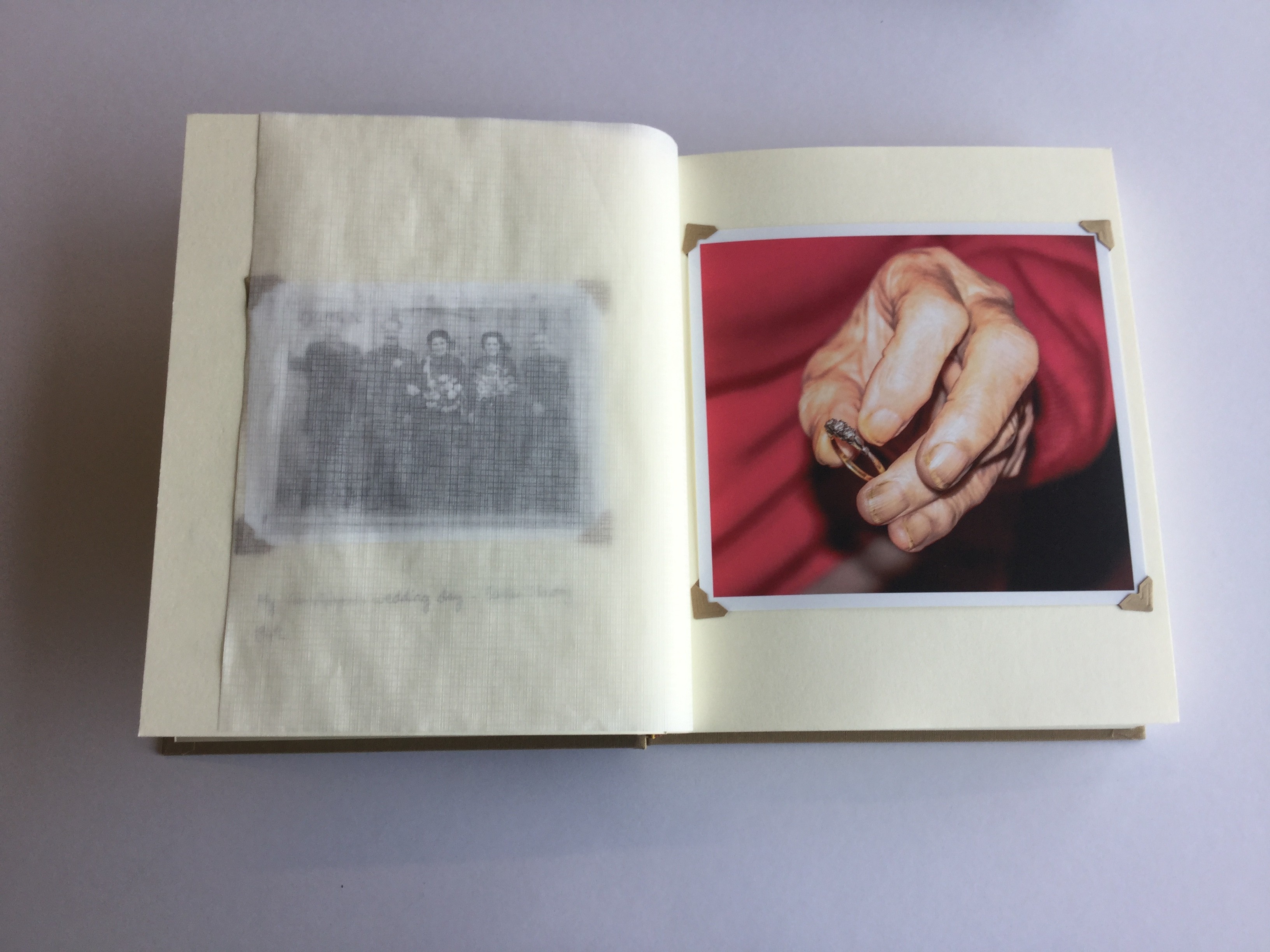
I did not mention at the start of my photo-book that my Grandfather was no longer alive, nor do I even suggest that the story is based on him. This is because it will make it easier to build-up a narrative slowly and overtime, without giving anything away. The first two images of the narrative start to suggest the story is based around my Grandparents; the left-hand image is a old archival image and I have included the caption “my Grandparents wedding day – 1949”. The right-hand image is a close-up of my Grandmother holding her wedding ring (which she wore when she was married to my Grandfather. The fact she is holding the ring does subtly imply the fact my Grandfather is no longer alive, a symbol of something which is no longer here; a object which connects to the past.
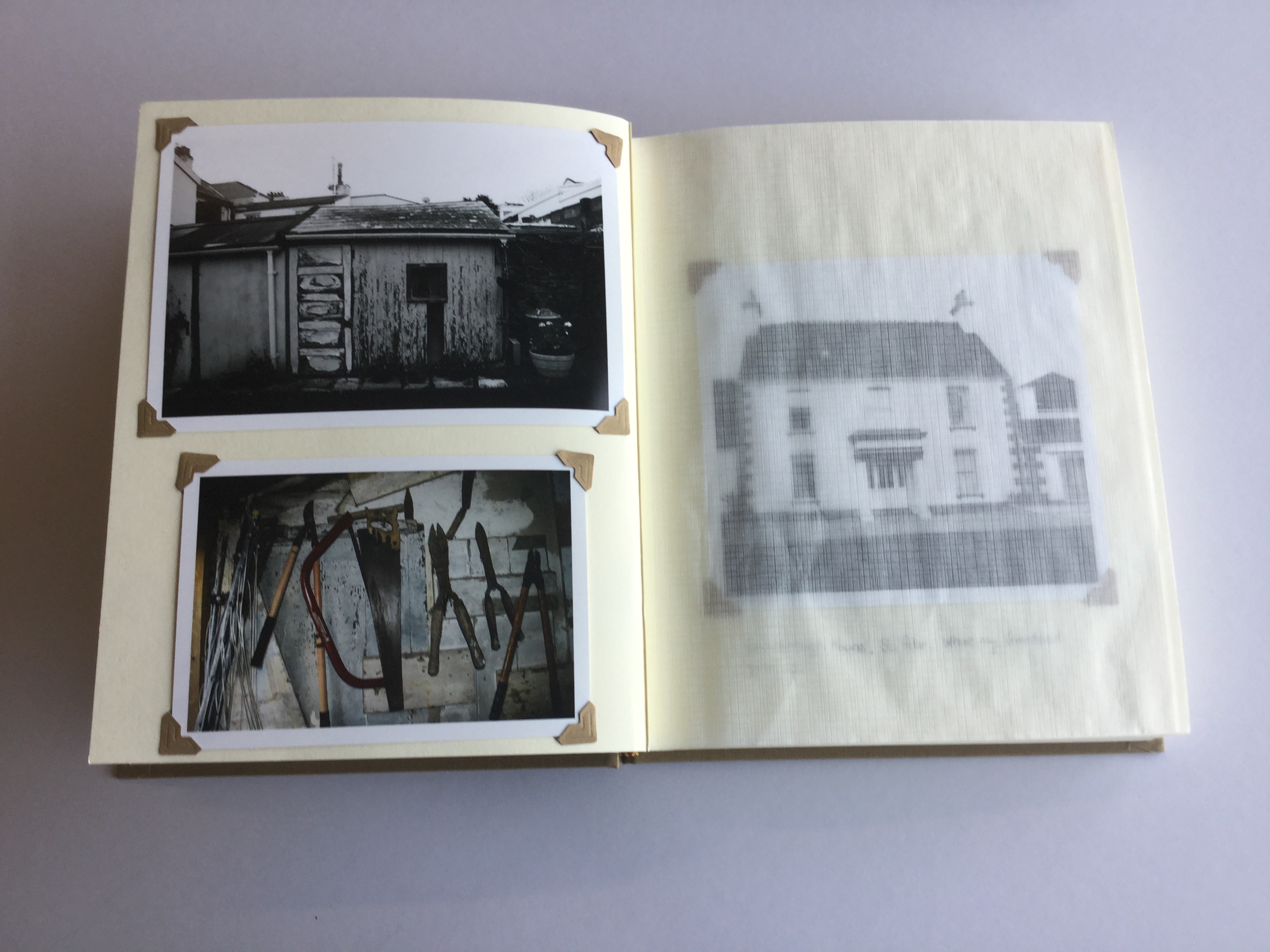
The fifth page of my story – consisting of two images on one page – relates to my Grandfather in a symbolic way. The images are of his shed in the back of my Grandma’s Garden, and the still-life is of the tools which he would have used. This use of symbolism is one of the main ways in which I have been able to replicate a sense of his presence. This use of symbolism extends the degree of intrigue behind the story because the viewer will not yet be able to fit. On the next page however, I have included the caption “Sommerleigh House, St. Peter. Where my Granddad grew up.”. This will invite the suggestion that there is a link between my Grandfather with page 5, and well as an implication of his presence throughout the entire story.
For the next couple of pages I continued this process of taking candid images reflecting my journey of discovery; photographing my Grandma, her garden and the gates to the graveyard where my Grandfather is buried. The light-switch is a key point in breaking up the narrative, as immediately on the following page, I have jumped away from the present time line and to some degree theme, by including an archival image of my Dad. This begins a smalls break in the narrative of two images,one of a watch and one taken of the moon late a night, the latter in particular reflecting not reality but instead a state of mind.
I would also consider these two pages as key images because they are very poetic images, designed to represent the the perspective of my Grandmother, photographing things that she would view going about her everyday activities. I have again connected my Granddad directly by including the caption, “Your Granddad served in WWII as a navigator for the RAF. He never spoke much about it”. This continues the viewers gradual introduction to my Granddad. On the following page a similar reflection can be shown, through an image of a Masai Mara statue and I have included a caption through which my Grandmother discusses her view of the time the family spent in Kenya. during the 1980s
To again break the flow in the narrative, I have included five landscape images of the scenery of St Ouens. These images don’t show anything in particular and are more-so metaphors for the journey I have taken. In a way I think they represent my state of mind and mood when making this photo-book. As they don’t really represent anything they therefore have quite a low intensity and thus provide a nice break before the ending of my narrative.
The penultimate image of the photo-book is one of my Grandparents in their Salvation Army uniform. My Granddad was nearing the end of his life by point and it is one of last photos ever taken of him. Even by this point I have not yet mentioned my Granddad is no longer alive, although his absence implies this. In this image I have included the caption “We planned to retire in 1986. Your Granddad wanted to visit his Brother Frank, in Australia”
On the next page/final image I wanted the image of both my Grandparents in their uniform on the last page to contrast directly with this one – emphasizing the fact he is no longer here. I feel that this image is an extremely powerful image because it emphasizes the fact my Grandmother is still part of the Salvation Army, but is now doing so alone. The simple caption explaining that my Granddad died in 1985 aged 63, finalizes the narrative and clarify his absence. I felt that relating this caption with the image of my Grandmother alone, emphasizes the reality of this situation.
My Final Photo Book Design and Layout
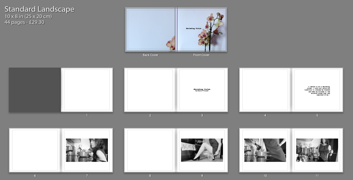
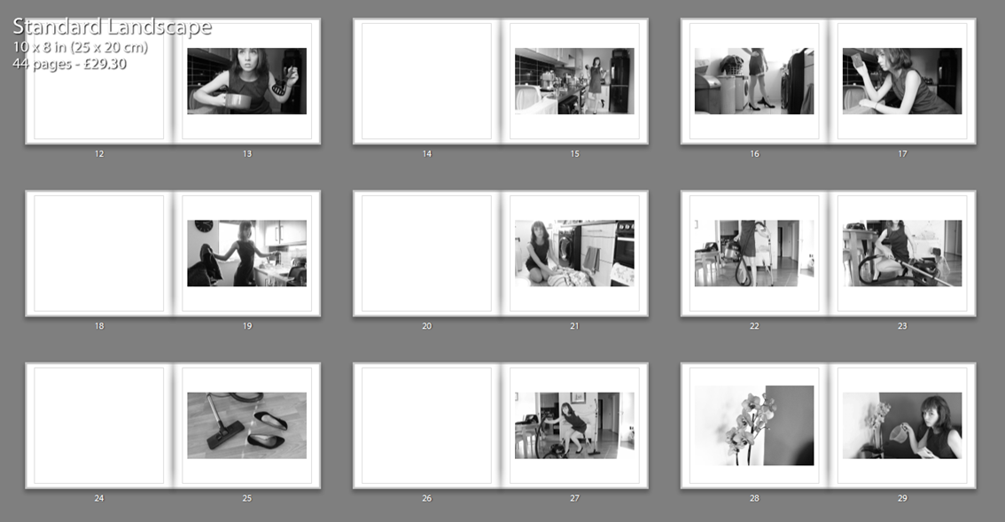
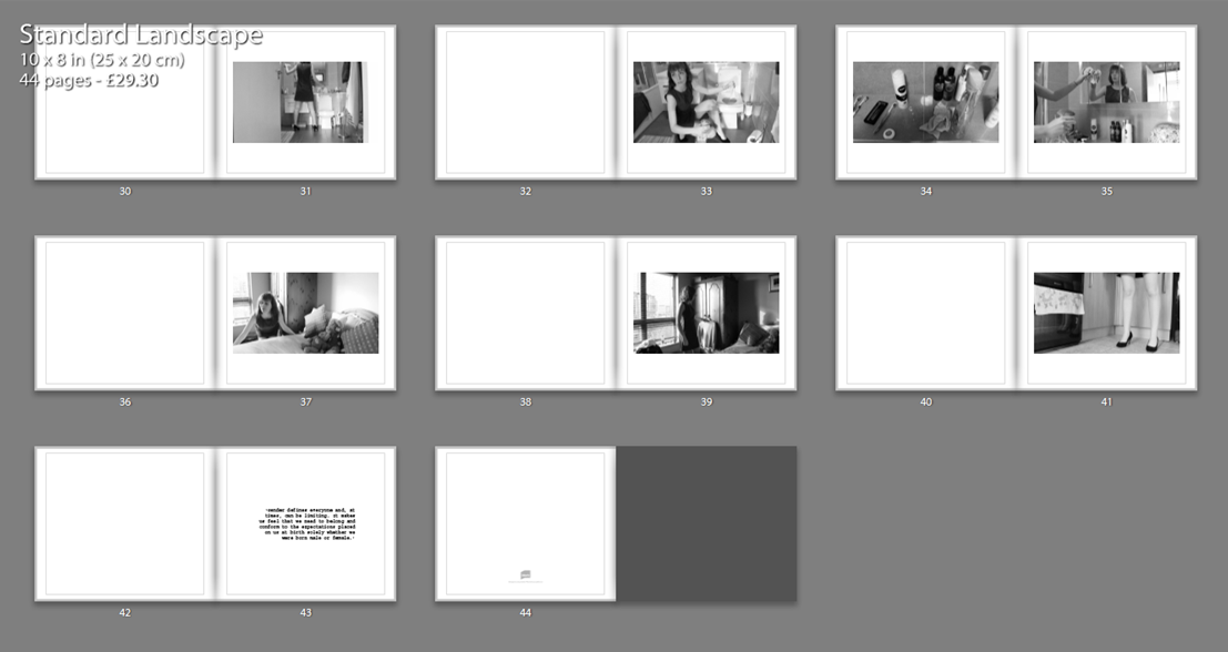
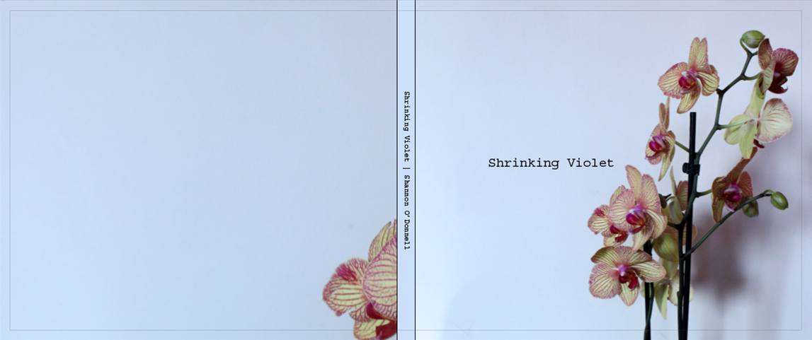
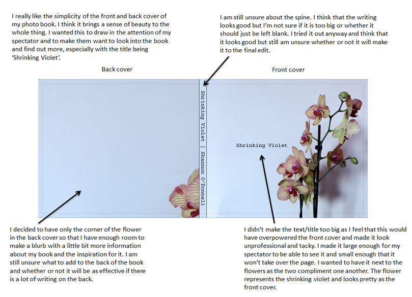
Photo Book Layout | Shrinking Violet
Photo Book | My Thoughts
I decided this week that I was going to make a photo book for my project as I have made some staged images and think that this will work really well with the short film that I created of my mum. I want it to look as professional as possible and for my work to stand out. I do not want to add the essay to the end of my photo book as for me it takes away from the images. I don’t want to have other photographers work in my own photo book as I want to exhibit my own work and to show my stylistic approach rather than evaluating someone else’s. I do have my essay on the blog and think that looks good enough. Editing together the photo book is going well and I am also adding in some quotes from my essay to bring more context to the photo book. I think that this is the best way to include my essay and is more original and interesting for my spectator rather than having to go through a huge chunk of text. I like to make my own quotes that hold impact and think that these look a lot better than an essay would and really embody the whole message that I want to get across in my images. I have really enjoyed making a photo book and think that it looks really great and professional as it all comes together.
Layout Idea | 1
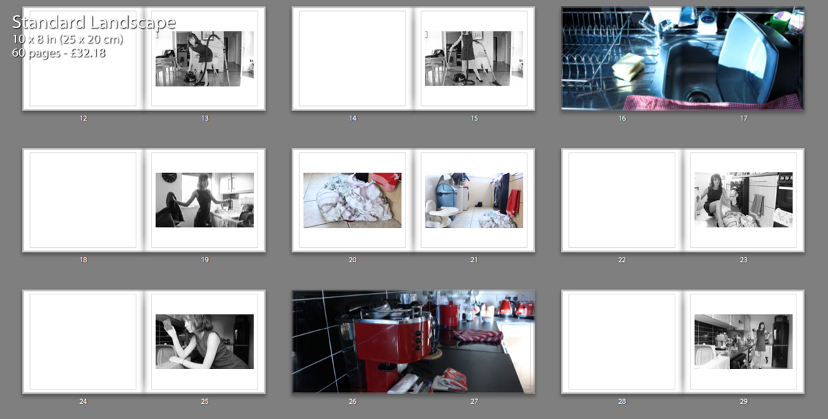
This first idea consists of black and white staged images as well as images in colour that are of objects. I wanted to have some double page spreads as I really like the way it looks as well as a mix of colour and black and white. I like this idea but I am unsure whether or not it takes a bit away from the black and white images as they are supposed to be my main focal point. I have just been experimenting around with different layouts and am trying to find what looks best for my work. I don’t think that I will be using this for my final book as it isn’t strong enough and doesn’t look as professional as I would like it to look. This mainly just helped me get into Lightroom and how to move photos around and how to use the editing software to create the book. I feel that this design/layout is a bit all over the place with the colour and black and white images. I do think that it would look a lot better if I just stuck to having all of my images black and white and kept to a better sequence than this one. I still really like the double page spread and might use this in the future for other projects but it just doesn’t work as well for this particular project for me.
Layout Idea | 2
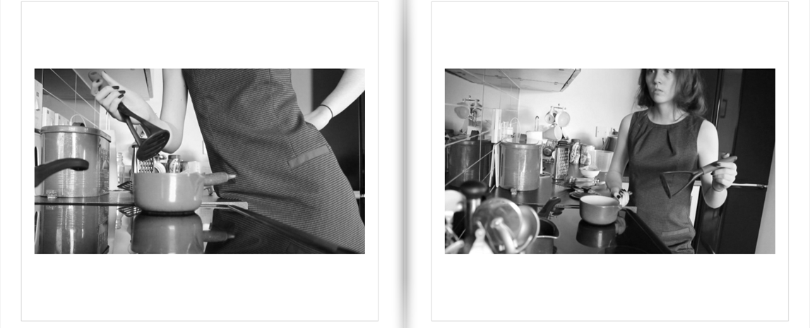
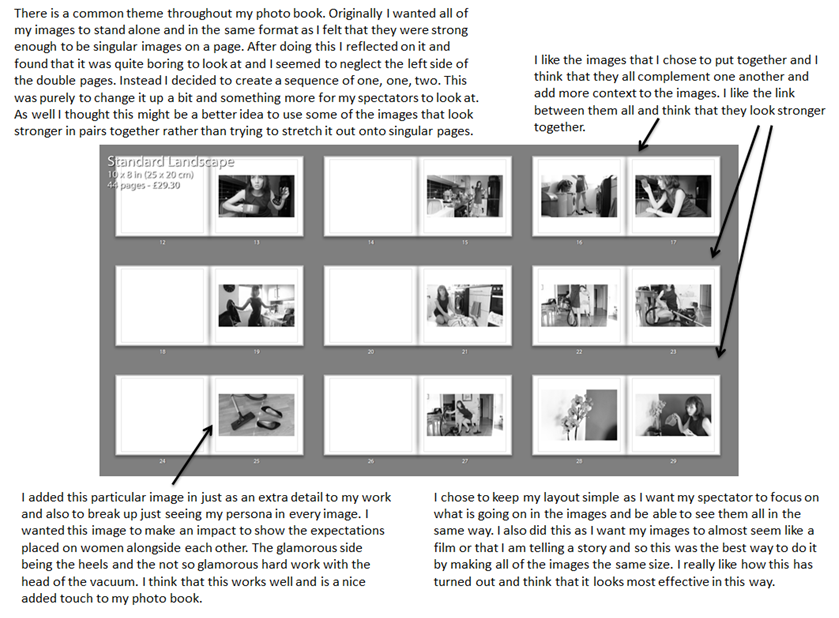
This layout is the one that I want to use as my final book. I think that it does look professional and is interesting for the spectator to look at. I really like that I have started with a quote of my own and ended the book with a quote of my own. I think this book is more effective as everything is in black and white so all of the images compliment one another. I tried to order my photos in such a way that represents how my mum cleans the house and in the same order that she actually cleans it. Starting from the kitchen and then ending in her bedroom this is the way my mum cleans the house. I decided to use few images as I only wanted to include my very best and my favourites. I think that this has worked out well and I have plenty of images to make an effective book. When creating this photo book I didn’t really have any photographers photo book in mind. I created something that made sense to me and that looked good for my project, I wouldn’t have been able to mimic someone else’s work or take inspiration from them as I know myself what I wanted to produce. I feel that doing this gave me more freedom to experiment and create whatever I wanted to without feeling that I need to create my book in a similar style to that of someone else’s.
Quotes for book [my own]:
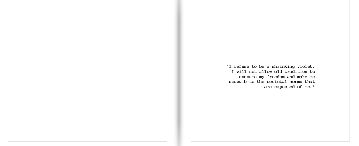
Opening quote – ‘I refuse to be a shrinking violet. I will not allow old tradition to consume my freedom and make me succumb to the societal norms that are expected of me
End of book quote – ‘Gender defines everyone and, at times, can be limiting. It makes us feel that we need to belong and conform to the expectations placed on us at birth solely on whether we were born male or female.’

