My Specification | Main Projects

For my projects and essay I will be focusing on making a book and a short film to go with that book. If I can I also want to create a fashion magazine as this is something that really interests me and I have plenty of ideas that I want to create for it. I am focusing my work on feminism and the unfair advantages and disadvantages faced with both men and women. I will be focusing on two different aspects of feminism, the first being the unfair stereotype given to women of being the carer and basically live to serve, doing all the cooking and cleaning for the family and/or her husband. I also want to focus on smudging the lines between gender stereotypes of fashion. Both topics really interest me and I want to be able to explore them further.

Main Idea | Personal Shoot

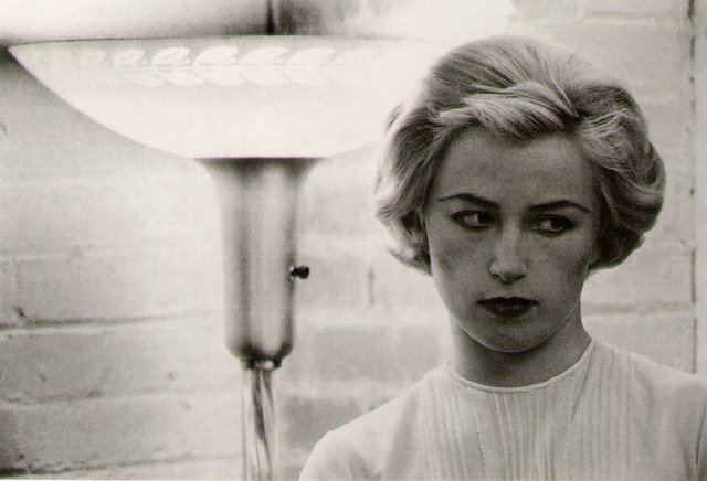
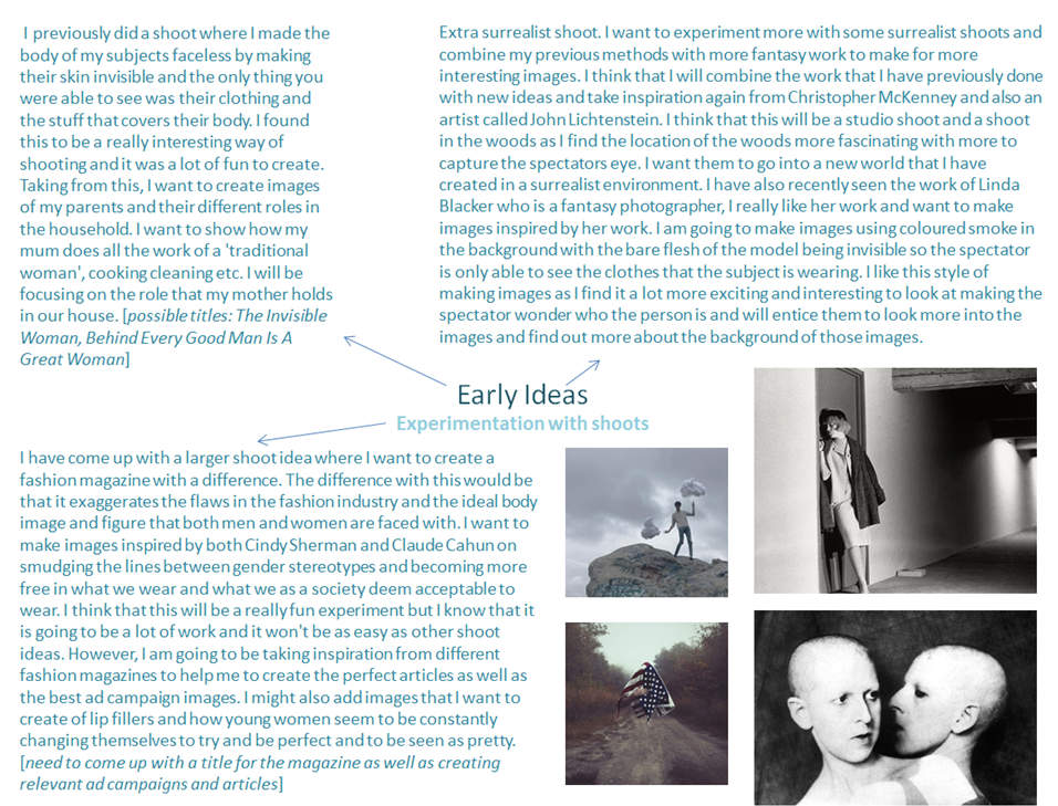
I want to look into the life of my mother and how she is a working housewife. Meaning that she has a full-time job and works from 9-5 yet is this expected to come home and do all of the chores and house work, cooking and cleaning, that a housewife would usually be expected to do. I want to make a short film of my mother going about her everyday chores and what does on a regular occurrence. From those film clips I want to make film stills, inspired by the work of Cindy Sherman, and edit them into strong images. After this I want to then mimic the work myself in a parody sort of way to make my spectators focus on what is going on in the images and how old-fashioned it is for the woman to be doing all of the chores and housework. I will also be interviewing my mum and asking her various questions about feminism and her role in the family. This will go along with my short film that I will be creating. I think that this will be a really fun and an interesting project to do as it is more personal and I do think that the images will be more interesting for my spectators to look at.

– make videos of my mum doing her everyday chores at different times and basically film what she is doing. I want to make it more artistic and film in more artsy and creative ways instead of straight on boring video. I will be turning this into a short film with a voice over of an interview with my mum on her role in life and how she feels about it. I want to find out more about what she deems acceptable within our society and why she has raised me differently and more openly to how she was brought up. After collecting this footage I will make images from this of screenshots of my mother and I will restage these images of myself in front of the camera almost parodying her role and how I don’t want to have that same role and don’t accept to be stuck in an old-fashioned way of life.

Screen Shot 2016-01-10 at 14.06.05
inspiration/mood board

Second Idea | Fashion and Gender

For this idea I want to create a fashion magazine dressing as both the male and female subjects of all of the images from the magazine. I have taken inspiration from Claude Cahun on smudging the lines between male and female stereotypes and want to explore this through the world of fashion. I have ideas of exaggerating ad campaigns that I have seen before to almost parody the ridiculous expectations put on both men and women with models acting and portraying the ‘perfect form’. Mainly this idea will focus on smudging the lines between the male and female expectations of fashion as I think that this is such a huge thing in recent times and will make the most impact on my spectators. I took inspiration for this from the recently launched ad campaign featuring Jaden Smith as the new face of Louis Vuitton womenswear. I find this so unique as Smith is bringing attention to gender stereotypes that we are all faced with but deem acceptable, this needs to change.

– make images in studio dressed as both the male and female model [wearing wigs and different clothing]
– possibly make images dressed as a different cultured woman [muslim] to show the difference in society [extra idea]
– make an image dressed as the Egyptian woman Nefertiti to add to the magazine [possibly, extra idea]

Screen Shot 2016-01-10 at 14.08.43
inspiration/moodboard

Main Concept and Plan of my project: Living in History Versus Modern Day

Overview 

My initial concept was to show the theme of ‘family’ and ‘community’ through the comparison of ‘history’ and the modern day. Using archival material, I plan to demonstrate a clear example of how family traditions change, within architecture, the work place, and within every day lifestyles. I also wish to display the privileges of living a lifestyle in the modern day compared to a lifestyle in war and the post-war era. This is all connected to my recent move to a new house.

Thoughts and Ideas 

  • I wish to dig deeper into the history of my house. Primarily using archival material which i extracted during my recent work internship at the Societe Jersiase.
  • The lifestyles of when it dated back
  • To interview and photograph previous owners, builders, landlords,
  • To discover the beauty around my house,
  • To show what my other family and friends think of the location, what the new build means to people,
  • The debuting controversy over the production of  a ‘block house’ on a old heritage site.

How can I show this? 

I believe I  can show this by producing various types of media. Voice Recording, Video, and Photography with various techniques such as montage and collage in Photoshop. I believe the manipulation of my images and the merging of old and new can subject the transition of time and passage, connecting to my family and the community around me. Another idea is use the technique of placing text on a photograph to show a distinct narrative. This is all in connection with the work of Wendy Ewald.

jagu-web

carver,chaidasha,front_550

In  the style of Ewalds work, I could produce an image, adjust it, then allow the person i photographed to write on the image to signify the personality, community and familiarity of the subject, condoning an overall sense of transition and modern and new.

Modernism Versus Minimalism

Photographers and Research 

Martin Toft – Similar concept as he was comparing the history of one location to another. Martin in his project ‘Atlantus’ discovered the movement of ‘Jersey’ (Channel Islands) to ‘New Jersey’ (State, United States of America), and how it has evolved, compares and works with the background and history of being part of a place most people haven’t even come across.

“A visual an oral exchange of cultures, histories and identities”

Bryan worked as a herdsman in America making may trips to export cattle to New Jersey, to look after the cows in quarantine in Clifton and to prepare them for sale to American buyers. It was Bryan who accompanied Precious Galinthia amongst forty head of Jerseys to New Jersey onboard a K.L.M. DC 7F freight plane bound for New York in March 1964.

atlantus1577

Tamika Tolliver, Asbury Park, New Jersey, United States, 1 Augus


CAPTURING MOVEMENT

Time photography


The idea ‘chronophotography’  was invented by French physiologist Etienne-Jules in the 1880’s, Jules did this so he could make accurate physiological analyses of movements, this term was also later applied to a range of images that are in a sequence. These were used by scientists to help analyse how the human body worked while we moved. Scientists began to make single-place chronophotographs, where multiple image were taken on one plate which overlapped one another. In the late 1850’s the measurement of the duration of an electric spark was measured by Bernhard Feddersen. Multi-plate chronophotography was later used, this is where a full range of movements was recorded on a series of individual photographic plates, this was first invented by using a battery of separate cameras, this was first introduced by Eadweard Muybridge. Movements were later captured in the 19th century where it was found that chronophotography methods could be reproduced into an illusion of natural movement, for example in a zoetrope, a zoetrope is a ‘optical toy consisting of a cylinder with a series of pictures on the inner surface that, when viewed through slits with the cylinder rotating, giving an impression of continuous motion’.  https://www.google.com/search?q=zoetrope+definition&oq=zoetrope+definition+&aqs=chrome..69i57.1895j0j7&sourceid=chrome&es_sm=122&ie=UTF-8&surl=1&safe=active

The four main figures of choronophotography are Muybridge, Marey, Ottomar Anschutz, and Georges Demeny. 

Eadweard Muybridge took a series of chronophotography images of someone riding a horse, and Muybridge was the first person who found out that when a horse galloped that at one point when the horse is galloping, all of the horses hooves are off the floor at one time, so at one point the horse is completely off the floor. Muybridge’s images were mainly used for scientific basis, as Muybridge was a photographer, his works were used for scientific study. To make this image of the horse Muybridge lined a raceway with 15-foot sheeting, which lines were also drawn at 21-inch intervals. While the horse raced the 12 cameras took the images as the horse rushed past.  

Image result for eadweard muybridge

Image result for eadweard muybridge

Image result for eadweard muybridge

Muybridge inspired others such as Marey, he was interested in human and animal locomotion, and he was influenced to experiment using photography. Marey invented a gun camera which he used in the early 1880’s, this made exposures fast enough to record the bodily movements of a bird flying. 


Gatherings: IPES Photos

As part of my project for Gatherings, I thought I should get some photos of the workplace as it is where people gather daily, and as my Dad now works for IPES, I asked if I would be able to go and photograph the office after everyone had gone home and I was allowed to. I chose three images from those I took to put into the photo book, which is a high n umber since from most of the shoots I have done I have only selected one image, but I felt they were different enough to all be included.

IPES photos

I like that there are no people in these images because it leaves it for the person viewing the images to imagine what kind of people use these spaces and what they become when they are busy with the people working there.

I have also spoken to a friend who goes to church, and he is going to introduce me to the priest so I can inquire about taking photos during/after a mass, so I can start to incorporate religion into my photo book.

Essay Plan- title/question and introduction

  1. Title/question: The entire essay must focus on the title or question of the project. The title needs to involve the concept of photographing the invisible as well as considering the idea of memory. 
  2. Introduction: The introduction needs to explain the main body of what the essay is about and what it is trying to address. The beginning paragraph should contain artist movements, quotes and photographers I have taken influence from.

Ideas:

  • How has Laia Abril and Yury Toroptsov shown the concept of memories and attempted to photograph the invisible?
  • How can memories be demonstrated through the medium of photography? 
  • How are memories reflected in Laia Abril’s and Yury Toroptsov’s interpretation of the concept? 
  • How has Boltanski, Abril and Toroptsov represented the concept of capturing the invisible through the medium of photography?

Planning stage: How do I structure my essay? What do I want to include?

  • The essay needs to follow a systematic structure, addressing the question I choose in detail. I will begin with an opening quote possibly from a philosopher or an artist I have found influential. Following the introduction will be the first paragraph and so on. There will be a topic of discussion for each paragraph, I will aim for four solid paragraphs. Finally, I will conclude the essay again referring to the question and making sure I have answered it sufficiently. The essay needs to include a quote at the beginning as I earlier stipulated, it also needs to have references from specific photographers and philosophers, it needs to show that I have thoroughly researched the chosen topic and have a variation of resources.


Memory and the self

Lockean Memory Theory:

John Locke suggests that an individual’s personal identity extends only as far as their own consciousness. There is a key connection between consciousness and memory. The self is a thinking intelligent being, that has reason and evaluation. He proposes the idea that in order to be a self, one must be a thinking being and due to consciousness always being intertwined with thinking therefore one only can extend itself to consciousness. The consciousness which Locke is referring to is parallel to memory. ‘If one cannot remember some experience, then one did not have that experience.’  Therefore, Locke thinks memory is a necessary condition of personal identity. Forgetfulness is when we lose sight of our past selves, which Locke then doubts whether we are the same thinking thing. 

‘Human life is embedded in time: we remember the past, we plan for the future and we live in the present. We swim in an ever-rolling stream.’

Greek philosopher Seneca’s idea, `If we do not live now, then when?’

In today’s modern world we are urged to live in the moment yet we are still constantly drawn back to the past which has influence over us still. Therefore the question remains of what we regard the value of memory to be. Not all memories are as clear as others, we have distinct memories and then we have hazy distant memories, so which memories are more powerful or instrumental? How do we categorise such abstract concepts? 


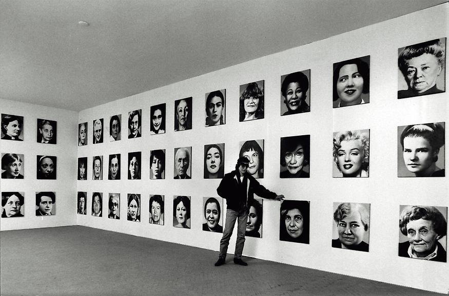
Chrisitan Boltanski:

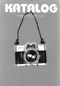
Christian Boltanski interview with KATALOG:

‘The public wandered slowly past this human sea of individual fates and forgotten lives…’

‘What qualities do you find in the photograph, and what does the medium mean to you?’

‘In my view you can equate the photograph with a dead body, just like an item of used clothing; it has the memory of something, and it is an object where the person behind it has disappeared.’ 

‘…always represents the memory of a reality.’

‘Someone once said that you die twice: when you die the first time and when somebody finds a photo of you and no longer remembers who it shows.’

‘You have talked about your interest in preserving ‘the little memory’. Can you explain what you mean by that?’

‘I mean that everyone is unique, because everyone thinks differently and remembers differently. We consist of all these experiences and memories, it is this ‘little memory’ that makes us different from others.’ 

‘I believe in the importance of every single human being, but even the most important ones disappear quite quickly, especially their little memory. What is most important is most fragile.’ 

‘You’ve said you want to touch people, even to make them weep. It’s rare for an artist today to use these big words and to try to stir the emotions. What do you think is the role of art today?’

‘I want to move people and to ask them questions about evil and good, about disappearance after death and so on. But they are questions to which I have no answers.’[1]
[1] KATALOG- Journal of photography & video- SPRING 1999

Disappearance and Menschlich:

My Specification | Ideas and Inspiration

Inspirations | Photographers and artists

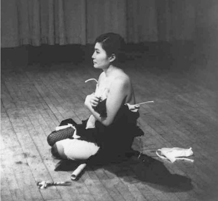
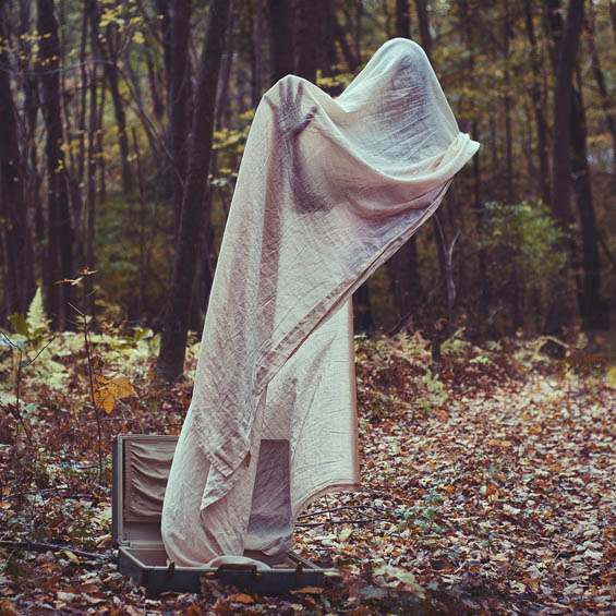
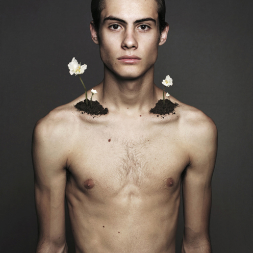
Obviously I am taking inspiration from the work of Cindy Sherman and her self portraits of taking on different female personas. I am also taking inspiration from Claude Cahun and her work where she smudges the line between the separateness of males and females. I think that this is very relevant and is now growing with fashion changing and people becoming more accepting and open to a new normal. These two are my main feminist photographer inspirations as I find their work so strong and I have always learnt a great deal from them but recently I have started to take a keen interest in the work of Yoko Ono, more specifically her work titled Cut Piece which is a very powerful video. Likewise, I have taken a lot of inspiration from surrealist photographers including Christopher McKenney and his horror surrealism which I absolutely love and find it so unique, it really stands out to me as well as the work of Brian Oldham. Both surrealist photographers work is different and I love to look at all of them. This is the effect that I want to have on my spectator, I want them to see my images and for them to stand out to them. I want to make images that give impact and that make my spectator stop and rethink and evaluate the way that they look at the world and life. I have already looked into the work of these photographers and have found out a fair amount about all of them but I want to compare and contrast them towards one another so that I can see which would be the best to write a response and essay about.

Cindy Sherman website: http://www.cindysherman.com
Claude Cahun website: http://courses.washington.edu/femart/final_project/wordpress/claude-cahun/
Yoko Ono website: http://imaginepeace.com
Christopher McKenney website: http://www.christophermckenney.com
Brian Oldham website: http://brianoldham.format.com/#1

Early Ideas | Experimentation with Shoots

early ideas photo


Surrealist Photographer | Linda Blacker

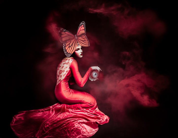
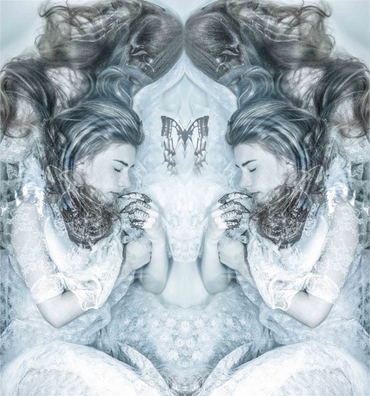
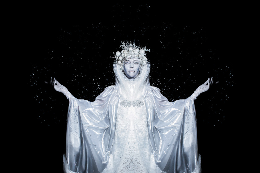
Over the Christmas period I have been looking for new photographers to explore who create surrealist photos like Christopher McKenney and Brian Oldham. I came across Linda Blacker on Instagram and found her images very interesting and different. I like her work and want to incorporate new and unique ideas like hers into my own work to make for more exciting images. Blacker is a fine art photographer, born in Chelmsford, United Kingdom. Her work combines fantasy and reality creating colourful and mystical images. Blacker’s work is very much fantasy and consists of plenty of makeup, props, sets and costumes. Her work is so interesting and different, it stands out and is very strange. Most of the time I just like to look at her work and see what she is doing yet never look into her work in enough depth to start making conceptual ideas of what the meaning behind each image is. They are very visually beautiful and tell a great story of the different characters that she manages to create and portray through her models.

Linda Blacker website: http://lindablackeraluk.co.uk/projects/fine-art/

Linda Blacker Instagram: https://www.instagram.com/lindablacker/

“I like to be in control of the entire piece. From the costume, to the set, I style the characters and I am even very precise about the position I want the model to be in.” – Linda Blacker

Interview with Linda Blacker: http://shoottheframe.com/photography-profile/linda-blacker-interview/

Overview | What I Think 

Looking further into the work of Blacker I find it so exciting and full of life. Her work is always so colourful and engaging which I think that I want to use when making my own images. I do think that Blacker’s work is very eccentric and over the top but I love that about her work. I won’t be doing any shoots like hers anytime soon as I don’t think it would be relevant to my personal study but I have taken some inspiration from her creativity and individuality. I want to somehow incorporate colourful smoke bombs into my own surrealist work and want to make unusual images that stand out just as much as the work of Blacker. All of Blacker’s work is done in a studio and with a makeup artist at hand which I obviously do not have but I like the idea of using the studio to make some interesting images.

Website2-435x560I find this image particularly interesting as Blacker has literally made the model part of the art work. It almost looks like a painting and the model blends in to that environment so well. In this image the model is unidentifiable and Blacker usually makes images like this on purpose as they aren’t the main event there is so much more going on around the model and Blacker wants the image to stand out as a whole and for her spectators not to just focus on the model. To me the model is supposed to be a cloud or could be a representation of wind, nature etc as she is blowing softly but the hot air balloons look as though they are being greatly affected by her presence. I love the colours in this image as it is so bright and happy. The colourful hot air balloons really stand out and make this image really inviting. Something about this image just makes me curious as it is so strange yet it makes me want to look at it more and find out what is actually going on in the image. It looks as though the entire thing is a painting and the model was painted and told what exact position to stand in and the exact facial expression she should make. I do like the idea of having complete control over my images and being able to position my model how I want them but I always prefer just coming to the scene and choosing what to do there and then, I tend to go with whatever looks best not just the idea and angle that I imagined in my head as it might not always work out that way or look as good as I imagine so being open to changes and different angles is the best for me.

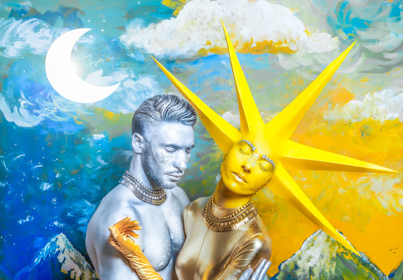
Sun-Moon-4copy-805x560This image also interests me, I get the impression through Blacker’s work that she likes to use paint and make her photographs look like paintings. I like that this image shows a man being the night and the moon while the woman is the sun showing the relationship between the two. The arm the woman has resting on the mans shoulder and his arms around her makes the image seem like the two are in a relationship but almost can’t actually touch each other or hold each other properly as they look strange. Both of them seem to be embracing one another with both of their eyes closed, this could be to make the image more powerful and mysterious focusing more on the whole image and the sun and the moon rather than focusing on two people painted as the sun and the moon. They are supposed to blend into the image to become a part of it and aren’t really there to stand out or to take away from the art work of the image.

Artist Reference | Roy Lichtenstein

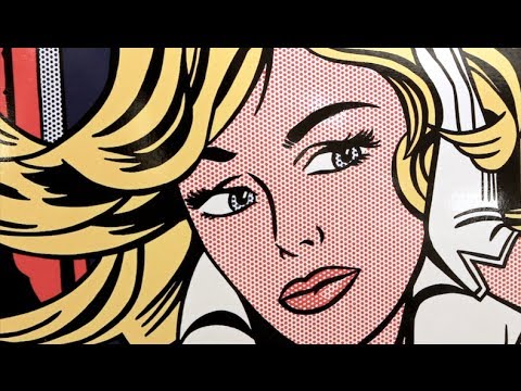
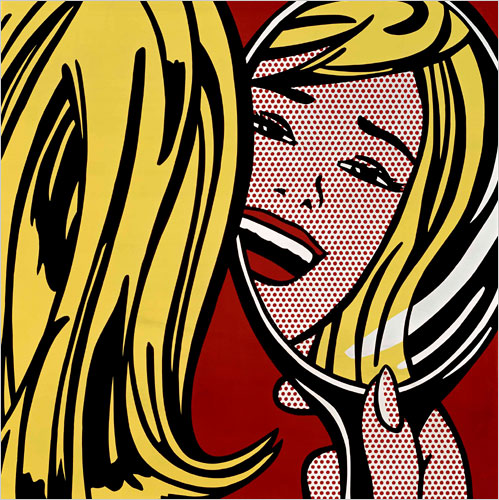
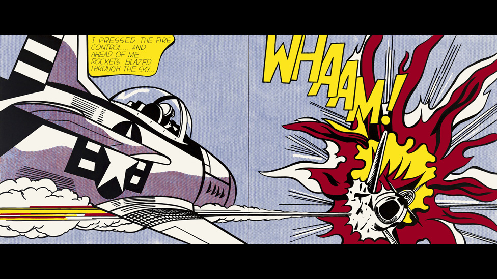
Roy Lichtenstein is an American artist, born in New York City in 1923. Lichtenstein’s career hit a high in the 1960s when he became a leading figure of the new Pop Art movement. His work is inspired by comic strips and advertisements, using bright and graphic works parodied American popular culture and the art world. This work was a reaction to some work of artists including Jackson Pollock and Willem de Kooning. He wanted to stand out and to challenge the way spectators view art and so became more inspired by advertisements and comic strips making his work unique. Lichtenstein died in New York in September 1997.

Roy Lichtenstein website: lichtensteinfoundation.org/

About Lichtenstein: http://www.biography.com/people/roy-lichtenstein-9381678

Jackson Pollock | Artist of the same period

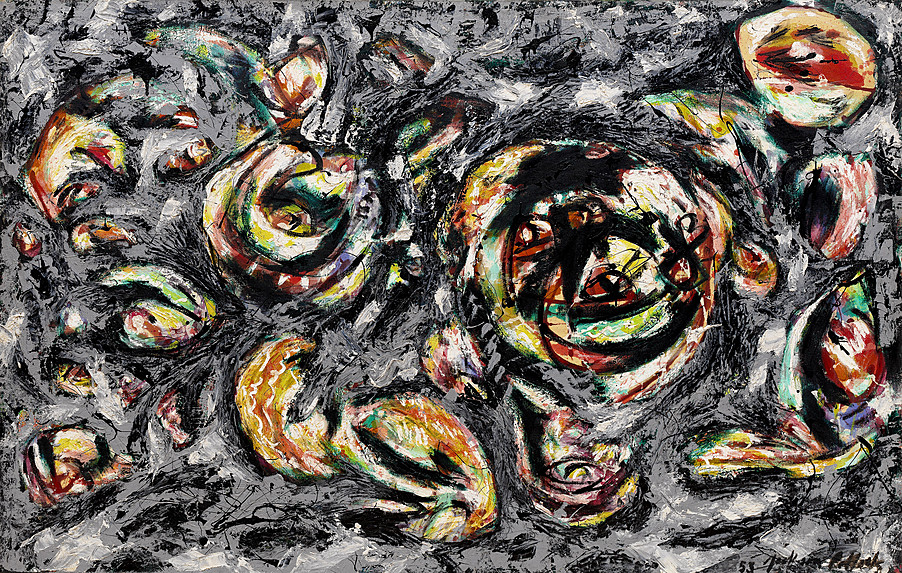
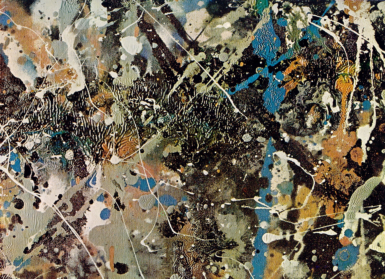
Jackson Pollock was an artist who was making work at the same time as Lichtenstein. He was very famous and his work is admired by many people today including some celebrities and actors [e.g Matthias Schoenaerts]. He was an American painter and was a leading face behind the abstract expressionism movement. He is known for being one of the most radical abstract art in history of modern art. Lichtenstein wanted to stand out from this and make his own mark on the world and so felt inspired by Pollock’s work but at the same time he wanted to challenge it or even go in a different direction which was to stand out even more than the work of Pollock himself. I really like Pollock’s work although it can seem like just a huge mess, easy and with a load of paint squiggles everywhere. However, I have tried to make painting similar to his and they haven’t been so successful and it is harder than it looks to get exactly what you want your painting to look like. I do think that his work is unique and it is interesting to see all the bursts of colour and different styles that he used within his paintings.

About Jackson Pollock: http://www.jackson-pollock.org/

Jackson Pollock website: http://www.jacksonpollock.org/


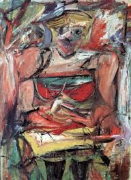
 Willem de Kooning | Artist of the same period

About willem de Kooning: http://www.theartstory.org/artist-de-kooning-willem.htm

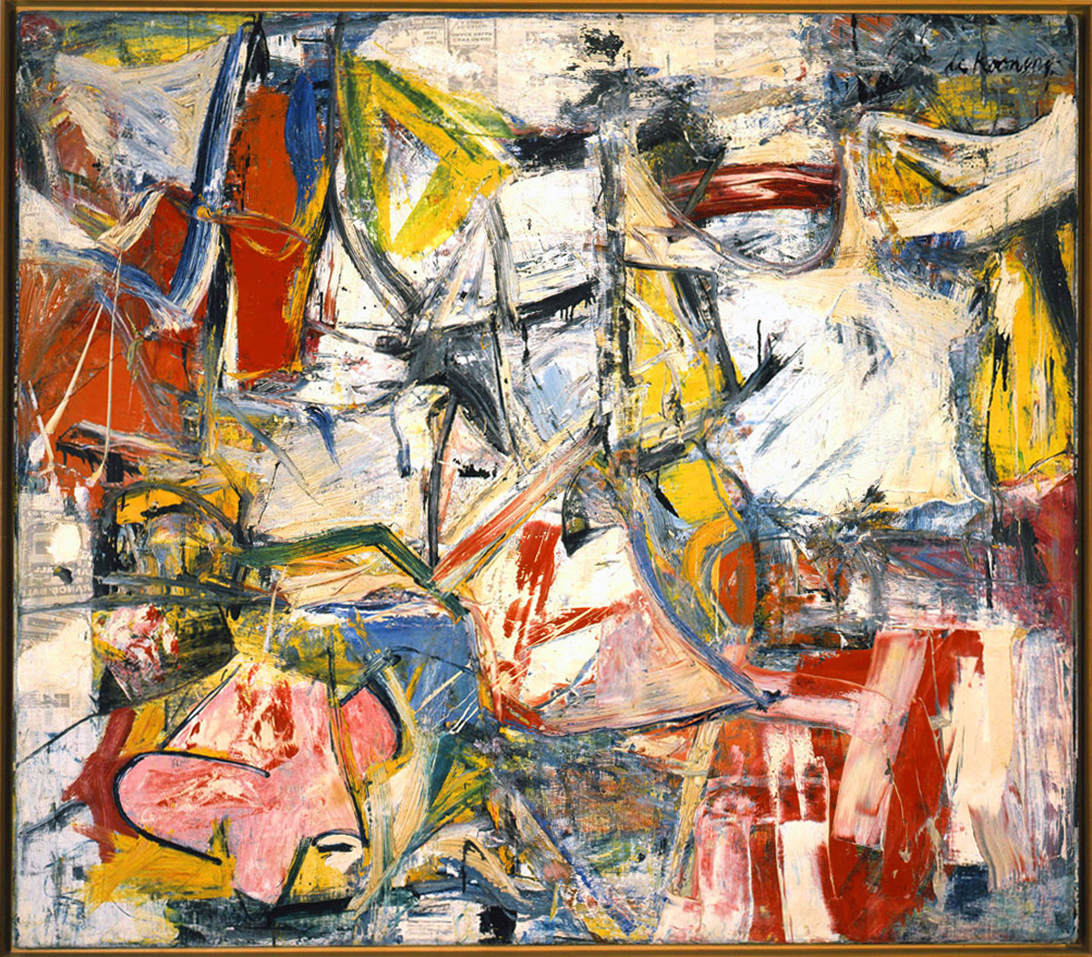
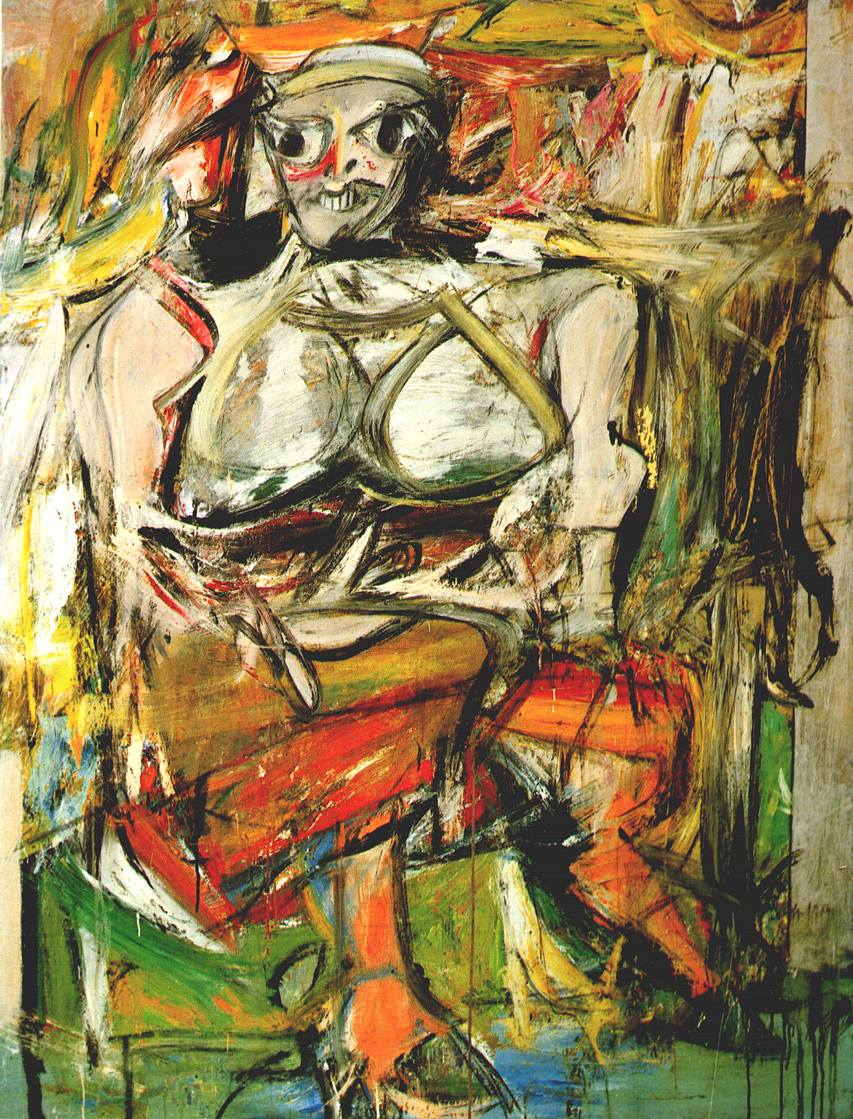
Willem de Kooning was also an artist at the time and was seen as one of the most prominent and celebrated abstract expressionist painters after Jackson Pollock. His work contains many images of distorted womenly shapes, which reminds me of the work of Picasso. He was a very traditional painter who became famous for his paintings of women, painted in different periods of his life. Lichtenstein was inspired by him through his use of women in art and paintings, which a lot of painters used [and still do] for inspiration. I think that Lichtenstein wanted to pose women in a more human like way showing their emotional states rather than how he physically sees them contrary to the work of Kooning. I don’t really like the work of Kooning as it kind of disfigures the women and makes them come across more as things or objects rather than actual human beings. They look so distorted and messed up that they don’t look human at all, which really does remind me of the work of Picasso and how he would change the facial features and make geometrical shapes out of them to make them unidentifiable.


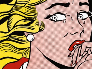
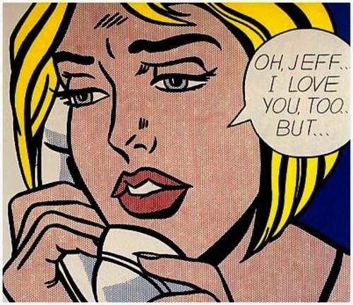
New York State Pavilion of the 1964 World’s Fair in New York City was a body of work that Roy Lichtenstein famously created. He made images mainly of women being emotional and to me his images see women as weak and small minded. I am unsure whether or not that was his intent but women are shown in more of a negative light through his work. His work is very theatrical and reminds me of the way women are portrayed in Film Noir films and the way those women are seen as being there for the man and only caring about what men think of her, including the femme fatales of those films who are seemingly set out to ruin the man who they have been hurt by.

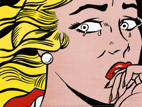
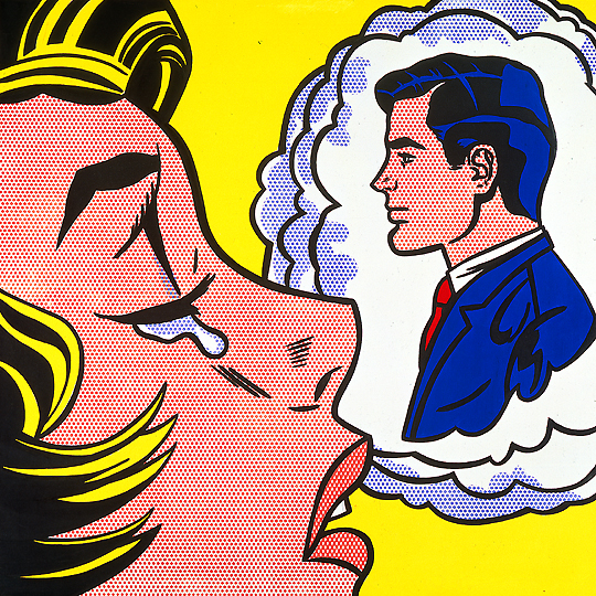
Roy Lichtenstein artwork

This piece of artwork stands out most to me as it is very simple and obvious. Lichtenstein portrays this woman as crying over a man that she is dreaming and thinking about all the time. It makes her seem weak and desperate to fall in love with this man or to be with him. I do like this image as I think that it is very powerful as I do think that a lot of women do get upset over stupid men but then again I know that women don’t feel sad for long about that one thing or person, we often move on and become stronger. I feel that Lichtenstein does portray women in more of a negative light in that they are constantly obsessing over men and wanting to be around men and that they need men to function properly which I think is wrong. I would like to respond to his work in some way on how women are actually much stronger than what Lichtenstein portrayed them as and that we can do things for ourselves without thinking about what men are going to think or what they have told us we should be doing. I do think the way that Lichtenstein has created this artwork is very unique and I like his comic strip style as it is different and interesting. A possible meaning behind the idea of using the comic strip could be that it is fantasy and women aren’t actually like that as all comic strips are fiction and are usually made with superheroes and made for the entertainment of the spectator to escape to a different world but ultimately he most likely just used this style so that his work would stand out from everyone else’s.

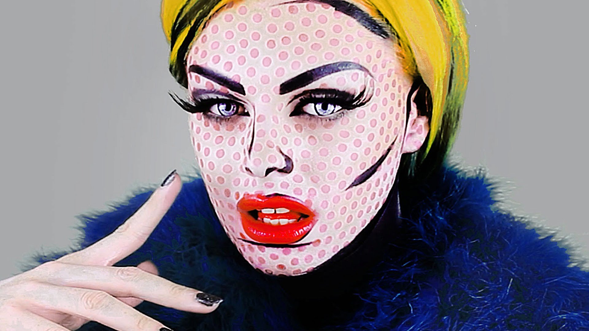
I also found images of women that have taken the style of Lichtenstein and given themselves a makeover to look like the woman does. I find these images really interesting and almost like a response to his work showing possibly how unrealistic they are and how his drawings don’t really reflect the way women actually are. I like this image of the woman with yellow hair as it again just shows how inhuman this woman is and how she is an ideal that Lichtenstein created that is impossible for women to meet and be like. Much like the drawing the women have used their makeup to make themselves look like a cartoon character and shows how it isn’t a realistic representation of a woman at all and although comic strips are exaggerated they don’t really dehumanize anyone with characters mainly consisting of superheroes with the most prominent element being the exaggerations of their body features.