Fashion Magazine | Experimentation

Here is all of the experimentation that I have done towards making my fashion magazine. I have changed my mind on what I want to create for the fashion magazine but I still wanted to add in this experimentation as creating all of the different personas has really helped me to create a better final outcome and to really get into character.

duck lips

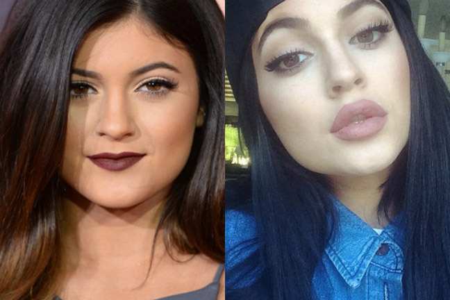
These images are parodying those young women that get lip fillers and work done on their bodies. I find this so trivial and something that young women shouldn’t even have to worry about. But that is the society we live in. We ridicule women publicly in magazines, on TV shows and to one another that it becomes hard for any woman to ever feel good about herself. The ideal of being the perfect woman is constantly drilled into young women’s minds making them feel that if they do not look a certain way then they aren’t good enough or that no one could ever love them. This ideal is so stupid and I wanted to make that clear in these images showing clearly how silly it makes young women look and that they should just embrace themselves and stop dwelling on the physical unimportant things. I do have to mention that I am nowhere near body confidence and I do see myself in a negative light, like most women. This is because we are constantly bombarded with celebrities and their flaws so if a celeb is flawed what does that make me? We forget that we are all human and that there are times where we aren’t going to look our best but there is nothing wrong with that, it’s what makes us human.

Picture7Above is an experimentation that I originally wanted to use as the front cover of my fashion magazine. The words written across my face are words that I’ve either been called or seen other women being called online and in person. I wanted to impact my spectator straight away and show them few derogatory words that are thrown at women daily. I came up with the idea and took inspiration from a past shoot that I did on femme fatales and found as many derogatory terms aimed at women as I possibly could. This research and previous experimentation has really helped me with this experiment. I also took inspiration from a video that I watched of a feminist activist group called the Pussy Riots. I came across such words in the comments that people had written anonymously. These comments were so offensive and vulgar. It really made me think about what those words meant and how someone can just through such words around as if they don’t hold much meaning or aren’t that offensive. Some of the language used to define women is absolutely disgusting and really belittles women is such a way that cannot really be defended. So in this shoot I am taking back those words, I wear them on my skin to show that the words that those people use to define me do not change who I am and they are just words. The term ‘feminazi’ came from a comment I saw and it really stood out to me. The fact that feminists, people that want equality, are compared to that of the Nazi’s that killed millions upon millions of innocent men, women and children is absolutely wrong and unjust. I find the word extremely offensive and something that shouldn’t have even been thought of. It really does show to me that the people who make these comments don’t know what they are talking about and they aren’t worth it. Those people who use words as if they are part of the english dictionary really make me wonder. How can people be so blinded by pure hatred and how can they be so stuck in their ways that they don’t even want to think about the idea of equality and won’t even try to understand what the word feminism actually means.


Picture8

Some of my experimentation’s are incomplete but this is purely because I changed my mind on the whole magazine idea. I think that what I was working towards was good work and I feel that I have been able to portray both the male and female characters well. I chose to become both male and female in my shoots as I took inspiration from Claude Cahun and her work challenging the norms of how men and women should be. I wanted my work to stand out and to make sense to a wide variety of spectator. This experiment was fun to do and has helped me with the process of choosing appropriate props and settings for my final outcomes. The above image is the start of a magazine layout idea that I had and acts as a double page spread. I wanted to show the differences in male and female style as well as the idea of being masculine and feminine. I wanted to mimic existing model’s style and the way magazine photographers want their models to look and how to be positioned. I do like these images as I do think that I look like a male in the images and think that I was able to successfully portray a stereotypical masculine physique by the positions that I am standing/sitting in.

Picture9

For this shoot I made a t-shirt that I got inspiration for while watching a feminist campaign online. I saw a sign that stated ‘Feminism. Back By Popular Demand’ and thought it was great and wanted to take that and bring it into my own work. I decided to paint it free-hand on the back of a plain white t-shirt that I had and on the front I decided to free-hand the symbol of female. I thought that this would work well and be a clear indication to my spectator that it was a step towards supporting feminism. For my characters I created a male and female. The male is wearing the front of the shirt with the female showing off the back of it. I thought it would also be a good idea for them to be holding paint brushes to show that they created the shirts together and are unified together. I really wanted this to be a clear message and easy for my spectator to understand. I think that this worked out well and the images came out successfully. The reason I decided against this idea of creating a magazine was because there would be so much editing to do and the lighting wasn’t right in the images as well as the fact that I came up with a new better idea. These ideas went well at the time but I did not want to develop them further.

Picture10 Picture11

My Fashion Shoot: Duck Lips and Big Hips

The idea of not being ‘perfect’ does stick in many young peoples heads and I find that young women often face such challenges of being beautiful and having an amazing body. I want my spectator to stop and think ‘whoah, what?’ and be intrigued enough to read on and want to find out more and more about what it means. I decided that this would be a good shoot as it shows the problems we have within our society and how judgmental we as a society and community really are. There is constant body shaming in magazines that people actually buy and young people will actually listen to and start to think that if they don’t look a certain way then they aren’t good enough. I think that this is important to focus on as we tend to overlook these kinds of things and never think about how damaging our comments on celebrities posts could actually be on young people, both boys and girls. I came up with the idea for this shoot when I saw a video about an 18 year old girl who got lip fillers and a nose job. I find that nowadays it’s almost common for a young girl to get work done because we as women never seem to feel good enough for anyone and the only way that we can improve ourselves is if we change ourselves and remold our natural look and beauty. I think that it is sad because young women so often feel insecure and as if things need to change and if we don’t look a certain way then we are not good enough and no one will ever love you which is untrue.
Linked to this I have taken inspiration from Cindy Sherman and will make a photograph of myself barefaced and then a photograph where I have ‘work done’ and so I will over draw my lips dramatically and somehow change my nose etc with a full face of makeup and changing my body too by adding pillows in certain areas. I think that this will be a fun shoot that will bring in more concepts to my main project of feminism and the rights and expectations of women. From this shoot I want to be able to add these images into my fashion magazine as one of the ad campaigns on one side will be the natural woman and in her natural form while on the other page next to it I will have an image of myself wearing a full face of makeup with overdrawn lips and everything will be exaggerated including my hips and breasts. I want this message to be clear and to the point so that my spectator can clearly see what the message is. I find that we live in a world where it is more acceptable to get plastic surgery than to actually embrace your natural beauty.

cindy sherman
Cindy Sherman inspiration [mini moodboard]
1418074163_kylie-jenner-lips-transformation-350
Kylie Jenner lip transformation [age 18]

My Response | Experimentation

duck lips

I like the images that I have chosen as my final ones and think that they work well. These images will work well in my magazine and I will be able to add advertisements next to the final chosen image so that it blends well with the magazine. I found this shoot really fun to do as it was something different and I was able to parody women who look this way and make a light-hearted joke at how they present themselves and what women that have gone through plastic surgery will often present themselves like. This will work well in the whole sarcastic aspect of my magazine and will really make each image look individual. The reason I wanted to add this in was because I find so many young women are bombarded with images of how they are expected to be and what they are expected to look like physically which is totally unfair and ultimately unrealistic as women are born with different body shapes and what looks good on one woman might not look the same on another, that is just part of who we are. It makes me sad to see young women getting lip fillers and boob implants because they are so insecure of how they look. I feel that as a society we focus way too much on feminine beauty and not enough on education, rights and the actual treatment of women. I wanted this shoot to be obviously staged and sarcastic to give my spectator a clear understanding of the message that I am trying to get across.


1st Essay draft

How does my mums role as breadwinner abdicate from her culture?

“A Legend of the Strength of… Motherhood.” [20]

INTRODUCTION:

Motherhood is the state or experience of having and raising a child. In this essay I am also going to analyse and compare the links between my personal study outcomes and Dorothea Lange’s Iconic ‘Migrant Mother’ photographs. I have chosen to analyse the photograph of ‘Migrant Mother’ because it is such a well-known photograph with a powerful context behind it which is very interesting to me, furthermore it relates to my personal study.  Secondly, I am going to explore my mum’s work ethic, female traditional roles and how my mums’ role as a breadwinner of my family abdicates from her culture. My mum being born in Madeira means that the female exceptions of her are very different to the role that she ‘plays’ now.  To explore this I have been photographing my mum in her working environment over a period of months. I am also going to include my personal archive photographs to compare my mum’s role then and now.

PARAGRAPH 1:

In 1939 during the Great Depression Dorothea Lange was working on a project for the Farm Security Administration (FSA), which was created to help combat American poverty. The aim of this project was to capture the effect that the Great Depression had on people. According to Dorothea Lange, this photograph was taken when she was driving past a camp site and she stopped and approached ‘Migrant Mother’ within 10-15 minutes she had taken 6 different exposures. Dorothea Lange said that ‘Migrant Mother’ had been living off frozen vegetables from the field and wild birds the children caught and they could not move on, because her husband had just sold the tires from the car to buy food. On the other hand Florence Owens Thompson who is ‘Migrant Mother’ herself says that the encounter was different.  She said that the photograph was taken on a camping site where they had set up temporarily while her husband had gone to get the car radiator repaired. Lange had also promised that the photographs would not be published, however she sent it to San Francisco News as well as to the Resettlement Administration in Washington, D.C. Since then the photograph has become an Icon and a representation of the Great Depression so much so that the photograph became the most reproduced photo in the history of photography, it was reproduced on things such as stamps all the way to cartoons.

Fashion Magazines | Ad Campaigns

I have decided that I will be making a magazine for my project instead of a photobook as I think that I will get a lot more out of it and be able to add more articles into it too. I think that the shoot with my mum and interview with her will look a lot better as a film rather than as stills just because of the way I am making it. I won’t be leaving this as one separate thing as I want to write an article on it in my magazine and add some stills from my mum as well as my parody recreations of what my mums role is. I think that this will work a lot better and give me more opportunity to create something that will stand out as well as bring across my main message of the woman’s role within our modern society. A lot of my work is based on feminism and the way women are represented and shown within modern society, focusing more on the social inequalities of men and women. I also want to add some work on other movements and things that I am passionate about that really should be talked about. I want to focus at least one page on animal testing and the use of animal fur for fashion and makeup, I also want to focus a two page spread on the rights of black people, especially in America. This situation has really been in the spotlight in recent news with major police brutality as well as white people adopting black culture yet not standing up for the inequalities that black people face. I think that this will be really interesting to add as it brings in a whole new side to my work and will add more depth to my work. Basically, I am highlighting the inequalities that so many people face within our society and how unfairly we are treated. I want to live in a society where people don’t see me as a woman and think less of me or for someone to walk past a black person and think less of them. This magazine is a movement for change and I want to put my message across as strongly as possible and to really highlight where we are at with equality in the Western world.

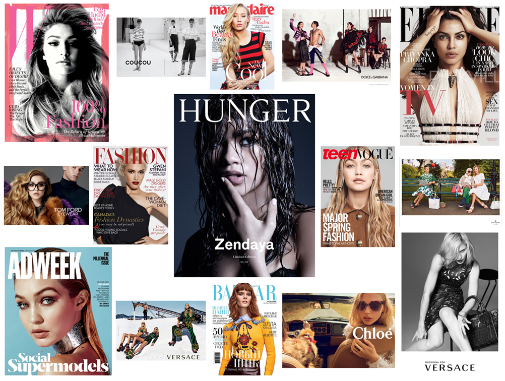
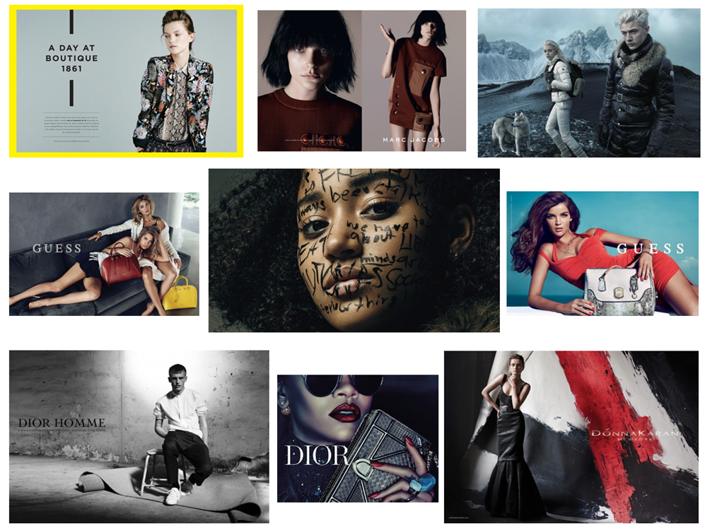
For my shoots I have been looking into some fashion magazines to gain some inspiration on how to lay everything out and also what images to make and where to make them. A lot of the images are taken in a studio with a plain white background which I can do in school but also I want to do some shoots out of school and in a new and different environment just to make my images a lot more interesting and to bring a bit more context and variety to my images. My magazine is obviously going to be mainly photography based and all focused on the visuals but also I want to add slogans and text to bring more context to the images and for them to make more sense. I am also planning on making some articles within my magazine, mainly being sarcastic and showing the struggle and the pressures placed on both men and women to be the ideal human and to look perfect. I want this magazine to really capture my spectators attention and I also want it to look as professional as possible. Doing research has really helped me with what kind of compositions work best for magazines and what kind of shots look good too. For example, a front cover is usually a medium close up shot showing the top half of the models body and the model usually won’t smile but stands in a certain position and has their mouth slightly open and staring into the camera. There is also another style of front cover where the model is closer to the camera and its more of a close up shot. This was really useful to have a look at so I can then make my magazine as professional looking as possible. For the inside covers I noticed a few different things. Most of the ad campaigns spread across two pages and are usually just one big image with the product and text being on the opposite page to where the model is. I also realised that a lot of fashion elements in these magazines have one image on one page covering the entire page and the other image of the other page having a white boarder around it. Research has been key in helping me to plan for my images and has made it a lot easier with the compositions that work well for magazines and what will stand out.

Inspirational mood board:

magazine inspo
magazine inspirations
mag inspo
magazine inspiration

Work in the Style of Inaki Domingo

“Ser Sangre” 

Inaki Domingo was born in Madrid in 1978 and is a visual artist. His most reflective work, ‘Ser Sangre’ questions and explores how the family is traditionally represented in family photo albums, replicating images contained in containers of intimate visual memory and how they constantly relive the perception that they always tend to look the same. ‘Ser Sangra’ when translated is ‘be blood’ in Spanish, accrediting these ideas of ‘connection’ and ‘relationships’ within a family lifestyle. This style of Domingo illustrates the translation and barriers of a family and how they transition during long periods of time, and in different destinations. The story that’s set on a family holiday in Majorca, shows the collections of frozen smiles predominate, to the detriment of other moments, much more frequent in any family’s day-to-day activities.

ID_REPROS_SERSANGRE_008
Domingo’s image on his family holiday in Majorca.

My Interpretation

Below is an image I took in the style of Domingo. The rustic and natural style of Domingo’s photographs underline the key hypothesis of my personal study.

IMG_0575
My own image in the style of Domingo.

My Interpretation

Below are another two interpretations I have done in the style of Domingo. His constant use of mediums such as archival material and drawings which have been scanned in,  lead me to explore this style of myself. I wanted to show the development of our family home when we moved house by incorporating objects that would be moved during this process. I photographed a childhood present I received and have kept ever since I was eight. During my younger years, I drew this and have kept the drawing ever since. I scanned this in and allowed that to feature in my personal study also.

Screen-Shot-2016-02-25-at-11.36.07

IMG_0631

Scan 66

Other Examples

68C22AE0-EF42-4668-8EE7-0B507C53B847

Scan 67


Draft introduction

Question:How has Boltanski, Abril and Toroptsov represented the concept of capturing the invisible and reflecting the meaning of memory through the medium of photography?

Introduction:

Someone once said that you die twice: when you die the first time and when somebody finds a photo of you and no longer remembers who it shows.’

We are made up of fragmented memories and forgotten dreams. Our entirety rests in the fate of old letters, burnt photographs and meaningless possessions. We never question the invisible, it is as though we are on a relentless pursuit to try and capture the invisible.  We abide by the rules and limitations that are enforced by the concept of death. But what happens to those who become untouchable, those who are no longer part of the flux. Their existence becomes empty and lost, they are no longer perceptible to the eye. Yet we still feel impossible and unexplained connections to the spiritless. We yearn to cherish the ‘good’  memories and except the restrictions we are faced with regarding mortality. In doing so, the feeling of life is created, the tangibility of pleasure and pain enters our worlds and consumes us. But, photographs hold heritage and meaning, they have a depth of knowledge and feeling to them. Photographs capture single moments of existence. They can tell a narrative of a second in a stranger’s life in an instance. Whether it is personal, isolated, private or rare, it is has an essence of being and timelessness. The allure of time, is its youthfulness. Time is the cure for it never fails to reveal the truth. ‘Human life is embedded in time: we remember the past, we plan for the future and we live in the present. We swim in an ever-rolling stream.’ 

I am exploring how the invisible can be captured and portrayed through the medium of photography. And why memories hold such a powerful influence over our past, present and future. I want to find out what makes a photograph meaningful, what gives the photograph reality and how through photography the memory of a person can live on. My project focuses on exploring the invisible through three female generation’s memories; this includes my grandmother, my mother and myself. These distinctive view points will enable my project to become more personal and really seek the depths of my grandfather’s life. I think memory is more than simply remembering a once present thought, but it is about connecting with the past in order for the past to live on. 

Essay Plan

The theme for my essay is going to be the concept of Love. I have chosen this theme because my grandparents have been married for 51 years and are so perfect for each other. I split the the theme of love into 5 sections which I think are most appropriate and most important in my Grandparents lives. Over the past three months I have been collecting photographs, archive material and film where I have been capturing their lives from five different perspectives; music, Jersey, Wales, Faith and Family. I have really enjoyed using my family as my personal project as I am able to as I have been able to use your

Possible questions;

how do  Larry Sultan’s and Sam Harris’ photographs of their family represent/ interpret the concept of love.

.Essay question: hypothesis

Opening Quote- need to find.

intro; 250- 500 words.

PG1- Larry Sulton

PG2-Sam Harris

PG3- your work and responses

Conclusion

Bibliography (List all of your sources)

Rosalind Krauss | Art Critic

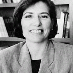
krausRosalind Krauss is an American art critic  and a Professor at the Columbia University in the City of New York for the study of Art History. Her work is to understand modernist art in all its dimensions; formal, historical and theoretical. Krauss is interested in the development in photography as well as works in art. She tends to focus on the avant-garde and feminist work. Krauss was also a critic and contributing editor for Artforum and one of the founders of the quarterly art theory journal October. She is a highly influential critic and theorist of the post Abstract Expressionist era.

About Rosalind Krauss: http://www.columbia.edu/cu/arthistory/faculty/Krauss.html

Bachelors | Book Research

Feature_BOOK_COVER_krauss_nov
Bachelors – Rosalind Krauss

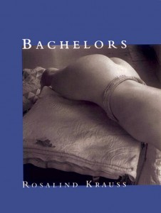
In this book Krauss explores the art of painters, sculptors and photographers. She examines their work on what they represent and how they show that representation. She looks more into the movement of feminism and nine women artists. Krauss claims that the women she has written about in this book challenge the ideals of unity and identifying with masculine aesthetics. Krauss talks about Cindy Sherman, Claude Cahun, Louise Bourgeois, Dora Maar and many others in expressing her views of women within the art industry.

“Within surrealist practice, too, woman was in construction, for she is the obsessional object there as well. And since the vehicle through which she is figured is itself manifestly constructed, woman and photograph become figures for each other’s condition: ambivalent, blurred, indistinct, and lacking in, to use Edward Weston’s word, ‘authority’.” – Rosalind Krauss

Krauss states that women lack authority in the photographic world and are still being objectified and seen as things rather than as human beings. This is really interesting to me as I do find most art has really blurred the woman and made it seem as if the woman is an object and is to be controlled by the male painting her etc. However, although there is a lot of objectification of women within photography, female photographers tend to make themselves the subject and almost parody the idea of being seen as an object, especially through the work of Cindy Sherman. I believe that now women are using their bodies because it is the only thing that is our own, we are taking it back in a sense.

Krauss talks about the work of Cindy Sherman and identifies her work as ‘slavishness’ as if she becomes a slave in her own images and another art critic writes about the link between Sherman and Douglas Sirk. This critic compares the work of Sherman to a still from  one of Sirk’s films and how both are focusing their work on a ‘remembered fantasy’. This is interesting to me as it brings in another dimension to Sherman’s work and how she came up with her ideas from watching old B films and Film Noir style films, this does suggest that Sherman has dreamt of envisioned her situation before hand and then worked based off of memory in her images. However, Sherman has stated before that she doesn’t envision any particular scene but she does it all there and then. She stated ‘some people have told me they remember the film that one of my images is derived from, but in fact I had no film in mind at all’. I like this quote as it shows that Sherman really does make it all up when she gets to her studio and works with what looks good in front of the camera and doesn’t solely depend on a memory or having to perfectly re-stage an image from a still that she took from an old film.

Wendy Ewald

Wendy Ewald is a photographer born in Michigan whose work specialises in capturing how children should ‘see’. This relationship is a gateway into how we can except the different relationships of different children between society, culture and multiple generations. It is said she uses “the camera as a tool of expression. Significantly meaning that her connection with characters in her images are able to relate with the reader in various relationships and contexts. In recent years, Ewald had produced conceptual instillations in Michigan and even England. I felt Wendy was an ideal artist to receive information and experimentation from as I was able to justify my ideas of presenting people and telling their stories through dictating the photographs.

Untitled

mojp

Wendy’s work is easily recognizable as the facial expressions are very clear and immediately let the reader know the context and emotion of these images.

Wendy shows an illiterate image of a community and family, as I think she wanted to reflect the different relationships between this group of people.

The words in Wendy’s images reflects a too the point way of interpreting an image. This makes the reader connect with this character as can be seen as relatable through the emotions.

Presentation 

Wendy adapts to the environment when blowing up her images, and does this possibly to create awareness to the community and families. With connection to my own personal study, I think Wendy Ewald’s work perpetrates the boundaries of what normal people consider. Using large scale prints, she is able to get across these messages of stereotyping by using text as well as print.

iho

My Interpretations of Wendy: 


Themes: Stereo Typing /  Violence / Community / Change